
Introduction to Griffon
The griffon is a mythological creature with the body of a lion and the head and wings of an eagle. As the lion was traditionally considered the king of the beasts and the eagle was the king of the birds, the griffon was thought to be an especially powerful and majestic creature. Similar to this majestic mix, Griffon, a Model-View-Controller (MVC)-based desktop application framework, uses Grails, the web application framework, as its foundation to enable the developer to switch between web and desktop development. The knowledge acquired in one transmutes to the other, thus bringing you the best of both worlds. Both frameworks share a lot of traits, Griffon’s MVC design and plugin facility is based on those provided by Grails, and the command-line tools and scripts found in one framework can also be found in the other.
Inspired by Grails, Griffon follows the “convention over configuration” paradigm, paired with an intuitive MVC architecture and a command line interface. Griffon also follows the spirit of the Swing Application Framework, which defines a simple yet powerful application life cycle and event publishing mechanism. Grails developers should feel right at home when trying out Griffon. Many of Grails’ conventions and commands are shared with Griffon.
The Griffon framework is extensible via plugins, and there are many to choose from. For example, you’ll find plugins for third-party Swing components like SwingX, Jide, and Macwidgets; persistence-related plugins like DataSource, GSQL, and Hibernate, among others; and 3D graphics and animation support is possible via JOGL and LWJGL. Griffon also supports additional UI toolkits like JavaFX and SWT.
This chapter, by no means comprehensive, introduces you to the basics of Griffon. For a detailed treatment on Griffon, we recommend:
- Griffon in Action (Manning Publications, 2012), co-authored by James Shingler, also theco-author of this book
- The Griffon documentation (http://griffon.codehaus.org/guide/latest/ )
The first step to getting up and running with Griffon is to install the distribution. To do so, follow these steps:
- Download a binary distribution of Griffon and extract the resulting zip file to a location of your choice from here:http://griffon.codehaus.org/Download . This chapter uses Griffon 1.1.0.
- Set the GRIFFON_HOME environment variable to the location where you extracted the zip file. On Unix/Linux based systems, this is typically a matter of adding something like export GRIFFON_HOME=/path/to/griffon to your profile. On Windows, you typically set an environment variable under My Computer
 Advanced Environment Variables.
 - Now you need to add the bin directory to your PATH variable. On a Unix/Linux base system, you can do this by adding export PATH="$PATH:$GRIFFON_HOME/bin". On Windows, modify the Path environment variable under My Computer Advanced Environment Variables.
If Griffon is working correctly, you should now be able to type griffon in the terminal window and see output similar to the below:
Welcome to Griffon 1.1.0 - http://griffon-framework.org/
Licensed under Apache Standard License 2.0
Griffon home is set to: /usr/local/griffon-1.1.0
No script name specified. Use 'griffon help' for more info
If you type griffon help at your command prompt as specified below, a list of available Griffon commands is displayed, confirming that GRIFFON_HOME was set as expected and that the griffon command is available on your path.
> griffon help
The output should be similar to this:
Welcome to Griffon 1.1.0 - http://griffon.codehaus.org/
Licensed under Apache Standard License 2.0
Griffon home is set to: /opt/griffon
 Note Griffon may produce output in addition to this, especially when you run it for the first time, when Griffon makes sure it can locate all the required dependencies, which should be available in the folder where Griffon was installed.
Now you’re ready to start building your first application. You’ll start with a default Griffon application and then enhance it using plugins.
Creating Your First Application
To create a Griffon application, use the following griffon command, which is similar to Grails, as Grails developers will notice.
> griffon create-app user
The create-app command creates the appropriate directory structure, the application, and even skeleton code that you can use to launch the application. To launch the application, navigate to the application directory and call the run-app command:
> griffon run-app
This command should compile all sources and package the application. After a few seconds, you’ll see a result similar to Figure 13-1.

Figure 13-1 . The default view
This does not look much of an application so far, but it is a full Griffon application with the complete directory structure created as explained in the next section. The griffon run-app command runs the application in the stand-alone mode, but it is not the only way to run your application. Every Griffon application can be deployed in three modes: stand-alone, Web Start, and applet.
Java Web Start is a framework developed by Sun Microsystems (now Oracle) that allows users to start application software for the Java Platform directly from the Internet using a web browser. Using JavaWS, desktop applications can be delivered across network. To launch the current application in Web Start mode in Griffon, use the following command:
> griffon run-webstart
Finally, you can run the application in applet mode with the following command:
> griffon run-applet
In both the cases, Web Start mode and applet mode, the result is similar, as depicted in Figure 13-1.
As we mentioned earlier, the create-app command creates the appropriate directory structure, the application, and even skeleton code. We will go through the directory structure next.
Directory Structure
One of the strengths of the Grails framework is its convention over configuration paradigm. Along the same lines, Griffon’s conventions are dictated by the common application structure shared by all applications; this structure was created when you invoked the Griffon create-app command.
Let’s see what else is created by that command. The core of the application resides in the griffon-app directory, as illustrated in Figure 13-2. There you can find the code for all models, views, and controllers, which together are the mainstay of the application. You’ll also find other useful artifacts there.

Figure 13-2 . Application directory structure
Table 13-1 shows a breakdown of the contents of each directory. As you develop more and more Griffon applications, you’ll come to appreciate that the applications all follow a common structure and layout. It makes moving between applications much easier. You don’t have to spend time to search your way through the application to see where the views, models, and controllers might be located. You just know where they are located.
Table 13-1. Important Directories in the Griffon Convention
| Directory | Description |
|---|---|
| griffon-app | Core Griffon artifacts |
| griffon-app/conf | Configuration sources |
| griffon-app/conf/keys | JAR signing keys |
| griffon-app/conf/dist | Package specific files |
| griffon-app/conf/dist/shared | Common files to all packaging targets |
| griffon-app/conf/metainf | Files that should go in META-INF inside the application/addon JAR |
| griffon-app/conf/webstart | Webstart templates |
| griffon-app/controllers | Controllers |
| griffon-app/models | Models |
| griffon-app/services | Services |
| griffon-app/resources | Images, properties files, and so on |
| griffon-app/views | GSP |
| lib | Third-party JAR files, such as database drivers |
| scripts | Build-time scripts |
| src | Supporting sources |
| src/main | Other Groovy/Java sources |
| test | Unit and integration tests |
| test/integration | Integration tests |
| test/unit | Unit tests |
| test/cli | Directory for command line tests |
Let’s now navigate through the MVC Triad created by Griffon in the models, views, and controllers directory named after the application. Griffon follows the MVC pattern (Model-View-Controller). The smallest unit of structure in a Griffon application is an MVC group. An MVC group is a set of three components, one for each member of the MVC pattern: model, view, and controller. Each member follows a naming convention that’s easy to follow. Griffon created an initial MVC group for the application when you issued the create-app command. We begin with looking at the view: the part of the application the user can touch and feel (in the literal sense). This file is located at griffon-app/view/user/UserView.groovy, as illustrated in Listing 13-1.
Listing 13-1. The Default View
package user
application(title: 'user',
  preferredSize: [320, 240],
  pack: true,
  //location: [50,50],
  locationByPlatform:true,
  iconImage: imageIcon('/griffon-icon-48x48.png').image,
  iconImages: [imageIcon('/griffon-icon-48x48.png').image,
imageIcon('/griffon-icon-32x32.png').image,
               imageIcon('/griffon-icon-16x16.png').image]) {
// add content here
    label('Content Goes Here') // delete me
}
The view script in the Listing 13-1 is a fairly straightforward SwingBuilder script. Griffon will execute this Groovy script in the context of its UberBuilder, a compositing FactoryBuilderSupport class, which allows seamless merging of existing Builders. From this code, you can see that the create-app command defines an application titled User with a default size of 320 by 240, some icons, and a Content Goes Here label. The application node resolves to a javax.swing.JFrame instance when run in stand-alone mode and a javax.swing.JApplet instance when run in applet mode. After the code sets some basic properties, such as the title and the location, in the application node, the label component resolves to javax.swing.JLabel.
Listing 13-2 illustrates the model class UserModel created by Griffon in the models directory.
Listing 13-2. Default UserModel Generated by Griffon
package user

import groovy.beans.Bindable

class UserModel {
   // @Bindable String propName
}
As you can see in Listing 13-2, the model in Griffon is Groovy-powered to map the fields to the properties following the JavaBeans convention. The Groovy compiler will generate the appropriate bytecode for a pair of methods (the getter and setter) and a private field. Also, notice the @Bindable attribute, which sets up Griffon data binding. The @Bindable annotation is on the individual fields. We can also move the @Bindable up to the class level, to make all the fields observable properties. We’ll look at binding in the next section. (If you are wondering about “observable” properties are, rest assured that we will cover them later in this chapter.) Now, let’s go through the default controller, as shown in Listing 13-3.
Listing 13-3. Default UserController Generated by Griffon
package user

class UserController {
    // these will be injected by Griffon
    def model
    def view

    // void mvcGroupInit(Map args) {
    //    // this method is called after model and view are injected
    // }

    // void mvcGroupDestroy() {
    //    // this method is called when the group is destroyed
    // }

    /*
        Remember that actions will be called outside of the UI thread by default. You can change this setting of course.Please readchapter 9 of the Griffon Guide to know more.
    def action = { evt = null ->
    }
    */
}
As you can see, Listing 13-3 includes a lot of comments in the cod. The commented code and the comments are created by Griffon when it creates the controller for the default application. The fields model and view in the controller will be injected by the Griffon framework. This allows us to access the view widgets and the model data if needed. At this point, the astute reader might notice that Griffon is an MVC framework blended with avant-garde concepts like injection and convention over configuration. The two methods in Listing 13-3 serve as initialization and destruction hooks respectively for any MVC member. We will discuss these methods in the controller section later in this chapter. As mentioned earlier, Griffon creates an initial MVC group for the application when you issue the create-app command. Listing 13-4 illustrates the MVC group configuration created in Application.groovy located in griffon-app/conf in the application’s structure.
Listing 13-4. Application.groovy in the default application
application {
    title = 'User'
    startupGroups = ['user']

    // Should Griffon exit when no Griffon created frames are showing?
    autoShutdown = true

    // If you want some non-standard application class, apply it here
    //frameClass = 'javax.swing.JFrame'
}
mvcGroups {
    // MVC Group for "user"
    'user' {
        model      = 'user.UserModel'
        view       = 'user.UserView'
        controller = 'user.UserController'
    }

}
In Listing 13-4, the user MVC group was created when the application was created and serves as the master group of the whole application. The property named application.startup-Groups serves as a list of the MVC groups that should be automatically started up when the application framework starts up. By default, the MVC group created as a part of the initial application is added to the list of startup groups. You can add any number of groups that you declare later. To create a new MVC group, invoke the following command from the command prompt from inside the user project.
> griffon create-mvc userDetails
The execution of create-mvc command generates four files, each in the appropriate functional directory: a model, a view, a controller, and a test file. Each of the files also has a name derived from the MVC group name.
C:workspacech013user>griffon create-mvc userDetails
Welcome to Griffon 1.1.0 - http://griffon-framework.org/
Licensed under Apache Standard License 2.0
Griffon home is set to: D:griffon-1.1.0

Base Directory: C:workspacech013user
Running script D:griffon-1.1.0scriptsCreateMvc.groovy
Resolving dependencies...
Dependencies resolved in 404ms.
Environment set to development
Resolving framework plugin dependencies ...
Framework plugin dependencies resolved in 376 ms.
Resolving plugin dependencies ...
Plugin dependencies resolved in 344 ms.
Created Model for UserDetails
Created View for UserDetails
Created Controller for UserDetails
Created Tests for UserDetails
Apart from generating MVC member files, the create-mvc command also changes the configuration files to tell the framework that you have a new MVC group as illustrated in Listing 13-5.
Listing 13-5. Application.groovy after running create-mvc command
application {
    title = 'User'
    startupGroups = ['user']

    // Should Griffon exit when no Griffon created frames are showing?
    autoShutdown = true

    // If you want some non-standard application class, apply it here
    //frameClass = 'javax.swing.JFrame'
}
    mvcGroups {
    // MVC Group for "userDetails"
    'userDetails' {
        model      = 'user.UserDetailsModel'
        view       = 'user.UserDetailsView'
        controller = 'user.UserDetailsController'
    }

    // MVC Group for "user"
    'user' {
        model      = 'user.UserModel'
        view       = 'user.UserView'
        controller = 'user.UserController'
    }

}
As you can see in Listing 13-5, Griffon added a new MVC group for the userDetails, but it did not add the userDetails MVC group to list of startup groups. You may choose to add the new MVC group to the startup group to instantiate it automatically or you can instantiate it manually using methods available to every MVC member and the application instance: buildMVCGroup(), createMVCGroup(), and withMVCGroup(). We will discuss these methods in the controller section later in this chapter.
Now we will enhance the default application by modifying the view, model, and controller to create the application, which allows us to create new users. The form used to create the user will look as shown in Figure 13-3.

Figure 13-3 . View of enhanced application
Looking at Figure 13-3, it’s easy to see that the model will have the following properties: firstName and lastName. Also, we will enable the create button if the user provides both a first name and last name. Listing 13-6 illustrates the model that churns this out.
Listing 13-6. Enhancing the UserModel
package user

import groovy.beans.Bindable
import griffon.transform.PropertyListener
import static griffon.util.GriffonNameUtils.isBlank

@Bindable
@PropertyListener(clos)
class UserModel {

        String firstName
        String lastName
        boolean create
        private clos = { event->
                create = !isBlank(firstName) &&
                !isBlank(lastName)
        }
}
The model in Listing 13-4 is quite simple. Other than the @Bindable annotation, which looks familiar since Griffon created it for us in the default model, there is another annotation: @PropertyListener. The @PropertyListener annotation registers a PropertyChangeListener that handles change events. The @PropertyListener is set up at the class level to listen to all property-change events associated with the class. The @Bindable annotation adds PropertyChangeSupport to all fields of the class. This means that when any of the field values change, a property change event is fired. When an event is fired, the closure is invoked with the event. The closure clos takes an event as input. The closure uses the isBlank helper to determine the value of the boolean create. isBlank is a utility method provided by the Griffon runtime to check if the field is blank.
Now let’s enhance the view. Referring to Figure 13-3, we need two labels, two text fields, and one button. Listing 13-7 illustrates the code for the view.
Listing 13-7. Enhancing the View
package user
actions { action(id: 'createAction', name: 'Create', enabled: bind{ model.create }, closure: controller.create) }
application(title: 'User',
  preferredSize: [320, 240],
  pack: true,
  //location: [50,50],
  locationByPlatform:true,
  iconImage: imageIcon('/griffon-icon-48x48.png').image,
  iconImages: [imageIcon('/griffon-icon-48x48.png').image,
               imageIcon('/griffon-icon-32x32.png').image,
               imageIcon('/griffon-icon-16x16.png').image]) {

gridLayout(cols: 2, rows: 3)
label 'First Name:'
textField columns: 20,
text: bind(target: model, 'firstName', mutual: true)
label 'Last Name:'
textField columns:20,
text: bind(target: model, 'lastName', mutual: true)
label ''
button  createAction, constraints: 'span 2, right'

}
As illustrated in Listing 13-7, the view components are associated with the model property using the binding. The textField bindings contain an extra parameter, mutual. Setting mutual to true creates a bi-directional binding. When the view is changed, the model is updated, and when the model is changed, the view is updated. You also see that when the user clicks a button, the associated createAction is invoked on the controller. Let’s look at the controller next. Listing 13-8 illustrates the code for the UserController.
Listing 13-8. Enhancing the Controller
package user

class UserController {
    def model
    def view

    def create = {
        println "First Name: ${model.firstName}"
        println "Last Name: ${model.lastName}"
    }
}
The controller in Listing 13-8 is trivial: when the Create button is clicked, the action in controller prints the model values.
Now you can the run the application using the following command:
> griffon run-app user
The Figure 13-4 depicts the running application. The create button is not enabled until the user fills the lastName. We will show you how to enhance the look and feel of the application in the next section but before that we will cover the topic that is important in terms of the facilities that must be provided by an application framework: the application life cycle.

Figure 13-4 . The enhanced application
Griffon Application Life Cycle
Griffon is an open source, rich client platform framework. In a rich client application, the client not only provides the UI (user interface), but is also responsible for data processing. Rich client applications are generally built on a framework, are extensible with the help of plugins, and can be seamlessly updated with globally distributed applications. The desktop applications share common features, such as menus, toolbars, and so on. For such features, a rich client platform provides a framework with which the features can quickly be rolled and assembled. The rich client platform also provides the configuration and extension infrastructure with which features such as menus can be declaratively loaded by the framework, thus allowing developers to focus on the core business of the application. To this end, one of the key concerns of the desktop applications is the lifecycle management of its components.
The desktop application should be responsible for bootstrapping itself, allocating resources to the components being loaded, and instantiated and relinquishing the allocated resources when they are not needed. Griffon addresses all these concerns with its well-defined life cycle management. Every Griffon application goes through the same life cycle phases no matter in which mode they are running, with the exception of applet mode, where there is an additional phase.. Every phase has an associated life cycle script that will be invoked at the appropriate time and these scripts are located in the griffon-app/lifecycle in the application’s structure. The phases are as follows:
- Initialization
- Startup
- Ready
- Shutdown
- Stop
Initialization
The initialization phase is the first to be called by the application’s life cycle. The application instance was just created and its configuration was read but you can’t access any MVC members yet. This phase is typically used to tweak the application for the current platform, including its look and feel. Listing 13-9 illustrates the code in the script for this phase (Initialize.groovy).
Listing 13-9. Initialize.groovy
import groovy.swing.SwingBuilder
import static griffon.util.GriffonApplicationUtils.isMacOSX

SwingBuilder.lookAndFeel((isMacOSX ? 'system' : 'nimbus'), 'gtk', ['metal', [boldFonts: false]])
The code in this script configures the look and feel using a list of names that resolve to a particular lookAndFeel setting.
Startup
The Startup phase is responsible for instantiating all MVC groups that have been defined in the application’s configuration (Application.groovy) and that also were marked as startup groups in the same configuration file.
Ready
The Ready phase is called right after Startup with the condition that no pending events are available in the UI queue. The application’s main frame is displayed at the end of this phase. The application is fully initialized at this point; no further life cycle scripts will be called until the application is ready to shut down in the next life cycle phase.
Shutdown
The Shutdown phase begins when the application is about to close. Any artifact can invoke the shutdown sequence by calling shutdown() on the app instance. This is the last life cycle script called by Griffon. The shutdown phase represents the last chance for freeing used resources, saving configuration settings, and closing any connections your application might have opened.
Stop
The Stop phase is only available when running in applet mode. It is called when the applet container invokes destroy() on the applet instance.
These are all the phases in the Griffon application lifecycle. It’s simple, but it’s a powerful feature in Griffon’s arsenal against painful desktop application development. Instead of figuring out when and how each of these tasks should be invoked, you let Griffon call the phase-handler scripts when needed. These scripts are guaranteed to be invoked inside the UI thread (the Event Dispatch Thread in Swing). The script names match each phase name; you’ll find them inside griffon-app/lifecycle. In the next section, we’ll dig into views.
Note The Swing toolkit has a rule: all long computations must be performed outside of the Event Dispatch Thread (or EDT for short). This rule also states that all interaction with UI components must be done inside the EDT, including building a component and reading/writing component properties. More information on concurrency in swing can be obtained from http://docs.oracle.com/javase/tutorial/uiswing/concurrency/index.html .
Groovy can do anything Java can do. If you think about the goal of developing the user interface from a Java perspective, you have two options: Swing or Standard Widget Toolkit (SWT). Either choice would work. You could just start coding Groovy and use Swing or SWT the same way you would in a normal Java program. However, if you’ve ever coded Swing or SWT, you probably aren’t too excited right now.
Groovy uses builders1 to make the job easier. It has both the Swing family of builders (SwingBuilder,2 SwingXBuilder, and JideBuilder3 ) and the SWT builder (SwtBuilder4 ). Using Groovy and a builder will make it much easier to create a client application. In general, Java developers are more likely to be familiar with Swing than SWT. Therefore, we’ll show you how to use Swing as the presentation technology and SwingXBuilder to make it easier. SwingXBuilder extends SwingBuilder and provides access to all of the power of SwingBuilder, plus the Swing components from the folks at SwingLabs.5
Builder Overview
A Swing user interface can be thought of as a composite or a tree of graphical components. If you have programmed with Swing, you’re undoubtedly familiar with the neverending pattern of adding a component to its parent. It can be a complex, verbose mess. Groovy tackles the mess using builders.
If you have spent any time with Groovy, you have probably seen or used MarkupBuilder to construct an HTML or XML document. Builders can be used equally as well to build a Swing UI.
The easiest way to gain appreciation for SwingXBuilder is to see an example. Listing 13-10 shows how to use SwingXBuilder to create a simple user interface.
Listing 13-10. Creating a Simple UI Using SwingXBuilder
import groovy.swing.SwingXBuilder
import static javax.swing.WindowConstants.EXIT_ON_CLOSE
import javax.swing.*

class SimpleUI {

    static void main(args) {
        def simpleUI = new SimpleUI()
        simpleUI.run()
    }
        def swing
    def count = 0

    def run = {
          swing = new SwingXBuilder()
          swing.lookAndFeel('system')

          // create the actions
          swing.action(id: 'exitAction',
            name: 'Exit',
            closure: this.&exit,
            mnemonic: 'x',
            accelerator: 'F4',
            shortDescription: 'Exit SimpleUI'
          )
          swing.action(id: 'aboutAction',
            name: 'About',
            closure: this.&showAbout,
            mnemonic: 'A',

            accelerator: 'F1',
            shortDescription: 'Find out about SimpleUI'
          )
          swing.action(id: 'clickAction',
            name: 'Click',
            closure: this.&click,
            shortDescription: 'Increment the Click Count'
          )

          // Define the Frame
          swing.frame(id:'simpleUIFrame', title: 'SimpleUI',
                location: [100,100],
                defaultCloseOperation: EXIT_ON_CLOSE
            ) {
          // Define the Menubar
          menuBar {
              menu(text: 'File', mnemonic: 'F') {
                  menuItem(exitAction)
              }
              glue()
              menu(text: 'Help', mnemonic: 'H') {
                  menuItem(aboutAction)
              }
          }

          // Define some stuff
          button(id:'clickButton', text:"Click Me", action: clickAction)
          // INSERT MORE STUFF HERE
            }

          swing.simpleUIFrame.pack()
          swing.simpleUIFrame.show()
    }

    void click(event) {
      count++
      swing.clickButton.text = "Clicked ${count} time(s)."
    }

   void showAbout(event) {
      JOptionPane.showMessageDialog(swing.simpleUIFrame,
'"This is the SimpleUI Application''')
    }
    void exit(event) {
      System.exit(0)
    }
}
Executing the SimpleUI application creates the user interface shown in Figure 13-5.

Figure 13-5 . The SimpleUI application
The SimpleUI application creates a Swing user interface that features a menu bar that contains a File menu, a Help menu, and a button in the content area. The text on the button changes every time the user clicks it. When the program starts, it invokes the run closure to build the UI. The run closure sets up the builder, and then uses the builder to create three actions that will be used within the UI. Then the closure uses the builder to create the frame. The frame contains a menu bar, which contains the File and Help menus. Each of the menus contains menu items that reference the previously created actions. The frame also contains a button labeled Click Me, and a reference to the clickAction action.
If you take a closer look at the actions, you will notice that a parameter named closure was passed to the builder when creating the actions. In the case of clickAction, the closure to be executed is click. The click closure increments a counter and sets the button’s text.
Griffon View
Views are usually written as Groovy scripts that create the UI by composing elements using builder nodes. Griffon supports all nodes provided by SwingBuilder by default.
Additional nodes can be configured in griffon-app/conf/Builder.groovy; the Griffon runtime will make sure to correctly setup the builder.
Listing 13-11 shows Builder.groovy located in the griffon-app/conf in the application’s structure.
Listing 13-11. Builder.groovy
root {
  'groovy.swing.SwingBuilder' {
    controller = ['Threading']
    view = '*'
  }
}
In Listing 13-11 the root node is the top-level node used to mark the default namespace used by the builder. If you need to expose additional nodes to a controller, add a new builder to Builder.groovy and place all the libraries and dependencies of the new builder in your application’s lib directory. Listing 13-12 illustrates adding MacWidgetsBuilder (http://griffon.codehaus.org/MacWidgetsBuilder ) to Builder.groovy.
Listing 13-12. Adding MacWidgetsBuilder to Builder.groovy
root {
  'groovy.swing.SwingBuilder' {
    controller = ['Threading']
    view = '*'
  }
  'griffon.builder.macwidgets.MacWidgetsBuilder'{
    view = '*'
  }
}
You can also append the following line to the default Builder.groovy file as an alternative to the MacWidgetsBuilder block in Listing13-10.
root.'griffon.builder.macwidgets.MacWidgetsBuilder'.view = '*'
Adding builders to your builder configuration can be automated via plugins. All the builders shown at http://griffon.codehaus.org/Builders have companion plugins that adds the builder automatically so that you do not have to add it manually. Besides, there are many plugins (see http://artifacts.griffon-framework.org/plugins/ ) that can contribute additional nodes that you can use on views.
You can also get the list of all available plugins by invoking the list-plugins command target at your command prompt.
> griffon list-plugins
Invoking this command displays a table of all available plugins as shown in Figure 13-6

Figure 13-6 . List of available plugins
To get plugin specific information you can use plug-info command target with plugin’s name as the parameter.
> griffon plug-info jide-builder
Invoking this command displays the plugin details with documentation information along with the author’s name and email address, as shown in Figure 13-7.
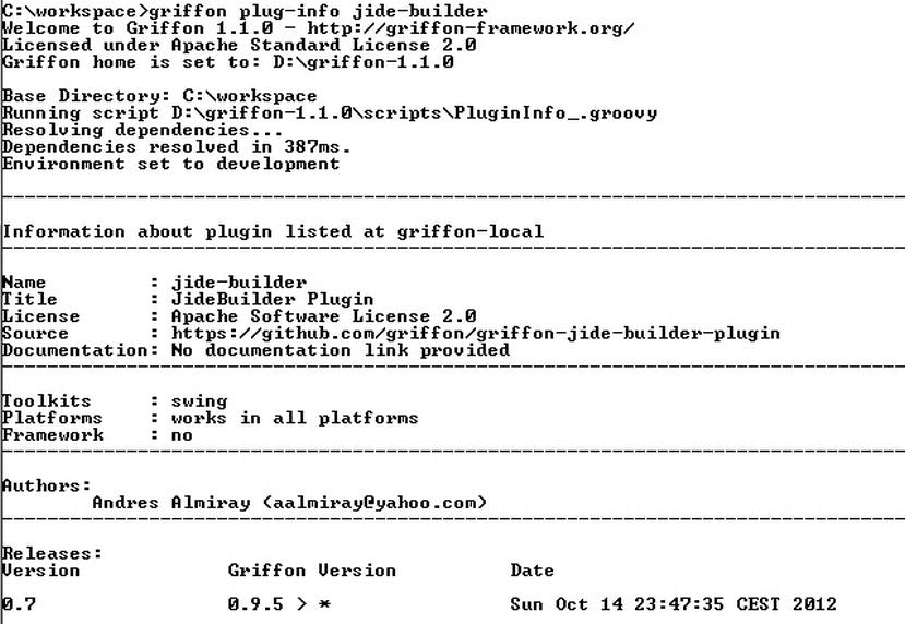
Figure 13-7 . plugin details
Now we will enhance the look and feel of the view using plugins - JideBuilder and MigLayout. We will use the JideBuilder nodes for setting up the top banner and MigLayout to organize the components as illustrated in Listing 13-13.
Listing 13-13. View using JideBuilder and MigLayout
package user
import java.awt.Color
actions {
    action(id: 'loginAction',
    name: 'Login',
    enabled: bind{ model.enabled },
    closure: controller.login)
}
application(title: 'User', pack:true,
  locationByPlatform:true,
  iconImage: imageIcon('/griffon-icon-48x48.png').image,
  iconImages: [imageIcon('/griffon-icon-48x48.png').image,
  imageIcon('/griffon-icon-32x32.png').image,
  imageIcon('/griffon-icon-16x16.png').image]) {
      migLayout(layoutConstraints: 'fill')
      bannerPanel(constraints: 'span 2, growx, wrap',
      title: 'Login',
      subtitle: 'Please enter your credentials',
      titleIcon: imageIcon('/griffon-icon-48x48.png'),
      border: lineBorder(color: Color.BLACK, thickness: 1),
      subTitleColor: Color.WHITE,
      background: new Color(0,0,0,1),
      startColor: Color.WHITE,
      endColor: Color.BLACK,
      vertical: true)
    label 'Username:', constraints: 'left'
    textField columns: 20, text: bind('username', target: model), constraints: 'wrap'
    label 'Password:', constraints: 'left'
    passwordField columns: 20, text: bind('password', target: model), constraints: 'wrap'
    button loginAction, constraints: 'span 2, right'
}
You’ll need to install twoplugins if you intend to run this application: jide-builder and miglayout, using the following commands:> griffon install-plugin miglayout
> griffon install-plugin jide-builder
The code in Listing 13-13 generates the screen shown in Figure 13-8. The code in Listing 13-14 and Listing 13-15 illustrates the model and the controller used for this application.
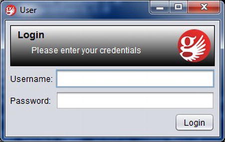
Figure 13-8 . View Using JideBuilder and MigLayout
Listing 13-14. UserModel for Login Application
package user
import groovy.beans.Bindable
import griffon.transform.PropertyListener
@PropertyListener(enabler)
class UserModel {
    @Bindable String username
    @Bindable String password
    @Bindable boolean enabled
    private enabler = { evt ->
      if(evt.propertyName == 'enabled') return
      enabled = username && password
    }
}
Listing 13-15. Controller for Login Application
package user

import javax.swing.JOptionPane
class UserController {
    def login = {
        JOptionPane.showMessageDialog(app.windowManager.windows[0],
            """
               username = $model.username
               password = $model.password
            """.stripIndent(14).toString())
    }
}
Special Nodes
There are many Swing components and it would be a daunting task to find and make a SwingBuilder node for each one for them. Instead of tracking down each Swing component for their node names, drop the first J from the class name and uncapitalize the next character; for instance, JButton => button, JLabel => label. This rule applies to all Swing classes available in the JDK. In addition, SwingBuilder includes a few extra nodes that aren’t related to a particular Swing class, but prove to be useful when you need to insert a custom Swing component. In this section, we’ll look at six special nodes:
- Application
- Container
- Widget
- Bean
- Noparent
- Root
Application
This node is provided by Swing plugin and defines a top level container depending on the current running mode. Of all the properties suggested by the default template, you’ll notice iconImage and iconImages. The first property is a standard property of JFrame. It usually defines the icon to display at the top of the frame (on platforms that support such a setting). The second property (iconImages) is a JDK 6 addition to java.awt.Window. This property instructs the window to select the most appropriate icon according to platform preferences. Griffon ignores this setting if it’s running in JDK 5. This property overrides the setting specified for iconImage if it’s supported in the current JDK and platform.
Container
This node is provided by SwingBuilder and is a pass-through node that accepts any UI component as a value. This node allows for nesting of child content. It’s quite useful when you need to embed a custom component for which a node is not available. Listing 13-16 illustrates its usage.
Listing 13-16. Using Container Node
container(new CustomPanel()) {
    label 'custom label'
}
Widget
This node is provided by SwingBuilder and is a pass-through node that accepts any UI component as a value. As opposed to container, this node does not allow nesting of child content. It’s quite useful when you need to embed a custom component for which a node is not available. Listing 13-17 illustrates its usage.
Listing 13-17. Using Widget Node
widget(new CustomDisplay(), title: 'custom title') {
Bean
This node is provided by SwingBuilder and is a catch-all node. It allows you to set properties on any object using the builder syntax. Listing 13-18 illustrates its usage for setting up bindings on a model.
Listing 13-18. Using Bean Node
textField columns: 20, id: username
bean(model, value: bind{ username.text })
Noparent
This node is provided by SwingBuilder. Child nodes are always attached to their parents, but there are times when you don’t want that to happen. In these cases, wrap those nodes with noparent, as illustrated in Listing 13-19.
Listing 13-19. Using Noparent Node
panel {
    gridLayout(cols: 2, rows: 2)
    button('Click 1', id: b1')
    button('Click 2', id: b2')
    button('Click 3', id: b2')
    button('Click 4', id: b4')    // the following line will cause the buttons
    // to be reordered
    // bean(button1, text: 'Click 11')
    noparent {
        // this is safe, buttons do not change places
        bean(button1, text: 'Click 11')
    }
}
Root
This node is provided by Griffon and it identifies the top level node of a secondary View script. View scripts are expected to return the top level node, but there may be times when further customizations prevent this from happening; for example, when wiring up a custom listener. When that happens, the result has to be made explicit; otherwise the script will return the wrong value. Using the root() node avoids forgetting this fact while also providing an alias for the node. Listing 13-20 illustrates its usage.
Listing 13-20. Using Root Node
root(
    tree(id: 'mytree')
)mytree.addTreeSelectionModel(new DefaultTreeSelectionModel() {
   ...
})
Swing uses the model-view-controller architecture (MVC) as the fundamental design behind each of its components. Essentially, MVC divides GUI components into three elements—the model, the view, and the controller. Each of these elements plays a crucial role in how the component behaves. The model encloses the state data for each component.
There are different models for different types of components. For example, the model of a menu may contain a list of the menu items from which the user can select. Note that this information remains the same no matter how the component is drawn on the screen; model data always exists independent of the component’s visual representation. The view refers to how you see the component on the screen.
The controller is the portion of the user interface that dictates how the component interacts with events. Events come in many forms; for example, a mouse click or a keyboard event. The controller decides how each component will react to the event.
With MVC, each of the three elements requires the services of another element to keep itself continually updated. Likewise, the view determines if the component is the recipient of user events, such as mouse clicks. The view passes these events on to the controller, which decides how to handle them best. Based on the controller’s decisions, the values in the model may need to be altered.
Griffon automates the creation of the model, view, and controller classes both at build time and at runtime. It configures them via injection to follow the original convention of paths of references, observed updates, and user interactions. It also has conventional file locations for the created groups and other conventions relating to the life cycle of the MVC group.
The MVC pattern is found in Griffon both at the architectural level and the presentation layer. In Griffon, any MVC member can be registered as a listener on a model class, by means of PropertyChangeListeners and PropertyChangeEvents. The responsibility of Models is to hold data that can be used by both Controller and View to communicate with each other. The Griffon Models are observable; all the properties in a Griffon model are observable. This means that whenever the value of any of the properties changes, an event is fired. To make a property observable, all you need to do is annotate the property with the @Bindable annotation. The @Bindable annotation, facilitated by Groovy’s AST transformation, instructs the Groovy compiler to inject the byte code that makes the annotated property observable and ensure that a PropertyChangeEvent is fired for each observable property whenever the value of this observable property is changed. This considerably simplifies setting up bindings so that changes in the UI can automatically be sent to model properties and vice versa
When creating Swing UIs, you’re often interested in monitoring the changes of value of certain UI elements. For this purpose, the usual approach is to use JavaBeans PropertyChangeListeners to be notified when the value of a class field changes. You then end up writing this very common boilerplate code in your Java beans, as illustrated in Listing 13-21.
Listing 13-21. Javabean Without @Bindable Annotation
import java.beans.PropertyChangeSupport;
import java.beans.PropertyChangeListener;

public class MyBean {
    private String prop;

    PropertyChangeSupport pcs = new PropertyChangeSupport(this);

    public void addPropertyChangeListener(PropertyChangeListener l) {
        pcs.add(l);
    }

    public void removePropertyChangeListener(PropertyChangeListener l) {
        pcs.remove(l);
    }

    public String getProp() {
        return prop;
    }

    public void setProp(String prop) {
        pcs.firePropertyChanged("prop", this.prop, this.prop = prop);
    }
}
Using @Bindable annotation in Groovy, the code in Listing 13-21 can be greatly simplified, as illustrated in Listing 13-22.
Listing 13-22. Bean with @Bindable Annotation
class MyBean {
    @Bindable String prop
}
Another annotation, @PropertyListener, helps you register PropertyChangeListeners without so much effort. The @PropertyListener accepts the in-place definition of a closure or reference of a closure property defined in the same class or a List of any of both.
The Code in Listing 13-23 is greatly simplified using @PropertyListener annotation, as illustrated in Listing 13-24.
Listing 13-23. Bean Without @PropertyListener Annotation
import groovy.beans.Bindable
import java.beans.PropertyChangeListener
class UserModel {
    def controller
    @Bindable String firstName
    @Bindable String lastName
def snoopAll = { evt -> ... }
UserModel() {
        addPropertyChangeListener(snoopAll as PropertyChangeListener)
        addPropertyChangeListener('lastName', {
            controller.someAction(it)
        } as PropertyChangeListener)
    }
}
Listing 13-24. Bean with @PropertyListener Annotation
import griffon.transform.PropertyListener
import groovy.beans.Bindable
@PropertyListener(snoopAll)
class MyModel {
    def controller
    @Bindable String name
    @Bindable @PropertyListener({controller.someAction(it)})
                String lastname    def snoopAll = { evt -> ... }
}
Binding in Griffon is achieved by leveraging JavaBeans’ PropertyChangeEvent and their related classes. Thus binding will work with any class that fires this type of event, regardless of its usage (or non-usage( of @Bindable. The SwingBuilder class in Groovy contains bind node that allows you to cleanly bind the state of two objects. A simple TestBean with two properties, property1 and property2, is shown below:
class TestBean {
  @Bindable String property1
  String property2
}
You can bind the field property2 to be the same value as property1 using the following:
bind(source: testBean, sourceProperty: 'property1',
     target: testBean, targetProperty: 'property2')
As a result of this binding, the value of the property2 is same as the value of the property1 and if the value of the property1 is changed, the change is reflected in the property2.
There are the three options for writing a binding using the bind node:
- Long. The most complete of all three, you must explicitly specify both ends of the binding. The following snippet sets a unidirectional binding from bean1.prop1 to bean2.prop2.
bind(source: bean1, sourceProperty: 'prop1', target: bean2, targetProperty: 'prop2') - Contextual. This type of binding can assume either the sources or the targets depending on the context. When used in this way, either sourceProperty: or targetProperty: can be omitted and considered implicit; the bind node's value becomes the property name.
bean(bean1, prop1: bind('prop2', target: bean2)) - Short. This type of binding is only useful for setting implicit targets. It expects a closure as the definition of the binding value.
bean(bean2, prop2: bind{ bean1.prop1 })
Controllers
Controllers are the entry point for your application’s logic. The controller has properties and methods injected by Griffon, hooks for post- initialization and handler actions. Some of the properties, methods, actions are created by Griffon when we created the default application, as shown in Listing 13-3. Along with these properties, we will introduce several other properties and methods in this section.
Injected Properties
The injected properties you need to understand are as follows:
- App—The app property points to the current running application, through which you can access the application’s configuration. Using this property, an application can expose its configuration, controllers, views, models, and builders in the form of app.config, app.controllers, app.views, app.models, and app.builders.
- Builder—The builder property points to the builder used to create the view related to this controller. The view and the builder may share the same variables, but they’re two distinct objects: the view is a script that tells you what you just built, and the builder is a CompositeBuilder instance that allows the controller to build new UI components if needed.
- Model—The model property, when defined, lets the controller access the model that’s related to its group. A controller usually updates the view via the model, assuming the proper bindings are put into place. But there’s no strict requirement for a controller to always have a model. If you think your controller doesn’t require a model, you can safely delete this property from the code; there won’t be an error, because Griffon will check for the property declaration before setting the value.
- View—The view property references the third member of the MVC triad: the view. Like the model, this property is optional. In some cases the controller may interact with the view solely by updating the model, in which case it’s safe to delete this property from the code.
Injected Methods
The following sections provide examples of the injected methods you’ll be using.
This method lets you create new instances of a MVC group. It always returns three elements: Model, View, and Controller, in that order.
Listing 13-25. Usage of createMVCgroup
class SampleController {
    def action = { evt = null ->
        def (m, v, c) = createMVCGroup('Other')
    }
}
This method is a restricted version of the more general buildMVCGroup(), explained next.
buildMVCgroup
This method lets you create new instances of an MVC group. Listing 13-26 illustrates its usage.
Listing 13-26. Usage of buildMVCgroup
class SampleController {
    def action = { evt = null ->
        MVCGroup group = buildMVCGroup('Other')
    }
}
This method is used when building a group that may contain additional MVC members, as createMVCGroup() returns strict MVC members only (Model, View, Controller).
destroyMVCgroup
The destroyMVCGroup() method removes the group reference from the application. Listing 13-27 shows its usage.
Listing 13-27. Usage of destroyMVCgroup
class SampleController {
    def action = { evt = null ->
        destroyMVCGroup('Other')
    }
}
This method performs the following steps in the following specified order:
- Calls mvcGroupDestroy() on each MVC member that is not a Script.
- Calls dispose() on the associated builder.
- Removes all references of the MVC members from the applications cache.
- Fires a DestroyMVCGroup event.
Once a group is destroyed, you cannot use it again.
withMVCgroup
This method lets you create new instances of a MVC group that is short-lived; for example, one that creates a dialog box. The withMVCGroup() method is a mix of createMVCGroup() and destroyMVCGroup() that makes sure the created group is destroyed immediately after it’s no longer of use. Listing 13-28 illustrates its usage.
Listing 13-28. Usage ofwithMVCgroup
class SampleController {
    def action = { evt = null ->
        withMVCGroup('Other') { m, v, c ->
            // configure the group
        }
    }
}
Create a new MVC group instance, and then discard it once it is no longer of use.
newInstance
This method creates a new instance of a particular class and type. It is a convenience method that fires an event after the instance is created; the application will not perform additional management for an instance created in this way. Listing 13-29 illustrates its usage.
Listing 13-29. Usage of newInstance()
class SampleController {
    def action = { evt = null ->
        def myService = newInstance(MyServiceClass, 'service')
    }
}
Initialization and Destruction Hook
Other than listening to application events, creating and destroying MVC groups or holding references to service, controllers in Griffon can also react to MVC Initialization/Destruction through mvcGroupInit and mvcGroupDestroy methods which we will explain next.
This method serves as an initialization hook for any MVC member that is neither a script nor a CompositeBuilder instance. It will be called right after an instance is created.
The signature of the method is this:
void mvcGroupInit(Map<String, Object> args)
The args parameter holds any additional data that has passed to either createMVCGroup() or buildMVCGroup(). Listing 13-30 shows its usage.
Listing 13-30. Usage of mcvGroupInit
class SampleController {
    def someProperty
    def mvcGroupInit(Map args) {
        someProperty = args.random
    }
}
mvcGroupDestroy
This method serves as a destruction hook for any MVC member that is neither a script nor a CompositeBuilder instance. It will be called when the instance is about to be removed from the application’s cache during the destroy sequence of an MVC group. Listing 13-31 shows the usage of mvcGroupDestroy().
Listing 13-31. Usage of mvcGroupDestroy
class SampleController {
    def mvcGroupDestroy() {
        // perform cleanup
    }
}
Actions
Controller actions are usually defined using a closure property form, as illustrated in Listing 13-32.
Listing 13-32. Actions in Controller
class MyController {
    def someAction = { evt = null ->
        // do some stuff
    }
}
An action is nothing more than a closure property or a method that follows a conventional set of arguments, which is the event generated by the UI.
Summary
You started this chapter by setting up your development environment and using the Griffon create-app command to create your first Griffon application. You took a brief tour of how Griffon’s convention-over-configuration paradigm makes the application structure predictable and easy to follow. You saw that data binding between views and controllers comes naturally with Griffon. The view components display the current status of the model, whereas the related controllers change them.
Finally, you saw how the power and expressiveness of Groovy help you write concise, expressive, powerful code. Our goal was to give you a sample of what is possible with Griffon. You are only limited by your imagination.
1 Refer to Chapter 3 for a review of builders.
2 http://groovy.codehaus.org/Swing+Builder
3 http://groovy.codehaus.org/JideBuilder