
IN THIS CHAPTER
A Sample Pivot Table
Moving Data into a Pivot Table
Special Features of Pivot Tables
Sample Pivot Tables from QuickBooks Data
Chapter 2 ended with a brief description of building a pivot table from QuickBooks data. Because of the great flexibility of analysis that pivot tables offer you, and because it is so easy to port data from QuickBooks into Excel, this chapter describes the pivot tables features in much greater depth. You will see how to bring pivot tables to bear on QuickBooks data and explore patterns in your data that you simply can't uncover in the QuickBooks user interface.
Pivot tables do take some getting used to. Before you can begin to feel comfortable with them you have to learn a few special terms. And pivot tables are so powerful and flexible that you need some experience before new ways to use them become clear. The next section gets some of that housekeeping out of the way with an overview of pivot table fields.
Figure 3.1 shows a mildly complicated pivot table based on QuickBooks' Rock Castle Construction sample file.
Notice in Figure 3.1 that you can see the joint effect of City and Class on the company's revenues. It's important to know whether there is a difference in how your products do according to your customers' locations. One reason is that knowing where different products perform best enables you to focus your marketing efforts.
In QuickBooks, you can view a report of sales by item. You can customize a transaction report that shows sales by, say, customer city.

But you can't see whether pine cabinets sell better in Millbrae or in Bayshore. A pivot table makes that kind of information both straightforward and easy to get.
It will help you to understand pivot tables if you begin by understanding some of their terminology.
The explanation of terms might as well start with the term pivot table itself. When Microsoft first introduced pivot tables in the mid-1990s, it chose to call them "pivottables," which it continues to do so today. So, if you want to look up information about pivot tables in Microsoft Help documents or online, you might get more information if you spell it as one word, without a space. This book uses the less gimmicky term "pivot table."
A table pivots on a worksheet in the sense that the user can change the orientation of a field in the table by dragging it from a row orientation to a column orientation, or vice versa. So doing is called pivoting the table. It's fun to watch once or twice, and it leads to an initially intriguing term, but even if you (like me) find that you have created thousands of pivot tables over the years, you'll be hard-pressed to think of a time that you pivoted a table for a reason more important than just watching the wheels go around.
Pivot tables have four kinds of fields: row, column, data, and page.
A row field is one that occupies rows in a pivot table. In Figure 3.2, the field called Name City is the row field. The designation Name City is due to QuickBooks. Several address fields are qualified by the word Name, to indicate that they are associated with the Customer Name: Name Street1, Name State, Name Zip, and so on.
The individual rows associated with the row field are each occupied by a row item. The row items in Figure 3.2 are Bayshore, East Bayshore, Middlefield, and so on. Notice that there is one row item labeled (blank). This is to account for items that have no value in Name City. You can use the dropdown labeled Name City to suppress the (blank) item by clearing its checkbox. See Figure 3.3.
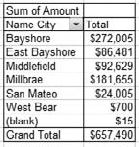

Figure 3.4 shows the pivot table from Figure 3.2 with Name City moved (or pivoted) to act as a column field. Its different items now occupy separate columns, whereas in Figure 3.2, as a row field, its items occupied separate rows.
Compare Figures 3.1, 3.2, and 3.4. Figure 3.1 is the usual way of displaying a table that has two fields: One is used as a row and the other as a column. Figures 3.2 and 3.4 show that you can use other considerations, such as a report layout, to decide whether to treat a pivot table's single field as a row or as a column field. This is strictly a look-and-feel decision and has nothing at all to do with the results of the analysis.
In pivot table parlance, Figures 3.2 and 3.4 actually have two fields each (and Figure 3.1 has three fields). The reason is that pivot tables consider the data that's totaled to be a field. This is consistent with how QuickBooks regards the data. In Figures 3.1, 3.2, and 3.4, the data that's totaled and shown as currency is QuickBooks' Amount field: You can tell because there's a cell labeled Sum of Amount. This label tells you that the Amount field has been summed, and the sums appear in the cells occupied by the table's data field.
Note
There are several functions that you can use to summarize the data field. So far this chapter has shown only the SUM function. For example, Figure 3.1 shows you the sum of the Amount field for Remodel class sales that took place in Bayshore summed to $117,465. Other functions available are the COUNT function (such as the number of sales of the Remodel class in Bayshore), AVERAGE, MAX, MIN, STANDARD DEVIATION, and VARIANCE. (The most useful of these for business analysis are SUM, COUNT, and AVERAGE.) Excel refers to all these functions as totals, even though only one, SUM, has anything to do with getting a total.
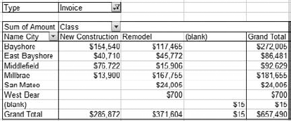
A fourth type of field in a pivot table is the Page field. It hasn't yet appeared in this chapter's figures, but you'll see one in Figure 3.5.
QuickBooks has a field named Type (some reports in QuickBooks refer to it as Transaction Type). Its possible values include Invoice, Sales Receipt, Payment, Deposit, and so on. Used as a Page field in Figure 3.5, you can call for specific transactions: those that are invoices. You could use its dropdown to select any other type of transaction that appears in the report exported from QuickBooks. In Figure 3.5, only those transactions that are invoices contribute their data to the pivot table. For example, invoices for the Remodel class in Middlefield sum to $15,906.
If, instead, you wanted to see the sum of Sales Receipt transactions by class and city, you would choose Sales Receipt from the Type dropdown. (It is labeled Type because that's the name the QuickBooks report gives the field. If a QuickBooks report calls it Transaction Type, that's the label you'd see on the dropdown.)
There can be more than one row, column, data, or page field in a pivot table. The considerations are different for row and column fields than they are for page fields, or for the data field.
Suppose that you wanted the breakdown shown in Figure 3.1 but instead of Class in columns and City in rows, you wanted both Class and City in rows. That's entirely feasible and it might look like the table shown in Figure 3.6.
Figure 3.6 shows what happens when you treat, in this case, the Class field as a secondary or inner row field instead of as a column field. Compare Figure 3.6 to Figure 3.1. The total amounts for each combination of Class and City are the same in both figures. All that differs is the layout.

But some people find it easier to locate a particular combination of Class and City when the fields are laid out as an inner and an outer row field. And if a field has more than three or four items, it can stretch too far, left to right, if it's treated as a column field. You get a taller, skinnier table if you use two row fields.
You also get a denser table structure. The totals for a particular City or Class are no longer found by looking to the end of a row or the bottom of a column. Instead, to find the subtotal for, say, East Bayshore, you have to look below the rows for East Bayshore New Construction and for East Bayshore Remodel; then you get to the subtotal for East Bayshore.
There's also the issue of subtotals for the inner row field. Notice in Figure 3.1 that the total across all cities for the Remodel class is $371,604. You don't find that total anywhere in Figure 3.6 because as the table is structured there is no place for the Remodel total.
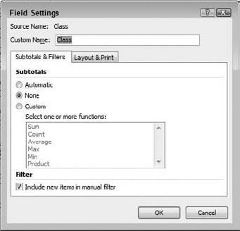
In this situation, where you want an inner and an outer field, take these steps to get subtotals for the inner field:
Right-click any cell that contains a value for the inner field, such as New Construction in Figure 3.6.
Choose Field Settings from the contextual menu.
The Field Settings dialog box appears (see Figure 3.7). Choose Custom under Subtotals, and click Sum in the list box. Then click OK to close the dialog box.
The result of taking Steps 1 through 3 earlier appears in Figure 3.8.
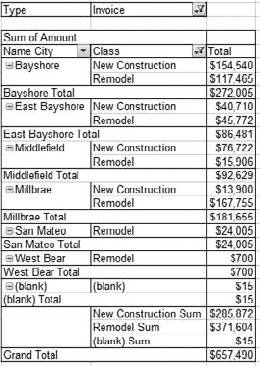
Notice near the bottom of the pivot table, just before the Grand Total row, you find three subtotals, sometimes called block totals, one for each Class (including the records with blank values on Class). The values are the same as the column totals shown in Figure 3.1.
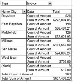
You can display more than just one data field in a pivot table. The data fields might represent different underlying fields, such as Amount and Open Balance. Or they might show two ways of viewing the same field, such as Sum of Amount and Count of Amount. Figure 3.9 shows an example.
To keep the pivot table from becoming too complex, only one row field and one page field appear in Figure 3.9; there is no column field. As in prior figures, the transactions summarized by the pivot table are limited to Invoices by means of the page field.
By arranging to show both the count and the sum of the transactions' amounts, you can tell how important a particular city is to the business, in terms both of dollars billed and in terms of frequency of transactions.
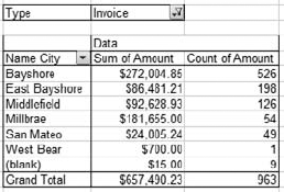
Notice in Figure 3.9 that the two data fields, Count and Sum of Amount, are stacked vertically within each City item. In Excel 2003 and earlier, this is the default arrangement when you call for two or more data fields. But particularly when you have no column field, you might want to arrange the data fields side by side. Compare Figure 3.10 to Figure 3.9.
To arrange the layout shown in Figure 3.10, start with the arrangement shown in Figure 3.9. Then take these steps:
Move the mouse pointer over the button labeled Data.
When the mouse pointer turns into a crosshairs, press the mouse button and hold it down.
Drag the Data button one column to the right and release the mouse button.
If you want to stack the data fields vertically, take Steps 1 and 2 earlier, but drag the Data button one row down and one column to the left before releasing it.
The default arrangement of multiple data fields in Excel 2007 is side by side, and the button is labeled Values instead of Data. Otherwise the procedures are as given immediately prior.

The section "Page fields" earlier in this chapter noted that you use a pivot table's page field as a record-selection device. For example, if the underlying data set includes various transaction types, you can set the Page field to Invoice to limit the records summarized by the pivot table to only Invoice transactions.
You could limit the records even further by including another page field in the pivot table. If the additional page field represented Account, you could select the Labor Income item. Then the pivot table summaries would be based on invoice transactions that are posted to the Labor Income account. Figure 3.11 shows how this arrangement might look.
The important issue here is that adding a second page field to a pivot table connects the two page field items by a logical AND. That is, in Figure 3.11, the records that are summarized by the sum and count functions are those that are Invoice transactions and that post to Labor Income.
Tip
To arrange page fields side by side, right-click a cell in the pivot table and choose PivotTable Options from the contextual menu. Change the Display Fields in Report Filter Area from Down, Then Over to Over, Then Down.
The previous section explained how to manage the use of multiple fields as row fields, page fields, and data fields. When you have more than one data field it's often because you want to display the field using different kinds of totals: as a sum, as a count, as an average, and so on. Here's how to change a data field's summary function:
Suppose you have already established Amount as a data field in a pivot table, and that the data field appears as the Sum of Amount. If you want to change that to Count instead, take these steps:
Right click any cell in the pivot table's Data area — in this example, that means any cell that contains a sum for the Amount field.
Choose Value Field Settings from the contextual menu.
The Value Field Settings dialog box appears as shown in Figure 3.12. (When you're working with a Data field, the dialog box's appearance differs from that shown in Figure 3.7.)
Choose Count in the Summarize Value Field By list box.
Note
If a field has even one missing value — a blank cell — or text value in the pivot table's data source, then Excel uses COUNT as the default totaling method. If all the field's values are numeric, then the default totaling method is SUM.
Pivot tables offer a special method of formatting Data fields. Suppose that you just now finished creating the pivot table shown in Figure 3.11. The number format of the Data field is by default General, so you would see no dollar signs or commas in the data field totals. You would prefer that the format be Currency.
The normal way to format cells is to select them and then use Format Cells, either from the Formatting toolbar, or from the Excel 2007 Ribbon, or by right-clicking the cells and using the contextual menu.
These methods all associate the selected format with the cells that the Data field occupies, not necessarily with the Data field itself. Under some circumstances, when you modify the pivot table structure, you can lose that cell formatting. Furthermore, if you change a SUM field to a COUNT field, the cell formatting can make it look like East Bayshore has $198.00 transactions instead of 198 transactions.

Figure 3.12. You can edit the field's name in the Custom Name edit box, but it's best to include the totaling method as part of the name.
So the best way to set a number format for a Data field is to use its field settings. Right-click in a Data field cell and choose Value Field Settings from the contextual menu. Click the Number Format button in the Value Field Settings dialog box and select the number format you want for the field.
If you subsequently change the totaling method for the Data field from, for example, SUM to COUNT, Excel acts as though you have changed the Data field itself, not just its totaling method. Therefore Excel does not apply the currency format you established for the SUM to the field when it shows COUNT instead. It applies the General number format, or some other number format that you have specified for the data field when it shows counts.
And if you change the structure of the table, you can be confident that the Data field will retain the number format you assigned to it, whether you change a row field to a column orientation or vice versa.
At times you will want to view your QuickBooks data using a totaling method other than Sum and Count. As the earlier section "Data fields" mentioned, there are several other totals that you might find useful. These include AVERAGE, MIN, and MAX.
If you have read Chapter 10, you know that some sales are more efficient than others. The sale of a product with a higher contribution margin is generally more profitable than the sale of a product with a lower contribution margin.
A similar line of thought, applied to total sales revenue and number of sales, shows that the notion of average sales revenue can be important. If it takes 200 sales to reach $20,000 in revenue, then there's something about those sales that makes them less efficient than 100 different sales that get you to the same revenue figure. A more rigorous analysis would look at both revenue and variable costs, along with a breakdown by item sold, sales territory, and sales rep. But you can get a quick idea by comparing a total revenue analysis with an average revenue analysis — perhaps something such as in Figure 3.13.

Figure 3.13. These three pivot tables sort the cities by descending total revenue, by descending transaction counts, and by descending average revenue.
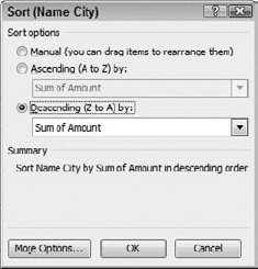
Figure 3.14. If you choose Name City instead of Sum of Amount, you can get an alphabetic sort of the row field by the name of the city.
Figure 3.13 shows that the company realizes the greatest portion of its revenue from sales in Bayshore, and the second largest portion from Millbrae — the difference between the two is over $90,000. Bayshore looks like a good sales patch.
But if you look at the average sales, you see that Bayshore falls from first place in total revenue to fourth place in average revenue. The culprit is the number of sales in Bayshore: 526 versus 198 in East Bayshore. Much depends on how the company makes its sales: Online, for example, entails a lot less overhead than cold calls. Still, those Bayshore sales have to be eating up a lot of G&A dollars, and a manager at Rock Castle Construction should probably be looking hard at how the company's sales force is deployed.
You can't make that kind of inference from just looking at total revenue. You have to look at averages and perhaps counts as well.
It's important to recognize that there's no QuickBooks report that will give you this sort of analysis. But if you don't have it, you have no quantitative basis to manage your company's sales. You need something that looks at total and average revenue by fields such as territory, sales rep, or item sold.
Figure 3.13 shows the same data set sorted three ways: by Sum of Amount, by Count of Amount, and by Average of Amount. You could arrange these data sorts by the usual Excel method of selecting the range and then choosing Sort from the Data menu (in Excel 2007, you choose Sort & Filter from either the Home or the Data tab).
But if you do that, you might have to do it again if you restructure the pivot table in some way. If you know that you'll always want to sort a pivot table in a particular way, take these steps in Excel 2007:
Right-click a row field item. In Figure 3.13 you might choose Bayshore under Name City.
Choose Sort from the contextual menu.
Click More Options. The Sort (Name City) dialog box shown in Figure 3.14 appears.
To replicate the setup in Figure 3.13, click the Descending (Z to A) dropdown in the Sort Options dialog box.
Choose Sum of Amount from the Descending (Z to A) dropdown.
Click OK.
In versions earlier than Excel 2007, choose Field Settings in Step 2 and click the Advanced button in Step 3.
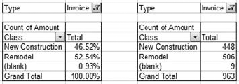
Thus far, this chapter has focused on showing actual dollar amounts, or counts of transactions, in pivot table data fields. You can also view them as percents. For example, you might wonder what percent of a company's revenue comes from different classes of sales. The Rock Castle Construction Company uses New Construction, Remodel, and Overhead as its three classes. Figure 3.15 shows how invoiced sales amounts are distributed across the company's classes.
To get an analysis such as the one shown in Figure 3.15, take these steps:
Build or redesign the pivot table so that it has the Row field and the Data field you want. Use the Data field's settings to choose the totaling method you want — most likely,
SUM, COUNT, orAVERAGE.Right-click a Data field cell and choose Value Field Settings from the contextual menu.
Click the Show Values As tab, and choose % of Column from the Show Values As dropdown.
Click OK.
Note that the sequence is functionally the same in Excel 2003 and earlier.
Most of the choices you have in the Show Data As dropdown are different sorts of percents: percent of row, percent of or percent difference from some other item, and so on. You are unlikely to need or want to use any of these options, but you might want to keep in mind that they're there.
Note
One useful option in the Show Data As dropdown is the Running Total In option. This option can be useful when you need to re-create balance sheet accounts for consecutive accounting periods. You would set the base field to Date.
So far, I have focused on how you can use pivot tables, configured in different ways, to answer questions about a business's operations that can't be addressed directly in the QuickBooks user interface. There are more such examples in the remainder of the chapter, but it's time to see how to build a pivot table from data that you have exported from QuickBooks via reports. (Chapters 1 and 2 cover in detail the considerations involved in exporting reports to Excel.)
Bear in mind as you glance through the following material that you do not need to complete the processes for every pivot table you build. It's quite enough to export a new report when your company data has changed significantly — depending on how active your company file is, you might want to re-export data weekly, monthly, or even quarterly.
This chapter also shows you a little-known way to update all your pivot tables with fresh data from QuickBooks without doing anything more than exporting a new report. Implementing that technique can save you large amounts of time, even in the short run.
Depending on the version, Excel supports three or four sources of data for a pivot table. At least one must be in place before you can build a pivot table. This book concentrates on just one data source: the list. The next section explores the relationship between Excel lists and QuickBooks reports.
An Excel pivot table can also be built using data in another application such as an Oracle, SQL Server, or Access database. The database must support open database connectivity (ODBC), a standard software interface that enables the exchange of data between applications. QuickBooks' support for ODBC is very limited, though, and you can't depend on its availability from version to version, or even for all datasets within a specific version. (Some ODBC drivers are available from third-party vendors.)
Two other data sources have very limited applicability. Multiple Consolidation Ranges, which is no longer available in Excel 2007, was never a truly feasible source. Another Pivot Table as a data source had significant drawbacks and has also been dropped as an option from Excel 2007.
Note
The drawbacks have to do with the shared cache. For example, if two pivot tables share the same data cache and a field is grouped in a particular way in one pivot table, it is automatically grouped the same way in the other pivot table. This was generally regarded as an annoying situation.
That leaves Excel lists. An Excel list is an informal structure and in fact is little more than a set of guidelines for laying out data. In Excel 2007, lists have become formal structures, but are known as tables.
If you want to apply Excel's powerful analytic technology to QuickBooks data, it's essential that you understand the basics of Excel lists and tables. Fortunately, QuickBooks' transaction reports work beautifully with Excel list and table structures.
In Excel 2007, a table is not the same as a pivot table. An Excel 2007 table is a list with a few bells and whistles added into the mix. If you identify a list as a table by clicking the Ribbon's Insert tab and then clicking Table in the Tables group, Excel does the following:
Adds AutoFilter dropdowns in the table's first row.
Enables the addition of a totals row to the end of the table.
Adds shading to the rows and columns.
Creates a named range that identifies the table.
Of these actions, the fourth is useful. Later sections of this chapter explain named ranges in more detail; for now, simply know that you can tell Excel to use a named range as a pivot table's data source.
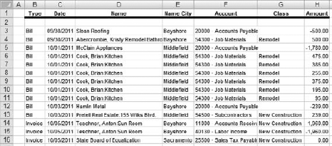
Figure 3.16 shows an example of a QuickBooks report after it's been exported to Excel.
You can create this list of QuickBooks data in Excel by following the steps described in Chapter 2. Once you're used to exporting a report, it's almost second nature and you can get the data out of QuickBooks and into Excel in three steps: Open the report, modify it as needed, and export it to Excel.
Once the report is there, you still have a couple of quick steps to conform to Excel's list structure:
Delete mostly blank rows starting at row 2. Notice row 2 in Figure 13.16. QuickBooks puts it there to show the date label in the Custom Transaction Detail report if the user has specified a date range other than All. An Excel list should not have a row of blank cells immediately following the field names in the first row, so in this case you would delete row 2. QuickBooks often puts more blank rows at the top of other detail reports (for example, the Profit & Loss Detail report), and then you would delete each blank row to draw the start of the actual data up to just below the field names.
Delete any rows that contain subtotals. QuickBooks knows that those rows are subtotals, but Excel doesn't, so Excel interprets a subtotal row as a separate record. The effect is to falsely inflate the dollar totals in the resulting pivot table.
After you have deleted blank rows beginning with row 2, and subtotal rows, you are left with a range of data in the worksheet that conforms to what Excel calls a list. A list has column labels and different records in different rows; it should not have blank columns interspersed as separators.
An Excel list has the names of the fields in its first row; they are often termed column labels. This characteristic of lists is useful for analysis techniques other than pivot tables. Excel can use column labels in chart legends, to make it easier to sort data and filter it, and for use with other utilities such as the analysis toolpack.
While you can get away with omitting column labels with data that you'll chart, sort, or filter, these labels are required in a pivot table's data source. If you omit the column headers, Excel will think your first row of data represents the column headers.
Each row in a list constitutes a different record. The records need not be sorted, although of course they can be. It is technically permissible but inconvenient for there to be blank rows in the list, so you should delete any that exist. As noted earlier, you should also delete any subtotal and total rows from the exported report.
QuickBooks' Custom Transaction Detail report is nearly ideal as a data source for an Excel pivot table. That is so for several reasons, as follows.
Most QuickBooks detail reports include at least one filter. The Profit & Loss Detail report filters for all income and expense accounts. The Sales by Customer Detail report filters for all sales items and all customers/jobs. The Inventory Valuation Detail report filters for all inventory and assembly items.
By contrast, the only filter that the Custom Transaction Detail report includes is Dates, which defaults to This Month-to-date. If you set that filter to All before exporting, you'll get all transactions, regardless of date, transaction type, account, or any other criterion.
This is helpful because you can use Excel's pivot table page fields to limit the records you analyze to a particular period, or class, account, and so on. To get a different view, you just choose a different item in the page field — you don't need to re-run the report with a different filter.
Note
There are times when it is useful to use a filter to the Custom Transaction Detail report before you export it. For example, without a good bit of spadework it is difficult to show all income accounts, and only income accounts, using a pivot table's page field. In a case like that, it's usually better to include the field as a row field and use the field's dropdown to select individual items. Even this approach can be onerous, but if you use the QuickBooks Account filter before exporting the report it's very easy to limit the analysis to the accounts you're interested in.
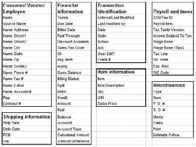
The Custom Transaction Detail Transaction report can display 71 fields. This does not include all the fields available in QuickBooks but it does account for most of the fields that you're likely to want to analyze. Calculated fields such as the current average cost of an inventory item and some specialized fields such as Vehicle Mileage Rate are not included. Figure 3.17 shows the fields available in the Custom Transaction Detail report.
I recommend that you make two changes to the Custom Transaction Detail report and then have QuickBooks memorize the report with your changes. The changes are as follows:
Change the report's dates to All.
Include all the fields in the report. Click the report's Modify Report tab and use the Columns list box to select all fields. If you don't want to include all fields, at least include all the fields that you might ever want to access. Omit the (left margin) column, which isn't a field at all but is just some padding on the left edge of the report.
After you have made those changes, click the report's Memorize button, give it a meaningful name such as Custom Transaction Detail for Pivot Tables, and click OK.
The reason to make these changes, and to memorize them, is that there are likely to be several pivot tables that you will want to examine on a periodic basis — monthly, quarterly, weekly, whatever. If you set things up correctly, you won't have to re-create those pivot tables every time another period has elapsed. You just run the report again and export it to the existing Excel workbook. When you have that workbook set up as described in the next section, your pivot tables will automatically refresh themselves with the new set of exported data.
If you know that you're always getting all transactions from your company file, regardless of their date, you can be confident that your periodic exports update the workbook accurately. (You can always filter for particular dates in the pivot table itself.)
The reason to include all the available fields in the report is partly practical and partly technical. As a practical matter, by exporting all the fields in the same report, you can base several pivot tables on the same set of source data. And if something in an analysis piques your interest, it might be that you already have some other field available that will help you explore further.
As a technical matter, exporting all the fields the first time means that you won't have to add a field later on. If you have to add one later, you might have to rebuild your pivot tables. If a pivot table sees a field name that wasn't there when it was built, difficulties can arise when the table updates itself based on the new set of data.
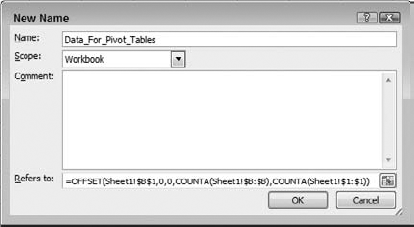
Excel has a feature called range names. If you give a name, such as Data_For_Pivot_Tables, to a range of contiguous cells in a worksheet, you can use that name when you're asked to identify the location of a pivot table's source data.
Note
Named ranges have many other uses in Excel. As just one example, you can use them in formulas as data sources for charts. But the other uses go beyond the scope of this book, and well beyond the scope of this chapter.
If you're not interested (or not interested just now) in the technical underpinnings of dynamic range names, skip the next section, "Creating dynamic range names." You can use the information in this section when you're ready to build the pivot table. Later, if you get curious, you might want to come back to the next section.
After you have exported the Custom Transaction Detail report from QuickBooks, you'll want to delete its second, blank row and any subtotal or total rows it contains. These deletions were explained in the earlier section "Excel lists."
Note
You should leave column A alone, even though it's mostly blank and often com- pletely so. If you delete a blank column A so that the main data range starts there, you'll have to delete column A again the next time you export to this sheet. If you do that, you'll induce a #REF! error in the definition of the dynamic range name.
Now name the range by taking the following steps. (You need take them once only.)
Select the cell in the uppermost row and the leftmost column in the exported report. In the course of events as described here, that's cell B1. (Although you'll see any applicable dates in column A, the actual report data starts in column B.)
If you're using Excel 2007, click the Formulas tab on the Ribbon and then click Define Name in the Defined Names group. If you're using an earlier version of Excel, choose Insert

Type the name Data_For_Pivot_Tables into the Name edit box. Of course, you can use just about any name you want, as long as it doesn't contain spaces and doesn't resemble a cell reference like D15. (There are other rules but it's hard to break them unless you're really working at it.)
Assuming that you began in Step 1 by selecting cell B1, enter the following in the Refers To edit box:
=OFFSET(Sheet1!$B$1,0,0,COUNTA(Sheet1!$B:$B), COUNTA(Sheet1!$1:$1)).
Click OK.
Here's the background, technical information on the formula at the end of the previous section. Again, you can skip this if you want.
What you're aiming for is a way to update several — perhaps many — pivot tables in an Excel workbook when you export new data to the workbook from a QuickBooks report. When you first create the pivot tables, you tell Excel to look for the source data in a range named — well, whatever name you want. This chapter is using, as its example of a range name, Data_For_ Pivot_Tables.
Tip
The technique described here works equally well for automatically updating Excel charts with new data.
When you define a range name, you include a reference to worksheet cells. For example, in the Refers To edit box, you could enter this:
=Sheet1!$A$1:$E$5
Then the name would refer to that worksheet range in the worksheet named Sheet1. (By convention, Excel uses an exclamation point to separate the name of a worksheet from a cell or range address.) The dollar signs in $A$1 and $E$5 anchor the reference to the range A1:E5.
The problem is that a range defined by a reference to fixed column letters and row numbers is static. No matter whether the data you export from QuickBooks occupies five rows or 500, five columns or 50, the name you defined as referring to Sheet1!$A$1:$E$5 stubbornly continues to refer to those specific 25 cells.
But if you create a dynamic range name, you can replace the old data with new, a smaller range with a larger one, and the name will redefine itself to capture all the new data. If you set up the pivot tables so that they look to a named range for their source data rather than to a specific address, the pivot tables will also capture the new data.
The way to do that is to use something similar to this formula in the New Name dialog box:
=OFFSET(Sheet1!$B$1,0,0,COUNTA(Sheet1!$B:$B),COUNTA(Sheet1!$1:$1))
The formula uses Excel's OFFSET function, which defines the location, and number of rows and columns, of a worksheet range. Its syntax is:
=OFFSET(Reference,Rows,Columns,Height,Width)
The address that OFFSET assembles is based on its reference argument. Suppose the reference is cell $B$1, as in the prior example. Then the remaining arguments to the function have these effects:
The Rows argument defines how far away from B1, in rows, that the new range starts
The Columns argument defines how far away from B1, in columns, that the new ran starts.
Height is the number of rows occupied by the new range.
Width is the number of columns occupied by the new range.
So, the formula
=OFFSET($B$1,1,1,3,4)
returns an address that is one row down and one column right of B1. It is three rows high an four columns wide. So the OFFSET function with those arguments returns the range C2:F4.
In the example, this section is using the following for the pivot table's source data:
=OFFSET(Sheet1!$B$1,0,0,COUNTA(Sheet1!$B:$B),COUNTA(Sheet1!$1:$1))
The reference cell is Sheet1!$B$1, and the new range starts zero rows down and zero column over from $B$1 — that is, the new range's upper-left corner is cell $B$1.
The entire point of defining a range name in this way is to make the reference sensitive to the number of rows and columns it occupies. Therefore, the number of rows and columns that contain data must be counted. The results of those counts determine the number of rows and columns in the named range.
The COUNTA function is used to count the number of values, whether numeric or not, in a range of cells. For example, in
=COUNTA(Sheet1!$1:$1)
the COUNTA function returns the number of values in row 1 of Sheet1.
And in
=COUNTA(Sheet1!$B:$B
the COUNTA function returns the number of values in column B of Sheet1. This is why I pref to suppress (left margin) in the report's display, and to be certain that the report's first column contains a field such as Trans # or Type that is sure to have a value in every transaction. That way, I'll get an accurate count of the number of transactions that the exported QuickBooks report contains. I don't want the first data column to contain a field such as Debit, which is overwhelmingly likely to contain fewer values than there are exported records.
So, if the exported report contains 70 columns and 1,500 rows, then the range definition
=OFFSET(Sheet1!$B$1,0,0,COUNTA(Sheet1!$B:$B),COUNTA(Sheet1!$1:$1))
resolves to this:
=OFFSET(Sheet1!$B$1,0,0,1500,70)
or, more simply, Sheet1!B1:BS1500. That's the address of the range occupied by a report exported to Sheet1 when the report has 1,500 rows and 70 columns. If the range is named Data_For_Pivot_Tables, any and all pivot tables in the workbook that base their source data on the range Data_For_Pivot_Tables will get their data from Sheet1!B1:BS1500.
Back to the entire point of doing all this. (Doing it just once, remember.) The next time that you export the report to Sheet1 in this workbook, it's liable to have more rows: More time will have elapsed and more transactions will have been recorded, therefore the Custom Transaction Detail report will have more rows (unless, of course, you add a filter to it; the technique described here handles that situation, too).
Because you created a dynamic range name, the range redefines itself when the new data arrives. The OFFSET formula re-counts the number of values in the first column and extends the range reference to encompass all the new rows. The pivot tables that use the range for their source data now refer to the newly extended range.
The same is true of the number of columns in the range. I advised you earlier, in the section "Memorize the report," to use the same number of fields — all of them — when you export the report. In case you decide not to follow that advice, the OFFSET formula counts not only the rows but the columns in the exported report.
Note
Suppose you decide to establish a shorter range of dates for the report prior to re-exporting it. Won't that result in a smaller range? If so, what happens to the data in the earlier, larger range? QuickBooks warns you, when you're exporting to an existing worksheet, that it will overwrite existing data. It doesn't tell you that it first deletes all the data in the worksheet. Therefore, you don't need to worry about earlier data remaining. (You do need to worry about data that you don't want to lose, even if it's outside the range occupied by the exported QuickBooks report.)
Note
Be sure that you don't put any extraneous data in column B or row 1, outside the range occupied by the exported report. If you do, the COUNTA functions in the range definition will count those values and will give the range too many rows or too many columns, or both.
Once you have exported the report to Excel into a dynamic named range, as described in the previous section, you're ready to build a pivot table.
Note
If you have already built one or more pivot table reports based on exported QuickBooks reports, as described in the earlier section "Use a named range," you do not need to rebuild the pivot tables. The instructions in the previous section are designed to provide a basis that responds accurately to new data in an exported QuickBooks report. The existing pivot tables do need to cite the range's name, such as Data_For_Pivot_Tables, as their data source.
To build a new pivot table, take these steps:

In Excel 2007, click the Ribbon's Insert tab and then click PivotTable in the Tables group. In earlier versions of Excel, choose Data
Excel 2007 displays the Create PivotTable dialog box shown in Figure 3.19. In the Table/Range edit box, enter the name of the dynamic range you established for the exported QuickBooks report. This example uses Data_For_Pivot_Tables.
Leave the New Worksheet option selected and click OK.
Versions of Excel earlier than Excel 2007 use a three-step wizard. Use its first step to indicate that the data source is an Excel list. Supply the name of the dynamic range in the second step, and specify a new worksheet in the third step.
Excel 2007 displays the worksheet and the PivotTable Field List dialog box shown in Figure 3.20 when you leave the Create PivotTable dialog box.
Versions earlier than Excel 2007 present a somewhat different interface. The functionality is identical but you can drag fields from the Field List directly into their areas in the worksheet (for example, Drop Page Fields Here and Drop Data Items Here).
Using the PivotTable Field List dialog box shown in Figure 3.20, drag the fields from the list box labeled Choose Fields to Add to Report into the boxes where you want them:
The Report Filter box represents a pivot table's page fields.
The Column Labels and Row Labels boxes represent a pivot table's Column and Row fields, respectively.
The Values box represents a pivot table's Data fields.
If you filled the Defer Layout Update checkbox, you can click the Update button at any time to view the pivot table's current structure. When you have finished the initial design, close the dialog box. Figure 3.21 shows one possible result.

Figure 3.20. Fill the Defer Layout Update checkbox to keep the pivot table placeholder in the worksheet as you add more fields.
You can, of course, create other pivot tables to cut the data in different ways. Let each pivot table get its data from the same named range — again, this example has used the range name Data_For_Pivot_Tables. When each pivot table is based on the same data range, you can be more confident that you're not comparing apples and bowling balls. When you're through designing the pivot tables, be sure to save the workbook.
A pivot table doesn't automatically respond to a change in its source data the way a worksheet formula does. Suppose you use the SUM function in a formula to get the total of the values in A1:A5. Then you change the value in, say, A3. Unless you've gone to the trouble of turning off automatic recalculation, the formula with the SUM function immediately recalculates and takes account of the changed value.
Pivot tables don't work like that. When their data source changes, they don't automatically recalculate themselves. You have to arrange for that to happen. There are three basic methods:
Updating a pivot table to reflect new data is called refreshing the pivot table. To do this manually, right-click any cell in the pivot table and choose Refresh from the contextual menu (in versions earlier than Excel 2007, the menu item is Refresh Data).
You can, if you want, use the pivot table's options to call for the pivot table to refresh itself when the workbook is opened. This approach has value when the pivot table's data source is not a range in a worksheet, as explained in this chapter, but a connection to an external database. In that case, whenever you open the workbook, the pivot table refreshes itself from the latest information in the database.
QuickBooks does not generally support that sort of live connection. So, if you want to take this approach, you would have to update the workbook with new data from a QuickBooks report as described earlier in this chapter, then save and close the workbook, and then cause the pivot table or tables to refresh themselves by reopening the workbook.
This is probably the most convenient method in the long run, but it requires some up-front work. The idea is to cause VBA code to run automatically whenever you activate a worksheet that contains one or more pivot tables. (VBA is Microsoft's Visual Basic for Applications scripting language, which Excel uses.) In turn, the VBA code causes the pivot tables to refresh. This approach is superior to manual or semi-automatic refreshes because you don't have to remember to do it every time you export a QuickBooks report.
Here are the steps to arrange automatic refreshes:
Right-click the worksheet tab of a worksheet that contains one or more pivot tables.
Choose View Code from the contextual menu.
The Visual Basic Editor window opens, as shown in Figure 3.22.
There are two dropdowns at the top of the Code window. The one on the left, by default, displays General. Choose Worksheet from that dropdown.
The dropdown on the right changes to display SelectionChange and two VBA statements appear in the Code window. You can select and delete them if you want. They do no harm if you decide to keep them.
Choose Activate from the dropdown on the right. The following statements appear in the code window, with a blank row between them:
Private Sub Worksheet_Activate()
End Sub
Enter the following code between the Private Sub and the End Sub statements:
Dim pt As PivotTable
For Each pt In ActiveSheet.PivotTables
    pt.RefreshTable
Next pt
Switch back to the Excel workbook window and save the workbook.

Now whenever you activate the worksheet, any pivot table in that worksheet will be refreshed with the most current data in its data source.
With all the spadework done, it's easy to update the pivot tables later, perhaps at the beginning of the next accounting period. Just export the version of the Custom Transaction Detail report you had QuickBooks memorize. If any transactions occurred in the meantime, they will be included in the new export.
The steps to perform an initial export have been described in detail in Chapter 2. Follow those steps to export the report to a new Excel workbook. Then follow the steps described earlier in this chapter, in the section "Excel lists." Create the dynamic named range, design the pivot tables, and save the workbook.
Now you're ready to update the workbook — and thus the dynamic named range and the associated pivot tables — with new data:
Make sure that the Excel workbook you want to update is closed. Excel itself can be open. (If the workbook is open, QuickBooks will wait until you're ready to export; then QuickBooks will tell you that you need to close the workbook first.)
Open the memorized report in QuickBooks and click the Export button.
Choose An Existing Excel Workbook.
Click Browse, and navigate to the location where the pivot table workbook is stored, and click Open.
Choose Use an Existing Sheet in the Workbook. Choose the name of the worksheet that contains the exported data from the Select a Sheet dropdown.
Be sure the Include a New Worksheet checkbox is cleared.
Click Export.
When the export is complete, proceed as described earlier in the section "Excel lists." You just have to delete the second, blank row and any subtotal rows. The dynamic range name now takes over and recalculates its rows and columns so that all the pertinent data is captured. Your pivot tables will update according to your choice of manual, semi-automatic, or automatic refreshes, described earlier in this section.
Since Microsoft introduced Excel pivot tables in the mid-1990s, they have become more and more integrated into the full workbook interface. Related features, such as pivot charts, have been implemented. (This section is not intended as a treatise on Excel or its pivot tables. But it often helps to know that a particular feature exists. That way, if you decide at some point that you might want to use it, you'll know it's there and you'll know what terms to look up for further information.)
Even though you have set up the pivot tables to do the analyses that you're interested in, from time to time you'll want to fine-tune them, or make them do something special so that you can peer into the data summary more closely. Some of the associated techniques are explained here.
Figure 3.6 shows an example of a pivot table with two row fields: an outer row field (Name City) and an inner row field (Class). A subtotal for each Name City item appears after the final Class item for that city. Usually you'll want to see those subtotals, but you can suppress them if you don't:
Right-click any cell in the column that shows the names of the outer row field's items.
Choose Field Settings from the contextual menu. The Field Settings dialog box appears.
Click None in the Subtotals area, and then click OK.
You can also use the Field Settings dialog box to change the name of the field as it's displayed in the pivot table. The field will still point to its original column in the pivot table's data source.
Other settings in the Field Settings dialog box are more idiosyncratic. You can, for example, call for a subtotal that uses a different type of summary than is shown for the individual row items. For example, each value for Name City could show the Sum of Amount. But then the subtotal for Class could show the Average of Amount. (It would take an unusual analysis requirement to get you to make that sort of arrangement.) There are some other layout options on the Layout & Print tab, such as including a page break at each change in a field's item.
Row and column fields in a pivot table are usually best reserved for fields that identify categories, such as individual cities and states, or inventory items, or sales reps. A row field isn't often used to display each individual value found in a numeric field such as Amount.
At times, though, you would like to group numeric values into categories such as Low, Medium, and High. Suppose that you're thinking of altering your company's sales commission plan to include bonuses for sales that fall within certain revenue categories. Before you implement the plan, it would be wise to determine the number of past sales in each category.
The way to do that is to group the Amount field in categories. Here are the steps:
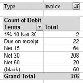
Establish a pivot table with Amount as both the row field and the data field.
With Amount in the data field, its total will usually default to Count, but if it doesn't then use the Field Settings dialog box to set the total method to Count.
Right-click in one of the row field cells and choose Group from the contextual menu.
The Grouping dialog box appears as shown in Figure 3.23. Set its Starting At edit box to zero.
You should normally leave the Ending At edit box alone, but you can modify it if desired.
Set the By value to the group size you're after. For example, if you want group boundaries to go up in $10,000 increments, enter 10000 in the By edit box.
Click OK.
The result will look something like the pivot table in Figure 3.24.
The process of grouping a continuous variable is the same in Excel versions earlier than Excel 2007. However, Excel 2007 has fixed an annoying problem that existed in earlier versions: If the field that you wanted to group contained a blank value somewhere in the underlying data set, you could not group on that field. It did not help to suppress blanks. You had to go to the data source and either eliminate the record, or provide it with a nonblank value, and then rebuild the pivot table. Fortunately this has been fixed in Excel 2007.
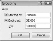
Figure 3.23. By default, the smallest and largest values in the data source are placed in the Start At and the End At

The labels of a grouped numeric field do not use any special formatting that you might have applied to the numeric field itself. For example, if Amount has been formatted in the pivot table as Currency, the dollar signs, commas, and decimal points are not preserved in the group labels.
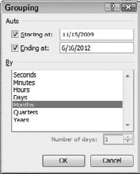
If the field that you're grouping is a date field, the grouping options recognize the field's characteristics and present you with a different set of choices. (See Figure 3.25.)
If, as you normally will, you want to show months in one year separate from months in a different year, you should click both Years and Months in the By list box. If you click Months only, then (for example) February 2010 and February 2011 will be combined in the same pivot table row. The same is true for Quarters.
At times, you want to use pivot table information directly in worksheet cells. There are two pivot table features that you'll find useful for getting data out of a pivot table.
GETPIVOTDATA is a worksheet function that you can enter in a cell, just like SUM or IF. Its syntax is complicated, though, and if you enter it yourself with the keyboard you're liable to make mistakes. Fortunately, there's an easier way.
Suppose you wanted to show a value in a pivot table in some other worksheet cell or even in a different worksheet. Type = in that cell, perhaps cell J15, just as you would to initiate any worksheet formula. Then click in the pivot table, in the cell whose value you want to show in J15. The GETPIVOTDATA function is automatically completed on your behalf. It might look something like this:
=GETPIVOTDATA("Amount",$A$3,"Name City","Millbrae","Class","Remodel")(You can see why you might want it generated automatically.) Now you can restructure the pivot table, within limits, and the GETPIVOTDATA function will continue to return the Amount value for the Millbrae item of Name City when the Class is Remodel.
The ability to generate the GETPIVOTDATA function is a toggle. In Excel 2007, select a pivot table cell and then click the Options tab on the Ribbon. Click Options in the PivotTable group and then click Generate GetPivotData. It's more complicated in earlier versions; see the documentation for the version you're using.
From time to time I see a value in a pivot table that doesn't make much sense to me. Long experience has taught me that it's not the pivot table going wrong. Either I did something I shouldn't have when I designed the table, or there's something strange in the pivot table's data source.
It should be faster to find something strange in the data than to figure out what I did wrong designing the table. But QuickBooks reports can send thousands and thousands of records to Excel, and it could take a while to find the records in question. That's when a drill-down can be helpful.
I just double-click the cell in the pivot table's data field that looks odd, and Excel responds by inserting a new worksheet that contains all the fields in the underlying data source and all the individual records that are summarized in that data cell. Sometimes the problem is nothing more than a typographical error I made while entering the data in QuickBooks.
That makes it much easier to find the problem, if the problem is in the data. If it's not, then I know to look to my pivot table design. When I'm through examining the individual records I just delete the worksheet that Excel added.
For this technique to work, you need to have the proper option set. To see if it's set, right-click a cell in a pivot table and choose PivotTable Options from the contextual menu. In the PivotTable Options dialog box, on the Data tab, make sure Enable Show Details is checked.
Pivot tables enable you to create new fields and items within fields, right in the pivot table. This feature is both limited and useful:
It's limited because you can create a calculated field for use only as a data field — you can't use a calculated field as a row or column field. You can create a calculated item only for use in a row or column field.
It's useful because you might want to analyze a QuickBooks field that is not easily exported — assuming you can export it at all.
There are good reasons to create a calculated data field in a pivot table that uses QuickBooks data; some are described in the remainder of this section. But the analysis of the sort of data you can obtain from QuickBooks is not normally enhanced by the addition of calculated items in row or column fields. (This book does not explain calculated items further.)
Suppose you're interested in assessing your company's monthly gross profit over time. QuickBooks offers a chart (by choosing Reports
On the other hand, QuickBooks detail reports do not show a calculated field such as Gross Profit. So if your exported report is a detail report, you'll have to create a calculated field in the pivot table named Gross Profit. (You could calculate the field in a worksheet and incorporate the results into the pivot table's data source. But that approach creates complications when you next export from QuickBooks.)
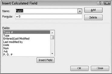
Figure 3.26. Use the Name dropdown to view any existing calculated fields, along with their formulas.
Note
You could export the Profit & Loss Standard report, with months in columns. Once the report has been exported to Excel, select the range of monthly dates (they are used as the column headers) and the corresponding range of Gross Margin values. With that multiple selection, create a standard line chart. However, if you export the standard report, you lose the ability to examine underlying detail records. Furthermore, you might be running an ad hoc analysis and prefer not to create and export a report simply to satisfy a momentary curiosity. In this sort of very common situation, a calculated field is a good alternative.
To create the calculated Gross Profit field in the pivot table, take these steps in Excel 2007:
Select any cell in the pivot table to activate the Options tab for PivotTable Tools.
Click Formulas in the Tools group and then choose Calculated Field in the dropdown list.
The Insert Calculated Field dialog box appears as shown in Figure 3.26. Type the name Gross Profit in the Name edit box.
In the Formula edit box, enter this formula:
=Credit-Debit
Click OK.
In earlier versions of Excel, right-click a cell in the pivot table and choose Show PivotTable Toolbar in the contextual menu. On the toolbar, choose Formulas from the PivotTable dropdown and proceed with Step 2.
Now you have established the calculated field in the pivot table, but you can't yet see it. Here's one way to display it, which assumes that you have exported the Custom Transaction Detail report and that you have included at least these fields: Date, Debit, Credit, and Account Type.
If you can't see the PivotTable Field List dialog box, right-click a cell in the pivot table and choose Field List from the contextual menu.
Drag Date from the Choose Fields list box into the Row Labels box.
If you have filled the Defer Update checkbox, click the Update button.
Right-click one of the dates in the pivot table's row area. Choose Group from the contextual menu.
In the Grouping dialog box, make sure that both Years and Months are selected in the By list box. Click OK. The pivot table updates to show months within years instead of individual dates
In the PivotTable Field List dialog box, drag Account Type from the Choose Fields list box into the Report Filter box, and drag Gross Profit (your newly calculated field) into the Values box.
If the Gross Profit field is not using
SUMas its totaling method, click its dropdown arrow in the Values box, choose Value Field Settings from the menu, and select Sum from the Summarize list box. While you're there, you might as well click the Number Format button to choose Currency as the number format. Click OK twice to close the Value Field Settings dialog box.Click the dropdown on the right of Account Type in the pivot table's page field. If necessary, select the Multiple Items checkbox. Clear the All checkbox to clear all account type checkboxes, and then select the Cost of Goods Sold checkbox and the Income checkbox.
Click OK. The result appears in Figure 3.27.
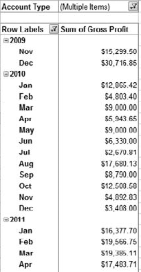
Figure 3.27. Compare the Sum of Gross Profit values with the Gross Profit line in the Profit & Loss Standard report.
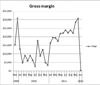
As shown in Figure 3.27, you now have a pivot table that displays the gross profit — income less cost of goods sold — for each month within the data range you selected when you exported your report from QuickBooks. The next section shows you how to chart your results.
Pivot charts came along several years after pivot tables first arrived in Excel, and it shows: They are not as mature a feature as pivot tables, but they continue to improve. There are some things that you can do with standard Excel reports that you cannot do with pivot charts, but because the reverse is also true it's helpful to know about both.
If you worked your way through the previous section on creating a calculated field in a pivot table, you're ready to show the results in a pivot chart. It's a quick process:
Select any cell in the pivot table.
Click the Ribbon's Options tab, under PivotTable Tools.
Click the PivotChart button in the Tools group.
Select one of the Line chart types in the Insert PivotChart dialog box, and click OK. A new pivot chart appears, embedded in the active worksheet. (You can relocate it to its own chart sheet if you prefer.)
To change the default chart title of Total, click the title to select it, drag across the characters to select them, and type what you want to use as the title. Click anything else to deselect the title.

Figure 3.29. A report to show when outstanding balances are due, and how much payment can be expected, by customer.
I sometimes find that the final month in the pivot table — and therefore in the pivot chart — really represents only partial results. Therefore I suppress it by clicking the Row Labels dropdown at the top of the pivot table and clearing the checkbox for the period that I want to omit from the table. When the complete results are in for the month, I can re-export the report, refresh the pivot table, and select that month's checkbox.
The pivot chart based on the pivot table in Figure 3.27 appears in Figure 3.28.
This chapter concludes with two pivot table reports based on QuickBooks sample file data, exported through the Custom Transaction Detail report. They show types of analysis that I have found helpful in my own business, but that QuickBooks does not do a good job of supplying.
Figure 3.29 shows a pivot table of customer by quarter during which payment comes due. More formally:
It uses the QuickBooks Contact field rather than the Name field. In this way the table avoids a different row for each combination of customer and job, which would make for a much more complicated table.
It groups on the Due Date field, showing it by quarter rather than by individual date due.
It shows invoices only, and of the invoices it shows only those that are still in Accounts Receivable.
QuickBooks does a good job of displaying aging data, but that applies only to overdue payments. Another useful report is Open Invoices, which shows open balances, but although it shows due dates it doesn't classify by them. It's good to know who's late and by how much, but it's also good to know how much to expect in the future.
Figure 3.30 contains a report of total revenue associated with each item sold, by class (remodel vs. new construction). To get the correct figures, these special steps were needed:
Define a calculated field, Revenue, as Credit minus Debit.
In the Transaction Type filter, select Sales Receipts and Invoices.
In the Account filter, select all accounts except Inventory Asset.
A filter for Name City is also used, so that the user can easily switch between job locales.
You can create the report in Figure 3.30 in QuickBooks by using the Custom Transaction Summary Report. But there's a problem: If you want to include a text field such as Name City as a filter, you might find that it's too inclusive. The QuickBooks description on the Filters tab of the Modify Report dialog box says, "Enter the words (or characters) that must be in the Name City field."
Of course, the name of the field varies when you change the field you want to filter on. The point is that whatever you enter in the edit box as a filter criterion must be in the field for a record to be selected — not be equal to, but be in. That means if you enter Bayshore in the edit box, the filter returns records for Bayshore, for East Bayshore, and for E. Bayshore.
This probably isn't what you want. This sort of fuzzy search absolutely has a place in filtering, but this isn't it. The filter used in the pivot table report returns what you ask for, and nothing else.
Figure 3.31 shows the QuickBooks version of the report so that you can compare it to the pivot
