
Chapter 10. Interpretation of Deep Models
At this point we have seen lots of examples of training deep models to solve problems. In each case we collect some data, build a model, and train it until it produces the correct outputs on our training and test data. Then we pat ourselves on the back, declare the problem to be solved, and go on to the next problem. After all, we have a model that produces correct predictions for input data. What more could we possibly want?
But often that is only the beginning! Once you finish training the model there are lots of important questions you might ask. How does the model work? What aspects of an input sample led to a particular prediction? Can you trust the model’s predictions? How accurate are they? Are there situations where it is likely to fail? What exactly has it “learned”? And can it lead to new insights about the data it was trained on?
All of these questions fall under the topic of interpretability. It covers everything you might want from a model beyond mechanically using it to make predictions. It is a very broad subject, and the techniques it encompasses are as diverse as the questions they try to answer. We cannot hope to cover all of them in just one chapter, but we will try to at least get a taste of some of the more important approaches.
To do this, we will revisit examples from earlier chapters. When we saw them before, we just trained models to make predictions, verified their accuracy, and then considered our work complete. Now we will take a deeper look and see what else we can learn.
Explaining Predictions
Suppose you have trained a model to recognize photographs of different kinds of vehicles. You run it on your test set and find it accurately distinguishes between cars, boats, trains, and airplanes. Does that make it ready to put into production? Can you trust it to keep producing accurate results in the future?
Maybe, but if wrong results lead to serious consequences you might find yourself wishing for some further validation. It would help if you knew why the model produced its particular predictions. Does it really look at the vehicle, or is it actually relying on unrelated aspects of the image? Photos of cars usually also include roads. Airplanes tend to be silhouetted against the sky. Pictures of trains usually include tracks, and ones of boats include lots of water. If the model is really identifying the background rather than the vehicle, it may do well on the test set but fail badly in unexpected cases. A boat silhouetted against the sky might be classified as an airplane, and a car driving past water might be identified as a boat.
Another possible problem is that the model is fixating on overly specific details. Perhaps it does not really identify pictures of cars, just pictures that include license plates. Or perhaps it is very good at identifying life preservers, and has learned to associate them with pictures of boats. This will usually work, but will fail when shown a car driving past a swimming pool with a life preserver visible in the background.
Being able to explain why the model made a prediction is an important part of interpretability. When the model identifies a photograph of a car, you want to know that it made the identification based on the actual car, not based on the road, and not based on only one small part of the car. In short, you want to know that it gave the right answer for the right reasons. That gives you confidence that it will also work on future inputs.
As a concrete example, let’s return to the diabetic retinopathy model from Chapter 8. Recall that this model takes an image of a retina as input, and predicts the presence and severity of diabetic retinopathy in the patient. Between the input and output are dozens of Layer objects and more than eight million trained parameters. We want to understand why a particular input led to a particular output, but we cannot hope to learn that just by looking at the model. Its complexity is far beyond human comprehension.
Many techniques have been developed for trying to answer this question. We will apply one of the simplest ones, called saliency mapping.1 The essence of this technique is to ask which pixels of the input image are most important (or “salient”) for determining the output. In some sense, of course, every pixel is important. The output is a hugely complex nonlinear function of all the inputs. In the right image, any pixel might contain signs of disease. But in a particular image only a fraction of them do, and we want to know which ones they are.
Saliency mapping uses a simple approximation to answer this question: just take the derivative of the outputs with respect to all the inputs. If a region of the image contains no sign of disease, small changes to any individual pixel in that region should have little effect on the output. The derivative should therefore be small. A positive diagnosis involves correlations between many pixels. When those correlations are absent, they cannot be created just by changing one pixel. But when they are present, a change to any one of the participating pixels can potentially strengthen or weaken the result. The derivative should be largest in the “important” regions the model is paying attention to.
Let’s look at the code. First we need to build the model and reload the trained parameter values:
importdeepchemasdcimportnumpyasnpfrommodelimportDRModelfromdataimportload_images_DRtrain,valid,test=load_images_DR(split='random',seed=123)model=DRModel(n_init_kernel=32,augment=False,model_dir='test_model')model.restore()
Now we can use the model to make predictions about samples. For example, let’s check the predictions for the first 10 test samples:
X=test.Xy=test.yforiinrange(10):prediction=np.argmax(model.predict_on_batch([X[i]]))('True class:%d, Predicted class:%d'%(y[i],prediction))
Here is the output:
Trueclass:0,Predictedclass:0Trueclass:2,Predictedclass:2Trueclass:0,Predictedclass:0Trueclass:0,Predictedclass:0Trueclass:3,Predictedclass:0Trueclass:2,Predictedclass:2Trueclass:0,Predictedclass:0Trueclass:0,Predictedclass:0Trueclass:0,Predictedclass:0Trueclass:2,Predictedclass:2
It gets 9 of the first 10 samples right, which is not bad. But what is it looking at when it makes its predictions? Saliency mapping can give us an answer. DeepChem makes this easy:
saliency=model.compute_saliency(X[0])
compute_saliency() takes the input array for a particular sample and returns the derivative of every output with respect to every input. We can get a better sense of what this means by looking at the shape of the result:
(saliency.shape)
This reports it is an array of shape (5, 512, 512, 3). X[0] is the 0th input image, which is an array of shape (512, 512, 3), the last dimension being the three color components. In addition, the model has five outputs, the probabilities of the sample belonging to each of the five classes. saliency contains the derivative of each of the five outputs with respect to each of the 512×512×3 inputs.
This needs a little processing to be made more useful. First, we want to take the absolute value of every element. We don’t care whether a pixel should be made darker or lighter to increase the output, just that it has an effect. Then we want to condense it down to just one number per pixel. That could be done in various ways, but for now we will simply sum over the first and last dimensions. If any color component affects any of the output predictions, that makes the pixel important. Finally, we will normalize the values to be between 0 and 1:
sal_map=np.sum(np.abs(saliency),axis=(0,3))sal_map-=np.min(sal_map)sal_map/=np.max(sal_map)
Let’s see what it looks like. Figure 10-1 shows a sample that the model correctly identifies as having severe diabetic retinopathy. The input image is on the left, and the right side highlights the most salient regions in white.

Figure 10-1. Saliency map for an image with severe diabetic retinopathy.
The first thing we notice is that the saliency is widely spread over the whole retina, not just in a few spots. It is not uniform, however. Saliency is concentrated along the blood vessels, and especially at points where blood vessels branch. Indeed, some of the indications a doctor looks for to diagnose diabetic retinopathy include abnormal blood vessels, bleeding, and the growth of new blood vessels. The model appears to be focusing its attention on the correct parts of the image, the same ones a doctor would look at most closely.
Optimizing Inputs
Saliency mapping and similar techniques tell you what information the model was focusing on when it made a prediction. But how exactly did it interpret that information? The diabetic retinopathy model focuses on blood vessels, but what does it look for to distinguish healthy from diseased blood vessels? Similarly, when a model identifies a photograph of a boat, it’s good to know it made the identification based on the pixels that make up the boat, not the ones that make up the background. But what about those pixels led it to conclude it was seeing a boat? Was it based on color? On shape? Combinations of small details? Could there be unrelated pictures the model would equally confidently (but incorrectly) identify as a boat? What exactly does the model “think” a boat looks like?
A common approach to answering these questions is to search for inputs that maximize the prediction probability. Out of all possible inputs you could put into the model, which ones lead to the strongest predictions? By examining those inputs, you can see what the model is really “looking for.” Sometimes it turns out to be very different from what you expect! Figure 10-2 shows images that have been optimized to produce strong predictions when fed into a high-quality image recognition model. The model identifies each image as the listed category with very high confidence, yet to a human they have almost no resemblance!

Figure 10-2. Images that fool a high-quality image recognition model. (Source: Arxiv.org.)
As an example, consider the transcription factor binding model from Chapter 6. Recall that this model takes a DNA sequence as input, and predicts whether the sequence contains a binding site for the transcription factor JUND. What does it think a binding site looks like? We want to consider all possible DNA sequences and find the ones for which the model most confidently predicts that a binding site is present.
Unfortunately, we can’t really consider all possible inputs. There are 4101 possible DNA sequences of length 101. If you needed only one nanosecond to examine each one, it would take many times longer than the age of the universe to get through all of them. Instead, we need a strategy to sample a smaller number of inputs.
One possibility is just to look at the sequences in the training set. In this case, that is actually a reasonable strategy. The training set covers tens of millions of bases from a real chromosome, so it likely is a good representation of the inputs that will be used with this model in practice. Figure 10-3 shows the 10 sequences from the training set for which the model produces the highest output. Each of them is predicted to have a binding site with greater than 97% probability. Nine of them do in fact have binding sites, while one is a false positive. For each one, we have used saliency mapping to identify what the model is focusing on and colored the bases by their saliency.

Figure 10-3. The 10 training examples with the highest predicted outputs. Checkmarks indicate the samples that contain actual binding sites.
Looking at these inputs, we can immediately see the core pattern it is recognizing: TGA ... TCA, where ... consists of one or two bases that are usually C or G. The saliency indicates it also pays some attention to another one or two bases on either side. The previous base can be an A, C, or G, and the following base is always either a C or T. This agrees with the known binding motif for JUND, which is shown in Figure 10-4 as a position weight matrix.

Figure 10-4. The known binding motif for JUND, represented as a position weight matrix. The height of each letter indicates the probability of that base appearing at the corresponding position.
The one sequence that was incorrectly predicted to have a binding site does not contain this pattern. Instead, it has several repetitions of the pattern TGAC, all close together. This looks like the beginning of a true binding motif, but it is never followed by TCA. Apparently our model has learned to identify the true binding motif, but it also can be misled when several incomplete versions occur in close proximity.
The training samples will not always be a good representation of the full range of possible inputs. If your training set consists entirely of photographs of vehicles, it tells you nothing about how the model responds to other inputs. Perhaps if shown a photograph of a snowflake, it would confidently label it as a boat. Perhaps there even are inputs that look nothing like photographs—maybe just simple geometric patterns or even random noise—that the model would identify as boats. To test for this possibility, we can’t rely on the inputs we already have. Instead, we need to let the model tell us what it is looking for. We start with a completely random input, then use an optimization algorithm to modify it in ways that increase the model’s output.
Let’s try doing this for the TF binding model. We begin by generating a completely random sequence and computing the model’s prediction for it:
best_sequence=np.random.randint(4,size=101)best_score=float(model.predict_on_batch([dc.metrics.to_one_hot(best_sequence,4)]))
Now to optimize it. We randomly select a position within the sequence and a new base to set it to. If this change causes the output to increase, we keep it. Otherwise, we discard the change and try something else:
forstepinrange(1000):index=np.random.randint(101)base=np.random.randint(4)ifbest_sequence[index]!=base:sequence=best_sequence.copy()sequence[index]=basescore=float(model.predict_on_batch([dc.metrics.to_one_hot(sequence,4)]))ifscore>best_score:best_sequence=sequencebest_score=score
This rapidly leads to sequences that maximize the predicted probability. Within 1,000 steps, we usually find the output has saturated and equals 1.0.
Figure 10-5 shows 10 sequences generated by this process. All instances of the three most common binding patterns (TGACTCA, TGAGTCA, and TGACGTCA) are highlighted. Every sequence contains at least one occurrence of one of these patterns, and usually three or four. Sequences that maximize the model’s output have exactly the properties we expect them to, which gives us confidence that the model is working well.

Figure 10-5. Example sequences that have been optimized to maximize the model’s output.
Predicting Uncertainty
Even when you have convinced yourself that a model produces accurate predictions, that still leaves an important question: exactly how accurate are they? In science, we are rarely satisfied with just a number; we want an uncertainty for every number. If the model outputs 1.352, should we interpret that as meaning the true value is between 1.351 and 1.353? Or between 0 and 3?
As a concrete example, we will use the solubility model from Chapter 4. Recall that this model takes a molecule as input, represented as a molecular graph, and outputs a number indicating how easily it dissolves in water. We built and trained the model with the following code.
tasks,datasets,transformers=dc.molnet.load_delaney(featurizer='GraphConv')train_dataset,valid_dataset,test_dataset=datasetsmodel=GraphConvModel(n_tasks=1,mode='regression',dropout=0.2)model.fit(train_dataset,nb_epoch=100)
When we first examined this model, we evaluated its accuracy on the test set and declared ourselves satisfied. Now let’s try to do a better job of quantifying its accuracy.
A very simple thing we might try doing is just to compute the root-mean-squared (RMS) error of the model’s predictions on the test set:
y_pred=model.predict(test_dataset)(np.sqrt(np.mean((test_dataset.y-y_pred)**2)))
This reports an RMS error of 0.396. Should we therefore use that as the expected uncertainty in all predictions made by the model? If the test set is representative of all inputs the model will be used on, and if all errors follow a single distribution, that might be a reasonable thing to do. Unfortunately, neither of those is a safe assumption! Some predictions may have much larger errors than others, and depending on the particular molecules that happen to be in the test set, their average error might be either higher or lower than what you will encounter in practice.
We really want to associate a different uncertainty with every output. We want to know in advance which predictions are more accurate and which are less accurate. To do that, we need to consider more carefully the multiple factors that contribute to errors in a model’s predictions.2 As we will see, there are two fundamentally different types of uncertainty that must be included.
Figure 10-6 shows the true versus predicted solubilities of the molecules in the training set. The model is doing a very good job of reproducing the training set, but not a perfect job. The points are distributed in a band with finite width around the diagonal. Even though it was trained on those samples, the model still has some error when predicting them. Given that, we have to expect it to have at least as much error on other data it was not trained on.
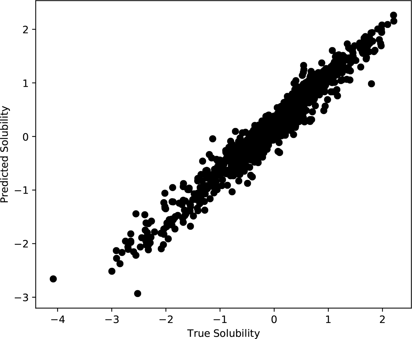
Figure 10-6. True versus predicted solubilities for the molecules in the training set.
Notice that we are only looking at the training set. This uncertainty can be determined entirely from information that is available at training time. That means we can train a model to predict it! We can add another set of outputs to the model: for every value it predicts, it will also output an estimate of the uncertainty in that prediction.
Now consider Figure 10-7. We have repeated the training process 10 times, giving us 10 different models. We have used each of them to predict the solubility of 10 molecules from the test set. All of the models were trained on the same data, and they have similar errors on the training set, yet they produce different predictions for the test set molecules! For each molecule, we get a range of different solubilities depending on which model we use.

Figure 10-7. Solubilities of 10 molecules from the test set, as predicted by a set of models all trained on the same data.
This is a fundamentally different type of uncertainty, known as epistemic uncertainty. It comes from the fact that many different models fit the training data equally well, and we don’t know which one is “best.”
A straightforward way to measure epistemic uncertainty is to train many models and compare their results, as we have done in Figure 10-7. Often this is prohibitively expensive, however. If you have a large, complicated model that takes weeks to train, you don’t want to repeat the process many times.
A much faster alternative is to train a single model using dropout, then predict each output many times with different dropout masks. Usually dropout is only performed at training time. If 50% of the outputs from a layer are randomly set to 0 in each training step, at test time you would instead multiply every output by 0.5. But let’s not do that. Let’s randomly set half the outputs to 0, then repeat the process with many different random masks to get a collection of different predictions. The variation between the predicted values gives a pretty good estimate of the epistemic uncertainty.
Notice how your modeling choices involve trade offs between these two kinds of uncertainty. If you use a large model with lots of parameters, you can get it to fit the training data very closely. That model will probably be underdetermined, however, so lots of combinations of parameter values will fit the training data equally well. If instead you use a small model with few parameters, there is more likely to be a unique set of optimal parameter values, but it probably also won’t fit the training set as well. In either case, both types of uncertainty must be included when estimating the accuracy of the model’s predictions.
This sounds complicated. How do we do it in practice? Fortunately, DeepChem makes it very easy. Just include one extra argument to the model’s constructor:
model=GraphConvModel(n_tasks=1,mode='regression',dropout=0.2,uncertainty=True)
By including the option uncertainty=True, we tell the model to add the extra outputs for uncertainty and make necessary changes to the loss function. Now we can make predictions like this:
y_pred,y_std=model.predict_uncertainty(test_dataset)
This computes the model’s output many times with different dropout masks, then returns the average value for each output element, along with an estimate of the standard deviation of each one.
Figure 10-8 shows how it works on the test set. For each sample, we plot the actual error in the prediction versus the model’s uncertainty estimate. The data shows a clear trend: samples with large predicted uncertainty tend to have larger errors than those with small predicted uncertainty. The dotted line corresponds to . Points below this line have predicted solubilities that are within two (predicted) standard deviations of the true value. Roughly 90% of the samples are within this region.

Figure 10-8. True error in the model’s predictions, versus its estimates of the uncertainty in each value.
Interpretability, Explainability, and Real-World Consequences
The greater the consequences of a wrong prediction, the more important it is to understand how the model works. For some models, individual predictions are unimportant. A chemist working in the early stages of drug development might use a model to screen millions of potential compounds and select the most promising ones to synthesize. The accuracy of the model’s predictions may be low, but that is acceptable. As long as the passing compounds are, on average, better than the rejected ones, it is serving a useful purpose.
In other cases, every prediction matters. When a model is used to diagnose a disease or recommend a treatment, the accuracy of each result can literally determine whether a patient lives or dies. The question “Should I trust this result?” becomes vitally important.
Ideally the model should produce not just a diagnosis, but also a summary of the evidence supporting that diagnosis. The patient’s doctor could examine the evidence and make an informed decision about whether the model has functioned correctly in that particular case. A model that has this property is said to be explainable.
Unfortunately, far too many deep learning models are not explainable. In that case, the doctor is faced with a difficult choice. Do they trust the model, even if they have no idea what evidence a result is based on? Or do they ignore the model and rely on their own judgment? Neither choice is satisfactory.
Remember this principle: every model ultimately interacts with humans. To evaluate the quality of a model, you must include those interactions in your analysis. Often they depend as much on psychology or economics as on machine learning. It is not enough to compute a correlation coefficient or ROC AUC on the model’s predictions. You must also consider who will see those predictions, how they will be interpreted, and what real-world effects they will ultimately have.
Making a model more interpretable or explainable may not affect the accuracy of its predictions, but it can still have a huge impact on the real-world consequences of those predictions. It is an essential part of model design.
Conclusion
Deep models have a reputation of being hard to interpret, but many useful techniques have been developed that can help. By using these techniques you can begin to understand what your model is doing and how it is working. That helps you decide whether to trust it, and lets you identify situations where it is likely to fail. It also may give new insights into the data. For example, by analyzing the TF binding model we discovered the binding motif for a particular transcription factor.
1 Simonyan, K., A. Vedaldi, and A. Zisserman. “Deep Inside Convolutional Networks: Visualising Image Classification Models and Saliency Maps.” Arxiv.org. 2014.
2 Kendall, A., and Y. Gal, “What Uncertainties Do We Need in Bayesian Deep Learning for Computer Vision?” https://arxiv.org/abs/1703.04977. 2017.