Chapter 19
The Art of Documentary Editing
Today, the idea of editing—juxtaposing images with one another, and with sounds—is so much a part of our media experience that it can be hard to even notice the cuts between shots in a documentary. It is worth stopping to remember, however, that the very first films, the Lumière Brothers’ snapshots of life at the end of the nineteenth century, consisted of only one shot. These “actualities” ran about a minute long, and did not have any edits, but they did accurately document everyday activity, events, and places of the time. Le Repas de Bébé (1895) consists of one shot of Auguste Lumière, his wife, and baby daughter having breakfast in the countryside, while Barque Sortant du Port (1896) consists of a single shot of a boat leaving the port, being rowed into rough seas by three men (Figure 19.1). It wasn’t long before people discovered that new and more complex meaning could be created by cutting the film and rearranging the order of shots, and a language of film editing quickly evolved. Documentary is an integral part of that history, and continues to push the formal language of film editing forward.
There are two basic concepts that form the foundation of all documentary and fiction film: juxtaposition, which relies on the contrast between shots to create filmic meaning, and continuity, a system that assures us that individual shots, when cut together, will give the illusion of smooth and continuous time, movement, and space, no matter when or in what order the shots were taken.
Fiction films, which commonly attempt to create a sense of unified time and space, rely heavily on continuity style shooting and editing. Observational documentary films are the closest relatives of the fiction cinema because they also rely on a sense of unified time and space in which the action unfolds more or less as if the camera wasn’t there. Prior to the 1960s, though, observational documentaries were difficult to make because of the lack of portable equipment that could record sync sound. The result of this was that documentary came to rely less on continuity, and more on the ways ideas could be conveyed through the juxtaposition of images and sounds using techniques drawn from the arenas of rhetoric, propaganda, or artistic experimentation.
■ Editing Expository Films
As discussed in Chapter 2, many early documentaries were created with primarily educational goals. From Depression Era films like The River (1938) and The Plough That Broke the Plains (1936) to propaganda films like the World War II Why We Fight series, many early documentaries relied heavily on third-person narration (Chapter 18). Accompanying visuals contributed meaning, but most of the messaging was conveyed through an omniscience and authoritative spoken text (Figure 19.2). While this range of documentary style has broadened since then, many documentaries still take the expository form. Not all expository films use narration, as interviews may do much of the job of delivering content (along with the visual evidence and graphic elements). In general, though, a hallmark of expository documentaries is that the verbal elements carry much of the film’s story or arguments.
Most documentaries today take a less obviously didactic approach than the documentaries of the 1930s and ’40s, but they likely rely on a combination of an authoritative third-person narrator accompanied by strong supporting visuals. Take, for example, Marco Williams’ documentary Banished: How Whites Drove Blacks out of Town in America (2006), edited by Kathryn Barnier, about the forced expulsion of African-Americans from three Southern towns in the early twentieth century. The film opens with a narration that is illustrated, literally, through original drawings (Figure 19.3).

■ Figure 19.1 Barque Sortant du Port (1896) like all Lumière Brothers’ films, consisted of a single shot.
The narrator tells us, “In 1864, in Washington County, Indiana, White residents made a very simple proposal to the Black community: leave or die.” We see hand-drawn images of white men attacking black men, and of lynchings. The images reinforce what we are hearing.
Later in the film, documents, photographs, and archival footage accompany what is being put forward in the audio track, lending authority to the speaker and to the film’s arguments. One of the main characters in Banished is Elliot Jaspin, a reporter at Cox Newspapers who has been researching the expulsion of Blacks from towns during the Reconstruction era (circa 1865) (Figure 19.4). In an interview setting, Jaspin recounts, “The only conclusion you can come to, after you look at all this, is that Blacks feared for their lives and they fled the county.”

■ Figure 19.2 In expository documentaries like Pare Lorentz’s The Plough That Broke The Plains, about the destruction of the Great Plains by uncontrolled agricultural production, an omniscient narrator tells us what the filmmaker wants us to know: “We turned over millions of acres for war . . . the world was our market!”
We see Jaspin in the interview setup for only a few seconds, however. The rest of the time we see images of newspapers from the 1860s, with headlines like “Negro Residents in Panic” and “Crowd Whips Several and Orders Them to Leave” (Figure 19.5, left). These images are more than illustrations; they are powerful visual evidence that helps persuade us that what we are hearing is true.
Banished also puts images of Jaspin at work over the audio from his interview (Figure 19.5, right). These observational shots provide us with a deeper sense of who this man is. Piles of papers and files all over his desk tell us he is a meticulous and dedicated investigative reporter.
This sequence is an example of the ways more expository elements like interviews and narration work hand-in-hand with more observational elements in many contemporary documentaries. It is quite common to see observational scenes that play out in “real time” followed by narration or an interview with one of the film’s characters. Often, observational scenes play out partially, and then the sound drops down or out and we hear narration or interview voice-over as we continue to see the scene unfold.
For example, Banished presents us with a powerful observational scene from a 1987 march in Forsyth County, Georgia, where civil rights activists were confronted by white supremacists (Figure 19.6). We hear sync sound from the event, which at times fades down to allow us to hear the sound from an interview, recorded later on, providing perspective or recounting the events.

■ Figure 19.3 Marco Williams employs charcoal drawings like this one in the opening sequence of Banished: How Whites Drove Blacks Out of Town in America to provide visual support for the unknown history of expulsion of blacks from towns across the country.

■ Figure 19.4 Reporter Elliot Jaspin in an interview setup in Banished.


All expository documentaries treat the combination of interview, narration, observational, and other elements in their own way. Observational footage and eyewitness accounts can give expert analysis an experiential human touch. A narration may be illustrated by graphics with facts and figures. Music can contribute to the emotional tenor of a sequence. Editing is a matter of coordinating all of these elements in the best way you can. Each element carries its own burden of meaning, and ideally they all support one another to achieve the film’s goals.
■ Editing Impressionistic Films
Another approach to documentary editing that has contributed to its form today is more impressionistic and poetic. Consider an early film like Joris Ivens’ 1929 film Regen (Rain), discussed in Chapter 2. The story is of a passing rain shower in the Dutch city of Amsterdam and is told through a series of shots that explore the graphic and compositional aspects of the frame. Though the film presumably shows one passing rain shower (it was actually shot over several weeks), the order and arrangement of the shots are determined less by continuity of action than by continuities or contrasts of pattern, movement, and composition from shot to shot (Figure 19.7). The effect is to open up meanings, inviting the viewer to consider the relationship between the shots. It also relies more heavily on emotion and impression than argument.


■ Figure 19.6 An observational scene from Banished. The sync sound is brought down at times so we can hear context and analysis provided by interviewees like Rev. Elisabeth Omilami, one of the participants.
Watching Ivens’ film today is a startling reminder of how the same formal and poetic impetus drives much documentary editing today.


■ Figure 19.7 Consecutive shots in Regen (Rain) show how editing is used to explore the relationship between shots of raindrops falling on water (left) and a crowd with umbrellas (right).
Associative Editing
Ivens’ film, and many documentaries, make use of associative editing techniques. Broadly speaking, associative editing works by comparing or contrasting the content of the shots to create an association that is not contained in the individual shots. The connecting content can be either formal (color, shape, movement) or more thematic and metaphorical. The idea is that by juxtaposing shots that don’t have an immediate, direct, or obvious narrative connection, new meaning is generated.
Associative editing relies on theories of montage developed by Soviet filmmakers in the early part of the twentieth century. These filmmakers, including Dziga Vertov and Sergei Eisenstein, saw the cinema as a potentially revolutionary art form that could wake up the masses to the reality of life around them and create a new form of citizen who would be highly engaged with their social reality. They were interested in the power of conflict and juxtaposition, both within individual frames and between shots.
In his essay “Methods of Montage,” Eisenstein attempted to define the various relationships that could exist between shots.1 These included:
- Metric montage, where the cut point is based on the duration of the shot.
- Rhythmic montage, where the length of the shot depends on what is happening in the frame. Length can vary, and effect can be obtained by changing the length of shots. In this type of montage, changes in rhythm create new meaning.
- Tonal montage, which uses the emotional meaning or “mood” of the shots to determine their placement relative to one another.
- Overtonal/Associational montage, which is the combination of metric, rhythmic, and tonal montage properties in a sequence.
- Intellectual montage (the highest form, according to Eisenstein) juxtaposes shots to create a new intellectual meaning.
While these categories might seem abstract and unrelated to documentary practices today, they are in fact quite present in most documentaries. In Nostalgia for the Light (2011), Chilean filmmaker Patricio Guzman uses a variety of these tactics to bring seemingly unrelated elements into relationship with one another. The film documents astronomers who use high-powered telescopes in the Chilean desert to see into outer space, as well as a group of women who comb through the desert sand in search of the remains of their loved ones who were “disappeared” during the brutal military dictatorship of General Augusto Pinochet. One particularly devastating sequence uses several of Eisenstein’s montage categories to bring these seemingly disparate topics into relationship to one another (Figure 19.8).

■ Figure 19.8 Montage in Nostalgia for the Light. The moon (A), asteroids (B), human bones (C), and a skull (D), which matches the moon in shot (A). The camera tilts down to reveal that this is a human skull (E).
A shot of the universe as seen through a telescope dissolves into close-ups of the surface of the moon and asteroids. The shots are
■ Associative Editing in the Opening of The Most Dangerous Man in America
More commonly, documentaries employ some version of associative editing in an opening montage. An example is the opening sequence of The Most Dangerous Man in America (2009), a documentary by Judith Ehrlich and Rick Goldsmith about the Pentagon Papers, secret documents leaked by military analyst Daniel Ellsberg that exposed the extent of US involvement in the Vietnam War (Figure 19.9). In the first two minutes of the film, we see the juxtaposition of at least six types of footage: maps of Cambodia and Vietnam in a vintage photocopying machine, stylized reenactments of a man sneaking documents out of a file cabinet and into a briefcase, archival footage of aerial bombing, official State Department documents, interview clips, and archival footage of Richard Nixon, Secretary of State Henry Kissinger, and Daniel Ellsberg himself.
This rich assortment of images and the accompanying sounds draw the viewer in through a series of juxtapositions. The past is seen next to present-day interviews, which gives us a sense that we will be viewing historical events through a contemporary lens. Footage of aerial bombing superimposed on official State Department documents creates a sense that policy formed in Washington has an impact on actual lives on the ground in Vietnam. There is also the juxtaposition of the perspectives of government officials like Nixon and Kissinger, who say things like, “If entire file cabinets can be stolen and given to the press you can’t have orderly government anymore,” with that of Daniel Ellsberg, who is seen saying to reporters, “Wouldn’t you go to prison to help end this war?”
In addition to the more thematic and content-related associations, there is a juxtaposition of styles at work. The dramatically lit reenactments feel like a spy thriller, but their theatricality is undermined by the gritty 16mm news footage that follows. The film is telling us that although this has all the suspense of a Hollywood thriller, it is a story based in reality. This raises the stakes for us as viewers.

■ Figure 19.9 Associative editing in The Most Dangerous Man in America. Stylized “spy thriller” reenactments (A) are juxtaposed with archival footage and documents (B). Mrs. Ellsberg tells us this will be a private story (C) but it is also very public (D). And the film’s central conflict: government secrecy (E) vs the public’s right to know (F).
approximately four seconds long each (metric montage) and have similar lighting, color palette, and texture (tonal montage). The ambient audio, which sounds roughly like air blowing in a tunnel, plays under all the shots, joining them together. These shots of space are followed by extreme close-up shots of human bones, which look astonishingly similar in texture, color, and shape to the surface of the moon and asteroids. The last of these shots is almost identical in shape to the first shot of the moon (this is called a graphic match because of the compositional similarities between the shots). The camera then pans down to reveal that what we are viewing is in fact a human skull.
This beautiful and emotional sequence is the essence of Eisenstein’s intellectual montage. Questions of scale and context collapse, and the viewer is left to experience the contrast between the dead mineral composition of the moon and the organic nature of the bones that just recently held flesh. We are left asking what the relationship is between outer space and the most inner anguish, and how do humans find purpose in a world with such unknowability and injustice?
■ Observational Documentaries and the Continuity System
During the 1960s, with the advent of sync sound and the possibilities afforded by portable equipment, the idea of showing a story in “real time” began to take precedence in documentary. Observational filmmakers like Frederick Wiseman, Robert Drew, and the Maysles filmed events as they unfolded, and cut them together using the dominant convention of the fiction cinema: continuity editing.
The hallmark of continuity style is to render each edit, the link from one shot to another, as seamlessly as possible. In order to cut a film in this style, the filmmaker has to shoot it with an understanding of the conventions of continuity so that the editor will have the right shots to work with. Although the principles of the continuity system can, at first, seem a bit like a needlessly complex jigsaw puzzle, they are, in fact, quite simple and intuitive once you are aware of them. Here are a few of the basic rules of continuity, as well as an exploration of how they are used in some documentary films.
■ Four Basic Principles Of Continuity Editing
- Continuity of mise-en-scène (shared shot content)
- Continuity of performance, actions, and placement
- Continuity of spatial orientation
- Avoiding “too similar” shots
1. Continuity of Mise-en-Scène (Shared Shot Content)
Let’s start with two shots connected by one single edit (Figure 19.10). We want to cut shot A with shot B as seamlessly as possible. Shot A is a long shot of two men at a chess table in the park starting a game. Shot B is a medium close-up of the player with the white pieces making his first move.
Mise-en-scène is a term derived from film studies that refers to everything that appears before the camera and its arrangement. In documentary, this means our subjects and their environments. The first rule of continuity—preserving continuity of mise-en-scène—means that the clothes our character wears, the things he touches, and his surroundings need to remain the same from one shot to the next. Because in real time our chess game might last an hour, it’s not uncommon that two shots like these might not actually be shot one right after the other. Perhaps as the day gets colder, our character puts on a jacket. Preserving continuity means that a shot with the jacket off will not cut seamlessly with a shot taken later on, when our subject is wearing the jacket. Similar issues come up around anything that changes noticeably over time, including plates of food being consumed, drinks, cigarettes, clocks, or even the position of the chess pieces on the board. Coauthor Kelly Anderson was once the coproducer on a TV program where Character A was washing a frying pan at the kitchen sink. When the scene was edited, the shot was cut next to a shot of Character B listening to Character A speaking. It took the filmmakers a while to realize that the frying pan being washed was also seen, full of scrambled eggs, on the stove next to Character B. Many jokes about this being a “2-frying-pan-family” ensued. The audience likely never noticed the continuity error, but it’s a good idea to keep these things in mind when shooting and editing. The idea of the observational style is to allow the audience to experience what is going on with the characters in the moment, without being distracted by reminders that images were actually shot at different times.

■ Figure 19.10 A simple edit. Cutting from a long shot (a) to a medium close-up (b).
The angle and quality of the light must also be consistent if you want to edit shots together and create the illusion of continuous space and time. Documentary audiences are more likely than fiction film viewers to forgive small changes in lighting between shots, and color correction in postproduction can help you match different lighting setups, but joining images shot at noon with others shot at dusk will likely present problems if you want the audience to experience them as occurring in a continuous time.
2. Continuity of Performance, Actions, and Placement
In the chess game above, if we are to cut shot A seamlessly with shot B, then the placement and physical actions of our performers must be consistent. In the example of the chess game, our character moves the king’s pawn with his left hand in the long shot, so he must move the same chess piece with the same hand in the medium close-up. This ensures that the visible actions in the two shots match. Also, our character is sitting upright with his right hand in his lap in the long shot, so he cannot be leaning forward, resting his chin in his right hand in the medium close-up.
Consider these two shots from Zachary Heinzerling’s Academy Award®-nominated film Cutie and the Boxer (2013), discussed in Chapter 7 (Figure 19.11). The long shot on the left shows Ushio wetting craft paper and hanging it on a clothesline. This is followed by a medium shot of the same activity. Even though the second shot was probably taken later, the two shots cut together relatively seamlessly because the setting, lighting, and Ushio’s wardrobe, as well as the position of the paper and of his hands, match between the two shots.
Unlike in fiction filmmaking, where the editor will have multiple takes of a scene shot from many angles to work with, the documentary editor will comb through the footage looking for shots that can be edited together seamlessly to convey the action of the scene. This is not always easy. For example, in the sequence above, a close inspection reveals that there is actually more paper hanging from the line in the second shot, but the match is close enough that audiences don’t notice the difference and the edit is “good enough” to pass muster. In certain cases where even a “good enough” match cannot be found, one can always use a cutaway between two shots of action, creating a “bridge” that maintains the illusion of continuous actions (p. 317).

3. Continuity of Spatial Orientation
For the viewer to understand the physical space of the scene and the relationships between characters and objects in that space, we need to maintain coherent and consistent spatial orientation. Spatial orientation begins with the 180° principle, which, in basic terms, means that you must shoot all of the shots in a continuity sequence from only one side of the action. In other words, when a scene begins with a shot taken from one side, you cannot cut to shots taken from the other side because the perspective of the viewer will be reversed and create disorientation. See Chapter 7 for an analysis of how this plays out in a scene from Cutie and the Boxer.
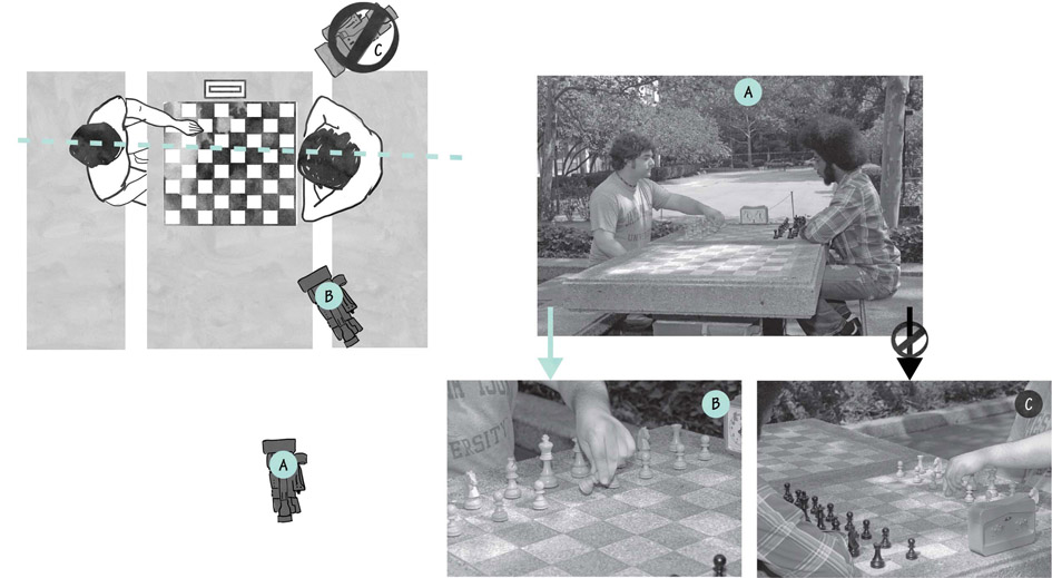
■ Figure 19.12 Continuity of spatial orientation. Character sightlines establish the 180 degree line of action and shot (A) establishes on which side of that line the camera must remain. Shot (C) crosses the line and you should not use shots from that camera position.
Using our chess game as an example, this means you can cut from shot (A) to shot (B), but not from shot (A) to shot (C) (Figure 19.12). When you begin shooting, the man playing with the white pieces is to your left. When he looks at his opponent, he faces left to right. The opponent playing the black pieces is to your right and he faces right to left. This is the spatial orientation from your side of the table. However, for the onlooker who is watching the game from the other side of the table, across from you, everything is reversed. When we make a film, the camera is the spectator, and to shoot this scene we cannot take some shots from one side of the table and others from the opposite side because that would reverse the direction and position of the players’ faces.
Notice in shot (C) that our character now suddenly faces screen left, and is positioned on the right side of the frame. This shot will not cut with the first shot without causing spatial confusion for the viewer. The viewer might think that the players, for some reason, suddenly changed places and the total shift in background and the position of the clock will seriously throw off the illusion of continuous activity.
4. Avoiding “Too Similar” Shots
The too-similar-shot rule (our own term) states that, when we cut from one shot of a subject to another shot of the same subject, we need to make sure that each shot is a distinct composition in terms of frame size or camera angle. If we try to cut together two shots of the same subject when the frames are very similar, then the viewer has the feeling that a single shot has simply lurched forward a little bit. This is called a jump cut, and the awkwardness of the edit calls attention to itself. In some instances this may be a desirable aesthetic approach, but if you are trying to create a sense of seamless time and space it won’t work. Basically, this rule tells us that in order to cut from shot (A), the men sitting at the chess table, to shot (B), white making his first move, we must significantly change the angle or the size of shot (Figure 19.13).

■ Figure 19.13 The “Too Similar Shot” rule. Two shots of obviously different sizes and angles such as shot (A), a long shot profile shot, and shot (B), a close-up frontal from a frontal three-quarter angle cut together smoothly. Two shots that are nearly identical in framing, such as shot (A) and shot (C), will cause a jump cut when edited together.
In documentary interviews, you can often see this principle in action. Since most people talk in a more long-winded way than most documentary directors find economical, it is common to edit together various pieces of an interview to make a statement clearer or shorter. Often a cinematographer will vary the shot size while the interviewer is asking each question to give the editor more options for cutting between parts of the interview. Figure 19.14 shows an example from Hubert Sauper’s Darwin’s Nightmare (2004), which explores the impact of the globalized trade in fish and guns on the people who live around Lake Victoria in Tanzania.

■ Figure 19.14 A medium shot of an interviewee, cut next to a close-up shot. These two shots cut together without creating a jump cut because the framing is significantly different.
In the scene, we see an interview subject talking in a medium shot, then there is a cut to a close-up of the same person in the same interview setup (Figure 19.14). The cut feels seamless because there is enough of a change in the shot size.
5. Cutaways
Later on in the same interview sequence, there is another cut in the interview. In this case, the editor employs another standard documentary convention: the cutaway. A cutaway is a shot of a detail within your scene other than the main action. Here, the cutaway is a shot of a young boy with a distended belly, a sign of malnutrition, walking on the beach (Figure 19.15).

■ Figure 19.15 A cutaway in Darwin’s Nightmare.
A word of caution is in order here. Cutaways can create strong associations and can alter the meaning of what is being conveyed in the scene. The interview we are discussing concerns the globalized competition for natural resources in Africa. As the interviewee asks, “Who is to gain, and who is to miss?” the film cuts to the shot of the boy on the beach. This creates a powerful statement that Africans, in particular the most vulnerable, are losing out. The film provides powerful evidence that this is indeed the case, but it is worth remembering that we have enormous power as documentary filmmakers. In actuality, we don’t know who this child is, why he is starving, or whether it was shot the same day or even on the beach the interview was shot on. Because of the power of continuity conventions, the audience will probably assume these things are happening simultaneously. All documentary filmmakers deal with the challenge of creating a representation of an event after it occurred. You will find your own ways of delivering on the trust your audience invests in you.

■ Figure 19.16 Significant detail in Mr. Cao Goes to Washington.
In addition to being a staple of interview editing, cutaways can also be extremely useful in observational scenes. In S. Leo Chiang’s Mr. Cao Goes to Washington (2012), analyzed in Chapter 7, a cutaway of some campaign materials tells us that Cao is the first Vietnamese-American Congressman in the history of the United States (Figure 19.16). Without this cutaway, this critical information would have had to be delivered through interviews, narration, or text cards. This shot could also be called a significant detail shot.
■ Timing, Rhythm, and Pacing
Another way of thinking about editing refers to questions of timing, rhythm, and pacing. As you get into the nuts and bolts of editing, you will find yourself pondering some of the following questions:
- What is the best place to put my in-point for the shot I am about to cut in?
- How long should I hold the shot before cutting to something else?
- Is there a “best place” to cut out of a shot?
- Should my shots overall be short, or longer?
- Should I vary the length of the shots in my sequence, or keep them about the same duration?
in practice
■ Jump Cutting Interviews


■ Figure 19.17 The left frame is cut next to the right one in Fog of War, producing a jump cut because McNamara’s position in the frame changes only slightly and his hand is raised in the second shot.
The use of intentional jump cuts directly challenges the precept of invisible edits by tossing out concerns like the 180° line of action, the too-similar-shot rule, and the use of cutaways to hide edits. The key to using jump cuts in your film is to utilize them as an intentional technique, a stylistic choice around which you plan and organize your shooting.
Errol Morris’ Fog of War (2003) is based largely on an interview with former Secretary of Defense Robert S. McNamara. Morris edits the interview and does not cover the cuts with any other visuals, resulting in jump cuts (Figure 19.17). He explains:
I have always heavily edited my interviews . . . In all of my previous films, I have tried to cover my tracks. I put images over the cuts in the soundtrack, and I hide all of the cuts.
McNamara has a way of talking where he endlessly qualifies what he’s saying. He says X, and then he stops and he qualifies X. And then he qualifies the qualification. And then often qualifies the qualification of the qualification. And so on in some infinite regress. Not quite infinite. But often confusing. And also long-winded. (Of course, it could be argued that it is precisely these extended qualifications that give us a deeper understanding of McNamara’s personality. Yet, I think that’s there’s enough of them left in the movie to give the general idea.)
I wanted to hear him talk, but I also wanted the essence of what he was saying.
In this film, for whatever reason, I liked leaving them raw.2
The effect is to let us in on the process of fabrication, to tell us that this portrait of McNamara is authored and emanates from a filmmaker with a point of view. Morris wants us to know that there was more said, but that he has decided to cut it out.
In other words, what makes a good cut? The answer to this question is subjective, and you will find your own approach and style for each film, but what follows are some thoughts about how other filmmakers have approached these issues.
Timing
Timing refers to the specific placement of a shot within the sequence, meaning the precise moment you cut to a new shot for maximum impact. Good editors have a sixth sense for timing: it seems to be in their bones. The rest of us experiment—we try an edit and then trim it until it feels right. A few tips:
- Know when to cut away from an interview or a subject. There are moments when a person’s facial expression, or body language, is more important than their actual words. Don’t reduce the power of a moment by inserting a cutaway over some of your best material. The reverse is also true—to minimize an impact you don’t like, you can cut away to another shot.
- In some cases, the moment after someone finishes speaking is extremely powerful. Perhaps they have just said something they didn’t expect to say, or have more to say but are holding back. Don’t lose the moment by cutting away too quickly.
- If your shot includes a camera move (a zoom or a pan, for example), let the shot begin a frame or two before the move starts, and let it “land” before cutting away from it. This is especially true if you are cutting to another still shot. If you need or want to cut while the camera is moving, try cutting to another moving shot.
- If a person, car, or other object is moving through the frame, let them leave the frame before you cut out of the shot. Similarly, be deliberate about where you cut in or out of an action or gesture.
Rhythm
Rhythm within a sequence refers to the duration of the shots relative to each other, and the patterns of emphasis, or pulses, these durations create. If you consider an edited shot as a pulse or a beat, like a musical beat, then you will be able to manipulate the duration of these image “beats” to create regular, irregular, or syncopated visual rhythms.
In documentary, we often confront questions of rhythm when cutting a montage to music. Should you cut on the beat, holding every shot for the same amount of time, say four or eight beats of music? Or should you vary it, cutting several shots together on the beat, and then holding several shots for longer? Either approach can work. Watch a wide variety of films to get a sense of how their editors tackle this question and find your own approach.
Pacing
Pace (also called “tempo”) is, of course, related to rhythm, in that it is determined by the duration of shots next to other shots. But pace refers specifically to the rate of speed that a scene, or sequence of scenes, plays out. A fast-paced editing approach can suggest intensity, excitement, energy, or even confusion or chaos, depending on the context. Slowly paced editing can lend a feeling of casualness, contemplation, or even torpor or stasis to a movie. In Nobody’s Business (1996), an experimental documentary by Alan Berliner about his father, Berliner uses pacing extensively to create mood and meaning (Figure 19.18). During a sequence where he is researching family birth and death records, shots of what appear to be fragments of official records go by extremely quickly (3–5 frames each), emphasizing the sheer number of records and how overwhelming it must be to go through them all on a microfilm reader. Finally, the sequence ends with a 6-second wider shot with the name “Rigrod” in the center, which is the town Berliner’s grandparents were from.
An example of a slower-paced film is Nicolas Philibert’s Etre et Avoir (2002), about a one-room schoolhouse in rural France. The film begins with three shots of farmers herding cattle in a snowstorm. The shots are quite long (12 to 21 seconds each), but the scene feels frenetic because the cows are panicking, the farmers are nervous, and the snow is coming down hard. Then the film cuts to a shot taken from inside the school, through the window. The snowstorm is raging outside but inside it is quiet. Then we see desks with chair piled high: an empty schoolroom. Suddenly a turtle enters the frame, then another. For a full 33 seconds we watch the same wide shot, without any camera movement at all, as the turtles make their way across the floor. Through its pacing, the film is telling us that things are going to move, quite literally, at a turtle’s pace, and that we should settle in to appreciate what can be discovered in the stillness (Figure 19.19).


■ Figure 19.18 Pacing in Alan Berliner’s Nobody’s Business (1996). Fragments of documents (left 3 images) are cut together so quickly they are barely readable. The sequence lands and holds on a wider shot of the document that shows where his grandparents are from (right).


■ Figure 19.19 In Etre et Avoir, pacing is used to tell us that things move slowly in a one-room schoolhouse, and that we should expect to spend time discovering the beauty in the stillness.
In many films, the pacing is determined by the subject matter, or by the style the director or editor chooses. However, very few films strictly maintain a single pace from beginning to end. Contrasting the pace of scenes is an important tool for creating narrative emphasis and overall story shape.
■ Editing Patterns
Try and approach each scene with a strategy. Perhaps you will start with a long shot (LS) to establish the location, then move to a medium shot (MS), and then a close-up (CU) of the specific action going on. Or, start with a CU, cut to a MS to reveal its local context, and then to a LS to tell us where we are. You don’t need to use the same pattern each time. In fact, varying your editing patterns can keep your film feeling alive and interesting.
In Nostalgia for the Light, Guzman begins a scene about his childhood with the following sequence of shots (Figure 19.20). The first shot is so close up it is abstract, sparking our curiosity about what will follow. The shots that follow progress from CUs to MSs to a WA, mimicking the expanding consciousness of childhood, which begins with the intimate objects in the home and ends with the wider world outside.
Try to avoid extremes of focal length from one shot to the next. An important part of editing is to establish a sense of space, and this means not disorienting the viewer. Avoid going from an extreme long shot (ELS) to an extreme close one (ECU). Instead, try cutting from a LS to a MS, and then to the close-up. As with all rules, you may break this one for a desired effect.


■ Figure 19.20 Selected shots from a sequence in Nostalgia for the Light. The sequence begins with an extreme close-up (top left), moves to a medium close-up of the window (top right), then a medium long shot of the kitchen (bottom left), and ends with a long shot of the exterior of the house (bottom right).
Try to come in and out of a scene, and certainly in and out of your film, with a bang. Look for intriguing, well-composed transition shots for your openings and closings. Often the opening and closing shots can serve as “bookends” for the content in between. In Darwin’s Nightmare, the opening shot is of a cargo plane landing, suggesting that the story is beginning (Figure 19.21). Throughout the film, we learn that these planes not only pick up fish, but deliver weapons to some of Africa’s most conflict-embroiled nations. These trades devastate the local communities in many ways, including promoting disease and drug use. The film’s last shots are of a plane leaving, which is reminiscent of the opening, and a final shot of a local woman watching the plane depart—reminding us that some people can leave the nightmare but that others are stuck to endure the consequences of globalization run amok.


■ Figure 19.21 The opening (top) and closing (center, bottom) shots of Darwin’s Nightmare bookend the film and remind us of globalization’s human consequences.
■ Image Transitions
There are many ways to get from one shot to another, but in the world of documentary filmmaking, there are really only three transitions that are widely used: the cut, the dissolve, and the fade.
The Cut
For the most part in this chapter and in the previous chapters, we’re exploring the function, power, and versatility of the cut, which is the joining of two shots such that the last frame of the first shot is directly replaced by the first frame of the next shot. The visual shift in a cut from one shot to the next is sequential, instantaneous, and complete. The cut is the most efficient and unobtrusive way to move through the images and moments in your film, and they are by far the most effective technique for creating clear, sharp, meaningful juxtapositions. In Jennifer Baichwal’s Manufactured Landscapes (2006), there is a powerful cut from a shot of an iron being made on an assembly line to a shot of a similar iron that is rusting away in a trash dump. The cut emphasizes a central theme of the film: the endless cycle of consumption and waste our economic system creates, and its environmental impact (Figure 19.22).


The Dissolve
In a dissolve, the first shot gradually disappears as the second shot gradually appears. With a dissolve we see, for a moment, both images on the screen simultaneously (Figure 19.23). A dissolve can have any duration the filmmaker needs, from a few frames to many seconds. A long dissolve becomes a superimposition (two images layered over one another) before giving way to the second shot entirely. A dissolve invited the viewer to think about the deeper relationship between two shots. Dissolves are often used to imply a significant change in time, space, or theme. As such, a dissolve is a promise. It says, “Look at these two images merging, something significant is happening.” For this reason, it should not be overused. Students often throw dissolves in everywhere just because they can. Finally, if two images don’t cut together well, dissolving between them won’t fix the problem!
The Fade
The fade-out is a slow disappearing of an image into a color, and a fade-in is the slow appearing of the image from a color. Most commonly, one sees a fade to (or from) black, and less frequently, a fade to (or from) white or another color. The duration of the transition, and the amount of solid color between the images, can be short or long. Very often a fade-out and fade-in are used back-to-back as a transition from one image to another. In the language of film editing, this technique is frequently used to signal a time ellipsis or to punctuate a major shift in the dramatic direction of the movie. There is a strong sense of closure after a fade-out, and if followed by a fade-in, the audience feels a sense of a new beginning.


■ Figure 19.23 This slow dissolve from Errol Morris’ The Thin Blue Line (1988) takes us from forensic drawings to the morgue photo of a fallen police officer, reminding us that there are real beings behind abstract figures.
■ Conclusion
As we’ve seen in this chapter, it is in the editing room that documentaries take their true shape. We’ve looked at a variety of approaches and a broad array of considerations you need to keep in mind as you develop your film. With such a big arsenal, it may be tempting to use as many of the tools mentioned here as you can. But remember it is the story that comes first. It’s often said in the editing room that “less is more.” Be economical with your editing, and make sure every shot serves your story and moves your film forward. Just remember, putting the right two shots together can take people’s breath away. Getting that right will take you a long way.
■ Combining Images in a Single Frame
Any discussion about the way images work together would be remiss without a consideration of compositing. Compositing is the combining of visual elements from separate sources in a single frame. This technique is often used in fiction films, usually for special effects (Superman flying over the city sky-line, for example). Compositing is less common in documentary, but there are filmmakers who have explored the possibilities of layering distinct images to create a new, more multiplicitous, film language. One in particular is Edin Velez, who speaks about layering images in Chapter 1. When asked why he began putting images together in his experimental documentaries during the 1980s, he says:
When you look at a painting, you can sort of scan the painting and create your own narrative. You can look at a figure in the foreground, or the background, or the painting as a unit. When I started trying to layer images, it was to try and get away from the tyranny of the single frame, because I thought film and video were so linear. We need to watch one image, followed by another image, and so on. I wanted to try and create a more “interactive” experience. That term didn’t quite exist yet, but I wanted to try and create a video screen in which there were a number of different elements that were all moving the story forward. So you could look at the moving image screen, almost as one looks at a painting, and in a weird sense re-edit every scene to your liking. It was about trying to create an alternative film grammar that could tell a linear story with more options.3
Figure 19.24 shows how Velez used keyframes and mattes to block out part of each image so it could be layered over or under the other images. While the technical aspects of compositing are beyond the scope of this book, we include an example here because it is a technique that is important to some makers and we want you to be aware that it exists.
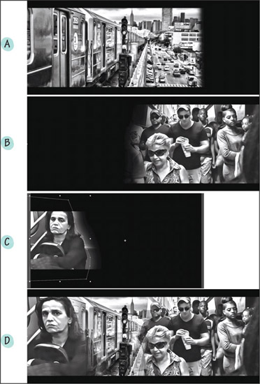
■ Figure 19.24 Compositing in Edin Velez’s State of Rest and Motion (2015). Images (A),(B), and (C) are separate images that are layered into the final image (D) using mattes. Frame (C) shows the keyframes used to create the matte.