Chapter 22
Finishing Picture and Mastering
Once you have a picture-locked film and a mixed soundtrack, it may seem like the big creative choices are over. Yet there are still important aesthetic decisions to be made before exporting your film onto a format that will allow you to send it out into the world. This chapter looks at the picture finishing process for a variety of workflows. The determining factors in choosing your workflow will include 1) your budget, and 2) where your film is going to be seen. Student films that may show in a couple of festivals, and perhaps on YouTube or another online platform, will have a very different workflow than a film destined for more recognized festivals, for broadcast, or for theatrical presentation.
■ Color Correction vs Color Grading
Whereas historically, video color correction was done in an expensive online session in a postproduction facility that specialized in this work, the move to NLE editing meant that much color correction could be done using your NLE software tools. But in the last few years, the growing ability of digital cameras to handle a broad range of exposures has been accompanied by a similar growth in separate software specifically designed to give a whole new level of control over color at a low cost. Many of these new tools fall under the rubric of color grading. Adobe’s Creative Suite, for example, now includes Adobe Speed Grade, and many other programs have come on the market. Color grading refers to the use of color to create mood, meaning, and a specialized look for your documentary. As such, it goes beyond the scope of color correction, which includes the more basic goals of getting appropriate and consistent color throughout your documentary. In this chapter, we will mostly focus on color correction adjustments you might expect to do on your own in your NLE system. If you are planning to work with extended dynamic range (Chapter 12) and do color grading, you will probably want to work with a colorist who specializes in this area. Like all workflow choices, it pays to consult with these specialists before you start shooting your project!
■ Color Correction in Your NLE System
If you are working on a project that does not include funds for professional color grading, you will probably be using some standard tools that are incorporated into most NLE systems. These are, in fact, quite powerful correction features that take some time and patience to learn. Once you master them, though, you can correct many problems in your picture and put out a visually polished documentary.
Color correction is used primarily to accomplish four things:
- Adjust brightness and contrast values for your shots.
- Correct color balance so that skin tones in particular are correct, and the level of color saturation is appropriate for your desired look.
- Create consistent color and brightness values across shots within a scene, and throughout the film.
- Tweak subtle tonalities for a specific look or mood.
Adjusting Brightness and Contrast
Brightness refers to the overall lightness or darkness of your shot. Contrast refers to the range of dark and light values within the shot. If brights are too low, and darks too light, your image will look gray. Consider these two archival images of Coney Island’s Dreamland in 1905, as they are displayed in Premiere Pro’s Program Panel (Figure 22.1).


■ Figure 22.1 Brightness and Contrast. The image on the left, the camera original, does not make use of the full range of white and black levels available. The image on the right has had its white and black levels adjusted using the Fast Color Corrector in Premiere Pro, resulting in higher contrast and a more dynamic image.
We measure white and black levels using the waveform scope, which gives us a graphical representation of the brightness levels across the image. Brightness is measured in IREs, with 100 representing pure white and 0 representing black, and is represented on the scope’s y-axis (Figure 22.2).
Although there is some type of Brightness and Contrast filter in every NLE program, you will have better control using a more sophisticated filter. For our purposes, let’s take a quick look at the fast color corrector filter in Premiere Pro (Figure 22.3).
If you are delivering a program for broadcast, you will need to pay close attention to your brightness levels as there are technical standards set by engineers that need to be closely adhered to. Black levels for broadcast, for example, need to be set at 0 IREs, and your whites at 100. Requirements for various platforms vary, so be sure to check the specifications for your particular exhibitor before you begin postproduction.
Adjusting Hue and Saturation
Hue refers to the color values of your image—in other words, the balance of red, blue, or green in your image. Saturation refers to the intensity of the colors. An image with rich, deep color would be considered highly saturated, while a washed-out image is less saturated. An image that has no saturation is black and white. Generally speaking, the most important hue and saturation adjustments are those that affect the way people’s skin tones look. Hue and saturation can also be manipulated to create a look or mood for your film.


■ Figure 22.2 The waveform scope shows the white and black levels of the image. The top photograph, which looks more “washed out,” has a smaller range of white and black values than the one on the bottom. The range is indicated by a bar on the right-hand side of the scope.

■ Figure 22.3 The Fast Color Corrector filter in Premiere Pro (left, A) is a good choice for basic adjustments to Brightness and Contrast. Use the Input Level slider under “saturation” (right, A) to bring the white levels in the brightest part of the picture (the tower) to 100 IREs (B), and the darkest parts of the image (the bottom right corner) to 0 (C). The middle slider will adjust the range of gray values (you can do this by eye).
While there are many filters in your NLE toolbox for adjusting the hue and saturation of your image, here we will stick with the Fast Color Corrector filter. Consider the image in Figure 22.4, which was shot in mixed light (Chapter 12) and as a result has a blue tinge.

■ Figure 22.4 Adjusting hue and saturation using the Fast Color Corrector in Premiere Pro. The dot in the middle of the color wheel (A) is in the center before the image is adjusted. In order to reduce the blue tint, and add orange, you drag the dot slowly away from the blue side of the color wheel and towards its opposite, orange (B). As you can see, the result is a warmer image. (See plate section for color.)
The Fast Color Corrector’s color wheel has its roots in a color wheel that has been used for more than 300 years to help people understand the relationships between colors (Figure 22.5).


■ Figure 22.5 The first color wheel is attributed to Isaac Newton, who in 1706 arranged red, orange, yellow, green, blue, indigo, and violet into a natural progression on a rotating disk (left). As the disk spins, the colors blur together so rapidly that the human eye sees white. The color wheel in many color correction programs follows the same principle (right). As you reduce the amount of blue, for example, you increase the amount of its complementary color, yellow. (See plate section for color.)
Another useful tool for adjusting color is the Vectorscope (Figure 22.6). The vectorscope represents the saturation of each color in the image.
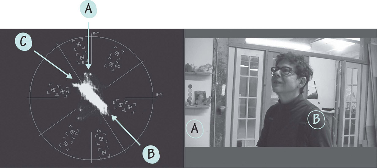
■ Figure 22.6 The vectorscope represents the saturation level of the various colors in the image. The red object on the shelf (A) creates a spike on the “red” area of the vectorscope (A). Similarly, the blue shirt (B) registers strongly in the “blue” area of the vectorscope (B). The (C) line represents skin tones, and is a valuable reference point when correcting people’s faces. Because what registers is the color of the blood, not the pigment of the skin, all skin tones should register along this exact line. (See plate section for color.)

■ Figure 22.7 The vectorscope’s flesh tone line. Cropping the program panel image to reveal just the face of the subject illustrates how skin tones, when they are corrected properly, fall along the vectorscope’s flesh tone line. (See plate section for color.)
When color correcting, keep in mind that your computer monitor is not necessarily calibrated to give you accurate colors. Whenever color correcting with your NLE, you should plan to screen the final results on a television monitor that has been calibrated to give the most accurate color possible (Chapter 8). It is also a good idea to work in a dark room, as the natural light coming from the outside will change over the course of the day, impacting what you see on your screen. Another tip is to look away from your computer quite frequently as you color correct. Your eyes and your brain are incredibly adept at adjusting to input. Before you know it, a green skin tone may begin to look normal if you don’t take a break now and then.
And, finally, a word of caution: color correction tools are something that should be researched thoroughly before you go grabbing sliders and pushing them around. Color correction is not just about the buttons you need to push: there is considerable technique and aesthetic judgment involved.
■ Titles and Credits
The final step, before you master your film, is to put titles and credits on it. Most NLE systems contain a title tool with more typographical options than you could (or should!) use in a lifetime. You can choose from dozens of fonts, sizes, and colors. You can adjust the opacity of the text, create drop shadows or fuzzy edges, make the text scroll up or down, or crawl sideways, or fly in from the four corners of the screen. You can create titles against simple color backgrounds, like any color text on black or any color on white. Or, by adding an additional video track to your timeline, you can superimpose your opening or closing credits over scenes from your film (Figure 22.9).
If you are working with a colorist in a program like DaVinci Resolve, the film will generally be imported back into your NLE for titling. Some filmmakers prefer to create their titles in
■ Working with a Professional Colorist
What can a professional colorist add to your documentary? If your documentary is going to be broadcast, you will be required to do a professional color correction or grading session to make sure you meet the technical specifications of the broadcaster to whom you are delivering. But there are also other reasons to draw on the expertise of someone who spends their days doing color correction.
Brian Boyd has worked doing color correction and creating cohesive looks for numerous television shows, as well as feature documentaries and dramas for theatrical and festival release. His documentary credits include A Will for the Woods (2014, Dirs. Amy Browne, Jeremy Kaplan, Tony Hale, and Brian Wilson) and Next Year in Jerusalem (2013, Dir. David Gaynes). He often collaborates with documentary director Morgan Spurlock. Asked what a professional colorist brings to a production, Brian says:
Being a colorist can be an invisible art at times. Most documentarians just want the footage to look the best it can. Documentaries can’t always shoot under ideal conditions, and from shot to shot drastic light and hue shifts can occur. A professional colorist has the ability to see these problems and make the best decisions as to how to balance the shots out so that nothing feels out of place or distracting.
But a colorist can also help filmmakers enhance the power of their story. I’ve gotten to work on a lot of films and every single one has moments where we accomplish this. In A Will for the Woods (2014), a man goes through the process of preparing his own green burial. I received the footage after the subject had passed away, and I felt personally responsible for showing him in the best way possible during his final days. I’ve worked with Morgan Spurlock, creating slick commercial looks for his documentary Greatest Movie Ever Sold (2011), or showing how beautiful and harsh Afghanistan is in Where in the World is Osama Bin Laden? (2008) (Figure 22.8). I did a faux documentary The Bay (2012), directed by Barry Levinson. It’s an eco disaster film set in a small town. Barry shot the film with a few cameras and it was my job to make it look like it was filmed with about 75 different cameras. I got to really degrade and “hurt” the footage for the look of the film. I took HD footage down to VHS and then back up. I messed with the timing of shots to create stuttered security cam footage. It was very experimental and fun.1
The industry standard color correction tool at the moment, according to Boyd, is DaVinci Resolve, from Blackmagic Design.
Resolve did something that was unheard of in the post production world. They basically released their product for free. It works seamlessly with Final Cut Pro, and works extremely well with Premiere Pro and Avid. There is a paid version of the software that adds some needed tools for professional finishing, but a documentary could easily be finished on the free version of Resolve.
What Blackmagic Design did by releasing DaVinci Resolve for free changed the industry. Suddenly everyone had access to professional color tools. There are positives and negatives to this. The industry was flooded with colorists who had no experience and didn’t get the chance to learn the proper way to do color. You need to apprentice under a senior colorist for years before you understand the nuances of color for film and TV.
On the more positive side, larger color systems like Assimilate’s Scratch and FilmLight’s Baselight are stuck playing catch-up, and have had to get creative with their products.2
Brian’s advice for students and emerging filmmakers? If you want to take full advantage of these new tools, you will want to investigate shooting with log gamma (Chapter 12) or another flat camera profile. The extended dynamic range will give the colorist much more to work with in terms of highlights and shadow detail, as well as color.

■ Figure 22.8 In this scene from Morgan Spurlock’s Where in the World is Osama Bin Laden? (2008), color grading brings out the subtle colors and textures of the Afghani landscape. (See plate section for color.)
a program like Adobe Illustrator or Photoshop, and then import them back into the NLE system. For complex layered or animated titles that require more sophistication than your NLE has, many designers use Adobe After Effects.

■ Figure 22.9 The title tool in Premiere Pro allows you to select from a wide variety of fonts and effects, including “drop shadow” to make text superimposed over image pop out. In this case, a light gray rectangle has been placed behind the title to make it more legible.
Think of your credits as an aspect of your film that is as important as any other visual element. Take time to design them. Do you want them to appear over moving images? Be combined with still images in some way? Just be simple but beautifully designed type on a black background? Do you want them to move (scroll) or to fade up and out one page at a time (cards)? It is easy, in the tired euphoria of locking picture and finishing sound, to short-change your titles. Think of them as adding a very important graphic touch that defines the overall tone of your film, and can be a simple way of adding style and production value (Figures 22.10 and 22.11).
A word of advice: the people who worked on your movie deserve proper credit. Especially for people initiating their careers in film, credits can be as important as pay. It is not unusual for talented people to work only for the credit, especially if they believe the film will be good. If you slap your credits together at the last minute, you run the risk of forgetting people, giving them improper credit, or misspelling their names. All of these are serious faux pas and can alienate the people you’ve worked with, who are among your most important resources as a filmmaker. Also, do not forget to acknowledge those people who helped make your film a reality, though they may not have directly worked on it, by including them in a “thanks to . . .” credit.
Lower Thirds
In addition to opening and end credits, documentaries often include titles that identify the people and locations in the film. As with opening and closing titles, these can easily be created within your NLE program, or imported from Photoshop or Illustrator.


■ Figure 22.10 The opening sequence of Spike Lee’s When The Levees Broke: A Requiem in Four Acts (2006), about Hurricane Katrina, uses an appropriately simple style for the somber message of the opening card (left). The main title card (right) takes its graphic inspiration from the wrought iron street signs typical of New Orleans.


■ Figure 22.11 Helvetica (Dir. Gary Hustwit, 2007) takes a live action approach that is appropriate for its subject matter (the Helvetica font). We see a typesetter arranging letters and applying ink to them. We see the results of his labor when he prints out a card with the film’s title on it.

■ Figure 22.12 Title and picture safety overlays. Because different monitors may clip some of your frame, it’s important to keep your text within title safety (the inner green box) and any critical action within picture safety (the outer green box).
These titles are called lower thirds because traditionally they always appeared in the bottom third of the screen. In practice today, they can be anywhere in the frame, as long as they are placed within title safety (the inner portion of the frame that will be visible in a variety of exhibition venues, including older TV sets) (Figure 22.12). Titles that identify people generally include the person’s name, as well as a professional association or some sense of who they are beyond just their name. For experts, this is often their professional title, like a university affiliation or other job-related information that will add credibility to their testimony. For other people, it can be trickier to figure out the right way to describe them. In a film about a murder trial, for example, you might interview a jury member who also happens to be a school teacher. In this case, it would probably make sense to identify them as “jury member” rather than as “science teacher,” as the latter is irrelevant to the film. On the other hand, if it’s a police misconduct trial and your jury member is also a retired police officer, it might be important to give your viewer both pieces of information. Use your own judgment, keeping your story in mind, and a sense of what information will best allow your viewer to put the speaker’s comments and actions into perspective.


■ Figure 22.13 A simple approach to lower thirds is used in Banished (Dir. Marco Williams, 2006) (left). A more stylized approach is used in Hubert Sauper’s Darwin’s Nightmare (2004): a black card with a degraded “typewriter” font is cut in over the interview to emphasize the investigative nature of the documentary (right).
Location identifiers, or Location IDs, present information that tells the audience where the events they are seeing are unfolding. Often they appear when the film moves to a new geographical place, or when the building we are looking at, for example, is significant to the story but not identifiable at first glance (“FBI headquarters,” for example, or “Smith family home”).
As with opening and closing credits, lower thirds should be designed carefully. Sometimes a very simple design is best, while at other times you can add production value through more stylized design choices (Figure 22.13). Just keep in mind that the titles should complement the film, not distract or shout out “look at me!”
■ Mastering Your Project
Picture locked, sound mixed, color corrected and titled, your film is now ready to be exported out of the computer and put into distribution. The first step in this process is to create full-resolution program masters. Mastering simply means outputting your film as a high-resolution digital file or onto a high-quality HD tape format (with a backup high-resolution digital file). The program masters serve dual purposes: they archive your film, and you use them to make distribution copies.
When creating your program masters, it’s a good practice to create two versions. One is a textless master, without any titles or lower thirds. The textless master will be used to make copies for countries where the language differs from the one your film titles are in. Not having your titles married to the picture will allow a Brazilian broadcaster, for example, to add Portuguese versions of your titles with ease. The version of your film that includes your titles is called the texted master.
From your program master, you will output a range of files for different exhibition purposes. NLE systems offer a huge range of output options that employ various codecs, resolutions, frame sizes, and so on (Figure 22.14).
Different codecs are compatible with different uses. For example, the MPEG 2 codec is used for making DVDs, and MPEG 4 and H.264 are commonly used for distribution over the web. You can also export a QuickTime movie of your project at different levels of compression depending on your distribution outlet. Outputting to tape is done via a cable connected to your computer (such as Firewire or Thunderbolt), but many of these other output options, like QuickTime movies or MPEG 2, simply create media files that can be exported into third-party programs for multimedia playback, for further compression, for uploading to the web, or for authoring DVDs or Blu-rays.

■ Figure 22.14 The Export Settings window in Premiere Pro. Notice the wide variety of formats (left) and codecs (right) you can choose from.
Output Formats
These days, it can be very confusing to know what formats your exhibitors will be requesting from you. “Many broadcasters who request files ask for Apple ProRes HQ, but that’s not standard by any means. Every broadcaster is different,” says Keith Shapiro, the General Manager of Frame:Runner, Inc., a New York postproduction house. “And, many still ask for HD tapes.”3
Common formats used for projection at film festivals include HDCAM, DigiBeta, Blu-ray disc, a hi-resolution file, or a Digital Cinema Package (see below).
Digital Cinema Package (DCP)
Increasingly filmmakers find themselves having to use the Digital Cinema Package (DCP) format for delivery. DCP, which is defined by the industry consortium Digital Cinema Initiatives, involves creating a collection of digital files used to store and convey digital cinema audio, image, and data streams. Finishing, mastering, and distributing on DCP is always expensive, primarily because it involves surround sound and other extensive postproduction services. This means that these processes are undertaken when a filmmaker knows that they have the budget to go this route, or after they have secured a theatrical release or have been accepted into a festival that requires a DCP. Increasingly, broadcasters also require a DCP.
If you anticipate that you’ll be finishing on DCP, plan for this workflow before you start editing because all postproduction houses have their own requirements in terms of formats, processes, and elements. Though there is software you can use to create a DCP on your own, there are potential pitfalls and you should proceed with caution.
Whether you are exporting to a high-resolution file or to tape, you should add a program leader to the head of your program master. Leaders include color bars and tone, a slate, and a countdown (Figures 22.15 and 22.16).


■ Figure 22.15 The HD color bars and countdown in Premiere Pro. You insert these, as well as a 1 KHz tone, at the head of your program master as a reference for future duplication and exhibition.

■ Figure 22.16 A program slate, which is inserted for 10 seconds after the color bars and tone, and before the countdown. The slate generally includes the program title, the total running time (TRT), the creation date, technical information about the audio, the start time code, and the production company or creators of the film.
Bars and Tone
If you plan to broadcast your movie over television or cable, or submit it to film festivals, it’s important to give the recipient of your film some way to accurately calibrate their equipment so that your film will look and sound as you intend. The standard calibration tools, which you lay down at the head of your tape, are color bars and tone. We have already mentioned color bars with respect to calibrating field monitors (Chapter 8). The leader elements discussed here are the Society of Motion Picture and Television Engineers (SMPTE) standard color bars, which allow the projectionist or broadcast engineer to accurately calibrate the chrominance and luminance of their playback equipment. The 1 kHz reference tone, which is recorded on the sound track under the color bars, allows them to calibrate the audio so that your program is played back neither too soft nor too loud.
The Program Slate
In addition, a standard professional program leader includes a program slate, which is a simple list of all of the information that would be important to a broadcaster or pro grammer, including (a) the film title, (b) total running time (TRT), (c) starting time code, (d) audio configuration (i.e., mixed or stereo unmixed), (e) production date, and (f) producer or creators (Figure 22.16). Standard start time code is 01;00;00;00, which means that the actual start time code of the tape or file will have to be backtimed to give you room for these other elements before the program starts. The normal default for sequence starting time code is 01;00;00;00, so if you are exporting from your NLE you will have to change your sequence settings for this particular sequence to something like 00;59;00;00 and make sure your program starts at exactly 01;00;00;00.
SMPTE Countdown
SMPTE countdown is a numeric countdown in seconds, from 10 to 2, which cuts to black for the last 2 seconds of the countdown (Figure 22.15). Your project then begins precisely after the end of the 2 seconds of black. Countdown allows the broadcast engineer or projectionist to easily cue your tape for screening. By simply pausing in the black, after the #2 frame, they can be sure to begin your program with a little buffer of black before the first images appear on screen.
Exhibiting on Disc
Although Internet streaming and DCPs have gained huge ground in exhibition, DVD and Blu-ray discs are still common ways of distributing your documentary, particularly in the home video and educational markets. Discs are still used for exhibition at some festivals, though these are increasingly asking for high-resolution digital files or DCPs. A few years ago, DVDs were the standard for festival screeners or demo reels. Nowadays these functions are almost exclusively served by online (sometimes password-protected) screeners on websites like vimeo.com, imdb.com, or youtube.com.
DVDs play back at standard resolution, whereas Blu-ray discs are high definition. While DVDs play on practically all players (DVD, Blu-ray, and computers), Blu-ray discs will not play on standard DVD players. Both Blu-ray discs and DVDs are optical discs that store the binary data for your sounds and images as microscopic bumps and indentations, called pits, in the surface of the disc. These pits are written as one long, ultrafine spiral called the data track and are read with a laser beam as the disc spins in the drive bay. The primary difference between these two formats is the precision of the laser and the size and number of the data pits. The red laser found in the DVD system is capable of reading data tracks that are 0.74 microns wide, while the much sharper blue laser (hence the name) with its shorter wavelength can read data off tracks that are 0.32 microns wide. This allows for much more data to be packed on a disc, and the blue laser also provides for faster data rates.
A single-layer DVD holds 4.7 GB of data, and a dual-layer DVD can hold 8.5 GB. A single-layer Blu-ray disc, however, can hold 25 GB, and a dual-layer one holds 50 GB. The audio/video data transfer rates are similarly different with DVDs clocking in at 10.08 Mbps, and Blu-rays at a much faster 54.0 Mbps. What this all adds up to is resolution potential, and this is why DVDs can only support standard-definition video resolutions whereas Blu-ray is capable of high definition.
DVDs encode the image and sound data using the MPEG 2 compression codec. Blu-ray can use either MPEG-2 or the newer H.264/MPEG-4 AVC codec. For projects shot at 24p and edited at 24p or 23.976 fps, you can output, encode, and author either type of disc at these frame rates as well. Keeping your frame rate at 24p or 23.976 fps allows you to put more footage, less compressed, onto the disc, because you have fewer frames and less data per minute.
Pressed or Burned?
Not all DVD and Blu-ray discs are created equal. Pressed discs are created through a process called replication, which physically mold the pits of the data track into the surface of the polycarbonate plastic, which is then coated in aluminum. This is the kind of disc you find when you buy a commercial movie. Burned discs, created through duplication, use recordable media and are created using a laser to burn a color dye layer in the media surface, which turns various colors and densities that mimic the depth and shadows of the physical pits in a pressed disc.
Pressed discs offer much better compatibility and physical longevity but must be created by a professional disc mastering service. The cost for having discs professionally mastered is quite low, but they are only available in bulk quantities, which means 500 or more discs. If you plan to go this route, the disc mastering service you choose will instruct you as to the specific file format they prefer to work with. What if you need fewer discs? Then you’re likely to burn your own using recordable discs. Recordable DVDs come in four flavors: DVD+R and DVD–R are record-once-only formats, and DVD+RW and DVD–RW can have their data erased and rewritten. Recordable Blu-ray discs are BD–R (record once only) and BD-RE (rewritable). In both cases, rewritable discs are not a good choice for distribution.
Encoding, authoring, and burning your own DVDs or Blu-rays requires a computer with a DVD burner or Blu-ray burner and a DVD authoring program like Adobe Encore or Pinnacle Studio for the PC (Figure 22.17). Make sure you thoroughly research the capabilities and options these programs offer before you encode, author, and burn your discs.

■ Figure 22.17 The interface for Adobe Encore, a powerful disc authoring program.