8. Styles
OVER THE PRECEDING six chapters we have looked at all the pieces that we need to build an application in Windows Presentation Foundation. We’ve seen how an application is constructed out of controls that can be positioned with layout, visualized, and integrated with data, and finally perform a set of actions. The final concept to understand is styles.
Styles are a set of properties and actions to associate with an element. Styles are the aggregators of all customizations; they support all the concepts we’ve learned about so far: changing templates, animations, bindings, commands, and all other features exposed by WPF. Styles can be combined with other resources and packaged into a theme. Themes provide a consistent way for designers to interact with developers to create applications. Using themes, we can define a completely different look and behavior for an application.
Style Principles
The notion of creating a separate definition of the style or theme for a “thing” has been around a long time. Microsoft Word afforded me my first experience with styles and themes many years ago. Word has a notion of named bundles of formatting information: Heading 1, Heading 2, Normal, and so on. The Web world’s first dabbling in styles consisted of the notion of basic semantic markup: things like H1, H2, and EMPHASIS. These semantic tags would then be rendered by a browser with a specific style. With the advent of Cascading Style Sheets (CSS), the document author could define a custom style for each of these named tags or, in fact, for any tag using a specialized query language.
For WPF we knew we wanted to support some type of styling, the ability to reuse style information across multiple elements. Styling would enable consistent UIs and support the designer/developer work flow by allowing for a clean separation of the designer’s style and the developer’s UI structure. Having a single model to span UI, documents, and media was critical. Three principles drove the development of the WPF style system: (1) embrace element composition, (2) provide a unified model for customization, and (3) optimize for the tools experience.
Element Composition
As we’ve seen in the rest of this book, WPF relies heavily on element composition, which introduces some interesting questions for the styling system. First, how should styles be associated with elements? Initially the WPF team thought of having a single style at the root of the element tree and using some type of query language for applying styles to elements deep in the tree. Imagine something like this:

This model, however, did not work well with element composition and deep hierarchies. The fact that the document structure must be encoded into the ApplyTo clause breaks encapsulation. In a deeply nested document structure these clauses also become very large and unwieldy.
What we really wanted was a style for any container element, so that styles could be associated with the document structure without the large ApplyTo clauses. We also wanted to be able to put the style definitions close to the elements; if we have a set of styles that we want to apply to only a section of the display tree, we don’t want to have to define a scope for every rule.
Instead of this notion of global styles, we opted to define a scope for each style. So we can define a new style at any point in the tree:

In addition, because of how resource references work, we can leverage the resource system to scope named and type-based styles to the tree as well:

Because the rest of WPF relies so heavily on element composition, the style system must also be optimized for composition. Beyond basic composition is also the overall goal of unifying UI, documents, and media. Styling, too, should apply uniformly.
Unified Model for Customization
For WPF, unification came in two flavors: (1) being able to apply styles to any of the presentation domains (UI, documents, and media) and (2) being able to customize anything in the system (properties, actions, display, etc.). One of the big benefits we got from building a unified presentation platform was that the ability to use styles across the entire platform did not cost anything, provided that the styling system gave access to all the features of the platform.
We needed styles to be able to do only two things: set properties and listen to events. If we could support these two functionalities, then everything else in the system would be accessible.
Here we’ll build a set of styles that apply to any type of element: paragraphs, buttons, shapes, and so on (Figure 8.1):

Figure 8.1. Using property setters to apply styles to UI, documents, and media

Nothing is ever quite that easy, so we’ll see some places where the styling system exposes implementation details of the core WPF engine. For example, the simple way to apply triggers to an element would be to use a simple property setter against the Triggers property on an element:

However, because of some implementation details having to do with how triggers are applied, we end up with a slightly more specialized model with the Style.Triggers property:

The principle is still present, even if the object model is a bit archaic; if something can be done to an element, it can be done in a style. We hope that most developers won’t have to spend all their days in markup, though, so tool support is critical.
Optimization for Tools
Providing great tool support is probably the single most difficult task with styles. CSS has an amazing power to apply multiple rules to a given element using a specialized query language. Within this very powerful language is support for declaring rule precedence, hierarchical selection, tag name selection, identified element selection, and so on. CSS provides an incredibly powerful, but extremely difficult, tool model.
One problem with the CSS rules-based approach for style selection is that the process is one-way. Given a set of rules, we can determine the elements that it affects; but given a change to a property on an element, it is effectively impossible to determine what style should “own” the property value. Suppose we want a visual designer to update the style definition when we change a property value, so that it can be shared with other elements. The only real way to do this with a complex rules system is to enforce some simplifications: In CSS it is common to have a model in which all styles are identified by CSS class names.
WPF very intentionally limits the power of style selection; each element has exactly two styles affecting it at any given time, only one of which can be customized by the developer using the element (the other style is the “default” style associated by the element author). There are only two ways to determine the style to use: by direct reference from the element to a named resource, or via the type of the element. This is basically a hybrid model of Word styles and CSS.
In addition to the simplicity of the model, there is now no need to build a query language for determining which elements a style should affect. In addition, designers and developers find it much easier to determine which elements will be affected by a change to a style.
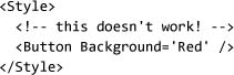
The final big decision regarding tool support came down to the actual encoding of the style definition in the markup. If you are familiar with CSS, you have probably seen styles defined by name/value pair combinations:

This is a very nice, compact syntax, but it suffers from two problems. The first is predominantly a tool problem: We now have a way of parsing and handling styles that is completely different from anything else in the system (everything else is XML). This adds a lot of complexity to the tool. For WPF we decided to bet on XML, so we chose to encode styles using XAML notation:

The second problem has more to do with composition: There is no good way to nest complex values in the CSS style notation. Using XAML property element syntax, we can specify arbitrarily complex values:

With the principles of element composition, unified styling, and optimization for tools, we can begin looking at the details of how the style system works.
Beginning Styles
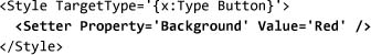
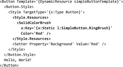
Styles are composed of three things: setters, triggers, and resources. To see the progression of using styles, we will start with a simple button that uses a local property set to make the background red:
We can start by moving the property set into a style. When we create a new style, we need to tell the style (using the TargetType property) what type of object we want to associate the style with:

To set the background to be red, we need to specify a property setter using a Setter object. There are two types of setters: property setters and event setters. Property setters allow us to set a property value for all objects that use the style. Event setters allow us to connect an event handler to any objects to which the style is applied. Generally it is better to use commands to connect behavior to controls, so event setters are infrequently used.
The property name is scoped by the target type of the style; thus “Background” is known to refer to Button.BackgroundProperty:
When the model for styles was created, there was a lot of debate about whether a special syntax should be developed for handling property and event setters. One idea was to have an “as used” syntax—that is, something more akin to the following:
Recall that one of the main tenets for all of WPF was the notion that markup and the object model should be as similar as possible. In this case, the normal rules for processing markup would say that this example would create a new button and set the background to be red. For styles, obviously this isn’t what we really wanted to happen. Instead, styles are actually a customization script. The style allows us to adjust properties, events, triggers, and resources for an object.
With the setter syntax for a style, the markup is explicit that it is a customization script and completely in sync with the object model. To associate the style with the type, we need to set the Style property:

As we learned in Chapter 6, we can use a resource reference to share the definition of the style:

In Chapter 6 we saw that we can associate data templates with a type by using DataTemplateKey instead of directly referencing the template. We can do the same thing with styles, by specifying the key to be the type object for associating with the style; therefore, we can automatically apply a style to all objects of the specified type. If we change the key in our example to {x:Type Button}, any button contained within the window will be red:

The key for a style defines how it will be retrieved from the resource dictionary. The target type of a style defines the type to which the style will be applied. All this can be confusing, since often the key and target type are the same.[1] However, we saw earlier that we may want to create multiple named styles for the same target type.
Beyond the basic setter functionality of styles, we can associate triggers and resources with a style. Triggers work exactly as they do for control and data templates. We can adjust the background of the button by attaching a property trigger to the IsMouseOver property:

At this point you might be asking, What is the difference between ControlTemplate.Triggers and Style.Triggers? Remember that the control template affects the display tree for the control. In the case of adjusting the button’s background color, the style appears to affect the display tree, but really the button’s Background property is being set and the default template for Button binds the Background property to an element in the display tree.
To see the distinction between these two, we can add another trigger for the IsPressed property:

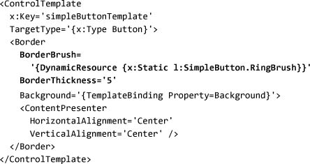
If we run this example, we’ll find that when we move the mouse down on the button, it does not become yellow. The reason is that the default template for Button does not bind the background property to any element in the display tree when the button is pressed. To understand this, let’s look at a simplified version of Button’s default control template:

Because the default template for Button removes the background template binding (by explicitly making the border’s background red), our style trigger has no impact. The reason for this type of feature is that control templates can affect only the properties on visual tree elements, whereas styles can affect only the control’s properties.
Models, Display, and Styles
The overlap between Style and ControlTemplate brings us to the issue of the split between display and behavior. There are several well-known patterns for object-oriented design, one of which is called model-view-controller (MVC). In this pattern, objects are divided into three parts: (1) a model that defines the data structures, (2) a view that defines the data display, and (3) a controller that defines the interaction. Although WPF doesn’t strictly conform to this pattern, it is useful to think about MVC when looking at styles and templates.
WPF’s control types, such as Button, define both a data model and an interaction model for the control. The display of the control is completely determined by the template. WPF then allows us to provide data through the content model, which was covered in Chapter 3. With the content model, we now have a basic MVC style pattern without all the usual complexity.
The reason why it’s interesting to think about this split of data (model), template (view), and control (controller) is that styles provide a simple way to connect all these. Controls provide customization through properties, which styles support setting. Templates provide customization through property and resource bindings, which styles support setting. And data is wired to controls through the control’s properties, which styles support setting. Not only do styles participate in adjusting each of these three parts, but they connect the parts; using a style, we can associate a template with a control, and a data source with the control.
We can now look in more depth at the relationship between styles and templates. We’ll begin with a simple template for a button:

At first glance, it may not be obvious that this template supports any additional customization; the template contains no references to any properties on the element. In Chapter 3 we saw that ContentPresenter implicitly binds to the Content property of the templated control. For this reason we could set the Content property and the template control and see the results.
We can bind more properties to the template using the TemplateBinding feature, which we learned about in Chapter 7:

Now the template for the button has a parameter that is a property on the button itself, so we style the button using the Background property and have that style affect the display:

Using this approach, we can create a template that has quite a bit of flexibility, but we are limited to customizing the properties that the control author anticipated needing (e.g., Background and Foreground properties). If we want more levers of control in customization—for example, to offer a “highlight” color in a template—we have three options: (1) to create a new control with the additional property, (2) to create an attached property that applies to the control that we’re customizing, or (3) to use a well-known named resource.
Generally, creating a new control to enable styling is overkill. Ideally we’d like to be able to apply styles and templates to existing elements. The options of creating attached properties and using named resources are very similar; however, attached properties are seen more as “programmatic” access than as style access. Attached properties are generally seen as ways of influencing behavior, but named resources work more naturally in styles.
To define a named resource we need to create a unique key, which we do by creating a static instance of ComponentResourceKey[2]:

Now we have a globally unique identifier for this custom property, which we can use in the template. Here we will wire up the Border.BorderBrush property to the named resource:
In the style for Button, we can now adjust this resource, as well as any local properties:
Notice that the style now has some type of dependency on the template. The style refers to a named resource that has impact only if the template is binding to it. For this reason, it is very common to have the style implement the association with the template:

If we think about all of these bits together—templates, styles, and resources—we can begin to see that there is an interesting packaging that defines a complete look and feel for a control. This bundling effectively defines a single control theme.
Themes
WPF has been built with themes in mind; however, most of the APIs in WPF are focused around styles and resources. The only place where themes are mentioned in the object model is a single assembly attribute called ThemeInfoAttribute. A theme is actually just a resource dictionary. Although you may not think that you’ve seen the type up to now, ResourceDictionary is the type of all the Resources properties that we’ve seen on controls, templates, and styles.
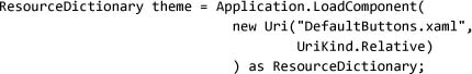
To define a custom theme, the easiest starting point is to create a new XAML file in a project and define a ResourceDictionary object (for this example we will call the file myTheme.xaml):

Wherever we want to apply this new style, we can do so using the MergedDictionaries property on ResourceDictionary:

In this usage, a theme definition is merged into the standard resource lookup hierarchy. Recall from Chapter 6 that we retrieve resources by looking up the element tree, then the application object, and finally the system resources. When we merge a dictionary into the tree, those resources become available at that location. We can use this technique to make a different theme active for portions of a UI.
Style lookup generally follows the standard resource lookup pattern, with one notable exception: ThemeInfoAttribute allows a type author to tell the system where the default theme for the type will be located. When retrieving a style, the system uses a particular default for a theme if no information for that type is found in the control tree, application object, or system resources. This default enables control authors to create themes for their controls.
Defining a new control that we want to be theme-aware takes three steps: First we must set DefaultStyleKey to associate the type with a theme:

The next step is to specify the theme discovery policy for the assembly using ThemeInfoAttribute:
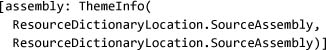
Finally, we must create one or more themes for the control. Each theme must be added to the application with the correct name (detailed in Table 8.1), and marked as a page in the project file (remember from Chapter 2 that we compile XAML files into a project by using the Page item type).
Table 8.1. Operating System Themes and the Names to Use for the Theme Resource Dictionary

Using this technique, we can create a control that has a different default appearance for each operating system theme. The list of operating system themes cannot be extended at this time. Microsoft occasionally adds new themes (the “royale” theme was added for the Media Center and Tablet PC editions of Windows XP), but there is no public way for third parties to create new themes.[3]
Skinning
People often confuse two related concepts: themes and skins. Typically, a theme is defined as a collection of data used to customize the look and feel of an application, and skinning is generally the end user customizability of that theme. Microsoft Office, for example, has a rich theme for its UI but provides no skinning support. Windows Media Player, on the other hand, has great support for skinning, including allowing end users to build custom themes.
WPF ships with rich support for themes, enabling both a control and an application author to have an amazing degree of flexibility in controlling their look and feel. WPF, however, does not ship with any intrinsic ability for skinning an application.
To implement skinning is a trivial matter, though, if we understand how styles and themes work. If themes are nothing more than merging a resource dictionary into a global collection, then it seems we can implement skinning with a small amount of code to adjust the collection of resources at the application, window, or container level.
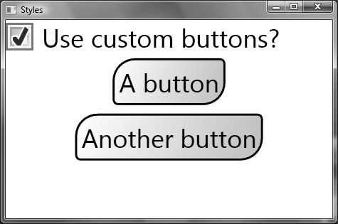
To demonstrate, we can create a simple window that has a check box (to toggle the skin) and two buttons (to show the skin):

Running this application right now will produce the expected display (Figure 8.2).
Figure 8.2. Our skinning application with no skin applied

We can then define two different themes using ResourceDictionary. The first theme will be a boring theme that does nothing. This boring theme will allow us to return easily to the default look of the application:

The second theme will apply a custom template to any button used in the application:


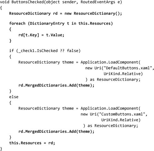
To toggle between the styles, we will hook up the CheckBox.Checked and CheckBox.Unchecked events to a single function that does the work. We also need to provide a name for the check box so that we can later check its value:

To load the appropriate resource, we can use Application.LoadComponent, which will take a URI and return the resource dictionary:
Using the MergedDictionaries property on ResourceDictionary, we can add the theme resources to the window’s resources. MergedDictionaries allows us to keep all the locally defined resources and merge in the theme.
To do this, we need to clone the resource dictionary from the window:

Putting all this together, we can see the implementation of merging in a custom theme and associating it with the window:[4]
Running this application will produce a display something like Figure 8.3 (on page 412).
Figure 8.3. Our skinning application with a custom skin applied
This logic could easily be keyed off of a registry or configuration setting. In addition, we could replace the LoadComponent call with a direct call to XamlReader, which would allow us to load the XAML definition of the theme from anywhere (LoadComponent is limited to loading resources that are included in the application’s manifest).
Style Inheritance
WPF’s controls are all heavily based on styles and templates. The general design philosophy is that the controls themselves may not contain any hard-coded property values, defaults, or visuals, because we want graphic designers and theme authors to have complete control over the defaults for the controls. The various examples of customizing controls in this chapter have shown that, within a style, we can adjust only a few properties, so where are the rest of the values coming from?
Every property in WPF has a notion of value precedence (Figure 8.4). All the features we’ve seen so far—styling, data binding, inheritance, and so on—are applied in a strict order. The interesting thing about styles is that actually two are applied to any given element. When we use a control, it appears that there is only one style because the second one is reserved for the control author. In all scenarios, local property values will trump any style-specified value.
Figure 8.4. Property value precedence

In addition to this basic precedence is the ability to create a base style from which multiple styles can inherit. Styles are allowed to have only one parent style (no multiple inheritance, you C++ fans), but a base style can apply to multiple types of child styles. This changes the picture from Figure 8.4 by introducing hierarchy to styles, as Figure 8.5 (on page 414) shows.
Figure 8.5. Property value precedence with base styles

Suppose we want to create a base style for use in all of our controls that defines some common font properties. We can do this by defining a style with a target type of a common base type that has all the properties we want to adjust and giving the style a name:

We can then associate this base type with multiple control types using a normal style definition and setting the BasedOn property:[5]

To really see the power here, we can create a couple of styles for different control types. In addition, for this example we will say that we want buttons to be bold, no matter what the base font is:

Running this code shows that all three control types get their font family and size from the baseControls style, and that all buttons are bold as well (Figure 8.6 on page 416).
Figure 8.6. Using a BasedOn style to apply common properties to multiple styles

We’ve now seen all the basic features of styles. Probably the most important thing about styles, though, is how to use them to improve an application, not break it.
Using Styles for Good, Not Evil
The inclusion of styles, and more generally the complete customizability of WPF, is probably one of the biggest changes over previous presentation technologies. On the WPF team we often compare what we’re doing to the original Macintosh that introduced average users to a rich set of fonts and typography. We, the humans of the world, had to endure a decade of ransom note–style documents until people figured out how to use fonts responsibly to communicate information in a better fashion.
The same rigor is needed when we’re thinking about styles. People define custom styles for three primary reasons: (1) to share property sets across two or more instances, (2) to move all customizations to a single point in an application, or (3) to define a distinctive look for an application.
Using styles for the first two purposes is great, and I highly encourage it. Provided that we have guidelines for how to do this (just like we should have coding guidelines for the code), using styles can boost productivity quite a lot. Whether we move these style definitions into a separate file or not is really just a matter of personal coding style.
It is for this last type of style—the definition of a custom look for an application—that I provide three notes of caution:
- Never build just a style to try to create a custom look. Think about this as a holistic theme for the application.
- Encompass enough of the common controls in a theme that the application feels consistent, because consistency is king.
- Have a point.
Build Themes, Not Styles
Custom themes tend to get big quickly. The definition of a few custom gradients and shapes for controls can consume hundreds of lines of markup. In addition, we begin to introduce dependencies between templates and styles and resources and templates (notice the circular dependency?). Often rich themes may involve custom code for value converters or additional control behavior. Consequently, generally the best practice is to think of a theme as a “thing” rather than just a collection of styles at the root window in the application.
The first piece of concrete advice I would give is to move the definition of the theme into a separate file and use the merged-dictionaries feature to bind the theme into the application. Even better, move the theme definition to a separate assembly and use a cross-assembly reference to load the style (/<assemblyName>;component/<resourceName>):

This practice clearly isolates the theme from the application, makes it easier for us to hand off the theme to a designer, and forces us to think about the theme as a separate component.
Consistency Is King
When building a custom look and feel for an application, it is important to make it consistent across all the controls that will be used. One of the goals of WPF was to make every control customizable so that we wouldn’t get the “Frankenstein” applications often seen with older forms packages (appearing as if the UI had been stitched together using parts of other applications). Of course, this powerful functionality raises the bar for developing custom themes, but it increases the quality of the user experience.
Probably the simplest way to approach creating a consistent design is to pick a theme (“metallic,” “flat,” etc.). Consider the “evil” set of controls shown in Figure 8.7. Here the font choices and sizes are all different, colors are different, even the angle of the text is different. The top button might be a great style for creating a game UI or whimsical survey-type interface, and the radio buttons are in a simple typographic style that might be nice for a Web application. Although I won’t claim to be a good graphic designer, the controls under “good” are at least consistent. They use a common UI style, font choice, and so on.
Figure 8.7. Consistency in a theme is critical to building a usable application.

Beyond basic consistency is the idea of creating a full suite of controls. When most people start building a theme, they pick a few common and simple controls to style, like the various buttons. But then they try to build a real application and run into all types of controls that may require more complex styles, or again they end up with a different, but equally bad, type of Frankenstein UI (Figure 8.8). One of the very common errors in this area is forgetting to style scrollbars. In Figure 8.8, the buttons have a “cool” theme, but the slider and tab controls lack any customization.
Figure 8.8. Consistency applies also to using a custom theme for all the controls, or at least matching the existing ones.

If we create a style that is consistent both in the look and in the breadth of controls, we need to have something that ties the entire theme together.
Have a Point
Custom themes allow us to differentiate one application from others. Creating a custom theme is potentially expensive, in terms of both design and implementation. The key thing is that a custom theme should convey something to the user. Maybe the message in the theme is a company brand, or an “extreme” styling to convey how cool an application is. The important thing is that we should be able to say what that message is, ideally in a single sentence. An example that the WPF team often banters around is the Xbox theme that we might imagine creating. Xbox has a very distinctive look for its hardware, software, and even Web presence. Creating a custom theme that matched the Xbox look would be a great message to send; it would clearly distinguish Xbox applications from the rest of Windows.
In general, if an application is a utility or a standard type of business application, it is unlikely that a custom theme will really add a lot of value to that offering. Even in these scenarios, though, it may be interesting to use themes to enforce good usability guidelines.
Where Are We?
In this chapter we’ve covered how styles and themes work in WPF. We’ve seen how to define and use styles, and how to package them into themes, and we’ve learned some best practices for using styles. With this final piece of the puzzle, we can see how styles plug into the data system, using resources and templates. All the parts of WPF come together in styling.