
Chapter 3 Typography for the Screen

You never know what is enough unless you know what is more than enough.
—William Blake
One of the greatest tools a motion graphics designer has to communicate ideas and information is type. Unfortunately, creating effective designs with type has become much harder. Gone are the days when an artist could design with one screen resolution in mind. As we continue to ride the edge of technology, it seems that we are in need of some old-school typographic essentials.
An easy way to keep elements aesthetically pleasing on a screen of any size is to go back to the essentials. The type tools that Adobe offers are very powerful with their seemingly endless options for editability. But that power is often wasted without the right knowledge. Some of you had the benefit of learning about typography back in school; others are self-taught. We’d like to revisit some core design theory in this chapter and bring certain technology to life with a few insider tricks. Remember that just because your type might be moving doesn’t mean layout, font, and color choices have to fly out the window. Often, it’s these little details that help solidify your message across any screen.
Typographic Essentials
Are you (or do you know) an “old-school” designer who remembers what it was like at the start of digital design? Back then, digital artists were commonly viewed as a bunch of unrefined yahoos who didn’t know, or worse yet, didn’t care about the finer points of design. From setting type to color theory, there was an explosion of “untrained” artists, freely creating without a care in the world.
Although we look back and view that time as an exciting revolution, it did have an everlasting effect on typographic terminology. Many terms, clearly defined for centuries, were beginning to get mixed up and even redefined. Some of this happened through lack of training, but a lot of it had to do with the shift in technology.
Just so we’re all designing from the same point of reference, let’s take a quick run through some key terms in typography. Who knows; maybe we can pay homage to the “old-school” designers while still staying true to the “untrained yahoo” in all of us.
 Notes
Notes
If you need to convert font technology or make a font cross platform, be sure to check out TransType. This tool from FontLab lets you rebundle Mac OS and Windows fonts as OpenType fonts and make them cross platform. Although it’s not cheap, it quickly pays for itself if you need cross-platform fonts.
Font Technology
When talking about setting type digitally, you’ll often hear designers discussing fonts. You must install and activate a font, which is a digital file on your system. With it you can view and use a typeface.
Don’t confuse the word font with typeface. So we don’t get sidetracked, we’ll revisit why those terms might cause confusion shortly. As for fonts, there are three different kinds of file formats predominantly in use today: PostScript, TrueType, and OpenType. All three will work with Adobe software.
PostScript

Adobe created PostScript fonts to alleviate common issues when printing text of various sizes on different printers. Before PostScript, each printer would print each font slightly differently, even when printing the same electronic document. PostScript fonts store the shape of each font with Bézier curves to ensure consistency when printing the font. These fonts work with certified printers to communicate exactly how each font should appear regardless of the type of printing technology. The most widely adapted format for PostScript is known as Type 1.
TrueType

TrueType is very similar to PostScript but uses a slightly different and more efficient method for creating the curves that define the fonts’ specific shapes. TrueType was created by Apple and later licensed to Microsoft, and was a competitor to PostScript. There are slightly different resources for TrueType fonts on Windows and for Mac OS X, so they are not cross-platform compatible.
OpenType

OpenType fonts hold true to their name in that the format is openly developed by Adobe and Microsoft. Fonts, such as TrueType and Type 1 fonts, may be embedded within an OpenType font. OpenType is based on Microsoft’s original TrueType Open format. OpenType fonts use a common wrapper that allows any operating system to decode any OpenType font. There is also a creative benefit to OpenType fonts. They support far more glyphs within each letter than typical PostScript fonts (Figure 3.1). This expanded glyph support also allows for multilingual characters to be embedded within a single font. Adobe OpenType fonts can be identified by the name Pro.
Figure 3.1 This text is Adobe Garamond Pro, and each section is an exact duplicate of the original. The appearance was changed by choosing different glyphs embedded within the OpenType font.

 Tip
Tip
For a complete user’s guide to OpenType fonts, be sure to check out www.adobe.com/type/browser/pdfs/OTGuide.pdf.
Foundations of Type
Since we mentioned it earlier, we’ll clarify the difference between a font and typeface. Basically, a font is the actual computer file that contains the information to display and print a typeface. A typeface is the graphic style of text, often shown with slightly different variations, forming a type family. Now that we’re all speaking from the same voice, let’s continue on with typography.
Understanding the terms used to describe the stylistic attributes of type can help you solve design problems without having to resort to changing the copy. Because each typeface brings something different to the table, these terms are used to describe exactly why a typeface will or won’t work within a given situation.
Did you know it was possible to make a typeface appear larger without changing its point size? Well, you can if you choose a typeface with a tall x-height (Figure 3.2). The x-height is literally the height of a lowercase x. This is a good letter to use because it’s representative of the relative height of the letters in a typeface. The x-height is used to determine the height of the rest of the lowercase letters within the typeface.
Figure 3.2 Both typefaces are set to the same point size. Notice how the text with the taller x-height actually makes the text appear larger?

Understanding x-height can save you time while browsing through fonts. If you know the project doesn’t allow for a lot of space, you only need to look for a typeface with a tall x-height. Helpful, right?
Here are a few more essential terms you need to know (Figure 3.3):
Figure 3.3 Some of the core terms used to define character structure.

• Baseline. The baseline is where the bottom of each letter sits. Notice how rounded letters actually sit below the baseline? This helps create the illusion of the rounded letters sitting on the same baseline as the flat letters. If they actually sat right on top of the baseline, the typeface wouldn’t look as natural.
Tip
If you’re looking for more information about type in all of its technical and stylistic glory, be sure to visit www.adobe.com/type.
• Cap-Height. The height of a capital letter measured from the baseline to the top of the letter.
• Ascender. The part of a letter that rises above the x-height (Figure 3.4).
Figure 3.4 Ascenders and descenders are influenced by the x-height. Usually, when a typeface has a short x-height, it has long ascenders and descenders; conversely, when the x-height is tall, they are shorter.

• Descender. The part of a letter that extends below the x-height (Figure 3.4).
• Tangents. Usually caused by ascenders and descenders, Tangents happen when two lines converge between lines of text that create a distraction for the viewer (Figure 3.5).
Figure 3.5 Watch your ascenders and descenders when adjusting the leading to avoid creating any tangents.

• Serifs. The details or marks that appear at the ends of individual letters’ main strokes (Figure 3.6).
Figure 3.6 Be aware of serifs with small intricate details when choosing a serif typeface for video. The details can often disappear when viewed on small screens. When you’re working with an interlaced project, the fine details will often cause the type to flicker.

Selecting a Typeface
The Character panel in any of the Creative Suite applications offers two boxes from which to choose a typeface—the Family box and the Style box (Figure 3.7). Each font chosen in the Family box determines the fonts that appear in the Style box. Although these choices are intertwined, each option is actually a different font used to create the style variation.
Figure 3.7 Font Family box (A); Font Style box (B).

 Close-Up: Font Selection
As a designer, selecting the “right” font can be a bit intimidating. We recommend two techniques that make experimentation easier. The goal is to try new ways of viewing and finding type to move out of your comfort zone.
One trick is to set a block of text in After Effects or Photoshop and then apply the text. Don’t make the text too big, because you’ll need to accommodate for variations in x-height. In the Timeline or Layers panel, select the text layer. Click inside either the Font Family or Font Style fields, and then use the down and up arrows to cycle through loaded fonts.
Another trick is to access a useful website for font identification. You can load up a JPEG of a type sample and then ask www.WhatTheFont.com to identify it. If it’s a font you don’t own, the website will of course sell it to you. We find the database to be very accurate and a great time-saver if we’re trying to match a design or client asset.
Font Families
A font family is typically a collection of font styles that belong together. For example, Helvetica would be the overarching type family; Helvetica Bold and Helvetica Oblique would be two of the typefaces within the Helvetica type family (Figure 3.8).
Figure 3.8 Different typefaces within the Helvetica type family.

As you create your projects within any application in Adobe Creative Suite, the delineation between font and typeface can become relatively confusing. We mention this because this is a rare instance where the terms “font family” and “typeface family” can actually be used interchangeably. As you browse through fonts on your system in the Character panel, you are actually directly referencing the font files. So the boxes in the Character panel are labeled “font family” and “font style” accordingly. Although you are technically selecting font families and styles to activate, the results of your choices will be seen in your project as the chosen typeface within a type family (Figure 3.9).
Figure 3.9 Because lower-third designs are typically tight on space, we used variations from the Adobe Garamond Pro type family to create the definition between names, eliminating the need for a space.

Tip
Using the variations available in a type family is a way to create a sense of hierarchy within your designs while maintaining one cohesive look.
Different Categories of Typeface
Truth be told, there are literally thousands of fonts in the world. As such, it’s become essential to label and describe their unique characteristics (Figure 3.10). This makes it easier to better define specific styles of typefaces. It is necessary to subdivide fonts into different categories.
Figure 3.10 It’s usually unwise to create a layout using many different typefaces, but we created this so it would be easy to compare the differences in the same composition.

Although more categories exist, these are the categories that are typically used most often:
• Serifs. Serifs are the details or marks that appear at the ends of individual letters’ main strokes. Although the true origin of their creation is less than clear, their use is well documented throughout history, across many cultures and languages. Their main function is to assist the eye in identification of each letter for better comprehension.
• Slab serif. If you want to mix it up with your typographic lingo, expand on your definition of a serif with slab serif. Kind of the “Fred Flintstone” of serifs, slab serifs have very distinct chunky serifs. They don’t have to be perfectly squared in their shape, so they can also be identified by the lack of a smooth transition to the serifs.
• Sans serif. Sans serifs (literally means “without serif”) create a clean and modern look because they do not contain serifs. They are commonly used in titles, headlines, and other short lengths of text.
Close-Up: The Truth About Faux
We’re sure you’ve come across the “faux” font settings in the Character panel menu. We highly recommend that you do not use faux (derived from the French word for “fake”) if you have the “real” version of the font. Although the faux setting is fully supported across Photoshop, Illustrator, and After Effects, there’s no substitute for the quality of a true font. Most type fanatics would view the use of the faux settings as sacrilege since it often distorts the true design of a typeface. However, there are certain instances where using the faux settings makes sense. If you have a project that requires the use of a font that’s way too thin for video, faux bold works well to thicken the lines and remove any flicker. Or if you must create an italic version of a typeface when there really is no italic version, use faux italic.
• Script. If you’re looking for a typeface that’s a little more expressive—with long flowing strokes and accented curves—scripts are a great place to start.
To recap, the preceding categories help group different typefaces (and their families) together according to general appearance. Then each typeface family has style variations, such as Bold, Italic, Condensed, and so on.
Type Layout
The technical term for placing type on the screen is called setting type. The term “set” refers to letterset printing where each letter is meticulously set in place. Although you won’t be using rows of hot metal in After Effects any time soon, we still recommend carefully laying out type. Sloppy design leads to poor results.
The process of setting your type can dramatically change the look and feel of a project. When a strong layout is combined with a dramatic typeface, you can really define the style of a project before you even consider color, texture, and animation speed. Let’s start by looking at kerning, leading, and tracking.
Tip
To move in increments of ten while kerning, press Command+Option+left or right arrow (Ctrl+Alt+left or right arrow).
When setting type, it makes sense to adjust the kerning of a word first, and then go back and adjust the tracking. That way, once you’ve set the proper space between individual letters, adjusting the tracking will space out all the letters in proportion, preserving your initial kerning adjustments.
Kerning
Kerning is the process of adjusting the space between two characters (Figure 3.11). Some fonts have been meticulously kerned by their designers, whereas others are often sloppy (which is often the case with free fonts). The goal here is to create a sense of optical balance (Figure 3.12). You want letters to feel interconnected within the word and a sense of visual flow. Kerning is one of those design elements that the average person won’t notice when it’s done well, and that’s a good thing.
Figure 3.11 If you want to quickly fine-tune kerning in a word, just use your left and right arrow keys to move the cursor through the word between characters. Once the cursor is in the new position, use the kerning key command to adjust the new area.

Figure 3.12 Poor kerning can stick out like a sore thumb. Kerning is not an exact science. It’s more about the feeling you create. You want to create the feeling of balance and uniformity, even if the spaces between the letters are technically uneven.

Kerning can be quickly done by hand. Once your cursor is in the right place, you can adjust kerning directly in the Character panel or by using the keyboard shortcut Option+left or right arrow (Alt+left or right arrow).
Tracking
Tracking is very similar to kerning. Instead of adjusting the space between two letters, tracking adjusts the space between all the selected letters (Figure 3.13). If you plan on animating text, a slightly looser track may be necessary to improve readability. We also track text a little looser to accommodate for strokes or bevels.
Figure 3.13 Notice as the tracking is performed that the spaces that get adjusted are always to the right of the selected characters.

To adjust tracking, select all the characters you want to adjust and make changes directly in the Character panel or use the same kerning keyboard shortcuts, Option+left or right arrow (Alt+left or right arrow).
Tip
If you find the highlight distracting when making adjustments, it’s very easy to hide. For Photoshop and Illustrator, use the keyboard shortcut Command+H (Ctrl+H). For After Effects, use Command+Shift+H (Ctrl+Shift+H). Just don’t forget to “unhide” your selection with the same command when you are finished. Otherwise, when you try to select anything else in your project, you won’t see your selection.
Leading
Leading is the process of adjusting the space between multiple lines of text on the screen. The term is actually derived from when printers used pieces of lead to control the amount of space between the lines of text in the printing press (Figure 3.14).
Figure 3.14 You can select one or multiple lines to adjust the leading between the different lines of text. With the text selected, you can adjust the leading in the Character panel or by using the keyboard shortcuts Option+up or down arrow (Alt+up or down arrow).

By default, text leading is set by the point size and internal properties of the font. To use this setting, just leave the Leading field set to Auto. On the other hand, you may need to fit more text on the screen. In this case, you can tweak the Leading size. Just be careful to avoid collisions between the ascenders and descenders, or text will become hard to read.
Controlling Type
One of the most overlooked joys of working with Adobe applications has to be the consistency of the user interface. It doesn’t matter if you’re used to working in Photoshop, Illustrator, or After Effects. The layout and function of the controls are remarkably similar between each application. When creating type, you’ll find the Character and Paragraph panels in each application with many of the same controls and options.
Notes
Another important option for adjusting kerning and leading automatically is the Adobe Every-line Composer option in the Paragraph panel. This can automatically adjust text properties for the best layout. We’ll explore it in depth later in the chapter.
Various designers prefer to set type in different applications. We find that Adobe Illustrator has the most typographic controls (although the essentials are still present in both Photoshop and After Effects). Adobe Illustrator text will import as a vector object (which can be scaled with the Continuously Rasterize switch). You’ll need to return to Illustrator to make edits.
We often set text in Photoshop, because it can be easily converted into editable (and animatable) text in After Effects. You’ll of course also need to set and work with text right in After Effects.
Before we delve into the specifics of each application, let’s cover the core features and functions you’ll find repeated throughout Photoshop, Illustrator, and After Effects. Learning how to master type in each application produces consistent results in your design, no matter where you start the process.
Entering Type
There are mainly three forms of type found throughout Adobe Creative Suite 5: point type, paragraph type, and type on a path (Figure 3.15). Although the method for creating paragraph type and type on a path varies slightly between applications, their function remains the same.
Figure 3.15 Examples of point type (A), paragraph type (B), and type on a path (C) are shown.

• Point type. If you use the Type tool or the Vertical Type tool and click once in your canvas without dragging, you’re creating point type. An actual point will appear exactly where you clicked in the canvas. Once you create the initial placement of your text, point type will keep the text on one line as you continue to type. If you want to have multiple lines of text within one type layer, you must press Return (Enter) for each new line. Point type is useful when you want to align text to a particular area. You can combine it with an alignment command to create a line of text that can literally run off the screen.
Tip
To change the size of the area of paragraph type later, select the Type tool and click inside the paragraph to bring up the Transform controls. Then click on the handles to resize accordingly. You may need to hover your cursor at an edge to access the control handles.
• Paragraph type. Paragraph type is text that resides within a specified area. In Illustrator, it’s literally called area type. Click and drag with the Type tool to create a rectangle to define the area for your text. In Photoshop and Illustrator, you can click directly inside a vector path with the Type tool to have text flow inside an irregular shape.
• Path type. Path type is text that flows along and follows a specific path. A number of parameters control the appearance and placement of the text along the path. The variations are literally endless. Animating path type will give you a whole new level of control via the ability to animate the path as well as the text along the path.
Close-Up: Are You Safe?
When setting type for video, it’s important to be aware of title safe and action safe areas. Because the edges of a video screen often get cropped off by the edges of the television, you want to make sure text is inside the title safe area and any important picture in the video stays within the action safe area. Title and action safe are built into Photoshop and Illustrator with the preset project templates for video. To view and hide title and action safe areas in Photoshop, choose View < Show < Guides. The inner guides indicate title safe, and the outer guides indicate action safe. In Illustrator, they are on by default when using a video preset. To turn off safe zones in Illustrator, select the Artboard tool, navigate to the top of the interface, and click the Artboard Options button to access the menu where you can enable and disable the visibility. In After Effects, just Option-click (Alt-click) the Choose Grid And Guide Options button at the bottom of the Composition panel or Layers panel to enable or disable safe zones.
Character Panel Controls
Although each application has slightly different features for type, the majority of the features in the Character panel are the same. In this example we’ll look at the Character panel in Photoshop (Figure 3.16).
Figure 3.16 The Character panel in Photoshop is similar to those in other Adobe Creative Suite applications. Many controls are available to help precisely set type down to the character.

A Point size. Controls the size of your type in points (based on Postscript). To change the default measurement for a point, choose Preferences < Units & Rulers < Type.
B Leading. Controls the spacing between lines of text.
C Kerning. Controls the spacing between two characters. Two options are available:
• Metrics. An automatic setting for kerning based on character pairing. This setting works only as well as the information supplied by the font designer.
• Optical. Automatically adjusts the kerning between individual letters by analyzing their unique shapes. We generally recommend trying this setting before making manual adjustments to the kerning.
D Tracking. Controls the spacing between all selected characters.
E Text scale. Controls the scale of type vertically and horizontally independently.
F Baseline. Controls the distance above or below the baseline.
G Color. Where color is defined for the type selected.
H Superscript and Subscript characters. Specify whether a character is a superscript (aka superior) or a subscript (aka inferior). Most commonly used for scientific notation, these settings make quick work of formulas and expressions. Rather than having to change both the point size and baseline of a character, try these settings instead. You’re now ready to animate E=mc2 as you drink your H2O.
I Anti-aliasing. Controls the amount and sharpness of anti-aliasing applied to the typeface. Try different settings if you are having a hard time reading smaller type or to smooth edges on extremely large type.
Notes
The Superscript and Subscript buttons are not in all the applications in the Adobe Creative Suite, but you can still access these options through the Character panel menu in the upper-right corner of the panel. Even if a font is missing the glyphs, the software will automatically make the adjustments.
Paragraph Panel Controls
Whenever you need to lay out large areas of text, you should pay a visit to the Paragraph panel. We’re sure you’re familiar with the basic settings: Left, Right, and Center Align. Usually, that’s just the start of the process when setting a large block of text. This panel can help you specify exactly when to hyphenate a word; justify all text; set spacing rules for lines, characters, and indents; and more.
Alignment
The Align buttons are grouped in the upper-left corner of the Paragraph panel (Figure 3.17). To apply alignment to any text, select a layer to change the entire layer. If you want to affect only a certain area, select the specific lines of text to change and click the appropriate button to apply the alignment.
Figure 3.17 When Align is applied, you will always have at least one ragged edge. If you’re using vertical text, the buttons will change to Top, Bottom, or Center Align.

Justification
Using Justification on paragraph text will remove the ragged edges in your layout. Choosing Left, Right, or Center really only refers to the last line of type (Figure 3.18). To justify the bottom line, click the Justify All button on the right; this is also known as forced justification. If you’re unhappy with the results, you can fine-tune the Justification settings in the Paragraph panel menu (Figure 3.19).
Figure 3.18 Examples of Left, Center, and Right justification.

Figure 3.19 Any adjustments made in the Justification menu are applied to the entire paragraph. Use the traditional tracking and kerning adjustments in the Character panel to make changes within specific areas of text.

Notes
Justification can only be applied to paragraph text, not point text.
The Justification settings allow you to adjust three different parameters:
• Word Spacing. This option literally adjusts the amount of space used for a space, typed in by using the spacebar.
• Letter Spacing. This option controls the amount of space between each letter including both the kerning and tracking settings.
• Glyph Scaling. This option controls the amount of width a glyph (individual character) can scale when applying justification.
Notes
You can adjust the default value for the Auto Leading setting that appears in the Character panel. But don’t be confused; you can adjust that setting only in the Paragraph panel menu. Click the Paragraph panel menu and choose Justification. The default leading value is at the bottom of the menu. This actually does make sense in that the leading is a key component for setting paragraphs.
Every time justification is applied to different text, the settings will be slightly different to account for the various fonts, characters, space, and format settings. That is the reason for Minimum and Maximum and Desired settings. As the justification is applied, the software can adjust for each given situation. To better understand how this works, let’s look at the descriptions of the settings:
• Minimum and Maximum. This option controls the minimum and maximum settings acceptable for justified paragraphs only.
• Desired. This option specifies the optimum settings for each parameter in both justified and unjustified paragraphs alike.
Adobe Line Composers
Line composers use two different methods to analyze text and decide where to best apply line breaks and hyphens based on the format parameters specified at that time. These methods of analysis are called line composers. To change line composers, click the panel menu in the upper-right corner of the Paragraph panel (Figure 3.20):
Figure 3.20 Adobe Single-line Composer was used on the left; Adobe Every-line Composer was used on the right. Although the adjustments were minor, the line composers make for a good starting point before delving into the finer points of justification and hyphenation settings.

• Adobe Single-line Composer is the more traditional and default way of setting type one line at a time. This composer will always try to compress the spacing between characters before increasing space.
• Adobe Every-line Composer is a more intensive way of setting type where each character and line is analyzed, and different parameters are assigned different values. These values help determine exactly where to best create hyphens and line breaks. First and foremost, it will always try to maintain even spacing between words and characters. This option only works with paragraph text.
Hyphenation
Often, you’ll have long words in a sentence that will need to wrap to another line. By breaking a word across lines, large gaps can be avoided. To do this, you’ll need to use a hyphen. Found in both Photoshop and Illustrator, Hyphenate can be activated or deactivated by selecting or deselecting its check box at the bottom of the Paragraph panel (Figure 3.21). With Hyphenate enabled, there are many options to control exactly when and how a word will be hyphenated. To open the options menu, choose Hyphenation from the Paragraph panel menu (Figure 3.22):
Figure 3.21 It’s easy to quickly enable or disable hyphenation using its check box in the Paragraph panel.
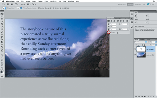
Figure 3.22 You can specify where hyphens occur within a word and also where they can appear within the overall paragraph.

• Words Longer Than. Sets the minimum number of characters in a word before a hyphen will be used.
• After First. The minimum number of characters at the beginning of the word before a break can be applied.
• Before Last. The minimum number of characters from the end of a word after a break.
• Hyphen Limit. The maximum number of consecutive lines a hyphen can be applied.
• Hyphenation Zone. Used with the Single-line Composer, the zone is a “buffer” from the right side of a paragraph that specifies where a hyphen cannot be applied.
Tip
You can click directly on the icon for any of the paragraph spacing controls to set a value. Click+drag to the right to increase the value; click+drag to the left to decrease the value. This is a good way to interactively watch a preview of the adjustment as it’s being applied.
There’s a difference between pressing Return (Enter) to create a new line (aka line break) and pressing Shift+Return (Shift+Enter) to create a new line. When you press Shift+Return (Shift+Enter), you create a new line of type, but that new line will not be the start of a new paragraph. This is called performing a soft return.
More controls are available in the Paragraph panel that really help with the spacing of paragraphs. To create a new paragraph, you must press Return (Enter) to start the line for that paragraph. After you’ve gone through the area of type and specified each new paragraph with a hard return, you can then adjust all the paragraphs at once using three settings (Figure 3.23).
Figure 3.23 Indent Spacing, Space Before Paragraph, and Space After Paragraph all help control the layout of area type.

A Indent Spacing. Creates an indent at the start of each new paragraph (this value can also be negative to bump out the first line).
B Space Before Paragraph. Adjusts the amount of space before each paragraph.
C Space After Paragraph. Adjusts the amount of space after each paragraph.
Hanging Punctuation
You can place punctuation inside or outside the margins of your text with hanging punctuation. To activate this feature, select Roman Hanging Punctuation from the Paragraph panel menu (Figure 3.24).
Figure 3.24 In the frame on the left, Roman Hanging Punctuation is not selected; in the frame on the right, it is selected. Notice how the quotation marks are moved outside the margins.

Setting Type in Illustrator
For a motion designer, Illustrator is the tool of choice to create custom typographic designs. The ability to change text into outlines allows designers to then alter the text just like any other vector graphics. There are also more paragraph type options than are offered by Photoshop or After Effects, so it’s easy to create layouts like two-column text or have text flow through different areas of the screen with threading, as in InDesign. Out of all the applications bundled in Adobe Creative Suite Production Premium, Illustrator gives you the most complete toolset for creating and manipulating custom type treatments.
Notes
If we receive a Word or Pages document, we’ll usually also save it as an RTF (rich text format). This just helps cover the bases in case one file works better than the other.
Even though text is placed within Illustrator from an external file, there is no link back to the original file. The text is embedded within the Illustrator file.
Use the Direct Selection tool to change the size of the text area. Using the Free Transform tool will change the size of the text area as well as the size of the text.
Importing Type
To save time and reduce errors, don’t retype anything that already exists in a digital file. In Illustrator, you can import both formatted and unformatted text. Whenever possible, if you want to retain the type formatting, save two different file formats for import. To import an external text file, choose File < Place and select the file to import (Figure 3.25). You can also just copy the text from its original document and paste it directly into Illustrator (Figure 3.26).
Figure 3.25 When placing this Word document, you have a few options, including the choice to strip out any formatting and just import the unformatted text.
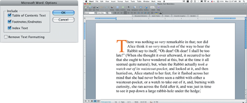
Figure 3.26 Once the text is placed within Illustrator, you can change the formatting just like you would for any text created directly within the document.

Point and Paragraph Additional Controls
Using the Type and Vertical Type tools in Illustrator to set point type is the same process we covered earlier in the chapter, so let’s look at setting paragraph type. Paragraph type is known as area type in Illustrator, and it has some extra features that really set it apart from Photoshop:
Tip
In Illustrator you can switch type orientation between horizontal and vertical at any time. To convert type, choose Type < Type Orientation < Horizontal or Vertical.
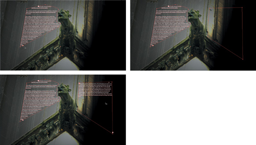
• Text can flow across multiple areas within the document through a process called “threading” (Figure 3.27).
Figure 3.27 To specify areas to thread text between, click the plus (+) button in the lower-right corner of the area, and then click on the blank white box in the upper-left corner of the next area to choose where the text will flow next.
• Area type supports multicolumn layouts (Figure 3.28).
Figure 3.28 You can specify the number of columns by selecting the area type and opening the area type options. Choose Type < Area Type Options and specify both Rows and Columns.

Setting Type Along a Path
When you want your type to wrap around a specific object or be placed around a geometric shape, like a circle, you’ll want to set type along a path.
You can set type along any path or shape, open or closed, in Illustrator. Two tools enable you to set type on a path: Type on a Path and Vertical Type on a Path. Click and hold on the Type tool to reveal these two tools. Several options are provided to control the placement of the type along a path. Before we get to those options, we need to actually place type along a path.
Notes
Don’t panic if you’re setting type on a shape that has a fill or a stroke. Those settings will disappear. If you want to still see the original graphics, make a copy before you place type on a path.
1. Select the Type on a Path tool and line up the cross bar in the cursor directly over the path (Figure 3.29).
Figure 3.29 When you have the cursor lined up over the path, click exactly where you want the type to begin.

2. With your cursor positioned, click the path where you want the type to start.
3. Type your text. If you want to change fonts or resize the type, be sure to select the type before you make any adjustments. In addition to changing the font size, you can use any of the other parameters in the Character or Paragraph panel to change the type along the path.
4. When you have the type sized properly, use the Direct Selection tool to manipulate the type around the circle. For type on an open path, you’ll notice three brackets around the type—at the beginning, middle, and end. For a closed path, like a circle, the brackets don’t appear quite so easily (Figure 3.30). In the circle example, the brackets slid around to the left of the text because the text was left aligned.
Figure 3.30 On a closed path, the beginning and end brackets will be right next to each other; the middle bracket will be in the middle of the entire path, not just the text. The exact placement of the brackets will depend on the alignment settings.

5. To place the text controls in their correct position around the type, click on the leftmost bracket and bring it around the bottom of the circle to the end of the text (Figure 3.31).
Figure 3.31 Properly orienting the brackets around the type makes it easier to adjust the type placement later.

Tip
You might find it easier to change the baseline and orientation of the type using the Type on a Path Options. These options really help when you can’t quite get the type to orient properly along the path using the manual brackets. To open the options, choose Type < Type On A Path. You can apply a few interesting effects, but the area you’ll probably want to change most often is the baseline or the flip setting.
6. To center the type on the circle, click on the middle bracket and slide the text into position. Be careful not to slide the text below the path, or the type will flip its orientation (Figure 3.32).
Figure 3.32 Dragging on the middle bracket will slide type as well as change its orientation.

To set additional type on the bottom of the circle, duplicate the current path type. Type on a path cannot have more than one orientation. For type to be placed on the bottom of the circle properly, it needs to be flipped to the inside of the circle. Once the type is at the bottom of the circle, choose Type < Type on a Path to open the options and change the Align to Path setting to Ascender (Figure 3.33). Now the ascenders of the type will align to the path instead of the bottom of the letters as usual.
Figure 3.33 Type on a Path Options.

Creating Custom Type with Illustrator
Having the ability to create custom type is the number one reason a motion graphics designer would create title designs in Illustrator. It’s easy to create a customized title starting with a basic typeface. You can then modify individual letters by manipulating the paths. This technique lets you create a totally unique type treatment, moving the title design from stock to custom (Figure 3.34).
Figure 3.34 Convert type to outlines to change it into a fully editable vector shape.

You‘ll first need to convert type to outlines. It’s important to note that the type will no longer be editable after converting it to outlines, so save the file under a different filename or make an extra copy before converting the type. Convert the type layer into outlines by selecting the type and then choosing Type < Create Outlines or pressing Command+Shift+O (Ctrl+Shift+O).
When the type is converted, it is made up of paths just like any other shapes in Illustrator. Now you’re free to use the full set of tools in Illustrator to push, pull, brush, effect—well, you get the idea. Mix it up and see what you can come up with. This is one area where experimentation is worth pursuing.
Tip
To save time switching between tools in the Tools panel, use the Command (Ctrl) key to switch between tools on the fly.
Select the Convert Point tool from the Tools panel, and use it to change the Bézier handles and change the overall shape of the paths. When you just need to move anchor points, press Command (Ctrl) to switch to the Direct Selection tool. Use the Direct Selection tool to click and drag directly on anchor points to reposition them; use the Convert Point tool to adjust the vector tangent handles.
Setting Type in Photoshop
Setting type in Photoshop is efficient for motion designers because you can always convert type originally created in Photoshop into type that is native in After Effects. Layer styles also make animation easier because After Effects supports their import as editable (and in turn animation ready) effects. Type with Repoussé has taken Photoshop to new heights with 3D type and shiny new materials.
Paragraph and Area Type
When setting paragraph type in Photoshop, you can set type in a rectangular shape by selecting the Type tool and dragging to draw out the bounding box. This is a great way to keep text inside the title safe and action safe zones. Just drag your box inside the guides.
Close-Up: Type Conversion in Photoshop
In Photoshop, you can switch your type between point text and area text or even change the orientation between horizontal and vertical at any time.
To convert type between point text and area text, the menu will contextually change between paragraph and point depending on what kind of type is selected at the time. To convert type, choose Layer < Type < Convert to Paragraph (Point) Text.
To change type orientation, choose Layer < Type < Horizontal or Vertical.
But what if you want to set type within a specific shape, just like Illustrator? Easy; in Photoshop, you don’t even have to switch tools. With the Type tool selected, move your cursor directly over any vector shape in the project and wait for the two dotted brackets to appear around the text cursor (Figure 3.35). Once those brackets appear, click in the shape and type away.
Figure 3.35 Placed type inside a custom vector shape in Photoshop. You can finesse the placement with the options in the Paragraph panel.

Setting Type Along a Path
Notes
Once you’ve created type along a path in Photoshop, the original path created is not directly linked to the text. You can delete the original path layer if it’s not in use. To change the path the type layer is using, select the type layer and then select any of the vector tools like the Path/Direct Selection tools or the Convert Point tool to move the path handles.
Tip
If you are typesetting in a document that already contains other layers and graphics, sometimes those other elements may become distracting. To avoid this, you may want to solo the visibility of the text layer as you make the final kerning, tracking, and leading adjustments. Option-click (Alt-click) the layer eye icon to view that layer and turn off all other layers. You can then apply the adjustments to that layer; as long as you haven’t changed the visibility of any of the other layers, just Option-click (Alt-click) the eye again to return all layers to their previous state of visibility. This works in Photoshop and Illustrator. You can solo layers in After Effects as well, but it has its own set of custom options. We’ll cover those in the “Type in After Effects” section later in this chapter.
Type along a path works in a similar fashion to Illustrator. The main difference is how Photoshop automatically switches to the Type tool to recognize the edge of a path. Place your text on the path by placing the cursor directly over the path, or in the shape if the cursor is inside a specific vector shape (Figure 3.36).
Figure 3.36 Use the Direct Selection or Path Selection tool to position type along a path in Photoshop.

Using the Direct Selection or Path Selection tool makes placing type along a path a truly interactive, visual experience. The functions are the same as in Illustrator; however, the brackets along the path in Photoshop are not visible until you hover your mouse over the three anchor points. The functions of each anchor point are the same as they are in Illustrator.
Notes
To see the path and type in After Effects, import the Photoshop document as a composition. Open the composition, select the layer that should be type, and choose Layer < Convert to Editable Text.
For animation, we recommend setting type on a path in Photoshop instead of Illustrator because the type and the path will import as fully editable objects within After Effects. Wondering why we just don’t start creating path text directly in After Effects? It’s just about time. It’s faster to storyboard and create the effect in Photoshop. Plus, when it’s approved, all the work from Photoshop will import directly into After Effects.
Creating 3D with Repoussé
One of the best new features in Adobe Photoshop CS5 has to be Repoussé. Repoussé allows you to create actual 3D objects out of type with full control over the materials applied to the front, side, back, and different bevel faces (Figure 3.37). Before converting any type through Repoussé, make sure you’ve saved an extra copy should you need to go back and make any changes to the original type. Repoussé will rasterize any type into one solid object, so you’ll no longer have individual character control.
Figure 3.37 This “wood” type treatment was created in Repoussé. It has true 3D dimension, materials, and lighting.

If you want to find out more about Repoussé and all other things 3D, check out Chapter 8, “Designing and Working in 3D.”
Using Layer Styles with Type
Layer styles can add depth and dimension to your type with bevels, drop shadows, and glows. But, as I’m sure some of you may know, misuse of layer styles can cause flashbacks—to 1998. So remember that more often than not less is more. We’ve found layer styles extremely useful in specific situations:
• If your type is competing with the background, try a subtle shadow or glow (Figure 3.38).
Figure 3.38 A soft outer glow of black can help create just enough separation from the background to make your type stand out.

• To add some dimension to your type, try using some layer styles (Figure 3.39).
Figure 3.39 To illustrate just how many layer styles will seamlessly import into After Effects, we’ve gone a little overboard to create this 3D look for the text.

One of the biggest reasons we like layer styles in Photoshop has to be their integration with After Effects. On import, you’ll have the choice to merge the layer styles into the footage or leave them editable. By all means leave them editable (Figure 3.40). If you still can’t see the editable layer styles in the Timeline panel, choose Layer < Layer Styles < Convert to Editable Styles (Figure 3.41). The layer styles will then appear in After Effects in the Timeline panel ready to animate.
Figure 3.40 After Effects supports the import of most layer styles from Photoshop, creating more sources for effects that can be keyframed and animated.

Figure 3.41 If you don’t see editable layer styles appearing in the Timeline, convert them to editable styles in the Layer menu.

Type in After Effects
After Effects has a robust set of tools to set the type directly within the application. Although we set our fair share of type starting in After Effects, we usually prefer to create our initial type designs and layouts in Photoshop and then import those layouts into After Effects for animation.
Text Tool
Setting point type and paragraph type in After Effects is the same process as we covered in Photoshop. However, setting type along a path is a slightly different process. Once you’re familiar with the text animators in After Effects, setting up text on a path is a breeze.
Text Animator Possibilities
The animation tools for text in After Effects are nothing short of amazing. You can layer different animations and moves onto the type to create some flexible and complex animations in a very short amount of time. To get familiar with the capabilities within After Effects, let’s look at some of the preset animations. Choose Animation < Browse Presets and double-click on the Text folder in Bridge. Open any of the folders to browse through the different presets. Navigate through a few more folders to get the full effect of just how many different kinds of text animators and effects are possible in After Effects.
Creating a Text Animator
A text animator is almost identical to any other kind of animation possible in After Effects. With any layer in After Effects, there are properties that can be animated, positioned, scaled, rotated, and more. With text animators, you can apply those same animation properties directly to the text, as a kind of “subcategory.” The process is very similar to parenting one layer to control another except this time it’s all within the same layer.
To apply a text animator, twirl down the parameters for your text layer. In the column for switches, click the button next to Animate and select a parameter to animate. Using animators is a twofold process. First, make the change to the parameter. Second, animate the selectors that determine exactly which characters are affected by the parameter change.
To see a finished example, open the project YouNeverKnow.aep. You can see that one animator has been applied to the type layer called you never know (Opacity). The only parameter that has keyframes is the offset. The values in the range selector determine how much of that text will be affected by the animator. Since the range starts at 0 and ends at 100, 100 percent of the type will be affected by the values in the animator. The Opacity value is set to 0, which means that any type that is currently selected will have an Opacity value set to 0. When the offset is animated, the length of the selected area will not change, it will just slide the selection, and any type that ends up falling outside of the selected area will be revealed (Figure 3.42).
Figure 3.42 Animating the offset is almost like sliding a stencil over a light to reveal different patterns and shapes based on the settings of the stencil.

Once an animator’s range is applied and animated, click the Add button to continue to add more parameters to that animator. Because the settings are loaded into the same animator, the selected area and its offset will be the same for every parameter loaded into that animator. If you want to animate a different parameter with different timing, click the Animate button and add another animator. Every animator can have its own timings because every animator has its own Range Selector.
Creating Type on a Path
Since we just discussed how to create a text animator, you already know how to animate type on a path. It’s just a question of tying the type to the path. You can do that in three steps:
1. Create a path.
2. Twirl open the layer properties and expand the Path Options.
3. Click the Path menu and choose Path 1 (or the name of any other path in the composition).
Now that the type is tied to the path, you can animate the type along the path just like you’d apply any other animation to an animation group using animators.