
Chapter 7. Statistical Graphics
One of the hardest parts of an analysis is producing quality supporting graphics. Conversely, a good graph is one of the best ways to present findings. Fortunately, R provides excellent graphing capabilities, both in the base installation and with add-on packages such as lattice and ggplot2. We will briefly present some simple graphs using base graphics and then show their counterparts in ggplot2. This will be supplemented throughout the book where supporting graphics—with code—will be made using ggplot2 and occasionally base graphics.
Graphics are used in statistics primarily for two reasons: exploratory data analysis (EDA) and presenting results. Both are incredibly important but must be targeted to different audiences.
7.1. Base Graphics
When graphing for the first time with R, most people use base graphics and then move on to ggplot2 when their needs become more complex. While base graphs can be beautiful creations, we recommend spending the most time learning about ggplot2 in Section 7.2. This section is here for completeness and because base graphics are just needed, especially for modifying the plots generated by other functions.
Before we can go any further we need some data. Most of the datasets built into R are tiny, even by standards from ten years ago. A good dataset for example graphs is, ironically, included with ggplot2. In order to access it, ggplot2 must first be installed and loaded. Then the diamonds data can be loaded and inspected.
> require(ggplot2)
> data(diamonds)
> head(diamonds)
carat cut color clarity depth table price x y z
1 0.23 Ideal E SI2 61.5 55 326 3.95 3.98 2.43
2 0.21 Premium E SI1 59.8 61 326 3.89 3.84 2.31
3 0.23 Good E VS1 56.9 65 327 4.05 4.07 2.31
4 0.29 Premium I VS2 62.4 58 334 4.20 4.23 2.63
5 0.31 Good J SI2 63.3 58 335 4.34 4.35 2.75
6 0.24 Very Good J VVS2 62.8 57 336 3.94 3.96 2.48
7.1.1. Base Histograms
The most common graph of data in a single variable is a histogram. This shows the distribution of values for that variable. Creating a histogram is very simple and illustrated in Figure 7.1 for the carat column in diamonds.
> hist(diamonds$carat, main = "Carat Histogram", xlab = "Carat")

This shows the distribution of the carat size. Notice that the title was set using the main argument and the x-axis label with the xlab argument. More complicated histograms are easier to create with ggplot2. These extra capabilities are presented in Section 7.2.1.
Histograms break the data into buckets and the heights of the bars represent the number of observations that fall into each bucket. This can be sensitive to the number and size of buckets, so making a good histogram can require some experimentation.
7.1.2. Base Scatterplot
It is frequently good to see two variables in comparison with each other; this is where the scatterplot is used. Every point represents an observation in two variables where the x-axis represents one variable and the y-axis another. We will plot the price of diamonds against the carat using formula notation (see Figure 7.2).
> plot(price ~ carat, data = diamonds)
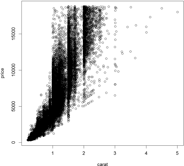
The ~ separating price and carat indicates that we are viewing price against carat where price is the y value and carat is the x value. Formulas are explained in more detail in Chapters 15 and 16.
It is also possible to build a scatterplot by simply specifying the x and y variables without the formula interface. This allows plotting of variables that are not necessarily in a data.frame.
> plot(diamonds$carat, diamonds$price)
Scatterplots are one of the most frequently used statistical graphs and will be detailed further using ggplot2 in Section 7.2.2.
7.1.3. Boxplots
Although boxplots are often among the first graphs taught to statistics students, they are a matter of great debate in the statistics community. Andrew Gelman from Columbia University has been very vocal in his displeasure with boxplots.1 However, other people such as Hadley Wickham2 and John Tukey are strong proponents of the boxplot. Given their ubiquity (deserved or not) it is important to learn them. Thankfully, R has the boxplot function (see Figure 7.3).
1. http://andrewgelman.com/2009/02/boxplot_challen/ and http://andrewgelman.com/2009/10/better_than_a_b/
2. http://vita.had.co.nz/papers/boxplots.pdf
> boxplot(diamonds$carat)

The idea behind the boxplot is that the thick middle line represents the median and the box is bounded by the first and third quartiles. That is, the middle 50% of data (the Interquartile Range or IQR) is held in the box. The lines extend out to 1.5*IQR in both directions. Outlier points are then plotted beyond that. It is important to note that while 50% of the data are very visible in the box, that means 50% of the data are not really displayed. That is a lot of information to not see.
As with other graphs previously discussed, more details will be provided using ggplot2 in Section 7.2.3.
Many objects, such as linear models and contingency tables, have built-in plot functions, which we will see later in the book.
7.2. ggplot2
While R’s base graphics are extremely powerful and flexible and can be customized to a great extent, using them can be labor intensive. Two packages—ggplot2 and lattice—were built to make graphing easier. Over the past few years ggplot2 has far exceeded lattice in popularity and features. We re-create all the previous graphs in Section 7.1 and expand the examples with more advanced features. Neither this chapter nor this book is an exhaustive review of ggplot2. But throughout this book, where there is a plot the accompanying code (mostly with ggplot2, although some use base graphics) is included.
Initially, the ggplot2 syntax is harder to grasp, but the effort is more than worthwhile. It is much easier to delineate data by color, shape, or size and add legends with ggplot2. Graphs are quicker to build. Graphs that could take 30 lines of code with base graphics are possible with just one line in ggplot2.
The basic structure for ggplot2 starts with the ggplot function,3 which at its most basic should take the data as its first argument. It can take more arguments, or fewer, but we will stick with that for now. After initializing the object, we add layers using the + symbol. To start, we will just discuss geometric layers such as points, lines and histograms. They are included using functions like geom point, geom line and geom histogram. These functions take multiple arguments, the most important being which variable in the data gets mapped to which axis or other aesthetic using aes. Furthermore, each layer can have different aesthetic mappings and even different data.
3. The package was previously called ggplot but early on Hadley made massive changes, so he upgraded the name to ggplot2.
7.2.1. ggplot2 Histograms and Densities
Returning to the histogram seen in Figure 7.1, we plot the distribution of diamond carats using ggplot2. This is built using ggplot and geom histogram. Because histograms are one-dimensional displays of data, we need to specify only one aesthetic mapping, the x-axis. Figure 7.4 shows the plot.
> ggplot(data = diamonds) + geom_histogram(aes(x = carat))

A similar display is the density plot, which is done by changing geom histogram to geom density. We also specify the color to fill in the graph using the fill argument. This differs from the color argument that we will see later. Also notice that the fill argument was entered outside the aes function. This is because we want the whole graph to be that color. We will see how it can be used inside aes later. This results in the graph shown in Figure 7.5
> ggplot(data = diamonds) + geom_density(aes(x = carat), fill = "grey50")
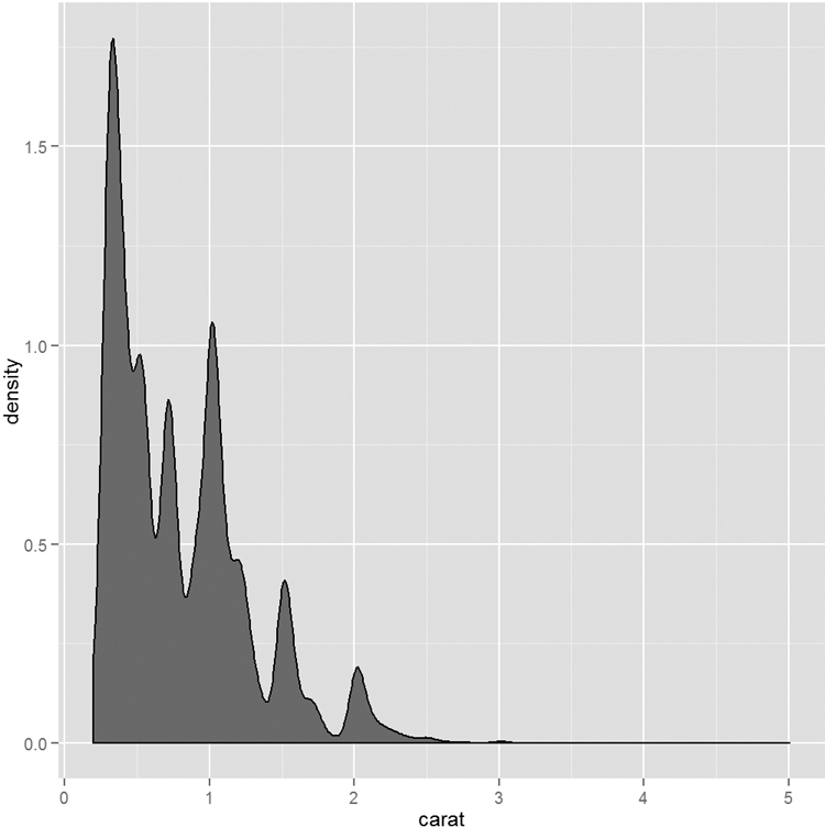
Whereas histograms display counts of data in buckets, density plots show the probability of observations falling within a sliding window along the variable of interest. The difference between the two is subtle but important. Histograms are more of a discrete measurement while density plots are more of a continuous measurement.
7.2.2. ggplot2 Scatterplots
Here we not only show the ggplot2 way of making scatterplots but also show off some of the power of ggplot2. We start by re-creating the simple scatterplot in Figure 7.2. Like before, we use ggplot to initialize the object, but this time we include aes inside the ggplot call instead of using it in the geom. The ggplot2 version is shown in Figure 7.6.
> ggplot(diamonds, aes(x = carat, y = price)) + geom_point()

In the next few examples we will be using ggplot(diamonds, aes(x=carat, y=price)) repeatedly, which ordinarily would require a lot of redundant typing. Fortunately we can save ggplot objects to variables and add layers later. We will save it to g. Notice that nothing is plotted.
> # save basics of ggplot object to a variable
> g <- ggplot(diamonds, aes(x = carat, y = price))
Going forward we can add any layer to g. Running g + geom point() would re-create the graph shown in Figure 7.6.
The diamonds data have many interesting variables we can examine. Let’s first look at color, which we will map to the color4 aesthetic in Figure 7.7.
4. ggplot will accept both the American (color) and British (colour) spellings.
> g + geom_point(aes(color = color))

Notice that we set color=color inside aes. This is because the designated color will be determined by the data. Also see that a legend was automatically generated. Recent versions of ggplot2 have added flexibility with the legend, which we will discuss later.
ggplot2 also has the ability to make faceted plots, or small multiples as Edward Tufte would say. This is done using facet wrap or facet grid. facet wrap takes the levels of one variable, cuts up the underlying data according to them, makes a separate pane for each set, and arranges them to fit in the plot, as seen in Figure 7.8. Here the row and column placement have no real meaning. facet grid acts similarly but assigns all levels of a variable to either a row or column as shown in Figure 7.9. In this case the upper left pane displays a scatterplot where the data are only for diamonds with Fair cut and I1 clarity. The pane to the right is a scatterplot where the data are only for diamonds with Fair cut and SI2 clarity. The pane in the second row, first column is a scatterplot where the data are only for diamonds with Good cut and I1 clarity. After understanding how to read one pane in this plot we can easily understand all the panes and make quick comparisons.
> g + geom_point(aes(color = color)) + facet_wrap(~color)
> g + geom_point(aes(color = color)) + facet_grid(cut ~ clarity)
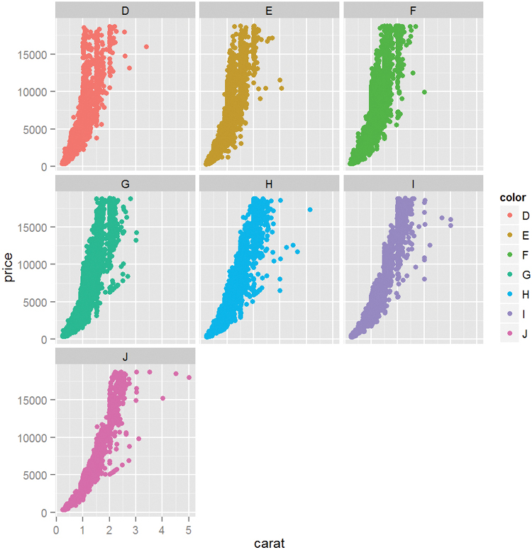
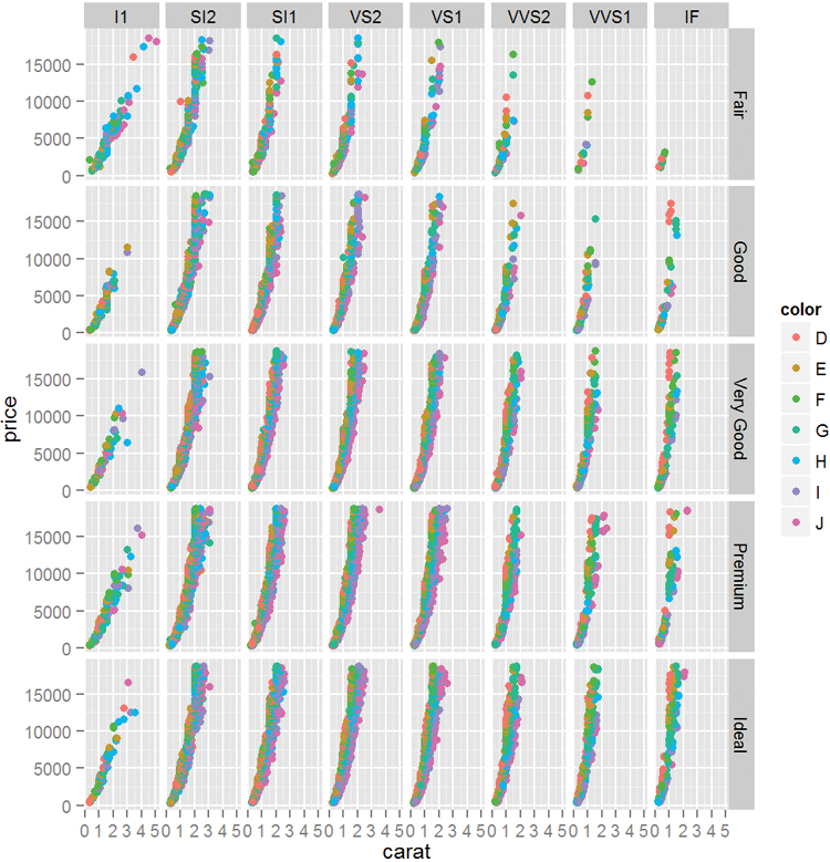
Figure 7.9 Scatterplot faceted by cut and clarity. Notice that cut is aligned vertically while clarity is aligned horizontally.
Faceting also works with histograms or any other geom as shown in Figure 7.10.
> ggplot(diamonds, aes(x = carat)) + geom_histogram() + facet_wrap(~color)

7.2.3. ggplot2 Boxplots and Violins Plots
Being a complete graphics package, ggplot2 offers a boxplot geom through geom boxplot. Even though it is one-dimensional, using a y aesthetic, there needs to be some x aesthetic, so we will use 1. The result is shown in Figure 7.11.
> ggplot(diamonds, aes(y = carat, x = 1)) + geom_boxplot()

This is neatly extended to drawing multiple boxplots, one for each level of a variable, as seen in Figure 7.12.
> ggplot(diamonds, aes(y = carat, x = cut)) + geom_boxplot()
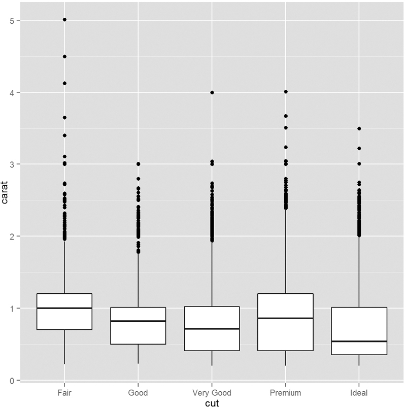
Getting fancy, we can swap out the boxplot for violin plots using geom violin as shown in Figure 7.13.
> ggplot(diamonds, aes(y = carat, x = cut)) + geom_violin()

Violin plots are similar to boxplots except that the boxes are curved, giving a sense of the density of the data. This provides more information than the straight sides of ordinary boxplots.
We can use multiple layers (geoms) on the same plot, as seen in Figure 7.14. Notice that the order of the layers matters. In the graph on the left, the points are underneath the violins, while in the graph on the right, the points are on top of the violins.
> ggplot(diamonds, aes(y = carat, x = cut)) + geom_point() + geom_violin()
> ggplot(diamonds, aes(y = carat, x = cut)) + geom_violin() + geom_point()

Figure 7.14 Violin plots with points. The graph on the left was built by adding the points geom and then the violin geom, while the plot on the right was built in the opposite order. The order in which the geoms are added determines the positioning of the layers.
7.2.4. ggplot2 Line Graphs
Line charts are often used when one variable has a certain continuity, but that is not always necessary because there is often a good reason to use a line with categorical data. Figure 7.15 shows an example of a line plot using the economics data from ggplot2. ggplot2 intelligently handles dates and plots them on a logical scale.
> ggplot(economics, aes(x = date, y = pop)) + geom_line()

While this worked just fine, it is sometimes necessary to use aes(group=1) with geom line. Yes, it is hacky, but it gets the job done, just like when plotting a single boxplot as in Section 7.2.3. It is a quirk of ggplot2 that sometimes lines cannot be plotted without a group aesthetic.
A common task for line plots is displaying a metric over the course of a year for many years. To prepare the economics data we will use Wickham’s lubridate package, which has convenient functions for manipulating dates. We need to create two new variables, year and month. To simplify things we will subset the data to include only years starting with 2000.
> # load the lubridate package
> require(lubridate)
>
> ## create year and month variables
> economics$year <- year(economics$date)
> # the label argument to month means that the result should be the
> # names of the month instead of the number
> economics$month <- month(economics$date, label=TRUE)
>
> # subset the data
> # the which function returns the indices of observations where the
> # tested condition was TRUE
> econ2000 <- economics[which(economics$year >= 2000), ]
>
> # load the scales package for better axis formatting
> require(scales)
>
> # build the foundation of the plot
> g <- ggplot(econ2000, aes(x=month, y=pop))
> # add lines color coded and grouped by year
> # the group aesthetic breaks the data into separate groups
> g <- g + geom_line(aes(color=factor(year), group=year))
> # name the legend "Year"
> g <- g + scale_color_discrete(name="Year")
> # format the y axis
> g <- g + scale_y_continuous(labels=comma)
> # add a title and axis labels
> g <- g + labs(title="Population Growth", x="Month", y="Population")
> # plot the graph
> g
Figure 7.16 contains many new concepts. The first part, ggplot(econ2000, aes(x=month, y=pop)) + geom line(aes(color=factor(year), group=year)), is code we have seen before; it creates the line graph with a separate line and color for each year. Notice that we converted year to a factor so that it would get a discrete color scale. That scale was named by using scale color discrete(name="Year"). The y-axis was formatted to have commas using scale y continuous(labels=comma). Last, the title, x-label and y-label were set with labs(title="Population Growth", x="Month", y="Population"). All of these pieces put together built a professional-looking, publication-quality graph.
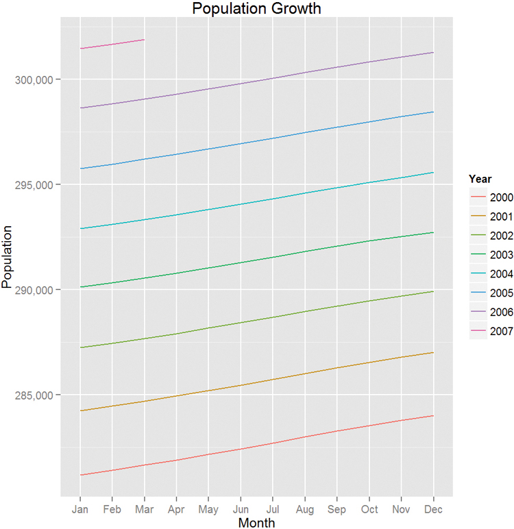
Also note the use of which to subset the data. This is similar to a where clause in SQL.
7.2.5. Themes
A great part of ggplot2 is the ability to use themes to easily change the way plots look. While building a theme from scratch can be daunting, Jeffrey Arnold from the University of Rochester has put together ggthemes, a package of themes to re-create commonly used styles of graphs. Just a few styles—The Economist, Excel, Edward Tufte and The Wall Street Journal—are exhibited in Figure 7.17.
> require(ggthemes)
> # build a plot and store it in g2
> g2 <- ggplot(diamonds, aes(x=carat, y=price)) +
+ geom_point(aes(color=color))
>
> # apply a few themes
> g2 + theme_economist() + scale_colour_economist()
> g2 + theme_excel() + scale_colour_excel()
> g2 + theme_tufte()
> g2 + theme_wsj()

Figure 7.17 Various themes from the ggthemes package. Starting from top left and going clockwise: The Economist, Excel (for those with bosses who demand Excel output), Edward Tufte and The Wall Street Journal.
7.3. Conclusion
We have seen both basic graphs and ggplot graphs that are both nicer and easier to create. We have covered histograms, scatterplots, boxplots, line plots and density graphs. We have also looked at using colors and small multiples for distinguishing data. There are many other features in ggplot2 such as jittering, stacking, dodging and alpha, which we will demonstrate in context throughout the book.