
Chapter 14. Probability Distributions
Being a statistical programming language, R easily handles all the basic necessities of statistics, including drawing random numbers and calculating distribution values (the focus of this chapter), means, variances, maxmima and minima, correlation and t-tests (the focus of Chapter 15).
Probability distributions lie at the heart of statistics, so naturally R provides numerous functions for making use of them. These include functions for generating random numbers and calculating the distribution and quantile.
14.1. Normal Distribution
Perhaps the most famous, and most used, statistical distribution is the normal distribution, sometimes referred to as the Gaussian distribution, which is defined as
where μ is the mean and σ the standard deviation. This is the famous bell curve that describes so many phenomena in life. To draw random numbers from the normal distribution use the rnorm function, which, optionally, allows the specification of the mean and standard deviation.
> # 10 draws from the standard 0-1 normal distribution
> rnorm(n = 10)
[1] -2.1654005 0.7044448 0.1545891 1.3325220 -0.1965996 1.3166821
[7] 0.2055784 0.7698138 0.4276115 -0.6209493
> # 10 draws from the 100-20 distribution
> rnorm(n = 10, mean = 100, sd = 20)
[1] 99.50443 86.81502 73.57329 113.36646 70.55072 95.70594
[7] 67.10154 99.49917 111.02245 114.16694
The density (the probability of a particular value) for the normal distribution is calculated using dnorm.
> randNorm10 <- rnorm(10)
> randNorm10
[1] -1.2376217 0.2989008 1.8963171 -1.1609135 -0.9199759 0.4251059
[7] -1.1112031 -0.3353926 -0.5533266 -0.5985041
> dnorm(randNorm10)
[1] 0.18548296 0.38151338 0.06607612 0.20335569 0.26129210 0.36447547
[7] 0.21517046 0.37712348 0.34231507 0.33352345
> dnorm(c(-1, 0, 1))
[1] 0.2419707 0.3989423 0.2419707
dnorm returns the probability of a specific number occurring. While it is technically mathematically impossible to find the exact probability of a number from a continuous distribution, this is an estimate of the probability. Like with rnorm, a mean and standard deviation can be specified for dnorm.
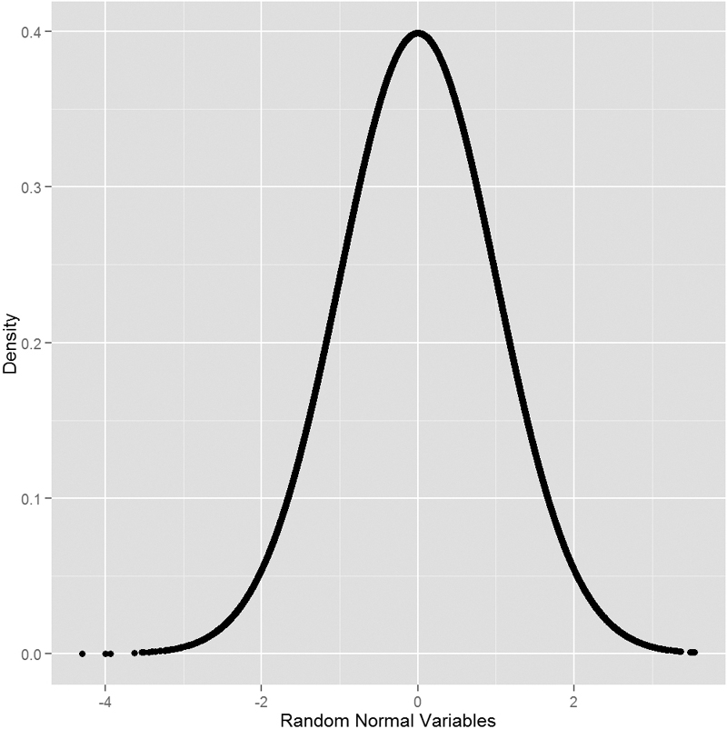
To see this visually we generate a number of normal random variables, calculate their distributions and then plot them. This should result in a nicely shaped bell curve, as seen in Figure 14.1.
> # generate the normal variables
> randNorm <- rnorm(30000)
> # calcualte their distributions
> randDensity <- dnorm(randNorm)
> # load ggplot2
> require(ggplot2)
> # plot them
> ggplot(data.frame(x = randNorm, y = randDensity)) + aes(x = x, y = y) +
+ geom_point() + labs(x = "Random Normal Variables", y = "Density")
Similarly, pnorm calculates the distribution of the normal distribution; that is, the cumulative probability that a given number, or smaller number, occurs. This is defined as
> pnorm(randNorm10)
[1] 0.1079282 0.6174921 0.9710409 0.1228385 0.1787927 0.6646203
[7] 0.1332405 0.3686645 0.2900199 0.2747518
> pnorm(c(-3, 0, 3))
[1] 0.001349898 0.500000000 0.998650102
> pnorm(-1)
[1] 0.1586553
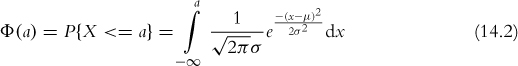
By default this is left-tailed. To find the probability that the variable falls between two points, we must calculate the two probabilities and subtract them from each other.
> pnorm(1) - pnorm(0)
[1] 0.3413447
> pnorm(1) - pnorm(-1)
[1] 0.6826895
This probability is represented by the area under the curve and illustrated in Figure 14.2, which is drawn by the following code.
> # a few things happen with this first line of code
> # the idea is to build a ggplot2 object that we can build upon later
> # that is why it is saved to p
> # we take randNorm and randDensity and put them into a data.frame
> # we declare the x and y axes outside of any other function
> # this just gives more flexibility
> # we add lines with geom_line()
> # x- and y-axis labels with labs(x="x", y="Density")
> p <- ggplot(data.frame(x=randNorm, y=randDensity)) + aes(x=x, y=y) +
+ geom_line() + labs(x="x", y="Density")
>
> # plotting p will print a nice distribution
> # to create a shaded area under the curve we first calculate that area
> # generate a sequence of numbers going from the far left to -1
> neg1Seq <- seq(from=min(randNorm), to=-1, by=.1)
>
> # build a data.frame of that sequence as x
> # the distribution values for that sequence as y
> lessThanNeg1 <- data.frame(x=neg1Seq, y=dnorm(neg1Seq))
>
> head(lessThanNeg1)
x y
1 -3.873328 0.0002203542
2 -3.773328 0.0003229731
3 -3.673328 0.0004686713
4 -3.573328 0.0006733293
5 -3.473328 0.0009577314
6 -3.373328 0.0013487051
>
> # combine this with endpoints at the far left and far right
> # the height is 0
> lessThanNeg1 <- rbind(c(min(randNorm), 0),
+ lessThanNeg1,
+ c(max(lessThanNeg1$x), 0))
>
> # use that shaded region as a polygon
> p + geom_polygon(data=lessThanNeg1, aes(x=x, y=y))
>
> # create a similar sequence going from -1 to 1
> neg1Pos1Seq <- seq(from=-1, to=1, by=.1)
>
> # build a data.frame of that sequence as x
> # the distribution values for that sequence as y
> neg1To1 <- data.frame(x=neg1Pos1Seq, y=dnorm(neg1Pos1Seq))
>
> head(neg1To1)
x y
1 -1.0 0.2419707
2 -0.9 0.2660852
3 -0.8 0.2896916
4 -0.7 0.3122539
5 -0.6 0.3332246
6 -0.5 0.3520653
>
> # combine this with endpoints at the far left and far right
> # the height is 0
> neg1To1 <- rbind(c(min(neg1To1$x), 0),
+ neg1To1,
+ c(max(neg1To1$x), 0))
>
> # use that shaded region as a polygon
> p + geom_polygon(data=neg1To1, aes(x=x, y=y))

Figure 14.2 Area under a normal curve. The plot on the left shows the area to the left of -1, while the plot on the right shows the area between -1 and 1.
The distribution has a non-decreasing shape, as shown in Figure 14.3. The information displayed here is the same as in Figure 14.2 but it is shown differently. Instead of the cumulative probability being shown as a shaded region it is displayed as a single point along the y-axis.
> randProb <- pnorm(randNorm)
> ggplot(data.frame(x=randNorm, y=randProb)) + aes(x=x, y=y) +
+ geom_point() + labs(x="Random Normal Variables", y="Probability")

The opposite of pnorm is qnorm. Given a cumulative probability it returns the quantile.
> randNorm10
[1] -1.2376217 0.2989008 1.8963171 -1.1609135 -0.9199759 0.4251059
[7] -1.1112031 -0.3353926 -0.5533266 -0.5985041
> qnorm(pnorm(randNorm10))
[1] -1.2376217 0.2989008 1.8963171 -1.1609135 -0.9199759 0.4251059
[7] -1.1112031 -0.3353926 -0.5533266 -0.5985041
> all.equal(randNorm10, qnorm(pnorm(randNorm10)))
[1] TRUE
14.2. Binomial Distribution
Like the normal distribution, the binomial distribution is well represented in R. Its probability mass function is
where
and n is the number of trials and p is the probability of success of a trial. The mean is np and the variance is np(1 – p). When n = 1 this reduces to the Bernoulli distribution.
Generating random numbers from the binomial distribution is not simply generating random numbers but rather generating the number of successes of independent trials. To simulate the number of successes out of ten trials with probability 0.4 of success, we run rbinom with n=1 (only one run of the trials), size=10 (trial size of 10), and prob=0.4 (probability of success is 0.4).
> rbinom(n = 1, size = 10, prob = 0.4)
[1] 6
That is to say that ten trials were conducted, each with 0.4 probability of success, and the number generated is the number that succeeded. As this is random, different numbers will be generated each time.
By setting n to anything greater than 1, R will generate the number of successes for each of the n sets of size trials.
> rbinom(n = 1, size = 10, prob = 0.4)
[1] 3
> rbinom(n = 5, size = 10, prob = 0.4)
[1] 5 3 6 5 4
> rbinom(n = 10, size = 10, prob = 0.4)
[1] 5 3 4 4 5 3 3 5 3 3
Setting size to 1 turns the numbers into a Bernoulli random variable, which can take on only the value 1 (success) or 0 (failure).
> rbinom(n = 1, size = 1, prob = 0.4)
[1] 1
> rbinom(n = 5, size = 1, prob = 0.4)
[1] 0 0 1 1 1
> rbinom(n = 10, size = 1, prob = 0.4)
[1] 0 0 0 1 0 1 0 0 1 0
To visualize the binomial distribution we randomly generate 10,000 experiments, each with 10 trials and 0.3 probability of success. This is seen in Figure 14.4, which shows that the most common number of successes is 3, as expected.
> binomData <- data.frame(Successes = rbinom(n = 10000, size = 10,
+ prob = 0.3))
> ggplot(binomData, aes(x = Successes)) + geom_histogram(binwidth = 1)

Figure 14.4 Ten thousand runs of binomial experiments with ten trials each and probability of success of 0.3.
To see how the binomial distribution is well approximated by the normal distribution as the number of trials grows large, we run similar experiments with differing numbers of trials and graph the results, as shown in Figure 14.5, on page 181.
> # create a data.frame with Successes being the 10,000 random draws
> # Size equals 5 for all 10,000 rows
> binom5 <- data.frame(Successes=rbinom(n=10000, size=5,
+ prob=.3), Size=5)
> dim(binom5)
[1] 10000 2
> head(binom5)
Successes Size
1 1 5
2 1 5
3 2 5
4 2 5
5 3 5
6 0 5
>
> # similar to before, still 10,000 rows
> # numbers are drawn from a distribution with a different size
> # Size now equals 10 for all 10,000 rows
> binom10 <- data.frame(Successes=rbinom(n=10000, size=10,
+ prob=.3), Size=10)
> dim(binom10)
[1] 10000 2
> head(binom10)
Successes Size
1 1 10
2 3 10
3 3 10
4 3 10
5 0 10
6 3 10
>
> binom100 <- data.frame(Successes=rbinom(n=10000, size=100,
+ prob=.3), Size=100)
>
> binom1000 <- data.frame(Successes=rbinom(n=10000, size=1000,
+ prob=.3), Size=1000)
>
> # combine them all into one data.frame
> binomAll <- rbind(binom5, binom10, binom100, binom1000)
> dim(binomAll)
[1] 40000 2
> head(binomAll, 10)
Successes Size
1 1 5
2 1 5
3 2 5
4 2 5
5 3 5
6 0 5
7 1 5
8 1 5
9 1 5
10 1 5
> tail(binomAll, 10)
Successes Size
39991 316 1000
39992 311 1000
39993 296 1000
39994 316 1000
39995 288 1000
39996 286 1000
39997 264 1000
39998 291 1000
39999 300 1000
40000 302 1000
>
> # build the plot
> # histograms only need an x aesthetic
> # it is faceted (broken up) based on the values of Size
> # these are 5, 10, 100, 1000
> ggplot(binomAll, aes(x=Successes)) + geom_histogram() +
+ facet_wrap(~ Size, scales="free")

Figure 14.5 Random binomial histograms faceted by trial size. Notice that while not perfect, as the number of trials increases the distribution appears more normal. Also note the differing scales in each pane.
The cumulative distribution function is
where n and p are the number of trials and the probability of success, respectively, as before.
Similar to the normal distribution functions, dbinom and pbinom provide the density (probability of an exact value) and distribution (cumulative probability), respectively, for the binomial distribution.
> # probability of 3 successes out of 10
> dbinom(x = 3, size = 10, prob = 0.3)
[1] 0.2668279
> # probability of 3 or fewer successes out of 10
> pbinom(q = 3, size = 10, prob = 0.3)
[1] 0.6496107
> # both functions can be vectorized
> dbinom(x = 1:10, size = 10, prob = 0.3)
[1] 0.1210608210 0.2334744405 0.2668279320 0.2001209490 0.1029193452
[6] 0.0367569090 0.0090016920 0.0014467005 0.0001377810 0.0000059049
> pbinom(q = 1:10, size = 10, prob = 0.3)
[1] 0.1493083 0.3827828 0.6496107 0.8497317 0.9526510 0.9894079
[7] 0.9984096 0.9998563 0.9999941 1.0000000
Given a certain probability, qbinom returns the quantile, which for this distribution is the number of successes.
> qbinom(p = 0.3, size = 10, prob = 0.3)
[1] 2
> qbinom(p = c(0.3, 0.35, 0.4, 0.5, 0.6), size = 10, prob = 0.3)
[1] 2 2 3 3 3
14.3. Poisson Distribution
Another popular distribution is the Poisson distribution, which is for count data. Its probability mass function is
and the cumulative distribution is

where λ is both the mean and variance.
To generate random counts, the density, the distribution and quantiles use rpois, dpois, ppois and qpois, respectively.
As λ grows large the Poisson distribution begins to resemble the normal distribution. To see this we will simulate 10,000 draws from the Poisson distribution and plot their histograms to see the shape.
> # generate 10,000 random counts from 5 different Poisson distributions
> pois1 <- rpois(n=10000, lambda=1)
> pois2 <- rpois(n=10000, lambda=2)
> pois5 <- rpois(n=10000, lambda=5)
> pois10 <- rpois(n=10000, lambda=10)
> pois20 <- rpois(n=10000, lambda=20)
> pois <- data.frame(Lambda.1=pois1, Lambda.2=pois2,
+ Lambda.5=pois5, Lambda.10=pois10, Lambda.20=pois20)
> # load reshape2 package to melt the data to make it easier to plot
> require(reshape2)
> # melt the data into a long format
> pois <- melt(data=pois, variable.name="Lambda", value.name="x")
> # load the stringr package to help clean up the new column name
> require(stringr)
> # clean up the Lambda to just show the value for that lambda
> pois$Lambda <- as.factor(as.numeric(str_extract(string=pois$Lambda,
+ pattern="\d+")))
> head(pois)
Lambda x
1 1 0
2 1 2
3 1 0
4 1 1
5 1 2
6 1 0
> tail(pois)
Lambda x
49995 20 26
49996 20 14
49997 20 26
49998 20 22
49999 20 20
50000 20 23
Now we will plot a separate histogram for each value of λ, as shown in Figure 14.6.
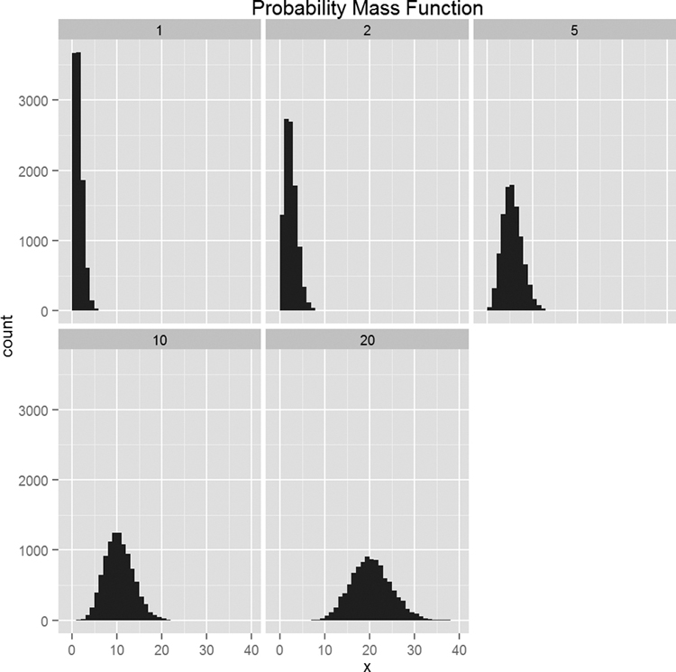
Figure 14.6 Histograms for 10,000 draws from the Poisson distribution at varying levels of λ. Notice how the histograms become more like the normal distribution.
> require(ggplot2)
> ggplot(pois, aes(x=x)) + geom_histogram(binwidth=1) +
+ facet_wrap(~ Lambda) + ggtitle("Probability Mass Function")
Another, perhaps more compelling, way to visualize this convergence to normality is within overlaid density plots, as seen in Figure 14.7.
> ggplot(pois, aes(x=x)) +
+ geom_density(aes(group=Lambda, color=Lambda, fill=Lambda),
+ adjust=4, alpha=1/2) +
+ scale_color_discrete() + scale_fill_discrete() +
+ ggtitle("Probability Mass Function")

Figure 14.7 Density plots for 10,000 draws from the Poisson distribution at varying levels of λ. Notice how the density plots become more like the normal distribution.
14.4. Other Distributions
R supports many distributions, some of which are very common, while others are quite obscure. They are listed in Table 14.1; the mathematical formulas, means and variances are in Table 14.2.


Table 14.2 Formulas, Means and Variances for Various Statistical Distributions
(The B in the F distribution is the beta function, ![]()
14.5. Conclusion
R facilitates the use of many different probability distributions through the various random number, density, distribution and quantile functions outlined in Table 14.1. We focused on three distributions—normal, Bernoulli and Poisson—in detail as they are the most commonly used. The formulas for every distribution available in the base packages of R, along with their means and variances, are listed in Table 14.2.