
Chapter 20. Nonlinear Models
A key tenet of linear models is a linear relationship, which is actually reflected in the coefficients, not the predictors. While this is a nice simplifying assumption, in reality nonlinearity often holds. Fortunately, modern computing makes fitting nonlinear models not much more difficult than fitting linear models. Typical implementations are nonlinear least squares, splines, decision trees and random forests and generalized additive models (GAMs).
20.1. Nonlinear Least Squares
The nonlinear least squares model uses squared error loss to find the optimal parameters of a generic (nonlinear) function of the predictors.
A common application for a nonlinear model is using the location of WiFi-connected devices to determine the location of the WiFi hotspot. In a problem like this, the locations of the devices in a two-dimensional grid are known, and they report their distance to the hotspot but with some random noise due to the fluctuation of the signal strength. A sample dataset is available at http://jaredlander.com/data/wifi.rdata.
> load("data/wifi.rdata")
> head(wifi)
Distance x y
1 21.87559 28.60461 68.429628
2 67.68198 90.29680 29.155945
3 79.25427 83.48934 0.371902
4 44.73767 61.39133 80.258138
5 39.71233 19.55080 83.805855
6 56.65595 71.93928 65.551340
This dataset is easy to plot with ggplot2. The x- and y-axes are the device’s positions in the grid and the color represents how far the device is from the hotspot, blue being closer and red being farther (see Figure 20.1).
> require(ggplot2)
> ggplot(wifi, aes(x=x, y=y, color=Distance)) + geom_point() +
+ scale_color_gradient2(low="blue", mid="white", high="red",
+ midpoint=mean(wifi$Distance))
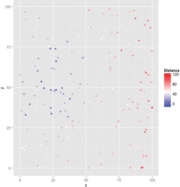
Figure 20.1 Plot of WiFi device position colored by distance from the hotspot. Blue points are closer and red points are farther.
The distance between a device i and the hotspot is
where βx and βy are the unknown x- and y-coordinates of the hotspot.
A standard function in R for computing nonlinear least squares is nls. Since these problems are usually intractable, numerical methods are used, which can be sensitive to starting values, so best guesses need to be specified. The function takes a formula—just like lm—except the equation and coefficients are explicitly specified. The starting values for the coefficients are given in a named list.
> # specify the square root model
> # starting values are at the center of the grid
> wifiMod1 <- nls(Distance ~ sqrt((betaX - x)^2 + (betaY - y)^2),
+ data = wifi, start = list(betaX = 50, betaY = 50))
> summary(wifiMod1)
Formula: Distance ~ sqrt((betaX - x)^2 + (betaY - y)^2)
Parameters:
Estimate Std. Error t value Pr(>|t|)
betaX 17.851 1.289 13.85 <2e-16 ***
betaY 52.906 1.476 35.85 <2e-16 ***
---
Signif. codes: 0 '***' 0.001 '**' 0.01 '*' 0.05 '.' 0.1 ' ' 1
Residual standard error: 13.73 on 198 degrees of freedom
Number of iterations to convergence: 6
Achieved convergence tolerance: 3.846e-06
This estimates that the hotspot is located at 17.8506668, 52.9056438. Plotting this in Figure 20.2, we see that the hotspot is located amidst the “close” blue points, indicating a good fit.
> ggplot(wifi, aes(x = x, y = y, color = Distance)) + geom_point() +
+ scale_color_gradient2(low = "blue", mid = "white", high = "red",
+ midpoint = mean(wifi$Distance)) +
+ geom_point(data = as.data.frame(t(coef(wifiMod1))),
+ aes(x = betaX, y = betaY), size = 5, color = "green")

Figure 20.2 Plot of WiFi devices. The hotspot is the large green dot. Its position in the middle of the blue dots indicates a good fit.
20.2. Splines
A smoothing spline can be used to fit a smooth to data that exhibit nonlinear behavior and even make predictions on new data. A spline is a function f that is a linear combination of N functions (one for each unique data point) that are transformations of the variable x.

The goal is to find the function f that minimizes

where λ is the smoothing parameter. Small λ s make for a rough smooth and large λs make for a smooth smooth.
This is accomplished in R using smooth.spline. It returns a list of items where x holds the unique values of the data, y are the corresponding fitted values and df is the degrees of freedom used. We demonstrate with the diamonds data.
> data(diamonds)
> # fit with a few different degrees of freedom
> # the degrees of freedom must be greater than 1
> # but less than the number of unique x values in the data
> diaSpline1 <- smooth.spline(x=diamonds$carat, y=diamonds$price)
> diaSpline2 <- smooth.spline(x=diamonds$carat, y=diamonds$price,
+ df=2)
> diaSpline3 <- smooth.spline(x=diamonds$carat, y=diamonds$price,
+ df=10)
> diaSpline4 <- smooth.spline(x=diamonds$carat, y=diamonds$price,
+ df=20)
> diaSpline5 <- smooth.spline(x=diamonds$carat, y=diamonds$price,
+ df=50)
> diaSpline6 <- smooth.spline(x=diamonds$carat, y=diamonds$price,
+ df=100)
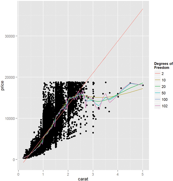
To plot these we extract the information from the objects, build a data.frame, then add a new layer on top of the standard scatterplot of the diamonds data. Figure 20.3 shows this. Fewer degrees of freedom leads to straighter fits while higher degrees of freedom leads to more interpolating lines.
> get.spline.info <- function(object)
+ {
+ data.frame(x=object$x, y=object$y, df=object$df)
+ }
>
> require(plyr)
> # combine results into one data.frame
> splineDF <- ldply(list(diaSpline1, diaSpline2, diaSpline3,
+ diaSpline4, diaSpline5, diaSpline6),
get.spline.info)
> head(splineDF)
x y df
1 0.20 361.9112 101.9053
2 0.21 397.1761 101.9053
3 0.22 437.9095 101.9053
4 0.23 479.9756 101.9053
5 0.24 517.0467 101.9053
6 0.25 542.2470 101.9053
>
> g <- ggplot(diamonds, aes(x=carat, y=price)) + geom_point()
> g + geom_line(data=splineDF,
+ aes(x=x, y=y, color=factor(round(df, 0)),
+ group=df)) + scale_color_discrete("Degrees of nFreedom")
Making predictions on new data is done, as usual, with predict.
Another type of spline is the basis spline, which creates new predictors based on transformations of the original predictors. The best basis spline is the natural cubic spline because it creates smooth transitions at interior breakpoints and forces linear behavior beyond the endpoints of the input data. A natural cubic spline with K breakpoints (knots) is made of K basis functions
where
and ξ is the location of a knot and t+ denotes the positive part of t.
While the math may seem complicated, natural cubic splines are easily fitted using ns from the splines package. It takes a predictor variable and the number of new variables to return.
> require(splines)
> head(ns(diamonds$carat, df = 1))
1
[1,] 0.00500073
[2,] 0.00166691
[3,] 0.00500073
[4,] 0.01500219
[5,] 0.01833601
[6,] 0.00666764
> head(ns(diamonds$carat, df = 2))
1 2
[1,] 0.013777685 -0.007265289
[2,] 0.004593275 -0.002422504
[3,] 0.013777685 -0.007265289
[4,] 0.041275287 -0.021735857
[5,] 0.050408348 -0.026525299
[6,] 0.018367750 -0.009684459
> head(ns(diamonds$carat, df = 3))
1 2 3
[1,] -0.03025012 0.06432178 -0.03404826
[2,] -0.01010308 0.02146773 -0.01136379
[3,] -0.03025012 0.06432178 -0.03404826
[4,] -0.08915435 0.19076693 -0.10098109
[5,] -0.10788271 0.23166685 -0.12263116
[6,] -0.04026453 0.08566738 -0.04534740
> head(ns(diamonds$carat, df = 4))
1 2 3 4
[1,] 3.214286e-04 -0.04811737 0.10035562 -0.05223825
[2,] 1.190476e-05 -0.01611797 0.03361632 -0.01749835
[3,] 3.214286e-04 -0.04811737 0.10035562 -0.05223825
[4,] 8.678571e-03 -0.13796549 0.28774667 -0.14978118
[5,] 1.584524e-02 -0.16428790 0.34264579 -0.17835789
[6,] 7.619048e-04 -0.06388053 0.13323194 -0.06935141
These new predictors can then be used in any model just like any other predictor. More knots means a more interpolating fit. Plotting the result of a natural cubic spline overlaid on data is easy with ggplot2. Figure 20.4a shows this for the diamonds data and

six knots, and Figure 20.4b shows it with three knots. Notice that having six knots fits the data more smoothly.
> g <- ggplot(diamonds, aes(x = carat, y = price)) + geom_point()
> g + stat_smooth(method = "lm", formula = y ~ ns(x, 6), color = "blue")
> g + stat_smooth(method = "lm", formula = y ~ ns(x, 3), color = "red")
20.3. Generalized Additive Models
Another method for fitting nonlinear models is generalized additive models (GAMs), which fit a separate smoothing function on each predictor independently. As the name implies, these are general and work in a number of regression contexts, meaning the response can be continuous, binary, count and other types. Like many of the best modern techniques in machine learning, this is the brainchild of Trevor Hastie and Robert Tibshirani based on work from John Chambers, the creator of S, the precursor of R.
They are specified as
where X1, X2, . . ., Xp are ordinary predictors and the fj’s are any smoothing functions.
The mgcv package fits GAMs with a syntax very similar to glm. To illustrate we use data on credit scores from the University of California–Irvine Machine Learning Repository at http://archive.ics.uci.edu/ml/datasets/Statlog+(German+Credit+Data). The data are stored in a space-separated text file with no headers where categorical data have been labeled with nonobvious codes. This arcane file format goes back to a time when data storage was more limited but has, for some reason, persisted.
The first step is reading the data like any other file except that the column names need to be specified.
> # make vector of column names
> creditNames <- c("Checking", "Duration", "CreditHistory",
+ "Purpose", "CreditAmount", "Savings", "Employment",
+ "InstallmentRate", "GenderMarital", "OtherDebtors",
+ "YearsAtResidence", "RealEstate", "Age",
+ "OtherInstallment", "Housing", "ExistingCredits", "Job",
+ "NumLiable", "Phone", "Foreign", "Credit")
>
> # use read.table to read the file
> # specify that headers are not included
> # the col.names are from creditNames
> theURL <- "http://archive.ics.uci.edu/ml/
+ machine-learning-databases/statlog/german/german.data
> credit <- read.table(the URL sep = " ", header = FALSE,
+ col.names = creditNames,
+ stringsAsFactors = FALSE)
>
> head(credit)
Checking Duration CreditHistory Purpose CreditAmount Savings
1 A11 6 A34 A43 1169 A65
2 A12 48 A32 A43 5951 A61
3 A14 12 A34 A46 2096 A61
4 A11 42 A32 A42 7882 A61
5 A11 24 A33 A40 4870 A61
6 A14 36 A32 A46 9055 A65
Employment InstallmentRate GenderMarital OtherDebtors
1 A75 4 A93 A101
2 A73 2 A92 A101
3 A74 2 A93 A101
4 A74 2 A93 A103
5 A73 3 A93 A101
6 A73 2 A93 A101
YearsAtResidence RealEstate Age OtherInstallment Housing
1 4 A121 67 A143 A152
2 2 A121 22 A143 A152
3 3 A121 49 A143 A152
4 4 A122 45 A143 A153
5 4 A124 53 A143 A153
6 4 A124 35 A143 A153
ExistingCredits Job NumLiable Phone Foreign Credit
1 2 A173 1 A192 A201 1
2 1 A173 1 A191 A201 2
3 1 A172 2 A191 A201 1
4 1 A173 2 A191 A201 1
5 2 A173 2 A191 A201 2
6 1 A172 2 A192 A201 1
Now comes the unpleasant task of translating the codes to meaningful data. To save time and effort we decode only the variables we care about for a simple model. The simplest way of decoding is to create named vectors where the name is the code and the value is the new data.
> # before
> head(credit[, c("CreditHistory", "Purpose", "Employment", "Credit")])
CreditHistory Purpose Employment Credit
1 A34 A43 A75 1
2 A32 A43 A73 2
3 A34 A46 A74 1
4 A32 A42 A74 1
5 A33 A40 A73 2
6 A32 A46 A73 1
>
> creditHistory <- c(A30 = "All Paid", A31 = "All Paid This Bank",
+ A32 = "Up To Date", A33 = "Late Payment",
+ A34 = "Critical Account")
>
> purpose <- c(A40 = "car (new)", A41 = "car (used)",
+ A42 = "furniture/equipment", A43 = "radio/television",
+ A44 = "domestic appliances", A45 = "repairs",
+ A46 = "education", A47 = "(vacation - does not exist?)",
+ A48 = "retraining", A49 = "business", A410 = "others")
>
> employment <- c(A71 = "unemployed", A72 = "< 1 year",
+ A73 = "1 - 4 years", A74 = "4 - 7 years", A75 = ">= 7 years")
>
> credit$CreditHistory <- creditHistory[credit$CreditHistory]
> credit$Purpose <- purpose[credit$Purpose]
> credit$Employment <- employment[credit$Employment]
>
> # code credit as good/bad
> credit$Credit <- ifelse(credit$Credit == 1, "Good", "Bad")
> # make good the base levels
> credit$Credit <- factor(credit$Credit, levels = c("Good", "Bad"))
>
> # after
> head(credit[, c("CreditHistory", "Purpose", "Employment",
"Credit")])
CreditHistory Purpose Employment Credit
1 Critical Account radio/television >= 7 years Good
2 Up To Date radio/television 1 - 4 years Bad
3 Critical Account education 4 - 7 years Good
4 Up To Date furniture/equipment 4 - 7 years Good
5 Late Payment car (new) 1 - 4 years Bad
6 Up To Date education 1 - 4 years Good
Viewing the data will help give a sense of the relationship between the variables. Figures 20.5 and 20.6 show that there is not a clear linear relationship, so a GAM may be appropriate.
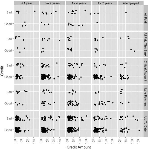
Figure 20.5 Plot of good credit versus bad based on credit amount, credit history and employment status.

Figure 20.6 Plot of age versus credit amount faceted by credit history and employment status, color coded by credit.
> require(useful)
> ggplot(credit, aes(x=CreditAmount, y=Credit)) +
+ geom_jitter(position = position_jitter(height = .2)) +
+ facet_grid(CreditHistory ~ Employment) +
+ xlab("Credit Amount") +
+ theme(axis.text.x=element_text(angle=90, hjust=1, vjust=.5)) +
+ scale_x_continuous(labels=multiple)
>
> ggplot(credit, aes(x=CreditAmount, y=Age)) +
+ geom_point(aes(color=Credit)) +
+ facet_grid(CreditHistory ~ Employment) +
+ xlab("Credit Amount") +
+ theme(axis.text.x=element_text(angle=90, hjust=1, vjust=.5)) +
+ scale_x_continuous(labels=multiple)
Using gam is very similar to using other modeling functions like lm and glm that take a formula argument. The difference is that continuous variables, such as CreditAmount and Age, can be transformed using a nonparametric smoothing function such as a spline or tensor product.1
1. Tensor products are a way of representing transformation functions of predictors, possibly measured on different units.
> require(mgcv)
> # fit a logistic GAM
> # apply a tensor product on CreditAmount and a spline on Age
> creditGam <- gam(Credit ~ te(CreditAmount) + s(Age) + CreditHistory +
+ Employment,
+ data=credit, family=binomial(link="logit"))
> summary(creditGam)
Family: binomial
Link function: logit
Formula:
Credit ~ te(CreditAmount) + s(Age) + CreditHistory + Employment
Parametric coefficients:
Estimate Std. Error z value Pr(>|z|)
(Intercept) 0.662840 0.372377 1.780 0.07507
CreditHistoryAll Paid This Bank 0.008412 0.453267 0.019 0.98519
CreditHistoryCritical Account -1.809046 0.376326 -4.807 1.53e-06
CreditHistoryLate Payment -1.136008 0.412776 -2.752 0.00592
CreditHistoryUp To Date -1.104274 0.355208 -3.109 0.00188
Employment>= 7 years -0.388518 0.240343 -1.617 0.10598
Employment1 - 4 years -0.380981 0.204292 -1.865 0.06220
Employment4 - 7 years -0.820943 0.252069 -3.257 0.00113
Employmentunemployed -0.092727 0.334975 -0.277 0.78192
(Intercept) .
CreditHistoryAll Paid This Bank
CreditHistoryCritical Account ***
CreditHistoryLate Payment **
CreditHistoryUp To Date **
Employment>= 7 years
Employment1 - 4 years .
Employment4 - 7 years **
Employmentunemployed
---
Signif. codes: 0 '***' 0.001 '**' 0.01 '*' 0.05 '.' 0.1 ' ' 1
Approximate significance of smooth terms:
edf Ref.df Chi.sq p-value
te(CreditAmount) 2.415 2.783 20.79 0.000112 ***
s(Age) 1.932 2.435 6.13 0.068957 .
---
Signif. codes: 0 '***' 0.001 '**' 0.01 '*' 0.05 '.' 0.1 ' ' 1
R-sq.(adj) = 0.0922 Deviance explained = 8.57%
UBRE score = 0.1437 Scale est. = 1 n = 1000
The smoother is fitted automatically in the fitting process and can be viewed after the fact. Figure 20.7 shows CreditAmount and Age with their applied smoothers, a tensor product and a spline, respectively. The gray, shaded area represents the confidence interval for the smooths.
> plot(creditGam, select = 1, se = TRUE, shade = TRUE)
> plot(creditGam, select = 2, se = TRUE, shade = TRUE)

Figure 20.7 The smoother result for fitting a GAM on credit data. The shaded region represents two pointwise standard deviations.
20.4. Decision Trees
A relatively modern technique for fitting nonlinear models is the decision tree. Decision trees work for both regression and classification by performing binary splits on the recursive predictors.
For regression trees, the predictors are partitioned into M regions R1, R2, . . ., RM and the response y is modeled as the average for a region with
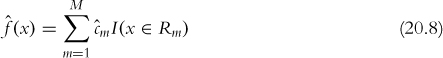
where
is the average y value for the region.
The method for classification trees is similar. The predictors are partitioned into M regions and the proportion of each class in each of the regions, ![]() , is calculated as
, is calculated as

where Nm is the number of items in region m and the summation counts the number of observations of class k in region m.
Trees can be calculated with the rpart function in rpart. Like other modeling functions, it uses the formula interface but does not take interactions.
> require(rpart)
> creditTree <- rpart(Credit ~ CreditAmount + Age +
+ CreditHistory + Employment, data = credit)
Printing the object displays the tree in text form.
> creditTree
n= 1000
node), split, n, loss, yval, (yprob)
* denotes terminal node
1) root 1000 300 Good (0.7000000 0.3000000)
2) CreditHistory=Critical Account,Late Payment,Up To
Date 911 247 Good (0.7288694 0.2711306)
4) CreditAmount< 7760.5 846 211 Good (0.7505910 0.2494090) *
5) CreditAmount>=7760.5 65 29 Bad (0.4461538 0.5538462)
10) Age>=29.5 40 17 Good (0.5750000 0.4250000)
20) Age< 38.5 19 4 Good (0.7894737 0.2105263) *
21) Age>=38.5 21 8 Bad (0.3809524 0.6190476) *
11) Age< 29.5 25 6 Bad (0.2400000 0.7600000) *
3) CreditHistory=All Paid,All Paid This Bank 89 36
Bad (0.4044944 0.5955056) *
The printed tree has one line per node. The first node is the root for all the data and shows that there are 1,000 observations of which 300 are considered “Bad.” The next level of indentation is the first split, which is on CreditHistory. One direction—where CreditHistory equals either “Critical Account,” “Late Payment” or “Up To Date”—contains 911 observations of which 247 are considered “Bad.” This has a 73% probability of having good credit. The other direction—where CreditHistory equals either “All Paid” or “All Paid This Bank”—has a 60% probability of having bad credit. The next level of indentation represents the next split.
Continuing to read the results this way could be laborious; plotting will be easier. Figure 20.8 shows the splits. Nodes split to the left meet the criteria while nodes to the right do not. Each terminal node is labelled by the predicted class, either “Good” or “Bad.” The percentage is read from left to right, with the probability of being “Good” on the left.
> require(rpart.plot)
> rpart.plot(creditTree, extra = 4)
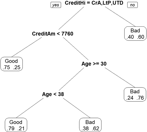
Figure 20.8 Display of decision tree based on credit data. Nodes split to the left meet the criteria while nodes to the right do not. Each terminal node is labeled by the predicted class, either “Good” or “Bad.” The percentage is read from left to right, with the probability of being “Good” on the left.
While trees are easy to interpret and fit data nicely, they tend to be unstable with high variance due to overfitting. A slight change in the training data can cause a significant difference in the model.
20.5. Random Forests
Random forests are a type of ensemble method. An ensemble method is a process in which numerous models are fitted and the results are combined for stronger predictions. While this provides great predictions, inference and explainability are often limited. Random forests are composed of a number of decision trees where the included predictors are chosen at random. The name comes from randomly building trees to make a forest.
In the case of the credit data we will use CreditHistory, Purpose, Employment, Duration, Age and CreditAmount. Some trees will have just CreditHistory and Employment, another will have Purpose, Employment and Age, while another will have CreditHistory, Purpose, Employment and Age. All of these different trees cover all the bases and make for a random forest that should have strong predictive power.
Fitting the random forest is done with randomForest from the randomForest package. Normally, randomForest can be used with a formula, but sometimes that fails and individual predictor and response matrices should be supplied.
> require(useful)
> require(randomForest)
> # build the predictor and response matrices
> creditFormula <- Credit ~ CreditHistory + Purpose + Employment +
+ Duration + Age + CreditAmount
> creditX <- build.x(creditFormula, data=credit)
> creditY <- build.y(creditFormula, data=credit)
>
> # fit the random forest
> creditForest <- randomForest(x=creditX, y=creditY)
>
> creditForest
Call:
randomForest(x = creditX, y = creditY)
Type of random forest: classification
Number of trees: 500
No. of variables tried at each split: 4
OOB estimate of error rate: 28.2%
Confusion matrix:
Good Bad class.error
Good 649 51 0.07285714
Bad 231 69 0.77000000
The displayed information shows that 500 trees were built and four variables were assessed at each split; the confusion matrix shows that this is not exactly the best fit and that there is room for improvement.
20.6. Conclusion
With modern computing power, the previously necessary simplifying assumptions of linearity and normality are starting to give way to nonparametric techniques. Popular implementations are nonlinear least squares, splines, generalized additive models, decision trees and random forests. As with every other method, these all have their benefits and costs.