16
Layouts with CSS Grid and Flexbox
In the last chapter, you learned the finer points of how the box model can be styled, and some of the longer-standing methods for manipulating layout.
But new tools have been introduced in CSS to give you better control over your markup and to give it more semantic meaning. Those tools are the CSS Grid Layout Module and the CSS Flexible Box Layout Module, known more familiarly as CSS Grid and Flexbox. In this chapter, you’ll learn what they are, how they work, and when to use each.
Modern Solutions for an Important Problem
Part of the reason Flexbox and CSS Grid (or simply Grid) have emerged is because they are a modern solution to an important problem: creating flexible layouts that work properly on different screen sizes.
With the advent of responsive web design (RWD), floating elements to create column layouts revealed a critical bug that also affected SEO: you could not control the stacking order.
That means if you float the aside element, as in Chapter 15, that element needs to go above the main content. Search engines will prioritize the aside, and if you stack the content, the aside will always be first (Video 16.1).
CSS Grid vs. Flexbox: Which should you use?
This chapter shows you both CSS Grid and Flexbox, but it’s good to know what the difference is so that you can keep it in mind moving forward.
The most common answer to this question is that Flexbox organizes content in one dimension—by rows or columns. CSS Grid organizes content in two dimensions—rows and columns.
Both are well supported by browsers at this point, as these tables at caniuse.com demonstrate (FIGURES 16.1 and 16.2).

Figure 16.1 Browser support for Flexbox

Figure 16.2 Browser support for CSS Grid
And both give you similar results quickly (FIGURES 16.3 and 16.4).

Figure 16.3 A simple Flexbox example

Figure 16.4 A simple CSS Grid example
What you’ll quickly find is that CSS Grid is a bit more granular. Before we dig into that, let’s take a look at Flexbox.
Using Flexbox
We start by setting the display property to the value flex, which will lay out the element and its children according to the CSS Flexible Box Layout Module, known by its close friends as Flexbox.
It essentially enables you to use a set of properties that also use the word flex in the parent and child elements.
All of these properties have default values, so you will see results as soon as you use the display property to enable Flexbox. Let’s say you have a set of paragraphs inside a div container (FIGURE 16.5).

Figure 16.5 Paragraphs pre-Flexbox
To enable Flexbox on an element:
Type the element or selector you want to target. In this case, it’s
div {.On the next line, type
display: flex;.On the next line, type
}to close the style declaration.
This gives you FIGURE 16.6 (some styling has been added so that you can better see the effects).

Figure 16.6 Paragraphs with Flexbox applied
You might notice that the paragraphs are not equal width and that they’re very cramped, with all six on the same line/row.
That’s because display: flex takes all the child elements and converts them into columns of content. In fact, they don’t even need to be the same type of element. Here’s another example, with more than just paragraph elements (FIGURE 16.7).

Figure 16.7 Flexbox applied to all children
Luckily, this doesn’t extend to all descendants, just children. So without much fuss, you can get a pretty good two- or three-column layout working.
How width works in Flexbox
By default, display: flex takes all child elements and evenly distributes them into columns. But there are a few ways to define column widths, which Flexbox will take into account.
The first is simply by defining the width property. Flexbox will respect a defined width (meaning it will use the defined width instead of overriding it). Because Flexbox lends itself well to multiple screen sizes (meaning the overall width of your container will change), this book uses percentages. But you can use any unit you want.
Later in the chapter, you will learn about an even better way to define the width of child containers, called flex-basis, so keep an eye out for that!
In the next task, the goal is to take the provided markup and make a two-column layout where the <article> element is 70 percent of the width of the <main> container, with the <aside> occupying the other 30 percent.
To create a two-column layout with Flexbox:
Here is the starting markup:
<main>
    <article>
        ...
    </article>
    <aside>
        ...
    </aside>
</main>
In your style sheet, target the element you want to use Flexbox on. In this case, type
main {.On a new line, type
display: flex;.On a new line, type
}to close the style declaration.Target the children of the element you’re using Flexbox on. Type
main article {.On a new line, type
width: 68%;.Since the
widthproperty doesn’t take into account padding, you need to account for it so you don’t break the main container with overflowing elements. Because of that, subtract 2 percent from the overall 70 percent width you want the<article>element to take up.On a new line, type
padding: 2%;.On a new line, type
}.Now target the other child element. On a new line, type
main aside {.Just as with
<article>, to prevent the content from overflowing the container, subtract the padding from the width of the element.On a new line, type
width: 28%;.On a new line, type
padding: 2%;.On a new line, type
}.
This gives you a two-column layout that stacks properly (FIGURE 16.8).
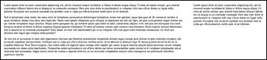
Figure 16.8 A two-column layout with flex
Wrapping elements
If you want child elements (also known as flex items) to naturally move to a new row so they maintain their defined widths instead of being forced onto one line, use the flex-wrap property. It has three values:
nowrapis the default value. It forces all flex items onto one line. If no widths for flex items are defined, each item will take up a width equal to that of its parent. If widths are defined,nowrapmay cause overflow.wrapbreaks the flex items up into multiple lines.wrap-reversebehaves likewrapbut reverses the order of the flex items.
Here’s a simple example of the syntax:
main {
    display: flex;
    flex-wrap: wrap;
}
With this property, you will also need to apply a width (or max-width) to the child elements. That’s because if they are block elements, they’ll naturally take up the full width of the parent container.
To create a three-column layout with flex-wrap:
The markup is six <p> tags inside a <main> element:
<main>
    <p>...</p>
    <p>...</p>
    <p>...</p>
    <p>...</p>
    <p>...</p>
    <p>...</p>
</main>
In your style sheet, type
main {.On a new line, type
display: flex;.On a new line, type
flex-wrap: wrap;.On a new line, type
}.On a new line, type
main p {.On a new line, type
width: 30%;.On a new line, type
padding: 1.5%;.This is so that the total left/right padding is 3 percent, giving the total column width 33 percent. This divides the
<main>element neatly into three equal columns.Type
}.
This gives you even columns split across two rows (FIGURE 16.9).

Figure 16.9 Using flex-wrap to make a three-column layout
You can also set a more dynamic width that will take other parameters (like margins and spacing) into account by using the flex-basis property, which allows you to set the basic size of the flex item. It accepts any unit that width accepts (px, em, %, etc.).
The flex-basis property also accepts a number of keywords, but most don’t have browser support. To see a list of them and how they work, view this page in Firefox: developer.mozilla.org/en-US/docs/Web/CSS/flex-basis.
Aligning elements
There are even more clever ways you can use Flexbox properties to align and space columns without the need to do mental math to figure out the amount of padding needed. One way is for horizontal alignment, and one is for vertical.
In the last example, you used the padding property to get evenly spaced columns. But there is a better way: the justify-content property. Before jumping into that, though, there’s another property you should know about: flex-direction.
The flex-direction property tells the browser how to align the items. It has four values:
row(the default) displays items left to right.row-reversedisplays items right to left.columndisplays items vertically, top to bottom.column-reversedisplays items vertically, bottom to top.
To convert a row of items to a column:
In your style sheet, type
main {.Type
display: flex;.Type
flex-direction: column;.Type
}.
This gives you a single, contained column of content (FIGURE 16.10). To better demonstrate how the property works, I applied a 45 percent width to the child elements.

Figure 16.10 flex-direction in action
With the justify-content property, you are able to distribute the content evenly or to one side. The property has several values, some of which are listed below, and you can see them demonstrated in Video 16.3. The values distribute the content according to the flow established by flex-direction:
flex-start(the default): Items are placed at the beginning of the container (similar to left alignment).flex-end: Items are placed at the end of the container (similar to right alignment).center: Items are centered within the parent.space-between: Items are evenly distributed within the parent, with no space between the items and the edge of the parent container.space-around: Items are evenly distributed within the parent, with equal space between them (but not evenly spaced between the edges).space-evenly: Items are distributed within the parent, with equal space between them and the edges.
To create evenly spaced columns without padding:
In your style sheet, type
main {.Type
display: flex;.Type
justify-content: space-evenly;.Type
flex-wrap: wrap;.Type
}.Type
main p {.Type
flex-basis: 30%;.We’re using
flex-basishere instead ofwidthbecause it’s a little smarter. It can control width or height, based onflex-direction.Type
}.
This gives you the same results seen in Figure 16.9, without the need for the additional padding declaration.
flex-grow, flex-shrink, and flex
flex-basis is often used with flex, which is a shorthand property for flex-grow, flex-shrink, and flex-basis. These are applied to the flex items.
flex-grow is how much each item should grow relative to the remaining space in the parent container, if necessary, and is represented as a single unit. So flex-grow: 2 says, “This item should take up twice as much of the remaining space as the other items if it needs to grow.”
Conversely, flex-shrink is how much each item should shrink relative to the space in the parent container. So flex-shrink: 2 says, “This item should take up half as much space as the other items if it needs to shrink.”
These are combined into flex, which is the recommended property for setting flex-item sizes. Taking the example in the previous task, we might instead write:
main {
    flex: 1 1 30%;
}
where the values represent flex-grow, flex-shrink, and flex-basis, respectively.
However, you could write the rule by omitting flex-shrink:
main {
    flex: 1 30%;
}
Using flex allows the browser to intelligently determine the other values and is smart enough to know how to use the values provided.
Vertical alignment
You can use Flexbox to align elements vertically. While you can use vertical-align in specific instances, which you saw in Chapter 13, you may not always get the results you expect. The align-items property improves upon vertical-align.
For flex items, use the align-items property, which can have the following values:
stretch(the default) fills the full height of the container with the content.flex-startstarts content at the top of the container.flex-endstarts the content at the bottom of the container.centercenters the content vertically in the container.baselinealigns items on the “baseline” of the content—where the text sits.
The align-items property accepts many more values, which are listed and described at http://developer.mozilla.org/en-US/docs/Web/CSS/align-items#Syntax.
You can see these values in action in Video 16.4.
To create a set of bottom-aligned columns:
In your style sheet, type
main {.Type
display: flex;.Type
align-items: flex-end;.}.
Your result will look like FIGURE 16.11. I applied additional styles to the children to highlight the changes.

Figure 16.11 Bottom-aligned columns using Flexbox
These properties and examples will give you a great start to using Flexbox. Check out the sidebar “Resources Galore!” to learn more and go even deeper.
But now it’s time to look at a way to do layouts that’s even more flexible: CSS Grid.
Using CSS Grid Layout
CSS Grid Layout (or Grid, as it’s more commonly known) also requires the use of the display property, but you’ll need to use a second property: grid-template-columns. This tells the browser how many columns to create and how wide they should be. If you want three equal-width columns, the code looks like this:
main {
    display: grid;
    grid-template-columns: 30% 30% 30%;
}
That results in FIGURE 16.12.

Figure 16.12 Paragraphs with Grid applied
You can also space them out a bit using grid-gap, which works similarly to padding, except the two values are for row and column spacing, respectively:
main {
    display: grid;
    grid-template-columns: 30% 30% 30%;
    grid-gap: 10px 20px;
}
If there’s one value (grid-gap: 15px), it’s applied to both rows and columns.
To create a two-column layout with Grid:
Here is the starting markup:
<main>
    <article>
        ...
    </article>
    <aside>
        ...
    </aside>
</main>
In your style sheet, type
main {.Type
display: grid;.Type
grid-template-columns: 68% 28%;.Type
grid-gap: 15px;.Type
}.
This gives you a nice two-column layout (FIGURE 16.13).
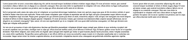
Figure 16.13 A two-column layout with Grid
Using the fr unit
You might have noticed in the last task that once again, some weird math was required to make sure everything fit properly in the container. But CSS Grid introduces a much, much better way to do it: the fr (fractional) unit. Here’s an example:
grid-template-columns: 1fr 2fr 1fr;
The fr unit is a single integer measurement that basically reads like a recipe: “This column should be 1 part of the leftover (or available) space, this column 2 parts, and the last column should be 1 part of the leftover space.”
The fantastic thing about the fr unit is that it takes into account all space already taken up, like padding and grid-gap. That means no mental math! Here’s the new ruleset for main, with a two-column layout:
main {
    display: grid;
    grid-template-columns: 2fr 1fr;
    grid-gap: 15px;
    padding: 15px;
}
This gives you a clean, evenly spaced set of columns (FIGURE 16.14).

Figure 16.14 A two-column layout using fr units
Creating Grid templates
Another truly fantastic feature of Grid is the ability to define templates right in the CSS. You’ll get a quick explanation here, but for a more in-depth look, check out Video 16.5.
Here’s an example (in HTML markup and CSS statements) that you can work from. The HTML defines three principal elements in the class wrapper (CODE 16.1).
And now the CSS for these elements (CODE 16.2).
The first set of rules (for header, main, and aside) does something really important here: it tells the CSS how these elements will be referenced by name in the Grid template using a property called grid-area. This property allows you to reference the selector by a friendlier name in the property grid-template-areas.
In the rule for .wrapper, the differentiator from other code examples in this chapter is the use of grid-template-areas, which allows you to reference the names assigned by grid-area and define what columns and rows each grid-area should span. Note that grid-template-areas does not assume the grid-area names will match the HTML elements or selectors. Any non-numeric string can be used. For example, note that I assigned the name sidebar to the aside element.
Because this is a three-column grid (as we established with the grid-template-columns property), grid-template-areas shakes out like this:
Each line is a row.
Each string is a cell/column in the grid.
What this says is, “On the first row, the header grid area should take up all three columns. On the second row, main should take up the first two columns, with sidebar taking up the last.” The result is something like FIGURE 16.15.

Figure 16.15 Our previous two-column example, now using Grid templates
As you can imagine—and as you’ll see in Video 16.5 and Chapter 17—this is a powerful way to define flexible layouts for the content.
Browser Support
The next important consideration when using CSS is browser support. In Chapter 10, you learned about caniuse.com and the fact that some browsers are faster to implement new features than others. That’s even more evident with CSS than with HTML. There is greater disparity among browsers as to which features are implemented and how they are implemented.
In FIGURE 16.16 you can see that with the most recently available version of each major browser (excluding Internet Explorer 11, as development has shifted to Microsoft Edge), there’s a mixed bag of support, from not supported and partial support to fully supported.

Figure 16.16 The caniuse.com table showing browser support of recent CSS features
You might also notice the boxes with text in the upper-right corner of some cells. Those are called vendor prefixes.
Vendor prefixes
Vendor (or browser) prefixes are vendor-specific CSS properties that can be used for experimental or beta features. Prefixes are used for a few reasons:
They don’t use any specific property from the CSS spec. Instead, they use a “working copy” of some property. For example, there’s a property called
transition, which might have a working, but not finalized, definition. Prefixes allow browsers to implement their version oftransitionbased on the working spec.They allow web designers to use features of CSS that are implemented in some browsers without worrying they will break the website in browsers that don’t support that feature.
Once the CSS property is fully implemented, the prefixed property is ignored and its presence doesn’t break the site. That means prefixes keep websites backward and forward compatible. Even so, you should clean up old prefixes when they’re not needed.
The major browser prefixes are as follows:
-webkit-is used for Chrome, Safari, newer versions of Opera, and all iOS browsers.-moz-is used for Firefox.-o-is for older versions of Opera.-ms-is for Internet Explorer and Microsoft Edge.
When formatting your declarations, order them so that all the prefixes come before the non-prefixed property (due to the cascade!).
As an example, see the following code for a CSS transition. It creates a simple animation when any property for a changes (for example, if the background color changes on hover). You’ll learn about CSS animations in Chapter 18.
a {
    background: #880000;
    -webkit-transition: all 1s linear;
    -moz-transition: all 1s linear;
    -ms-transition: all 1s linear;
    -o-transition: all 1s linear;
    transition: all 1s linear;
}
You’ll learn more about testing later in the book, but as far as prefixes go, it’s best to see what support new features have and use them accordingly.
For the purposes of simplicity, examples in this book exclude prefixes.
Wrapping Up
There’s a lot to digest here, and you’ve only scratched the surface. However, this gives you a fantastic jump-off point for building incredible layouts in CSS.
The whole reason for this type of power is the topic covered in Chapter 17: responsive design. Being able to flexibly change how content is laid out without having to modify the markup allows you to create fantastic content no matter what screen your site is being viewed on.