11
CREATING BACKGROUNDS FOR VIDEO
While the video world often constrains itself to a 4×3 or 16×9 aspect ratio, the real world does not. When incorporating photos, type, and logos, there is often empty space. Some choose to leave this area empty (or filled with black). I like the color black more than most people—in fact, half my wardrobe is gray, charcoal, or black. But even I’ll admit that it can get pretty boring for video.
To combat this, you can wallpaper the screen. You may choose to fill the screen with blended colors, repeating patterns, or soft textures. In all cases, Photoshop proves to be an excellent tool for creating backgrounds for video. If you choose to animate these backgrounds, they can easily be imported as layered images into After Effects, Combustion, and most nonlinear editing packages these days. In fact, 75% of my After Effects work starts in Photoshop. With this wide-open box of possibilities, let’s begin.
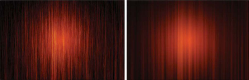
Backgrounds should match the “mood” of the piece. Don’t just tile the client’s logo.

Be sure to go with less saturated red tones. The use of gradual blends helps hold this background together.

(Image courtesy American Diabetes Association.)
Gradients
Video has difficulty dealing with high-contrast ratios. Proper use of gradients exploits video’s greatest weakness. A gradient is a gradual blend between two or more colors. These gradual transitions work very well on video, even after duplication to lower-quality consumer tape stock or being broadcast.
There are three major ways to access gradients:
• Gradient tool
• Gradient Fill layer
• Gradient Map
However, all three use a similar interface: the Gradient Editor.
Proper use of gradients can lift your work off the screen. Gradients are essential to natural color.

Gradient Editor
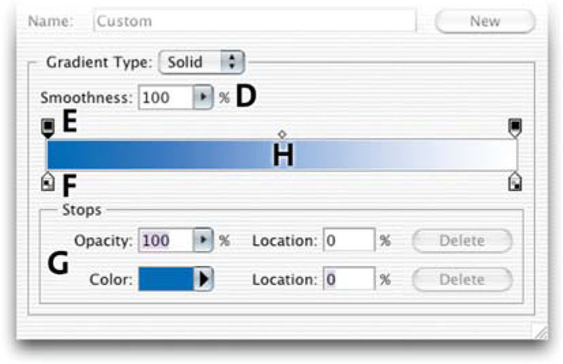
All gradients are edited using the common Gradient Editor. To access it, click on the thumbnail of the gradient that is loaded in the pop-up window or the Options bar.
Presets (A). You have several presets to choose from. If you want to load additional preset gradients, access them from the submenu (triangle icon). You can choose to replace the existing gradients, or append (add-on) to the loaded gradients. You can also load gradients that live outside the presets folder by clicking the Load button. There are several gradients available online, as well as with this book’s DVD. You can also choose to save your own creations. The best place to store them is inside your Presets Folder (Application Folder> Presets>Gradients). This way they will appear in the submenu for faster loading.
Name (B). For ease of recall, gradients can be named. If you are having a particularly boring day, express yourself here.
Type (C). There are two gradients to choose from: Solid and Noise. Solid gradients involve color and opacity stops, with gradual blends in between. Noise gradients contain randomly distributed colors within a specified range. Each has a different interface and will be discussed separately.

Solid Editor
Smoothness (D). Controls the rate at which colors blend into each other. It can be gradual or steep.
Opacity stops (E). Gradients can contain blends between opacity values as well. To add another stop, click in an empty area on the top of the gradient spectrum. To adjust a stop, click on it, and then modify the opacity field.
Color stops (F). The simplest gradients contain only two colors, but who said clients were simple? Often you may choose to use several colors (or even repeat colors) to achieve a desired effect. Double-click on the color stop to access the Adobe Color Picker.
Stop Editor (G). Selected gradient stops can be adjusted numerically. You can edit the opacity, color, and location (0%–100%, read left to right.)
Midpoint (H). Between stops are midpoints. By default, the midpoint is halfway between two stops. However, it wouldn’t be Photoshop if you couldn’t tweak it.
Noise Editor
Roughness (I). Noise gradients use a roughness setting to determine how many different colors are used to create noise. Use the ![]() (comma) and
(comma) and ![]() (period) keys to cycle through your gradient presets.
(period) keys to cycle through your gradient presets.
Color Model (J). You can choose between three models: Red-Green-Blue, Hue-Saturation-Brightness, or L*a*b.
Color Range Sliders (K). Adjust the range of colors available to the gradient.

Options (L). You can choose to restrict colors (which has no apparent effect for broadcast-safe colors). You can also introduce random transparency. To create a new gradient, click on the Randomize button. Every time you click, a new gradient will be generated.
New Button (M). To add a gradient to the Presets window, type a name into the name field. Click the New button, and an icon will be added in the Presets window. This new gradient is not yet permanently saved, but stored temporarily in the Preferences file. If this file is deleted or damaged, or if you change presets, the new gradient set will be lost. You must click the Save button and navigate to the desired folder. Be sure to append the file name with .grd to inform Photoshop that it is a gradient set.
Gradient Tool
The Gradient tool can be used to manually draw gradients on a layer. To access the Gradient tool, select it from the toolbar, or press ![]() . The Paint Bucket shares the same well as the Gradient tool, so if you can’t find the Gradient tool, press
. The Paint Bucket shares the same well as the Gradient tool, so if you can’t find the Gradient tool, press ![]() to cycle through your tools.
to cycle through your tools.

The Gradient tool can use any gradient created from the gradient editor or from the Presets menu. To select a gradient, choose from the available ones in the Options bar. You can also load preset libraries or manually load gradients by accessing the palette’s submenu. To access the gradient editor, double-click a Gradient icon.
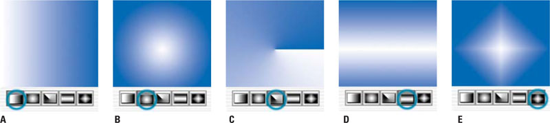
You now must choose between five options to build your gradient:
Linear gradient (A). Shades from the starting point to the ending point in a straight line.
Radial gradient (B). Shades from the starting point to the ending point in a circular pattern.
Angle gradient (C). Draws the gradient in a counterclockwise sweep from the starting point.
Reflected gradient (D). Draws a linear gradient symmetrically on both sides of the starting point.
Diamond gradient (E). Draws the gradient in a diamond-shaped pattern outward from the starting point.
You have a few available options to further modify the gradient. You can specify a blend mode to affect how the gradient is applied to the layer. (For more on the versatile blend modes, see Chapter 3, “Why Layers?”)
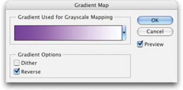
• To swap the direction of colors in the gradient, select Reverse.
• To create a smoother blend by adding noise, choose Dither.
• To use a gradient’s built-in transparency, check the Transparency box. If a preset gradient does not contain transparency, edit it and add opacity stops.
• To draw the gradient, click to set the starting point. Continue to hold the mouse button down and draw to the endpoint.
• To constrain the angle to multiples of 45º, hold down the ![]() key as you drag.
key as you drag.

Gradient Fill Layer
A Gradient Fill layer creates a new gradient layer in your document (Layer>New Fill Layer>Gradient or from the Create New Adjustment or Fill Layer menu at the bottom of the layer’s palette). Instead of drawing the gradient, you access its controls from the editor and a pop-up window. The gradient can be positioned by dragging in the open document. You can also change the direction and shape of the gradient. When you are satisfied, click OK. While this gradient is not very flexible, it can be included when creating an action. To confine the new gradient to a specific area, make a selection first. This will add a layer mask to the gradient layer. You can edit this mask at any time by highlighting the layer and using any painting tool or filter.

You can click the gradient to display the Gradient Editor. You can also click on the drop-down arrow to access the pop-up gradient palette. You can choose to set additional options, or edit the gradient if desired. All of the previous options and styles are available to modify the gradient. Additionally, you can move the center of the gradient by clicking and dragging inside the Image window.
Double-clicking on the adjustment layer’s icon launches the gradient controls. You can then click and drag within the window to reposition the gradient.

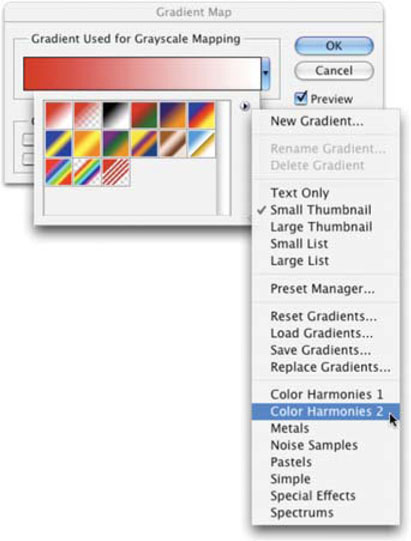
Gradient Map
A frequently underused feature is the Gradient Map (Layer> New Adjustment Layer > Gradient Map). The Gradient Map applies a new gradient to the grayscale range of an image. A two-color gradient produces a nice duotone effect. Shadows map to one of the color stops of the gradient fill; highlights map to the other. The midtones map to the gradations in between.
Gradient Map in AE?
 Looking for the gradient map in After Effects? It’s called Colorama. It’s great for special looks and color treatments.
A multicolored gradient or noise gradient can add interesting colors to an image. This is an effective technique for colorizing textures or photos for a background. I recommend using the Gradient Map from the Adjustment Layers menu, because it will provide the necessary flexibility to tweak your look. To modify the Gradient Map, access the Gradient Editor and adjust the previously mentioned options. Remember, Dither adds random noise, which can smooth the appearance of the gradient fill, thus reducing banding. Let’s try it out.
The Gradient Map adjustment layer is fast and flexible. You can also change the adjustment layer’s blending mode to extend the effect’s possibilities.

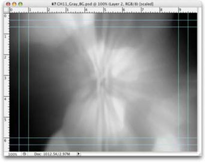
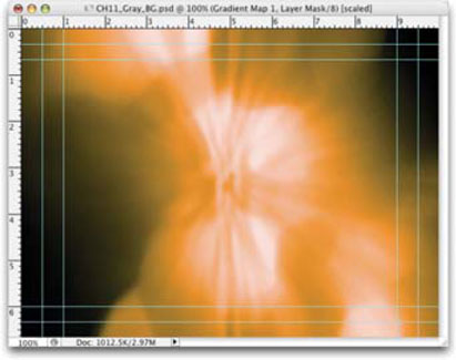
Step 1. Open the file Ch11_Gray_BG.psd from the DVD-ROM.
Step 2. Add a new Gradient Map adjustment layer by choosing Layer>New Adjustment Layer>Gradient Map. Then click OK.
Step 3. In the Gradient Map window, click the drop-down list near the gradient preview to see a list of thumbnails. These would work fine, but let’s load some more.
Step 4. In the thumbnail area, click the triangular submenu to the right to show the list of gradient presets. Choose Color Harmonies 2 and click OK to load it.
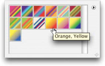
Step 5. Choose the Orange, Yellow preset and click OK.
Step 6. It is now time to experiment with Blending modes. Press ![]() to select the Move tool then press
to select the Move tool then press ![]() to cycle modes. Color Burn, Linear Light, and Color look good in my opinion. Choose one you like (to move backwards through the blending list press
to cycle modes. Color Burn, Linear Light, and Color look good in my opinion. Choose one you like (to move backwards through the blending list press ![]() .
.
Working with Photo Sources
Using a photo as a background can be a very effective technique if handled properly. Remember this guiding advice: it’s a background. Sounds simple, right? But be careful that the image you put behind your text or logos does not compete for attention or you will distract your viewers and reduce their comprehension. Here are a few techniques to try.
Defocusing
Gently softening an image works well. This can create a sense of image without dominating the screen. One of the most effective filters for this is the Lens Blur filter first introduced in Photoshop CS (if this is not available to you, then go for Gaussian Blur). Let’s try it out:

Step 1. Open the file Ch11_BG_Market.psd from the DVD-ROM.
Step 2. Duplicate the Background layer by pressing ![]()
![]() . By filtering a copy of the background, you can reduce the opacity of the blurred copy to modify the strength of blurring.
. By filtering a copy of the background, you can reduce the opacity of the blurred copy to modify the strength of blurring.
Step 3. Apply the Lens Blur filter by choosing Filter>Blur>Lens Blur. Adjust the filter to taste, but favor an out of focus image. Click OK when satisfied.
Creating a Screened Area
Another technique to make a “cleared” area for text involves using a screen. This is a very traditional print process, but it works well for video as well. Let’s use the same image we had open for our last example.

Step 1. Use (or open) the file Ch11_BG_Market.psd from the DVD-ROM.
Step 2. With the Rectangular Marquee, draw an area for your text (often referred to as the text block).
Step 3. Add a Levels adjustment layer by choosing Layer>New Adjustment Layer>Levels and click OK to create the layer.
Step 4. Drag the Gray Midpoint slider for Input to the left (a value of approximately 1.75 should work).
Step 5. Lighten the box by dragging the Black Output slider to the right (a value of 100 should work).
The advantage to using an adjustment layer is that you can continue to modify the background layers.
Gradient Maps
Gradient Maps aren’t just for amorphous backgrounds; in fact they also work quite well on photographic backgrounds.

Step 1. Open the file Ch11_Flower_Market.psd from the DVD-ROM.
Step 2. Strip the color from the source using one of two techniques. The first Image>Adjustments>Desaturate is good if you are in a hurry. The second, a Black&White adjustment layer (available in CS3), does a much nicer job of making the grayscale file.

Step 3. We’ll now soften the image with a gentle blur. Press ![]() to select All then choose Edit> Copy Merged to copy al layers to your clipboard. Paste this layer into the Layers Palette by pressing
to select All then choose Edit> Copy Merged to copy al layers to your clipboard. Paste this layer into the Layers Palette by pressing ![]()
![]() . Blur the layer with a 15-pixel Gaussian Blur and set its Blending Mode to Screen.
. Blur the layer with a 15-pixel Gaussian Blur and set its Blending Mode to Screen.
Step 4. Add the Gradient Map by choosing it from the Adjustment Layer pop-up menu at the bottom of the Layers palette.
Step 5. Experiment with different Gradient Maps and Blending Modes to see the full range of design options.
Filtering
To further modify photos into backdrops, experiment with filters. While frequently overused, judicious application of the Artistic or Brush Stroke filters can simplify a photo to a pleasant image. Combine filters with fading and blending to achieve a modern look.
Sometimes the photo may serve just as a painter’s palette. By applying several distortions and filters, it is possible to render a photo unrecognizable. All that is left behind are the dominant colors originally contained in the source. This is an excellent way to generate random color fields to use as backgrounds.
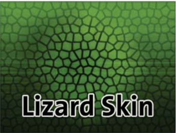
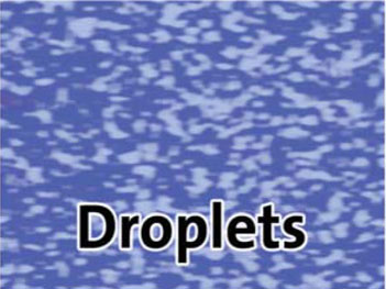
Using Patterned Tiles
Tiling a pattern or texture is a nice way to fill up space. The key is to make sure the texture size is large enough that the seams are not visible. You can find several collections of patterns available, but the key is to look for seamless ones. Thanks to the folks at Auto FX, I was able to include a sampler of seamless textures on the book’s DVD. You can find 3000 textures as well as hundreds of free fonts at their Web site, http://www.autofx.com.
The easiest way to make a tiled background is to use a pattern adjustment layer. The adjustment layer will create a pattern that can be easily resized and pos itioned. Let’s begin.
These utterly useless patterns are built in Photoshop. Don’t let them scare you away. The Artist Surfaces, Rock Patterns, and Texture Fills collection are very useful.

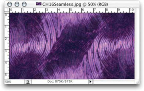
Step 1. Open the file Ch11_Seamless.jpg in this chapter’s folder or any other seamless texture.
Step 2. Select the entire object by pressing ![]() .
.
Step 3. Define the pattern and name it (Edit>Define Pattern). The pattern is now temporarily stored in your Preferences file.
Step 4. Create or open a safe-title document sized for your edit system.
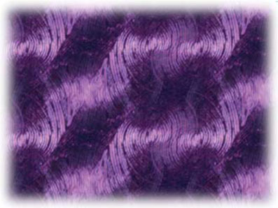
Step 5. From the Fill Layer menu on the Layers palette, choose Pattern. The last-added pattern will automatically be selected. Adjust the scaling of the pattern, but do not exceed 100%, or the pattern will soften.
Step 6. You can click in the palette and reposition the pattern by dragging.
The end result, perfectly tiled and scalable. And at any time, the Pattern Fill layer is editable.
Step 7. To save the pattern, click on the drop-down arrow, then the triangular submenu icon. Select Save Patterns and give it a unique name, adding .pat at the end to inform Photoshop that this is a pattern library. All of the visible presets in the window will be stored into this library (you can ![]() click to remove a thumbnail from the library). The best place to store them is inside your Presets folder (Application Folder>Presets>Patterns). This way, they will appear in the submenu for faster loading.
click to remove a thumbnail from the library). The best place to store them is inside your Presets folder (Application Folder>Presets>Patterns). This way, they will appear in the submenu for faster loading.
Step 8. Click OK to apply the pattern to the layer.
More Free Patterns
 You’ll also find a huge collection of seamless textures on this book’s disc provided by the generous folks at Auto FX Software (http://www.autofx.com).
If you change the size of your document, the pattern will automatically expand or contract to fill the work area.
Creating Patterns from Photos
If you have a photo that you’d like to turn into a seamless background, there are two key techniques: Offset (with cloning), and the Pattern Maker filter introduced in Photoshop 7. If you are scanning the photo, scan it at a higher resolution so you have plenty of pixels to work with. Tiled patterns look best when the tiles have fewer repetitions.
Offset and Clone
The “original” method of creating seamless patterns involves the Offset filter. By shifting an image, the seams become clearly visible. You can then employ the Clone Stamp or Healing Brush to smooth out the edges.
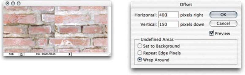
Step 1. Open the file Ch11_Brick.tif to try out this technique.
The original image.
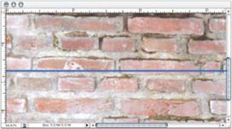
Step 2. The brick photo contains several repeating patterns. However, the photo is slightly misaligned, which will cause problems. If you have horizontal or vertical lines, check alignment using guides.
• You need to determine the specific misalignment. Select the Measure tool; it is in the same well as the Eyedropper tools. (To cycle, press ![]() .)
.)
• Measure along a straight line to determine the misalignment.
• Select Image>Rotate Canvas>Arbitrary The appropriate measurement is automatically plugged in and will correct misalignment.
Use the Measure tool to determine if the image needs to be rotated into alignment.

Step 3. Crop a small portion of the tile. Try to get some of the mortar along the edges as shown. This will make a more natural tile.
The cropped image.
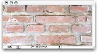
Step 4. Choose Filter>Other>Offset to push the image over; be sure to offset horizontally and vertically. Be certain to select the Wrap Around option. This step will show the seams that must be removed to create a tile.
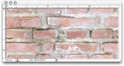
Step 5. Erase the seams using a combination of the Clone Stamp, Healing Brush, Smudge, and Blur tools. Remember to clone from several parts of the image to avoid “twins” syndrome. You can compare your pattern source with the file Ch11_ Brick_Processed.tif.
Step 6. Select>All and choose Edit>Define Pattern. You can now use the pattern as a seamless tile.
Step 7. To use a seamless tile, add a pattern adjustment layer. Be sure to save your custom patterns to your Presets folder. The Save menu can be accessed from the Pattern palette’s submenu. You can move the pattern at any time to tweak the fill. Highlight the adjustment layer, and then click in the composition’s window and drag.
Open the file Ch11_Wall.psd to see the results.
After cloning the seams, the tile is ready.
Pattern Maker
The Pattern Maker can be found under the Filter menu in Photoshop 7 or newer. It can be used to generate tiling patterns. These patterns do not often match their initial source; the pixels are “scrambled” to generate a seamless tile. Because the pattern is based on the pixels in a sample, it shares visual characteristics with the original image. This filter works well for small patterns, but not on large objects. The Pattern Maker command is available only for 8-bit images, so you’ll need to down-convert 16-bit or 32-bit sources. Let’s explore this useful filter.
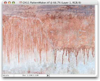
Step 1. Open the file Ch11_Pattern_Maker.tif.
Step 2. Size the image for your video editing system by cropping or using the Canvas Size command.
Step 3. The layer from which you make the selection will be replaced by the generated pattern. It is a good idea to copy the layer by pressing ![]() .
.
Step 4. Make a selection with the rectangular Marquee tool around the area you want to use as the basis for the tile.
Step 5. Choose Filter>Pattern Maker.
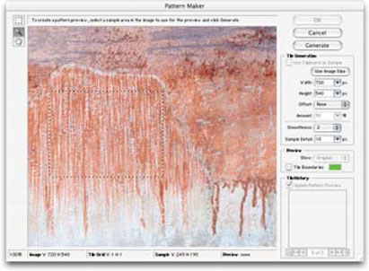
Depending on your source, you may need to increase the Smoothness and Sample Detail to a higher value. If the pixels in the sample lack contrast, increase the Smoothness value to decrease edges. If the sample contains details that are being chopped up, increase the Sample Detail value. Increasing the Smoothness and Sample Detail increases render time.
Sample and Remix for Better Patterns
Increasing the Sample Detail and Smoothness improves the appearance, but significantly increases render time.
Step 6. Tell the Pattern Maker filter that you want to generate a full-size tile by clicking on the Use Image Size button. This produces the best results as the pattern is sized to fill the whole layer.
Step 7. Click Generate Again to create additional patterns. You can use the same options, or make adjustments and click Generate Again. You can flip back through all generated tiles using the Tile History panel.
Step 8. When you’re happy with the preview, click OK.

Step 9. You can now define the image as a seamless pattern using the previously described techniques of Edit>Define Pattern.
Softening the Background
Getting the right balance between focus and detail will require some experimentation. To produce a natural defocused effect, you can harness the powerful Gaussian Blur or Lens Blur filters. Unfortunately, there are no Blur of Focus adjustment layers (although you can harness Smart Filters in Photoshop CS3).
One way is to flatten the layered background, or make a copy and flatten it. This is inefficient, because it requires backing up and managing multiple files. A better option is targeted flattening, first introduced in Chapter 3 (page 60) as an alpha channel solution. The technique is relatively simple, but it opens up several new design options.
Step 1. For this technique to work, all layers must be floating. The bottom layer is likely named Background and is technically not a layer yet. ![]() + double-click to float the layer.
+ double-click to float the layer.
Step 2. Select the topmost layer by clicking or pressing ![]()
![]() .
.
Step 3. Create a new layer by pressing ![]()
![]() .
.
Step 4. Hold down the ![]() key
key ![]() and select Merge Visible from the Layer palette’s submenu. All layers will be flattened to the target layer.
and select Merge Visible from the Layer palette’s submenu. All layers will be flattened to the target layer.
Step 5. You can now defocus this layer by using one of the natural blurs such as Gaussian Blur or Motion Blur.
Be sure to hold down the ![]() key when choosing Merged Visible. This will preserve your layers.
key when choosing Merged Visible. This will preserve your layers.

The softened background will make a better backdrop for foreground elements. Use blurred copies and blending modes for new looks.
This technique has many other implications, especially when blending multiple copies of layers together. Try targeted flatten-ing periodically while building a composition. Apply assorted filters, such as Radial Blur (Zoom) to these intermediary copies, and then adjust blending modes. Several new techniques can be developed.
Some Recipes
You can see the recipe by flipping down the action. Feel free to modify these to create more automatic backgrounds.
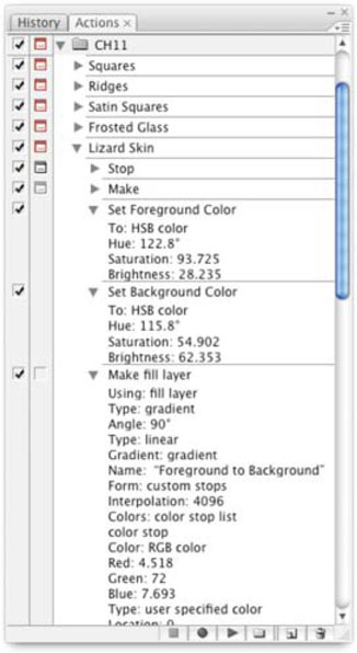
To get you started, 12 backgrounds created entirely within Photoshop are included on the DVD. Instead of eating up page space printing long lists, I’ve captured these backgrounds as Photoshop actions.
Step 1. To load a set of actions, call up the Actions palette.
Step 2. Go to the palette’s submenu and choose Load Actions.
Step 3. Open the PSV Backgrounds Ch11.atn file in the chapter’s folder on the DVD-ROM. You can view each step by flipping down all of the triangles in the palette. You can also use these actions to quickly create the featured backgrounds.
Step 4. To watch the individual steps in an action, change the action’s playback speed. From the Actions palette submenu, choose Playback Options>Pause for (X) seconds. You can now see the action playback one step at a time.
Remember, there is no exact science to these backgrounds, just some controlled experimentation and a little bit of luck. By employing the Actions palette, you can capture these experiments for later use. For more on Actions, see Chapter 12, “Automation.”
Backgrounds in Action
You’ll find an Actions file on the DVD for all of these backgrounds. Feel free to modify these backgrounds and use them in your projects.


The Most Versatile Effect: Gradient Wipe
I couldn’t discuss gradients without talking about the incredible Gradient Wipe. After Effects can use any gradient layer as a “transition map.” Create or modify a gradient in Photoshop first. You can combine gradient layers, blend modes, and filters to create an interesting map.
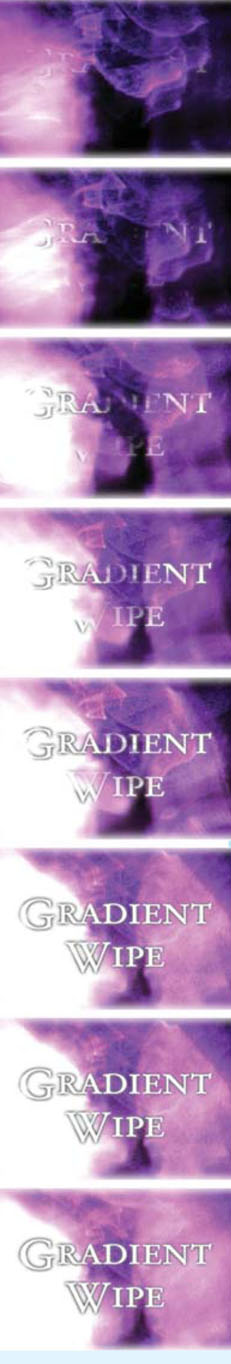
Step 1. Import the gradient into After Effects.
Step 2. Add the gradient to your timeline but leave its visibility off. Make sure the gradient layer is the length of your composition.
Step 3. Apply the Gradient Wipe (Effect>Transition>Gradient Wipe) to the intended layer.
Step 4. Define the Gradient Layer source.
Step 5. Turn up the Transition’s softness for a smoother transition.
Step 6. Start the transition 100% complete, and then set a second keyframe to 0% where you want the transition to end.
A linear gradient blends with the Clouds and Flaming Pear’s Glitterato filters.

Not an AE user (yet)? Final Cut Pro has the same effect, conveniently called Gradient Wipe. Other NLE users should look for the Spice Master AVX from Pixélan software (http://www.pixelan.com).

See It Move
A sample project is provided on the DVD.
Hands On | 11
A Loop is a Loop is a Loop
Would you like to learn a technique that can save you thousands of dollars? If you produce videos, television, motion graphics, or DVDs you are probably quite familiar with looping backgrounds. These essential elements get used all the time under title graphics, inserted into lower-thirds, or as DVD menus. There are plenty of outlets available for purchasing looping backgrounds (chances are you already own some).
But this gets expensive, and does not give your video a unique look. There are several approaches to looping backgrounds, several companies (including the major players) take a lazy way out and don’t make a full loop, but instead just dissolve to a graphic or different source.

By combining the power of Photoshop and After Effects, you can create custom looping backgrounds. In this tutorial, we’ll create two different looping backgrounds. You can harness these techniques to create very different backgrounds with just a little bit of effort and variation. Let’s explore your options.
You’ll find Exercise 11 on the DVD-ROM.

PROfile: Kevin Oleksy
Kevin Oleksy is an experienced video pro working for the U.S. Government. He produces re-enactments, documentaries, training pieces, and live satellite talk shows.
“I’ve been in video production for about 20 years and spent time in news as a cameraman, reporter, anchor, producer, technical director, and director. However, I’ve spent the majority of my career in post-production, doing military, corporate, and commercial editing and finishing,” said Oleksy. “I was first introduced to the Avid back in the 5.0 days and haven’t looked back.”
Oleksy soon discovered the power of Photoshop to enhance his video projects. He started with Photoshop version 4 and has been a huge fan since. Photoshop also helped him expand into After Effects as well.
“When I worked for the military I mainly used Photoshop for Over-The-Shoulder graphics within the nightly newscast and the week in review. I would take still shots that highlighted the story and create a layered and keyable graphics that I could either fly in layer-by-layer live or import into the Avid for post work,” said Oleksy. “I continue to use Photoshop to make mattes and backgrounds as well as titling. I do all of my titling in Photoshop… the flexibility and power for titles is awesome.”
Oleksy thinks that Photoshop is the perfect companion application for any NLE package. He says it is a required skill for editors.
“Learning Photoshop is crucial in the video world. The flexibility and versatility it provides, allows you to create more visually appealing and hard-hitting productions. NLE’s are great for editing, but their titling, masking and background abilities are often limited and weak.”
To lean and keep his skills sharp, Oleksy takes every opportunity to attend training sessions and conferences. He’s a firm believer in pushing himself to learn more.
“No matter how far you get, there’s always somewhere further to get to. You can never say ‘I have enough knowledge to be the best that I can.’ Take every opportunity to attend training and trade-shows,” said Oleksy. “Also, watch what other’s are doing and try to build on that; some of the best ideas are generated by something you saw by someone else. No one is the be-all, know-all editing or graphics god, but the more you learn, the more you can learn!”