

That’s about it. If you’ve read this book front to back, you should now understand the fundamentals of CSS—how to speak it and how to understand it. Like any language, there is always more to learn—nuances that turns humdrum prose into compelling poetry.
In this last chapter, I want to offer a few parting words about the state of CSS and to review some of the best practices I’ve stressed throughout the book.
I’ve mentioned throughout this book that CSS is a standard created by the World Wide Web Consortium (W3C), and that the browser manufacturers then interpret this standard—with varying degrees of success—to create their products. In theory, since there is an accepted standard CSS, there is “perfect” CSS code that exactly follows these standards.
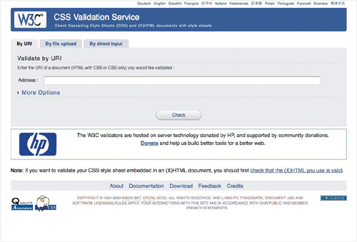
The W3C has created a Web site that will validate your CSS code, checking that it adheres to the W3C specified CSS standard. To use the W3C Validation Service:
01 | Visit jigsaw.w3.org/css-validator/. |
02 | Enter a URL, upload a file, or enter your CSS directly. |
03 | Click the Check button. |
04 | Hold your breath while waiting to see whether or not your code is valid. Any errors in your code will be highlighted by line number, showing the exact problem. |
If there are problems, don’t sweat it. First check what the errors are. Some of the “hacks” we use to create Web sites that work cross-browser will cause errors, even though they do not interfere with the page displaying.
Standards are important. The closer we can get to ideal CSS, the better it is for everybody. If we could simply code to the CSS standard and know our designs would display the same way in all browsers, what a wonderful world it would be.
That’s not the world we live in.
In our world, we have to deal with multiple browsers that conflict with each other. Writing code that meets the strict W3C standards is all fine and good, but completely unrealistic if you expect your code to actually work. The fact is most CSS code on the Web will not validate, because working designers have to be more concerned with making their Web pages look right across multiple browsers than with meeting some perfect code ideal. Many of the techniques I’ve shown you for getting your code to work cross-browser, such as the underscore hack to get IE6 to play nice with widths and padding, will not validate.
I recommend validating your CSS code as a last step in the QA process, to help you find any true errors in your code that you need to fix. But look closely at the errors raised. Make sure it is not simply flagging code you are using to get your designs to work cross-browser.
It is far more important that your code works, is fast, and is easy to edit than it is for it to be valid according to the W3C.


A CSS framework is a library of generic styles that can be easily applied to most Web designs. They come in the form of pre-built external style sheets that package ready-made design solutions for common elements such as headers, columns, footers, and sections. Using a CSS framework allows designers quick and easy access to well tested, cross-browser compatible, and standards-compliant CSS code. This tends to speed development of better code.
On the downside, when you use a CSS framework you import code that you may or may not use, but which will increase download time. In addition, you are relying on pre-built code that might limit your design choices. There are a wide variety of CSS frameworks, so choosing one will depend on what you need it to do.
Here are some popular CSS frameworks to get you started:
Blueprint.  Provides a solid layout grid, typographic controls, and a style sheet for printing. LINK: blueprintcss.org
Emastic. Uses ems to create elastic layouts. LINK: code.google.com/p/emastic
Typogridphy. Uses 12- and 16-column grids at 960px wide and typographic style rules for “creating vertical rhythm.” LINK: csswizardry.com/typogridphy/
YAML. “Yet Another Multicolumn Layout” provides flexible multi-column layouts that are easy to edit and modify. LINK: yaml.de
YUI Grids. Yahoo’s CSS Grids framework provides fixed and fluid layouts. LINK: developer.yahoo.com/yui/grids
If you are working in an environment where multiple sources are creating your Web content, you need a common library of styles. To facilitate a consistent layout, you can create your own CSS framework, often simple editorial styles, that the group then shares and can apply to their content. This also helps prevent writers or editors from adding inline or embedded styles when they need a particular style.
Beyond standard CSS best practices, there are a few things to keep in mind when creating your own CSS framework:
| Use a class name prefix to ensure that your framework will not conflict with other classes. Add a three- to six-letter prefix before all framework classes to ensure they do not conflict with other styles. |
| Keep the rules as generic as possible. These styles should provide bare-bones styling so as not to interfere with other site-wide styles. |
| Provide styles for common layout elements such as columns, drop-boxes, article excerpts, small print, and image captions. Framework styles should be used primarily for layout and for creating commonly used editorial styles. |
Mobile devices are a popular way to access the Web, but not particularly good for displaying Web pages designed for larger screens. Fortunately, CSS allows you to set style sheets specifically for mobile screens, but you need to keep a few things in mind when creating mobile designs:
| Use a single column with no horizontal scrolling. Most mobile devices have a portrait rather than landscape orientation, which limits horizontal design. |
| Provide constant top level navigation and hide secondary navigation. Many mobile devices have little or no built-in browser navigation, so the designer needs to include back buttons as well as top level navigation. You do not need a complete index of the site, though, since mobile devices often require the user to navigate through all links in order to select one of them. |
| Minimize the use of foreground and background images. Although images might be a necessary part of the content, it’s better to provide links to larger images and eliminate any background images altogether. This makes pages faster to load and easier to read on small screens. |
| Keep the design simple. Simple, well-structured pages will be much easier to use on small mobile screens. |
Viewing a printed Web page is a very different experience than viewing it on a screen (even a small screen). Paper, by its very nature, is not hyper-textual. However, paper is more portable and cheaper than a computer, and many of your visitors will opt to print Web pages rather than reading them on the screen. To that end, you should adapt your designs for print:
| Hide navigation and ads. No matter how hard you press on the piece of paper, it will not jump to another piece of paper. So all linked elements should be hidden by using display: none. |
| Consider colors and images carefully. Remember that what looks good on the screen doesn’t necessarily look good when printed. |
| Do not rely on background images for layout or bullets. Many people will turn background images off, so do not assume those images will print. |
| Use point sizes for font sizes. Although not preferred for screen layout, point sizes are perfect for print. |
| Allow maximum width for important content. Columns on printed pages should allow the maximum reading area for important content. |
| Display custom content such as link URLs and footers. Since the reader may not have the URLs listed, set up your pages to list any link URLs either at the end of the article or next to the links in context. |
Throughout this book, I have attempted to present the vast range of techniques possible with CSS, knowing that the future of Web design with CSS is not in what we know how to do now, but in what we will learn to do in the future. That said, there are many well-tested techniques that are widely accepted as CSS best practices. Many of these best practices have more to do with the limitation of the medium and browsers than they do with good design practice, but knowing them can speed your development process and lead to better designs.
| Use external style sheets. The power of using CSS comes in its ability to make a single change that effects an entire Web site. This power is only possible, though, when styles are collected into external style sheet files. NoteExternal style sheets are explained in “Where to Put Style Rules” in Chapter 5, “Semantics.” |
| Use <link> for speed and @import for flexibility. @import has the advantage that it can be used equally well in both HTML documents and external CSS files. Unfortunately there are issues in IE—styles imported using @import will not load until after the content, causing a delay in page loading. If you notice problems with pages loading, use <link> instead of @import. |
| Link to CSS for screen, print, and handheld media. CSS should be used to tailor the content for each output media. Designers need to consider how the page will look when printed or viewed on handheld devices. |
|
Inline styles cannot be overridden, making it impossible to change whatever styles they set and limiting design flexibility. Inline styles also increase the code-to-text ratio, diminishing search engine optimization (SEO) and lowering your ranking in many search engines. |
| Avoid embedded styles in the body. When placed in the body, embedded styles often render after the page content has loaded, causing an unattractive re-rendering of the page. They can also be difficult to override, difficult to find and edit, and can increase the code-to-text ratio, diminishing SEO. |
| If you have to use embedded styles, add them only in the <head> and keep them brief. Although styles embedded in the <head> of the document will be rendered before the content is displayed, they limit design flexibility and will add more code, diminishing SEO. |
| Avoid !important. Although a useful tool during development and prototyping of your site, making a declaration important reduces design flexibility and can often be confusing for later developers who may need to override the style. Note!important is explained in“Importance” in Chapter 5, “Semantics.” |
| Use concise, meaningful classes and IDs. Avoid using names that describe the style being applied, as this will cause problems if those styles need to change. Instead, use names that describe the function of the class or ID. For example, instead of naming a class redtext, name it hilight or hilighterror. |
Use <img> tags for image content (photos, illustrations, diagrams, and so on), not for your interface. Placing an image in your HTML means that it cannot be easily styled or changed. Virtually all interface chrome—including icons, logos, controls, and buttons—can be added to the interface using background images in your CSS. This will cut down on the amount of code in your HTML, which is better for SEO, and allow for greater versatility when redesigning. | |
| HTML should never be used for style, only for structure. HTML is intended to structure the page. Placing tags such as <b> or <i> specify a particular style rather than structure. Instead use tags that add as few browser styles as possible, for example <strong> and <em>. |
| Avoid using padding and borders for fixed-dimension elements. Problems with the IE6 implementation of the box model mean that padding and borders can be a hassle to deal with in any element with a fixed width and/or height. Try adding padding or margins to nested elements instead. NoteFor a quick fix to the box model problem, see “Fixing IE6” in Chapter 6, “Vocabulary.” |
| Use CSS sprites for buttons and controls. CSS sprites allow you to download fewer images and avoid the annoying “flash” as images load during link state changes. NoteUse CSS sprites to add backgrounds to links, as described in Chapter 10, “Navigation” in the section “CSS Sprites.” |
Add comments to your CSS wherever possible to help explain what’s going on. Notes can be added as a last step in development, but should be included to help future designers and developers. NoteComments are explained in the section “Adding Notes to CSS” in Chapter 5, “Semantics.” | |
| Always add a semicolon at the end of every declaration. Even if it is the last CSS rule in the list, add the semicolon to avoid future aggravation. |
| Specify units except for 0. 0 is zero no matter what the unit, but in most cases a unit is needed. line-height and opacity are the two exceptions whose values do not have units. NoteFor details about values in CSS, see Appendix B, “CSS Values.” |
| Use RGB values for colors. Although colors can be defined in a variety of ways in CSS, RGB values provide a broader gamut and are easier to change using JavaScript. |
| Use ems for all sizes or ems for font sizing, pixels for absolute sizes, and percentages for relative sizes. There is an ongoing debate as to whether ems or pixels are better for creating Web designs. If you choose to go with all ems, you need to become familiar with a good pixel-to-em calculator, like Em Calculator (riddle.pl/emcalc). |
| Limit the scope of rules. Using IDs and classes, you can ensure that styles are only applied where you want them and don’t “leak” over into other areas or cause style conflicts. |
Use CSS property shortcuts wherever possible. Many CSS properties can be combined into a single property using a shortcut. For example, border-top:5px; border-right:5px;border-bottom:1px; border-left :2px; can better be expressed as: border:5px 5px 1px 2px; | |
| Don’t add redundant styles. Once a style property is set for an element, it will be inherited by all elements with that selector type (HTML, class, or ID) on the page and their child elements. |
| Use as few IDs as possible, and use each only once per Web page. The more IDs you have, the more complicated your code gets. Generally you can get by with only a few IDs for major page grid sections. If you can use more than one ID in a contextual selector, you’ve got too many IDs. |
| Use as few classes as possible. As with IDs, the more classes on your page, the more complicated your code. Classes are useful for styling similar types of elements, but not every instance of an element needs its own class. |
| Try to end contextual rules with an HTML selector. Although not a hard and fast rule, the more CSS contextual rules you can end with an HTML selector, the more you are minimizing the number of IDs and classes in your code. |