
Understanding users
3.1 Introduction
3.2 What is cognition?
3.3 Cognitive frameworks
3.1 Introduction
Imagine trying to drive a car by using just a computer keyboard. The four arrow keys are used for steering, the space bar for braking, and the return key for accelerating. To indicate left you need to press the F1 key and to indicate right the F2 key. To sound your horn you need to press the F3 key. To switch the headlights on you need to use the F4 key, and to switch the windscreen wipers on the F5 key. Now imagine as you are driving along a road a ball is suddenly kicked in front of you. What would you do? Bash the arrow keys and the space bar madly while pressing the F3 key? How would you rate your chances of missing the ball?
Most of us would balk at the very idea of driving a car this way. Many early video games, however, were designed along these lines: the user had to press an arbitrary combination of function keys to drive or navigate through the game. There was little, if any, consideration of the user's capabilities. While some users regarded mastering an arbitrary set of keyboard controls as a challenge, many users found them very limiting, frustrating, and difficult to use. More recently, computer consoles have been designed with the user's capabilities and the demands of the activity in mind. Much better ways of controlling and interacting, such as through using joysticks and steering wheels, are provided that map much better onto the physical and cognitive aspects of driving and navigating.
In this chapter we examine some of the core cognitive aspects of interaction design. Specifically, we consider what humans are good and bad at and show how this knowledge can be used to inform the design of technologies that both extend human capabilities and compensate for their weaknesses. We also look at some of the influential cognitive-based conceptual frameworks that have been developed for explaining the way humans interact with computers. (Other ways of conceptualizing human behavior that focus on the social and affective aspects of interaction design are presented in the following two chapters.)
The main aims of this chapter are to:
- Explain what cognition is and why it is important for interaction design.
- Describe the main ways cognition has been applied to interaction design.
- Provide a number of examples in which cognitive research has led to the design of more effective interactive products.
- Explain what mental models are.
- Give examples of conceptual frameworks that are useful for interaction design.
- Enable you to try to elicit a mental model and be able to understand what it means.
3.2 What is Cognition?
Cognition is what goes on in our heads when we carry out our everyday activities. It involves cognitive processes, like thinking, remembering, learning, daydreaming, decision-making, seeing, reading, writing, and talking. As Figure 3.1 indicates, there are many different kinds of cognition. Norman (1993) distinguishes between two general modes: experiential and reflective cognition. The former is a state of mind in which we perceive, act, and react to events around us effectively and effortlessly. It requires reaching a certain level of expertise and engagement. Examples include driving a car, reading a book, having a conversation, and playing a video game. In contrast, reflective cognition involves thinking, comparing, and decision-making. This kind of cognition is what leads to new ideas and creativity. Examples include designing, learning, and writing a book. Norman points out that both modes are essential for everyday life, but that each requires different kinds of technological support.

Figure 3.1 What goes on in the mind?
Cognition has also been described in terms of specific kinds of processes. These include:
- attention
- perception and recognition
- memory
- learning
- reading, speaking, and listening
- problem-solving, planning, reasoning, decision-making.
It is important to note that many of these cognitive processes are interdependent: several may be involved for a given activity. It is rare for one to occur in isolation. For example, when you try to learn material for an exam, you need to attend to the material, perceive and recognize it, read it, think about it, and try to remember it. Below we describe the various kinds in more detail, followed by a summary box highlighting core design implications for each. Most relevant (and most thoroughly researched) for interaction design is memory, which we describe in greatest detail.
Attention is the process of selecting things to concentrate on, at a point in time, from the range of possibilities available. Attention involves our auditory and/or visual senses. An example of auditory attention is waiting in the dentist's waiting room for our name to be called out to know when it is our time to go in. An example of visual attention is scanning the football results in a newspaper to attend to information about how our team has done. Attention allows us to focus on information that is relevant to what we are doing. The extent to which this process is easy or difficult depends on (i) whether we have clear goals and (ii) whether the information we need is salient in the environment.
(i) Our goals. If we know exactly what we want to find out we try to match this with the information that is available. For example, if we have just landed at an airport after a long flight and want to find out who had won the World Cup, we might scan the headlines at the newspaper stand, check the web, call a friend, or ask someone in the street. When we are not sure exactly what we are looking for we may browse through information, allowing it to guide our attention to interesting or salient items. For example, when we go to a restaurant we may have the general goal of eating a meal but only a vague idea of what we want to eat. We peruse the menu to find things that whet our appetite, letting our attention be drawn to the imaginative descriptions of various dishes. After scanning through the possibilities and imagining what each dish might be like (plus taking into account other factors, such as cost, who we are with, what the specials are, what the waiter recommends, whether we want a two- or three-course meal, and so on), we may then make a decision.
(ii) Information presentation. The way information is displayed can also greatly influence how easy or difficult it is to attend to appropriate pieces of information. Look at Figure 3.2 and try the activity (based on Tullis, 1987). Here, the information-searching tasks are very precise, requiring specific answers. The information density is identical in both displays. However, it is much harder to find the information in the bottom screen than in the top screen. The reason for this is that the information is very poorly structured in the bottom, making it difficult to find the information. In the top, the information has been ordered into meaningful categories with blank spacing between them making it easier to select the necessary information.

Figure 3.2 Two different ways of structuring the same information at the interface: one makes it much easier to find information than the other
Look at the top screen of Figure 3.2 and: (i) find the price for a double room at the Quality Inn in Columbia; (ii) find the phone number of the Days Inn in Charleston. Then look at the bottom screen in Figure 3.2 and: (i) find the price of a double room at the Holiday Inn in Bradley; (ii) find the phone number of the Quality Inn in Bedford. Which took longer to do?
In an early study Tullis found that the two screens produced quite different results: it took an average of 3.2 seconds to search the top screen and 5.5 seconds to find the same kind of information in the bottom screen. Why is this so, considering that both displays have the same density of information (31%)? The primary reason is the way the characters are grouped in the display. In the top screen they are grouped into vertical categories of information, e.g. place, kind of accommodation, phone number, and rates, that have columns of space between them. In the bottom screen the information is bunched up together, making it much harder to search through.
Many of us now spend a large proportion of our time staring at a computer screen. While focusing on one task at the screen we switch constantly between others, for example, every 5–10 minutes while writing this chapter I check my email, breaking off sometimes in mid-sentence to see who has sent me a message and then finding myself diverted to looking at the latest news item or website recommended to me by a colleague. Like nearly everyone else, I am addicted; I can't stop myself from looking.
I have watched others engaged in ‘multi-apping’ to the point of awe. For example, while attending a talk at a conference I watched a student volunteer in front of me deftly switch between four ongoing instant message chats (one at the conference, one at school, one with friends, one at her part-time job), read, answer, delete, and place all new messages in various folders of her two email accounts, check and scan through a large list of blogs and news feeds—while appearing to listen to the talk, take some notes, google the speaker's background, and open up his publications. When she had a spare moment she played a game of patience. I must say, I felt quite exhausted just watching her for 10 minutes. It was as if she was capable of living in multiple worlds all at the same time while not letting a moment go to waste. But how much did she take in of the talk?
Moreover, is it possible to pay attention to and not get distracted from the main ongoing activity in our work, e.g. writing an essay, listening to a lecture, when simultaneously engaged in numerous ‘back channel’, screen-based activities? Surely there must be some detrimental effects? As noted by Katie Hafner (2005), a technology reporter, “distracting oneself used to consist of sharpening a half-dozen pencils or lighting a cigarette. Today, there is a universe of diversions to buy, hear, watch and forward, which makes focussing on a task all the more challenging.”
DESIGN IMPLICATIONS Attention
- Make information salient when it needs attending to at a given stage of a task.
- Use techniques like animated graphics, color, underlining, ordering of items, sequencing of different information, and spacing of items to achieve this.
- Avoid cluttering the interface with too much information. This especially applies to the use of color, sound, and graphics: there is a temptation to use lots of them, resulting in a mishmash of media that is distracting and annoying rather than helping the user attend to relevant information.
- Search engines and form fill-ins that are simple are much easier to use, like the Google search engine (see Figure 3.3). The main reason is that users can more quickly find where on the screen to type in their search.
Perception refers to how information is acquired from the environment, via the different sense organs, e.g. eyes, ears, fingers, and transformed into experiences of objects, events, sounds, and tastes (Roth, 1986). It is complex, involving other cognitive processes such as memory, attention, and language. Vision is the most dominant sense for sighted individuals, followed by hearing and touch. With respect to interaction design it is important to present information in a way that can be readily perceived in the manner intended.
As was demonstrated in Activity 3.1, grouping items together and leaving spaces between them can aid attention. In addition, many web designers recommend using blank space (more commonly known as white space) when grouping objects together on a screen as it helps users to perceive and locate items more easily and quickly. However, some researchers suggest that too much white space can be detrimental, making it sometimes harder to find information (Spool et al., 1997). In a study comparing web pages displaying the same amount of information, but which were structured using different graphical methods, it was found that people took less time to locate items for information that was grouped using a border than when using color contrast (Weller, 2004; see Figure 3.4). The findings suggest that using contrasting color is not a good way to group information on a screen and that using borders is more effective (Galitz, 1997).
Combinations of different media need also to be designed to allow users to recognize the composite information represented in them in the way intended. The use of sound and animation together needs to be coordinated so they happen in a logical sequence. An example of this is the design of lip-synch applications, where the animation of an avatar's or agent's face to make it appear to be talking must be carefully synchronized with the speech that is emitted. A slight delay between the two can make it difficult and disturbing to perceive what is happening—as sometimes happens when film dubbing gets out of synch. A general design principle is that information needs to be represented in an appropriate form to facilitate the perception and recognition of its underlying meaning.
DESIGN IMPLICATION Perception
Representations of information need to be designed to be perceptible and recognizable across different media:
- Icons and other graphical representations should enable users to readily distinguish their meaning.
- Bordering and spacing are effective visual ways of grouping information that makes it easier to perceive and locate items.
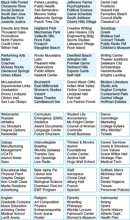
Figure 3.4 Two ways of structuring information on a web page. It takes more time for people to find a named item in the top one than in the bottom one, suggesting that using bordering as a grouping method helps searching while using contrasting color hinders it.
- Sounds should be audible and distinguishable so users understand what they represent.
- Speech output should enable users to distinguish between the set of spoken words and also be able to understand their meaning.
- Text should be legible and distinguishable from the background, e.g. it is OK to use yellow text on a black or blue background but not on a white or green background.
- Tactile feedback used in virtual environments should allow users to recognize the meaning of the various touch sensations being emulated. The feedback should be distinguishable so that, for example, the sensation of squeezing is represented in a tactile form that is different from the sensation of pushing.
Memory involves recalling various kinds of knowledge that allow us to act appropriately. It is very versatile, enabling us to do many things. For example, it allows us to recognize someone's face, remember someone's name, recall when we last met them, and know what we said to them last. Simply, without memory we would not be able to function.
It is not possible for us to remember everything that we see, hear, taste, smell, or touch, nor would we want to, as our brains would get completely overloaded. A filtering process is used to decide what information gets further processed and memorized. This filtering process, however, is not without its problems. Often we forget things we would dearly love to remember and conversely remember things we would love to forget. For example, we may find it difficult to remember everyday things like people's names and phone numbers, or scientific knowledge such as mathematical formulae. On the other hand, we may effortlessly remember trivia or tunes that cycle endlessly through our heads.
How does this filtering process work? Initially, encoding takes place determining which information is attended to in the environment and how it is interpreted. The extent to which it takes place affects our ability to recall that information later. The more attention that is paid to something and the more it is processed in terms of thinking about it and comparing it with other knowledge, the more likely it is to be remembered. For example, when learning about a topic it is much better to reflect upon it, carry out exercises, have discussions with others about it, and write notes than just passively read a book or watch a video about it. Thus, how information is interpreted when it is encountered greatly affects how it is represented in memory and how easy it is to retrieve subsequently.
Another factor that affects the extent to which information can be subsequently retrieved is the context in which it is encoded. One outcome is that sometimes it can be difficult for people to recall information that was encoded in a different context from the one they currently are in. Consider the following scenario:
You are on a train and someone comes up to you and says hello. You don't recognize him for a few moments but then realize it is one of your neighbors. You are only used to seeing your neighbor in the hallway of your apartment block and seeing him out of context makes him difficult to recognize initially.
Another well-known memory phenomenon is that people are much better at recognizing things than recalling things. Furthermore, certain kinds of information are easier to recognize than others. In particular, people are very good at recognizing thousands of pictures even if they have only seen them briefly before.
Activity 3.2
Try to remember the dates of all the members of your family's and your closest friends' birthdays. How many can you remember? Then try to describe what is on the cover of the last CD/DVD you bought. Which is easiest and why?
Comment
It is likely that you remembered much better what was on the CD/DVD cover (the image, the colors, the title) than the birthdays of your family and friends. People are very good at remembering visual cues about things, for example the color of items, the location of objects (a book being on the top shelf), and marks on an object, e.g. a scratch on a watch, a chip on a cup. In contrast, people find other kinds of information persistently difficult to learn and remember, especially arbitrary material like birthdays and phone numbers.
Instead of requiring users to recall from memory a command name from a possible set of hundreds or even thousands, GUIs provide visually-based options that users can browse through until they recognize the operation they want to perform. Likewise, web browsers provide facilities for displaying lists of URLs that have been visited. This means that users need only recognize a name of a site when scanning through a list of URLs.
What strategies do you use to help you remember things?
Comment
People often write down what they need to remember on a piece of paper. They also ask others to remind them. Another approach is to use various mental strategies, like mnemonics. A mnemonic involves taking the first letters of a set of words in a phrase or set of concepts and using them to make a more memorable phrase, often using bizarre and idiosyncratic connections. For example, some people have problems working out where east is in relation to west and vice versa, i.e. is it to the left or right. A mnemonic to help figure this out is to take the first letters of the four main points of the compass and then use them in the phrase ‘Never Eat Shredded Wheat,’ mentally recited in a clockwise sequence.
Personal information management (PIM) has become a growing concern for many people. The number of documents created, images, music files, and videoclips downloaded, emails and attachments saved, URLs bookmarked, and so on increases every day. A major problem is deciding where and how to save them, e.g. in hierarchical or flat folders, and then remembering what they were called and where to find them again. Naming is the most common means of encoding them, but trying to remember a name of a file you created some time back can be very difficult, especially if you have tens of thousands of named files. How might such a process be facilitated, taking into account people's memory abilities?

Figure 3.5 Apple Computer's Spotlight search tool
Mark Lansdale and Ernest Edmonds (1992) suggest that it is profitable to view this kind of remembering as involving two memory processes: recall-directed, followed by recognition-based scanning. The first refers to using memorized information about the required file to get as close to it as possible. The more exact this is the more success the user will have in tracking down the desired file. The second happens when recall has failed to produce what a user wants and so requires reading through a list. To illustrate the difference between these two processes, consider the following scenario: a user is trying to access a couple of websites she visited the week before that compared the selling price of cars offered by different dealers. The user is able to recall the name of one website, ‘autobargains.com.’ She types this in and the website appears. This is an example of successful recall-directed memory. However, the user is unable to remember the name of the second one. She vaguely remembers it was something like ‘alwaysthecheapest.com,’ but typing this in proves unsuccessful. Instead, she switches to scanning her history list and selects the folder labeled more than six days ago. She notices two or three URLs that could be the one desired at the top of the list, and on the second attempt she finds the website she is looking for. In this situation, the user initially tries recall-directed memory and when this fails, adopts the second strategy of recognition-based scanning—which takes longer but eventually results in success.
File management systems should be designed to optimize both kinds of memory processes. In particular, systems should be developed that let people use whatever memory they have to limit the area being searched and then represent the information in this area of the interface so as to maximally assist them in finding what they need. The system should provide the user with a number of ways of encoding documents mnemonically, including time stamping, categorizing, flagging, and attribution, e.g. color, text, icon, sound, or image. Powerful search engines have gone a long way towards helping people track down the files they want. For example, various search and find tools, such as Apple's Spotlight, enable the user to type a full or partial name or even the first letter of a file that it then searches for in the entire system, including emails, contacts, images, calendars, and applications. Figure 3.5 shows part of a list of 158 files that Spotlight matched to the user's phrase ‘cartoon’, prioritized in terms of what the user may be looking for, such as chapters and images.
Box 3.2: The Problem with the Magical Number 7 Plus or Minus 2
Perhaps the best known finding in psychology (certainly the one that nearly all students remember many years after they have finished their studies) is George Miller's (1956) theory that 7±2 chunks of information can be held in short-term memory at any one time. By short-term memory he meant a memory store in which information was assumed to be processed when first perceived. By chunks he meant a range of items like numbers, letters, or words. According to Miller's theory, therefore, people's immediate memory capacity is very limited. They are able to remember only a few words or numbers that they have heard or seen. If you are not familiar with this phenomenon, try out the following exercise: read the first list below (or get someone to read it to you), cover it up, and then try to recall as many of the items as possible. Repeat this for the other lists.
- 3, 12, 6, 20, 9, 4, 0, 1, 19, 8, 97, 13, 84
- cat, house, paper, laugh, people, red, yes, number, shadow, broom, rain, plant, lamp, chocolate, radio, one, coin, jet
- t, k, s, y, r, q, x, p, a, z, l, b, m, e
How many did you correctly remember for each list? Between 5 and 9, as suggested by Miller's theory?
Chunks can also be combined items that are meaningful. For example, it is possible to remember the same number of two-word phrases like hot chocolate, banana split, cream cracker, rock music, cheddar cheese, leather belt, laser printer, tree fern, fluffy duckling, cold rain. When these are all muddled up, e.g. split belt, fern crackers, banana laser, printer cream, cheddar tree, rain duckling, hot rock, however, it is much harder to remember as many chunks. This is mainly because the first set contains all meaningful two-word phrases that have been heard before and require less time to be processed in short-term memory, whereas the second set are completely novel phrases that don't exist in the real world. You need to spend time linking the two parts of the phrase together while trying to memorize them. This takes more time and effort to achieve. Of course it is possible to do if you have time to spend rehearsing them, but if you are asked to do it having heard them only once in quick succession, it is most likely you will remember only a few.
You may be thinking by now, “OK, this is interesting, but what has it got to do with interaction design?” Well, not only does this 50-year-old theory have a special place in psychology, it has also made a big impression in HCI. Unfortunately, however, for the wrong reasons. Many designers have heard or read about this phenomenon and think, ah, here is a bit of psychology I can usefully apply to interface design. Would you agree with them? If so, how might people's ability to only remember 7±2 chunks that they have just read or heard be usefully applied to interaction design?
According to a survey by Bob Bailey (2000) several designers have been led to believe the following guidelines and have even created interfaces based on them:
- Have only seven options on a menu.
- Display only seven icons on a menu bar.
- Never have more than seven bullets in a list.
- Place only seven tabs at the top of a website page.
- Place only seven items on a pull-down menu.
All of these are wrong. Why? The simple reason is that these are all items that can be scanned and rescanned visually and hence do not have to be recalled from short-term memory. They don't just flash up on the screen and disappear, requiring the user to remember them before deciding which one to select. If you were asked to find an item of food most people crave in the set of single words listed above, would you have any problem? No, you would just scan the list until you recognized the one (chocolate) that matched the task and then select it—just as people do when interacting with menus, lists, and tabs—regardless of whether they comprise three or 30 items. What the users are required to do here is not remember as many items as possible, having only heard or seen them once in a sequence, but instead scan through a set of items until they recognize the one they want. Quite a different task. Furthermore, there is much more useful psychological research that can be profitably applied to interaction design.
Memory load. Phone banking has become increasingly popular in the last few years. It allows customers to carry out financial transactions, such as paying bills and checking the balance of their accounts, at their convenience. One of the problems confronting banks that provide this facility, however, is how to manage security concerns. Anyone can phone up a bank and pretend to be someone else. How do the banks prevent fraudulent transactions?
One solution has been to develop rigorous security measures whereby customers must provide various pieces of information before gaining access to their accounts. Typically, these include providing the answers to a combination of the following:
- their zip code or post code
- their mother's maiden name
- their birthplace
- the last school they attended
- the first school they attended
- a password of between 5 and 10 letters
- a memorable address (not their home)
- a memorable date (not their birthday).
Many of these are relatively easy to remember and recall as they are very familiar. But consider the last two. How easy is it for someone to come up with such memorable information and then be able to recall it readily? Perhaps the customer can give the address and birthday of another member of their family as a memorable address and date. But what about the request for a password? Suppose a customer selects the word ‘interaction’ as a password—fairly easy to remember. The problem is that the bank operators do not ask for the full password, because of the danger that someone in the vicinity might overhear and write it down. Instead they are instructed to ask the customer to provide specific letters from it, like the seventh followed by the fifth. However, such information does not spring readily to mind. Instead, it requires mentally counting each letter of the password until the desired one is reached. How long does it take you to determine the seventh letter of the password ‘interaction’? How did you do it?
To make things harder, banks also randomize the questions they ask. Again, this is to prevent someone who might be overhearing from memorizing the sequence of information. However, it also means that the customers themselves cannot learn the sequence of information required, meaning they have to generate different information every time they call up the bank.
This requirement to remember and recall such information puts a big memory load on customers. Some people find such a procedure quite nerve-wracking and are prone to forget certain pieces of information. As a coping strategy they write down their details on a sheet of paper. Having such an external representation at hand makes it much easier for them to read off the necessary information rather than having to recall it from memory. However, it also makes them vulnerable to the very fraud the banks were trying to prevent, should anyone else get hold of that piece of paper!
Activity 3.4
How else might banks solve the problem of providing a secure system while making the memory load relatively easy for people wanting to use phone banking? How does phone banking compare with online banking?
Comment
An alternative approach is to provide the customers with a PIN and ask them to key this in on their phone keypad, followed by asking one or two questions like their zip or post code, as a backup. Online banking has similar security risks to phone banking, and hence this requires a number of security measures to be enforced. These include that the user sets up a nickname and a password. For example, some banks require typing in three randomly selected letters from a password each time the user logs on. This is harder to do online than when asked over the phone, mainly because it interferes with the normally highly automated process of typing in a password. You really have to think about what letters and numbers are in your password; for example, has it got two letter f's after the number 6, or just one?
Researchers have also investigated whether images could be used instead of alphanumerics for passwords. The idea is based on the principle that recognition is better than recall: users should be able to remember their passwords more accurately if they are required to recognize a set of images from a display that make up their password than if they have to recall a sequence of alphanumerics. To this end, the graphical authentication approach has been developed which asks people to select a series of images from different matrices of options. The images can be faces, cartoons, or photos of scenes or objects, e.g. sunset, dog or even abstract images. To enable the process to be secure, however, requires people selecting a sequence of four to eight images and subsequently being able to recognize each item in the correct sequence. In other words, both recall (of the sequence) and recognition are involved. Studies have shown that while the graphical approach appears an attractive alternative it has yet to demonstrate convincingly an advantage over the use of alphanumerics. Moreover, it takes much longer to create and subsequently select a sequence of images each time a person logs on than typing in a set of letters and numbers at a keyboard (De Angeli et al., 2005).
Box 3.3: Using UbiComp Technology as A Memory Aid for Cooking
People suffering from memory impairments can find it difficult to complete common household tasks, like cooking and washing up, where they may forget a step or where they were. These can be exacerbated if the person gets disrupted, e.g. the phone rings, and where they may end up not adding an ingredient or adding the washing up liquid twice. A prototype system called Cook's Collage was designed to provide surrogate memory support for general cooking tasks (Tran et al., 2005). Cameras were mounted underneath cabinets to capture still images of a cooking activity. These were then displayed as a series of images, in the form of a cartoon strip, on a flat-panel display mounted on an eye-level kitchen cabinet (see Figure 3.6). Preliminary evaluation of the prototype, being used by old people while cooking, showed them using it mainly as an aide-memoire, checking to see whether they had added certain ingredients after being distracted from the cooking task at hand.

Figure 3.6 A screenshot of Cook's Collage showing images of a recent cooking activity. The strip is designed to be read backwards, starting with the highlighted image. This shows to the cook that he previously added the 29th scoop (!) of sugar and in the previous image two scoops of soda water
DESIGN IMPLICAITONS Memory
- Do not overload users' memories with complicated procedures for carrying out tasks.
- Design interfaces that promote recognition rather than recall by using menus, icons, and consistently placed objects.
- Provide users with a variety of ways of encoding digital information, e.g. files, emails, images, to help them remember where they have stored them, through the use of categories, color, flagging, time stamping, icons, etc.
Learning can be considered in terms of (i) how to use a computer-based application or (ii) using a computer-based application to understand a given topic. Jack Carroll (1990) and his colleagues have written extensively about how to design interfaces to help learners develop computer-based skills. A main observation is that people find it very hard to learn by following a set of instructions in a manual. Instead, they much prefer to ‘learn through doing.’ GUIs and direct manipulation interfaces are good environments for supporting this kind of active learning by supporting exploratory interaction and, importantly, allowing users to ‘undo’ their actions, i.e. return to a previous state if they make a mistake by clicking on the wrong option. Carroll has also suggested that another way of helping learners is by using a ‘training-wheels’ approach. This involves restricting the possible functions that can be carried out by a novice to the basics and then extending these as the novice becomes more experienced. The underlying rationale is to make initial learning more tractable, helping the learner focus on simple operations before moving on to more complex ones.
There have been numerous attempts to harness the capabilities of different technologies to help learners understand topics. One of the main benefits of interactive technologies, such as web-based, multimedia, and virtual reality, is that they provide alternative ways of representing and interacting with information that are not possible with traditional technologies, e.g. books, video. In so doing, they have the potential of offering learners the ability to explore ideas and concepts in different ways. For example, interactive multimedia has been designed to help children learn abstract concepts, e.g. mathematical formulae, notations, laws of physics, that they find difficult to grasp when represented in other media. Different representations of the same process, e.g. a graph, a formula, a sound, a simulation, are displayed and interacted with in ways that make their relationship with each other more explicit to the learner.
One form of interactivity that has been found to be highly effective is ‘dynalinking’ (Rogers and Scaife, 1998). Abstract representations, such as diagrams, are linked together with a more concrete illustration of what they stand for, such as simulation. Changes in one are matched by changes in the other, enabling a better understanding of what the abstraction means. An example where it has been used is in the design of Pondworld, aimed at helping students learn ecological concepts, e.g. food webs. A concrete simulation showed various organisms swimming and moving around and occasionally an event where one would eat another, e.g. a snail eating the weed. This was annotated and accompanied by various eating sounds, e.g. chomping to attract the children's attention. The children could also interact with the simulation. When an organism was clicked on, it would say what it was and what it ate, e.g. “I'm a weed. I make my own food”. The concrete simulation was dynalinked with other abstract representations of the pond ecosystem. One of these was an abstract food web diagram (see Figure 3.7). The children were encouraged to interact with the interlinked diagrams in various ways and to observe what happened in the concrete simulation when something was changed in the diagram and vice versa. The evaluation study showed that children understood much better the purpose of the diagrams and improved significantly in their ability to reason about the ecosystem (Rogers et al., 2003).
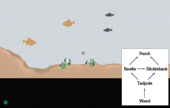
Figure 3.7 Dynalinking used in the Pondworld software
Dynalinking has been used in other domains to explicitly show relationships among multiple dimensions where the information to be understood or learned is complex (Sutcliffe, 2002). For example, it can be useful for domains like economic forecasting, molecular modeling, and statistical analyses.
Dilemma: Evolutionary Versus Revolutionary Upgrading
A constant dilemma facing designers involved in upgrading software is where and how to place new functions. Decisions have to be made on how to incorporate them with the existing interface design. Do they try to keep the same structure and add more buttons/menu options, or do they design a new model of interaction that is better suited to organizing and categorizing the increased set of functions? If the former strategy is followed, users do not have to learn a new conceptual model every time they upgrade a piece of software. The down side of trying to keep the same interface structure, however, is that it can easily get overloaded.
A problem when upgrading software, therefore, is working out how to redesign the interaction so that the amount of relearning, relative to the gains from the new functionality, is acceptable by users.
- Design interfaces that encourage exploration.
- Design interfaces that constrain and guide users to select appropriate actions when initially learning.
- Dynamically link concrete representations and abstract concepts to facilitate the learning of complex material.
Reading, speaking, and listening are three forms of language processing that have similar and different properties. One similarity is that the meaning of sentences or phrases is the same regardless of the mode in which it is conveyed. For example, the sentence “Computers are a wonderful invention” essentially has the same meaning whether one reads it, speaks it, or hears it. However, the ease with which people can read, listen, or speak differs depending on the person, task, and context. For example, many people find listening much easier than reading. Specific differences between the three modes include:
- Written language is permanent while listening is transient. It is possible to reread information if not understood the first time round. This is not possible with spoken information that is being broadcast.
- Reading can be quicker than speaking or listening, as written text can be rapidly scanned in ways not possible when listening to serially presented spoken words.
- Listening requires less cognitive effort than reading or speaking. Children, especially, often prefer to listen to narratives provided in multimedia or web-based learning material than to read the equivalent text online.
- Written language tends to be grammatical while spoken language is often ungrammatical. For example, people often start a sentence and stop in mid-sentence, letting someone else start speaking.
- There are marked differences between people in their ability to use language. Some people prefer reading to listening, while others prefer listening. Likewise, some people prefer speaking to writing and vice versa.
- Dyslexics have difficulties understanding and recognizing written words, making it hard for them to write grammatical sentences and spell correctly.
- People who have hearing or sight problems are restricted in the way they can process language.
Many applications have been developed either to capitalize on people's reading, writing, and listening skills, or to support or replace them where they lack or have difficulty with them. These include:
- Interactive books and web-based material that help people to read or learn foreign languages.
- Speech-recognition systems that allow users to provide instructions via spoken commands, e.g. wordprocessing dictation, home control devices that respond to vocalized requests.
- Speech-output systems that use artificially generated speech, e.g. written-text-to-speech systems for the blind.
- Natural-language systems that enable users to type in questions and give text-based responses, e.g. the Ask search engine.
- Cognitive aids that help people who find it difficult to read, write, and speak. A number of special interfaces have been developed for people who have problems with reading, writing, and speaking, e.g. see Edwards (1992).
- Customized input and output devices that allow people with various disabilities to have access to the web and use wordprocessors and other software packages.
- Interaction techniques that allow blind people to read graphs and other visuals on the web through the use of auditory navigation and tactile diagrams (Petrie et al., 2002).
DESIGN IMPLICATIONS Reading, speaking, and listening
- Keep the length of speech-based menus and instructions to a minimum. Research has shown that people find it hard to follow spoken menus with more than three or four options. Likewise, they are bad at remembering sets of instructions and directions that have more than a few parts.
- Accentuate the intonation of artificially generated speech voices, as they are harder to understand than human voices.
- Provide opportunities for making text large on a screen, without affecting the formatting, for people who find it hard to read small text.
Problem-solving, planning, reasoning, and decision-making are all processes involving reflective cognition. They include thinking about what to do, what the options are, and what the consequences might be of carrying out a given action. They often involve conscious processes (being aware of what one is thinking about), discussion with others (or oneself), and the use of various kinds of artifacts, e.g. maps, books, pen and paper. For example, when planning the best route to get somewhere, say a foreign city, we may ask others, use a map, get instructions from the web, or a combination of these. Reasoning also involves working through different scenarios and deciding which is the best option or solution to a given problem. In the route-planning activity we may be aware of alternative routes and reason through the advantages and disadvantages of each route before deciding on the best one. Many a family argument has come about because one member thinks he or she knows the best route while another thinks otherwise.
Comparing different sources of information is also common practice when seeking information on the web. For example, just as people will phone around for a range of quotes, so too will they use ‘comparison’ search engines, e.g. cheapflights.com, that list products in terms of their prices available on other sites.
The extent to which people engage in reflective cognition depends on their level of experience with a domain, application, or skill. Novices tend to have limited knowledge and will often make assumptions about what to do using other knowledge about similar situations. They tend to act by trial and error, exploring and experimenting with ways of doing things. As a result they may start off being slow, making errors, and generally being inefficient. They may also act irrationally, following their superstitions and not thinking ahead to the consequences of their actions. In contrast, experts have much more knowledge and experience and are able to select optimal strategies for carrying out their tasks. They are likely to be able to think ahead more, considering what the consequences might be of opting for a particular move or solution (as do expert chess players).
Box 3.4: Wanted: An Interface that the Police Can Use
In 2004 the San Jose police department installed a new mobile dispatch system in every police car that used a windows-based touch-screen computer. But the system was found to be too complex and difficult to use (Hafner, 2004). Part of the problem was that routine tasks, e.g. calling for assistance, that should have been straightforward to do were transformed into overly complicated tasks, requiring long sequences. The system was designed to aid police in rapid decision-making when driving their cars, but the interface was found to be too cluttered and behaved too much like a Windows computer. As one police officer said: “do you think if you're hunkered down and someone's shooting at you in your car, you're going to be able to sit there and look for Control or Alt or Function? No you are going to look for the red button.” After consultation with police officers the interface was designed to be much simpler and with fewer steps required for critical actions.
DESIGN IMPLICATIONS Problem-solving, planning, reasoning, and decision-making
- Provide additional hidden information that is easy to access for users who wish to understand more about how to carry out an activity more effectively, e.g. web searching.
- Use simple and memorable functions at the interface for computational aids intended to support rapid decision-making and planning that takes place while on the move.
3.3 Cognitive Frameworks
A number of conceptual frameworks have been developed to explain and predict user behavior based on theories of cognition. In this section, we outline the influential ones that have been developed for interaction design, which are:
- mental models
- theory of action
- information processing
- external cognition
- distributed cognition.
3.3.1 Mental Models
In Chapter 2 we pointed out that a successful system is one based on a conceptual model that enables users to readily learn a system and use it effectively. People primarily develop knowledge of how to interact with a system and, to a lesser extent, how that system works. These two kinds of knowledge are often referred to as a user's mental model.
It is assumed that mental models are used by people to reason about a system, and in particular, to try to fathom out what to do when something unexpected happens with the system or when encountering unfamiliar systems. The more someone learns about a system and how it functions, the more their mental model develops. For example, TV engineers have a ‘deep’ mental model of how TVs work that allows them to work out how to fix them. In contrast, an average citizen is likely to have a reasonably good mental model of how to operate a TV but a ‘shallow’ mental model of how it works. Within cognitive psychology, mental models have been postulated as internal constructions of some aspect of the external world that are manipulated, enabling predictions and inferences to be made (Craik, 1943). This process is thought to involve the ‘fleshing out’ and the ‘running’ of a mental model (Johnson-Laird, 1983). This can involve both unconscious and conscious mental processes, where images and analogies are activated.
Activity 3.5
To illustrate how we use mental models in our everyday reasoning, imagine the following two scenarios:
- You arrive home from a holiday on a cold winter's night to a cold house. You have a small baby and you need to get the house warm as quickly as possible. Your house is centrally heated. Do you set the thermostat as high as possible or turn it to the desired temperature, e.g. 70°F?
- You arrive home from being out all night starving hungry. You look in the fridge and find all that is left is an uncooked pizza. The instructions on the packet say heat the oven to 375°F and then place the pizza in the oven for 20 minutes. Your oven is electric. How do you heat it up? Do you turn it to the specified temperature or higher?
Comment
Most people when asked the first question imagine the scenario in terms of what they would do in their own house and choose the first option. A typical explanation is that setting the temperature to be as high as possible increases the rate at which the room warms up. While many people may believe this, it is incorrect. Thermostats work by switching on the heat and keeping it going at a constant speed until the desired temperature set is reached, at which point they cut out. They cannot control the rate at which heat is given out from a heating system. Left at a given setting, thermostats will turn the heat on and off as necessary to maintain the desired temperature.
When asked the second question, most people say they would turn the oven to the specified temperature and put the pizza in when they think it is at the desired temperature. Some people answer that they would turn the oven to a higher temperature in order to warm it up more quickly. Electric ovens work on the same principle as central heating, and so turning the heat up higher will not warm it up any quicker. There is also the problem of the pizza burning if the oven is too hot!
Why do people use erroneous mental models? It seems that in the above scenarios, they are running a mental model based on a general valve theory of the way something works (Kempton, 1986). This assumes the underlying principle of ‘more is more:’ the more you turn or push something the more it causes the desired effect. This principle holds for a range of physical devices, such as faucets and radio controls, where the more you turn them the more water or volume is given. However, it does not hold for thermostats, which instead function based on the principle of an on–off switch. What seems to happen is that in everyday life people develop a core set of abstractions about how things work, and apply these to a range of devices, irrespective of whether they are appropriate.
Using incorrect mental models to guide behavior is surprisingly common. Just watch people at a pedestrian crossing or waiting for an elevator. How many times do they press the button? A lot of people will press it at least twice. When asked why a common reason given is that they think it will make the lights change faster or ensure the elevator arrives. This seems to be another example of following the ‘more is more’ philosophy: it is believed that the more times you press the button the more likely it is to result in the desired effect.
Many people's understanding of how computer-based technologies and services, e.g. the Internet, wireless networking, broadband, search engines, viruses, work is poor. Their mental models are often incomplete, easily confusable, based on inappropriate analogies, and superstition (Norman, 1983). As a consequence, they find it difficult to identify, describe, or solve a problem, and lack the words or concepts to explain what is happening.
If people could develop better mental models of interactive systems they would be in a better position to know how to carry out their tasks efficiently, and know what to do if a system started malfunctioning. Ideally, they should be able to develop a mental model that matches the conceptual model. But to what extent is this realistic given that most people are resistant to spending much time learning about how things work, especially if it involves reading manuals or other documentation? Alternatively, if interactive technologies could be designed to be more transparent, then it might be easier to understand them in terms of how they work and what to do when they don't. Transparency involves including:
- useful feedback in response to user input
- easy-to-understand and intuitive ways of interacting with the system.
In addition, it requires providing the right kind and level of information, in the form of:
- clear and easy-to-follow instructions
- appropriate online help and tutorials
- context-sensitive guidance for users, set at their level of experience, explaining how to proceed when they are not sure what to do at a given stage of a task.
Dilemma: How much Transparency?
How much and what kind of transparency do you think a designer should provide in an interactive product? This is not a straightforward question to answer and depends a lot on the requirements of the targeted user groups. Some users simply want to get on with their tasks and don't want to have to learn about how the thing they are using works. In this situation, the system should be designed to make it obvious what to do and how to use it. For example, most cell phone users want a simple ‘plug-and-play’ type interface, where it is straightforward to carry out functions like saving an address, text messaging, and making a call. Functions that are difficult to learn can be off-putting. Users simply won't bother to make the extra effort, meaning that many of the functions provided are never used. Other users like to understand how the device they are using works in order to make informed decisions about how to carry out their tasks, especially if there are numerous ways of doing something. Some search engines have been designed with this in mind: they provide background information on how they work and how to improve one's searching techniques (see Figure 3.8).
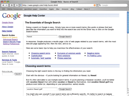
Figure 3.8 The Google help center which provides extensive information about how to make your searching strategy more effective
3.3.2 Theory of Action
Another way of conceptualizing how users interact with interactive products is in terms of their goals and what they need to do to achieve them. Norman's 1986 theory of action specifies what users do at the interface in terms of seven stages of an activity:
- Establish a goal.
- Form an intention.
- Specify an action sequence.
- Execute an action.
- Perceive the system state.
- Interpret the state.
- Evaluate the system state with respect to the goals and intentions.
The theory proposes that the stages take place sequentially. To illustrate how these are cycled through, consider the task of finding out about the latest news for the day. First, the user sets a goal to find out about the latest news via a news website. Next, it involves forming an intention, e.g. check out the BBC website, then specifying what to do, e.g. move cursor to link on browser), followed by executing that action sequence, e.g. move mouse, click on mouse button. To assess the outcome of the action and whether it meets the user's goal involves perceiving what has happened at the interface, e.g. seeing a new page pop up on the screen, interpreting it, e.g. reading that it is the BBC newsite, and then evaluating it with respect to the goal, e.g. now able to read the latest news.
In reality, however, human activity does not proceed in such an orderly and sequential manner. It is more often the case that some stages are missed, others repeated, while others appear out of order. Furthermore, many users do not have a clear goal in mind but react to what appears on the screen, such as when they are browsing the web or revisiting emails. It must be stressed, therefore, that the theory is only meant as an approximation of what happens and has been deliberately simplified. It is intended to help designers and researchers think about how best to design interfaces to enable users to monitor their actions with respect to their goals in terms of the various stages of action.
At a general level, it suggests the importance of providing feedback about the system state so that users can check to see whether their goals and intentions have been met. An example is the use of visual reminders, which can be designed to support the different stages of action. Dialog boxes can trigger the generation of intentions by reminding users of what is possible. Menus can aid the stages of intention formation and action specification through allowing users to browse, scan, and point at an option. Feedback, such as the different cursor icons used at an interface, inform users that an operation is currently being executed.
It is important to note that while interaction styles can be specifically geared towards certain action stages, they may do so at the expense of others. For example, while menus are good at helping users form intentions, they can also distract them by providing a range of choices that can lead them astray from their initial intentions. How many times have you changed your mind about what you planned to do based on what catches your eye when browsing a set of menu options or hyperlinks on a website? And, how often have you been tempted to add features like sounds, animations, colors, and fancy backgrounds to a Powerpoint presentation because you happen upon them in the menu options—even though they were not part of your original intention to create a set of slides for a talk? Such reaction-based actions are common, especially for GUI-based interfaces.
Related to the theory of action is the gulf of execution and the gulf of evaluation (Norman, 1986; Hutchins et al., 1986). The ‘gulfs’ explicate the gaps that exist between the user and the interface and point to how to design the latter to enable the user to cope with them. The first one—the gulf of execution—describes the distance from the user to the physical system while the second one—the gulf of evaluation—is the distance from the physical system to the user (see Figure 3.9). Norman and his colleagues suggest that designers and users need to concern themselves with how to bridge the gulfs in order to reduce the cognitive effort required to perform a task. This can be achieved, on the one hand, by designing usable interfaces that match the psychological characteristics of the user, e.g. taking into account their memory limitations, and, on the other hand, by the user learning to create goals, plans, and action sequences that fit with how the interface works.

Figure 3.9 Bridging the gulfs of execution and evaluation
Over the last two decades, the gulfs have had considerable impact on how researchers conceptualize and design new interfaces and tools. Lieberman and Fry (1995) used the concepts to directly inform the design of a debugging environment, called ZStep 94, intended to help programmers overcome the gulfs of execution and evaluation when translating their intentions of how a program should be written with their actual coding. Instead of having to imagine how a piece of code will work over time, graphical tools were provided at the interface that dynamically visualized the process for the programmer (see Figure 3.10). In so doing, the gulf of execution is reduced, requiring much less cognitive effort by the programmer. Nowadays, such debugging tools are commonplace.

Figure 3.10 ZStep 94: an early debugging tool that visualized code over time, inspired by the concepts of the gulf of execution and evaluation (Lieberman and Fry, 1995)
New conceptual frameworks have also been spawned. Quintana et al. (2000) have used the gulfs as the basis of their learner-centered design (LCD) approach, that has been influential in informing the design of educational applications. They stress the need to bridge the ‘gulf of expertise’ between a learner and the domain they are learning about. Bellotti et al. (2002) have also used it as the basis of their ‘making sense’ framework that addresses the new challenges facing designers when developing ubiquitous computing systems.
3.3.3 Information Processing
Another approach to conceptualizing how the mind works has been to use metaphors and analogies. A number of comparisons have been made, including conceptualizing the mind as a reservoir, a telephone network, and a digital computer. One prevalent metaphor from cognitive psychology is the idea that the mind is an information processor. Information is thought to enter and exit the mind through a series of ordered processing stages (see Figure 3.11). Within these stages, various processes are assumed to act upon mental representations. Processes include comparing and matching. Mental representations are assumed to comprise images, mental models, rules, and other forms of knowledge.

Figure 3.11 Human information processing model
The information processing model provides a basis from which to make predictions about human performance. Hypotheses can be made about how long someone will take to perceive and respond to a stimulus (also known as reaction time) and what bottlenecks occur if a person is overloaded with too much information. A classic approach is the human processor model, which models the cognitive processes of a user interacting with a computer (Card et al., 1983). Based on the information processing model, cognition is conceptualized as a series of processing stages, where perceptual, cognitive, and motor processors are organized in relation to one another (see Figure 3.12). The model predicts which cognitive processes are involved when a user interacts with a computer, enabling calculations to be made of how long a user will take to carry out various tasks. This can be useful when comparing different interfaces. For example, it has been used to compare how well different wordprocessors support a range of editing tasks (see section 15.4).
The information processing approach is based on modeling mental activities that happen exclusively inside the head. However, most cognitive activities involve people interacting with external kinds of representations, like books, documents, and computers—not to mention one another. For example, when we go home from wherever we have been we do not need to remember the details of the route because we rely on cues in the environment, e.g. we know to turn left at the red house, right when the road comes to a T-junction, and so on. Similarly, when we are at home we do not have to remember where everything is because information is ‘out there.’ We decide what to eat and drink by scanning the items in the fridge, find out whether any messages have been left by glancing at the answering machine to see if there is a flashing light, and so on. To what extent, therefore, can we say that information processing models are truly representative of everyday cognitive activities? Moreover, do they adequately account for how people interact with computers and other devices?

Figure 3.12 The human processor model
Several researchers have argued that existing information processing approaches are too impoverished:
The traditional approach to the study of cognition is to look at the pure intellect, isolated from distractions and from artificial aids. Experiments are performed in closed, isolated rooms, with a minimum of distracting lights or sounds, no other people to assist with the task, and no aids to memory or thought. The tasks are arbitrary ones, invented by the researcher. Model builders build simulations and descriptions of these isolated situations. The theoretical analyses are self-contained little structures, isolated from the world, isolated from any other knowledge or abilities of the person. (Norman, 1990, p. 5)
Instead, there has been an increasing trend to study cognitive activities in the context in which they occur, analyzing cognition as it happens “in the wild” (Hutchins, 1995). A central goal has been to look at how structures in the environment can both aid human cognition and reduce cognitive load. Two approaches that have adopted this approach are ‘external’ and ‘distributed’ cognition, which we now turn our attention to.
3.3.4 External Cognition
People interact with or create information through using a variety of external representations, e.g. books, multimedia, newspapers, web pages, maps, diagrams, notes, drawings, and so on. Furthermore, an impressive range of tools have been developed throughout history to aid cognition, including pens, calculators, and computer-based technologies. The combination of external representations and physical tools has greatly extended and supported people's ability to carry out cognitive activities (Norman, 1993). Indeed, they are such an integral part that it is difficult to imagine how we would go about much of our everyday life without them.
External cognition is concerned with explaining the cognitive processes involved when we interact with different external representations (Scaife and Rogers, 1996). A main goal is to explicate the cognitive benefits of using different representations for different cognitive activities and the processes involved. The main ones include:
- Externalizing to reduce memory load.
- Computational offloading.
- Annotating and cognitive tracing.
1. Externalizing to Reduce Memory Load
A number of strategies have been developed for transforming knowledge into external representations to reduce memory load. One such strategy is externalizing things we find difficult to remember, such as birthdays, appointments, and addresses. Diaries, personal reminders, and calendars are examples of cognitive artifacts that are commonly used for this purpose, acting as external reminders of what we need to do at a given time, e.g. buy a card for a relative's birthday.
Other kinds of external representations that people frequently employ are notes, like post-it notes, shopping lists, and to-do lists. Where these are placed in the environment can also be crucial. For example, people often place post-it notes in prominent positions, such as on walls, on the side of computer monitors, by the front door, and sometimes even on their hands, in a deliberate attempt to ensure they do remind them of what needs to be done or remembered. People also place things in piles in their offices and by the front door, indicating what needs to be done urgently and what can wait for a while.
Externalizing, therefore, can help reduce people's memory burden by:
- reminding them to do something, e.g. get something for their mother's birthday
- reminding them of what to do, e.g. buy a card
- reminding them of when to do something, e.g. send it by a certain date.
A number of computer-based applications have been developed to reduce the burden on people to remember things, including web-based to-do list services, e.g. Ta-da ™, email, and text messaging for meetings, birthdays, etc. Specialized prosthetic devices have also been designed for people with memory problems, such as the memory aid for cooking depicted in Box 3.3.
2. Computational Offloading
Computational offloading occurs when we use a tool or device in conjunction with an external representation to help us carry out a computation. An example is using pen and paper to solve a math problem.
Activity 3.6
- Multiply 2 by 3 in your head. Easy. Now try multiplying 234 by 456 in your head. Not as easy. Try doing the sum using a pen and paper. Then try again with a calculator. Why is it easier to do the calculation with pen and paper and even easier with a calculator?
- Try doing the same two sums using Roman numerals.
Comment
- Carrying out the sum using pen and paper is easier than doing it in your head because you ‘offload’ some of the computation by writing down partial results and using them to continue with the calculation. Doing the same sum with a calculator is even easier, because it requires only eight simple key presses. Even more of the computation has been offloaded onto the tool. You need only follow a simple internalized procedure (key in first number, then the multiplier sign, then next number, and finally the equals sign) and then read off the result from the external display.
- Using Roman numerals to do the same sum is much harder: 2 by 3 becomes II × III, and 234 by 456 becomes CCXXXIIII × CCCCXXXXXVI. The first calculation may be possible to do in your head or on a bit of paper, but the second is incredibly difficult to do in your head or even on a piece of paper (unless you are an expert in using Roman numerals or you ‘cheat’ and transform it into Arabic numerals). Calculators do not have Roman numerals so it would be impossible to do on a calculator.
Hence, it is much harder to perform the calculations using Roman numerals than algebraic numerals—even though the problem is equivalent in both conditions. The reason for this is that the two kinds of representation transform the task into one that is easy and one that is more difficult, respectively. The kind of tool used also can change the nature of the task to being more or less easy.
3. Annotating and Cognitive Tracing
Another way in which we externalize our cognition is by modifying representations to reflect changes that are taking place that we wish to mark. For example, people often cross things off in a to-do list to show that they have been completed. They may also reorder objects in the environment by creating different piles as the nature of the work to be done changes. These two kinds of modification are called annotating and cognitive tracing:
- Annotating involves modifying external representations, such as crossing off or underlining items.
- Cognitive tracing involves externally manipulating items into different orders or structures.
Annotating is often used when people go shopping. People usually begin their shopping by planning what they are going to buy. This often involves looking in their cupboards and fridge to see what needs stocking up. However, many people are aware that they won't remember all this in their heads and so often externalize it as a written shopping list. The act of writing may also remind them of other items that they need to buy, which they may not have noticed when looking through the cupboards. When they actually go shopping at the store, they may cross off items on the shopping list as they are placed in the shopping basket or cart. This provides them with an annotated externalization, allowing them to see at a glance what items are still left on the list that need to be bought. Some displays, e.g. tablet PCs, large interactive displays, and PDAs, enable users to physically annotate documents, such as circling data or writing notes, using styluses or their fingertips (see Chapter 6). The annotations can be stored with the document, enabling the users to revisit their's or other's externalizations at a later date.
Cognitive tracing is useful in situations where the current state of play is in a state of flux and the person is trying to optimize their position. This typically happens when playing games, such as:
- In a card game the continued rearrangement of a hand of cards into suits, ascending order, or same numbers to help determine what cards to keep and which to play, as the game progresses and tactics change.
- In Scrabble, where shuffling around letters in the tray helps a person work out the best word given the set of letters (Maglio et al., 1999).
It has also been used as an interactive function, for example, letting students know what they have studied in an online e-learning package. An interactive diagram can be used to highlight all the nodes visited, exercises completed, and units still to study.
A general cognitive principle for interaction design based on the external cognition approach is to provide external representations at an interface that reduce memory load and facilitate computational offloading. Different kinds of information visualizations can be developed that reduce the amount of effort required to make inferences about a given topic, e.g. financial forecasting, identifying programming bugs. In so doing, they can extend or amplify cognition, allowing people to perceive and do activities that they couldn't do otherwise. For example, information visualizations (see Chapter 6) represent masses of data in a visual form that can make it easier to make cross-comparisons across dimensions. GUIs are also able to reduce memory load significantly through providing external representations, e.g. Wizards, dialog boxes, that guide users through their interactions.
Box 3.5: Context-sensitive Information: Shopping Reminders on the Move
Wireless communication systems that use GPS technology can provide people on the move with context-sensitive information. Information such as reminders and to-do lists can be triggered and played via a handheld device e.g. cell phone, or other technology e.g. car audio system, whenever it is deemed appropriate, relative to a person's location or specific time. An early prototype, called comMotion (Marmasse and Schmandt, 2000), used a speech-output system to inform people of the groceries they needed to buy, such as milk, whenever they drove or cycled past a store that sold them (see Figure 3.13).
How useful is this kind of externalization? Are people really that bad at remembering things? In what ways is it an improvement over other reminder techniques, such as shopping lists written on paper or lists stored on handheld devices, e.g. cell phones? Certainly, it is more difficult to look at a hand-written list while on the move compared with listening to a verbal reminder. But is this kind of external aid useful or desirable?

Figure 3.13 comMotion: a context-aware reminder system
For people who suffer from various memory disorders e.g. Alzheimers, there is clearly much potential for such context-aware reminder systems being able to assist them in their daily lives. But for others, it may result in them depending more and more on spoken or visual reminders, popping up all the time to tell them what they should be doing, when, and where. They may well be reminded to buy the milk but at what price? Losing their own ability to remember?
3.3.5 Distributed Cognition
The distributed cognition approach studies the nature of cognitive phenomena across individuals, artifacts, and internal and external representations (Hutchins, 1995). Typically, it involves describing a ‘cognitive system,’ which entails interactions among people, the artifacts they use, and the environment they are working in (see Figure 3.14). It differs from the external cognition approach in that it provides a more extensive account of the cognitive system.
An example of a cognitive system is an airline cockpit, where a top-level goal is to fly the plane. This involves:
- the pilot, co-pilot, and air traffic controller interacting with one another
- the pilot and co-pilot interacting with the instruments in the cockpit

Figure 3.14 Comparison of traditional and distributed cognition approaches
- the pilot and co-pilot interacting with the environment in which the plane is flying, e.g. sky, runway.
A primary objective of the distributed cognition approach is to describe these interactions in terms of how information is propagated through different media. By this is meant how information is represented and re-represented as it moves across individuals and through the array of artifacts that are used, e.g. maps, instrument readings, scribbles, spoken word, during activities. These transformations of information are referred to as changes in representational state.
This way of describing and analyzing a cognitive activity contrasts with other cognitive approaches, e.g. the information processing model, in that it focuses not on what is happening inside the head of an individual, but on what is happening across a system of individuals and artifacts. For example, in the cognitive system of the cockpit, a number of people and artifacts are involved in the activity of ‘flying to a higher altitude.’ The air traffic controller initially tells the co-pilot when it is safe to fly to a higher altitude. The co-pilot then alerts the pilot, who is flying the plane, by moving a knob on the instrument panel in front of them, indicating that it is now safe to fly (see Figure 3.15). Hence, the information concerning this activity is transformed through different media (over the radio, through the co-pilot, and via a change in the position of an instrument).
A distributed cognition analysis typically involves examining:
- The distributed problem-solving that takes place (including the way people work together to solve a problem).
- The role of verbal and non-verbal behavior (including what is said, what is implied by glances, winks, etc. and what is not said).
- The various coordinating mechanisms that are used, e.g. rules, procedures.

Figure 3.15 A cognitive system in which information is propagated through different media
- The various ways communication takes place as the collaborative activity progresses.
- How knowledge is shared and accessed.
Chapter 8 describes in more detail how to conduct a distributed cognition analysis.
Assignment
The aim of this assignment is for you to elicit mental models from people. In particular, the goal is for you to understand the nature of people's knowledge about an interactive product in terms of how to use it and how it works.
- First, elicit your own mental model. Write down how you think a cash machine (ATM) works. Then answer the following questions (abbreviated from Payne, 1991):
- How much money are you allowed to take out?
- If you took this out and then went to another machine and tried to withdraw the same amount, what would happen?
- What is on your card?
- How is the information used?
- What happens if you enter the wrong number?
- Why are there pauses between the steps of a transaction?
- How long are they?
- What happens if you type ahead during the pauses?
- What happens to the card in the machine?
- Why does it stay inside the machine?
- Do you count the money? Why?
Next, ask two other people the same set of questions.
- Now analyze your answers. Do you get the same or different explanations? What do the findings indicate? How accurate are people's mental models of the way ATMs work? How transparent are the ATM systems they are talking about?
- Next, try to interpret your findings with respect to the design of the system. Are any interface features revealed as being particularly problematic? What design recommendations do these suggest?
- Finally, how might you design a better conceptual model that would allow users to develop a better mental model of ATMs (assuming this is a desirable goal)?
This exercise is based on an extensive study carried out by Steve Payne on people's mental models of ATMs. He found that people do have mental models of ATMs, frequently resorting to analogies to explain how they work. Moreover, he found that people's explanations were highly variable and based on ad hoc reasoning.
Summary
This chapter has explained the importance of understanding users, especially their cognitive aspects. It has described relevant findings and theories about how people carry out their everyday activities and how to learn from these when designing interactive products. It has provided illustrations of what happens when you design systems with the user in mind and what happens when you don't. It has also presented a number of conceptual frameworks that allow ideas about cognition to be generalized across different situations.
Key Points
- Cognition comprises many processes, including thinking, attention, learning, memory, perception, decision-making, planning, reading, speaking, and listening.
- The way an interface is designed can greatly affect how well people can perceive, attend, learn, and remember how to carry out their tasks.
- The main benefits of conceptual frameworks and cognitive theories are that they can explain user interaction and predict user performance.
Further Reading
JACKO, J. and SEARS, A. (eds) (2003) The Human–Computer Interaction Handbook: Fundamentals, Evolving Technologies and Emerging Applications. Lawrence Erlbaum Associates. Section II introduced by Mary Czerwinski provides some good overview chapters on human aspects of HCI, including Perceptual-Motor Interaction (Romeo Chua, Daniel J. Weeks and David Goodman), Human Information Processing (Robert W. Proctor and Kim-Phuong L. Vu), and Mental Models (Gerrit C. van der Veer and Maria del Carmen Puerta Melguizo).
RASKIN, J. (2000) The Humane Interface. Addison-Wesley. This thought-provoking book by the late Jef Raskin re-examines the cognitive foundations of interaction design, explicating why interfaces fail or succeed. It is written in a personable and witty style with many insightful anecdotes.
MULLET, K. and SANO, D. (1995) Designing Visual Interfaces. SunSoft Press. This is an excellent book on the dos and don'ts of interactive graphical design. It includes many concrete examples that have followed (or not) design principles based on cognitive issues.
CARROLL, J. (ed.) (1991) Designing Interaction. Cambridge University Press. This edited volume provides a good collection of papers on cognitive aspects of interaction design.
NORMAN, D. (1988) The Psychology of Everyday Things. Basic Books.
NORMAN, D. (1993) Things that Make Us Smart. Addison-Wesley. These two early books by Don Norman provide many key findings and observations about people's behavior and their use of artifacts. They are written in a stimulating and thought-provoking way, using many examples from everyday life to illustrate conceptual issues. He also presents a number of psychological theories, including external cognition, in an easily digestible form.
ROGERS, Y., RUTHERFORD, A. and BIBBY, P. (eds) (1992) Models in the Mind. Academic Press. This volume provides a good collection of papers on eliciting, interpreting, and theorizing about mental models in HCI and other domains.