
Data analysis, interpretation, and presentation
The main aims of this chapter are to:
- Discuss the difference between qualitative and quantitative data and analysis.
- Enable you to be able to analyze data gathered from questionnaires.
- Enable you to be able to analyze data gathered from interviews.
- Enable you to be able to analyze data gathered from observation studies.
- Make you aware of the kind of software packages that are available to help your analysis.
- Identify some of the common pitfalls in data analysis, interpretation, and presentation.
- Enable you to be able to interpret and present your findings in a meaningful and appropriate manner.
8.1 Introduction
8.2 Qualitative and quantitative
8.3 Simple quantitative analysis
8.4 Simple qualitative analysis
8.5 Tools to support data analysis
8.6 Using theoretical frameworks
8.7 Presenting the findings
8.1 Introduction
The kind of analysis that can be performed on a set of data will be influenced by the goals identified at the outset, and the data actually gathered. Broadly speaking, you may take a qualitative analysis approach or a quantitative analysis approach, or a combination of qualitative and quantitative. The last of these is very common as it supports triangulation and provides flexibility.
Most analysis, whether it is quantitative or qualitative, begins with initial reactions or observations from the data. This might involve identifying patterns or calculating simple numerical values such as ratios, averages, or percentages. This initial analysis is followed by more detailed work using structured frameworks or theories to support the investigation.
Interpretation of the findings often proceeds in parallel with analysis, but there are different ways to interpret results and it is important to make sure that the data supports your conclusions. A common mistake is for the investigator's existing beliefs or biases to influence the interpretation of results. Imagine that through initial analysis of your data you have discovered a pattern of responses to customer care questionnaires which indicates that inquiries from customers that are routed through the Sydney office of an organization take longer to process than those routed through the Moscow office. This result can be interpreted in many different ways. Which do you choose? You may conclude that the customer care operatives in Sydney are less efficient, or you may conclude that the customer care operatives in Sydney provide more detailed responses, or you may conclude that the technology supporting the processing of inquiries needs to be updated in Sydney, or you may conclude that customers reaching the Sydney office demand a higher level of service, and so on. In order to determine which of these potential interpretations is more accurate, it would be appropriate to look at other data such as customer inquiry details, and maybe interviews with staff.
Another common mistake is to make claims that go beyond what the data can support. This is a matter of interpretation and of presentation. The words ‘many’ or ‘often’ or indeed ‘all’ need to be used very carefully when reporting conclusions. An investigator should remain as impartial and objective as possible if the conclusions are to be believed, and showing that your conclusions are supported by your results is an important skill to develop.
Finally, finding the best way to present your findings is equally skilled, and depends on your goals but also on the audience for whom the results were produced. For example, in the requirements activity you might choose to present your findings using a formal notation, while reporting the results of an evaluation to the team of developers might involve a summary of problems found, supported by video clips of users experiencing those problems.
In this chapter we will introduce a variety of methods and describe in more detail how to approach data analysis using some of the common approaches taken in interaction design.
8.2 Qualitative and Quantitative
Quantitative data is data that is in the form of numbers, or that can easily be translated into numbers. For example, the number of years' experience the interviewees have, the number of projects a department handles at a time, or the number of minutes it takes to perform a task. Qualitative data is data that is difficult to measure, count, or express in numerical terms in a sensible fashion (it may be possible to record or express qualitative data in a numerical form, but that does not mean it is sensible to do so—see Box 8.1).
It is sometimes assumed that certain forms of data gathering will only result in quantitative data and others will only result in qualitative data. However, this is a fallacy. All the forms of data gathering discussed in the previous chapter may result in qualitative and quantitative data. For example, on a questionnaire, questions about the participant's age, or number of software packages they use a day, will result in quantitative data, while any ‘comments’ fields will result in qualitative data. In an observation, quantitative data you may record includes the number of people involved in a project, or how many hours a participant spends trying to sort out a problem they encounter, while notes about the level of frustration, or the nature of interactions between team members, is qualitative data.
Quantitative analysis uses numerical methods to ascertain the magnitude, amount, or size of something, for example, the attributes, behavior, or opinions of the participants. For example, in describing a population, a quantitative analysis might conclude that the average person is 5 feet 11 inches tall, weighs 180 pounds, and is 45 years old. Qualitative analysis focuses on the nature of something and can be represented by themes, patterns, and stories. For example, in describing the same population, a qualitative analysis might conclude that the average person is tall, thin, and middle-aged.
Box 8.1: Use and Abuse of Numbers
Numerical information can be used and abused in many ways, and if you are not comfortable dealing with numbers, it is always better to ask for help from someone who is, because it is easy to misrepresent your data. Any qualitative data can be turned into a set of numbers, which in turn can be manipulated in a wide variety of ways, and then interpreted with respect to your goals. People tend to believe that numbers offer a stronger or clearer conclusion, and so there is a strong temptation to use numbers, even though, on reflection, you would probably realize that their use is unwarranted. For example, assume that you have collected a set of interviews from sales representatives regarding the use of a new mobile product for reporting sales queries. One way of turning this data into a numerical form would be to count the number of words uttered by each of your interviewees.
You might then draw conclusions about how strongly the sales representatives feel about the mobile devices, e.g. the more they had to say about the product, the stronger they feel about it. But do you think this is a wise way to analyze the data? This set of quantitative data is unlikely to be of much use in answering your study questions.
Other, less obvious abuses include translating small population sizes into percentages. For example, saying that 50% of users take longer than 30 minutes to place an order through an e-commerce website carries a different meaning than saying that two out of four users had the same problem. It is better not to use percentages unless the number of data points is at least over 10, and even then it is appropriate to use both percentages and raw numbers, to make sure that your claim is not misunderstood.
Numbers are infinitely malleable, and make a very convincing argument, but before adding a set of numbers together, finding an average, calculating a percentage, or performing any other kind of numerical translation on your data, stop and think about whether what you are doing makes sense in the context.
It is also possible to perform perfectly legitimate statistical calculations on a set of data and still to present misleading results by not making the context clear, or by choosing the particular calculation that gives the most favorable result (Huff, 1991).
There are times when translating non-numerical data into a numerical or ordered scale is perfectly appropriate, and this is a common approach in interaction design. However, you need to be careful that any translations you apply will not misrepresent your data.
8.2.1 The First Steps in Analyzing Data
Having performed data gathering sessions, there is some initial processing of the data normally required before data analysis can begin in earnest. There are many different combinations of data, but here we discuss typical data collected through interviews, questionnaires, and observation sessions. This information is summarized in Table 8.1.
Interviews. Raw interview data is usually in the form of audio recordings and interviewer notes. The notes need to be written up and expanded as soon as possible after the interview has taken place so that the interviewer's memory is clear and fresh. The audio recording may be used to help in this process, or it may be transcribed (i.e. written out) for more detailed analysis. Transcription takes significant effort, as people talk more quickly than most people can type (or write), and the recording is not always very clear, requiring the tape to be repeatedly rewound and replayed. It is therefore worth considering whether or not to transcribe the whole interview, or just sections of it that are relevant to your investigation.
Interviews are sometimes video recorded, especially if the interviewee is given a task to perform, or props are used to prompt discussion. The audio channel of the video data may also be transcribed.
Closed questions are usually treated as quantitative data and analyzed using simple quantitative analysis (see below). For example, a question that asks for the respondent's age range can easily be analyzed to find out the percentage of respondents in each range. More complicated statistical techniques are needed to identify relationships between question responses that can be generalized, such as being able to say that men over the age of 35 all believe that buttons on cell phones are too small.
Open questions result in qualitative data which might be searched for categories or patterns of response.
Questionnaires. Raw data from questionnaires consists of the respondents' answers to the questions, and these may be in written format, or for online surveys, the data is likely to be in a database. It may be necessary to clean up the data by removing entries where the respondent has misunderstood a question.
The data can be filtered according to respondent subpopulations, e.g. everyone under 16, or according to question, e.g. to understand respondents' reactions to color. This allows analyses to be conducted on subsets of the data, and hence to draw detailed conclusions for more specific goals. This is made easier by the use of a simple tool such as a spreadsheet, as discussed below.
As for interviews, closed questions are likely to be analyzed quantitatively and open questions qualitatively.
Observation. This kind of data gathering can result in a wide variety of raw data including observer's notes, photographs, data logs, think-aloud protocols, video and audio recordings. All this raw data presents a rich picture of the activity under observation, but it can also make it difficult to analyze unless a structured framework is adopted. Initial data processing here would include writing up and expanding notes, transcribing elements of the audio and video recordings, and the think-aloud protocols. For observation in a controlled environment, initial processing might also include synchronizing different data recordings.
Transcriptions and observer's notes are most likely to be analyzed using qualitative approaches, while photographs provide contextual information. Data logs and some elements of the observer's notes would probably be analyzed quantitatively.
Throughout this initial processing, patterns and themes in the data may present themselves. It is useful to make a note of these initial impressions to use as a basis for further, more detailed analysis, but don't rely on these initial impressions alone as you may be unintentionally biased by them.
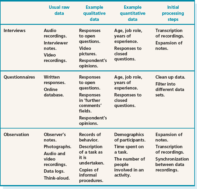
Table 8.1 Data gathered and typical initial processing steps for the main data gathering techniques
8.3 Simple Quantitative Analysis
Explaining statistical analysis requires several books on its own. We will not try to explain statistics in any detail, although some basic statistical terms and use of statistics are discussed further in Chapter 14. Here, we introduce some simple quantitative analysis techniques you can use effectively in an interaction designmcontext. The techniques explored here are averages and percentages. Percentages are useful for standardizing the data, particularly if you want to compare two or more large sets of responses.
Averages and percentages are fairly well-known numerical measures. However, there are three different types of ‘average’ and which one you use changes the meaning of your results. These three are: mean, median, and mode. Mean refers to the commonly understood interpretation of average, i.e. add together all the figures and divide by the number of figures you started with. Median and mode are less well-known but are very useful. The median is the middle value of the data when the numbers are ranked. The mode is the most commonly occurring number. For example, in a set of data (2, 3, 4, 6, 6, 7, 7, 7, 8), the median is 6 and the mode is 7, while the mean is 50/9 = 5.56. In this case, the difference between the different averages is not that great. However, consider the set (2, 2, 2, 2, 450). Now the median is 2, the mode is 2, and the mean is 458/5 = 91.6!
Before any analysis can take place, the data need to be collated into analyzable data sets. Quantitative data can usually be translated into rows and columns, where one row equals one record, e.g. respondent or interviewee. If these are then entered into a spreadsheet such as Excel, this makes simple manipulations and data set filtering easier. Before entering data in this way, it is important to decide how you will represent the different possible answers. For example, a ‘don't know’ answer and no answer at all are different responses that need to be distinguished. Also, if dealing with options from a closed question, such as job role, there are two different possible approaches which affect the analysis. One approach is to have a column headed ‘job role’ and to enter the job role as it is given to you by the respondent or interviewee. The alternative approach is to have a column for each possible answer. The latter approach lends itself more easily to automatic summaries. Note, however, that this option will only be open to you if the original question was designed to collect the appropriate data (see Box 8.2).
Box 8.2: How Question Design Affects Data Analysis
Activity 7.2 asked you to suggest some interview questions that you might ask a colleague to help evaluate Cybelle. We shall use this example here to illustrate how different question designs affect the kinds of analysis that can be performed, and the kind of conclusions that can be drawn.
Assume that you have asked the question: “How do you feel about Cybelle?” Responses to this will be varied and may include that she is pretty, wears nice clothes, is life-like, is intelligent, is amusing, is helpful, and so on. There are many possibilities, and the responses would need to be treated qualitatively.
This means that analysis of the data must consider each individual response. If you have only 10 or so responses then this may not be too bad, but if you have many more then it becomes harder to process the information, and harder to summarize your findings. This is typical of open-ended questions—answers are not likely to be homogeneous and so will need to be treated individually. In contrast, answers to a closed question, which gives respondents a fixed set of alternatives to choose from, can be treated quantitatively. So, for example, instead of asking “How do you feel about Cybelle?,” assume that you have asked: “In your opinion, is Cybelle amusing or irritating?” This clearly reduces the number of options and you would then record the response as ‘irritating,’ ‘amusing,’ or ‘neither.’
When entered in a spreadsheet, or a simple table, initial analysis of this data might look like the following:
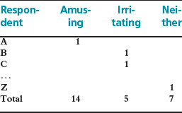
Based on this, we can then say that 14 out of 26 (54%) of our respondents found Cybelle amusing, 5 out of 26 (19%) found her irritating, and 7 out of 26 (27%) found her neither amusing nor irritating.
Another alternative which might be used in a questionnaire is to phrase the question in terms of a Likert scale, such as the one below. This again alters the kind of data and hence the kind of conclusions that can be drawn:
In your opinion, Cybelle is amusing:
![]()
Then this data could be analyzed using a simple spreadsheet or table:
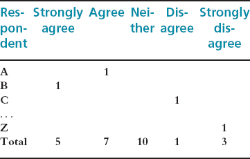
In this case we have changed the kind of data we are collecting, and cannot, based on this second set, say anything about whether respondents found Cybelle irritating, as we have not asked that question. We can only say that, for example, 4 out of 26 (15%) disagreed with the statement that Cybelle is amusing (and of those 3(11.5%) strongly disagreed).
For simple collation and analysis, spreadsheet software such as Excel is often used as it is commonly available, well-understood, and it offers a variety of numerical manipulations and graphical representations. Initial analysis might involve finding out averages, and identifying any ‘outliers,’ i.e. values that are significantly different from the others. Producing a graphical representation of the data helps to get an overall view of the data and any patterns it contains.
For example, consider the set of data shown in Table 8.2 which is extracted from a set of data collected during an evaluation study of an e-commerce website. The overall goal of the study was to identify areas of the website that are problematic for users, and at what point in the transaction the user is likely to abandon the process. The data gathering methods used were questionnaire, observation of a controlled task, and data logging. The data in this table shows the experience of the users and the number of errors made by each user trying to complete the task. This data was captured in a spreadsheet and the totals and averages were calculated automatically once the data had been entered. Then the graphs in Figure 8.1 were generated using a spreadsheet package. From these we can get an overall view of the data set. In particular, we can see that there are no significant outliers in the error rate data. Note that you may choose to present the data to your target audience using these graphical representations, or you may not. The point here is that it is valuable to use them for your own data analysis, whatever happens to them afterwards.
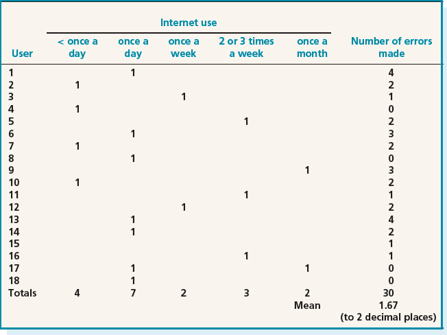
Table 8.2 Data gathered during a study of an e-commerce site

Figure 8.1 Graphical representations of the data in Table 8.2. (a) The distribution of errors made. Take note of the scale used in these graphs as seemingly large differences may be much smaller in reality. (b) The spread of Internet experience within the participant group
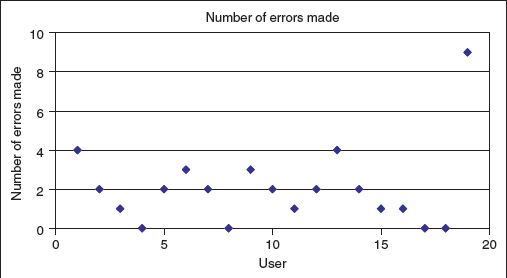
Figure 8.2 Using a scatter diagram helps to identify outliers in your data quite quickly
If we add one more user to Table 8.2 with an error rate of 9, we can see in Figure 8.2 how using a scatter graph helps to identify outliers. Outliers are usually removed from the larger data set because they distort the general patterns, however, they may also be interesting cases to investigate further to see if there are special circumstances surrounding this user and their session.
These initial investigations also help to identify other areas for further investigation. For example, is there something special about the users with error rate 0, or something distinctive about the performance of those who use the Internet only once a month?
Activity 8.1
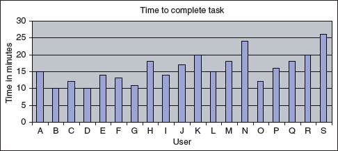
The data in the table below represents the time taken for a group of users to select and buy an item from an online shopping website.
- Calculate the mean, median, and mode values for this data.
- Comment on how values differ and consider which of these averages you might choose to report in your study findings.
- Using a spreadsheet application to which you have access, generate a bar graph and a scatter diagram to give you an overall view of the data. Using these diagrams, make two initial observations about the data that might form the basis of further investigation.

Comment
- The mean is:
15 + 10 + 12 + 10 + 14 + 13 + 11 + 18+ 14 + 17 + 20 + 15 + 18 + 24 + 12 + 16+ 18 + 20 + 26
divided by 19 = 303/19 = 15.95 (to 2 decimal places).
The median is calculated by ranking the values first:
10, 10, 11, 12, 12, 13, 14, 14, 15, 15, 16, 17, 18, 18, 18, 20, 20, 24, 26
The median then is 15 and the mode is 18.
- In this example, the mean and median are close together—15.95 and 15 respectively—and the mode is a bit higher at 18. Each of these averages reports on a different feature of the data, and hence highlights a different point about the participants' performance. The most common completion time is 18 minutes, but this information on its own doesn't say anything about the range of completion times. The middle point of completion times is 15 minutes, but this on its own doesn't say how wide that range is. The mean of 15.95 minutes may indicate that all participants completed the task in exactly this time, or that the range of performance times was between one minute and 285 minutes, or any of a wide range of other combinations. Any one of these averages, taken on its own, gives a partial picture of the data collected. In order to communicate a more accurate, rounded view of the data, it would be better to report all three averages.
- The first graph is a bar graph:
The scatter diagram for this data is:
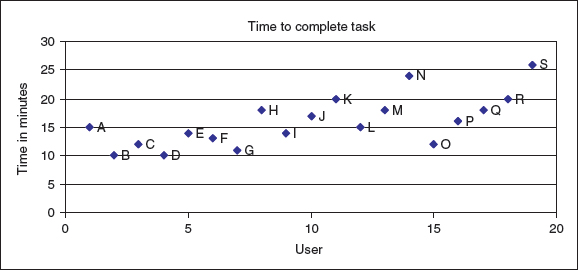
From these two diagrams there are two areas for further investigation. First of all, the values for user N (24) and user S (26) are higher than the others and could be looked at in more detail. In addition, there appears to be a trend that the users at the beginning of the testing time (particularly users B, C, D, E, F, and G) performed faster than those towards the end of the testing time. This is not a clear-cut situation as O also performed well, and I, L, and P were almost as fast, but there may be something about this later testing time that has affected the results, and it is worth investigating further.
It is fairly straightforward to compare two sets of results, e.g. from the evaluation of two interactive products, using these kinds of graphical representations of the data. Semantic differential data can also be analyzed in this way and used to identify trends, provided the format of the question is appropriate. For example, the following question was asked in a questionnaire to evaluate two different phone designs:
For each pair of adjectives, place a cross at the point between them that reflects the extent to which you believe the adjectives describe the phone design. Please place only one cross between the marks on each line.

Tables 8.3 and 8.4 show the tabulated results from 100 respondents who replied to the questionnaire. Note that the responses have been translated into five possible categories, numbered from 1 to 5, based on where the respondent marked the line between each pair of adjectives. It is possible that respondents may have intentionally put a cross closer to one side of the box than the other, but it is acceptable to lose this nuance in the data provided the original data is not lost, and any further analysis could refer back to it. It is always important to keep any data you collect so that it can be used to confirm or refute any suggestions later—as well as being able to use it for further data analysis.
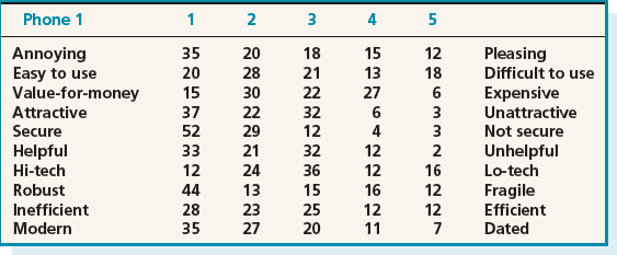

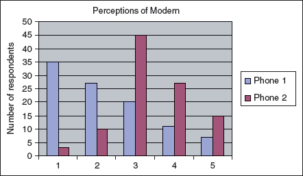
Figure 8.3 A graphical comparison of two phone designs according to whether they are perceived as ‘modern’ or ‘dated’
The graph in Figure 8.3 shows how the two phone designs varied according to the respondents' perceptions of how modern the design is. This graphical notation shows clearly how the two designs compare.
Data logs that capture users' interactions with a system can also be analyzed and represented graphically, thus helping to identify patterns in behavior. Also, more sophisticated manipulations and graphical images can be used to highlight patterns in collected data. Box 8.3 describes how data logs of an online computer game were used to identify patterns of interactions. This example also shows how observational data can be used to interpret quantitative data.
The examples given in this section have largely focused on data sets which have more than 10 records, i.e. respondents or interviewees. If only a small number of records are collected, then it may be more important to analyze the individual records in more depth than to identify trends. In this case, tabulating the data for ease of presentation may be sufficient.
Box 8.3: Identifying Interaction Patterns in Log Data from a Massively Multiplayer online Role-playing Game
Massively Multiplayer Online Role-Playing Games (MMORPGs) involve hundreds of thousands of players interacting on a daily basis within a virtual world, and working towards achieving certain targets. While the challenges offered by these games are often the same as those in a single-player environment, the attraction of MMORPGs is the ability to join a community of gamers, to gain a reputation within that community, and to share gaming experiences directly. Several recent games have been designed so that players have to collaborate in order to progress.
Ducheneaut and Moore (2004) wanted to investigate how successful MMORPGs are at encouraging interactivity between players. To do this, they analyzed data logs and video recordings of player-to-player interactions in the game Star Wars Galaxies (SWG), complemented by a three-month ethnography of the same environment. The ethnography was achieved by the researchers joining the SWG community as players and using the system regularly over three months. During this time, they identified two locations within the virtual world which were heavily used by other players—the cantina and starport in Coronet City. The cantina is where entertainers can be found and players often go to recover from battle fatigue; players have to go to the starport in order to travel between locations, and shuttles fly about every 9 minutes. See Figure 8.4.
To collect a log of player interactions, they then created two characters and placed them, one in each location, for a month. Using the game's ‘/log’ command, they recorded all public utterances and gestures from these locations. In all, 26 days of data were recorded, with 21 hours a day. This resulted in 100 mb of data and represented a total of 5493 unique players in the two locations. A purpose-built parser was used to extract the most interesting data from the logs and to identify who was interacting with whom, in what way (gesture or chat), where, when, and what was the content of the interaction (text chat or ‘social’ command). In this context, a ‘gesture’ may be a smile, greet, clap, cheer, etc., and a ‘social’ is a particular kind of gesture which is non-directional such as flex. They then analyzed the data for patterns of behavior. One finding was that a small number of players were frequently present in one location while there were many others who visited for only a short time. The median number of days a player was present was 2, while the average was 3.5; only 2% of the total number of players were present more than half the time. Another aspect they investigated was the activity within the cantina over the course of a day. Figure 8.5 shows a summary graph of activity in the cantina for the 26 days. This shows a fairly even distribution of activity throughout the day, with gestures representing about one-third of the events and public messages representing two-thirds.

Figure 8.4 The cantina in SWG's Coronet City.
Their analysis of the 10 most popular gestures is summarized below:
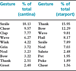
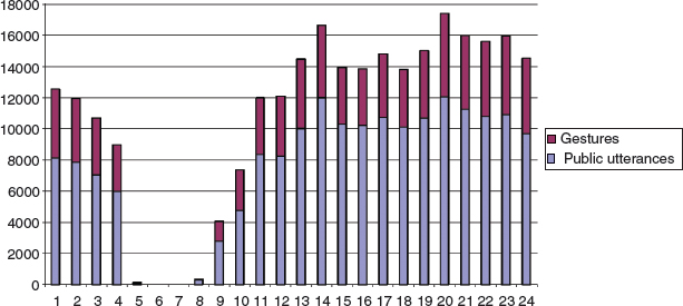
Figure 8.5 Summary of the activity in the cantina over the course of a day. (The gap between 4 a.m. and 7 a.m. is due to a regular server reboot during this time)
These two kinds of analysis are helpful to get an overview of the different players' interactions but do not indicate the richness of social interaction each player is engaged with. So Ducheneaut and Moore analyzed the interactions on three dimensions for each player: the number of gestures received, the number of gestures made, and the number of public utterances made. Having done so, they concluded that the average player goes into the cantina, makes about one gesture to another player, exchanges about four sentences with him or her, and receives one gesture in return. This conclusion was arrived at from taking averages across the data, but in order to get a clearer view of interactions, they plotted dimensions for each individual set of data on a graph. This is reproduced in Figure 8.6. The x-axis represents the number of gestures received, the y-axis represents the number of gestures made, and the size of the ‘dot’ is proportional to the number of public utterances made by the player. This graphical representation illustrated an unexpected finding—that the majority of players do not interact very much. Another set of players make a large number of utterances but make or receive no gestures. Yet another (smaller) set of players gesture and talk a lot, but receive few gestures in return.
The researchers concluded that these last two kinds of behavior are due to the player programming their avatar to repeat actions even when the player is not logged on. This kind of behavior is not truly interactive as it is designed simply to advance the player within the game (one way of gaining points is to repeatedly perform activities related to the avatar's profession). This behavior then affects the social atmosphere of the cantina because other players are unhappy about the false kind of interaction.

Figure 8.6 Interaction profiles of players in the cantina.
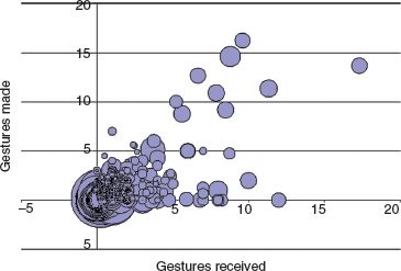
Figure 8.7 Interaction profiles of players in the starport.
Bubbles to the right of this graph represent players who interact a lot—making and receiving gestures, and chatting. These players are engaging in the kind of social interaction that the designers of SWG want to promote.
A similar analysis was performed for the starport (Figure 8.7), but a different pattern of interactions was found. A large number of players made and received no gestures, but made a lot of public utterances. The ethnographic data helped researchers to interpret this finding too—the starport was a good place to advertise as there were many people gathered waiting for a shuttle. Another set of players at the starport said very little; the researchers believe that these were people looking for trainers to give them a particular skill they needed in order to progress in the game.
8.4 Simple Qualitative Analysis
As with quantitative analysis, the first step in qualitative analysis is to gain an overall impression of the data and to start looking for patterns. Some patterns will have emerged during the data gathering itself, and so you may already have some idea of the kinds of pattern to look for, but it is important to confirm and re-confirm findings to make sure that initial impressions are not biasing analysis. For observation data, the guiding framework will have given some structure to the data. For example, the framework for observation from Goetz and LeCompte (1984) introduced in Chapter 7, will have resulted in a focus on questions such as “Who is present,” “What is happening” and “Where is it happening.” Using this framework you may notice that when someone from the accounts department comes to the administration office to meet staff members, then there is a lot of interest and everyone from the office attends the meeting. However, when visitors from other departments come to the administration office, or when accounts meetings are held in the accounts office, there is less interest. Using Robson's framework, patterns relating to physical objects, people's goals, sequences of events, and so on are likely to emerge.
There are three simple types of qualitative analysis that we discuss here: identifying recurring patterns and themes, categorizing data, and analyzing critical incidents. These are not mutually exclusive and can each be used with the others.
8.4.1 Identifying Recurring Patterns or Themes
As you become more familiar with the data, recurring themes or patterns will emerge. An example is noticing that most senior managers interviewed express frustration at the lack of up-to-date information they have from the marketing department.
Nearly all data analysis begins with identifying patterns or themes. This is true when working with quantitative and qualitative data. Sometimes the patterns or themes form the primary set of findings for the analysis and sometimes they are just the starting point for more detailed investigation of the data. Patterns in quantitative data may be identified through graphical representation (as discussed above), but identifying themes in qualitative data requires the researcher to be immersed in the data. Themes emerge and evolve over this time.
The study goals provide an orienting focus for the formulation of themes. For example, consider a survey to evaluate whether the information displayed on a train travel website is adequate and sufficient. Several of the respondents add comments to the survey suggesting that, as well as the origin and destination stations, the station stops in between should also be displayed. This is a theme relevant to the study goals and would be reported as a main theme. In another part of the survey, under ‘further comments’ you might notice that several respondents comment that the company's logo is distracting. Although this too is a theme in the data, it is not directly relevant to the study's goals and may be reported only as a minor theme.
One aspect of this form of analysis is to keep clear and consistent records of what has been found, and a close description of themes or patterns that are emerging. If the description is not specific enough then you may end up with a set of observations that do not address the goals. If the description is too specific then you may find that you have lots of themes, each with only one or two pieces of evidence.
Studying the data, focusing on the study goals, and keeping clear records of the analysis as it progresses are important. Box 8.4 and Case Study 8.1 describe studies where themes have been identified from qualitative data and reported as a significant part of their results. The results in Box 8.4 were arrived at by immersion in the data; the box for Case Study 8.1 illustrates the use of a specific technique for ordering data—the affinity diagram.
Note that patterns and themes in your data may relate to a variety of aspects: to behavior, to your user group, to places or situations where certain events happen, and so on. Each of these kinds of theme may be relevant to your goals. For example, descriptions of typical users (personas) may be an outcome of data analysis that focuses on patterns of participant characteristics.
Box 8.4: Themes in European Culture
Bell (2001) reports on ethnographic research in Italy, Germany, France, the UK, and Spain that focused on European culture. She and her team visited 45 households from small towns, cities, and major metropolitan centers. The aim of the study was to understand what people do and don't do in their homes, how a household relates to the wider community, what technologies were present, and how they were used. The work they conducted informed the design of existing products and pointed to new product opportunities such as computing in public spaces.
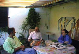
Figure 8.8 Bell interviewing a German family
The researchers used an approach which allowed them to track important cultural values—in each country they started by visiting a small town, then moved to a city, and then to a larger metropolitan area. In this way, they could initially understand the daily rhythm of life in the country in a manageable context before moving to the more complex situations. They assumed that any patterns which were observed in all three different contexts were likely to be significant. Taking an ethnographic stance, the researchers tried to do everything that native people would normally do. They followed people around and asked lots of questions about what life was like and what people do. Four significant themes (called ‘domains’ by the researchers) were identified from this work: togetherness, media experiences, consumption habits, and life outside of the home.
Togetherness. Family, kinship, and community were found to be very significant in Europe. For example, the importance of the family eating together was a recurrent theme in the interviews and in the team's observations. Other occasions also promote social gatherings, such as sporting events and leisure activities. The researchers noted that sometimes people spend time together simply watching television. They found an emphasis on face-to-face social time throughout their studies, and the willingness of people to expend effort to maintain this ‘togetherness.’
Media experiences. The researchers found that many different kinds of media play a variety of roles in European life—both consumption and production of content. For example, they found people painting, playing musical instruments, sketching and drawing in nearly every population center they visited. Television and print media also play an important role. Television is talked about explicitly by European families for its educational role. The researchers found print media of various kinds (magazines, newspapers, catalogues, pricelists, etc.) in the European homes they visited, and also observed rituals of reading and use of these materials, for example buying more than one daily newspaper in order to gain different perspectives on the news articles.
Consumption habits. “Food shopping is a really important part of daily life in most European countries.” Europeans frequent a wide variety of shops and have a distinct preference for very fresh food. The open-air market is a particularly important part of French daily life, and the preparation, cooking, and consumption of the food is highly valued. In addition to purchasing items, shopping is also a social activity which connects people to their communities.
Life outside of the home. The researchers were struck by the variety of spaces outside the home where people socialized, and by the diversity of behaviors they observed. For example, people talk, flirt, play games, admire, create art, listen to music, eat, dance, swim, walk, and ‘hang out’ in gardens, parks, bars, pubs, cafes, promenades, markets, boulevards, and plazas. How often people frequent these places, and what they do there, changes with age and life stage.
CASE STUDY 8.1: Using Ethnographic Data to Understand Indian ATM Usage
This case study focuses on an investigation into the use of ATMs (Automated Teller Machines) in Mumbai, India. It illustrates the use of ethnographic data to answer questions such as: “What is the general attitude towards ATMs use?” and “What problems do people face when using ATMs?”
The project involved data collection through field observations and semi-structured interviews with early ATM adopters, bank customers who do not use the ATM, and customers who used the ATM for the first time during this study. Over 40 interviews were recorded, and photographs and videos were taken where possible. In addition, user profiles representing six different social classes were generated. Together with observations of ATM usage the project collected a considerable amount of data.
The project's use of affinity diagrams to help analyze the information that they collected is described by De Angeli et al. (2004). The affinity diagram (see Figure 8.9 for an example) which is used in contextual design (Beyer and Holtzblatt, 1998) aims to organize individual ideas and insights into a hierarchy showing common structures and themes. Notes are grouped together because they are similar in some fashion. The groups are not predefined, but must emerge from the data. The process was originally introduced into the software quality community from Japan, where it is regarded as one of the seven quality processes. The affinity diagram is built by a process of induction. One note is put up first, and then the team searches for other notes that are related in some way.
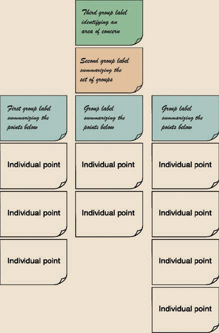
Figure 8.9 The structure of an affinity diagram.
The affinity diagram organized the insights, ideas, and cultural influences gathered during the interviews and observations into a set of 10 top-level categories including perceptions of ATMs, banking habits, what people do while waiting in banks, and social and language barriers to banking (see Figure 8.10). Using the affinity diagram technique also highlighted some opposite behaviors. For example, two women who both wanted to avoid temptation (that of spending too much money) had different attitudes to the ATM. One used the ATM routinely but only to draw out enough cash to cover her immediate requirements. The other felt that having 24-hour access to cash was too much of a temptation in itself.
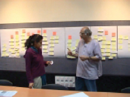
Figure 8.10 Building the affinity diagram of Indian ATM usage
8.4.2 Categorizing Data
Transcripts of meetings, interviews, or think-aloud protocols can be analyzed at a high level of detail, such as identifying stories or themes, or at a fine level of detail in which each word, phrase, utterance, or gesture is analyzed. Either way, elements identified in the data are usually categorized first using a categorization scheme. The categorization scheme may arise from the data itself, if the investigation is exploratory, as it might be in the requirements activity, or it might originate elsewhere in a well-recognized categorization scheme, or a combination of these two approaches may be used. The principle here is that the data is divided up into elements and each element is then categorized.
Which categories to use is largely determined by the goal of the study. One of its most challenging aspects is determining meaningful categories that are orthogonal—i.e. do not overlap each other in any way. Another is deciding on the appropriate granularity for the categories, e.g. at word, phrase, sentence, or paragraph level; this is also dependent on the goal of the study and the data being analyzed.
The categorization scheme used must be reliable so that the analysis can be replicated. This can be demonstrated by training a second person to use the categories. When training is complete, both people analyze the same data sample. If there is a large discrepancy between the two analyses, either training was inadequate or the categorization is not working and needs to be refined. Talking to those applying the categorization scheme can determine the source of the problem, which is usually with the categorization. If so, then the categorization scheme needs to be revised and re-tested. However, if the individuals do not seem to know how to carry out the process then they probably need more training.
When a high level of reliability is reached, it can be quantified by calculating the inter-rater reliability. This is the percentage of agreement between the two researchers, defined as the number of items that both people categorized in the same way, expressed as a percentage of the total number of items examined. It provides a measure of the efficacy of the technique and the rigor of the category definition.
To illustrate categorization, we present an example derived from a set of studies looking at the use of different navigation aids in an online educational setting (Armitage, U. 2004). These studies involved observing users working through some online educational material (about evaluation methods), using the think-aloud technique. The think-aloud protocol was recorded and then transcribed before being analyzed from various perspectives, one of which was to identify usability problems that the participants were having with the online environment (Nestor Navigator, Zeiliger et al. (1997)). An excerpt from the transcription is shown in Figure 8.11.
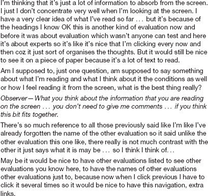
Figure 8.11 Excerpt from a transcript of a think-aloud protocol when using an online educational environment. Note the prompt from the observer about half way through
This excerpt was analyzed using a categorization scheme derived from a set of negative effects of a system on a user given in van Rens (1997) and was iteratively extended to accommodate the specific kinds of interaction observed in these studies. The categorization scheme is shown in Figure 8.12.
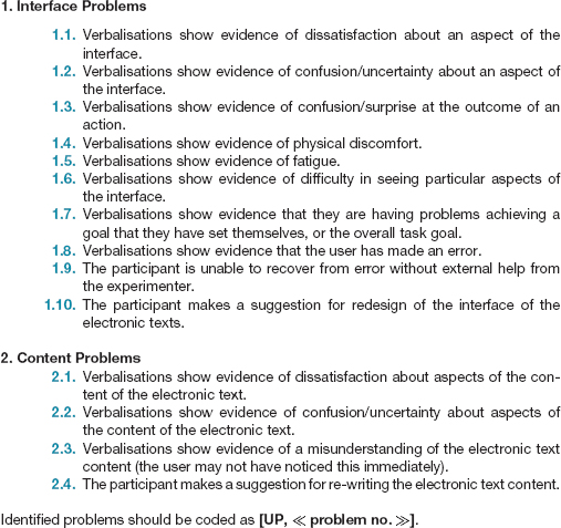
Figure 8.12 Criteria for identifying usability problems from verbal protocol transcriptions
This scheme developed and evolved as the transcripts were analyzed. Figure 8.13 shows the excerpt above coded using this categorization scheme. Note that the transcript is divided up using square brackets to indicate which element is being identified as showing a particular usability problem.
A rigid categorization scheme means that the data is structured only according to the prespecified categories. However, where a significant set of data cannot be categorized, the scheme can be extended. In this case the categorization scheme and the categorization itself develop in parallel, with the scheme evolving as more analysis is done.
Having categorized the data, the results can be used to answer the study goals. In the example above, the study allowed the researchers to be able to quantify the number of usability problems encountered overall by participants, the mean number of problems per participant for each of the test conditions, and the number of unique problems of each type per participant. This also helped to identify patterns of behavior and recurring problems. Having the think-aloud protocol meant that the overall view of the usability problems could take context into account.
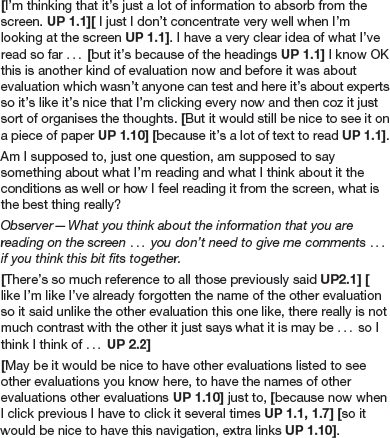
Figure 8.13 The excerpt in Figure 8.11 coded using the categorization scheme in Figure 8.12
Activity 8.2
The following is another think-aloud extract from the same study. Using the categorization scheme in Figure 8.12, code this extract for usability problems. Remember to put brackets around the complete element of the extract that you are coding.
Well, looking at the map, again there's no obvious start point, there should be something highlighted that says “start here.”
Ok, the next keyword that's highlighted is evaluating, but I'm not sure that's where I want to go straight away, so I'm just going to go back to the introduction.
Yeah, so I probably want to read about usability problems before I start looking at evaluation. So, I, yeah. I would have thought that the links in each one of the pages would take you to the next logical point, but my logic might be different to other people's. Just going to go and have a look at usability problems.
Ok, again I'm going to flip back to the introduction. I'm just thinking if I was going to do this myself I would still have a link back to the introduction, but I would take people through the logical sequence of each one of these bits that fans out, rather than expecting them to go back all the time.
Going back … to the introduction. Look at the types. Observation, didn't really want to go there. What's this bit [pointing to Types of UE on map]? Going straightto types of …
Ok, right, yeah, I've already been there before. We've already looked at usability problems, yep that's ok, so we'll have a look at these references.
I clicked on the map rather than going back via introduction, to be honest I get fed up going back to introduction all the time.
Comment
Coding transcripts is not easy, and you may have had some difficulties doing this, but this activity will have given you an idea of the kind of decisions that need to be taken. As with much data analysis, it gets easier with practice. Our coded extract is below:
[ Well, looking at the map, again there's no obvious start point UP 1.2, 2.2], [ there should be something highlighted that says “start here” UP 1.1, 1.10].
Ok, the next keyword that's highlighted is evaluating, but [ I'm not sure that's where I want to go straight away UP 2.2], so I'm just going to go back to the introduction.
Yeah, so I probably want to read about usability problems before I start looking at evaluation. So, I, yeah.[ I would have thought that the links in each one of the pages would take you to the next logical point, but my logic might be different to other people'sUP 1.3]. Just going to go and have a look at usability problems.
Ok, again I'm going to flip back to the introduction. [I'm just thinking if I was going to do this myself I would still have a link back to the introduction, but I would take people through the logical sequence of each one of these bits that fans out, rather than expecting them to go back all the time UP 1.10].
Going back … to the introduction.[Look at the types. Observation, didn't really want to go there. What's this bit [pointing to Types of UE on map]? UP 2.2] Goingstraight totypes of …
Ok, right, yeah, I've already been there before. We've already looked at usability problems, yep that's ok, so we'll have a look at these references.
I clicked on the map rather than going back via introduction, [to be honest I get fed up going back to introduction all the time. UP 1.1]
The example above used a form of content analysis. Content analysis typically involves categorizing the data and then studying the frequency of category occurrences. For example, Maria Ebling and Bonnie John (2000) developed a hierarchical content classification for analyzing data when evaluating a graphical interface for a distributed file system.
An informal version of content analysis is often used as the first stage in identifying software objects from descriptions of the domain. In this approach, nouns and verbs are identified and scrutinized to see if they represent significant classes.
Another way of analyzing a transcript is to use discourse analysis. Discourse analysis focuses on the dialog, i.e. the meaning of what is said, and how words are used to convey meaning. Discourse analysis is strongly interpretive, pays great attention to context, and views language not only as reflecting psychological and social aspects but also as constructing it (Coyle, 1995). An underlying assumption of discourse analysis is that there is no objective scientific truth. Language is a form of social reality that is open to interpretation from different perspectives. In this sense, the underlying philosophy of discourse analysis is similar to that of ethnography. Language is viewed as a constructive tool and discourse analysis provides a way of focusing upon how people use language to construct versions of their worlds (Fiske, 1994).
Small changes in wording can change meaning, as the following excerpts indicate (Coyle, 1995):
Discourse analysis is what you do when you are saying that you are doing discourse analysis …
According to Coyle, discourse analysis is what you do when you are saying that you are doing discourse analysis …
By adding just three words, “According to Coyle,” the sense of authority changes, depending on what the reader knows about Coyle's work and reputation.
Conversation analysis is a very fine-grained form of discourse analysis. In conversation analysis the semantics of the discourse are examined in fine detail, and the focus is on how conversations are conducted. This technique is used in sociological studies and examines how conversations start, how turn-taking is structured, and other rules of conversation. This analysis technique has been used to analyze interactions on the Internet, e.g. in chatrooms, bulletin boards, and virtual worlds, and has started to influence designers' understanding about users' needs in these environments. It can also be used to compare conversations that take place through different media, e.g. face-to-face versus email.
8.4.3 Looking for Critical Incidents
Data gathering sessions for interaction design usually result in a lot of data. Analyzing all of that data in any detail would be very time-consuming, and is often not necessary. We have already suggested that themes, patterns and categories can be used to identify areas where detailed analysis is appropriate. Another approach is to use the ‘critical incident technique.’
The critical incident technique is a flexible set of principles that emerged from work carried out in the United States Army Air Forces where the goal was to identify the critical requirements of ‘good’ and ‘bad’ performance by pilots (Flanagan, 1954). It has two basic principles: “(a) reporting facts regarding behaviour is preferable to the collection of interpretations, ratings and opinions based on general impressions; (b) reporting should be limited to those behaviours which, according to competent observers, make a significant contribution to the activity” (Flanagan, 1954, p.355). In the interaction design context, the use of well-planned observation sessions as discussed in Chapter 7 satisfies the first principle. The second principle is referring to critical incidents, i.e. incidents which are significant or pivotal to the activity being observed, in either a desirable or an undesirable way.
In interaction design, critical incident analysis has been used in a variety of ways, but the main focus is to identify specific incidents that are significant, and then to focus on these and analyze them in detail, using the rest of the data collected as context to inform their interpretation. These may be identified by the users, through a retrospective discussion of a recent event, or they may be identified by an observer either through studying video footage, or from observation of the event in real time. For example, in an evaluation study a critical incident may be signalled by times when users were obviously stuck—usually marked by a comment, silence, looks of puzzlement, etc. Jurgen Koenemann-Belliveau et al. (1994) used this approach to compare the efficacy of two versions of a Smalltalk programming manual for supporting novice programmers. They examined breakdowns or problems in achieving a programming task and identified possible threats of incidents, and they were able to trace through a sequence of incidents and achieve a more holistic understanding of the problem. For example, they found that they needed to emphasize how objects interact in teaching object-oriented programming.
Another example is reported in Curzon et al. (2002). They identified a set of critical incidents through field trials of an in-car navigation device. One example incident in this context was “On one journey, the system gave directions to turn right when the destination was to the left. Its route was to go round the block to go in the other direction. A car following ignored this turn and went the more obvious way, arriving first.”
Activity 8.3
Set yourself or a friend the task of identifying the next available theatre or cinema performance you'd like to attend in your local area. As you perform this task, or watch your friend do it, make a note of critical incidents associated with the activity. Remember that a critical incident may be a positive or a negative event.
In my local area, information about entertainment is available through the local paper, the Internet, ringing up local cinemas or theaters, or by visiting the local library where they stock leaflets about the entertainment on in the area. When I asked my daughter to attempt this task, I noticed several critical incidents including the following:
- After searching around the house for a while, she found a copy of the local paper for the correct week.
- The local paper she had found did not have details of the cinema that she wanted to visit.
- When trying to book the cinema tickets by phone she discovered that she needed a credit card which she doesn't have, and so she had to give me the phone!
As with data gathering, it is common practice to employ more than one complementary data analysis approach. For example, following a critical incident analysis, themes may be identified around the circumstances that caused the incident to occur, and then discourse analysis may be conducted to understand the detail. Analyzing video material brings its own challenges; we address video analysis in Box 8.5.
Box 8.5: Analyzing Video Material
One approach to analyzing video data is interaction analysis (IA), outlined by Jordan and Henderson (1995). They describe it as an in-depth microanalysis of how people interact with one another, their physical environment, and the documents, artifacts, and technologies in that environment. A focus is on the patterns and anomalies in people's routine interactions and the events that unfold throughout time. These are described in terms of the turns people take in talking and physical actions they perform, e.g. writing. The approach also looks to see if there are seamless transitions between events, e.g. handovers between shift workers, or there is some awkwardness or something does not happen, e.g. one shift worker forgets to pass on information to another. Other approaches to analyzing and interpreting video data are distributed cognition and grounded theory, covered in Section 8.5. Here, again, the emphasis is on revealing phenomena that are important to an ongoing activity. Ethnographically and anthropologically informed analyses of human and social conduct in work, home, and everyday spaces are also popular, e.g. Heath and Luff (1994).
A good way to start a video analysis is to watch what has been recorded all the way through while writing a high-level narrative of what happens, noting down where in the video there are any potentially interesting events. How you decide which is an interesting event will depend on what is being observed. For example, if you are studying the interruptions that occur in an open plan office, you would include each time a person breaks off from an ongoing activity, e.g. phone rings, someone walks into their cubicle, email arrives. If it is a study of how pairs of students use a collaborative learning tool then activities such as turn-taking, sharing of input device/s, speaking over one another, and ‘fighting’ over shared objects would be appropriate to record.
Chronological and video time is used to index and number events. These may not be the same, since videotape can run at different speeds to real time. Labels for certain routine events are also used, e.g. lunchtime, coffee break, staff meeting, doctor's round. Spreadsheets are used to record the classification and description of events, together with annotations and notes of how the events began, how they unfold, and how they end.
Video can be augmented with captured screens or logged data of people's interactions with a computer display. There are various logging and screen capture tools, e.g. Camtasia or SnagIt, available for this purpose that enable you to play back the interactions as a movie, showing screen objects being opened, moved, selected, and so on. These can then be played in parallel with the video to provide different perspectives on the talk, physical interactions, and the system's responses that occur. Having a combination of data streams can enable more detailed and fine-grained patterns of behavior to be interpreted.
8.5 Tools to Support Data Analysis
It would be possible to analyze even large data sets using only manual techniques, however most people would agree that it is quicker, easier, and more accurate to use a software tool of some kind. We introduced the idea of using a simple spreadsheet application in Section 8.3, but there are other more sophisticated tools available—some of which support the organization and manipulation of the data, and some of which are focused on performing statistical tests.
New tools are developed and existing ones are enhanced on a regular basis, so we do not attempt to provide a comprehensive survey of this area. Instead, we discuss the kind of support available, and describe briefly some of the more popular tools used in interaction design.
For qualitative data, there are two broad types of package available. The first supports the categorization and theme-based analysis of data. These typically provide facilities to associate labels (categories, themes, etc.) with sections of data, search the data for key words or phrases, investigate the relationships between different themes or categories, and help to develop the coding scheme further; some packages can also generate graphical representations. The second supports the quantitative analysis of text-based data. These help with techniques such as content analysis which focus on the number of occurrences of words, or words with similar meanings. Some of these provide very sophisticated mechanisms to show the occurrence and co-occurrence of words or phrases. Both types of package provide searching, coding, project management, writing and annotating, and report generation facilities. Although it is useful to distinguish between these two types of package, software that is primarily focused on quantitative analysis now also includes some coding facilities, and vice versa, and so the distinction is very blurred.
More detail regarding software tools to support the analysis of qualitative data can be found through the CAQDAS Networking Project, based at the University of Surrey (http://www.caqdas.soc.surrey.ac.uk/).
One popular example of the first type of package is N6 (formerly NUD*IST), which supports the annotation and coding of textual data. Using N6, field notes can be searched for key words or phrases and a report printed listing every occasion the word or phrase is used. The information can also be printed out as a tree showing the relationship of occurrences. Similarly, N6 can be used to search a body of text to identify specific predetermined categories or words for content analysis. Like all software packages, N6 has advantages and disadvantages, but it is particularly powerful for handling very large sets of data. Nvivo is another package developed by the same people as N6, and this provides more sophisticated facilities for exploring, merging, and manipulating codes and data. Both packages can generate output for statistical packages such as SPSS.
SPSS (Statistical Package for the Social Sciences) is one of the more popular quantitative analysis packages that supports the use of statistical tests. SPSS is a sophisticated package which assumes that the user knows and understands statistical analysis. As we pointed out above, many of the qualitative data analysis tools produce output that can be fed into a statistical analysis package such as SPSS, facilitating the quantitative analysis of qualitative data. SPSS offers a wide range of statistical tests for things such as frequency distributions, rank correlations (to determine statistical significance), regression analysis, and cluster analysis.
Box 8.6 briefly describes the Observer Video-Pro tool which is designed to help the analysis of video data.
Box 8.6: The Observer Video-pro: an Automated Data Analysis Tool
The Observer Video-Pro provides the following features (Noldus, 2000):
- During preparation of a video tape recording, a time code generator adds a time code to each video frame.
- During a data collection session, a time code reader retrieves the time code from the tape, allowing frame-accurate event timing independent of the playback speed of the video cassette recorder (VCR).
- Each keyboard entry is firmly anchored to the video frame displayed at the instant the evaluator presses the first key of a behavior code or free-format note. The evaluator can also use a mouse to score events.
- Observational data can be reviewed and edited, with synchronized display of the corresponding video images.
- For optimal visual feedback during coding, the evaluator can display the video image in a window on the computer screen.
- The VCR can be controlled by the computer, allowing software-controlled ‘jog,’ ‘shuttle,’ and ‘search’ functions.
- Video images can be captured and saved as disk files for use as illustrations in documents, slides for presentations, etc.
- Marked video episodes can be copied to an Edit Decision List for easy creation of highlight tapes.
Activity 8.4
What does the Observer Video-Pro tool allow you to search for in the data collected?
Comment
Depending on how the logs have been annotated, using the Observer Video-Pro product you can search the data for various things including the following:
Video time—a specific time, e.g. 02:24:36.04 (hh:mm:ss.dd).
Marker—a previously entered free-format annotation.
Event—a combination of actor, behavior, and modifiers, with optional wildcards, e.g. the first occurrence of “glazed look” or “Sarah approaches Janice”.
Text—any word or alphanumeric text string occurring in the coded event records or free-format notes.
8.6 Using Theoretical Frameworks
Structuring the analysis of qualitative data around a theoretical framework can lead to additional insights that go beyond the results found from the simple techniques introduced earlier. This approach also relies less on the study goals to focus analysis. However, these frameworks are quite sophisticated and using them requires investment to make sure that the framework is understood and applied appropriately. This section discusses three frameworks that are commonly used in interaction design to structure the analysis of data gathered in the field, such as ethnographic data: grounded theory, distributed cognition, and activity theory.
8.6.1 Grounded Theory
Grounded theory is an approach to qualitative data analysis that aims to develop theory from the systematic analysis and interpretation of empirical data, i.e. the theory derived is grounded in the data. The approach was originally developed by Glaser and Strauss (1967) and since has been adopted by several researchers, with some adaptations to different circumstances. In particular, Glaser and Strauss have individually (and with others) developed the theory in slightly different ways, but the aim of this approach remains the same. Glaser (1992) provides further information about the differences and areas of controversy.
The aim of grounded theory is to develop a theory that fits a set of collected data. By ‘theory’ is meant in this context: “a set of well-developed concepts related through statements of relationship, which together constitute an integrated framework that can be used to explain or predict phenomena” (Strauss and Corbin, 1998). Development of a ‘grounded’ theory progresses through alternating data collection and data analysis: first data is collected and analyzed to identify categories, then that analysis leads to the need for further data collection, which is analyzed, and more data is then collected. Data gathering is hence driven by the emerging theory. This approach continues until no new insights emerge and the theory is well-developed. During this process, the researcher needs to maintain a balance between objectivity and sensitivity. Objectivity is needed to maintain accurate and impartial interpretation of events; sensitivity is required to notice the subtleties in the data and identify relationships between concepts.
The thrust of the analysis undertaken is to identify and define the properties and dimensions of relevant categories and then to use these as the basis for constructing a theory. Category identification and definition is achieved by ‘coding’ the data, i.e. marking it up according to the emerging categories. According to Strauss and Corbin (1998), this coding has three aspects, which are iteratively performed through the cycle of data collection and analysis:
- Open coding. Open coding is the process through which categories, their properties, and dimensions are discovered in the data. This process is similar to our discussion of categorization above, including the question of granularity of coding (at the word, line, sentence, conversation level, etc.).
- Axial coding. Axial coding is the process of systematically fleshing out categories and relating them to their subcategories.
- Selective coding. Selective coding is the process of refining and integrating categories to form a larger theoretical scheme. The categories are organized around one central category that forms the backbone of the theory. Initially, the theory will contain only an outline of the categories but as more data is collected, they are refined and developed further.
Grounded theory says little about what data collection techniques should be used, but focuses instead on the analysis. Strauss and Corbin (1998) encourage the use of written records of analysis and diagrammatic representations of categories (which they call memos and diagrams). These memos and diagrams evolve as data analysis progresses. The following analytic tools are used to help stimulate the analyst's thinking and identify and characterize relevant categories:
- The use of questioning (not questioning your participants, but questioning the data): questions can help an analyst to generate ideas or consider different ways of looking at the data. It can be useful to ask questions when analysis appears to be in a rut.
- Analysis of a word, phrase, or sentence: considering in detail the meaning of an utterance can also help to trigger different perspectives on the data.
- Further analysis through comparisons: comparisons may be made between objects or between abstract categories. In either case, comparing one with the other brings alternative interpretations. Sharp et al. (2005) take this idea further and use metaphor as an analysis technique with qualitative data.
One of the things that distinguishes a grounded theory approach to data gathering and analysis from ethnographic approaches is that researchers are encouraged to draw on their own theoretical backgrounds to help inform the study, provided that they are alert to the possibility of unintentional bias.
An example of applying the grounded theory approach to qualitative data analysis
Sarker et al. (2001) used the grounded theory approach to develop a model of collaboration in virtual teams. The virtual teams used in the study were made up of students from two universities—one in Canada and one in the United States of America. Each team consisted of four to five members from each university. Each team was given the task of studying a business systems problem, producing a systems design for it, and developing a working prototype. The projects themselves lasted about 14 weeks and a total of 12 teams participated in the study. The team members could communicate directly with each other using various technologies such as email, videoconferencing, telephone, and fax. The main communication channel, however, was Webboard, a collaborative message board tool supporting threaded discussions, email discussions, chat rooms, instant messaging, calendar, whiteboard, blogging, and so on. Using Webboard meant that communication was more public, and could be recorded more easily.
All communication data through Webboard was automatically saved, minutes of any videoconferences, telephone calls, or Internet chat sessions undertaken were posted on Webboard, and the team members were also asked to provide any additional emails they received or sent to other team members. In addition to this data, the team's final project reports, individual team members' reflections on the lessons learned through the project, feedback on fellow team members' performance, and comments on the virtual project itself were all collected and used as data for the study.
As soon as the teams were formed, informal data analysis began and two of the researchers became participant observers in the project teams, developing sensitivity to the project and its goals. They also began to reflect on their own backgrounds to see what theoretical frameworks they could draw on.
Open coding. This was done initially on a line-by-line basis, but later coding was done at the message level, while other documents such as reports and reflections were coded at document level. Over 200 categories were generated, and as these were refined, some informal axial coding was also done. Table 8.5 shows two messages posted at the beginning of a project, and illustrates how these messages were coded during the open coding process.
Sarker et al. note that codes emerged and continued to be refined over the life of the project. Also, a significant number of the codes that were ultimately used in the theory building were recurrent, for example, preference for technology and time gaps/boundaries. Finally, some of the key categories were identified when considering messages as one unit and looking at comparable strips in other data segments.
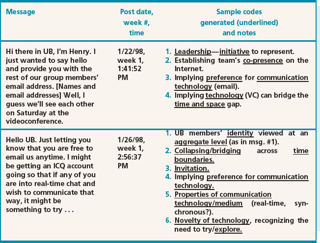
Table 8.5 An illustration of open coding
Through constant comparison of data across categories, the names of categories were refined, merged, and changed over time.
Axial coding. Sarker et al. found the suggestions in Strauss and Corbin about how to relate subcategories too constraining. They instead used a two-step process for axial coding:
- The major categories, e.g. technology, norms, social practices, stages of team development, and frames of reference, were hierarchically related to subcategories. For example, the category technology was linked to the subcategories purpose of technology, nature of ownership, accessibility (by time, location, cost, awareness), future potential, degree of novelty, and interconnectedness. At the next level, purpose of technology was linked to information sharing, triggering, and so on (see Figure 8.14). During this process, the researchers returned to open coding and refined categories further.
- For each major category researchers created a description (called a ‘memo’) that attempted to integrate as many of the categories and subcategories as possible. These memos also evolved as analysis progressed. Figure 8.15 contains an excerpt from an early draft memo for the technology category.
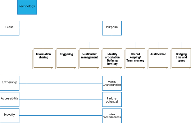
Figure 8.14 Axial coding for the technology category
Figure 8.15 An excerpt from an early draft of an integrative memo for the technology category
Selective coding. This stage of coding involves linking the categories and subcategories into a theory, and as theory building is quite complex, we only present an overview of the process here.
Sarker et al. wanted to develop a theory of virtual teams, and so they used two approaches from their background to help them. One of these approaches (Couch, 1996) emphasizes the concepts that a theory of human conduct must use. The other focuses on social structure (Giddens, 1984). Using these two approaches, the category ‘stages of team development’ was chosen as the core category for the grounded theory to be built from this data set, and other categories were linked around it. This theory was further elaborated upon through discussions and reading of theory, and evolved into a theory of how virtual teams develop over time. More details can be found in Sarker and Sahay (2003).
How useful is a grounded theory approach to analysis?
A grounded theory approach to analysis emphasizes the important role of empirical data in the derivation of theory. It has become increasingly popular in interaction design to answer specific questions and design concerns.
For example, Adams et al. (2005) describe their use of grounded theory to investigate how technology can empower or exclude its users due to interactions between social context, system design, and implementation. They studied the introduction and use of digital libraries in four settings over a four-year period, collecting data from a total of 144 users. Focus groups and interviews were the primary data collection techniques. They concluded that where technology is integrated with the communities and their practice, through an information intermediary, perceptions of empowerment were increased; where technology is deployed within communities, yet with poor design and support, technologies were perceived as complex and threatening; and where technology was designed in isolation from the communities, users were either unaware of the technology or perceived it as complex or threatening.
Dourish et al. (2004) used semi-structured interviews and grounded theory to examine how people answer the question “Is this system secure enough for what I want to do now?,” in the context of ubiquitous and mobile technologies. This qualitative approach was used to explore the issues before moving on to develop more detailed questions, but their conclusions included suggested design modifications to take this perspective on security into account.
8.6.2 Distributed Cognition
We introduced the distributed cognition approach in Chapter 3, as a theoretical account of the distributed nature of cognitive phenomena across individuals, artifacts, and internal and external representations (Hutchins, 1995). Here, we illustrate how to conduct a distributed cognition analysis by providing a worked example.
Typically, a distributed cognition analysis results in an event-driven description which emphasizes information and its propagation through the cognitive system under study. The cognitive system under study might be one person's use of a computational tool, such as a calculator; two people's joint activities when designing the layout for the front page of a newspaper, using a shared authoring tool, or more widely, a large team of software developers and programmers, examining how they coordinate their work with one another, using a variety of mediating artifacts, such as schedules, clocks, to-do lists, and shared files.
The granularity of analysis varies depending on the activities and cognitive system being observed and the research or design questions being asked. For example, if the goal is to examine how a team of pilots fly a plane—with a view to improving communication between them—then the focus will be on the interactions and communications that take place between them and their instruments, at a fine level of granularity. If the goal is to understand how pilots learn how to fly—with a view to developing new training materials—then the focus will be at a coarser grain of analysis, taking into account the cultural, historical, and learning aspects involved in becoming a pilot.
The description produced may cover a period of a day, an hour, or only minutes, depending on the study's focus. For the longer periods, verbal descriptions are primarily used. For the shorter periods, micro-level analyses of the cognitive processes are meticulously plotted using diagrammatic forms and other graphical representations. The rationale for performing the finer levels of analysis is to reveal practices and discrepancies that would go unnoticed using coarser grains of analysis, but which reveal themselves as critical to the work activity.
Ed Hutchins emphasizes that an important part of doing a distributed cognition analysis is to have a deep understanding of the work domain that is being studied. He even recommends, where possible, that the investigators take steps to learn ‘the trade’ under study and become an accomplished pilot or sailor (as he has done himself in both cases). This can take a team of researchers several months and even years to accomplish and in most cases this is impractical for a research or design team to do.
Alternatively, it is possible to spend a few weeks immersed in the culture and setting of a specific team to learn enough about the organization and its work practices to conduct a focused analysis of a particular cognitive system. For example, I spent six weeks with an engineering team, where I was able to learn enough about their work practice to gain a good understanding of how they worked together on projects, how they coordinated their work with each other, and how the technologies that were used mediated their work activities. I was then able to document and analyze a number of problems they were experiencing through the introduction of new networking technology. Using the distributed cognition framework, I described how seemingly simple communication problems led to large delays and recommended how the situation could be improved (Rogers, 1993, 1994).
Performing a distributed cognition analysis
It should be stressed that there is not one single way of doing a distributed cognition analysis, nor is there an off-the-shelf manual that can be followed. A good way to begin analyzing and interpreting the data collected is to describe the official work practices, in terms of the routines and procedures followed, and the workarounds that teams develop when coping with the various demands placed upon them at different times during their work. In so doing, any breakdowns, incidents, or unusual happenings should be highlighted, especially where it was discovered that excessive time was being spent doing something, errors were made using a system, or a piece of information was passed on incorrectly to someone else or misheard. While writing these observations down it is good to start posing specific research questions related to them, e.g. “Why did X not let Y know the printer was broken when he came back from his break?” and to contemplate further, e.g. “Was it a communication failure, a problem with being overloaded at the time, or a technology problem?”
It is at this point that knowledge of the theory of distributed cognition can help in interpreting and representing the observations of a work setting (see Chapter 3 and Hutchins, 1995). It provides an analytic framework and a set of concepts to describe what is happening at a higher level of abstraction. Problems can be described in terms of the communication pathways that are being hindered or the breakdowns arising due to information not propagating effectively from one representational state to another (see Box 8.7). The framework can reveal where information is being ‘distorted,’ resulting in poor communication or inefficiency. Conversely, it can show when different technologies and the representations displayed via them are effective at mediating certain work activities and how well they are coordinated.
Box 8.7: Distributed Cognition Concepts
A distributed cognition analysis involves producing a detailed description of the domain area at varying levels of granularity. At the micro-level, a small set of cognitive terms are used to depict the representations employed in a cognitive activity and the processes acting upon them. The terms are intended to steer the analysis towards conceptualizing problems in terms of distributed information and representations. This level of description can also directly lead to recommendations, suggesting how to change or redesign an aspect of the cognitive system, such as a display or a socially mediated practice. The main terms used are:
The cognitive system—the interactions among people, the artifacts they use, and the environment they are working in.
The communicative pathways—the channels by which information is passed between people, e.g. phone, email, physical gesture.
Propagation of representational states—how information is transformed across different media. Media refers to external artifacts (e.g. instruments, maps, paper notes) and internal representations (e.g. human memory). These can be socially mediated (e.g. passing on a message verbally), technologically mediated (e.g. pressing a key on a computer), or mentally mediated (e.g. reading the time on a clock).
An example of applying the distributed cognition approach: call centers
Ackermann and Halverson's research (Ackermann and Halverson, 2000; Halverson, 2002) has used the distributed cognition framework to understand, at a cognitive level, how call centers work. Call centers have greatly increased during the last 10 years—now fronting many organizations, including banks, computer companies, postal services, and government offices. Their main function is to field phone-based queries, offering help and advice to customers about their products, services, etc.
The aim of Ackermann and Halverson's study was to find out how the operators of a typical call center manage the fast-paced and information-intensive process they are engaged in and, in particular, how they answer queries and what information resources they use to achieve this. Their study lasted 18 months, where they collected large amounts of data, including observations, videos, and semi-structured interviews. From their assortment of data, they initially described the domain area and what the phone operators do to accomplish their work. They also noted the unusual demands placed upon the operators and the methods and workarounds they used.
One of the first things they noted is that call center operators are under a lot of pressure. They need to begin forming their answers within 45–60 seconds of answering a call. This can be very demanding, given the diversity of questions that can be asked and the round-about way of talking some callers adopt. However, they also observed that many of the queries the operators encounter are similar, enabling the operators to classify them into types and develop ‘routines’ for finding the information needed for a given type. At a finer level of analysis, Ackermann and Halverson decided to focus on the routines. They observed over 300 calls, taped 60 of them, and chose to analyze 10 in detail. The 10 were transcribed, covering the actions taken and the conversations that took place. One example of ‘Joan’ is used in their write up of the study to illustrate what is involved in a typical routine.
To begin, they drew a schematic bird's eye view of Joan's workplace, illustrating the physical set-up (see Figure 8.16). The figure shows how the different workspaces are related to each other and the various resources that are used during calls. What stands out immediately from the figure is the way the resources are spread out, requiring Joan to walk from her desk to a shared table for every call. While keeping her fit, it also reveals that certain types of information have to be ‘carried’ between the different locations.
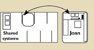
Figure 8.16 Joan's workplace and the shared resources used by the operators. The left-hand diagram shows how the cubicles are positioned in relation to one another and the right-hand diagram is a blown-up schematic of Joan's space
The representations and technologies that are used at Joan's desk and elsewhere are then described. These include software applications, monitors, the telephone, manuals, lists, scraps of paper, and post-it notes. The way that incoming calls are handled is also highlighted: pointing out how the telephone system allocates incoming calls to the next available operator.
The type of call that is then analyzed is one of the most common, which in this call center concerns employment verification. Ackermann and Halverson describe a specific example that is representative of many others. A caller (a mortgage lender) wishes to find out whether one of its customers is actually employed by Company X and so calls the call center to verify this. Joan, who receives the call, looks up this information using a database (EMPLOY) that can only be accessed at the shared terminal that is 3 meters away from her desk. For every call she has to disconnect her headset from the phone, and walk to the central table to access the database to find out the information needed. In addition, Joan has to enter a record for every call using a computer-based tracking system (CAT) that is accessed via the terminal on her desk. When she answers the call, she has at the same time to close out the one she was previously working on. While doing this, she asks the caller for details about the person in question. This she types into the new record (the overlapping of tasks is noted by the analysts as being significant). Joan then writes this down on a piece of paper. The reason for this duplication of the same information is that she needs to carry it over to the EMPLOY system. The information (including a social security number) is too much to remember and would be easy to get mixed up or forgotten while walking over to the other terminal. She walks over to the EMPLOY system with the piece of paper and copies the information into the software, to enable her to get the new information she needs. She writes this down on the same piece of paper. She then returns to her desk and relays this new piece of information back to the caller, while completing the details of the call in the record on the CAT system (the overlapping of tasks at this stage is noted by the analysts as also being significant).
Having described the seemingly simple task in prose, Halverson and Ackermann re-represent the short sequence of events in a diagrammatic form, making explicit how the various media support the way the information is propagated across different representational states. The diagram reveals the different cognitive memories that are used during the various transformations (see Figure 8.17), including Joan's and the caller's, indicating how they are transformed from working memory to long-term memory. Importantly, by representing this common routine using the notation, nine different memories were revealed as being involved in the propagation of representational states. This is a large number and shows how the routine task is far from simple, involving a complex set of overlapping steps.
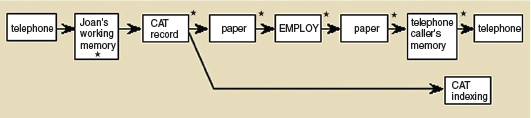
Figure 8.17 A diagram showing the propagation of representational states for the employee verification process. The boxes show the different representational states for different media (e.g. telephone, paper, Joan's memory) and the arrows show the transformations on these. The asterixes indicate where Joan's working memory is also involved
Through examining the diagram and revisiting their textual descriptions, Ackermann and Halverson were able to reflect upon the implications of the many overlapping tasks Joan has to accomplish, some simultaneously. They subsequently performed an even finer grain of analysis, examining how the multiple memories are interleaved at a physical level, noting the actual physical movements involved in each change in representation state, e.g. when Joan moved and clicked the mouse, alongside what was said at that point. Another notation was used for this purpose.
How useful is distributed cognition?
What is gained from conducting a detailed distributed cognition analysis such as this one? To a manager or outsider, the routine call would appear to involve a simple request and yet Ackermann and Halverson's analysis reveals it to be a complex cognitive task. An outcome of performing their micro-level analysis was to make explicit the nature of the complexity: showing how memories are distributed and interwoven; sometimes they belong to an individual, e.g. Joan's note written down on a piece of paper, and other times they are part of the system, e.g. the call handling procedure embedded in the telephone system. Furthermore, it describes systematically how a piece of information is propagated through multiple representational states, being verbally, physically, and mentally transformed, that has implications for the redesign of the supporting systems. It identifies the cognitive workload that is involved when different resources have to be used and coordinated for the same task.
What are the design implications? Simply enabling the EMPLOY database to be accessed at the same terminal as the CAT system would seem like an obvious solution. However, the information still needs to be propagated between applications and the cutting and pasting editing functions may not be compatible between the different applications. Moreover, the operator may be put under even more pressure to complete a call in even less time, if it is perceived that the operators no longer have to walk anywhere to access information resources. However, this perspective does not take into account the amount of cognitive effort required to access and enter information via different information systems.
Performing a detailed distributed cognition analysis enables researchers and designers to explore the trade-offs and likely outcomes of potential solutions and in so doing suggest a more grounded set of cognitive requirements, e.g. types of information resources, that are considered suitable for specific kinds of activities. Clearly, such a painstaking level of analysis and the expertise required in the interpretation is very costly. In the commercial world, where deadlines and budgets are always looming, it is unlikely to be practical. However, in large-scale and safety critical projects, where more time and resources are available, it can be a valuable analytic tool to use.
8.6.3 Activity Theory
Activity theory (AT) is a product of Soviet psychology that explains human behavior in terms of our practical activity with the world. It originated as part of the attempt to produce a Marxist psychology, an enterprise usually associated with Vygotsky (e.g. 1926/1962) and later Leontiev (e.g. 1978, 1989). In the last 20–30 years, versions of AT have become popular elsewhere, particularly in Scandinavia, Germany, and now growing in the USA and UK. The newer ‘versions’ of AT have been popular in research investigating ‘applied’ problems, particularly those to do with work, technology, and education.
Activity theory provides a framework that focuses analysis around the concept of an ‘activity’ and helps to identify tensions between the different elements of the system. For example, Wendy Mackay et al. (2000) analyzed a 4-minute excerpt from a video of users working with a new software tool. They identified 19 shifts in attention between different parts of the tool interface and the task at hand. In fact, some users spent so much time engaged in these shifts that they lost track of their original task. Using the theory helped evaluators to focus on relevant incidents.
AT outlines two key models: one which outlines what constitutes an ‘activity’ and one which models the mediating role of artifacts.
The individual model
AT models activities in a hierarchical way. At the bottom level are ‘operations,’ routinized behaviors that require little conscious attention, e.g. rapid typing. At an intermediate level are ‘actions,’ behavior that is characterized by conscious planning, e.g. producing a glossary. The top level is the activity, and that provides a minimum meaningful context for understanding the individual actions, e.g. writing an essay (see Figure 8.18). There may be many different operations capable of fulfilling an action, and many actions capable of serving the same activity.

Figure 8.18 The original activity theory model
Activities can be identified on the basis of the motives that elicit them, actions on the basis of conscious goals that guide them, and operations by the conditions necessary to attain the goals. However, there is an intimate and fluid link between levels. Actions can become operations as they become more automatic and operations can become actions when an operation encounters an obstacle, thus requiring conscious planning. Similarly there is no strict demarcation between action and activity. If ‘motive’ changes then an activity can become an action. It is also important to realize that activities are not self-contained. Activities relate to others while actions may be part of different activities, and so on.
The role of artifacts
Artifacts can be physical, such as a book or a stone, or they can be abstract, such as a system of symbols or a set of rules. Physical artifacts have physical properties that cause humans to respond to them as direct objects to be acted upon. They also embody a set of social practices, their design reflecting a history of particular use. Leontiev describes the process of learning what these inherent properties are as one of ‘appropriation,’ signifying the active nature of the learning that is needed. The kind of learning involved is one of identifying and participating in the activity appropriate to the artifact. Consider an infant learning to feed with a spoon. Leontiev (1981) observed that, at first, the infant carries the spoon to its mouth as though it were handling any other object, not considering the need to hold it horizontal. Over time, with adult guidance, the spoon is shaped in the way it is because of the social practice—the activity—of feeding and, in turn, the infant's task is to learn that relationship—to discover what practice(s) the object embodies. By contrast a spoon dropped into the cage of a mouse, say, will only ever have the status of just another physical object—no different from that of a stone.
The idea of abstract artifacts follows from the idea of ‘mediation,’ i.e. a fundamental characteristic of human development is the change from a direct mode of acting on the world to one that is mediated by something else. In AT, the artifacts involved in an activity mediate between the elements of it.
AT also emphasizes the social context of an activity. Even when apparently working alone, an individual is still engaged in activities that are given meaning by a wider set of practices.
The classic view of an activity has a subject (who performs the activity) and an object (on which the activity is performed). Recent developments in AT, particularly by Engeström (e.g. 1999) and Nardi (e.g. 1996), have widened the focus from the ‘individual’ triangle of a single activity (subject, activity, and object) to include supra-individual concepts—tools, rules, community, and division of labor. By tool is meant the artifacts, signs, and means that mediate the subject and object; by community is meant those who share the same object; by rules is meant a set of agreed conventions and policies covering what it means to be a member of that community (set by laws, parents, managers, boards, etc.); and by division of labor is meant the primary means of classifying the labor in a workplace, e.g. manager, engineer, receptionist. The extended versions allow consideration of networks of interrelated activities—forming an ‘activity system’ (see Figure 8.19).
Performing an analysis driven by activity theory
AT does not present a clear methodological prescription for the description or analysis of behavior as a set of procedures to be followed. The conceptual model (Figure 8.18) is the main framework that is used to describe levels within an activity. This means that identifying elements will be highly dependent on individual interpretation. Christiansen (1996, p.177) summarizes: “Methodologically… the ideal data for an application of AT consist of longitudinal ethnographic observation, interviews and discussion in real-life settings, supplemented by experiments.” She continues that you “cannot interview people directly through rote questions but must interpret their actions and opinions after some careful reflection,” which is a difficult process. Nevertheless, the original and later versions of the AT framework have become popular amongst researchers and some practitioners as a way of identifying needs for new tools and to analyze problems that are present in a work or other setting.
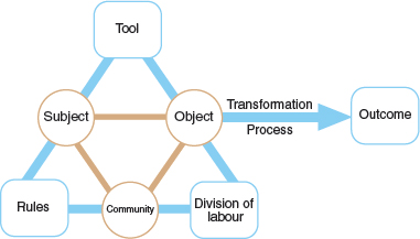
Figure 8.19 Engeström's (1999) activity system model. The tool element is sometimes referred to as the mediating artifact
One of the biggest problems with doing an AT analysis is working out when something should be described as a top-level activity and when something is better described as a lower-level action. In Figure 8.20, completing a software project is considered to be a top-level activity, while programming a module as an action. However, equally, programming a module could be viewed as an activity—if that was the object of the subject (person).
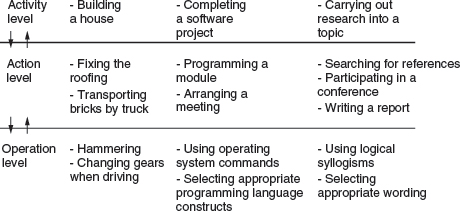
Figure 8.20 Examples of activities, actions, and operations
An example of applying the activity system approach: customer support center
To illustrate how AT can be used to interpret a work setting, we describe how it was used by Collins et al. (2002), who together with a small in-house IT support team, set out to identify the tools needed by customer support engineers whose job it is to document solutions to customer problems. The version of AT they used was the popular Engeström one (Figure 8.19). The domain chosen overlaps with the call center analyzed using the distributed cognition approach. We have selected these two projects on purpose to show the different emphases between the two approaches.
Documenting solutions to customer problems was identified as the activity to be focused on. This was seen in the wider context of knowledge management—a concept that has received much attention in recent years. The primary method of data collection was through interview: 32 employees were interviewed for one to one-and-a-half hours each. The interviews were transcribed and documented with notes and artifacts produced by the interviewees during the conversation. These were then annotated in terms of particular elements of the activity system, e.g. rules, object. Examples of subjects were frontline and backline engineers who deal with the calls; examples of tools were a knowledge repository tool with documented answers and the computer network used to run it on.
The analysts noted the tensions that the interviewees had talked about within or between elements, e.g. subject versus rules. These provided them with talking points by which to consider the system dynamics together with opportunities for thinking about new tools to support the customer support people. Examples of within and between element tensions include:
- Community—limited communication across stakeholder groups contributes to a lack of appreciation among the backline engineers of the needs of frontline customer support engineers.
- Tool—combination of a new knowledge repository tool and the physical computer from which it ran (the hardware and network on which the tool ran were not fast enough to enable timely access to the desired knowledge).
- Division of labor versus subject—workload balance and focus was lacking for the backline engineers who were expected to handle the majority of customer calls that do not currently have documented solutions the frontline staff can handle.
- Subject versus rules—the organization has a set of explicit and implicit rules for rating the knowledge documents. However, there was considerable conflict between the subjects involved in authoring and annotating them as to which was the most important. As a consequence, many did not use the rating system.
In presenting the results, excerpts from the interviews are used to back up many of the identified tensions, for example, an answer to the question “When you're talking to a customer, do you do documentation in real time” was “I try to. This is the best way, but it's real hard to get all that down. A lot of times I summarize it or if I can get another call while I am finishing up this call… if another one is coming, I'll answer the phone and start working on it. I'll then have to go back and work from memory to update this other call. It's not a good habit to get into. If the phone is ringing, it's ringing, you know.”
How useful is activity theory?
Many examples of tensions were identified in Collins' et al. analysis. Hence they built up a picture of the company by, firstly, identifying the core elements in the customer support center in terms of rules, objects, etc., and then assigning examples of tensions and conflict within and between them. Using these as discussion points, the team were able to suggest specific improvements to the knowledge management tool being developed, including:
- Delay in retrieval of relevant documents must be reconciled with user expectations for speed.
- Software tools must support individual user preferences for communication media, e.g. email, instant messaging.
Performing an AT analysis enables researchers and designers to identify the tensions in a workplace leading to specific needs for new technological tools. It can be difficult, however, getting to grips with the concepts and being able to determine how to label the points raised in the interviews. Expertise and a good background in the Soviet version of activity theory are recommended to become competent in it. Similar to the distributed cognition approach, in the commercial world, where deadlines and budgets are always looming, it is unlikely to be practical. As with distributed cognition, where more time and resources are available, it can be a valuable analytic tool.
Activity 8.5
Give some examples of how this activity theory (AT) analysis differs from and is similar to the distributed cognition (DC) analysis of the call center in the previous section.
Comment
Some of the main differences and similarities are:
- AT focuses on describing the tensions between parts of the AT system, using quotes to back them up, whereas a DC analysis focuses on drilling down on the way representations and technologies are used for a given distributed activity.
- AT provides a set of concepts by which to label and instantiate specific observations for an activity system, whereas DC represents the sequence of events (often in a diagrammatic form) making explicit how the various media support the way information is propagated across different representational states.
- Both AT and DC analyses reveal problems with existing technologies leading the analysts to suggest design recommendations for improving the existing set-up.
- The AT analysis used a large number of interviews and in-house team discussions to collect and articulate their data, whereas the DC analysis used data collected from a combination of observations and interviews.
- The AT analysis provided specific requirements for a particular software tool being developed, whereas the DC analysis explored the trade-offs and likely outcomes of potential solutions suggesting a grounded set of cognitive requirements.
8.7 Presenting the Findings
The best way to present findings depends on the audience, and the original goals of the study. However, it also is dependent on the data gathering and analysis techniques used.
In the previous sections of this chapter, you met many different ways of presenting findings—as numbers, through various graphical devices, in tables, in textual descriptions, as a set of themes or categories, and so on. These representations may be used directly to report your findings, provided they are appropriate for your audience and your purpose, or they may be used as background evidence for a different form of representation.
Broadly speaking, data gathering and analysis in interaction design is carried out for one of two purposes: to derive requirements for an interactive product, or to evaluate an interactive product under development. These two purposes have their own needs in terms of the notations to use and the information to be highlighted, but they also have similarities in terms of the choices to be made for presentation. For example, they usually involve reporting findings to a technical design team who will act on the findings.
In this section, we discuss three kinds of presentation style that we have not focused on as yet: using rigorous notations, using stories, and summarizing. There are other ways of presenting findings, but these are representative of the main options. In addition, these are not mutually exclusive and are often used in combination.
8.7.1 Rigorous Notations
A number of rigorous notations have been developed to analyze, capture, and present information for interaction design. The term ‘rigorous’ is not intended to imply ‘formal’ or ‘rigid,’ but simply to say that the notations have clear syntax and semantics. For example, the work models promoted in contextual design (Beyer and Holtzblatt, 1998) use simple but clear conventions for representing flows, breakdowns, individual roles, and so on. The modeling language UML (Unified Modeling Language) has stricter and more precise syntax to be followed and is more often used to specify internal software designs (although it has also been used and extended in the context of user interface design, e.g. Van Den Bergh and Coninx, 2005).
Advantages of using a rigorous notation are that it gives you clear guidance on what to look for in the findings and what to highlight, and that it forces you to be precise. Disadvantages include: that by highlighting specific elements, it inevitably also downplays or ignores other aspects, and that the precision expressed by the notation may be lost on an audience if they don't know the notation well. Producing diagrams in these notations inevitably requires further analysis of the findings in order to identify the specific characteristics and properties that the notation highlights.
To overcome their disadvantages, rigorous notations are usually used in combination with stories or other more easily accessible formats.
8.7.2 Using Stories
Storytelling is an easy and intuitive approach for people to communicate ideas and experiences. It is no surprise, then, that stories (also sometimes called narratives) are used extensively in interaction design both to communicate findings of investigative studies, and as the basis for further development such as product design or system enhancements.
Storytelling may be employed in three different ways. First, participants, i.e. interviewees, questionnaire respondents, and those you have observed, may have told stories of their own during data gathering. These stories can be extracted, compared, and may be used to communicate findings to others, e.g. as anecdotes to bring a summary report to life.
Second, stories about participants may be employed. For example, in reporting her findings about European culture, Bell (2001) presents general themes and overall findings, but then illustrates these with specific stories about participants she observed. For example, one of the themes from her observations was that food shopping is important in European cultures. To illustrate the importance of the local market in France, she tells the following story:
Patrice lives with her husband Frederico and their two small children in a tiny village in Brittany. In her early 30s, Patrice has retired from working in the company she and her husband started. She now runs her household and looks after her kids and husband. Like many other European women we interviewed, she expressed serious reservations about catalog shopping, saying “I like to touch and see things before I buy them.” And although she lives just a five-minute drive from a town with a large supermarket, Patrice chooses to shop in the local produce markets, which cycle through southern Brittany. It is important to buy what is locally seasonally available: “it just tastes better,” Patrice says.
Including these kinds of specific stories gives credibility and adds weight to the summary claim. Making a multimedia presentation of the story by adding video or audio excerpts and photographs will illustrate the story further. This kind of approach can be particularly effective if presenting data from an evaluation study that involves observation, as it is hard to contest well-chosen video excerpts of users interacting with technology or anecdotes from interview transcripts.
Third, stories may be constructed from smaller anecdotes or repeated patterns that are found in the data. In this case, stories provide a way of rationalizing and collating data to form a representative account of a product's use or a certain type of event.
Any stories collected through data gathering may be used as the basis for constructing scenarios. Scenarios are hypothesized stories about people and their daily life. They are a powerful technique for interaction design and can be used throughout the lifecycle. See Chapters 10 and 11 for more information on scenarios.
8.7.3 Summarizing The Findings
Clearly written reports with an overview at the beginning and a detailed content list make for easy reading and a good reference document. Including anecdotes, quotations, pictures, and video clips helps to bring the study to life, stimulate interest, and make the written description more meaningful. Some teams emphasize quantitative data, but its value depends on the type of study. Often both qualitative and quantitative data analysis are used because they provide alternative perspectives.
Some audiences are likely to be more interested in the headline findings than in the details of stories or precise specifications. These may be high-level managers, the set of users who acted as participants in studies, or product designers who want to use the results to develop a new product. Whoever they are, being able to present a summary of the findings is important. This is where numbers and statistical values (if you have any) can be really powerful. However, in these summaries it is important not to overstate your findings—if 8 out of 10 users preferred design A over design B, this does not mean that design A is 80% more attractive than design B. If you found 800 out of 1000 users preferred design A then you have more evidence to suggest that design A is better, but there are still other factors to take into account. In general, be wary of using words such as ‘most,’ ‘all,’ ‘majority,’ ‘none,’ and be careful when writing justifications to ensure that they reflect the data.
Activity 8.6
Consider each of the findings below and the associated summary statement about it. For each one, comment on whether the finding supports the statement.
- Finding: 2 out of 4 people who filled in the questionnaire ticked the box that said they prefer not to use the ring back facility on their cell phone.
Statement: Half of the users don't use the ringback facility.
- Finding: Joan who works in the design department was observed one day walking for 10 minutes to collect printout from the high-quality colour printer.
Statement: Significant time is wasted by designers who have to walk a long distance to collect printout.
- Finding: A data log of 1000 hours of interaction with a website recorded during January, February, and March records 8 hours spent looking at the helpfiles.
Statement: The website's helpfiles were used less than 1% of the time during the first quarter of the year.
Comment
- The questionnaire didn't ask if they use the ring back, just whether they preferred to use the ring back facility. In addition, 2 users out of 4 is a very small number of participants and it would be better to state the actual numbers.
- Observing one designer on one day having to walk to get printout does not mean that this is a general problem. There may be other reasons why this happened on this day, and other information is needed to make a clear statement.
- This statement is justified as the log was recorded for a significant period of time, and using percentages to represent this finding is appropriate as the numbers are so large.
Assignment
The aim of this assignment is for you to practice data analysis and presentation. Assume that you are to present the findings of your data gathering assignment from Chapter 7 to a group of peers, e.g. through a seminar.
- Review the data you have gathered and identify any qualitative data and any quantitative data in your data set.
- Is there any qualitative data that could sensibly and helpfully be translated into quantitative measures? If so, do the translation and add this data to your quantitative set.
- Consider your quantitative data.
- Decide how best to enter your quantitative data into your spreadsheet software. For example, you need to consider how to handle answers to closed questions. Then enter the data and generate some graphical representations. As you are likely to have very few records, i.e. respondents or interviewees, in your data set, you will have to think carefully about what if any graphical representations will provide meaningful summaries of your findings.
- Is there any data for which simple measures such as percentages or averages will be helpful? If so, calculate the three different types of average.
- Consider your qualitative data.
- Based on your refinement of the study question ‘improving the product,’ identify some themes from your qualitative data, e.g. what features of the product cause people difficulties, did any of your participants suggest alternative designs or solutions? Refine your themes and collate extracts of data which support the theme.
- Identify any critical incidents in your data. This may arise from interview or questionnaire responses, or from observation. Describe these incidents carefully and choose one or two to analyze in more depth, focusing on the context in which they occurred.
- Collate your findings as a presentation and deliver them to a group of your peers.
- Review your presentation and any questions you received from your peers and consider where your analysis and presentation could be improved.
Summary
This chapter has described in detail the difference between qualitative and quantitative data and between qualitative or quantitative analysis.
Quantitative and qualitative data can be analyzed for patterns and trends using simple techniques and graphical representations. Qualitative data may be analyzed using a variety of approaches including identifying categories or themes, and using theoretical frameworks, such as grounded theory, distributed cognition and activity theory.
It was noted that presenting the results is just as important as analyzing the data, hence it is important to make sure that any summary or claim arising from the analysis is carefully contextualized, and can be justified by the data.
Key Points
- The kind of data analysis that can be done depends on the data gathering techniques used.
- Qualitative and quantitative data may be collected from any of the main data gathering techniques: interviews, questionnaires, and observation.
- Quantitative data analysis for interaction design usually involves calculating percentages and averages.
- There are three different kinds of average: mean, mode, and median.
- Graphical representations of quantitative data help in identifying patterns, outliers, and the overall view of the data.
- Qualitative data analysis may be framed by theories. Three such theories are grounded theory, activity theory, and distributed cognition.
Further Reading
HUFF, D. (1991) How to Lie with Statistics. Penguin Books. This wonderful little book illustrates the many ways in which numbers can be misrepresented. Unlike some (many) books on statistics, the text is easy to read and amusing.
STRAUSS, A. and CORBIN, J. (1998) Basics of Qualitative Research: Techniques and Procedures for Developing Grounded Theory, 2nd edn. Sage. This presents a readable and practical account of applying the grounded theory approach. It is not tailored specifically to interaction design and therefore requires some interpretation. It is a good discussion of the basic approach.
ROGERS, Y. (2006) Distributed cognition and communication. In The Encyclopedia of Language and Linguistics, 2nd edn, K. Brown (ed.). Elsevier, pp. 731–733. (A version can also be downloaded from Yvonne Rogers' website.) This chapter provides a readable introduction to the background and application of distributed cognition.
KUUTTI, K. (1996) Activity theory as a potential framework for human–computer interaction. In Context and Consciousness, B.A. Nardi (ed.). MIT Press. pp. 17–44. This provides a digestible description of activity theory and how it can be applied in HCI.