
Usability testing and field studies
14.1 Introduction
14.2 Usability testing
14.3 Field studies
14.1 Introduction
Imagine you have designed a new shared web space intended for advertising second-hand goods. How would you find out whether householders would be able to use it to find what they wanted and whether it was a reliable and effective service? What evaluation methods would you employ? In this chapter we describe two very different approaches—usability testing and field studies. The first you would use to evaluate its effectiveness, ease of use, and satisfaction, and the second you would use to assess how it would support householders finding desired items. The first, usability testing, takes place mainly in a controlled environment; the second, a field study, examines how a product is used in natural home environments.
Typically, the performance of users interacting with a product is measured for set tasks in a usability test. This allows the system's effectiveness to be assessed and usability problems to be identified, e.g. problems printing a document or finding information. Usability testing varies in terms of the amount of control over the study. At one end are experiments, typically carried out in laboratory settings, that test user performance (e.g. reading) on one or two variables (e.g. font size, resolution) on a number of participants. At the other end are more opportunistic studies, that investigate a subset of usability and user experience goals, e.g. satisfaction, fun, frustration, for a handful of users. Between these two extremes are controlled tasks that examine such things as the ease of searching for and locating information items.
Recently, it has become more common for field studies to be conducted in natural environments, such as homes, offices, and outdoors. This is especially so for the evaluation of new technologies, such as mobile devices. Observation, diaries, and interviews are commonly used methods. Importantly, they take place in the setting where the product is used.
The main aims of this chapter are to:
- Explain how to do usability testing through examples.
- Outline the basics of experimental design.
- Discuss the methods used in usability testing.
- Discuss the role of field studies in evaluation.
14.2 Usability Testing
Usability testing is an approach that emphasizes the property of being usable, i.e. it is the product that is being tested rather than the user. It is conducted in a controlled environment. By this is meant placing the product to be tested in a usability laboratory, or similar controlled environment, where the performance of users on pre-planned tasks is repeatedly measured. The goal is to test whether the product being developed is usable by the intended user population to achieve the tasks for which it was designed (Dumas and Redish, 1999). It has been most commonly used to test desktop-based applications, such as websites, wordprocessors, and search tools.
Data is collected using a combination of methods. Key components are the user test and the user satisfaction questionnaire. The user test measures human performance on specific tasks, e.g. reaction time such as pressing a key when a light first appears. Examples of tasks include reading different typefaces (e.g. Helvetica and Times), navigating through different menu types (e.g. context versus cascade), and information searching. Software logging of keystrokes and mouse movements together with video recordings of the user's actions are used for recording user performance for the set tasks. The user satisfaction questionnaire is used to find out how users actually feel about using the product, through asking them to rate it along a number of scales, after interacting with it. The combined measures are analyzed to determine if the design is efficient and effective. Interviews, which are usually structured or semi-structured, may also be conducted with users.
Time and number are the two main measures used, in terms of the time it takes typical users to complete a task, such as finding a website, and the number of errors that participants make, such as wrong menu options selected when creating a spreadsheet. Quantitative performance measures are obtained during the tests that produce the following types of data (Wixon and Wilson, 1997):
- Time to complete a task.
- Time to complete a task after a specified time away from the product.
- Number and type of errors per task.
- Number of errors per unit of time.
- Number of navigations to online help or manuals.
- Number of users making a particular error.
- Number of users completing a task successfully.
In the early days of usability testing, user tests were conducted to investigate the efficacy of specific features of an interface. For example, a team of scientists from Xerox Corporation ran a series of user tests to determine what was the optimal number of buttons to put on a mouse, how many items to put in a menu, and how to design icons, as part of their Xerox Star office workstation system (Bewley et al., 1990). In total, over 15 user tests were performed involving over 200 users and lasting over 400 hours. This averaged out at 10—15 users per test, taking 2 hours each. The results of the various tests were then fed back into the design of the interface; for example, three buttons on the mouse was found to be best for selecting from a set of options.
It is considered that 5–12 users is an acceptable number to test in a usability study (Dumas and Redish, 1999), but sometimes it is possible to use fewer when there are budget and schedule constraints. For instance, quick feedback about a design idea, such as the initial placement of a logo on a website, can be obtained from only two or three users.
Many companies, such as Microsoft and IBM, test their products in custom-built usability labs (Lund, 1994). These facilities comprise a main testing laboratory, with recording equipment and the product being tested, and an observation room where the evaluators sit and analyze the data. There may also be a reception area for testers, a storage area, and a viewing room for observers. The space may be arranged to superficially mimic features of the real world. For example, if the product is an office product or for use in a hotel reception area, the laboratory can be set up to look like that environment. But in other respects it is artificial. Soundproofing and lack of windows, telephones, fax machines, co-workers, and other workplace and social artifacts eliminate most of the normal sources of distraction so that the users can concentrate on the tasks set for them to perform.
Typically there are two to three wall-mounted video cameras that record the user's behavior, such as hand movements, facial expression, and general body language. Microphones are also placed near where the participants will be sitting to record their utterances. Video and other data is fed through to monitors in the observation room. The observation room is usually separated from the main laboratory or work-room by a one-way mirror so that evaluators can watch participants being tested but testers cannot see them. It can be a small auditorium with rows of seats at different levels or, more simply, a small backroom consisting of a row of chairs, facing the monitors. They are designed so that evaluators and others can watch the tests while ongoing, both on the monitors and through the mirror. Figure 14.1 shows a typical arrangement.

Figure 14.1 A usability laboratory in which evaluators watch participants on a monitor and through a one-way mirror
Sometimes, modifications may have to be made to the room set-up to test different types of applications. For example, Chris Nodder and his colleagues at Microsoft had to partition the space into two rooms when they were testing early versions of NetMeeting, a videoconferencing product, in the mid-1990s, as Figure 14.2 shows (Nodder et al., 1999). This allowed users in both rooms to be observed when conducting a meeting via the videoconference system.
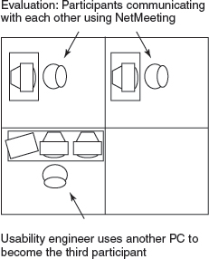
Figure 14.2 The testing arrangement used for NetMeeting videoconferencing product
Usability labs can be very expensive and labor-intensive to run and maintain. A less expensive alternative, that is becoming increasingly popular, is the use of mobile usability testing equipment. Video cameras, laptops, and other measuring equipment are temporarily set up in an office or other space, converting it into a makeshift usability laboratory. Another advantage is that equipment can be taken into work settings, enabling testing to be done on site, making it less artificial and more convenient for the participants.
As mentioned in Box 7.10, there is an increasing number of evaluation products coming onto the market that are specifically designed for mobile evaluation, and in particular, evaluating mobile devices. They are often referred to as ‘lab-in-a-box’ or ‘lab-in-a-suitcase’ because they pack away neatly into a convenient carrying case. One example is the Tracksys portable lab which costs around $5000 (Figure 14.3). It is composed of off-the-shelf components that plug into a PC and can record video direct to hard disk (Figure 14.4).
Another trend has been to conduct remote usability testing, where users perform a set of tasks with a product in their own setting and their interactions with the software are logged remotely. A popular example, is userzoom, which enables users to participate in usability tests from their home, illustrated in Figure 14.5. An advantage is that many users can be tested at the same time and the logged data automatically compiled into statistical packages for data analysis. For example, the number of clicks per page and the tracking of clicks when searching websites for specified tasks can be readily obtained.
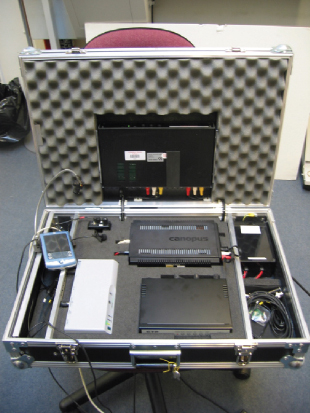
Figure 14.3 The Tracksys ‘lab-in-a-box’ system, which comprises components that pack into a heavy duty padded flight case plus a PC system
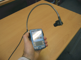
Figure 14.4 The Tracksys system being used with a mobile device camera that attaches to a flexible arm, which mounts on a mobile device, and is tethered to the lab
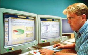
Figure 14.5 Userzoom enables remote usability testing
To illustrate how usability testing takes place in practice we now look at the steps involved in testing a large website. This was for a medical information system called MedlinePlus.
14.2.1 Usability Testing of a Large Website: MedlinePlus
MedlinePlus is a large website created by the National Library of Medicine (NLM) to provide health information for a wide range of the general public, doctors, and other medical professionals across the USA and the rest of the world. It was first developed in the 1990s and modified over the years, with a complete revision starting in 2002 (Marill et al., 2006). The original homepage for this system is shown in Figures 14.6–14.8. In 1999, usability consultant Keith Cogdill was commissioned by NLM to evaluate MedlinePlus.
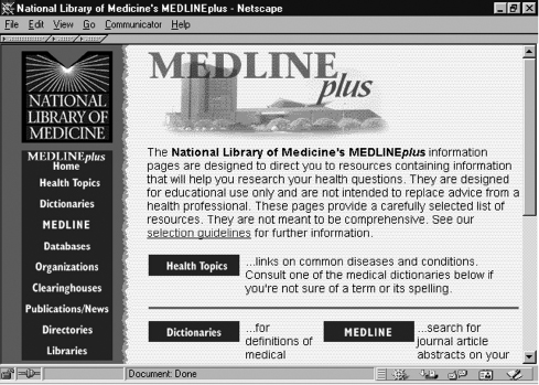
Figure 14.6 Homepage of MedlinePlus
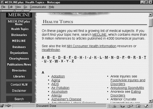
Figure 14.7 Clicking ‘Health Topics’ on the homepage produced this page
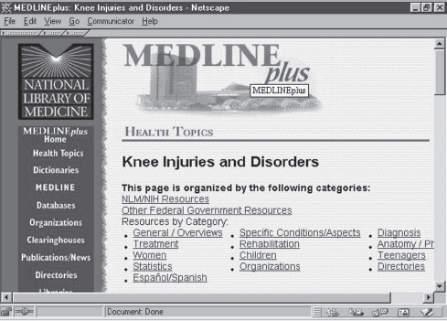
Figure 14.8 Categories of links within Health Topics for knee injuries
Activity 14.1
Data gathering requires a specific goal. What might this be in this context?
Comment
Our definition of usability suggests that MedlinePlus had to be: efficient, effective, safe, easy to learn, easy to remember, and have good utility (i.e. good usability); and be rewarding, support creativity, motivating, helpful, and satisfying to use (i.e. good user experience). There are many different kinds of users for this website, for example, the general public, doctors, and medical researchers, each with different information needs.
The evaluation of Medline was extensive, involving usability testing and heuristic evaluation. Here, we report on the various steps taken for the usability testing, including: what the goals of the evaluation were, how participants were selected, what kinds of tasks were set, how the testing was managed, what the ethical issues were, how the data was collected, analyzed, and interpreted.
Goals and Questions
The goal of the evaluation study was to identify the range of usability problems. Cogdill (1999) wanted to know if the way the topics on the homepage were categorized was usable by the majority of users. His team also wanted to check how users navigated around a large website for a number of tasks.
Selection of Participants
MedlinePlus was tested with nine participants selected from primary health care practices in the Washington, DC metropolitan area. This was accomplished by placing recruitment posters in the reception areas of two medical practices. People who wanted to participate were asked to complete a brief questionnaire, which asked about age, experience in using the web, and frequency of seeking health-related information. Cogdill then called all those who used the web more than twice a month. He explained that they would be involved in testing a product from the NLM, but did not mention MedlinePlus so that potential testers would not review the site before doing the tests. Seven of the nine participants were women, because balancing for gender was considered less important than web experience. It was considered important to find people in the Washington, DC region so that they could come to the test center and for the number of participants to fall within the range of 6–12 recommended by usability experts (Dumas and Redish, 1999).
Development of the Tasks
The following five tasks were developed in collaboration with NLM staff to check the categorizing schemes and navigation support. The topics chosen for the tasks were identified from questions most frequently asked by website users.
- Task 1: Find information about whether a dark bump on your shoulder might be skin cancer.
- Task 2: Find information about whether it is safe to use Prozac during pregnancy.
- Task 3: Find information about whether there is a vaccine for hepatitis C.
- Task 4: Find recommendations about the treatment of breast cancer, specifically the use of mastectomies.
- Task 5: Find information about the dangers associated with drinking alcohol during pregnancy.
The efficacy of each task was reviewed by colleagues and a pilot test was conducted with potential users who would not be involved in the main testing procedure. Criteria for successfully completing each task were also decided. For example, participants had to find and access between three and nine web page URLs for each of the five tasks.
The Test Procedure
Five scripts were prepared in advance for the user test (see Figures 14.9–14.13). The purpose of each script was to ensure that all participants were given the same instructions and information. The scripts included an introduction to the study, reassurance, e.g. “It does not matter if you make a mistake, we are testing the website not you”, a statement of the purpose of the test, a consent form, information on how to start the test with open-ended questions, the list of tasks, a description saying that the users can carry the tasks out in their own way, and finally what to say to the users once they have completed the task.
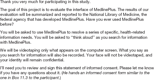
Figure 14.9 The script used to greet participants in the MedlinePlus study
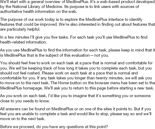
Figure 14.10 The script used to explain the procedure
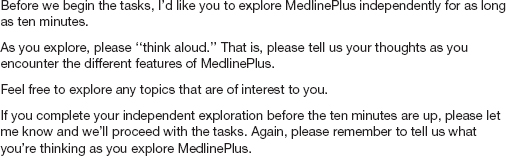
Figure 14.11 The script used to introduce and describe the initial exploration task

Figure 14.12 The script used to direct participants' behavior
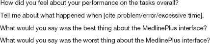
Figure 14.13 The debriefing script used in the MedlinePlus study
Testing was done in laboratory-like conditions. The participants were asked to sit down alone at a monitor, and the goals of the study and test procedure were explained. Before starting the main tasks the participants were invited to explore the website for up to 10 minutes to familiarize themselves with it. Each participant was then asked to work through the five tasks, thinking aloud. They were given up to 20 minutes for each task. If they did not finish a task in the allotted time they were asked to stop. If they forgot to think out loud or appeared to be stuck they were prompted. When all the tasks were completed, the participants were given a post-test questionnaire to fill in consisting of items derived from the QUIS user satisfaction questionnaire (first version, Chin et ah, 1988). Finally, when the questionnaire was completed, a debriefing session was held in which participants were asked for their opinions.
Data Collection
Completion times for the tasks were automatically recorded and calculated from the video. The participants' actions were also logged using a software tool. The logged data revealed the pathways that the participants took for each task. For example, Table 14.1 shows the online resources that participant A visited while trying to complete the first task. The performance data contained the following:
- Start time and completion time.
- Page count (i.e. number of pages accessed during the search task).
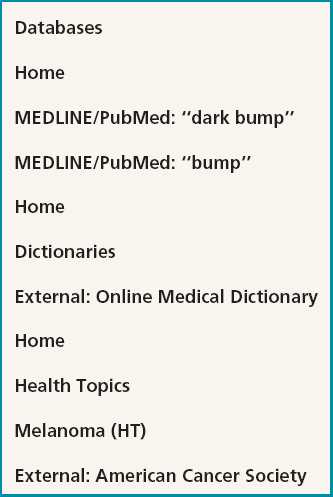
Table 14.1 The resources visited by participant A for the first task
- External site count (i.e. number of external sites accessed during the search task).
- Termination of tasks.
- Medical publications accessed during the search task.
- The user's search path.
- Any negative comments observed during the search.
- Ratings from the user satisfaction questionnaire and comments from the debriefing interview.
Table 14.2 contains the performance data for the nine participants for task 1. It shows the time to complete the task and the different kinds of searches undertaken. Similar tables were produced for the other four tasks.
Activity 14.2
Examine Table 14.2.
- Why do you think letters are used to represent participants?
- What do you notice about the completion times when compared with the reasons for terminating tasks (i.e. completion records)?
- What does the rest of the data tell you?
Comment
- Participants' names should be kept confidential in reports, so a coding scheme is used.
- Completion times are not closely associated with successful completion of this task. For example, completion times range from 5–15 minutes for successful completion and from 9–13 minutes for those who asked to terminate the task.
- From the data it appears that there may have been several ways to complete the task successfully. For example, participants A and C both completed the task successfully but their records of visiting the different resources differ considerably.
Data Analysis
The data was analyzed using a number of categories, including:
- Website organization in terms of the arrangement of topics, menu depth, and organization of links.
- Browsing efficiency including navigation menu location and text density.
- Use of the search features.

Table 14.2 Performance data for task 1: Find information about whether a dark bump on your shoulder might be skin cancer. Mean (M) and standard deviation (SD) for all subjects are also shown
A main finding was that reaching external sites was often difficult. Furthermore, analysis of the search moves revealed that several participants experienced difficulty finding the health topics pages devoted to different types of cancer. The user satisfaction questionnaire showed that participants' opinions of MedlinePlus were fairly neutral. They rated it well for ease of learning but poorly for ease of use, because there were problems in going back to previous screens. The set of findings was then fed back to the developers in an oral presentation and in a written report.
Activity 14.3
- Was the way in which participants were selected appropriate? Justify your comments.
- Why do you think participants were asked to read each new task aloud before starting it and to return to the homepage?
- Was the briefing material adequate? Justify your comment.
Comments
- The evaluator tried to get a representative number of users across the user age range from both genders. There were, however, more women participants than men participants because the evaluator was more concerned about getting experienced web users than getting an even gender balance.
- This was to make it easy for the evaluator to detect the beginning of a new task on the video log. Sending the participants back to the homepage before starting each new task ensured that logging always started from the same place. It also helped to orient the participants.
- The briefing material was full and carefully prepared. Participants were told what was expected of them and the scripts were pre-planned to ensure that each participant was treated in the same way. An informed consent form was also included.
The second version of MedlinePlus is shown in Figures 14.14–14.15. It had much more content, with over 700 health topic pages, licensed material including drug information, a medical encyclopedia, a dictionary, news feeds, and tutorials. The new homepage (Figure 14.14) was designed to be simple, intuitive, and accessible to users whose web expertise varied. The pages were designed to have a uniform look and feel and the branding to be simple and distinctive. Other new features included a search engine and a bilingual site. The changes that were made were based upon more recent usability testing recommendations and user survey results, new technical requirements, web design trends, and the need to grow the site in an orderly way (Marill et al., 2006, p. 30).

Figure 14.14 Homepage of revised version of MedlinePlus
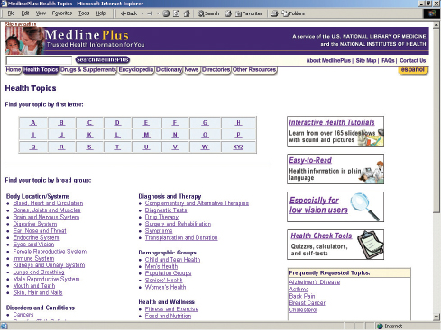
Figure 14.15 Clicking ‘Health Topics’ on the homepage of the revised version produced this page
14.2.2 Conducting Experiments in Usability Testing
Sometimes, it is important to test a specific hypothesis that makes a prediction about the way users will perform with an interface. In this context, the user test is run more like a scientific experiment. An example of a hypothesis is: context menus are easier to select options from compared with cascading menus. Hypotheses are often based on a theory, such as Fitt's Law (see next chapter), or previous research findings. Specific measurements are decided upon as a way of testing the hypothesis. In the above example, the accuracy of selecting menu options would be compared by counting the number of errors each participant makes for each menu type.
Typically, a hypothesis involves examining a relationship between two things, called variables. In the above example the variables are menu types and error rate. Another example of a relationship that could be tested is between time and font, for the hypothesis “reading text displayed in 12-point Helvetica font is faster than reading text displayed in 12-point Times New Roman.” Variables can be independent or dependent. An independent variable is what the investigator ‘manipulates’ (i.e. selects), and in the above example it is the different font types. The experimenter could have equally selected to compare another sans serif with a serif font, e.g. Geneva versus Times. The other variable is called the dependent variable, and in our example, this is the time taken to read the text. It is a measure of the user performance and if our hypothesis is correct, will vary depending on the different types of font used.
When setting up a hypothesis to test the effect of the independent variable (s) on the dependent variable it is usual to derive a ‘null’ and an ‘alternative’ one. The null hypothesis in our example would state that there is no difference between Helvetica and Times font on reading time. The alternative hypothesis would state that there was a difference between the two on reading time. When a difference is specified but not what it will be, it is called a two-tailed hypothesis. This is because it can be interpreted in two ways: either the Helvetica font or the Times font is faster to read. Alternatively, the hypothesis can be stated in terms of one effect. This is called a one-tailed hypothesis and would state that Helvetica is easier to read than Times, or vice versa. A one-tailed hypothesis would be made if there was a strong reason to believe it to be the case. For example, it could be based on the findings of previous experiments investigating paper-based text that have all shown that sans serif is easer to read because of the simple shape form of the letters. A two-tailed hypothesis would be chosen if there was no reason or theory that could be used to support the case that the predicted effect would go one way or the other.
You might ask why do you need a null hypothesis since it seems the reverse of what the experimenter believes. Counter-intuitively, it is put forward to allow the data to contradict it. If the experimental data shows a big difference between reading times for the two different fonts, then the null hypothesis that font type has no effect can be rejected. Conversely, if there is no difference between the two then the alternative hypothesis is rejected, i.e. the claim that Helvetica font is easier to read is not supported.
In order to test a hypothesis, the experimenter has to set up the conditions and find ways to keep other variables constant, to prevent them from influencing the findings. This is called the experimental design. Examples of other variables that need to be kept constant for both fonts include color of text and screen resolution. For example, if the text is blue in one condition and black in the other then it could be this which causes the effect (i.e. differences in reading rates). Often a control condition is set up as part of the experimental design. This is typically used when you want to determine if a new method (e.g. presenting learning material as dynamic multimedia software), enhances performance (e.g. learning) compared with an existing method (e.g. presenting the same material in a static paper-based form). More than one condition can be compared with the control, for example:
Control condition = Paper-based
Condition 1 = Multimedia
Condition 2 = Virtual reality
The independent variable in this example is the type of media, e.g. paper-based, multimedia, virtual reality. The dependent variable measures learning performance, and could include the number of questions that are answered successfully for each condition before and after the experiment.
Sometimes an experimenter might want to investigate the relationship between two independent variables, for example, age and educational background. A hypothesis might be that young people are faster at finding text on the web than older people and that those with a scientific background are more effective at selecting search terms. An experiment would be set up to measure the time it takes to complete the task and number of searches carried out. The analysis of the data would focus on both the effects of the main variables (age and background) and also look for any interactions among them.
Hypothesis testing can also be extended to include even more variables, but it makes the experimental design more complex. An example is testing the effects of age and educational background on user performance for two methods of web searching: one a search engine and the other a browser. Again, the goal is to test the effects of the main variables (age background, web searching method) and to look for any interactions among them. However, as the number of variables increases in an experimental design, it makes it more difficult to work out from the data what is causing the results.
Another concern in experimental design is to determine which participants to use for which conditions of an experiment. The experience of participating in one condition will affect the performance of those participants if asked to partake in another condition. For example, having learned about the way the heart works using a multimedia condition it would be unfair to expose the same participants to the same learning material via another medium, e.g. virtual reality. The reason being that they would have had more time to learn about the same topic and this would increase their chances of answering more questions correctly. In some experimental designs, however, it is possible to use the same participants for all conditions without letting such training effects bias the results.
The names given for the different designs are: different-participant design, same-participant design, and matched-pairs design. In different-participant design, a single group of participants is allocated randomly to each of the experimental conditions, so that different participants perform in different conditions. In experimental jargon this is called between-subjects. An advantage is that there are no ordering or training effects, caused by the influence of participants' experience of one set of tasks on performance in the next, as each participant only ever performs in one condition. A disadvantage is that large numbers of participants are needed so that the effect of any individual differences among participants, such as differences in experience and expertise, is minimalized. Randomly allocating the participants and pre-testing to identify any participants that differ strongly from the others can help.
In same-participant design, all participants perform in all conditions so only half the number of participants is needed; the main reason for this design is to lessen the impact of individual differences and to see how performance varies across conditions for each participant. In experimental jargon this is called within-subjects. It is important to ensure that the order in which participants perform tasks for this set-up does not bias the results. For example, if there are two tasks, A and B, half the participants should do task A followed by task B and the other half should do task B followed by task A. This is known as counterbalancing. Counterbalancing neutralizes possible unfair effects of learning from the first task, i.e. the order effect.
In matched-participant design, participants are matched in pairs based on certain user characteristics such as expertise and gender. Each pair is then randomly allocated to each experimental condition. A problem with this arrangement is that other important variables that have not been taken into account may influence the results. For example, experience in using the web could influence the results of tests to evaluate the navigability of a website. So web expertise would be a good criterion for matching participants.
The advantages and disadvantages of using different experimental designs are summarized in Table 14.3.
Similar to user tests, the data collected to measure user performance on the tasks set in an experiment usually includes response times for subtasks, total times to complete a task, and number of errors per task. Analyzing the data involves comparing the performance data obtained across the different conditions. The response times, errors, etc. are averaged across conditions to see if there are any marked differences. Statistical tests are then used, such as t-tests, that statistically compare the differences between the conditions, to reveal if these are significant. For example, a t-test could reveal whether Helvetica or Times font is faster to read on the screen.
t-Tests are the most widely used statistical test in HCI and other fields, such as psychology. They can be used to answer the question of whether two variables are related or not. The scores, e.g. time taken to read a page of text, for each participant in each condition are used to compute the means (x) and standard deviations (SD). The standard deviation is a statistical measure of the spread or variability around the mean. The t-test uses a simple equation to test the significance of the difference between the means. If they are significantly different from each other we can reject the null hypothesis and in so doing infer that the alternative hypothesis holds. A typical t-test result that compared reading time for two groups with 9 and 12 participants each might be: t = 4.53, p < 0.05, df = 19. The t-value of 4.53 is the score derived from applying the t-test; df stands for degrees of freedom, which represents the number of values in the conditions that are free to vary. This is a complex concept that we will not explain here other than to mention how it is derived and that it is always written as part of the result of a t-test. The dfs are calculated by summing the number of participants in one condition minus one and the number of participants in the other condition minus one. It is calculated as df = (Na − 1) + (Nb − 1), where Na is the number of participants in one condition and Nb is the number of participants in the other condition. In our example, df = (9 − 1) + (12 − 1) = 19. p is the probability that the effect found did not occur by chance. So, when p < 0.05, it means that the effect found is probably not due to chance and that there is only a 5% chance of that being the case. Typically, a value of p < 0.05 is considered good enough to reject the null hypothesis, although lower levels of p are more convincing, e.g. p < 0.01 where the effect found is even less likely to be due to chance, there being only a 1% chance of that being the case.
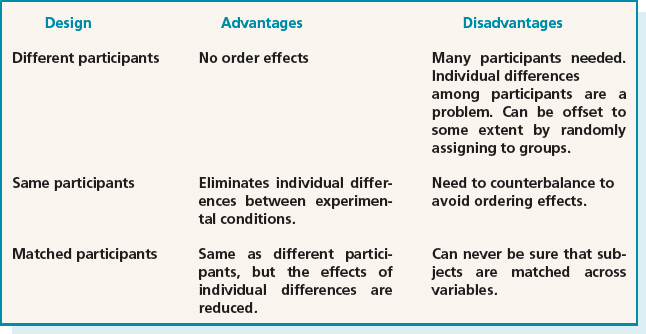
Table 14.3 The advantages and disadvantages of different allocation of participants to conditions
Box 14.1 describes an experiment to test whether broad, shallow menu design is preferable to deep menus on the web.
Box 14.1: An Experiment to Evaluate Structure in Web Page Design
A large body of research has been done on exploring the optimal number of items in a menu design, and most studies conclude that breadth is preferable to depth in organizing menu content. By this it is meant having a large number of top-level menu items with few levels rather than a small number of top-level items with many levels. Around 1997, when the web was still a relatively new phenomenon, there was an assumption that the number of links from a homepage to other items should be fewer than 10. The assumption was based on misapplying Miller's magic number, 7 ±2. This assumption fails to recognize, however, that users do not need to remember the items, they need only to be able to identify them, which is far easier. A contrary position was that because recognition is easier than recall, it would be better to have a much larger number of links on the homepage. This goes against a rule of thumb for information display on paper that advocates the use of white space to prevent confusion and an unpleasing, cluttered design. To solve this controversy Kevin Larson and Mary Czer-winski (1998) from Microsoft Research carried out an experiment. The following account outlines the main points of their study.
The goal of the experiment was to find the optimal depth versus breadth structure of hyperlinks for expertly categorized web content. Three conditions were tested using different link designs varying in depth/breadth for the same web content. Each design had 512 bottom-level nodes.
Condition 1: 8 × 8 × 8 (8 top-level categories, each with 8 sublevels, with 8 content levels under each)
Condition 2: 16 × 32 (16 top-level categories, each with 32 content-level categories)
Condition 3: 32 × 16 (32 top-level categories, each with 16 content-level categories)
These conditions were compared using a same-participant experimental design. 19 experienced web users each performed eight search tasks for each condition, making a total of 24 searches. The eight searches were selected for each participant at random from a bank of 128 possible target items that were categorized according to content and complexity. Participants were given the same number of items from each category and no one searched for the same item more than once (i.e. there was no duplication of items across conditions).
Reaction times (RT) to complete each search were recorded. The data was collated in terms of the averages (Avg.) and standard deviations (SD) for each condition. The averages showed that participants completed search tasks fastest in the 16 × 32 hierarchy (Avg. RT = 36 seconds, SD = 16), second fastest in the 32 × 16 hierarchy (Avg. RT = 46 seconds, SD = 26), and slowest in the 8×8×8 hierarchy (Avg. RT = 58 seconds, SD = 23). These results suggest that breadth is preferable to depth for searching web content. However, very large numbers of links on one page may be detrimental to searching performance. More experiments are needed to identify the ideal number at the top level.
Activity 14.4
- What were the independent and dependent variables in the study described in Box 14.1?
- Write two possible hypotheses.
- The participants are all described as ‘experts.’ Is this adequate? What else do you want to know about them?
- How do controlled experiments differ from typical usability testing (i.e. that done in most companies)?
Comment
- The independent variable is menu link structure. The dependent variable is reaction time to complete a search successfully.
- Web search performance is faster with broad, shallow link structures.
There is no difference in search performance using different link structures.
- ‘Expert’ could refer to a broad range of expertise. The evaluators could have used a screening questionnaire to make sure that all the participants had reached a basic level of expertise and there were no super-experts in the group. However, given that all the participants did all the conditions, differences in expertise had less impact than in other experimental designs.
- Controlled experiments compare two or more conditions (i.e. treatments of the independent variable) based on quantitative measures of human performance. Therefore other evaluators can follow the same procedure and can apply the same statistical tests in order to check the results. Typically, usability testing is designed to find the problems that users encounter when carrying out a set of standardized tasks.
14.3 Field Studies
Field studies are typically conducted to find out how a product or prototype is adopted and used by people in their working and everyday lives. Such settings are very different from the controlled environments used during usability testing, where tasks are set and completed in an orderly way. Instead, they are ‘messy’ in the sense that activities often overlap and are constantly interrupted. It follows that the way people interact with products in their everyday messy worlds is often different from how they perform on set tasks in a laboratory setting. Hence, by evaluating how people think about, interact, and integrate products within the settings they will ultimately be used in, we can get a better sense of how successful the products will be in the real world. The trade-off, however, is that we cannot test specific hypotheses about an interface nor account, with the same degree of certainty, for how people react to or use a product—as we can do in the laboratory setting. This makes it more difficult to determine what causes them to behave in a certain way or what is problematic about the usability of a product. Instead, qualitative accounts and descriptions of people's behavior and activities are obtained that reveal how they used the product and reacted to its design.
Field studies can range in time from just a few minutes to a period of several months or even years. Data is collected primarily by observing and interviewing people; collecting video, audio, and field notes to record what occurs in the chosen setting. In addition, participants may be asked to fill out paper-based or electronic diaries, that run on cell phones or other handheld devices, at particular points during the day, such as when they are interrupted during their ongoing activity or when they encounter a problem when interacting with a product or when they are in a particular location (see Figure 14.16). This technique is based on the experience sampling method (ESM) used in healthcare (Csikszentmihalyhi and Larson, 1987). Data on the frequency and patterning of certain daily activities, such as the monitoring of eating and drinking habits, or social interactions like phone and face-to-face conversations, are recorded. Software running on the PDAs or cell phones triggers participants at certain intervals, requesting them to answer questions or fill out dynamic forms and checklists. These might include recording what they are doing, what they are feeling like at a particular time, where they are or how many conversations they have had in the last hour.
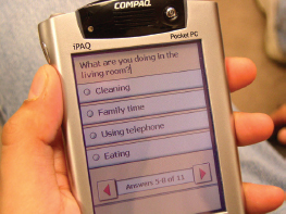
Figure 14.16 An example context-aware experience sampling tool running on a PDA
When conducting a field study, it is important to let the people being observed, or asked to record information, know how long the study or session will take. The investigators will need to work out and agree with the participants what part of the site is to be recorded and how. If setting up cameras they need to be situated in an unobtrusive place. For example, if a field study is being conducted on how families use a new messaging system, they will need to agree on if and where cameras can be placed in their house. The participants will need to be told how to switch them on and off. The investigators will also need to work out in advance what to do if the prototype or product breaks down while in situ. Can the participants reboot the system or will the investigators need to be called in? Security arrangements will also need to be made if expensive or precious equipment is being evaluated in a public place.
Examples of field studies were presented in Chapter 12. Two of these were the Nokia phone study and the HutchWorld portal; the Nokia phone study explored how users from a different cultural environment, Japan, used a cell phone designed for Europeans while the HutchWorld portal was evaluated with patients in a hospital setting to see how the practical constraints of that environment impacted its use by patients. A number of other field studies have explored how new technologies have been appropriated by people in their own cultures and settings. By appropriation is meant how the participants use, integrate, and adapt the technology to suit their needs, desires, and way of living. For example, the drift table, an innovative interactive map table described in Chapter 4, was placed in a number of homes in London for a period of weeks to see how the home owners appropriated it. The field study showed how the different home owners interacted with it in quite different ways, providing a range of different accounts for how they understood it and what they did with it. Another field study, mentioned in Chapter 4, was of the Opinionizer system that was designed as part of a social space where people could share their opinions visually and anonymously, via a public display. The system was intended to facilitate the initiation of conversations with strangers at a party or other social gathering. Observations of it being interacted with at a number of parties showed a 'honey-pot' effect: as the number of people in the immediate vicinity of the system increased, a sociable ‘buzz’ was created, where a variety of conversations were started between the strangers.
The findings from these and other field studies are typically written up in the form of vignettes, excerpts, critical incidents, patterns, and narratives to illustrate how the products are being adopted and integrated into their surroundings. Another approach is to use a particular conceptual framework to guide the analysis (see Chapter 8). This enables the data to be explained at a more general level in terms of cognitive processes, or social practices such as learning, or conversational or linguistic interactions. To show how this is done we present a field study that used a framework of learning artifacts, derived from Activity Theory, to analyze how people understand and learn how to use a new technology in their own home. The field study was carried out by Marianne Graves Petersen, Kim Holskov Madsen and Arne Kjaer (2002), who analyzed how two different families' behavior evolved as they learned to use their newly purchased Bang and Olufsen TV and integrated video system. The system was integrated in the sense that both the TV and video were operated by a single remote control. For example, after pressing the button for the TV, the same sequence of steps is followed to get channel 7 as to get track 7 on the video. The families each consisted of two parents and two children. One family, who had two small children, had not owned a Bang and Olufsen system before. The other family, with two adult children, had owned a Bang and Olufsen system and they bought the new one to be part of their home entertainment system with ‘surround-sound.’
Only two families were chosen for the study because the investigators wanted to study how the learning and adoption process evolved in depth over a period of several months. The families were visited four times each at intervals of approximately a month during this time in their homes, in the evenings. The investigators restricted their use of video and the duration of their visits, conscious that they were visiting people during their leisure time in their homes. The families were asked a series of open-ended questions during the visits. For example: Why did they decide to buy it? Where did the idea come from? What were their expectations? Did the two families discuss their idea for the purchase with their families and friends? Did they visit and talk with the distributor before making the purchase? In addition, they were asked to fill in an incident diary form whenever they noted anything interesting or unusual happening.
Following the initial interviews, the investigators constructed scenario-based, hands-on activities to further develop their understanding of the families' expectations and use of the system.
Activity 14.5
Petersen et al. (2002) note that the incident diary method failed to be used by the families. Why do you think this was and how might it have been used differently?
Comment
The incident diary probably failed in this context because it was distracting from the relaxed atmosphere in which the families used the product. They were probably enjoying watching TV or videos on the family sofa, and did not wish to interrupt this experience to complete a diary entry. Alternatively, if they had been asked to fill in a simple form at the end of each day, reflecting on their experiences, it may have been used more.
Activity Theory as an Analytic Framework
In Chapter 8 you were introduced to Activity Theory, where it was used to explain how artifacts mediate activity. A number of concepts were introduced. Following Engestrom's (1990) and Wartofsky's (1979) adaptation of the theory, Petersen et al. propose that artifacts can be conceptualized in terms of how people learn and understand how to use new technologies. The four types they describe are: (i) 'what artifacts,' which describe the purpose of the design; (ii) 'how artifacts,' which indicate how the ‘what artifacts’ are used; (iii) 'why artifacts,' which suggest why a particular way of doing something is chosen; and (iv) 'where to artifacts,' which indicate a motive to change a behavior or understanding of how a product works. Having this way of conceptualizing artifacts helps understand how design supports the development of a product's use as people learn more about how to use it within the context of their activities.
Collecting and Analyzing Data
Using this conceptual framework, the investigators analyzed their data (observations, interviews, video recordings), looking through it several times and noting themes. Other themes also developed from the interests of the families. They then described a series of episodes that were particularly successful, problematic, surprising, or difficult to tackle. These episodes included: the cinema experience, programming the video recording, and sticking to old procedures. Here we describe one of them for one family: the cinema experience.
The chosen episode shows how one mother, called Sarah, pursued the promise of the cinema experience. When the system was being installed Sarah explained, excitedly, how her family was looking forward to the large screen and surround-sound of the cinema experience, which was their prime motive for buying the new system. A demonstration in the shop and the marketing literature helped to create this expectation. The description that is presented illustrates how this expectation pervaded Sarah's learning of how to use the new system. It also shows how her knowledge of the family's previous system impeded her learning the new system and about how the integration of functions for operating the TV and CD player in the design of the remote control affected her. The story is told through the analysis of salient excerpts from the investigator's observations and interviews with Sarah and her husband, Paul.
Figure 14.17 Learning artifacts one month after delivery when trying to achieve the cinema experience
After one month of the initial set-up of the new system, Sarah is still using the remote from the old system, which does not give her the cinema experience. One of the problems that Sarah faces is that the new remote is highly modal. The following excerpt illustrates that Sarah still has to learn how to use the function LIST on the new remote.
Sarah: “…what I can't do now and what I have not learned or asked about or read myself, that is to make the screen… if I'm watching a video … to make… what is it called… to enlarge or reduce the size of the picture … I can't do that … I mean it would take a long time for me to sit and experiment, it would be easier to read the manual, but it would be even easier to ask someone, if there was someone to ask.”
[Some discussion about whether Sarah would use the manual or not]
Question: Are there any other things that you would like to do with the new remote control?
Sarah: “I can operate the video, but there is still the thing about making the picture bigger and smaller and then there is surround sound, too. I have not worked it out. I know it is [she studies the new remote control in her hand]… no I don't know… yes LIST… I know it has something to do with LIST.”
This initial experience was analyzed in terms of the various categories of artifacts, noting the important role of the LIST button as a ‘how artifact’ (see Figure 14.17).
The analysis then describes how she learns from her husband, Paul, while he is being interviewed by the investigators. The conversation informs Sarah about what she needs to do to learn to operate the remote to get surround-sound. The following excerpt illustrates how he does this:
Paul: “Now I would like to have the right size of the picture and the surround sound on. If we start with the size, we do…”
[Paul does this without problems]
Paul: “Then when we want surround sound, we must connect all five loud speakers. Then we need to go over to what is called ‘speaker’ mode and you do this by pressing LIST… there we have speaker mode [the text ‘speaker’ appears in the display of the remote control], then we press number button 5…”
Question: And you pressed 5 because you remember…?
Paul: “Well there was some logic involved as I know that you have five speakers in surround sound, right?”
Sarah: “Oooohh, yes of course… that is a strange kind of logic isn't it! It's so simple really!”
This excerpt also indicates that Sarah has learned that she must connect the speakers. By the time of the investigators' next visit, Sarah has connected the speakers and proudly announces that she has achieved the surround-sound. She did this by connecting the TV through the CD player that only required four speakers to be connected. It was only when Paul achieved the surround-sound with the TV—which required all five speakers to be connected—that Sarah realized her understanding was faulty.
Sarah: “Then I turned on the CD player. And then I wanted to connect the loudspeakers—all five of them.”
Question: What did you do then?
Sarah: “Well, then I needed to start by turning up the volume [she turns up the volume] … and then… hmm … [Sarah studies the remote control] … I put on… I pressed twice on… hmm …onlift… LIFT!… and then I pressed number button 4 and now they are on” [the surround sound is on].
Question: When you experimented with this yourself, do you remember how you found out that this is the way to do it?
Sarah: “Well I recalled that I needed to press… that LIFT button… that one I've always remembered… a few times [actually twice], and then there is nothing to it apart from pressing up to … you see, I knew we have up to five loudspeakers, right !?… and then I pressed number button 4 and the lights [on the loudspeakers] turned green” [she points to the speakers].
The investigators observe that a breakdown occurred because Sarah needed to find the LIST button, which she then referred to as the LIFT button, probably because she didn't understand what it is for. However, she has now developed the principle of pressing the number to get the number of speakers that she wants. In terms of activity theory, this operation has become her ‘why artifact,’ which she did not have before. Meanwhile, her previous ‘how artifact’ that was “something to do with LIST” has been refined to ’ “press LIST or LIFT a few times.” The learning artifacts in Figure 14.18 show how Sarah's efforts have evolved to successfully obtain the cinema experience in her living room.
The outcome from this detailed analysis is an explanation of the motivation for Sarah's behavior when operating the TV; a trace of where breakdowns in her understanding of the design of the TV occurred and how her understanding evolved as she learned to use it. It also accounted for why Sarah had problems accomplishing the task of turning on the loudspeakers in the surround-sound system to obtain the cinema experience, in terms of lacking some of the learning artifacts on the ‘how and why artifacts’—which she later discovered through listening to her husband explain how he did the same task. Highlighting the family's problems with the TV system also showed how they could be changed by, for example, modifying the design, improving the manual, and providing better help. It is unlikely that the same findings would have been revealed through usability testing.
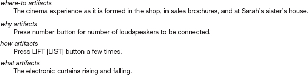
Figure 14.18 Learning artifacts two months after delivery: finally establishing the cinema experience
The case study on communicability evaluation describes how another theory—semiotic engineering, which is based on a branch of linguistics known as semiotics—provides another theoretical perspective for analyzing data collected in field studies or from usability testing.
CASE STUDY 14.1: Communicability Evaluation
Clarisse de Souza (2005) and her colleagues have developed a theory of HCI—semiotic engineering—that provides a series of tools for HCI design and evaluation. In semiotics the fundamental entity is the sign, which can take the form of a gesture, a symbol, or words, for example. One way or another all of our communication is through signs, even when we don't intend to produce signs, our mere existence conveys messages about us—how we dress, how old we are, our gender, the way we speak, etc., can all be interpreted as signs that carry information.
Semiotic engineering views human—computer interaction in terms of communication between the designers of the artifact and the user. In linguistic terms the designer and the user are thought of as interlocutors and the artifact is thought of as a message from the designer to users. You can read more about the theory of semiotic engineering on the website (id-book. com). Of main interest here is how the theory is applied in evaluation, which focuses on identifying breakdowns in communication between the user and the designer. These breakdowns occur when the user fails to understand the message (i.e. the design of the artifact) sent by the designer—in other words, the problems that the user has interacting with the artifact—i.e. the communicability of a design. The method used is communicability evaluation. Like usability testing and field studies, evaluating communicability is based on observing a user's experiences with an application either directly or, more usually, recorded on video or audio. Using a predefined set of tags the evaluator analyzes the user's behavior, focusing on breakdowns in which the user either could not understand the designer's intentions (as encoded in the interface) or could not make herself understood by the application. The first step in the communicability evaluation involves tagging the user's interaction with communicability utterances. In other words, it consists of “putting words into the user's mouth” in a kind of reverse protocol analysis (de Souza, 2005, p. 126). The evaluator looks for patterns of behavior that correspond to tags such as: “Oops!,” “Where is it?,” “I can do it this way,” “I can do otherwise,” “Looks fine to me.” Figure 14.19 presents a schematic image of communicability utterances for a few frames of recorded video. Thirteen such tags have been identified and you can see how they are applied in the case study on the book website.

Figure 14.19 Schematic image of tagging communicative utterances
In sum, usability testing in a laboratory is most suitable for testing software upgrades, prototypes, and working systems. Although the goal of a usability study can be broad, such as determining how usable a product is, more specific questions are typically addressed, such as, “can users complete a certain task within a certain time, or find a particular item, or find the answer to a question” as in the MedlinePlus study. In contrast, field studies are useful when wanting to discover how products and prototypes will be used within their intended social and physical context of use. Routines and other types of activities are analyzed as they unfold in their natural settings, describing and conceptualizing the ways artifacts are used and adopted. There are no interventions on behalf of the investigator other than the placement of the prototype or product in the setting, and questions and/or probes to discover how they are learned, used, and adopted. Case study 14.2 about developing cross-cultural children's book communities provides another example of a field study. Here we see how a group of evaluators worked with teachers and school children to evaluate prototypes of online community spaces at various stages of development.
CASE STUDY 14.2: Developing Cross-cultural Children's Book Communities
The ‘International Children's Digital Library’ (ICDL) (www.icdlbooks.org) is an online library for the world's children developed by Allison Druin, Ben Bederson, Ann Weeks, and researchers from the University of Maryland. To support this mission, research is being conducted on how children access and use digital books to explore diverse cultures. With over 1000 books, from more than 200 countries in 35 languages, ICDL is the world's largest international library online for children, ages 3—13. Figure 14.20 below shows the introductory screen for the ICDL. This interface is available in 10 different languages.
The ‘ICDL Communities’ project explores the social context surrounding next generation learners and how they share books. This research focuses on how to support an online global community of children who don't speak the same languages but want to share the same digital resources and interact with each other socially, learn about each others' cultures, and make friends even if they do not speak the same language. Using specially developed tools, children communicate inter-culturally, create and share stories, and build cross-cultural understanding.

Figure 14.20 The homepage of the International Children's Digital Library
This case study reports the results of three rounds of evaluations during the iterative development of the ICDL Communities software with children in three pairs of countries: Hungary/USA; Argentina/USA; Mexico/USA (Komlodi et al., 2007). In the early evaluations the researchers investigated how the children liked to represent themselves and their team using paper (Figure 14.21). In later prototypes the children worked online in pairs using tablet PCs (Figure 14.22).
The findings from each round of evaluation enabled the researchers to learn more about the children's needs, which enabled them to extend the functionality of the prototype and refine its usability and sociability. As the development proceeded it became clear that it was essential to support the entire context of use, including providing team-building activities for children and support for teachers before using the online tools.
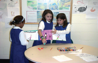
Figure 14.21 American children make drawings to represent themselves and their community
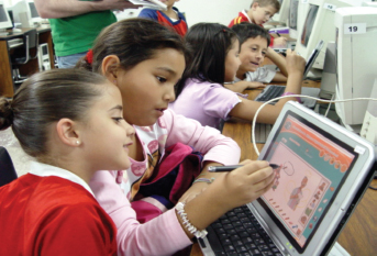
Figure 14.22 Mexican children working with an early prototype using a tablet PC
From these evaluation studies researchers learned that: children enjoy interacting with other children form different countries and a remarkable amount of communication takes place even when the children do not share a common language; identity and representation are particularly important to children when communicating online; drawing and sharing stories is fun; providing support for children and teachers off-line as well as online is as essential as developing good software for the success of this kind of activity.
Dilemma: How Many Users Should I Include in My Evaluation Study?
A question students always ask is how many users do I need to include in my study? Deciding on how many to use for a usability study is partly a logistical issue that depends on schedules, budgets, representative users, and facilities available. As already mentioned, many professionals recommend that 5—12 testers is enough (Dumas and Redish, 1999), although a handful of users can provide useful feedback at early stages of a design. Others say that as soon as the same kinds of problems start being revealed and there is nothing new, it is time to stop. The more testers there are, the more representative the findings will be across the user population but the study will also be more expensive and time-consuming, so there is a trade-off to be made.
Field studies generally focus on one or two sites where a new prototype or product is being evaluated. The number of people being studied at these sites will vary, depending on what is of interest. It may be a family at home, a software team in an engineering firm, or a large group of students in a classroom setting. The problem with studying only one or two settings is that the findings from one group of people may not be representative of how other groups would act. However, the detailed findings gleaned for these one or two groups with respect to how they learn to use a technology and adopt it over time can be very revealing.
Assignment
This assignment continues work on the web-based ticket reservation system introduced at the end of Chapter 10. and continued in Chapter 11. Using either the paper or software prototype, or the HTML web pages developed to represent the basic structure of your website, follow the instructions below to evaluate your prototype.
- (a) Based on your knowledge of the requirements for this system, develop a standard task, e.g. booking two seats for a particular performance.
- (b) Consider the relationship between yourself and your participants. Do you need to use an informed consent form? If so, prepare a suitable informed consent form. Justify your decision.
- (c) Select three typical users, who can be friends or colleagues, and ask them to do the task using your prototype.
- (d) Note the problems that each user encounters. If you can, time their performance. (If you happen to have a video camera, you could film each participant.)
- (e) Since the system is not actually implemented you cannot do a full field study of this system. However, imagine that you are planning a field study of this system. How would you do it? What kinds of things would you need to take into account? What sort of data would you collect and how would you analyze it?
- (f) What are the main benefits and problems with usability testing and field studies?
Summary
This chapter described usability testing focusing on how to do user testing. MedlinePlus was introduced as an example where usability testing was conducted for a large web-based medical information system. Experimental design was then introduced as a more rigorous form of testing a hypothesis. These were contrasted with the evaluation approach of using field studies and included a field study of how families purchased and learnt how to use and understand an integrated entertainment system. Interview data from the study was analyzed using an adapted version of Activity Theory as a conceptual framework. Key differences between usability testing and field studies include the controlled nature of usability testing in which tests are performed under laboratory-like conditions verses the naturalistic approach adopted in field studies where the focus is on understanding how users interact with technology in their work or everyday environments.
Key Points
- User testing is a central component of usability testing; it also can include observation, user satisfaction questionnaires, and interviews.
- Field studies are carried out to discover how people interact with technology in the real world.
- Testing is commonly done in controlled laboratory-like conditions, in contrast to field studies that focus on how the product is used in a working or everyday context.
- 'Usability-in-a-box' and remote testing systems have been developed that are more affordable than usability labs and also more portable, making them suitable for field use and remote evaluations.
- Experiments aim to test a hypothesis by manipulating certain variables while keeping others constant.
- The experimenter controls independent variable(s) in order to measure dependent variable(s).
Further Reading
DUMAS, J.S. and REDISH, J.C. (1999) A Practical Guide to Usability Testing. Intellect. Many books have been written about usability testing, but this one is particularly useful because it describes the process in detail and provides many examples.
LARSON, K. and CZERWINSKI, M. (1998) Web page design: Implications of memory, structure and scent for information retrieval. In Proceedings of CHI'98, pp. 25–32. This paper describes the breadth-versus-depth web study outlined in Box 14.1.
LAZAR, J. (2006) Web Usability: A User-Centered Design Approach. Addison-Wesley. This book covers the entire user-centered design process for websites, from determining the site mission and target user population, through requirements gathering, conceptual and physical design, usability testing, implementation, and evaluation. It contains useful case studies and pays special attention to universal usability issues.
PETERSEN, M.J., MADSEN, K.H., and KJAER, A. (2002) The usability of everyday technology; Emerging and fading opportunities. Transactions on Computer-Human Interaction (TOCHI) 9(2): 74–105. This paper describes a field study in which the evaluators traced the evolution of how two families used their entertainment system over a period of several months. The study demonstrates how activity theory can be used to frame the study and guide data analysis.
ROBSON, C. (1994) Experimental Design and Statistics in Psychology. Penguin Psychology. This book provides an introduction to experimental design and basic statistics.
RUBIN, J. (1994) Handbook of Usability Testing: How to Plan, Design and Conduct Effective Tests. John Wiley & Sons. This book also provides good practical advice about preparing and conducting user tests, analyzing and reporting the results.
DE SOUZA, S.C. (2005) The Semiotic Engineering of Human–Computer Interaction. MIT Press. This book discusses how semiotic engineering, a practical approach that is based on the theory and practice of semiotic analysis, provides an alternative approach to usability testing.
KOMLODI, A., Ho, W., PREECE, J., DRUIN, A., GOLUB, E., ALBURO, J., LIAO, S., ELKIS, A., RESNICK, P. (2007) Evaluating a cross-cultural children's online book community: Lessons learned for sociability, usability, and Cultural exchange. Interacting with Computers. 19, 494–511. In this paper the authors describe the methods they used, and the issues they needed to consider when designing and evaluating an online book community for children from different cultures.
INTERVIEW: with Ben Shneiderman
Ben Shneiderman is Professor of Computer Science at the University of Maryland, where he was founder and director of the Human–Computer Interaction Laboratory from 1983 to 2000. He is author of the highly acclaimed book Designing the User Interface: Strategies for Effective Human–Computer Interaction, now in its fourth edition with co-author Catherine Plaisant. He developed the concept of direct manipulation and created the user interface for the selectable text link that makes the web so easy to use. Now he works on universal usability, information visualization, and creativity support tools.
JP: Ben you've been a strong advocate of measuring user performance and user satisfaction. Why is just watching users not enough?
BS: Watching users is a great way to begin, but if we are to develop a scientific foundation for HCI that promotes theory and supports prediction, measurement will be important. The purpose of measurement is not statistics but insight.
JP: OK can you give me an example?
BS: Watching users traverse a menu tree may reveal problems, but when you measure the time and number of clicks you prove that broader and shallower trees are almost always the winning strategy. This conflict between broader and shallower trees emerged in a conference panel discussion with a leading researcher for a major corporation. She and her colleagues followed up by testing users' speed of performance on searching tasks with two-level and three-level trees. (You can read about this experiment in Box 14.1).
JP: But is user performance speed always the important measure?
BS: Measuring user performance speed, error rates, and user satisfaction separately is important because sometimes users may be satisfied by an elaborate graphical interface even if it slows them down substantially. Finding the right balance among performance, error rates, and user satisfaction depends on whether you are building a repetitive dataentry system, a life-critical air-traffic control system, or an enjoyable game.
JP: Experiments are an important part of your undergraduate classes. Why?
BS: Most computer science and information systems students have had little exposure to experiments. I want to make sure that my students can form lucid and testable hypotheses that can be experimentally tested with groups of real users. They should understand about choosing a small number of independent variables to modify and dependent variables to measure. I believe that students benefit by understanding how to control for biases and perform statistical tests that confirm or refute the hypotheses. My students conduct experimental projects in teams and prepare their reports on the web. For example, one team did a project in which they varied the display size and demonstrated that web surfers found what they needed faster with larger screens. Another group found that bigger mouse pads do not speed task performance (www.otal.umd.edu/SHORE2000). Even if students never conduct an experiment professionally, the process of designing experiments helps them to become more effective analysts. I also want my students to be able to read scientific papers that report on experiments.
JP: What ‘take-away messages’ do you want your students to get from taking an HCI class?
BS: I want my students to know about rigorous and replicable scientific results that form the foundation for understanding human–computer interaction. Just as physics provides a scientific foundation for mechanical engineering, HCI provides a rigorous foundation for usability engineering.
JP: How do you distinguish between an experiment and usability testing?
BS: The best controlled experiments start with a hypothesis that has practical implications and theoretical results of broad importance. A controlled experiment has at least two conditions and applies statistical tests such as t-test and analysis of variance (ANOVA) to verify statistically significant differences. The results confirm or refute the hypothesis and the procedure is carefully described so that others can replicate it. I tell my students that experiments have two parents and three children. The parents are “a practical problem” and “a theoretical foundation” and the three children are “help in resolving the practical problem,” “refinements to the theory,” and “advice to future experimenters who work on the same problem.”
By contrast, a usability test studies a small number of users who carry out required tasks. Statistical results are less important. The goal is to refine a product as quickly as possible. The outcome of a usability test is a report to developers that identifies frequent problems and possibly suggests improvements, maybe ranked from high to low priority and from low to high developer effort.
JP: What do you see as the important usability issues for the next five years?
BS: I see three directions for the next five years. The first is the shift from emphasizing the technology to focusing on user needs. I like to say “the old computing is about what computers can do, the new computing is about what users can do,” which is the theme of my book Leonardo's Laptop: Human Needs and the New Computing Technologies.
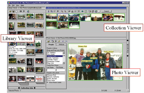
Figure 14.23 PhotoFinder for personal photo libraries, includes drag-and-drop annotations for family member names
JP: But hasn't HCI always been about what users can do?
BS: Yes, but HCI and usability engineering have been more evaluative than generative. To clarify, I believe that deeper theories about human needs will contribute to innovations in mobility, ubiquity, and community. Information and communication tools will become pervasive and enable higher levels of social interaction. For example, museum visitors to the Louvre, white-water rafters in Colorado, or family travelers to Hawaii's Haleakala volcano will be able to point at a sculpture, rock, or flower and find out about it. They'll be able to see photos at different seasons taken by previous visitors and send their own pictures back to friends and grandparents. One of our projects allows people to accumulate, organize, and retrieve the many photos that they will take and receive. Users of our PhotoFinder software tool can organize their photos and annotate them by dragging and dropping name labels. Then they can find photos of people and events to tell stories and reminisce (see Figure 14.23).
HCI researchers who understand human needs are likely to come up with innovations that help physicians to make better diagnoses, enable shoppers to find what they want at fair prices, and allow educators to create more compelling experiences for students.
JP: What are the other two directions?
BS: The second opportunity is to support universal usability, thereby bringing the benefits of information and communications technology to the widest possible set of users. Website designers will need to learn how to attract and retain a broad set of users with divergent needs and differing skills. They will have to understand how to accommodate users efficiently with slow and fast network connections, small and large displays, and various software platforms. System designers who invent strategies to accommodate young and old, novice and expert, and users with varying disabilities will earn the appreciation of users and the respect of their colleagues. Evidence is accumulating that designs that facilitate English, French, Chinese and other versions of a website also make it easy to accommodate end-user customization, convert to wireless applications, support disabled users and speed modifications. The good news is that satisfying these multiple requirements also produces interfaces that are better for all users. Diversity promotes quality.
The third direction is the development of tools to let more people be more creative more of the time. Word processors, painting tools and music-composition software are a good starting point, but creative people need more powerful tools so that they can explore alternative solutions rapidly. Creativity-support tools will speed search of existing solutions, facilitate consultations with peers and mentors, and record the users' history of activity so that they can review, revise, and share their work.
But remember that every positive development also has a potential dark side. One of the formidable challenges for HCI students is to think carefully about how to cope with the unexpected and unintended. Powerful tools can have dangerous consequences. I encourage students to embrace the opportunity and accept the responsibility.