
Introducing evaluation
- Examine how the approaches and methods are used for different purposes at different stages of the design process.
- Discuss some of the practical challenges that evaluators have to consider when doing evaluation.
- 12.1 Introduction
- 12.2 The why, what, where, and when of evaluation
- 12.3 Evaluation approaches and methods
- 12.4 Evaluation case studies
- 12.5 What did we learn from the case studies?
12.1 Introduction
Imagine you have designed a website for sharing music, gossip, and photos among teenagers. You have used Flash to prototype your first design and implemented the core functionality. How would you find out whether it would appeal to teenagers and if they will use it? You would carry out an evaluation study.
Evaluation is integral to the design process. It collects information about users' or potential users' experiences when interacting with a prototype, computer system, a component of a computer system, or a design artifact, e.g. screen sketch, in order to improve its design. It focuses on both the usability of the system, e.g. how easy it is to learn and to use, and on the users' experience when interacting with the system, e.g. how satisfying, enjoyable, or motivating the interaction is.
The web's presence and, more recently, the proliferation of cell phones and other small digital devices like iPods, has heightened awareness about usability, but many designers still assume that if they and their colleagues can use the product and find it attractive, others will too. The problem with this argument is that designers are often not like the target user population. For example, a 24-year-old software developer is likely to have different characteristics from a retired 86-year-old teacher with little computer experience. Without evaluation, designers cannot be sure that their design is usable by the target user population, and that it is what users want.
There are many different evaluation methods, some of which involve users directly, while others call indirectly on an understanding of users' needs and psychology. Sometimes evaluation is done in a laboratory and other times in natural work or leisure settings. This chapter starts by discussing why evaluation is important, what needs to be evaluated, where that evaluation should take place, and when in the product lifecycle evaluation is needed. We introduce some terms that are used in this and other books you may read. We then introduce three evaluation approaches and key evaluation methods, and examine six short evaluation case studies which illustrate them. For each one we look at the aim of the evaluation, at what stage the evaluation was done during design, the techniques that are used to collect and analyze the data, and the challenges that the evaluators encountered. The chapter ends with a discussion of what we learn from the case studies.
The specific aims of this chapter are to:
- Illustrate how observation, interviews, and questionnaires that you encountered in Chapters 7 and 8 are used in evaluation.
- Explain the key concepts and terms used in evaluation.
- Introduce three main evaluation approaches and key evaluation methods within the context of real evaluation studies.
12.2 The Why, What, Where, and When of Evaluation
Users want interactive products to be easy to learn, effective, efficient, safe, and satisfying to use. Being entertaining, attractive, challenging, and enjoyable is also important for the success of websites, games, toys, and other consumer products. Achieving this requires the product to be evaluated, and running effective evaluations involves understanding not only why evaluation is important but also what aspects to evaluate, where evaluation should take place, and when to evaluate.
12.2.1 Why Evaluate?
Evaluation is needed to check that users can use the product and that they like it, particularly if the design concept is new. Furthermore, nowadays users look for much more than just a usable system, they look for a pleasing and engaging experience. “‘User experience’ encompasses all aspects of the end-users' interaction … the first requirement for an exemplary user experience is to meet the exact needs of the customer, without fuss or bother. Next comes simplicity and elegance which produces products that are a joy to own, a joy to use” Nielsen Norman Group (www.nngroup.com). “Websites must be usable as well as aesthetically pleasing” (Badre, 2002, pp. 6–7).
From a business and marketing perspective there are also good reasons for investing in evaluation, these include: designers get feedback about their early design ideas; major problems are fixed before the product goes on sale; designers focus on real problems rather than debating what each other likes or dislikes about the product.
12.2.2 What to Evaluate
The wide diversity of interactive products gives rise to a range of features that evaluators must be able to evaluate. For example, developers of a new web browser may want to know if users find items faster with their product, whereas developers of a creativity support tool for teaching story-writing may ask if students develop more engaging, emotionally satisfying stories. Government authorities may ask if a computerized system for controlling traffic lights results in fewer accidents. Makers of a toy may ask if six-year-olds can manipulate the controls and whether they are engaged by its furry case and pixie face, and whether the toy is safe for them to play with. A company that develops personal, digital music players may want to know if the size, color, and shape of the casing is liked by people from different age groups living in different countries. A new company may want to assess market reaction to its new homepage design.
Activity 12.1
Think of examples of the following systems and write down the usability and user experience features that are important for the success of each:
- a wordprocessor
- a personal music player (i.e. like iPod)
- a website that sells clothes
- an online patient support community.
Comment
- It must be as easy as possible for the intended users to learn and to use and it must be satisfying. Note that wrapped into this are characteristics such as consistency, reliability, predictability, etc., that are necessary for ease of use.
- A personal music player must also have all the above characteristics and it must be possible to record, organize, and find music easily. In addition, the physical design, e.g. color, shape, size, position of keys, etc., must be usable and attractive, e.g. pleasing feel, shape, and color.
- A website that sells clothes needs to have the basic usability features too. In particular, navigation through the system needs to be straightforward and well supported. In addition, the website must be attractive, with good graphics of the clothes—who would want to buy clothes they can't see or that look unattractive? Trust is also a big issue in online shopping, so a well-designed, secure procedure for taking customer credit card details is essential; it must not only be clear but must take into account the need to provide feedback, protect the users' financial information, and engender trust.
- An online patient support group must support the exchange of factual and emotional information. As well as the standard usability features, it needs to enable patients to express emotions, possibly using emoticons, other symbols, sending personal pictures, sounds, or flowers. For example, some 3D environments enable users to represent themselves on the screen as avatars that can jump, wave, look happy or sad, move close to another person, or move away.
From these examples, you can see that the success of many interactive products depends on much more than usability. Aesthetic, emotional, engaging, and motivating qualities are important too.
12.2.3 Where to Evaluate
Some features, such as the sequence of links on a website, are generally best evaluated in a laboratory, because it is easier for the evaluators to control the evaluation process and to make sure that the evaluation focuses on specific aspects of the system. Similarly, testing the size of the keys on a cell phone can be done in a laboratory. Other aspects, such as whether children enjoy playing with a collaborative toy, or whether an online dating system is emotionally satisfying, can be evaluated more effectively in natural settings, because evaluators can see what children do with the toy when left to their own devices, and can assess the emotional expressions of the adults in the dating system example. Likewise, evaluating how a cell phone is used and liked by different users such as busy business executives, or teenagers, involves observing how the users use the phone in their normal lives and talking to them about it.
Activity 12.2
Identify one adult and one teenager who is prepared to talk with you about their cell phone usage; these may be family or friends. Ask them questions such as: Do they always carry the cell-phone switched on? Do they give their number to others freely or is the number only made available to a restricted group of people? Do they have a large phone book of numbers stored in the phone? Is having the latest model important? What functionality do they use? Is the size, feel, color, ring-tone, and casing important to them? Is their phone a fashion object?
Comment
You are likely to have found quite different patterns of use between the adult and the teenager. Typically teenagers are avid cell phone users; they carry their cell phone everywhere and are frequently in contact with their friends and family. Often their calls are concerned with coordinating social activities. For example, it is quite common to hear comments such as: “I just got off the Metro and I'll be at Starbucks in a few minutes. What about you?” Having a new cell phone model can bring kudos, and so does having a modern case. Members of this user group often feel anxious when separated from their cell phone because they feel isolated. Comments like: “If you don't have a cell phone you can get left out” are common. The physical appearance of the phone may also be important. “I had to use my Mum's old phone which is a real brick. It was so embarrassing!”
In contrast, many adults use their phones for purposes other than social activities such as work commitments, checking up on their spouses and children, and for keeping in touch when they are traveling.
12.2.4 When to Evaluate
At what stage in the product lifecycle evaluation takes place depends on the type of product itself. For example, the product being developed may be a brand-new concept or an upgrade of an existing product. If the product is new, then considerable time is usually invested in market research and establishing user requirements. Once these requirements have been established, they are used to create a design artifact such as initial sketches, a series of screens, or a prototype of the design ideas. These are then evaluated to see if the designers have interpreted the users' requirements correctly and embodied them in their designs appropriately. The designs will be modified according to the evaluation feedback and a new set of prototypes will be developed and then evaluated.
When a product is upgraded there is usually less scope for change than when designing a new product, and attention is focused on improving specific aspects of the product's design such as how to navigate through a website. Some products, such as office systems, go through many versions, and successful products may reach double-digit version numbers. If the product is being upgraded then evaluation is not necessarily dependent on establishing a set of requirements, and evaluation may be the first step in redesign.
Evaluations that are done to assess the success of a finished product, such as those needed to satisfy a funding agency that its money has been used well or to check that a standard is being upheld, are known as summative evaluations. Agencies such as the National Institute of Standards and Technology (NIST) in the USA, the International Standards Organization (ISO), and the British Standards Institute (BSI) set standards by which products may be evaluated.
When evaluations are done during design to check that the product continues to meet users' needs they are know as formative evaluations. Formative evaluations cover a broad span of design, from the development of early sketches and prototypes through to tweaking and perfecting an almost finished design, and then maintaining the product, which may involve several upgrades.
In the case studies in Section 12.5 we examine evaluations that have been performed during:
- Early design of an artifact to clarify design ideas.
- Evaluation of a working prototype.
- Refining or maintaining a product.
- Exploration of a new design concept.
Box12.1 The Language of Evaluation
Analytical evaluation: an approach to evaluation that does not involve end-users. Heuristic evaluation, walkthroughs, and modeling are forms of analytical evaluation.
Controlled experiment: a study that is performed in a laboratory which is controlled by the evaluator. Aspects controlled typically include the task that participants are asked to perform, the environment in which the study occurs, and the amount of time available to complete the study.
Field study: a study that is done in a natural environment such as at home as opposed to a study in a controlled setting such as a laboratory.
Formative evaluation:an evaluation that is done during design to check that the product continues to meet users' needs.
Heuristic evaluation: an approach to evaluation in which knowledge of typical users is applied, often guided by heuristics, to identify usability problems.
Predictive evaluation: an approach to evaluation in which theoretically based models are used to predict user performance.
Summative evaluation: an evaluation that is done when the design is complete to assess whether it meets required standards such as those set by a standards agency like NIST or BSI.
Usability laboratory: a laboratory that is designed for usability testing.
User studies: any evaluation that involves users directly, either in their natural environments, or in the laboratory.
Usability study: an evaluation that is performed to examine the usability of a design or system.
Usability testing: an evaluation approach to evaluation that involves measuring users' performance and evaluating their satisfaction with the system in question on certain tasks in a laboratory setting.
User testing: an evaluation approach where users are asked to perform certain tasks using a system or prototype in an informal or laboratory setting.
12.3 Evaluation Approaches and Methods
At a general level, we describe evaluation studies as taking one of three main evaluation approaches. Each of these is based on a distinct set of values and assumptions as to how evaluation should be conducted. At a more detailed level, we consider a set of evaluation methods some of which are based on the data gathering techniques introduced in Chapter 7, but tailored for evaluation purposes.
12.3.1 Approaches
The three main evaluation approaches are: (1) usability testing; (2) field studies; and (3) analytical evaluation. Each of these approaches has several methods associated with it. The methods used in evaluation are: observing users, asking users, e.g. through interviews and questionnaires, asking experts, user testing, inspections, and modeling users' performance. Some approaches use the same methods. For example, usability testing and field studies both involve observing users and asking users but the conditions under which they are used, and the ways in which they are used, are different.
1. Usability Testing
Usability testing was the dominant evaluation approach in the 1980s (Whiteside et al., 1998), and remains important, particularly at later stages of design for ensuring consistency in navigation structure, use of terms, and how the system responds to the user. Usability testing involves measuring typical users' performance on typical tasks. This is generally done by noting the number and kinds of errors that the users make and recording the time that it takes them to complete the task. As the users perform these tasks, they are watched and recorded on video and their interactions with the software are recorded, usually by logging input to and output from the system. User satisfaction questionnaires and interviews are also used to elicit users' opinions.
The defining characteristic of usability testing is that the test environment and the format of the testing is controlled by the evaluator (Mayhew, 1999; Hackos and Reddish, 1998; Koyani et al., 2003). Quantifying users' performance is a dominant theme in usability testing. Typically, tests take place in a laboratory or in laboratory-like conditions where the user is isolated from the normal day-to-day interruptions. Visitors are not allowed and telephone calls are stopped, and there is no possibility of talking to colleagues, checking email, or doing any of the other tasks that most of us rapidly switch among in our normal lives.
Usability testing has been particularly important for the development of standard products that go through many generations, such as wordprocessing systems, databases, and spreadsheets. In this case, the findings from a usability test are summarized in a usability specification so that developers can test future prototypes or versions of the product against it. Optimal performance levels and minimal levels of acceptance are generally specified and current levels noted. Changes in the design can then be implemented. This is called ‘usability engineering.’
User testing methods that form the heart of usability testing are discussed in more detail in Chapter 14.
2. Field Studies
The distinguishing feature of field studies is that they are done in natural settings with the aim of understanding what people do naturally and how products mediate their activities. More specifically, they can be used to: (1) help identify opportunities for new technology; (2) establish the requirements for design; (3) facilitate the introduction of technology, or how to deploy existing technology in new contexts; and (4) evaluate technology (Bly, 1997; Holtzblatt, 2005). Each of these will be illustrated in the examples described in Section 12.5.
Chapter 7 introduced you to the data gathering techniques of interviews and observation, which are the basic techniques of field studies. As you will recall, the data takes the form of events and conversations that are recorded as notes, or by audio or video recording, and later analyzed using a variety of methods. Artifacts are also collected and questionnaires may also be administered. More details on field studies are presented in Chapter 14.
3. Analytical Evaluation
In analytical evaluation two categories of evaluation methods are considered: inspections, which include heuristic evaluation and walkthroughs, and theoretically based models, which are used to predict user performance. In heuristic evaluations knowledge of typical users is applied, often guided by heuristics, e.g. guidelines and standards, to identify usability problems. Walkthroughs, as the name suggests, involve experts in walking through scenarios with prototypes of the application. A key feature for analytical evaluations is that users need not be present (Nielsen and Mack, 1994; Nielsen and Tahir, 2002).
Heuristics are based on common-sense knowledge and usability guidelines, e.g. always provide clearly marked exits and use consistent terms. They were originally developed for screen-based applications but these have now been adapted to make new sets of heuristics for evaluating web-based products, mobile devices, collaborative technologies, and computerized toys. Care is needed in using heuristics because designers are sometimes led astray by findings from heuristic evaluations that turn out not to be as accurate as they seemed at first (Cockton et al., 2002).
Cognitive walkthroughs, which were the first walkthroughs developed, involve simulating a user's problem-solving process at each step in the human–computer dialog, and checking to see how users progress from step to step in these interactions (Nielsen and Mack, 1994). A key feature of cognitive walkthroughs is that they focus on evaluating designs for ease of learning. Other types of walkthroughs have also been developed, and in Chapter 15 you will learn about pluralistic walkthroughs.
Models have been used primarily for comparing the efficacy of different interfaces for the same application, and the optimal arrangement and location of features on the interface base. For example, the keystroke level model provides numerical predictions of user performance and Fitts' Law predicts the time it takes to reach a target using a pointing device. There is more about analytical evaluation in Chapter 15.
Combining Approaches
We have presented each evaluation approach separately, which implies that they are used independently of each other, which is sometimes true. However, this is often not the case. Combinations of approaches are used to get a broad understanding of the efficacy of a design. For example, sometimes the controlled studies performed in a usability laboratory are combined with observations intended to find out how users typically use the product in their natural environment. Figure 12.1 illustrates one way in which usability testing and field studies may be combined in one program of evaluation.
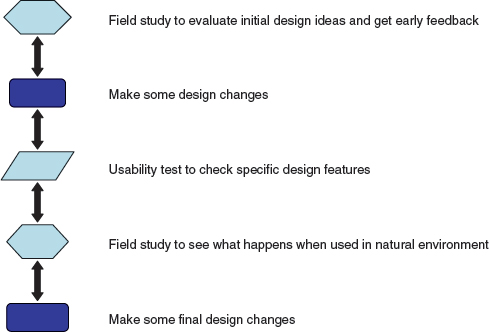
Figure 12.1 Example of the way usability testing and field studies can complement each other
Opportunistic Evaluations
Evaluations may be detailed studies or opportunistic investigations. The latter are generally done early in the design process to provide designers with feedback quickly about a design idea. Getting this kind of feedback early in the design process is an essential ingredient of successful design because it confirms whether it is worth proceeding to develop an idea into a prototype. Typically, these early evaluations are informal and do not require many resources. For example, the designers may go to a few local users and ask their opinions. Getting feedback this early in design can help save time and money if an idea needs to be modified or abandoned. In fact, opportunistic evaluations with users can be conducted often in addition to more formal evaluations.
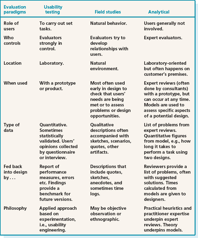
Table 12.1 summarizes the key aspects of each evaluation approach for the following issues:
- the role of users
- who controls the process and the relationship between evaluators and users during the evaluation
Table 12.1 Characteristics of different evaluation approaches
- the location of the evaluation
- when the evaluation is most useful
- the type of data collected and how it is analyzed
- how the evaluation findings are fed back into the design process
- the philosophy and theory that underlies the evaluation approaches.
12.3.2 Methods
The main methods used in evaluation are: observing users; asking users their opinions; asking experts their opinions; testing users' performance; and modeling users' task performance to predict the efficacy of a user interface. Observation studies, questionnaires, and interviews underpin the first three of these methods, and these were discussed in Chapter 7. In this chapter we discuss how these techniques are used in evaluation. Testing users' performance will be discussed in Chapter 14; asking experts their opinions and modeling users' task performance to predict the efficacy of a user interface will both be discussed in Chapter 15. The relationship between evaluation approaches and evaluation methods is shown in Table 12.2.
12.4 Evaluation Case Studies
The following six short case studies illustrate the use of these evaluation methods and introduce you to some of the challenges that evaluators face. Each case study is followed by an activity which is designed to encourage you to explore these issues yourself.
12.4.1 Evaluating Early Design Ideas for a Mobile Device for Rural Indian Nurses
This case study illustrates how a field study based on observation and interviews was used in an early evaluation of design ideas for a mobile record-keeping system for use by auxiliary nurses in India. It also provides examples of some of the issues that have to be taken into account when working with users from a different culture.
A research team from the former Apple Research Laboratory (ARL) spent several months with auxiliary nurse midwives (ANMs) in rural India in 1995/6. They were trying to understand how ANMs go about their daily tasks and whether and how digital technology could help to improve both the service they give to their patients and their own job satisfaction (Grisedale et al., 1997). A diary entry by one of the researchers describes the work of a typical nurse midwife.
This morning I am following Padma, the local nurse midwife, on her house calls in Narwar, a farming village in Rajasthan. It is a hot dry day, and the local traffic, consisting of a few stray cattle and bristly pigs, lie slumped in troughs of dust trying to keep cool. We come to the gate of the Sharma household and are greeted by three women who welcome us. “Namaste” they say, and adjust their veils. The yard outside the house is the center of communal activity. It is formed from compacted earth and adorned with chalk drawings. Blankets are brought for us to sit on. Water is served in metal cups, drawn from a ceramic urn at the side of the house. Three generations of women are living in the house.
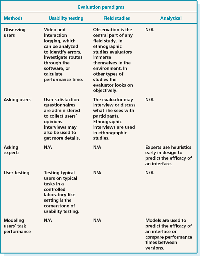
Table 12.2 The relationship between evaluation approaches and methods
Today, Padma is performing a routine post natal examination on the newest member of the family, baby Rao, whom she delivered three months ago. Padma reaches into her bag to consult her diary, which she keeps close by her. She talks with the women about Rao, and lays him on a low wooden bed to take a closer look at him. He has black hair and dark eyes, and on his forehead a crescent moon has been drawn, to protect him from the spirits.
(Grisedale et al., 1997, p. 471)
The goal of the design project was to develop a prototype of a mobile data-capture system to record health records. The system would need to be suitable for use by health care workers like Padma working in the kinds of environments described in the diary story. For such a system to be successful it would have to be suitable for people with minimal exposure to computers and require low-tech support. Typically each of around 350,000 ANMs is responsible for 3500 to 9000 people whom they visit on foot or by bicycle or moped. Each ANM covers three to five villages, some of which may be quite isolated. Their work generally includes: treating minor injuries and ailments, referring people to the local hospital, providing ante-and post-natal care, vaccinating people, malaria testing, and motivating villagers to use contraceptives. Each ANM receives two years of basic health-care training with refresher courses once they are working in the field.
Record-keeping is a major part of an ANM's job. She keeps a record of her daily activities which she then compiles into weekly and monthly reports. The kind of data recorded includes: number of wells in each village and when they have been treated to prevent malaria, weddings, the number of people in each household, the name of the head of house and the date when she last visited. For every eligible couple she records details about contraception and for each individual she records any illnesses, vaccinations, medication given, referrals, operations, etc. In addition she monitors all pregnancies, births, infant mortalities, and abortions. She also attends and records birth details such as gender and weight. At the time of the study, these records were typically not kept accurately and often bore little relation to reality, but there was no limit to the number of records that were kept. The ANMs completed forms rapidly and recorded figures by hand. The forms were often incorrect or incomplete because they didn't have time, or they didn't understand how to complete them, or villagers did not give accurate descriptions. From these observations the following design goals for the new product were identified:
- Translating the paper-based record keeping into an electronic format in a way that would fit into the working life of an ANM.
- Designing a view onto the data that would be meaningful for the ANM since the format of the device could not provide a 1:1 mapping of the forms that were currently used because the screen size was too small.
- Providing a navigational structure that felt natural for the ANMs.
- Providing a lightweight way for entering information.
Each of the design goals was used to develop prototype designs that could be evaluated with the ANMs. During field visits the evaluators used picture cards that showed the activities of the ANMs. These cards helped them to overcome the language barrier and develop a shared understanding of the ANM's tasks. They also developed an early mockup of a household overview as shown in Figure 12.2. A graphical language was needed that made sense to the ANMs, and which was sensitive to the cultural conventions of the community. For example, these users did not have experience of interface widgets such as scroll-bars and buttons. Developing appropriate icons was achieved by looking at training magazines that took account of cultural norms. For example, naked bodies were not shown and pregnant women were shown clothed with a diagram of the fetus drawn on top of their clothing.

Figure 12.2 Mockup of a household overview
The evaluation involved showing the designs to the ANMs, observing their reactions, and talking to them (i.e. informally interviewing them) to get suggestions for modifying the icons so that they distinguished between different circumstances, such as a pregnant woman and a woman who is not pregnant, a child with a disease and a healthy child, but did not offend the users. Figure 12.3 shows examples of some of these icons. The feedback collected from the evaluation enabled the team to improve the icon design.
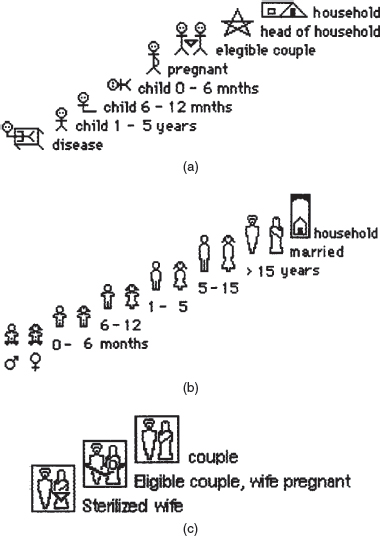
Figure 12.3 (a) Icons drawn by ANMs in the Punjab; (b) icons representing people by gender and age; (c) icons modified by the team to represent state of patients.
Activity 12.3
- The account above does not say how the data was recorded. What form of data recording would you have used?
- Based on this case study and on the information in Chapter 10, how does the use of interviews and observation differ between the requirements activity and evaluation?
- What kind of practical problems might the evaluators have encountered that would influence their evaluation procedures?
Comment
- There are several ways that the data could have been recorded. However, carrying video recorders is unlikely to be practical in the circumstances, and choosing a simple approach is more likely to be feasible. Taking notes is the simplest approach, and audio-recording may also have been possible. From their report it seems likely that Grisedale et al. relied on notes.
- In evaluation, attention is focused on getting feedback about an actual artifact. In the requirements activity, the focus is broader than this and encompasses a wider view of the product under development. In this case study, evaluation was carried out very early in the design process and focused on icon sketches. Establishing the requirements and evaluating prototypes was closely tied. Furthermore, in small teams like this one the same people often do both design and evaluation.
- This case study illustrates some practical issues when designing for people from another culture, for example communicating with users who speak a different language, the need to be sensitive to different norms, e.g. pictures of naked bodies were not acceptable, the need to spend time understanding the lifestyle of the users, which was very different from that of the design team. Other practical considerations would have included environmental conditions, such as dust and heat.
12.4.2 Evaluating Cell Phones for Different World Markets
This case study describes how evaluators use field studies of already existing devices in order to understand how to modify the product for a different market. It discusses how differences in cultural behavior can impact the way an evaluation is conducted and highlights the practical issues that evaluators may face, particularly when working with cell phones and other mobile devices.
Jan Blom and Jaakko Lehikoinen work for Nokia in Finland; Jan Chipchase is a research manager in Tokyo. They evaluate Nokia phone designs for customers worldwide which sometimes involves evaluating prototypes that are eight years ahead of what appears on a particular country's market (Blom et al., 2005). Their evaluations can be thought of as discovery research.
In 2004 the half billion Nokia phones sold were purchased by people from almost every country in the world. Evaluations were needed in emerging markets in China, India, and Brazil. In order to capture and secure these markets the evaluators had to examine cross-cultural differences, sometimes involving people with poor literacy, so that products could be tailored to local needs. Doing cross-cultural research poses its own logistical challenges. Is it better to attempt to blend with cultural norms or to be an outsider? These researchers have learned that being an outsider gives them an excuse for asking blatant questions which would be unacceptable from someone of the same culture.
Unlike devices for narrow, clearly defined user groups, cell phones are used by a wide variety of people in different situations and environments. For example, a cell phone conversation may start on public transport and be completed after the person arrives home. These changes in environment can provide challenges for data gathering. For example, users may not want evaluators to come into their homes or other private places or to observe them making personal phone calls or sending private messages.
Typical methods used to capture data for these kinds of evaluations include photo diaries obtained by shadowing people. Collecting this kind of data can be problematic because the user may move from a well-lit room to a dark place where flash photography draws unwanted attention. Evaluators must also be prepared for changing circumstances, so it's a good idea to carry coins, notes in local currency, energy bars, drinks, pens, a power plug adapter, spare batteries, DVDs, cassettes, mini-tripod, clean clothing, waterproof clothing, sun screen, pre-paid travel cards, printed copies of contact information, medication, and other things that support coping with the unexpected. Furthermore, cell phones are used intermittently but over long periods of time. This can cause tensions because researchers may need to be uncomfortably close to participants for prolonged periods. There are also the obvious problems of not speaking the same language, and security issues. Taking pictures and video recording is likely to be a sensitive issue in some situations, such as airports and train stations with heightened tension due to terrorist attacks. Riding in a taxi can present challenges. Is there enough room? Where should the observer sit? Will additional fare be needed? An alternative of shadowing moving vehicles by bike brings other challenges such as the evaluator needing to be a competent bike rider.
Activity 12.4
- Which evaluation method was used and how was the data collected?
- What was the prototype the researchers used?
- Would you consider this evaluation to be early in design or late in design? Explain your answer.
- We are not told much about what the evaluators were looking to find out. What kind of questions do think might have driven the evaluations?
Comment
- The method used was primarily observation and there was probably also some informal interviewing, although we are not told this. We are told that the data was collected using photo diaries in which the evaluator recorded a series of actions in photographs.
- The prototype used was a phone that was developed for a different market. We can assume from this that the design team anticipated being able to tailor the phone for these markets rather than having to create a completely different design.
- This evaluation can be regarded as early in the design of a cell phone for a particular market outside of Europe. On the other hand, since the prototype was a working phone, another perspective suggests that the evaluation is happening late in the design process.
- The evaluators wanted to see how the phone could be tailored for use in a different culture. This would have involved observing several factors including whether the physical casing, size of keys, and overall size and shape of the phone, was liked by people from different cultures. They might also have focused on whether people like to communicate by speaking as in the USA or by sending text messages (i.e. texting) as in many parts of Europe. If the latter, then short-cuts and the ability for personally tailoring the system might be needed to make text entry easier. Other cultural and social issues that would also have been of interest include what kind of emotional signals and moods do people want to communicate via their phone calls, is telling jokes, expressing trust and personal warmth in phone calls important in this culture?
12.4.3 Evaluating Affective Issues: Challenge and Engagement in a Collaborative Immersive Game
The success of collaborative entertainment technology depends on more than the productivity and performance measures that are at the heart of usability testing. For these systems to be successful they must engage and challenge users. New ways of evaluating these aspects are therefore needed and, in this case study (Mandryk and Inkpen, 2004), we see how physiological responses can be used to evaluate users' experiences with a collaborative immersive game.
Emerging technologies offer exciting new opportunities for co-located entertainment experiences as growth in the sales of games indicates. Like board games, many of these collaborative immersive games are highly interactive. Evaluating the success of such games depends on being able to identify how well they challenge and entertain users. The traditional focus of usability testing is on performance rather than user experience, and so evaluating these aspects presents a challenge. Regan Mandryk and Kori Inkpen (2004) conjectured that physiological indicators can be used to measure objectively a player's experience with entertainment technology. They have developed such measures, and tested their efficacy through an experiment to evaluate participants' experience of playing an online ice-hockey game.
They worked with ten subjects who were university students with a passion for playing computer games. They set up two conditions of play. In one condition players played the game against a friend via the computer, and in the other condition each player played against the computer. During each gaming session they placed sensors on their subjects to collect physiological data. These included measures of the moisture produced by sweat glands in the hands and feet, changes in heart rate and breathing rate. In addition they videoed participants and asked them to complete user satisfaction questionnaires at the end of the session. In order to reduce the effects of learning, half of the participants played first against a friend and then against the computer, and the other half played against the computer first. Figure 12.4 shows the set-up for recording data while the participants were playing the game.
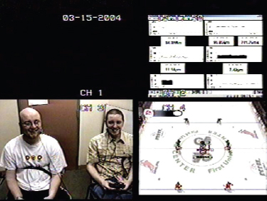
Figure 12.4 The display shows the physiological data (top right), two participants, and a screen of the game they played
Results from the user satisfaction questionnaire revealed that the mean ratings on a 1–5 scale for each item indicated that playing against a friend was the favored experience (Table 12.3).
Data recorded from the physiological responses was compared for the two conditions and in general revealed higher levels of excitement when players played against a friend than when they played against the computer. The physiological recordings were also compared across players and, in general, indicated the same trend. Figure 12.5 shows a comparison for two players.
Because of individual differences in physiological data it was not possible to directly compare the means of the two sets of results: subjective questionnaires and physiological measures. However, by normalizing the results it was possible to correlate the results across individuals. This indicated that the physiological data gathering and analysis methods used in this research appear to offer promise for evaluating levels of challenge and engagement, which are prime measures of the success of collaborative immersive entertainment technology. Although not perfect, these measures offer a way of going beyond traditional usability testing to get a deeper understanding of user experience goals.

Table 12.3 Mean subjective ratings given on a user satisfaction questionnaire using a five-point scale, in which 1 is lowest and 5 is highest for the 10 players. Identifying strongly with an experience state is indicated by a higher mean. The standard deviation indicates the spread of the results around the mean. Low values indicate little variation in participants' responses, high values indicate more variation
Activity 12.5
- What challenges might other evaluators face when using the physiological measures described in the case study?
- How might these challenges be overcome?
Comment
- Collecting physiological data requires special equipment and expertise to use it effectively so that participants are not alarmed or harmed (see Figure 12.4). Data analysis also requires different skills from those of most trained usability specialists.
- It is relatively easy and cheap to develop small sensing devices, and it is possible that if these measures become more widely accepted, then less obtrusive, non-invasive devices for collecting physiological data will become more widely available.
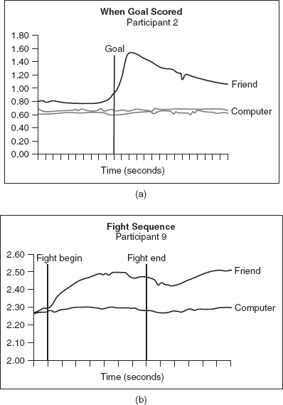
Figure 12.5 (a) A participant's skin response when scoring a goal against a friend versus against the computer and (b) another participant's response when engaging in a hockey fight against a friend versus against the computer
12.4.4 Improving a Design: the Hutchworld Patient Support System
This study shows how usability testing can be done late in the design of a system to identify problems that have been overlooked by designers. You will also read about how the evaluators conducted field studies to evaluate the system while dealing with the constraints of working with sick people in a hospital environment.
HutchWorld is a distributed virtual community developed in a collaboration between Microsoft's Virtual Worlds Research Group, and librarians and clinicians at the Fred Hutchinson Cancer Research Center in Seattle, Washington (Cheng et al., 2000). The system enables cancer patients, their caregivers, family, and friends to chat, tell their stories, discuss their experiences and coping strategies, and gain emotional and practical support from one another. Because this population is often isolated for fear of infection during treatment, being a cancer patient can be a lonely and frightening experience, which is also emotionally demanding on family and friends. The motivation for developing this system was to make HutchWorld a useful, engaging, easy-to-use, and emotionally satisfying environment for its users. It also had to provide privacy when needed and foster trust among participants.
A common approach to evaluation in a large project like HutchWorld is to begin by carrying out a number of informal studies. Typically, this involves asking a small number of users to comment on early prototypes. These findings are then fed back into the iterative development of the prototypes. Then, more formal evaluations are conducted in controlled environments and in natural settings (i.e. field studies). In this case study we focus on the evaluations that were done with the working prototypes.
Before developing this product, the team needed to learn about the patients' experience at the Fred Hutchinson Center. For instance, what is the typical treatment process, what resources are available to the patient community, and what are the needs of the different user groups within this community? Some patients were very sick, others suffered from bouts of depression. Patients varied along other dimensions, such as education and experience with computers, age, and gender. They came from different cultural backgrounds with different expectations. The team needed to work out what kind of virtual environment patients wanted. What would they do there? How would people interact? What should it look like? Therefore, they interviewed potential users from all the stakeholder groups—patients, caregivers, family, friends, clinicians, and social support staff—and observed their daily activity in the clinic and the hospital. They also read the latest research literature, talked to experts and former patients. After much discussion, they decided to make the design resemble the outpatient clinic lobby of the Fred Hutchinson Cancer Research Center. By using this real-world metaphor, they hoped that the users would easily infer what functionality was available in HutchWorld from their knowledge of the real clinic. A synchronous chat environment was selected because the team thought that this would be more realistic and personal than an asynchronous environment. They also decided to include 3D photographic avatars (i.e. representations of users) so that users could easily recognize each other. Figure 12.6 shows the preliminary design with examples of the avatars. You can also see the outpatient clinic lobby, the auditorium, the virtual garden, and the school. Outside the world, at the top right-hand side of the screen, is a list of commands in a palette and a list of participants. On the right-hand side at the bottom is a picture of a participant's avatar, and underneath the window is the textual chat window. Participants can move their avatars and interact with objects in the environment.

Figure 12.6 The preliminary design showing a view of the entrance into HutchWorld
The prototype was evaluated informally by interviewing users and observing their reactions. Once the basic design was determined the evaluators set up six computers in the Fred Hutchinson Center. These were managed by hospital staff and made available to patients. The evaluators focused on two aspects: they observed how and when patients used the system, how they interacted with it, and the kinds of problems that they experienced.
From these observations the evaluators realized that the user community was small, and there were never enough participants in the chat room for successful communication—a concept known as critical mass (Markus, 1987). Furthermore, many patients preferred asynchronous communication, which does not require an immediate response. Patients and their families used the email, journals, discussion lists, and the discussion boards. They also played games and searched the web.
Based on these findings the lobby was fully developed (Figure 12.7) and the software was redesigned to support asynchronous communication. HutchWorld became more like a portal that provided access to information-retrieval tools, communication tools, games, and other types of entertainment. Email, a bulletin board, a text-chat, and a web page creation tool, and a way of checking to see if anyone was around to chat in the 3D world were also provided.
The evaluators examined the usability of the revised system to get answers to such questions as: Is the system easy to learn to use? Can users find what they need? Can they send messages or chat? Do they recognize what the icons mean? Are menu names intuitive? They did this by developing specific tasks for the users to complete in Microsoft's usability labs, which are specially designed for evaluating usability. Seven participants (four male and three female) participated in the tests. Four participants had used chat rooms before and three were regular users and they all had browsed the web.

Figure 12.7 Prototype showing the lobby
Each participant was introduced to the session and given five minutes to explore Hutch World. They worked independently and while they explored they were asked to provide a running commentary about what they were looking at, what they were thinking, and what they found confusing. This commentary was recorded on video and so were the screens that they visited, so that the evaluators watching through a one-way mirror had a record of the participants' activities for later analysis. When the five-minute exploration period ended, the participants were asked to complete a series of tasks that were designed to test particular features of the Hutch World interface. These tasks focused on how participants:
- Dealt with their virtual identity; that is, how they represented themselves and were perceived by others.
- Communicated with others.
- Got the information they wanted.
- Found entertainment.
Figure 12.8 shows some of the structured tasks. Notice that the instructions are short, clearly written, and specific.

Figure 12.8 Example of the structured tasks—your identity in HutchWorld
During the study, a member of the development team role-played being a participant so that the real participants would be sure to have someone with whom to interact. The evaluator also asked the participants to fill out a short questionnaire after completing the tasks, with the aim of collecting their opinions about their experiences with HutchWorld. The questionnaire asked:
- What did you like about HutchWorld?
- What did you not like about HutchWorld?
- What did you find confusing or difficult to use in HutchWorld?
- How would you suggest improving HutchWorld?
By running these usability tests, the evaluators collected masses of data that they had to make sense of by systematic analysis. The findings from this and similar evaluations are usually extensive so the following discussion provides only a snapshot of what was learned from the evaluation.
Some participants' problems started right at the beginning of the five-minute exploration. The login page referred to ‘virtual worlds’ rather than the expected HutchWorld and, even though this might seem trivial, it was enough to confuse some users. This isn't unusual; developers tend to overlook small things like this, which is why evaluation is so important. Usability testing is particularly useful for identifying these kinds of problems, which are usually easy to fix but can cause users much frustration if left. Fortunately, most participants read the welcome message and used the navigation list, and over half used the chat buttons, managed to move around the 3D world, and read the overview. The five-minute free-exploration data was also analyzed to determine what people thought of HutchWorld.
The evaluators analyzed the users' performance on the tasks in detail and also how participants rated different features on a scale of 1–3 where 1 = easy, 2 = OK, 3 = difficult, and bold = needed help. Any activity that received an average rating above 1.5 across participants was considered in need of improvement. Figure 12.9 shows a fragment of the analysis summary.
The evaluation team reviewed the data and drew up a table of issues, noting whether each was a priority to fix. Table 12.4 shows how some of the issues were ranked in priority. There were just five high-ranking problems that absolutely had to be fixed:

Figure 12.9 Summary of part of the analysis in which users rated HutchWorld
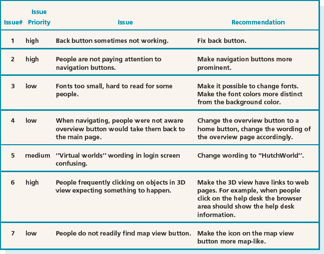
Table 12.4 Usability issues ranked according to importance

- The back button did not always work.
- People were not paying attention to navigation buttons, so they needed to be more prominent.
- People frequently clicked on objects in the 3D view and expected something to happen. A suggestion for fixing this was to provide links to a web page.
- People did not realize that there could be other real people in the 3D world with whom they could chat, so the wording in the overview description had to be changed.
- People were not noticing the chat window and instead were trying to chat to people in the participant list. The team needed to clarify the instructions about where to chat.
After dealing with these problems the software was evaluated again with six new participants, two males and four females. These tests followed the same general format as those just described but this time they tested multiple users at once, to ensure that the virtual world supported multi-user interactions. The tests were also more detailed and focused and, of course, there were still usability problems to be fixed. This raises the question of “when has enough testing been done?,” which we explore in the Dilemma box.
Dilemma: When is it Time to Stop Testing?
Was HutchWorld good enough after these evaluations? When has enough testing been done? This frequently asked question is difficult to answer. Few developers have the luxury of testing as thoroughly as they would like. Since every test you do will reveal some area where improvement can be made, you cannot assume that there will be a time when the system is perfect: no system is ever perfect. Normally, schedule and budget constraints determine when testing has to stop. Joseph Dumas and Ginny Redish, established usability consultants, point out that for iterative design and testing to be successful, each test should take as little time as possible while still yielding useful information and without burdening the team (Dumas and Redish, 1999).
The next step was to evaluate whether there were problems when HutchWorld was used by cancer patients and care-givers in the real world setting of the Fred Hutchinson Cancer Research Center. Focus groups and informal observation enabled the evaluators to examine patterns of use and to see who used which parts of the system, when, and why. (For those interested in finding out about this part of the study or reading a more detailed account of the whole study, you will find this information on our book website.)
- The case study does not say much about early evaluation to test the design shown in Figure 12.6. What would you have done to evaluate this early design?
- The evaluators recorded the gender of participants and noted their previous experience with similar systems. Why is this important?
- Why do you think it was important to give participants a five-minute exploration period?
- The evaluators collected participants' opinions. What kinds of concerns do you think participants might have about using Hutch World? Hints: personal information, medical information, communicating feelings, etc.
- Which evaluation methods were used early in design, which were used late in design, and which were used during both early and late design phases.
Comment
- We would have based the evaluation on informal discussion with users such as patients, medical staff, relatives, friends, caregivers, physicians, and hospital administrators. We would also have spent time observing what happened in the hospital.
- It is possible that men and women react differently in certain circumstances. Experience of using computers is likely to be an important influence on how the users would react to the system, so knowing how much previous experience users have with different types of software enables evaluators to make informed judgments about their performance. For example, experts and novices tend to behave differently.
- The evaluators wanted to see how participants reacted to the system and whether or not they could logon and get started. The exploration period gave the participants time to get used to the system before doing the set tasks.
- Comments and medical details are personal and people want privacy. Participants might be concerned about whether the medical information they get via the computer and from one another is accurate. Participants might be concerned about how clearly and accurately they are communicating because non-verbal communication is reduced online.
- As in the previous case studies, observation and interviews were used early in design. Late in design, once a functional prototype or working system was developed and the project was nearing completion, more formal usability tests were performed. Two types of tests were done: usability tests in Microsoft's laboratory, and field studies of how people used the product in the Fred Hutchinson Center. From the usability test data the evaluators could see when users got stuck or confused or failed to complete the task and how long it took them. Questionnaires and interviews were used to collect information about the users' satisfaction with the system. In the field studies, users were observed and their opinions were sought via questionnaires and interviews. Observation, individual or focus group interviews, and questionnaires were used to evaluate the software both early on and later in design.
12.4.5 Multiple Methods Help Ensure Good Usability: The Olympic Messaging System (OMS)
This case study describes a system that was highly visible and carried with it IBM's reputation. Therefore it had to function well. Consequently, the design team contained some of the most creative designers and evaluators of the time and no expense was spared. This case study is a classic, though now old, and we are including it to illustrate how a range of methods can be used to evaluate different aspects of a system.
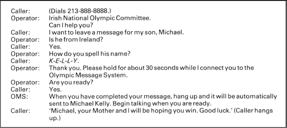
The 1984 Olympic Message System (OMS) was a voice mail system, developed by IBM so that Olympic Games contestants, their families, and friends could send and receive messages (Gould et al., 1990). Listeners could hear the message exactly as it was spoken. The OMS could be used from almost any push-button phone system around the world. While this may not sound amazing by today's standards, in 1983 it was innovative. The OMS worked in 12 languages and the kiosks and dialog are shown in Figures 12.10 and 12.11.
Gould and his team wanted to ensure that the OMS was successful. To achieve this goal a wide array of evaluation methods was used to collect feedback about its usability and whether users liked it. These included:
- Interviews with the Olympic committee and the Olympians themselves to get feedback about printed scenarios and screens.
- Tests in which Olympians, their families, and friends had to find information in the user guides.
- Tests in which users interacted with early simulations of the telephone keypad with a person speaking the commands back (a form of Wizard of Oz prototyping). These simulations tested how much a user needed to know about the system, what feedback was needed, and any incorrect assumptions about user behavior made by the designers.
- Early demonstrations with focus groups from outside of the USA to get their reactions.
- An Olympian joined the design team in order to provide informal feedback.
Figure 12.10 An Olympic Message System kiosk
- Interviews with Olympians to make sure that the system being developed was what they wanted.
- Tests with friends and family from overseas to check that cultural differences that might result in the interface being difficult to use had not been overlooked.
- Tests known as ‘coffee and donut’ tests in which 65 people tested the system in return for these treats.
- A ‘try-to-destroy-it’ test was conducted in which 24 computer science students were challenged to ‘break’ the system in any way they could. One of these tests involved all the students calling into the OMS at the same time. Needless to say, the students enjoyed the challenge and didn't need any other motivation!
- Two other tests examined the reliability of the system with heavy traffic generated by 2800 and 1000 users, respectively.
- Usability tests of a prototype involving 100 participants to check for problems before launching.
- The final test was a pre-Olympic field test of the interface at an international event with competitors from 65 countries. The outcome of this test was surprising because, despite all the other testing, 57 different usability problems were recorded by the end of the five-day test period. Many of these problems arose from strong cultural differences between users from different countries. Testers from Oman, Colombia, Pakistan, Japan, and Korea were unable to use the system. Gould and his colleagues were embarrassed by their own lack of sensitivity to cultural differences. They commented that “watching this … had a far greater impact than reading about it. It was embarrassing …” (Gould et al., 1990, p. 274).

Activity 12.7
- What is the most significant message you learn from this case study?
- Why was it important for the evaluators to use a variety of methods?
Comment
- The most significant lesson from this study is that the more evaluation with users, the better. While most design teams do not have the resources of this team, with ingenuity it is usually possible to test products extensively.
- Different methods provide different kinds of data that enables evaluators to learn about different aspects of the users' experiences. This supports triangulation (discussed in Chapter 7).
12.4.6 Evaluating a New Kind of Interaction: an Ambient System
Most systems are designed to replace or support tasks that we already do, but research in ubiquitous computing is producing completely new systems so that we can explore new ways of interacting with technology. In this situation there may be no alternative but to design a robust prototype, give it to users, and evaluate what they do with it, and what they like or don't like. This field study looks at a system in which software sensors are embedded in a wall-like structure which people interact with; such systems are known as ambient systems.
The ambient device being evaluated in this case study is known as the ‘Hello.Wall’ and it was developed by Norbet Streitz and his colleagues, as part of a project sponsored by the European Commission's Disappearing Computer Initiative (Streitz et al., 2005). As the name suggests, this initiative supports projects that aim to break new ground by developing devices that blend in with the environment and do not look like a computer (Streitz et al., 2005). When users interact with these devices they notice that their environment is changing according to their actions, rather than thinking: “Oh! There's a computer over there on the table.”
The Hello.Wall is a 1.8 meter-wide by 2-meter high artifact with integrated light cells and sensing technology (see Figure 12.12). It enhances awareness of their environment by ‘notifying’ people passing by or watching it. Different light patterns correspond to different types of information. Some of the patterns created by the light cells provide public information that everyone can know about, but some provide private information known only to those people allowed to know it, which enables users to communicate private information with people of their choice. In addition, the Hello.Wall has an aesthetic impact that helps to create the ‘mood’ of the space that it occupies and this can influence social gatherings.
There are three different zones of interaction created around the Hello.Wall: a close interaction zone which is close up to the wall, a notification zone which is further away, and an ambient zone which is still further away (see Figure 12.13).
People in the ambient zone contribute to the experience by generating continuously displayed ambient patterns. These patterns suggest general presence information. People in the notification zone are identified and the Hello.Wall reacts to and enriches their personal presence. People in the interaction zone can interact directly with the Hello.Wall environment. In each circumstance the wall generates interaction patterns that are appropriate.
Activity 12.8
- The Hello.Wall is an innovative device. It is designed to allow people to explore the possibilities offered by such devices and to see how their physical presence impacts the social environment that they inhabit. What evaluation methods would you use to evaluate the Hello.Wall?
- Imagine that you are evaluating users' impressions of the Hello.Wall and write a few interview questions that you would ask users.
Comment
- Since the underlying concept of the Hello.Wall is to allow people to interact with it as they wish, any evaluation method that intruded upon this free-form exploratory environment would be counterproductive. One way of collecting data about these interactions would be to discretely position video cameras to record what people do when they are in the Wall's environment. This raises some privacy concerns that need to be considered and this is a topic for Chapter 13. Interviews and questionnaires could also be used to collect data from people who have moved out of the Wall's range.
- There are several questions that you might have thought of. Here are our suggestions:
- (a) What were your initial reactions when the Hello.Wall reacted to your presence?
- (b) What did you actually do when you saw the Hello.Wall?
- (c) How did it respond?
- (d) How did that make you feel?
Probing for more information would be useful depending on how users answer these questions.

Figure 12.12 The Hello. Wall in which the ambient display combines unobtrusive, calm technology and a continual display of high-quality aesthetic patterns to convey the idea of turning everyday spaces into social places where people can meet and interact

Figure 12.13 Communication zones which depend on the distance from the display
12.5 What did we Learn from the Case Studies?
Together the case studies provide examples of how different evaluation approaches (i.e. usability testing, field studies, and analytical evaluation) and methods (i.e. observing users, asking users their opinions, asking experts their opinions, testing users' performance, and modeling users' task performance) are used, and the kinds of practical challenges that evaluators routinely face. These include:
- What to do when there are not many users, e.g. HutchWorld and the collaborative immersive game case studies.
- How to observe users in their natural location (i.e. field studies) without disturbing them, e.g. cell phone case study.
- Communicating with users who come from a different culture, and speak a different language, e.g. record-keeping system for the auxiliary nurse midwives in India.
- How best to respect different cultural norms, e.g. record-keeping system for the auxiliary nurse midwives in India.
- Triangulating data from different sources to gain an overview of the system's usability, e.g. Olympic Messaging System and HutchWorld.
- Working with users who are sick and may be emotionally fragile, e.g. HutchWorld.
- The need to cope with rapidly changing physical environments, e.g. cell phone study.
- Ensuring that users are safe and not in discomfort, e.g. collaborative immersive game).
- Avoiding any impact on users who are exploring a new kind of technology, e.g. Hello.Wall).
- Having to develop different data collection and analysis techniques to evaluate user experience goals such as challenge and engagement, e.g. collaborative immersive game.
- Creating ‘on-the-fly’ ways of testing usability that are quick and inexpensive, e.g. some of the methods used in the Olympic Messaging System case study.
- Respecting users and their privacy (all of the case studies, but particularly HutchWorld and the record-keeping system for the auxiliary nurse midwives in India because these studies involve medical information).
Assignment
In this assignment we want you to think about the case studies you read in this chapter and reflect on the evaluation methods used.
- For each of the six case studies think about the role of evaluation in the design of the system and note the artifacts that were evaluated, when during the design they were evaluated, which methods were used, and what was learned from the evaluations? Note any issues of particular interest. You may find that constructing a table like the one that follows is a helpful approach.

- How was the design advanced after each evaluation?
- What were the main constraints that influenced the evaluation?
- How did the use of different approaches and methods build on and complement each other to give a broader picture of the evaluation?
- Which parts of the evaluation were directed at usability goals and which at user experience goals?
Summary
The aim of this chapter was to introduce a range of evaluation methods and concepts that will be revisited in the next three chapters. We defined evaluation as a process for collecting information about users' or potential users' experiences when interacting with a prototype, computer system, a component of a computer system, or a design artifact, e.g. screen sketch, in order to improve its design. Evaluation is done throughout design. Typically early evaluations involve observing and interviewing users, whereas usability testing is particularly useful for refining designs that are well advanced.
In order to evaluate the wide range of products currently being developed, evaluators must be creative. This is particularly true when evaluating mobile and ubiquitous devices, such as cell phones which are used in different environments. Current methods work well for evaluating usability and questionnaires and interviews capture many aspects of user satisfaction. However, new methods are needed to evaluate the kinds of emotional reactions that can occur when interacting with online entertainment systems. Physiological measures may provide one solution but other solutions are also needed.
Key Points
- Evaluation and design are very closely integrated in user-centered design.
- Some of the same data gathering techniques are used in evaluation as for establishing requirements and identifying users' needs, but they are used differently, e.g. observation, interviews and questionnaires, etc.
- Three main evaluation approaches are: usability testing, field studies and analytical evaluation.
- The main evaluation methods are: observing users, asking users, asking experts, user testing, inspection methods (i.e. heuristic evaluation and walkthroughs), and modelling users' task performance.
- Different evaluation approaches and evaluation methods are usually combined in any one evaluation study.
- Dealing with constraints, such as gaining access to users or accommodating users' routines, is an important skill for evaluators to develop.
Further Reading
BLOM, J., CHIPCHASE, J. and LEHIKOINEN, J. (2005) Contextual and cultural challenges for user mobility research. CACM. 48(7), 37–47. This article provides a fascinating account of the challenges of evaluating mobile devices for use by different cultures.
CHENG, L., STONE, L., FARNHAM, S., CLARK, A.M. and ZANER-GODSEY, M. (2000) Hutchworld: Lessons Learned. A Collaborative Project: Fred Hutchinson Cancer Research Center & Microsoft Research. In the Proceedings of the Virtual Worlds Conference 2000, Paris, France. This paper describes the HutchWorld study and, as the title suggests, it discusses the design lessons that were learned. It also describes the evaluation studies in more detail.
GOULD, J.D., BOIES, S.J., LEVY, S., RICHARDS, J.T. and SCHOONARD, J. (1987). The 1984 Olympic Message System: a test of behavioral principles of systems design. Communications of the ACM, 30(9), 758–769. This is the original, full version of the OMS paper.
GRISEDALE, S., STONE, M. and GRUNSTEIDL, A. (1997) Designing a graphical user interface for healthcare workers in rural India. In CHI 97 Conference Procs (Design Briefings), 471–478. This paper provides a very readable, amusing, and sensitive account of the challenges of developing a product for people from a different culture. It also highlights some of the constraints involved in designing for mobile devices with small displays.
MANDRYK, R.L. and INKPEN, K.M. (2004) Physiological indicators for the evaluation of co-located collaborative play. Proceedings ACM Conference CSCW Chicago, IL, November 6–10, 102–111. This paper describes how the researchers set up an experiment to investigate the efficacy of a range of physiological measures for evaluating users' experience of challenge and engagement when playing a collaborative immersive ice-hockey game against a friend compared with playing the same game against the computer. The results indicate that these measures correspond well with the participants' subjective ratings. The paper provides a valuable alternative to standard usability testing, which is less well suited to evaluating this kind of user experience.
SHNEIDERMAN, B. and PLAISANT, C. (2005) Designing the User Interface: Strategies for Effective Human-Computer Interaction, 4th edn. Addison Wesley. This text provides an alternative way of categorizing evaluation methods and offers a good overview.
WHITESIDE, J. BENNETT, J. and HOLTZBLATT, K. (1998) Usability engineering: our experience and evolution In M. Helander (eds.), Handbook of Human–Computer Interaction. North Holland. Though written several years ago, this chapter provides a useful review of the strengths and weakness of usability engineering and explains why ethnographic techniques can provide a valuable alternative, or supplement, in some circumstances, 791–817.