
Understanding and conceptualizing interaction
2.1 Introduction
2.2 Understanding the problem space
2.3 Conceptualizing the design space
2.4 Theories, models, and frameworks
2.1 Introduction
Imagine you have been asked to design an application to let people organize, store, and retrieve their assortment of files, e.g. email, photos, movies, MP3, chats, documents, in a fast, efficient, and enjoyable way. What would you do? How would you start? Would you begin by sketching out how the interface might look, work out how the system architecture should be structured, or simply start coding? Or, would you start by asking users about their current experiences of saving files and look at existing tools, e.g. Google desktop search, and, based on this, begin thinking about why and how you were going to design the application?
Interaction designers would begin by doing the latter. It is important to realize that having a clear understanding of why and how you are going to design something, before writing any code, can save enormous amounts of time, effort, and money later on in the design process. Ill thought out ideas, incompatible and unusable designs can be refined while it is relatively easy and painless to do so. Once ideas are committed to code they become much harder to throw away. Such preliminary thinking through of ideas about the user experience and what kinds of designs might be appropriate is, however, a skill that needs to be learned. It is not something that can be done overnight by following a checklist, but requires practice in learning to identify, understand, and examine the issues—just like learning to write an essay or to program. In this chapter we describe the steps involved. In particular, we focus on what it takes to understand and conceptualize interaction.
The main aims of this chapter are to:
- Explain what is meant by the problem space.
- Explain how to conceptualize interaction.
- Describe what a conceptual model is and how to begin to formulate one.
- Discuss the pros and cons of using interface metaphors as part of a conceptual model.
- Outline the core interaction types for informing the development of a conceptual model.
- Introduce theories, models, and frameworks as a way of informing interaction design.
2.2 Understanding the Problem Space
In the process of creating an interactive product, it can be tempting to begin at the ‘nuts and bolts’ level of design. By this, we mean working out how to design the physical interface and what technologies and interaction styles to use, e.g. whether to use touchscreen, speech, graphical user interface, sensor interface, etc. A problem with trying to solve a design problem beginning at this level is that usability and user experience goals can be overlooked. For example, consider the problem of providing drivers with better navigation and traffic information. How might you achieve this? One could tackle the problem by thinking straight away about a good technology or a particular kind of interface to use. For example, one might think that augmented reality, where images are superimposed on objects in the real world (see Figure 2.1a), would be appropriate, since it can be useful for integrating additional information with an ongoing activity, e.g. overlaying X-rays on a patient during an operation. In the context of driving, it could be effective for displaying information to drivers who need to find out where they are going and what to do at certain points during their journey. In particular, images of places and directions to follow could be projected inside the car, on the dashboard or rear-view mirror or windshield (see Figure 2.1b). However, there is a problem with this proposal: it is likely to be unsafe. It could easily distract drivers, encouraging them to switch their attention from the road to the images being projected.
While it is certainly necessary at some point to decide how to design the physical aspects, it is better to make these kinds of decisions after articulating the nature of the problem space. By this, we mean understanding and conceptualizing what is currently the user experience/product and how this is going to be improved or changed. This requires a design team thinking through how their ideas will support or extend the way people communicate and interact in their everyday activities. In the above example, it involves finding out what is problematic with existing forms of navigating while driving, e.g. trying to read maps while moving the steering wheel or looking at a small navigation display mounted on the dashboard when approaching a roundabout, and how to ensure that drivers can continue to drive safely without being distracted.
As emphasized in Chapter 1, identifying usability and user experience goals is a prerequisite to understanding the problem space. Another important consideration is to make explicit underlying assumptions and claims. By an assumption is meant taking something for granted, e.g. people will want to watch movies on their cell phones. By a claim is meant stating something to be true when it is still open to question, e.g. a multimodal style of interaction for controlling a car navigation system—one that involves speaking while driving—is perfectly safe. Writing down your assumptions and claims and then trying to defend and support them can highlight those that are vague or wanting. In so doing, poorly constructed design ideas can be reformulated. In many projects, this process involves identifying human activities and interactivities that are problematic and working out how they might be improved through being supported with a different set of operations. In others, it can be more speculative, requiring thinking through what to design for an engaging user experience.
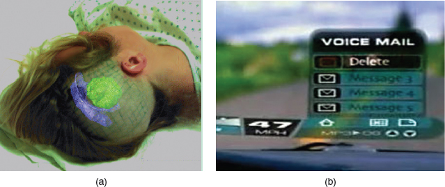
Figure 2.1 (a) Overlaying X-rays on a patient during an operation. (b) A screen shot taken from HP's vision of the future, CoolTown. In this hypothetical scenario, digital information about the car's state and the driver's navigation plans is projected onto the windshield. A multimodal voice browsing interface is proposed that allows the driver to control interactions with the vehicle when driving. How safe do you think this would be?
The process of articulating the problem space is typically done as a team effort. Invariably, team members will have differing perspectives on the problem space. For example, a project manager is likely to be concerned about a proposed solution in terms of budgets, timelines, and staffing costs, whereas a software engineer will be thinking about breaking it down into specific technical concepts. It is important that the implications of pursuing each perspective are considered in relation to one another. While being time-consuming and sometimes resulting in disagreements among the team, the benefits of this process can far outweigh the associated costs. There is much less chance of incorrect assumptions and unsupported claims creeping into a design solution that turn out to be unusable or unwanted. Furthermore, spending time enumerating and reflecting upon ideas during the early stages of the design process enables more options and possibilities to be considered. Box 2.1 presents a hypothetical scenario of a team working through their assumptions and claims, showing how, in so doing, problems are explicated and explored, leading to a specific avenue of investigation agreed on by the team.
Box 2.1: A hypothetical scenario showing the assumptions and claims (italicized) made by different members of a design team and how they are resolved
A large software company has decided it needs to develop an upgrade of its web browser because its marketing team has discovered that many of its customers have switched over to using another browser. They assume something is wrong with theirs and that their rivals have a better product. But they don't know what the problem is with theirs. The design team put in charge of this project assume they need to improve the usability of a number of the browser's functions. They claim that this will win back users by making features of the interface simpler, more attractive, and more flexible to use.
The user experience researchers on the design team conduct an initial user study investigating how people use their company's web browser. They also look at other web browsers on the market and compare their functionality and usability. They observe and talk to many different users. They discover several things about the usability of their web browser, some of which they were not expecting. One revelation is that many of their customers have never actually used the bookmarking feature. They present their findings to the rest of the team and have a long discussion about why each of them thinks the bookmarking function is not being used. One member points out that the web browser's function for organizing URLs requires dragging individual URLs into a hierarchical folder. She claims that this is very time-consuming, fiddly, and error-prone, and assumes this is the reason why many users do not use it. Another member backs her up, saying how awkward it is to use this method when wanting to move large numbers of URLs between folders. One of the user experience engineers agrees, noting how several of the users he talked to mentioned how difficult they found it when trying to move a number of web addresses between folders and how they often ended up accidentally putting URLs into the wrong folders.
A software engineer reflects on what has been said, and makes the claim that the bookmark function is no longer needed since he assumes that most people do what he does, which is to revisit a website by scanning through their history list of previously visited sites. Another member of the team disagrees with him, claiming that many users do not like to leave a trail of all the sites they have ever visited for anyone else to see and would prefer to be able to save only URLs they want to revisit. The bookmark function provides them with this option.
After much discussion on the pros and cons of bookmarking versus history lists, the team decides to investigate further how to support effectively the saving, ordering, and retrieving of web pages in a web browser. All agree that the format of the existing web browser's hierarchical structure is too rigid and that one of their priorities is to see how they can create a simpler set of operations.
Consider another actual example. Smartphones (also called 3G handsets in Europe) came into being in 2002, with Orange's SPV (stands for Sound, Pictures, Video) being the first on the market. There was much hype about the amazing set of features they were offering, including full color web browsing, streaming video, predictive text, playing music in MP3 format, and multiplayer video games. An assumption that many of the phone companies made in developing the new generation of phone services was that customers would want to use their cell phone to make video calls, download songs and movies, watch sports highlights, browse the web, etc.—all while on the move. To what extent do you think this assumption is correct?
The problem space identified by the cell phone companies was very open-ended. Unlike the hypothetical scenario presented in Box 2.1 for the web browser, there was no specific problem that needed to be addressed. Alternatively, the phone companies sought to provide a whole suite of new functions that would create a quite different user experience from what was offered by the previous generation of cell phones. A claim made by the companies was that people would be prepared to pay a higher premium for this more extensive range of services. An assumption was that users would be happy doing all the things they can currently do on a PC, but using a much smaller handheld device, because they can do them while on the move. A further claim was that the Smartphone would become the next must-have fashion item that many users would want to own.
For one user group, known in the advertising business as YAFs (Young Active Fun), these assumptions and claims are proving to be true. Many young people enjoy playing multiplayer games on their cell phones, taking and sending pictures, downloading and listening to music, etc., and showing off their phones to one another. For example, in India, ‘gaming on the move’ has become one of the fastest-growing cell phone activities among the tech-savvy young. Analysts have predicted that over 220 million people in India will be playing games on their cell phones by 2009 (BBC Worldnews, 2004). For other user groups, however, such claims and assumptions are proving incorrect. A large number of users have discovered that carrying out multimedia-based activities using a cell phone is too expensive, too cumbersome, or too impoverished compared with what they can do when using much faster PCs and much larger and higher-resolution displays. In another survey conducted by Continental Research, 36% of British phone users having multimedia capabilities were found to have never sent a multimedia message. As well as the reasons stated above it was discovered that many phone users simply did not know how to use the array of functions and shied away from learning how (Ward, 2004).
Explicating people's assumptions and claims about why they think something might be a good idea (or not) enables the design team as a whole to view multiple perspectives on the problem space and in so doing reveal conflicting and problematic ones. The following framework is intended to provide a set of core questions to aid design teams in this process:
- Are there problems with an existing product or user experience? If so, what are they?
- Why do you think there are problems?
- How do you think your proposed design ideas might overcome these?
- If you have not identified any problems and instead are designing for a new user experience how do you think your proposed design ideas support, change, or extend current ways of doing things?
Activity 2.1
Use the framework to explicate the main assumptions and claims behind the design of an online photo sharing and management application.
Comment
The sharing of digital images on the web, so that potentially anyone can view them and add comments, is a new experience that is capitalizing on the hugely successful phenomenon of blogging. While there were already a number of applications available on the web that enabled people to place their photo collections on a shared server, they have been primarily designed as personal spaces for individuals, family, and friends. In contrast, Flickr was one of the first blog-based photo-sharing services. An assumption was that just as people like to blog, i.e. share their experiences via text-based entries on the web and invite comments from anyone in the world, so too would people want to share with the rest of the world their photo collections and get comments back on them. In this way the company was extending the user experience of blogging into the realm of image sharing. A claim from Flickr's website (2005) was that it “is almost certainly the best online photo management and sharing application in the world” because it provides many easy–to-use functions for uploading, storing, classifying, and viewing people's photos. One innovative function that was designed was the ability to tag/annotate parts of a photo, e.g. someone in a crowd, with personal commentary, e.g. “that's me”.
2.3 Conceptualizing the Design Space
Having a good understanding of the problem space greatly helps design teams progress to the next phase of the design process, which is to conceptualize the design space. Primarily this involves describing what the system is going to be to the users, through developing a conceptual model—we explain how to do this in the next section. The design space can also be conceptualized in other ways, including exploring the nature of the interaction that underlies user activities (see Section 2.3.4) and through the lenses of different theories, models, and frameworks (see Section 2.4). A benefit of conceptualizing the design space using one or more of these is that it can inform and systematically structure a design solution.
2.3.1. Conceptual Models
A conceptual model is a high-level description of how a system is organized and operates. (Johnson and Henderson, 2002, p. 26)
Many people have difficulty understanding what a conceptual model is, and yet it is one of the most fundamental parts of interaction design, as noted by David Liddle (1996), a renowned interaction designer:
The most important thing to design is the user's conceptual model. Everything else should be subordinated to making that model clear, obvious, and substantial. That is almost exactly the opposite of how most software is designed. (Liddle, 1996, p. 17)
So what exactly is a conceptual model? How do design teams develop one and how do they know when they have a good one? Here, we begin to address these questions by drawing on Johnson and Henderson's (2002) account of conceptual models.
They define a conceptual model as an abstraction that outlines what people can do with a product and what concepts are needed to understand how to interact with it. It is important to stress that it is not a description of the user interface but a structure outlining the concepts and the relationships between them that will form the basis of the product or system. In so doing, it enables “designers to straighten out their thinking before they start laying out their widgets” (p. 28). In a nutshell, a conceptual model provides a working strategy; a framework of general concepts and their interrelations. Johnson and Henderson (2002) propose that a conceptual model should comprise the following components:
- The major metaphors and analogies that are used to convey to the user how to understand what a product is for and how to use it for an activity.
- The concepts that users are exposed to through the product, including the task–domain objects they create and manipulate, their attributes, and the operations that can be performed on them.
- The relationships between those concepts, e.g. whether one object contains another, the relative importance of actions to others, and whether an object is part of another.
- The mappings between the concepts and the user experience the product is designed to support or invoke.
How the various metaphors, concepts, and their relationships are organized determines how the users will subsequently think of a product and the operations they can carry out on it. To show how each of the components can be operationalized for a specific design problem, we revisit our hypothetical scenario of the design team responsible for upgrading the company's web browser. We outline below an initial description of part of the conceptual model for the upgrade (Note: It would need to include more components for describing all of the functions of a web browser).
(i) The Major Metaphors and Analogies
The main metaphor is browsing, the idea of following links in a page through exploring what is there. It draws on the analogy of window shopping (Glossary, 2005). Another metaphor is bookmarking. Web pages are ordered as a chronological list of sites visited over time and labeled as bookmarks that are selected by the reader, similar to the way bits of card, post-its, etc. are used to mark a place to return to in a physical book.
(ii) The Concepts
These include web pages (URLs), dynamic and static web pages, links, lists, folders of URLs, obsolete URLs, saving a URL, revisiting a URL, organizing saved URLs, updating URLs, sending a URL, listing saved URLs, deleting saved URLs, reorganizing URLs.
(iii) The Relationships Between Concepts
These include one object contains another, e.g. a folder contains a collection of related URLs, the relative importance of actions to others, e.g. the ability to add a URL to a list of saved websites the browser is currently pointing to is more important than the ability to move the position of saved URLs around the list, and an object is a specialization of another, e.g. a dynamic web page is a special kind of web page.
(iv) The Mappings
A saved URL corresponds to a web page on the Internet. When the user clicks on the URL, their web browser points to the web page and it appears on their screen.
By exploring the relationships between the various components of the conceptual model, the design team can debate the merits of providing different methods and how they support the main concepts, e.g. saving, revisiting, categorizing, reorganizing, and their mapping to the task domain. They can also begin discussing whether a new metaphor may be preferable that combines the activities of browsing and searching. In turn, this can lead the design team to articulate the importance of containership as a relationship. For example, what is the best way to sort and revisit saved objects and how many and what types of containers, e.g. folders, bars, are most fitting for the task domain? The same enumeration of concepts can be repeated for other functions of the web browser—both current and new. In so doing, the design team can begin to systematically work out what will be the most simple, effective, and memorable way of supporting users while browsing the Internet.
Developing a conceptual model can at first seem daunting, especially for those not trained or versed in thinking at an abstract level. It can be much easier to talk about a design idea in concrete terms, such as deciding upon the look and feel of a proposed system, the layout of menu options and other graphical elements, and where information will appear on a screen. But as stressed throughout this chapter, these types of decisions should not be made until the foundations of the system have been worked out—just as architects and interior designers would not think about which color curtains to have before they have decided upon where the windows will be placed in a plan for a new building.
The benefits of conceptualizing a design in general terms early on in the design process encourages design teams:
- To orient themselves towards asking specific kinds of questions about how the conceptual model will be understood by the targeted users.
- Not to become narrowly focused early on.
- To establish a set of common terms they all understand and agree upon, reducing the chance of misunderstandings and confusion arising later on.
Once formulated and agreed upon, a conceptual model becomes a shared blueprint. This can be represented as a textual description and/or in a diagrammatic form, depending on the preferred linga franca used by the design team. As you will see later in Chapter 11, the conceptual model is used by the design team as the basis from which to develop more detailed and concrete aspects of the design.
In the next section we describe two interactive products that have become classics in their time. Both were based on very clear and simple conceptual models. It is important to note that they were developed before Johnson and Henderson's (2002) framework was published, but that there are similarities between the way they have been characterized in the literature. In particular, they both emphasize the use of analogy with the physical world and identify core concepts that made them successful products (Winograd, 1996; Smith et al., 1982). Where they differ is in emphasizing the extra value of taking a physical artifact and making it into an interactive digital entity.
2.3.2 Examples of Best Practice
The Spreadsheet—VisiCalc (Bricklin and Frankston)
An example of a good conceptual model that has stood the test of time is that which underlies the ubiquitous spreadsheet, originally conceived by Dan Bricklin and Bob Frankston and implemented as a software tool called VisiCalc (www.bricklin.com). The main reason why this conceptual model has been so successful is that it was simple, clear, and obvious to the users how to use the application and what it could do for them. As Frankston notes, somewhat modestly, in an email to a colleague: “it is just a tool to allow others to work out their ideas and reduce the tedium of repeating the same calculations.”
Bricklin and Frankston understood the kind of tool that would be useful to both professionals, e.g. accountants, and lay persons. They also emphasized the need to design it to be intuitive and, importantly, leverage off existing practice. They worked out a set of concepts that were operationalized in terms of the task domain in a way that substantially extended the range of computations accountants could do. These were developed into very effective, usable, and powerful operations.
The conceptual model was based on an analogy of the paper-based ledger sheet that was used in accounting practice at the time (Winograd, 1996). Bricklin and Frankston also conceptualized problematic aspects of the task domain that could substantially be improved upon through using a computer-based tool. For example, they observed that a core financial activity is forecasting. This requires projecting financial results based on assumptions about a company, such as projected and actual sales, investments, infrastructure, and costs. The amount of profit or loss is calculated for different projections. A company may want to determine how much loss it will incur before it achieves break-even, based on different amounts of investment, for different periods of time. Financial analysts need to see a spread of projections for different time periods. Doing this kind of multiple projecting by hand requires much effort and is subject to human error. Using a calculator can reduce the computational load of doing numerous sums but there is still much key pressing and writing down of partial results to be done—again making the process protracted and prone to errors.
Bricklin and Frankston exploited the interactivity provided by microcomputers and developed an application that was capable of interactive financial modeling. Key goals of their conceptual model were: (i) to create a spreadsheet that was analogous to a ledger sheet in the way it looked, with columns and rows, that allowed people to capitalize on their familiarity with how to use this kind of representation; (ii) to make the spreadsheet interactive, by allowing the user to input and change data in any of the cells in the columns or rows; and (iii) to have the computer perform a range of different calculations and recalculations in response to user input. For example, the last column could be programmed to display the sum of all the cells in the columns preceding it. With the computer doing all the calculations, together with an easy-to-learn-and-use interface, users were provided with an easy-to-understand tool, based on a simple conceptual model (see Figure 2.2). Moreover, it gave them a new way of effortlessly working out any number of forecasts—greatly extending what they could do before with existing technology.

Figure 2.2 A screenshot of the original VisiCalc interface. At the top left-hand corner is where the user typed in operations to be performed (in this case subtracting row 4 from row 3 to work out the profit). The main area has columns labeled A, B, C, etc. across the top and rows 1, 2, 3, etc. down the side. The cursor highlights a cell which displays the calculated results
The simplicity of this conceptual model is clear and it is not surprising that it received much critical acclaim. For various business reasons, however, VisiCalc did not become a successful commercial product. But many of the basic concepts and the metaphor that were inherent in its conceptual model became widely adopted by other software companies. Most notable, as acknowledged by Bricklin and Frankston on their website, is Microsoft's Excel 97 spreadsheet which has many similarities to VisiCalc—even 18 years after its inception (see Figure 2.3).
The Star interface (based on Miller and Johnson, 1996 and Smith et al., 1982)
Another classic of its time was the 8010 ‘Star’ system, developed by Xerox in 1981, that revolutionized the way interfaces were designed for personal computing. Like VisiCalc, it received great acclaim but was not commercially successful, and lo and behold many aspects of its conceptual model were borrowed and adapted by other companies, such as Apple and Microsoft, that later appeared in their very successful Mac and Windows products.
Star was designed as an office system, targeted at workers not interested in computing per se. An important consideration was to make the computer as ‘invisible’ to the users as possible and to design applications that were suitable for them. The Star developers spent several person-years at the beginning of the project working out an appropriate conceptual model for such an office system. In the end they selected a conceptual model based on an analogy to a physical office. They wanted office workers to imagine the computer to be like an office environment, by acting on electronic counterparts of physical objects in the real world. Their assumption was that this would simplify and clarify the electronic world, making it seem more familiar, less alien, and easier to learn (see Figure 2.4).
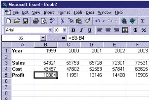
Figure 2.3 A screenshot of Microsoft's 97 Excel spreadsheet. Note the way the columns and rows are organized and the space at the top for typing in operations are the same as they were in VisiCalc
The Star was based on a conceptual model that included the familiar knowledge of an office. Paper, folders, filing cabinets, and mailboxes were represented as icons on the screen and were designed to possess some of the properties of their physical counterparts. Dragging a document icon across the desktop screen was seen as equivalent to picking up a piece of paper in the physical world and moving it (but this of course is a very different action). Similarly, dragging an electronic document onto an electronic folder was seen as being analogous to placing a physical document into a physical cabinet. In addition, new concepts that were incorporated as part of the desktop metaphor were operations that could not be performed in the physical world. For example, electronic files could be placed onto an icon of a printer on the desktop, resulting in the computer printing them out.

Figure 2.4 (a) The Xerox Star computer and (b) GUI interface
Dilemma: Over-Specified Applications: A Question of More Choice or More Confusion?
The best conceptual models are those that appear simple and clear to their users and are task-oriented. However, all too often applications can end up being based on overly complex conceptual models, especially if they are the result of a series of upgrades, where more and more functions and ways of doing something are added to the original conceptual model. Whereas in the first version of the software there may have been one way of doing something, later versions are often designed to allow several ways of performing the same operation. For example, some operating and wordprocessing systems now make it possible for the user to carry out the same activity in a number of different ways, e.g. to delete a file the user can issue a command like CtrlD, speak to the computer by saying “delete file,” or drag an icon of the file to the recycle bin. Users have to learn each of the different styles to decide which they prefer. Many users prefer to stick to the methods they have always used and trusted and, not surprisingly, become annoyed when they find a simple way of doing something has been changed, albeit more flexibly, now allowing them to do it in three or more different ways. Is providing multiple ways of carrying out the same operation desirable? What do you think?
2.3.3 Interface Metaphors and Analogies
An interface metaphor is considered to be a central component of a conceptual model. It provides a structure that is similar in some way to aspects of a familiar entity (or entities) but that also has its own behaviors and properties. Consider the term search engine. It has been designed to invite comparison with a common object—a mechanical engine with several parts working—together with an everyday action—searching by looking through numerous files in many different places to extract relevant information. The functions supported by a search engine also include other features besides those belonging to an engine that searches, such as listing and prioritizing the results of a search. It also does these actions in quite different ways from how a mechanical engine works or how a human being might search a library for books on a given topic. The similarities implied by the use of the term ‘search engine,’ therefore, are at a general level. They are meant to conjure up the essence of the process of finding relevant information, enabling the user to link these to less familiar aspects of the functionality provided.
Box 2.2: Why are Metaphors so Popular?
People frequently use metaphors and analogies (here we use the terms interchangeably) as a source of inspiration to understand and explain to others what they are doing or trying to do, in terms that are familiar to them. They are an integral part of human language (Lakoff and Johnson, 1980). Metaphors are commonly used to explain something that is unfamiliar or hard to grasp by way of comparison with something that is familiar and easy to grasp. For example, they are commonly employed in education, where teachers use them to introduce something new to students by comparing the new material with something they already understand. An example is the comparison of human evolution with a game. We are all familiar with the properties of a game: there are rules, each player has a goal to win (or lose), there are heuristics to deal with situations where there are no rules, there is the propensity to cheat when the other players are not looking, and so on. By conjuring up these properties, the analogy helps us begin to understand the more difficult concept of evolution—how it happens, what rules govern it, who cheats, and so on.
It is not surprising, therefore, to see how widely metaphors and analogies have been applied in interaction design. Both have been used, in overlapping ways, to conceptualize abstract, hard to imagine, and difficult to articulate computer-based concepts and interactions in more concrete and familiar terms and as graphical visualizations at the interface. This use includes:
- As a way of conceptualizing a particular interaction style, e.g. using the system as a tool.
- As part of the conceptual model instantiated at the interface, e.g. the desktop metaphor.
- As a way of describing computers, e.g. the Internet highway.
- As names for describing specific operations, e.g. ‘cut’ and ‘paste’ commands for deleting and copying objects (analogy taken from the media industry).
- As part of the training material aimed at helping learning, e.g. comparing a wordprocessor with a typewriter.
In many instances, it is hard not to use metaphorical terms, as they have become so ingrained in the language we use to express ourselves. This is increasingly the case when talking about computers. Just ask yourself or someone else to describe how the Internet works. Then try doing it without using a single metaphor.
Interface metaphors are often composites, i.e. they combine quite different pieces of familiar knowledge with the system functionality. We already mentioned the search engine as one such example. Can you think of any others?
Comment
Some other examples include:
Scrollbar—combines the concept of a scroll with a bar, as in bar chart.
Toolbar—combines the idea of a set of tools with a bar.
Web Portal—a gateway to a particular collection of pages of networked information.
Benefits of Interface Metaphors
Interface metaphors have proven to be highly successful, providing users with a familiar orienting device and helping them understand and learn how to use a system. People find it easier to learn and talk about what they are doing at the computer interface in terms familiar to them—whether they are computer-phobic or highly experienced programmers. Metaphorically-based commands used in Unix, like ‘lint’ and ‘pipe,’ have very concrete meanings in everyday language that, when used in the context of the Unix operating system, metaphorically represent some aspect of the operations they refer to. Although their meaning may appear obscure, especially to the novice, they make sense when understood in the context of programming. For example, Unix allows the programmer to send the output of one program to another by using the pipe | symbol. Once explained, it is easy to imagine the output from one container going to another via a pipe.
Activity 2.3
Suggest two computing metaphors that have become common parlance whose original source of reference is (or always was) obscure?
Comment
Two are:
Java—The programming language Java originally was called Oak, but that name had already been taken. It is not clear how the developers moved from Oak to Java. Java is a name commonly associated with coffee. Other Java-based metaphors that have been spawned include Java beans (a reusable software component) and the steaming coffee-cup logo.
Bluetooth—Bluetooth is used in a computing context to describe the wireless technology that is able to unite technology, communication, and consumer electronics. The name is taken from King Harald Blue Tooth, who was a 10th century legendary Viking king responsible for uniting Scandinavia and thus getting people to talk to each other.
Opposition to Using Interface Metaphors
A mistake sometimes made by designers is to try to design an interface metaphor to look and behave literally like the physical entity it is being compared with. This misses the point about the benefit of developing interface metaphors. As stressed earlier, they are meant to be used to map familiar to unfamiliar knowledge, enabling users to understand and learn about the new domain. Designing interface metaphors only as literal models of the thing being compared with has understandably led to heavy criticism. One of the most outspoken critics is Ted Nelson (1990), who considers metaphorical interfaces as “using old half-ideas as crutches” (p. 237). Other objections to the use of metaphors in interaction design include:
Breaks the rules. Several commentators have criticized the use of interface metaphors because of the cultural and logical contradictions involved in accommodating the metaphor when instantiated as a GUI. A pet hate is the recycle bin (trashcan) that used to sit on the desktop. Logically and culturally (i.e. in the real world), it should be placed under the desk. If this same rule was followed in the virtual desktop, users would not be able to see the bin because it would be occluded by the desktop surface. A counter-argument to this objection is that it does not matter whether rules are contravened. Once people understand why the bin is on the desktop, they readily accept that the real-world rule had to be broken. Moreover, the unexpected juxtaposition of the bin on the desktop can draw to the user's attention the additional functionality that it provides. The trashcan now appears in the toolbar of the Mac operating systems—but the same logic applies—is a trashcan a tool? Moreover, does it matter?
Too constraining. Another argument against interface metaphors is that they are too constraining, restricting the kinds of computational tasks that would be useful at the interface. An example is trying to open a file that is embedded in several hundreds of files in a directory. Having to scan through hundreds of icons on a desktop or scroll through a list of files seems a very inefficient way of doing this. A better way is to allow users to instruct the computer to open the desired file by typing in its name (assuming they can remember the name of the file).
Conflicts with design principles. By trying to design the interface metaphor to fit in with the constraints of the physical world, designers are forced into making bad design solutions that conflict with basic design principles. Ted Nelson used the trashcan as an example of such violation: “a hideous failure of consistency is the garbage can on the Macintosh, which means either ‘destroy this’ or ‘eject it for safekeeping’” (Nelson, 1990). The trashcan has now been designed to transform into an abstract ‘eject’ icon on the Mac when an icon of an external drive, disk, or memory stick is selected from the desktop and moved towards it, thereby reducing the ambiguity associated with the original metaphor.
Not being able to understand the system functionality beyond the metaphor. It has been argued that users may get fixed in their understanding of the system based on the interface metaphor. In so doing, they may find it difficult to see what else can be done with the system beyond the actions suggested by the interface metaphor. Nelson (1990) also argues that the similarity of interface metaphors to any real objects in the world is so tenuous that it hinders more than it helps. We would argue the opposite: because the link is tenuous and there are only a certain number of similarities, it enables the user to see both the dissimilarities and how the metaphor has been extended.
Overly literal translation of existing bad designs. Sometimes designers fall into the trap of trying to create a virtual object to resemble a familiar physical object that is itself badly designed. A well-known example is the virtual calculator, which is designed to look and behave like a physical calculator. The interface of many physical calculators, however, has been poorly designed in the first place, based on poor conceptual models, with excessive use of modes, poor labeling of functions, and difficult-to-manipulate key sequences (Mullet and Sano, 1995). The design of the calculator in Figure 2.5(a) has even gone as far as replicating functions needing shift keys, e.g. deg, oct, and hex, which could have been redesigned as dedicated software buttons. Trying to use a virtual calculator that has been designed to emulate a poorly designed physical calculator is much harder than using the physical device itself. A better approach would have been for the designers to think about how to use the computational power of the computer to support the kinds of tasks people need to do when performing calculations (cf. the spreadsheet design). The calculator in Figure 2.5(b) has been designed to do this to some extent, by moving the buttons closer to each other (minimizing the amount of mousing) and providing flexible display modes with one-to-one mappings with different functions.
Limits the designer's imagination in conjuring up new paradigms and models Designers may fixate on ‘tired’ ideas, based on well-known technologies, that they know people are very familiar with. Nelson points out that one of the dangers of always looking backwards is that it prevents the designer from thinking of new functionality to provide. For example, Gentner and Nielsen (1996) discuss how they used a book metaphor for designing the user interface to Sun Microsystems' online documentation. In hindsight they realized how it had blinkered them in organizing the online material, preventing them from introducing desirable functions such as the ability to reorder chapters according to their relevance scores after being searched.
Clearly, there are pitfalls in using interface metaphors in interaction design. Indeed, this approach has led to some badly designed conceptual models, that have resulted in confusion and frustration. However, this does not have to be the case. Provided designers are aware of the dangers and try to develop interface metaphors that effectively combine familiar knowledge with new functionality in a meaningful way, then many of the above problems can be avoided.
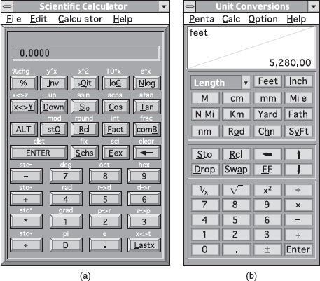
Figure 2.5 Two virtual calculators where (a) has been designed too literally and (b) more appropriately for a computer screen
Activity 2.4
Examine a web browser you use and describe the metaphors that have been incorporated into its design.
Comment
Many aspects of a web browser are based on metaphors, including:
- a range of toolbars, such as a button bar, navigation bar, favorite bar, history bar
- tabs, menus, organizers
- search engines, guides
- bookmarks, favorites
- icons for familiar objects like stop lights, home.
2.3.4 Interaction Types
Another way of conceptualizing the design space is in terms of the user's interactions with a system or product. This can help designers formulate a conceptual model by determining what kinds of interaction to use, and why, before committing to a particular interface. There are a number of possible interfaces available for designers to implement, including speech-based, GUI, multimedia, tangible, and wearables. Note that we are distinguishing here between interface types, which will be discussed in Chapter 6, and interaction types, which we discuss in this section. While cost and other product constraints will often dictate which of these can be used for a given application, considering the interaction type that will best support a user experience can highlight the trade-offs, dilemmas, and pros and cons of using a particular interface type.
Consider the following problem description: a company has been asked to design a computer-based system that will encourage autistic children to communicate and express themselves better. What type of interaction would be appropriate to use at the interface for this particular user group? It is known that autistic children find it difficult to express what they are feeling or thinking through talking and are more expressive when using their bodies and limbs. Clearly an interaction style based on talking would not be effective but one that involves the children interacting with a system by moving in a physical and/or digital space would seem a more promising starting point.
We suggest four fundamental types of interaction someone can have with a product/system. These are not meant to be mutually exclusive, e.g. someone can interact with a system based on different kinds of activities, nor are they meant to be definitive. They are:
- Instructing—where users issue instructions to a system. This can be done in a number of ways, including: typing in commands, selecting options from menus in a windows environment or on a touch screen, speaking aloud commands, pressing buttons, or using a combination of function keys.
- Conversing—where users have a dialog with a system. Users can speak via an interface or type in questions to which the system replies via text or speech output.
- Manipulating—where users interact with objects in a virtual or physical space by manipulating them, e.g. opening, holding, closing, placing. Users can hone in on their familiar knowledge of how to interact with objects.
- Exploring—where users move through a virtual environment or a physical space. Virtual environments include 3D worlds and virtual reality systems. They enable users to hone in on their familiar knowledge of physically moving around. Physical spaces that use sensor-based technologies include smart rooms and ambient environments, also enabling people to capitalize on familiarity.
Instructing
This type of interaction describes how users carry out their tasks by telling the system what to do. Examples include giving instructions to a system to perform operations such as tell the time, print a file, and remind the user of an appointment. A diverse range of products has been designed based on this model, including VCRs, hi-fi systems, alarm clocks, and computers. The way in which the user issues instructions can vary from pressing buttons to typing in strings of characters. Many activities are readily supported by giving instructions.
Operating systems like Unix and Linux have been designed primarily as command-based systems, where users issue instructions at the prompt as a command or set of commands. In Windows and other GUI-based systems, control keys or the selection of menu options via a mouse are used. Typically, a wide range of functions are provided from which users have to select when they want to do something to the object on which they are working. For example, a user writing a report using a wordprocessor will want to format the document, count the number of words typed, and check the spelling. The user instructs the system to do these operations by issuing appropriate commands. Typically, commands are carried out in a sequence, with the system responding appropriately (or not) as instructed.
One of the main benefits of designing an interaction based on issuing instructions is that the interaction is quick and efficient. It is particularly fitting where there is a need to frequently repeat actions performed on multiple objects. Examples include the repetitive actions of saving, deleting, and organizing files.
Activity 2.5
There are many different kinds of vending machines in the world. Each offers a range of goods, requiring the user initially to part with some money. Figure 2.6 shows photos of two different vending machines, one that provides soft drinks and the other a range of snacks. Both use an instructional mode of interaction. However, the way they do so is quite different.
What instructions must be issued to obtain a can of coke from the first machine and a bar of chocolate from the second? Why has it been necessary to design a more complex mode of interaction for the second vending machine? What problems can arise with this mode of interaction?
Comment
The first vending machine has been designed using simple instructions. There are a small number of drinks to choose from and each is represented by a large button displaying the label of each drink. The user simply has to press one button and this should have the effect of returning the selected drink. The second machine is more complex, offering a wider range of snacks. The trade-off for providing more choices, however, is that the user can no longer instruct the machine by using a simple one-press action but is required to use a more complex process, involving: (i) reading off the code, e.g. C12, under the item chosen; then (ii) keying this into the number pad adjacent to the displayed items; and (iii) checking the price of the selected option and ensuring that the amount of money inserted is the same or greater (depending on whether or not the machine provides change). Problems that can arise from this type of interaction are the customer misreading the code and/or miskeying in the code, resulting in the machine not issuing the snack or providing the wrong item.
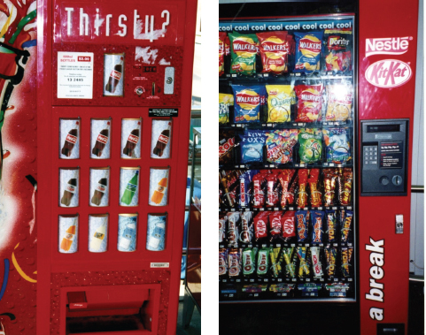
Figure 2.6 Two different types of vending machine
A better way of designing an interface for a large number of choices of variable cost might be to continue to use direct mapping, but use buttons that show miniature versions of the snacks placed in a large matrix (rather than showing actual versions). This would use the available space at the front of the vending machine more economically. The customer would need only to press the button of the object chosen and put in the correct amount of money. There is less chance of error resulting from pressing the wrong code or keys. The trade-off for the vending company, however, is that the machine is less flexible in terms of which snacks it can sell. If a new product line comes out they will also need to replace part of the physical interface to the machine—which would be costly.
Activity 2.6
Another ubiquitous vending machine is the ticket machine. Typically, a number of instructions have to be given in a sequence when using one of these. Consider ticket machines designed to issue train tickets at railway stations—how often have you (or the person in front of you) struggled to work out how to purchase a ticket and made a mistake? How many instructions have to be given? What order are they given in? Is it logical or arbitrary? Could the interaction have been designed any differently to make it more obvious to people how to issue instructions to the machine to get the desired train ticket?
Comment
Ticketing machines vary enormously from country to country and from application to application. They are often not standardized. Therefore, a person's knowledge of the Eurostar ticketing machine in London will not be useful when buying a ticket for the Sydney Monorail or cinema tickets for the Odeon. Sometimes the interaction has been designed where the user has to specify the type of ticket first, e.g. adult, child, the kind of ticket, e.g. single, return, special saver, then the destination, and finally to insert their money. Others require that the user insert a credit card first, before selecting the destination and the type of ticket.
Conversing
This form of interaction is based on the idea of a person having a conversation with a system, where the system acts as a dialog partner. In particular, the system is designed to respond in a way another human being might when having a conversation. It differs from the activity of instructing insofar as it encompasses a two-way communication process with the system acting like a partner rather than a machine that obeys orders. It has been most commonly used for applications where the user needs to find out specific kinds of information or wants to discuss issues. Examples include advisory systems, help facilities, and search engines.
The kinds of conversation that are currently supported range from simple voice-recognition, menu-driven systems that are interacted with via phones to more complex natural language-based systems that involve the system parsing and responding to queries typed in by the user. Examples of the former include banking, ticket booking, and train-time inquiries, where the user talks to the system in single-word phrases and numbers e.g. yes, no, three, in response to prompts from the system. Examples of the latter include search engines and help systems, where the user types in a specific query e.g. “how do I change the margin widths?”, to which the system responds by giving various answers.
A main benefit of developing a conceptual model that uses a conversational style of interaction is that it allows people, especially novices, to interact with a system in a way that is familiar to them. For example, the search engine ‘Ask Jeeves for Kids!’ allows children to ask a question in a way they would when asking their teachers or parents—rather than making them reformulate their question in terms of keywords and Boolean logic. Similarly, the generation of virtual representatives that have been incorporated into online store websites offer customers quick and direct answers to their product-related queries. An example is Anna, whose appearance was commented upon in the last chapter. She is a semi-cartoon character fronting the Swedish furniture store Ikea's Help center (www.ikea.com) by directing the user to a part of the store's website in response to his or her questions typed in at the dialog box (see Figure 2.7). For example, when a user types in “do you have any kitchen chairs?” Anna replies “please have a look at the chairs” and a page of chairs is automatically displayed. The system matches keywords in the queries to a database of suitable web pages or answers.

Figure 2.7 An example of an online agent, Anna, designed by Verity for Ikea furniture store
A disadvantage of this approach is the potential misunderstandings that can arise when the system is unable to answer the user's question in the way the user expects. This tends to happen when more complex questions are asked that cannot rely on single keyword matching. For example, a child might type in a seemingly simple question to Ask Jeeves for Kids, like “How many legs does a centipede have?” to which Jeeves replies with the following:

While these are potentially interesting links, it is unlikely that the original question will be answered by following any of them.
Another problem that can arise from using a conversational-based interaction type is that certain kinds of tasks are transformed into cumbersome and one-sided interactions. This is especially true for automated phone-based systems that use auditory menus to advance the interaction. Users have to listen to a voice providing several options, then make a selection, and repeat through further layers of menus before accomplishing their goal, e.g. reaching a real human, paying a bill. Here is the beginning of a dialog between a user who wants to find out about car insurance and an insurance company's reception system:
<user dials an insurance company>
“Welcome to St. Paul's Insurance Company. Press 1 if new customer, 2 if you are an existing customer”
<user presses 1>
“Thank you for calling St. Paul's Insurance Company. If you require house insurance press 1, car insurance press 2, travel insurance press 3, health insurance press 4, other press 5”
“You have reached the car insurance division. If you require information about fully comprehensive insurance press 1, 3rd-party insurance press 2…”
Manipulating
This form of interaction involves manipulating objects and capitalizes on users' knowledge of how they do so in the physical world. For example, virtual objects can be manipulated by moving, selecting, opening, and closing. Extensions to these actions include zooming in and out, stretching, and shrinking—actions that are not possible with objects in the real world. Physical toys and robots have also been embedded with computation and capability that enables them to act and react in programmable ways depending on whether they are squeezed, touched, sensed, or moved. Tagged physical objects, e.g. balls, bricks, blocks, that are manipulated in a physical world, e.g. placed on a surface, can result in other physical and digital events occurring, such as a lever moving or a sound, comment, or animation being played. For example, the Chromarium color cubes were designed to enable children to mix colors (a very familiar physical activity) using a novel form of physical–digital interaction (Rogers et al., 2002a). The two colored cubes have hidden RFID tags1 embedded in them; when they are placed next to a RFID reader (in this case a covered plinth on the table), a computer detects which colors are face up. In Figure 2.8 the faces showing are red and yellow. Their digital counterparts are depicted on the large vertical screen on the wall, together with an animation of the resulting color when the two colors are mixed—in this case it is orange.
What might be the advantages of using a physical–digital form of manipulation? One of the main benefits, when used in this context, is to encourage creativity and playfulness. In a study exploring color mixing, it was found that young children (aged 4–6 years) were far more creative, collaborative, and reflective when mixing colors with the physical–digital cubes compared with mixing digital colored disks as part of software applications (Rogers et al., 2002a). In particular, they explored many more combinations and tried to see if they could change the density of the colors being mixed, for example, by placing the cubes on top of each other and pressing them hard on the table.
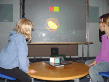
Figure 2.8 The Chromarium color cubes. Turning the two physical cubes on the table results in digital counterpart colors being mixed on the display, depending on which surface of the cubes are face up on the table
The MIT Media Lab has also developed a new generation of digital manipulatives—computationally-enhanced physical artifacts (see Figure 2.9). One form of manipulative—the Cricket—comprises a tiny microchip processor, that is capable of two-way infrared communication and controlling motors and sensors (Resnick et al., 1998). Crickets can be programmed and combined with physical artifacts, sensors, and motors to enable students to explore programming concepts in novel physical ways.
A framework that has been highly influential in informing the design of software applications is direct manipulation (Shneiderman, 1983). It proposes that digital objects be designed at the interface that can be interacted with in ways that are analogous to how physical objects in the physical world are manipulated. In so doing, direct manipulation interfaces are assumed to enable users to feel that they are directly controlling the digital objects represented by the computer. To enable this to happen, Shneiderman (1983) has outlined three core principles that need to be followed. These are:
- continuous representation of the objects and actions of interest;
- rapid reversible incremental actions with immediate feedback about the object of interest;
- physical actions and button pressing instead of issuing commands with complex syntax.
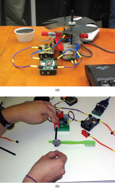
Figure 2.9 (a) Two Cricket components, roughly the size of a matchbox car. (b) Crickets can be programmed and combined with physical artifacts, sensors, and motors to create novel working physical models
According to these principles, an object on the screen remains visible while a user performs physical actions on it and any actions performed on it are immediately visible. For example, a user can move a file by dragging an icon that represents it from one part of the desktop to another. Shneiderman points out that there are many benefits of direct manipulation. These include:
- helping beginners learn basic functionality rapidly;
- enabling experienced users to work rapidly on a wide range of tasks;
- allowing infrequent users to remember how to carry out operations over time;
- preventing the need for error messages, except very rarely;
- showing users immediately how their actions are furthering their goals;
- reducing users' experiences of anxiety;
- helping users gain confidence and mastery and feel in control.
Apple Computer Inc. was one of the first computer companies to design an operating environment that used direct manipulation as its central mode of interaction. The highly successful Macintosh desktop demonstrates the main principles of direct manipulation (see Figure 2.10). One of their assumptions was that people expect their physical actions to have physical results, so when a drawing tool is used, a corresponding line should appear and when a file is placed in the trashcan, a corresponding sound or visual cue showing it has been successfully thrown away is used (Apple Computer Inc., 1987). A number of visual and auditory cues was used to provide such feedback, including various animations and sounds, e.g. shrinking and expanding icons accompanied with ‘shhhlicc’ and ‘crouik’ sounds to represent opening and closing of files). Much of the interaction design was geared towards providing clues to the user to know what to do, to feel comfortable, and to enjoy exploring the interface. More recent Mac interfaces follow the same principles, but have become more colorful, use more animation, and provide more detailed icons that have a 3D perspective.
Many applications have been developed based on some form of direct manipulation, e.g. wordprocessing packages, video games, learning tools, and image editing tools. However, while direct manipulation interfaces provide a very versatile mode of interaction they do have their drawbacks. In particular, not all tasks can be described by objects and not all actions can be undertaken directly. Some tasks are also better achieved through issuing commands. For example, consider how you edit an essay using a wordprocessor. Suppose you had referenced work by Ben Shneiderman but had spelled his name as Schneiderman, with an extra ‘c’ throughout the essay. How would you correct this error using a direct manipulation interface? You would need to read through your essay and manually select the ‘c’ in every ‘Schneiderman,’ highlighting and then deleting it. This would be very tedious and it would be easy to miss one or two. By contrast, this operation is relatively effortless and also likely to be more accurate when using a command-based interaction. All you need to do is instruct the wordprocessor to find every ‘Schneiderman’ and replace it with ‘Shneiderman.’ This can be done through selecting a menu option or using a combination of command keys and then typing the changes required into the dialog box that pops up.
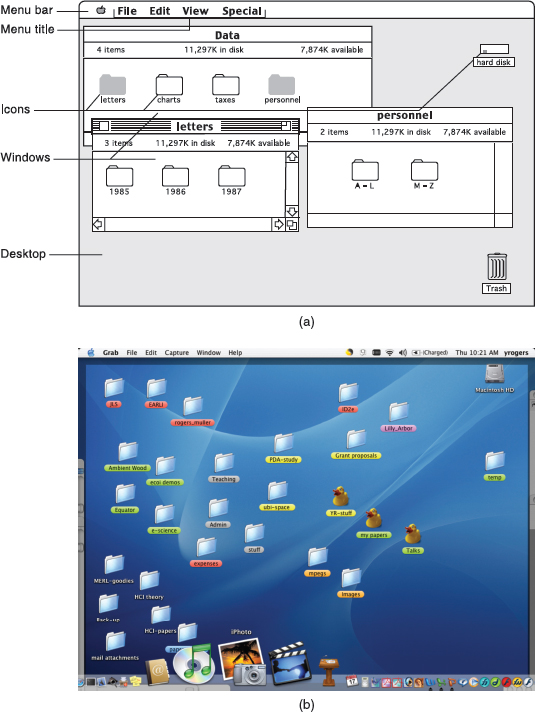
Figure 2.10 Two screen shots of (a) an original (1987) and (b) more recent (2005) Mac desktop interface. What are the main differences?
Exploring
This mode of interaction involves users moving through virtual or physical environments. For example, users can explore aspects of a virtual 3D environment, e.g. the interior of a building. Physical environments can also be embedded with sensing technologies that, when they detect the presence of someone or certain body movements, respond by triggering certain digital or physical events to occur. Similar to direct manipulation and direct manipulatives, the fundamental idea is to enable people to explore and interact with an environment, be it physical or digital, by exploiting their knowledge of how they move and navigate through existing spaces.
Many 3D virtual environments have been built that include virtual worlds designed for people to move between various rooms and buildings to learn, e.g. virtual universities, and fantasy worlds where people wander around different parts to socialize, e.g. virtual parties. A number of virtual landscapes depicting cities, parks, buildings, rooms, and datasets have also been built, both realistic and abstract, that enable users to fly over them and zoom in and out of different parts. For example, a team of computer scientists at University College London has built a number of city-scale environments, including the City of London (see Figure 2.11), that can be explored on a desktop machine or using a specially built CAVE system. A CAVE (Computer Automatic Virtual Environment) is designed to provide a sense of immersion through providing 3D video images and audio. When inside a CAVE, the user is presented with high-resolution stereo images projected in real time on its walls and the floor. When viewed through shutter glasses, the left/right stereo images are presented separately to the left and right eyes, respectively, producing the illusion of 3D objects appearing both within and beyond the walls of the CAVE. The images are presented with reference to the user's viewpoint, which is continuously updated. The user navigates through a virtual environment by moving his body, arms, and head in the CAVE.
Other virtual environments that have been built include worlds that are larger than life, enabling users to move around them, experiencing things that are normally impossible or invisible to the eye (Figure 2.12a); highly realistic representations of architectural designs, allowing clients and customers to imagine how they will use and move through planned buildings and public spaces (Figure 2.12b) and visualizations of complex datasets that scientists can virtually climb inside and experience (Figure 2.13).
A number of physical environments have been developed in which are embedded sensor technologies and other location-detection technologies. They are often called context-aware environments: the location and/or presence of people in the vicinity of a sensing device is detected and based on this, the environment decides which digital information to provide on a device, e.g. a PDA, or which action to perform, e.g. changing lights in a room, that is considered relevant or useful to the person at a particular time and place. For example, a number of electronic tourist guides have been developed that run on mobile devices, e.g. PDAs and cell phones equipped with GPS, that provide information about restaurants, historical buildings, and other places of interest as the tourist wanders near them in an unfamiliar city (Cheverst et al., 2000). Physically embedded environments have also been designed to extend how children learn. For example, the Ambient Wood project was designed as an outdoor learning experience where a physical woodland was wired to present various forms of digital information to children, as they moved around it (Rogers et al., 2005). Depending on which part of the woodland they passed by, e.g. a particular kind of tree, a bush, a hole, an image would occasionally pop up on a PDA they were carrying, or a sound was played via hidden speakers or heard through a special handheld audio device—the ambient horn (see Figure 2.14). The idea was to provide contextually-relevant digital information that would enhance the ‘usual’ physical experience available to children when exploring an outdoor world.
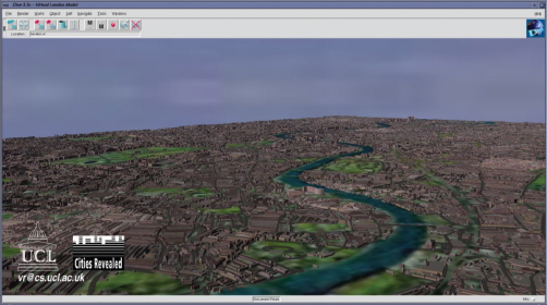
Figure 2.11 An example of a 3D virtual city

Figure 2.12 A CAVE that enables the user to stand near a 10-meter insect like a grasshopper, be swallowed and end up in its abdomen, and a life-like simulation of a newly designed train station that enables users to imagine what it would be like to walk through it
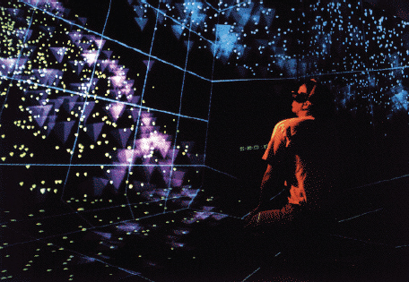
Figure 2.13 NCSA's CAVE being used by a scientist to move through 3D visualizations of their datasets
Another example of a context-aware physical environment is the smart home. This is a real house embedded with a complex network of sensors and audio/video recording devices, with the purpose of detecting and identifying various environmental parameters, e.g. temperature, human presence, and aspects of the occupant's behavior, e.g. the occupant's routines and deviations. The idea behind the design of smart homes is that through using the various data collected and/or monitored, contextually relevant forms of digital information can be provided to the occupants or others, e.g. caregivers, family members, at appropriate times in different parts of the house or other places. A few, much publicized, smart homes were built based on this philosophy, including the ‘Aware Home’ in the USA (Abowd et al., 2000), the ‘Ubiquitous Home’ in Japan (Yamazake, 2005), and the ‘Orange-at-Home’ in the UK (Harper, 2003). Living experiments were subsequently conducted to see how real families would respond and adapt to such a set-up, over a period of several months.

Figure 2.14 The Ambient Wood. Children (a) listening to ambient sounds and (b) viewing images that popped up as they walked past certain locations in the wired wood.
Online and video games often involve players moving through a virtual environment, e.g. chasing someone, running from someone, driving a vehicle through hazardous terrain, and manipulating objects, e.g. using swords, holding steering wheels, opening doors. Rich and highly realistic graphical interfaces are used, where gamers are represented graphically on screen as 3D realistic avatars that are moved and controlled via a joystick and/or pushing buttons on a console. In the early days of gaming, however, games developers were largely restricted to instruction-based types of interaction. For example, the ZORK game introduced in the early 1980s (Figure 2.15) required the players to move around the virtual environment by typing in text commands. To what extent do you think this affects the gaming experience? Do you think the early text-based games were as engaging and exciting as modern-day ones (see Figure 2.16)?

Figure 2.15 A game using a text-based instruction mode of interaction
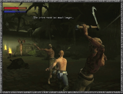
Figure 2.16 A 3D virtual game (Voodoo Island), involving an avatar-based mode of interaction
Comment
The early text-based games required the user to imagine aspects of the game and to remember a large number of text commands to enable them to move around and progress with the game. In this respect, the user experience can be viewed as less gripping and involve more mental effort than more recent video games. Drama and tension are added when games involve interacting with rich and realistic graphics, listening to accompanying stereo sounds, and seeing flashing text cues. Perhaps the main difference between the two gaming experiences is similar to that between reading a book on the sofa and watching a 3D movie in an IMAX theatre; both can be very engaging but in quite different ways.
Box 2.3: Which is Best—Agent, Context-Aware, Direct Manipulation, or Command-based Interactions?
A big debate in interaction design is concerned with how and who controls an interface. The different forms of interaction available vary in terms of how much control a user has and how much the computer has. At one end of the spectrum are (i) command-based and (ii) direct manipulation interfaces where the user is primarily in control of the interaction. At the other end are (i) agents, e.g. guides, wizards, companions, assistants, and (ii) context-aware environments where the system is largely in control, deciding what to do and making suggestions to the user.
Advocates of the agent approach, e.g. Nicholas Negroponte claim it can be much more versatile than direct manipulation or command-based interfaces, allowing users to do what they want to do through delegating the boring and time-consuming tasks to an agent. Negroponte uses the analogy of a well-trained English butler who answers the phone, tends to a person's needs, fends off callers, and tells ‘white lies’ if necessary on his master's behalf. Similarly, a digital butler is designed to read a user's email and flag the important ones, scout the web and newsgroups for interesting information, screen unwanted electronic intrusions, and so on. This approach assumes that people like to delegate work to others rather than directly interact with computers themselves.
Proponents of the context-aware approach argue that enabling the environment to monitor, recognize, and detect deviations in a person's behavior enables timely information to be provided that can be helpful and even critical at times, e.g. Abowd and Mynatt (2000). For example, elderly people's movements can be detected in the home and emergency or care services alerted if something untoward happens to them that might otherwise go unnoticed, e.g. they fall over and break a leg and are unable to get to a telephone.
The problem with delegating tasks to agents or leaving it to the environment to determine how to respond in a certain way is that it is very difficult to accurately predict all the things users want done, what is really happening to them, or the type of information they might want or find useful at a particular time. If the agents do the tasks incorrectly or the environment provides inappropriate information, frustration and anger will ensue. For example, a person may choose to take a rest in an unexpected area (on the carpet), which could be detected as a fall. Moreover, many users do not want to be constantly monitored, as it violates their sense of privacy, nor do they like to be told what to do by a computer system. Imagine your car deciding you should be driving more slowly because it is raining.
Advocates of the direct manipulation approach, e.g. Ben Shneiderman, suggest that it is preferable because it allows users to enjoy mastery and being in control. People like to know what is going on, be involved in the action, and have a sense of power over the computer—all of which direct manipulation interfaces support.
Advocates of the command-based approach go one step further, arguing that many tasks are best carried out at an abstract level, where the user is completely in control. Issuing abstract commands based on a carefully designed set of syntax and semantics is often a very efficient and elegant way of performing many operations. This is especially the case for repetitive operations, where the same action needs to be performed on multiple objects. Examples include sorting out files, deleting accumulated email messages, opening and closing files, and installing applications comprising multiple files—which when done by direct manipulation or through delegation can be inefficient or ambiguous.
To what extent do you need to be in control in your everyday and working life? Are you happy to let the computer monitor and decide what you need or do you prefer to tell the computer what you want doing?
Other Ways of Conceptualizing Activities
Besides the four core activities of instructing, conversing, manipulating, and exploring, there are many other ways of describing the specific domain and context-based activities users engage in, such as learning, working, socializing, browsing, writing, problem-solving, decision-making, and information-searching—to name but a few. We suggest that when considering how to design for these, it is useful to think about them in terms of the core interaction types, and in so doing, tease out the dilemmas and issues that might arise when using a particular interface.
Another way of classifying activity types is in terms of the context in which they are conducted. McCullough (2004) suggests 30 different kinds of situated activities, organized by: work, e.g. presenting to groups, documenting, home, e.g. recharging oneself, resting, in town, e.g. eating, drinking, and talking, and on the road, e.g. walking, driving. The purpose of his framework is to help designers be less ad hoc and more systematic when thinking about the usability of technology-modified places in the environment. Similarly, our set of core interaction types is intended to help designers evaluate the user activities involved in a user experience, and to contemplate the pros and cons of using different interface types to support them. Specific design and research concerns are outlined in Chapter 6 when considering interaction types in relation to interface types.
Box 2.4: From Controlling to Coupling: A New Way of Conceptualizing Interactions
The quest to develop new interaction techniques that go beyond the WIMP interface requires different conceptualizing for the nature of the interaction between person and environment. Rather than considering how to design a dialog for a user and a system, new frameworks are needed that can inform how to design a particular kind of interface and interaction style. For example, a different way of thinking is needed about what people can or might do in the physical world (and how they might react) when provided with contextually-relevant digital information at certain times, as a result of having their ‘presence,’ ‘states,’ and ‘levels’ being detected, e.g. emotional state, state of learning, information needs, when using sensing and tracking technologies. Instead of the user controlling an input device to interact with a computer, the ubiquitous environment has to detect the location of someone and determine what information, e.g. a sound, a message, an image, to present via a personal display, e.g. cell phone, PDA, or public display, e.g. a wall display, speakers.
One way of describing these different forms of interactions is in terms of the coupling between an action and an effect. Couplings can be viewed as tight or loose. A tight coupling is where an action, e.g. an arm gesture, causes an effect that is obvious and immediate to a person or persons present, e.g. a light switches on. A loose coupling is where the relationship between an action and effect is not obvious or immediate, e.g. a person walking past a hidden sensor in the environment may trigger a message to appear on someone else's cell phone. Neither person may perceive or understand how the event was caused. The decision of how tight to design the coupling will depend on the nature of the user experience. Loose couplings involving ambiguity are a powerful tactic to use when developing interactive games (Rogers and Muller, 2006). Tight couplings are considered necessary where feedback needs to be visible and immediate, such as being able to turn on the lights or taps and get instant light or water (see Chapter 1).
The notion of coupling is very different from the conceptualization of a user having a dialog with a system or directly manipulating an interface, where the user is very much in control of the interaction, with the system responding to the user's requests. A coupling may involve a one-off action–effect, e.g. switching on the light, or a series of interactions, e.g. interacting with a virtual character to find out more about its likes/dislikes. Accordingly, feedback may be designed to be immediate or delayed.
This different perspective on user interaction requires thinking differently about how to design for user experiences. New frameworks have begun to appear to provide guidance. For example, Benford et al.'s (2005) framework describes how to analyze the movements of sensing-based interfaces in terms of whether they are to be expected, sensed, and desired by the users while Bellotti et al.'s (2002) framework poses questions to designers as to how to compensate for the lack of GUI features in sensor-based interactions, e.g. obvious feedback and user control.
2.4 Theories, Models, and Frameworks
Other sources of inspiration and knowledge that are used to inform design and guide research are theories, models, and frameworks (Carroll, 2003). A theory is a well-substantiated explanation of some aspect of a phenomenon, for example, the theory of information processing that explains how the mind, or some aspect of it, is assumed to work. A model is a simplification of some aspect of human–computer interaction intended to make it easier for designers to predict and evaluate alternative designs. A framework is a set of interrelated concepts and/or a set of specific questions that is intended to inform a particular domain area, e.g. collaborative learning, online communities, or an analytic method, e.g. ethnographic studies.
Theories. Over the last 30 years, numerous theories have been imported into human–computer interaction, providing a means of analyzing and predicting the performance of users carrying out tasks for specific kinds of computer interfaces and systems. These have been primarily cognitive, social, and organizational in origin. For example, cognitive theories about human memory were used in the 1980s to determine what were the best ways of representing operations, given people's memory limitations. One of the main benefits of applying such theories in interaction design is to help identify factors, e.g. cognitive, social, and affective, relevant to the design and evaluation of interactive products. Some of the most influential theories in HCI, e.g. Fitt's Law, and others that are making their mark, e.g. distributed cognition, will be covered in later chapters.
Models. Models are typically abstracted from a theory coming from a contributing discipline, e.g. psychology, that can be directly applied to interaction design. For example, Norman (1988) developed a number of models of user interaction based on theories of cognitive processing arising out of cognitive science, that were intended to explain the way users interacted with interactive technologies. These include his cyclical seven stages of action model (see Chapter 3)—that describes how users move from their plans to executing physical actions they need to perform to achieve them, to evaluating the outcome of their actions with respect to their goals. Another highly influential model based on cognitive theory that made its mark in the 1980s was Card, Moran, and Newell's keystroke model (see Chapters 3 and 15). This was used by a number of researchers and designers as a predictive way of analyzing user performance for different interfaces to determine which would be the most effective. More recent models developed in interaction design are user models, that predict what information users want in their interactions, and models that characterize core components of the user experience, such as Norman's 2004 model of emotional design (Chapter 5).
Frameworks. A number of frameworks have been introduced in interaction design to help designers constrain and scope the user experience for which they are designing. In contrast to a model—which is a simplification of a phenomenon—a framework offers advice to designers as to what to design or look for. This can come in a variety of forms, including steps, questions, concepts, challenges, principles, and dimensions. Frameworks, like models, have traditionally been based on theories of human behavior, but they are increasingly being developed from the experiences of actual design practice and the findings arising from user studies.
There are many frameworks that have been published in the HCI/interaction design literatures, covering different aspects of the user experience and a diversity of application areas. For example, there are frameworks for helping designers think about how to conceptualize learning, working, socializing, fun, emotion, etc., and others that focus on how to design particular kinds of technologies to evoke certain responses, e.g. persuasive technologies and pleasurable products (see Chapter 5). A classic early example of a conceptual framework that has been highly influential in human–computer interaction is Norman's (1988) explication of the relationship between the design of a conceptual model and a user's understanding of it (see Figure 2.17). The framework depicts three interacting components: the designer, the user, and the system. Behind each of these are:
- The designer's model—the model the designer has of how the system should work.
- The system image—how the system actually works is portrayed to the user through the interface, manuals, help facilities, etc.
- The user's model—how the user understands how the system works.
The framework is simple but highly effective: it provides a powerful visualization, making explicit the relationship between how a system should function, how it is presented to the users, and how it is understood by the users. In an ideal world, users should be able to carry out their tasks in the way intended by the designer by interacting with the system image which makes it obvious what to do. If the system image does not make the designer's model clear to the users, it is likely that they will end up with an incorrect understanding of the system, which in turn will increase the chances of their using the system ineffectively and making errors. This has been found to happen often in the real world. By drawing attention to this potential discrepancy, designers can be made aware of the importance of trying to bridge the gap more effectively.

Figure 2.17 The designer's model, the user's model and the system image (Norman, 1988)
Theories, models, and frameworks are not mutually exclusive but overlap in their way of conceptualizing the problem and design space, varying in their level of rigor, abstraction, and purpose. Theories tend to be comprehensive, explaining human–computer interactions; models tend to simplify some aspect of human–computer interaction, providing a basis for designing and evaluating systems; frameworks tend to be prescriptive, providing designers with concepts, questions, and principles to consider when designing for a user experience.
Assignment
The aim of this assignment is for you to think about the appropriateness of different kinds of conceptual models that have been designed for similar physical and digital information artifacts.
- Compare the ways the following information artifacts are organized:
- a personal pocket-sized calendar/diary (one week to a page);
- a wall calendar (one month to a page, usually with a picture/photo);
- a wall planner (displaying the whole year).
What are the main concepts and metaphors that have been used for each (think about the way time is conceptualized for each of them)?
- Using Johnson and Henderson's (2002) framework, describe the conceptual models that underlie the design of:
- an electronic personal calendar found on a personal organizer or handheld computer;
- a shared calendar found on the web.
How do they differ and what are the main benefits compared with the equivalent physical artifacts? What new functionality has been provided? What interface metaphors have been used? Do you think new users will have problems understanding how these kinds of interactive calendars work? What aspects of the conceptual model might be confusing?
Summary
This chapter has explained the importance of understanding and conceptualizing a design space before trying to build anything. It has stressed throughout the need to be explicit about the claims and assumptions behind design decisions that are suggested. It described an approach to formulating a conceptual model and then provided two classic examples of very well designed conceptual models. It also discussed the pros and cons of using interface metaphors as part of the conceptual model. Finally, it considered other ways of conceptualizing interaction, in terms of interaction types, theories, models, and frameworks.
Key Points
- It is important to have a good understanding of the problem space, specifying what it is you are doing, why, and how it will support users in the way intended.
- A fundamental aspect of interaction design is to develop a conceptual model.
- A conceptual model is a high-level description of a product in terms of what users can do with it and the concepts they need to understand how to interact with it.
- Decisions about conceptual design should be made before commencing any physical design, e.g. choosing menus, icons, dialog boxes.
- Interface metaphors are commonly used as part of a conceptual model.
- Interaction types, e.g. conversing, instructing, provide a way of thinking about how best to support the activities users will be doing when using a product or service.
- Theories, models, and frameworks provide another way of framing and informing design and research.
Further Reading
JOHNSON, J. and HENDERSON, A. (2002) Conceptual Models: Begin by Designing What to Design. Interactions, January/February 2002, ACM Press, pp. 25–32. This paper explains what a conceptual model is and shows how to construct one and why it is necessary to do so. It is very cogently argued and shows how and where this design activity can be integrated into interaction design.
MCCULLOUGH, M. (2004) Digital Ground: Architecture, Pervasive Computing and Environmental Knowing. MIT Press. This book presents many new ideas, concepts, and frameworks for designing pervasive technologies. In particular, it discusses in depth the many new challenges confronting interaction designers and architects when working out how to embed information technology into the ambient social complexities of the physical world.
LAUREL, B. (ed.) (1990) The Art of Human Computer Design has a number of papers on conceptual models and interface metaphors. Two that are definitely worth reading are: Tom Erickson, “Working with interface metaphors” (pp. 65–74), which is a practical hands-on guide to designing interface metaphors (covered later in this book), and Ted Nelson's polemic, “The right way to think about software design” (pp. 229–234), which is a scathing attack on the use of interface metaphors.
JOHNSON, M. and LAKOFF, G. (1980) Metaphors We Live By. The University of Chicago Press. Those wanting to find out more about how metaphors are used in everyday conversations should take a look at this text.
There are many good articles on the topic of interface agents. A classic is:
LANIER, J. (1995) Agents of alienation. ACM Interactions, 2(3), 66–72. The Art of Human Computer Design also provides several thought-provoking articles, including one called “Interface agents: metaphors with character” by Brenda Laurel (pp. 355–366) and another called “Guides: characterizing the interface” by Tim Oren et al.(pp. 367–382).
BANNON, L. (1977) Problems in human–machine interaction and communication. Proc HCI'97, San Francisco. Bannon presents a critical review of the agent approach to interface design.
MIT'S MEDIA LAB. (www.media.mit.edu) is a good place to find out what are the latest research paradigms and technological innovations.
INTERVIEW: with Terry Winograd
Terry Winograd is a Professor of Computer Science at Stanford University and one of the founding faculty of a new Interdisciplinary Design Program at Stanford, known as the ‘d.school.’ He has done extensive research and writing on the design of human – computer interaction. His early research on natural language understanding by computers, was a milestone in artificial intelligence, and he has written two books and numerous articles on that topic. His book, Bringing Design to Software, brings together the perspectives of a number of leading researchers and designers.
YR: Tell me about your background and how you moved into interaction design.
TW: I got into interaction design through a couple of intermediate steps. I started out doing research in artificial intelligence. I became interested in how people interact with computers, in particular, when using ordinary language. It became clear after years of working on that, however, that the computer was a long way off from matching human abilities. Moreover, using natural language with a computer when it doesn't really understand you can be very frustrating and in fact a very bad way to interact with it. So, rather than trying to get the computer to imitate a person, I became interested in other ways of taking advantage of what computers can do well and what people can do well. That led me into the general field of HCI. As I began to look at what was going on in that field and to study it, it became clear that it was not the same as other areas of computer science. The key issues were about how the technology fits with what people could do and what they wanted to do. In contrast, most of computer science is really dominated by how the mechanisms operate.
I was very attracted to thinking more in the style of design disciplines, such as product design, urban design, architecture, and so on. I realized that there was an approach that you might call a design way, that puts the technical aspects into the background with respect to understanding the interaction. Through looking at these design disciplines, I realized that there was something unique about interaction design, which is that it has a dialogic temporal element. By this I mean a human dialog: not in the sense of using ordinary language, but in the sense of thinking about the sequence and the flow of interaction. So I think of interaction design as being about designing a space for people, where that space has to have a temporal flow. It has to have a dialog with the person.
YR: Could you tell me a bit more about what you think is involved in interaction design?
TW: One of the biggest influences is product design. I think that interaction design overlaps with it, because they both take a very strong user-oriented view. Both are concerned with finding a user group, understanding their needs, then using that understanding to come up with new ideas. They may be ones that the users don't even realize when you begin. It is then a matter of trying to translate who it is, what they are doing, and why they are doing it into possible innovations. In the case of product design it is products. In the case of interaction design it is the way that a system interacts with the person.
YR: What do you think are important inputs into the design process?
TW: One of the characteristics of design fields as opposed to traditional engineering fields is that there is much more dependence on case studies and examples than on formulas. Whereas an engineer knows how to calculate something, an architect or a designer is working in a tradition where there is a history over time of other things people have done. People have said that the secret of great design is to know what to steal and to know when some element or some way of doing things that worked before will be appropriate to your setting and then adapt it. Generally you can't apply it directly, but I think a big part of doing good design is experience and exposure. You have to have seen a lot of things in practice and understood what is good and bad about them, to then use these to inform your design.
YR: How do you see the relationship between studying interaction design and the practice of it? Is there a good dialog between research and practice?
TW: Academic study of interaction design is a tricky area because so much of it depends on a kind of tacit knowledge that comes through experience and exposure. It is not the kind of thing you can set down easily as, say, you can scientific formulas. A lot of design research tends to be methodological. It is not about the design per se but is more about how you go about doing design, in particular, knowing what are the appropriate steps to take and how you put them together.
YR: How do you see the field of interaction design taking on board the current explosion in new technologies—for example mobile, ubiquitous, infrared, and so on? Is it different, say, from 20 years ago when it was just about designing software applications to sit on the desktop?
TW: I think a real change in people's thinking has been to move from interface design to interaction design. This has been pushed by the fact that we do have all kinds of devices nowadays. Interface design used to mean graphical interfaces, which meant designing menus and other widgets. But now when you're talking about handheld devices, gesture interfaces, telephone interfaces and so on, it is clear that you can't focus just on the widgets. The widgets may be part of any one of these devices but the design thinking as a whole has to focus on the interaction.
YR: What advice would you give to a student coming into the field on what they should be learning and looking for?
TW: I think a student who wants to learn this field should think of it as a kind of dual process, that is what Donald Schön calls “reflection in action,” needing both the action and the reflection. It is important to have experience with trying to build things. That experience can be from outside work, projects, and courses where you are actually engaged in making something work. At the same time you need to be able to step back and look at it not as “What do I need to do next?” but from the perspective of what you are doing and how that fits into the larger picture. The courses we are developing for the d.school are all built around this approach. Students work on interdisciplinary projects that are unique to each course, but in all of them we maintain a central focus on being user-centered, developing ideas through iterative prototyping, and being mindful of the design process while engaging in it.
YR: Are there any classic case studies that stand out as good exemplars of interaction design?
TW: I still use the Xerox Star as an exemplar because so much of what we use today was there. When you go back to look at the Star, it seems very ordinary until you see it in the context of when it was first created. I also think some exemplars that are very interesting are ones that weren't commercial successes. For example, I use the PenPoint system that was developed for pen computers by Go. Again, they were thinking fresh. They set out to do something different and they were much more conscious of the design issues than somebody who was simply adapting the next version of something that already existed. PalmPilot is another good example, because they looked at the problem in a different way to make something work. Another interesting exemplar, which other people may not agree with, is Microsoft Bob—not because it was a successful program—because it wasn't—but because it was a first exploration of a certain style of interaction, using animated agents. You can see very clearly from these exemplars what design trade-offs the designers were making and why, and then you can look at the consequences.
YR: Finally, what are the biggest challenges facing people working in this area?
TW: I think one of the biggest challenges is what Pelle Ehn calls the dialectic between tradition and transcendence. That is, people work and live in certain ways already, and they understand how to adapt that within a small range, but they don't have an understanding or a feel for what it would mean to make a radical change, for example, to change their way of doing business on the Internet before it was around, or to change their way of writing from pen and paper when word processors weren't around. The designer needs to envision things that fill real needs for users, but which the users can't yet envision.
1 RFID stands for Radio Frequency Identification and is a method of remotely storing and retrieving data using tags that come in the form of stickers, disks, cards, etc., which can receive and respond to queries sent wirelessly from an RFID transceiver.