
Affective aspects
- 5.1 Introduction
- 5.2 What are affective aspects?
- 5.3 Expressive interfaces and positive emotions
- 5.4 Frustrating interfaces and negative emotions
- 5.5 Persuasive technologies
- 5.6 Anthropomorphism in interaction design
- 5.7 Interface agents, virtual pets, and interactive toys
- 5.8 Models of affective aspects
5.1 Introduction
An overarching goal of interaction design is to develop interactive systems that elicit positive responses from users, such as feeling at ease, being comfortable, and enjoying the experience of using them—be it a washing machine or a flight deck. Designers are also concerned with how to create interactive products that elicit specific kinds of emotional responses in users, such as motivating them to learn, play, be creative, or be social. There has also been much interest in designing websites and Internet applications that people can trust, that make them feel comfortable about divulging personal information or when making a purchase.
Taken together, we refer to this emerging area as the affective aspects of interaction design. In this chapter we look at how and why the design of interactive products causes certain kinds of emotional responses in users. We begin by looking in general at expressive interfaces, examining the role of an interface's appearance to users and how it affects usability. We then examine how interactive products elicit positive effects, e.g. pleasure, and negative responses, e.g. frustration. How technologies are being designed and used to persuade people to change their behavior and attitudes is then covered. Following this, we discuss the controversial topic of anthropomorphism and the implications of designing applications to have human-like qualities. We examine the range of physical and virtual characters that have gained popularity to motivate people to learn, buy, listen and consider how useful and appropriate they are. Finally, we present three models that have been proposed to explain the relationship between affect and user experience: (i) Norman's (2004) emotional design model, (ii) Jordan's (2000) pleasure model for product design, and (iii) McCarthy and Wright's (2004) technology as experience framework.
The main aims of this chapter are to:
- Explain what expressive interfaces are and the effects they can have on people.
- Outline the nature of user frustration and how to reduce it.
- Describe how technologies can be designed to change people's attitudes and behavior.
- Debate the pros and cons of applying anthropomorphism in interaction design.
- Describe the affective aspects used in interface agents and interactive physical toys.
- Present models and frameworks of affect that can be applied to interaction design.
- Enable you to critique the persuasive impact of an online agent on customers.
5.2 What are Affective Aspects?
In general, the term ‘affective’ refers to the generation of an emotional response. For example, when people are happy they smile. Affective behavior can also trigger an emotional response in others. So, for example, when someone smiles it can cause others to feel good and smile back. Emotional skills, especially the ability to express and recognize emotions, are central to human communication. Most of us are highly skilled at detecting when someone is angry, happy, sad, or bored by recognizing their facial expressions, way of speaking, and other body signals. We are also very good at knowing what emotions to express in a given situation. For example, when someone has just heard he has failed an exam we know it is not a good time to smile and be happy. Instead we try to empathize.
It has been suggested that computers be designed to recognize and express emotions in the same way humans do (Picard, 1998). The term coined for this approach is ‘affective computing.’ A long-standing area of research in artificial intelligence and artificial life has been the creation of intelligent robots and other computer-based systems that behave like humans and other creatures. One well-known project was MIT's COG, where a group of researchers attempted to build an artificial two-year-old. An offspring of COG was Kismet (Breazeal, 1999), which was designed to engage in meaningful social interactions with humans (see Figure 5.1). Rather than trying to get the system to show an emotion to a user, we consider how interactive systems can be designed to provoke an emotion within the user.
5.3 Expressive Interfaces and Positive Emotions
Expressive forms like emoticons, sounds, icons, and virtual agents have been used at the interface to (i) convey emotional states and/or (ii) elicit certain kinds of emotional responses in users, such as feeling at ease, comfort, and happiness. Icons and animations have been used to indicate the current state of a computer or a cell phone, notably when it is waking up or being rebooted. A classic from the 1980s and 1990s was the happy Mac icon that appeared on the screen of the Apple computer whenever the machine was booted (see Figure 5.2a). The smiling icon conveyed a sense of friendliness, inviting the user to feel at ease and even smile back. The appearance of the icon on the screen was also very reassuring to users, indicating that their computer was working correctly. This was especially true for situations where users had to reboot their computer after it had crashed, and where previous attempts to reboot had failed (usually indicated by a sad icon face—see Figure 5.2b). After 18 years, sadly, the happy Mac icon was laid to rest although the sad Mac icon now shows its face on an iPod if its software needs restoring (see Figure 5.2c). MacOS has since switched to the use of more abstract icons to indicate starting up and busy with a process, showing a swirling clock or a colorful beach ball.
Other ways of conveying the status of a system are through the use of:
- Dynamic icons, e.g. a recycle bin expanding when a file is placed in it.

Figure 5.1 Kismet the robot expressing (a) surprise and (b) disgust
- Animations, e.g. a bee flying across the screen indicating that the computer is doing something, such as checking files.
- Spoken messages, using various kinds of voices, telling the user what needs to be done.
- Various sonifications indicating actions and events, e.g. whoosh for window closing, schlook for a file being dragged, ding for new email arriving.
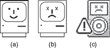
Figure 5.2 (a) Smiling and sad Apple icons for (b) the classic Mac and (c) the iPod.
One of the benefits of using expressive embellishments is that they provide reassuring feedback to the user that can be both informative and fun. They can, however, sometimes have the opposite effect on people, who find them intrusive, causing them at times to get annoyed and even angry. This is especially so for ‘cutesy’ looking ones. How enjoyable they are perceived to be varies considerably across cultures. In South Korea and Japan, for example, cute cartoon characters such as those depicted in Manga comics have huge cult followings. Moreover, their influence has become widespread in the design of websites, video games, cell phone skins, etc. These include the use of large-eyed creatures such as those used in Pokemon and Pikachu games, and bright colors and pastels (Marcus, 2002).
Users themselves have also been inventive in expressing their emotions at the computer interface. One well-known method is the use of emoticons. These are keyboard symbols that are combined in various ways to convey feelings and emotions by simulating facial expressions such as smiling, winking, and frowning on the screen. The meaning of an emoticon depends on the content of the message and where it is placed in the message. For example, a smiley face placed at the end of a message can mean that the sender is happy about a piece of news she has just written about. Alternatively, if it is placed at the end of a comment in the body of the message, it usually indicates that this comment is not intended to be taken seriously. Most emoticons are designed to be interpreted with the viewer's head tilted over to the left (a result of the way the symbols are represented on the screen). Some of the best-known ones are presented in Table 5.1. Nowadays, email and instant messaging users can select from ready-made ones, that are often 3D, very colorful, and cute. An example of a collection of smiley icons that a colleague of mine uses is shown in Figure 5.3.
The style of an interface, in terms of the shapes, fonts, colors, balance, white space, and graphical elements that are used and the way they are combined, can also influence its affectiveness. Use of imagery at the interface can result in more engaging and enjoyable experiences (Mullet and Sano, 1995). Until recently, however, the focus of HCI was primarily on usability, with scant attention being paid to the design of aesthetically pleasing interfaces. Empirical studies showing that the aesthetics of an interface can have a positive effect on people's perception of the system's usability (Tractinsky, 1997, 2000) have begun to change that, and the importance of aesthetics is gaining acceptance within the HCI community. When the ‘look and feel’ of an interface is pleasing, e.g. beautiful graphics, nice feel to the way the elements have been put together, well-designed fonts, elegant use of images and color, a good sense of balance, users are likely to be more tolerant, e.g. they may be prepared to wait a few more seconds for a website to download. Furthermore, good-looking interfaces are often more satisfying and pleasurable to use. A key concern, therefore, is to strike a balance between designing pleasurable and usable interfaces (Tractinsky et al., 2000).

Table 5.1 Some commonly used emoticons
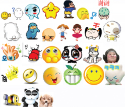
Figure 5.3 A collection of graphical smiley icons used by a colleague in MSN messenger
A question of style or stereotype? Figure 5.4 shows two differently designed dialog boxes. Describe how they differ in terms of style. Of the two, which one do you prefer? Why? Which one do you think Europeans would like the most and which Americans?
Comment
Aaron Marcus, a graphic designer, created the two designs in an attempt to provide appealing interfaces. Dialog box A was designed for white American females while dialog box B was designed for European adult male intellectuals. The rationale behind Marcus's ideas was that European adult male intellectuals like “suave prose, a restrained treatment of information density, and a classical approach to font selection, e.g. the use of serif type in axial symmetric layouts similar to those found in elegant bronze European building identification signs.” In contrast, white American females “prefer a more detailed presentation, curvilinear shapes and the absence of some of the more brutal terms … favored by male software engineers.”
Figure 5.4 Square and round dialog boxes designed by Aaron Marcus (1993): (a) dialog box designed for white American women; (b) dialog box designed for European adult male intellectuals
When the different interfaces were empirically tested by Teasley et al. (1994), their results did not support Marcus's assumptions. In particular, they found that the European dialog box was preferred by all and was considered most appropriate for all users. Moreover, the round dialog box designed for women was strongly disliked by everyone. The assumption that women like curvilinear features did not hold in this context. At the very least, displaying the font labels in a circular plane makes them more difficult to read than when presented in the conventionally accepted horizontal plane.
5.4 Frustrating Interfaces and Negative Emotions
In many situations, computer interfaces may inadvertently elicit negative emotional responses, such as anger and disgust. This typically happens when something that should be simple to use or set turns out to be complex. The most commonly cited examples are remote controls, VCRs, printers, digital alarm clocks, and digital TV systems (Rourke, 2005). Getting a printer to work with a new digital camera, trying to switch from watching a DVD to the TV, and changing the time on a digital alarm clock in a hotel can be very trying.
This does not mean that developers are unaware of such usability problems. Several methods have been devised to help the novice user get set up and become familiarized with a technology. However, these have sometimes backfired, since the design solution itself has ironically become a source of annoyance and frustration. For example, one technique that was popularized in the 1990s was the use of friendly agents at the interface. The assumption was that novices would feel more at ease with a ‘companion’ and would be encouraged to try things out, after listening, watching, following, and interacting with it. Microsoft pioneered a class of agent-based software, Bob, aimed at new computer users (many of whom were viewed as computer-phobic). The agents were presented as friendly characters, including a pet dog and a cute bunny. An underlying assumption was that having these kinds of agents on the screen would make users feel more comfortable with using the software. An interface metaphor of a warm, cozy living room, replete with fire and furniture, was also provided (see Figure 5.5)—again intended to convey a comfortable feeling.
However, Bob never became a commercial product. Why do you think not?
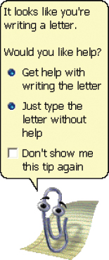
Contrary to the designer's expectations, many people did not like the idea of Bob at all, finding the interface too cute and childish. However, Microsoft did not give up on the idea of making their interfaces more friendly and developed other kinds of agents, including the infamous ‘Clippy’ (a paper clip that has human-like qualities), as part of their Windows 98 operating environment.1 Clippy typically appeared at the bottom of a user's screen whenever the system ‘thought’ the user needed help carrying out a particular task (see Figure 5.6). It, too, was depicted as a cartoon character, with a warm personality. This time, Clippy was released as a commercial product but it was not a success. Many Microsoft users found it very trying and intrusive, distracting them from their work. When it was finally retired, numerous websites posted jokes and witty comments, celebrating its demise.

Figure 5.5 ‘At home with Bob’ software developed for Windows 95. Although now defunct it has been resurrected affectionately to run on a Virtual PC platform
Interfaces, if designed poorly, can make people look stupid, feel insulted or threatened. The effect can be to make them annoyed to the point of losing their temper. There are many reasons why such emotional responses occur:
- When an application doesn't work properly or crashes.
- When a system doesn't do what the user wants it to do.
- When a user's expectations are not met.
- When a system does not provide sufficient information to let the user know what to do.
- When error messages pop up that are vague or obtuse.
- When the appearance of an interface is too noisy, garish, gimmicky, or patronizing.
- When a system requires users to carry out too many steps to perform a task, only to discover a mistake was made somewhere along the line and they need to start all over again.
Activity 5.2
Provide specific examples for each of the above categories from your own experience, when you have become frustrated with an interactive device, e.g. phone, VCR, vending machine, printer, digital camera, computer. In doing this, write down any further types of frustration that come to mind. Then prioritize these in terms of how annoying they are. Which are the main culprits?
Comment
In the text below we provide examples of common frustrations experienced when using computer systems. The most egregious include unhelpful error messages and excessive housekeeping tasks. You no doubt came up with many more.
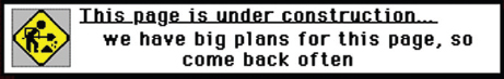
Figure 5.7 Men at work sign for website ‘under construction.’
Often user frustration is a result of bad design, no design, inadvertent design, or ill-thought-out design. It is rarely caused deliberately. However, the impact of poor design on users can be quite drastic and make them abandon the application or tool.
1. Gimmicks
Frustration can happen when clicking on a link to a website only to discover that it is still ‘under construction.’ It can be even more annoying when the website displays a road-sign icon of ‘men at work’ or some other jokey sign (see Figure 5.7). Although the website owner may think such signs amusing, it merely increases the viewer's frustration, having made the effort to go to the website only to be told that it is incomplete.
2. Error messages
Error messages have a long history in computer interface design, and are notorious for their incomprehensibility. For example, Nielsen (1993) describes an early system that was developed, allowing only for one line of error messages. Whenever the error message was too long, the system truncated it to fit on the line, which the users would spend a long time trying to decipher. The full message was available only by pressing the PF1 (help key) function key. While this may have seemed like a natural design solution to the developers, it was not at all obvious to the users. A much better design solution would have been to use the one line of the screen to indicate how to find more information about the current error—“press the PF1 key for explanation”.
Threatening error messages can also cause users to get frustrated (see Figure 5.8). Rather than helping them, they can make them panic, especially if subsequently given only two chances to rectify the situation, as is often the case after typing in a password incorrectly. Is it really necessary to use bold red with an exclamation mark? Would it not be more pleasant if the message suggested that the user try again?
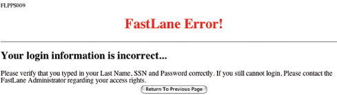
Figure 5.8 The error message that the National Science Foundation (NSF) Fastlane website posts up on the web if a user types in his or her personal details for accessing the protected website incorrectly
Box 5.1: Main Guidelines on How to Design Good Error Messages
Ideally, error messages should be treated as how to fix it messages. Instead of explicating what has happened, they should state the cause of the problem and what the user needs to do to fix it. Shneiderman (1998) has developed a detailed set of guidelines on how to develop helpful messages that are easy to read and understand. Below are some of the main recommendations.
- Rather than condemn users, messages should be courteous, indicating what users need to do to set things right.
- Avoid using terms like FATAL, ERROR, INVALID, BAD, and ILLEGAL.
- Avoid long code numbers and uppercase letters.
- Audio warnings should be under the user's control, since they can cause much embarrassment.
- Messages should be precise rather than vague.
- Messages should provide a help icon or command to allow users to get context-sensitive help.
- Messages should be provided at multiple levels, so that short messages can be supplemented with longer explanations. (Adapted from Shneiderman, 1998)
Activity 5.3
Below are some common error messages expressed in harsh computer jargon that can be quite off-putting. Rewrite them in more usable, useful, and friendly language that would help users to understand the cause of the problem and how to fix it. For each message, imagine a specific context where such a problem might occur.
SYNTAX ERROR
INVALID FILENAME
INVALID DATA
APPLICATION ZETA HAS UNEXPECTEDLY QUIT DUE TO A TYPE 4 ERROR DRIVE ERROR: ABORT, RETRY OR FAIL?
Comment
How specific the given advice can be will depend on the kind of system involved. Here are suggestions for hypothetical systems.
SYNTAX ERROR—There is a problem with the way you have typed the command. Check for typos.
INVALID FILENAME—Choose another filename that uses only 20 characters or less and is lowercase without any spaces.
INVALID DATA—There is a problem with the data you have entered. Try again, checking that no decimal points are used.
APPLICATION ZETA HAS UNEXPECTEDLY QUIT DUE TO A TYPE 4 ERROR—The application you were working on crashed because of an internal memory problem. Try rebooting and increasing the amount of memory allocated to the application.
DRIVE ERROR: ABORT, RETRY OR FAIL?—There is a problem with reading your disk. Try inserting it again.
Waiting
Websites that take forever to download can be frustrating, especially those that have to load Flash programs. Showing an icon whirring around and the word ‘loading’ with a slow percentage bar increasing on the splash page can be off-putting, unless the user expects or knows that something good is going to appear. Links that hang and eventually do not load can also be very annoying.
Upgrading Software
Another common frustration is upgrading a piece of software. Users now have to go through this housekeeping task on a regular basis, especially if they run a number of applications. More often than not it is time-consuming, requiring the user to do a range of things, such as resetting preferences, sorting out extensions, checking other configurations, and learning new ways of doing things. Often, problems can develop that are not detected until later, when a user tries an operation that worked fine before but mysteriously now fails. A common problem is that settings get lost or do not copy over properly during the upgrade. To add to the frustration, users may also discover that several of their well-learned procedures for carrying out tasks have been substantially changed in the upgrade.
Appearance
People are often frustrated by:
- Websites that are overloaded with text and graphics, making it difficult to find the information desired and slow to access.
- Flashing animations, especially flashing banner ads and pop-up ads, which are very distracting.
- The over-use of sound effects and music, especially when selecting options, carrying out actions, running tutorials, or watching website demos.
- ‘Featuritis’—an excessive number of operations, such as the array of buttons on remote controls.
- Childish designs that keep popping up on the screen, such as certain kinds of helper agents.
- Poorly laid out keyboards, pads, control panels, and other input devices that cause users to persistently press the wrong keys or buttons.
5.4.1 Dealing with User Frustration
One way of coping with computer-induced frustration is to vent. For example, a typical response to seeing the cursor freeze on the screen is repeatedly to hit the keys on the keyboard. Another way is to flame. When upset or annoyed by a piece of news or something in an email message, people may overreact and respond by writing things in email that they wouldn't dream of saying to someone face-to-face. They often use keyboard symbols to emphasize their anger or frustration, e.g. exclamation marks (!!!!), capital letters (WHY DID YOU DO THAT?), and repeated question marks (??????) that can be quite offensive to those on the receiving end. While such venting behavior can make the user feel temporarily less frustrated, it can be very unproductive and can annoy the recipients. Anyone who has received a flame knows just how unpleasant it can be.
Information that has been designed into the interface to help users carry out tasks includes tips, handy hints, and contextualized advice. Like error messages, this kind of help information needs to be designed to guide users on what to do next when they get stuck and it is not obvious from the interface what to do. The signaling used at the interface to indicate that such online help is available also needs careful consideration. A cartoon-based agent with a catchy tune may seem friendly and helpful the first time round, but can quickly become annoying. A help icon or command that is activated by the users themselves when they want help is often preferable.
Dilemma: Should computers say they're sorry?
A provocative idea is that computers should apologize when they make a mistake. Reeves and Naas (1996), for example, argue that they should be polite and courteous in the same way as people are to one another. While apologizing is normal social etiquette in human behavior, especially when someone makes a mistake, would you agree that computers should be made to behave in the same way? Would users be as forgiving of computers as they are of one another? For example, what would most users think if, after a system had crashed, it came up with a spoken or written apology such as, “I'm really sorry I crashed. I'll try not to do it again”? Would they think that the computer was being sincere? Would the apology make them forgive the computer in the way they forgive other people, after receiving such an apology? Or would it have no effect at all? Worse still, would users perceive such messages as vacuous statements and regard them simply as condescending, thereby increasing their level of frustration? How else might systems communicate with users when they have committed an error?
5.5 Persuasive Technologies
A diversity of technologies is increasingly being used to draw people's attention to certain kinds of information in an attempt to change what they do or think. Pop-up ads, warning messages, reminders, prompts, personalized messages, and recommendations are some of the methods that are being deployed on computer screens. Fogg (2003) has labeled this phenomenon ‘persuasive technology’; interactive computing systems are deliberately designed to change people's attitudes and behaviors. Traditionally, media such as magazines, newspapers, pamphlets, radio, and TV have been used to persuade people to join a good cause, give up a bad habit, donate money, or buy a product. For example, a picture of a starving child with bulging eyes staring out at the reader on the front of a newspaper is commonly used by charities. The effect is to pull at the readers' heartstrings, inducing feelings of guilt and, in so doing, spur them on to writing a cheque.
More recently, interactive techniques have been used on the web to entice, cajole, and persuade people to do something they might not have otherwise done. Successful examples include Amazon's 1-click mechanism (see Chapter 1) that makes it so easy and tempting to buy something at their online store, and recommender systems that suggest specific books, hotels, restaurants, etc. a reader might want to try based on their previous purchases, choices, and taste. Splash pages to online shopping sites and color images of gorgeous-looking beach and mountain scenes on travel sites are designed to lure people into making impulse purchases.
In addition to using interactive technologies as a more targeted and personalized form of advertising, Fogg suggests they can be used to change people's behaviors in non-commercial domains, such as safety, preventative healthcare, fitness, personal relationships, and learning. Here, the emphasis is on changing habits or doing something that will improve an individual's well-being through monitoring his or her behavior. For example, Nintendo's Pocket Pikachu (see Figure 5.9) with pedometer attached is designed to motivate children into being more physically active on a consistent basis. The owner of the digital pet that ‘lives’ in the device is required to walk, run, or jump each day to keep it alive. If the owner does not exercise for a week the virtual pet becomes unhappy and eventually dies. This can be a powerful means of persuasion, given that children often become emotionally attached to their virtual pets, especially when they start to care for them.

Figure 5.9 Pokemon Pikachu: a virtual pet toy with embedded pedometer
Similarly, the WaterBot system was developed using a special monitoring and feedback device, but for adults as a way of reducing their usage of water in their homes (Arroyo et al., (2005). There is much evidence to suggest that people are wasteful with water, often leaving the tap running continuously for long periods of time while cleaning their teeth or washing. The research team thought that the use of monitoring technology could help persuade householders to change their behavior to be more conservative in their water usage. To this end, they used the theory of positive reinforcement to inform their design, which states that activities are likely to be repeated if some kind of reward is given occasionally and randomly (similar to the reward system used in slot machines). A sensor-based system was developed where positive auditory messages and chimes were sounded when the tap was turned off. The water was also lit with a random pattern of color as a reward for consistent water-saving behavior (see Figure 5.10). Two illuminated bar graphs were also presented alongside the tap, showing how much water a person had used relative to others in the household. Here, the idea was to encourage peer pressure and for the members of the household to talk to each other about their water usage. Informal feedback of the prototype system in a small number of people's homes suggested that the most effective method of persuasion was the constantly changing bar graph. It drew people's attention to the tap, leading them to make quick comparisons between their's and the others' water consumption. The rewards of chimes and colored water had less impact, especially as their novelty wore off.
A key question is whether the use of novel forms of interactive technologies, e.g. the combination of sensors and dynamically updated information, that monitor, nag, or send personalized messages intermittently to a person are more effective at changing a person's behavior than non-interactive methods, such as the placement of warning signs, labels, or adverts in prominent positions.

Figure 5.10 The Waterbot monitoring system showing a continuous visual reminder of a user's water consumption relative to others in the household and illuminated water as a form of reward for using less water
Activity 5.4
Which method is more persuasive for giving up smoking?
There are numerous methods, including hypnosis, that have been developed to help people give up smoking. Many self-help books are also available. Several governments now require tobacco companies to place large and threatening messages on all of their cigarette packs as a way of warning against the dangers of smoking and, in so doing, encourage smokers to give up (see Figure 5.11b). Another method uses a simple monitoring device attached to the top of a pack of cigarettes that counts how many cigarettes someone smokes, providing feedback that will make the smoker more aware of just how many he or she really smokes (smokers will often deceive themselves as to how many cigarettes they actually smoke each day), which in turn, may help them reduce the number they smoke (see Figure 5.11a). Do you think this self-monitoring method is more effective than the use of the ‘smoking kills’ warning messages and, if so, why?
Comment
When the health warning messages were first introduced they appeared to have a significant shock effect on smokers—especially the guilt-inducing ones which mentioned that smoking can damage a baby during pregnancy and harm the health of those around the smoker. However, the impact can wear off for addicted smokers, who know only too well that it is bad for their health. The counter may prove to be a more effective method in the long run as it dynamically changes in response to the user's behavior, increasing in number whenever a person takes a cigarette from a pack. The accumulating total over a day or week may be sufficiently frightening that it triggers a smoker into deciding to give up.
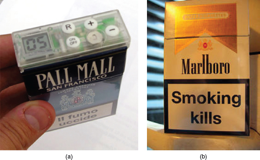
Figure 5.11 (a) A cigarette counter that lights up an LCD display showing the number of cigarettes a person smokes each day. The idea is that people will become aware of how much they really are smoking, which will lead them to take control and reduce the number they smoke. (b) The kind of shocking label required by the British government on all cigarette boxes
Box 5.2: The darker side: deceptive technology
Technology is increasingly being used to deceive people into parting with their personal details that allow Internet fraudsters to access their bank accounts and draw money from them. Authentic-looking letters, appearing to be sent from eBay, PayPal, and various leading banks, are spammed across the world, ending up in people's email boxes with messages such as “During our regular verification of accounts, we couldn't verify your information. Please click here to update and verify your information.” Given that many people have an account with one of these corporations, there is a chance that they will be misled and unwittingly follow what is being asked of them, only to discover a few days later they are several thousand dollars worse off. Similarly, letters from supposedly super-rich individuals in far-away countries, offering a share of their assets if the recipient of the email provides them with his bank details, have been persistently spammed worldwide. While many people are becoming increasingly wary of what are known as ‘phishing’ scams, there are still many vulnerable people who are gullible to such tactics. (Note: The term ‘phishing’ is a play on the term ‘fishing’ that refers to the sophisticated way of luring users' financial information and passwords). Moreover, Internet fraudsters are becoming smarter and are always changing their tactics. While the art of deception is centuries old, the increasing, pervasive, and often ingenious use of the web to trick people into divulging personal information may have catastrophic effects on society.
5.6 Anthropomorphism in Interaction Design
A controversial debate in interaction design is whether to exploit anthropomorphism (the propensity people have to attribute human qualities to objects). It is something that people do naturally in their everyday lives and is commonly exploited in the design of technologies, e.g. the creation of human-like animals and plants in cartoon films, the design of toys that have human qualities. The approach is also becoming more widespread in interaction design, through the introduction of agents and interactive toys.
It is well known that people readily attribute human qualities to their pets and their cars, and, conversely, are willing to accept human attributes that have been assigned by others to cartoon characters, robots, and toys. Advertisers are well aware of this phenomenon and often create human-like characters out of inanimate objects to promote their products. For example, breakfast cereals, butter, and fruit drinks have all been transmogrified into characters with human qualities (they move, talk, have personalities, and show emotions), enticing the viewer to buy them. Children are especially susceptible to this kind of ‘magic,’ as witnessed by their love of cartoons, where all manner of inanimate objects are brought to life with human-like qualities.
The finding that people, especially children, have a propensity to accept and enjoy objects that have been given human-like qualities has led many designers to capitalize on it, most notably in the design of human – computer dialogs modeled on how humans talk to each other. A range of animated screen characters, such as agents, friends, advisors, and virtual pets, have been developed.
Anthropomorphism has also been used in the development of cuddly toys that are embedded with software. Early commercial products like ActiMates™ were designed to encourage children to learn through playing with the cuddly toys. For example, Barney (a cuddly bear ActiMate) attempted to motivate play in children by using human-based speech and movement (Strommen, 1998). The toys were programmed to react to the child and make comments while watching TV together or working together on a computer-based task. In particular, Barney was programmed to congratulate the child whenever she produced a right answer and also to react to the content on screen with appropriate emotions, e.g. cheering at good news and expressing concern at bad news. More recently, interactive dolls, such as those produced by Playmates Toys, have been designed to talk, sense, and understand the world around them, using sensor-based technologies, speech recognition, and various mechanical protractors embedded in their bodies. For example, Amazing Amanda can exhibit a number of facial expressions to convey her feelings. If she is offered something to eat she does not want, e.g. a piece of plastic pizza embedded with an RFID tag that when placed near her mouth is read by a tag reader hidden in her neck, she will contort her face and say “I don't want that” (Figure 5.12).
An underlying argument in favor of the anthropomorphic approach is that furnishing interactive systems with personalities and other human-like attributes makes them more enjoyable and fun to interact with. It is also assumed that they can motivate people to carry out the tasks suggested, e.g. purchasing goods, more strongly than if they are presented in cold, abstract computer language. Being addressed in first person, e.g. “Hello Chris! Nice to see you again. Welcome back. Now what were we doing last time? Oh yes, exercise 5. Let's start again”, is much more appealing than being addressed in the impersonal third person (“User 24, commence exercise 5”), especially for children. It can make them feel more at ease and reduce their anxiety. Similarly, interacting with screen characters like tutors and wizards can be much more pleasant than interacting with a cold dialog box or blinking cursor on a blank screen. Typing a question in plain English, using a search engine like Ask (which was based on the well-known fictitious butler Jeeves, who has now been retired), is more natural and personable than thinking up a set of keywords, as required by other search engines.

Figure 5.12 Playmates Toys interactive doll called Amazing Amanda
However, there have been many criticisms of the anthropomorphic approach. Shneiderman (1998), one of the best known critics, has written at length about the problems of attributing human qualities to computer systems. His central argument is that anthropomorphic interfaces, especially those that use first-person dialog and screen characters, are downright deceptive. An unpleasant side-effect is that they can make people feel anxious, resulting in them feeling inferior or stupid. A screen tutor that wags its finger at the user and says, “Now, Chris, that's not right! Try again. You can do better” is likely to feel more offensive than a system dialog box saying, “Incorrect. Try again.”
Anthropomorphism can also lead people into a false sense of belief, enticing them to confide in agents called ‘software bots’ that reside in chatrooms and other electronic spaces, pretending to be conversant human beings. Furthermore, children are no longer required to use their imagination when acting out real-life scenarios, e.g. playing doctors and nurses, but can play with dolls that control the play, telling them their wants and dislikes. By far the most common complaint against computers pretending to have human qualities, however, is that people find them very annoying. Once users discover that a system cannot really converse like a human or does not possess real human qualities (like having a personality or being sincere), they become quickly disillusioned and subsequently distrust it. E-commerce sites that pretend to be caring by presenting an assortment of virtual assistants, receptionists, and other such helpers are seen for what they really are—artificial. Children and adults alike also are quickly bored and annoyed with applications that are fronted by artificial screen characters, e.g. tutor wizards, and simply ignore whatever they might suggest.
A number of studies have investigated people's reactions and responses to computers that have been designed to be more human-like. A body of work reported by Reeves and Nass (1996) has identified several benefits of the anthropomorphic approach. They found that computers that were designed to flatter and praise users when they did something right had a positive impact on how they felt about themselves. For example, an educational program was designed to say, “Your question makes an interesting and useful distinction. Great job!” after a user had contributed a new question to it. Students enjoyed the experience and were more willing to continue working with the computer than were other students who were not praised by the computer for doing the same things. In another study, Walker et al. (1994) compared people's responses to a talking-face display and an equivalent text-only one and found that people spent more time with the former than the latter. When given a questionnaire to fill in, the face-display group made fewer mistakes and wrote down more comments. In a follow-up study, Sproull et al. (1996) again found that users reacted quite differently to the two interfaces, with users presenting themselves in a more positive light to the talking-face display and generally interacting with it more.
Sproull et al.'s studies also revealed, however, that the talking-face display made some users feel disconcerted or displeased. The choice of a stern talking face may have been a large contributing factor. Perhaps a different kind of response would have been elicited if a friendlier smiling face had been used. Nevertheless, a number of other studies have shown that increasing the ‘humanness’ of an interface is counterproductive. People can be misled into believing that a computer is like a human, with human levels of intelligence. For example, one study investigating users' responses to interacting with agents at the interface represented as human guides found that the users expected the agents to be more human-like than they actually were. In particular, they expected the agents to have personality, emotion, and motivation—even though the guides were portrayed on the screen as simple black and white static icons. Furthermore, the users became disappointed when they discovered the agents did not have any of these characteristics (Oren et al., 1990). In another study comparing an anthropomorphic interface that spoke in the first person and was highly personable (“Hi there, John! It's nice to meet you, I see you are ready now”) with a mechanistic one that spoke in the third person (“Press the ENTER key to begin session”), the former was rated by college students as less honest and it made them feel less responsible for their actions (Quintanar et al., 1982).
5.7 Interface Agents, Virtual Pets, and Interactive Toys
As mentioned in the previous section, a new genre of cartoon and life-like characters has begun appearing on our computer screens—as agents to help us search the web, as e-commerce assistants that give us information about products, as characters in video games, as learning companions or instructors in educational programs, and many more. The best known are videogame stars such as Lara Croft and Super Mario and virtual pets such as Neopets. Other kinds include virtual popstars, virtual talk-show hosts, virtual bartenders, virtual shop assistants, and virtual newscasters (see Figure 5.13). Interactive toy pets, e.g. Aibo, and other artificial anthropomorphized characters, e.g. Pokemon, Creatures, that are intended to be cared for and played with by their owners have also proved highly popular.
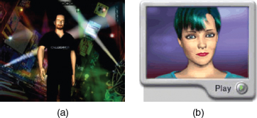
Figure 5.13 Examples of (a) an early virtual popstar E-cyas and (b) the first virtual newscaster, Ananova
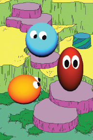
One of the earliest groups of agents to be designed that explored the relationship between emotion and behavior was the Woggles (Bates, 1994). The agents were designed to appear on the screen and play games with one another, such as hide and seek. They appeared as different colored bouncy balls with cute facial expressions (see Figure 5.14). Users could change their moods, e.g. from happy to sad, by moving various sliders, which in turn changed their movement, e.g. they bounced less,, facial expression, e.g. they no longer smiled, and how willing they were to play with the other Woggles.
Bruce Blumberg and his group at MIT develop autonomous animated creatures that live in virtual 3D environments. The creatures are autonomous in that they decide what to do, based on what they can sense of the 3D world, and how they feel, based on their internal states. One of the earliest creatures to be developed was a pet called Silas T. Dog (Blumberg, 1996). The 3D dog looks like a cartoon creature but is designed to behave like a real dog (see Figure 5.15a). For example, he can walk, run, sit, wag his tail, bark, cock his leg, chase sticks, and rub his head on people when he is happy. He navigates through his world by using his ‘nose’ and synthetic vision. He also has been programmed with various internal goals and needs that he tries to satisfy, including wanting to play and have company. He responds to events in the environment; for example, he becomes aggressive if a hamster enters his patch.

Figure 5.15 (a) Silas the virtual dog and (b) with human owner
A person can interact with Silas by making various gestures that are detected by a computer-vision system. For example, the person can pretend to throw a stick, which is recognized as an action that Silas responds to. An image of the person is also projected onto a large screen so that he can be seen in relation to Silas (see Figure 5.15b). Depending on his mood, Silas will run after the stick and return it, e.g. when he is happy and playful, or cower and refuse to fetch it, e.g. when he is hungry or sad. Who needs a real pet dog anymore?
Another MIT researcher, Stefan Marti, has developed a physically embodied pet, such as a cuddly squirrel or rabbit cell phone (see Figure 5.16). It is programmed to manage a person's phone calls by answering calls, taking messages, and alerting the owner when it decides it is important enough for him or her to pick up the phone. When it determines that the call is important enough for its owner to answer it waves its arms around and moves its body with a soft shuffling sound—the effect is intended to be more pleasant and less intrusive than that of the harsh ringing tone emitted by a cell or landline phone.

Figure 5.16 Cellular squirrel alert and cellular rabbit sleeping
The pet decides whether to alert its owner by listening to the conversation around it, and trying to pick up key subject words that are relevant to what the caller wants to talk about. The number of the caller and the tone of the caller's voice are also evaluated. When the pet starts to move the owner can squeeze one of its upper paws to accept the call that accesses a Bluetooth speakerphone function, or can squeeze a lower paw to send the call to voicemail.
An underlying assumption is that having a cuddly pet screen and signal calls will be less disruptive to ongoing meetings. A study comparing people's responses to being interrupted by the squirrel versus a regular landline ringing, showed that they rated the squirrel as being more friendly, fun, and humorous (Marti and Schmandt, 2005). Most of all they found it cute.
Much effort has gone into designing interface agents to be life-like, exhibiting realistic human movements, like walking and running, and having distinct personalities and traits. The design of the characters' appearance, their facial expressions, and how their lips move when talking are all considered important interface design concerns. This has included modeling various conversational mechanisms such as:
- Recognizing and responding to verbal and non-verbal input.
- Generating verbal and non-verbal output.
- Coping with breakdowns, turn-taking, and other conversational mechanisms.
- Giving signals that indicate the state of the conversation as well as contributing new suggestions for the dialog (Cassell, 2000, p. 72).
An example is Rea, who was developed as an embodied real-estate agent with a human-like body that she uses in human-like ways during a conversation (Cassell, 2000). In particular, she uses eye gaze, body posture, hand gestures, and facial expressions while talking (see Figure 5.17). Although the dialog appears relatively simple, it involves a sophisticated underlying set of conversational mechanisms and gesture-recognition techniques. An example of a conversation with Rea is:

Figure 5.17 (a) Rea the life-like realtor and (b) having a conversation with a human
Mike approaches the screen and Rea turns to face him and says:
“Hello. How can I help you?”
Mike: “I'm looking to buy a place near MIT.”
Rea nods, indicating she is following.
Rea: “I have a house to show you” (picture of a house appears on the screen).
“It is in Somerville.”
Mike: “Tell me about it.”
Rea looks up and away while she plans what to say.
Rea makes an expansive gesture with her hands.
Mike brings his hands up as if to speak, so Rea does not continue, waiting for him to speak.
Mike:“Tell me more about it.”
Rea: “Sure thing. It has a nice garden …”
As you can see, the gestures and responses from Rea are human-like although her comments and suggestions are rather simple for an agent trying to sell a house to a customer.
5.8 Models of Affective Aspects
In Chapters 3 and 4 we described how theories of cognition and communication have been applied to interaction design. Theories of emotion and pleasure are also beginning to appear in interaction design to explain people's responses to and uses of interactive products. Most prominent is Don Norman's (2004), who has shifted his attention from the psychology of design to considering more centrally what he calls ‘emotional design.’ He argues that our emotional attachment and involvement with products is as important as how easy we find them to use. If we find the look and feel of a product pleasing, we are likely to have a more positive experience.
(i) Emotional Design Model
Norman and his colleagues, Andrew Ortony and William Revelle (2004), have proposed a model of emotion that explains how emotion and behavior are determined by different levels of the brain. At the lowest level are parts of the brain that are pre-wired to automatically respond to events happening in the physical world. This is called the visceral level. At the next level are the brain processes that control our everyday behavior. This is called the behavioral level. At the highest level are brain processes that contemplate. This is called the reflective level (see Figure 5.18).
The visceral level responds rapidly, making judgments about what is good or bad, safe or dangerous, pleasurable or abhorrent. It also triggers the emotional responses to stimuli, e.g. fear, joy, anger, and sadness that are expressed through a combination of physiological and behavioral responses. For example, on seeing a very large hairy spider running across the floor of the bathroom most people will experience fear, causing them to scream and run away. The behavioral level is the site where most human activities occur; examples include well-learned routine operations such as talking, typing, and driving. The reflective level entails conscious thought where we generalize across events or step back from the routine and the immediate. An example is switching between thinking about the narrative structure and special effects used in a Harry Potter movie and becoming scared at the visceral level when watching the movie.
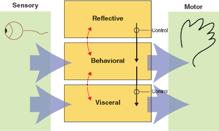
Figure 5.18 Norman's (2004) model of emotional design showing three levels: visceral, behavioral, and reflective. The arrows refer to how the different levels are affected by each other
The model makes a number of claims about how we respond to stressful and pleasurable situations. A central claim is that our affective state, be it positive or negative, changes how we think. When we are frightened or angry, the emotional response is to focus on the problem at hand and try to overcome or resolve the perceived danger. Our bodies will respond by tensing our muscles and sweating. In contrast, when we are very happy, such as watching our team win the last game of the championship, the emotional response is to laugh, cheer, and jump about. The body relaxes. When in such a positive state of mind we are assumed to be far less focused, which can even enable us to be more creative.
The model explains how the human brain and the body switch gear to respond appropriately to different events. But how can it be used in interaction design? Can products be designed to make people happy and, in so doing, be more creative? Should this be a high-level goal? According to Norman (2004), when people are happy they are more likely to overlook and cope with minor problems they are experiencing with a device. In contrast, when someone is anxious or angry they are more likely to be less tolerant. So does this mean that designers should be creating products that adapt according to people's different emotional states? When people are feeling angry should an interface be more attentive and informative than when they are happy?
Such an adaptive approach is unrealistic, since people's moods change all the time and it would be difficult to keep abreast of them, let alone know what kind of interface to present to complement them. Instead, Norman takes a more conventional approach to applying the model, suggesting that designers focus on the context and tasks a product is being used for. But Norman's explanation of how this could play out in practice has its problems. On the one hand, he argues that if the product is intended to be used during leisure time and is meant to be fun and enjoyable to use then designers “can get away with more” and not be too worried about how the information appears at the interface. On the other hand, he says that for serious tasks, such as monitoring a process control plant or driving a car, designers need to pay special attention to all the information required to do the task at hand and that the interface should be visible with clear and unambiguous feedback. The bottom line is “things intended to be used under stressful situations require a lot more care, with much more attention to detail.”
Activity 5.5
Do you agree with Norman's position about the different amounts of attention that need to be paid to serious versus pleasurable tasks?
Comment
While it is of utmost importance that the technologies used by operators in dangerous and highly stressful situations, such as on a battlefield or in a burning building, are effective, efficient, and informative, why would it not be the case, equally, for other situations? Would people not want to have clear and unambiguous feedback, too, for pleasurable tasks carried out in convivial environments, such as controlling a home entertainment system—especially if they had paid thousands of dollars for it? People can become very frustrated and angry with a TV system that does not give them clear information about when and on which channel a program is supposed to be.
A less controversial application of the model is to think about how to design products in terms of the three levels. Visceral design refers to making products look, feel, and sound good. The designer can use a number of aesthetic techniques such as clean lines, balance, color, shape, and texture. The iPod, featured in Chapter 1, exemplifies this approach. Behavioral design is about use and equates with the traditional values of usability. Reflective design is about taking into account the meaning and personal value of a product in a particular culture. For example, the design of a Swatch watch focuses on reflective aspects, where the aesthetics, the use of cultural images and graphical elements are central. Brilliant colors, wild designs, and art are very much part of the Swatch trademark and are what draw people to buy and wear their watches.
(ii) Pleasure Model
Patrick Jordan (2000) has proposed an alternative affective model that focuses more on the pleasurable aspects of our interactions with products. It considers all of the potential benefits that a product can deliver. Based on Lionel Tiger's (1992) framework of pleasure, it proposes four conceptually distinct types of pleasure. These are:
- physio-pleasure
- socio-pleasure
- psycho-pleasure
- ideo-pleasure (cognitive).
Physio-pleasure refers to bodily pleasures connected to sensory experiences, e.g. touch, taste, and smell. An example is the tactile pleasure of holding a sleek cell phone while making a call. Socio-pleasure refers to the enjoyment of being in the company of others, such as loved ones, friends, and colleagues. An example is the socio-pleasure of showing photos to one another, via the LCD display on a digital camera, that someone has just taken at a friend's birthday party. Psycho-pleasure refers to people's emotional and cognitive reactions to a product. These are similar to the ones Norman talks about at the behavioral level. An example is the emotionally satisfying experience of shopping on the web using an online site that is both pleasing and easy to use. Ideo-pleasure refers to people's values and is akin to the reflective level of Norman's model. It entails the aesthetics of a product and the cultural and personal values a person attributes to it. For example, a person who buys a hybrid car that runs on a combination of electricity and gas may derive more ideo-pleasure using it because it is saving energy and is cheaper to run.
The pleasure model does not attempt to explain how pleasures happen at a biological or behavioral level, but is intended as a means of framing a designer's thinking about pleasure, highlighting that there are different kinds. It does not prescribe that a product be designed to cover the complete set of pleasures (although this is possible and may be desirable), but that certain ones may be more important to consider for a product. For example, it may be very beneficial to take all of them into account when designing a cell phone for teenagers, but only the psycho and socio aspects when designing a landline phone for use by operators at call centers. What is important is that the benefits of considering a pleasure type or set of types are identified by the design team in the first place.
(iii) Technology as Experience Framework
McCarthy and Wright (2004) have developed an account of the user experience largely in terms of how it is ‘felt’ by the user. They recognize that defining experience is incredibly difficult because it is so nebulous and ever-present to us, just as swimming in water is to a fish. Nevertheless, they have tried to capture the essence of human experience by describing it in both holistic and metaphorical terms. These comprise a balance of sensual, cerebral, and emotional ‘threads.’ Their framework draws heavily from the philosophical writings of Dewey and Pragmatism, which focus on the sense-making aspects of human experience. As Dewey points out: “Emotion is the moving and cementing force. It selects what is congruous and dyes what is selected with its color, thereby giving qualitative unity to materials externally disparate and dissimilar. It thus provides unity in and through the varied parts of experience.”
McCarthy and Wright propose four core threads that make up our holistic experiences: compositional, sensual, emotional, and spatio-temporal.
The sensual thread. This is concerned with our sensory engagement with a situation and is similar to the visceral level of Norman's model. It can be equated with the level of absorption people have with various technological devices and applications, most notable being computer games, cell phones, and chatrooms, where users can be highly absorbed in their interactions at a sensory level. These can involve thrill, fear, pain, and comfort.
The emotional thread. Common examples of emotions that spring to mind are sorrow, anger, joy, and happiness. In addition, the framework points out how emotions are intertwined with the situation in which they arise, e.g. a person becomes angry with a computer because it does not work properly. Emotions also involve making judgments of value. For example, when purchasing a new cell phone, people may be drawn to the ones that are most cool-looking but be in an emotional turmoil because they are the most expensive. They can't really afford them but they really would like one of them.
The compositional thread. This is concerned with the narrative part of an experience, as it unfolds, and the way a person makes sense of them. For example, when shopping online, the choices laid out to people can lead them in a coherent way to making a desired purchase or they can lead to frustrating experiences resulting in no purchase being made. When in this situation, people ask themselves questions such as “What is this about? Where am I? What has happened? What is going to happen next? What would happen if… ?” The compositional thread is the internal thinking we do during our experiences.
The spatio-temporal thread. This refers to the space and time in which our experiences take place and their effect upon those experiences. There are many ways of thinking about space and time and their relationship with one another, for example, we talk of time speeding up, standing still, and slowing down, while we talk of space in terms of public and personal places, and needing one's own space.
So how do you use these concepts to think about designing for affect? The threads are meant as ideas to help designers think and talk more clearly and concretely about the relationship between technology and experience. By describing an experience in terms of the interconnected aspects of experience, the framework can aid thinking about the whole experience of a technology rather than as fragmented aspects, e.g. its usability, its marketability, or utility. For example, when buying clothes online, the framework can be used to capture the whole gamut of experiences, including: the fear or joy of needing to buy a new outfit; the time and place where it can be purchased, e.g. online stores or shopping mall; the tensions of how to engage with the vendor, e.g. the pushy sales assistant or an anonymous website; the value judgment involved in contemplating the cost and how much one is prepared to spend; the internal monologue that goes on where questions are asked such as will it look good on me, what size should I buy, do I have shoes to match, do I need to try it on, how easy will it be to wash, will I need to iron it each time, and how often will I be able to wear it. All of these aspects can be described in terms of the four threads and in so doing highlight which aspects are more important for a given product. For example, if you were to do this exercise for buying a new TV entertainment system versus buying a new MP3 player you might find you would get quite different descriptions, leading ultimately to thinking about their design differently.
CASE STUDY 5.1: Using The ‘Technology as Experience’ Framework
To show how the framework can be used to think about and inform design, two case studies are presented on our website. Both used it to guide their initial ideas for the design of two different websites: (i) an online fundraising site and (ii) a site that reviews men's clothing, intended to appeal to men who do not enjoy shopping.
The first was written by Heather Collins when she was a graduate student. She used primarily the sensory and compositional threads of the framework, leading to insights on how fundraising organizations can maximize their website to tell a compelling story to a potential donor that is balanced in content and emotion. Her design combines elements of storytelling, appropriate emotional triggers, and a welcoming atmosphere to encourage potential donors to act by making a donation, volunteering their time, telling their friends, or attending a related event. Through this process, the donor can create a meaningful connection to a cause or problem directly impacting their community. The personal connection makes the online donation experience pleasurable for the user.
The second was written by Aaron Loehrlein when he was a graduate student. He used all the threads to think about designing a website for a pleasurable experience for clothes shopping among men who ordinarily hate clothes shopping. Because the website is a consumer guide for men's clothes, and not a retail site, it encourages a more relaxed emotional interaction with its users. The website does not present clothes as part of a larger fashion trend, but describes how the clothes are likely to fit into the life of the wearer. The descriptions are meant to provide an entertaining, non-challenging experience by using simple, jargon-free language, familiar metaphors, and sarcastic humor that is never aimed at the wearer. He found the emotional and sensual threads to be particularly useful to design for this.
Assignment
This assignment requires you to write a critique of the persuasive impact of a virtual agent by considering what it would take for a virtual agent to be believable, trustworthy, and convincing.
- Look at a website that has a virtual assistant, e.g. Anna at Ikea.com or one of the case studies featured by the Digital Animations Group (DAG) at http://www.dagroupplc.com, who specialize in developing a variety of online agents) and answer the following:
- What does the virtual agent do?
- What type of agent is it?
- Does it elicit an emotional response from you? If so, what kind?
- What kind of personality does it have?
- How is this expressed?
- What kinds of behavior does it exhibit?
- What are its facial expressions like?
- What is its appearance like? Is it realistic or cartoon-like?
- Where does it appear on the screen?
- How does it communicate with the user (text or speech)?
- Is the level of discourse patronizing or at the right level?
- Is the agent helpful in guiding the user towards making a purchase or finding out something?
- Is it too pushy?
- What gender is it? Do you think this makes a difference?
- Would you trust the agent to the extent that you would be happy to buy a product from it or follow its guidance? If not, why not?
- What else would it take to make the agent persuasive?
- Next, look at an equivalent website that does not include an agent but is based on a conceptual model of browsing, e.g. Amazon.com. How does it compare with the agent-based site you have just looked at?
- Is it easy to find information?
- What kind of mechanism does the site use to make recommendations and guide the user in making a purchase or finding out information?
- Is any kind of personalization used at the interface to make the user feel welcome or special?
- Would the site be improved by having an agent? Explain your reasons either way.
- Finally, discuss which site you would trust most and give your reasons for this.
Summary
This chapter has described the different ways interactive products can be designed (both deliberately and inadvertently) to make people respond in certain ways. The extent to which users will learn, buy a product online, quit a bad habit, or chat with others depends on how convincing the interface is, how comfortable he or she feels when using a product, or how well he or she can trust it. If the interactive product is frustrating to use, annoying, or patronizing, users will easily become angry and despondent, and often stop using it. If, on the other hand, the product is pleasurable, enjoyable to use, and makes people feel comfortable and at ease, then they will continue to use it, make a purchase, return to the website, or continue to learn. This chapter has described various interaction mechanisms that can be used to elicit positive emotional responses in users and ways of avoiding negative ones.
Key Points
- Affective aspects of interaction design are concerned with the way interactive systems engender emotional responses.
- Well-designed interfaces can elicit good feelings in people.
- Aesthetically pleasing interfaces can be a pleasure to use.
- Expressive interfaces can provide reassuring feedback to users as well as be informative and fun.
- Badly designed interfaces often make people frustrated and angry.
- Technologies can be designed to persuade people to change their behaviors or attitudes.
- Anthropomorphism is the attribution of human qualities to objects.
- An increasingly popular form of anthropomorphism is to create agents and other virtual characters as part of an interface.
- Models of affect provide a way of conceptualizing emotional and pleasurable aspects of interaction design.
Further Reading
JORDAN, P.W. (2000) Designing Pleasurable Products. Taylor & Francis. This book was written primarily for a product design audience to consider as part of the human factors. However, its applicability to interaction design has meant that it has become a popular book for those wanting to understand more about the relationship between usability and pleasure. It provides many illuminating case studies of the design of products, such as cars, cameras, and clocks. It also provides detailed ‘product benefits specifications’ that are a form of guidance on how to design and evaluate pleasurable aspects.
FOGG, B.J. (2003) Persuasive Technology: Using Computers to Change What we Think and Do. Morgan Kaufmann. This is a very readable and provocative book, explaining how a diversity of technologies can and have been designed to persuade people to change their behavior and attitudes. It presents a conceptual framework of the different types, a host of examples, together with discussing social, ethical, and credibility issues to do with using persuasive technologies.
NORMAN, D. (2004) Emotional Design: Why we Love (or Hate) Everyday Things. Basic Books. This book is an easy read while at the same time being thought-provoking. We get to see inside his kitchen and learn about the design aesthetics of his collection of teapots. The book also includes essays on the emotional aspects of robots, computer games, and a host of other pleasurable interfaces.
TURKLE, S. (1995) Life on the Screen. Simon and Schuster. This classic covers a range of social impact and affective aspects of how users interact with a variety of computer-based applications. Sherry Turkle discusses at length how computers, the Internet, software, and the design of interfaces affect our identities.
Two early papers on interface agents can be found in Brenda Laurel (ed.) (1990) The Art of Human–Computer Interface Design. Addison Wesley:
LAUREL, B. (1990) Interface agents: metaphor with character, pp. 355–366.
OREN, T., SALOMON, G., KREITMAN, K. and Don, A. (1990) Guides: characterizing the interface, pp. 367–381.
Excerpts from a lively debate between Pattie Maes and Ben Shneiderman on ‘direct manipulation vs. interface agents' can be found in ACM Interactions Magazine 4 (6) (1997) 42–61.
1 On the Mac version of Microsoft's Office 2001, an anthropomorphized Mac computer with big feet and a hand that conveys various gestures and moods replaced Clippy.