
What is interaction design?
- Describe what and who is involved in the process of interaction design.
- Outline the different forms of guidance used in interaction design.
- Enable you to evaluate an interactive product and explain what is good and bad about it in terms of the goals and core principles of interaction design.
1.1 Introduction
1.2 Good and poor design
1.3 What is interaction design?
1.4 The user experience
1.5 The process of interaction design
1.6 Interaction design and the user experience
1.1 Introduction
How many interactive products are there in everyday use? Think for a minute about what you use in a typical day: cell (mobile) phone, computer, personal organizer, remote control, coffee machine, ATM, ticket machine, library information system, the web, photocopier, watch, printer, stereo, DVD player, calculator, video game … the list is endless. Now think for a minute about how usable they are. How many are actually easy, effortless, and enjoyable to use? All of them, several, or just one or two? This list is probably considerably shorter. Why is this so?
Think about when some device caused you considerable grief—how much time did you waste trying to get it to work? Two well-known interactive devices that cause numerous people immense grief are the photocopier that doesn't copy the way they want and the VCR or DVD that records a different program from the one they thought they had set or none at all. Why do you think these things happen time and time again? Moreover, can anything be done about it?
Many products that require users to interact with them to carry out their tasks, e.g. buying a ticket online from the web, photocopying an article, setting the alarm on a digital clock, have not necessarily been designed with the users in mind. Typically, they have been engineered as systems to perform set functions. While they may work effectively from an engineering perspective, it is often at the expense of how the system will be used by real people. A main aim of interaction design is to redress this concern by bringing usability into the design process. In essence, it is about developing interactive products1 that are easy, effective, and enjoyable to use—from the users' perspective.
In this chapter we begin by examining what interaction design is. We look at the difference between good and poor design, highlighting how products can differ radically in how usable they are. We then describe what and who is involved in the process of interaction design. The user experience, which has become a central concern of interaction design, is then introduced. Finally, we outline how to characterize the user experience in terms of usability, user experience goals, and design principles. An assignment is presented at the end of the chapter in which you have the opportunity to put into practice what you have read by evaluating the design of an interactive product.
The main aims of this chapter are to:
- Explain the difference between good and poor interaction design.
- Describe what interaction design is and how it relates to human–computer interaction and other fields.
- Explain what is meant by the user experience and usability.
1.2 Good and Poor Design
A central concern of interaction design is to develop interactive products that are usable. By this is generally meant easy to learn, effective to use, and providing an enjoyable user experience. A good place to start thinking about how to design usable interactive products is to compare examples of well and poorly designed ones. Through identifying the specific weaknesses and strengths of different interactive systems, we can begin to understand what it means for something to be usable or not. Here, we describe two examples of poorly designed products—a voice mail system used in hotels and the ubiquitous remote control device—and contrast these with two well-designed examples of products that perform the same function.
(i) Voice Mail System
Imagine the following scenario. You're staying at a hotel for a week while on a business trip. You discover you have left your cell phone at home so you have to rely on the hotel's facilities. The hotel has a voice mail system for each room. To find out if you have a message, you pick up the handset and listen to the tone. If it goes ‘beep beep beep’ there is a message. To find out how to access the message you have to read a set of instructions next to the phone.
You read and follow the first step:
“1. Touch 41.”
The system responds, “You have reached the Sunny Hotel voice message center. Please enter the room number for which you would like to leave a message.”
You wait to hear how to listen to a recorded message. But there are no further instructions from the phone. You look down at the instruction sheet again and read:
“2. Touch*, your room number, and #.”
You do so and the system replies, “You have reached the mailbox for room 106. To leave a message type in your password.”
You type in the room number again and the system replies, “Please enter room number again and then your password.”
You don't know what your password is. You thought it was the same as your room number. But clearly not. At this point you give up and call reception for help. The person at the desk explains the correct procedure for recording and listening to messages. This involves typing in, at the appropriate times, the room number and the extension number of the phone (the latter is your password, which is different from the room number). Moreover, it takes six steps to access a message and five steps to leave a message. You go out and buy a new cell phone.
What is problematic with this voice mail system?
- It is infuriating.
- It is confusing.
- It is inefficient, requiring you to carry out a number of steps for basic tasks.
- It is difficult to use.
- It has no means of letting you know at a glance whether any messages have been left or how many there are. You have to pick up the handset to find out and then go through a series of steps to listen to them.
- It is not obvious what to do: the instructions are provided partially by the system and partially by a card beside the phone.
Now consider the following phone answering machine. Figure 1.1 shows two small sketches of an answering machine phone. Incoming messages are represented using physical marbles. The number of marbles that have moved into the pinball-like chute indicates the number of messages. Dropping one of these marbles into a slot in the machine causes the recorded message to play. Dropping the same marble into another slot on the phone dials the caller who left the message.
How does the ‘marble’ answering machine differ from the voice mail system?
- It uses familiar physical objects that indicate visually at a glance how many messages have been left.
- It is aesthetically pleasing and enjoyable to use.
- It only requires one-step actions to perform core tasks.
- It is a simple but elegant design.
- It offers less functionality and allows anyone to listen to any of the messages.
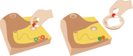
Figure 1.1 The marble answering machine (Bishop, cited by Crampton Smith, 1995)
The marble answering machine was designed by Durrell Bishop while a student at the Royal College of Art in London (described by Crampton Smith, 1995). One of his goals was to design a messaging system that represented its basic functionality in terms of the behavior of everyday objects. To do this, he capitalized on people's everyday knowledge of how the physical world works. In particular, he made use of the ubiquitous everyday action of picking up a physical object and putting it down in another place. This is an example of an interactive product designed with the users in mind. The focus is on providing them with an enjoyable experience but one that also makes efficient the activity of receiving messages. However, it is important to note that although the marble answering machine is a very elegant and usable design, it would not be practical in a hotel setting. One of the main reasons is that it is not robust enough to be used in public places, for example, the marbles could easily get lost or be taken as souvenirs. Also, the need to identify the user before allowing the messages to be played is essential in a hotel setting. When considering the usability of a design, therefore, it is important to take into account where it is going to be used and who is going to use it. The marble answering machine would be more suited in a home setting—provided there were no children who might be tempted to play with the marbles!
(ii) Remote Control Device
Every home entertainment system, be it the TV, cable, music system, DVD player, VCR, etc., comes with its own remote control device. Each one is different in terms of how it looks and works. Many have been designed with a dizzying array of small, multicolored and double-labeled buttons (one on the button and one above or below it), that often seem arbitrarily positioned in relation to one another. Many viewers, especially when sitting in their living room, find it difficult to locate the right ones even for the simplest of tasks, like pausing or finding the main menu. It can be especially frustrating for those who need to put their reading glasses on each time to read the buttons. The remote control device appears like it has been put together very much as an afterthought.
In contrast, the TiVo remote control, designed as part of a digital video recorder, is in a class of its own (see Figure 1.2a). Much effort and thought has gone into its design. The buttons are large, clearly labeled and logically arranged, making them easy to locate and use in conjunction with the menu interface that appears on the TV monitor. In terms of its physical form, the remote device has been designed to fit into the palm of a hand, having a peanut shape. It also has a playful look and feel about it; colorful buttons and cartoon icons have been used that are very distinctive, making it easy to identify them in the dark and without having to put reading glasses on.
How was it possible to create such a usable and appealing remote device where so many others have failed? The answer is simple; TiVo took the time and effort to follow a user-centered design process. Specifically, TiVo's director of product design at the time involved potential users in the design process, getting their feedback on everything from the feel of the device in the hand to where best to place the batteries—making them easy to replace but not to fall out. He and his design team also resisted the trap of ‘buttonitis’—which so many other remote controls have fallen victim to—where buttons breed like rabbits, one for every new function. They did this by restricting the number of control buttons embedded in the device to the essential ones. Other functions were then represented as part of the menu options and dialog boxes displayed on the TV monitor, that could then be selected via the core set of physical control buttons. The result was a highly usable and pleasurable device, that has received much praise and numerous design awards.
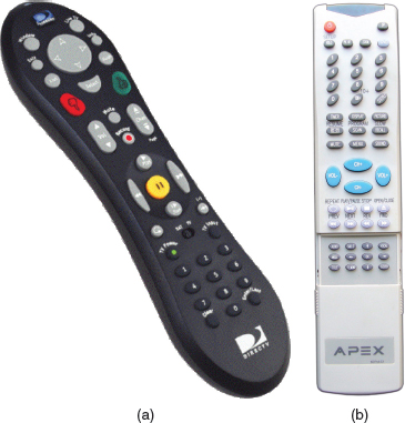
Figure 1.2 Two contrasting remote control devices: (a) the TiVo remote. TiVo Inc.; (b)a standard remote. How do they differ in their design and use?
1.2.1 What to Design
Designing usable interactive products requires considering who is going to be using them, how they are going to be used, and where they are going to be used. Another key concern is understanding the kind of activities people are doing when interacting with the products. The appropriateness of different kinds of interfaces and arrangements of input and output devices depends on what kinds of activities need to be supported. For example, if the activity to be supported is to let people communicate with each other at a distance, then a system that allows easy input of messages (spoken or written) that can be readily accessed by the intended recipient is essential. In addition, an interface that allows the users to interact with the messages, e.g. edit, annotate, store, would be very useful.
The range of activities that can be supported is diverse. Just think for a minute what you can currently do using computer-based systems: send messages, gather information, write essays, control power plants, program, draw, plan, calculate, play games—to name but a few. Now think about the types of interfaces and interactive devices that are available. They, too, are equally diverse: multimedia applications, virtual reality environments, speech-based systems, handheld devices, and large interactive displays—to name but a few. There are also many ways of designing how users can interact with a system, e.g. via the use of menus, commands, forms, icons, touchscreens, sensors, etc. Furthermore, a range of innovative everyday artifacts are being created, using novel materials, such as interactive toys, smart mirrors, and wearables (see Figure 1.3). The interfaces for everyday consumer items, like cameras, microwave ovens, and washing machines, that used to be physical and the realm of product design, are now increasingly digitally based, requiring interaction design. What this all amounts to is a multitude of choices and decisions that interaction designers have to make for an ever-increasing range of products.
A key question for interaction design is: how do you optimize the users' interactions with a system, environment, or product, so that they support and extend the users' activities in effective, useful, and usable ways? One could use intuition and hope for the best. Alternatively, one can be more principled in deciding which choices to make by basing them on an understanding of the users. This involves:
- Taking into account what people are good and bad at.
- Considering what might help people with the way they currently do things.
- Thinking through what might provide quality user experiences.
- Listening to what people want and getting them involved in the design.
- Using ‘tried and tested’ user-based techniques during the design process.
The aim of this book is to cover these aspects with the goal of teaching you how to carry out interaction design. In particular, it focuses on how to identify users' needs and the context of their activities, and from this understanding, move to designing usable, useful, and pleasurable interactive products.
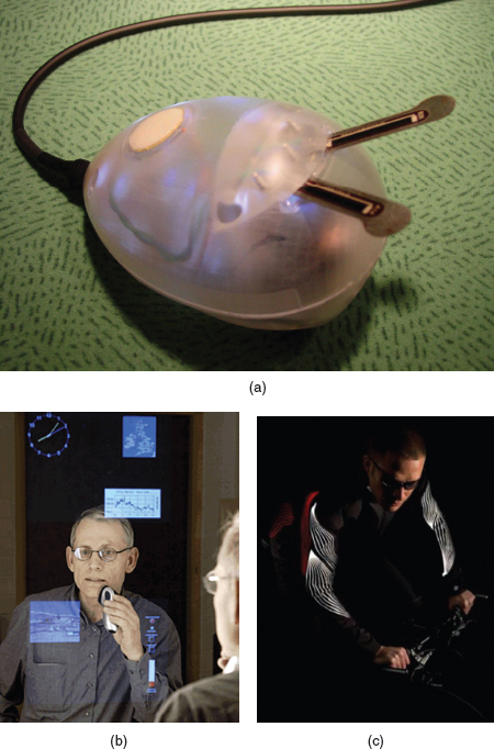
Figure 1.3 Novel forms of interactive products. (a) An interactive music toy (Beatbug) developed by Tod Machover to allow the creation, manipulation, and sharing of rhythm. When the beatbugs are connected via a network, groups of children holding one can share and develop collaborative rhythms of music. (b) An example of ambient intelligence: Philips bathroom mirror that displays the time, weather, and other personal information, including heart rate and weight. (c) A wearable concept: the ‘illum’ commuting jacket that lights up at night using electroluminescent muscle-fiber graphics.
How does making a phone call differ when using:
- a public phone box
- a cell phone?
How have these devices been designed to take into account:
- the kind of users,
- the type of activity being supported, and
- the context of use?
Comment
- Public phones are designed to be used by the general public. Many have Braille embossed on the keys and speaker volume control to enable people who are blind and hard of hearing to use them.
Cell phones are intended for all user groups, although they can be difficult to use for people who are blind or have limited manual dexterity.
- Most phone boxes are designed with a simple mode of interaction: insert card or money and key in the phone number. If engaged or unable to connect, the money or card is returned when the receiver is replaced. There is also the option of allowing the caller to make a follow-on call by pressing a button rather than collecting the money and reinserting it again.
Cell phones have a more complex mode of interaction. More functionality is provided, including contact book, saved messages, schedules, customized settings, voice mail, and security settings. In addition, most cell phones now include a whole host of other non-phone-based functions, including games, digital camera, calculator, and clock.
- Phone boxes are intended to be used in public places, say on a street corner or in an airport, and so have been designed to give the user a degree of privacy and noise protection through the use of hoods and booths.
Cell phones have been designed to be used anywhere and can be set to alert the user to a call waiting in different ways. These include silent vibrate mode for use in meetings and loud customized ring tones for everyday and outdoor use.
1.3 What is interaction design?
By interaction design, we mean
designing interactive products to support the way people communicate and interact in their everyday and working lives.
Put another way, it is about creating user experiences that enhance and augment the way people work, communicate, and interact. More generally, Winograd (1997, p. 160) describes it as “designing spaces for human communication and interaction.” Thackara views it as “the why as well as the how of our daily interactions using computers” (2001, p. 50).
A number of terms have been used to emphasize different aspects of what is being designed, including user interface design, software design, user-centered design, product design, web design, experience design, and interactive system design. Interaction design is increasingly being accepted as the umbrella term, covering all of these aspects. Indeed, many practitioners and designers, who ten years ago would have described what they were doing as interface design or interactive system design, now promote what they are doing as interaction design.
The focus of interaction design is very much concerned with practice, i.e. how to design user experiences. It is not wedded to a particular way of doing design, but is more eclectic, promoting the use of a range of methods, techniques, and frameworks. Some interaction designers have since begun to put forward their own perspective, for example, Cooper and Reiman (2003) present their take on interaction design as ‘goal-directed’ and Lowgren and Stolterman (2004) as ‘thoughtful.’
How does interaction design differ from other approaches to the design of computer-based systems, such as software engineering? A simple analogy to another profession, concerned with creating buildings, may clarify this difference. In his account of interaction design, Terry Winograd asks how architects and civil engineers differ when faced with the problem of building a house. Architects are concerned with the people and their interactions with each other and with the house being built. For example, is there the right mix of family and private spaces? Are the spaces for cooking and eating in close proximity? Will people live in the space being designed in the way it was intended to be used? In contrast, engineers are interested in issues to do with realizing the project. These include practical concerns like cost, durability, structural aspects, environmental aspects, fire regulations, and construction methods. Just as there is a difference between designing and building a house, so too is there a distinction between designing an interactive product and engineering the software for it.
1.3.1 The Components of Interaction Design
We view interaction design as fundamental to all disciplines, fields, and approaches that are concerned with researching and designing computer-based systems for people (see Figure 1.4). Why are there so many and what do they all do? Furthermore, how do the various disciplines, fields, and design approaches differ from one another?
We have already described the distinction between interaction design and software engineering. The differences between interaction design and the other approaches referred to in the figure is largely down to which methods, philosophies, and lenses they use to study, analyse, and design computers. Another way they vary is in terms of the scope and problems they address. For example, Information Systems is concerned with the application of computing technology in domains like business, health, and education, whereas Computer-Supported Cooperative Work (CSCW) is concerned with the need also to support multiple people working together using computer systems (Greif, 1998).
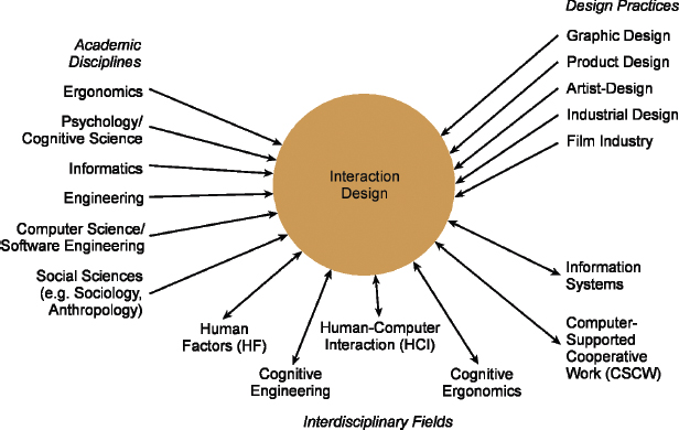
Figure 1.4 Relationship among contributing academic disciplines, design practices, and interdisciplinary fields concerned with interaction design
Box 1.1: Is Interaction Design Beyond HCI?
We see the main difference between Interaction Design (ID) and Human–Computer Interaction (HCI) as one of scope. ID has cast its net much wider, being concerned with the theory, research, and practice of designing user experiences for all manner of technologies, systems, and products, whereas HCI has traditionally had a narrower focus, being “concerned with the design, evaluation, and implementation of interactive computing systems for human use and with the study of major phenomena surrounding them” (ACM SIGCHI, 1992, p. 6). That is one of the reasons why we chose to call our book Interaction Design: Beyond Human–Computer Interaction, to reflect the wider scope.
What about Human Factors and Ergo-nomics? We see Ergonomics and Human Factors as having closely overlapping goals with HCI, being concerned with understanding the interactions among humans and other aspects of a system in order to optimize human well-being and overall system performance (Human Factors Society, 2005).
1.3.2 Who is Involved in Interaction Design?
From Figure 1.4 it can also be seen that many people are involved, ranging from social scientists to film-makers. This is not surprising given that technology has become such a pervasive part of our lives. But it can all seem rather bewildering to the onlooker. How do the assortment of players work together?
Designers need to know many different things about users, technologies, and interactions between them in order to create effective user experiences. At the very least, they need to understand how people act and react to events and how they communicate and interact with each other. To be able to create engaging user experiences they also need to understand how emotions work, what is meant by aesthetics, desirability, and the role of narrative in human experience. Developers also need to understand the business side, the technical side, the manufacturing side, and the marketing side. Clearly, it is difficult for one person to be well versed in all of these diverse areas and also know how to apply the different forms of knowledge to the process of interaction design. Most interaction design is done by multidisciplinary teams, where the skill sets of engineers, designers, programmers, psychologists, anthropologists, sociologists, artists, toy makers, and others are drawn upon. It is rarely the case, however, that a design team would have all of these professionals working together. Who to include in a team will depend on a number of factors, including a company's design philosophy, its size, purpose, and product line.
One of the benefits of bringing together people with different backgrounds and training is the potential of many more ideas being generated, new methods developed, and more creative and original designs being produced. However, the down side is the costs involved. The more people there are with different backgrounds in a design team, the more difficult it can be to communicate and progress forward the designs being generated. Why? People with different backgrounds have different perspectives and ways of seeing and talking about the world (see Figure 1.5). What one person values as important others may not even see (Kim, 1990). Similarly, a computer scientist's understanding of the term ‘representation’ is often very different from a graphic designer's or a psychologist's.
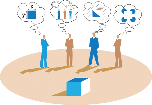
Figure 1.5 Four different team members looking at the same square, but each seeing it quite differently
What this means in practice is that confusion, misunderstanding, and communication breakdowns can surface in a team. The various team members may have different ways of talking about design and may use the same terms to mean quite different things. Other problems can arise when a group of people is ‘thrown’ together who have not worked as a team. For example, the Philips Vision of the Future Project found that its multidisciplinary teams—who were responsible for developing ideas and products for the future—experienced a number of difficulties, namely, that project team members did not always have a clear idea of who needed what information, when, and in what form (Lambourne et al., 1997).
Activity 1.2
In practice, the makeup of a given design team depends on the kind of interactive product being built. Who do you think should be involved in developing:
- A public kiosk providing information about the exhibits available in a science museum?
- An interactive educational website to accompany a TV series?
Each team will need a number of different people with different skill sets. For example, the first interactive product would need:
- Graphic and interaction designers, museum curators, educational advisors, software engineers, software designers, usability engineers, ergonomists.
The second project would need:
- TV producers, graphic and interaction designers, teachers, video experts, software engineers, software designers, usability engineers.
In addition, as both systems are being developed for use by the general public, representative users, such as school children and parents, should be involved.
In practice, design teams often end up being quite large, especially if they are working on a big project to meet a fixed deadline. For example, it is common to find teams of 15 people or more working on a website project for an extensive period of time, like six months. This means that a number of people from each area of expertise are likely to be working as part of the project team.
1.3.3 Interaction Design Consultants
Interaction design is now widespread in product development. In particular, website consultants, global corporations, and the computing industries have all realized its pivotal role in successful interactive products. The presence or absence of good interaction design can make or break a company. To get noticed in the highly competitive field of web products requires standing out. Being able to say that your product is easy, effective, and engaging to use is seen as central to this. Marketing departments are also realizing how branding, the number of hits, customer return rate, and customer satisfaction are greatly affected by the usability of a website.
In response to the growing demand for interaction design a number of consultancies have established themselves. These include the NielsenNorman Group, Cooper, Swim and IDEO. Swim was set up in the mid-1990s by Gitta Salomon as a small company to assist clients with the design of interactive products (see the interview with her at the end of this chapter). She points out how often companies realize the importance of interaction design but don't know how to do it themselves. So they get in touch with companies, like Swim, with their partially developed products and ask them for help. This can come in the form of an expert ‘crit’ in which a detailed review of the usability and design of the product is given (for more on expert evaluation, see Chapter 15). More extensively, it can involve helping clients create their products.
IDEO is a much larger enterprise, with several branches worldwide and over 25 years of experience in the area. They design products, services, and environments for other companies, pioneering new user experiences (Spreenberg et al., 1995). They have developed thousands of products for numerous clients, each time following their particular brand of interaction design (see Figure 1.6). Some of their most famous designs include the first mouse used by Apple, the Palm V and mMode, the integrated service platform for AT&T cell phones. They were also involved in the design of the TiVo system.
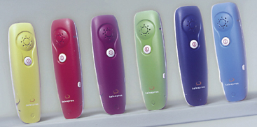
Figure 1.6 An innovative product developed by IDEO: wireless cell phones for Telespree. The phones were designed to be inexpensive, playful, and very simple to use, employing voice recognition for driving the interaction and only one button for turning them on and off.
Box 1.2: What's in a Name? from Interface Designers to User Experience Architects
Fifteen years ago, when a company wanted to develop an interface for an interactive product it advertised for interface designers. Such professionals were primarily involved in the design and evaluation of widgets for desktop applications. Now that the potential range of interactive products has greatly diversified, coupled with the growing realization of the importance of getting the interface right, a number of other job descriptions have begun to emerge. These include:
- Interactive/interaction designers (people involved in the design of all the interactive aspects of a product).
- Usability engineers (people who focus on evaluating products, using usability methods and principles).
- Web designers (people who develop and create the visual design of websites, such as layouts).
- UI designers (people experienced in user-centered design methodologies).
- UI design engineers (people who develop and model the end user experience, using task, workflow analytic methods, and low and high-level prototyping tools).
- Information architects (people who come up with ideas of how to plan and structure interactive products, especially websites).
- User experience (UX) designers/ architects/researchers (people who do all the above but who may also carry out ethnographic field studies to research into users' needs and convert them into actionable results).
1.4 The User Experience
A concept that has become central to interaction design is the user experience. By this it is meant how a product behaves and is used by people in the real world. As stressed by Jesse Garrett (2003, p. 10), “every product that is used by someone has a user experience: newspapers, ketchup bottles, reclining armchairs, cardigan sweaters.” More specifically, it is about how people feel about a product and their pleasure and satisfaction when using it, looking at it, holding it, and opening or closing it. It includes their overall impression of how good it is to use right down to the sensual effect small details have on them, such as how smoothly a switch rotates or the sound of a click and the touch of a button when pressing it.

It is important to point out that one cannot design a user experience, only design for a user experience. In particular, one cannot design a sensual experience, but only create the design features that can evoke it. For example, the outside case of a cell phone can be designed to be smooth, silky, and fit in the palm of a hand that when held, touched, looked at, and interacted with can provoke a sensual and satisfying user experience. Conversely, if it is designed to be heavy and awkward to hold, it is much more likely to end up providing a poor user experience, that is uncomfortable and unpleasant.
Activity 1.3: The iPod phenomenon
Apple Computer's first (and subsequent) generation of iPods were a phenomenonal success. How do you think this happened?
Comment
Apple realized early on that successful interaction design involves creating interactive products that have a quality user experience. The sleek appearance of the iPod music player, its simplicity of use, its elegance in style, its distinct plain white color, a novel interaction style that many people discovered was a sheer pleasure to learn and use, the catchy naming of its product and content (iTunes, iPod), among many other design features, led to it becoming one of the greatest of its kind and a must-have fashion item for teenagers, students, and others alike. While there were many competing MP3 players on the market at the time, some with more powerful functionality, other with bigger screens, more memory, cheaper, easier to use, etc., the quality of the overall user experience paled in comparison with that provided by the iPod.
There are many aspects of the user experience that can be considered and ways of taking them into account when designing interactive products. Of central importance is the usability, the functionality, the aesthetics, the content, the look and feel, and the sensual and emotional appeal. In addition, Jack Carroll (2004) stresses other wide-reaching aspects including fun, health, social capital (the social resources that develop and are maintained through social networks, shared values, goals, and norms), and cultural identity, e.g. age, ethnicity, race, disability, family status, occupation, education. At a more subjective level, John McCarthy and Peter Wright (2004) discuss the importance of people's expectations and the way they make sense of their experiences when using technology (see Chapter 5 for more on this).
How realistic is it for interaction designers to take all of these factors (and potentially many others) into account and, moreover, be able to translate and combine them to produce quality user experiences? Put frankly, there is no magic formula to help them. As of yet, there is not a unifying theory or framework that can be readily applied by interaction designers. Many of the aspects mentioned are only beginning to be understood. New conceptual frameworks that try to combine them are just emerging. What is established in the field of interaction design, however, are tried and tested design methods, a lot of prescriptive advice, and many relevant research findings. Here, we begin by examining these by outlining the core processes and goals of interaction design.

Figure 1.7 An advert for Apple's iPod on its online store site
1.5 The Process of Interaction Design
The process of interaction design involves four basic activities:
- Identifying needs and establishing requirements for the user experience.
- Developing alternative designs that meet those requirements.
- Building interactive versions of the designs so that they can be communicated and assessed.
- Evaluating what is being built throughout the process and the user experience it offers.
These activities are intended to inform one another and to be repeated. For example, measuring the usability of what has been built in terms of whether it is easy to use provides feedback that certain changes must be made or that certain requirements have not yet been met. Eliciting responses from potential users about what they think and feel about what has been designed, in terms of its appeal, touch, engagement, usefulness, etc., can help explicate the nature of the user experience that the product evokes.
Evaluating what has been built is very much at the heart of interaction design. Its focus is on ensuring that the product is usable. It is usually addressed through a user-centered approach to design, which, as the name suggests, seeks to involve users throughout the design process. There are many different ways of achieving this: for example, through observing users, talking to them, interviewing them, testing them using performance tasks, modeling their performance, asking them to fill in questionnaires, and even asking them to become co-designers. The findings from the different ways of engaging and eliciting knowledge from users are then interpreted with respect to ongoing design activities (we give more detail about all these aspects of evaluation in Chapters 12–15).
Equally important as involving users when evaluating an interactive product is understanding what people do. Chapters 3, 4, and 5 explain in detail how people act and interact with one another, with information, and with various technologies, together with describing their abilities, emotions, needs, desires, and what causes them to get annoyed, frustrated, lose patience, and get bored. Such knowledge can greatly help designers determine which solutions to choose from the many design alternatives available, and how to develop and test these further. Chapter 10 describes how an understanding of people and what they do can be translated to requirements, while Chapters 9 and 11 discuss how to involve users effectively in the design process.
A main reason for having a better understanding of people in the contexts in which they live, work, and learn is that it can help designers understand how to design interactive products that will fit those niches. A collaborative planning tool intended to be used by teams of scientists for a space mission working in different parts of the world will have quite different needs from one targeted at customer and sales agents to be used in a furniture store to draw up kitchen layout plans. Understanding the differences between people can also help designers appreciate that one size does not fit all; what works for one user group may be totally inappropriate for another. For example, children have different expectations about how they want to learn or play from adults. They may find having interactive quizzes and cartoon characters helping them along to be highly motivating, whereas most adults find them annoying. Conversely, adults often like talking-heads discussions about topics, but children find them boring. Just as everyday objects like clothes, food, and games are designed differently for children, teenagers, and adults, so, too, must interactive products be designed for different kinds of user.
Learning more about people and what they do can also reveal incorrect assumptions that designers may have about particular user groups and what they need. For example, it is often assumed that because of ailing vision and dexterity, old people want things to be big—be it text or graphical elements appearing on a screen or the physical controls, like dials and switches, used to control devices. This may be true for some old people but studies have also shown that many people in their 70s, 80s, and older are perfectly capable of interacting with standard-sized information and even small-size interfaces, e.g. PDAs, just as well as those in their teens and 20s can even though, initially, some might think they will find it difficult (Siek et al., 2005). It is increasingly the case that as people get older they do not like to consider themselves as lacking in cognitive and manual skills. Being aware of people's sensitivities is as important as knowing how to design for their capabilities.
Being aware of cultural differences is also an important concern for interaction design, particularly for products intended for a diverse range of user groups from different countries. An example of a cultural difference is the dates and times used in different countries. In the USA, for example, the date is written as month, day, year, e.g. 05/21/06, whereas in other countries it is written in the sequence of day, month, year, e.g. 21/05/06. This can cause problems to designers when deciding on the format of online forms, especially if intended for global use. It is also a concern for products that have time as a function, e.g. operating systems, digital clocks, car dashboards. Which cultural group do they give preference to? How do they alert users to the format that is set as default? This raises the question of how easily an interface designed for one user group can be used and accepted by another (Callahan, 2005). Moreover, why is it that certain products, like the iPod, are universally accepted by people from all parts of the world whereas websites are designed differently and reacted to differently by people from different cultures?
As well as there being standard differences in the way cultures communicate and represent information, designers from different cultures (that can be cross- or within-country) will often use different form factors, images, and graphical elements when creating products and dialog features for an interface. This can take the form of contrasting designs, where different colors, types of images, and structuring of information are used to appeal to people in different countries (see Figure 1.8).
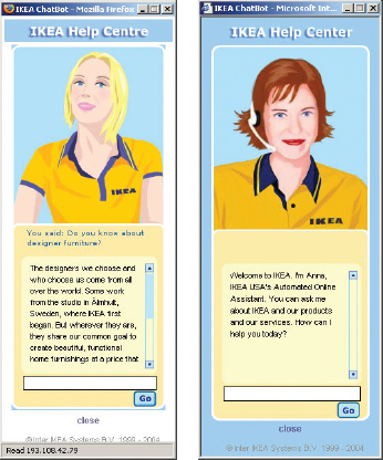
Figure 1.8 Anna the online sales agent, designed to be subtley different for UK and US customers. What are the differences and which is which? What should Anna's appearance be like for other countries, like India, South Africa, or China?
1.6 Interaction Design and the User Experience
Part of the process of understanding users is to be clear about the primary objective of developing an interactive product for them. Is it to design an efficient system that will allow them to be highly productive in their work, or is it to design a learning tool that will be challenging and motivating, or is it something else? To help identify the objectives we suggest classifying them in terms of usability and user experience goals. Usability goals are viewed as being concerned with meeting specific usability criteria, e.g. efficiency, whereas user experience goals are largely concerned with explicating the nature of the user experience, e.g. to be aesthetically pleasing. It is important to note, however, that the distinction between the two types of goal is not clear-cut, since usability is fundamental to the quality of the user experience and, conversely, aspects of the user experience, such as how it feels and looks, are inextricably linked with how usable the product is. We distinguish between them here to help clarify their roles but stress the importance of considering them together when designing for a user experience.
1.6.1 Usability Goals
Usability is generally regarded as ensuring that interactive products are easy to learn, effective to use, and enjoyable from the user's perspective. It involves optimizing the interactions people have with interactive products to enable them to carry out their activities at work, school, and in their everyday life. More specifically, usability is broken down into the following goals:
- effective to use (effectiveness)
- efficient to use (efficiency)
- safe to use (safety)
- having good utility (utility)
- easy to learn (learnability)
- easy to remember how to use (memorability).
Usability goals are typically operationalized as questions. The purpose is to provide the interaction designer with a concrete means of assessing various aspects of an interactive product and the user experience. Through answering the questions designers can be alerted very early on in the design process to potential design problems and conflicts that they might not have considered. However, simply asking “is the system easy to learn?” is not going to be very helpful. Asking about the usability of a product in a more detailed way, for example, “how long will it take a user to figure out how to use the most basic functions for the new web browser; how much can they capitalize on from their prior experience, and how long would it take a user to learn the whole set of functions?” will elicit far more information. Below we give a description of each goal and a question for each one.
Effectiveness is a very general goal and refers to how good a product is at doing what it is supposed to do.
Question: Is the product capable of allowing people to learn, carry out their work efficiently, access the information they need, or buy the goods they want?
Efficiency refers to the way a product supports users in carrying out their tasks. The marble answering machine described at the beginning of this chapter was considered efficient in that it let the user carry out common tasks, e.g. listening to messages, through a minimal number of steps. In contrast, the voice mail system was considered inefficient because it required the user to carry out many steps and learn an arbitrary set of sequences for the same common task. This implies that an efficient way of supporting common tasks is to let the user use single button or key presses. An example of where this kind of efficiency mechanism has been employed effectively is in online shopping. Once users have entered all the necessary personal details in an online form to make a purchase, they can let the website save all their personal details. Then, if they want to make another purchase at that site, they don't have to re-enter all their personal details again. A highly successful mechanism patented by Amazon.com is the one-click option, which requires users only to click a single button when they want to make another purchase.
Question: Once users have learned how to use a product to carry out their tasks, can they sustain a high level of productivity?
Safety involves protecting the user from dangerous conditions and undesirable situations. In relation to the first ergonomic aspect, it refers to the external conditions where people work. For example, where there are hazardous conditions—like X-ray machines or chemical plants—operators should be able to interact with and control computer-based systems remotely. The second aspect refers to helping any kind of user in any kind of situation avoid the dangers of carrying out unwanted actions accidentally. It also refers to the perceived fears users might have of the consequences of making errors and how this affects their behavior. To make interactive products safer in this sense involves (i) preventing the user from making serious errors by reducing the risk of wrong keys/buttons being mistakenly activated (an example is not placing the quit or delete-file command right next to the save command on a menu) and (ii) providing users with various means of recovery should they make errors. Safe interactive systems should engender confidence and allow the user the opportunity to explore the interface to try out new operations (see Figure 1.9a). Other safety mechanisms include undo facilities and confirmatory dialog boxes that give users another chance to consider their intentions (a well-known example is the appearance of a dialog box, after issuing the command to delete everything in the trashcan, saying: “Are you sure you want to remove all the items in the Trash permanently?” See Figure 1.9b).
Question: What is the range of errors that are possible using the product and what measures are there to permit users to recover easily from them?
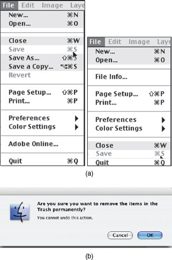
Figure 1.9 (a) A safe and unsafe menu. Which is which and why? (b) A warning dialog box for Mac OS X
Utility refers to the extent to which the product provides the right kind of functionality so that users can do what they need or want to do. An example of a product with high utility is an accounting software package that provides a powerful computational tool that accountants can use to work out tax returns. An example of a product with low utility is a software drawing tool that does not allow users to draw freehand but forces them to use a mouse to create their drawings, using only polygon shapes.
Question: Does the product provide an appropriate set of functions that will enable users to carry out all their tasks in the way they want to do them?
Learnability refers to how easy a system is to learn to use. It is well known that people don't like spending a long time learning how to use a system. They want to get started straight away and become competent at carrying out tasks without too much effort. This is especially so for interactive products intended for everyday use, e.g. DVD players, email, and those used only infrequently, e.g. videoconferencing. To a certain extent, people are prepared to spend longer learning more complex systems that provide a wider range of functionality, e.g. web authoring tools, word processors. In these situations, CD-ROM and online tutorials can help by providing interactive step-by-step material with hands-on exercises. However, many people find these difficult to relate to the tasks they want to accomplish. A key concern is determining how much time users are prepared to spend learning a product. It seems a waste if a product provides a range of functionality which the majority of users are unable or not prepared to spend time learning how to use.
Question: Is it possible for the user to work out how to use the product by exploring the interface and trying out certain actions? How hard will it be to learn the whole set of functions in this way?
Memorability refers to how easy a product is to remember how to use, once learned. This is especially important for interactive products that are used infrequently. If users haven't used an operation for a few months or longer, they should be able to remember or at least rapidly be reminded how to use it. Users shouldn't have to keep relearning how to carry out tasks. Unfortunately, this tends to happen when the operations required to be learned are obscure, illogical, or poorly sequenced. Users need to be helped to remember how to do tasks. There are many ways of designing the interaction to support this. For example, users can be helped to remember the sequence of operations at different stages of a task through meaningful icons, command names, and menu options. Also, structuring options and icons so they are placed in relevant categories of options, e.g. placing all the drawing tools in the same place on the screen, can help the user remember where to look to find a particular tool at a given stage of a task.
Question: What kinds of interface support have been provided to help users remember how to carry out tasks, especially for products and operations they use infrequently?
We are now being asked to create and remember increasing numbers of passwords. We need them to enable us to log onto the various computers we use at work and home, and again to gain access to our email accounts, online accounts, web accounts, bank accounts, etc. Registration for the majority of online services also requires that we create new usernames and passwords.
This constant need for security, however, ends up giving most users a case of passworditus. Media people and other intensive online users suffer particularly. They are likely to have large numbers of accounts for different services. For example, Bill Thompson (2004), a commentator for the BBC World Service program, admitted to having 30 separate accounts, not to mention his Windows laptop demanding he change his password every three months. How does he (and we) cope with this cognitive demand, especially for services used infrequently? The answer: with much frustration, often adopting workarounds that are none too healthy.
To begin, most of us create a password based on the name of our partners, children, pets or favorite cartoon character. Although, according to Yahoo! (2004), the most common password is still ‘password,’ followed closely by ‘God,’ ‘sex,’ ‘money,’ and ‘love.’ When we're asked to create new passwords most of will use the same one—despite knowing it is not a very good idea. The more conscientious among us are likely to forget many of them, or muddle them up, especially if we use them infrequently. To add to our misery, many online sites have become wise to our fondness for pet names (which can be more easily descrambled), and now require us to create and memorize passwords that comprise a mix of upper and lower case alphabetic and numeric characters that are greater than eight characters, and that do not sound like words or names—all of which makes it much harder for us to remember them. To their credit, many service providers try to help the hapless and frustrated user log on to their service again by providing a ‘forgotten your password?’ option at the login dialog box. But relying on passwords being sent via email each time is time-consuming and tedious. Will it ever be possible for someone to invent a single login/password configuration that will be robust enough not to be broken into and yet easy enough to remember?
Activity 1.4
How long do you think it should take to learn how to use the following interactive products and how long does it actually take most people to learn them? How memorable are they?
- Using a DVD or VCR to play a movie.
- Using a DVD or VCR recorder to record two TV programs.
- Using an authoring tool to create a website.
Comment
- To play a DVD or video should be as simple as turning the radio on, should take less than 30 seconds to work out, and then should be straightforward to do subsequently. Most people are able to fathom how to play a DVD or video. However, many TV systems require the user to switch to the DVD or video channel using one or two remote control devices. Other settings may also need to be configured before the DVD/video will play, like typing in a code for adult restricted movies. Most people are able to remember how to play a movie once they have used a particular product.
- Recording is a more complex operation and should take a couple of minutes to learn how to do and to check that the programming is correct. VCR players are renowned for their notorious interfaces, resulting in few people remembering how to prerecord programs. DVD recorders generally have been designed with better interfaces that provide viewers with more interactive feedback and cues, using menus and dialog boxes that appear on the TV itself. An example of a well-designed interface is TiVo, where viewers need only to remember the first letter or two of a program they want to watch and then select from a scrolling menu on the TV screen.
- A well-designed authoring tool should let the user create a basic page in about 20 minutes. Learning the full range of operations and possibilities is likely to take much longer, possibly a few days. In reality, there are some good authoring tools that allow the user to get started straight away, providing templates that they can adapt. Most users will extend their repertoire, taking another hour or so to learn more functions. However, very few people actually learn to use the full range of functions provided by the authoring tool. Users will tend to remember frequently used operations, e.g. cut and paste or inserting images, especially if they are consistent with the way they are carried out in other software applications. However, less frequently used operations may need to be relearned, e.g. formatting tables.
As well as couching usability goals in terms of specific questions, they are turned into usability criteria. These are specific objectives that enable the usability of a product to be assessed in terms of how it can improve (or not) a user's performance. Examples of commonly used usability criteria are time to complete a task (efficiency), time to learn a task (learnability), and the number of errors made when carrying out a given task over time (memorability). These can provide quantitative indicators of the extent to which productivity has increased, or how work, training, or learning have been improved. They are also useful for measuring the extent to which personal, public, and home-based products support leisure and information-gathering activities. However, they do not address the overall quality of the user experience, which is where user experience goals come into play.
1.6.2 User Experience Goals
There are a number of user experience goals that are beginning to be articulated in interaction design. They include both positive and negative ones, for example:
Many of these are subjective qualities and concerned with how a system feels to a user. They differ from the more objective usability goals in that they are concerned with how users experience an interactive product from their perspective, rather than assessing how useful or productive a system is from its own perspective. Whereas the terms used to describe usability goals comprise a small distinct set, many more terms are used to describe the multifaceted nature of the user experience. They also overlap with what they are referring to. In so doing, they offer subtely different ways of expressing the way an experience varies for the same activity over time, technology, and place. For example, we may describe listening to music in the shower as highly pleasurable, while consider it more apt to describe listening to music in the car as enjoyable. Similarly, listening to music on a high-end powerful music system may invoke in us exciting and emotionally fulfilling feelings, while listening to it on an MP3 player may be enjoyable when on the move. The process of selecting terms that best convey a user's feelings, state of being, emotions, sensations, etc., when using or interacting with a product at a given time and place, can help designers understand the multifaceted and changing nature of the user experience. Similar to usability goals, user experience concepts are most useful when turned into specific questions. For example, when considering how engaging an interactive virtual agent is for an online store, one can ask:
How long do users interact with the virtual sales agent? Do they suspend their disbelief when typing in questions?
To consider the effect of its appeal one can ask:
What is the user's immediate response to the agent's appearance? Is it one of mockery, dismay, or enjoyment? Do they smile, laugh, or scoff?
The concepts can be further defined in terms of elements that contribute to making a user experience pleasurable, fun, exciting, etc. They include attention, pace, play, interactivity, conscious and unconscious control, style of narrative, and flow. In particular, the concept of flow (Csikszentmihalyi, 1997) is becoming popular in interaction design for informing the design of user experiences for websites, video games, and other interactive products. It refers to a state of intense emotional involvement that comes from being completely involved in an activity, like playing music, and where time flies. Instead of designing web interfaces to cater for visitors who know what they want, they can be designed to induce a state of flow, leading the visitor to some unexpected place, where they become completely absorbed. In an interview with Wired magazine, Csikszentmihalyi (1996) uses the analogy of a gourmet meal to describe how a user experience can be designed to be engrossing, “starting off with the appetizers, moving on to the salads and entrées, and building toward dessert and not knowing what will follow.”
How do concepts of the user experience fare in relation to usability? Until recently, traditional HCI has championed the usability of a system in terms of efficiency, utility, etc., while overlooking the role played by other aspects of the user experience, such as aesthetics, etc. However, a sea change has happened in HCI in the last few years, and those involved in shaping the field have begun in earnest to take on board other aspects of the user experience (see Blythe et al., 2003; Wilson, 2005). Even Don Norman (2004), a staunch advocate of usability, changed his way of thinking about interaction design when discovering there was a positive correlation between usability and aesthetics. He first read about this from the findings of two studies conducted independently by Japanese and Israeli researchers in the late 1990s: they both found that attractive interfaces for functionally equivalent ATM machines were perceived to be easier to use than unattractive ones (see Figure 1.10).
Those working in the computer games industry have acknowledged for a long time that there is an important relationship between pleasure and usability. Counter-intuitively, they also realized it can work in a negative direction. Many gamers enjoy and find most challenging non-easy video games, which contravene usability goals (Frohlich and Murphy, 1999). Banging a plastic hammer to hit a virtual nail represented on the computer screen, compared with using a more efficient way to do the same thing, e.g. selecting an option using command keys, may require more effort and be more error-prone but can result in a much more enjoyable and fun experience.
Not all usability and user experience goals will be relevant to the design and evaluation of an interactive product being developed. Some combinations will also be incompatible. For example, it may not be possible or desirable to design a process control system that is both safe and fun. Recognizing and understanding the nature of the relationship between usability and other user experience goals is central to interaction design. It enables designers to become aware of the consequences of pursuing different combinations when designing products and highlight potential trade-offs and conflicts. As suggested by Jack Carroll (2004), articulating the interactions of the various components of the user's experience can lead to a deeper and more significant interpretation of the role of each component.
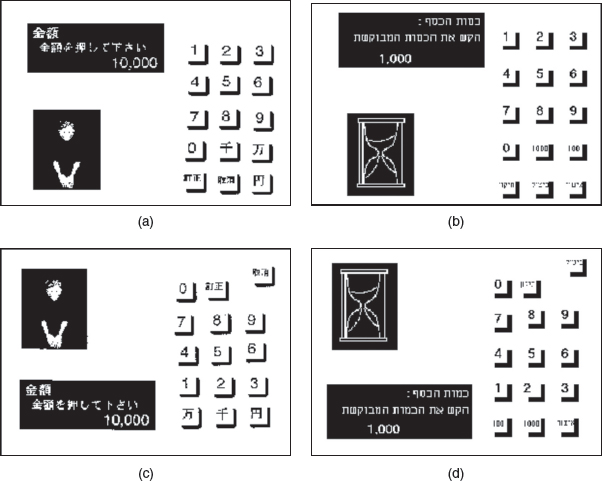
Figure 1.10 Are attractive interfaces more or less usable? An original Japanese interface, rated (a) high and (c) low on apparent usability and aesthetics (Kurosu and Kashimura, 1995) and the equivalent Israeli interface rated (b) high and (d) low on apparent usability and aesthetics (Tractinsky, N. 1997)
Activity 1.5
Study the four screens in Figure 1.10 for the two different ATM designs. The screens in Figure 1.10(a) and 1.10(c) were developed by Japanese researchers and the screens in Figure 1.10(b) and 1.10(c) were developed by Israelis. Compare these pairs of screen to identify how they differ and suggest why screens (a) and (b) were rated high on usability while (c) and (d) were rated low.
Aesthetic differences can be subtle, especially concerning page layout. The differences here are:
- In (a) and (b) the keypad runs from 1 to 9 top to bottom, while in (c) and (d) it runs from 1 to 9 from bottom to top.
- The positioning of the amount of money is placed in the top left hand corner in (a) and (b) making it prominent and easy to find. In (c) and (d) the amount is in the bottom left hand corner.
- The keypad in (a) and (b) is symmetrical, while asymmetrical in (c) and (d).
1.6.3 Design Principles
Design principles are used by interaction designers to aid their thinking when designing for the user experience. These are generalizable abstractions intended to orient designers towards thinking about different aspects of their designs. A well-known example is feedback: products should be designed to provide adequate feedback to the users to ensure they know what to do next in their tasks. Design principles are derived from a mix of theory-based knowledge, experience, and common sense. They tend to be written in a prescriptive manner, suggesting to designers what to provide and what to avoid at the interface—if you like, the dos and don'ts of interaction design. More specifically, they are intended to help designers explain and improve their designs (Thimbleby, 1990). However, they are not intended to specify how to design an actual interface, e.g. telling the designer how to design a particular icon or how to structure a web portal, but act more like triggers to designers, ensuring that they have provided certain features at an interface.
A number of design principles have been promoted. The best known are concerned with how to determine what users should see and do when carrying out their tasks using an interactive product. Here we briefly describe the most common ones: visibility, feedback, constraints, consistency, and affordances. Each of these has been written about extensively by Don Norman 1998 in his bestseller The Design of Everyday Things.
Visibility. The importance of visibility is exemplified by our contrasting examples at the beginning of the chapter. The voice mail system made the presence and number of waiting messages invisible, while the answer machine made both aspects highly visible. The more visible functions are, the more likely users will be able to know what to do next. Norman (1998) describes the controls of a car to emphasize this point. The controls for different operations are clearly visible, e.g. indicators, headlights, horn, hazard warning lights, indicating what can be done. The relationship between the way the controls have been positioned in the car and what they do makes it easy for the driver to find the appropriate control for the task at hand.
In contrast, when functions are ‘out of sight,’ it makes them more difficult to find and know how to use. For example, devices and environments that have become automated through the use of sensor-technology (usually for hygiene and energy-saving reasons)—like faucets, elevators, and lights—can sometimes be more difficult for people to know how to control, especially how to activate or deactivate them. This can result in users getting caught out and frustrated (see Figure 1.11). Highly visible controlling devices, like knobs, buttons, and switches, which are intuitive to use, have been replaced by invisible and ambiguous ‘activating zones’ where people have to guess where to move their hands, bodies, or feet on, into, or in front of to make them work.
Feedback. Related to the concept of visibility is feedback. This is best illustrated by an analogy to what everyday life would be like without it. Imagine trying to play a guitar, slice bread using a knife, or write using a pen if none of the actions produced any effect for several seconds. There would be an unbearable delay before the music was produced, the bread was cut, or the words appeared on the paper, making it almost impossible for the person to continue with the next strum, saw, or stroke.

Figure 1.11 A sign in the restrooms at Cincinnati airport. Because it is not visible to the user as to what to do to turn the faucet on and off, a sign has been added to explain what is normally an everyday and well-learned activity. It does not explain, however, what to do if you are wearing black clothing
Feedback is about sending back information about what action has been done and what has been accomplished, allowing the person to continue with the activity. Various kinds of feedback are available for interaction design—audio, tactile, verbal, visual, and combinations of these. Deciding which combinations are appropriate for different kinds of activities and interactivities is central. Using feedback in the right way can also provide the necessary visibility for user interaction.
Constraints. The design concept of constraining refers to determining ways of restricting the kinds of user interaction that can take place at a given moment. There are various ways this can be achieved. A common design practice in graphical user interfaces is to deactivate certain menu options by shading them, thereby restricting the user to only actions permissible at that stage of the activity (see Figure 1.12). One of the advantages of this form of constraining is that it prevents the user from selecting incorrect options and thereby reduces the chance of making a mistake. The use of different kinds of graphical representations can also constrain a person's interpretation of a problem or information space. For example, flow chart diagrams show which objects are related to which, thereby constraining the way the information can be perceived. The physical design of a device can also constrain how it is used, for example, the external slots in a computer or PDA have been designed to only allow a cable or card to be inserted in a certain way. Sometimes, however, the physical constraint is ambiguous, as shown in Figure 1.13.
Figure 1.12 A menu showing restricted availability of options as an example of logical constraining. Shaded area indicates deactivated options
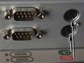
Figure 1.13 Where do you plug in the mouse and keyboard? This figure shows part of the back of a computer. There are two sets of connectors; the two on the right are for a mouse and a keyboard. They look identical and are physically constrained in the same way. How do you know which is which? Do the labels help?
Consistency. This refers to designing interfaces to have similar operations and use similar elements for achieving similar tasks. In particular, a consistent interface is one that follows rules, such as using the same operation to select all objects. For example, a consistent operation is using the same input action to highlight any graphical object at the interface, such as always clicking the left mouse button. Inconsistent interfaces, on the other hand, allow exceptions to a rule. An example of this is where certain graphical objects, e.g. email messages presented in a table, can be highlighted only by using the right mouse button, while all other operations are highlighted using the left button. A problem with this kind of inconsistency is that it is quite arbitrary, making it difficult for users to remember and making the users more prone to mistakes.
One of the benefits of consistent interfaces, therefore, is that they are easier to learn and use. Users have to learn only a single mode of operation that is applicable to all objects. This principle works well for simple interfaces with limited operations, like a mini CD player with a small number of operations mapped onto separate buttons. Here, all the user has to do is learn what each button represents and select accordingly. However, it can be more problematic to apply the concept of consistency to more complex interfaces, especially when many different operations need to be designed for. For example, consider how to design an interface for an application that offers hundreds of operations, e.g. a word-processing application. There is simply not enough space for a thousand buttons, each of which maps onto an individual operation. Even if there were, it would be extremely difficult and time-consuming for the user to search through them all to find the desired operation. A much more effective design solution is to create categories of commands that can be mapped into subsets of operations.
Affordance is a term used to refer to an attribute of an object that allows people to know how to use it. For example, a mouse button invites pushing (in so doing activating clicking) by the way it is physically constrained in its plastic shell. At a very simple level, to afford means “to give a clue” (Norman, 1988). When the affordances of a physical object are perceptually obvious it is easy to know how to interact with it. For example, a door handle affords pulling, a cup handle affords grasping, and a mouse button affords pushing. Norman introduced this concept in the late 1980s in his discussion of the design of everyday objects. Since then, it has been much popularized, being used to describe how interface objects should be designed so that they make obvious what can be done to them. For example, graphical elements like buttons, icons, links, and scrollbars are talked about with respect to how to make it appear obvious how they should be used: icons should be designed to afford clicking, scrollbars to afford moving up and down, buttons to afford pushing.
Unfortunately, the term ‘affordance’ has become rather a catch-all phrase, losing much of its potency as a design principle. Norman (1999), who was largely responsible for originally promoting the concept in his book The Design of Everyday Things (1988), despairs at the way it has come to be used in common parlance:
“I put an affordance there,” a participant would say, “I wonder if the object affords clicking …” affordances this, affordances that. And no data, just opinion. Yikes! What had I unleashed upon the world? Norman's (1999) reaction to a CHI-Web discussion.
He has since tried to clarify his argument about the utility of the concept by saying there are two kinds of affordance: perceived and real. Physical objects are said to have real affordances, like grasping, that are perceptually obvious and do not have to be learned. In contrast, user interfaces that are screen-based are virtual and do not have these kinds of real affordances. Using this distinction, he argues that it does not make sense to try to design for real affordances at the interface—except when designing physical devices, like control consoles, where affordances like pulling and pressing are helpful in guiding the user to know what to do. Alternatively, screen-based interfaces are better conceptualized as perceived affordances, which are essentially learned conventions. In conclusion, Norman argues that other design concepts, like feedback and constraints, are more useful for helping designers develop graphical user interfaces.
There are also numerous websites and guidebooks that provide more exhaustive sets of design principles that we have just touched upon here, with specific examples for designing the web, GUIs, and more generally interaction design. Two of the most well-known websites that provide design principles with examples to illustrate how to use them are Tog's First Principles of Interaction Design (asktog.com) and Jakob Nielsen's useit.com site.
Applying Design Principles in Practice
One of the problems of applying more than one of the design principles in interaction design is that trade-offs can arise between them. For example, the more you try to constrain an interface, the less visible information becomes. The same can also happen when trying to apply a single design principle. For example, the more an interface is designed to ‘afford’ through trying to resemble the way physical objects look, the more it can become cluttered and difficult to use. Consistency can be a problematic design principle; trying to design an interface to be consistent with something can make it inconsistent with something else. Furthermore, sometimes inconsistent interfaces are actually easier to use than consistent interfaces. Grudin (1989) illustrates the consistency dilemma with an analogy to where knives are stored in a house. Knives come in a variety of forms, e.g. butter knives, steak knives, table knives, fish knives. An easy place to put them all and subsequently locate them is in the top drawer by the sink. This makes it easy for everyone to find them and follows a simple consistent rule. But what about the knives that don't fit or are too sharp to put in the drawer, like carving knives and bread knives? They are placed in a wooden block. And what about the best knives kept only for special occasions? They are placed in the cabinet in the other room for safekeeping. And what about other knives like putty knives and paint-scraping knives used in home projects (kept in the garage) and jack knives (kept in one's pockets or backpack)? Very quickly the consistency rule begins to break down.
Grudin notes how in extending the number of places where knives are kept inconsistency is introduced, which in turn increases the time needed to learn where they are all stored. However, the placement of the knives in different places often makes it easier to find them because they are at hand for the context in which they are used and also next to the other objects used for a specific task, e.g. all the home project tools are stored together in a box in the garage. The same is true when designing interfaces: introducing inconsistency can make it more difficult to learn an interface but in the long run can make it easier to use.
Activity 1.6
One of the main design principles which Nielsen has proselytized, especially for website design, is simplicity. He proposes that designers go through all of their design elements and remove them one by one. If a design works just as well without an element, then remove it. Do you think this is a good design principle? If you have your own website, try doing this and seeing what happens. At what point does the interaction break down?
Comment
Simplicity is certainly an important design principle. Many designers try to cram too much into a screenful of space, making it unwieldy for people to find what they are interested in. Removing design elements to see what can be discarded without affecting the overall function of the website can be a salutary lesson. Unnecessary icons, buttons, boxes, lines, graphics, shading, and text can be stripped, leaving a cleaner, crisper, and easier-to-navigate website. However, graphics, shading, coloring, and formatting can make a site aesthetically pleasing and enjoyable to use. Plain vanilla sites with just lists of text and a few hyperlinks may not be as appealing and may put certain visitors off returning. Good interaction design involves getting the balance between aesthetic appeal and the right amount and kind of information per page.
Box 1.4: Usable Usability: Which Terms do I Use?
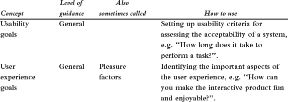
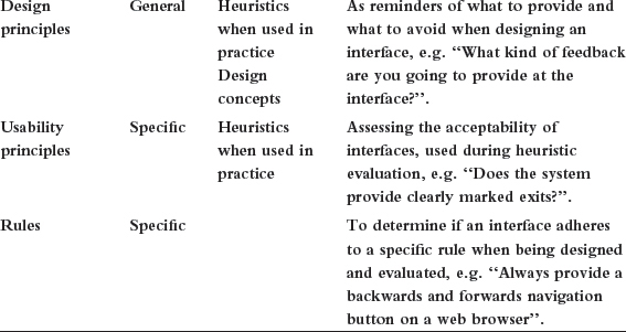
The various terms proposed for describing the different aspects of usability can be confusing. They are often used interchangeably and in different combinations. Some people talk about usability design principles, others usability heuristics, and others design concepts. The key is understanding how to use the different levels of guidance. ‘Guidelines’ is the most general term used to refer to all forms of guidance.
‘Goals’ refer to the high-level usability aims of the system, e.g. it should be efficient to use. ‘Principles’ refer to general guidance intended to inform the design and evaluation of a system. ‘Rules’ are low-level guidance that refer to a particular prescription that must be followed. ‘Heuristics’ is a general term used to refer to design and usability principles when applied to a particular design problem.
Dilemma: Device Clutter: Convergence or Specialization?
Look around your living room and you are likely to see a range of home entertainment systems, each with its own remote control. One for the TV, one for the DVD player, one for the CD player, one for the sound system, one for the robot toy, and so on. According to a survey carried out by Intel at the end of 2004, over 50% of British households owned five or more remote controls and 25% had more than seven. For many of us, it can be frustrating to learn how to use them all and then remember how to use them. Often there is a lack of consistency between the remote controls—the ways of operating them can be quite different, even for the most basic of functions, e.g. switching on and off, stopping, rewinding, or increasing volume. The same holds true for our ever-increasing collection of personal devices, where even the most basic controls on PDAs, MP3s, cell phones, digital cameras, etc., can be inconsistent.
How can we reduce the usability problems that come with device clutter? One approach is convergence. By this is meant designing a single control, hand-held, or PC that does everything. Already we are seeing a new generation of cell phones that has moved towards a model of multifunction convergence; as well as enabling phone calls and texting, cell phones now offer an increasing number of other functions, including taking and sending pictures, video streaming, live multiplayer games, huge memory storage, and a personal music system. Likewise, several companies have begun developing a single powerful PC targetted for the living room, which combines the functionality of all manner of devices and systems all in one box.
But is it possible to design a usable, all-in-one interface, for controlling a multifunction single device/PC? In particular, can an interface be designed that is easy to understand by users, especially those who are not technology savvy, which enables them to seamlessly and effortlessly switch between quite different activities, such as listening to music, making a call, taking a picture, and watching streaming video? Compromises can result when one device is asked to do the work of many. In particular, the complexity required can often result in a confusing interface. The result can be an overbloated and over-specified device that is impossible to use. In contrast, specialization may be a better solution where the form, factor, look and feel, and features of a single device are designed for a specific task. The major benefit of doing so is that the device is designed to fit the task and person using it.
James Landay (2005), a director of Intel research, however, thinks that just like the GUI desktop interface made it possible for a wide range of users to easily carry out multiple tasks on a PC so, too, will a ubiquitous and easy-to-use interface for multifunction home and personal devices be able to achieve this. What do you think?
Assignment
This assignment is intended for you to put into practice what you have read about in this chapter. Specifically, the objective is to enable you to define usability and user experience goals and to transform these and other design principles into specific questions to help evaluate an interactive product.
Find an everyday handheld device, e.g. remote control, digital camera, cell phone and examine how it has been designed, paying particular attention to how the user is meant to interact with it.
- From your first impressions, write down what first comes to mind as to what is good and bad about the way the device works.
- Give a description of the user experience resulting from interacting with it.
- Based on your reading of this chapter and any other material you have come across, compile a set of usability and user experience goals that you think will be most relevant in evaluating the device. Decide which are the most important ones and explain why.
- Translate each of your set of usability and user experience goals into two or three specific questions. Then use them to assess how well your device fares.
- Repeat (c) and (d) using the design principles outlined in the chapter.
- Finally, discuss possible improvements to the interface based on the answers obtained for (d) and (e).
Summary
In this chapter we have looked at what interaction design is and why it is growing in importance. To begin, a number of good and bad designs were presented to illustrate how interaction design can make a difference. We described who and what is involved in interaction design, and the core set of design processes that need to be followed. We explained in detail what usability and user experience are and how they have been characterized, and how to operationalize them in order to assess the quality of a user experience resulting from interacting with an interactive product. The increasing emphasis on designing for the user experience and not just usable products was stressed. A number of core design principles were also introduced that provide guidance for helping inform the interaction design process.
Key Points
- Interaction design is concerned with designing interactive products to support the way people communicate and interact in their everyday and working lives.
- Interaction design is multidisciplinary, involving many inputs from wide-ranging disciplines and fields.
- Central to interaction design is determining how to create quality user experiences.
- Optimizing the interaction between users and interactive products requires taking into account a number of interdependent factors, including context of use, types of activity, cultural differences, and user groups.
- Identifying and specifying relevant usability and user experience goals can help lead to the design of good interactive products.
- Design principles, like feedback and simplicity, are useful heuristics for analyzing and evaluating aspects of an interactive product.
Further Reading
Here we recommend a few seminal readings on interaction design and the user experience. A more comprehensive list of useful books, articles, websites, videos, and other material can be found at our website.
COOPER, A. and REIMAN, R (2003) About Face 2.0: The essentials of interaction design. John Wiley. This is a second edition of ‘About Face’ and provides an updated overview of what is involved in interaction design, written in a very personable style that appeals to practitioners and students alike. It focuses primarily on designing for desktop platforms but also includes chapters on the web and device platforms.
GARRETT, J.J. (2003) The Elements of User Experience: User Centered Design for the Web. Easy Riders. This is a coffee-table introductory book to interaction design that focuses on how to ask the right questions when designing for a user experience. It emphasizes the importance of understanding how products work on the outside, i.e. when a person comes into contact with them and tries to work with them. It also takes into account a business perspective.
GRUDIN, J. (1990) The computer reaches out: the historical continuity of interface design. In CHI '90 Proceedings, pp. 261–268. This is an overview of how the interface has developed during the 30 years leading to the 1990s. Although somewhat dated, it is a classic of its time.
LIDWELL, W. HOLDEN, K. and BUTLER, J. (2003) Universal Principles of Design. Rockport Publishers, Inc. This book presents over 100 design principles that include consistency, accessibility, and visibility but also some lesser known ones, such as constancy, chunking, and symmetry. They are alphabetically ordered (for easy reference) with a diversity of examples to illustrate how they work and can be used.
NORMAN, D. (1988) The Design of Everyday Things. Doubleday (especially Chapter 1). Norman's writing is accessible and enjoyable to read. He writes extensively about the design and usability of everyday objects like doors, faucets, and fridges. These examples provide much food for thought in relation to designing interfaces.
NORMAN, D. (1999) ACM Interactions Magazine, May/June, 38–42. Affordances, conventions, and design. This is a short and thought-provoking critique of design principles.
WINOGRAD, T. (1997) From computing machinery to interaction design. In P. Denning and R. Metcalfe (eds) Beyond Calculation: The Next Fifty Years of Computing. Springer-Verlag, pp. 149– 162. Terry Winograd provides an overview of how interaction design has emerged as a new area, explaining how it does not fit into any existing design or computing fields. He describes the new demands and challenges facing the profession.
INTERVIEW: with Gitta Salomon

Gitta Salomon is a consultant interaction designer. She founded Swim Interaction Design Studio (swimstudio.com) in 1996 as a consultancy company to assist clients with the design of interactive products. Recently, many of her clients have included start-up companies, developing web-based and other products, who realize the importance of interaction design in ensuring their products are successful but don't know how to do this. Often they get in touch with Swim with partially developed products and ask for help with their interaction design. Swim has consulted for a range of clients, including Apple Computer, Nike, IBM, DoubleClick, Webex, and Gap, Inc.
YR: What is your approach to interaction design?
GS: I've devised my own definition: interaction design is the design of products that reveal themselves over time. Users don't necessarily see all the functionality in interactive products when they first look at them. For example, the first screen you see on a cell phone doesn't show you everything you can do with it. As you use it, additional functionality is revealed to you. Same thing with a web-based application or a Window's application—as you use them you find yourself in different states and suddenly you can do different things. This idea of revealing over time is possible because there is a microprocessor behind the product and usually there is also a dynamic display. I believe this definition characterizes the kind of products we work on—which is a very wide range, not just web products.
YR: How would you say interaction design has changed in the years since you started Swim?
GS: I don't think what we do has changed fundamentally, but the time frame for product development is much shorter. And seemingly more people think they want interaction design assistance. That has definitely changed. There are more people who don't necessarily know what interaction design is, but they are calling us and saying “we need it.” All of a sudden there is a great deal of focus and money on all of these products that are virtual and computationally based, which require a different type of design thinking.
YR: So what were the kinds of projects you were working on when you first started Swim?
GS: They were less web-centric. There was more software application design and a few hardware/software type things. Between 2001 and 2004, the focus shifted to almost exclusively web-based applications. However, these are quite similar to software applications—they just have different implementation constraints. More recently, the hardware/software products are starting to pick up again—it does seem that information appliances are going to take off. The nature of the problems we solve hasn't changed much; it's the platform and associated constraints that change.
YR: What would you say are the biggest challenges facing yourself and other consultants doing interaction design these days?
GS: One of the biggest challenges is remembering that half of what we do is the design work and the other half is the communication of that design work. The clients almost never bridge the gap for us: we need to bridge it. We always have to figure out how to deliver the work so it is going to have impact. We are the ones who need to ensure that the client is going to understand the deliverable and know what to do with it. That part of the work is oftentimes the most difficult. It means we've got to figure out what is going on internally with the client and decide how what we deliver will be effective. In some cases you just start seeing there is no place to engage with the client. And I think that is a very difficult problem. Most people right now don't have a product development process. They are just going for it. And we have to figure out how to fit into what is best described as a moving train.
YR: And what do you use when you try to communicate with them? Is it a combination of talking, meetings, and reports?
GS: We do a number of different things. Usually we will give them a written document, such as a report or a critique of their product. Sometimes we will give them interactive prototypes in Director, Flash, or HTML, things that simulate what the product experience would feel like. In the written materials, I often name the things that we all need to be talking about. Then at least we all have a common terminology to discuss things. It is a measure of our success if they start using the words that we gave them, because we truly have influenced their thinking. A lot of times we'll give them a diagram of what their system is like, because nobody has ever visualized it. We serve as the visualizers, taking a random assortment of vaguely defined concepts and giving some shape to them. We'll make an artifact, which allows them to say “Yes, it is like that” or “No, it's not like that, it's like this….” Without something to point to they couldn't even say to each other “No, that is not what I mean” because they didn't know if they were talking about the same thing. Many times we'll use schematic diagrams to represent system behavior. Once they have these diagrams then they can say “Oh no, we need all this other stuff in there, we forgot to tell you.” It seems that nobody is writing complete lists of functionality, requirements, specifications, or complete documentation anymore. This means the product ideas stay in somebody's head until we make them tangible through visualization.
YR: So this communication process is just as important as the ideas?
GS: I think it is, a lot of times.
YR: So, how do you start with a client?
GS: For clients who already have something built, I find that usually the best way for us to get started is to begin with the client doing a comprehensive demo of their product for us. We will usually spend a whole day collecting information. Besides the demo, they tell us about their target market, competitors, and a whole range of things. Over a longer period of time, we use the product and observe other people using it to get a much broader picture. Because the client's own vision of their product is so narrow, we have to step back from what they initially tell us.
YR: So do you write notes, and then try and put it together afterwards, or—what?
GS: We use all kinds of things. We use notes and video, and we sit around with tracing paper and marker pens. When reviewing the materials, I often try and bring them together in some sort of thematic way. It's often mind-boggling to bring a software product that's been thrown together into any kind of coherent framework. It's easy to write a shopping list of observations, but we want to assemble a larger structure and framework and that takes time to construct. We need to reflect and stew on what was done and what, maybe, should have been done. We need to highlight the issues and put them into some kind of larger order. If you always operate at a low level of detail, like worrying and critiquing the size of a button, you end up solving only local issues. You never really get to the big interaction design problems of the product, the ones that should be solved first.
YR: If you're given a prototype or product to evaluate and you discover that it is really bad, what do you do?
GS: Well, I almost never have the guts to go in and say something is fundamentally flawed. And that's perhaps not the best strategy anyway, because it's your word against theirs. Instead, I think it is always about making the case for why something is wrong or flawed. Sometimes I think we are like lawyers. We have to assemble the case for what's wrong with the product. We have to make a convincing argument, one that allows the client to get past their biases and grasp where and why things have gone wrong.
1 We use the term interactive products generically to refer to all classes of interactive systems, technologies, environments, tools, applications, services, and devices.