
Interfaces and interactions
6.1 Introduction
6.2 Paradigms
6.3 Interface types
6.4 Which interface?
The main aims of this chapter are:
- To introduce the notion of a paradigm and set the scene for how the various interfaces have developed in interaction design.
- To overview the many different kinds of interfaces.
- To highlight the main design and research issues for each of the different interfaces.
- To consider which interface is best for a given application or activity.
6.1 Introduction
Until the mid-1990s, interaction designers concerned themselves largely with developing efficient and effective user interfaces for desktop computers aimed at the single user. This involved working out how best to present information on a screen such that users would be able to perform their tasks, including determining how to structure menus to make options easy to navigate, designing icons and other graphical elements to be easily recognized and distinguished from one another, and developing logical dialog boxes that are easy to fill in. Advances in graphical interfaces, speech and handwriting recognition, together with the arrival of the Internet, cell phones, wireless networks, sensor technologies, and an assortment of other new technologies providing large and small displays, have changed the face of human–computer interaction. During the last decade designers have had many more opportunities for designing user experiences. The slew of technological developments has encouraged different ways of thinking about interaction design and an expansion of research in the field. For example, innovative ways of controlling and interacting with digital information have been developed that include gesture-based, tactile-based, and emotion-based interaction. Researchers and developers have also begun combining the physical and digital worlds, resulting in novel interfaces, including ‘mixed realities,’ ‘augmented realities,’ ‘tangible interfaces,’ and ‘wearable computing.’ A major thrust has been to design new interfaces that extend beyond the individual user: supporting small- and large-scale social interactions for people on the move, at home, and at work.
While making for exciting times, having so many degrees of freedom available within which to design can be daunting. The goal of this chapter is to consider how to design interfaces for different environments, people, places, and activities. To begin with, we give an overview of paradigmatic developments in interaction design. We then present an overview of the major interface developments, ranging from WIMPs (windows, icons, menus, pointer) to wearables. For each one, we outline the important challenges and issues confronting designers, together with illustrative research findings and products.
It is not possible to describe all the different types of interface in one book, let alone one chapter, and so we have necessarily been selective in what we have included. There are many excellent practitioner-oriented handbooks available that cover in more detail design concerns for a particular kind of interface or technology/application (see end of the chapter for examples). These include web, multimedia, and more recently handheld/mobile technology design. Here, we provide an overview of some of the key research and design concerns for a selection of interfaces, some of which are only briefly touched upon while others, that are more established in interaction design, are described in depth. Nevertheless, the chapter is much longer than the others in the book and can be read in sections or simply dipped into to find out about a particular type of interface.
6.2 Paradigms
Within interaction design, a paradigm refers to a particular approach that has been adopted by the community of researchers and designers for carrying out their work, in terms of shared assumptions, concepts, values, and practices. This follows from the way the term has been used in science to refer to a set of practices that a community has agreed upon, including:
- The questions to be asked and how they should be framed.
- The phenomena to be observed.
- The way findings from experiments are to be analyzed and interpreted (Kuhn, 1962).
In the 1980s, the prevailing paradigm in human–computer interaction was how to design user-centered applications for the desktop computer. Questions about what and how to design were framed in terms of specifying the requirements for a single ‘user’ interacting with a screen-based ‘interface.’ Task analytic and usability methods were developed based on an individual user's cognitive capabilities. The acronym WIMP was used as one way of characterizing the core features of an interface for a single user: this stood for Windows, Icons, Menus, and Pointer. This was later superseded by the GUI (graphical user interface), a term that has stuck with us ever since.
Within interaction design, many changes took place in the mid- to late 1990s. The WIMP interface with its single thread, discrete event dialog was considered to be unnecessarily limiting, e.g. Jacob, 1996. Instead, many argued that new frameworks, tools, and applications were needed to enable more flexible forms of interaction to take place, having a higher degree of interactivity and parallel input/output exchanges. At the same time, other kinds of non-WIMP interfaces were experimented with. The shift in thinking, together with technological advances, led to a new generation of user–computer environments, including virtual reality, multimedia, agent interfaces, pen-based interfaces, eye-movement-based interfaces, tangible interfaces, collaborative interfaces, and ubiquitous computing. The effect of moving interaction design ‘beyond the desktop’ resulted in many new challenges, questions, and phenomena being considered. New methods of designing, modeling, and analyzing came to the fore. At the same time, new theories, concepts, and ideas entered the stage. A turn to the ‘social,’ the ‘emotional,’ and the ‘environmental’ began shaping what was studied, how it was studied, and ultimately what was designed. Significantly, one of the main frames of reference—the single user—was replaced by a set of others, including people, places, and context.
One of the most influential developments that took place was the birth of ubiquitous computing (Weiser, 1991). A main idea was that the advent of ubiquitous computing (or ‘UbiComp’ as it is commonly known) would radically change the way people think about and interact with computers. In particular, computers would be designed to be part of the environment, embedded in a variety of everyday objects, devices, and displays (see Figure 6.1). The idea behind Weiser's vision was that a ubiquitous computing device would enter a person's center of attention when needed and move to the periphery of their attention when not, enabling the person to switch calmly and effortlessly between activities without having to figure out how to use a computer in performing their tasks. In essence, the technology would be unobtrusive and largely disappear into the background. People would be able to get on with their everyday and working lives, interacting with information and communicating and collaborating with others without being distracted or becoming frustrated with technology.
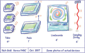
Figure 6.1 Examples of sketches for the new ubiquitous computing paradigm
The grand vision of ubiquitous computing has led to many new challenges, themes, and questions being articulated in interaction design and computer science. These include:
- How to enable people to access and interact with information in their work, social, and everyday lives, using an assortment of technologies.
- How to design user experiences for people using interfaces that are part of the environment but where there are no obvious controlling devices.
- How and in what form to provide contextually-relevant information to people at appropriate times and places to support them while on the move.
- How to ensure that information that is passed around via interconnected displays, devices, and objects, is secure and trustworthy.
The shift in thinking about ubiquitous computing has resulted in many new research and design activities and an extended vocabulary. Other terms, including pervasive computing, the disappearing computer, and ambient intelligence, have evolved that have different emphases and foci (we view them here as overlapping). In the next section, we describe the many new (and old) forms of interfaces that have been developed.
6.3 Interface Types
There are many kinds of interface that can be used to design for user experiences. A plethora of adjectives have been used to describe these, including graphical, command, speech, multimodal, invisible, ambient, mobile, intelligent, adaptive, and tangible. Some of the interface types are primarily concerned with a function (e.g. to be intelligent, to be adaptive, to be ambient), while others focus on the interaction style used (e.g. command, graphical, multimedia), the input/output device used (e.g. pen-based, speech-based), or the platform being designed for (e.g. PC, microwave). Here, we describe a selection of established and novel interfaces, outlining their benefits, and main design and research issues. We also include descriptions of illustrative products or prototypes that have been developed for each. The interface types are broken down into three decades loosely ordered in terms of when they were developed (see Table 6.1). It should be noted that this classification is not strictly accurate since some interface types emerged across the decades. The purpose of breaking them down into three sections is to make it easier to read about the many types.
1980s Interfaces
|
1990s interfaces
|
2000s interfaces
|
Table 6.1 The selection of interfaces, grouped into three decades, covered in this chapter that have evolved during the last 30 years
6.3.1 1980s interfaces
In this section we cover command and WIMP/GUI interfaces.
Command Interfaces
Command line driven interfaces require the user to type in commands that are typically abbreviations, e.g. ls, at the prompt symbol appearing on the computer display to which the system responds, e.g. by listing current files using a keyboard. Another way of issuing commands is through pressing certain combinations of keys, e.g. Shift+ Alt+ Ctrl. Some commands are also a fixed part of the keyboard, for example, ‘delete,’ ‘enter,’ and ‘undo,’ while other function keys can be programmed by the user as specific commands, e.g. F11 standing for ‘print’.
Activity 6.1
If you have not previously had any experience of a command-based interface, ask someone to set up a session for you on a UNIX terminal. Try using the UNIX commands SORT and ctrl D (to stop).
First type at the prompt sort
Then type in some names of animals, e.g.
Tiger
Elephant
Antelope
Snake
Then use the end of input command
^D (Ctrl D)
What happens on the screen? Do the same for a list of random numbers and see what happens.
Comment
The command SORT alphabetically or numerically sorts the typed input from the keyboard and will display your typed-in list of animals in alphabetical order and your list of numbers in numerical order. The same is true for a list of numbers. It is a very quick and efficient way of sorting and does not require selecting and specifying what to sort in a dialog box (as is required in GUI interfaces).
Advantages of command line based interfaces are their efficiency, precision, and speed. Users can issue a large number of commands that require one-step actions. Histories of interactions can be readily viewed at the prompt, allowing the user to see a trace of their interactions. However, efficiency and speed come at a cost. As you yourself may have experienced, there is a huge overhead in having to learn and remember all the key combinations or abbreviations or names used in a command line based system. While some people are able to remember the meaning of a large number of command names/keys and able to recall them when needed, many users find it difficult. This is especially so for infrequently used commands, where the user has to look them up in a manual or table. This can be time-consuming and break the flow of the interaction. Furthermore, selecting the wrong function key or combination of keys can occur when commands have been designed arbitrarily, e.g. F10 for save, or follow inconsistent rules, e.g. using Ctrl plus first letter of an operation for some commands and not others, such as Ctrl + F keys for Find, and Ctrl +V for Paste.
Box 6.1: Expert Use of Commands in AutoCAD
AutoCAD LT is a Windows version of a popular drafting package used by a variety of professionals in the building and engineering trade. It is designed to be used by expert draughtsmen/women and offers a sophisticated interface that combines a number of styles. It is a good example of using the different interaction styles for the most appropriate actions. Figure 6.2 illustrates the application's interface. The user has the option of issuing commands using the menus at the top of the screen, the toolbar just below the menus, or by entering the commands directly in the window offered at the bottom (note that this window can be resized, and most expert users keep this portion of the screen to only 3 or 4 lines at most). In addition, entry of point locations on the drawing can be done using a pointing device or by entering coordinates at the command line. The keyboard function keys offer shortcuts for other commands, and there is a set of buttons at the bottom of the screen offering further commands.
The command line portion of the screen has several purposes. First, commands issued using the toolbar, menus, function keys, or pointing device are echoed in the command line window. Second, the user is prompted regarding the appropriate options or other entries needed to complete a command. Third, the command line can be used to enter commands, point locations, or dimensions directly from the keyboard. Fourth, error messages are displayed here.
The two screens shown in Figure 6.2 illustrate some of the steps used to draw the two red squares in the top left of the drawing in Figure 6.2(b) (this was part of the action necessary to add some filing cabinets to the office layout shown). The first screen illustrates some of the commands issued in order to set up a coordinate system in the correct location on the drawing. This is reflected in the first 9 lines of the command line portion of the screen. Note the different responses recorded in the dialog window. The option ‘o’ was chosen using another menu command, the default for the new origin point was accepted by hitting ‘return’ at the keyboard. The user then attempted to turn the grid on by pressing the GRID button at the bottom of the screen, but this resulted in the error message “Grid too dense to display.” The command ‘ucsicon’ was typed via the keyboard. This command displays the coordinate origin on the drawing, and the user first turned this ‘on’ to check that it was in the right place, and then turned it ‘off.’ Both ‘on’ and ‘off’ were typed at the keyboard.
The second screen shows some of the dialog for drawing the two squares. The rectangle and offset commands this time were issued using the toolbar, and the coordinates were entered using the keyboard.
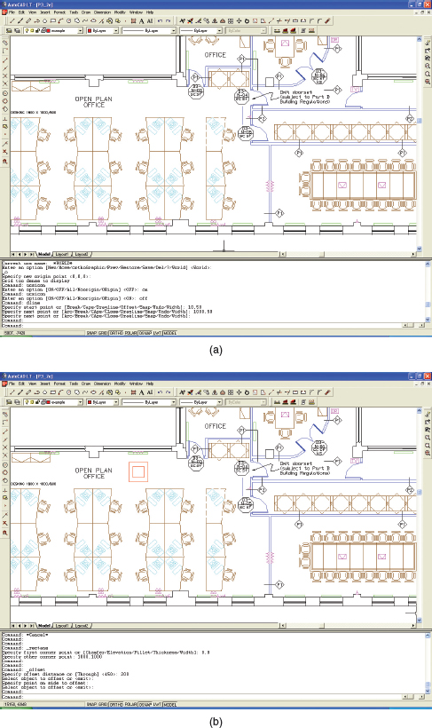
Figure 6.2 (a) The first step in drawing the new cabinets is to set up the coordinate system in the correct location. (b) Screen dump showing some of the commands issued in order to draw the red squares at the top of the drawing
In the early 1980s, much research investigated ways of optimizing command-based interfaces. The form of the commands (e.g. use of abbreviations, full names, familiar names), syntax (e.g. how best to combine different commands), and organization (e.g. how to structure options) are examples of some of the main areas that have been investigated (Shneiderman, 1998). A further concern was which names to use as commands that would be the easiest to remember. A number of variables were tested, including how familiar users were with the chosen names. Findings from a number of studies, however, were inconclusive; some found specific names were better remembered than general ones (Barnard et al., 1982), others showed names selected by users themselves were preferable (e.g. Ledgard et al., 1981; Scapin, 1981), while yet others demonstrated that high-frequency words were better remembered than low-frequency ones (Gunther et al., 1986).
The most relevant design principle is consistency (see Chapter 1). The method used for labeling/naming the commands should be chosen to be as consistent as possible, e.g. always use first letters of operation when using abbreviations.
Command-line interfaces have been largely superseded by graphical interfaces that incorporate commands as menus, icons, keyboard shortcuts, and pop-up/predictable text commands as part of an application. Where command line interfaces continue to have an advantage is when users find them easier and faster to use than equivalent menu-based systems (Raskin, 2000) and for performing certain operations as part of a complex software package, as we saw in Box 6.2. They also provide scripting for batch operations and are being increasingly used on the Web, where the search bar acts as a general purpose command line facility, e.g. www.yubnub.org. Many programmers prefer managing their files at the DOS/UNIX shell level of an operating system, while using command line text editors, like vi, when coding and debugging.
WIMP/GUI Interfaces
The Xerox Star interface (described in Chapter 2) led to the birth of the WIMP and subsequently the GUI, opening up new possibilities for users to interact with a system and for information to be presented and represented at the interface. Specifically, new ways of visually designing the interface became possible, that included the use of color, typography, and imagery (Mullet and Sano, 1995). The original WIMP comprises:
- Windows (that could be scrolled, stretched, overlapped, opened, closed, and moved around the screen using the mouse).
- Icons (that represented applications, objects, commands, and tools that were opened or activated when clicked on).
- Menus (offering lists of options that could be scrolled through and selected in the way a menu is used in a restaurant).
- Pointing device (a mouse controlling the cursor as a point of entry to the windows, menus, and icons on the screen).
The first generation of WIMP interfaces was primarily boxy in design; user interaction took place through a combination of windows, scroll bars, checkboxes, panels, palettes, and dialog boxes that appeared on the screen in various forms (see Figure 6.3). Application programmers were largely constrained by the set of widgets available to them, of which the dialog box was most prominent. (A widget is a standardized display representation of a control, like a button or scroll bar, that can be manipulated by the user.)
Figure 6.3 The boxy look of the first generation of GUIs. The window presents several checkboxes, notes boxes, and options as square buttons
The basic building blocks of the WIMP are still part of the modern GUI, but have evolved into a number of different forms and types. For example, there are now many different types of icons and menus, including audio icons and audio menus, 3D animated icons, and 2D icon-based menus. Windows have also greatly expanded in terms of how they are used and what they are used for; for example, a variety of dialog boxes, interactive forms, and feedback/error message boxes have become pervasive. In addition, a number of graphical elements that were not part of the WIMP interface have been incorporated into the GUI. These include toolbars and docks (a row or column of available applications and icons of other objects such as open files) and rollovers (where text labels appear next to an icon or part of the screen as the mouse is rolled over it). Here, we give an overview of the design issues concerning the basic building blocks of the WIMP/GUI: windows, menus, and icons.
Window design. Windows were invented to overcome the physical constraints of a computer display, enabling more information to be viewed and tasks to be performed at the same screen. Multiple windows can be opened at any one time, e.g. web pages and word documents, enabling the user to switch between them, when needing to look or work on different documents, files, and applications. Scrolling bars within windows also enable more information to be viewed than is possible on one screen. Scrollbars can be placed vertically and horizontally in windows to enable upwards, downwards, and sideways movements through a document.
One of the disadvantages of having multiple windows open is that it can be difficult to find specific ones. Various techniques have been developed to help users locate a particular window, a common one being to provide a list as part of an application menu. MacOS also provides a function that shrinks all windows that are open so they can be seen side by side on one screen (see Figure 6.4). The user needs only to press one function key and then move the cursor over each one to see what they are called. This technique enables the user to see at a glance what they have in their workspace and also enables them to easily select one to come to the forefront. Another option is to display all the windows open for a particular application, e.g. Word.
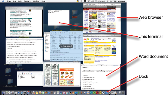
Figure 6.4 A window management technique provided in MacOS: pressing the F9 key causes all open windows to shrink and be placed side by side. This enables the user to see them all at a glance and be able to rapidly switch between them
A particular kind of window that is commonly used in GUIs is the dialog box. Confirmations, error messages, checklists, and forms are presented through them. Information in the dialog boxes is often designed to guide user interaction, with the user following the sequence of options provided. Examples include a sequenced series of forms (i.e. Wizards) presenting the necessary and optional choices that need to be filled in when choosing a PowerPoint presentation or an Excel spreadsheet. The downside of this style of interaction is that there can be a tendency to cram too much information or data entry fields into one box, making the interface confusing, crowded, and difficult to read (Mullet and Sano, 1995).
Box 6.2: The joys of filling in forms on the web
For many of us, shopping on the Internet is generally an enjoyable experience. For example, choosing a book on Amazon or flowers from Interflora can be done at our leisure and convenience. The part we don't enjoy, however, is filling in the online form to give the company the necessary details to pay for the selected items. This can often be a frustrating and time-consuming experience. It starts with having to create an account and a new password. Once past this hurdle, a new interactive form pops up for the delivery address and credit card details. The standard online form has a fixed format making it cumbersome and annoying to fill in, especially for people whose address does not fit within its constraints. Typically, boxes are provided (asterisked for where they must be filled in) for: address line 1 and address line 2, providing no extra lines for addresses that have more than two lines; a line for the town/city; and a line for the zip code (if the site is based in the USA) or other postal code (if based in another country). The format for the codes is different, making it difficult for non-US residents (and US residents for other country sites) to fill in this part. Further boxes are provided for home, work, and cell phone number, fax number, and email address (is it really necessary to provide all of these?) and credit card type, name of the owner, and credit card number.
One of the biggest gripes about online registration forms is the country of residence box that opens up as a never-ending menu, listing all of the countries in the world in alphabetical order. Instead of typing in the country they live in, users are forced to select the one they are from, which is fine if they happen to live in Australia or Austria but not if they live in Venezuela or Zambia. Some menus place the host site country first, but this can be easily overlooked if the user is primed to look for the letter of their country (see Figure 6.5).
This is an example of where the design principle of recognition over recall (see Chapter 3) does not apply and where the converse is true. A better design might be to have a predictive text option, where users need only to type in the first two or so letters of the country they are from to cause a narrowed down list of choices to appear that they can then select from at the interface.
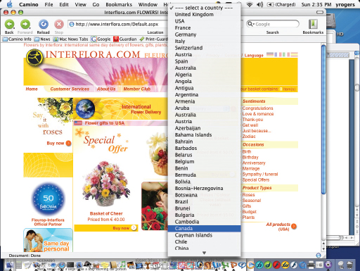
Activity 6.2
Go to the Interflora site (interflora.co.uk) and click on the international delivery option at the top of the homepage. How are the countries ordered? Is it an improvement to the scrolling pop-up menu?
At the time of writing this chapter, eight countries were listed at the top starting with the United Kingdom, then the USA, France, Germany, Italy, Switzerland, Austria, and Spain (see Figure 6.5). This was followed by the remaining set of countries listed in alphabetical order. The reason for having this particular ordering could be that the top eight are the countries who have most customers, with the UK residents using the service the most. More recently, the website had changed to using a table format grouping all the countries in alphabetical order using four columns across the page (see Table 6.2). Do you think this is an improvement? It took me about 8 seconds to select Sri Lanka, having overshot the target the first time I scrolled through, and 6 seconds to scroll through the more recent table (see below) using the web browser scrollbar.

Table 6.2 An excerpt of the listing of countries in alphabetical order using a table format
Research and design issues
A key research concern is window management—finding ways of enabling users to move fluidly between different windows (and monitors) and to be able to rapidly switch their attention between them to find the information they need or to work on the document/task within each of them—without getting distracted. Studies of how people use windows and multiple monitors have shown that window activation time (i.e. the time a window is open and interacted with) is relatively short, an average of 20 seconds, suggesting that people switch frequently between different documents and applications (Hutchings et al., 2004). Widgets like the taskbar in the Windows environment are used as the main method of switching between windows.
Microsoft and Apple are also continuously researching new ways of making switching between applications and documents simpler and coming up with new metaphors and organizing principles. An example is the ‘galleries’ concept (part of Microsoft Office 12), which provides users with a set of options to choose from (instead of a dialog box) when working on a document, spreadsheet, presentation, etc.
To increase the legibility and ease of use of information presented in windows, the design principles of spacing, grouping, and simplicity should be used (discussed in Chapter 3). An early overview of window interfaces—that is still highly relevant today—is Brad Myers's taxonomy of window manager interfaces (Myers, 1988).
Menu design. Just like restaurant menus, interface menus offer users a structured way of choosing from the available set of options. Headings are used as part of the menu to make it easier for the user to scan through them and find what they want. Figure 6.6 presents two different styles of restaurant menu, designed to appeal to different cultures: the American one is organized into a number of categories including starters (“new beginnings”), soups and salads (“greener pastures”) and sandwiches, while the Japanese burger menu is presented in three sequential categories: first the main meal, next the side order, and lastly the accompanying drink. The American menu uses enticing text to describe in more detail what each option entails, while the Japanese one uses a combination of appetizing photos and text.
Figure 6.6 Two different ways of classifying menus designed for different cultures

Interface menu designs have employed similar methods of categorizing and illustrating options available that have been adapted to the medium of the GUI. A difference is that interface menus are typically ordered across the top row or down the side of a screen using category headers as part of a menu bar. The contents of the menus are also for the large part invisible, only dropping down when the header is selected or rolled over with a mouse. The various options under each menu are typically ordered from top to bottom in terms of most frequently used options and grouped in terms of their similarity with one another, e.g. all formatting commands are placed together.
There is a number of menu interface styles, including flat lists, drop-down, pop-up, contextual, and expanding ones, e.g. scrolling and cascading. Flat menus are good at displaying a small number of options at the same time and where the size of the display is small, e.g. PDAs, cell phones, cameras, iPod. However, they often have to nest the lists of options within each other, requiring several steps to be taken by a user to get to the list with the desired option. Once deep down in a nested menu the user then has to take the same number of steps to get back to the top of the menu. Moving through previous screens can be tedious.
Expanding menus enable more options to be shown on a single screen than is possible with a single flat menu list. This makes navigation more flexible, allowing for the selection of options to be done in the same window. However, as highlighted in Figure 6.5, it can be frustrating having to scroll through tens or even hundreds of options. To improve navigation through scrolling menus, a number of novel controls have been devised. For example, the iPod provides a physical scrollpad that allows for clockwise and anti-clockwise movement, enabling long lists of tunes or artists to be rapidly scrolled through.
The most common type of expanding menu used as part of the PC interface is the cascading one (see Figure 6.7), which provides secondary and even tertiary menus to appear alongside the primary active drop-down menu, enabling further related options to be selected, e.g. selecting ‘track changes’ from the ‘tools’ menu leads to a secondary menu of three options by which to track changes in a Word document. The downside of using expanding menus, however, is that they require precise mouse control. Users can often end up making errors, namely overshooting or selecting the wrong options. In particular, cascading menus require users to move their mouse over the menu item, while holding the mouse pad or button down, and then when the cascading menu appears on the screen to move their cursor over to the next menu list and select the desired option. Most of us (even expert GUI users) have experienced the frustration of under- or over-shooting a menu option that leads to the desired cascading menu and worse, losing it as we try to maneuver the mouse onto the secondary or tertiary menu. It is even worse for people who have poor motor control and find controlling a mouse difficult.
Contextual menus provide access to often-used commands associated with a particular item, e.g. an icon. They provide appropriate commands that make sense in the context of a current task. They appear when the user presses the Control key while clicking on an interface element. For example, clicking on a photo in a website together with holding down the Control key results in a small set of relevant menu options appearing in an overlapping window, such as ‘open it in a new window,’ ‘save it,’ or ‘copy it.’ The advantage of contextual menus is that they provide a limited number of options associated with an interface element, overcoming some of the navigation problems associated with cascading and expanding menus.

Activity 6.3
Open an application that you use frequently (e.g. wordprocessor, email, web browser) and look at the menu header names (but do not open them just yet). For each one (e.g. File, Edit, Tools) write down what options you think are listed under each. Then look at the contents under each header. How many options were you able to remember and how many did you put in the wrong category? Now try to select the correct menu header for the following options (assuming they are included in the application): replace, save, spelling, and sort. Did you select the correct header each time or did you have to browse through a number of them?
Comment
Popular everyday applications, like wordprocessors, have grown enormously in terms of the functions they now offer. My current version of Word, for example, has 12 menu headers and 18 toolbars. Under each menu header there are on average 15 options, some of which are hidden under subheadings and only appear when they are rolled over with the mouse. Likewise, for each toolbar there is a set of tools that is available, be it for drawing, formatting, web, table, or borders. I find I can remember best the location of frequently used commands like spelling and replace. However, this is not because I remember which header is associated with which command, but more because of their spatial location. For infrequently used commands, like sorting a list of references into alphabetical order, I spend time flicking through the menus to find the command ‘sort.’ It is difficult to remember that the command ‘sort’ should be under the ‘table’ heading since what I am doing is not a table operation but using a tool to organize a section of my document. It would be more intuitive if the command was under the ‘tool’ header along with similar tools like ‘spelling.’ What this example illustrates is just how difficult it can be to group menu options into clearly defined and obvious categories. Some fit into several categories, while it can be difficult to group others. The placement of options in menus can also change between different versions of an application as more functions are added.
Research and design issues
Similar to command names, it is important to decide which are the best terms to use for menu options. Short phrases like ‘bring all to front’ can be more informative than single words like ‘front.’ However, the space for listing menu items is often restricted, such that menu names need to be short. They also need to be distinguishable, i.e. not easily confused with one another so that the user does not choose the wrong one by mistake. Operations such as ‘quit’ and ‘save’ should also be clearly separated to avoid the accidental loss of work.
The choice of which type of menu to use will often be determined by the application and type of system. Which is best will depend on the number of options that are on offer and the size of the display to present them in. Flat menus are best for displaying a small number of options at one time, while expanding menus are good for showing a large number of options, such as those available in file and document creation/editing applications.
Many guidelines exist for menu design, emphasizing the structuring, the navigation, and the number of items per menu. For example, an excerpt from ISO 9241, a major international standard for interaction design, considers grouping in menu design, as shown in Figure 6.8.

Icon design. The appearance of icons at the interface came about following the Xerox Star project (see Figure 2.1). They were used to represent objects as part of the desktop metaphor, namely, folders, documents, trashcans, and in- and out-trays. An assumption behind using icons instead of text labels is that they are easier to learn and remember, especially for non-expert computer users. They can also be designed to be compact and variably positioned on a screen.
Icons have become a pervasive feature of the interface. They now populate every application and operating system, and are used for all manner of functions besides representing desktop objects. These include depicting tools (e.g. paintbrush), applications (e.g. web browser), and a diversity of abstract operations (e.g. cut, paste, next, accept, change). They have also gone through many changes in their look and feel: black and white, color, shadowing, photorealistic images, 3D rendering, and animation have all been used.
While there was a period in the late 1980s/early 1990s when it was easy to find poorly designed icons at the interface (see Figure 6.9), icon design has now come of age. Interface icons look quite different; many have been designed to be very detailed and animated, making them both visually attractive and informative. The result is the design of GUIs that are highly inviting and emotionally appealing, and that feel alive. For example, Figure 6.10 contrasts the simple and jaggy Mac icon designs of the early 1990s with those that were developed as part of the Aqua range for the more recent operating environment Mac OSX. Whereas early icon designers were constrained by the graphical display technology of the day, they now have more flexibility. For example, the use of anti-aliasing techniques enables curves and non-rectilinear lines to be drawn, enabling more photo-illustrative styles to be developed (anti-aliasing means adding pixels around a jagged border of an object to visually smooth its outline).
Figure 6.9 Poor icon set from the early 1990s. What do you think they mean and why are they so bad?
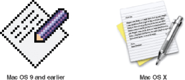
Figure 6.10 Early and more recent Mac icon designs for the TextEdit application
Icons can be designed to represent objects and operations at the interface using concrete objects and/or abstract symbols. The mapping between the representation and underlying referent can be similar (e.g. a picture of a file to represent the object file), analogical (e.g. a picture of a pair of scissors to represent ‘cut’), or arbitrary (e.g. the use of an X to represent ‘delete’). The most effective icons are generally those that are isomorphic since they have direct mapping between what is being represented and how it is represented. Many operations at the interface, however, are of actions to be performed on objects, making it more difficult to represent them using direct mapping. Instead, an effective technique is to use a combination of objects and symbols that capture the salient part of an action through using analogy, association, or convention (Rogers, 1989). For example, using a picture of a pair of scissors to represent ‘cut’ in a wordprocessing application provides sufficient clues as long as the user understands the convention of ‘cut’ for deleting text.
The greater flexibility offered by current GUI interfaces has enabled developers to create icon sets that are distinguishable, identifiable, and memorable. For example, different graphical genres have been used to group and identify different categories of icons. Figure 6.11 shows how colorful photo-realistic images have been used, each slanting slightly to the left, for the category of user applications, e.g. email, whereas monochrome straight-on and simple images have been used for the class of utility applications, e.g. printer set-up. The former have a fun feel to them, whereas the latter have a more serious look about them.

Figure 6.11 Contrasting genres of Aqua icons used for the Mac. The top row of icons have been designed for user applications and the bottom row for utility applications
Another approach has been to develop glossy, logo-style icons that are very distinctive, using only primary colors and symbols, having the effect of making them easily recognizable, such as those developed by Macromedia and Microsoft to represent their popular media applications (see Figure 6.12).
Icons that appear in toolbars or palettes as part of an application or presented on small device displays, e.g. PDAs, cell phones, digital cameras, have much less screen estate available. Because of this, they are typically designed to be simple, emphasizing the outline form of an object or symbol and using only grayscale or one or two colors. They tend to convey the tool and action performed on them using a combination of concrete objects and abstract symbols, e.g. a blank piece of paper with a plus sign representing a new blank document, an open envelope with an arrow coming out of it indicating a new message has arrived. Again, the goal should be to design a palette or set of icons that are easy to recognize and distinguishable from one another. Figure 6.13 provides examples of simple toolbar icons from Windows XP.

Figure 6.12 Logo-based icons for Microsoft and Macromedia applications (Powerpoint, Word, Dreamweaver, Flash) that are distinctive
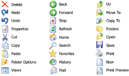
Figure 6.13 Examples of simple and distinguishable icons used in Windows XP toolbar. A combination of objects, abstract symbols, and depictions of tools is used to represent common objects and operations
Sketch simple icons to represent the following operations to appear on a digital camera LCD screen:
- Delete last picture taken.
- Delete all pictures stored.
- Format memory card.
Show them to your peers or friends, tell them that they are icons for a new digital camera intended to be really simple to use, and see if they can understand what each represents.
Comment
Figure 6.14 shows Toshiba's icons based on analogy and convention that are presented on the LCD display of the camera.
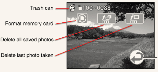
Figure 6.14 Icons used by Toshiba for three of its digital camera operations
The trashcan, which has become the conventional GUI icon to represent the command ‘to delete,’ has been used in combination with a representation of a single photo or a stack of photos, indicating what is deleted. The icon (to the left of them) uses a combination of an object and symbol: the image is of a memory card and the arrow conveys a complete circle. (The reason why one occasionally needs to format a memory card is to remove any residual memory files that can accumulate.) A key design issue is to make the three icons distinct from one another, especially the ‘delete last photo taken’ from the ‘delete all saved photos.’
Various books on how to design icons (e.g. Caplin, 2001; Horton, 1994) are now available together with sets of guidelines, standards, and style guides. There are also many icon builders and icon sets, e.g. ClipArt, providing a wealth of resources for designers, so that they do not have to draw or invent icons from scratch. Apple Computer Inc. has always been very good at providing their developers with style guides, explaining why certain designs are preferable to others and how to design icon sets. On its developers' website (developer.apple.com), advice is given on how and why certain graphical elements should be used when developing different types of icon. Among the various guidelines, it suggests that different categories of application (e.g. user, utility) should be represented by a different genre (see Figure 6.11) and recommends displaying a tool to communicate the nature of a task, e.g. a magnifying glass for searching, a camera for a photo editing tool. Microsoft has also begun providing more extensive guidance and step-by-step procedures on how to design icons for its applications on its website.
To help disambiguate the meaning of icons, text labels can be used under, above, or to the side of their icons (see Figure 6.13). This method is effective for toolbars that have small icon sets, e.g. those appearing as part of a web browser) but is not as good for applications that have large icon sets, e.g. photo editing or wordprocessing, since the screen can get very cluttered and busy; and conversely, making it sometimes harder and longer to find an icon. To prevent text/icon clutter at the interface, a rollover function can be used, where a text label appears adjacent to or above an icon, after one second of the user holding the cursor over it and for as long as the user keeps the cursor on it. This method allows identifying information to be temporarily displayed when needed.
6.3.2 1990s Interfaces
In this section we cover advanced graphical interfaces (including multimedia, virtual reality, and information visualization), speech-based, pen, gesture, and touch interfaces, and appliance interfaces.
Advanced Graphical Interfaces
A number of advanced graphical interfaces exist now that extend how users can access, explore, and visualize information. These include interactive animations, multimedia, virtual environments, and visualizations. Some are designed to be viewed and used by individuals; others by a group of users who are collocated or at a distance. Many claims have been made about the benefits they bring compared with the traditional GUI. Below we describe two major developments: multimedia and virtual environments, and then briefly touch upon visualizations.
Multimedia. Multimedia, as the name implies, combines different media within a single interface, namely, graphics, text, video, sound, and animations, and links them with various forms of interactivity. It differs from previous forms of combined media, e.g. TV, in that the different media can be interacted with by the user (Chapman and Chapman, 2004). Users can click on hotspots or links in an image or text appearing on one screen that leads them to another part of the program where, say, an animation or a video clip is played. From there they can return to where they were previously or move on to another place.
Many multimedia narratives and games have been developed that are designed to encourage users to explore different parts of the game or story by clicking on different parts of the screen. An assumption is that a combination of media and interactivity can provide better ways of presenting information than can either one alone. There is a general belief that ‘more is more’ and the ‘whole is greater than the sum of the parts’ (Lopuck, 1996). In addition, the ‘added value’ assumed from being able to interact with multimedia in ways not possible with single media (i.e. books, audio, video) is easier learning, better understanding, more engagement, and more pleasure (see Scaife and Rogers, 1996).
One of the distinctive features of multimedia is its ability to facilitate rapid access to multiple representations of information. Many multimedia encyclopedias and digital libraries have been designed based on this multiplicity principle, providing an assortment of audio and visual materials on a given topic. For example, if you want to find out about the heart, a typical multimedia-based encyclopedia will provide you with:
- One or two video clips of a real live heart pumping and possibly a heart transplant operation.
- Audio recordings of the heart beating and perhaps an eminent physician talking about the cause of heart disease.
- Static diagrams and animations of the circulatory system, sometimes with narration.
- Several columns of hypertext, describing the structure and function of the heart.
Hands-on interactive simulations have also been incorporated as part of multimedia learning environments. An early example is the Cardiac Tutor, developed to teach students about cardiac resuscitation, that required students to save patients by selecting the correct set of procedures in the correct order from various options displayed on the computer screen (Eliot and Woolf, 1994). A more recent example is BioBLAST®, a multimedia environment for high school biology classes, that incorporates simulation models based on NASA's research to enable students to develop and test their own designs for a life support system for use on the Moon (see Figure 6.15). The learning environment provides a range of simulators that are combined with online resources.
Multimedia CD-ROMs (and more recently interactive websites) have mainly been developed for training, educational, and entertainment purposes. It is generally assumed that learning (e.g. reading and scientific inquiry skills) and playing can be enhanced through interacting with engaging multimedia interfaces. But what actually happens when users are given unlimited, easy access to multiple media and simulations? Do they systematically switch between the various media and ‘read’ all the multiple representations on a particular subject? Or, are they more selective in what they look at and listen to?

Figure 6.15 Screen dump from the multimedia environment BioBLAST
Anyone who has interacted with an educational CD-ROM knows just how tempting it is to play the video clips and animations, while skimming through accompanying text or static diagrams. The former are dynamic, easy and enjoyable to watch, whilst the latter are viewed as static, boring, and difficult to read from the screen. For example, in an evaluation of Don Norman's CD-ROM of his work (First Person), students consistently admitted to ignoring the text at the interface in search of clickable icons of the author, which when selected would present an animated video of him explaining some aspect of design (Rogers and Aldrich, 1996). Given the choice to explore multimedia material in numerous ways, ironically, users tend to be highly selective as to what they actually attend to, adopting a ‘channel hopping’ mode of interaction. While enabling the users to select for themselves the information they want to view or features to explore, there is the danger that multimedia environments may in fact promote fragmented interactions where only part of the media is ever viewed. This may be acceptable for certain kinds of activities, e.g. browsing, but less optimal for others, e.g. learning about a topic. One way to encourage more systematic and extensive interactions (when it is considered important for the activity at hand) is to require certain activities to be completed that entail the reading of accompanying text, before the user is allowed to move on to the next level or task.
Box 6.3: Accessible Interactive TV Services for all
TV now provides many digital channels, of which sports, news, and movie channels are very popular. In addition, a range of interactive TV services are being offered that enable users to browse the web, customize their viewing choices, play interactive games, do their banking and shopping, and take an active part in a number of broadcast shows, e.g. voting. Besides offering a wide diversity of choices to the general public, there is much potential for empowering disabled and elderly users, by enabling them to access the services from the comfort of their own armchair. But it requires a new sensitivity to ‘interactive’ design, taking into account specific usability issues for those with impaired motor control, poor vision, and hearing difficulties (Newell, 2003). For example, remote controls need to be designed that can be manipulated with poor dexterity, text/icons need to be readable for those with poor eyesight, while navigation methods need to be straightforward for viewers who are not experienced with multimedia-based interfaces.
Activity 6.5
Go to the interactivities section on our accompanying website (http://www.id-book.com) and try to design the interface for a cell phone. How did the multimedia representations and interactivity help you to create a design?
Comment
The multimedia interactivity provides a constrained way of completing the task, involving a hands-on physical design activity and the selection of contextually relevant guidelines that are meant to help you think about the rationale behind your choices. However, rather than go through them step-by-step, it can be tempting simply to add a widget component to the template and move on to the next screen without reading or reflecting upon the guidelines. Sometimes, one can be so focused on comparing the visual interface components provided on the right-hand side of the screen that it is easy to forget to look at the left-hand side where the guidelines are.
A key research question is how to design interactive multimedia to help users explore, keep track of, and integrate the multiple representations of information provided, be it a digital library, a game, or learning material. As mentioned above, one technique is to provide hands-on interactivities and simulations at the interface that require the user to complete a task, solve a problem, or explore different aspects of a topic. Specific examples include electronic notebooks that are integrated as part of the interface, where users can copy, download, or type in their own material; multiple-choice quizzes that give feedback on how the user has done; interactive puzzles where the user has to select and position different pieces in the right combination; and simulation-type games where the user has to follow a set of procedures to achieve some goal for a given scenario. Another approach is to employ ‘dynalinking,’ where information depicted in one window explicitly changes in relation to what happens in another. This can help users keep track of multiple representations and see the relationship between them (Scaife and Rogers, 1996).
Specific guidelines are available that recommend how best to combine multiple media in relation to different kinds of task, e.g. when to use audio with graphics, sound with animations, and so on for different learning tasks. For example, Alty (1991) suggests that audio information is good for stimulating imagination, movies for action information, text for conveying details, whilst diagrams are good at conveying ideas. From such generalizations it is possible to devise a presentation strategy for learning. This can be along the lines of: first, stimulate the imagination through playing an audio clip; then, present an idea in diagrammatic form; then, display further details about the concept through hypertext. Sutcliffe and his colleagues have also developed guidelines, based on cognitive engineering principles, that recommend how to link different media together to give coherent and comprehensive presentations (Faraday and Sutcliffe, 1997; Sutcliffe, 2003). Quintana et al. (2002) have developed a set of guidelines for learner-centered design (LCD) that outline various features that can be used to guide and prompt students in multimedia learning environments. Examples include process maps and flow diagrams.
Virtual reality and virtual environments. Virtual reality and virtual environments are computer-generated graphical simulations, intended to create “the illusion of participation in a synthetic environment rather than external observation of such an environment” (Gigante, 1993, p. 3). Virtual reality (VR) is the generic term that refers to the experience of interacting with an artificial environment, which makes it feel virtually real. The term ‘virtual environment’ (VE) is used more specifically to describe what has been generated using computer technology (although both terms are used interchangeably). Images are displayed stereoscopically to the users—most commonly through shutter glasses—and objects within the field of vision can be interacted with via an input device like a joystick. The 3D graphics can be projected onto CAVE (Cave Automatic Virtual Environment) floor and wall surfaces (see Figure 2.12), desktop machines, or large shared displays, e.g. IMAX screens.
One of the main attractions of VRs/VEs is that they can provide opportunities for new kinds of experience, enabling users to interact with objects and navigate in 3D space in ways not possible in the physical world or a 2D graphical interface. The resulting user experience can be highly engaging; it can feel as if one really is flying around a virtual world. People can become immersed in and highly captivated by the experience (Kalawsky, 1993). For example, in the Virtual Zoo project, Allison et al. (1997) found that people were highly engaged and very much enjoyed the experience of adopting the role of a gorilla, navigating the environment, and watching other gorillas respond to their movements and presence (see Figure 6.16).
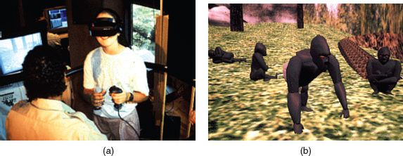
Figure 6.16 The Virtual Gorilla Project. On the left a student wears a head-mounted display and uses a joystick to interact with the virtual zoo. On the right are the virtual gorillas she sees and which react to her movements
One of the advantages of VRs/VEs is that simulations of the world can be constructed to have a higher level of fidelity with the objects they represent compared with other forms of graphical interface, e.g. multimedia. The illusion afforded by the technology can make virtual objects appear to be very life-like and behave according to the laws of physics. For example, landing and take-off terrains developed for flight simulators can appear to be very realistic. Moreover, it is assumed that learning and training applications can be improved through having a greater fidelity with the represented world. A sense of ‘presence’ can also make the virtual setting seem convincing. By presence is meant “a state of consciousness, the (psychological) sense of being in the virtual environment” (Slater and Wilbur, 1997, p. 605), where someone is totally engrossed by the experience, and behaves in a similar way to how he/she would if at an equivalent real event.
Another distinguishing feature of VRs/VEs is the different viewpoints they offer. Players can have a first-person perspective, where their view of the game or environment is through their own eyes, or a third-person perspective, where they see the world through a character visually represented on the screen, commonly known as an avatar. An example of a first-person perspective is that experienced in first-person shooter games such as DOOM, where the player moves through the environment without seeing a representation of themselves. It requires the user to imagine what he/she might look like and decide how best to move around. An example of a third-person perspective is that experienced in the game Tomb Raider, where the player sees the virtual world above and behind the avatar of Lara Croft. The user controls Lara's interactions with the environment by controlling her movements, e.g. making her jump, run, or crouch. Avatars can be represented from behind or from the front, depending on how the user controls its movements. First-person perspectives are typically used for flying/driving simulations and games, e.g. car racing, where it is important to have direct and immediate control to steer the virtual vehicle. Third-person perspectives are more commonly used in games, learning environments, and simulations where it is important to see a representation of self with respect to the environment and others in it. In some virtual environments it is possible to switch between the two perspectives, enabling the user to experience different viewpoints on the same game or training environment.
Early VRs/VEs were developed using head-mounted displays. However, they have been found to be uncomfortable to wear, sometimes causing motion sickness and disorientation. They are also expensive and difficult to program and maintain. Nowadays, desktop VRs/VEs are mostly used; software toolkits are now available that make it much easier to program a virtual environment, e.g. VRML, 3D Alice. Instead of moving in a physical space with a head-mounted display, users interact with a desktop virtual environment—as they would any other desktop application—using mice, keyboards, or joysticks as input devices. The desktop virtual environment can also be programmed to present a more realistic 3D effect (similar to that achieved in 3D movies shown at IMAX cinemas), requiring users to wear a pair of shutter glasses.
Research and design issues
VRs/VEs have been developed to support learning and training for numerous skills. Researchers have designed them to help people learn to drive a vehicle, fly a plane, and perform delicate surgical operations—where it is very expensive and potentially dangerous to start learning with the real thing. Others have investigated whether people can learn to find their way around a real building/place before visiting it by first navigating a virtual representation of it, e.g. Gabrielli et al., (2002). VEs have also been designed to help people practice social skills, speaking skills, and confront their social phobias, e.g. Cobb et al., (1999); Slater et al., (1999). An underlying assumption is that the environment can be designed as a ‘safe’ place to help people gently overcome their fears (e.g. spiders, talking in public) by confronting them through different levels of closeness and unpleasantness, e.g. seeing a small virtual spider move far away, seeing a medium one sitting nearby, and then finally touching a large one. Studies have shown that people can readily suspend their disbelief, imagining a virtual spider to be a real one or a virtual audience to be a real audience. For example, Slater et al. (1999) found that people rated themselves as being less anxious after speaking to a virtual audience that was programmed to respond to them in a positive fashion than after speaking to virtual audiences programmed to respond to them negatively.
Core design issues that need to be considered when developing virtual environments are: what are the most effective ways of enabling users to navigate through them, e.g. first versus third person; how to control their interactions and movements, e.g. use of head and body movements; how best to enable them to interact with information in them, e.g. use of keypads, pointing, joystick buttons; and how to enable users to collaborate and communicate with others in the virtual environment. A central concern is the level of realism to aim for. Is it necessary to design avatars and the environments they inhabit to be life-like, using ‘rich’ graphics, or can simpler and more abstract forms be used, but which nonetheless are equally capable of engendering a sense of presence? For more on this topic see the dilemma box below.
Guidelines are available for helping to design virtual environments, that focus on how best to support navigation and user control, including where to place landmarks and objects in large-scale environments to ease navigation (Vinson, 1999) and the rules of everyday life that can be contravened, e.g. enabling avatars to walk through virtual walls and buildings (Sutcliffe, 2002).
Dilemma Realism versus abstraction?
One of the challenges facing interaction designers is whether to use realism or abstraction when designing an interface. This means designing objects either to (i) give the illusion of behaving and looking like real-world counterparts or (ii) appear as abstractions of the objects being represented. This concern is particularly relevant when implementing conceptual models that are deliberately based on an analogy with some aspect of the real world. For example, is it preferable to design a desktop to look like a real desktop, a virtual house to look like a real house, or a virtual terrain to look like a real terrain? Or, alternatively, is it more effective to design representations as simple abstract renditions, depicting only a few salient features?
One of the main benefits of using realism at the interface is that it can enable people, especially computer phobics and novices, to feel more comfortable when learning an application. The rationale behind this is that such representations can readily tap into people's understanding of the physical world. Hence, realistic interfaces can help users initially understand the underlying conceptual model. In contrast, overly schematic and abstract representations can appear to be too computer-like and may be off-putting to the newcomer. The advantage of more abstract interfaces, however, is that they can be more efficient to use. Furthermore, the more experienced users become, the more they may find ‘comfortable’ interfaces no longer to their liking. A dilemma facing designers, therefore, is deciding between creating interfaces to make novice users feel comfortable (but more experienced users less comfortable) and designing interfaces to be effective for more experienced users (but maybe harder to learn by novices).
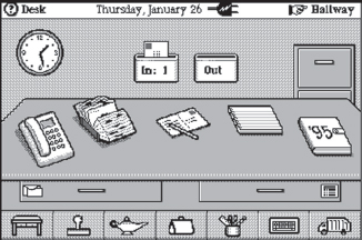
One of the earliest attempts at using realism at the interface was General Magic's office system Magic Cap, which was rendered in 3D. To achieve this degree of realism required using various perceptual cues such as perspective, shadowing, and shading. The result was a rather cute interface (see Figure 6.17). Although their intentions were well-grounded, the outcome was less successful. Many people commented on how childish and gawky it looked, having the appearance of illustrations in a children's picture book rather than a work-based application.
Mullet and Sano (1995) also point out how a 3D rendition of an object like a desk nearly always suffers from both an unnatural point of view and an awkward rendering style that ironically destroy the impression of being in a real physical space. One reason for this is that 3D depictions conflict with the effective use of display space, especially when 2D editing tasks need to be performed. As can be seen in Figure 6.17, these kinds of task were represented as ‘flat’ buttons that appear to be floating in front of the desk, e.g. mail, program manager, task manager.
For certain kinds of applications, using realism can be very effective for both novices and experienced users. Computer-based games fall into this category, especially those where users have to react rapidly to dynamic events that happen in a virtual world in real time, say flying a plane or playing a game of virtual football. Making the characters in the game resemble humans in the way they look, move, dress, and behave also makes them seem more convincing and lifelike, enhancing the enjoyment and fun factor.
Activity 6.6
Many games have been ported from the PC platform to the cell phone. Because of the memory and screen size limitations of the phone device, however, much simpler and more abstract representations have to be used. To what extent does this adaptation of the interface affect the experience of playing the same game?
Comment
The most effective games to have been ported over to the cell phone are highly addictive games that use simple graphics and do not require the user to navigate between different windows. Examples are Snake (see Figure 6.18), Tetris, and Snood, where the goal of the game is to move an object (e.g. a snake, abstract shapes, a shooter) small distances in order to eat food, fill a container, or delete shapes. More complex games, like World of Warcraft—which are very popular on the PC platform—do not port over nearly as well. It is simply too difficult to navigate and engage in the same level of interaction that makes the game enjoyable and addictive when played on a PC. Similar to the debate over text-based command games versus advanced graphical games, the extent to which the interaction style affects the user experience varies in terms of how engaging they are; but both can be equally enjoyable (see Activity 2.7).
Information visualization. Information visualization is a growing field concerned with the design of computer-generated visualizations of complex data that are typically interactive and dynamic. The goal is to amplify human cognition (see Chapter 3), enabling users to see patterns, trends, and anomalies in the visualization and from this to gain insight (Card et al., 1999). Specific objectives are to enhance discovery, decision-making, and explanation of phenomena. Most interactive visualizations have been developed for use by experts to enable them to understand and make sense of vast amounts of dynamically changing domain data or information, e.g. satellite images or research findings, that take much longer to achieve if using only text-based information.

Figure 6.18 Two screenshots from the game Snake—the one on the left is played on a PC and the one on the right on a cell phone. In both games, the goal is to move the snake (the blue thing and the black squares, respectively) towards targets that pop up on the screen (e.g. the bridge, the star) and to avoid obstacles (e.g. a flower, the end of the snake's tail). When a player successfully moves his snake head over or under a target, the snake increases its length by one blob or block. The longer the snake gets the harder it is to avoid obstacles. If the snake hits an obstacle the game is over. On the PC version there are lots of extra features that make the game more complicated, including more obstacles and ways of moving. The cell phone version has a simple 2D bird's eye representation, whereas the PC version adopts a 3D third-person avatar perspective
Common techniques that are used for depicting information and data are 3D interactive maps that can be zoomed in and out of and which present data via webs, trees, clusters, scatterplot diagrams, and interconnected nodes (Bederson and Shneiderman, 2003; Chen, 2004). Hierarchical and networked structures, color, labeling, tiling, and stacking are also used to convey different features and their spatial relationships. At the top of Figure 6.19 is a typical treemap, called MillionVis, that depicts one million items all on one screen using the graphical techniques of 2D stacking, tiling, and color (Fekete and Plaisant, 2002). The idea is that viewers can zoom in to parts of the visualization to find out more about certain data points, while also being able to see the overall structure of an entire data set. The treemap has been used to visualize file systems, enabling users to understand why they are running out of disk space, how much space different applications are using, and also for viewing large image repositories that contain Terabytes of satellite images. Similar visualizations have been used to represent changes in stocks and shares over time, using rollovers to show additional information, e.g. Marketmap on SmartMoney.com
The visualization at the bottom of Figure 6.19 depicts the evolution of co-authorship networks over time (Ke et al., 2004). It uses a canonical network to represent spatially the relationships between labeled authors and their place of work. Changing color and thickening lines that are animated over time convey increases in co-authoring over time. For example, the figure shows a time slice of 100 authors at various US academic institutions, in which Robertson, Mackinlay, and Card predominate, having published together many times more than with the other authors. Here, the idea is to enable researchers to readily see connections between authors and their frequency of publishing together with respect to their location over time. (Note: Figure 6.19 is a static screen shot for 1999.) Again, an assumption is that it is much easier to read this kind of diagram compared with trying to extract the same information from a text description or a table.
Research and design issues
Much of the research in information visualization has focused on developing algorithms and interactive techniques to enable viewers to explore and visualize data in novel ways. There has been less research on how visualizations are used in practice and whether they can amplify cognition, enabling people to discover and make better informed decisions, about policy or research. Key design issues include whether to use animation and/or interactivity, what form of coding to use, e.g. color or text labels, whether to use a 2D or 3D representational format, what forms of navigation, e.g. zooming or panning, and what kinds and how much additional information, e.g. rollovers or tables of text, to provide. The type of metaphor to be used is also an important concern, e.g. one based on flying over a geographical terrain or one that represents documents as part of an urban setting. There are, at the time of writing, no clear-cut guidelines on how to design effective visualizations; designers often apply relevant research findings from cognitive psychology (see Chapter 3) and graphical design, e.g. Tufte (1999). An overriding principle is to design a visualization that is easy to comprehend and easy to make inferences from. If too many variables are depicted in the same visualization it can make it much more difficult for the viewer to read and make sense of what is being represented.
Web-based Interfaces
Early websites were largely text-based, providing hyperlinks to different places or pages of text. Much of the design effort was concerned with how best to structure information at the interface to enable users to navigate and access it easily and quickly. Jakob Nielsen (2000) adapted his and Ralf Molich's usability guidelines (Nielsen and Molich, 1990) to make them applicable to website design, focusing on simplicity, feedback, speed, legibility, and ease of use. He has also stressed how critical download time is to the success of a website. Simply, users who have to wait too long for a page to appear are likely to move on somewhere else. One of Nielsen's recommendations is that it is best to have very few graphics on the homepage of a site but offer users the chance to see pictures of products, or maps, etc., only when they explicitly ask for them. This can be achieved by using thumbnails—miniaturized versions of the full picture—as links.
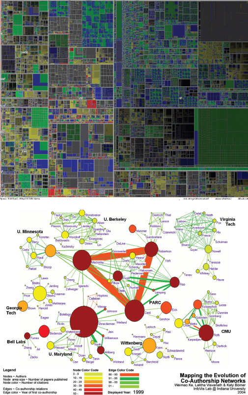
Figure 6.19 Two types of visualizations, one using flat colored blocks and the other animated color networks that expand and change color over time
Nielsen has become renowned for his doggedness on insisting that ‘vanilla’ websites are the most usable and easiest to navigate. True to his word, to this day, Nielsen has resisted including any graphics or photos on his homepage (useit.com). Instead he provides a series of hyperlinks to his alertboxes, books, reports, consulting services, and news articles. Other interaction designers, however, do not support his stance, arguing that it is possible to have both aesthetically pleasing and usable sites. A main reason for emphasizing the importance of graphical design is to make web pages distinctive, striking, and pleasurable for the user when they first view them and also to make them readily recognizable on their return.
It is not surprising, therefore, to see that nearly all commercial, public service, and personal websites have adopted more of a ‘multi-flavor’ rather than a ‘vanilla’ approach; using a range of graphics, images, and animations on their homepages. Website design took off in a big way in the early 2000s when user-centered editing tools, e.g. Dreamweaver, and programming languages, e.g. php, Flash and XML, emerged providing opportunities for both designers and the general public to create websites to look and behave more like multimedia environments. Groups of technologies, such as Ajax (asynchronous Javascript and XML) also started to appear, enabling applications to be built that are largely executed on a user's computer, allowing the development of reactive and rich graphical user interfaces. Many web-based interactivities and applications have been developed, including online pop quizzes, agents, recommenders, chatrooms, interactive games, and blogs. There is also an increasing number of PC-based applications that have become web-based, such as email, e.g. Gmail, and photo storing and sharing, e.g. Flickr. Web browsers also started to be developed for a range of platforms besides the PC, including interactive TV, cell phones, and PDAs.
Steve Krug (2000) has characterized the debate on usability versus attractiveness in terms of the difference between how designers create websites and how users actually view them. He argues that web designers create sites as if the user was going to pore over each page, reading the finely crafted text word for word, looking at the use of images, color, icons, etc., examining how the various items have been organized on the site, and then contemplating their options before they finally select a link. Users, however, behave quite differently. They will glance at a new page, scan part of it, and click on the first link that catches their interest or looks like it might lead them to what they want. Much of the content on a web page is not read. In his words, web designers are “thinking great literature” (or at least “product brochure”) while the user's reality is much closer to a “billboard going by at 60 miles an hour” (Krug, 2000, p. 21). While somewhat of a caricature of web designers and users, his depiction highlights the discrepancy between the meticulous ways designers create their websites with the rapid and less than systematic approach that users take to look at them.
Similar to newspapers, magazines, and TV, working out how to brand a web page to catch and keep ‘eyeballs’ is central to whether a user will stay on it and, importantly, return to it. We have talked about the need to keep screens uncluttered so that people can find their way around and see clearly what is available. However, there may be occasions when the need to maintain a brand overrides this principle. For example, the website for the Swedish newspaper Aftonbladet, while very busy and crowded (see Figure 6.20), was designed to continue the style of the paper-based version, which also has a busy and crowded appearance.

Figure 6.20 The front web page of the Aftonbladet newspaper
Advertisers also realize how effective flashing ads and banners can be for promoting their products, similar to the way animated neon light adverts are used in city centers, such as London's Piccadilly Circus. The homepage of many online newspapers, including the Aftonbladet is full of flashing banners and cartoon animations, many of which are adverts for other products (see http://www.aftonbladet.se for the full animation effects). Music and other sounds have also begun to be used to create a certain mood and captivate users. While online adverts are often garish, distracting, and can contravene basic usability principles, they are good at luring users' attention. As with other media, e.g. TV, newspapers and magazines, advertisers pay significant revenues to online companies to have their adverts placed on their websites, entitling them to say where and how they should appear.
There are numerous web design handbooks and several web usability books, e.g. Krug (2000); Cooper and Reiman (2003); Spool et al. (1997); Nielsen (2000). In addition, there are some good online sites offering guidelines and tips, together with pointers to examples of bad websites. Increasingly, it is the case that today's web interfaces are not that different from GUIs; both need to consider how best to design, present, and structure information and system behavior. The main difference is the web's emphasis on content and the use of hyperlinks for navigation.
Key design issues for websites, which differ from other interfaces, are captured very well by three questions proposed by Keith Instone (quoted in Veen, 2001): Where am I? What's here? Where can I go? Each web page should be designed with these three questions in mind. The answers must be clear to users. Jeffrey Veen (2001) expands on these questions. He suggests that a simple way to view a web page is to deconstruct it into three areas (see Figure 6.21). Across the top would be the answer to “Where am I?” Because users can arrive at a site from any direction (and rarely through the front door, or homepage), telling them where they are is critical. Having an area at the top of the page that ‘brands’ the page instantly provides that information. Down the left-hand side is an area in which navigation or menus sit. This should allow users to see immediately what else is available on the site, and answers the question “Where can I go?”
The most important information, and the reason a user has come to the site in the first place, is provided in the third area, the content area, which answers the question “What's here?” Content for web pages must be designed differently from standard documents, since the way users read web pages is different. On web pages, content should be short and precise, with crisp sentences. Using headlines to capture the main points of a paragraph is one way to increase the chances of your message getting over to a user who is scanning a page rather than looking at it in detail. Krug (2000) also suggests the importance of breaking up pages into clearly defined areas, making it obvious what is clickable and minimizing noise. He promotes creating a clear visual hierarchy on each page, so it is easy for a user to grasp in a hurry, showing which things are related and what's what (e.g. a link, a search box) and capitalizing on conventions (e.g. using a shopping cart icon on e-commerce sites to indicate the link to make a purchase) rather than reinventing the wheel.

Figure 6.21 Any web page has three main areas
W3C standards and guidelines also exist for web content accessibility (WCAG). By this is meant designing websites for users who have some form of disability. These include:
- Users who may not be able to see, hear, move, or may not be able to process some types of information easily or at all.
- Users who have difficulty reading or comprehending text.
- Users who may not have or be able to use a keyboard or mouse.
- Users who may have a text-only screen, a small screen, or a slow Internet connection.
Website content also needs to be designed for:
- Users who may not speak or understand fluently the language in which the document is written.
- Users who are in a setting where their eyes, ears, or hands are busy or interfered with, e.g. driving to work.
- Users who may have an early version of a browser, a different browser entirely, a voice browser, or a different operating system.
(From Web Content Accessibility Guidelines (WCAG), Version 1.0)
The web has advanced dramatically since the early days of creating HTML homepages. The initial sets of design guidelines developed for the web are currently being rethought, extended, and adapted to take into account the extensive developments. For example, a newer version of the WCAG is being developed to take into account the diversity of new technologies.
CASE STUDY 6.1: Blind users experience the Internet
In this case study Vanessa Evers and Hans Hillen from the University of Amsterdam discuss the redesign of a website's information architecture to provide audio navigation to assist blind users. This study is motivated by previous studies on Internet use with blind participants, which indicate that even with the help of screen readers such as JAWS and Window-eyes, blind users have more difficulty accessing the information on the Internet than seeing users. However, findings by Berry (1999) and others also suggest that blind users feel empowered by the Internet because it allows them to access information even though the linear nature of navigation caused blind users to spend considerable time browsing a web page before deciding on their next action.
Three research questions were asked in this study. First, how do blind users navigate websites? The findings show that blind users adopt different approaches during navigation to compensate for lack of accessibility in web design. Successful blind user navigation depends mostly on the availability of clear landmarks to guide navigation. The second question addressed the problems blind users encounter. Blind users were hindered most by cognitive overload and incomprehensible descriptions. The third question asked whether a high-level representation of a website's information architecture with audio navigation would support blind users well. The findings indicate that blind users do not become aware of the structure of entire websites but focus on identifying landmarks. Once these landmarks have been identified, and a goal achieved, the mental image the user has constructed of the website is limited to the landmarks to reach a particular goal.
The screen below is from a Dutch website, http://www.aktiebenin.nl, which was used in this research for navigation tasks by one of the blind participants.
Look at the Nike.com website and describe the kind of interface used. How does it contravene the design principles outlined by Veen? Does it matter? What kind of user experience is it providing for? What was your experience of engaging with it?
Comment
The Nike website is designed to be more like a cinematic experience and uses rich multimedia elements, e.g. videos, sounds, music, animations, and interactivity. Branding is central. In this sense, it is a far cry from a conventional website and contravenes many of the usability guidelines. Specifically, the site has been designed to entice the visitor to enter the virtual store and watch high quality and innovative movies about Nike Lab, Nike classes, etc. Various multimedia interactivities are embedded into the site to help the viewer move to other parts of the site, e.g. clicking on parts of an image or animation. Screen widgets are also provided, e.g. menus, ‘skip over,’ and ‘next’ buttons. It is easy to become immersed in the experience and forget it is a commercial store. It is also easy to get lost and to not know: Where am I? What's here? Where can I go? But this is precisely what Nike wants their visitors to do and enjoy the experience.
Speech Interfaces
A speech interface (or voice user interface, VUI) is where a person talks with a system that has a spoken language application, like a train timetable, a travel planner, or a phone service. It is most commonly used for inquiring about specific information, e.g. flight times, or to perform a transaction, e.g. buy a ticket or ‘top-up’ a cell phone account. It is a specific form of natural language interaction that is based on the interaction type of conversing (see Chapter 2), where users speak and listen to an interface (rather than type at or write on the screen). There are many commercially available speech-based applications that are now being used by corporations, especially for offering their services over the phone. Speech technology has also advanced applications that can be used by people with disabilities, including speech recognition wordprocessors, page scanners, web readers, and speech recognition software for operating home control systems, including lights, TV, stereo, and other home appliances.
Technically, speech interfaces have come of age, being much more sophisticated and accurate than the first generation of speech systems in the early 1990s, which earned a reputation for mishearing all too often what a person said (see cartoon). Actors are increasingly used to record the messages and prompts provided—that are much friendlier, more convincing, and pleasant than the artificially sounding synthesized speech that was typically used in the early systems.
One of the most popular uses of speech interfaces (or SR—speech recognition—as it is now known in the business) is for call routing, where companies use an automated speech system to enable users to reach one of their services. Many companies are replacing the frustrating and unwieldy touchtone technology for navigating their services (which was restricted to 10 numbers and the # and * symbols) with the use of caller-led speech. Callers can now state their needs in their own words (rather than pressing a series of arbitrary numbers), for example, “I'm having problems with my voice mail,” and in response are automatically forwarded to the appropriate service (Cohen et al., 2004).
In human conversations we often interrupt each other, especially if we know what we want, rather than waiting for someone to go through a series of options. For example, at a restaurant we may stop the waitress in mid-flow when describing the specials if we know what we want rather then let her go through the whole list. Similarly, speech technology has been designed with a feature called ‘barge-in’ that allows callers to interrupt a system message and provide their request or response before the message has finished playing. This can be very useful if the system has numerous options for the caller to choose from and the chooser knows already what he wants.
There are several ways a dialog can be structured. The most common is a directed dialog where the system is in control of the conversation, asking specific questions and requiring specific responses, similar to filling in a form (Cohen et al., 2004):
System: Which city do you want to fly to?
Caller: London
System: Which airport, Gatwick, Heathrow, Luton, Stansted or City?
Caller: Gatwick
System: What day do you want to depart?
Caller: Monday week
System: Is that Monday 5th May?
Caller: Yes
Other systems are more flexible, allowing the user to take more initiative and specify more information in one sentence, e.g. “I'd like to go to Paris next Monday for two weeks.” The problem with this approach is that there is more chance of error, since the caller might assume that the system can follow all of her needs in one go as a real travel agent can, e.g. “I'd like to go to Paris next Monday for two weeks and would like the cheapest possible flight, preferably leaving Stansted airport and definitely no stop-overs …” The list is simply too long and would overwhelm the system's parser. Carefully guided prompts can be used to get callers back on track and help them speak appropriately, e.g. “Sorry I did not get all that. Did you say you wanted to fly next Monday?”
Research and design issues
Key research questions are concerned with how to design systems that can recognize speech and keep the conversation on track. Some researchers focus on making it appear natural (i.e. like human conversations) while others are concerned more with how to help people navigate efficiently through a menu system, by enabling them to recover easily from errors (their own or the system's), be able to escape and go back to the main menu (cf. to the undo button of a GUI), and to guide those who are vague or ambiguous in their requests for information or services using prompts. The type of voice actor, e.g. male, female, neutral, or dialect and form of pronunciation are also topics of research. Do people prefer to listen to and are more patient with a female or male voice? What about one that is jolly versus serious?
An extensive set of guidelines by Cohen et al. (2004) discusses the pros and cons of using different techniques for structuring the dialog and managing the flow of voice interactions, the different ways of expressing errors, and the use of conversational etiquette.
Pen, Gesture, and Touchscreen Interfaces
Researchers and developers have experimented with a number of input devices besides the standard keyboard/mouse combination to investigate whether more fluid and natural (i.e. physical actions that humans are very familiar with, such as gesturing) ways of interacting with information at the interface can be supported. These forms of input are designed to enable people to write, draw, select, and move objects at an interface using pen-based, e.g. lightpens or styluses, gesture-based, and touch-based methods—all of which are well-honed skills that are developed from childhood. Camera capture and computer vision techniques are used to ‘read’ and ‘recognize’ people's arm and hand gestures at a whiteboard or in a room. Touchscreens have also been designed to enable users to use their fingertips to select options at an interface and move objects around an interactive tabletop surface. Using different forms of input can enable more degrees of freedom for user expression and object manipulation; for example, two hands can be used together to stretch and move objects on a touchscreen surface, similar to how both hands are used to stretch an elastic band or scoop together a set of objects. These kinds of two-handed actions are much easier and more natural to do by moving two fingers and thumbs simultaneously at an interface than when using a single pointing device like a mouse.
A successful commercial application that uses gesture interaction is Sony's EyeToy, which is a motion-sensitive camera that sits on top of a TV monitor and plugs into the back of a Sony Playstation. It can be used to play various video games. The camera films the player when standing in front of the TV, projecting her image onto the screen, making her the central character of the video game. The game can be played by anyone, regardless of age or computer experience, simply by moving her legs, arms, head, or any part of the body (see Figure 6.22).
Figure 6.22 Sony's EyeToy: the image of the player is projected onto the TV screen as part of the game, showing her using her arms and elbows to interact with the virtual game
Pen-based input is commonly used with PDAs and large displays, instead of mouse or keyboard input, for selecting items and supporting freehand sketching. One of the problems with using pens instead of mice, however, is that the flow of interaction can be more easily interrupted. In particular, it can be more difficult to select menu options that appear along one side of the screen or that require a virtual keyboard to be opened—especially if more than one person is working at the whiteboard. Users often have to move their arms long distances and sometimes have to ask others to get out of the way so they can select a command (or ask them to do it). To overcome these usability problems, Guimbretiere et al. (2001) developed novel pen-based techniques for very large wall displays that enable users to move more fluidly between writing, annotating, and sketching content while at the same time performing commands. Thus, instead of having to walk over to a part of the wall to select a command from a fixed menu, users can open up a context-sensitive menu (called a FlowMenu) wherever they were interacting with information at the wall by simply pressing a button on top of the pen to change modes. Using pen-based gestures for PDAs presents different kinds of usability problems. It can sometimes be difficult to see options on the screen because a user's hand can occlude part of it when gesturing. The benefit of using gestures, such as swiping and stroking, is that it supports more direct interaction. These can be mapped onto specific kinds of operations where repeated actions are necessary, e.g. zooming in and out functions for map-based applications.

Being able to recognize a person's handwriting and convert it into text has been a driving goal for pen-based systems. Early research in this area began with Apple Computer's pioneering handheld device, called the Newton (1993). Since then, the newer generation of Tablet PCs have significantly advanced handwriting recognition and conversion techniques, using an active digitizer as part of a special screen that enables users to write directly on the surface, which is then converted into standard typeface text. The process known as ‘digital ink’ is available for controlling many Windows applications. One of its other uses is to allow users to quickly and easily annotate existing documents, by hand, such as spreadsheets, presentations, and diagrams (see Figure 6.23)—in a similar way to how they would do it using paper-based versions.
A number of gesture-based systems have been developed for controlling home appliances, moving images around a wall, and various forms of entertainment, e.g. interactive games. Early systems used computer vision techniques to detect certain gesture types (e.g. location of hand, movement of arm) that were then converted into system commands. More recent systems have begun using sensor technologies that detect touch, bend, and speed of movement of the hand and/or arm. Figure 6.24 shows Ubi-Finger (Tsukada and Yasumara, 2002), which enables users to point at an object, e.g. a switch, using his/her index finger and then control it by an appropriate gesture, e.g. pushing the finger down as if flicking on the switch. Sign language applications have also been built to enable hearing-impaired people to communicate with others without needing a sign language interpreter (Sagawa et al., 1997).
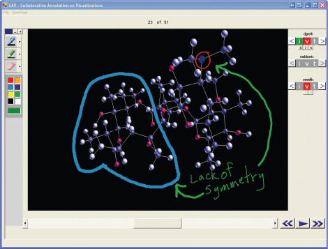
Figure 6.23 Microsoft's digital ink in action showing how it can be used to annotate a scientific diagram
Figure 6.24 Ubi-Finger: pointing at a light and making the appropriate gesture causes the light to come on
Research and design issues
Much the of research on gestures has been concerned with the different roles they play in communication, devising methods to distinguish between them for users controlling objects (Baudel and Beaudouin-Lafon, 1993) and how people use gestures to communicate with one another in remote and collocated settings, e.g. Bekker et al. (1995); Gutwin and Penner (2002). A key design concern, when using pens, gestures, and fingers as a form of input, is to consider how a computer system recognizes and delineates the user's gestures. In particular, how does it determine the start and end point of a hand movement and how does it know the difference between a deictic gesture (a deliberate pointing movement) and hand waving (an unconscious gesticulation) that is used to emphasize what is being said verbally?
Appliance Interfaces
Appliances include machines for the home, public place, or car (e.g. washing machines, VCRs, vending machines, remotes, photocopiers, printers and navigation systems) and personal consumer products (e.g. MP3 player, digital clock and digital camera). What they have in common is that most people using them will be trying to get something specific done in a short period of time, such as putting the washing on, watching a program, buying a ticket, changing the time, or taking a snapshot. They are unlikely to be interested in spending time exploring the interface or spending time looking through a manual to see how to use the appliance.
Research and design issues
Cooper and Reiman (2003) suggest that appliance interfaces require the designer to view them as transient interfaces, where the interaction is short. All too often, however, designers provide full-screen control panels or an unnecessary array of physical buttons that serve to frustrate and confuse the user and where only a few in a structured way would be much better. Here, the two fundamental design principles of simplicity and visibility are paramount. Status information, such as what the photocopier is doing, what the ticket machine is doing, and how much longer the washing is going to take should be provided in a very simple form and at a prominent place on the interface. A key design question is: as soft displays, e.g. LCD and touchscreens, increasingly become part of an appliance interface, what are the trade-offs with replacing the traditional physical controls, e.g. dials, buttons, knobs?
Activity 6.8
Look at the controls on your toaster (or the one in Figure 6.25 if you don't have one nearby) and describe what each does. Consider how these might be replaced with an LCD screen. What would be gained and lost from changing the interface in this way?
Comment
Standard toasters have two main controls, the lever to press down to start the toasting and a knob to set the amount of time for the toasting. Many now come with a small eject button intended to be pressed if the toast starts to burn. In Figure 6.25 it is to the left of the timer knob. Some also come with a range of settings for different ways of toasting (e.g. one side, frozen), selected by moving a dial or pressing buttons.
To design the controls to appear on an LCD screen would enable more information and options to be provided, e.g. only toast one slice, keep the toast warm, automatically pop up when the toast is burning. It would also allow precise timing of the toasting in minutes and seconds. However, as has happened with the design evolution of microwave ovens, a downside is that it is likely to increase the complexity of what previously was a set of logical and very simple actions—placing something in an oven and heating it up—making it more difficult to use.

6.3.3 2000s Interfaces
In this section we cover mobile, multimodal, shareable, tangible, augmented and mixed reality, wearable and robotic interfaces.
Mobile Interfaces
Mobile interfaces are designed for devices that are handheld and intended to be used while on the move, such as PDAs and cell phones. Technologies that support mobile interfaces have become ubiquitous in the last decade. Nearly everyone owns a cell phone, while applications running on PDAs have greatly expanded, and are now commonly used in restaurants to take orders, car rentals to check in car returns, supermarkets for checking stock, on the streets for multi-user gaming, and in education to support life-long learning. There are also smartphones, like the Blackberry device, that is essentially a combined cell phone and PDA (see Figure 6.26).

Figure 6.26 The Blackberry 7780 mobile device. Instead of a keypad it has a set of tiny buttons that is a simple version of the QWERTY keyboard
A number of physical controls have been developed for mobile interfaces, including a roller wheel positioned on the side of a phone (see Figure 6.26) and a rocker dial (see Figure 6.27) positioned on the front of a device—both designed for rapid scrolling of menus; the up/down ‘lips’ on the face of the phone, and two-way directional keypads and four-way navigational pads that encircle a central push button for selecting options. Softkeys (which usually appear at the bottom of a screen) and silk-screened buttons (icons that are printed on or under the glass of a touchscreen display) have been designed for frequently selected options and for mode changing. New physical controls have also been effectively deployed for specialized handsets, such as those developed for blind users (see Box 6.5).
The preference for and ability to use these control devices varies, depending on the dexterity and commitment of the user when using the handheld device. For example, some people find the rocker device fiddly to use for the fine control required for scrolling through menus on a small screen. Conversely, others are able to master them and find them much faster to use compared with using up and down arrow buttons that have to be pressed each time a menu option is moved through.
Box 6.4: Braille-based Cell Phones
Cell phones have been developed for blind users that have braille-based interfaces.
For example, the ALVA MPO model has eight braille input keys, synthetic speech output, and a 20-cell refreshable braille display (see Figure 6.27). At each end of the phone are rocker devices that are used to control (i) the speech and (ii) cursor movements and to navigate through menus. To increase or decrease the volume of the speech the user quickly presses the rocker up and down.

Figure 6.27 The ALVA MPO model 5500 with refreshable braille display
Numeric keypads on cell phones have been doubled up as text entry keypads, requiring much thumb activity to send a text message. Many users actually find this a pleasurable challenge rather than a frustrating form of input. To compensate, attachable keyboards and virtual keyboards have been developed. But these require a surface to be used on—restricting their use to when a person is stationary. Predictive text was invented to enable users to select from a range of words and messages offered by the system, having only typed in two or three letters. More recently, faster and more flexible forms of text input have been enabled through the provision of tiny QWERTY keys that appear as hard buttons on cell phones, selected using both thumbs, or soft keyboards that pop up on PDA screens—pecked at with a stylus (see Figure 6.26 showing the Blackberry 7780 and Figure 6.28 of the Treo).

Figure 6.28 Cell phone interface for the Treo 650 and the Vodaphone Simple Sagem VS1
Activity 6.9
Which mobile interface in Figure 6.28 do you prefer and which do you think your grandparents would prefer?
Comment
Different types of phones are now being designed for specific user groups, who vary in age, disability, culture, level of experience, and technophobia. The Treo 650 smartphone (shown on the left), with miniature QWERTY keyboard embedded beneath a large color screen and a 4-way navigation pad, is intended largely for those who are experienced technology users, while the Vodaphone Simple Sagem VS1 shown on the right has been designed for technophobes, providing a simple numerical keypad, simple scrolling menu interface, and only three dedicated buttons for quick access to main screen, messages, and contacts.
Research and Design Issues
Despite advances made for inputting text, mobile devices still fall short of the speed and efficiency that are attainable using the standard PC QWERTY keyboard/mouse combination. The thought of having to type this book using a mobile interface fills us with horror—it would be like trying to pour a vat of treacle through a funnel. Mobile interfaces can also be quite tricky and cumbersome to use—when compared to the fully-blown GUI—especially for those with poor manual dexterity or ‘fat’ fingers, making selecting tiny buttons on a cell phone or PDA appear cumbersome (Siek et al., 2005).
Hence, one of the key concerns for mobile interfaces is designing for the small screen real estate and limited control space available. Designers have to think very carefully about what type of dedicated controls (i.e. hard wired) to use, where to place them on the device, and then how to map them onto the software. Applications designed for mobile interfaces need to take into account that navigation will be restricted and text input entry slow, whether using pen or keypad input. To this end, web browsers have been developed that allow users to view and navigate through slimmed-down, largely menu-based and hyperlink-based websites while data entry applications have been customized to have smaller number of menus and predictive form fill-ins. Microsoft has also scaled down the Windows environment (Windows CE) to enable familiar PC applications to run on mobile devices and for data to be readily transferred from them to other computers. Guidelines are now available that focus specifically on how to design graphical and text-based interfaces for mobile devices (e.g. Weiss, 2002). Case study 11.2 presented on our website describes how prototyping can be used for developing mobile interfaces.
Multimodal Interfaces
Similar to multimedia interfaces, multimodal interfaces follow the ‘more is more’ principle to provide more enriched and complex user experiences (Bouchet and Nigay, 2004). They do so by multiplying the way information is experienced and controlled at the interface through using different modalities, i.e. touch, sight, sound, speech. Interface techniques that have been combined for this purpose include speech and gesture, eye-gaze and gesture, and pen input and speech (Oviatt et al., 2004). An assumption is that multimodal interfaces can support more flexible, efficient, and expressive means of human–computer interaction, that are more akin to the multi-modal experiences humans experience in the physical world (Oviatt, 2002). Different input/outputs may be used at the same time, e.g. using voice commands and gestures simultaneously to move through a virtual environment, or alternately, e.g. using speech commands followed by gesturing. The most common combination of technologies used for multimodal interfaces are computer speech and vision processing (Deng and Huang, 2004).
So far, there have not been any commercial applications developed that can be said to have multimodal interfaces. Speech-based mobile devices that allow people to interact with information via a combination of speech and touch are beginning to emerge. An example is SpeechWork's multimodal interface developed for one of Ford's SUV concept cars, which allows the occupants to operate on-board systems including entertainment, navigation, cell phone, and climate control by speech. However, despite the claims, in reality, it is just a speech-based system with a built-in touchscreen. It is likely to be some time before commercial applications begin to appear that combine gesture, eye movement, and speech recognition systems, for controlling and managing computer systems.
Box 6.5: Attentive Environments
Attentive environments are interfaces that turn user control on its head. Instead of the user controlling the computer, the computer is programmed to attend to the user's needs through anticipating what the user wants to do. In this sense the mode of interaction is much more implicit: where the computer system responds to the user's expressions and gestures. Camera-based techniques are used to detect the user's current state and needs. For example, cameras can detect where people are looking on a screen and decide what to display accordingly. Or they could detect that someone is looking at a TV and turn it on.
But how desirable and usable are such systems? Ultimately, for such systems to be acceptable by people they need to be very accurate and unobtrusive. In particular, they need to be able to determine when someone wants to do something at a given time, e.g. make a phone call or which websites they want to visit at particular times. IBM's Blue Eyes project addressed these concerns by developing a range of computational devices that used non-obtrusive sensing technology, including videos and microphones, to track and identify users' actions and provide feedback via a simple face interface (see Figure 6.29). This information was analyzed with respect to where users were looking, what they were doing, their gestures, and their facial expressions. It was then coded in terms of the user's physical, emotional, or informational state and was then used to determine what information they would like. For example, a Blue Eyes-enabled computer could become active when a user first walks into a room, firing up any new email messages that have arrived. If the user shakes his or her head, it would be interpreted by the computer as “I don't want to read them,” and instead it would show a listing of appointments for that day.
Research and Design Issues
Multimodal systems rely on recognizing aspects of a user's behavior—be it her handwriting, speech, gestures, eye movements, or other body movements. In many ways, this is much harder to accomplish and calibrate than single modality systems that are programmed to recognize one aspect of a user's behavior. The most researched modes of interaction are speech, gesture, and eye gaze tracking. A key research question is what is actually gained from combining different input and outputs and whether talking and gesturing as humans do with other humans is a natural way of interacting with a computer (see Chapter 4). Multimodal design guidelines are beginning to appear, e.g. Reeves (2004).
Shareable Interfaces
Shareable interfaces are designed for more than one person to use. Unlike PCs, laptops, and mobile devices—that are aimed at single users—they typically provide multiple inputs and sometimes allow simultaneous input by collocated groups. These include large wall displays, e.g. SmartBoards (see Figure 6.30a), where people use their own pens or gestures, and interactive tabletops, where small groups can interact with information being displayed on the surface using their fingertips. Examples of interactive tabletops include Mitsubishi's DiamondTouch (Dietz and Leigh, 2001, see Figure 6.30) and Sony's Smartskin (Rekimoto, 2002). The DiamondTouch tabletop is unique in that it can distinguish between different users touching the surface concurrently. An array of antennae is embedded in the touch surface and each one transmits a unique signal. Each user has their own receiver embedded in a mat they stand on or a chair they sit on. When a user touches the tabletop very small signals are sent through the user's body to their receiver, which identifies which antenna has been touched and sends this to the computer. Multiple users can touch the screen at the same time.
An advantage of shareable interfaces is that they provide a large interactional space that can support flexible group working, enabling groups to create content together at the same time. Compared with a collocated group trying to work around a single-user PC—where typically one person takes control of the mouse, making it more difficult for others to take part—large displays have the potential of being interacted with by multiple users, who can point to and touch the information being displayed, while simultaneously viewing the interactions and having the same shared point of reference (Rogers et al., 2004).
Shareable interfaces have also been designed to literally become part of the furniture. For example, Philips (2004) have designed the Café Table that displays a selection of contextually relevant content for the local community. Customers can drink coffee together while browsing digital content by placing physical tokens in a ceramic bowl placed in the center of the table. The Drift Table (see Figure 6.31), developed as part of Equator's Curious Home project, enables people to very slowly float over the countryside in the comfort of their own sitting room (Gaver et al., 2004). Objects placed on the table, e.g. books and mugs, control which part of the countryside is scrolled over, which can be viewed through the hole in the table via aerial photographs. Adding more objects to one side enables faster motion while adding more weight generally causes the view to ‘descend,’ zooming in on the landscape below.
Roomware has designed a number of integrated interactive furniture pieces, including walls, table, and chairs, that can be networked and positioned together so they can be used in unison to augment and complement existing ways of collaborating (see Figure 6.32). An underlying premise is that the natural way people work together is by congregating around tables, huddling and chatting besides walls and around tables. The Roomware furniture has been designed to augment these kinds of informal collaborative activities, allowing people to engage with digital content that is pervasively embedded at these different locations.

Figure 6.30 (a) A smartboard in use during a meeting and (b) Mitsubishi's interactive tabletop interface, where collocated users can interact simultaneously with digital content using their fingertips

Figure 6.31 The Drift Table: side and aerial view

Figure 6.32 Roomware furniture
Research and Design Issues
Early research on shareable interfaces focused largely on interactional issues, such as how to support electronically-based handwriting and drawing, and the selecting and moving of objects around the display (Elrord et al., 1992). The PARCTAB system (Schilit et al., 1993) investigated how information could be communicated between palm-sized, A4-sized, and whiteboard-sized displays using shared software tools, such as Tivoli (Rønby-Pedersen et al., 1993). Since then, there has been continuing interest in developing more fluid and direct styles of interaction with large displays, both wall-based and tabletop, involving freehand and pen-based gestures, e.g. Chen et al. (2003); Guimbretiere et al. (2001).
A key research issue is whether shareable surfaces can facilitate new and enhanced forms of collaborative interaction compared with what is possible when groups work together using their own devices, like laptops, PCs, and PDAs. One likely benefit is easier sharing and more equitable participation. For example, tabletops have been designed to support more effective joint browsing, sharing, and manipulation of images during decision-making and design activities (Chen et al., 2002; Rogers et al., 2004). Core design concerns include whether size, orientation, and shape of the display have an effect on collaboration. User studies have shown that horizontal surfaces compared with vertical ones support more turn-taking and collaborative working in collocated groups (Rogers and Lindley, 2004), while providing larger-sized tabletops does not improve group working but encourages more division of labor (Ryall et al., 2004). The need for both personal and shared spaces has been investigated to see how best to enable users to move between working on their own and together as a group. Several researchers have begun to investigate the pros and cons of providing users with complementary devices, such as PDAs, that are used in conjunction with the shareable surface. Design guidelines are also beginning to appear for different kinds of shareable surfaces, including tabletops and wall displays, e.g. Scott et al., (2003); O'Hara et al. (2004).
Tangible Interfaces
Tangible interfaces are a type of sensor-based interaction, where physical objects, e.g. bricks, balls, and cubes, are coupled with digital representations (Ishii and Ullmer, 1987). When a person manipulates the physical object/s, it is detected by a computer system via the sensing mechanism embedded in the physical object, causing a digital effect to occur, such as a sound, animation, or vibration (Fishkin, 2004). The digital effects can take place in a number of media and places, or they can be embedded in the physical object itself. For example, Zuckerman and Resnick's (2005) Flow Blocks (see Figure 6.33) depict changing numbers and lights that are embedded in the blocks, depending on how they are connected together. The flow blocks are designed to simulate real-life dynamic behavior and react when arranged in certain sequences. Another type of tangible interface is where a physical model, e.g. a puck, a piece of clay, or a model, is superimposed on a digital desktop. Moving one of the physical pieces around the tabletop causes digital events to take place on the tabletop. For example, a tangible interface, called Urp, was built to facilitate urban planning; miniature physical models of buildings could be moved around on the tabletop and used in combination with tokens for wind and shadow-generating tools, causing digital shadows surrounding them to change over time and visualizations of airflow to vary (see Figure 6.33b).
Figure 6.33 (a) Tangible Flow Blocks designed to enable children to create structures in time that behave like patterns in life, e.g. chain reactions (Zuckerman and Resnick, 2005); (b) Urp, a tangible interface for urban planning where digital shadows are cast from physical models that are moved around the table surface to show how they vary with different lighting conditions (Ullmar and Ishii, 1999)
Much of the work on tangibles has been exploratory to date. Many different systems have been built, with the aim of encouraging learning, design activities, playfulness, and collaboration. These include planning tools for landscape and urban planning, e.g. Honnecker (2005); Jakob et al. (2002); Underkoffler and Ishii (1999). The technologies that have been used to create tangibles include RFID tags (see Chapter 2) embedded in physical objects and digital tabletops that sense the movements of objects and subsequently provide visualizations surrounding the physical objects.
What are the benefits of using tangible interfaces compared with other interfaces, like GUI, gesture, or pen-based? One advantage is that physical objects and digital representations can be positioned, combined, and explored in creative ways, enabling dynamic information to be presented in different ways. Physical objects can also be held in both hands and combined and manipulated in ways not possible using other interfaces. This allows for more than one person to explore the interface together and for objects to be placed on top of each other, beside each other, and inside each other; the different configurations encourage different ways of representing and exploring a problem space. In so doing, people are able to see and understand situations differently, which can lead to greater insight, learning, and problem-solving than with other kinds of interfaces (Marshall et al., 2003).
Research and Design Issues
Because tangible interfaces are quite different from GUI-based ones, researchers have developed alternative conceptual frameworks that identify their novel and specific features, e.g. Fishkin (2004); Ullmar et al. (2005). Rather than think of designing a dialog between user and system, the notion of designing couplings between action and effect is often used (see Box 2.5). A key design concern is what kind of coupling to use between the physical action and effect. This includes determining where the digital feedback is provided in relation to the physical artifact that has been manipulated: for example, should it appear on top of the object (as in Figure 6.33a), beside it, or some other place. The type and placement of the digital media will depend to a large extent on the purpose of using a tangible interface. If it is to support learning then an explicit mapping between action and effect is critical. In contrast, if it is for entertainment purposes, e.g. playing music, storytelling, then it may be better to design them to be more implicit and unexpected. Another key design question is what kind of physical artifact to use to enable the user to carry out an activity in a natural way. Bricks, cubes, and other component sets are most commonly used because of their flexibility and simplicity, enabling people to hold them in both hands and to construct new structures that can be easily added to or changed. Post-it notes and cardboard tokens can also be used for placing material onto a surface that is transformed or attached to digital content, e.g. Klemmer et al. (2001); Rogers et al. (2006).
As the area of research is in its infancy, design guidance has so far been in terms of implications for using tangible interfaces for specific applications, e.g. learning (O'Malley and Stanton Fraser, 2005).
Augmented and Mixed Reality Interfaces
Other ways that the physical and digital worlds have been bridged include augmented reality, where virtual representations are superimposed on physical devices and objects and mixed reality, where views of the real world are combined with views of a virtual environment (Drascic and Milgram, 1996). One of the precursors of this work was the Digital Desk (Wellner, 1993). Physical office tools, like books, documents, and paper, were integrated with virtual representations, using projectors and video cameras. Both virtual and real documents were combined.
Augmented reality has mostly been experimented with in medicine, where virtual objects, e.g. X-rays and scans, are overlaid on part of a patient's body to aid the physician's understanding of what is being examined or operated on. Figure 6.34(a) shows an overlayed three-dimensional model of a fetus on top of the mother's womb. The aim was to give the doctor ‘X-ray vision,’ enabling her to ‘see inside’ the womb (Bajura et al., 1992). Augmented reality has also been used for commercial applications to aid controllers and operators in rapid decision-making. One example is air traffic control, where controllers are provided with dynamic information about the aircraft in their section, that is overlaid on a video screen showing the real planes, etc., landing, taking off, and taxiing. The additional information enables the controllers to easily identify planes that are difficult to make out—especially useful in poor weather conditions. Similarly, head up displays (HUDs) are increasingly being used in military and civil planes to aid pilots when landing during poor weather conditions. A HUD provides electronic directional markers on a fold-down display that appears directly in the field of view of the pilot (see Figure 6.34(b)). Instructions for building or repairing complex equipment, such as photocopiers and car engines, have also been designed to replace paper-based manuals, where drawings are superimposed upon the machinery itself, telling the mechanic what to do and where to do it.
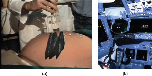
Figure 6.34 Two augmented reality applications showing (a) a scanned womb overlaying a pregnant woman's stomach and (b) a head up display (HUD) used in airline cockpits to provide directions to aid flying during poor weather conditions
Another approach is to augment everyday graphical representations, e.g. maps, with additional dynamic information. Such augmentations can complement the properties of the printed information in that they enable the user to interact with geographically embedded information in novel ways. An illustrative application is the augmentation of paper-based maps with photographs and video footage to enable emergency workers to assess the effects of flooding and traffic (Reitmayr et al., 2005). A camera mounted above the map tracks the map's locations on the surface while a projector augments the maps with projected information from overhead. Figure 6.35 shows areas of flooding that have been superimposed on a map of Cambridge (UK), together with images of the city center captured by cameras.

Figure 6.35 An augmented map showing the flooded areas at high water level overlayed on the paper map. The PDA device is used to interact with entities referenced on the map
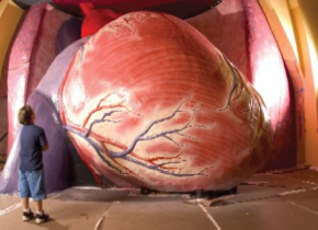
Figure 6.36 The Healthy Heart interactive installation at the Franklin Institute
Box 6.6: Larger than life: interactive installations and mixed reality games
Museums and galleries have begun to develop large interactive installations that enable visitors to have a user experience with a difference. Instead of entering a 3D virtual world they enter a 3D physical world that has been augmented with digital interfaces. An example is the healthy heart exhibition at the Franklin Institute in Philadelphia (see Figure 6.36), where a giant size model of the heart can be walked through presenting 3D sounds, lights, and video. One part is an eight-foot-long ‘crawl through arteries’ device that enables children to pretend they are blood cells navigating through clear and clogged arteries.
Another form of interactive experience is mixed reality games that are played in a blend of physical and virtual worlds using novel interfaces. For example, the Hunting of the Snark adventure game (Rogers et al., 2002) was designed as a series of interlinked mixed reality spaces intended to provoke children's imagination and creativity. Young children (8–10 years old) were given the task of finding as much as they could about an elusive creature called the Snark, by interacting with it in various physical/digital spaces. For example, in the Snooper room they hunt for hidden virtual tokens that can then be transformed into physical counterparts that enable them to interact with the Snark. The physical tokens are used to feed the Snark at a well (see Figure 6.37) fly with it in the air, or walk with it in a cave. The game was inspired by Lewis Carroll's poem in which a group of adventurers describe their encounters with a never really found fantasy creature. Similarly, in the Snark game, the Snark never shows itself in its entirety, only revealing aspects of itself, e.g. its likes/dislikes, personality, and so forth, depending on what the children do in the different spaces.
Figure 6.37 Two girls interacting with The Hunting of the Snark mixed reality game: the Snark registers disgust having been fed a physical token of an onion
Research and Design Issues
A key research concern when designing mixed reality environments and augmented reality is what form the digital augmentation should take and when and where it should appear in the physical environment (Rogers et al., 2005). The information needs to stand out but not distract the person from his ongoing activity in the physical world. For example, ambient sounds need to be designed to be distinct from naturally occurring sounds so that they draw a person's attention without distracting him and then allow him to return to what he was doing. Information that is superimposed on the physical world, e.g. digital information overlaying video footage of a runway to identify vehicles and planes, needs to be simple and easy to align with the real-world objects.
Augmented reality and mixed reality are emerging technologies. Hence, there aren't comprehensive sets of guidelines available. Hix and Gabbard (2002) provide some initial pointers but it must be stressed that the selection of appropriate technologies and interfaces may vary across different application areas. Designing for playful learning experiences is very different from designing for military or medical applications. Ambiguity and uncertainty may be exploited to good effect in mixed reality games but could be disastrous in the latter categories. The type of technology will also determine what guidance will be of relevance. A guideline for the use of an optical see-through display, e.g. shutter glasses or head-mounted display, may not be relevant for a video see-through display. Likewise, a guideline for a mobile augmented reality solution may not be relevant for a fixed display application.
Wearable Interfaces
One of the first developments in wearable computing was head- and eyewear-mounted cameras that enabled the wearer to record what he saw and access digital information while on the move (Mann, 1997). Imagine being at a party and being able to access the website of a person whom you have just met, while or after talking to her to find out more about her. The possibility of having instant information before one's very own eyes that is contextually relevant to an ongoing activity and that can be viewed surreptitiously (i.e. without having to physically pull out a device like a PDA) is very appealing.
Since the early experimental days of wearable computing (see Figure 6.38) there have been many innovations and inventions. New display technologies and wireless communication presents many opportunities for thinking about how to embed such technologies on people in the clothes they wear. Jewelry, head-mounted caps, glasses, shoes, and jackets have all been experimented with to provide the user with a means of interacting with digital information while on the move in the physical world. Applications that have been developed include automatic diaries that keep users up-to-date on what is happening and what they need to do throughout the day, and tour guides that inform users of relevant information as they walk through an exhibition and other public places (Rhodes et al., 1999)

Figure 6.38 The evolution of wearable computing
Recent wearable developments include eye glasses that have an embedded miniature LCD display on which digital content from DVD players and cell phones can be seen by the wearer but no one else and a ski jacket with integrated MP3 player controls that enable wearers to simply touch a button on their arm with their glove to change a track (Techstyle News, 2005).
Smart fabrics have also begun to be developed that enable people to monitor their health. For example, The Wearable Health Care System (WEALTHY) prototype contains tiny sensors that can collect information about the wearer's respiration, core and surface skin temperature, position (standing or lying down), and movement. The garment can take advantage of the cell phone network to communicate data with remote sensors, thanks to the integration of a miniaturized GPRS transmitter. The SensVest (see Figure 6.39) has similarly been designed to measure heart rate, body temperature, and movement during sports activities (Knight et al., 2005).
Figure 6.39 The SensVest prototype developed as part of the EU Lab of Tomorrow project, designed to monitor people playing sports
Research and design issues
A core design concern—that is specific to wearable interfaces—is comfort. Users need to feel comfortable wearing clothing that is embedded with technology. It needs to be light, small, not get in the way, fashionable, and preferably hidden in the clothing. Another related issue is hygiene—is it possible to wash or clean the clothing once worn? How easy is it to remove the electronic gadgetry and replace it? Where are the batteries going to be placed and how long is their life time? A key usability concern is how does the user control the devices that are embedded in his clothing—is touch, speech, or more conventional buttons and dials preferable?
For health monitoring wearable systems, there is also the trust issue of how reliable and accurate the information being monitored is. A wearer (or carer) does not want to be given false information about the wearer's heart rate or other bodily function, causing undue stress. Two other major concerns are social acceptance and privacy. Is it acceptable in our society for people to be looking up other's details while talking to them and how do people feel about others recording their intimate conversations without necessarily knowing this is happening and what happens subsequently to that information?
Robotic Interfaces
Robots have been with us for some time, most notably as characters in science fiction movies, but also playing an important role as part of manufacturing assembly lines, as remote investigators of hazardous locations, e.g. nuclear power stations and bomb disposal, and as search and rescue helpers in disasters, e.g. fires, or far away places, e.g. Mars. Console interfaces have been developed to enable humans to control and navigate robots in remote terrains, using a combination of joysticks and keyboard controls together with camera and sensor-based interactions (Baker et al., 2004). The focus has been on designing interfaces that enable users to effectively steer and move a remote robot with the aid of live video and dynamic maps.
More recently, domestic robots are appearing in our homes as helpers. For example, robots are being developed to help the elderly and disabled with certain activities, such as picking up objects and cooking meals. Pet robots, in the guise of human companions, are being commercialized, having first become a big hit in Japan. A new generation of sociable robots has also been envisioned that will work collaboratively with humans, and communicate and socialize with them—as if they were our peers (Breazeal, 2005).
Several research teams have taken the ‘cute and cuddly’ approach to designing robots, signalling to humans that the robots are more pet-like than human-like. For example, Mitsubishi has developed Mel the penguin (Sidner et al., 2005) whose role is to host events while the Japanese inventor Takanori Shibata has developed Paro, a baby harp seal, whose role is to be a companion (see Figure 6.40). Sensors have been embedded in the pet robots enabling them to detect certain human behaviors and respond accordingly. For example, they can open, close, and move their eyes, giggle, and raise their flippers. The robots afford cuddling and talking to—as if they were pets or animals. The appeal of pet robots is thought to be partially due to their therapeutic qualities, being able to reduce stress and loneliness among the elderly and infirm.
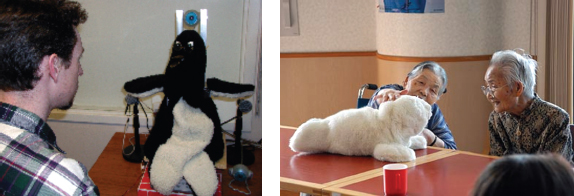
Figure 6.40 Mel, the penguin robot, designed to host activities and Japan's Paro, an interactive seal, designed as a companion, primarily for the elderly and sick children
Research and design issues
One of the key research questions to consider is what is special about a robotic interface and how it differs from other interfaces we have discussed. Robots are typically designed to exhibit behaviors, e.g. making facial expressions, walking, or talking, that humans will consider to be human or animal-like, e.g. happy, angry, intelligent. While this form of attribution also occurs for PC-based agent interfaces (see Chapter 2), having a physical embodiment—as robots do—can make people suspend their disbelief even more, viewing the robots as pets or humans. This raises the moral question as to whether such anthropomorphism should be encouraged. Should robots be designed to be as human-like as possible, looking like us with human features, e.g. eyes and mouth, behaving like us, communicating like us, and emotionally responding like us (cf. the animated agents approach advocated in Chapter 5)? Or should they be designed to look like robots and behave like robots, e.g. vacuum robots, that serve a clearly defined purpose? Likewise, should the interaction be designed to enable people to interact with the robot as if it was another human being, e.g. talking, gesturing, holding its hand and smiling at it, or should the interaction be designed to be more like human-computer interaction, e.g. pressing buttons, knobs, and dials to issue commands?
For many people, the cute pet approach to robotic interfaces seems preferable to one that aims to design them to be more like fully-fledged human beings. Humans know where they stand with pets and are less likely to be unnerved by them and, paradoxically, are more likely to suspend their disbelief in the companionship they provide.
6.4 Which Interface?
In this chapter we have given an overview of the diversity of interfaces that is now available or currently being researched. There are many opportunities to design for user experiences that are a far cry from those originally developed using command-based interfaces in the 1980s. An obvious question this raises is: “but which one and how do you design it?” For the most part, it is likely that much system development will continue for the PC platform, using advanced GUIs, in the form of multimedia, web-based interfaces, and virtual 3D environments. However, in the last decade, mobile interfaces have come of age and many developers are now creating interfaces and software toolkits for designers to enable people to access the web, communicate with one another, interact with information, and use slimmed-down applications while on the move. Speech interfaces are also being used much more for a variety of commercial services. Appliance and vehicle interfaces have become an important area of interaction design. Shareable and tangible interfaces are moving beyond blue-sky research projects and it is likely that soon they will become present in various shapes and forms in our homes, schools, public places, and workplaces. There are many exciting challenges ahead when it comes to the development of multimodal and robotic interfaces.
In many contexts, the requirements for the user experience that have been identified during the design process (to be discussed in Chapter 10) will determine what kind of interface might be appropriate and what features to include. For example, if a health care application is being developed to enable patients to monitor their dietary intake, then a mobile PDA-like device—that has the ability to scan barcodes and take pictures of food items that can be compared with a database—would seem a good interface to use, enabling mobility, effective object recognition, and ease of use. If the goal is to design a work environment to support collocated group decision-making activities then a shareable interactive surface would be a good choice. More novel kinds of interfaces, e.g. mixed reality and tangibles, have so far been primarily experimented with for play and learning experiences, although as the technology develops we are likely to see them being used to support other kinds of work-related and home-based activities.
Given that there are now many alternatives for the same activities it raises the question as to which is preferable for a given task or activity. For example, is multimedia better than tangible interfaces for learning? Is speech as effective as a command-based interface? Is a multimodal interface more effective than a monomodal interface? Will wearable interfaces be better than mobile interfaces for helping people find information in foreign cities? Are virtual environments the ultimate interface for playing games? Or will mixed reality or tangible environments prove to be more challenging and captivating? Will shareable interfaces, such as interactive furniture, be better at supporting communication and collaboration compared with using networked desktop PCs? And so forth. These questions have yet to be answered. In practice, which interface is most appropriate, most useful, most efficient, most engaging, most supportive, etc., will depend on the interplay of a number of factors, including reliability, social acceptability, privacy, ethical and location concerns.
Assignment
In Activity 6.6 we asked you to compare the experience of playing the game of Snake on a PC with a cell phone. For this assignment, we want you to consider the pros and cons of playing the same game using different interfaces. Select three interfaces, other than the GUI and mobile ones, e.g. tangible, wearable, and shareable, and describe how the game could be redesigned for each of these, taking into account the user group being targeted. For example, the tangible game could be designed for young children, the wearable interface for young adults, and the shareable interface for old people.
- Go through the research and design issues for each interface and consider whether they are relevant for the game setting and what issues they raise. For the wearable interface, issues to do with comfort and hygiene are important when designing the game.
- Describe a hypothetical scenario of how the game would be played for each of the three interfaces.
- Consider specific design issues that will need to be addressed. For example, for the shareable surface would it be best to have a tabletop or a wall-based surface? How will the users interact with the snake for each of the different interfaces; by using a pen, fingertips, or other input device? Is it best to have a representation of a snake for each player or one they take turns to play with? If multiple snakes are used, what will happen if one person tries to move another person's snake? Would you add any other rules? And so on.
- Compare the pros and cons of designing the Snake game using the three different interfaces with respect to how it is played on the cell phone and the PC.
Summary
This chapter has given an overview of the range of interfaces that can now be designed for user experiences. It has described the paradigmatic developments in interaction design and the issues and research questions that these have led to. In so doing, it has highlighted the opportunities and challenges that lie ahead for designers and researchers who are experimenting with and developing innovative interfaces. It has also explicated some of the assumptions behind the benefits of different interfaces—some that are supported, others that are still unsubstantiated. It has presented a number of interaction techniques and structures that are particularly suited (or not) for a given interface type. It has also discussed the dilemmas facing designers when using a particular kind of interface, e.g. abstract versus realism, menu selection versus free-form text input, human-like versus non-human-like. Finally, it has presented pointers to specific design guidelines and exemplary systems that have been designed using a given interface.
Key Points
- Many interfaces have emerged post the WIMP/GUI era, including speech, wearable, mobile, and tangible.
- Many new design and research questions need to be considered to guide designers when deciding which of the new generation of interfaces to use and what features to include.
- Web interfaces are becoming more like multimedia-based interfaces.
- An important concern that underlies the design of any kind of interface is how information is represented to the user (be it speech, multimedia, virtual reality, augmented reality, etc.), so that she can make sense of it with respect to her ongoing activity, e.g. playing a game, shopping online or interacting with a pet robot.
Further Reading
Many of the best books on designing interfaces have been developed for the practitioner market. They are often written in a humorous and highly accessible way, replete with cartoons, worldly prescriptions, and figures. They also use modern fonts that make the text very appealing. We recommend:
COOPER, A. and REIMAN, R. (2003) About Face 2.0: The Essentials of Interaction Design. John Wiley & Sons. This is a top favorite among designers and has become an international bestseller. It is provocative, laden with humor, has a very personable style while also having extensive coverage of everything you wanted and needed to know about GUI interface design.
JOHNSON, J. (2000) GUI Bloopers. Morgan Kaufmann. This has become a classic, covering all the dos and don'ts of software development and web design—full of the author's amusing anecdotes and other designer howlers.
MULLET, K. and SANO, D. (1995) Designing Visual Interfaces. SunSoft Press. While a bit dated now, the principles of visual design that are espoused and well illustrated are as relevant to advanced graphical interfaces as they were to the design of early GUI interfaces.
For web interfaces, we suggest:
KRUG, S. (2000) Don't Make Me Think. Circle.com Library. This is a very accessible and pithy book.
VEEN, J. (2001) The Art and Science of Web Design. New Riders. This has an in-depth coverage of design principles.
SPOOL, J., SCANLON, T., SCHROEDER, W., SNYDER, C. and DEANGELO, T. (1997) Web Site Usability. Morgan Kaufmann. While a bit dated, this book provides an extensive evaluation study of different websites, highlighting what works and does not work on different websites.
For speech interfaces:
COHEN, M., GIANGOLA, J. and BALOGH, J. (2004) Voice User Interface Design. Addison Wesley. The authors are well known in the field of speech technology and their latest book is a good introduction to the area, covering in equal measure technical and interaction design issues. The accompanying website has a number of speech interfaces that can be played, to bring the examples alive.
For appliance interfaces:
BERGMAN, E. (ed.) (2000) Information Appliances and Beyond. Morgann Kaufmann.