
How to create and use component diagrams
How to show the internal parts of a component diagram
How to create and use a class diagram
Chapter 2 discussed use case, activity, and sequence diagrams, and how they can be used to understand the problem space, as well as to begin mapping out how the application should be built and what the application is trying to accomplish. Once you have that information under your belt, the next step is to start trying to visualize (from a high level) the structure of the system, and then drill down into the classes and other objects that will be used by the application. This is where component diagrams and class diagrams come in.
This chapter begins by introducing component diagrams. It will break down an existing component diagram to provide a good understanding of all the parts that are available. It will look at all the elements from the component diagram toolbox, as well as describe all the different properties available to all the elements. The component diagram discussion will wrap up with step-by-step instructions on how to create a component diagram, as well as how to use a component diagram to model the internal workings of higher-level components.
After that, it is all about UML class diagrams (formerly known as logical class diagrams). As with component diagrams, this chapter examines some existing class diagrams, and covers the different toolbox elements and properties of those elements. The chapter concludes with a discussion of the step-by-step creation of a basic class diagram.
Note
The terms "class diagram," "logical class diagram," and "UML class diagram" will be used interchangeably throughout this chapter, but are meant to refer to the same diagram type.
As you learned in Chapter 2, the sequence diagram allows you to model and visualize the messages of a system. With the component diagram, you can visualize the components of the system that implement the system functionality, as well as other puzzle pieces of the system (such as Web services, user interfaces, COM components, and so on). A component diagram will depict the relationships between various components of your application or system.
A component diagram shows the parts of a design for a software system. These components could be executables, DLLs, or even entire systems. At this level, you aren't necessarily trying to decide exactly how things are being built. Rather, you are just trying to break down the architecture into something more manageable and understandable. A component diagram can be used to visualize the high-level structure of the system, and the service behavior that those components both provide and consume.
Think of a component as a modular unit that is replaceable. You don't know how the internals of the component work. Instead, you know what interfaces a component provides or consumes. Components on a component diagram have interfaces, either required interfaces or provided interfaces. An interface can be anything, from a Web site to a Web service. A required interface indicates functionality that a component expects to consume. A provided interface indicates functionality that a component provides for other components to consume. Each required interface on a component diagram should be linked to a provided interface.
Creating component diagrams has a couple of nice benefits. It can help the development team understand an existing design and see potential ways to improve it. More importantly, thinking of the system as a collection of components with well-defined interfaces improves the separation between components, which can make the design easier to change as the requirements change.
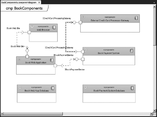
The best way to understand any diagram is to look at an example and take it apart. Figure 3-1 shows an example of a basic component diagram of the online bookstore system.

In Figure 3-1, the square objects labeled Web Browser and Book Web Application are called components. As mentioned previously, a component is a reusable piece of system functionality. A component provides and consumes behavior through interfaces, and can use other components. Another way to think about a component is that it is a kind of class.
Note
Click the chevron symbol on a component element to show just the component header, and hide other component information.
As mentioned, components expose interfaces that are either a functionality that a component provides for other components (a provider interface), or functionality that a component needs from other components (a required interface). Required interfaces are represented by an open circle called a hook. The Web Browser component exposes a required interface named Book Web Site. Provided interfaces are represented by a closed circle called a lollipop. The Book Payment System component exposes a provided interface named IBookPaymentService.
Required interfaces and provided interfaces are linked together using a Dependency element. A Dependency element appears as a dotted arrow linking a required interface to a provided interface.
Figure 3-2 shows the different elements and associations available for component diagrams.

Table 3-1 describes the different elements and associations.
Table 3.1. Component Diagram Toolbox Objects
NAME | DESCRIPTION |
|---|---|
| Turns the mouse back into a regular mouse pointer. |
| Defines how an element depends on another element. Begin the relationship from the dependent element. |
| Adds a component that defines a reusable unit of system functionality. |
| Designates behavior between a port on an outer component and an interface on an inner component. |
| Adds an interface that a component provides to other components. |
| Adds an interface that a component requires from other components. |
| Adds a comment for more details. |
| Defines how a component derives from another component. Begin the relationship from the derived component. |
| This connection tool creates a default relationship between shapes, based on the types of shapes being connected. |
| This tool specifies a connection between parts in a component. It connects a required interface on one part to a provided interface on another part. |
Each element on a component diagram has properties that can be manipulated using the Properties window in Visual Studio 2010. To see the properties of an element, right-click on the element in the diagram and select Properties. The properties will appear in the Properties window.
Table 3-2 describes the different properties available to component diagram elements.
Table 3.2. Component Diagram Element Properties
PROPERTY | DEFAULT | ELEMENT | DESCRIPTION |
|---|---|---|---|
| A default name | All | Identifies the element. |
|
| All | Uniquely identifies the element. Prefixed with the qualified name of the package that contains it. |
|
| All | The number of work items associated with this element. |
| (none) | All | General notes about the element can be added here. |
|
|
| The component exists only as a design artifact. At run-time, only its parts exist. |
|
|
| The component definition can be used only as a generalization from which other components can be specialized. |
|
|
| This interface cannot be specialized. |
| (none) |
| The template type that this type instantiates. Expand the parameter to see the bindings of the template parameters. |
| (none) |
| Lists the type's parameters. Used if this is a template type. To see the properties of individual parameters, click [...]. |
|
|
| |
| |||
| |||
| |||
| Type on creation |
| The type of a part is a component or class. |
|
|
| Indicates how many instances of the specified type form part of the parent component. |
| |||
| |||
* — A collection of any number. | |||
| |||
|
|
| The default namespace for elements added to this diagram. |
Let's look at the process of creating the component diagram shown in Figure 3-1. Using the same modeling project from Chapter 2, right-click on the project in Solution Explorer, and, from the context menu, select Add
Select the Component Diagram template and name it BookComponents.componentdiagram. Click the Add button to create this diagram. A blank component diagram named BookComponents.componentdiagram will be created in the modeling project and opened in Visual Studio 2010. At this point, you are ready to add components onto the diagram.
There are two options for adding components to the diagram. Using the toolbox, click the Component element, then click a blank area of the diagram. An empty Component element will appear on the diagram. This is useful for creating new components.
Existing components from other diagrams in the same modeling project can also be added to the diagram. Either open the existing diagram, or open the UML Model Explorer window (by selecting View
Note
You can also just drag the component from the Model Explorer onto the diagram.
From the Toolbox window, click the Component element and click a blank area on the diagram to create a new Component element. Select the component and change its name to Web Browser. Following this same method, add the following components to the component diagram:
Book Web ApplicationBook Web App DatabaseExternal Credit Card Processor GatewayBook Payment SystemBook Payment System Database
Once these components have been added, the component diagram should resemble Figure 3-3.

Now that all the components have been added to the diagram, the next step is to show all the provider relationships for components with interfaces that expose service behavior. From the Toolbox window, click the Provided Interface element, and then click on the Book Web Application component. The provided interface symbol (or lollipop) will attach itself to the Book Web Application component, with a default name of Interface1. This component is going to represent the Web site used for ordering books. Select the Provided Interface element, and, in the Properties window, rename it to Book Web Site.
Add another Provided Interface element to the Book Payment System component, and name it IBookPaymentService. This element will expose a Web service for interacting with the payment system. Finally, add a Provided Interface element to the External Credit Card Processor Gateway component and name it ICreditCardProcessingGateway. This element will expose a Web service for interacting with the external credit card processor. The component diagram should now resemble Figure 3-4.

Next, you must add the required interfaces. Remember, required interfaces represent behavior that a component consumes through an interface. As with adding components to the diagram, there are two options for adding interfaces (both required and provided interfaces) to the diagram. You can add a new interface from the Toolbox window, or, using the UML Model Explorer, you can drag an existing interface onto the diagram.
First, you must show that the Web Browser component utilizes the book Web site interface exposed by the Book Web Application component. From the toolbox, click the Required Interface element, then click the Web Browser component on the diagram. Rename the interface to Book Web Site.
Note
The interface elements can be easily repositioned on a component by dragging them to the appropriate location.
Next, let's add a required interface to the Book Web Application by using the UML Model Explorer. If the UML Model Explorer window is not visible, open it by going to View
The UML Model Explorer shows all the elements that have been added to the central model. In the UML Model Explorer, click and drag the IBookPaymentService interface to the Book Web Application component. This creates another instance of the IBookPaymentService provided interface. However, you need this interface to be a required interface. To change the interface type, select the IBookPaymentService provided interface on the Book Web Application component. Click the smart tag that appears above the element and select "Convert to Required Interface." The interface type will change from provided to required.
Note
You can also select the smart tag for a required interface and change it into a provided interface.
Finally, select the Required Interface element in the Toolbox window and click the Book Payment System component to create a required interface on that component. Rename the interface to be ICreditCardProcessingGateway. The component diagram should now resemble Figure 3-5.

With the components defined and the provided and required interfaces known, the next step is to show which provided interfaces satisfy which required interfaces. This is done using the Dependency element. A Dependency element always connects a required interface (or hook) to a provided interface (or lollipop).
In the Toolbox window, select the Dependency element. On the component diagram, select the Book Web Site required interface on the Web Browser component, then select the Book Web Site provided interface on the Book Web Application component. A dotted arrow will be created from the required interface to the provided interface, indicating that the provided interface satisfies the required interface. On the component diagram, select the dependency dotted arrow that was just created. In the Properties window, change the name to be HTTP. This will provide a visual indicator on the component diagram that this is an HTTP connection between the two components.
In the Toolbox window, select the Dependency element again. On the component diagram, select the IBookPaymentService required interface on the Book Web Application component. Then select the IBookPaymentService provided interface on the Book Payment System component. Finally, select the Dependency element from the toolbox, and connect the ICreditCardProcessingGateway required interface on the Book Payment System component to the ICreditCardProcessingGateway provided interface on the External Credit Card Processor Gateway. The component diagram should now resemble Figure 3-6.
The final step in creating this component diagram is to show the dependency relationship between the components and the databases that they use.
To create the dependency relationship between the Book Web Application and the Book Web App Database components, select the Dependency element from the Toolbox window, click the Book Web Application component, and then click the Book Web App Database component. A dotted arrow will be drawn between the two, indicating the dependency of the Web application on the database. Do the same thing between the Book Payment System component and the Book Payment System Database component. The component diagram is now complete, as shown in Figure 3-7.

To show how a larger component is comprised of smaller components, a component can also be placed inside other components on a component diagram. This section shows you how to create a component model of a Web service for the example book Web site. This Web service component is comprised of both a customer application server and a back-end order-processing server.
Using the same modeling project from earlier in this chapter, right-click on the project in Solution Explorer, and, from the context menu, select Add
Select the Component Diagram template and name it BookWebService.componentdiagram. Click the Add button to create this diagram. A blank component diagram named BookWebService.componentdiagram will be created in the modeling project and opened in Visual Studio.
From the Toolbox window, click the Component element and click a blank area on the diagram to create a new component element. Select the component and change its name to be Book Web Service. Select another Component element from the Toolbox window and click inside the Book Web Service component to create the new component inside the Book Web Service component. Name this component CustomerApplicationServer. Add a second component inside the Book Web Service component and name it OrderProcessingServer. The component diagram should now resemble Figure 3-8.

A component placed inside another component is called a part. A part is considered an attribute to its parent component, in the same way an attribute belongs to an ordinary class. A part has its own type, which is usually also a component. The label of a part has the same form as an attribute: +PartName : TypeName
Inside the parent component, each part can have provided and required interfaces that are defined for its type. If you added existing components using the UML Model Explorer, any defined provided or required interfaces for that component will automatically be instantiated.
Add two required interfaces to the CustomerApplicationServer named OrderBook and PaymentAuthorization. Add a provided interface named Sales. To the OrderProcessingServer, add a provided interface named OrderBook. The component diagram should now resemble Figure 3-9.

A nested component diagram can also show that an interface of the parent component is actually provided or required by one of its parts. This is done using a Port element. A Port element is placed on the parent component boundary, and the place the parent of the component's interface on the port. Finally, you connect the port to an interface of an internal part, using the Delegation element.
The example Web service has two external interfaces — a Web site provided interface, and a PaymentAuthorization required interface. Those interfaces are actually handled by the CustomerApplicationServer part. To handle this on the diagram, you must add ports to the Book Web Service component, add the external interfaces, and then connect the internal interfaces to the appropriate ports.
From the toolbox, select the Port element, then click on the Book Web Service component to create a port, which appears as a square box on the component. Change the name of the port element to be WebsitePort. Add a second port to the Book Web Service component and name it PaymentAuthorizationPort.
Once both ports are added, it's time to create the external interfaces for the Book Web Service component. From the toolbox, select the Provided Interface element, and then click the WebsitePort element on the diagram. A provided interface element will be added to the diagram, connected to WebsitePort. Change the name of the provided interface to Website. Add a required interface element, attached to the PaymentAuthorizationPort element, and change its name to Payment Authorization.
To finish out this component diagram, you must connect the internal components to the created ports. This is done using the Delegation element. Click on the Delegation element in the Toolbox window, then click on the WebsitePort element, and finally, click on the Sales provided interface. A solid arrow will connect the port to the Sales provided interface. Click on the Delegation element in the Toolbox window, then click on the PaymentAuthorizationPort element, and finally, click on the PaymentAuthorization required interface. A solid arrow will connect the PaymentAuthorization required interface with the PaymentAuthorizationPort element.
Add a Part Assembly element between the OrderBook required interface and OrderBook provided interface. The finished diagram should look similar to Figure 3-10.

Class diagrams depict the classes within an application or system and the relationship that exists between them. Different symbols represent the varying relationships that may exist (such as inheritance or association). This information is described independent of any reference to a particular implementation of the class. The purpose of the class diagram is to focus on the logical aspects of the classes, instead of how they are implemented.
Note
This chapter discusses UML class diagrams, or logical class diagrams. There is another type of class diagram, called a .NET class diagram, used to visualize program code. That is not discussed in this chapter.
In a class diagram, a type is a class, interface, or enumeration. Class and interface objects can have attributes defined. An attribute is a value that can be attached to an instance of a class or an interface. Classes and interfaces can also have operations defined. An operation is a method or function that can be performed by an instance of a class or interface.
On a class diagram, you can draw associations between any pairs of types. An association indicates that the system being developed stores links between the instances of the associated types. An association is a diagrammatic method of showing an attribute or pair of attributes. For example, if you have a class BookStore that has an attribute of type Book, you can state that definition by drawing an association between Bookstore and Book.
Using the Model Explorer, you can locate interfaces you have defined on the component diagram and drag those directly onto the class diagram to create them.
Let's look at a couple of examples of class diagrams to understand the different pieces. Figure 3-11 shows an example of the three standard kinds of types available for a class diagram:
Classes are used to represent data or object types.
BookOrderrepresents a class.Colorrepresents an enumeration. An enumeration is used to represent a type that has a limited number of literal values.Orderingrepresents an interface. Interfaces are used when you must differentiate between a pure interface versus a concrete class with internal implementations.

Note
Be sure to give each type a unique name.
Classes and interfaces contain both attributes and operations. An attribute is simply a named value that every instance of the type can have. An operation is a method or function that instances of the type can perform. The BookOrder class has two attributes (TotalPrice and MostRecentItem), and one operation (AddBook). As you can see from the diagram, attributes are listed under the Attributes section, while operations are listed under the Operations section. These sections can be collapsed by clicking the plus sign to the left of each section.
Enumerations contain a list of values called literals. When using an enumeration, be sure to give each literal value a separate name. Literal values can also be assigned a numeric number as well, by setting the Value field in the Properties window.
Figure 3-12 shows another example of a class diagram. In this example, you see two classes, BookStore and Book. You want to show how these classes are related or linked to each other. This is done by using an Association element. The Association element appears as a line connecting the two classes. An Association element is used to represent any kind of linkage between two elements, regardless of how the linkage is actually implemented in the code itself. Figure 3-12 shows that the BookStore class has an association with the Book class, in that a BookStore may have multiple books in it (indicated by the asterisk on the right side of the association).

Class diagrams can also be used to show inheritance, dependency, and package information as well.
Figure 3-13 shows the different elements and associations available for class diagrams.

Table 3-3 describes the different elements and associations.
Table 3.3. Class Diagram Toolbox Objects
DESCRIPTION | |
|---|---|
| Turns the mouse back into a regular mouse pointer. |
| Adds a type that defines a class. |
| Adds an interface to specify the attributes and operations that classes require to realize this interface. |
| Adds a type that defines a list of specific values. |
| Adds a package to organize types according to their namespaces. |
| Adds a comment for more details. |
| Defines how an element interacts with another element. Begin the relationship from the referencing type. |
| Specifies that the source type refers to parts of the target type. The parts can be shared with another owner. |
| Specifies that the source type has parts of the target type. The parts cannot be shared with another owner. |
| Defines how a type depends on another type. Begin the relationship from the dependent type. |
| Defines how a type inherits or realizes the members of another type. |
| Defines how a package imports types defined in another package. Begin the relationship from the package that uses another package. |
| This connection tool creates a default relationship between shapes, based on the types of shape being connected. |
Each type on a class diagram has properties that can be manipulated using the Properties window in Visual Studio. To see the properties of a type, right-click on the type in the diagram and then select Properties. The properties will appear in the Properties window.
Table 3-4 describes the different properties available to class diagram types.
Table 3.4. Class Diagram Type Properties
PROPERTY | DEFAULT | APPEARS IN | DESCRIPTION |
|---|---|---|---|
| A default name | All elements | Identifies the element. |
| Containing | All elements | Identifies the element uniquely. Prefixed with the qualified name of the package that contains it. |
|
|
| If |
|
|
| If |
|
|
|
|
| |||
| |||
|
| All elements | The number of work items associated with this element. |
| (blank) | All elements | You can make general notes about the item here. |
| (none) |
| The template type that this type instantiates. Expand the parameter to see the bindings of the template parameters. |
| (none) |
| Lists the type's parameters. Used if this is a template type. To see the properties of individual parameters, click [...]. |
In a class diagram, you can add attributes to classes and interfaces. As mentioned previously, an attribute defines values that can be attached to instances of a class or interface.
Each attribute on a class or interface has properties that can be manipulated using the Properties window in Visual Studio. To see the properties of an attribute, right-click on the type in the diagram and then select Properties. The properties will appear in the Properties window.
Table 3-5 describes the different properties available to class diagram attributes.
Table 3.5. Class Diagram Attribute Properties
PROPERTY | DEFAULT | DESCRIPTION |
|---|---|---|
|
| If |
| (a new name) | Should be unique within the type. |
| (none) | A primitive type (such as Integer), or a type that is defined in the model. |
|
|
|
| ||
| ||
| ||
|
| Count of associated work items. Read-only. |
|
| If |
|
| If |
| (empty) | For general notes, or for defining constraints on the values of the attribute. |
|
|
|
| ||
* — This attribute's value is a collection of values. | ||
| ||
| ||
|
| If |
|
| If |
In a class diagram, you can add operations to classes and interfaces. Remember, an operation is a method or function that can be performed by an instance of a class or interface.
Each operation on a class or interface has properties that can be manipulated using the Properties window in Visual Studio. To see the properties of an operation, right-click on the operation in the diagram and then select Properties. The properties will appear in the Properties window.
Table 3-6 describes the different properties available to class diagram operations.
Table 3.6. Class Diagram Operations Properties
PROPERTY | DEFAULT | DESCRIPTION |
|---|---|---|
| (a new name) | Should be unique within the containing type. |
| (none) | A list that has the form |
| (none) | (none), or a primitive type, or a type that is defined in the model. |
|
|
|
| ||
| ||
| ||
|
| Summarizes the visibility, name, parameters, and return type of the operation. Change these properties by editing the signature on the diagram, or editing the individual properties. |
| Count of associated work items. Read-only. | |
|
|
|
| ||
| ||
|
| If |
|
| If |
|
| The designer intends that this operation cannot be overridden in derived classes. |
|
| If |
|
|
|
| ||
| ||
| ||
| ||
|
| If |
|
| If |
In a class diagram, you can draw associations between any pair of types. Remember, a type is a class, interface, or enumeration.
Each association on a class or interface has properties that can be manipulated using the Properties window in Visual Studio. To see the properties of an association, right-click on the association in the diagram and then select Properties. The properties will appear in the Properties window.
Table 3-7 describes the different properties available to class diagram associations.
Table 3.7. Class Diagram Association Properties
Table 3-8 describes the different properties available to the First Role and Second Role.
Table 3.8. Class Diagram Role Properties
PROPERTY | DEFAULT | DESCRIPTION |
|---|---|---|
| Name of the type at this role | The name of the role. Appears near the end of the association on the diagram. |
|
|
|
| ||
| ||
The exact interpretation is open to local convention. | ||
|
| If |
|
| If |
|
| The association can be read in this direction. Given an instance of the opposite role, the software that you are describing can efficiently determine the associated instance of this role. If one role is navigable and the other is not, an arrow appears on the association in the navigable direction. |
| If | |
|
|
|
| ||
| ||
| ||
| ||
|
| If |
|
| If |
|
|
|
| ||
| ||
|
Let's look at how to create a class diagram. Using the same modeling project from before, right-click on the project in Solution Explorer, and, from the context menu, select Add
Select the UML Class Diagram template and name it BooksClassDiagram.classdiagram. Click the Add button to create this diagram. A blank UML class diagram named BooksClassDiagram will be created in the modeling project and opened in Visual Studio.
In the Toolbox tab, click the Class element and then click a blank space on the UML class diagram. This will create a class object on the diagram. In the properties for the class, change the name to be Store. This is going to be a generic store class that the book store object will inherit from. Set the Is Abstract property of the Store class to True, to indicate it is an abstract class.
Note
Notice how, when setting the class to be abstract, the font of the title changes to italics.
The Store class has a couple of generic attributes that apply to all stores, such as location and store hours. Right-click on the Store class and select Add

Next, you must create the book store class. The book store class will inherit from the Store class created earlier. Using the Toolbox window, add another Class object to the diagram, and name it BookStore. Select the Inheritance element in the Toolbox window. Click on the BookStore class, then on the Store class. A solid arrow will appear pointing from the BookStore class to the Store class, indicating that the BookStore inherits from the Store.
The inherited operations and attributes are not typically shown on specialized types, which is why the Store class attributes are not displayed on the BookStore class. However, you can use the smart tag on the inheritance arrow to add inherited operations to the specialized class. Simply click the smart tag and select Override Operations. Then, select which operations to show on the specialized class.
Let's add an operation for ordering books to the BookStore class. Right-click on the class and select Add
In the Parameter Collection Editor window, click the Add button to create a new parameter. Set the name of the parameter to be Item, and the type to be Book. Click the Add button again to create a second parameter named Quantity with a type of Integer. Click the OK button to close the Parameter Collection Editor window. The class diagram should resemble Figure 3-15.
Finally, let's create a class for the books. Add another class object to the class diagram and rename it Book. Add two attributes to the Book class: Price of type Integer, and NumberOfPages of type Integer. Create an association between the BookStore and the Book classes. Select the Association element from the Toolbox window, click on the BookStore class and then click on the Book class. This creates a connecting line between the two classes, as shown in Figure 3-16.


A BookStore can have multiple books in it, so you must modify the Multiplicity property for the Book class. Select the Association linking the BookStore and Book classes. In the Properties window, click the plus sign next to the Second Role property to expand it. Change the Multiplicity value to be *, indicating the BookStore can contain multiple books.
Figure 3-17 shows the final result of the class diagram.

This chapter examined component and class diagrams. You learned about what component diagrams can be used for, and the different elements available to component diagrams. You also learned about the different properties available to component diagram objects. A step-by-step walkthrough showed you how to create a component diagram. After that, you learned about class diagrams and how they can be used. You learned about the different elements that are available for class diagrams, and about all the different properties for class diagrams. The chapter concluded by looking at how to create a class diagram.
Chapter 4 discusses how the Architecture Explorer can be used to drill down into the existing project, which helps to understand the different aspects of the project. The information in the Architecture Explorer can then be turned into a graphical view by creating a dependency graph.