Plotting
Data visualization or plotting is an important part of scientific computing. In this chapter, we will demonstrate how to invoke the plotting capabilities of gnuplot through numEclipse. It is assumed that the user has installed the latest version of gnuplot and numEclipse preferences are configured to point to the gnuplot as shown in the installation guide on the numEclipse project website (http://www.numeclipse.org/install.html).
6.1 Simple Function Plot (fplot)
The “fplot” method is used to plot a mathematical function. It is very different from the MATLAB or Octave implementation. It can only plot the functions recognized by gnuplot. Fortunately, gnuplot has a good collection of built-in functions.

Figure 6.1
Unlike MATLAB, the function name is not enough e.g. “sin”. We also need to provide the arguments to the function i.e. “sin(x)”. However, the numbers of supported functions are limited but it does not stop a user to define new functions using algebraic combination of existing functions. For example,

Figure 6.2
In this example, we also define the x-range and y-range of the function plot. Please note that the range arguments are strings and not arrays unlike MATLAB. The syntax for using fplot is given in the following.
fplot (‘function-name(argument)’)
fplot (‘function-name(argument)’ ‘[xmin:xmax]’)
fplot (‘function-name(argument)’, ‘[xmin:xmax]’, ‘[ymin:ymax]’)
fplot(‘function-name(argument)’, ‘[xmin:xmax]’, ‘[ymin:ymax]’, ‘format’)
The last argument of the fplot method controls the plot format. The first character represents the color and second character represents the line type of the plot. The same format convention is used in the rest of the plotting functions discussed in this chapter.
Table 6.1
| Color | Line type |
| r(red) | * |
| g(green) | + |
| b(blue) | − |
| m (magenta) | . |
| o | |
| x |
In the following, we repeat the last example with a format option.

Figure 6.3
The following example shows how to annotate a plot with a title and labels. We also show how to overlay multiple plots and how to add a grid to a plot.

Figure 6.4
Command “hold on” holds the current plot and axes while the new plot is rendered. The new plot cannot modify the current properties of the plot for example the axes range cannot be changed. Command “hold off”, cancels the hold and the new plot will erase the existing plot including the axes properties, “grid on” shows the grid lines in the current plot and all the next plots until it is disabled using the “grid off’ command.
Commands xlabel(‘label’), ylabel(‘label’) and zlabel(‘label’) place the ‘label ‘ string besides the corresponding axis (x-, y- or z-axis). Command title(‘label’), places the label string on the top of the plot. The last example shows the usage of these annotation functions. These common functions are also applicable to all the plotting functions discussed in the following.
6.2 Two-Dimensional Plots
6.2.1 Basic plot (plot)
The most commonly used plot method is “plot”. plot(X) will plot the elements of X versus their index if X is a real vector. If X is complex vector then it will plot the imaginary component of vector X versus the real components. In case X is a real matrix then plot(X) will draw a line plot for each column of the matrix versus the row index. In case of complex matrix it will plot the imaginary components of the column versus their corresponding real components. plot(X, Y) will plot elements of vector Y versus elements of vector X. In case of complex vectors the imaginary components will be ignored and only real part of the vector elements will be used for plotting. We can add one more string argument to define the format of the plot, e.g. plot(X, “g+”) plot(X, Y, “bx”). The format is a two letter string where the first letter represents the color and second defines the line style. The possible values for color and line style are described in the previous section. A simple plot example is given in the following.

Figure 6.5
The above plot shows the points corresponding to sin function as blue plus “+ “ symbols and points for cos function as red cross “x” symbols. The range of each axis could be redefined using the following common commands.
axis([xmin, xmax, ymin, ymax])
axis([xmin, xmax, ymin, ymax, zmin, zmax])
“xmin”: minimum value of x axis
“xmax”: maximum value of x axis
“ymin”: minimum value of y axis
“ymax”: maximum value of y axis
“zmin”: minimum value of z axis
“zmax”: maximum value of z axis
In the following example, we show the last example with re-defined axes

Figure 6.6
In the absence of a format option, the plot function draws a plot using an interpolated line as shown in the following example.

Figure 6.7
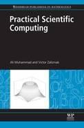
6.2.2 Logarithmic plot (plot)
The logarithmic plot functions (semilogx, semilogy, loglog) essentially work in the same manner as the plot function. They use the same argument format as the plot function. They differ in the way their axes are scaled.
semilogx uses log (base 10) scale for the X-axis.
semilogy uses log (base 10) scale for the Y-axis.
loglog uses log (base 10) for both X- and Y-axis.
These plots are used to view the trends in the dataset where the values are positive and there are large variations between data points. For example, an exponentially distributed dataset will show a linear relationship on a logarithmic plot.
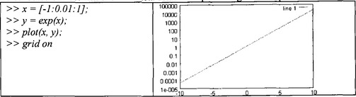
Figure 6.8
Note the equi-distant horizontal grid lines even though the difference in the y values is exponent of 10.
6.2.3 Polar plot (polar)
The polar plot method “polar (theta, rho)” draws a plot using polar coordinates of angle theta (in radians) versus the radius rho. Like the previous methods, we can also add a third String argument defining the format of line color and style as described previously. Note, how the horizontal and vertical grid lines change into radial and elliptical grid lines.

Figure 6.9
6.2.4 Bar chart (bar)
The bar chart method bar(X) makes a bar graph of elements of vector X as shown in the following example.

Figure 6.10
Method bar(X Y) draws a bar graph of elements of vector Y versus the elements of vector X, provided elements of X are increasing in the ascending manner.


6.3 Three-Dimensional Plots
6.3.1 Line plot (plot3)
The 3D version of the previously discussed plot method is “plot3”. It takes three vectors as arguments representing the x, y and z components of 3-dimensional line. A fourth String argument could be added to define the format of the line in the same manner as plot method. At this point, this method does not support matrix arguments, unlike MATLAB.

Figure 6.13
6.3.2 Mesh surface plot (mesh, meshc, contour)
The mesh surface plot is a popular 3D plot for scientific visualization. The method “mesh(X, Y Z) “ plots a meshed surface defined by the matrix argument Z such that vectors X and Y define the x and y coordinates. This method without the first two arguments will use the row and column index of the matrix Z to plot the mesh.

Figure 6.14
A variation of this method is meshc(X, Y, Z). This method enhances the mesh plot by adding contours. In the absence of first two arguments it works the same way as method mesh.
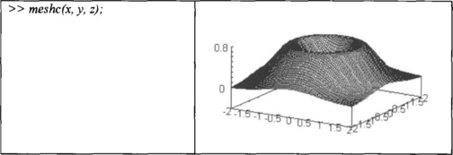
Figure 6.15
Sometimes we are only interested in the topography of the surface rather than the complete mesh plot. There is another method contour, which plots only the contour of the surface. It takes the same arguments as mesh or meshc.
Figure 6.16