
Lesson 6: Advanced Page Layout
The best web layouts account for variable content on a page. As text and images are added and/or removed, your layout can adapt. In this lesson, you will create from scratch a two-column CSS layout using the float and clear properties in order to create an adaptable page layout.
What you’ll learn in this lesson:
- • Working with the CSS float property
- • Creating columns with floated elements
- • Working with the CSS clear property
- • Creating a list-based CSS navigation bar
- • Changing column layout, size and adjustment
Starting up
Before starting, make sure that your tools and panels are consistent by resetting your workspace. See “Resetting the Dreamweaver workspace” in the Starting up section of this book.
You will work with several files from the dw06lessons folder in this lesson. Make sure that you have loaded the dwlessons folder onto your hard drive from www.digitalclassroombooks.com/epub/dreamweavercc. See “Loading lesson files” in the Starting up section of this book.
Before you begin, you need to create site settings that point to the dw06lessons folder. Go to Site > New Site, or, for details on creating a site, refer to Lesson 2, “Setting Up a New Site.”
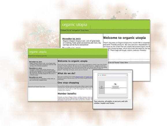
Layout with absolute-position divs versus layout with floats
In this lesson, you’ll learn an advanced method of layout in Dreamweaver using CSS boxes that are floated as columns. Unlike the inflexible nature of absolute-position divs, floated layouts can accommodate additional content more easily, and once you learn how to use them, they will allow you to use more creative layout options.
There are two methods of layout in Dreamweaver, and you will learn about both of them. To understand this, it helps to keep in mind that historically Dreamweaver has been designed for use in the Design view (in other words, not working in code). As you will soon see, the CSS float property that you will be using to create columns was not truly designed to be a tool for layout, and requires a good understanding of CSS to be useful.
Floated layouts are trickier to control and understand than absolute-position divs. Additionally, older web browsers such as Internet Explorer 6 have well-documented bugs and quirks that can prevent floated layouts from rendering correctly. To address these problems, coding techniques known as browser hacks have been developed over the years. The browser hacks involve adding additional code targeted toward one browser in order to make the pages look the same.
As users of Dreamweaver seek to duplicate some of the sophisticated sites they see online, they really have no choice but to work with floats. As you walk through this lesson, it is important to keep in mind that you do not necessarily have to choose between absolutely positioned layouts and floated layouts. Layouts that combine both absolute-position divs and floated layouts are commonplace and combine the strengths of both.
In addition to the two layouts described above, Dreamweaver CC also has a third category of layouts: fluid layouts. The fluid layout feature represents the latest development in web design and development: creating web pages designed to adapt to screens of different sizes. You will have the opportunity to work with this feature at the end of the lesson; however, you should note that this form of layout is not for everyone, so understanding the fundamentals of float-based layouts is still the recommended path for most Dreamweaver users.
To start creating more sophisticated and flexible layouts, you will first need to have a good understanding of the float property.
Creating a floated image
One of the reasons the float property in CSS was created was to allow for the appearance of text to wrap around an image. This concept was borrowed from print design, where the effect is standard practice and often called text wrap or runaround. In CSS, this effect is achieved by allowing elements following a floated element in the HTML markup to surround the element, effectively changing position. This behavior also makes it possible to create columns on a page, although this might not have been the original intent of the rule.
In this exercise, you will learn the basics of using the float property by applying it to an image in order to wrap text.
1 From the dw06lessons site, open the floatimage.html page. You will see a page with a large paragraph block of text. Click in the middle of the paragraph, immediately before the sentence, We also have added recyclable shopping bags.
2 Now choose Insert > Image > Image and in the Select Image Source dialog box, choose the image recycle_bag.gif from the images folder, and choose OK. While the image is still selected, locate the Alt field in the Properties Inspector at the bottom of the screen and type shopping bag in the text box, then click anywhere in the Design view to apply the change. The image has width and height dimensions of 81 × 101 pixels and is inserted as a block inside the paragraph.
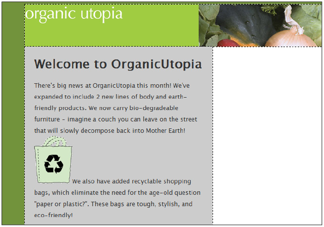
An image with default styling placed inside a paragraph.
The amount of space between the two sentences is determined by the height of the graphic. This is the default flow of HTML when an inline image is inserted into a paragraph.
You’ll now wrap the text around the image by applying the float property to the shopping bag graphic.
3 Click the <style> item under Sources pane in the CSS Designer panel. This will activate the Selectors panel and allow you to create a new style rule for the heading image.
4 Click the Add Selector button ( ) in the Selectors menu to create a new CSS selector and type .floatimage in the selector name text box, replacing any text Dreamweaver might have added. Press Enter (Windows) or Return (Mac OS) to create the selector.
5 Click the Layout button ( ) in the Properties panel locate the float property and click the Right button (
 ) from the float settings.
6 Make sure the shopping bag graphic is still selected; if it is not, do so now. Look at the Property Inspector, there is a Class drop-down menu, which by default is set to None.

The default Class is set to None.
From the Class drop-down menu, choose floatimage. With the class applied, the image will now be removed from the flow of the text and pushed far right, to the edge of the container.
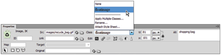
Change the Class to floatimage.
7 Choose <style> from the Sources pane and then click the .floatimage selector in the Selectors pane.
8 Click the Layout button ( ) in the Properties pane and change the float property to left by clicking the Left button (
 ) from the float options.
The image now floats to the left and the text wraps around it. This wrapping behavior is extremely important to keep in mind as you work with floated elements. You can float elements to the left or right only.
9 Scroll up in the Properties panel to locate the margin control. Click the margin-top value and type 10, then click the value for margin-right and again, type 10. Press Enter (Windows) or Return (Mac OS). The image now is set off from the text, adding needed space.

Set the Margin for the image.
10 Choose File > Save, and then File > Preview in Browser and choose a browser the your list to see the results in your browser. This technique is a simple and useful application of the float property. The next step is to apply this same concept to other elements, not just images. In the next exercise, you will float elements to create columns. Close your browser and then close the floatimage.html document.
Creating columns with HTML and CSS
One of the most important aspects of working with floated elements is understanding how they interact with their surrounding elements. This relationship is easy to understand when you have an object with a fixed width and height such as the shopping bag graphic from the last exercise. When floated elements are objects that are not fixed in size, such as a column which is defined by the amount of text inside, things can get interesting.
Creating the structure with divs and HTML5 semantic elements
To begin, you’ll start with a page similar to the Organic Utopia layout from Lesson 5, “Creating Page Layouts with CSS.” Specifically, the container div is 960 pixels wide and styled to be centered within the browser. The header element has one inline image (the Organic Utopia logo). You will first define the structure of the page by adding elements for the various sections.
1 In the Files panel, double-click the layout.html page. Your first step will be to add the navigation section. You will do so using the HTML5 nav semantic element.
2 In the Insert panel, choose the Structure category, then click the Navigation button ( ) from the list of elements. The Insert Navigation dialog box opens. Here you can choose where you would like the new nav element to be inserted. You need the navigation element to follow the header element.
3 In the Insert Navigation dialog box, click the Insert drop-down menu. Select the After tag option, then in the drop-down menu to the right, choose <header id="header"> Type navigation in the ID text field, and then click OK.

Set the properties in the Insert Navigation dialog box.
4 In the CSS Designer panel, select <style> from the Sources pane. Click the Add Selector button in the Selectors pane and Dreamweaver will add a new selector to the list as #container #navigation. Select and delete the text #container so that the selector is simply #navigation, place your cursor after #navigation and press Enter (Windows) or Return (Mac OS).
5 Click the Background button ( ) in the Properties panel. Locate the background-color property and type #88b036 into the Set background-color text field and press Enter (Windows) or Return (Mac OS) to add a green background color.
6 Click the Layout button ( ) in the Properties panel and locate the width property, then click the Set Width field to display the units popup menu. Choose % from the menu and type 100 in the Set width text field. Click in the Set height text field and choose px from the menu, then type 36 and press Enter (Windows) or Return (Mac OS). Your navigation section now spans across the width of the container.
You’ll now add three elements for the main and sidebar columns, as well as the footer. These next three steps are essentially variations on step 3: You are adding structural elements to your page and giving the elements good names to begin styling them.
7 In the Insert panel, scroll down and click the Section button ( ). In the Insert Section dialog box, click the Insert drop-down menu and choose the After Tag option, and then in the drop-down menu to the right choose <nav id="navigation">. Type main in the ID text field and then click OK.
8 Click the Aside button ( ) in the Insert panel. In the Insert Aside dialog box, click the Insert drop-down menu and choose the After Tag option, then in the drop-down menu to the right, choose <section id="main">. Type sidebar in the ID text field and then click OK.
The last section you will add will be for the footer at the bottom of the page.
9 Click the Footer button ( ) in the Insert panel. Click the Insert drop-down menu in the Insert Footer dialog box. Select the After Tag option, then in the drop-down menu to the right choose <aside id="sidebar">. Type footer in the ID text field and then click OK.
10 You will now style these new elements using the CSS Designer panel. Select <style> from the Sources pane, then click the Add Selector button in the Selectors pane and Dreamweaver will add a new selector to the list as #container #footer. Select and delete the text #container so that the selector is simply #footer, place your cursor after #footer and press Enter (Windows) or Return (Mac OS).
You will be adding a background-color style now so you can more easily see how the footer interacts with the two columns.
11 Click the Background properties button in the Properties panel. Locate the background-color property and type #CCC into the Set background-color text field and press Enter (Windows) or Return (Mac OS) to add a light gray background color.
You now have the main sections of your page, and you will have to start setting the widths of the columns.

The main sections of your web page are now created.
Setting the width and floating the columns
With the basic structure of your page set up in HTML, you will now set the width of the main and sidebar columns and float them using CSS. You will return to the navigation bar in a later exercise.
1 Click to place your cursor within the main section of your document window then click <style> in the Sources pane of the CSS Designer panel. Click the Add Selector button in the Selectors pane and type #main in the new selector field, then press Enter (Windows) or Return (Mac OS).
2 Choose the Layout button from the Properties panel. Double-click to the right of the width property, type 600px inside the Set-width text field and press Enter (Windows) or Return (Mac OS). Scroll down to the float property; choose right and you will see the main column move to the right and the sidebar column move up to fill in the remaining space. Now you’ll add some content to see how it fits into the column.

The main column moves to the right and the sidebar column moves up.
3 In the Files panel, double-click the main_content.html page. Select all the text on this page, then press Ctrl+C (Windows) or Command+C (Mac OS) to copy it. Close the file, then select the placeholder text in the main element and press Ctrl+V (Windows) or Command+V (Mac OS) to paste. The column expands to accommodate all the content. Notice that the footer appears to be behind the main column. This is a result of the floated properties you just added. You’ll take a look at this shortly, but first you will style the sidebar.
4 Click inside the sidebar, then in the CSS Designer panel, click <style> in the Sources pane and click the Add Selector button in the Selectors pane. Change the text so that the selector name reads #sidebar and press Enter (Windows) or Return (Mac OS). Choose the Layout button ( ). Double-click the Set width text field, type 360px and press Enter (Windows) or Return (Mac OS). Scroll down to the float property and choose Left. Visually, very little will change, but the two columns now have explicit widths and both are floating.
5 In the Files panel, double-click the sidebar_content.html page. Select all the text on this page and copy it. Close the file, and then click inside the sidebar and paste, replacing the placeholder text. The sidebar expands to fit this content, which is a definition list.

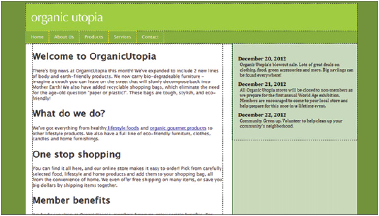
The sidebar section is floated to the left and has a width of 360. The main section is floated to the right and has a width of 600.
 We have cheated a bit in this exercise and created pre-existing styles for the sidebar content. Many of the techniques for modifying the margins of elements have been covered in earlier lessons. You can look at the styles for the <dl> and <dd> elements within the styles panel or the code view to see the details.
The behavior and appearance of the footer element could be somewhat confusing. As noted earlier, it appears to be behind your two columns. The reason for this has to do with the nature of floated elements. Floated elements are removed from the default flow of HTML and since both columns are floated, the footer ignores them and moves up directly below the navigation section. This is also why the height of the footer has expanded. From the perspective of the footer, there are no columns to interact with so it assumes its default behavior.
In order to push the footer below the columns, you need to add another CSS property to the footer called clear.
Using the clear property
When you apply the clear property to an object, you are essentially adding a rule that says No floated elements are allowed on either side of me. In fact, you can specify whether the left, right or both sides can have floated elements. You’ll try two different options in order to understand the clear property better.
1 Choose <style> from the Sources pane of the CSS Designer panel. In the Selector pane, click the #footer selector, then click the Layout button ( ) in the Properties panel. Scroll down to the clear property and click the Right button (
 ). This puts the footer element on the bottom of the page. You might need to scroll down to see it.
Although this seems to do the trick, there is a potential pitfall. You set the clear value to Right, but what would happen if the content in the main column were shorter than the content in the sidebar? Understanding the answer to this question will go a long way toward your understanding of floats and clears, so you’ll do a short experiment.
2 In the main section select the last three paragraphs and headings and then delete them. With less content in this column now, the footer still behaves the same and stops at the bottom of the main column, but the sidebar is longer now so the footer overlaps it.

Select and delete the last three paragraphs and headings in the Main div.
Of course, you could fix this by switching the value of the clear property from Right to Left. This would prevent the footer from being next to the sidebar, but the problem is that you might never know which column will have the most content, so the safest solution is to apply the clear property to both sides.
3 Choose Edit > Undo Delete to bring the content back into the main section.
4 Choose <style> in the Sources pane of the CSS Designer panel. Click the #footer selector in the Selectors pane, then click Show Set check box ( ) in the Properties panel. Locate the clear property and click the Both button (
 ). The footer element will now always be at the bottom because no floated elements are allowed to the left or the right.
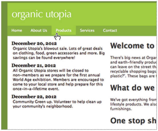
Creating a list-based CSS navigation bar
Floats can not only be used for simple image wrapping and creating columns, but also to create navigation. Here you’ll start creating a list-based navigation that uses CSS. This is a great way to create easily editable navigation bars that are also search engine-friendly because they use text instead of images. Additionally, you can think of navigation as simply a list of links to other pages, so it makes sense to use the list element. The first step is to add the content and then style the list items and the navigation element.
1 Select the placeholder text in the navigation element and if necessary click the HTML button in the Property Inspector. Click the Unordered List button ( ) and the text will become the first bullet in an unordered list.
2 Replace the placeholder text by typing Home, and then press Enter (Windows) or Return (MacOS).
This adds a new list item. Add the following navigation sections pressing Enter/Return after each one: About Us, Products, Services, Contact. Your layout will appear to break as the list items are added. Don’t worry; you will be using float properties to turn this list into a horizontal navigation bar.

Add the list items that will serve as your navigation.
You will now link the 5 items. The pages in this case have not been created so you will use a placeholder link for each item.
3 Select the word Home, click inside the Link text field in the Property Inspector and type # and then press Enter (Windows) or Return (Mac OS). This symbol creates a placeholder hyperlink. Repeat this step for each list item until all five are hyperlinked.
Now you’ll apply the float property and turn this vertical list into a horizontal one.
4 Click the <li> element in the tag selector at the bottom of the window.

Select the <li> element in the tag selector.
Click <style> in the Sources pane. Click the Add Selector button in the Selectors Pane and change the text supplied by Dreamweaver so the compound selector reads #navigation ul li. Press Enter (Windows) or Return (Mac OS).
5 Uncheck the Show Set button and then click Layout button from the Properties panel. Scroll down to the float property and choose Left. You will see that your list items are now stacked horizontally rather than vertically. By applying the float property, you have overridden the list items’ default behavior. However, there is still more work that you need to do.
6 Click the Others button ( ) in the Properties panel then choose none from the Set list-style-type drop-down menu. This removes the bullet points from each list item.
You still need to do more work; specifically, you need to create styles for the <a> element that is for hyperlinks. You’ll style the appearance and position of these links now.
7 Click inside any link in the navigation and click <style> in the Sources pane. Next, click the Add Selector button from the Selectors pane. The selector type is compound, but unnecessarily complex; edit the text so the selector name is set to #navigation ul li a, place your cursor at the end of the line, and then press Enter (Windows) or Return (Mac OS).

Create a new CSS rule for the navigation hyperlinks.
8 Click the Text button ( ) from the Properties Navigation menu. Locate the text-decoration property and click the button labeled none. This will remove the default underline below your hyperlinks. Locate the color property, click the color swatch, and choose white. Finally, locate the white-space property and chose nowrap from the menu of options. This will make sure your navigation links do no wrap to a second line and disrupt the content below.
9 Click the Layout button ( ) and scroll down to the padding control. Type 8 px for the top value and press Enter (Windows) or Return (Mac OS). Repeat the steps setting the bottom to 8px the left and right values to 15 px.

Apply padding to the hyperlink styles to create more space between your navigation.
10 Scroll up to the display property and choose block from the pop-up menu. This property and value changes the appearance of the list items: it expands and also allows the entire block to be clickable, not just the text.
You’re almost finished; however, your navigation links are currently overlapping the boundaries of the green navigation bar. This is because of some default margins—a topic you have run into before. In this case, the default margins of the unordered list are the culprit.
11 Click anywhere inside the navigation, if necessary, and then click the <ul> tag in the Tag Selector at the bottom of the screen. Click <style> in the Sources pane of the CSS Designer panel and click the Add Selector button. Edit the text making sure the selector reads #navigation ul, and then press Enter (Windows) or Return (Mac OS).
12 Click the Layout button in the Properties panel. Scroll down to the margin control and click the link button in the middle of the control. This will link all of the margins together using the same value. Click the margin-top property and type 0, then press Enter (Windows) or Return (Mac OS). Repeat these steps using the padding control and the hyperlinks will be centered within the navigation element.

Set the margins for the navigation to give it a more defined look.
The last piece to add is a little interactivity. Say that when the user mouses over any one of the navigation links, you would like it to change color. This improves usability by letting the user know the links are active. You can do this with the hover property for hyperlinks.
13 Click within any navigation link and then click <style> in the Sources pane of the CSS Designer panel. Click the Add Selector button and type #navigation a:hover in the selector name field.

Create a selector for #navigation a:hover.
Adding #navigation in front of the a:hover property creates a compound selector ensuring the styles only apply to links within the navigation menu. Press Enter (Windows) or Return (Mac OS).
14 Click the Background button in the Properties panel. Click the Set background-color text field and type #9fcc41 and press Enter (Windows) or Return (Mac OS). This is the same green as the header.
15 Save your document and choose File > Preview in Browser to see your list-based CSS menu. Be sure to mouse over the links to see the hover effect. Close the browser window and return to Dreamweaver.
Creating a style for the a:hover property produces a color rollover effect when the user’s cursor is on a link.
Changing column layout and size
Another benefit of using floated containers for layout is that they are very easy to modify. For example, perhaps you would like to experiment with your sidebar being on the right rather than the left, or perhaps you would like to experiment with changing the width of the entire layout. This can all be accomplished with a few easy modifications of the styles.
1 In the CSS Designer panel, choose <style> from the Sources pane and click the #main style in the Selectors pane. Click the Show Set check box to limit the list to only the properties that have been set and change the float property from right to left. This pushes the main box over to the left of the container and the sidebar slips to the right.
2 In the Selector pane, click the #sidebar selector; change the float property from left to right. There will be no visual change in this case, but it does ensure that the sidebar is flush against the container. That’s it! Two simple style changes create a completely different layout.

Change the float value of the #sidebar style from left to right.
If you’d like to change the overall width of your page layout, you can do this by modifying the #container div.
3 Click <style> in the Sources pane of the CSS Designer panel, then click the #container selector in the Selectors pane and change the width from 960 to 1100 and press Enter (Windows) or Return (Mac OS). This expands your container, and because your columns are floating, they will both remain aligned to their respective sides. For the purpose of this exercise, the original value of 960 is better, so type 960 back again. For now, the important part is to understand the concept.
4 While you are here, select the height property and remove it from the list by clicking the Remove CSS Property icon. Having a fixed height is useful at the beginning of the layout progress, but it should be removed at some point in order to accommodate more content.
Currently, the main column is aligned flush left against the container and the text is too close to the edge of the container. This is a common layout problem; you will now look at some techniques designed to help you create your own custom layouts and to better understand the behavior of floated elements.
5 Click the #main selector in the Selectors pane of the CSS Designer panel, and then clear the Show Set check box in the Properties panel. Click the Layout button and scroll down to the margin control. Type 20 inside the Set left margin text field, and then press Enter (Windows) or Return (Mac OS).

Adding 20 pixels of left margin to the #main column pushes it below #sidebar.
Notice that this change had the desired effect of adding space between the main column and the surrounding container. However, there is another effect: the #sidebar column has now slipped down below. This effect is to be expected because you are trying to squeeze two boxes into a fixed width space. Remember that the container is 960 pixels wide. The main column is 600 pixels wide, and you just added 20 pixels to it, thus making the true width 620 pixels. The sidebar is 360 pixels wide; adding the combined widths results in 980 pixels. The #sidebar column slips below #main because we added #main before #sidebar so it appears first in the HTML code.
This is a common dilemma with fixed width layouts, but as long as you understand the relationships, it is easy to fix. In this case, you’ll try reducing the width of the main column.
6 With the #main still selected in the Selectors panel, click the Show Set check box to show the current properties and change the width from 600 to 580, then press Enter (Windows) or Return (Mac OS). The width is reduced and the sidebar slips back up.
However, you can take this a bit further: the columns are actually very close to each other. You can add more space by reducing the width of the main section even further.
7 Type 550 as the width, and then click OK. You now have an additional gap of space between the main section and the sidebar.
 Keep in mind that you could have decreased the width of the #sidebar style if you preferred to keep the width of the #main column intact. There are no set rules for how to do this correctly. Layout in CSS becomes interplay between width, margins, padding, and content; every page has slightly different requirements. Just be sure to keep track of all these relationships in your own designs, since it can get confusing as you add more elements.
Creating the appearance of equal height columns
There is now another part of your layout that you need to pay attention to: the column height. Currently, the main column is longer than the sidebar; visually this isn’t really a problem because neither column has a background color, so the whole page appears white. But what happens if your design requires that explicit columns be defined by color? In this exercise, you’ll look at one solution for this issue.
1 Choose <style> from the Sources pane of the CSS Designer panel, then click the #sidebar selector in the Selectors pane. Make sure the Show Set check box is unchecked, and then click the Background button ( ) in the Properties panel. Finally, in the Set background-color text field, type #C8D9BC and press Enter (Windows) or Return (Mac OS).
2 Click the Border button ( ) in the Properties panel and locate the border-left-style property. Choose solid in the Set left border style drop-down menu. Locate the border-left-width property, double-click the Set left border width field, and type 2px. Press Enter (Windows) or Return (Mac OS). Finally, scroll to the border-left-color property and type #060 in the Set left border color text field. Press Enter (Windows) or Return (Mac OS).

Set the border for the #sidebar element.
The problem with the column is an aesthetic one. A column sometimes looks better when it spans to the bottom of the page rather than cutting off abruptly. Additionally, if you are using this layout throughout your site, every page will likely have different amounts of content. As a user moves from page to page, this would create irregular page appearance, as the column height jumps up and down based on the amount of content. To solve this, you’ll add a background image to the container div, which simulates the appearance of the column from top to bottom.
3 In the Selectors pane of the CSS Designer panel, click the #container selector. (You might have to click <style> in the Sources pane to display all of the selectors.) Click the Background button ( ) in the Properties panel, and click the Enter file path text box for the background-image property. Click the Browse button (
 ) and locate the container_bg.gif file in the images folder. Click OK (Windows) or Open (Mac OS).
This graphic is 960 pixels wide (which matches the width of your container), but it is only 2 pixels high. Essentially, it is a thin horizontal slice of the page and includes the sidebar color and green border.
4 From the background-repeat property, click the button for repeat-y ( ). This ensures the graphic will only be tiled from top to bottom and you will now see your columns filled in.
A background image creates the effect of a column extending the height of the page.
Now, the length of the column is irrelevant. The image background will always reach the bottom of the page and maintain a consistent appearance.
 Although this technique is useful, it relies on your layout being finalized. If the width of your container or the position of any of your columns changes, you must then change the background image. Additionally, other changes, such as the color of a column or any padding adjustments, could require you to modify your background image. For this reason, you should wait until the small changes and adjustments to your layout are complete before making a column background.
Applying finishing touches
You’ll now tidy up some loose ends with your layout. Specifically, you’ll add a background image to your header, and then move the rules in your current style sheet to an external style sheet so you can use these styles for other pages in your site.
1 Choose <style> in the Sources pane of the CSS Designer panel, then click the #header selector in the Selectors pane. Click the Background button ( ) in the Properties panel and locate the url property in the background-image section. Click the Enter the file path field, and then click the Browse button. Navigate to your images folder, choose veggies.jpg, and then click OK.
2 Click the no-repeat button ( ) from the background-repeat property. Click the first percent sign in the background-position property and choose Right. Notice that the veggies image has been applied to the right side of your header.

Adding a background image to the header.
Now you will move all the style rules to an external style sheet so you can use these styles on new pages.
3 Click the Add CSS Source button ( ) in the Sources pane of the CSS Designer panel and choose Create A New CSS File. The Create a New CSS File dialog box will appear. Click the Browse button and navigate to your site root directory. Type styles.css in the File name field, and then click Save. When you return to the Create New CSS File dialog box, click OK. You now have an external style sheet that we can use to save your rules.
4 Choose <style> from the Sources pane of the CSS Designer panel, then click the first selector in the list body. Scroll down, and then Shift+click the last style. This will select all the styles for the page. Click the selected items and drag them to the styles.css file in the Sources pane and release your mouse. The rules should disappear from the internal <style> source and be moved to the external styles.css file. Click styles.css in the Sources pane to verify that your rules have been moved.
You now have an external style sheet that can be attached to new or existing pages in your site. (If you receive a message saying that duplicate names are being copied, confirm the save, don’t cancel.)
5 Choose File > Save All, which will save both the HTML and CSS files. Then choose File > Close to close this page.
Creating more sophisticated layouts
The two-column layout you created represents a good foundation for a website. You would refer to this as a two-column fixed-width layout with a header and footer. However, you might be looking for more options. For example, what about a three-column layout, or a liquid layout in which the content adjusts to the width of the browser (also referred to as a flexible or fluid layout)? It is beyond the scope of this book to walk through all these options. However, Dreamweaver does offer a way to create different layouts on the fly. You can choose from a gallery of new layouts whenever you create a new page.
1 Choose File > New and make sure HTML is selected as the Page Type. In the Layout column, the None option is the default, but you can also choose from a couple of pre-made options.
2 Choose the 2 column fixed, right sidebar, header and footer option. Notice that a small thumbnail with a description of the layout appears. Click Create.

The thumbnail preview of the two column layout.
3 Choose File > Preview in Browser and when prompted, save this file as 2col_fixed.html. Adjust the width of the browser and you will see that the width of the container page remains fixed, as well as the content within.
Take a moment to read the text in this page. It mentions that the code for this page has been commented. You’ll take a look at this code now, in order to better understand the pros and cons of using these pre-generated pages.
Close the browser and return to Dreamweaver.
4 Click the Code View button and scroll to the top if necessary. The code in light gray represents comments that describe virtually every line of the CSS. So why is there a need to comment this file so heavily? To make a long story short, the code in this file is very robust and is optimized for cross-browser display. This means there are styles that address various bugs across different browsers, as well as other relatively advanced CSS code.
This presents a dilemma: You will benefit most from these templates only as long as you know how to modify them. In order to modify them effectively, however, you need to understand the rules of HTML and CSS relatively well. There is a limit to how far a WYSIWYG (What You See Is What You Get) application can take you in learning these rules.
This should not stop you in exploring these page layouts. They are extremely useful, and can be incredible time-savers. Just be aware that reverse-engineering how a page works can also be time-consuming, and that the answers might lie in the rules of HTML and CSS, and not in the Dreamweaver application.
5 Choose File > Close All and save any files if prompted.
Dreamweaver Fluid Grid Layout
A feature introduced in Dreamweaver CS6 was the addition of Fluid Grid Layouts. This is a system for creating websites that are alternatively known as adaptive or responsive, meaning that the layout of your pages changes depending on the size of the user’s screen. The model for this form of layout is in many ways radically different than the techniques presented in this lesson. Fluid Grid Layout uses a combination of HTML5, CSS3, and JavaScript to create layouts that are optimized for mobile devices and monitor screens of different sizes.
The techniques covered in this lesson are very well-tested and reliable in the current crop of web browsers; the techniques used for Fluid Grid layout introduce new complexities that are best covered in a separate lesson. This is why we cover them in Lesson 16, “Responsive Design and Layout for Mobile Devices.”
Self study
Experiment with the float property by opening the floatimage.html used in the first exercise. Add five or six instances of the shopping bag graphic in a row and apply the floatimage class to all of them. How could you create a thumbnail photo gallery using this technique?
Review
Questions
1 The float property allows you to float an element to the left, right and center. True or False?
2 What are the three possible values for the clear property? Name a situation where you might use this property.
3 How would you apply padding to a floated column?
Answers
1 False. The float property only has three values: left, right and none. You cannot float an element to center.
2 You can apply the clear property to an element with one of the following values: left, right or both. Elements with a clear property do not allow a floated element to the side specified. A common situation where you might use this would be when you need the footer element on your page to appear below any floated columns.
3 Select the selector for the column in the Selectors pane of the CSS Designer panel that you want to apply padding to by clicking it. Click the Layout button in the Properties panel. Then set a value for padding using the padding control.