
Lesson 15: Adding Interactivity with the jQuery UI Library
The average user’s expectations of how a website looks and feels has changed significantly over the years. Highly interactive websites that function more like traditional desktop applications are becoming more the norm. Dreamweaver CC includes jQuery UI Widgets: a library of interactive menus, panels, and animated user interfaces, that can be added to your projects and customized to take your pages to the next level.
What you’ll learn in this lesson:
- • The basics of the jQuery UI Framework
- • Adding a jQuery UI Tabs widget
- • Customizing a jQuery UI widget with CSS
- • Adding a jQuery UI Accordion widget
- • Adding a collapsible panel
Starting up
Before starting, make sure that your tools and panels are consistent by resetting your workspace. See “Resetting the Dreamweaver workspace” in the Starting up section of this book.
You will work with several files from the dw15lessons folder in this lesson. Make sure that you have loaded the dwlessons folder onto your hard drive from www.digitalclassroombooks.com/epub/dreamweavercc. See “Loading lesson files” in the Starting up section of this book.
Before you begin, you need to create site settings that point to the dw15lessons folder. Go to Site > New Site, or, for details on creating a site, refer to Lesson 2, “Setting Up a New Site.”
Introducing the jQuery UI Widgets
Dreamweaver CC introduces jQuery UI Widgets, giving you the ability to create powerful, interactive navigation and user interface elements with easy-to-use insert bar objects. The jQuery UI Widgets replace the Spry Widgets and include accordion menus, interactive controls, and tabbed containers, all of which harness the power of CSS for easy customization and styling to match any project. They are a great way to enhance navigation, organize content, and add dynamic style to your web pages.
The jQuery UI Library
Developed by the jQuery Foundation, jQuery UI is a curated set of user interface interactions, effects, widgets, and themes built on top of the jQuery JavaScript Library. Whether you’re building highly interactive web applications or you just need to add a date picker to a form control, jQuery UI makes the task possible.
The jQuery UI Widgets included in Dreamweaver allow you to easily add the most frequently used features and functionality of this library.
A look at the project
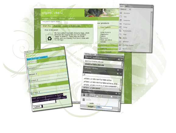
In this lesson, you’ll be completing the OrganicUtopia home page by using and customizing different jQuery UI Widgets. Before you get started, take a look at the completed version of the page to get an idea of what you’ll be working toward.
1 In the Files panel, locate the index_done.html page in the done folder, and double-click it to open it.
2 To view the jQuery UI Widgets in action, choose File > Preview in Browser, and select a browser to preview the page. Depending on which browser you are using, you might see a message indicating that scripts are being blocked. Click the Allow Blocked Content button to allow the scripts to run.
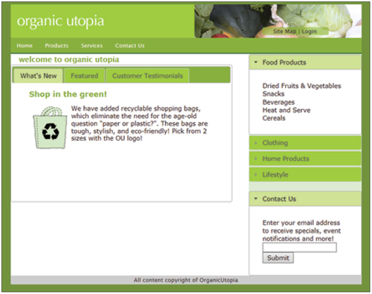
The completed jQuery UI page contains numerous interactive elements.
3 Click the accordion-style menu found on the right to expand and contract different categories of products.
4 In the center of the page, locate the three tabs labeled What’s New, Featured, and Customer Testimonials. Click each one to reveal a different content area—notice that the page doesn’t refresh when you do this.
5 In the lower-right corner, click the Contact Us bar to show or hide a sign-up box.
6 Close the browser and return to Dreamweaver. Then, choose File > Close to close the current file.
The jQuery Tabbed panel
The jQuery Tabbed panel widget organizes content into several panels that you can toggle between by clicking tabs. This is a great way to organize items on a page: it saves space and can improve usability when used correctly.
Editing the content of the tabbed panels is easy; you can type directly within the tabs or containers in the document window. Tabbed panels can contain almost any type of content, including text, images, video, and animation.
You’ll now add a jQuery Tabbed panel to your page to display three pieces of featured content.
1 From the Files menu, locate and open the index_start.html file for editing.
2 Choose File > Save As and save the page as index_work.html into your site’s root folder.
3 Near the top of your page, select the placeholder text that reads {tabbed panels here}, and delete it. Leave your cursor at this position.
4 Click the Insert panel (if necessary) to expand it and choose the jQuery UI category. Locate and click the Tabs button ( ) and click it to add a new tabs panel set.
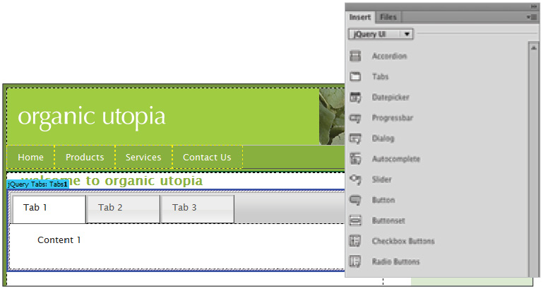
Add a new jQuery Tabs Panel at the top of the page, as shown.
5 Click inside the Tabs widget and then click <div#Tabs1> in the tag selector. Locate the Panels column in the center of the Property Inspector below. This shows you the current panels (and tabs) in your panel set, and lets you add new ones.
6 In the Property Inspector, click Tab 1 to activate it. On the page and within the tab, select the text Tab 1 and type What’s New in its place.

Select the text inside Tab 1 and rename it to What’s New.
7 Select the text within Tab 2 and type Featured. Select the text within Tab 3 and type Customer Testimonials. Be careful as you move from one tab to the next: if the eye icon appears and you click it, the tab will open up. For now, you just want to rename the tab headings.
Next, you will add content into the areas inside each tab.
8 Below the tabbed panel, you’ll see three paragraphs of content that you’ll move and organize into the new panel group. Highlight the entire first paragraph, beginning with the headline Shop In the Green and be sure to include the recycle bag image. Choose Edit > Cut.
9 Select the placeholder text within the first tab (Content 1), then choose Edit > Paste to paste the content directly into the What’s New panel. You will now place content into the Featured panel.
10 Place your cursor over the Featured tab but don’t click yet.
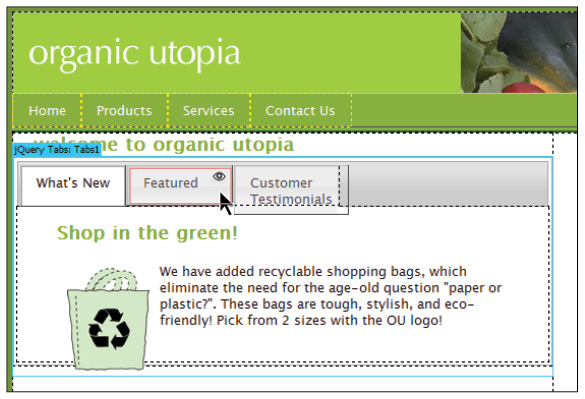
Clicking the eye icon will bring that tab to the front.
11 Wait for the eye icon to appear and then click once to bring the tab to the front.
12 Select the Featured Stuff! heading, paragraph and the image of the couch and choose Edit > Cut. Select the placeholder text Content 2 and then choose Edit > Paste.
13 Repeat steps 7, 8, and 9; cut the remaining content (Our loyal customers) from the page and paste it into the third panel (Customer Testimonials).
14 Click the Live view button on the Document toolbar to preview the tabbed panel so far. Click each of the three tabs in order to view the contents of each. Click the Live view button again to return to Design view.

Your new jQuery UI Tabbed panels set after moving the page contents to each of the three tabs (shown in Live view).
15 Choose File > Save All and preview your page in the browser to see your tabs in action. The copy dependent files dialog box will appear. Click OK to accept.
16 Close the browser and return to Dreamweaver. Now we will style this panel to match the page theme.
Styling jQuery UI widgets with CSS
One of the many benefits of using the jQuery UI widgets is that they share a common set of style sheets that you can customize to match to the color scheme of your website. In this exercise, you will change the color of the panel headings and tabs so that they match the OrganicUtopia color scheme. Once applied, these styles will apply to other jQuery UI widgets that you will add to your page.
1 In the Sources pane of the CSS Designer panel, locate and select the style sheet named jquery.ui.theme.min.css, which was attached when you added the tabbed panel group. This is the primary style sheet on which all of the jQuery UI widget styles are based. The jQuery UI tabbed panel also has a specific style sheet that you can modify to change its appearance, as you will see later in this exercise.
2 Click the Selector named .ui-widget-header to display its properties. Uncheck the Show Set check box in the Properties panel to show all of the properties and then click the Background button to display the background properties. Click the background-color value, type #88B036 (dark green), and then press Enter (Windows) or Return (Mac OS).
The jQuery UI Widgets also use an image to create a glossy appearance, which you will now disable to allow the green color to show through,
3 Locate the background-image property and click the Disable CSS Property button ( ) to disable the background-image. You should now see the green background color behind the tabs.

Modify the .ui-widget-header rule to change the appearance of the tab background.
4 Click the Selector beginning with .ui-state-default.ui-widget-content. Click the background-color value, type #9FCC41 (light green), and then press Enter (Windows) or Return (Mac OS). Disable the background-image as you did with the previous selector. This changes the default color of every tab.
5 Click the Selector beginning with .ui-state-active,.ui-widget-content. Click the background-color value, type #CF9 (light green), and then press Enter (Windows) or Return (Mac OS). Disable the background-image as you did with the previous selector. This changes the color of the currently selected tab.
6 Click the Selector beginning with .ui-state-hover,.ui-widget-content. Click the background-color value, type #CF9, press Enter (Windows) or Return (Mac OS), and then disable the background-image. This sets the background color of the non-active tabs to the same shade of green as the active tab when you hover your mouse over them.
The panel’s height is currently being defined by the amount of content. If you wanted to override this, you could set an explicit height for the panels.
7 Locate the file jquery.ui.tabs.min.css in the Sources pane of the CSS Designer panel. This style sheet specifies the style rules for the tabs control. Scroll to the bottom of the Selectors list and click the .ui-tabs .ui-tabs-panel selector.
8 Click the Layout button in the Properties panel and locate the height property. Click the drop-down menu to the right and choose px from the pop-up menu. In the new field that appears, type 250 (make sure px is specified) and then press Enter (Windows) or Return (Mac OS). This increases the overall height of the content panels.
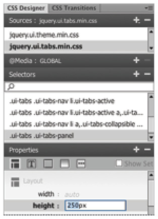
You can override the height of the panels by modifying the .ui-tabs .ui-tabs-pabel style.
9 Choose File > Save All. Then preview your page in the browser to see your tabs in action. The copy dependent files dialog box will appear. Click OK to accept. There are a few other styles that you could modify here, but for now, you’ll move on to the next jQuery UI Widget: the Accordion Panel.
The jQuery UI Accordion panel
At first glance, the jQuery Accordion panel resembles a standard vertical menu bar. As the name suggests, however, each item contracts and expands to reveal a content panel where you can add text and images. The accordion panel allows you to have only one panel open at a time.
Accordion panels are great for navigation, tree-style navigation or lists, or organizing related content (such as a Frequently Asked Questions list) into a clean, panel-style format. As with the other jQuery UI Widgets, the jQuery UI Accordion uses its own style sheet, which you can easily modify to make it match your current theme.
1 In the right column, locate the placeholder text that reads {accordion here}. Select and delete the placeholder text, and leave your cursor in place.
2 From the Insert panel, click and add a new Accordion at the cursor position. Click inside the Accordion widget and then click <div#Accordion1> in the tag selector.
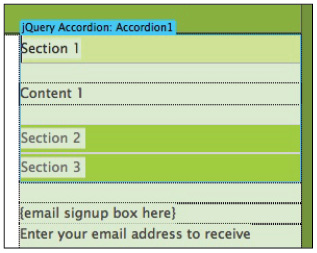
The jQuery UI Accordion added to the sidebar.
The Property Inspector below now displays the properties for the new widget.
3 In the Property Inspector, you see a list of the panels currently in your accordion (Section 1, Section 2 and Section 3). Click the plus sign (+) to add a new panel, for a total of four. A label displays above each new panel.
4 Click Section 4 in the Panels menu, and if necessary, then press the down arrow twice to push Section 4 to the bottom of the list. This step is not mandatory, but it helps to keep your label order straight.
5 On your page, highlight the Section 1 text. Delete it and type Food Products in its place. Do not press Enter (Windows) or Return (Mac OS) after typing.
Type directly within the accordion labels to rename them.
6 Repeat step 5 for the Sections 2, 3, and 4, renaming them Clothing, Home Products, and Lifestyle, respectively. Next, you’ll add content to each panel that corresponds to its label.
7 In your Files panel, locate the text folder and expand it. Double-click and open the file named accordiontext.html. This contains the text you’ll add to the accordion panel.
8 Select the text below the Food Products heading (don’t include the heading itself), and choose Edit > Cut. Return back to your index_work.html page.
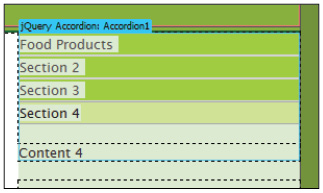
9 Click inside the Accordion widget and then click <div#Accordion1> in the tag selector to ensure it is selected; then, in the Properties Inspector, click the Food Products panel to open it.

Open the Food Products panel by clicking it in the Properties Inspector.
Highlight the placeholder text Content 1 on your page, and then choose Edit > Paste to paste it in the text from your content file.
10 Repeat steps 8 and 9 for the remaining paragraphs in the accordiontext.html file, pasting them into the Clothing, Home Products, and Lifestyle panels, respectively.
One of the benefits of using the jQuery UI widgets is that they share CSS files for common features. Since we changed the background, active and default states for these styles when inserting the Tabs panel, the Accordion has automatically received the same styles.
11 Choose File > Save All to save your page. If the Copy Dependent Files dialog box appears, click OK to allow Dreamweaver to copy any necessary files for your new widget to the site folder.
12 Choose File > Preview in Browser to see your new tabbed panel group in action. When you are done, close the browser and return to Dreamweaver.
Create a single collapsible panel
A collapsible panel displays or reveals its contents when clicked, and is a great way to hide information that doesn’t need to be visible at all times. You can create a collapsible panel using a jQuery UI Accordion that displays a single panel and label.
You’ll add a jQuery UI Accordion panel to create a collapsible e-mail sign-up form at the bottom of your page.
1 In the bottom half of the right column, locate the placeholder text that reads {Email signup box here}. Select and delete the placeholder text and leave your cursor positioned in its place.
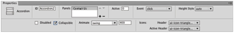
2 On the Insert panel, locate and click the Accordion button to add a panel at your cursor position.
3 Select the text that reads Section 1 at the top of the panel, and type Contact Us in its place.
4 Below the panel, select the paragraph that reads Enter your e-mail address to receive specials, event notifications and more! and also select the form elements.

Select all the content immediately below the jQuery UI Accordion panel.
5 Choose Edit > Cut.
6 Select the text that reads Content 1 shown in the panel area of your accordion panel, and paste the content you cut in its place. The text and form field now appear inside the panel.
7 Click the blue tab above the Accordion panel: Accordion 2 to select it. In the Property Inspector, click Section 2 in the Panels window to select it, and then click the minus sign (-) to delete the panel. Repeat these steps to delete Section 3 as well.
You can also define the default appearance of the accordion panel; in this case, you would like it to be able to be fully collapsed.
8 In the Property Inspector, click the Collapsible check box to set it so that the panel can be fully collapsed.
Use the Property Inspector to set the new panel’s Collapsible state.
9 Choose File > Save All to save your page. When the Copy Dependent Files dialog box appears, click OK to allow Dreamweaver to copy any necessary files to your site folder.
10 Choose File > Preview in Browser, and select a browser to test your page and see your new Collapsible panel in action. When you click the Contact Us label, the sign-up text and form appears—click it again to close it.
11 Close the browser and in Dreamweaver choose File > Close All.
Self study
As you can see, creating highly interactive web pages is made easy with jQuery UI Widgets. Whether it’s a fancy tabbed panel, or an accordion, the addition of a few widgets can make the difference between a good page and a great one. Further explore the different jQuery UI Widgets, and experiment with adding a DatePicker to your sidebar to display a calendar of events.
Practice working with the jQuery UI Tab Widget by adding a new tab to your existing panel or add another panel to the Accordion widget.
Review
Questions
1 What are the two primary jQuery UI Widgets that you can use for navigation and content presentation?
2 What is the significance of the jQueryAssets folder that is copied to your site when using a jQuery UI Widget?
3 What is the CSS file that contains the primary styles for all jQuery UI Widgets?
Answers
1 The jQuery UI Accordion panel and the jQuery UI Tabs panel.
2 The jQueryAssets folder contains necessary support files such as CSS, JavaScript, and image files that your widgets need in order to function.
3 The jquery.ui.theme.min.css file contains the base CSS styles used by all of the jQuery UI Widgets.