
C H A P T E R 2
Using the Right Tag for the Right Job
With HTML5, web developers are given an even wider palette of HTML elements with which to paint meaning into their pages. Many new elements have been introduced to more precisely mark up, define, and organize content. Understanding when and where to use the many elements within HTML is integral toward creating logically structured, specification-conforming, semantically rich web pages.
This chapter will provide an overview of the elements available in HTML5, both newly added and those inherited from HTML 4.01. That's a possibly daunting task, you might think! After all, there is an 800+ page specification that covers them all (the current length of the full WHATWG HTML specification, as of July 2011). To make tackling the longish list of elements easier, we'll examine the elements in sets and will devote separate chapters to further examine groups of elements of particular interest. The elements in HTML can be loosely grouped together in the following sets:
- Root element: The
htmlelement rightly stands alone, because it is the only element that contains all the other elements in a document.- Document metadata and scripting elements: The
headelement contains metadata for the document, as well as CSS styles and JavaScript in many cases.- Document sectioning elements: The body element encloses the content of the page, and new semantic sectioning elements define the header, footer, articles, and other sections on the page. These will be discussed in detail in Chapter 3.
- Content grouping elements: The content in a specific section of the web page may be organized into paragraphs, lists, block quotes, figures, and so on.
- Text-level semantics elements: Individual runs of text may have words or sentences marked up to provide fine-grained control over the content's meaning, such as separating time, abbreviations, and superscripts from adjacent content or providing emphasis, importance, or other differences to the normal prose. These will be discussed in detail in Chapter 3.
- Tabular data elements: Data that would be appropriate to display in a spreadsheet would likely be marked up using the rows and columns of the
tableand related elements.- Form elements: These include the text fields, drop-down menus, check boxes, and other elements for gathering user input in web forms. These will be discussed in detail in Chapter 4.
- Embedded content elements: These include external media embedded into a web page such as video, audio, a bitmap drawing surface, or third-party plug-ins such as Adobe Flash content. These will be discussed in detail in Chapter 5.
- Interactive elements: These include inherently interactive elements that require no further scripting.
Before diving into these groups, we'll cover two areas that apply to all the elements: the global attributes that apply to all HTML elements and “content model categories,” the often overlapping grouping that the HTML specification uses to categorize elements relative to each other. Let's get to it!
Global attributes
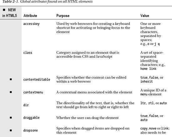
Becoming familiar with the attributes that are found on all HTML elements (Table 2-1) provides powerful tools for utilizing the core functionality available in HTML, such as integration with CSS and JavaScript as well as the new editing and drag-and-drop APIs.
__________
1 See www.iana.org/assignments/language-subtag-registry for a list of language codes; the “subtags” shown are what you would use.
 Note There is an additional set of global attributes that apply when microdata is used, which allows additional markup to be added to the elements on a page to make it easier for machines, such as search engine algorithms, to parse and use the content. Microdata will be discussed later in the book.
Accessibility
The accesskey and tabindex attributes provide access to elements on the page using the keyboard, which may be helpful for users with limited mobility. When set on an element, the accesskey attribute allows a key (or keys) to be pressed on the keyboard that activates the element. It could be used for following a hyperlink using the keyboard, for instance. Unfortunately, this accessibility upside has a downside. A keyboard combination is often needed to activate the access key, such as pressing the Ctrl or Alt key in combination with the set access key. Precisely which keyboard combination to use varies by browser and operating system, degrading the usefulness of this feature. Additionally, the keyboard combinations used could interfere with existing keyboard shortcuts—most critically those used by screen readers for visibility impaired web users. Lastly, having multiple access keys set on a single element (which could be helpful if the website is viewed from two types of devices) does not enjoy wide browser support. All of these factors make using access keys rather discouraging.
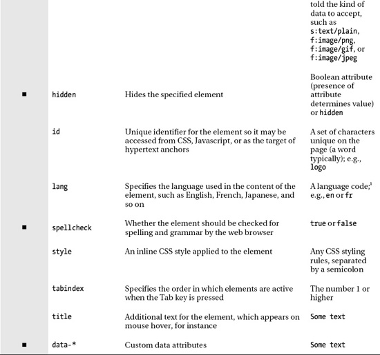
One last note before we move on—Opera Software's Opera web browser offers a nice feature in regard to access keys. By pressing the Shift key and the Esc key at the same time, a menu pops up over the web browser window that shows all access keys available on the page and where they link to (if the attribute is set on anchor elements; “null” is shown otherwise). See Figure 2-1 for an example.

Figure 2-1. Opera web browser showing access key and associated links available on the company homepage
The next attribute, tabindex, is possibly more useful. Press the Tab key repeatedly on your keyboard while on a web page, and you'll see different page elements become highlighted. This is a common way to access elements of a web page using the keyboard, which may be particularly familiar when filling out a web form. The tabindex attribute, when set on a number of different elements (beginning at 1 and incrementing by 1 on each element), determines the order that presses of the Tab key will move through the different elements, with lower numbers accessed first, for example:
<ul>

    <li><a href="first.html" tabindex="1">First Item Active</a>

    <li><a href="third.html" tabindex="3">Third Item Active</a>

    <li><a href="second.html" tabindex="2">Second Item Active</a>

</ul>
On presses of the Tab key, the first item in the list would be activated, followed by the last item and lastly the middle item. Obviously, in a list such as this, it would make more usability sense to have them activate in the same order as the list, but this demonstrates how the order can be customized using tabindex.
Metadata
The title attribute provides advisory information for an element. Often this is seen in the form of a tool tip when hovering over a link, form input field, or abbreviation or acronym. Here's an example:
<a href="http://w3.org" title="World Wide Web Consortium">W3C</a>
This will show a tool tip that shows “World Wide Web Consortium” when hovering over the link text “W3C” (Figure 2-2).
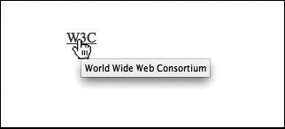
Figure 2-2. The tool tip effect of the title attribute being set on a link
The next attribute, lang, specifies what language the text within an element is written in. This is used by some elements to render text differently based on differences in language scripts, such as the type of quotes used. For example, the following code snippet from the top of a web page would specify that the whole HTML page is written in the English language:
<html lang="en">
Lastly, the contextmenu attribute was added in HTML5, but at the time of writing has yet to be implemented in any released major browser. The idea is that a menu element can be associated and displayed with a particular element by setting the element's contextmenu to the id attribute of the menu. For any more insight into how it works, you will have to wait for the browsers to catch up with the specification!
Identification
The id attribute is used for assigning a unique identifier to a specific element on the page, which can subsequently be accessed using CSS or JavaScript for styling or scripting purposes.2 It is a unique name you can assign to one of your HTML elements, which you can then use to reference the element. The class attribute is used in a similar fashion; however, unlike the id attribute, the same class value may be applied to multiple elements on the page for the purposes of specifying that they have something in common (such as a particular CSS style). To summarize, the main differences between the id and class attributes are as follows:
__________
2 The id attribute may also be used as the target of hyperlinks. Using the id attribute for this purpose is discussed in the “Hyperlinks” section in Chapter 3.
id- The value may appear once and only once per page so as to identify a single element.
class- The value may appear multiple times per page.
- A particular
classattribute value may contain multiple class names, each separated by a space.
To illustrate these differences, consider the following code snippet:
<p id="about-text" class="homepage popup">
This code contains the unique id attribute of about-text and two classes: homepage and popup. The id attribute of about-text would not be able to be used anywhere else, while both homepage and popup could be used on other elements. Note that elements do not need to have both an id attribute and a class attribute assigned to them; they could have one or the other, or neither. Also, to avoid problems, don't begin an id or class attribute with a number, and definitely don't include spaces (use dashes or underlines instead) in the name.
SENSIBLE ID AND CLASS VALUES
Both these attributes are used extensively in web development, so it is essential you are familiar with them. We will work with CSS and JavaScript where appropriate to illustrate the features of HTML5, but briefly, if you want to reference and style these attribute values from CSS, you type the value and then prefix IDs with a hash sign (#) and classes with a period (.), like this:
#about-text { background: blue; }

.homepage { color: white; }
To reference these attribute values from JavaScript, you would typically use the command document.getElementById("about-text") from within your JavaScript, where about-text is replaced with whatever the actual ID is of the element you want to gain access to. A similar command is available for retrieving all elements with a particular class value: document.getElementsByClassName("homepage") (where homepage is replaced with the class value you are referencing).
Editability
The contenteditable attribute is used in the new Editing APIs, well new as in HTML standards new. The Editing APIs, which allow in-page edits of page content, have had the attribute contenteditable since Internet Explorer introduced it in 2000, but it took until now to get the attribute into the HTML specification. The idea is to allow elements of HTML to be edited so that rich-text editors for web forms and the like can be more easily created (for creating marked-up text for a blog entry using a web application interface, for instance)3.
Spell-checking
The spellcheck attribute, as the name implies, is for specifying whether an element should be spell-checked. Web browsers often have a spell-checking feature that checks for spelling and grammatical errors as the user types into, for instance, a web form's input fields. Sometimes it's desirable to disable this spell-checking feature on certain elements on the page. For example, you may not want to check for spelling errors on an e-mail address typed into a web form, so the browser could be informed to ignore an e-mail address form input control using the spellcheck attribute. The values for the spellcheck attribute are true or false (or an empty string of text "", which maps to the true state). Naturally this fits quite well with content that can be edited.
Hiding elements
The hidden attribute, is for hiding and showing HTML elements. This is equivalent to using the CSS property and value display:none. While using CSS for hiding elements is a common practice, it is actually discouraged by the HTML5 specification in favor of using the hidden attribute. The hidden attribute adds additional semantics to the affected element. Its presence means that the element is not relevant at this time. This could be used by screen readers, for instance, which may otherwise pass over any hiding applied through a CSS display rule.
The following HTML and JavaScript snippet shows how to use the hidden attribute to show and hide content. The HTML part shows a definition list with a fox's common name and its Latin name:
<dl id="fox">

    <dt>Red Fox</dt>

    <dd id="latin" hidden>Vulpes vulpes</dd>

</dl>
The JavaScript part adds the functionality to show and hide the Latin name of the red fox when rolling on or off of its name. Since the hidden attribute is a Boolean attribute, it can be set to true or false using JavaScript, which leads to showing and hiding the element in question:
function toggleLatin(){

    var entry = document.getElementById("fox");
    var latin = document.getElementById("latin");

    entry.onmouseover = function(){

        latin.hidden = false;

    };

    entry.onmouseout = function(){

        latin.hidden = true;

    };

}

window.onload = toggleLatin;
__________
3 For an example of using contenteditable, refer to the “Web Storage” section in Appendix A.
Drag-and-drop
The draggable and dropzone attributes are two attributes that really exemplify the move of HTML toward building applications, as opposed to documents. These require some setup and JavaScript integration (which we'll discuss in Chapter 7), but when functional, these attributes allow HTML elements to be dragged from one part of the page and dropped onto another element (though as you will see, you will likely only use draggable for making this happen, as dropzone has yet to gain much browser support). What happens next is governed by JavaScript events.
Style
The style attribute provides a method of applying CSS styles directly to an element. Any styles applied in this way will override styles set on the element elsewhere. Although this can provide a quick way to apply styles to an element, it is best to avoid this attribute altogether and provide the styles for your page in an external style sheet. Having a clear separation between CSS and HTML code within your website provides organizational and flexibility advantages, because it is far easier to find and disable CSS rules when they are contained in a CSS file, instead of being spread between CSS and HTML.
Text directionality
The dir attribute controls which way text flows. Text normally flows from left to right, but if a language is used that flows the other direction, such as Arabic, the text needs to go that way as well. The dir attribute provides this ability. If an entire block is in a right-to-left language, use the value of “rtl” for right-to-left languages and “ltr” for left-to-right languages on the container element, which will flip the alignment of the text and punctuation:
<p dir="rtl">When rendered by a browser, this paragraph will appear aligned to the right.</p>

<p>While this paragraph will not because it lacks a <code>dir</code> attribute.</p>
A value of “auto” can also be given, which seeks to automatically determine the text directionality based on the enclosed text.
Note The CSS direction property provides this same functionality and takes the values inherit, ltr, and rtl. However, this CSS should NOT be used as this information should be embedded into the page itself so that the directionality of the textual content can still be determined even if the associated style sheet is disabled.
Custom data
The data-* attribute is a bit of an odd one. It is the catchall of attributes, allowing any attribute name to be added for the purposes of storing custom data in HTML elements for the use of, for instance, JavaScript applications. The * in the attribute name is not the actual finished attribute; it can be replaced with any text to create custom attributes. For example, city could be added to create the attribute data-city. Or score could be added to create data-score, which might be used on a web page listing high scores for a game. Take the following HTML snippet, for instance:
<button id="show-score-button">Show Scores</button>

<ul>

        <li data-score="3200">Top Blaster Tom</li>

        <li data-score="2250">Middle Range Merv</li>

        <li data-score="1100">Last Pop Louis</li>

</ul>
A JavaScript function could then be written that replaces the user name with the winning score when clicking a button:
function showScore(){

    document.getElementById("show-score-button").onclick = function(){

        var entries = document.getElementsByTagName("li");

        entries[0].innerHTML = entries[0].dataset["score"];

        entries[1].innerHTML = entries[1].dataset["score"];

        entries[2].innerHTML = entries[2].dataset["score"];

    }

}

window.onload = showScore;
Note The dataset property in the previous code allows access to data-* attributes as key/value pairs. However, only the custom part of the attribute is needed, so the attribute score is looked up in the dataset, not data-score.
This permits a lot of flexibility in what can be stored in an individual element but at the same time is backed by a specific specification. How paradoxical! The intention is that these attributes are used only within a particular site, and they are not utilized by software residing outside of the website's domain. On this, use these with caution and only when absolutely no other solution will work!
Content model categories
As stated in Chapter 1, originally, elements in HTML could be roughly divided into two categories: block and inline. The content model of one category or the other defined what kind of content could be placed inside a particular element. For instance, inline elements could not contain block elements. As HTML5 developed, these two types of content did not adequately describe the behavior of the available HTML elements. The WHATWG replaced block and inline with a larger set of categories,4 which group elements based on their similar characteristics. Elements in each category have a similar content model and must abide by the rules defining what kind of content it can have. There are now seven major categories, listed in Table 2-2.

Even these seven categories do not fully cover all elements within all contexts. For instance, an element may not fit into any of these categories (the html element, for instance) or may be referred to as transparent, meaning it inherits the category of its parent element. Many elements fit into more than one category, in which case they are said to have a hybrid content model.
__________
4 See http://blog.whatwg.org/content-model-overhaul for a description of the impetus behind this change.
Note There are actually a further seven minor categories that group elements within specific contextual scenarios, such as when they are part of a form. To view the additional categories, browse the category reference in the HTML specification at http://dev.w3.org/html5/spec-author-view/index.html#element-content-categories or http://whatwg.org/specs/web-apps/current-work/#element-content-categories.
Root element
To begin looking at the elements in HTML, it makes sense to look at the beginning—well, almost the beginning. We talked about the doctype declaration in the previous chapter, which is the first element to appear in an HTML document. However, following the doctype declaration is the html element, which serves as the element that encloses all other HTML elements in the document, otherwise known as the root element.
The root element is one of a handful of elements whose tags are optional (see Table 2-3 for a list of other elements that include optional tags). Although the tags may be optional, the element is not omitted. Optional elements will be implied if they are left out (the body element being an exception, which will be omitted if no page content is provided). For example, the following is a perfectly valid HTML5 document:
<!DOCTYPE html><title>Tiny HTML5</title><p>This is a valid HTML5 page!
In this case, the missing tags of the html, head, body, and p elements are added when parsing the document. It could even be shorter without the inclusion of the doctype declaration, but that would trigger quirks mode in the web browser (for a discussion of quirks mode, refer to the doctype section in Chapter 1).
Note For an easy way to check the validity of your documents against the current HTML5 specification, visit http://html5.validator.nu or http://validator.w3.org, both of which provide web-based services that validate supplied website URLs, uploaded HTML files, or directly input HTML. For the validator housed at the W3C, ensure you set the document type in the validator drop-down menu to “HTML5 (experimental)” to be certain you are checking it against the most current specification.


Although the preceding code snippet is handy for infuriating your XHTML-devoted friends, it is a good idea to include the optional tags anyway, if only for clarity's sake. While HTML5 can seem like it's bringing back coding practices from the 20th century, it is important to remember that it is documenting what has been used in practice, not necessarily what may be the best practice to do.
Attributes of html element
In addition to the global attributes, the html element has one new attribute, manifest, which is used in a new API for creating offline applications. When you utilize this attribute, the essential functional components of a web application (the JavaScript, for instance) can be cached in the browser so that the page will still function if the user goes offline and reloads the page.
Note The html element also has an attribute, xmlns, used to declare an XML namespace, which describes the markup language that is being used. This attribute should be present in valid XHTML documents. It has only one supported value, the text http://www.w3.org/1999/xhtml. It is applicable only to XHTML and has absolutely no meaning in HTML, other than to make the transition between HTML and XHTML easier in a document that may cross over between the two.
Document metadata and scripting elements
After the opening root html tag, the head element's opening tag appears, which contains the document metadata elements that specify such page properties as the title for the document as it appears in the browser window, a default URL address for elements on the page, character encoding information, and linked and embedded CSS style sheets, if they are utilized. Table 2-4 lists the relevant elements along with their content model categories.


__________
5 Fits in flow content category only if the itemprop attribute is present, which is part of the microdata specification available in HTML5.
6 Like the meta element, the link element fits in the flow and phrasing content category only if the itemprop attribute is present.
Web page information: title and meta
As demonstrated in the minimal HTML5 example shown earlier, title is the only compulsory element within the head section. The text between the opening and closing title tags will be displayed in the browser window title bar. The document title is an oft-neglected area of the document; you've surely seen pages with the title “Untitled Document” before. This is unfortunate, because given the proper care and attention, the document title can provide you and your users with many benefits:
- Better search engine ranking. Search engines will factor in the page title when determining the relevance of your web page to a particular topic, as well as when determining what to display on a search results page.
- Better convenience. Should your users bookmark the page, the page title will be used by default for the bookmark name.
- Better usability. Identification of both the website and the page in the same location can help to identify a particular page's association to a particular website. For example, “Semantic Web – W3C,” which is the title of the main semantic web page on the World Wide Web Consortium's website, clearly identifies the topic of the page as well as the website it is a part of.
Note As an example of the importance of meaningful titles in a web page, try opening several “Untitled Document” windows and then switch between them after minimizing them—can you tell which is which before switching? Or try opening the same pages as tabs in a single web browser window. Can you see at a glance which page is which?
Also note that if the name of the website is included in the title, the website name should appear after the page topic title. A similar problem to this can occur when a company or website name is placed before the actual page title, because the title may be cropped right to left if it is too long to display when minimized or in a tab, leading to the actual page topic title being cropped from view.
__________
7 Fits in flow content category only if the scoped attribute is present.
The meta element
The previous chapter introduced the meta element as being commonly used to set the character encoding for the page, but it is also commonly used to set up a series key/value pairs of metadata information and instructions. For instance, it may be used for defining a summary description of the web page or for defining a set of keywords for content on the page. In creating the “key” in the key/value pairing, the meta element uses one of two attributes, http-equiv or name, and the “value” part is set using the content attribute. Here's an example:
<!-- defines a set of keywords for the page's content -->

<meta name="keywords" content="html5, css, javascript, semantic web, web apps"/>


<!-- refreshes the page every 15 seconds -->

<meta http-equiv="refresh" content="15" />
Note Historically, search engines used keywords, but today many do not use them because it is easy to mislead a search engine that depends on this feature for the purpose of spamming the search results. However, if used properly, there is no harm in including them, although it would be important to update the keywords to reflect changes in content on a document that was edited frequently, which may create an extra step of maintenance without substantial gain. The choice is yours!
Some uses of the http-equiv attribute (known as a pragma directive) provide tasks such as setting cookies, specifying the character encoding, and so on, which are redundant to better approaches available. Consequently, several of the values are not recommended in the HTML5 specification. Specifically, the content-language and set-cookie directives are non-conforming and should not be used (the lang attribute should be used for setting the language of the content, and real HTTP headers should be used for setting cookies). The other official pragma directives from the HTML5 specification are content-type, which is an alternative form of the charset attribute; default-style, which is for setting the default CSS style sheet for the page (explained in Chapter 6); and refresh, which refreshes or redirects the page after a number of seconds, as shown in the code sample earlier.
Note To redirect the page after a pause, a URL is added to the content attribute when using the refresh pragma directive. After the specified number of seconds, the page is redirected to the URL. A redirect would look like so:
<meta http-equiv="refresh" content="3; URL=homepage.html">.
The full list of proposed values for the http-equiv and name attributes is large, so you are best to consult a resource such as the WHATWG PragmaExtensions and MetaExtensions wikis at http://wiki.whatwg.org/wiki/PragmaExtensions and http://wiki.whatwg.org/wiki/MetaExtensions, respectively. In addition to the values listed at those web addresses, the HTML5 specification also includes application-name as a value for the name attribute. This value allows for a title to be given to a web application (not a standard web page but an actual web application with scripted functionality added), which may be seen as an overarching title that is independent or supplementary to the page title (set using the title element). This is provided since the page title may change while using the application to reflect operations that are occurring, such as loading additional content, and so on.
Note Possibly more useful is the meta name keyword robots that instructs web crawlers (the automated programs that Google and others use for indexing web pages) on how to index the page. Information on this name value and others is available on the aforementioned WHATWG MetaExtensions wiki at http://wiki.whatwg.org/wiki/MetaExtensions.
Links, styles, and resources: base, link, and style
Only one base element may be used per document. It should appear in the head before any other elements that include a URL in their attributes. The idea is that the base element can prevent redundant typing of the same root URL over and over again when adding links throughout the page. Its two attributes, href and target, specify the URL to use and the default target (where applicable). target tells, for instance, whether a link opens in a new window or the same window. For example, if this appeared inside the head section:
<base href="http://example.com/portfolio/" target="_blank" />
and this appeared in the body section:
<a href="photographs.html">Photography</a>
then clicking the link would open a new browser window and connect the user to the URL http://example.com/portfolio/photographs.html.
The link element
The link element has the attributes href, rel, media, hreflang, type, and sizes, as well as the global attributes. Of these, at very least href and rel are commonly set. The href specifies the address (URL) of the linked resource, while rel specifies the type of resource. The following code is how you will most likely use this element, because it is commonly used for linking style sheets to your pages:
<link rel="stylesheet" href="main.css" type="text/css" />However, the rel attribute can be used to provide additional related information about the page. The nature of this attribute can be a little tricky to grasp, so let's consider an example. In addition to style sheets, you may have encountered rel before when using the link element to reference an RSS feed in the head of your web page, like this:
<link rel="alternate" href="http://example.com/feed/" type="application/rss+xml" />
The preceding code means that “an alternative version of this document exists at http://example.com/feed/,” and user agents can spot that and find the RSS feed—most modern browsers will display a feed icon in the browser address bar, allowing the user to select, view, and subscribe to the feed.
The alternate value can also be used with the hreflang attribute if the alternate version is a translation. It can also be used with the media attribute if the alternate version is designed for a different medium.8 It can also be used with the type attribute to indicate the linked document is a version of the page in a different file format, such as a PDF version of the page. For example, a link that referred to a printable PDF version of the document that was also in French might look like this:
<link rel="alternate" href="alt-fr.pdf" type="application/pdf"?hreflang="fr" media="print"

title="French version PDF for printing" />
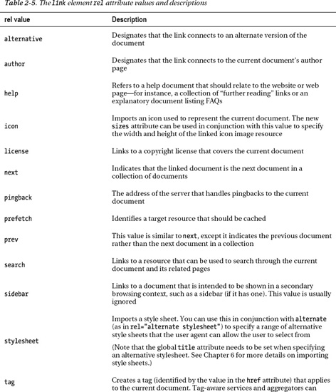
The HTML specification lists more than a dozen predefined types for the rel attribute (Table 2-5).
__________
8 The media attribute has a number of valid values such as screen, tty, tv, projection, handheld, print, braille, aural, and all, which are aimed respectively at computer screens, terminals, televisions, projectors, handheld devices, printed pages, Braille tactile feedback devices, speech synthesizers, and all of the above. Of these, you are most likely to use screen and print and possibly handheld. Opera uses projection when in full-screen mode, so if you have specified a screen type for your main style sheet, you may want to consider including projection: <link media="screen, projection" ... />.
The type attribute specifies the MIME type of the resource being linked. It is purely advisory to the browser (for example, the user agent won't solely rely on the value specified here to determine the resource type) and can be omitted for style sheets since they are the most commonly encountered type of file used in the link element.
The style element
The style element allows CSS style rules to be embedded directly into an HTML document, which may be a quick and convenient way to add style rules when creating a page, but as with the global style attribute, the CSS styles for a document are best provided through linking an external style sheet into the page using the link element. One new attribute is the scoped attribute, which (in theory) allows a piece of generic CSS to be applied to a specific block of HTML. However, at the time of writing, the current releases of major web browsers do not support this attribute.
Adding behavior and fallbacks: script and noscript
The script element is like the style and link elements combined, because it supports writing embedded client-side JavaScript code directly in the HTML document or allows a script to be loaded as an external file. As with CSS, unless it is unavoidable to embed the code in the HTML, it is best to place JavaScript in an external file (or files) that is loaded, like so:
<script type="text/javascript" src="js/menu.js"></script>
The previous code snippet shows the general appearance of the script element when linking in an external JavaScript file (in this case named menu.js and residing in a directory named js). Note that when linking in an external script, the element should not contain any content between its starting and ending tags.
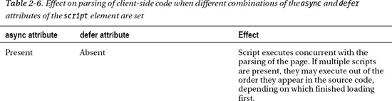
HTML5 defines a new attribute named async, which in combination with another attribute, defer, can be used to control when an externally loaded script is parsed. These are both Boolean attributes, so their presence and absence can affect the loading of external scripts in various ways (Table 2-6).

SCRIPT: AT THE TOP OR AT THE BOTTOM?
Lastly, the noscript element is for surrounding content that is shown only when scripting is disabled or not supported in the browser. If the noscript element is placed in the head of the document, it can contain only the link, style, and meta elements; otherwise, if it is in the body, it can contain all the normal elements that would appear in the body element, except another noscript element. It's also worth noting that the syntax of the noscript element is such that it is only applicable in HTML documents and has no effect in XHTML documents. noscript is one of those elements that had an uncertain future when XHTML was being pushed by the W3C, and it retains a bit of a crude and dirty reputation—a hackish—way of handling a disabled script. A better approach is to write a script that converts the content of a page from a static to a dynamic nature on the fly, because it's possible a script could fail even when scripting is enabled, and in that case the contents in noscript would not show up. For instance, consider the following code (which is embedded in the HTML for brevity's sake):
<div>

    <p id="fall-back">Script disabled</p>

    <script type="text/javascript">

    var fallBack = document.getElementById('fall-back'),

    var fallBackParent = fallBack.parentNode;

    fallBackParent.removeChild(fallBack);

    fallBackParent.innerHTML = "<button id='alert-button'>Show Alert!</button>"

    var showAlert = document.getElementById('alert-button'),
showAlert.onclick = function(){alert( "script worked!" );}
</script>
</div>
A paragraph (with an id set to fall-back) is provided with some default static content. A script element follows, which removes the default HTML and replaces it with a button that has the functionality to show an alert box when clicked. The advantage here is that, not only is finer-grained control provided for converting a static page to a dynamic one, but this will also work in XHTML.
Document sectioning elements
Following the closing head tag is the opening body tag, which can contain any non-head-specific markup, typically the content that would be expected to appear in the web browser window content area: paragraphs, lists, images, and so on. The body tag traditionally had several presentational attributes: background, text, link, vlink, and alink, which were used to set the document's background color, text color, link color, visited link color, and active link color, respectively. All of these attributes were depreciated in HTML 4.01 and have been labeled obsolete in HTML5. Their effects should be created with CSS instead. The CSS background-color, color, a:link, a:visited, and a:active properties and pseudoclasses (discussed in Chapter 6) are appropriate.
The closing body tag is followed immediately by the closing html tag. That's an HTML document in its entirety, albeit devoid of any content. The rest of the elements we'll look at in this chapter and the subsequent ones will primarily be the content elements—the ones that would appear in the body to mark up and organize content in various ways.
Semantic sectioning elements
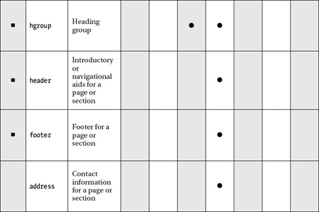
The first set of elements likely to appear in the body would be those involved in organizing content into different logical sections. These are shown in Table 2-7, which also lists the content model categories for each. You'll notice almost all are new to HTML5. You'll also notice their names imply common components of a web page, such as headers, footers, navigation bars, and so on. The semantic nuances of these elements deserve their own close attention, so for the time being just be aware that there are new elements in HTML5 for giving content finer-grained meaning than div and span elements are traditionally able to do. We will explore these new sectioning elements in more depth in Chapter 3.

Content grouping elements
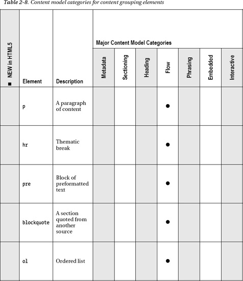
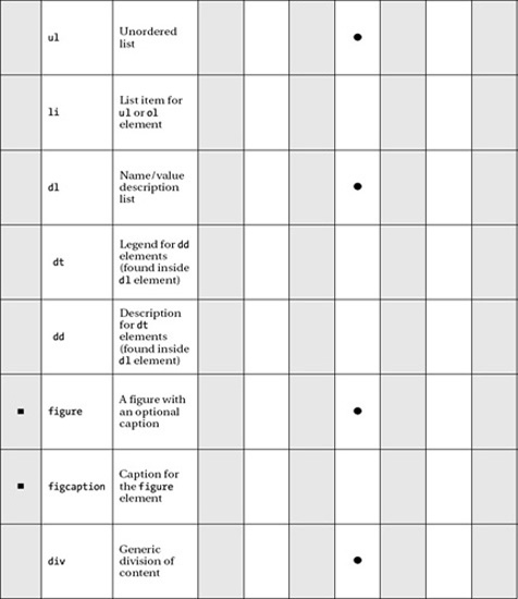
Inside a particular section of content on the page, the various components of that section are broken into paragraphs, lists, figures, and the like. The elements for paragraphs and so forth group content into smaller units than sections do. Except for figure and figcaption—which are new in HTML5—the elements in this group are all likely quite familiar to you. See Table 2-8 for the content model categories and descriptions of these elements.
The inevitable paragraph: p
Perhaps the markup you've used most often when writing web pages is p. There isn't much to be said about p: it is simply used to mark up a paragraph. Yet this humble element is often abused by WYSIWYG (What You See Is What You Get) web authoring software as a quick and dirty spacer for adding padding between content. You have likely seen markup such as the following, where an author has pressed the Enter key a few times in their editor:
<p> </p>
<p> </p>
<p> </p>
<p> </p>
This is a prime example of (X)HTML being co-opted into acting in a presentational manner. We find here multiple, pointless paragraphs, with a non-breaking space entity inside (because of some browsers not displaying empty elements), but the effect should really be achieved with CSS. A quick way of adding some space beneath your content is to add a class to the relevant content:
<p class="section">Your content here.</p>
and then style the class with CSS to add padding on the top or bottom:
.section { padding-bottom: 3em; }
Note Use of ems has traditionally been the preferred unit of measurement by professional web developers, because it is a relative unit of length, and will resize proportionally if the page is scaled up or down by the user (or developer). However, preference for ems has become less pronounced in recent years as web browsers have become better at handling resizing of absolute units (such as pixels). There is considerable debate over whether to use ems or pixels for sizes. An em may be less intuitive to use, while a pixel won't accommodate cascading size changes. It generally would not be a disaster to choose one or the other, so go with whichever you feel more comfortable using. At the end of the day you should be testing your pages under a variety of scenarios anyway, so issues should reveal themselves pretty quickly.
Break in thought: hr
The hr element, or horizontal rule, has historically been a presentational element, but it has been redefined to represent a thematic break between one piece of content and another. The hr element came with several attributes—size, width, noshade, and align—but all have been declared obsolete in HTML5, so CSS must be used for the horizontal rule's style, as it should be.
Retaining formatting: pre
Now, what about pre? The visual effect caused by the pre element is to preserve the whitespace (that is, the tabs, spaces, and line breaks) in your markup, so if that whitespace is important in understanding the content, such as in computer code samples, then use pre. Alternatively, the effect can be replicated with the CSS white-space:pre property and value, and this may well be a more viable option to use in cases where another element could be used that better describes the content in question. For example, in the case of marking up computer code, the code element along with the white-space CSS property could be used to preserve the formatting as well as convey the meaning of the content for situations where the formatting may be lost (such as if it were read by screen-reading software, for instance).
Quoting text: blockquote
blockquote is an element that has historically been used for its presentational effect rather than its semantic meaning or structural relevance, but it should be viewed as enclosing content that is quoted from another source, regardless of how it will be presented. The blockquote element has a cite attribute, which allows the author to reference the source of the quote (usually in the form of a URL, but it can be any form of citation, such as the name of another author or the title of a movie).
Note For inline quotations that appear in a paragraph, for instance, there also exists the q element, which is listed in the text-level semantics section in Chapter 3.
Lists
Three list types are available in the current HTML specification: unordered lists (ul), ordered lists (ol), and description lists (dl).
The differences between the list types are fairly minimal and straightforward:
- An unordered list should be used when your content is (as you would expect) not in any particular order.
- An ordered list should be used when your content is in an order of some kind: alphabetical, numerical, and so on.
- A description list is designed for associating names or terms with values or other data—any items that have a direct relationship with one another, such as a glossary of terms.
Unordered and ordered lists: ul, ol, and li
Unordered and ordered lists consist of an opening ul or ol tag, respectively, followed by any number of list item—li—elements, and then finally a closing </ul> or </ol> tag. The opening and closing tags can contain only list items, but list items can contain any flow elements, including paragraphs, divs, headers, and yet more lists. So long as they're all contained within a single list item, it's perfectly valid and well-formed markup. As far as differences between HTML/XHTML go, in HTML you don't have to close list items with </li>, but in XHTML you do.
Unordered lists do not have any attributes other than the global attributes. Ordered lists, on the other hand, have three additional attributes: reversed, start, and type. The first, reversed, determines what direction a list should be ordered. It is a Boolean attribute, meaning its presence or absence determines its behavior. If this attribute is present, the list will be descending (9, 8, 7, 6, 5…); otherwise, it will be ascending (1, 2, 3, 4, 5…). Unfortunately, at the time of writing, this attribute had poor browser support.
Note As mentioned in the attributes section in the previous chapter, Boolean attributes either can be included without any value when using HTML syntax or, if XHTML syntax is used, can be given a value equal to their name. In this situation, you may find HTML syntax is clearer. For example, both of the following would work:
<ol reversed>

    <li>item 1</li>

    <li>item 2</li>

</ol>


<ol reversed="reversed">

    <li>item 1</li>

    <li>item 2</li>

</ol>
Next, the start attribute allows authors to start the numbering of an ordered list at a number other than 1, which is useful if you need to interrupt an ordered list, such as in the case of a list of search results split over several pages. Interestingly, this attribute was deprecated in HTML 4.01 but is back to good standing in HTML5.
Finally, the type attribute can be used to change the marker at the beginning of the list from a decimal number (the default) to an alphabetical listing or roman numerals. However, it is strongly recommended to use the CSS list-style-type property instead, which offers far more options and also moves this presentational change to the CSS instead of the HTML.
The li element, when part of an unordered list, has only the global attributes but gains one more when inside an ordered list: value. This attribute allows authors to give a specific list item an out-of-sequence number.
With the attributes out of the way, let's move on to an example of implementing a list. Thankfully, though the markup may not be exciting, it is at least flexible, and with CSS you can display a list in a wide variety of ways: horizontally, vertically, expanding/collapsing, and so on. For instance, take the following navigation menu:
<ul>

      <li><a href="/">Home</a></li>

      <li><a href="/about/">About</a></li>

      <li><a href="/archive/">Archive</a></li>

      <li><a href="/contact/">Contact</a></li>

</ul>
We can turn this into a horizontal menu very easily using the following CSS rule:
li {

         float: left;

}
Simple! But it's clearly quite ugly and a bit unusable at this stage, so let's tidy things up a little:
li {

         border: 1px solid; float: left; list-style-type: none; padding: 0.2em 1em;

}
By adding a border, removing the list bullet, and adding a touch of padding, we get the list shown in Figure 2-3.
Figure 2-3. An unordered list with the list items floated left, bordered, and padded
As you can see, we already have a very serviceable horizontal menu. We could jazz this up even more with some styling of the anchor tags, giving them a background-color, using display:block to allow them to fill the whole list item area, changing their background with the pseudoclass :hover, and so on.
Note Russ Weakley, a co-chair of the Web Standards Group, has created a huge collection of different list styles (more than 70 at the current count) available at http://css.maxdesign.com.au. To help take some of the pain out of creating lists of links, it's also worth trying Accessify's List-O-Matic (http://accessify.com/tools-and-wizards/developer-tools/list-o-matic), an online list-builder that lets you select from a variety of prebuilt styles.
So, already you can see that a simple list can be displayed in a different way from its default style. It's possible to use CSS to create quite dynamic behavior with lists. For example, as documented by Eric Meyer (http://meyerweb.com/eric/css/edge/menus/demo.html), the :hover pseudoclass can be used to display nested lists as pop-out menus. The CSS to accomplish this is very simple:
li ul {display: none;}

li:hover > ul {display: block;}
This means any ul that is a descendent element of an li—that is, a nested list—should not be displayed. The second line says that any ul that is a child element of an li that is being hovered over should display as normal. In compliant browsers, the end result (with a few more presentational styles added) looks like Figure 2-4.

Figure 2-4. A pure CSS nested menu
All very neat. Patrick Griffiths' Suckerfish Dropdowns script (www.htmldog.com/articles/suckerfish/dropdowns) provides both a CSS solution and a JavaScript solution that are pretty robust (multiple nested menus are catered for) and very easy to implement, requiring only the inclusion of a small script and the addition of a class selector to your CSS file.
Description lists: dl, dt, and dd
The description list consists of an opening dl, followed by a term (dt), and then any number of descriptions (dd). A typical description list looks like this:
<dl>

      <dt>Bottle</dt>

      <dd>A receptacle having a narrow neck, usually no handles, and a mouth that can be

      plugged, corked, or capped.</dd>

      <dd>To hold in; restrain: "bottled up my emotions."</dd>

      <dt>Rocket</dt>

      <dd>A vehicle or device propelled by one or more rocket engines, especially such a

      vehicle designed to travel through space.</dd>

</dl>
Most browsers would display the preceding code in a similar way to that shown in Figure 2-5.

Figure 2-5. A description list, with the terms on the left and the descriptions indented
Description lists are, as noted, fairly flexible. As long as there is a direct relationship between the term and the description(s), many constructs can be represented using this list. For instance, a photograph as the term could have descriptions including information about both the photographer and the camera. In addition, a description list could be used to display a schedule for a series of presentations at a conference, with the title of the presentation as the term and the descriptions including details of the presenting author and the date and time. A description list could also be used in an online shopping application to describe product details, and so forth.
Although description lists are flexible in use, you should bear the following caveat in mind: a definition term can only contain phrasing content, not flow content, so no paragraphs, headers, or lists—which means that terms cannot be given differing levels of importance in the same way that headings can (h1, h2, and so on). A description element (dd) in the list, however, can contain any flow element or series of elements, so long as they're well-formed.
Diagrams, photos, illustrations: figure and figcaption
The idea behind the figure element is to provide diagrams, images, code, and so on, optionally with a caption or legend (figcaption element) as a self-contained unit that is relevant to the main content of the document. The figure should be able to be moved or removed without destroying the overall layout of the document.
For example, the following shows two images side by side, with a caption below (see Figure 2-6):
<figure>

        <img src="earth.jpg" title="View of Earth" alt="Photograph of the Earth from space.">

        <img src="mars.jpg" title="View of Mars" alt="Photograph of Mars from space.">

        <figcaption>The Earth and Mars shown side-by-side.</figcaption>

</figure>
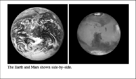
Figure 2-6. Example output from the figure and figcaption elements
Creating divisions: div
A div (short for “division") is used for marking out a block of content. It adds no special meaning to the content it surrounds but is simply used for being able to add additional CSS styles or JavaScript. The div has traditionally been a frequently used element to aid with layout of a page but has been superseded in many situations with more semantically specific elements (covered in more depth in Chapter 3).
Text-level semantic elements
We're down to the finest-grained control now: text-level elements that imbibe individual words and sentences with meaning. There are nuances of the correct semantic use of these elements that are best discussed together with the document sectioning elements in the next chapter, so for the time being familiarize yourself with the sizable number of these elements in Table 2-9, and we'll discuss them further in Chapter 3. Most have been around for a while, but several such as i and b have a changed meaning in HTML5.


__________
9 Only if it contains exclusively phrasing content.
Tabular data elements
Several years ago it was quite common practice to use tables to generate pixel-precise website layouts. At the time, this use of tables provided, to the untrained eye, a leap forward in web design, because designs could be created in Adobe Photoshop, sliced into a grid of pieces, and reassembled inside a table to create the original design in a web page. However, the inflexibility and accessibility concerns of this method of design soon saw it scorned in favor of CSS, when the touted “tableless layout” became a catchphrase to mean a pixel-perfect layout created without a table. Ouch. Where did tables go wrong? In the standards world, they went wrong when they were used for a purpose they weren't intended for—presentation. The table is for displaying data, ? la spreadsheets and nothing more.
As Table 2-10 shows, the table element is a single unit that fits into the flow content model category. All other table-related elements work within a table element to define its structure, so they do not fit any of the major categories. Like with the body element, a large number of attributes that were presentational in nature have been thrown into the obsolete bin; for example, in tr all the attributes except for the global attributes have been stripped away.
__________
10 May be placed in phrasing content, if it contains only phrasing content.
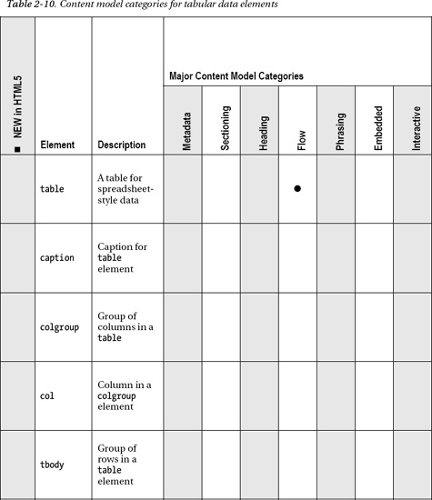
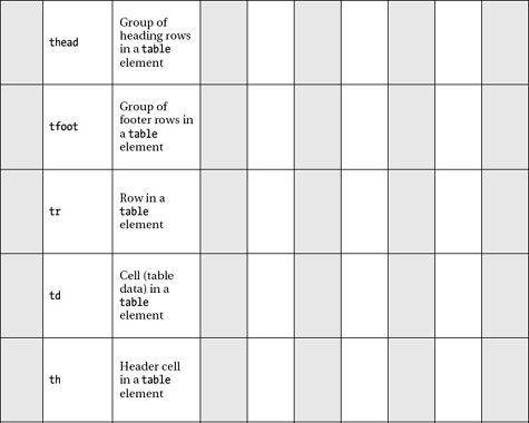
Table basics
It is reasonably straightforward to create a simple table when hand-coding markup. The bare essentials of a single table include an opening table tag, followed by at least one table row (a tr), followed by at least one table cell (a td, meaning “table data"). Here's an example:
<table>

        <tr>

                <td>Some data</td>

        </tr>

</table>
That's about as minimalist as you can get when it comes to creating tables, but you're unlikely to create a table with only one item of data, so let's make things a touch more interesting. The following markup is for a two-column table with two rows of data (the embedded style is to provide a border to act as a visual aid to better distinguish the layout of the table; ideally, its effect should be placed in an external CSS file in a production environment):
<style type="text/css">
    td { border: 1px solid #ff0000; }

</style>

<table>

    <tr>

        <td>Name</td>

        <td>Place of residence</td>

    </tr>

    <tr>

        <td>Anselm Bradford</td>

        <td>Auckland</td>

    </tr>

    <tr>

        <td>Paul Haine</td>

        <td>Oxford</td>

    </tr>

</table>
This will create a basic table, but let's take it a little further with table headers.
Adding table headers
You can make this table a bit clearer and easier to read by marking headers at the top of the table to indicate columns. Although you can do this by adding a class name to each table cell and then styling it with CSS, a far better way is to turn those uppermost table cells into bona fide table headers with the th element used in place of td.
<table>

    <tr>

        <th>Name</th>

        <th>Place of residence</th>

        </tr>


    ...


</table>
The preceding markup renders as shown in Figure 2-7.

Figure 2-7. A basic table using th for header cells
This approach has several benefits. To begin with, it's a great aid to accessibility. While a screen-reading device may, in the hands of a competent user, read the first table example as “Name, Place of residence, Anselm Bradford, Auckland, Paul Haine, Oxford,” with table headers available it can understand how the headers relate to the data and read it as “Name, Anselm Bradford, Place of residence, Auckland, Name, Paul Haine, Place of residence, Oxford…"11 Of course, in this simple example, it would be easy enough to infer the table structure. It's not hard to work out that “Name, Place of residence, Anselm Bradford, Auckland, Paul Haine, Oxford” is a person's name followed by a place name, but when tables get more complex (by having more rows and columns), this becomes much more of an issue.
Note You can also use the speak-header CSS property to control whether table header cells are read out once or always, in an aural style sheet.
Besides making the table more accessible to users of screen readers, using proper table headers also provides sighted users with a useful visual cue as to the structure of the table and makes life marginally easier for the web author, who doesn't have to include an extra class name for every header. In addition, this gives the designer an extra hook for CSS and scripting.
Adding legends: caption
Now that you've headed up the table, you can make things even better by including a table caption, in the form of the caption element. This element needs to be placed directly after the opening table tag:
<table>

          <caption>Personal details</caption>

          <tr>

                    <th>Name</th>

                    <th>Place of residence</th>

          </tr>

          …

</table>
Most user agents will render the caption as shown in Figure 2-8.

Figure 2-8. A basic table using a caption
__________
11 The W3C provides a tool to help understand how your tables could be read by assistive devices at www.w3.org/WAI/References/Tablin.
Adding structure: thead, tfoot, and tbody
If your table looks like it's getting a bit long and unwieldy, you can add some further structure with thead, tfoot, and tbody to help your browser make sense of things. These elements allow you to group rows into a header section, a footer section, and a body section. Much like the th elements, if needed, these three elements give you another hook for CSS and scripting without having to add extra classes or IDs. Like caption, these elements must be placed within the table markup in a very specific order and location. First, if you include any of the three, you must include thead. This element can go anywhere you like, but it's good practice to place it directly under the opening table tag—unless you've included a caption, in which case the thead element must go directly underneath that. You can place it underneath your tfoot and tbody if you like, and it would still be valid markup, but do this only if you want a bit of a brain ache when you come back to your markup a few months down the line and wonder what on earth you were thinking.
The tfoot element, however, must come before the tbody element. Why does the footer come before the body? It's so that a user agent can render the top and bottom of the table before starting on the middle, which is useful if you plan to have your table body scroll and you have many rows.
Finally, you add the tbody element. This tag is actually implicit in your table regardless. For example, try adding tbody {font-style: italic} to your CSS and apply it to a basic table, and you'll see that it styles the text in your table in an italic font. Even though its existence is implied, you must explicitly include the tbody tag if you're using thead and tfoot. So, once these elements are added, your markup should look a little like this:
<table>

        <thead>

                <tr>

                         <th>Name</th>

                         <th>Place of residence</th>

                </tr>

        </thead>

        <tfoot>

                <tr>

                         <th>Name</th>

                         <th>Place of residence</th>

               </tr>

        </tfoot>

        <tbody>

                <tr>

                         <td>Anselm Bradford</td>

                         <td>Auckland</td>

                </tr>

                <tr>

                         <td>Paul Haine</td>

                         <td>Oxford</td>

                </tr>

        </tbody>

</table>
With the exception of the headers now repeated at the foot of the table, there's no visual difference between a table that has these elements and one that doesn't, but it's good to include them because they provide extra, useful information about the structure of your table that can be exploited when printing or when viewing on-screen.
Be careful when using the tfoot element. Because this element may repeat itself over several pages, it's best used as a duplication of the thead element's content (as in the preceding example), rather than the literal conclusion of a long table, such as a final total beneath a column of prices (which would make little sense if it appeared before the table had been completed).
Adding even more structure: colgroup and col
If you need a table cell to span more than one row or column, you can achieve this effect with the rowspan and colspan attributes, each of which takes a numerical value indicating how many cells a particular cell should stretch across. This is all quite straightforward. For example, let's imagine that in addition to residing in Auckland, New Zealand, I have a second residence in Vermont. Adding this data to the table requires an additional row, but rather than leaving an empty table cell next to the new place of residence, I'll insert a rowspan attribute so that the cell containing my name pairs up with both places of residence:
…

<tr>

        <td rowspan="2">Anselm Bradford</td>

        <td>Auckland</td>

</tr>

<tr>

        <td>Vermont</td>

</tr>

<tr>

        <td>Paul Haine</td>

…
The table now renders as shown in Figure 2-9.

Figure 2-9. A basic table using the rowspan attribute
A table cell can span both rows and columns if necessary. You just need make sure your cells and spans add up. For instance, if your table has two rows, one containing five td elements, then the second row can span only up to five cells—any more than that and the table will not be valid and will render unpredictably, and any fewer than that and the slack must be taken up by remaining cells.
I've heard it suggested in the past that rowspan and colspan are presentational and should be avoided, but this is incorrect; you're using the attributes to define structure, not presentation, so you should keep that information in the markup.
As you may have noticed by now, most of the table markup presented so far relates only to rows and individual cells within those rows—there is no tc element. Instead, we have two elements that can define columns and groups of columns, and both are optional: col and colgroup.
The colgroup element allows you to specify how many groups of columns will exist in the table (so one colgroup per group of columns, and a group can contain just one column) and how many columns are contained within each group with the use of a span attribute and a numerical value. This element is placed directly after the opening table tag, and it does not contain any markup other than optional col tags, described shortly.
Consider, for example, the table shown in Figure 2-10.
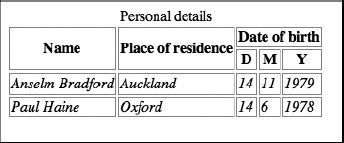
Figure 2-10. A table with multiple columns: there are three column groups here, headed by “Name,” “Place of residence,” and “Date of birth"
Reading along the uppermost headers, you can see that this table has three groups of columns, with the final column spanning the width of three cells. Using colgroup, you can define that structure at the start of the table like so:
<table>

        <colgroup></colgroup> <colgroup></colgroup> <colgroup span="3"></colgroup>

        <tr>

…
With this markup, you're saying that this table contains three groups of columns, the first two of which contain a single column (a single column is implied; you don't need to add a span="1" attribute in this case), and the third group contains three columns.
As shown in Table 2-10, there exists a col element, a self-closing element that also has a span attribute and that's used for specifying the existence of columns within a colgroup. Functionally and semantically, it's practically the same as colgroup, but unfortunately the HTML specification does not allow for nested colgroup elements, so you must use col instead. Using the preceding example, you can specify the final set of three columns in two different ways, either with one col per column, like this:
<table>

        <colgroup></colgroup> <colgroup></colgroup> <colgroup> <col /> <col /> <col />

        </colgroup>

        <tr>

        …
or with a single col and a span attribute, like this:
<table>

        <colgroup></colgroup> <colgroup></colgroup> <colgroup><col span="3"></colgroup>

        <tr>

        …
This is starting to look like a lot of work—why would anybody bother with this at all? It's true that at first glance it might appear that you're supplying redundant information, but this markup does have its uses. There are some side benefits, but the main reason for the existence of colgroup and col is to allow browsers to render the table even if all the table row data has yet to arrive. Without the information provided by these two tags, a browser must first parse the entire table to find the row with the largest number of cells in it. Next, the browser must calculate the width of that row, and only then will it know the width of the table and allow it to be rendered. When you let the browser know up front about the column structure of the table, the browser can render the data as it arrives.
Form elements
By their very nature web forms are a large topic—even larger so in HTML5 with the addition of many new elements. The form elements can often require careful coding of attributes to get groups of elements to work together properly and to have the form successfully submit its data to the server. Forms will be covered in depth in Chapter 4, but as a taste we will look at a basic example here:
<form action="handle_form.php">

    <label for="feedback">Please provide feedback on our form!</label>

    <br />

    <textarea id="feedback" rows="5" cols="50" placeholder="Enter your comments
    here..."></textarea>

    <br />

    <input type="submit" value="Submit!" />

</form>
When rendered in a web browser, this will look like Figure 2-11.
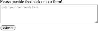
Figure 2-11. The appearance of a simple web form
This is just a simple example that shows the form structure. Forms generally follow the following format:
- Enclose form components within a
formelement that defines the file that will handle the form data when it is submitted.- Define a number of controls for gathering input, such as text fields, drop-down lists, radio buttons, and so on.
- Provide a button for submitting the form so that the entered data can be retrieved and processed.
If you are at all familiar with forms, you may notice an unfamiliar attribute in the previous example—placeholder, which adds grayed-out text in the textarea element that provides a tip on what should be entered. The placeholder attribute is one new attribute in HTML5, but it is barely the tip of the iceberg! There have been enormous changes to web forms in the latest specification. In addition to the new and updated elements listed in Table 2-11, a large number of new input types can be created using the input element, such as much-needed form inputs for e-mail addresses, phone numbers, dates and times, and more! You will have to wait until Chapter 4 where these will be covered in more depth. In the meantime, familiarize yourself with the basic form-related elements and then let's move on for the moment to an overview of embedded content elements.


__________
12 Fits in the interactive category if the type attribute is not set to hidden.
Embedded content elements
For years HTML was rather bad at doing anything other than formatting documents. Still images were the epitome of complex content that could be embedded in a page, and animated GIFs were the crème de la crème of animation. These shortcomings were instrumental in spreading technologies such as Adobe Flash Player, which addressed the lack of developed solutions for animation, interactivity, video, and audio on web pages. With HTML5, the language has made a serious shift toward being a platform for developing web applications, as opposed to purely formatting web documents. Perhaps more so than any other element, the new video element exemplified what HTML5 may hope to represent—a rich multimedia experience using open standards of HTML/CSS/JavaScript. Before the video element was introduced, video without Adobe Flash seemed impossible. Certainly, other solutions exist such as the Apple QuickTime plug-in, but for years Flash video has dominated on popular video-sharing websites such as YouTube.com.
In the spring of 2010, Apple Inc.'s Steve Jobs released an open letter slamming Adobe Flash as a buggy, antiquated technology that would fall to the wayside as HTML5 video spread. HTML5 was thrust into the public consciousness as the future of the Web. For the time being, that future is still ahead; Flash video still enjoys widespread use, and HTML5 video has suffered from disagreements over which video format should be used. But slowly the family of HTML5 technologies is making healthy progress toward standardizing functionality previously possible only with Adobe Flash and other third-party plug-ins—and not just in video. The new canvas element provides a bitmap drawing surface, which can be manipulated using JavaScript to create complex renderings and experiences13 analogous to the rich multimedia experiences previously produced with Adobe Flash.
The embedded content elements are such a rich and diverse set of elements that we will explore them in depth in Chapter 5. As with other sets of elements covered in this chapter, Table 2-12 shows the new and updated elements as well as the content model categories to which they belong. Familiarize yourself with these, and we'll get back to them in a few chapters. Now, onward!
__________
13 See Project Rome at http://ro.me for a glimpse at the capabilities of the embedded elements.


__________
14 May be placed in interactive category if the usemap attribute is set.
15 Like img element, may be placed in interactive category if the usemap attribute is set.
__________
16 May be placed in phrasing content, if it contains only phrasing content.
Interactive elements
This last group of elements are a small set that covers elements that are intended to be interacted with, typically with a click, without additional scripting or other mechanisms of creating interactivity. Three of the four elements in this group, details, summary, and command, are new, while menu has been redefined in HTML5 after being depreciated in HTML 4.01. See Table 2-13 for the usual summary of these elements.

Showing more info: summary and details
The summary and details elements work together to provide a “widget” that can show and hide additional text without the use of JavaScript or CSS. The summary element acts as a header (or summary, as the element name suggests) that provides a toggle that may be clicked to show and hide the text between the details tags. By default, the text inside details will be hidden until the toggle is clicked; however, a Boolean attribute, open, may be added to the details element in order to show the text by default.
Unfortunately, the details and summary elements are not well supported at the time of this writing, with only Google's Chrome browser, supporting this feature.18 If the browser you are using does not support these elements, all content within the details area will be shown, and there won't be a toggle of any sort.
A basic example might look like this:
<details>

        <summary>Legal Notice</summary>

        <small>All content copyright 2011 Anselm Bradford</small>

</details>
This will show a toggle and the text “Legal Notice,” which can be clicked to show and hide the copyright statement. The details element can contain any flow elements, which means the details could take on considerable complexity. For instance, this next example presents some HTML that might appear on a theater's website. This example uses the summary and details elements to show and hide additional information about the theater's currently performing play:
<details>

    <summary>A Midsummer Night's Dream</summary>

    <p>Duration: 1hr 42m</p>

    <p>Showtimes: </p>

    <ul>

        <li>Tuesday, 8pm</li>

        <li>Wednesday, 8pm</li>

        <li>Thursday, 8pm</li>

        <li>Friday, 6pm and 8pm</li>

    </ul>

</details>
__________
17 Fits in interactive category if type attribute is set to toolbar.
18 Visit the website http://caniuse.com and type details in the search field to see the current state of browser support.
Unlike the previous example, which toggled only one line of text, this example shows and hides two paragraphs and an unordered list.
Interacting with the elements will look something like Figure 2-12.
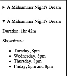
Figure 2-12. A details element showing the hidden and shown state after clicking the summary toggle
Note The summary element is optional; if it is omitted, the browser will create its own label for the details element, such as the text “Details.”
Using JavaScript, the details element could be used to set up a user preferences panel in a web application, for example. In this example, the summary is a nickname for the user, which they can then toggle open and change. Saving their changes updates the value in the summary element, which will change the appearance of the label for the details.
<script type="text/javascript">

    function update() {

        var nick = document.getElementById("nickname");

        var input = document.getElementById("input");

        nick.innerHTML = input.value;

    }

</script>

<details>

    <summary id="nickname">Mac</summary>

    <p><label for="input">Nickname: <input type="text" id="input" value="Mac" /></label></p>

    <p><button onclick="update();">Save...</button>

</details>
Figure 2-13 shows the process to open the details, change the name, and hit Save…, which (using JavaScript) then updates the summary text. Obviously, this would need to permanently save the changes to be really useful, either in a back-end database or possibly in a client-side storage (so-called web storage is available in an associated API, discussed in Appendix A).
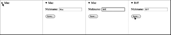
Figure 2-13. A details element using JavaScript to update the details summary dynamically
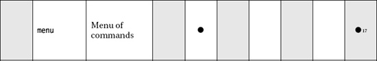
Providing toolbars: menu and command
Individual command elements placed inside a menu element can be used to create a menu bar like those found in desktop applications. Not only that, but it can be used to create a contextual menu or other interactive listing of menu options. Remember the contextmenu global attribute, which used these two elements? Unfortunately, like the contextmenu attribute, the command attribute has not been implemented in any major browser yet, so these menus remain in the theoretical space of the HTML5 specification.
Summary
Congratulations! This has been a very dense chapter, filled with lots of information, but I hope you have walked away with knowledge of what new elements exist in HTML5 and perhaps a refresher on other elements that have been there all along. Now it is time to turn to the specifics we glossed over in this chapter and look at how to practically use these rich new HTML elements.