
C H A P T E R 4
Form Mastery
In Chapter 2 we took a glance at what is new in web forms. Now it is time to turn our attention to them in more depth. Well, let's be honest, if that was said with excitement in many circles, even web-related ones, it may well be met with chuckles over the absurdity of getting excited over web forms. In the past, forms have been relegated to a unpleasant corner of web development, the domain of those interested in the finicky nit-picking of radio button groups, text input widths, and option-laden drop-down menus. Where's the sexy design and rich interactivity? But perhaps more importantly, where are all the form input types that should be there that instead needed to be hacked together using JavaScript? Form markup has been with us for many years, appearing at least as early as the HTML 2 specification, and has not changed in any remarkable way since then. It will be a relief to know then that in HTML5 the light has been cast on them, and they have grown into a capable set of input-handling HTML. Added are a capable new set of form input types, form elements, and attributes, as well as new methods for interfacing with JavaScript and CSS. With HTML5 a lot of functionality that had to be built in other ways is now given for free. Now that is exciting!
I begin this chapter by working through the available form markup, examining new features added to forms in HTML5 (and there are a lot), how best to use the different types of form controls, and how to enhance usability and accessibility with simple structural markup. We'll dissect a complete form and then finish off with some big-picture thoughts in regard to web form usability and related concerns.
Form markup refresher
In essence, forms are quite simple—they allow the user to input some data at one end and then send that data on to the other end to be dealt with by a form handler. A form handler typically means a script that processes the incoming form data, which is written in a server-side programming language or framework such as PHP, Python, or ASP.NET. Think of forms as the HTML equivalent of an intermediary for your data, located between you and the web page's server.
A form consists of a form element that establishes a container around any number of “form controls” (form HTML elements for gathering input) as well as any other body markup such as paragraphs and other flow content (however, having one form nested inside another is not allowed). Below all the input form controls will be a button of some sort for submitting the form—sending the entered data off to the server. Forms can send data using two different methods: GET and POST. The most obvious difference between these methods is that when using the GET method, the data from a form submission appears in the website's address URL. For example, the URL of a form submitted using the GET method might look like this:
handle_form.php?name=Anselm+Bradford&age=31.
which could have been the result of submitting the form in Figure 4-1.

Figure 4-1. A simple web form for gathering user input
For this form, the HTML may look like this:
<form method="get" action="handle_form.php">

     <p><label>Name: <input name="name" /></label></p>

     <p><label>Age: <input type="number" name="age" /></label></p>

     <p><button type="submit">Submit</button></p>

</form>
This example uses a PHP script to process the form, but plenty of other server-side languages could be used such as ASP.NET, Python, or others. In the case of PHP, there are three “superglobal” variables that allow it to access the data submitted in a form. The variables $_GET and $_POST get access to form data submitted via the GET and POST methods, respectively, while $_REQUEST acts as a container for all data submitted, regardless of the method. For instance, to echo back (display in the web browser) the values submitted in the previous form, the following PHP code might be used:
<p>

<?php

if (isset($_REQUEST["name"]) && isset($_REQUEST["age"])){

     echo "Name: " . $_REQUEST["name"] . "<br />";

     echo "Age: " . $_REQUEST["age"];

}

?>

</p>
 Note This is just a simple example used to display what was submitted; in a production environment, form input would need to be screened to ensure no malicious code was submitted as part of the form field data. For instance, for a form that updated a database, SQL commands could be entered into the form, and if the server-side script was not written to filter out commands of this sort, a malicious user could potentially delete data in the database or worse!
Dissecting the form element
Ignoring the other elements for the moment, the form element is quite simple, existing only as a container with a handful of attributes. In addition to the method and action attributes shown earlier, the form element has the following attributes (as well as the global attributes listed in Chapter 2): accept-charset, autocomplete, enctype, name, novalidate, and target. One attribute, accept, has been tossed to the obsolete bin in HTML5, while two attributes, autocomplete and novalidate, are new. Here's an example of a fully constructed form element:
<form action="handle_form.php" method="post" target="_blank" accept-charset="UTF-8"

enctype="multipart/form-data" autocomplete="off" novalidate>
While this uses all the attributes (excluding the global ones), it is not necessary to enter all or any attributes, because they are all optional. Typically, at very least the action and method (as in the earlier example) attributes will be specified. In the next section, we will discuss what each of these attributes do, so you can decide for yourself which you need.
Form element attributes
The following sections describe each of the form attributes in detail.
The action attribute
The action attribute tells the user agent (the web browser) what it's supposed to do with the contents of the form when the form is submitted (with a submit button, which is a form control element we'll discuss later). As in the earlier example, a server-side script can be specified to handle the submitted form data. If it is omitted, the form will redirect to the same URL it is submitted from.
The method attribute
The method attribute is where the form is set to use GET (the default) or POST. The general rule of thumb is that if the form submission is actively modifying data (such as updating a server-side database in some way) or includes sensitive information (such as a password), your form should use POST. On the other hand, if the form submission is passive, such as a database query for a search engine, then use GET. Why? Having the data visible in the page's URL (using GET) will allow the page to be bookmarked, which is useful for a search query, while not having it in the URL (using POST) offers better security for sensitive data. Also, GET is better suited to short amounts of data since it has size limitations because the URL can only be so long (the actual length varies by web browser).
The accept-charset attribute
The accept-charset attribute allows you to specify which character encodings the server can handle in the submitted form data. If not specified (the usual scenario), the character set of the page is used (as should be set in the head section using the meta element and/or sent in the server's HTTP response header). This attribute can be a space-separated list of values if several character sets are acceptable; however, to avoid issues of characters displaying incorrectly, always use UTF-8 when dealing with encoding. UTF-8 supports all the world's major languages.
The enctype attribute
The enctype attribute is used to specify how to encode the form data when it is sent. It takes three possible values: application/x-www-form-urlencoded, multipart/form-data, and text/plain. In most cases, it can be omitted, because it will default to the first value mentioned, which will encode the data in a URL-safe manner. This is typically needed to differentiate ambiguous form data from other information. For instance, if some form data had a forward slash (a solidus) in it, this would cause problems if it were placed in the URL of the web page in an unencoded state, since forward slashes mean to move to a new directory on the web server. Instead, a forward slash would be sent as %2F, which is the hexadecimal value assigned to a forward slash in the UTF-8 character set. Even if the POST method is used to send the data, this format will help pick out the form data from other information sent to the web server.
The time to change this attribute is when using a file input element (for uploading files, which is described later), in which case this attribute should contain a value of multipart/form-data, which allows the form to cope with binary data. The last value, text/plain, sends the form data unencoded. This value generally should not be used because it makes it difficult to pick out the form data. It is available mostly for historical reasons.
The target attribute
The target attribute works like the target attribute found on links (the a element) and tells the browser where to open the URL specified in the action attribute. The value _blank will open the form submittal result in a new window, _self will open it in the same window, and _parent will open it in the parent browsing context. For instance, an iframe element could be used to embed an HTML page with a form inside another HTML page, which would be considered the nested HTML page's parent browsing context. Lastly, the value of _top would load the page in the topmost page, if the form were nested several pages deep (using multiple iframes, for example).
The name attribute
The next attribute, name, is used to identify the form to scripts. It's essentially a unique ID given to a form to identify it among all forms used on a page. In JavaScript, forms can be accessed through the document.forms property, which contains a reference to all forms on the page. For instance, for a form that has the attribute name="contactform", the JavaScript document.forms.contactform could be used to access it. If you are not very familiar with JavaScript, just know that you could use the id (or even class) attribute to access a form as well, and that may well be a better route to take toward interacting with a form from JavaScript.
The autocomplete and novalidate attributes
Finally, the last two attributes, autocomplete and novalidate, will be discussed more later, but in brief they tell the browser whether to automatically fill in remembered values in the form and whether to validate the form's input, respectively.
Gathering input
The form element is just a container for data-gathering elements, called form controls, which are the input, select, and textarea elements. The specifics of how each of these work will be addressed in due course, but first it is important to make note of an attribute they all use: the name attribute. Unlike the name attribute that appears on the form element, this attribute has more of a critical role in this context. All form controls that are passing data to the form handler must have a name attribute; otherwise, they will not pass their values on when the form is submitted. Except for cases where form controls are being grouped together, such as is the case for radio buttons, the name attribute value should be unique so that a particular form input value can be picked out from the rest. For example, the following form snippet shows two input fields:
…

     <input name="firstname" type="text" value="Anselm" />

     <input name="lastname" type="text" value="Bradford" />

…
The name/value pair here is firstname/Anselm and lastname/Bradford (these values are the default set using the value attribute but could be changed via data input by the user). As discussed earlier, if the form were submitted using the GET method (and the web page filename was handle_form.php), then the URL of the page would look like this:
handle_form.php?firstname=Anselm&lastname=Bradford
This shows the name attributes and their associated values in the URL.
Generally, the real heart of a form will be found in the shape-shifting input element. I call it shape-shifting because the input element is rather unique among the HTML elements in that it can take on many different appearances and behaviors, depending on the value in its type attribute. The type attribute takes one of a set of keywords as its value. For example, the preceding example sets the input type to be a text input for both form controls with type="text". The list of available types has been substantially increased in HTML5, as shown in Table 4-1. The appearance of each input type will be determined by the web browser (and will likely vary between browsers) but can be styled with CSS.
Note If no type attribute is specified on the input element or if a type is used that is not yet supported in your preferred web browser, the input type will become a one-line text input field.


Original input types
Traditionally input had a small set of possible types: text, password, file, checkbox, radio, hidden, button, reset, submit, and image. To acquaint you with the different types, we'll briefly run through the original ones and then introduce the new ones in more depth.
Note As I cover the input types in the sections that follow, I provide screenshots for many of the form input fields. Don't be surprised if what you see here doesn't exactly match up to what appears in your own preferred web browser. Some fields may look different, some may function slightly different, or some may not be supported at all. There is a rapidly improving landscape of browser support for the new form elements and other features codified in the HTML5 specification. However, the goal here is not to show you exactly which browser to use to find a particular form input field; rather, it is to show you what is possible in the most up-to-date web browsers and what to expect, we hope, in the coming iterations of browsers that are still catching up. It is the road ahead, whether that is demonstrated by Safari, Chrome, Opera, Firefox, or Internet Explorer.
Text input
A text input is used, unsurprisingly, for gathering typed text input. This is the default type the input uses, and it is likely the most common input you have encountered. It is a single-line control and normally appears in the form of a rectangular box with an inset border, as shown in Figure 4-2.
Figure 4-2. A text input showing some content entered into the input
The allowed length of the input string can be specified with the addition of a maxlength attribute, which takes a numerical value equating to the maximum number of allowed characters. There is not a direct feedback mechanism provided in the event that the user tries to insert more than the allowed number of characters—the form control just ceases to accept extra characters and will truncate an overlong string if such a string is pasted into the control. If you want to alert users that they've run out of room, you'll need to use JavaScript.
Note The maxlength attribute isn't foolproof; longer lengths of text can be added to a text input via JavaScript, for instance, and this text would be submitted to the server without being truncated. To limit the length of text submitted with complete certitude, the length would need to checked on the server as well.
You can also include a value attribute that presets the content of the text control:
<input type="text" name="data" value="Default text" />
The text entered into the value attribute will appear inside the text field when the page loads, as shown in Figure 4-2.
Note Using the value attribute is a way to include default data that gets submitted if the user doesn't update the input's value before submitting the form. The value attribute has also traditionally been the way to prompt the user on what to type into a text field. This is such a common need in fact that HTML5 has added an attribute for such “placeholder” text. But don't worry about this feature for now because it will be covered later in this chapter!
Password input
A password input is almost identical to a text input; functionally the only difference is that character input is masked upon entry, usually by a series of dots, as shown in Figure 4-3. It shares the same possible attributes as a text input; the only difference is that the type attribute is set to type="password".

Figure 4-3. A password input showing text being entered
This type of input is not very secure—the form data will still be transmitted as plain text and will be visible in the URL if your form uses the GET method. This visual masking is really only to hinder anybody peering over your shoulder from seeing the input (for example, when you're in a public place and you're logging into your bank's website).
File input
A file input usually takes the form of a browse button of some sort and an area displaying information about the file that has been selected, if any. The appearance varies significantly between browsers, more so than with other common input types, as shown in Figure 4-4.

Figure 4-4. The appearance of the file input control in two different web browsers, Google Chrome (top) and Opera (bottom)
The file input control allows you to browse for a file on your local network for the purposes of uploading it to a website. Once you have selected the file, the file is displayed in some way, depending on the web browser, as shown in Figure 4-5.

Figure 4-5. The appearance of the file input control in two different web browsers: Google Chrome (top) shows the filename while Opera (bottom) displays the path to the file.
As mentioned earlier, for a form to successfully send binary data, such as is the case when uploading a file, set the enctype attribute on the associated form to enctype="multipart/form-data". This will properly format the form data so that the file is available to a server-side script to process.
Note In PHP, there is a global variable called $_FILES that can be used to get access to the uploaded file(s). You can find information on handling uploaded files in PHP at http://php.net/manual/en/features.file-upload.php.
By default only one file can be uploaded at a time; however, by adding the Boolean multiple attribute to the file input control, multiple files can be selected for uploading:
<input type="file" name="filedata" multiple />
Without this attribute, only one file at a time can be selected in the operating system's file browser; however, with this attribute included, the Command key (Mac) or Control key (Windows) can be held down to select multiple files. Again, the appearance of the file input control will vary by browser, but it may look like Figure 4-6.
Figure 4-6. The appearance of the file input control in Safari after multiple files have been selected
Note As is unfortunately all too commonly the case for contemporary HTML features, don't expect Internet Explorer support for the multiple attribute for the foreseeable future. However, it does work on Windows if another major web browser is used.
The file input includes an accept attribute, which can in theory be used to restrict the types of files uploaded; however, in practice it is purely advisory and likely will be ignored. It accepts a comma-separated list of MIME types pertaining to acceptable file types, which, for example could look like accept="image/gif,image/jpeg,image/jpg". This would advise the browser that the server accepts only GIF and JPEG images. Even if the browser heeds this attribute, in a production environment you will need to use a server-side filter to check that the files submitted are in fact the correct types, since client-side checks of this sort are easily circumvented.
Check boxes
This is the old check box we know and love for gathering input that is either true or false. Along with text inputs, this is one of the most common input types you are likely to run into. A checkbox input usually takes the form of a square box that can be checked or unchecked, but using JavaScript, a third “indeterminate” state can be set that gives the appearance of neither being in a true or false condition, as shown in Figure 4-7.
Figure 4-7. Three check boxes: one unchecked and one not, and one in an indeterminate state
The indeterminate state is set through the Boolean indeterminate property on the checkbox element, like so:
function init() {

          document.getElementById("option3").indeterminate = true;

}

window.onload = init;
This code would be placed in a script (either in a script element on the page or, preferably, in an external file) and would affect the following HTML snippet:
<input type="checkbox" name="option3" id="option3" />
To set a check box to the checked state, a Boolean checked attribute is added. Only check boxes that are checked will have their data submitted with the form. The value attribute can be used to set the value sent when the form is submitted, but it may be omitted, in which case the default value will be the text “on.” The check boxes in Figure 4-7 might look like this:
<input type="checkbox" name="option1" id="option1" />

<input type="checkbox" name="option2" id="option2" checked />

<input type="checkbox" name="option3" id="option3" />
When these are submitted as part of a form, the web page's URL will be appended with the querystring ?option2=on (if using the GET method).
Radio buttons
Like check boxes, radio buttons are probably something you have run into before. They are perhaps a little less common but still widely prevalent on the Web. A radio input has two states, either selected or not, as shown in Figure 4-8.
Figure 4-8. Two radio buttons, one selected and one not
You use radio buttons to indicate that only one choice out of several—a radio group—can be selected.
To indicate to the user agent that a radio button is part of a group, you give each radio input element an identical value for their name attribute. When the form is rendered, the user agent will not allow more than one radio input to be selected if that input shares a name value with another. Here's the markup for the preceding example:
<input type="radio" name="example" value="first" />

<input type="radio" name="example" value="second" checked />
As you can see in the previous code, the state of a radio button can, like a check box, be preset with the checked attribute.
Note A real-world form would also include form labels, but we'll get to those in the section “Adding structure with fieldsets and labels.”
Adding hidden input
A hidden input type is used to include extra data within a form that is not visible to the user but is submitted along with the rest of the form data. Here is an example:
<input type="hidden" name="hiddenValue" value="42" />
When the form that contained this input is submitted, the value hiddenValue=42 would appear in the URL (if using the GET method) and would be passed to the server side along with the other data in the form.
Note A hidden input is sometimes used with the file input type to tell the server the maximum file size that is acceptable to upload. For instance, a form might include the following input to tell the server script that a file upload should be limited to a maximum 20 kilobytes (approximately) in file size:
<input type="hidden" name="MAX_FILE_SIZE" value="20000" />.Button, submit, reset, and image inputs
The button input type has a lot of overlaps with the button element (discussed later in this chapter), and between the two, the button element is probably the better choice to use. Both create a clickable button with a text label, but the essential difference is that the button element can use HTML elements in its label, whereas the button input type can use only plain text (see the “Submitting forms using buttons and images” section later in this chapter for an example), making it less flexible. The submit and reset types create buttons as well, with the additional ability to submit the form (send the data to the server) and reset the form values to their default values when clicked. As with the button input, button can be used for these tasks as well. In short, if it looks like a button, use the button element!
The last type, image, is for using an image in place of a submit button; it will be discussed later in the “Submitting forms using buttons and images” section.
New input types
As you saw in Table 4-1, there is a great variety of new types for the input element. Some are more general, such as the input for numbers, while others are very specific, such as creating a color picker.
Note Many of the form elements are not yet implemented in modern web browsers. Opera and Google Chrome seem to be leading the pack, but for those that do not support the new types, the input fields will fall back to the default—the basic text input. As with other HTML5 features, you can use Modernizr (http://www.modernizr.com) to detect support for the new input types. To add support for features missing in older web browsers, you can use a script such as html5Widgets, which is a JavaScript polyfill—meaning it fills in missing form features using JavaScript in browsers that do not support them natively. Download the html5Widgets script and find implementation details at https://github.com/zoltan-dulac/html5Widgets.
Color picker
The color input type creates a color picker (also known as a color well) that can be used to choose colors, as shown in Figure 4-9. The color values are sent as URL-encoded1 hexadecimal values on form submission. For instance, black (the default) will be sent as %23000000, where “%23” is the URL-encoding for the hash symbol (#), which means %23000000 is the color value #000000 (which is the more usual way of encountering colors in, for example, CSS code).

Figure 4-9. Pop-up color picker created with the color input type, as shown in the Opera web browser
This particular input may seem rather esoteric, and you may even go so far as to ask yourself when you would actually need it. Here's an example to get your gears turning on how it could be used: a search engine that includes a “search-by-color” feature, perhaps as part of a search form for a car dealership that allowed the user to include a preferred color in their search for a new car:
<p><label>Preferred color: <input type="color" name="carcolor" /></label></p>2
While you might not find yourself using this input very often, when you need it, it's certainly invaluable to have. And at the end of the day, how cool is it to be able add some color to a form, literally, when so often forms are a sea of bland text input fields?
Date and time input
Date/time controls are a common requirement for websites that need to gather input for a specific date and time, such as airline booking sites or hotel accommodation booking systems. To address this need, HTML5 has added quite a few inputs related to selecting particular date and time values and ranges. The date, time, datetime, datetime-local, month, and week input types create finer- or coarser-grained methods of gathering time and date information. These form controls typically feature a numerical stepper and/or what looks like a standard drop-down list (Figure 4-10). The most sophisticated implementation at the moment, in Opera, produces a pop-up calendar control when clicked for selecting the desired date (Figure 4-11).
__________
1 URL-encoded means special characters are converted to a code that is safe to transmit via a website URL address.
2 As mentioned in an earlier example, we'll get to the label element later.

Figure 4-10. All the different date- and time-related inputs as shown in the Opera web browser. From top to bottom: date, time, datetime, datetime-local, month, week.

Figure 4-11. A pop-up for a date/time control showing the calendar control available natively in Opera
Perhaps more than any other control, these input types show how much potentially comes for free with the new additions to web forms. The calendar control in Figure 4-11 is provided natively by the web browser with one line of HTML, which would normally require a significant amount of JavaScript, CSS, and HTML to create. As of the time of writing, Opera is the only browser providing a calendar control natively, so a JavaScript/CSS/HTML solution is still the route that is needed for the majority of contemporary web browsers. Unfortunate as this is, utilizing what the browser provides natively, where possible, will prepare your pages to transition to a natively provided interface once wider support is gained for these input types. We can only hope that other web browsers will catch up shortly, but in the meantime, a project such as jQueryUI (http://jqueryui.com) can be used in conjunction with Modernizr (http://modernizr.com) to provide a fallback for when the date/time inputs are not supported. jQueryUI includes a calendar control called datepicker (http://jqueryui.com/demos/datepicker/) that produces a calendar control very much like that in Figure 4-11, but since it is not a native control, circumstances where JavaScript is disabled would need to be handled if the control were a critical part of the form input.
To preset the input with a date/time, the value attribute can be supplied with a string of text that sets the initial value. Table 4-2 shows the format of this text string for each date/time input type.

Note the difference between datetime and datetime-local in Table 4-2. The Z in datetime means the entered date and time are sent to the server with the expectation that they are in the UTC time zone (in England, for example). This gives the time a common time zone, which may be easier to work with, but it means the server, the client, or the user would need to offset this time zone to get to their own. The other type, datetime-local, does not include a time zone value, so the data is expected to be in the time zone of wherever the visitor is located when they submit the form.
This same text string formats in Table 4-2 can also be used with the min and max attributes, which can be used to create a date range with a minimum and/or maximum allowed date/time value. Also, the attribute step can be added to set the amount a date/time field can be moved by. For instance, for the input types involving time (time, datetime, and datetime-local), there is a default step of 60 seconds—meaning each click of the control to advance the value will move it 1 minute forward (or backward). For the input types that include time, the step attribute is expressed in seconds, so by adding step="120", the default value would be changed to 2 minutes (60 seconds multiplied by two) instead of 1 minute. The date, week, and month input types have larger units of measurement and have default step values of 1 day, 1 week, and 1 month, respectively. For example, the following code snippet would provide a control that would allow the selection of every other week (by setting the step to 2 weeks) and would be limited to dates during the (northern hemisphere) summer:
<input type="week" name="event" step="2" min="2011-W25" max="2011-W38" />
Numerical inputs: number and range
The number input type does what you'd expect—it handles numerical input. In supporting browsers, the appearance is a stepper control like that of the time input type (Figure 4-12). As with the date/time controls, the min and max attributes can be used to confine the range of possible numbers within a range. Also, the step attribute can be used to increment or decrement the value by a certain amount (the default is 1). Fractional values can be used if the min and/or step attributes are set to a decimal value.
Figure 4-12. A number input type with a value being entered
In situations where displaying the actual value of the number isn't of utmost importance, there is the range input type (Figure 4-13), which displays a draggable slider between a minimum and maximum value (0 and 100 by default). The min, max, and step attributes can be set on this type as well.
Figure 4-13. By default the range does not show the value it is currently at.
Search input
The search input type is the simplest of the new types added in HTML5. Depending on the browser, it may be indistinguishable from a regular text input type control. So, why is it there? This is an addition added primarily for semantic reasons. Setting a form input type to search separates that field from other text fields on the page. In the future, this may be used to apply functionality or behavior expected of a search field. For instance, Safari currently adds an x button to the right of the search field that clears any text typed in the field (Figure 4-14). This is consistent with how the built-in web search field in the toolbar behaves.
Figure 4-14. Safari provides a button for clearing the search by default on search input types.
Personal details: e-mail, phone, and website URL inputs
Like the search input type, the last three input types—email, tel, and url—are just text fields with additional semantic meaning attached. They even look like regular generic text input fields (Figure 4-2), but under the surface, they have a special quality that will save you a lot of time fiddling with scripts on your page. They are great examples for showcasing a new feature in HTML5—built-in form validation! Let's get to that next.
Validating and submitting forms
I mentioned in passing when discussing the form element that there is an attribute called novalidate that can be added to a form to bypass a number of validation rules that would otherwise be checked on the input. It's like dialing back the form to the old days. I merely mention its existence should you want to do that, but let's look at what these validation rules are about instead.
Take the email input type; it provides the semantic meaning that whatever text is entered into it will be in the form of a valid e-mail address. This is something that the web browser can check when the form is submitted. If the entered value is not a properly formed e-mail address, the browser can throw up an error message to tell the user to enter a correct value (Figure 4-15).

Figure 4-15. Invalid text entered into an email input type field produces a validation error when the form is submitted.
For browsers that don't support the new HTML5 client-side validation, a JavaScript by Weston Ruter called webforms2.js can be included to provide support. This script can be downloaded at https://github.com/westonruter/webforms2.
Note It's a good rule of thumb to double-check the input received from a form on the server side as well. The client-side validation behavior shown here is primarily to increase the usability of your forms. They provide the user with some immediate feedback that they entered the wrong type of information, without necessitating you create that functionality yourself using JavaScript or other means. When it comes to processing the data on the server side, you will want to check it again to make sure the correct type of information was submitted. Who knows, maybe the user visited your form from some obscure web browser that doesn't support client-side validation and slipped through all your browser-sniffing checks and managed to mangle their e-mail address when entering it into the form. These things happen, so double-check the submitted data on the server.
By default the email input type supports only one e-mail address being entered and will fail validation if more than one is added to the field. This can be changed, however, if the Boolean attribute multiple is added the input field. It will then tolerate a comma-separated list of e-mail addresses entered into a single field.
The url input type will also complain if the wrong kind of information is entered into the field. Any malformed URL address entered will throw a validation error similar to Figure 4-15. Additionally, it will add http:// when needed to complete a full URL address.
The tel input type is a bit looser in that it is not looking for a particular format but will complain if non-numerical characters are entered. It can't be strict on the format of the numbers since telephone number formats differ around the world. To refine this input type so that it does validate a particular telephone number format, there is attribute just for that purpose. Called the pattern attribute, this attribute takes a regular expression (regex)3 as a value and validates input into the field based on whether it matches the regex. Regex is a topic that is beyond the scope of this book, but as a quick example, the following code snippet would limit input into the telephone field only to the format NNN-NNN-NNNN, where the first digit would be a number between 2 and 9 and the rest would be between 0 and 94:
<input type="tel" name="usphone" pattern="^[2-9]d{2}-d{3}-d{4}$" />
It is cryptic looking for sure! If you want to discover how regex works, do a quick web search for regex, and you will find loads of resources. For some handy, prebuilt regex patterns to match everything from credit card numbers to latitude and longitude, check out http://html5pattern.com, which also includes a test bed where you can develop and test your own patterns.
Note The pattern attribute isn't just found on the telephone input type; it's found on all the text-based input types. Those are text, search, url, tel, email, and password.
Making input required
A simpler form (pun unintended) of validation is requiring that certain fields and form controls be given at least some kind of value before the form is submitted. This is where the Boolean required attribute can be utilized. By adding this attribute to a form control:
<p><input type="text" name="example" required /></p>
an error pop-up will appear if nothing is entered into the field (Figure 4-16).

Figure 4-16. A validation error showing that a required field was not filled in
Submitting forms using buttons and images
A submit button is used to submit all the form data to the file indicated in the form's action attribute (or to itself, if no action attribute is specified). As mentioned earlier in the chapter, the button element is a more flexible option than the input element for creating buttons. For instance, compare the two lines of code in the following HTML snippet, which produces the buttons in Figure 4-17:
__________
3 A regex is a very compact syntax for matching text that fits a particular pattern.
4 Ideally, a regex should be built with flexibility in mind in certain respects but strict where it needs to be. This simple example is not wholly ideal, because it requires dashes between the numbers. Better would be a regex that handled any combination of dashes or no dashes as long as the appropriate sequence of digits was there.
<p><input type="submit"/></p>

<p><button type="submit"><img src="star.png" alt="" /><strong><em>Submit!</em></strong></button></p>

Figure 4-17. Two submit buttons, one created with the input element (top) and the other created with the button element (bottom)
Since the button element is not a self-closing element, it allows HTML to be enclosed within the text that creates its label, which provides the possibility of greater styling of the label.
If the type attribute is set to type="reset", a reset button is created. A reset button input resets all form controls within the same form to their initial values. Including a reset button used to be a common practice, but it's since become unfashionable because of the high risk of users accidentally resetting their form instead of submitting it. Without any undo function, reset buttons are of little use and should be used with caution, if at all.
Note Come on, we've all done it: reached the end of a form, tabbed to what we thought was the submit button, pressed Enter, and watched in despair as all our form data promptly vanished. If you're ever thinking of including a reset button on a form, just try to remember how many times in the past you have filled in a form, reached the end, and thought, “Actually, I think I'll just delete all of that and not bother.” Exactly.
One use case where the button element's submission type does not overlap with the input element is if you want to use an image as a submit button, in which case an input with a type attribute of image and an additional src attribute need to be used. While an image can be used inside a button (like in Figure 4-17), using an image input control makes the entire image the button, without any additional UI elements added by the browser. The src attribute points to where the image file resides on the server, just like an img. Also like an img, remember to include an alt attribute that describes the purpose of the image, for accessibility reasons.
Using an image for a submit button will also send x and y coordinates along as values (the x and y coordinates of the location in the image you clicked); this is for when image submits are being used in conjunction with a server-side image map. And if your image has a name attribute, that will also get sent along with those coordinates. For instance, if your form uses the GET method, an image submit button like this:
<input type="image" name="imagesubmit"/>
will pass values like this:
handle_form.php?imagesubmit.x=10&imagesubmit.y=20
If you aren't doing anything with these values, don't worry about them. They don't do any harm when they're submitted along with the rest of the form data. If you really want to prevent them from showing up in the URL, then you can change the method attribute of the form from GET to POST, which will hide all values from the user.
Other common input element attributes
While not central to the functionality of the form controls, several attributes are worth noting. To begin with, there are a number of attributes that can be used to override a form's behavior on specific elements. Table 4-3 lists these attributes, which you can see by their names will override specific values set in the attributes for the parent form element (refer to the discussion of the attributes on the form element if need be).

Each form control element (button, input, and so on) also has an attribute called form, which can be used to associate a form control element with a form that is different from the one it is contained in within the HTML structure. This is perhaps clearer if viewed through some example code:
<form id="form1">

     <p><button type="submit">Submit!</button></p>

</form>

<form id="form2">

     <p><input name="example" form="form1 form2" /></p>

     <p><button type="submit">Submit!</button></p>

</form>
In this case, the input element with the name example has its form attribute set to the value form1 form2, which means it is treated as if its containing forms were form1 and form2. When either form is submitted, the example input control will be submitted as well. In this way, the form attribute can be used to simulate a nested form, even though that structure is not allowed in HTML. The form attribute can also be set on submit buttons so that one submit button can submit another form. This feature could be used if, for example, you had a search field in the header and footer of your page and you wanted both search inputs to be submitted to the same form. Instead of putting the whole page content inside the form (which would prevent creating additional forms on the page), the header and footer submit controls can be associated with the same form.
Note Like with other contemporary form features, Opera is ahead of the pack on this one. Be sure to test this feature in your preferred browser, but don't be surprised if it isn't implemented yet!
Providing placeholder text
There are little things that can be done to a form that help so much to make it more polished and usable. This is one such thing. Instead of having blank text fields on a form, you can add text to the fields to hint at what they are for (address, telephone number, and so on). Traditionally this was done by setting the value attribute on the input element. The problem with this approach is that the text added initially could be erased, which didn't make sense for something that really was just a hint and not meant to be an editable feature. This problem has been solved in HTML5 with the placeholder attribute. Text added to this attribute will appear in a text field when it is empty. Figure 4-18 shows what this looks like.
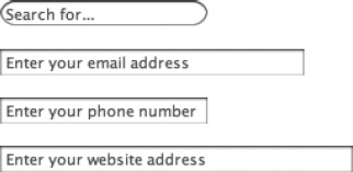
Figure 4-18. Four different text-based input fields (search, email, tel, and url) with placeholder text added
Making input read-only
The readonly attribute is available for preventing the content in an input control from being modified from its initial value. This can be useful if a form field value is updated via JavaScript without allowing the user to change the value, as may be done if the value was the result of a calculation in some way. This is a Boolean attribute, so you can simply add it to the element:
<input type="text" value="You can't delete this" readonly />
Autocomplete and autofocus
Autocomplete is a feature web browsers have for helping fill out the details on a form automatically. If someone is filling in their name, address, phone number, etc., repeatedly on different forms (when creating accounts on e-commerce sites, for instance), the autocomplete feature can store these values and then fill them into similar forms that are filled out in the future. This is a preference set in the web browser application. In coordination with this feature comes the autocomplete attribute, which allows the browser's autocomplete feature to be turned off for individual elements in a form or for the form as a whole. This might be done for fields that are receiving sensitive data or that will never be needed for another form. The attribute has a value of either on or off, as follows:
<form method="post" autocomplete="off">
This will turn autocomplete off for all the form controls in this example form.
The autofocus attribute is straightforward enough; it is a Boolean attribute, which when added to a form control makes the focus jump to the specified element immediately when the page loads. This means the user can start typing immediately without the need to click the first (or whichever) element beforehand. It is supported on button, input, keygen, select, and textarea. Adding this attribute is only really a good idea to do if there is no other input on the page that the user may want to click first.
Using data lists
The majority of the input types include an attribute called list5 that works with a new element—the datalist. This element defines a list of options that are available when entering data into a form control input. The datalist element itself is not shown on the web page but instead provides data to the list attribute of other elements in the form. As an example, let's take a snippet from a form for an online job application. There might be a text input field that requests the desired salary range, like so:
<p><input type="text" name="salary" placeholder="Enter desired salary" /></p>
The user could enter any amount, but it would help to provide a list of common values for the user to choose from. For example, the following values might be shown:
40,000+
60,000+
80,000+
100,000+
120,000+
These could be represented as a data list like so:
<datalist id="salaries">

     <option value="40,000+" />

     <option value="60,000+" />

     <option value="80,000+" />

     <option value="100,000+" />

     <option value="120,000+" />

</datalist>
The text input field then can make use of this list by setting its list attribute to the ID of the data list:
<p><input type="text" name="salary" placeholder="Enter desired salary" list="salaries" /></p>
The result is that when the user starts typing a value in the field, relevant matches in the data list will pop up, as shown in Figure 4-19.
__________
5 Excluded are password, checkbox, radio, file, hidden, image, button, submit, and reset.

Figure 4-19. Three panels showing how a data list can be associated with a text input field. The associated data list appears when placing focus in the text input field, and the list is narrowed down to matching options as letters are typed.
Other form controls
The input element is undoubtedly a large and versatile element, but it isn't the only form control. We've talked about button, but there is also select (and option) and textarea. These aren't new to HTML5, however. What has been added has been datalist, which was covered in the prior section; progress; meter (otherwise known as a gauge); output; and keygen. Let's take a look at each of the controls that haven't been covered yet, from old to new.
Menus
The select element is a container element, allowing any number of option and optgroup elements. It normally displays as a drop-down list, as shown in Figure 4-20.
Figure 4-20. A select menu
This element has two specific attributes not covered elsewhere, disabled and size.6 It also may use the multiple attribute (first brought up earlier in this chapter in the file input section). The Boolean disabled attribute can be added to disable (gray out) user interaction with the menu. The size and multiple attributes are related. If the Boolean multiple attribute is added, the select menu will normally display as a scrollable list box that permits multiple selections by the user, by holding down the Command key (Mac) or Control key (Windows) and clicking multiple items. The size attribute, which accepts a numerical value, determines how many rows of options are displayed. Figure 4-21 shows an example of a list menu.
__________
6 It also has the global attributes covered in Chapter 2 and the name, required, autofocus, and form attributes covered earlier in this chapter.
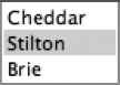
Figure 4-21. A list menu, created with a select element with a multiple attribute added
Each row within a select is contained within an option element, like so:
<select name="cheesemenu">

     <option>Cheddar</option>

     <option>Stilton</option>

     <option>Brie</option>

</select>
Note The datalist element shown earlier uses option elements, too, but formats them with self-closing tags and uses the value attribute for the list data.
The option element has four specific attributes: disabled, selected, value, and label. Like the disabled attribute on select, this is a Boolean attribute that prevents the user from selecting a particular item in the menu. The Boolean selected attribute is used to indicate to the user agent that a particular option should be selected initially; without it, the browser may display either nothing at all (just a blank select box) or the first option it encounters. For instance, to select the second option by default, selected is added like so:
<select name="cheesemenu">

     <option>Cheddar</option>

     <option selected>Stilton</option>

     <option>Brie</option>

</select>
Multiple option elements can have the selected attribute set, but only if the select has the multiple attribute added.
Adding different values
The value attribute is used to allow the submission of a value that differs from the content of a particular option. If the value attribute is omitted, then the content is used as the value. For example, given the following menu:
<select name="cheesemenu">

     <option value="ch01">Cheddar</option>

     <option value="ch02">Stilton</option>

     <option>Brie</option>

</select>
If the first or second option is selected, they will submit the values ch01 and ch02, respectively. If the third option is selected, it will use the content “Brie” for its value since there isn't a value attribute specified. This behavior is useful for situations where what you show the user differs from what you want to submit to the server. For example, if you were building a form for an e-commerce site, you might have a drop-down menu of products. You'd want to show the names of the products to the user, but a product number of some sort would be much easier for you to manage on the server side. So, along with adding each product name, you would add the product number as a value in each option in the list. The names would display to the user, but after selecting a product and submitting the form, the product number is what would be submitted to the server.
Note In practice, all the options should consistently use or not use the value attribute.
Adding shorthand labels
Finally, we come to the label attribute. This attribute is designed to accept a short value to use in lieu of displaying the content of an option. The label attribute can be used to provide an alternative display label, while still retaining the original content for the value passed to the server. The code for this looks like the following:
<select name="cheesemenu">

     <option>Cheddar</option>

     <option>Stilton</option>

     <option>Brie</option>

     <option label="All">All of the cheeses in all of the worlds</option>

</select>
Adding menu structure
To help provide structure to your menus, you can use the optgroup element to group similar option elements. So, instead of the following markup:
<select name="cheesemenu">

     <option>- - - English cheeses - - -</option>

     <option value="cheddar">Cheddar</option>

     <option value="stilton">Stilton</option>

     <option>- - -French cheeses- - -</option>

     <option value="brie">Brie</option>

</select>
you would use this:
<select name="cheesemenu">

     <optgroup label="English cheeses">

          <option value="cheddar">Cheddar</option>

          <option value="stilton">Stilton</option>

     </optgroup>

     <optgroup label="French cheeses">

          <option value="brie">Brie</option>

     </optgroup>

</select>
The preceding markup would render as shown in Figure 4-22.

Figure 4-22. A select menu organized with multiple optgroup elements
The optgroup element is a clear example of using the right tag for the right job. A benefit of using optgroup elements to divide your option elements is that the optgroup label cannot be selected, nor can its value be submitted as data, whereas in the former example the page author would either have to live with erroneous submissions or provide a client- or server-side validator to ensure such dividers had not been submitted. Additionally, the optgroup element has a Boolean disabled attribute, which can be used to disable whole groups of option elements, if required.
Text boxes
The textarea element is similar in some ways to the text input element, but it allows multiple lines of input rather than just one. It uses a pair of attributes, cols and rows, to control its size, and instead of using a value attribute to preset any textual content, it uses the content of the element itself. It's a container element, rather than a self-closing empty element.
The following code creates a textarea that is 20 columns wide and 5 rows high (a scrollbar will appear if the input exceeds the visible area).
<textarea cols="20" rows="5">Type your content here</textarea>
Even though the textarea element is a container for content, the previous code would be better formatted using the new placeholder attribute and leaving the content in the element empty, like so:
<textarea cols="20" rows="5" placeholder="Type your content here"></textarea>
Figure 4-23 shows the result.

Figure 4-23. A textarea 20 columns wide and 5 rows high, with placeholder text added
The textarea element includes an attribute not mentioned elsewhere: wrap. This attribute is used to indicate whether line breaks should be added to the submitted text area data at the points where the text wraps in the text box's available area. This attribute can have the value hard or soft. The first, hard, means that newline characters are added to the submitted form data at the points where the submitted text wrapped to a new line in the text area. After submitting the form in this state, you will see the URL-encoded newline character in the URL, which looks like %0D%0A (if using the GET method). On the other hand, a soft value means that while the text can wrap on-screen, the submitted data will be sent without any line breaks indicating where the text wrapped in the text area. This is the default behavior.
A text area control may also use the maxlength attribute to limit the amount of characters that can be input; this works like how the maxlength attribute works on a single-line text input control, and the same cautions apply (that is, double-check the length on the server-side if the data length is of critical importance).
Displaying progress
This is a new element in the HTML5 specification and it is pretty neat! Fundamentally, it's simple: show how far into a multistage process someone has gotten. For instance, a form might be spread over multiple pages, and this element is for indicating which page (out of the total number of pages) the user was on. What is this element called? progress! It works like this: there are two attributes, max and value. The max attribute is the maximum number of steps in a task, and value is the current step that the user is on.
Let's look at an example:
<progress max="3" value="1">Step 1 of 3</progress>
This defines being at the first of three steps. In a browser that supports this element, the display may look like Figure 4-24.
Figure 4-24. The progress element as rendered in a supporting web browser (Opera in this case)
Note For those browser's that don't support this element, it is important to put some meaningful text between the element's tags, since this will get displayed in cases where the progress element is not supported (Figure 4-25).
Figure 4-25. In a web browser that does not support the progress element, the text content between the element's tags gets displayed instead.
Displaying a gauge
The meter element (Figure 4-26) may look identical to the progress element (Figure 4-26), but there is an important schematic difference. The progress element is for the display of the progression through steps in a task, while the meter element is for the display of a gauge—that is, a specific value within a known range. It could be used to show how much hard drive space is remaining or how much inventory is left.
Figure 4-26. The meter element as it appears in Google Chrome
The min and max attributes set the minimum and maximum ends of the range, while the value attribute sets where in the range the gauge is. The element also has a good number of attributes that are used for schematic purposes to ascertain the meaning behind where a particular value is in a set range. The optimum, low, and high attributes allow segmenting of the range into regions. This can be used by the web browser to display the gauge differently depending on where the value is in the range, as is shown in Figure 4-27.

Figure 4-27. A meter element reducing in value through the high and low ranges
The code for the preceding meters is as follows:
<p>

<meter min="0" low="20" high="80" optimum="90" max="100" value="100">Space left: </meter> 100%

</p>


<p>

<meter min="0" low="20" high="80" optimum="90" max="100" value="90">Space left: </meter> 90%
</p>


<p>

<meter min="0" low="20" high="80" optimum="90" max="100" value="80">Space left: </meter> 80%

</p>


<p>

<meter min="0" low="20" high="80" optimum="90" max="100" value="70">Space left: </meter> 70%

</p>


<p>

<meter min="0" low="20" high="80" optimum="90" max="100" value="60">Space left: </meter> 60%

</p>


<p>

<meter min="0" low="20" high="80" optimum="90" max="100" value="50">Space left: </meter> 50%

</p>


<p>

<meter min="0" low="20" high="80" optimum="90" max="100" value="40">Space left: </meter> 40%

</p>


<p>

<meter min="0" low="20" high="80" optimum="90" max="100" value="30">Space left: </meter> 30%

</p>


<p>

<meter min="0" low="20" high="80" optimum="90" max="100" value="20">Space left: </meter> 20%

</p>


<p>

<meter min="0" low="20" high="80" optimum="90" max="100" value="10">Space left: </meter> 10%

</p>


<p>

<meter min="0" low="20" high="80" optimum="90" max="100" value="0">Space left: </meter> 0%

</p>
Notice that, like with the progress element, some descriptive textual content is placed between the meter element's tags. This content will display in web browsers that don't support the element.
Displaying calculated output
The output element is for displaying the result of a calculation. It is very much a semantic element in that the output looks like plain text on the page.
In addition to the global attributes and form and name attributes (both discussed earlier), the output element has one other attribute: for. This attribute should contain a list of IDs of the elements that went into the calculation that this output element is displaying:
<input id="inputa" type="number"> +

<input id="inputb" type="number"> =

<output id="resultfld" name="result" for="inputa inputb"></output>
A typical use case would be the display of the result of a calculation generated by a script. The following script would update the value of the output element every time the two number inputs are changed:
var inputa;

var inputb;

var resultfld;

function init(){

     inputa = document.getElementById("inputa");

     inputb = document.getElementById("inputb");

     resultfld = document.getElementById("resultfld");

     inputa.oninput = updateResult;

     inputb.oninput = updateResult;

}

function updateResult(){

     resultfld.value = Number(inputa.value)+Number(inputb.value);

}

window.onload = init;
Cryptographic key generator
The keygen element is used to generate a private and public cryptographic key, the public side of which is sent to the server at form submittal. The element itself is rather cryptic-looking because it is by default a drop-down list of numbers and nothing more. These numbers are the bit size of the keys used in the encryption algorithm. Larger numbers will result in more difficult-to-crack keys. The expected use case for this element would be that the server would generate a certificate that is sent back to the client to establish a trusted secure communication between the two. Cryptography for encrypted communication between a web page and web server is beyond the scope of this book, and this element is not one you are going to use unless you know something about cryptography already.7 Even if you do know something about cryptography, don't necessarily get too attached to this element in its current form. There is the distinct possibility that it will change course in the future (the HTML specification is still in draft status after all). For instance, representatives from Microsoft have stated they have no intention of supporting keygen (keygen was original developed by Internet Explorer competitor Netscape, so Microsoft approached implementing cryptography from a different direction). The current approach toward the element's standardization makes the actual algorithms used optional so that the element itself can be supported (for backward compatibility), but the cryptographic components may be omitted. Whether Microsoft implements the element under these terms is yet to be seen. Unless you have no other alternative, you're best to leave keygen alone for the moment until the dust settles.
Note This highlights an all too common problem with standardizing HTML, because each browser manufacturer may have a vested interest in one implementation over another, leading to either multiple implementations of the same functionality or functionality that is not standardized because an agreement can't be reached. This kind of disagreement is what led to video codecs not being standardized in the video element, which, as you'll see in Chapter 5, means more than one video file needs to be supplied to be compatible with all major browsers.
__________
7 IBM publishes a primer on public key encryption that you may want to take a look at to familiarize yourself with the concepts: www.ibm.com/developerworks/web/library/s-pki.html.
Adding structure with fieldsets and labels
The fieldset element allows web authors to divide form controls into thematically linked sections, making it easier for users to work through the form while also enhancing accessibility for assistive devices. Most browsers will display a fieldset with a simple border. For instance, the following markup displays the results shown in Figure 4-28:
<fieldset>

     <p>

     <select name="cheesemenu">

          <option>Cheddar</option>

          <option>Stilton</option>

          <option>Brie</option>

     </select>

     </p><p>

     <button type="submit">Submit!</button>

     </p>

</fieldset>

Figure 4-28. An example of the usual rendering of a fieldset
To identify each fieldset, you must use the legend element:
<fieldset>

     <legend>Cheeses of the world</legend>

     <p>

     <select name="cheesemenu">

          <option>Cheddar</option>

          <option>Stilton</option>

          <option>Brie</option>

     </select>

     </p><p>

     <button type="submit">Submit!</button>

     </p>

</fieldset>
The form will now look something like Figure 4-29.

Figure 4-29. A fieldset with a legend
The last form element to mention, label, also increases both usability and accessibility. This element is used to form an association between a textual label and a form control. When the label and form control are associated with each other, either can be clicked to interact with the control. For example, a label associated with a check box means that the label can be clicked, which will then select the box. There are two ways of creating clickable labels like this in the markup. The first—and preferable—way is by enclosing the form control within a label. Here is an example:
<label>Favorite cheese: <input type="text" name="ch" /></label>
In the preceding example, clicking the “Favorite cheese:" text in the label causes the nested input to gain focus, which in this case means the user could start typing in the text field. An alternative solution is to use the for attribute:
<label for="favcheese">Favorite cheese: </label> <input type="text" id="favcheese" name="ch" />
The advantage of using the for attribute is that the form control does not need to appear inside the label. The value in the for attribute is the ID of the associated form control, which means the two are associated, even if they are located in separate spots in the markup. This is potentially useful; however, because of this manual pairing of attributes, using the for attribute can be laborious. I don't recommend using it unless you absolutely must. A use case is in situations where a form appears inside a table and the labels appear in one column and the form controls in another column.
Note Remember that tables are used for arranging tabular data in rows and columns only and should not be used for layout; this includes using a table for the sole purpose of aesthetically laying out a form! Use CSS instead for this purpose.
Putting it all together
Remember the City Press? The fictional newspaper website from the previous chapter? Let's look at a form for the site for gathering news tips so we can see all these form controls coming together.
Page 1, gathering user details
The form is broken into two pages, the first for registering the tipster on the site and the second for recording the new tip they have. The form's first page looks like Figure 4-30.
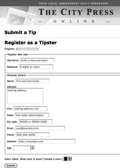
Figure 4-30. The first form on the City Press “submit a tip” form
To create this form, first we need a form element. We'll set two attributes: action, which will go to our second form page, and method. Which method do we need? GET or POST? Well, the users will be submitting data that will likely end up in a database, so it's a submission that will actively be modifying data. So, we use POST. Also, it should be a big hint to use POST if a password input field appears on the form, which it does. OK, this is our starting form:
Next, although the form is spread across two pages, there are three steps to progress through the form, since there will be a confirmation page after the data is submitted, so we should add a progress element to show that:
<form action="form2.php" method="post">

     <p>Progress: <progress value="0" max="2">1/3</progress></p>

</form>
Notice the value attribute is set to zero and the max is set to two, but the alternative content text is “1/3.” This is because we will have three steps to complete: the first form, the second form, and a confirmation page after the second form is submitted. So the alternative text will go 1/3, 2/3, 3/3, while the value attribute will go 0, 1, 2.
Next we see that we need the user to create a username and password (presumably they would be able to log in elsewhere after going through this process), which we can separate into its own fieldset. A legend is used to add a title to the fieldset, and the text and password input fields are set to be required. Also, placeholder text is added to both. A regex pattern is added to the password field so that it will only accept passwords that are six characters or longer.
…

<fieldset>

     <legend>Register New User</legend>

     <p><label>Username: <input type="text" name="username" placeholder="enter a new username"

     required/></label></p>

     <p><label>Password: <input type="password" name="password" placeholder="6 digits or more"

     pattern="^.{6,}" required/></label></p>

</fieldset>

…
Below this we add another fieldset for the personal details area. The first field is a generic text input field for gathering the tipster's name. Placeholder text is added that hints as to the format of the information to enter:
…

<fieldset>

     <legend>Personal Details</legend>

     <p><label>Name: <input type="text" name="name" placeholder="first and last name"

     /></label></p>

…
Following the name input is a text area for gathering the tipster's mailing address followed by a single-line text input for gathering the city name. For the address input, we could use the label's for attribute in order to place a line break element between the label and the text area. The for attribute wouldn't be required in this circumstance, but you may find this to be a cleaner approach because it prevents including extra HTML elements inside the label's tags:
…

     <p><label for="address">Address:</label><br />

     <textarea id="address" name="address" cols="20" rows="5" placeholder="mailing

     address"></textarea></p>

     <p><label>City: <input type="text" name="city" placeholder="mailing address city"

     /></label></p>

…
Next is the state field. One option here is to create a drop-down list using the select element, with all 50 states filled in. This would likely be the best course to take when we were sure that only people in the United States would be filling out this form. But let's say we're not certain the users will necessarily be coming from the United States. In that case, an alternative is to have a regular text input field but set its list attribute to a data list containing the state names (or abbreviations). Just below the opening form element, a new datalist element is added for this purpose:
<form action="form2.php" method="post">

<datalist id="statelist">

     <option value="AL" />

     <option value="AK" />

     <option value="AZ" />

     <option value="AR" />

     <option value="CA" />

     <option value="CO" />

     <option value="DE" />

…
Then back in the personal details fieldset, the text input for state is added. Also added is the ZIP code input field:
…

     <p><label>State: <input type="text" name="states" list="statelist" placeholder="two-

     letter abbreviation" /></label></p>

     <p><label>Zip code: <input type="text" name="name"

     placeholder="00000 or 00000-0000" /></label></p>

…
Next is the only required field in this set, the e-mail address field. The user is reminded by the placeholder text to enter a valid e-mail address, but automatic validation of the form will pick up any inconsistencies as well:
…

     <p><label>Email: <input type="email" name="name" placeholder="[email protected]"

required/></label></p>

…
Next the optional telephone and website input fields are added:
…

     <p><label>Phone: <input type="tel" placeholder="000-000-0000" /></label></p>

     <p><label>Website: <input type="url" placeholder="http://example.com" /></label></p>

…
Last in this fieldset, the optional age field is added as a number input field. The min and max attributes are set to a realistic age range, with some padding on the upper end. The closing fieldset tag ends this group:
Next, a required color picker input is used as a simple check against automated spam bots, which presumably wouldn't be able to pick the correct color for “snow.” Sadly, the pattern attribute isn't available on the color input type, so this would need to be checked with JavaScript on the server side. We'll assume it's being checked on the server:
…

     <p><label>Spam check. What color is snow? (choose a color)

     <input type="color" name="captcha" required/></label></p>

…
Lastly, a submit button is added just before the closing form tag, which completes this form:
…

     <button type="submit" name="tipform1">Submit</button>

</form>
Page 2, gathering commentary
After filling in the form and clicking submit, the user ends up on page 2 with the second form, which looks like Figure 4-31.

Figure 4-31. The second form on the City Press “submit a tip” form
Like the first page, a form element is created with an action and method attribute. Also, because there is a file input field on the form, we set the enctype attribute to multipart/form-data so that binary data can be sent. Next, a progress element is added and incremented over the one that appeared on the first form:
<form action="complete.php" method="post" enctype="multipart/form-data">

     <p>Progress: <progress value="1" max="2">2/3</progress></p>

</form>
Next, a fieldset and legend is created for the tip details area. A date/time input field is added for the local date and time of the news incident. A textarea element is used for gathering the tip details, and a file input is used for allowing a supporting file to be attached, if necessary:
…

<fieldset>

     <legend>Enter Tip Details</legend>

     <p><label>Date/Time of incident: <input type="datetime-local" /></label></p>

     <p><label>Tip details: <textarea></textarea></label></p>

     <p><label>Attach supporting file:  <input type="file" /></label></p>

…
Next, a range input type is added as an “importance” slider for the tip. The fieldset is then closed. Next to the slider is a read-only text input field that includes placeholder text to indicate that a higher value on the slider means “more urgent”:
…

     <p><label>Urgency: <input type="range" name="range" id="range" min="1" max="10" /><input

id="rvalue" placeholder="more urgent" readonly /></label>

</fieldset>

…
Using JavaScript, we'll make the value in the read-only text input update dynamically when the slider is moved. We'll set the placeholder text to indicate that a high number on the slider means “most urgent” and update the text input to the value of the slider when the slider is moved. The JavaScript is added in a script element in the head of the document:
…

<script type="text/javascript">

     var range;

     var rvalue;


     function init(){

          range = document.getElementById("range");

          rvalue = document.getElementById("rvalue");

          rvalue.placeholder = "10 is most urgent";

          range.onchange = update;

     }


     function update(){

          rvalue.value = range.value;

     }


     window.onload = init;

</script>

…
Note Remember that in a production environment you would want to move your script to an external file because this provides a better organizational separation of your markup and script.
A new fieldset is created for “Communication Preferences” regarding the tip. A check box is provided for indicating whether the user may be contacted. If so, then another fieldset is nested inside of the first, where two radio buttons allow the user to choose their preferred contact method. By default “Email” is selected (with the checked attribute):
…

<fieldset>

     <legend>Communication Preferences</legend>

     <p><label>May we contact you about this tip? <input type="checkbox" /></label></p>

     <fieldset>

          <legend>Preferred contact method:</legend>

          <p><label> Phone: <input type="radio" name="contactpref" /></label></p>

          <p><label> Email: <input type="radio" name="contactpref" checked /></label></p>

     </fieldset>

</fieldset>

…
Next, a meter gives some indication of how well the paper is staffed at the moment, with six out of ten staff in the office. We won't speculate how often this meter gets updated, but it is an appropriate element to use here as the number of staff is a known quantity.
Finally, like the last form, a submit button appears at the end, and the form is closed:
…

     <p><label>Staff in the office

     <meter min="0" value="6" low="2" optimal="9" high="8" max="10" >6/10</meter>

     </label></p>

     <button type="submit" name="tipform2">Submit</button>

</form>
Page 3, providing confirmation
Submitting the second form brings the user to the acknowledgment page, where the progress element is updated to its final position, and a short thank-you message is given:
<form>

     <p>Progress: <progress value="2" max="2">2/2</progress></p>

     <p>The tip was successfully received. Thank you!</p>

</form>
The resulting page looks like Figure 4-32.

Figure 4-32. The third and final acknowledgment page
Form usability
It is easy to create a form, but it is much harder to create a really good form. The City Press tip form shows all the options and input variables that can be taken into account when creating even a simple form. Forms really do become more of an application than a web page the more complex they get, so you need to consider usability seriously. Even in the City Press tip form, more could be added to make it even more usable. For instance, the title attribute could be added to all input fields to give a hint to what those fields are expecting when the user hovers their cursor over them (or uses a screen reader). It gets more serious than that, though; if your form is at the point at which the general public starts giving you money, you need to test your form rigorously, observe people using it and record their reactions (even if your audience is just a few colleagues from the other side of the office), and make sure it works as well as it possibly can.
Exhaustive coverage of the subject of form usability is well beyond the scope of this book, but the guidelines outlined in the following sections should be enough to help you avoid some common form usability problems. Beyond the information you'll find in this chapter, I recommend reading the classic Don't Make Me Think: A Common Sense Approach to Web Usability by Steve Krug (New Riders Press, 2000).
Use the right input for the right job
So, you know about every input type there is, but which one is appropriate to use in a given situation? Some of these are obvious—a file input has only one purpose, and no other type of input can be used in its place—but what about, for instance, check boxes vs. radio buttons? A good rule of thumb is that if you have a list of two or more options and the user must select one and only one of them, use radio buttons. Selecting one radio button should then deselect any other radio button that is part of the same named group. But if the list contains many options to select from, consider using a select menu instead. You'll retain the inability to select more than one option, and you'll save some space (at the expense of “discoverability”).
Check boxes, on the other hand, are used when there are several choices to make, and users can leave them all blank or select as many as they like. Checking one check box does not deselect any others within the group. The menu equivalent of a series of check boxes is a select menu with the multiple attribute present, but check boxes are generally easier to use because they do not require the user to understand what keyboard/mouse combination to use to select/deselect the options, so you may want to avoid multiple-select lists where possible.
You should also use a check box when there is a single option that users can switch on or off, such as for agreeing to sign up for a newsletter. You would not use a radio button here because a radio button can only be deselected by selecting another.
Remember also to use labels, fieldsets, and legends to aid in both usability and accessibility.
Keep it short and simple
Collect only the information you need and no more than that. Do you really need to know if I'm a Mr. or a Ms.? Do you really need my fax number? My occupation? My annual salary? Question the presence of every field you have in your form, and if it's a compulsory field, question again whether it needs to be. Your marketers may relish the opportunity to collect reams of personal data about your site visitors, but the longer your form is and the more irrelevant users start perceiving it to be, the higher the risk that they'll abandon it.
Don't make me think, don't make me work, and don't try to trick me
Make your form as easy to complete as possible. If at any point a user has to pause for a few seconds to try to work out what's gone wrong or what you mean, then that's a few more seconds when he might just think “Oh, forget it” and go off to make a sandwich. So, for instance, if your form contains compulsory fields, consider styling these fields more prominently (and, of course, add the required attribute so form validation will kick in). Make it clear from the beginning the fields that must be filled in. If this is the majority of the fields, consider adding the text “Optional” next to the optional fields.
If you need data in a certain format, don't rely on users entering it in that format—this is what your form handler on the server is supposed to deal with. For instance, if a user needs to enter a credit card number, let her fill it in as 1234 5678 9012 3456 if she wants (that's how it's formatted on her credit card), 1234567890123456, or 1234-5678-9012-3456—whatever works for the user, within reason. Deft use of the pattern attribute can allow flexibility in form input but still validate critical information and essentially formatting (such as checking that the correct number of digits was entered). Remember, computers are supposed to save the user time. Provide a guide to a preferred format if you like, but allow for the possibility of alternate entries.
If the user has made an error that can't be solved by server-side code, then let him know with a clear, meaningful, and appropriate error message—the sooner, the better. Use built-in form validation and provide JavaScript and/or server-generated validation and error messages as a backup. The more complex your form, the more things that can go wrong, so test, test, test, and make sure there are no meaningless error messages.
Remember that the Internet is global
If your form is not specific to any one country, try not to fill it with references to “states” and “ZIP codes,” and certainly don't make those fields compulsory if you do include them. Also relating to the previous point, don't try to restrict the format of the user's data unless you are absolutely certain of its format.
Note An upcoming attribute that is relevant to the internationalization of your form is the dirname attribute, which is specified on the textarea, text input, and search input elements. Remember how form data is submitted as key/value pairs? This attribute creates a key that is sent to the server, which has the directionality of the text entered into the form control as its value. This will appear as either ltr (left to right) or rtl (right to left). Don't expect this attribute to work today, though, because it has yet to be implemented by major browsers. More information about it and a code example is available at http://dev.w3.org/html5/spec/common-input-element-attributes.html#attr-input-dirname.
Provide a fallback when needed
A lot of material in this chapter is quite new and may not work in all browsers. Thankfully, input types will usually degrade to regular text fields when a particular input type is not supported. But this can still have serious consequences for the usability of your form if you designed it with all the rich controls that are in the HTML5 specification but didn't consider what it would look like in an older browser. Investigate projects like Modernizr (http://modernizr.com), jQueryUI (http://jqueryui.com), and webforms2 (http://code.google.com/p/webforms2/) because these projects will help you with implementing “polyfills” into your site, meaning they provide (through JavaScript) functionality that you would expect to be natively available in the browser.
Summary
It is fairly easy to create forms—just insert a couple of input tags, add a bit of text, slap a submit button on the end, and then you get to go home early—but it is a lot harder to create forms that are usable, accessible, and logical. Think about the meaning of your form content. What schematic elements make sense for use as input? These are not things that should be left to the last minute. Your form may be the most important part of your website, particularly if it's a form that allows people to enter their credit card details, so it should be a model of simplicity and ease of use. It should not upset people, anger them, or put them off—it seems odd to have to say that, but I've seen some terrible forms in my time that did just that. Lastly, be prepared for the reality that to create the ultimate usable form, you'll invariably have to turn to JavaScript or server-side code (or both) to help you provide users with the expected features of modern web forms.