
C H A P T E R 6
CSS3
In this chapter, we'll diverge for the most part from HTML into a totally different language and specification. It's time for Cascading Style Sheets (CSS). CSS may not be HTML, but HTML is not much to look at without CSS, so mastery of one necessitates some degree of mastery of the other.
Since this book is about HTML, we'll spend most of our time in this chapter examining the relationship between HTML and CSS and how the two interact, but we'll explore purely CSS topics as well. The CSS specification is currently in its third iteration, so we'll run through the necessary core CSS concepts you should know and then dive into the details of what is new. There's a bit of technical jargon to cover, but in doing so, we'll set the stage for our exploration of the possibilities of page design. From a usability standpoint, these aspects can be just as important as the semantics of your markup.
The present state: CSS2.1
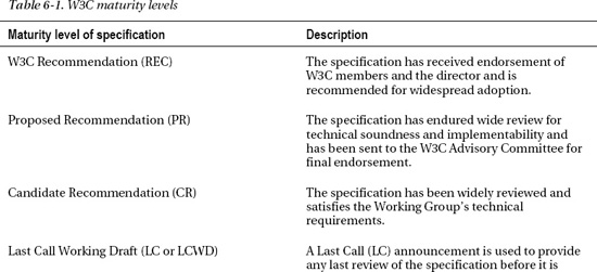
CSS is broken into levels, which are versions of the specification analogous to the W3C versions of HTML (HTML 3.2, HTML 4.01, HTML5, and so on). The current stable and complete level is CSS level 2 revision 1, otherwise known as CSS2.1. Documents developed by the W3C go through stages of review that are used to identify the stability of a particular specification (Table 6-1).

It often takes years to develop a specification to full maturity, and a particular document might waffle back and forth between different levels of maturity as technological conditions change and new working drafts emerge. For example, CSS2 was a published recommendation in 1998; CSS2.1 (remember, a revision on CSS2) took more than a decade to become a W3C Recommendation but finally did so on June 6, 2011! Obviously, this does not mean we had to wait until June 2011 to use features in CSS2.1, but it does mean that the specification potentially could change while it was under review. For comparison, consider this: the W3C's version of HTML5 is currently in Working Draft status! It's not unreasonable to expect that its progression to Recommendation status could take a decade or more. However, as this book has shown, there is so much available for use in HTML5 today. Its availability is not a decade away, but the specification (and subsequent implementations) will evolve over that period. You have also seen features (the track element, for instance) that are yet to be implemented by any major web browser. If the specification were at W3C Recommendation status, unimplemented features would not be found (WHATWG's HTML versionless specification takes a different view to this). So, now that you have an understanding of the state of CSS in the broader picture, what is the state of the next level of CSS, CSS level 3?
CSS3 modules
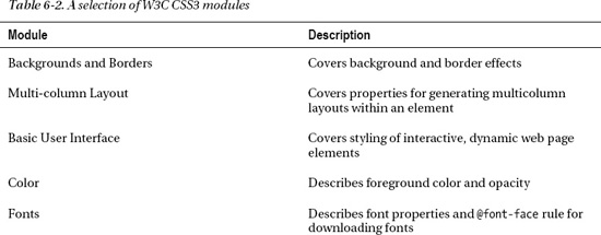
CSS3 is defined differently than its predecessors. Instead of one monster document covering the entire specification, CSS3 is broken into dozens of modules that are in various states of maturity. This allows self-contained features of CSS to reach maturity quicker and not be held back by being part of a larger draft document. Table 6-2 lists a selection of modules from the W3C. This gives you a taste of some of the features brought into CSS3. You can find the full list of modules at www.w3.org/Style/CSS/current-work.

Using CSS
Now that you have an overview of what CSS3 is from an organizational standpoint, let's run through its proper use. This may well be familiar to you, and if so, feel free to skip ahead to the discussion of specific modules in CSS3, but do at least skim over this section because there are new aspects to using CSS that have been introduced in CSS3.
Attaching a style sheet
Before using CSS with HTML, you need to attach a style sheet to the page so that the CSS styles can access the HTML they are associated with. There are a couple ways of doing this, but the way you should approach it by using the link element. link first came up in Chapter 2, but we did not discuss using it to link style sheets in depth. As you may recall, this element appears in the head section of the page, and the rel attribute is used to indicate the linked document is a style sheet:
<!DOCTYPE html>

<html>

          <head>

                    <meta charset="utf-8" />

                    <title>HTML5 and CSS together</title>

                    <link rel="stylesheet" href="css/main.css" type="text/css" />

          </head>

          <body>

                    <p>CSS rules!</p>

          </body>

</html>
 Note As noted in Chapter 2, you can omit the
 type attribute when linking to a style sheet, as that is what the linked document will be presumed to be by default.
The title attribute has special significance to the link element within the context of style sheets. This attribute is used for differentiating the different possible kinds of style sheets that are linked. You may be asking yourself, “What different kinds of style sheets?” Don't worry, it's all CSS; there isn't another language to learn! The kinds of style sheets determine the priority a particular style sheet has over other style sheets linked on the page. There are three kinds that can be added to a document:
- Persistent: Always applied to the document
- Preferred: Applied to the document unless an alternative style sheet is applied
- Alternative: Alternative to the preferred or persistent style sheet
The main implementation difference between persistent, preferred, and alternative style sheets is that persistent style sheets do not have a title attribute, while preferred and alternative style sheets do.
All style sheets that are persistent will be applied to the HTML document, regardless of the number that are attached. This is the most common way that style sheets are applied. The style sheet in the preceding code snippet is a persistent style sheet. In contrast, not all preferred and alternate style sheets may be applied. If multiple preferred and alternate style sheets are linked to an HTML document, only one will be selected and used on the page. An alternative style sheet works just like a preferred style sheet, with the additional meaning that it can be used as a replacement for the preferred style sheet specified on the page. Alternative style sheets may be selected by the user for preferential or accessibility reasons.
The following shows a page with a persistent, preferred, and two alternative style sheets attached:
…

<head>

     <meta charset="utf-8" />

     <title>HTML5 and CSS together</title>


     <link rel="stylesheet" href="css/main.css" type="text/css" />

     <link rel="stylesheet" href="css/colors-generic.css" type="text/css" title="Generic color styles" />

     <link rel="alternative stylesheet" href="css/colors-protanopia.css" type="text/css" title="Protanopia adjusted color styles" />

     <link rel="alternative stylesheet" href="css/colors-deuteranopia.css" type="text/css" title="Deuteranopia adjusted color styles" />

       </head>

…
In this example page, main.css is the persistent style sheet and is used to set all the styles for the page, across all situations. colors-generic.css is a preferred style sheet that adds the color-related styles to the page. The two alternative style sheets are given as a choice for users with color blindness in the red-green spectrum: colors-protanopia.css for protanopia and colors-deuteranopia.css for deuteranopia. Presumably, activating these styles would alter the page colors to compensate for areas where color blindness may make the content difficult to view. How these alternative style sheets become available depends on the user agent in use, but some browsers offer a menu option where the user can select alternative styles (Figure 6-1).
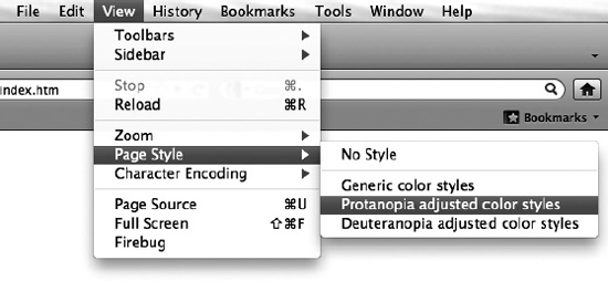
Figure 6-1. In Firefox, preferred and alternative style sheets can be selected under the View menu.
You can also set the preferred style sheet using the meta element. The http-equiv="Default-Style" pragma directive may be used to set the preferred style sheet by setting the content attribute to the title of one of the style sheets. For example, the following would set the style sheet with the title “Blue Theme” as the default style sheet:
…

<head>

     <meta charset="utf-8" />

     <meta http-equiv="Default-Style" content="Blue Theme" />

     <title>HTML5 and CSS together</title>


     <link rel="stylesheet" href="css/red.css"

     type="text/css" title="Red Theme" />

     <link rel="alternative stylesheet" href="css/green.css"

     type="text/css" title="Green Theme" />

     <link rel="alternative stylesheet" href="css/blue.css"

     type="text/css" title="Blue Theme" />

</head>

…
Using the meta element for setting the default style sheet offers a central point at which the preferred styles on the page can be selected. This opens the possibility of changing one value dynamically using a server-side script, for instance, based on user interaction or other variables.
CSS style rules
After attaching a style sheet to a page, you will need to access the HTML elements on the page and style them. A style rule is code you will create to style parts of the HTML content. A style rule begins with a selector. Selectors will be covered in more detail in the next section, but in short, they are a set of rules for selecting the different components of an HTML page. The selector is followed by curly brackets ({ and }) that enclose all the styling information for a particular style rule. Between the brackets are pairs of CSS properties and values, which taken together are called declarations. To provide various styling effects, a CSS style rule can have one or more declarations, each terminated with a semicolon. They can, and usually do, span multiple lines. Figure 6-2 summarizes the entire style rule syntax and terminology.

Figure 6-2. The terminology and syntax of a CSS style rule
In the example in Figure 6-2, the selector is p, which accesses all the paragraph elements (p) on the page; the style declarations then set their background color to red and the text color to yellow (this is a simple example; we'll get into proper color formatting later).
A CAVEAT: BROWSER CSS3 PROPERTY PREFIXES
The prefixed versions of the property could then be removed over time as the property is standardized and web browser vendors become compliant with the final specification.
Note If you encounter a CSS property in this chapter that does not work in a browser you test it in, try adding the appropriate browser prefix and see whether that is the issue.
Essential CSS selector syntax
Selectors are the bridge between your CSS style declarations and the HTML content they need to affect. The majority of selectors you will run into will likely fall into one of three categories: type selectors, ID selectors, and class selectors. There are other categories that we'll get to in due course, but these three are the most common.
Type selectors allow any element to be referenced by its HTML element type name, such as p, article, em, li, blockquote, and so forth. ID selectors allow a specific element to be referenced that has its global id attribute set to some value. Class selectors work the same as ID selectors, except they reference all elements with their class attribute set to some value. These three categories of selectors are termed simple selectors and are summarized in Table 6-3.

As you can see in Table 6-3, the ID selector prefixes the value of the ID with a hash sign. Another example might look like this:
#company-name { font-weight:bold; }
The preceding code would access and bold the text content of an element in the HTML with the id attribute of company-name, such as “The City Press” text in this bit of HTML:
<h1 id="company-name">The City Press</h1>
The class selector works in a similar way, except that a period is used to reference the class attribute value. The following code would add a border and padding around HTML elements that had their class attribute set to alert:
.alert { border:1px solid red; padding:5px; display:inline-block; }
Note You might not be familiar with the code display:inline-block. It has to do will how the styled element is laid out on the page. Exactly what that means will be explained later in the “CSS Box Model” section of this chapter.
The preceding selector might reference the following HTML:
<p class="alert">Warning!</p>
An advantage with classes is that—unlike IDs—a single element can have more than one class applied to it, so styles can be layered on top of each other inside a single element. For example, the following uses the .alert rule from earlier, plus an additional .critical rule:
<p class="alert">

          <span class="critical">Warning!</span> do not feed the kittens, they are

          <span class="alert critical">dangerous</span>

</p>
The additional style rule uppercases the text and colors it red:
.critical { text-transform:uppercase; color:red; }
Taken altogether, this creates an alert box surrounding some text, some of which is merely critical to read and some of which is a critically important alert. The final styled text looks like Figure 6-3.
Figure 6-3. Class style rules can be “doubled up” on each other by setting more than one styled class attribute value on an element.
Combining selectors
CSS is very flexible in how selectors are defined, and there are plenty of opportunities to save typing if you are careful with your HTML and CSS structures. For example, if a group of selectors have the same CSS declarations they are applying, these style rules can be combined into a comma-separated list, called a selector list, which will assign a set of the CSS declarations to all the selectors in the list. For example, the following would change the color of all headers on the page to red:
h1,h2,h3,h4,h5,h6 { color:red; }
This just saves space and the time of having to type the same CSS declarations over and over; the selectors are still separate entities. It is possible, however, to combine selectors into aggregate selectors, called compound selectors, which can be used to match specific content in a web page's structure. Consider a code snippet from earlier:
<span class="alert critical">dangerous</span>
This element has two classes applied so can be styled using three different selectors:
…

span.alert { }

span.critical { }

span.alert.critical { }

…
The first two class selectors simply pick out one or the other class—they will reference any span element that has one or the other of the two class values assigned to it. The third chains the two class values together to create a compound selector that will only reference span elements that have both classes applied.
If the type selector is left off (as was done in earlier examples), all elements will be searched for a match. This is equivalent to using the * selector (called the universal selector) in combination with another selector (in this case a class selector):
.critical { color:red; }     /* match all elements for class 'critical' */

*.critical { color:red; }    /* match all elements for class 'critical' */

p.critical { color:red; }    /* match paragraph elements for class 'critical' */
Note You are likely familiar with this, but if CSS is not something you spend much time with perhaps you don't recognize the purpose of the /* text */ part in the preceding code; that is how you would write a comment in CSS that is ignored by the web browser.
Take a close look at that last line of code, p.critical…; that is two simple selectors placed together, that of a type selector and a class selector. This is where compound selectors get their name, because they are simple selectors that have been compounded together. It's important to note that they always begin with a type selector, a universal selector, or no selector (in which case a universal selector is implied). After the type selector, they can have a long chain of additional simple selectors. Here's an example:
em.alert.critical.item { }
This selector would only reference an HTML element that was of the correct type and had the correct classes applied, such as the following:
<em class="alert critical item">Rocket fuel</em>
Note More than two kinds of selectors can be combined; for example, em.alert.critical#item is a valid compound selector, but in practice this is unnecessarily verbose because there should be only one element with the ID of item on the page, so the inclusion of the class selectors (or even the type selector) would not be necessary.
Compound selectors are powerful, but there are other syntactic options available to match a variety of HTML structures. Let's move on to complex selectors!
Combinators and complex selectors
Table 6-4 lists a set of syntax rules called combinators, which determine how the relationship between different HTML elements can be described for the purposes of referencing them with a selector.

Complex selectors combine one or more compound selectors together using a combinator. Because they are composed of compound selectors, they will always use at least a type selector on each side of the combinator. Although both sides of the combinator will include a type selector, the rest of the compound selector can contain any kind of selector chained on to the end. It can even contain mixes of combinators and selectors. For example, imagine a website that allowed guest writers to author content on the site. A section might be created and given a class that designated it as containing guest content:
<body>

          <header>
                   <h1>Page header</h1>

                   <h2>Subtitle</h2>

          </header>

          <section class="guest">

                   <h1>Guest content</h1>

                   <div>

                            <article>

                                <h1>Guest article</h1>

                                <footer>Article author</footer>

                            </article>

                   </div>

                   <footer>Section footer</footer>

          </section>

          <footer>Page footer</footer>

</body>
A complex selector might be used to pick out the footer in an article that was the top guest section on the page, for the purpose of emphasizing the author, or what have you:
header + section.guest article > footer { border:1px solid red; }
Reading right to left, this would add a red border to a footer that was directly contained in an article that was a descendant of a section that has the class guest set. This section must be directly adjacent to a header. Since the header should appear at the top of the page, this would pick out the top section only (if there were multiple sections on the page). To see this demonstrated, create an exact duplicate of the section in the prior code block and paste it below the existing one. If you apply the styles, you will see that only the footer inside the first section's article will have the style applied. To select the footer in any article, the adjacent sibling combinator (+) could be changed to the new general sibling combinator (~), which would match any section with the class guest that was a sibling of the header.
Note Although it is possible to create long chains of selectors and combinators, you will want to aim to create as concise selectors as possible. Unnecessarily complex selectors can become difficult to comprehend and hard to maintain against changes in the HTML. However, it is important to know that creating such complex selectors is possible, for when you do need them!
Advanced selectors
Beyond the simple type, ID, and class selectors, there are an astounding variety of other selectors available in CSS, which can all be chained on to a type selector if desired. Other types of selectors include the following:
- Attribute selectors: Elements can be accessed based on their attributes, attribute values, or parts thereof.
- Pseudoclasses: Elements can be selected based on patterns found in their structure, their response to user interaction, their assigned language, or other properties that may not be directly set on an element.
- Pseudoelements: Parts of elements that aren't explicitly defined in markup may be accessed, such as the first letter or first line of text in an element.
And more! As you will soon see, ever more so, CSS has powerful logical rules that can be designed to pick out specific chunks of HTML. Let's run through these other selectors so you see what's new.
Attribute selectors
Technically, the ID and class selectors from earlier are attribute selectors, but their syntax is different from the rest of the attribute selectors, so I've separated them. These selectors can reference elements that have certain patterns in their attributes. Table 6-5 summarizes this bunch.

As you can see, attribute selectors are not new, but a set of three of them are: [A^="V"], [A$="V"], and [A*="V"]. These will allow you to match an element that has an attribute value that starts, ends, or contains a particular piece of text. It's worth pointing out that attribute selectors (any kind), like other selectors, can be chained together into compound selectors:
a[href][rel] { color:orange; }
This selector would match any anchor element (a) that had both the href and rel attributes set. By including a search pattern for a URL in the href attribute, this could be narrowed to a specific subset of hyperlink anchors. For example, on my own site, maybe I want to prefetch pages from my own domain, but I want to style those links differently than others on the page. I might create a rule like this:
a[href*="anselmbradford.com"][rel="prefetch"] { color:orange; }
This would only match hyperlink anchors that linked to resources that contained "anselmbradford.com" as part of their URL and had their rel attribute set to prefetch, like so:
<a href="http://blog.anselmbradford.com" rel="prefetch">Anselm's blog</a>
The possibilities of attribute selectors are numerous. Examples include picking specific file types out of a, img, or object source URLs in order to handle styling based on file type. As another example, the polymorphic input element can easily have its different types styled using attribute selectors. For instance:
input[type="password"] { border:1px solid red; }
This style rule would add a red border around all password input form controls.
When using a class selector on an element, ask yourself whether there is an attribute already present that could be picked out instead. If an existing attribute could be used, adding an additional class attribute solely for styling purposes creates extraneous code that may need to be maintained and updated down the road. For instance, if the preceding style rule were changed to use a class selector instead of an attribute selector, it would mean you would have to remember to add the correct class attribute value to any new password input form controls added to the page instead of relying on their existing type attribute, which they all would need to have anyway.
Styling links and fragment identifier targets
The next group of selectors have to do with the behavior of hyperlinks, called location pseudoclass selectors (Table 6-6); this small group deals with referencing unvisited and visited links and fragment identifiers. The :link and :visited selectors are self-explanatory as well as being nothing new, so let's look instead at the new :target selector and how it deals with fragment identifiers.

Fragment identifiers were introduced in the “Hyperlinks“ section in Chapter 3. In that chapter, an example was given for an anchor element:
<a href="newpage.html#parttwo">link</a>
This element links to a specific HTML element on the linked page by matching the fragment identifier #parttwo with the id attribute value partwo, so the page would be scrolled to an element such as this one:
<h3 id="parttwo">Part Two</h3>
Since this is using a fragment identifier, this element could be styled using the :target selector. This selector's style rule will apply to any element that is a target of the fragment identifier that appears in the URL (which should be only one element on the page):
:target { text-decoration:overline; }
When the fragment identifier appears in the address bar URL of the page, the element on the page that is being targeted will receive the styling of the :target selector rule. Remove the fragment identifier from the URL, and the style disappears. This is particularly useful in situations where the user could scroll away from the targeted element; by styling it differently, it could be made so that the user wouldn't lose sight of it if they were looking for it again (styles could be added to go so far as to fix the targeted element in place, so it would remain in view even if the page scrolled1).
___________
1 This is done using the position:fixed property and value, which will be touched upon later in the chapter.
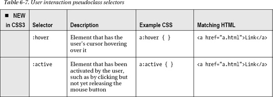
Selecting elements involved in user interaction
In addition to :link and :visited, the selectors :hover and :active (Table 6-7) are commonly associated with links. However, they can be used to respond to user interaction on any element.
For example, the following is a short unordered list:
<ul>

          <li>Milk</li>

          <li>Eggs</li>

          <li>Carrots</li>

          <li>Butter</li>

          <li>Almonds</li>

          <li>Flour</li>

</ul>
To help the user visually pick out which item they are hovering over, the :hover selector could be used to set up a style rule that changed the background color to light gray:
li:hover { background-color:#ccc; }
This will be applied only when the user hovers over the items in the list, darkening those rows the user is hovering over (Figure 6-4).
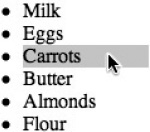
Figure 6-4. The :hover selector allows a style to be applied only when the mouse cursor is over an element.
The :active selector is for styling an element that is being activated by the user, which, for instance, means the mouse button has been pressed over the element, but it is yet to be released. This selector could be used anywhere the appearance of an element should change when the element is pressed but prior to releasing the element, such as in a drag-and-drop application. It is commonly used on link anchors to flash a different color or other style change when a link is clicked.
Selecting form control elements
Table 6-8 lists a group of selectors used for styling the various states of user interface components, notably, web form controls. Excluding the first four selectors, the selectors from :indeterminate onward are part of the CSS3 Basic User Interface Module (the other selectors shown in this chapter are part of the Selectors Level 3 Module).
Note The WC3's CSS working group published a document on August 12, 2011, that indicates the next iteration of CSS will have all the selectors in this chapter specified in the same module, named Selectors Level 4.

___________
2 Applies after user has clicked into the text field.
3 Input will be invalid until a valid email address is entered.
The :focus selector isn't just for forms, but its behavior is easiest to see in the context of web forms. Applied to text fields, the :focus selector adds a style when the user clicks in the field and begins to type. When the user clicks another field, the focus moves, and the style rule is applied accordingly. Taking the web form that appeared in Chapter 4, we could add this simple style:
input:focus {

          border:5px solid black;

}
This style rule will add a prominent black border around any text field the user clicks in to start typing. It will make it clear which text field currently has focus (Figure 6-5).
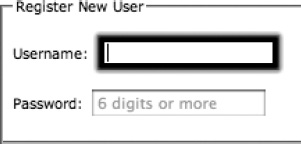
Figure 6-5. The :focus selector applied to a text field allows styles to be attached when the user selects the field to start typing.
The :enabled and :disabled selectors both work with the Boolean disabled attribute. The :enabled selector will apply a style to any form element that does not have the disabled attribute present, while :disabled will apply a style to any element that does have the disabled attribute present.
___________
4 The check box needs to have its indeterminate property set to true in JavaScript.
The :required and :optional selectors are like the :enabled and :disabled selectors, except they are triggered by the presence or absence of the Boolean required attribute.
The :read-only and :read-write selectors work in the presence or absence of the Boolean readonly attribute. Some form controls, such as the file upload control (type="file" as set in input), are read-only by default and will be picked up by the :read-only selector without the addition of the readonly attribute.
The :valid and :invalid selectors work like the :required and :optional selectors, except they aren't tied directly to the required attribute. The :valid selector will pick up any element that has no form validation constraints attached to it (required attribute, pattern attribute, and so on), while :invalid will pick up any element that has constraints, if those constraints are not met.
The :checked and :indeterminate selectors usually apply to check boxes and radio buttons. The :checked selector will apply to these controls when they are in a checked state. :indeterminate is a little more difficult to trigger. It is possible for a check box to be in neither a checked nor unchecked state. Check box controls have a Boolean indeterminate property accessible from JavaScript that can be set, which will then trigger the applicability of this selector. Say you have a check box control:
<input id="undecided" type="checkbox" />
The id is then accessed from JavaScript to set the state of the check box to indeterminate:
function setState() {

          var check = document.getElementById("undecided");

          check.indeterminate = true;

}

window.onload = setState;
With this script, the check box will be placed in the indeterminate state (Figure 6-6) and can then have styles applied using the :indeterminate selector.
Figure 6-6. A check box in the indeterminate state
Note You may find the styles you can apply to check boxes are pretty boring. Safari, Chrome, and Firefox don't support adding borders and background to the check boxes. To see whether your styles are being applied, try setting the height, like height:100px;. Any content around the check box should get pushed out of the way.
The default: style will apply to elements designated as being the default within a given context; for example, the initially checked radio button in a radio button group may be considered the default. This one could be styled, and that style would stay with the initially checked button, even if another radio button was clicked. Another scenario is if there is more than one submit button on a form (which there really shouldn't be—but this is just hypothetical!), one of those buttons will be considered the default submit button for the form. Unfortunately, what gets set to be the default varies from browser to browser. For instance, Opera recognizes the first scenario with the radio buttons, while Safari recognizes the second scenario, but neither recognizes both scenarios.
The last two selectors in this group, :in-range and :out-of-range, are for elements that have a constraint on a range of values that can be input into them. For instance, the number input form control has min and max attributes that set the range of values that can be input into the number field. If the entered value falls into this range between the minimum and maximum range, the :in-range selector style rule will apply, while if it is outside of this range, the :out-of-range selector will apply. The range input form control can use these selectors too, in theory; however, as of this writing, only Opera supports it (and partially so, because the :out-of-range selector is ignored).
Pattern matching selectors
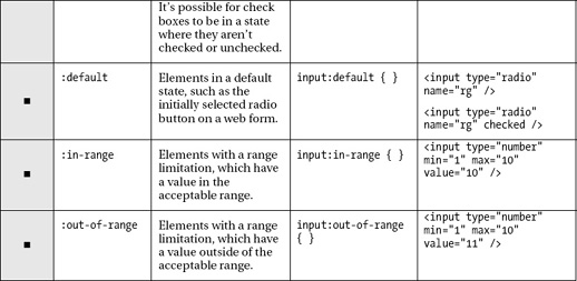
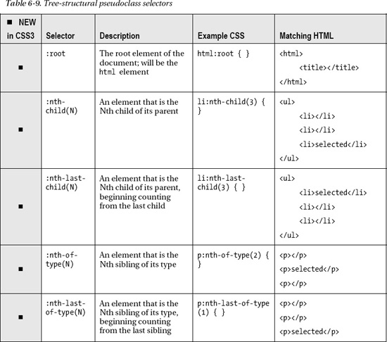
Additional logic can be introduced into a selector by using one of the “nth-” type selectors, part of the tree-structural pseudoclass selectors group (see Table 6-9). All but one of these selectors is new in CSS3.

These selectors work particularly well with lists, tables, or any other HTML structure that has repeating rows of information. They allow styles to the applied following a repeating pattern, which can be used to zebra stripe a list of items for instance. To begin with, they can be given one of two keywords: even or odd, which apply a style to even or odd counted elements within a particular parent element. For example, the following is a basic HTML list:
<ul>

    <li>Row 1</li>

    <li>Row 2</li>
    <li>Row 3</li>

    <li>Row 4</li>

    <li>Row 5</li>

    <li>Row 6</li>

</ul>
Odd-numbered rows in this list can be colored gray by adding the following code:
li:nth-child(odd) { background-color:#ccc; }
Coloring the even rows is as easy as exchanging the keyword odd with even:
li:nth-child(even) { background-color:#ccc; }
These result in the lists shown in Figure 6-7.

Figure 6-7. Zebra striping on even and odd numbered rows in a list being styled using :nth-child(even) and :nth-child(odd) selectors
Additionally, nth- selectors include a pattern formula that allows different rows from the even or odd ones to be selected. In place of even or odd, the formula an+b can be used. The n equals the number of child elements to process (six rows in a list in the prior case), with counting beginning at zero. The value of a is then multiplied by each value of n, and b is added to that value. For example, in the formula 3n+1, the first row processed assigns a value of 0 to n, so the formula ends up being (3 × 0) + 1, which equals 1, meaning the style applies to the first row. For the next row, the formula becomes (3 × 1) + 1, which equals 4, meaning the style applies to the fourth row. Next would be (3 × 2) + 1, equaling the seventh row. Figure 6-8 is the appearance of an unordered list that had the following CSS rule applied:
li:nth-child(3n+1) { background-color:#cccccc; }

Figure 6-8. Results of the selector :nth-child(3n+1) on an unordered list
The nth- selectors can also be given a concrete value that they should select, such as :nth-child(2) to stylize only the second row, :nth-child(3) to stylize only the third row, and so on.
The nth-of-type selectors, such as :nth-of-type(N), have the ability to pick elements out of a group of elements of a certain type that share the same parent. So, instead of picking the children elements of a particular element, these selectors pick the siblings of a particular element. For example, the following HTML could be the structure of a blog of some sort, with a header and footer section and a number of articles sandwiched between the two:
<body>

          <header></header>

          <article><h1>Article 1</h1></article>

          <article><h1>Article 2</h1></article>

          <article><h1>Article 3</h1></article>

          <footer></footer>

</body>
Because all these sections share the same parent (the body), the :nth-of-type(N) selector could be combined with a type selector to pick out a particular article while ignoring the header and footer:
article:nth-of-type(1){ background-color:#f00; };
This would pick out the first article and color its background red (hexadecimal color codes will be discussed later).
Note If it was just the first item of a particular type that was being selected and that behavior was not going to change, the new :first-of-type selector could be used instead. However, the nth-of-type selectors can use the an+b formula to pick out more than one element.
Pseudoelement selectors
The elements in Table 6-10 are perhaps less common to encounter because their behavior is rather unique among the different selector categories. As you will soon see, they enable styles to be applied to parts of an element that aren't otherwise accessible. While you may recognize the selectors listed in Table 6-10, you may notice that their syntax has changed to include two colons instead of one at the beginning of the selector. See the “What makes a pseudoelement?” sidebar later in this section for more information.

The ::first-line and ::first-letter selectors are self-explanatory, because they select the first line of text and first letter of text within an element. For example, they can be used to create “drop caps” at the beginning of paragraphs and stylistically change the first line of text, as shown in Figure 6-9.
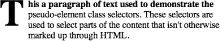
Figure 6-9. The ::first-letter and ::first-line selectors applying styles to a paragraph to create a "drop cap" first letter and bold first line
An effect like that shown in Figure 6-9 could be created by applying the following CSS to a paragraph element (p) filled with text:
p::first-line {

          font-weight:bold;

}

p::first-letter {

          margin-top:-0.2em;

          float:left;

          font-size:4em;

          margin-right:0.1em;

}
The next two selectors in this group, ::before and ::after, are for generating and inserting content before and after an element. The precise behavior of how this is done is described in the CSS3 Generated and Replaced Content Module,5 but in brief, images or text may be the inserted around an element. Using CSS to insert text into a page is something that many frown upon, since it is seen as using CSS for something that should be done in HTML. If you do use these pseudoelements, bear in mind that for accessibility reasons the content needs to make sense even if the style sheet is disabled, so any inserted content needs to be frivolous. That being said, let's move on to how you would use these selectors.
Both selectors would generally be used with the CSS content property, which is used to specify the actual content to insert. The content property can take quoted text, url() and attr() notation syntax, and more. The url() notation syntax takes an image file path between its parentheses, like url("images/pic.jpg"). The attr() notation syntax takes an attribute name that is found on the element between its parantheses, which will be replaced with the attribute's value. For example, a link to download a PDF document could be created with the following:
<a href="presentation.pdf" type="application/pdf">Download the presentation</a>
A selector could then be created to pick out anchor elements on the page that have a type attribute set to the MIME type application/pdf (we'll use a wildcard attribute selector so we don't have to type the whole MIME type). On those elements, the pseudoelements selectors would generate an icon (by linking to an external image) before the link and some text after it that says it's a PDF. Here's an example:
___________
a[type*="pdf"]::before

{

          content: url(doc.png);

          margin-right:5px;

}

a[type*="pdf"]::after

{

          content: " (" attr(type) ")";

}
Using the content property, the icon is embedded before the anchor element, and the parentheses and value of the type attribute are inserted after the element. Figure 6-10 shows the result.
Figure 6-10. The ::before and ::after selectors inserting an icon and file type information around a link
WHAT MAKES A PSEUDOELEMENT?
Table 6-11 lists a couple pseudoelements that are in the CSS3 Generated and Replaced Content Module specification but have such poor browser support that you are unlikely to be able to use them. We'll see what the future holds for them. Remember that the specification is in draft status, so they could disappear if browser support doesn't materialize.

Note There is a pseudoelement selector named ::selection that allows styles to be applied to text that has been selected by the user. It was originally included in the CSS3 Selectors module, but apparently this behavior was too radical for the W3C, and it has since been removed. However, you will find it has strong browser support. For example, try adding the style rule ::selection { color:#0f0; } to your page and select some text. It will turn it green!
Miscellaneous selectors
Two additional selectors don't fit well into any of the other categories. The :lang(L) selector finds content that is designated as being in a searched-for language (set through its lang attribute or otherwise inherited from the metadata of the page). A language code7 is placed between the parentheses of the selector. See Table 6-12 for an example.
___________
6 The ::marker selector is explained in greater detail in another specification, CSS Lists and Counters Module Level 3, accessible here: http://www.w3.org/TR/css3-lists/#marker-pseudoelement
7 See http://www.iana.org/assignments/language-subtag-registry for a list of language codes, the “subtags” shown are what you would use.
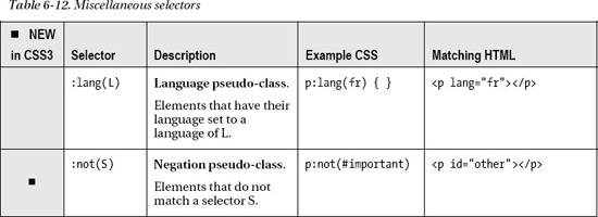
The other element in Table 6-12 is the new :not(S) selector, which is for finding all elements that do not match a certain selector. Combined with other selectors, it can be used to create quite complex matching rules for a style. For example, for the purposes of visually identifying the links on my site that linked to external resources that I did not want to endorse, I might choose to select and style all links that did not contain the “anselmbradford.com” URL in their href property and contained the nofollow or noreferrer attribute values in their rel attribute:
a[rel^="no"]:not([href*="anselmbradford.com"]) { color:red; }
The first part is an attribute selector that works on the rel attribute, while the second part contains another attribute selector for working on the href attribute, the results of which are negated by the :not() selector. Notice that we just search for a value for rel that begins with "no" to pick up the two possible values. Applied to the following code snippet, the preceding selector would skip styling the first anchor, style the second and third anchor, and skip the fourth:
<a href="http://anselmbradford.com" rel="noreferrer"> Anselm's website </a>

<a href="http://example.com/contact.html" rel="noreferrer"> Example.com contact </a>

<a href="http://example.com/links.html" rel="nofollow"> Example.com links </a>

<a href="http://example.com" rel="bookmark"> Example.com homepage </a>
As you can see, the possibilities are virtually endless in regard to the selectors you can construct!
Using selectors effectively
As you saw in the simple selector section earlier, selectors can be generalized to all elements, for example:
:only-child { color:blue; }   /* match any element that is the only element contained in its parent element */

::first-letter { font-size:2em; }      /* match the first letter of all elements' content */
Depending on the selector, generalizing in this way can become unwieldy because the styles applied may become attached to elements with vastly different purposes and meanings. You will likely see ID selectors generalized in this way, such as in the code snippet #item {}. However, this is commonly done because ID selectors will always pick out only one element and so will never generalize out to other elements on the page.
Note Some professional CSS developers advocate using class selectors in favor of ID selectors. The reason for this essentially boils down to flexibility. ID selectors can be used on only one element on the page, ever. Class selectors can be applied to one element by choice, effectively making them equivalent to ID selectors. However, they can be applied to multiple elements as well, which is an added benefit, if down the road you realize that a particular style rule needs to be applied more than once.
Having said that, going in the other direction and getting too specific with a chain of selectors should be avoided as well. This is termed a selector's specificity. And it's a bad thing if a selector's specificity gets too focused. Avoid CSS rules like the following:
article section#one ul li.item::first-letter { color:blue; }
Although this will work fine in the situation it's used in, it is brittle. Changes to the HTML could easily cause this rule to no longer be applied, which also means this selector can't be easily moved to another context. By assigning a class to the unordered list (instead of the list item) and picking out the list item by type, the selector could be shortened to the following:
ul.toc li::first-letter { color:blue; }
Concise selectors are where you will see your correct application of HTML5's semantic elements coming back to save you time in the long run. Instead of creating complex selectors or relying on classes or IDs to pick out certain kinds of content, you can apply the styles directly to em, strong, article, aside, and so forth, without any deeper specificity needed. Obviously, if you wanted to target a particular kind of article or aside, that is where classes (and possibly IDs) would come into play, but first look at what content can be grouped together using semantic HTML elements, then attributes, and then custom IDs or classes.
CSS Box Model
Now that we've thoroughly covered selectors, you should have a thorough understanding of how to access your HTML from CSS. At this point, there is another fundamental concept that is worth exploring—the CSS Box Model.
As far as CSS is concerned, the HTML elements that make up a web page are contained within a rectangular box that determines its position in relation to the other elements on the page. This paradigm of laying out the page's content in boxes is where the CSS Box Model gets its name. There are three main types of boxes in this model: block-level, line-level, and inline-level. To visualize how these differ, imagine a paragraph of text. By default, a block-level box is constructed around the whole paragraph, a line-level box is constructed around each separate line of text in the paragraph, and an inline-level box is constructed around each word in a single line of text. This is how CSS sees the content and lays it out, but this differs slightly from how you will use the Box Model. You will wrap the content you want to manipulate from CSS in an HTML element, such as a p element for the whole paragraph or an em element for an individual word in the paragraph. You'll then use a selector to stylize these elements. Typically this means you will be dealing with block-level or inline-level boxes. Line-level boxes are not something you get easy access to (although there is the ::first-line selector), so just make a mental note that they are something CSS is using internally to lay out content. You may wrap more than one word in an em, maybe even a whole line, but this will still be viewed as an inline-level box, because it may or may not take up the entire line of text.
Block-level boxes are the most commonly encountered type of box. When styling an element inside a block-level box, you will have access to CSS properties for padding, a margin, and possibly a border sandwiched between the two. Outside the box are positioning properties that can be used to offset the box away from its default position.8 Inside the box are width and height properties used to set the size of the box. All these properties are shown in Figure 6-11.

Figure 6-11. A block-level box showing padding, border, margin, width, and height, as well as the positioning properties around an HTML element
A block-level box is found most commonly around flow content such as paragraphs, headings, or other elements that provide a division between blocks of content. By default, block-level boxes will expand to fill the width of their containing element and will stack vertically on top of each other.
An inline-level box is commonly found around phrasing content such as span, q, em, and so on. By default, inline-level boxes will run horizontally rather than vertically, because they follow the lines of text in the content. The box for an inline level box looks exactly like a block-level box (Figure 6-11) except any margin applied on the top and bottom of the box will be ignored—only margins on the left and right sides have an effect. Additionally, padding applied to the top and bottom will not push away elements above and below the element, as a block-level box would do, but instead will overlap the element's border (if present) over adjacent content. Lastly, inline-level boxes take up only as much space as the content contained within them, plus any padding that is set, meaning they will ignore settings to their width and height properties. Figure 6-12 shows an example of block-level and inline-level boxes and how they interact with each other.
___________
8 The positioning properties (left, top, right, bottom) are used in combination with the position property, which will be discussed later.

Figure 6-12. Block-level and Inline-level boxes. Note that an inline-level box that extends across two lines will wrap around by default.
In Figure 6-12, there is a border drawn around the entire content and the first paragraph (both block-level boxes), and borders are drawn around a single word and several words. An element that has a block-level box can be referred to as a block-level element. The words are contained in inline-level boxes and have 10 pixels (px) of padding applied. As you can see, although the box border has expanded 10px in all directions away from the text, the top and bottom padding does not affect any surrounding elements, and the borders overlap with other content on the page. If you're curious, the following is the HTML to produce the previous:
<div class="box">

  <p class="box">

    This is the first paragraph in this page of content, it has a border drawn around it to

    show that it is a block-level element.

  </p>

  <p>

    This is a second paragraph, it is a block-level element as well, but does not have a

    bordered style added. Instead, some of the <span class="box">inline-level</span> boxes are

    shown with borders added. <span class="box">Inline-level boxes may wrap</span> around more

    than one line if the layout requires them to.

  </p>

</div>
And the CSS is as follows:
.box {

          border:2px solid black;

          padding:10px;

}
Setting box type
The type of box used is not set in stone. In fact, there is a CSS property called display for setting the type of box an element is contained in. Setting display:block on an element will treat it as being contained in a block-level box, while setting display:inline will treat it as being contained in an inline-level box. Having the ability to swap between box types is particularly useful with anchor elements (a), which are inline-level elements by default, so they ignore width and height settings.
Consider the following HTML:
The preceding code could be styled with the following CSS:
a {

           width:200px;             /* set the width */

           height:60px;             /* set the height */

           border:1px solid #000;   /* set a black border */

           background-color:#ccc;   /* set a gray background */

           padding:10px;            /* set 10 pixels of padding */

           text-decoration:none;    /* remove the underline */

           text-align:center;       /* center align the text */

           margin-top:20px;         /* add margin to the top */

}
This code produces the appearance of Figure 6-13. The width and height and margin top are ignored because these are two inline-level elements.
Figure 6-13. Two inline-level elements will line up side by side by default.
Now if an additional style rule is added to convert the second box into a block-level element:
a.block {

           display:block;           /* treat as block-level element */

}
the appearance of the second link changes to include the width and height (and margin so the elements don't overlap), as shown in Figure 6-14. The whole area of the larger rectangular shape is part of the link's active area, so having an anchor element display as a block-level element offers more flexibility in the size of the linked area. This aspect is particularly useful when creating menus, for instance.

Figure 6-14. Inline-level and block-level boxes. The block-level box moves to its own line.
A problem with setting an inline-level element to display as a block-level element is that the block element will move below the content that came before it, starting a new line of content, as shown in Figure 6-14. There is additional display property that can format the element as being in a block-level box but then treat the formatted box as if it were an inline-level box. Changing the display to display:inline-block produces Figure 6-15.
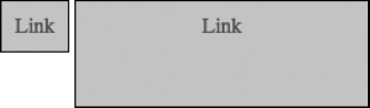
Figure 6-15. Inline-level box and block-level box being treated as an inline-level box for layout purposes
There are several other values for the display property,9 but block, inline, and inline-block are the three main ones that can be used for changing the default layout behavior of the majority of HTML's elements.
Setting box position
To make adjustments to the position of an element, the position property is used. It has the following values (plus inherit, which just uses its parent element's settings):
static: The box is in its default position. The positioning properties (left,top,right, andbottom) are ignored.relative: The box is offset from its default position by the number of pixels specified in the CSS positioning properties, which are the namedleft,top,right, andbottom.absolute: The box is offset by the number of pixels specified in the positioning properties but is offset from the upper-left corner of the first parent element that has itspositionproperty set to a non-staticvalue or to the upper-left corner of the browser's viewing area, whichever comes first.fixed: Works like absolute positioning with the added functionality that the box does not scroll with the rest of the content on the page and is instead fixed in the viewing area.
Setting box layering
Since boxes may be positioned relatively and absolutely, that means they may overlap each other (which can be used to create interesting effects!). When two elements overlap each other, the order in which they are layered can be set using the z-index property. There are some caveats with this property, but they are easy to grasp:
- Both elements overlapping each other need to have the same parent element (they need to be contained together in the same HTML block) if the layering is to be changed.
- At least one of the elements needs to have its
positionproperty set torelative,absolute, orfixed. - At least one of the elements needs to have its
z-indexproperty set. A higher number relative to the other element will bring an element in front of the other one, while a lower number will bring it behind.
___________
9 See all CSS display property values here: http://www.w3.org/TR/css3-box/#display
Backgrounds and borders
Background and borders used to be pretty limited. The shapes were rectangular with solid-colored backgrounds or a single repeating image. The borders had some variety (solid, dashed, dotted, and so on) but were still stuck in a rectangular shape. Rounded corners, for instance, have been notoriously complex to create. CSS3 has made many effects, including rounded corners, much easier. Rounded corners are part of the CSS3 Backgrounds and Borders Module, which also adds the ability to add multiple backgrounds, clip and repeat backgrounds in new ways, and add drop shadows, to name a few additions.
Basic background color and images
The background-color property sets the color of the background. It will take any color format described in the "Color" section in this chapter. The color is drawn behind any background images so it will show through if the background has images attached that contain transparent areas. The value transparent can be given so that no color shows through.
The background-image property is used to attach images to the background of an element. The syntax url(“path/to/bgimage.png”) is used to attach the image, where path/to/bgimage.png is the file path to the image to include. The file path may be relative to the location of the style sheet, or it may be absolute (using http:// or similar in the beginning of the path). It's not uncommon to see relative file paths such as url("../images/pic.jpg") since the style sheet is often placed in a different directory from the images. The ../ moves up one directory before going into the images directory.
Note The quotes around the image's file path are optional if there are no spaces in the filename or file path. If there are spaces, however, quotes around the file path are required.
The background-repeat property determines how a background image (if present) is repeated, if it is repeated. The basic settings are repeat, no-repeat, repeat-x, and repeat-y. These determine, respectively, whether the image is tiled, not tiled (shown only once), tiled horizontally, or tiled vertically. Two new values have been added to this property in CSS3: space and round. Normally when an image is repeated, it will repeat as needed to fill the available space with some portion of the image, even if that means some of the image will be clipped out of view. The space and round properties prevent this clipping from happening. A value of space will fill the available space with the image—without clipping the image—and will then add space between the repeated images as necessary to evenly fill the available area. A value of round works essentially the same way, but instead of filling the excess area with empty space, the image is scaled up to fill the available area. Use the round value with caution, because an image will rapidly degrade in quality as it is scaled up, becoming fuzzy and pixelated. Not good!
Note The space and round values of the background-repeat property currently have limited browser support. As of the time of writing, Opera is the only major browser that supports them both. This is a good point to mention that Modernizr (http://modernizr.com), the HTML5 detection library mentioned in Chapter 1, also has detection capabilities for CSS3!
The background-attachment property determines whether a background image or images are scrolled with the content when the page is scrolled. The value fixed fixes a background in place, even if the page scrolls, while scroll allows it to scroll away with the contents. Also, a new value, local, has been added. This value applies only to elements that have their own scrollbar on the page.10 If this value is set, when the user scrolls the inset scrollbar, the background in that area of the screen will scroll with it.
Note For a demonstration of the different values of background-attachment, visit http://people.opera.com/pepelsbey/experiments/bga.
The background-position property is for offsetting the starting point of the background image. It takes two values that correspond to the horizontal and vertical positioning. You can set specific values or use preset keywords:
/* background image is offset 10 pixels left and 25 pixels down */

background-position: -10px 25px;
The properties background-clip and background-origin have been introduced in CSS3. Both these properties take the same values, but each has a different function. The background-clip is for specifying the “background painting area,” which is the area where the color and images will be rendered. The background-origin specifies the “background positioning area,” which is for determining where the point of origin is for the background, meaning the point at which the upper-left corner of a nonrepeated image would begin (the 0,0 point if you are familiar with coordinate spaces). The three values for these properties are as follows:
border-box: The background painting area/positioning area extends to the outer edge of the border. The border will run over the top of the image, but it can be semitransparent.padding-box: The background painting area/positioning area extends to the inner edge of the border. This is the default value.content-box: The background painting area/positioning area extends only to edge of the content area, which is the area before any padding is applied.
___________
10 Setting the width and height properties on an element and then setting overflow:auto will cause a scrollbar to appear so the user can get to any overflowing text.
Figure 6-16 illustrates these different values.

Figure 6-16. The placement meaning of the three values available values for the background-clip and background-origin properties.
To demonstrate these values, we can create two boxes, which we'll apply a background to shortly:
<div class="box"></div>

<div class="box no-clip"></div>
We'll style both boxes so they have a width, height, padding, margin and a semi-transparent border (the color syntax for the transparent border may look foreign to you; this will be covered in the "Color" section later). One will be clipped to the content area, while the other will be clipped to the border area:
.box {

       width:200px;                                   /* set the width to 200 pixels */

       height:200px;                                  /* set the height to 200 pixels */

       padding:20px;                                  /* set the padding to 20 pixels */

       margin:10px;                                   /* set the margin to 10 pixels */

       border:10px solid hsla(0 , 0% , 0% , 0.5 );    /*set a semi-transparent black border */

       background-color: #ccc;                        /* set a gray background color */

       background-image: url(logo.png);               /* attach an image */

       background-repeat:space;                       /* repeat image in available space */

       background-origin:content-box;                 /* set image origin to content edge */

       background-clip:content-box;                   /* clip image at content edge */

}


.no-clip {

       background-clip:border-box;                    /* clip image at border edge */

}
The boxes will appear like Figure 6-17. The background images will repeat beginning at the same origin but will be clipped at different points.

Figure 6-17. Two treatments of a background using the new background-clip and background-origin properties as well as the space value in the background-repeat property
Lastly, in backgrounds, the new background-size property can be used to stretch a background over its background area instead of repeating it. This is a useful and needed feature of backgrounds, but be careful your image doesn't get stretched or scaled up too far, or it will begin looking fuzzy, pixelated, and downright awful. The property takes one or two values. One value sets the horizontal and vertical size together, while two values set these independently of each other. The width and height can be set with a percentage, but this risks distorting the image when set for both dimensions of the image. To address this, the keyword auto may be used for one dimension, so the image maintains its aspect ratio. This is the default value for the height when only one value is given:
/* Set width to 100% of the available area and height to 50% of the image height */ background-size:100% 50%;

/* Set width to 100% and maintain the aspect ratio of the image */

background-size:100% auto;

/* Set the width 50% and the height to auto */

background-size:50%;
Note The first setting in the previous code will distort the image.
The background-size property also has the keywords contain and cover. A value of contain will scale the image to completely fit in the background area while maintaining its aspect area, even if there is some whitespace on one side. The cover value will scale the image while maintaining the aspect ratio as well, but it will scale the image so that it completely covers the background area, even if this means some of the image will be clipped out of view (Figure 6-18).

Figure 6-18. The contain (L) and cover (R) values set on the background-size property. Notice the accentuated pixelation that occurred when the image was scaled up.
Multiple backgrounds
Added in CSS3 is the ability of the background properties to support having multiple images specified, which will layer on top of each other inside the background area. The syntax is easy—separate each image by a comma. For instance, two images, shown in Figure 6-19, could be combined using the following:
background-image: url(logo.png) , url(star.png);
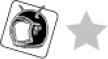
Figure 6-19. Two separate images that will be combined using multiple backgrounds
Using this technique will result in the combined pattern shown in Figure 6-20.

Figure 6-20. Two separate images layered together in a background
Reversing the order of the images in the backgroud-image property will change their layering. The first image specified will appear on top. The other background properties can be supplied with comma-separated values to set the properties on each image individually; for instance, to only repeat the star image in Figure 6-20, the following could be added:
background-repeat: no-repeat , repeat;
These values could be set via JavaScript too, which could lead to some pretty interesting dynamic effects!
Rounded corners
The ability to have a property that creates rounded corners on an element is a panacea for web design. This used to be a painful process of slicing up images and placing them into a grid of div elements so the four corners could be isolated. Yuck! The new border-radius property allows borders to be rounded. Borders can be rounded all at once, individually, or even in a nonuniform fashion. Giving the property one length value will set all four corners to that value:
border-radius:20px; /* round all corners by 20 pixels */
Giving the property four values will set the rounding on each of the four corners:
border-radius:100px 50px 25px 0px; /* each corner is rounded by a different amount */
Using a forward slash between the values will allow different values to be specified for rounding each side of a corner, leading to a nonuniform corner:
border-radius: 100px / 20px; /* round one side of the corner more than the other side */
The forward slash in the preceding code breaks the rounding into two values; the first value is the horizontal rounding amount, and the second value is the vertical rounding amount.
The results of the previous three properties applied to an empty div with a background color look like Figure 6-21.

Figure 6-21. Many different shapes can be created by using the border-radius property.
Drop shadows
The box-shadow property can be used to create a drop shadow around the box. The values it takes are the horizontal distance of the shadow, the vertical distance, the amount of blur to apply, the amount it should spread, and finally the color of the shadow. Here's an example:
box-shadow: 10px 15px 20px 5px #999999;
This moves the shadow 10 pixels to the right, moves it 15 pixels down, blurs it 20 pixels, spreads it out 5 pixels (this expands the shadow outward in all directions), and sets it to a dark gray color. Figure 6-22 shows this property applied to the shapes created in the “Rounded corners” section.

Figure 6-22. Shapes with drop shadows applied using box-shadow property
Color
If utilized correctly, color can be a powerful addition to a web page's design, improving its structure by visually grouping items together based on their color or separating content in the layout through the use of contrasting colors. It can be abused too, making an otherwise good layout gaudy and, particularly if clashing colors are used, hard to look at. There are accessibility concerns in regard to color too, because certain color choices for the page can make content difficult to read for those with color blindness. Red-green color blindness is most prevalent, so avoid separating content into shades of red and green that are at a similar level of luminosity.
Color on-screen
The colors you see on your screen are defined using combinations of the primary colors red, green, and blue in an additive color model, which means all three combined at full intensity will produce white (Figure 6-23).
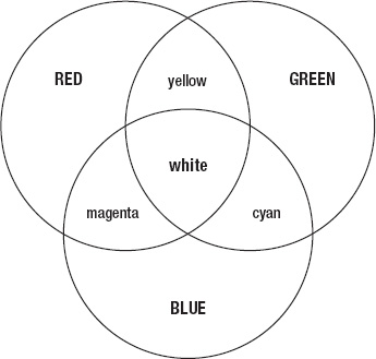
Figure 6-23. In an additive color model, the primary colors add to the lightness of each other.
Within CSS, color is commonly defined using hexadecimal notation. This notation breaks the red, green, and blue components of a color into two-digit numbers that together result in a six-digit number preceded by a hash sign, in the form #RRGGBB. Called a hex triplet, each digit pair has the hexadecimal numerical range of 00–FF. For example, #ff00ff represents full-intensity red and full-intensity blue, without any green. Combined, they produce magenta. If you are unclear of how this sequence of numbers and letters becomes a color, be sure to read the "How web color values are calculated" sidebar for more information.
HOW WEB COLOR VALUES ARE CALCULATED
All the colors you see displayed on your screen are composed of the three primary colors red, green, and blue. As shown in Figure 6-23, it is an additive color model, meaning as the intensity of the primary colors increases, the color becomes lighter and lighter (the lightness is added to) until eventually it becomes white. To define color in a web browser, each primary color is stored in a byte, or 8 bits (8 ones and/or zeros). Each color component (red, green, and blue) then has the possible values in the range of 00000000 to 11111111, which is the range 0–255 in decimal. 0 is complete lack of the color, while 255 is the fullest possible intensity of the color. Decimal is a base-10 counting system, meaning ten digits (including 0) are used before counting moves position. Binary is a base-2 system, meaning only two digits are present (0 or 1). Base-16, hexadecimal, has 16 digits that can be used to compress a binary number, such as 1111, into one digit: F. The following table shows the first 16 digits of each numbering system:

The value 255 in decimal can be represented as 11111111 in binary or FF in hexadecimal. Obviously, at two digits long, hexadecimal wins as the most compact representation of the number 255. Pure white, which is the combined full intensity of red, green, and blue, can be represented as red = 255, green = 255, and blue = 255, or in hexadecimal as red = FF, green = FF, and blue = FF. Condensed all together we get FFFFFF. Add a hash sign to the beginning, and this is the hexadecimal notation used for colors on the Web. The range of colors available in this system is 256 × 256 × 256 (or 2563), which equals 16,777,216 possible colors. (256 is used here instead of 255, because the calculation needs to factor in zero in each color component.)
Note There is a handy color utility named ColorZilla (www.colorzilla.com) that integrates into Firefox and provides several features such as an in-browser color picker, web page color scheme analyzer, and even a tool for creating CSS gradients!
Hexadecimal notation can also represent color using three digits when a digit is repeated in each of the color components. So, magenta could also be represented as #f0f. White, which is #ffffff in hexadecimal, can be optionally shortened to #fff. #99aaff (a light blue) could be shortened to #9af, and so forth.
It is also possible to use a preset color keyword such as white, black, aquamarine, and so on. While modern web browsers support dozens of keywords for choosing colors, for the sake of consistency stick with precisely defining your colors (through hexadecimal notation or otherwise) to ensure they are the same as what appear in your images and other content. (What exactly does “burlywood” look like? And yes, that is a supported color keyword!)
Color is used in several CSS properties but is most common for setting background and foreground colors. Backgrounds will be covered later in this chapter, so let's first look closer at foreground colors. Foreground colors (for the textual content on a page) are defined using the color property, which is part of the CSS Color Module Level 3. This module is one of the few in CSS3 that is now at W3C Recommendation status. It's a small module, defining color and another property, opacity. In addition to hexadecimal notation, there are other notation systems that can be used in color, which we'll get into next.
Functional notation syntax
Instead of specifying a hexadecimal value, there is another syntax that can be used called functional notation. In this form of syntax, the command rgb(R, G, B) is used, where the “R, G, B” are replaced with either the decimal representation or, perhaps more useful, the percentage of a particular color component. So for example, whereas magenta could be written in either of the following hexadecimal notation forms:
p { color: #ff00ff; }

p { color: #f0f; }
using functional notation this could be rewritten as this:
p { color: rgb( 255, 0, 255 ); }

p { color: rgb( 100%, 0% , 100% ); }
Functional notation isn't new in CSS3, but the next form of it is: Hue, Saturation, Lightness (HSL).
Hue, saturation, lightness
HSL functional notation uses the form hsl( H, S, L, ), where “H, S, L” represents the hue, saturation, and lightness of a color. Before going further with the syntax, you'll need to understand what exactly HSL means.
In an RGB color system, adjusting each of the components of a color to arrive at a shade or tint (darker or lighter version of the same color) is a rather unintuitive process, particularly for inexperienced developers. Depending on the color, more than one of the three RGB components may need to be increased or decreased to achieve a proper shade or tint of the color. Imagine a bright yellow color composed of red and green. A darker yellow cannot be created by only reducing the red component, because that will just result in a greener hue of yellow, not a darker yellow. Both the red and the green components need to be reduced. HSL aims to make this kind of adjustment easier.
In HSL, all the possible colors in an RGB color space are enclosed in a cylinder. The hue is what would commonly be thought of as the actual color (which may be lighter or darker or more or less saturated). Looking down on the HSL cylinder, all colors are visible, and which one is selected is determined by moving around the outside of the cylinder. Because this is a circle in cross section, this movement is given a value between 0° and 360°. The colors are spread around the circle in the order of the colors of a rainbow, beginning and ending at red. So, 0° and 360° are both red.
The saturation is determined by a percentage indicating how far the color is from the center of the cylinder; 0 percent is at the center, which means it would lack all saturation or be grayscale. Conversely, 100 percent means it would be at the edge or at the full possible intensity of a color. Moving down the cylinder darkens the color, ending at black, while moving up the cylinder lightens it, ending at white. This is measured in a percentage too, where 0 percent is black and 100 percent is white, and values in between are darker or lighter shades and tints of the color. Refer to Figure 6-24 for a visual representation of how these values relate to each other.

Figure 6-24. Hue, Saturation, and Lightness (HSL) cylinder defining how to adjust RGB colors in a more intuitive fashion
Now that you have an understanding how HSL works, you can use the HSL functional notation syntax where you would have used hexadecimal notation, for example:
p { color: hsl(300, 100%, 50%); }           /* magenta */

p { color: hsl(300, 20%, 50%); }            /* pastel magenta – less saturated */

p { color: hsl(300, 20%, 25%); }            /* dark shade – less lightness */

p { color: hsl(115, 20%, 25%); }            /* dark green – different hue */
Notice that the lightness is placed in the middle initially (50 percent); if it were at 100 percent or 0 percent, it would make the color pure white or pure black, regardless of the other values.
Opacity
Any element can have its overall opacity adjusted using the opacity property. The possible values are between 0.0 and 1.0 that map to the range 0 percent to 100 percent. The following are all legitimate values:
p { opacity:1.0; }                          /* totally opaque */

p { opacity:0.0; }                          /* totally transparent */

p { opacity:0.5; }                          /* 50% transparent */

p { opacity:0.25; }                         /* 75% transparent */
Opacity can also be added using the functional notation styles outlined earlier by adding an opacity component—called alpha—when defining a color. This makes the functional notation styles become rgba( R, G, B, A ) and hsla( H, S, L, A), where “A” is an alpha value to add, which has the same value range as the opacity property:
p { color: rgba(0, 255, 0 , 0.1); }         /* nearly transparent green */

p { color: hsla(225, 100%, 50%, 0.5); }     /* semi-transparent blue */
The difference between setting the color in the color property and the opacity property is that opacity will affect the whole element (including backgrounds and borders), while color will affect only the foreground text (Figure 6-25).
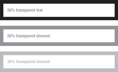
Figure 6-25. The color property will affect only an element's contents (top), while the opaque property will affect the whole element (middle and bottom).
Web typography
If there is anything that is more of a disappointment to those coming from the world of print design to web design, typography has got to be it. Or rather, it should be said, “was more of a disappointment,” because the ability to control typography has progressed in leaps and bounds in CSS3. The available typeface choices are now potentially limitless, and there are text-level effects that can be applied, such as drop shadows and strokes. With this power comes the need to not abuse typography, to not lose sight of the purpose of typography on the page, and to use these effects to help the user process the content on your page, not to hinder their comprehension.
Web fonts
For years, fonts were something that were referenced in a style sheet, not something that were downloaded for use by a style sheet. If a particular operating system did not have a referenced font installed, the browser would fall back to one of a handful of generic defaults. Practically, this meant Arial, Times New Roman, and Courier New and a few others were the only “safe” typeface choices. Elaborate hacks such as scalable Inman Flash Replacement (sIFR)11 emerged that replaced text on the page with Adobe Flash content that could display embedded fonts. This effort has since been abandoned in favor of the ability in modern web browsers to download fonts for use on a page. So-called web fonts have seen a dramatic rise in availability thanks to the introduction of the @font-face rule, part of the CSS Fonts Module Level 3. This rule allows a font file to be linked into the style sheet for inclusion on the page.
___________
11 sIFR information can be found here: http://novemberborn.net/sifr3, however it is noted that the project is no longer maintained.
Note Since the typeface definition file needs to be downloaded before it is displayed, using web fonts potentially introduces what front-end developer Paul Irish termed FOUT (Flash Of Unstyled Text),12 whereby the text on the page flashes with its default font before using the downloaded typeface. Some web browsers have attempted to address this issue, so you may not run into it; however, if you do, there are scripts available such as fout-b-gone (www.extensis.com/en/WebINK/fout-b-gone/) that aim to prevent FOUT in browsers where it still occurs.
Depending on the browser, fonts can be downloaded in a variety of formats (TrueType, OpenType, and so on). A newer format that all modern web browsers support is Web Open Font Format (WOFF), which is a lightweight font format developed in 2009 specifically for fonts that will be distributed over the Web. The format is currently undergoing standardization at the W3C.13
Google hosts a library of web fonts at www.google.com/webfonts that can be linked to remotely for inclusion in your website. Since its launch, this directory has grown exponentially from a handful of fonts to hundreds. This is a good place to start experimenting with web fonts.
The general idea behind downloading fonts is that the @font-face directive is placed at the top of your CSS file and specifies the font family and font file source for download:
@font-face

{

          font-family: myFont;

          src: url('LunotrobeOutline.woff') format('woff'),

}
The font-family property can then be set to the value of the font-family set in the @font-face rule:
body { font-family: myFont; }
This will apply the downloaded font to all elements in the body of the web page.
Caution You use a variety of typefaces all the time, but like other bodies of work, typefaces were designed by someone! This means you are not necessarily legally allowed to use any font you come across. Be sure you are licensed to use the fonts you choose. For instance, fonts by Adobe Systems can't be used directly as web fonts, even if you have them installed on your computer! However, a subscription-based service such as Typekit (http://typekit.com) can be used as an intermediary to allow the use of otherwise restricted fonts.
___________
12 Paul Irish's post on FOUT can be found here: http://paulirish.com/2009/fighting-the-font-face-fout/
13 See http://www.w3.org/TR/WOFF/
Multiple columns
Creating a text block with multiple columns used to require a lot of different divs for the different columns in the layout. To ease this markup pain, a new property, the columns property, has been added. At its most basic, the property can be set to a value that specifies the number of columns to add, like so:
p.col { columns: 3; }
This will break the paragraph (with a class attribute set to "col") into three columns within its available area. There are number of related properties for getting more specific with how the columns are displayed; for instance, the gap between columns can be controlled like a border using the column-gap and column-rule properties. There is also a column-count property, which is available just for setting the column count. (The columns property is a shorthand property for these other properties). For example, the following would produce the layout in Figure 6-26:
column-count: 3;

column-gap: 2em;

column-rule: 0.35em solid #000;

Figure 6-26. Multiple columns applied to a paragraph
The column-gap property specifies the width of the gap between the columns, while the column-rule property specifies the width style and color of the vertical rules.
Text effects
The text-shadow property was added back in CSS2, but it was removed in CSS2.1. Well, it's back again in CSS3! Don't let the name fool you; creating a text shadow is probably the least-useful effect possible with this property, but it's the place to start when looking at it. The property uses almost the same format as the box-shadow property shown in the “Backgrounds and borders” section. The only difference is that text-shadow does not have a spread value.
If you play around with the values, you can create effects that appear like indented text, embossed text, and so on. Also, an outline can be added to text this way by offsetting several layered text shadows. To do this, four text shadows can be chained together using commas, each one offset in a different direction:
h1 {

          font-size:4em;

          color:#fff;

          text-shadow: -1px 0 0 #000 , 0 -1px 0 #000 , 1px 0 0 #000 , 0 1px 0 #000;

}
Remember, the first value is the horizontal offset of the shadow, the second value is the vertical offset, the third value is the blur, and the fourth value is the color. This will create outlined text like Figure 6-27.

Figure 6-27. Outlined text created using the text-shadow property
Note WebKit-based browsers (Safari and Google Chrome) have implemented a property called text-stroke. It is not in any CSS specification at the W3C, so you're best to avoid it until (if) it appears in any of the CSS3 modules. To use it, you need the webkit prefix; the property is -webkit-text-stroke, which takes a width and a color, as in -webkit-text-stroke: 1px #f00.
Rules of typography
There's a rule of composition promoted in Robin William's book The Non-Designer's Design Book that states elements on the page that are merely similar should be avoided. If design elements on a layout are different, make them very different in order to create contrast in the layout. Use the contrasting differences among the design elements as a way to help visually organize the page. This fits into typography when you think about the typefaces you choose to use. Fonts fall into two main categories: serif and sans serif. Serif fonts are typefaces with embellishments to the edges of the letters (called serifs). These include Times New Roman, Georgia, Palatino, and so on. Sans serif (meaning “without serifs”) includes Arial, Helvetica, Verdana, and so on. If you start including different serif or different sans serif fonts in the same design, pause for a moment and consider whether it is really necessary to have, for example, Arial and Helvetica together in the same layout. Typefaces that are similar yet distinct enough that their differences are noticeable are best avoided. Along those same lines, it's best to avoid using more than two typefaces overall on the page. There is so much you can do with bolding, italicizing, color, and so on, that even using one typeface offers a plethora of stylistic choices and treatments.
When thinking about the overall organization of textual content, use typography to create a hierarchy of information on the page, clearly identifying what content is more important to read over other content. This is the purpose of headlines, titles, subtitles, and so on; they create a hierarchy your eye can quickly scan to get deeper and deeper into the information on the page. Don't be afraid to size text large when you see it as the top bit of information on the page, but like with your typeface choices, avoid creating typography that is almost the same size but not quite the same, because this will likely be distracting.
The HTML5 outline algorithm discussed in Chapter 3 is particularly useful for helping you organize your page into a hierarchy. You may want to refer to that section when organizing your headings and so forth.
Lastly, the single greatest rule to follow in regard to typography is: if text is meant to be read, make it readable!
Summary
This has been one of the largest chapters in this book, and for good reason! I hope you can appreciate the power of CSS to fine-tune the appearance of elements on your page. This is the tip of the proverbial iceberg; there is plenty not covered that is developing in CSS, such as techniques for creating transitions and animations from CSS without any JavaScript code (the merits of which can be debated!), rotating and otherwise transforming the elements in 2D and 3D space, creating gradients from CSS, applying images to borders, and more! See www.w3.org/TR/css-2010/#properties for a list of available CSS properties you can use (because the W3 uses “snapshots,” this may not be a complete list until it is updated again). We're not completely done with CSS, because this is a growing area, which, along with HTML5, is paving the path of what is possible on the road ahead, and that is where we will go in the next chapters!