2.1 Scatterplots
2.2 Modeling Data
![]() Scatterplots are ideal for exploring the relationship between two quantitative variables. When constructing a scatterplot we often deal with explanatory and response variables. The explanatory variable may be thought of as the independent variable, and the response variable may be thought of as the dependent variable.
Scatterplots are ideal for exploring the relationship between two quantitative variables. When constructing a scatterplot we often deal with explanatory and response variables. The explanatory variable may be thought of as the independent variable, and the response variable may be thought of as the dependent variable.
![]() It’s important to note that when working with two quantitative variables, we do not always consider one to be the explanatory variable and the other to be the response variable. Sometimes, we just want to explore the relationship between two variables, and it doesn’t make sense to declare one variable the explanatory and the other the response.
It’s important to note that when working with two quantitative variables, we do not always consider one to be the explanatory variable and the other to be the response variable. Sometimes, we just want to explore the relationship between two variables, and it doesn’t make sense to declare one variable the explanatory and the other the response.
![]() We interpret scatterplots in much the same way we interpret univariate data; we look for the overall pattern of the data. We address the form, direction, and strength of the relationship. Remember to look for outliers as well. Are there any points in the scatterplot that deviate from the overall pattern?
We interpret scatterplots in much the same way we interpret univariate data; we look for the overall pattern of the data. We address the form, direction, and strength of the relationship. Remember to look for outliers as well. Are there any points in the scatterplot that deviate from the overall pattern?
![]() When addressing the form of the relationship, look to see if the data is linear (Figure 2.1) or curved (Figure 2.2).
When addressing the form of the relationship, look to see if the data is linear (Figure 2.1) or curved (Figure 2.2).


![]() When addressing the direction of the relationship, look to see if the data has a positive or negative relationship (Figures 2.3, 2.4).
When addressing the direction of the relationship, look to see if the data has a positive or negative relationship (Figures 2.3, 2.4).
![]() When addressing the strength of the relationship, consider whether the relationship appears to be weak, moderate, strong, or somewhere in between (Figures 2.5–2.7).
When addressing the strength of the relationship, consider whether the relationship appears to be weak, moderate, strong, or somewhere in between (Figures 2.5–2.7).

![]() When dealing with linear relationships, we often use the r-value, or the correlation coefficient. The correlation coefficient can be found by using the formula:
When dealing with linear relationships, we often use the r-value, or the correlation coefficient. The correlation coefficient can be found by using the formula:
![]() In practice, we avoid using the formula at all cost. However, it helps to suffer through a couple of calculations using the formula in order to understand how the formula works and gain a deeper appreciation of technology.
In practice, we avoid using the formula at all cost. However, it helps to suffer through a couple of calculations using the formula in order to understand how the formula works and gain a deeper appreciation of technology.
![]() It’s important to remember the following facts about correlation (make sure you know all of them!):
It’s important to remember the following facts about correlation (make sure you know all of them!):
Correlation (the r-value) only describes a linear relationship. Do not use r to describe a curved relationship.
Correlation makes no distinction between explanatory and response variables. If we switch the x and y variables, we still get the same correlation.
Correlation has no unit of measurement. The formula for correlation uses the means and standard deviations for x and y and thus uses standardized values.
If r is positive, then the association is positive; if r is negative, then the association is negative.
–1 ≤ r ≤ 1: r = 1 implies that there is a perfectly linear positive relationship. r = –1 implies that there is a perfectly linear negative relationship. r = 0 implies that there is no correlation.
The r-value, like the mean and standard deviation, is not a resistant measure. This means that even one extreme data point can have a dramatic effect on the r-value. Remember that outliers can either strengthen or weaken the r-value. So use caution!
The r-value does not change when you change units of measurement. For example, changing the x and/or y variables from centimeters to millimeters or even from centimeters to inches does not change the r-value.
Correlation does not imply causation. Just because two variables are strongly associated or even correlated (linear) does not mean that changes in one variable are causing changes in another.
![]() When modeling linear data, we use the Least Squares Regression Line (LSRL). The LSRL is fitted to the data by minimizing the sum of the squared residuals. The graphing calculator again comes to our rescue by calculating the LSRL and its equation. The LSRL equation takes the form of ŷ = a + bx where b is the slope and a is the y -intercept. The AP* formula sheet uses the form ŷ = b0 + b1 x. Either form may be used as long as you define your variables. Just remember that the number in front of x is the slope, and the “other” number is the y -intercept.
When modeling linear data, we use the Least Squares Regression Line (LSRL). The LSRL is fitted to the data by minimizing the sum of the squared residuals. The graphing calculator again comes to our rescue by calculating the LSRL and its equation. The LSRL equation takes the form of ŷ = a + bx where b is the slope and a is the y -intercept. The AP* formula sheet uses the form ŷ = b0 + b1 x. Either form may be used as long as you define your variables. Just remember that the number in front of x is the slope, and the “other” number is the y -intercept.
![]() Once the LSRL is fitted to the data, we can then use the LSRL equation to make predictions. We can simply substitute a value of x into the equation of the LSRL and obtain the predicted value, ŷ.
Once the LSRL is fitted to the data, we can then use the LSRL equation to make predictions. We can simply substitute a value of x into the equation of the LSRL and obtain the predicted value, ŷ.
![]() The LSRL minimizes the sum of the squared residuals. What does this mean? A residual is the difference between the observed value, y, and the predicted value, ŷ. In other words, residual = observed – predicted. Remember that all predicted values are located on the LSRL. A residual can be positive, negative, or zero. A residual is zero only when the point is located on the LSRL. Since the sum of the residuals is always zero, we square the vertical distances of the residuals. The LSRL is fitted to the data so that the sum of the square of these vertical distances is as small as possible.
The LSRL minimizes the sum of the squared residuals. What does this mean? A residual is the difference between the observed value, y, and the predicted value, ŷ. In other words, residual = observed – predicted. Remember that all predicted values are located on the LSRL. A residual can be positive, negative, or zero. A residual is zero only when the point is located on the LSRL. Since the sum of the residuals is always zero, we square the vertical distances of the residuals. The LSRL is fitted to the data so that the sum of the square of these vertical distances is as small as possible.
![]() The slope of the regression line (LSRL) is important. Consider the time required to run the last mile of a marathon in relation to the time required to run the first mile of a marathon. The equation ŷ = 1.25x, where x is the time required to run the first mile in minutes and ŷ is the predicted time it takes to run the last mile in minutes, could be used to model or predict the runner’s time for his last mile. The interpretation of the slope in context would be that for every one minute increase in time needed to run the first mile, the predicted time to run the last mile would increase by 1.25 minutes, on average. It should be noted that the slope is a rate of change and that that since the slope is positive, the time will increase by 1.25 minutes. A negative slope would give a negative rate of change.
The slope of the regression line (LSRL) is important. Consider the time required to run the last mile of a marathon in relation to the time required to run the first mile of a marathon. The equation ŷ = 1.25x, where x is the time required to run the first mile in minutes and ŷ is the predicted time it takes to run the last mile in minutes, could be used to model or predict the runner’s time for his last mile. The interpretation of the slope in context would be that for every one minute increase in time needed to run the first mile, the predicted time to run the last mile would increase by 1.25 minutes, on average. It should be noted that the slope is a rate of change and that that since the slope is positive, the time will increase by 1.25 minutes. A negative slope would give a negative rate of change.
All LSRLs pass though the point (
,
).
The formula for the slope is
This formula is given on the AP* Exam. Notice that if r is positive, the slope is positive; if r is negative, the slope is negative.
By substituting (
The r2 value is called the Coefficient of Determination. The r2value is the proportion of variability of y that can be explained or accounted for by the linear relationship of y on x. To find r2, we simply square the r-value. Remember, even an r2 value of 1 does not necessarily imply any cause-and-effect relationship! Note: A common misinterpretation of the r2 value is that it is the percentage of observations (data points) that lie on the LSRL. This is simply not the case. You could have an r2 value of .70 (70%) and not have any data points that are actually on the LSRL.
It’s important to remember the effect that outliers can have on regression. If removing an outlier has a dramatic effect on the slope of the LSRL, then the point is called an influential observation. These points have “leverage” and tend to be outliers in the x-direction. Think of prying something open with a pry bar. Applying pressure to the end of the pry bar gives us more leverage or impact. These observations are considered influential because they have a dramatic impact on the LSRL—they pull the LSRL toward them.
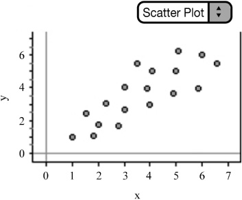
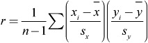
![]() Example: Consider the following scatterplot.
Example: Consider the following scatterplot.
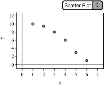
![]() We can examine the scatterplot in Figure 2.8 and describe the form, direction, and strength of the relationship. We observe that the relationship is negative—that is, as x increases y decreases. We also note that the relationship is relatively strong and linear. We can write the equation of the LSRL and graph the line. The equation of the LSRL is ŷ = 8.5−1.lx. The correlation coefficient is r ≈ –.9381 and the coefficient of determination is r2 = .88. Notice that the slope and the r-value are both negative. This is not a coincidence.
We can examine the scatterplot in Figure 2.8 and describe the form, direction, and strength of the relationship. We observe that the relationship is negative—that is, as x increases y decreases. We also note that the relationship is relatively strong and linear. We can write the equation of the LSRL and graph the line. The equation of the LSRL is ŷ = 8.5−1.lx. The correlation coefficient is r ≈ –.9381 and the coefficient of determination is r2 = .88. Notice that the slope and the r-value are both negative. This is not a coincidence.
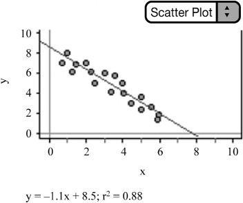
![]() Notice what happens to the LSRL, r, and r2 as we shift a data point from the scatterplot that is located toward the end of the LSRL in the x-direction. Consider Figure 2.9. The equation of the LSRL changes to ŷ = 7.5−.677x, r changes to ≈ .5385, and r2 changes to .29. Moving the data point has a dramatic effect on r, r 2, and the LSRL, so we consider it to be an influential observation.
Notice what happens to the LSRL, r, and r2 as we shift a data point from the scatterplot that is located toward the end of the LSRL in the x-direction. Consider Figure 2.9. The equation of the LSRL changes to ŷ = 7.5−.677x, r changes to ≈ .5385, and r2 changes to .29. Moving the data point has a dramatic effect on r, r 2, and the LSRL, so we consider it to be an influential observation.
![]() Moving a data point near the middle of the scatterplot does not typically have as much of an impact on the LSRL, r, and r2 as moving a data point toward the end of the scatterplot in the x-direction. Consider Figure 2.10. Although dragging a data point from the middle of the scatterplot still changes the location and equation of the LSRL, it does not impact the regression nearly as much. Note that r and r2 change to .7874 and .62, respectively. Although moving this data point impacts regression somewhat, the effect is much less, so we consider this data point “less influential.”
Moving a data point near the middle of the scatterplot does not typically have as much of an impact on the LSRL, r, and r2 as moving a data point toward the end of the scatterplot in the x-direction. Consider Figure 2.10. Although dragging a data point from the middle of the scatterplot still changes the location and equation of the LSRL, it does not impact the regression nearly as much. Note that r and r2 change to .7874 and .62, respectively. Although moving this data point impacts regression somewhat, the effect is much less, so we consider this data point “less influential.”

![]() Linear data can be modeled using the LSRL. It’s important to remember, however, that not all data is linear. How do we determine if a line is really the best model to use to represent the data? Maybe the data follow some type of curved relationship?
Linear data can be modeled using the LSRL. It’s important to remember, however, that not all data is linear. How do we determine if a line is really the best model to use to represent the data? Maybe the data follow some type of curved relationship?
![]() Examining the scatterplot, as mentioned earlier, is the first step to finding an appropriate model. However, sometimes looking at the scatterplot and finding the r-value can be a little deceiving. Consider the following two scatterplots. Both contain the same data but are scaled differently. Changing the scale of the scatterplot can make the data appear more or less linear than is really the case. You might guess the r-value of Figure 2.12 to be higher than that of Figure 2.11 since the data points “appear” closer together in Figure 2.12 than they do in Figure 2.11. The r-values are the same, however; only the scale has been changed. Our eyes can sometimes deceive us.
Examining the scatterplot, as mentioned earlier, is the first step to finding an appropriate model. However, sometimes looking at the scatterplot and finding the r-value can be a little deceiving. Consider the following two scatterplots. Both contain the same data but are scaled differently. Changing the scale of the scatterplot can make the data appear more or less linear than is really the case. You might guess the r-value of Figure 2.12 to be higher than that of Figure 2.11 since the data points “appear” closer together in Figure 2.12 than they do in Figure 2.11. The r-values are the same, however; only the scale has been changed. Our eyes can sometimes deceive us.

To help make the decision of which model is best, we turn our attention to residual plots.
![]() The residual plot plots the residuals against the explanatory variable. If the residual plot models the data well, the residuals should not follow a systematic or definite pattern (Figures 2.13–2.14).
The residual plot plots the residuals against the explanatory variable. If the residual plot models the data well, the residuals should not follow a systematic or definite pattern (Figures 2.13–2.14).
![]() The next three examples will be used to aide in the understanding of how to find an appropriate model (equation) for a given data set. The promising AP Stats student (yes, that’s you!) should understand how to take a given set of bivariate data, determine which model is appropriate, perform the inverse transformation, and write the appropriate equation. The TI-83/84 can be used to construct a scatterplot and the corresponding residual plot. Remember that the graphing calculator will create a list of the residuals once linear regression has been performed on the data. After the appropriate model is determined, we can obtain the LSRL equation from the calculator and transform it to the appropriate equation to model the data. We use logarithms in exponential and power models because these models involve equations with exponents. Remember that a logarithm is just another way to write an exponent. It’s important to remember the following algebraic properties of logarithms:
The next three examples will be used to aide in the understanding of how to find an appropriate model (equation) for a given data set. The promising AP Stats student (yes, that’s you!) should understand how to take a given set of bivariate data, determine which model is appropriate, perform the inverse transformation, and write the appropriate equation. The TI-83/84 can be used to construct a scatterplot and the corresponding residual plot. Remember that the graphing calculator will create a list of the residuals once linear regression has been performed on the data. After the appropriate model is determined, we can obtain the LSRL equation from the calculator and transform it to the appropriate equation to model the data. We use logarithms in exponential and power models because these models involve equations with exponents. Remember that a logarithm is just another way to write an exponent. It’s important to remember the following algebraic properties of logarithms:
log(AB) = log A + log B
log(A|B) = log A − log B
log Xn = nlog X
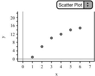
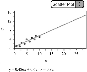
![]() Linear Model: Consider the data in Figure 2.15. Examining the scatterplot of the data reveals a strong, positive, linear relationship. The lack of a pattern in the residual plot confirms that a linear model is appropriate, compared to any other non-linear model. We should be able to get pretty good predictions using the LSRL equation.
Linear Model: Consider the data in Figure 2.15. Examining the scatterplot of the data reveals a strong, positive, linear relationship. The lack of a pattern in the residual plot confirms that a linear model is appropriate, compared to any other non-linear model. We should be able to get pretty good predictions using the LSRL equation.
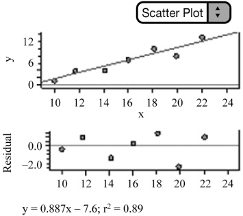
![]() Exponential Model: Consider the data in Figure 2.16. There appears to be a curved pattern to the data. The data does not appear to be linear. To rule out a linear model, we can use our calculator or statistical software to find the LSRL equation and then construct a residual plot of the residuals against x. We can see that the residual plot has a definite pattern and thus contradicts a linear model. This implies that a non-linear model is more appropriate.
Exponential Model: Consider the data in Figure 2.16. There appears to be a curved pattern to the data. The data does not appear to be linear. To rule out a linear model, we can use our calculator or statistical software to find the LSRL equation and then construct a residual plot of the residuals against x. We can see that the residual plot has a definite pattern and thus contradicts a linear model. This implies that a non-linear model is more appropriate.

An exponential or power model might be appropriate. Exponential growth models increase by a fixed percentage of the previous amount. In other words,
and so on. These percentages are approximately equal. This is an indication that an exponential model might best represent the data. Next, we look at the graph of log y vs. x (Figure 2.17). Notice that the graph of log y vs. x straightens the data. This is another sign that an exponential model might be appropriate. Finally, we can see that the residual plot for the exponential model (log y on x) appears to have random scatter. An exponential model is appropriate.

We can write the LSRL equation for the transformed data of log y vs. x. We then use the properties of logs and perform the inverse transformation as follows to obtain the exponential model for the original data.
Write the LSRL for log y on x.
Your calculator may give you ŷ = .4937 + .3112x, but remember that you are using the log of the y values, so be sure to use log ŷ, not just ŷ.
log ŷ = .4937 + .3112x
Rewrite as an exponential equation. Remember that log is the common log with base 10.
ŷ = 10.4937+.3112x
Separate into two powers of 10.
ŷ = 10.4937. 10.3112x
Take 10 to the .4937 power and 10 to the .3112 power and rewrite.
ŷ = 3.1167 · 2.0474x
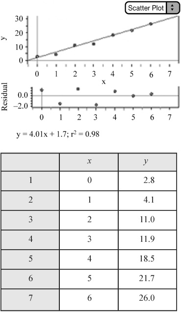
Our final equation is an exponential equation. Notice how well the graph of the exponential equation models the original data (Figure 2.18).

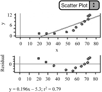
![]() Power Model: Consider the data in Figure 2.19. As always, remember to plot the original data. There appears to be a curved pattern. We can confirm that a linear model is not appropriate by interpreting the residual plot of the residuals against x, once our calculator or software has created the LSRL equation. The residual plot shows a definite pattern; therefore a linear model is not appropriate.
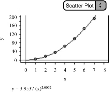
Power Model: Consider the data in Figure 2.19. As always, remember to plot the original data. There appears to be a curved pattern. We can confirm that a linear model is not appropriate by interpreting the residual plot of the residuals against x, once our calculator or software has created the LSRL equation. The residual plot shows a definite pattern; therefore a linear model is not appropriate.
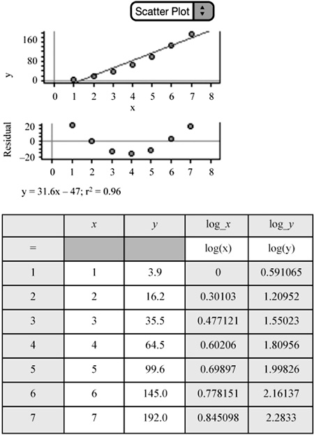
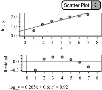
We can then examine the graph of log y on x. Notice that taking the log of the y-values and plotting them against x does not straighten the data—in fact, it bends the data in the opposite direction. What about the residual plot for log y vs. x? There appears to be a pattern in the residual plot (Figure 2.20); this indicates that an exponential model is not appropriate.
Next, we plot log y vs. log x (Figure 2.21). Notice that this straightens the data and that the residual plot of log y vs. log x appears to have random scatter. A power model is therefore appropriate.
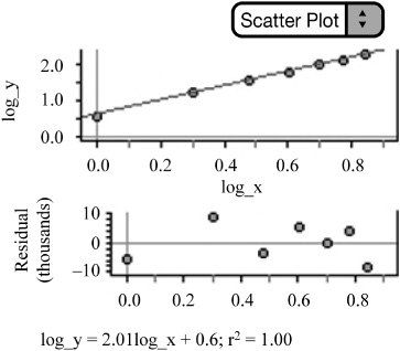
We can then perform the inverse transformation to obtain the appropriate equation to model the data.
Write the LSRL for log y on log x.
log ŷ = .5970 + 2.0052 1og x Remember we are using logs!
Rewrite as a power equation.
ŷ = 10.5970+2.00521ogx
Separate into two powers of 10.
ŷ = 10.5970 · 102.0052logx
Use the power property of logs to rewrite.
ŷ = 10.5970 · 10logx2.0052
Take 10 to the .5970 power and cancel 10 to the log power.
ŷ = 3.9537·x2.0052
Our final equation is a power equation. Notice how well the power model fits the data in the original scatterplot (Figure 2.22).