
![]()
Time-Series Analysis and Forecasting
In this chapter, we introduce the concept of time-series forecasting straight using a couple of examples. We’ll talk about a popular bank, which has been offering credit cards to its customers for more than a decade. Every month the bank has some customers who file for bankruptcy. Some customers have defaulted on their loans for more than six months, and finally they need to be taken off the books. Obviously, this is a loss to the bank, in terms of dollars and accounts. Can the bank proactively estimate these losses for each of its portfolios? Can the bank proactively take necessary steps to control the loss and find out whether it is going to soar in the future? How does the bank forecast such losses based on historical data?
Let’s consider another example. A contact center or business process outsourcing (BPO) process receives and processes thousands of calls every month. The number of calls is not the same every day. The call volume is different depending upon whether it’s a weekend or a weekday and whether it’s morning or evening. Can the BPO center forecast the call volumes so that it can better manage the resources and employee shifts? Again, one question arises: how do you forecast the future call volumes?
Another example is a laptop computer manufacturing company that has been in business for the last three decades. It has a couple of new models that will be launched in the next few months. Can the company determine the total addressable market? Can it estimate the sales of the next two quarters based on historical data?
Many companies track variables related to the economy such as gross domestic product (GDP), growth rate index, unemployment rate, and so on. Based on historical values, can you forecast the future values of these variables? If yes, everyone would like to have those numbers.
Similarly, can you forecast a stock price based on the past several years of data? Can you forecast the number of visitors for a web site? How do you forecast the number of viewers for a TV program?
There are many such business scenarios that involve forecasting variables that vary with time. The forecasting time lines for the variables can be days, months, quarters, years, or even seconds and milliseconds. Basically, it can be any unit that represents a time line. You can use time-series analysis and forecasting techniques for most of these business scenarios. These techniques are the topic of discussion in this chapter.
What Is a Time-Series Process?
Any process that varies over time is a time-series process provided the interval is fixed. If you are talking about monthly data and one month is the interval between two time points, then you should have one value of the variable every month for it to be defined as a time-series process.
Time-series data is a sequence of records collected from a process with equally spaced intervals in time. In simple terms, any metric that is measured over time is a time-series process, given that the time interval is the same between any two consecutive points. In the following text, you will consider some time-series plots as examples.
You denote a time series with Yt, where Y is the value of the metric at time point t. Refer to Table 12-1, which is charted in Figure 12-1. It is an example of the daily call volume of the last two years for a voice-processing BPO.
Table 12-1. Daily Call Volume of a Voice-Processing BPO
|
Day |
Denoted by |
Call Volume |
|---|---|---|
|
10/25/2014 |
Yt |
99,552 |
|
10/24/2014 |
Yt-1 |
113,014 |
|
10/23/2014 |
Yt-2 |
118,502 |
|
10/22/2014 |
Yt-3 |
119,437 |
|
10/21/2014 |
123,410 | |
|
10/20/2014 |
129,368 | |
|
10/19/2014 |
135,961 | |
|
10/18/2014 |
131,698 | |
|
. . . |
. . . |
. . . . |
|
. . . . |
. . . |
. . . . |
|
2/23/2014 |
Yt-p |
113,214 |

Figure 12-1. Daily call volume for a voice-processing BPO
Figure 12-2 shows an example of time-series data for monthly laptop computer sales.

Figure 12-2. Time-series data on monthly laptop sales
Figure 12-3 shows the time-series chart of the United States’ GDP for the past 50 years. This GDP is calculated at purchasers’ prices. It is the sum of the gross value added by all resident producers in the economy. Product taxes and subsidies are treated appropriately while calculating the value of the products. It’s not necessary to get into details of how GDP is actually calculated.

Figure 12-3. Time-series data on U.S. GDP (Source: World Bank, http://data.worldbank.org/country?display=graph)
Figure 12-4 shows the time-series chart of U.S. mobile cellular subscriptions (per 100 people).
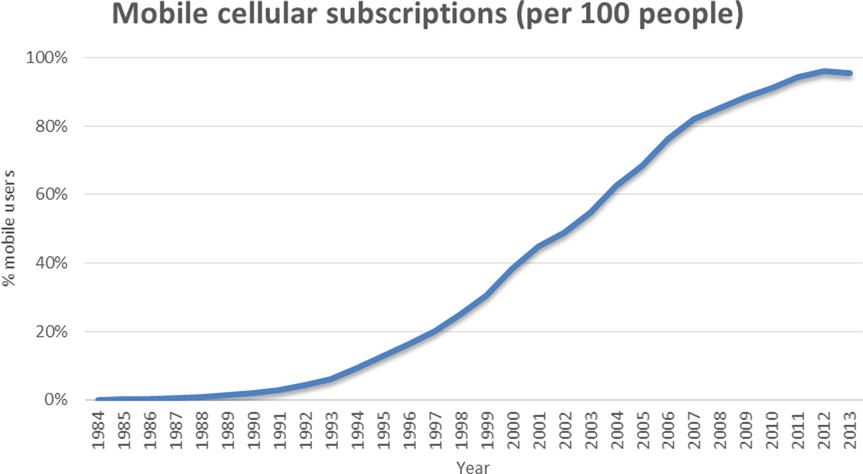
Figure 12-4. U.S. mobile cellular subscriptions, per 100 people (Source: World Bank, http://data.worldbank.org/indicator/IT.CEL.SETS.P2)
Main Phases of Time-Series Analysis
So far in this chapter, you have seen several examples of time-series data. The aim of time-series analysis is to comprehend the historical time line of data, analyze it to uncover hidden patterns, and finally model the patterns to use for forecasting. There are three main phases of time-series analysis (Figure 12-5).
- Descriptive analysis
- Modeling
- Forecasting the future values

Figure 12-5. Main phases in time-series analysis
In the descriptive phase, you try to understand the nature of the time series. You try to answer questions about what the trend looks like, upward or downward, and whether there any seasonal trend in the process. Finding patterns in the data is a vital step. In the modeling or pattern discovery step, you model the inherent properties of the time-series data. There are several methods of finding patterns in the process of time-series analysis.
Once you have identified the patterns, forecasting is relatively easy. It is simple to use a model to forecast future values. In the next section, you will see some modeling techniques. Before applying these techniques, it helps if you get a basic feel of the data using descriptive statistics methodologies. You have already studied predictive modeling in earlier chapters. Normally, in predictive modeling, you predict the dependent variable Y using a set of X variable values. In time-series analysis, it’s different. Here you predict Y using the previous values of Y. The following mathematical representation helps further clarify this difference:
|
Predictive modeling |
Y versus X1, X2, . . . Xp |
|
Time-series analysis |
Y versus Y (Yt versus Yt-1) |
Modeling Methodologies
There are several techniques for modeling a time series, both simple and heuristic. Mainly all these modeling techniques can be classified into two categories: heuristic and proper statistical methods. There are some major drawbacks in simple heuristic or instinctive methods. There are hardly any statistical tests to back up simplistic heuristic methods. That is why, in this book, the discussion is limited to more scientific statistical methods. The main focus will be on the Box–Jenkins approach (or ARIMA technique), which is probably one of the most commonly used techniques in the time-series domain.
George Box and Gwilym Jenkins popularized the auto-regressive integrated moving average (ARIMA) technique of modeling a time series. ARIMA methods were not actually invented by Box and Jenkins, but they made some significant contributions in simplifying the techniques. To understand model building using the Box–Jenkins approach, you first need to develop an understanding of terms like ARIMA, AR, MA, and ARMA process.
What Is ARIMA?
Time-series models are known as ARIMA models if they follow certain rules. One such rule is that the values of the time series should fall under certain limits. Later sections of the chapter will come back to ARIMA.
The AR Process
An auto-regressive (AR) process is where the current values of the series depend on their previous values. Auto-regression is also an indicative name, which specifies that it is regression on itself. The auto-regressive process is denoted by AR(p), where p is the order of the auto-regressive process. In the AR process, the current values of the series are a factor of previous values. P determines on how many previous values the current value of the series depends.
For example, consider Yt , Yt-1, Yt-2, Yt-3, Yt-4, Yt-5 , Yt-6, . . . Yt-k, which constitutes a time series. If this series is an AR(1) series, then the value of Y at the given time t will be a factor of its value at time t-1.
Yt = a1*Yt-1 + εt
a1 is the factor or the quantified impact Yt-1 on Yt , and εt is the random error at time t. εt is also known as white noise. When I say that Y at any given time t is a factor of its value at time t-1, it may not exactly be equal to a1*Yt-1 . It may be slightly higher or lower than a1*Yt-1. But you can’t precisely tell what will be the value of εt. It is just a small random value at time t, which may be positive or negative. This term (εt.) can’t be specifically quantified in an actual time-series model because it takes different values at different time points.
For an AR(2) series, the value of Y at time t will be a factor of the value at time t-1 and t-2.
Yt = a1*Yt-1 + a2*Yt-2 + εt
a1 is the factor or the quantified impact Yt-1 on Yt , and a2 is the quantified impact Yt-2 on Yt .
Likewise, for a series to be AR(P), Y will depend on the previous Y values until the time point t-p.
Yt = a1*Yt-1 + a2*Yt-2 + a3*Yt-3 + . . . ..+ ap*Yt-p + εt
a1, a2, a3, . . . .ap are the quantified impacts of Yt-1 ,Yt-2, . . . Yt-p on Yt .
Let’s look at an example in the sales domain. If you come across a sales series where the current month’s sales depends upon the previous month’s sales, then you call that an AR(1) series.
The following equation and the plot in Figure 12-6 represent an AR(1) process for time-series sales data:
Yt = 0.76*Yt-1 + εt

Figure 12-6. A typical AR (1) time-series equation plot (product sales over time)
The following equation and the plot in Figure 12-7 represent an AR(2) process of time-series sales data for a different product:
Yt = 0.45*Yt-1 + 0.48*Yt-2+ εt
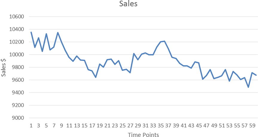
Figure 12-7. A typical AR (2) time-series equation plot (product sales over time)
Please note that Figures 12-6 and 12-7 are typical examples, but not every AR(1) or AR(2) graph will look like this. The shape of a time-series plot varies from one equation to another even within the same order of an AR(p) process. It is not easy to determine the order of an AR process by simply looking at the shape of the time-series curve alone.
The MA Process
A moving average (MA) process is a time-series process where the current value and the previous values in the series are almost the same. But the current deviation in the series depends upon the previous white noise or error or shock (that is, εt , εt-1, and so on). Generally, εt is considered to be an unobserved term. It can be a small random change in the current series because of some unknown reason; it may be due to some external effect. For example, while studying a sales trend, a small observed random change in sales might be due to external factors such as accidental rain, snow, or exceptionally hot weather. In an AR process, Yt depends on the previous values of Y, whereas in the MA process, Yt-1 doesn’t come into picture at all. It’s all about the short-term shocks in the series; MA is not related to the long-term trends, like in an AR process. In the MA process, the current value of the series is a factor of the previous errors. MA(q) is the analog of AR(p) as far as the notation for the MA process is concerned. Here q determines how many previous error values have an effect on the current value of an MA series. εt, εt-1, εt-3, . . . , εt-k denotes the errors or shocks or the white noises at time t, t-1, . . . . t-k.
If a series is MA(1), then the deviation at time t will be a factor of the error at t and t-1.
Yt - μ = εt + b1*εt-1
In the previous equation:
- b1 is the factor or the quantified impact of εt-1 on the current deviation.
- μ is the mean of the overall series.
- Yt - μ is the deviation at time t.
Note that there is no Yt-1 term in this equation. The current error and previous error constitute only the right side of the equation.
If a series is MA(2), then the deviation at time t will be a factor of the errors at t, t-1, and t-2.
Yt - μ = εt + b1*εt-1+ b2*εt-2
In the previous equation:
- b1 and b2 are the factors or the quantified impacts of εt-1 and εt-2 on the current deviation.
- μ is the mean of the overall series.
- Yt -μ is the deviation at time t.
Similarly, for an MA(q) series, the deviation at time t will be a factor of the errors at t, t-1, . . . .. t-p.
Yt -μ = εt + b1*εt-1+ b2*εt-2. . . .. . . .+ bq*εt-q
You will appreciate that an AR component is a long-term trend component, while an MA component is a short-term component.
The following equation and the plot in Figure 12-8 represent an MA(1) process for time-series sales data:
Yt = εt + 0.3*εt-1

Figure 12-8. A typical MA(1) time-series equation plot (product sales over time)
The following equation and the plot in Figure 12-9 represent an MA(2) process for time-series sales data:
Yt = εt + 0.1*εt-1+ 0.3*εt-2

Figure 12-9. A typical MA(2) time-series equation plot (product sales over time)
As discussed for an AP(p) series, the shape of any MA(q) series curve also depends upon the actual parameters. Even if the order of two MA(q) series is the same, their plot shapes can differ based upon the actual parameter values in their respective equations.
ARMA Process
If a process shows the properties of an auto-regressive process and a moving average process, then it is called an ARMA process. In an ARMA time-series process, the current value of the series depends on its previous values. The small deviations from the mean value in an ARMA process are a factor of the previous errors. You can think of an ARMA process as a series with both long-term trend and short-term seasonality. ARMA(p,q) is the general notation for an ARMA process, where p is the order of the AR process and q is the order of the MA process.
For example, if Yt , Yt-1 , Yt-2 , Yt-2 , Yt-4 , Yt-5 , Yt-6, . . . .. . . .. . . .. . . . . . , Yt-k are the values in the time series and εt, εt-1, εt-2, . . . , εt-k are the errors at time t, t-1, t-2, . . . . t-k, respectively, then an ARMA(1,1) series is written as follows:
Yt = a1*Yt-1 + εt + b1*εt-1
a1 is the factor or the quantified impact of Yt-1 on Yt , and εt is the random error at time t. b1 is the factor or the quantified impact of εt-1 on the current value.
An ARMA(2,1) series is written as follows:
Yt = a1*Yt-1 + a2*Yt-2 + εt + b1*εt-1
a1 and a2 are the quantified impacts of Yt-1 and Yt-2 on Yt, and εt is the random error at time t. b1 is the factor or the quantified impact of εt-1 on the current value.
In the same way, the generic ARMA (p,q) series is written as follows:
Yt = a1*Yt-1 + a2*Yt-2 + a3*Yt-3 + . . . ..+ ap*Yt-p + εt + b1*εt-1+ b2*εt-2. . . .. . . .+ bq*εt-q
a1, a2, a3, . . . . ap are the quantified impacts of Yt-1 ,Yt-2, . . . . Yt-p on Yt, and b1, b2, . . . . bq are the factors or the quantified impacts of εt-1 and εt-2 . . . εt-q on Yt.
The equation and the plot in Figure 12-10 represent an ARMA(1,1) process of a typical sales time-series data:
Yt = 0.75* Yt-1 + εt + 0.2* εt-1
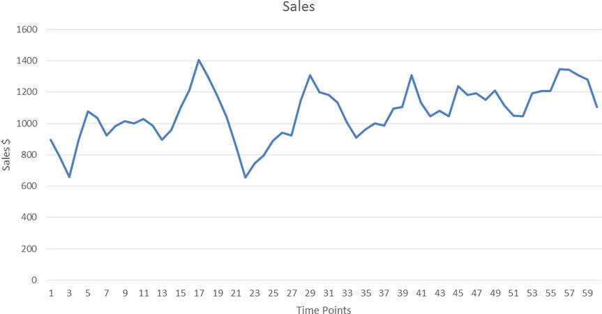
Figure 12-10. A typical ARMA(1,1) time-series equation plot (product sales over time)
The following equation and the plot in Figure 12-11 represent an ARMA(2,1) process for time-series sales data:
Yt = 0.35* Yt-1 + 0.45*Y Yt-2 + εt +0.1* εt-1

Figure 12-11. A typical ARMA(2,1) time-series equation plot (product sales over time)
Now you know what an ARMA process is. And you are also in a position to envisage the equation of a general ARMA(p,q) process. You are now ready to learn the Box–Jenkins ARIMA approach of time-series modeling.
Understanding ARIMA Using an Eyesight Measurement Analogy
I’ll use an analogy related to eyesight measurement and prescription eyeglasses as an example to explain a serious concept. Nowadays there is a lot complicated equipment to measure human eyesight. It is relatively easy to accurately measure eyesight and get the right prescription for eyeglasses. But a few decades back, before today’s sophisticated and computerized eye testing machines, doctors accomplished this task manually. Today, almost everyone who has visited an eye doctor may easily recognize the picture presented in the Figure 12-12. It is known as a Snellen chart (though this name is not as common as the chart itself).

Figure 12-12. A Snellen chart (courtesy: Wikipedia)
To test eye sight and prescribe eyeglasses, doctors perform a small test. Instead of using special equipment, in the past doctors had a box full of lenses (of different powers). The patient was asked to sit in a chair and was given an empty frame to put on her eyes. The doctor used to put differently powered lenses, on by one, in the frame and asked the patient to read from the Snellen chart. Some patients, for example, read the top seven rows and struggled with the lower ones. The doctor then removed the first lens and put another. After much such iteration, the doctor used to finalize on the exact lenses to be used in the patient’s glass. Some patients got diagnosed as nearsighted and some with farsightedness. The basic assumption in this process was that all the patients are literate. But what if the patient was illiterate and couldn’t read any letters?
So, the major steps in the process of eyesight determination and prescription can be listed as follows:
- Assume that patient is literate.
- Based on some tests, identify nearsightedness or farsightedness and get a rough estimate of eyesight.
- Estimate the exact eyesight by trying various lenses.
- Use the test results to give the prescription.
A similar analogy can be used with Box–Jenkins approach. Say you have a time series in your hands and you want to forecast some future values in this series. You first need to identify whether the time-series process is an AR process or an MA process or an ARMA process. You also need to identify the orders, p and q, of AR(p) or MA(q) or ARMA(p,q) processes as applicable. Once you identify the type of series and the orders, you can attempt to write the series equation. You are already familiar with the AR(p), MA(q), and ARMA(p,q) equations. The next step is to find parameters such as a1, a2, . . . ap, and b1, b2, . . . bq as applicable. Before you move on to identifying the model, there is an assumption to be made; the series has to be stationary (in the coming sections, I explain more about stationary time series). This is to simplify the overall model identification process. Table 12-2 uses the eyeglasses prescription analogy to illustrate the Box–Jenkins approach. After that I discuss various steps involved in the Box–Jenkins approach.
Table 12-2. An Analogy Between a Vision Test and the Box–Jenkins Approach
|
Vision Test |
Box–Jenkins Approach |
|---|---|
|
Assume the patient is literate. |
Assume that the time series is stationary; otherwise, make it stationary. |
|
Based on some tests, identify nearsightedness or farsightedness and get a rough estimate of eyesight. |
Based on plots (ACF and PACF functions, explained later in this chapter), identify whether the model is an AR or MA or ARMA process. |
|
Estimate the exact eyesight by trying various lenses. |
Estimate the parameters such as a1, a2, . . . ap, and b1, b2, . . . bq. |
|
Use the test results to give the prescription. |
Use the final model for forecasting. |
Steps in the Box–Jenkins Approach
Once again I’ll show a time-series forecasting problem. Consider some time-series data of a premium stock over a period of time. Let’s assume you have the stock price data for the past year. Also assume that you want to predict the stock prices for the next week. You will use the Box–Jenkins approach for this forecasting. First you need to make sure that the stock price time-series process is stationary. Then you need to identify the type of process, which approximates the pattern followed by the stock price data. Is it an AR process or an MA process or an ARMA process? Once you have the basic model equation in place, you can estimate the parameters. Successfully completing all these steps concludes the model-building process. You now have the final equation that can be used for forecasting the future values of the stock under consideration. You also need to take a look at the model accuracy or the error rate before you can continue with the final forecasting and model deployment. What follows is a detailed explanation of each step.
Step 1: Testing Whether the Time Series Is Stationary
If a time-series process is stationary, it’s much easier to build the model using the Box–Jenkins methodology.
What Is a Stationary Time Series?
“A time series is said to be stationary if there is no systematic change in mean (no trend), if there is no systematic change in variance, and if strictly periodic variations have been removed,” according to Dr. Chris Chatfield in The Analysis of Time Series: An Introduction (Chapman and Hall, 2003). A stationary time series is in a state of statistical equilibrium. If the series is varying within certain limits and if the previous or future values of the mean and variance of the series are not going to be exceptionally high, then the series can be understood as a stationary series. In the stationary time-series process, the mean and variance hover around a single value. With the growth of a series, if the mean and variance of the series also tend to grow extremely high, then the series is considered to be nonstationary. It’s difficult to identify patterns in a nonstationary time series, and model building can be tough. A nonconstant mean or nonconstant variance is a sign of a nonstationary time-series process (Figure 12-13). These processes are also called explosive.
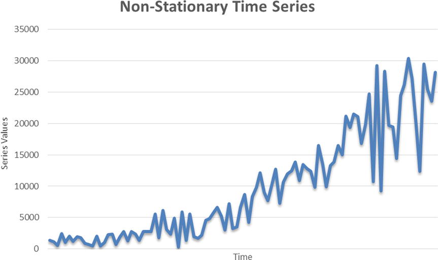
Figure 12-13. An example of a nonstationary time series
In some cases, it is easy to identify a nonstationary time series. You need to ask two questions:
- What will the series mean be at time ∞ (infinity)?
- What will the series variance be at time ∞ (infinity)?
If the answer to either one of these questions is ∞, then you can safely conclude that the series under consideration is nonstationary. As a nonstationary series grows, you can see that the values of the series start inflating too much; in fact, they tend to go out of proportion soon. It becomes really tough to predict the series values using the Box–Jenkins approach in such a case. Real-life scenarios may encounter many nonstationary series. You may have to transform or differentiate to make them stationary. Later sections will cover the details of series transformation and differentiation.
Figure 12-14 shows an example plot of a stationary time series.
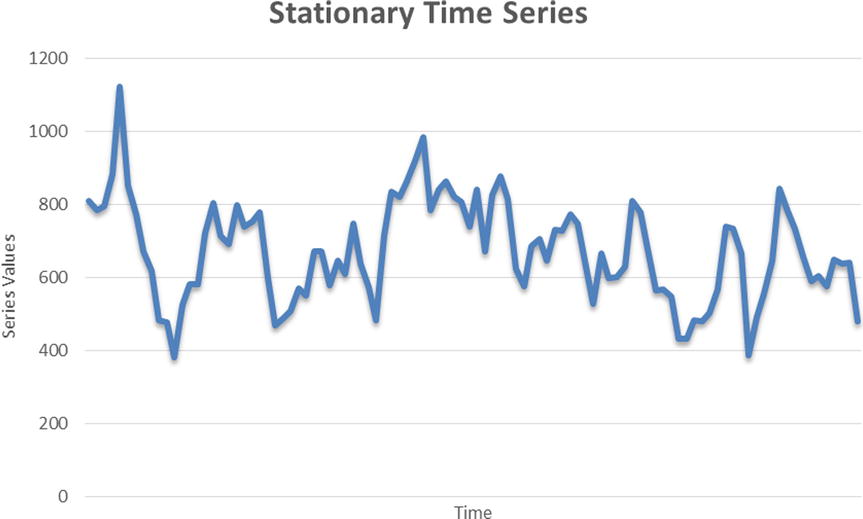
Figure 12-14. An example of a stationary time series
In Figure 12-14, some steadiness is apparent in the series plot. It’s not inflating too much from its mean value line. In this case, the value of variance or mean will also show steadiness or a state of equilibrium. By now I have discussed many times that simply by looking at the curve shape, it is not a good idea to come to a conclusion. You need a scientifically proven statistical approach to test whether a series is stationary. In fact, curve shapes can be misleading at times and can lead to wrong conclusions. For example, let’s take the series shown in Figure 12-15, which represents weekly fluctuations in Microsoft’s stock price. The data shown in this plot is Microsoft’s stock prices from January 2010 to September 2014 (Source: http://finance.yahoo.com/echarts?s=MSFT). Just looking at the curve shape, you can’t undoubtedly tell whether it is a stationary or nonstationary series. You need a solid test for testing stationarity.

Figure 12-15. Time-series data for weekly stock prices of a listed company
Testing Stationarity Using a DF Test
To test the stationarity of a series, you use Dickey Fuller (DF) test checks. The actual theory behind DF and Augmented Dickey Fuller (ADF) tests is complicated and beyond the scope of this book. What follows is a simplified and practical use of a DF test, which may be sufficient for field use.
The null and alternative hypotheses of a DF test are as follows:
- H0: The series is not stationary.
- H1: The series is stationary.
So, you perform a DF test and take note of the P-value. Looking at the P-value of the DF test, if the P-value is less than 5 percent (0.05), you reject the null hypothesis, which is equivalent to rejecting the hypothesis that the series is not stationary. So, a series is concluded as stationary when the P-value of a DF test is less than 0.05. On the other hand, if the P-value is more than 0.05, then you go ahead and accept the null hypothesis, which means that the series is not stationary.
SAS Code for Testing Stationarity
The following is the SAS code for testing the stationarity of a series. Let’s assume that the Microsoft stock price data is imported into the SAS environment and stored in a data set called ms.
proc arima data= ms;
identify var= stock_price  stationarity=(DICKEY);
run;
The following is an explanation of this code:
- proc arima: arima is the procedure to fit ARIMA models.
- data= ms;: The data set name is ms.
- identify var= stock_price: This mentions the time-series variable, which is Adj_close in this case.
- stationarity=(DICKEY): This is the keyword for the DF test.
Table 12-3 shows the output of this code.
Table 12-3. Output of PROC ARIMA on the Data Set ms (DF Test)
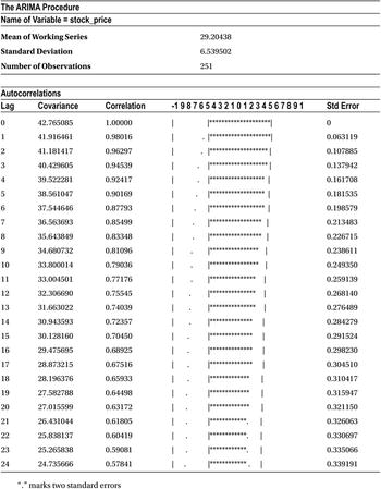
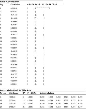
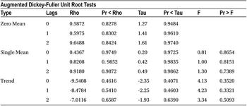
The output in Table 12-3 includes several tables, but the one that matters here is the last one named Augmented Dickey-Fuller Unit Root Tests. Within that table you need to focus on the section named Single Mean. The Zero Mean portion of the table is calculated by assuming the mean of the series is zero. The Trend portion of the table is calculated by assuming the null hypothesis of a DF test is true, meaning that the series is stationary with some trend component. You can safely ignore these two portions of the output from your inference. So, to keep it simple, let’s concentrate only on Table 12-4, which is taken from the complete table, Augmented Dickey-Fuller Unit Root Tests.
Table 12-4. The Single Mean Portion of Augmented Dickey-Fuller Unit Root Tests

You need to look at the P-value of a single mean for an augmented Dickey Fuller test.
- Pr<Rho values are more than 5 percent for lags 0, 1, and 2.
- Similarly, Pr<Tau values are more than 5 percent for lags0, 1, and 2.
So, you safely conclude here that the series under consideration is not stationary.
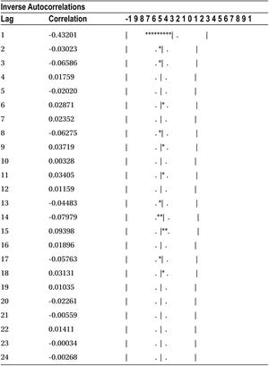
![]() Note As discussed earlier, the exact explanation of a DF test is complicated and is beyond the scope of this book. The following are some notes for statistics enthusiasts.
Note As discussed earlier, the exact explanation of a DF test is complicated and is beyond the scope of this book. The following are some notes for statistics enthusiasts.
The DF test has two sets of P-values:
- The first set of P-values (Pr<Rho) is for testing the unit roots directly. Looking at these P-values (Table 12-4), you can conclude that the series is not stationary.
- The second set of P-values (Pr<Tau) is for testing the regression of a differentiated Yt on a constant, time t, Yt-1, and differentiated Yt-1.
If a series is not stationary like the way you saw in the previous case (Figure 12-15), you can differentiate it to make it stationary. If Yt is the original series, then ∆Yt=Yt - Yt-1. Instead of taking the original series values, you consider the differentiated series, as shown in Table 12-5.
Table 12-5. Differentiated Series Data

In the previous Microsoft example, the stock price time series was not stationary. Let’s create a differentiated time series using the following SAS code. It is pretty straightforward.
data ms1;
set ms;
diff_stock_price=stock_price-lag1(stock_price);
run;
Yt-1
ms1 is the new data set, Lag1 denotes the Yt-1 values, and diff_stock_price is the new differentiated series. Table 12-6 is a snapshot of the differentiated series.
Table 12-6. A Snapshot of the Differentiated Stock Price Time Series
|
Obs |
stock_price |
diff_stock_price |
|---|---|---|
|
1 |
27.05 |
. |
|
2 |
27.23 |
0.18 |
|
3 |
25.55 |
-1.68 |
|
4 |
24.86 |
-0.69 |
|
5 |
24.72 |
-0.14 |
|
6 |
24.64 |
-0.08 |
|
7 |
25.5 |
0.86 |
|
8 |
25.41 |
-0.09 |
|
9 |
25.34 |
-0.07 |
|
10 |
25.94 |
0.60 |
Note that some series may not be stationary even after the first differentiation. You then need to go for the second differentiation. If even the second differentiation doesn’t work, you may have to try some other transformation logarithm.
Now instead of considering the original series, in other words, the stock price (Yt), you now consider the differentiated stock price and test it for stationarity. The following is the code to perform this test:
proc arima data= ms1;
identify var=diff_stock_price stationarity=(DICKEY);
run;
Table 12-7 shows the output of this code. Again, you concentrate only on the Augmented Dickey-Fuller Unit Root Tests table of the output. The focus will be on the Single Mean portion.
Table 12-7. Output of PROC ARIMA on ms1 (DF Test)

Both the sets of P-values on Rho and Tau are well below 5 percent. Hence, you conclude that the series diff_stock_price is stationary.
The Integration Component in the ARIMA Process
In the previous section, you saw how to make a nonstationary process stationary by differentiating it. The original Microsoft price was in tens of dollars, whereas the differentiated value (the new series, which is stationary) is in fractions. Please refer to Table 12-6.
The differentiated series is stationary, and it can be used for analysis using the Box–Jenkins approach. The new series can be any ARMA(p,q) process. But the forecasted values of this series will be in fractions only. As a matter of fact, you have no interest in forecasting the differentiated time series. Our main interest is in forecasting actual Microsoft stock prices but obviously not the differentiated series. You can still derive the original series values from the differentiated series. You need to perform an integration act on the differentiated series, which is the mathematical opposite of differentiation. You made the series stationary by differentiating it. Now you apply the integration to the transformed series to bring it back into its original form. Here the order of the integration (d) is 1. The order of differentiation, which you did to the stock prices series, was also 1. An ARMA series with integration is also known as an ARIMA series. It is denoted by ARIMA (p,d,q), where p is the order of the AR component, d is the order of integration, and finally q is the order of the MA component.
The order of integration required in the current example process is 1. This is simply because to make it stationary, you did the differentiation once. Some series are stationary without any need of differentiation. For such time series, the order of integration is 0. The following are some examples of the ARIMA processes:
The ARIMA(1,1, 0) series is written as follows:
∆Yt = a1*∆Yt-1 + εt
a1 is the factor or the quantified impact ∆Yt-1 on ∆Yt , and εt is the random error at time t, in other words, ∆Yt=Yt-Yt-1.
The ARIMA(2,1, 0) series is written as follows:
∆Yt = a1*∆Yt-1+ a2*∆Yt-2 + εt
a1 and a2 are the factors or the quantified impacts of ∆Yt-1 and ∆Yt-2 on ∆Yt , and εt is the random error at time t, in other words, ∆Yt=Yt-Yt-1.
The ARIMA(1,1, 1) series is written as follows:
∆Yt = a1*∆Yt-1+ εt + b1*εt-1
a1 is the factor or the quantified impact of ∆Yt-1 on ∆Yt, and εt and εt-1 are the random errors at time t and t-1, in other words, ∆Yt = Yt-Yt-1.
Integration After Forecasting
You must be wondering how to integrate after forecasting. Table 12-6 shows the form of the series after differentiating the original series in the Microsoft stock price example. In this example, you found that the stock price was not stationary, but diff_stock_price is stationary.
Now let’s assume you have gone ahead with the diff_stock_price series and produced three forecasted values after the analysis. Refer to observations 11, 12, and 13 in Table 12-8.
Table 12-8. Forecasted Values in the Time Series diff_stock_price
|
Obs |
stock_price |
diff_stock_price |
|---|---|---|
|
1 |
27.05 |
. |
|
2 |
27.23 |
0.18 |
|
3 |
25.55 |
-1.68 |
|
4 |
24.86 |
-0.69 |
|
5 |
24.72 |
-0.14 |
|
6 |
24.64 |
-0.08 |
|
7 |
25.5 |
0.86 |
|
8 |
25.41 |
-0.09 |
|
9 |
25.34 |
-0.07 |
|
10 |
25.94 |
0.60 |
|
11 |
-0.10 | |
|
12 |
0.21 | |
|
13 |
-0.11 |
Having done this, how do you know what the stock prices will be for observations 11, 12, and 13? In other words, the question here is, how do you bring back the forecasted series in its original units?
You know that the differentiated stock prices at any given time t can be calculated by the following formula:
- Diff_stock_price at time t = (Stock price at time t) – (Stock price at time t-1)
Before forecasting:
- Diff_stock_price at time 10 = (Stock price at time 10) – (Stock price at time 9)
- Diff_stock_price at time 10 = 25.94 – 25.34
- Diff_stock_price at time 10 = 0.60
After forecasting:
- Diff_stock_price at time 11 = (Stock price at time 11) – ( Stock price at time 10)
- Inserting the values in this equation from Table 12-8, you get the following:
- -0.10 = Stock price at time 11-25.94
- Stock price at time 11 = 25.94 -0.10
- Stock price at time 11 = 25.84
Similarly,
- Diff_stock_price at time 12 = (Stock price at time 12) – (Stock price at time 11)
- 0.21 = Stock price at time 12 – 25.84
- Stock price at time 12 = 25.84 + 0.21
- Stock price at time 12 = 26.05
Repeating the same calculations, you get the stock price at time point 13 as 25.94 (Table 12-9).
Table 12-9. Forecasted Values in the Time Series stock_price and diff_stock_price (After Integration)
|
Obs |
stock_price |
diff_stock_price |
|---|---|---|
|
1 |
27.05 |
. |
|
2 |
27.23 |
0.18 |
|
3 |
25.55 |
-1.68 |
|
4 |
24.86 |
-0.69 |
|
5 |
24.72 |
-0.14 |
|
6 |
24.64 |
-0.08 |
|
7 |
25.5 |
0.86 |
|
8 |
25.41 |
-0.09 |
|
9 |
25.34 |
-0.07 |
|
10 |
25.94 |
0.60 |
|
11 |
25.84 |
-0.10 |
|
12 |
26.05 |
0.21 |
|
13 |
25.94 |
-0.11 |
The rule of thumb is that you subtract the previous lag values while differentiating; you add previous lag values while integrating. Once the series is stationary, it’s ready for analysis, and forecasting becomes relatively easy. The next step is to identify the type of series. Is it AR, MA, or ARMA?
For the current example series, you have already identified the order of integration. Now you need to identify p and q. This is the next step.
Step 2: Identifying the Model
Model identification is one of the important steps in time-series modeling using the Box–Jenkins methodology. The final forecast accuracy will depend on how precisely you identify the model. The model identification includes finding out the type of time-series process, whether you are dealing with AR(1) or AR(2) or MA(1) or MA(2) or ARMA(1,1) or ARMA(2,1), and so on. By identifying the type of series, you will get a basic idea of the data. If it is AR, then you know that the current values of the series are dependent on the previous values. An AR series has a long-term trend. If it is MA, then the errors will have some impact. An MA series has some short-term seasonal effects. In fact, you can write the basic form of the series for ARMA(p,q) as follows:
Yt = a1*Yt-1 + a2*Yt-2 + a3*Yt-3 + . . . ..+ ap*Yt-p + εt + b1*εt-1+ b2*εt-2. . . .. . . .+ bq*εt-q
Identifying the model is definitely not easy. It is not enough to look at the series graph and conclude the type and order of the series. You need some concrete metrics for identifying the type and order of a series. You need to use the auto correlation function (ACF) and partial auto correlation function (PACF) functions and plots to identify the type of the series. I will go into details of this in the following sections. First, for a better comprehension, let’s look at some time-series equations and their plots.
Time-Series Examples
To understand the identification of the series, you will consider some simulated time series. You will see plots for about 15 graphs with their equations (Figures 12-16 through 12-30). The following are some time-series graphs. Let’s try to guess what their series will be.
Time Series Plot – 1 (Figure 12-16): yt = 0.66yt-1 + εt
Figure 12-16. A time-series plot for yt = 0.66yt-1 + εt
Time Series Plot – 2 (Figure 12-17): yt = 0.83yt-1 + εt

Figure 12-17. A time-series plot for yt = 0.83yt-1 + εt
Time Series Plot – 3 (Figure 12-18): yt = -0.95yt-1 + εt

Figure 12-18. A time-series plot for yt = -0.95yt-1 + εt
Time Series Plot – 4 (Figure 12-19): yt = 0.4yt-1 + 0.48yt-2 + εt

Figure 12-19. A time-series plot for yt = 0.4yt-1 + 0.48yt-2 + εt
Time Series Plot – 5 (Figure 12-20): yt = 0.5yt-1 + 0.4yt-2 + εt
Figure 12-20. A time-series plot for yt = 0.5yt-1 + 0.4yt-2 + εt
Time Series Plot – 6 (Figure 12-21): yt = 0.3yt-1 + 0.33yt-2 + 0.26yt-3 + εt

Figure 12-21. A time-series plot for yt = 0.3yt-1 + 0.33yt-2 + 0.26yt-3 + εt
Time Series Plot – 7 (Figure 12-22): yt = εt -0.8 εt-1
Figure 12-22. A time-series plot for yt = εt -0.8 εt-1
Time Series Plot – 8 (Figure 12-23): yt = εt +0.66 εt-1

Figure 12-23. A time-series plot for yt = εt +0.66 εt-1
Time Series Plot – 9 (Figure 12-24): yt = εt +0.95 εt-1
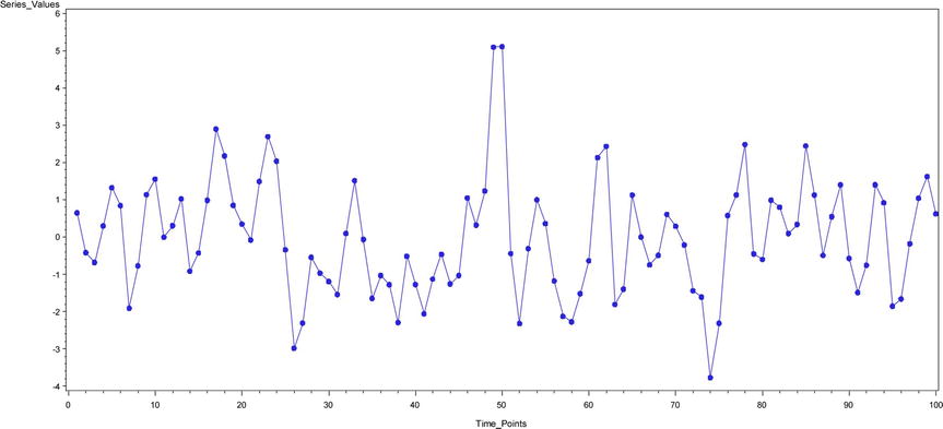
Figure 12-24. A time-series plot for yt = εt +0.95 εt-1
Time Series Plot – 10 (Figure 12-25): yt = εt -0.4 εt-1-0.38 εt-2

Figure 12-25. A time-series plot for yt = εt -0.4 εt-1-0.38 εt-2
Time Series Plot – 11 (Figure 12-26): yt = εt -0.6 εt-1-0.3 εt-2
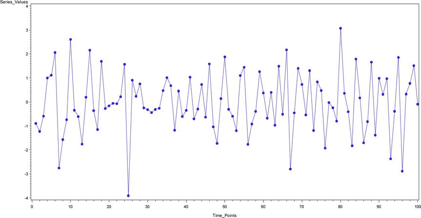
Figure 12-26. A time-series plot for yt = εt-0.6 εt-1 -0.3 εt-2
Time Series Plot – 12 (Figure 12-27): yt = εt -0.55 εt-1 -0.35 εt-2-0.15 εt-3

Figure 12-27. A time-series plot for yt = εt -0.55 εt-1-0.35 εt-2-0.15 εt-3
Time Series Plot – 13 (Figure 12-28): yt = -0.95 yt -1+ εt -0.8 εt-1
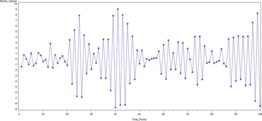
Figure 12-28. A time-series plot for yt= -0.95 yt -1 + εt-0.8 εt-1
Time Series Plot – 14 (Figure 12-29): yt = 0.77 yt -1 + εt +0.6 εt-1
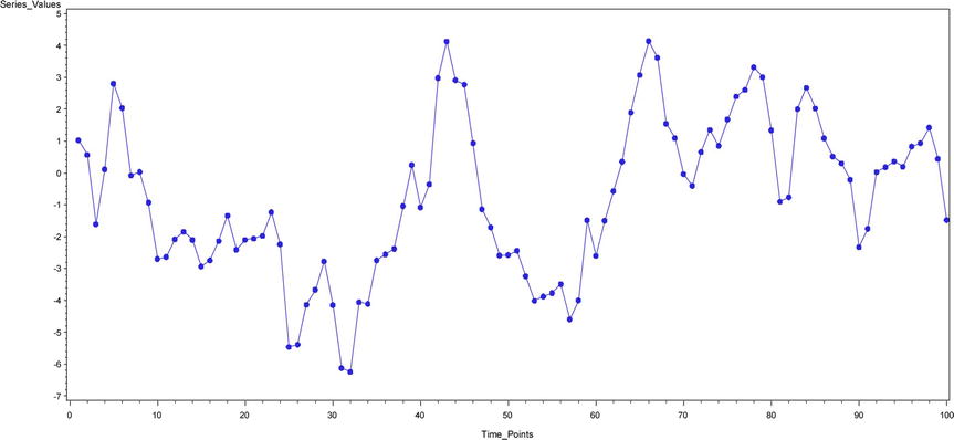
Figure 12-29. A time-series plot for yt = 0.77yt-1+ εt+0.6 εt-1
Time Series Plot – 15 (Figure 12-30): yt = 0.55yt-1+ 0.35yt-2+ εt -0.5 εt-1
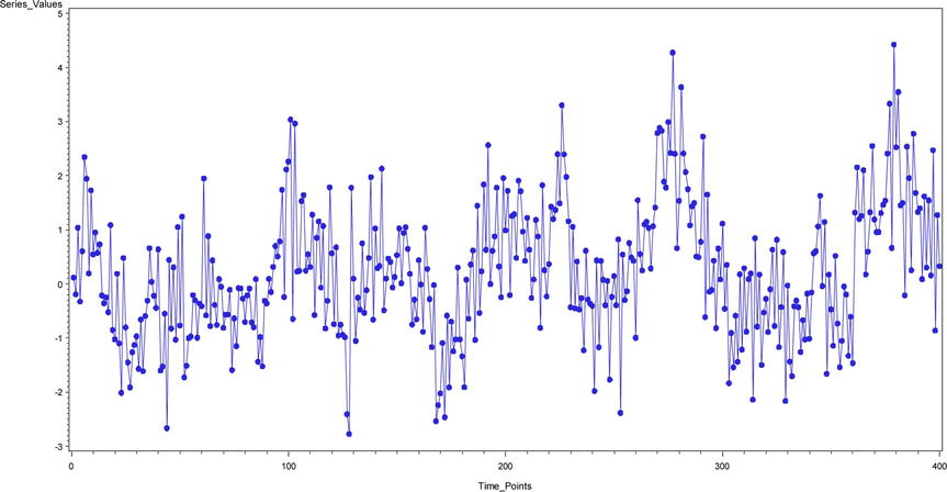
Figure 12-30. A time-series plot for yt = 0.55yt-1 + 0.35yt-2+ εt -0.5 εt-1
Was a simple observation enough to judge the type of series? In the time-series plots from Figures 12-16 through 12-30, some of them are AR processes. There are examples of AR(1), AR(2), AR(3). Some are pure MA processes. There are examples of MA(1), MA(2), and MA(3). Some series are ARMA processes.
In the preceding examples, I simulated the data; hence, I could write the equations. But in practical scenarios you will not have the model equations. You will just have the series values and the series graph. You know that it’s not easy to classify any of these series as AR, MA, or ARMA just by looking at the series values. You need some concrete metrics for identifying the type of series. You need to use ACF and PACF functions and plots to identify the type of the series. I discuss these topics in the following sections. The following lines are the 15 time-series equations put at one place so that you can compare them:
TS - 1:  yt = 0.66 yt-1 + εt
TS - 2:  yt = 0.83 yt-1 + εt
TS - 3:  yt = -0.95 yt-1 + εt
TS - 4:  yt = 0.4 yt-1 + 0.48 yt-2 + εt
TS - 5:  yt = 0.5 yt-1 + 0.4 yt-2 + εt
TS - 6:  yt = 0.3 yt-1 + 0.33 yt-2 + 0.26 yt-3 + εt
TS - 7:  yt = εt -0.8 εt-1
TS - 8:  yt = εt +0.66 εt-1
TS - 9:  yt = εt +0.95 εt-1
TS - 10: yt = εt` -0.4 εt-1 -0.38 εt-2
TS - 11: yt = εt` -0.6 εt-1 -0.3 εt-2
TS - 12: yt = εt -0.55 εt-1 -0.35 εt-2-0.15 εt-3
TS - 13: yt = -0.95 yt-1 + εt -0.8 εt-1
TS - 14: yt = 0.77 yt-1 + εt +0.6 εt-1
TS - 15: yt = 0.55 yt-1 + 0.35 yt-2 + εt -0.5 εt-1
Auto Correlation Function
Auto correlation is the correlation between Yt upon Yt-1. Generally you will find correlation between two variables, but here you are finding correlation between Y upon previous values of Y. The auto correlation function is a function of all such correlations at different lags. The ACF is denoted by ρh, where h indicates the lag.
- ACF(0): Correlation at lag0 (ρ0) = Yt and Yt =1
- ACF(1): Correlation at lag1 (ρ1) = Correlation between Yt and Yt-1
- ACF(2): Correlation at lag2 (ρ2) = Correlation between Yt and Yt-2
- ACF(3): Correlation at lag3 (ρ3) = Correlation between Yt and Yt-3
The graphs created using auto correlation values are called auto correlation plots. Figure 12-31 shows an example of one such plot. On the x-axis you have the lag values, while the y-axis has the auto correlation values. The graph might vary based on the type of the series.

Figure 12-31. An example auto correlation plot
In AR models, the current values of the series depend on its previous values. You can expect the auto correlation to chart a pattern in AR models.
Partial Auto Correlation Function
The partial auto correlation function is the partial correlations between Y and its previous values calculated at different lags. The partial correlation is the correlation after removing the effect of the other variables. You can visualize partial correlation as the correlation coefficient after removing or excluding the effect of the other independent variables. You can also treat it is as an exclusive correlation. Let’s see an example. You can expect a credit score to be dependent upon the number of existing loans, income, payment dues, length of credit history, and number of dependents. Trying to find a simple correlation between the number of loans and credit score will give you the association between the two variables, which will also include the effect of all other variables on the credit score. To find a partial correlation, you need to first eliminate the effect of the other impacting variables. For all practical purposes, you can envisage the partial correlation coefficient as a regression coefficient.
For the credit score example, here’s the equation:
Credit score = β0+ β1 (number of loans)+ β2 (payment due)+ β3 (length of credit history) + β4 (number of dependents)
The partial correlation between the number of loans and the credit score is β1, assuming that there is no multicolliniarity. β1 is the exclusive impact of the variable number of loans on the credit score. Now you can appreciate that a partial coefficient is the quantified association between two variables, which is not explained by any of their mutual associations with any other variable.
In the context of time-series analysis, partial auto correlation is found by regressing the old values of Y on the current value. The PACF is denoted by θh, where h indicates the lag.
- PACF(0): Partial correlation at lag0 (θ0) = Yt and Yt = 1
- PACF(1): Partial correlation at lag1 (θ1) = Regression coefficient of Yt-1 when Yt-1 is regressed up on Yt
- PACF(2): Partial correlation at lag2 (θ2) = Regression coefficient of Yt-2 when Yt-1 and Yt-2 are regressed up on Yt
- PACF(3): Partial correlation at lag3 (θ3)= Regression coefficient of Yt-3 when Yt-1, Yt-2 and Yt-3 are regressed up on Yt
The graphs created using partial auto correlation values are called partial auto correlation plots. Figure 12-32 shows an example of one such plot. On the x-axis you have the lag values, while the y- axis has the partial auto correlation values. As is the case with ACF, a PACF graph might vary based on the type of series.

Figure 12-32. An example of a partial auto correlation plot
In MA models, the current errors in the series depend on its previous error values. You expect the partial auto correlation to follow a pattern in MA models.
Creating ACF and PACF Plots in SAS
Using the ACF and PACF plots, you can get an idea about the type of series. This is the second step in the time-series analysis process. You have to first make sure that the time series is stationary. You may have to differentiate the series at times to make it stationary; a stationary series is ready for analysis. Once the series is ready, you want to categorize what type of series it is. Just to recap, to identify the type of series, you need to study the ACF and PACF plots generated for the series. What follows next is the code for creating ACF and PACF plots in SAS:
proc arima data=ts15 plots=all;
identify var=Series_Values ;
run;
You need to use the plots=all option to generate ACF and PACF plots. The SAS output gives four plots.
- The original series graph
- ACF plot
- PACF plot
- IACF plot
![]() Note IACF stands for inverse auto correlation. It will be discussed in later sections.
Note IACF stands for inverse auto correlation. It will be discussed in later sections.
Rules of Thumb for Identifying the AR Process
The ACF for the AR process tails off or dies down to zero. The moment you see an ACF plot showing a reducing tendency toward zero, you can safely conclude that the process type is AR. Figure 12-33 shows a few examples.

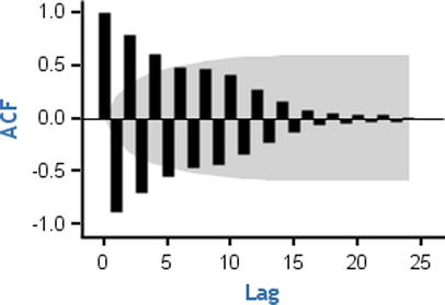
If you observe any such behaviors in your series, then definitely there is an AR component in your series. It means the current values of the series depend on some previous values of the series. This is one of the reasons why the ACF function shows a dampened or slow demolition of correlation toward zero. Yt depends on Yt-1, and Yt-1 depends on Yt-2; hence, Yt indirectly depends on Yt-2. So, the correlation at lag2 is slightly less than what it is at lag1. The correlation at lag 3 is slightly less than the correlation at lag 2. Hence, the ACF of the AR process shows this behavior of slow decrement toward zero.
But this is just the first half of the story. What about the order of the AR process? How do you identify whether a series is AR(1) or AR(2) or AR(p)? How do you find the value of P? Once you get a confirmation from the ACF plot that the process is AR, you need to look at the PACF to know the order of the series. The PACF cuts off for an AR process. There will be no significant partial auto correlation values after a few lags. The lag number indicates the order of the series. For example, if ACF slowly dampens to zero and the PACF function cuts off at lag1, then the order of the AR process is 1. If ACF slowly dampens to zero and the PACF function cuts off at lag2, then the order of the AR process is 2. Figure 12-34 shows a few examples of PACF plots for an AR process.


Counting clockwise from the top left, in graph 1, you see that the PACF cuts off at lag1. So, the order of that AR process is 1. The partial correlation value at lag0 is always 1. In graph 2 (top right), also the PACF cuts off at lag1. In graph 3 (in other words, the bottom left), the PACF cuts off at lag2 so the order of that AR process is 2. In the last graph (in other words, the right bottom one), the PACF cuts off at lag 3; hence, the order of that AR process is 3. The gray band shows the significance. Any lag that is outside the limits of that band is significant. The last graph appears as if it is cutting off at lag 4, but the fourth PACF value is nonsignificant enough because it is within the limits of the gray band.
Here is the justification for the cutoffs in the PACF graph for the AR process. Imagine an AR process of order 1; the Yt-1 will have maximum impact on Yt. If you remove the previous impacts from Yt-1 and Yt and calculate the correlation, then you will get a high correlation only for lag1, and the rest of the lags will be negligible for the AR(1) process. Similarly, for an AR(2) process, the Yt-1, Yt-2 will have a maximum impact on Yt. If you remove all the previous effects from Yt-1, Yt-2, and Yt, then the correlation will be high for lag1 and lag2 only. All the remaining correlations, beyond lag 2, will be negligible for an AR(2) process. Please refer to Table 12-10 for a summary.
Table 12-10. The Rules of Thumb to Identify an AR(P) Process
|
AR Process |
Behavior |
|---|---|
|
ACF |
Slowly tails off or diminishes to zero. Either reduces in one direction or reduces in a sinusoidal (sine wave) passion. |
|
PACF |
Cuts off. The cutoff lag indicates the order of the AR process. |
In the simulated list of time series in Figure 12-16 through Figure 12-30, the first six plots belong to the AR series. Let’s take a look at their ACF and PACF plots (Figure 12-35 through Figure 12-40). Once again, I would like to remind you that for any new series, in an actual business situation, the series equation will not be available. This is just an exercise to get the series equation.
Time Series Plot 1 (Figure 12-16): yt = 0.66yt-1 + εt
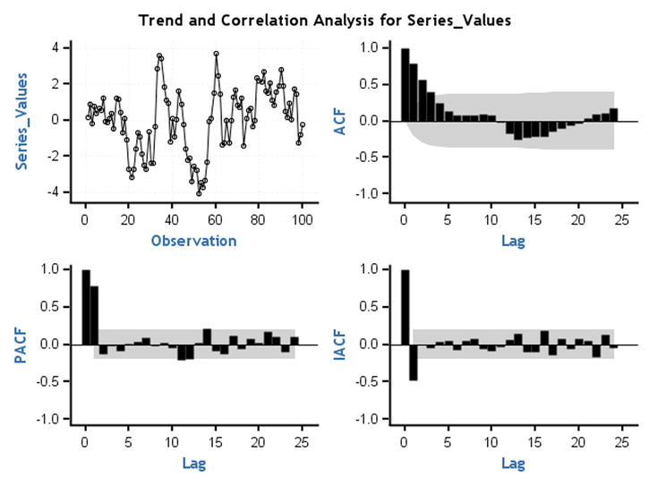
Figure 12-35. ACF and PACF plots for time-series plot 1 (Figure 12-16)
Note that in Figure 12-35 the ACF is dying down to zero and the PACF cuts off at lag1. TS 1 is an AR process of order 1.
Time Series Plot 2 (Figure 12-17): yt = 0.83yt-1 + εt
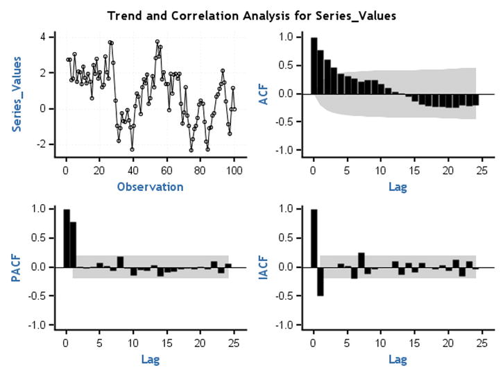
Figure 12-36. ACF and PACF plots for time-series plot 2 (Figure 12-17)
Note that in Figure 12-36 the ACF is dying down to zero and the PACF cuts off at lag 1. TS 2 is an AR process of order 1.
Time Series Plot 3 (Figure 12-18): yt = -0.95yt-1 + εt

Figure 12-37. ACF and PACF plots for time-series plot 3 (Figure 12-18)
Note that in Figure 12-37 the ACF is dying down to zero and the PACF cuts off at lag 1. TS 3 is an AR process of order 1.
Time Series Plot 4 (Figure 12-19): yt = 0.4yt-1 + 0.48yt-2 + εt
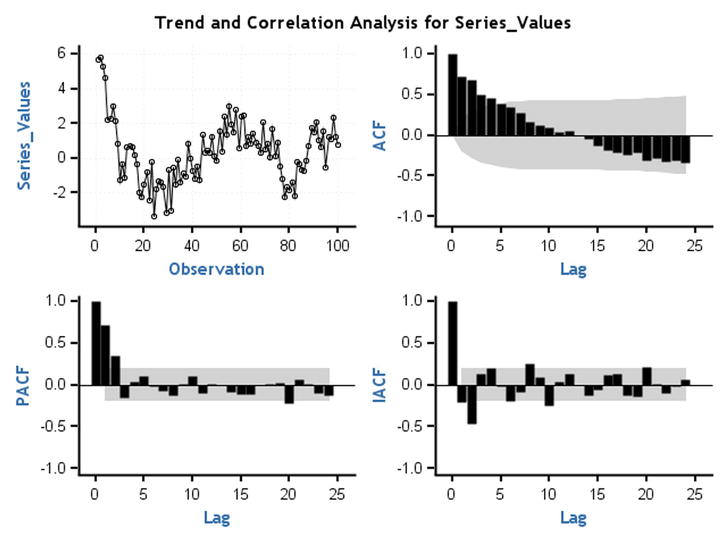
Figure 12-38. ACF and PACF plots for time-series plot 4 (Figure 12-19)
Note that in Figure 12-38 the ACF is dying down to zero and the PACF cuts off at lag 2. TS 4 is an AR process of order 2.
Time Series Plot 5 (Figure 12-20): yt = 0.5yt-1 + 0.4yt-2 + εt

Figure 12-39. ACF and PACF plots for time-series plot 5 (Figure 12-20)
Note that in Figure 12-39 the ACF is dying down to zero and the PACF cuts off at lag 2. TS 5 is an AR process of order 2.
Time Series Plot 6 (Figure 12-21): yt = 0.3yt-1 + 0.33yt-2 + 0.26yt-3 + εt

Figure 12-40. ACF and PACF plots for time-series plot 6 (Figure 12-21)
Note that in Figure 12-40 the ACF is dying down to zero and the PACF cuts off at lag 3. TS 6 is an AR process of order 3.
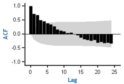
Rules of Thumb for Identifying the MA Process
The method of identifying the MA process is almost the same as the AR process. For an MA process, the PACF process slowly dies down, and the ACF cuts off. Since, in an MA process, the current value of the series has no direct dependency on the past values, the ACF cuts off. The errors of the series depend on the previous errors. This is the cause for the PACF to dampen slowly. Table 12-11 lists the rules of thumb for identifying an MA process.
Table 12-11. The Rules of Thumb to Identify MA Process
|
MA Process |
Behavior |
|---|---|
|
ACF |
Cuts off. The cutoff lag indicates the order of the MA process. |
|
PACF |
Slowly tails off or diminishes to zero. Either reduces in one direction or reduces in a sinusoidal or sine wave pattern. |
There is a small issue with the PACF plots. Since you are dealing with errors, which are generally small in magnitude, the PACF plot is not clear, and it’s hard to interpret. You can make use of an inverse auto correlation function (IACF) plot as a substitute to a PACF plot.
Inverse Auto Correlation Function
The inverse auto correlation function is an auto correlation function wherein you interchange the roles of errors and actual series values. The ACF plot for ARMA (2,0) looks the same as an IACF plot for ARMA(0,2). You can use IACF as a substitute to PACF in your analysis. For some models, an IACF graph shows a clear trend and is hence easy to interpret. You can comprehend IACF as an auto correlation function calculated between the errors. Table 12-12 lists the modified and final rules of thumb for identifying an MA process.
Table 12-12. The Rules of Thumb to Identify MA Process with IACF
|
MA process |
Behavior |
|---|---|
|
ACF |
Cuts off. The cutoff lag indicates the order of the MA process. |
|
PACF/IACF |
Slowly tails off or diminishes to zero. Either reduces in one direction or reduces in a sinusoidal or a sine wave pattern |
Figures 12-41 through 12-46 show some of the MA series from the earlier examples with their ACF, PACF, and IACF plots.
Time Series Plot 7 (Figure 12-22): yt = εt -0.8 εt-1

Figure 12-41. ACF and PACF plots for time-series plot 7 (Figure 12-22)
Note that in Figure 12-41 the IACF shows a dampening trend toward zero and the ACF cuts off at lag1. TS 7 is an MA process of order 1.
Time Series Plot 8 (Figure 12-23): yt = εt +0.66 εt-1

Figure 12-42. ACF and PACF plots for time-series plot 8 (Figure 12-23)
Note that in Figure 12-42 the IACF shows a sine wave dampening toward zero and the ACF cuts off at lag1. TS 8 is an MA process of order1. Since the IACF is not clear, you may expect a lower coefficient for previous errors.
Time Series Plot 9 (Figure 12-24): yt = εt +0.95 εt-1
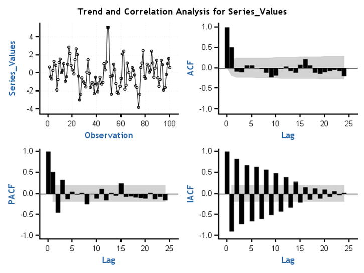
Figure 12-43. ACF and PACF plots for time-series plot 9 (Figure 12-24)
Note that in Figure 12-43 the IACF shows a dampening toward zero and the ACF cuts off at lag1. TS 9 is an MA process of order1.
Time Series Plot 10 (Figure 12-25): yt = εt -0.4 εt-1-0.38 εt-2

Figure 12-44. ACF and PACF plots for time-series plot 10 (Figure 12-25)
Note that in Figure 12-44 the IACF shows a dampening toward zero and the ACF cuts off at lag2. TS 10 is an MA process of order2.
Time Series Plot 11 (Figure 12-26): yt = εt -0.6 εt-1-0.3 εt-2

Figure 12-45. ACF and PACF plots for time-series plot 11 (Figure 12-26)
Note that in Figure 12-45 the IACF shows a dampening toward zero and the ACF cuts off at lag2. TS 11 is an MA process of order2.
Time Series Plot 12 (Figure 12-27): yt = εt -0.55 εt-1-0.35 εt-2-0.15 εt-3

Figure 12-46. ACF and PACF plots for time-series plot 12 (Figure 12-27)
Note that in Figure 12-46 the IACF shows a dampening toward zero and the ACF cuts off at lag3. TS 12 is an MA process of order 3.
Rules of Thumb for Identifying the ARMA Process
When compared with pure AR and pure MA processes, it’s difficult to identify the orders of an ARMA process. If the ACF dampens to zero, then it’s an AR process, and the PACF gives the order of the AR process. If the IACF dampens to zero, then it’s an MA process, and the order is decided by looking at the ACF plot. But for an ARMA process, the ACF, PACF, and IACF will all behave the same way. Though you can quickly identify that the process is an ARMA process, you will not be able to decide the orders. So, when the series is an ARMA process, then you will not be able to identify the orders by looking at the ACF, PACF, and IACF graphs. Table 12-13 summarizes the rule of thumb. Figures 12-47 through Figure 12-49 give the example plots of ACF, PACF, and IACF for the ARMA processes discussed in earlier sections.
Table 12-13. The Rule of Thumb to Identify an ARMA Process
|
ARMA Process |
Behavior |
|---|---|
|
ACF/PACF/IACF |
All of them damp down to zero. |
Time Series Plot 13 (Figure 12-28): yt = -0.95yt-1 + εt -0.8 εt-1
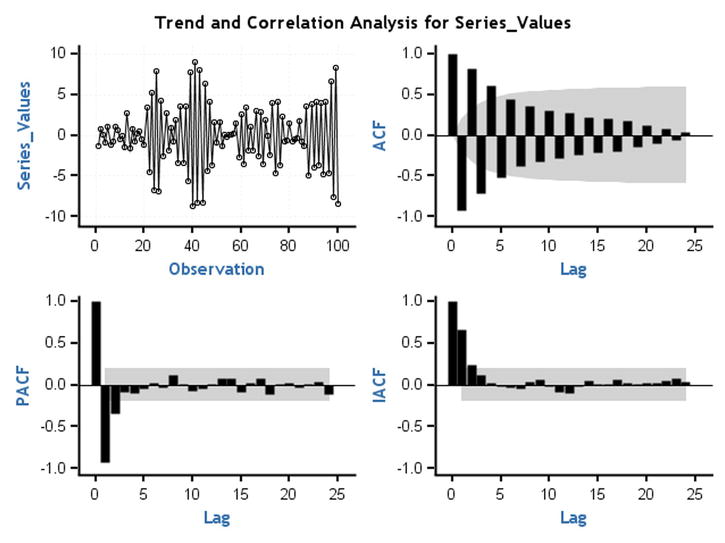
Figure 12-47. ACF and PACF plots for time-series plot 13 (Figure 12-28)
Note that in Figure 12-47 the ACF, PACF, and IACF damp down to zero. TS 13 is an ARMA process.
Time Series Plot 14 (Figure 12-29): yt = 0.77yt-1 + εt +0.6 εt-1

Figure 12-48. ACF and PACF plots for time-series plot 14 (Figure 12-29)
Note that in Figure 12-48 the ACF, PACF, and IACF damp down to zero. TS 14 is an ARMA process.
Time Series Plot 15 (Figure 12-30): yt = 0.55yt-1 + 0.35yt-2 + εt -0.5 εt-1
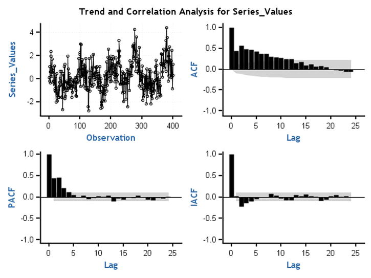
Figure 12-49. ACF and PACF plots for time-series plot 15 (Figure 12-30)
Note that in Figure 12-49 the ACF, PACF, and IACF damp down to zero. TS 15 is an ARMA process.
Finding Out ARMA Orders (p,q) Using SCAN and ESACF
You have already learned that just by looking at the ACF, PACF, and IACF graphs, you will not be able to identify the orders p and q in an ARMA process. Fortunately, you have some advanced techniques for determining the orders of ARMA models. To determine the orders, you need to calculate two more functions: the smallest canonical correlation (SCAN) and extended sample auto correlation function (ESACF). They were developed by Ruey Tsay and George Tiao. According to their research, if a series is ARMA (p,q), then the ESACF plot is a triangle with (p,q) as the vertex. And the SCAN plot is a rectangle with (p,q) as the vertex. The details of this theory are beyond the scope of this book; however, as usual, you can use SAS to calculate the ESACF and SCAN function values and arrive at the values of p and q. What follows is the SAS code to calculate the ESACF and SCAN function values:
proc arima data= TS13 plots=all;
identify var=x    SCAN ESACF ;
run;
You need to add just two options: SCAN and ESACF. This code gives much more elaborate output. You can directly look at the final consolidated recommendations by SCAN and ESACF (Table 12-14).
Table 12-14. Finding the Order of an ARMA Process Using SCAN and ESACF, SAS Output

Since you already tested the stationarity well before this phase, you can simply take d as zero here. In other words, you can take p+d as p in Table 12-14. The first option suggestion by the SCAN function is ARMA(1,1). The ESACF also suggests ARMA(1,1) as the first option. So, the underlined series is 1,3. Both SCAN and ESACF give a few more options for p and q. Generally, a less complicated model with fewer parameters should be chosen over more complicated ones. Simple models yield better forecasts.
If you take a model of p=5 and q=5, then the model equation will have too many parameters that need to be estimated. The model (p=5,q=5) will have a1,a2,a3,a4,a5, and b1,b2,b3,b4,b5 as parameters. Generally, models with too many parameters are not robust enough to give accurate forecasts. So, less complicated models with p<=2 and q<=2 are preferred. If SCAN and ESACF are suggesting more than one option, then it’s better to go with the model with the smallest values of p and q.
Similarly, you can find the SCAN and ESACF for TS 14 and TS 15. Refer to Tables 12-15 and 12-16 for the output.
proc arima data = TS14 plots = all;
identify var = x SCAN ESACF ;
run;
Table 12-15. Finding the Order of an ARMA Process Using SCAN and ESACF, SAS Output
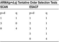
Table 12-16. Finding the Order of an ARMA Process Using SCAN and ESACF, SAS Output
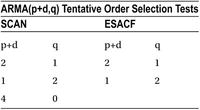
Again, the first preference given by both SCAN and ESACF is ARMA(1,1). So, TS 14 is an ARMA(1,1) process.
proc arima data= TS15 plots=all;
identify var=x    SCAN ESACF ;
run;
You already took a stationary series, which required no further differentiation. This means that can be taken as d=0. Both SCAN and ESACF are giving the first preference as an ARMA(2,1) process. So, the time series TS 15 is an ARMA(2,1) process.
Let’s recap what has happened up to now. You want to forecast the future values. You need the ARIMA technique for model building and forecasting. To build a model using the Box–Jenkins approach, you need the series to be stationary. As part of step 1, you tested the stationarity. If the series is not stationary, you make it stationary by differentiating it. That is where the value of d in ARIMA (p,d,q) is decided. Then in step 2 you identify the orders of p and q. Once you have p and q, you can write a skeleton equation of the model. For example, you identify a model as AR(1), and then you can write a skeleton equation as follows:
Yt= a1*Yt-1+ εt-1
Now as a next step you will need to find an estimate of a1. Depending on the type of series—AR(p), MA(q), or ARMA(p,q)—you need to estimate the number of parameters. If the series is AR(2), you need to estimate two parameters.
Identification SAS Example
An e-commerce web site wants to track the number of unique visitors per day and has collected data for nearly one year. And now the company wants to forecast the number of visitors for the coming week. Before forecasting, you need to identify what type of series this is.
The following is the code for identifying the number of unique visitors (per day). Refer to Table 12-17 and Figure 12-50 for the output.
ods graphics on; /* Option to display graphs */
proc arima data = web_views plots = all;
identify var = Visitors stationarity = (DICKEY) ;
run;
Table 12-17. Output of PROC ARIMA on web_views Series
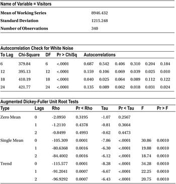

Figure 12-50. ACF, PACF, and IACF plots from the output of PROC ARIMA on web_views series
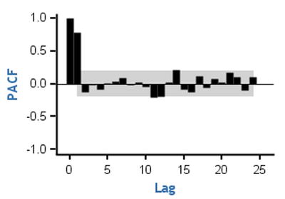
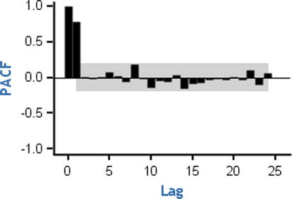
From Table 12-17, you can interpret that the process is stationary. The ACF is dampening to zero, so the process is an AR process. The PACF cuts off at lag1. A close observation of the PACF graph reveals that lag-2 is not significant. So, the unique visitors time series is an AR (1) process. The skeleton equation of the time series is as follows:
Yt= a1*Yt-1+ εt-1
If you can estimate the value of a1, then you can use this model for forecasting the number of unique visitors for the coming week, which is the ultimate goal.
Step 3: Estimating the Parameters
By now you have the model equation. You have already identified the time series as AR(p) or MA(q) or ARMA(p,q). You now have to find the model parameters. This model equation looks similar to the regression models discussed in Chapter 10 on multiple linear regressions. Just to recap, refer to the following analogy of equations.
Regression equation: y = β0 + β1x1 + β2x2 + β3x3 + β4x4 + β5x5 + β6x6 . . . .. . . . + βpxp
Time-series equation: Yt = a1*Yt-1 + a2*Yt-2 + a3*Yt-3 + . . . ..+ ap*Yt-p + εt + b1*εt-1+ b2*εt-2. . . .. . . .+ bq*εt-q
Like the way you found the regression coefficients, you now need to use some optimization technique to find the parameters of the time-series equation. You can use the maximum likelihood estimator technique to guess the model parameters. This step is relatively easy. You just need to use the estimate option in the SAS code. You need to specify the model equation by mentioning the order.
Here is the code for estimating the parameters:
proc arima data=web_views;
identify var=Visitors ;
estimate p=1 q=0  method=ML;
run;
Earlier you already concluded that the unique visitors time-series is an AR(1) process. Hence, p=1 and q=0. The method=ML option indicates the maximum likelihood method.
Table 12-18 is the maximum likelihood table created by this code.
Table 12-18. Output of PROC ARIMA on web_views Series: Estimating the Parameters

MU is the intercept or the mean of the series. An AR(1,1) estimate (in other words, a1) value is 0.68773. You can now write a more complete model equation as follows:
Yt = (0.68773)*Yt-1 + εt
You can use this equation for forecasting future values. In addition to the parameter estimate, SAS produces detailed output. The following are some notes on how to interpret some of the unfamiliar yet important tables in the output. Refer to Table 12-19.
Table 12-19. One Important Output Table of PROC ARIMA on web_views Series: Estimating the Parameters
|
Constant Estimate |
2792.49 |
|
Variance Estimate |
781147.7 |
|
Std Error Estimate |
883.8256 |
|
AIC |
5580.809 |
|
SBC |
5588.467 |
|
Number of Residuals |
340 |
The AIC and SBC values help you to compare between two models. Low AIC and SBC value models are preferred. A low value of Akaike’s information criteria (AIC) and Schwarz’s Bayesian criterion (SBC) indicates that the model with the current estimates is the right fit for the data. This helps when you are trying to work with various orders such as AR(1) versus AR(2) versus ARMA(1,1), and so on. Refer to Table 12-20 and Figure 12-51. An explanation is given after Figure 12-51.
Table 12-20. Autocorrelation Check of Residuals, an Output Table of PROC ARIMA on web_views Series: Estimating the Parameters

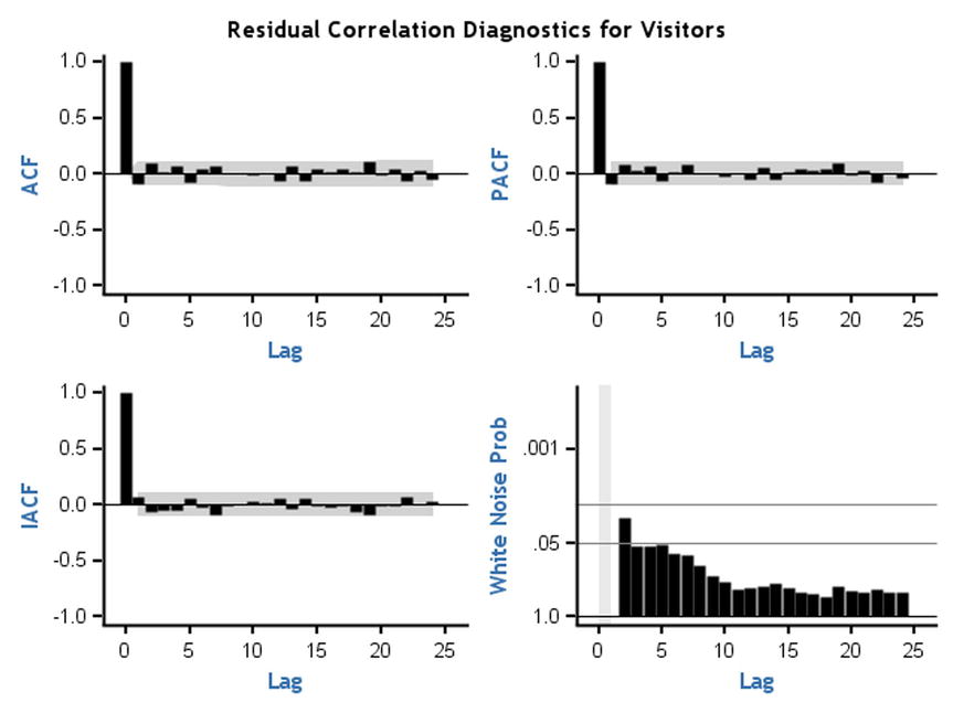
Figure 12-51. Residual auto correlation check, output table of PROC ARIMA on web_views Series; estimating the parameters
A residual auto correlation check helps you to identify whether there is any information left in the data after building the model. The model should be good enough to extract all the hidden patterns in the data. If there are still some trends left, then you observe them in residual plots. These residual plots show no trend in ACF, PACF, and IACF. You also observed that white noise probabilities (Figure 12-51, bottom right) are negligible.
For example, if you try to fit your model wrongly—in other words, instead of an AR(1) model, you try to fit an ARMA(0,0) model—then the residual plots show the trends (Figure 12-52). For a better understanding, you can compare the following code with the previous code. Both are the same except the values of p and q.
proc arima data=web_views;
identify var=Visitors ;
estimate p=0 q=0  method=ML;
run;
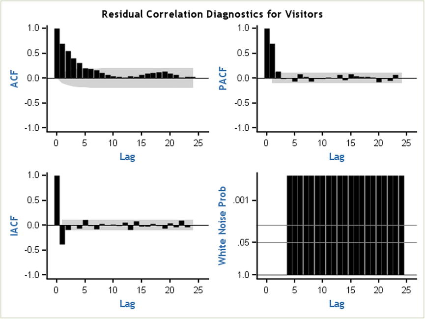
Figure 12-52. Residual auto correlation check, choosing a wrong model
You can’t extract all the information with an AR(0,0) model. You see a trend in the ACF plot for residuals. The white noise probability is also significantly high. This indicates that there is some information still left in the model. This residual information needs to be extracted.
Once you are done with the model parameters estimation, you are left only with the forecasting. This is the last step in the model building.
Step 4: Forecasting Using the Model
Up to now you have worked really hard to find the type of the model, estimate the parameters, and create the final model equation. Once you have the final equation, what remains is to substitute the historical values to get the forecasts. SAS is there as usual to help you out. You just need to use a forecast option in the code.
proc arima data=web_views;
Identify var=Visitors;
Estimate p=1 q=0 method=ml;
Forecast lead=7;
run;
lead=7 indicates the next seven forecasted values, which, in this case, are the unique number of visitors that are likely to visit in the next seven days. This code also appends two new components to the output (forecast table and forecast graph). Table 12-21 is the forecast table, and Figure 12-53 charts the forecast graph from the SAS output.
Table 12-21. Next Seven Days Forecasts for the Variable Visitors, SAS Output

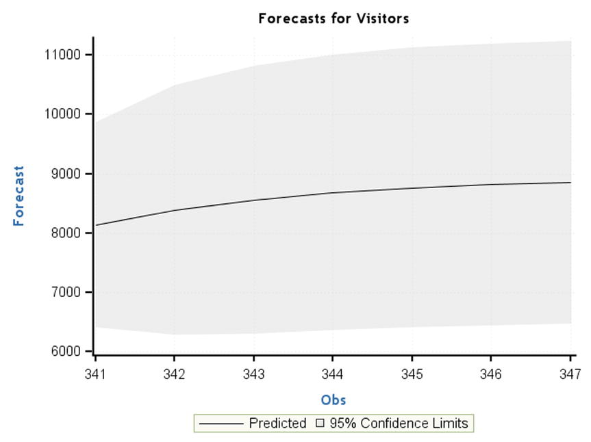
Figure 12-53. Predicted forecast for the visitors, SAS output
Data is available until observation 340. The values from 341 to 347 are forecasted and displayed along with the 95 percent confidence limits. There is a steady increment expected in the number of visitors to the web site. If you see a sharp dip, then it can serve as an alert message. If there is a huge increment in the forecasts, then you may need to step up the web site’s IT infrastructure, including the number of servers, network bandwidth, and so on. Also, you need to make sure that there are no technical glitches. In the current case, everything seems to be normal; the forecasted flow of visitors shows a manageable, steady increase.
This is a logical end to our time-series analysis and forecasting process using the Box–Jenkins ARIMA approach. Every analyst wants to accurately forecast the future values by building the best model for the available historical data. This can be definitely achieved by using the Box–Jenkins approach. The following are some suggestions while building time-series models:
- Have sufficient historical data, at least 30 data points. Make sure you don’t run into too much history. Only the historical values that will have an impact on future forecasts should be considered.
- Do not forecast too far into the future. With one year of data, forecasting the next two years is not a good idea. It may be that 10 percent or fewer data points into the future is recommended.
- Remove outliers before building the model.
Case Study: Time-Series Forecasting Using the SAS Example
Air Voice is a mobile network company that has more than 70 million customers. The customer care center of this company handles millions of calls per day. The company wants to increase customer satisfaction by resolving most of the customer queries within the agreed-upon service level agreements (SLAs). This can be done by better resource planning by forecasting the number of calls every week. The following is a typical call volume forecasting exercise.
The daily call volume data is available for the last 300 days. The volume is in multiples of thousands. The following is the procedure to analyze and forecast the future call volume values.
Step 1: Testing the Stationarity
The following is the SAS code to test the stationarity. It was already explained in the earlier sections. Refer to Table 12-22 for the SAS output relevant to this task.
proc arima data=call_volume;
identify var=call_volume stationarity=(DICKEY);
run;
Table 12-22. Testing the Stationarity of call_volume Time Series, SAS Output

The process is stationary on the basis of a single mean P-value in the Augmented Dickey Fuller test.
Step 2: Identifying the Model Type Using ACF and PACF Plots
The following code creates the ACF and PACF plots to facilitate the identification of model type. Refer to Figure 12-54 for the SAS output relevant to this task.
ods graphics on;
proc arima data=call_volume plots=all;
identify var=call_volume stationarity=(DICKEY);
run;

Figure 12-54. ACF and PACF plots for identification of the model type, SAS output
The ACF is dampening. The PACF and IACF are also decreasing to zero. This should be an ARMA process. You will use the SCAN and ESACF options to find the orders. Refer to the following SAS code and relevant output in Table 12-23.
proc arima data=call_volume plots=all;
identify var=call_volume SCAN ESACF;
run;
Table 12-23. SCAN and ESACF table for finding ARMA process orders p and q, SAS output

The first option given by both SCAN and ESACF is ARMA(1,1). You will try to estimate the parameters a1 and b1.
Step 3: Estimating the Parameters
Refer to the following SAS code and the relevant SAS output in Table 12-24 to find out the model equation parameters.
proc arima data=call_volume plots=all;
identify var=call_volume SCAN ESACF;
estimate p=1 q=1 method=ML;
run;
Table 12-24. Estimation of the Parameters, Maximum Likelihood Estimation Table from the SAS Output

The AR and MA parameters values are now estimated. The model equation is as follows:
yt =9825.6 + 0.90783yt-1 + εt -0.68286 εt-1
Step 4: Forecasting
You can now forecast the next week’s call volumes. The applicable SAS code and its interpretation are left as an exercise for you. I have already discussed the process in detail, in the earlier sections, for other cases. Refer to Table 12-25 for the relevant portion of the SAS output.
Table 12-25. Forecasts Data for Call Volume, SAS Output

As you can observe in Table 12-25, there are no major dips or increments expected over the next week. No major changes are required in the resource planning!
Checking the Model Accuracy
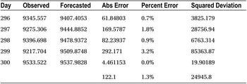
Testing the model accuracy is important in any model-building exercise. Residual graphs and AIC and SBC values tell you how well you have built the model. To test the forecasting accuracy, it might be a good idea to put aside some data for testing purposes and later use it to test the model accuracy. For example, in the call volume forecasting data, you have data available for 300 days. Of these 300 days of data, you assume that the data is available only for 295 days and use the next 5 days of data for testing the accuracy of forecasts. You forecast these 5 days of values using the model. You expect a good model to give the forecasts close to the actual values. Refer to Table 12-26.
Table 12-26. Forecasted Values and Errors in the Previous Call Volume Example
Ideally you would like to have the error be zero or less than 5 percent. The following are some measures of errors or accuracy. In the following text, Yi is the actual value and Ŷi is the expected value.
- Mean absolute deviation (MAD)
- Average(absolute deviations)

- Mean absolute percent error(MAPE). This is the most widely used measure.
- Average(percent deviations)
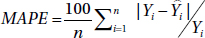
- Mean square error (MSE)
- Average(squared deviations)

- Another related measure is root mean square error, which is
 .
.
In the previous example, here are the values:
- MAD =122.1
- MAPE =1.3 percent
- MSE =24,945.8
- RMSE =157.9
It is generally a good practice to keep 5 to 10 percent of the sample data for validation purposes. The exact percentage will depend on the size of the data set.
Conclusion
In this chapter, you learned what a time-series process is. I discussed one of the most widely used time-series techniques, that is, the Box–Jenkins ARIMA technique. I also discussed the four major steps in ARIMA model building. The ARIMA models are one of the many types of models. There are sessional ARIMA models; there are ARIMAX models, which will use an independent variable X along with the historical values of Y; and there are heuristic TSI models. I suggest you research other time-series techniques only after developing a solid understanding of the basics of ARIMA model building. The model accuracy-testing methodologies discussed at the end of the chapter should be taken seriously. It’s good practice for analysts to furnish the error rates along with the forecasted values.