
Chapter 3
The Analysis of Data—Univariate
Espionage in the American Civil War
Data One Would Give an Arm For: Blood Pressure
Introduction
When we teach elementary statistical techniques we frequently use small data sets—for very good reasons. With small data sets, statistics such as the mean, interquartile range, and so on are quickly and easily calculated by hand, allowing students to gain an understanding of the processes behind the statistics, as encapsulated by the formulas. Unfortunately, small data sets are frequently dangerous data sets; not much insight can be gained by studying the distributions. For example, changing the bin size of a histogram of a small data set is often invites student confusion. Which of the differing histogram shapes is the “real” one? With scatterplots based on a small number of points, are we imagining curvature in a residual plot, or are we reaching into a random scatter of stars and creating a Big Dipper? Little insight into a population can be gained by examining small data sets.
Large data sets better facilitate the exploration of distributions and scatterplots and allow students to better discern stable shapes and trends. With advances in technology, downloading and working with large data sets in the classroom has become more feasible. In this chapter, I will use JMP to analyze two large data sets, offer some practice with the skills we have discussed, and here and there highlight some additional capabilities of JMP. Thus far, I have highlighted the various windows, panels of information, choice points, and other navigational characteristics of JMP. I will now shift the focus to data analysis supported by JMP. The verb support is important. One of the beauties of the software’s design is that when one analyzes data, JMP recedes into the background and acts as a helpful silent partner supporting data analysis, not an obtrusive interface requiring intermittent user attention.
Espionage in the American Civil War
Data analysis begins with questions presented in a context. The geographic and historical context for our first leap into a large data set is the great state of Virginia during the early stages of the American Civil War, in 1861. The Confederate army system was modeled after the Federal system; units of soldiers known as companies were formed in counties and sent to their state capitals. There the companies were combined into larger groups called “regiments,” almost exclusively comprised of ten companies. Many of these state regiments were sent to Richmond, the capital of the Confederacy, for service outside their state in the Confederate army as dictated by the fortunes of war.
At this time, General George McClellan commanded the Union forces in the eastern theater. An essential part of his planning depended on the number of Confederate soldiers his troops would face in any operations in Virginia. This parameter was, of course, unknown to the Federal forces. Random sampling not being an option, such estimation would normally be done by gathering information from observations in the field—that is, from spies. General McClellan’s training at West Point did not include study in the art of espionage, so he asked Allan Pinkerton, the famous Chicago-based detective, to gather information about Confederate troops, and specifically to estimate their numbers and locations in Virginia.
In 1861 the editors of the northern press felt that McClellan should be marching to Richmond, engaging the Rebels, and putting an end to the insurrection. Conventional military wisdom was that “enough” men to successfully advance on entrenched forces was at least three times the number of troops available to the defenders. Pinkerton’s estimate of the number of Confederate troops across the Potomac in neighboring Virginia was in excess of 100,000. General McClellan, in accordance with the aforementioned military thinking of the time, was not about to sally forth into battle until he achieved a more favorable ratio of attacking to defending troops than he currently had. This reluctance put him at odds with the press, the public, President Abraham Lincoln, and eventually military historians.
In point of historical fact, Pinkerton’s numbers were wrong, and no one knew this better than the Confederate generals, whose memoirs began to appear in the 1880s. By 1885, historians were busily reviewing these personal accounts as well as available wartime documents and concluded that Pinkerton should have stuck to detective work. The only question of any interest was the extent to which McClellan was culpable for allowing himself to be misled by Pinkerton.
Our large-scale statistical analysis will focus on the question of whether Pinkerton’s method of estimation, as described by him, should have worked. Pinkerton’s first known report to McClellan, dated October 4, 1861, contains a clear estimation methodology in what we would now think of as a spreadsheet. He began by assuming that Confederate infantry regiments consisted of 700 men. After identifying the number of regiments then in Virginia he multiplied that number by 700. Then he subtracted 15 percent for sickness to arrive at his final estimate of troop strength. Pinkerton’s determination of the number of regiments per state is not considered here. For a more complete analysis of Pinkerton’s method, see Olsen (2005). It turns out that Pinkerton made a serious error of arithmetic in his report; Pinkerton (or his secretary) actually subtracted one-fifteenth, not 15 percent, of a regiment for sickness. Such an error would, of course, result in an inflated estimate. Our statistical question is not about the arithmetic; rather, our interest is in Pinkerton’s method as presented in his report. Were his assumptions about the sizes of regiments and the level of sickness consistent with the facts on the ground at the time? We shall use JMP to help answer this question.
Data on company sizes, as well as numbers of individuals sick, were recorded in bimonthly Confederate company muster rolls. Recall that in the Confederate army the regiments were almost invariably made up of ten companies, so the leap from company sizes to regimental sizes is a shift of a decimal point. Data from the surviving Confederate company muster rolls for the months of June, August, October, and December 1861 are in the file Pinkerton.jmp.
1. Select File → Open and navigate to wherever you have elected to save the JMP files.
2. Select Pinkerton → Open.
JMP will respond by displaying the raw data table. The variable names appear in the Columns panel to the left of the data table, as shown in figure 3.1.
Figure 3.1 Muster roll variables

The first variable, Regiment, compactly encodes the state where the regiment was formed, the regimental number, and the company, A through J. As an example, 719.02 indicates company B (.02) of the nineteenth regiment in state number 7: Mississippi. From this encoding the company, regiment, and state have been reconstructed using some capabilities of JMP that we will see later. The variables of interest to us as we analyze the efficacy of Pinkerton’s methods are the company sizes (Total) and the percentage of soldiers who were sick, injured, or otherwise not available for medical reasons (% sick). A quick glance at the data reveals that there are many cells with missing data. One reason for missing data is timing. If a regiment did not form until September it would not appear in these muster rolls until October. Another reason for missing data is that the collection of muster rolls is incomplete, some rolls having been lost in the fog of war.
Our analysis will focus on Pinkerton’s basic assumptions: (1) there were 700 men per regiment, and (2) 15 percent of them were sick. The unit of analysis is the company, so we are assessing whether 70 soldiers per company and a 15 percent sick rate are consistent with the true conditions on the ground in 1861. Since the August muster rolls would be the most recent bimonthly report prior to Pinkerton’s October 4th report to McClellan, we can focus our analysis on the August data.
1. Select Analyze → Distribution → Total Aug → Y, Columns → OK.
Arrange the layout of the graphs and numeric information to suit your preferences; my preferences are usually to display in a horizontal format (Distributions → Stack) as shown in figure 3.2.
Figure 3.2 Distribution for August 1861

2. Click the Total Aug hot spot and select Continuous Fit → Normal.
We see immediately in figure 3.3 that the August 1861 distribution of company sizes is approximately normal. It is interesting to note that, contrary to the accusation of estimates writ large, it appears Pinkerton’s assumption of regimental sizes was actually too low. The mean in August was about 15 men per company higher than Pinkerton’s assumption of 70 per company. The Confederate legislature had mandated that companies be no smaller than 64 men. With the benefit of hindsight, one might argue that since the companies were quickly formed and sent immediately for training after formation, adding a 10 percent “fudge factor” would give a reasonable estimate of company size. However, it is unknown where Pinkerton derived this number for company sizes, and there is nothing to indicate Pinkerton used that reasoning to arrive at such a fudge factor.
Figure 3.3 Normal fit

What about the proportion of men sick? Returning to the data table,
1. Select Analyze → Distribution → % Sick Aug, Y → Columns → OK.
The distribution of %Sick in figure 3.4 is positively skewed, with a mean 21.7 percent and a median of 19.5 percent. Pinkerton’s assumption of 15 percent appears to be too low. His estimate of the number of “effectives” per regiment would be 85 percent of 700, or about 600 soldiers. The data for August suggests the mean number of effectives would be approximately 78.3 percent of 85, 66.6 per company, or about 660 effectives per regiment. Pinkerton’s procedure, applied to August data, appears to be about 6 percent too high. That performance, while perhaps not great, is certainly not a searing indictment of incompetence either. How does Pinkerton’s method in his October 4th report stack up for each of the four sets of the muster rolls? Once again, Close All Reports, and proceed to Step 1.
Figure 3.4 Distribution of %Sick, August 1861

1. Select Analyze → Distribution.
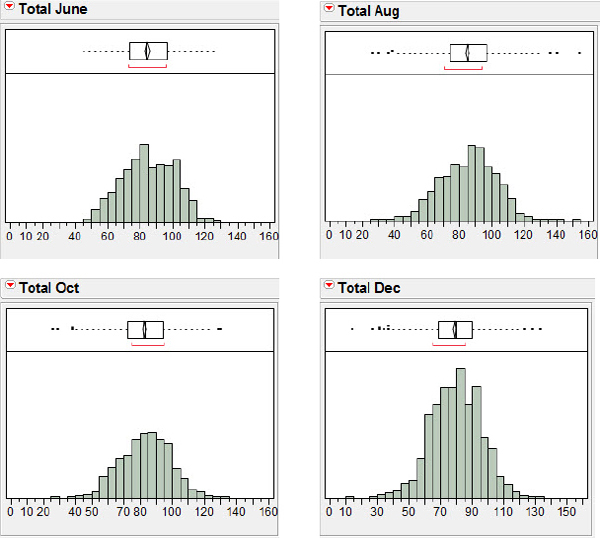
2. While pressing the Control key, select all four of the Total columns (June, Aug., Oct., and Dec.).
3. Select Y, Columns → OK.
4. Click Distributions → Uniform Scaling and then again on Distributions → Stack.
5. For each histogram, click on the scale and make the following changes: Minimum = 0, Maximum = 160, Increment = 10, # Minor Ticks = 1.
The resulting distributions of the company totals shown in figure 3.5 represent a certain consistency of totals across these dates, suggesting that the August agreement between Pinkerton and regimental reality was not a simply a statistical fluke.
Figure 3.5 Company totals for four months, 1861
How does the %Sick compare across months? I encourage you to try this one on your own (don’t forget the uniform scaling). You should see displays similar to that shown in figure 3.6.
Figure 3.6 Company %Sick for four months, 1861

From these data it appears that while the shapes of the distributions are similar, the %Sick June is different from August, October, and December. The means for all companies in the sample are 12.8, 21.7, 19.5, and 18.3 percent, respectively. What might account for this pattern of %Sick? Notice that the number of companies for which we have muster rolls at the end of June was 47; then we have 84 at the end of August, 100 at the end of October, and 111 at the end of December. Perhaps the greater number of companies packed into the camps contributed to the spread of sickness. Perhaps it just takes a bit of time for sickness to spread. The first major battle of the war had been fought in July at Manassas Junction, Virginia, and after that there was a long lull in major action. Perhaps the 21.7 percent peak in August also reflects soldiers wounded in the July action.
The distributions of the company sizes and the %Sick over these six months (June to December) have unearthed a possibly surprising result: Contrary to historians' beliefs, Pinkerton’s method does not seem to be all that bad. The arithmetic misunderstanding of how to handle the subtraction of 15 percent would, of course, result in higher estimates of numbers of “effective” troops. (Perhaps Pinkerton could have used a math teacher? There was a math teacher in the war at this time—Thomas “Stonewall” Jackson, lately of the Virginia Military Institute—but he was already serving in a different army for a different commander, General Robert E. Lee.)
Now that we have addressed our original questions about Pinkerton’s methods and have the power of JMP at our disposal, we will do a little gratuitous snooping around in the data. One question we might ask of the data is, were the company sizes approximately equal across the states, or was there some variation? Recall that with Beck’s (2002) sherd data we were able to display parallel box plots of the breaking forces for the sherds from Arizona and compare the different sources of sherds. We will similarly disaggregate the totals data and display the October company sizes by state. Once again, return to the JMP data table.
1. Select Analyze → Fit Y by X → Total Oct → Y, Response.
2. Choose State for the X, Factor and click OK.
3. On the Oneway Analysis of Total Oct By State hot spot make these choices:
a. Select Display Options and deselect Grand Mean.
b. Select Display Options and deselect X Axis Proportional.
c. Select Display Options and select Box Plots.
d. Right-click in the box plot graph area and select Line Width Scale → 2.0.
Thickening the lines for the box plots by selecting a line width of 2.0 will make them stand out a bit more in the display; you should now see a screen resembling figure 3.7.
Figure 3.7 Distribution of totals by state, October 1861

Notice that JMP is displaying individual values (one dot per value) as well as the box plots. Bakker and Gravemeijer (2004) suggest that a display that contains both the individual points and a box plot or histogram as an overlay might aid students in making the transition to thinking about distributions as a “whole.” (We can also call attention to the potential small-sample limitations of box plots by referring students to the plots for Arkansas, Florida, and Maryland.) A process called “jittering” will improve on the plot. Jittering adds a small amount of random variation in the display (not the data!). In this case, jittering will present the repeated values for company totals as a set of horizontally placed dots.
1. Click the Oneway Analysis of Total Oct By State hot spot again.
2. Select Display Options → Points Jittered.
With jittering enabled in figure 3.8 we can acquire a better sense of both the values for company sizes as well as the number of companies from each of the states, something the box plot alone cannot provide. (Recall, however, that if we check Display Options > X-Axis Proportional, the differences in sample size will be presented visually by allocating more horizontal box plot space to the states with more companies.)
Figure 3.8 Jittered distribution of totals by state, October 1861

Data One Would Give an Arm For: Blood Pressure
In our first analysis of a large data set I used the Pinkerton data to demonstrate the versatility of JMP as a partner in analyzing large data sets using univariate plots. We compared distributions across time, and across different states. I mentioned in passing some of the thoughts of researchers in statistical education about graphically assisting students as they make a transition from a focus on individual data points to a focus on distributions of data points. My second analysis of a large data set will continue in this vein, mixing new JMP techniques with a discussion of teaching practice.
The techniques of analyzing univariate data can help lay a foundation for bivariate analysis. Cook and Weisberg (1999) and Gould (2004) suggest that looking for trends and patterns in bivariate data can be instructive for students before they actually analyze scatterplots. Garfield and Ben-Zvi (2008) develop an activity based on bivariate data where the explanatory variable has been “binned,” that is, the values of the explanatory variable have been transformed into intervals to facilitate looking for trends in data. They believe these plots will help students begin to think about relationships between two variables. Rather than being overwhelmed by a scatterplot, students can examine bivariate data by “looking for a trend as well as scatter from the trend, by focusing on both center and spread for one variable (y) relative to values of a second…variable (x)” (p. 290).
Their belief is given experimental support by Noss and colleagues (1999), who performed an experiment designed to assess nurses' understandings of the concepts of average and variation. The nurses had access to statistical software and were asked to consider the relationship between age and blood pressure. The nurses were already familiar with scatterplots, and the scatterplot was their initial choice for a visual representation of the data. Open the BloodPressure file and display the scatterplot of systolic blood pressure versus age, as shown in figure 3.9. This is the scatterplot as it was presented to the nurses. Many of the nurses found it difficult to see a relationship, and some decided there was no relationship between systolic blood pressure and age.
Figure 3.9 Nurses' initial scatterplot

The investigators were puzzled by the nurses' reaction to the scatterplot. The nurses' prior training and experience should have given them a bias toward a belief in a positive relation between systolic blood pressure and age; however, the nurses were disappointed in the perceived weakness of the relationship. The investigators felt part of the problem was that the large amount of variability in the scatterplot (that is, the relatively large residuals) may have hindered the nurses' ability to recognize any relationship or trend; perhaps the nurses believed that “variation and relationship were somehow antithetical” (p. 42). The investigators prompted the nurses to “slice” the data axis and summarize the data by finding means within the slices, and by displaying the data as a set of box plots as shown in figure 3.10.
Figure 3.10 Nurses' box plots
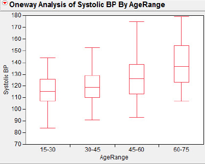
The nurses were initially unfamiliar with box plots, but once they were helped to interpret the plots they were able to see the relationship between age and systolic blood pressure as clearly positive, as well as understand that beyond this simple positive relationship there was substantial variation.
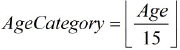
In chapter 5 we will use transformations of numerical data involving elementary functions such as logarithms. Here I would like to use these data to introduce a JMP capability that is often useful when working with categorical data. Our specific goal is to create figure 3.10 using the data in the file BloodPressure. We need to create a variable that expresses the patients' ages as categories by using a method of “recoding” values of the existing ages.
1. Double-click at the top of the column to the right of the SystolicBP variable.
JMP will respond by creating a variable initially named Column 3. We will define a new variable, AgeCategory. Our plan is to convert ages in the interval [15, 30) to “1,” ages in the interval [30, 45) to “2,” and so on. After a little head-scratching and inspection of the data values I conjured up the following method: Find the greatest integer (round down) of the age divided by 15. This procedure is shown symbolically in figure 3.11. In addition to creating the variable, we will also need to inform JMP that this variable is categorical rather than numeric. Let us begin this transformation adventure.
Figure 3.11 Greatest integer
2. Double-click Column 3.
JMP will respond as shown in figure 3.12.
Figure 3.12 Initial column information
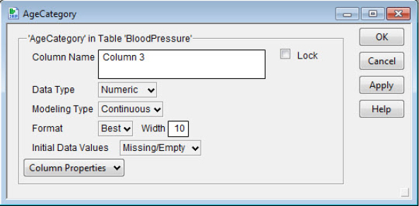
3. Type AgeCategory in the Column Name field, and select Character as the Data Type.
4. Select Column Properties → Formula → Edit Formula.
JMP responds again, presenting the panel shown in figure 3.13 and informing us that there is no formula (yet). Our task is to make a formula that mirrors our intent.
Figure 3.13 Edit formula panel
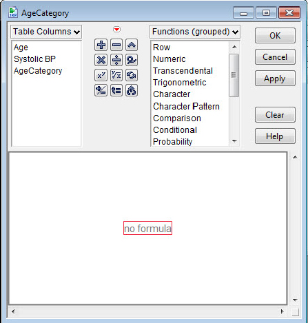
5. a. Double-click in the no formula region.
We will create this variable as a character variable for reasons that will become apparent shortly.
b. Select Character > Char, Numeric → Floor, and Age → ÷ → 15 → OK → OK.
As always, check to make sure that the transformation works. Age 19, for example, should appear as an AgeCategory of 1, age 30 as a 2, and so on.
Categories 1, 2, 3, and thereafter seem rather arbitrary, possibly more abstract than is comfortable, and almost certainly confusing to those not familiar with the mathematical heritage of the data (that is to say, confusing to a large fraction of the data interpreting public). JMP has a procedure that will allow us to fix this: recoding. The designers of JMP thoughtfully included recoding to handle problems such as inconsistent data entry, typographical errors, and missing data. These are just the sorts of problems that can occur often in a classroom when students gather and enter data (but of course only very rarely when teachers do!). Consider, for example, the potential spelling and capitalization variants of “Rhode Island.” Recoding consistently variant data values is easier and less time consuming than individually locating each variant spelling in a large data set. Our use of recoding is not to correct bad data; it is to present a more easily interpreted horizontal axis under our box plots.
6. Click at the top of the column AgeCategory and select Cols → Recode.
You should now see the panel shown in figure 3.14. We are going to replace the “numeric” values with a more easily interpreted description; this is why we made the AgeCategory variable a character variable initially. Note that JMP will recode, or define new values for old values, but will balk at changing numeric values to character values at the recoding step.
Figure 3.14 Initial recode panel

7. In the field that now has the value In Place, select Formula Column.
Now replace the Old Value of 1 with the New Value 15–30. Replace the succeeding Old Values with 30–45, 45–60, and 60–75 and click two OKs. I am not being too fussy here about the boundary values. If you feel a little squeamish, perhaps something like [15, 30) or 15–<30 would be better, but I am unaware of any decently simple alternative to just explaining in accompanying text what 15–30 means.
8. Double-click on the new column and change the variable name to AgeRange.
You should now see the panel shown in figure 3.15.
Figure 3.15 Variable recoded

In the Formula part of the panel you may notice the Match formula. We actually could have used the Edit Formula capabilities in JMP to create a formula to do the recoding, but the automatic Recode capability was easier in this case. Now we’ll reproduce figure 3.10, mirroring our procedures for the muster roll data. We will implement one additional step we did not take for the muster roll data, so that the data points are not shown in the box plots.
1. Select Analyze → Fit Y by X → Systolic BP → Y, Response.
2. Choose Age Range for the X, Factor and click OK.
3. On the Oneway Analysis of Systolic BP By Age Range hot spot make these choices:
a. Select Display Options and deselect Grand Mean.
b. Select Display Options and deselect X Axis Proportional.
c. Select Display Options and select Box Plots.
d. Select Display Options and deselect Points.
e. Right-click in the box plot graph area and select Line Width Scale → 2.0.
What Have We Learned?
In chapter 3, I discussed some of the advantages of large data sets in teaching and illustrated the use of large data sets in the context of rich contextual problems. Your knowledge of JMP techniques increased as you learned how to define new variables in terms of existing variables. We also considered some thoughts from the literature of statistics education research, in the form of univariate techniques to prepare students for their future analysis of bivariate data. Chapters 4 and 5 will focus on bivariate analysis with JMP, continuing our dual concern with JMP techniques and the teaching of elementary statistics.
References
Bakker, A., & K. Gravemeijer. (2004). Learning to reason about distributions. In D. Ben-Zviand J. Garfield (Eds.), The challenge of developing statistical literacy, reasoning, and thinking. Dordrecht, The Netherlands: Kluwer Academic Publishers.
Cook, R. D., & S. Weisberg. (1999). Applied regression including computing and graphics. New York: Wiley-Interscience.
Garfield, J., & D. Ben-Zvi. (2008). Developing students' statistical reasoning: Connecting research and teaching practice. New York: Springer.
Gould, R. (2004). Variability: one statistician’s view. Statistics Education Research Journal 3(2): 7–16.
Noss, R., et al. (1999). Touching epistemologies: Meanings of average and variation in nursing practice. Educational Studies in Mathematics 40(1): 25–51.
Olsen, C. (2005). Was Pinkerton right? STATS 42(1): 24–28.