
Chapter 6. Adaptive layout
- Manually adapting layouts
- Automatically adapting layouts
- Adapting layouts in code and in Interface Builder
- Choosing how best to adapt layouts
From the iPhone 4S to the iPad Pro, vastly different device resolutions are available that your app needs to look good in. After adding landscape and portrait to the mix, plus all the different multitasking windows that your app can find itself in, it’s a headache to think about designing different fixed app layouts for all the different combinations and permutations.
There must be an easier way. How can the interface of an app look great regardless of its environment?
Over the years, Apple has introduced several different approaches for setting up a layout that adapts to its environment. In this chapter, we’ll look at various solutions and how to choose between them.
6.1. The problems
Before we look at the solutions, let’s look closer at the problems we’re facing.
Device resolutions
Once upon a time, there was one iPhone, and everyone was happy. Pixels were the same as points, and developers knew the resolution of the screen they were developing for. Fast-forward to today, and there are multiple devices on the market, let alone in people’s hands, and multiple point resolutions that an app needs to look great on (see figure 6.1).
Figure 6.1. Device point resolutions

Device orientation
Apps don’t display only in portrait orientation. Apple recommends that apps display in both portrait and landscape orientation, where possible. Oops, that doubles the number of resolutions your app layout must accommodate (see figure 6.2).
Figure 6.2. Device point resolutions with orientation

App window sizes
In iOS 9, Apple introduced different multitasking capabilities to iPads. Slide Over, available on most iPads, allows you to drag in a narrow version of an app. Split View, available on newer iPads, allows two apps to run side by side, at a width customizable by the user, giving iPads nearly infinite combinations of widths.
View controller sizes
View controller root views don’t always fill the screen. View controller views can take up a portion of a screen, for example, when presented as a popover or as part of a split view controller.
These factors—device resolutions, device orientations, app window sizes, and different view controller sizes—need to be considered when presenting a scene in your app.
Content
And it doesn’t stop there. Up to now, we’ve looked at how the layout of a scene’s content must adapt to its environment. What if the content itself changes? A label could display dynamic text, for example, or your app could support different languages.
Whether the pressure is from external or internal forces, the layout of your app needs to adapt. But how?
6.2. Auto layout
Auto layout is a technique for describing interfaces using constraints. The Auto Layout engine uses these constraints to calculate how to lay out your app’s interface.
In this book, you’ll build a Bookcase app in which a user can keep track of books in their bookcase. The designer has sent through the interface in figure 6.3 for adding the details of a book. You’re going to lay out this scene, exploring auto layout!
Figure 6.3. Add-a-book interface

Checkpoint
Open the repo here, which contains the interface ready to lay out with auto layout from https://github.com/iOSAppDevelopmentwithSwiftinAction/Bookcase.git (Chapter6.1.InitialSetup).
In auto layout, views have a number of main layout constraints. Constraints are divided into size and location, which is divided further into horizontal (x-axis) and vertical (y-axis). See table 6.1.
Table 6.1. Constraint types
|
Categories |
Attribute |
Additional information |
|---|---|---|
| Location: Horizontal | Leading, Trailing | Constraints on the left (leading) and right (trailing) of a view. In right-to-left languages, their directions swap. |
| Left, Right | It’s usually preferable to use leading and trailing. See the note following the table for more information. | |
| Center X | ||
| Location: Vertical | Top, Bottom | |
| Center Y | ||
| Baseline, First Baseline | Text views such as labels contain a baseline representing the bottom of the first or last lines of text (excluding descenders that drop below the line in letters such as j, p, or q). | |
| Size | Width, Height | Can be an absolute value, or relative to another view’s size constraint. |
| Aspect ratio (based on width and height) | To constrain a view’s aspect ratio, constrain its width to its height. |
Note
You may wonder, if leading and trailing are constraints on the left and right, wouldn’t left and right attributes be redundant? Well, there’s a difference. Although leading is on the left and trailing on the right if the device’s current language is left-to-right (such as English), the two attributes switch sides if the current language is right-to-left (such as Arabic). Why would they do this? Whereas left-to-right language speakers expect to see their most important content on the left, right-to-left language speakers expect it on the right. It’s recommended to use leading and trailing constraints over left and right, because they ensure the most important content is always in its correct place.
See figure 6.4 to help visualize these attributes.
Figure 6.4. Constraint attributes

Size constraints are the only constraints that can be a value in themselves, without relating to another view. All location constraints must (and size constraints can) specify the view that they relate to. It can make sense to say view A is 50 points high, but it doesn’t make sense to say it’s 50 points in the y direction ... away from what? Fifty points away from its superview top? Fifty points away from another view’s bottom?
6.2.1. Auto layout tips
Auto layout can be a complicated topic at first, but with practice, the process of describing your layout using constraints will become easier.
After laying out the interface in the storyboard, it can help—especially while learning auto layout—to sketch out the constraints on paper, separating the horizontal and vertical constraints. Then ask yourself three questions:
- Is it possible to determine the size and position of every view based on these constraints?
- Do your constraints still make sense if the width or height of the scene’s root view increases? Will a view stretch, for example?
- Do your constraints still make sense if the width or height of the scene’s root view decreases? Will a view shrink, for example?
6.2.2. Auto layout in Interface Builder
Let’s use auto layout in Interface Builder to describe the add-a-book form interface.
Open the main storyboard and select View As at the bottom left of the storyboard canvas. This opens the device configuration bar, where you can select to view the storyboard from the perspective of different devices or orientations (see figure 6.5).
Figure 6.5. View as

You’ll find the interface has been laid out nicely in the storyboard for when you’re viewing it as iPhone 8, but because no adaptive layout has yet been implemented, it looks wrong viewed on other devices or orientations. Because views are merely positioned from the top left by default with absolute width and height point values, in different resolutions they can appear positioned incorrectly, or cut off (see figure 6.6).
Figure 6.6. Interface before auto layout

Let’s implement auto layout constraints to rectify the situation.
Luckily, our helpful designer has sketched out how they want the design to look, separating the horizontal constraints (width and location) from the vertical constraints (height and location) and adding helpful comments. Take a moment to familiarize yourself with the horizontal constraints in figure 6.7. Confirm for yourself whether you could determine the x position and width of every view in the design based on these constraints, regardless of the width of the root view. (Don’t worry if certain rules aren’t clear yet; we’ll look at each of them in turn.)
Figure 6.7. Horizontal constraints for the add-a-book scene

Before we look at the vertical constraints, how about adding a couple of horizontal constraints? Let’s start with the horizontal constraints on the book view.
If you select the book image and examine its attributes in the Attributes Inspector, you’ll find that it’s set to Aspect Fit mode. This means that it will fit the image inside its boundaries (represented in figure 6.7 by the shaded rectangle), but maintain its aspect ratio. This has been set to Aspect Fit mode, so that in the future, if this image is replaced by a wide and short image, it will fill out the available space. We’ll look more at image views in chapter 13.
Creating constraints in the canvas
Add your first constraint on the book image: 16 points from left safe area layout guide. Follow the steps in figure 6.8.
Figure 6.8. Create a constraint.

When you create your first constraint, red error lines will appear in the canvas. Auto layout errors can indicate one of two types of errors, as explained in table 6.2.
Table 6.2. Auto layout errors
|
Error |
Description |
|---|---|
| Unsatisfiable layout | Two or more constraints are in conflict. |
| Ambiguous layout | Your layout has two or more solutions, and the Auto Layout engine isn’t clear which is preferable. |
At this early stage, these error lines indicate that your layout is ambiguous because you have more constraints yet to define! You’ll also see an error arrow at the top right of the document outline. Select this arrow to get more information about the problem. You’ll find that the book view is missing a constraint for the y position. Not to worry, you’ll get to that when you look at the vertical constraints!
The root view of each scene automatically contains a safe area, bordered by what are called safe area layout guides. Pinning your view to safe area layout guides ensures that your view is not obscured by other interface elements such as status, navigation, and tab bars.
The book’s width is represented with a dotted line in figure 6.7 because it’s implicitly defined by other constraints. If the book view is pinned to the left and right of its superview, there’s no option but for the width to fill the available space. If you were to specify an absolute width for the book, the layout may work for one resolution, but if the superview had a width of any other value, the layout rules would cause an unsatisfiable layout.
Similarly, the widths of the title text field, author text field, and notes text view are implicitly defined by the width of views to their left and right. If the root view is displayed on a wide device or orientation, these three views will merely grow to fill the available space.
Add the right constraint for the book:
- This time, Control-drag to the right, releasing again on the book’s superview.
- Select Trailing Space to Safe Area. The book view is now pinned to the left and right safe area layout guides of the root view, and implicitly fills the available width.
- You can confirm that the two constraints have been added correctly by opening the Size Inspector with the book view selected.
See figure 6.9.
Figure 6.9. Constraints in the Size Inspector
To finish off the book’s constraints, in figure 6.10, look at the vertical constraints from the sketch of our friendly designer. Confirm for yourself again that these rules are sufficient for the Auto Layout engine to determine the y position and height of every view.
Figure 6.10. Vertical constraints for add-a-book scene

- Pin the book to the top safe area layout guide by Control-dragging up from the book this time.
- Select Top Space to Safe Area.
Notice that despite not defining the book’s height yet, the red error lines are gone. The top, left, and right guidelines
should be blue, indicating that these constraints are valid. However, there’s a problem. The book image view has more than
doubled in height. What’s going on? Why would the Auto Layout engine do that?
Intrinsic content size
Certain types of views have an intrinsic content size. Labels and buttons, for example, have an intrinsic content size defined by their content, but text fields and switches have a default intrinsic content size. Image views, such as the book and the star-rating view in our example, have an intrinsic size defined by the size of the image.
If you don’t specify a size for a view with an intrinsic content size, the Auto Layout engine will assume the intrinsic content size to determine the size of the view.
Intrinsic content size is why you won’t need to specify height constraints for any of the labels or text fields in the example. Their intrinsic height works fine with the design.
Plain views don’t have an intrinsic content size, so you have to define their size in auto layout. If you have created a subclass of UIView, for example, you can set its intrinsic content size in the code by overriding the instrinsicContentSize property.
The book image view has an intrinsic content size based on the size of the image it contains. Because you’ve specified that the book image view use auto layout to determine its size and position and you haven’t added a height constraint for the view, the Auto Layout engine falls back to using the image view’s intrinsic content size, which is based on the height of the image itself. However, in this case we don’t want to use the book image view’s intrinsic content size. The designer has requested that the book height be 30% the height of the root view. - Control-drag up from the book again, releasing when the root view is selected.
- Select Equal Heights.
A height constraint will generate based on 100% of the root view in the canvas. That’s not exactly what you were after, so you’ll need to edit the additional constraint options.
Editing constraints in constraint options
Occasionally, you’ll want to make more-detailed edits to a constraint. You can make these edits in the constraint options.
- With the book selected, open the Size Inspector.
- Find the Equal Height constraint you created, and select Edit. Here, you can formulate an equation to define the constraint.
- Modify the multiplier to 0.3 to base the book height on 30% of the root view’s height (see figure 6.11).
Figure 6.11. Constraint options

It’s about priorities
Notice in the options that constraints also have priorities. Priorities range from 1 to 1,000, clustering around 250 (low), 500 (medium), 750 (high), and 1,000 (required). You can use priorities to describe your preferences and help the Auto Layout engine understand how to resolve ambiguities. We’ll come back to priorities shortly.
Creating constraints in the align menu
Now, to center the star-rating view. You could Control-drag from the star-rating view to its superview again (this time, dragging up). But for a change, you’ll use the Align button. In the bottom, right-hand corner of the canvas, you’ll find five curious buttons (see figure 6.12).
Figure 6.12. Auto layout buttons

We’ll come to each in turn, but first let’s look at the Align menu:  . When you have two or more views selected, you can use the Align menu with two views selected to align their edges, centers,
or baselines. When you only have one view selected, you can use the Align menu to center a view horizontally or vertically
in its container.
. When you have two or more views selected, you can use the Align menu with two views selected to align their edges, centers,
or baselines. When you only have one view selected, you can use the Align menu to center a view horizontally or vertically
in its container.
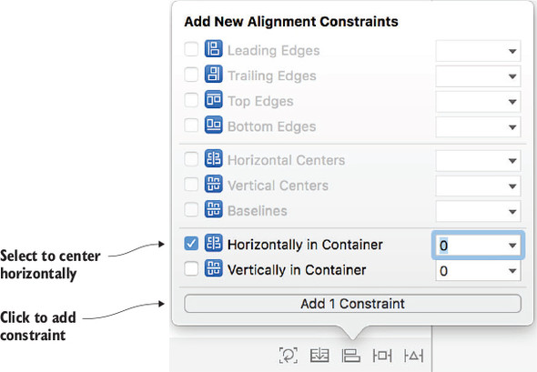
- Select the star-rating view and click Align.
- Center the star-rating view in the root view by selecting Horizontally in Container.
- Select Add 1 Constraint (see figure 6.13).
Figure 6.13. Add constraint in align menu
The star-rating view should now have an x position (center) and width and height (from intrinsic content size) and only needs a y position. The designer’s brief suggests it should be a standard distance from the book view. A standard distance lets the Auto Layout engine choose the most appropriate value.
Creating constraints in the Add New Constraints menu
Now, you’ll add a y position to the star-rating view, using the Add New Constraints menu:  .
.
- With the star-rating view selected, click Add New Constraints. The four spokes at the top of the menu can be used to pin an edge of the selected view to its nearest neighbor. The nearest neighbor could be another view, the edge of its container view, or a layout guide. You can specify a numeric value, the current distance between the views in the canvas, or a standard value. You’ll use the standard value.
- Select the drop-down on the top pin.
- Select Use Standard Value.
Tip
In this menu, you can also see which view Interface Builder has detected that you’re most likely intending to pin your view to. You can make a change to this here, if necessary, but your intention was to pin the star-rating view to the book view, Interface Builder has guessed correctly!
- Select Add 1 Constraint to finalize your changes (see figure 6.14).
Figure 6.14. Add constraint in pin menu

Challenge
Practice using the Add New Constraints menu, by adding constraints for the notes text view. Pin it a standard distance on the left, 0 points from the bottom safe area layout guide and 16 points to the right safe area layout guide. (At the time of writing, standard distance isn’t available when pinning to the safe area layout guides.)
Creating multiple constraints in the Add New Constraints menu
You can also use the Add New Constraints menu to pin multiple views simultaneously.
The title text field, author text field, and notes text view all need to be separated by a standard distance, pinned to the right safe area layout guide, and a standard distance from their associated labels.
- Select the title text field and the author text field.
- Select the Add New Constraints button again.
- Select a standard distance on the left, top, and bottom, and a value of 16 on the right.
- Be sure that the red line connecting each of the four directions is active. If it’s dim, you need to click on it to activate it.
- Select the Add 7 Constraints button (see figure 6.15).
Figure 6.15. Adding multiple view constraints in the pin menu
Wait—why 7? You selected two views and gave each view four constraints. Two times four—doesn’t that equal 8? When you created a constraint pinning the bottom of the title field to the top of the author field, Xcode recognized it would be redundant to create a top constraint for the author field, reducing your constraints to 7. You might notice your title and author text fields have shrunk and moved to the right of the scene. Strange! See figure 6.16.
Figure 6.16. Shrunken text fields
Because you added constraints to the text fields, the Auto Layout engine takes over managing their position and size. Because these text fields are pinned to labels on their left that don’t have auto layout positions yet, this is the Auto Layout engine’s best guess as to your intention. The text fields have a width of 25 points, the default intrinsic content width of a text field that doesn’t contain text. Not to worry—this will all get sorted out when you add constraints to the labels. The labels should already be set to right justified in the Attributes Inspector and pinned to their related text fields. As requested by the designer, let’s make them the same width.
- Select the three labels (Title, Author, and Notes).
- Select Equal Widths in the Add New Constraints menu.
- While you’re in this menu, pin them flush to the left safe area layout guide as well, with a value of 16.
- Don’t forget to select the Add 5 Constraints button! The labels and text fields should return to their position on the left.
Why wouldn’t you need to specify an absolute width for one of these three labels? You may have guessed it: the labels have an intrinsic content width based on their content. The only way for all three widths to be equal is for them to be equal to the widest option—otherwise, two labels would have to shrink smaller than their content width.
But as you’ve seen, text fields have an intrinsic content size too. If both labels and text fields have an intrinsic content size, how does the Auto Layout engine know which views to stretch and shrink to accommodate different resolutions?
Hugging and resistance
Imagine a hypothetical interface laid out with one view containing two labels. If the view width increases, the first label should stay the same width and the second label should stretch to fill the available space. If the view width decreases, again the first label should stay the same width and the second label should shrink to its available space (see figure 6.17).
Figure 6.17. Preferred behavior when stretching and shrinking+

How would you indicate this preferred behavior to the Auto Layout engine? Your first thought might be to specify a fixed width for the first label, but what happens one day when you decide to localize your app into different languages, and the word for “title” in another language is shorter—or worse, longer? Do you manually update the width of the title label for every language you’ve localized your app into? Or do you change the width value to the longest possible version of the word “title”? A better approach is to allow the intrinsic content size of the label to do its job in defining the width of the label, and let the Auto Layout engine know which label you’d prefer to shrink and stretch if necessary. How? By setting the label’s Content Hugging Priorities and Content Compression Resistance Priorities.
The higher the priority of Content Hugging, the more a view tries to hug its intrinsic content width and resists stretching. The higher the priority of Content Compression Resistance, the more a view resists compression of its content, or shrinking. See figure 6.18 to help grasp these concepts.
Figure 6.18. Compression resistance versus hugging

The default Content Hugging Priority for a label is 251 (low) and the default Content Compression Resistance Priority is 750 (high).
In the hypothetical interface of figure 6.17, to indicate that your preference is for the second label to shrink or stretch if necessary, you could give the second label lower priorities for horizontal hugging and compression in the Size Inspector (see figure 6.19).
Figure 6.19. Hugging and compression priorities

Conversely, you could also have given the first label higher horizontal hugging and compression priorities.
Great! But back to the add-a-book interface layout. Will you need to make changes to these priorities to indicate whether the title label and title text field should shrink or compress beyond their intrinsic content size? Well, no!
Because it’s a common preference in a layout for a text field to grow or shrink while the label remains the same width as its content, defaults to accommodate this are baked into the system. Although the label hugging priority default is 251, the text field hugging priority default is 250. The text field will be the preferable view to stretch rather than using a label. Because the text field’s intrinsic content width is a bare minimum width of 25 points, it’s fine for the text field to continue to resist compression at the same priority level as other views.
Creating baseline constraints
Now, all that’s left is to give these three labels a y location.
- Control-drag from the title label to the title text field.
- Select Last Baseline to align the baselines of the two.
- Repeat steps 1 and 2 for the author label. As the notes are taken in a scrollable multiline view, a baseline property doesn’t make sense, so the designer has suggested the notes label could be aligned to the text view’s top.
- Control-drag between the notes label and the notes text view and select Top.
That’s it—you’ve fully described the add-a-book form using auto layout constraints. Well done!
If you select all the views now by clicking on the storyboard and selecting Command-A, you should (hopefully) no longer be seeing any red error lines or arrows. You may, however, still see orange warning lines, most likely indicating several views are slightly misplaced on the canvas. Select the orange warning arrow at the top right of the document outline and skim over the issues.
Resolving auto layout issues
Sometimes, you might have issues with your auto layout constraints, but two buttons can help you out:
 Update Frames will automatically update the views in the canvas based on your constraints.
 Resolve Auto Layout Issues can either update or create constraints based on the views’ locations, or clear all constraints so you can start from scratch.
Because Xcode can misinterpret your intention with your interface when defining your constraints for you in Resolve Auto Layout
Issues, I generally avoid this option.
Resolve Auto Layout Issues can either update or create constraints based on the views’ locations, or clear all constraints so you can start from scratch.
Because Xcode can misinterpret your intention with your interface when defining your constraints for you in Resolve Auto Layout
Issues, I generally avoid this option.
If you have any orange warning lines indicating a misplaced view, let’s resolve the issue now by updating frames.
Note
If you don’t have any orange warning lines, but you’re interested in experimenting with updating frames, feel free to misplace a view by dragging it to where it shouldn’t be!
- Ensure that all views are still selected by clicking on the storyboard and selecting Command-A.
- Say the magic word, and select Update Frames. Alakazam! The views in your scene should move into their perfect position, based on the constraints you set up. Orange error lines should be replaced with blue valid lines.
Regardless of the device you run your app on, the layout should adapt based on the rules you specified as constraints. See figure 6.20 for how your interface should look now on three different devices.
Figure 6.20. Interface after auto layout

Congratulations, you’ve laid out an interface using constraints and auto layout!
Run the app yourself to confirm that your design adapts to different device resolutions. You can rotate the simulator by holding down Command and the left-arrow (←) or right-arrow (→) buttons, and the interface will adapt to its new environment. Your app will even adapt to multitasking modes such as Slide Over or Split View!
Checkpoint
If you’d like to compare your project with mine at this point, you can check mine out here: https://github.com/iOSApp-DevelopmentwithSwiftinAction/Bookcase.git (Chapter6.2.AutoLayout).
If you’re using an iPhone device or simulator, you may have discovered that the simulator doesn’t want to rotate in one orientation. What’s going on?

Because iPhone users are less likely than iPad users to want to use their handsets upside down, the default approach is to indicate to the user that the handset is upside down by not triggering a rotation for this orientation. This is set in the project’s general target settings, under Deployment Info, where Upside Down Device Orientation is unchecked by default for Universal devices. (If you dig down and select iPad devices, you’ll find that iPads override this universal behavior by allowing upside down device orientation.)

For more on project settings, see appendix A.
6.2.3. Auto layout in code
Because Interface Builder gives you the capacity to visualize your layout, and immediate feedback on errors and warnings, it’s the best place to set up your constraints if possible. However, occasionally you may want your scene, or views within your scene, to change state, for example, after user interaction. This adjustment to your layout might need to be handled in code.
Luckily, it’s possible to work with auto layout constraints in code. There are three main approaches you can use that are syntactic differences that, in the end, produce the same result: constraints that the Auto Layout engine can use to lay out a scene. You can set up your constraints with combinations of different approaches.
Three approaches
The following is a brief overview of the three different approaches to defining your constraints programmatically. Whichever approach you use, you’ll generate an NSLayoutConstraint object. After generating the constraint, you then need to activate the constraint. (This is an easy step to forget.)
You can activate constraints in two ways:
- Set each constraint’s active property to true:
constraint.active = true
- Pass an array of constraints into NSLayoutConstraint’s activate method:
NSLayoutConstraint.activate(constraints)
NSLayoutConstraint
NSLayoutConstraint is a powerful but verbose approach to defining individual constraints.
Back in figure 6.11, you saw that setting up the options that define a constraint is like formulating an equation. Using NSLayoutConstraint, you can create a constraint by passing in all the components of that equation and then activating the constraints (see figure 6.21).
Figure 6.21. NSLayoutConstraint syntax

Visual Format Language
Visual Format Language (VFL) takes a different approach to defining constraints. In VFL, you can describe multiple constraints simultaneously.
Rather than setting up each individual constraint, you describe the horizontal and vertical sketches of your layout as strings in a visual format. Probably the easiest way to get grasp VFL is by looking at an example. Imagine you want to set up the horizontal constraints of a label and a text field, side by side, filling the available space.
First, set up a dictionary containing the elements:
let views = ["label": label, "textField": textField]
Then, you need to describe the horizontal layout, using VFL. See figure 6.22 for your first look at the VFL syntax.
Figure 6.22. Visual Format Language syntax example

In English, this string says, “In the horizontal direction, place the label a standard distance from the left edge, place the text field a standard distance away, and then place the text field a standard distance away from the right edge.”
This VFL string will automatically set up horizontal constraints for both the label and textField; not bad for a little string!
Once you define a VFL string, you can pass this and the dictionary of views into NSLayoutConstraint’s constraintsWithVisualFormat method, and then activate the constraints you generate, as shown in the following listing.
Listing 6.1. Create Visual Format Language constraints
let views = ["label": label, "textField": textField]
let formatString = "H:|-[label]-[textField]-|"
let constraints = NSLayoutConstraint.constraints (
       withVisualFormat: formatString,
       options: [],
       metrics: nil,
       views: views)
NSLayoutConstraint.activate(constraints)
VFL does have a limitation—it doesn’t support multipliers. If multipliers are necessary, VFL needs to be used in combination with other techniques.
Layout anchors
NSLayoutAnchor creates individual constraints in a way similar to NSLayoutConstraint, but with a more succinct syntax. Every view and layout guide has anchors representing the 12 main constraint types (listed in table 6.1). You can constrain these anchors directly to each other to generate NSLayoutConstraints. Again, it’s a matter of passing in the different components of the constraint equation, but in a different way (see figure 6.23).
Figure 6.23. NSLayoutAnchor syntax

If the defaults for multiplier (1) and constant (0) are sufficient, these parameters can be left out of the call.
You’ll practice using programmatic constraints by adding layout anchors to adapt views that were already created in code.
Checkpoint
Open the ViewsInCode project from chapter 4, or if you prefer, you can download it from https://github.com/iOSAppDevelopment-withSwiftinAction/ViewsInCode.git (1.Displaying-Views branch).
Remind yourself of the project by running it on the simulator. In this project you added a red view that was the width and half the height of the root view. You then placed a label half-way down.
Great! These coordinates and dimensions were relative to the size of the root view, which was, by default, the same size as the app window. Regardless of whether you run this app on an iPhone 4S or on an iPad Pro, the calculation is correct.
But wait, there’s a problem. Rotate the simulator, and you’ll see something like figure 6.24.
Figure 6.24. Rotating orientation

When the app window rotates to another orientation, the scene’s root view automatically rotates, but any subviews don’t automatically resize or reposition to the root view’s new dimensions. What can we do about that?
Auto layout to the rescue!
- After setting up the views programmatically in the viewDidLoad method, create the view’s constraints, as shown in the code in this step.
First, pin the red view’s top, and leading and trailing anchors to the root view, and set the red view’s height to half the
height of the root view.
Next, pin the label’s leading anchor to the root view, and the top anchor of the label points from the bottom of the red view.
For simplicity, set up an array of NSLayoutConstraints, and then activate them all at once.
let constraints:[NSLayoutConstraint] = [
 //red view
 redView.topAnchor.constraint(equalTo: view.topAnchor),
 redView.leadingAnchor.constraint(equalTo: view.leadingAnchor),
 redView.trailingAnchor.constraint(equalTo: view.trailingAnchor),
 redView.heightAnchor.constraint(equalTo: view.heightAnchor,
   multiplier: 0.5),
 //label
 label.topAnchor.constraint(equalTo: redView.bottomAnchor, constant: 8),
 label.leadingAnchor.constraint(equalTo:
   view.layoutMarginsGuide.leadingAnchor)
]
NSLayoutConstraint.activate(constraints)
- Done. But wait! Run the app and rotate the simulator again. You’ll find that not only are your new constraints being ignored, but there are a bunch of messages in the console that Xcode was “Unable to simultaneously satisfy constraints.” What’s going on?
Automatic autoresizing constraints
Each view has a translatesAutoresizingMaskIntoConstraints property, which, if true, will automatically convert your autoresizing masks into auto layout constraints. We’ll look at autoresizing masks in a moment, but for the moment it’s sufficient to understand that these additional, automatically generated constraints are conflicting with the constraints you’re manually creating.
The translatesAutoresizingMaskIntoConstraints property defaults to true, but will automatically swap to false if you add auto layout constraints to a view in Interface Builder. If you plan to add your views programmatically using auto layout as you’re doing now, you must set this property on each view in code to false, or these automatically generated constraints may conflict with yours.
- Set this property to false for the redView.
redView.translatesAutoresizingMaskIntoConstraints = false
- Do the same for the label.
label.translatesAutoresizingMaskIntoConstraints = false
That’s it! You’ve set up sufficient constraints for the red view and label to know how to display, regardless of the device or orientation they’re displayed in. - Run the app in different device simulators and rotate the simulators to confirm that the app is displaying correctly.
6.3. Autoresizing
Before auto layout, Apple’s first attempt at solving the problem of adaptive layout was called autoresizing, known also as springs and struts. As you’ll see, autoresizing does have limitations compared to auto layout, but can still be a useful tool for quickly building simple interfaces, and the more powerful auto layout can be implemented for more-complex layouts.
As you’ve seen, views by default maintain the absolute position (x-y) and size (width-height) that they’re instantiated with. If a view’s superview (such as a scene’s root view) changes size (perhaps due to a rotation), its subviews by default won’t adjust accordingly. Autoresizing aims to correct this by adding certain rules that determine how a view resizes when its superview resizes.
The four outer margin attributes (top, left, right, and bottom) and the two size attributes (width and height) can be set to flexible (the springs) or fixed (the struts). See figure 6.25 to see how springs and struts define a view’s relationship with its superview.
Figure 6.25. Autoresizing attributes

6.3.1. Autoresizing in code
We’re going to explore how autoresizing works in code by looking again at the ViewsInCode project.
Checkpoint
You could remove (by selecting Source Control > Discard all Changes) or comment out any adjustments you made to the layout earlier, or if you prefer, you can check it out at https://github.com/iOSApp-DevelopmentwithSwiftinAction/ViewsInCode.git (1.DisplayingViews branch).
Note
You can comment out code by surrounding it with forward slash + asterisk (/*), and asterisk + forward slash (*/); for example: /* Comment */.
Let’s consider how autoresizing could be used to automatically resize the red view and the label of the ViewsInCode project. Take another look at figure 6.24 to remind yourself of what the intention of the interface is, and then look at a written description of that intention for the red view in table 6.3.
Table 6.3. Red view
|
Attribute |
Description |
|---|---|
| Left margin | 0 |
| Width | The width of the superview |
| Right margin | 0 |
| Top margin | 0 |
| Height | Half the height of the superview |
| Bottom margin | Half the height of the superview |
Describing the interface this way helps make it clear which attributes are relative to the size of the superview (and therefore springs), and which are absolute values (and therefore struts).
When setting up the autoresizing rules for a view, rather than specifying all six attributes, only relative or flexible measurements (springs) are specified, and all unmentioned attributes are assumed to be absolute or inflexible (struts).
The width, height, and bottom margin are all relative to the superview, so you’ll set them to be springs. Use the UIView’s autoresizingMask property, and pass in an array containing the three flexible attributes.
- Add the following line where you set up the redView in the viewDidLoad method:
redView.autoresizingMask = [.flexibleHeight, .flexibleWidth,
   .flexibleBottomMargin]
Follow the same process for the label described in table 6.4.Table 6.4. Label
In the label’s case, the right margin, top margin, and bottom margin are all relative to the superview, so you should set them to springs.Attribute
Description
Left margin 20 Width Fixed width Right margin Width of superview (minus) width (minus) left margin Top margin Half the height of the superview Height Fixed height Bottom margin Superview height (minus) height (minus) top margin - Add the following line after instantiating the label:
label.autoresizingMask = [.flexibleTopMargin, .flexibleBottomMargin, .flexibleRightMargin] - Run the app and rotate the simulator to check how the views resize on rotation (see figure 6.26). (I’ve given the label a background color to highlight the difference more clearly.)
Figure 6.26. Autoresizing views in code

Close, but not perfect! The red view resized great, but the label is slightly off. The simple calculation that Xcode performs to determine the top and bottom margins of the label aren’t sufficient to place it precisely where you’d like it. This is a case where a more precise method such as auto layout will be necessary to perfect the layout.
6.3.2. Autoresizing in Interface Builder
You can perform autoresizing in Interface Builder as well. After laying out your views, you go to the Size Inspector for each view, where you’ll find an autoresizing section with the six autoresizing attributes that you saw in figure 6.5.
Click on the six attributes to turn them on and off. Margins attributes are represented by struts (lines with flat ends), and size attributes are represented by springs (lines with arrowheads). The default attributes are represented by the Top-Left margin struts turned on and the Left-Bottom struts and Width-Height springs turned off (see figure 6.27). Notice the image to the right of the autoresizing attributes gives you a visual indication of the expected result with this combination of springs and struts.
Figure 6.27. Default autoresizing

For example, to replicate the red view’s attributes from table 6.3, you’d turn on the Width-Height springs, and the right margin strut (see figure 6.28).
Figure 6.28. Red view autoresizing

6.3.3. Autoresizing considerations
You probably already have noticed some limitations of autoresizing:
- Each measurement needs to be defined as either absolute or relative, but sometimes you want a combination of both. For example, you might want a label to be positioned at a relative y position (half the height of its superview) plus an absolute position (a margin). This sort of combination isn’t possible with autoresizing only.
- In autoresizing, the only relationship a view has is with its container. In real-life interfaces, views can have relationships with other views at the same level.
- Autoresizing doesn’t take into consideration the possibility that the content of a view could change, requiring layout adjustments.
How does Xcode know to use autoresizing or auto layout to lay out your interface? When you drag a view onto Interface Builder, it will by default begin with top and left struts defined in autoresizing. As soon as a view contains at least one constraint, Interface Builder assumes you’re planning to use auto layout constraints on this view rather than autoresizing, and the autoresizing attributes disappear from the Size Inspector.
Using autoresizing in a scene doesn’t prevent you from using auto layout on other views in the same scene. It’s possible to lay out a scene using the simpler autoresizing and then incrementally adopt the more powerful and complex system of auto layout on views where it’s needed.
6.4. Manual adaptive layout
Auto layout (along with size classes discussed in the next chapter) will be sufficient for most interfaces, but occasionally you may need to implement adaption and transitions of your interface manually in code.
To explore manual adaptive layout, you’ll work on the same ViewsInCode project from the previous section, but from its initial state.
Checkpoint
Again, discard or comment out changes, or check out the repo again from https://github.com/iOSAppDevelopmentwithSwift-inAction/ViewsInCode.git (1.DisplayingViews branch).
6.4.1. Receiving transition events
Whenever the root view of a view controller changes size (such as when the app rotates), a UIViewController event called viewWillTransition()triggers. This method passes in an argument containing the new size of the root view.
Override this method, and use this size parameter to resize the red view and reposition the label, as shown in the following listing.
Listing 6.2. Reposition/Resize views when view size transitions
override func viewWillTransition(to size: CGSize,
       with coordinator: UIViewControllerTransitionCoordinator) {      1
   super.viewWillTransition(to: size, with: coordinator)               2
   self.redView.frame.size = CGSize(width: size.width,                 3
       height: size.height / 2)                                        3
   self.label.frame.origin.y = size.height / 2                         4
}
Run the app again, and rotate the simulator to test your repositioning code. The end result of the rotations is great, but the rotation transition doesn’t look quite right and it’s hard to tell exactly what’s happening with the speed of the transition. Slow down the transition to get a better look at it by selecting Debug > Slow Animations.
Remember the yellow view is the root view of the scene, and is resized automatically by UIKit. On the other hand, the red view, a subview of the yellow view, is controlled by you.
When the animations are slowed down, notice that the yellow view’s rotation, width, and height transition over the duration of the rotation transition. Meanwhile, at the moment the rotation is triggered, the red view’s width and height change to their new values without transitioning. How can you make the red view’s resizing transition over time like the yellow view’s?
There’s an argument in the viewWillTransition method that’s the key to performing this transition: the transition coordinator.
The transition coordinator is generated when a scene transition begins, and handles animations of views during the transition. You can tell the transition coordinator to animate your views for you too, using the animate method.
The animateAlongsideTransition method accepts two arguments that are both closures, as explained in table 6.5.
Table 6.5. animateAlongsideTransition arguments
|
Argument |
Description |
|---|---|
| animation | Any changes to properties within this closure will automatically animate for the duration of the transition. |
| completion | This closure will be called after the animation is complete, and can be used for any cleanups, such as removing subviews. |
In general, the structure of a viewWillTransition method should look like the following listing.
Listing 6.3. viewWillTransition method structure
override func viewWillTransition(to size: CGSize,
       with coordinator: UIViewControllerTransitionCoordinator) {
   super.viewWillTransition(to: size, with: coordinator)             1

   coordinator.animate (alongsideTransition: { (context) in          2
   }) { (context) in                                                 3

   }
}
For our ViewsInCode example, you could resize the red view and reposition the label within the animation block, as shown in the following listing.
Listing 6.4. Animate reposition/resize views
override func viewWillTransition(to size: CGSize,
       with coordinator: UIViewControllerTransitionCoordinator) {
   super.viewWillTransition(to: size, with: coordinator)              1

   coordinator.animate (alongsideTransition: { (context) in
       self.redView.frame.size = CGSize(width: size.width,
           height: size.height / 2)                                   2
       self.label.frame.origin.y = size.height / 2
   }) { (context) in                                                  3

   }
}
- 1 No setup necessary
- 2 Animate property changes
- 3 No cleanup necessary
Run the app again with animations slowed down, and notice that this time the red view and the label animate smoothly to their new positions and dimensions.
6.4.2. Receiving layout events
Rather than programmatically adjusting the size and position of views in a scene at the moment a view transitions, developers may prefer to adjust them at the moment the scene’s root view’s layout is being updated.
When is a view’s layout updated?
Every view contains a flag that indicates that it requires updates to its layout. If this flag is set to true, it will be updated at the next appropriate moment in the run cycle. A view could be flagged as needing layout several times in the same cycle, but the actual layout process is only performed once.
The system can set this flag to true. When does the system flag that the root view’s layout needs updating? Here are common times:
- When the view appears
- When the view is resized (for example, after an orientation change)
- When the view’s subviews change (that is, a subview is added to the view, or a subview is removed from the view
You can also set the flag to true by calling the view’s setNeedsLayout method. If you do need to manually request the layout process to be performed immediately, this is possible as well, by calling the layoutIfNeeded method.
Updating view layout
When the appropriate time arrives in the run cycle to update a view, and it’s flagged to require updates, three methods are called to lay out a view’s subviews (see figure 6.29).
Figure 6.29. Layout subviews

The view controller first registers that it will lay out the subviews, then the view does the layout of subviews, and finally the view controller registers that it did lay out the subviews. You can override any of these methods to manually resize and reposition subviews. If the trigger to lay out involves a transition such as resizing a view, the transition coordinator will animate any changes made in these three methods as well.
To explore this alternative approach, you’ll use the viewWillLayoutSubviews method to update the position and size of the redView and label.
First, remove or comment out the viewWillTransition method from the previous section.
Override the viewWillLayoutSubviews method, and call its super method. Resize the red view and reposition the label. To see when this method is called, print a message to the console, as shown in the following listing.
Listing 6.5. Reposition/Resize views when view is laid out
override func viewWillLayoutSubviews() {                              1
   super.viewWillLayoutSubviews()                                     2
   self.redView.frame.size = CGSize(width: view.frame.width,          3
       height: view.frame.height / 2)                                 3
   self.label.frame.origin.y = view.frame.height / 2                  4
   print("View will layout subviews")                                 5
}
Run the app on the simulator again, and rotate the app. You should see the red view resizing and the label repositioning, animated the way it was before.
Considerations
The approach you decide to go with is up to you and the specifics of your app, but advantages do exist for repositioning and resizing when the layout updates:
- The layoutSubviews method will be called when a view appears, and when the view resizes (such as a rotation). You can take advantage of this to perform repositioning and resizing that will be consistent initially and on rotation.
- You can take advantage of the call setNeedsLayout to manually request that the layout updates.
- By overriding the layoutSubviews method in a UIView subclass, you can pass on the responsibility of managing a view’s layout to the view itself, something that can make sense in many cases.
Certain disadvantages to this approach are these:
- You probably noticed in the console that the viewWillLayoutSubviews method was called twice when the view appeared. Despite the use of a flag to avoid redundant layout updates, it’s still possible for this method to be called on multiple run cycles. You should consider this possibility. Avoid processor-intensive work in these methods and ensure that any one-off work is only performed once.
- Repositioning and resizing views manually in a simple interface with a view and a label isn’t too bad, but what happens when the interface contains dozens of different types of views? What if you want the interface to look different on an iPad and an iPhone, or portrait and landscape? Setting up an interface entirely in code can get complex quickly.
Although certain developers prefer to adapt views programmatically, most iOS developers use programmatic repositioning and resizing of views as a last resort, useful for certain circumstances where auto layout isn’t sufficient, such as dynamic interfaces or customized animations.
6.5. Choosing an approach
In this chapter, you’ve looked at several approaches to building an adaptive layout:
- Manually
- Responding to transition events
- Responding to layout events
- Automatically
- Using autoresizing
- In Interface Builder
- Setting autoresizing mask in code
- Using auto layout
- In Interface Builder
- In code
- Using layout constraints
- Using layout anchors
- Using visual format language
- Using autoresizing
Wow, that’s a long list of alternatives! How do you know which to use?
We covered some of the pros and cons of each. Beyond those, it comes down to personal preferences. Some users may prefer the granular control of making changes manually. Others may prefer the relative simplicity of autoresizing. Another group may prefer to have everything in code, whereas others like to work visually.
I generally lean toward auto layout. It can be complicated at first, but the time investment in getting familiar with it is worth it, and with practice the process of describing your layout using constraints will become easier. I also prefer to use Interface Builder where possible to visualize the interface, and more quickly recognize issues with my constraints.
That said, auto layout isn’t like working in a vacuum, and it’s a good idea to be familiar with other adaptive layout options. Different combinations of techniques can be used where appropriate. Dynamic designs, for example, are great candidates for working with adaptive layout in code.
We’re not done with adaptive layout yet! We’ll explore more ways to adapt interfaces in the next chapter. Though our layouts have adapted, they’ve still been similar on different devices and rotations. In the next chapter, you’ll make your apps adapt even more to their environment!
6.6. Summary
In this chapter, you learned the following:
- The position and size of the views in your layout should adapt to their environment—regardless of the device resolution, orientation, or if they’re presented in a multitasking mode or split view controller.
- You can manually adapt views in code when the scene’s view loads and transitions, or when the scene’s view is laid out.
- You can adapt views using autoresizing, which can be sufficient on simpler layouts.
- Constraints are the rules that describe a layout in auto layout, and can be defined in Interface Builder or in code.
- Auto layout allows more-complicated relationships between views.
- A view in Interface Builder by default is positioned with autoresizing, until it’s given an auto layout constraint.
- A layout can use a combination of methods to adapt its views.