
K Means Cluster Platform Overview
K Means Cluster is one of four platforms that JMP provides for clustering observations. For a comparison of all four methods, see “Overview of Platforms for Clustering Observations”.
The K Means Cluster platform forms a specified number of clusters using an iterative fitting process. The k-means algorithm first selects a set of n points called cluster seeds as an initial guess for the means of the clusters. Each observation is assigned to the nearest cluster seed to form a set of temporary clusters. The seeds are then replaced by the cluster means, the points are reassigned, and the process continues until no further changes occur in the clusters.
The k-means algorithm is a special case of the EM algorithm, where E stands for Expectation, and M stands for maximization. In the case of the k-means algorithm, the calculation of temporary cluster means represents the Expectation step, and the assignment of points to the closest clusters represents the Maximization step.
K-Means clustering supports only numeric columns. K-Means clustering ignores modeling types (nominal and ordinal) and treats all numeric columns as continuous.
You must specify the number of clusters, k, or a range of values for k, in advance. However, you can compare the results of different values of k to select an optimal number of clusters for your data.
For background on K-Means clustering, see SAS Institute Inc. (2005) and Hastie et al. (2009).
Overview of Platforms for Clustering Observations
Clustering is a multivariate technique that groups together observations that share similar values across a number of variables. Typically, observations are not scattered evenly through n-dimensional space, but rather they form clumps, or clusters. Identifying these clusters provides you with a deeper understanding of your data.
Note: JMP also provides a platform that enables you to cluster variables. See the “Cluster Variables” chapter.
JMP provides four platforms that you can use to cluster observations:
• Hierarchical Cluster is useful for smaller tables with up to several tens of thousands of rows and allows character data. Hierarchical clustering combines rows in a hierarchical sequence that is portrayed as a tree. You can choose the number of clusters that is most appropriate for your data after the tree is built.
• K Means Cluster is appropriate for larger tables with up to millions of rows and allows only numerical data. You need to specify the number of clusters, k, in advance. The algorithm guesses at cluster seed points. It then conducts an iterative process of alternately assigning points to clusters and recalculating cluster centers.
• Normal Mixtures is appropriate when your data come from a mixture of multivariate normal distributions that might overlap and allows only numerical data. For situations where you have multivariate outliers, you can use an outlier cluster with an assumed uniform distribution. A separate Robust Normal Mixtures option is an alternative to the Normal Mixture with uniform outlier cluster.
You need to specify the number of clusters in advance. Maximum likelihood is used to estimate the mixture proportions and the means, standard deviations, and correlations jointly. Each point is assigned a probability of being in each group. The EM algorithm is used to obtain estimates.
• Latent Class Analysis is appropriate when most of your variables are categorical. You need to specify the number of clusters in advance. The algorithm fits a model that assumes a multinomial mixture distribution. A maximum likelihood estimate of cluster membership is calculated for each observation. An observation is classified into the cluster for which its probability of membership is the largest.
|
Method
|
Data Type or Modeling Type
|
Data Table Size
|
Specify Number of Clusters
|
|
Hierarchical Cluster
|
Any
|
With Fast Ward, up to 200,000 rows
With other methods, up to 5,000 rows
|
No
|
|
K Means Cluster
|
Numeric
|
Up to millions of rows
|
Yes
|
|
Normal Mixtures
|
Numeric
|
Any size
|
Yes
|
|
Latent Class Analysis
|
Nominal or Ordinal
|
Any size
|
Yes
|
Example of K Means Cluster
In this example, you use the Cytometry.jmp sample data table to cluster observations using K Means Cluster. Cytometry is used to detect markers of the surface of cells and the readings from these markers help diagnose certain diseases. In this example, the observations are grouped based on readings of four markers in a cytometry analysis.
1. Select Help > Sample Data Library and open Cytometry.jmp
2. Select Analyze > Clustering > K Means Cluster.
3. Select CD3, CD8, CD4, and MCB and click Y, Columns.
4. Click OK.
5. Enter 3 next to Number of Clusters.
6. Enter 15 next to Range of Clusters (Optional).
Because the Range of Clusters is set to 15, the platform provides fits for 3 to 15 clusters. You can then determine your preferred number of clusters.
7. Click Go.
Figure 8.2 Cluster Comparison Report

The Cluster Comparison report appears at the top of the report window. The best fit is determined by the highest CCC value. In this case, the best fit occurs when you fit 11 clusters.
8. Scroll to the K Means NCluster=11 report.
Figure 8.3 K Means NCluster=11 Report

The Cluster Summary report shows the number of observations in each of the eleven clusters. The Cluster Means report shows the means of the four marker readings for each cluster.
9. Click the K Means NCluster=11 red triangle and select Parallel Coord Plots.
Figure 8.4 Parallel Coordinate Plots for Cytometry Data

The Parallel Coordinate Plots display the structure of the observations in each cluster. Use these plots to see how the clusters differ. Clusters 4, 6, 7, 8, and 9 tend to have comparatively low CD8 values and high CD4 values. Cluster 1, on the other hand, has higher CD8 values and lower CD4 values.
10. Click the K Means NCluster=11 red triangle and select Biplot.
Figure 8.5 Biplot for Cytometry Data

The clusters that appear to be most separated from the others based on their first two principal components are clusters 3, 10, and 11. This is supported by their parallel coordinate plots in Figure 8.4, which differ from the plots for the other clusters.
Launch the K Means Cluster Platform
Launch the K Means Cluster platform by selecting Analyze > Clustering > K Means Cluster. Figure 8.6 shows the Clustering launch window for Cytometry.jmp.
Figure 8.6 K Means Cluster Launch Window

Y, Columns
The variables used for clustering observations.
Note: K-Means clustering supports only numeric columns.
Weight
A column whose numeric values assign a weight to each row in the analysis.
Freq
A column whose numeric values assign a frequency to each row in the analysis.
By
A column whose levels define separate analyses. For each level of the specified column, the corresponding rows are analyzed. The results are presented in separate reports. If more than one By variable is assigned, a separate analysis is produced for each possible combination of the levels of the By variables.
Launch Window Options
KMeans is the default clustering method, but you have the option to select Hierarchical or Normal Mixtures. If you select KMeans or Normal Mixtures, when you click OK, a Control Panel appears. See “Iterative Clustering Control Panel”.
Columns Scaled Individually
Scales each column independently of the other columns. Use when variables do not share a common measurement scale, and you do not want one variable to dominate the clustering process. For example, one variable might have values that are between 0 and 1000, and another variable might have values between 0 and 10. In this situation, you can use the option so that the clustering process is not dominated by the first variable.
Johnson Transform
Fits a Johnson family distribution to the Y variables. If Columns Scaled Individually is selected, a separate Johnson transformation is fit to each Y variable. If Columns Scaled Individually is not selected, a single Johnson transformation is fit to values for all the Y variables. Two of the Johnson families (Sb and Su) are considered and the fitting method uses maximum likelihood.See the Distributions chapter in the Basic Analysis book.
The Johnson transformations attempt to normalize the data, mitigating skewness, and pulling outliers in toward the center of the distribution.
Iterative Clustering Report
When you click OK in the launch window, the Iterative Clustering report window appears, showing:
• A Transformations report. (Shown only if Johnson Transformation option is selected.) The Transformations report contains a row for each variable entered in Y, Columns. For each variable, the best-fit Johnson distribution is reported from the Sb or Su family, as well as the estimated values for the parameters  . For more information about the Johnson distributions, see the Distributions chapter in the Basic Analysis book.
• A Control Panel for fitting models. See “Iterative Clustering Control Panel”.
As you fit models, additional reports are added to the window. See “K Means NCluster=<k> Report”.
Iterative Clustering Options
Save Transformed
(Available only if the Johnson Transformation option is selected.) Saves the transformed data as new formula columns in the data table.
See the JMP Reports chapter in the Using JMP book for more information about the following options:
Local Data Filter
Shows or hides the local data filter that enables you to filter the data used in a specific report.
Redo
Contains options that enable you to repeat or relaunch the analysis. In platforms that support the feature, the Automatic Recalc option immediately reflects the changes that you make to the data table in the corresponding report window.
Save Script
Contains options that enable you to save a script that reproduces the report to several destinations.
Save By-Group Script
Contains options that enable you to save a script that reproduces the platform report for all levels of a By variable to several destinations. Available only when a By variable is specified in the launch window.
Iterative Clustering Control Panel
The Control Panel for the Cytometry.jmp data table is shown in Figure 8.7. You can interactively fit different numbers of clusters or you can specify a range using the Range of Clusters option.
Figure 8.7 Iterative Clustering Control Panel

The Control Panel has the following options:
Declutter
Locates multivariate outliers. Enter the maximum number of neighbors to examine. When you click OK, plots appear giving distances between each point and that point’s nearest neighbor, second nearest neighbor, up to the maximum nearest neighbor specified.
Caution: The total number of nearest neighbors specified is denoted using a small k. This number is not directly connected to the number of clusters, also sometimes denoted with a small k.
The following options appear beneath the nearest neighbor plots:
Reset Excluded
Specifies that excluded rows be treated as excluded in future cluster fits within the given report. For example, if you exclude rows based on nearest neighbor plots or the scatterplot matrix, you must select this option to exclude these rows from cluster fits performed within the report using the Control Panel.
Scatterplot Matrix
Creates a scatterplot matrix in a separate window that uses all of the Y variables.
Save NN Distances
Saves the distances from each row to its kth nearest neighbor as new columns in the data table.
Close
Removes the Declutter report.
Method
The following clustering methods are available:
KMeans Clustering
Described in this chapter.
Normal Mixtures
Described in the “Iterative Clustering Control Panel” in the “Normal Mixtures” chapter.
Robust Normal Mixtures
Described in the “Normal Mixtures NCluster=<k> Report” in the “Normal Mixtures” chapter.
Self Organizing Map
Described in “Self Organizing Map Control Panel”.
Number of Clusters
Designates the number of clusters to form.
Range of Clusters (Optional)
Provides an upper bound for the number of clusters to form. If a number is entered here, the platform creates separate analyses for every integer between Number of Clusters and the value entered as Range of Clusters (Optional).
Go
Unless Single Step is selected, fits the clusters automatically.
Single Step
Enables you to step through the clustering process one iteration at a time. When you select Single Step and click Go, a K Means Cluster report appears with no cluster assignments but containing a Go and a Step button.
‒ Click the Step button to step through the iterations one at a time.
‒ Click the Go button to fit the clusters automatically.
Use within-cluster std deviations
Scales distances using the estimated standard deviation of each variable for observations within each cluster. If you do not select this option, distances are scaled by an overall estimate of the standard deviation of each variable.
Shift distances using sampling rates
Adjusts distances based on the sizes of clusters. If you have unequally sized clusters, an observation should have a higher probability of being assigned to larger clusters because there is a higher prior probability that the observation comes from a larger cluster.
K Means NCluster=<k> Report
When you click Go in the Control Panel, the following reports appear:
• A Cluster Comparison report. See “Cluster Comparison Report”.
• One or more K Means NCluster=<k> reports, where k is the number of clusters fit. A K Means NCluster=<k> report appears for each fit that you conduct.
The Cluster Comparison report and the KMeans NCluster=11 report for the Cytometry.jmp data table, with the variables CD3 through MCB as Y, Columns, are shown in Figure 8.2 and “K Means NCluster=11 Report”.
Cluster Comparison Report
The Cluster Comparison report gives fit statistics to compare the various models. The fit statistic is the Cubic Clustering Criterion (CCC). Larger values of CCC indicate better fit. The best fit is indicated with the designation Optimal CCC in a column called Best. See SAS Institute Inc. (1983). Constant columns are not included in the CCC calculation.
K Means NCluster=<k> Report
The K Means NCluster=<k> report gives the following summary statistics for each cluster:
• The Cluster Summary report gives the number of clusters and the observations in each cluster, as well as the number of iterations required.
• The Cluster Means report gives means for the observations in each cluster for each variable.
• The Cluster Standard Deviations report gives standard deviations for the observations in each cluster for each variable.
K Means NCluster=<k> Report Options
Each K Means NCluster=<k> report contains the following options:
Biplot
Shows a plot of the points and clusters in the first two principal components of the data. Circles are drawn around the cluster centers. The size of the circles is proportional to the count inside the cluster. The shaded area is the 50% density contour around the mean, and indicates where 50% of the observations in that cluster would fall (Mardia et al., 1980). Below the plot is an option to save the cluster colors to the data table. The eigenvalues are shown in decreasing order.
Biplot Options
Contains the following options for controlling the appearance of the Biplot:
Show Biplot Rays
Shows the biplot rays. The labeled rays show the directions of the covariates in the subspace defined by the principal components. They represent the degree of association of each variable with each principal component.
Biplot Ray Position
Enables you to specify the position and radius scaling of the biplot rays. By default, the rays emanate from the point (0,0). In the plot, you can drag the rays or use this option to specify coordinates. You can also adjust the scaling of the rays to make them more visible with the radius scaling option.
Mark Clusters
Assigns markers that identify the clusters to the rows of the data table.
Biplot 3D
Shows a three-dimensional biplot of the data. Available only when there are three or more variables.
Parallel Coord Plots
Creates a parallel coordinate plot for each cluster. The plot report has options for showing and hiding the data and means. For details, see the Parallel Plots chapter in the Essential Graphing book.
Scatterplot Matrix
Creates a scatterplot matrix using all of the Y variables in a separate window.
Save Colors to Table
Assigns colors that identify the clusters to the rows of the data table.
Save Clusters
Saves the following two columns to the data table:
‒ The Cluster column contains the number of the cluster to which the given row is assigned.
‒ (Not available for Self Organizing Maps.) The Distance column contains a scaled distance between the given observation and its cluster mean. For each variable, the difference between the observation’s value and the cluster mean on that variable is divided by the overall standard deviation for the variable. These scaled differences are squared and summed across the variables. The square root of the sum is given as the Distance. If Johnson Transform is selected, Distance is calculated in transformed units.
Save Cluster Formula
Saves a formula column called Cluster Formula to the data table. This is the formula that identifies cluster membership for each.
Simulate Clusters
Creates a new data table containing simulated cluster observations on the Y variables, using the cluster means and standard deviations.
Remove
Removes the clustering report.
Self Organizing Map
The Self-Organizing Map (SOM) technique was developed by Teuvo Kohonen (1989, 1990) and extended by other neural network enthusiasts and statisticians. The original SOM was cast as a learning process, like the original neural net algorithms, but the version implemented here is a variation on k-means clustering. In the SOM literature, this variation is called a batch algorithm using a locally weighted linear smoother.
The goal of a SOM is not only to form clusters in a particular layout on a cluster grid, such that points in clusters that are near each other in the SOM grid are also near each other in multivariate space. In classical k-means clustering, the structure of the clusters is arbitrary, but in SOMs the clusters have a grid structure. The grid structure helps interpret the clusters in two dimensions: clusters that are close are more similar than distant clusters. See “Description of SOM Algorithm”.
Self Organizing Map Control Panel
Select the Self Organizing Map option from the Method list in the Iterative Clustering Control Panel (Figure 8.8).
Figure 8.8 Self Organizing Map Control Panel

Some of the options on the panel are described in “Iterative Clustering Control Panel”. The other options are described as follows:
Number of Clusters
Not applicable for SOM.
Range of Clusters (Optional)
Not applicable for SOM.
N Rows
The number of rows in the cluster grid.
N Columns
The number of columns in the cluster grid.
Bandwidth
Specifies the effect of neighboring clusters for predicting centroids. A smaller bandwidth results in putting more weight on closer clusters.
Self Organizing Map Report
Figure 8.9 Self Organizing Map Report
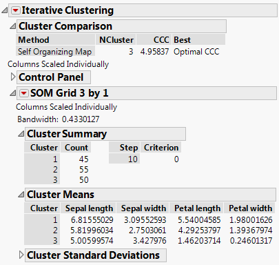
The SOM report is named according to the Grid size requested. The Bandwidth is given at the top of the SOM Grid report. The report itself is analogous to the K Means NCluster report. See “K Means NCluster=<k> Report”.
For details about the red-triangle options for Self Organizing Maps, see “K Means NCluster=<k> Report Options”.
Description of SOM Algorithm
The SOM implementation in JMP proceeds as follows:
• Initial cluster seeds are selected in a way that provides a good coverage of the multidimensional space. JMP uses principal components to determine the two directions that capture the most variation in the data.
• JMP then lays out a grid in this principal component space with its edges 2.5 standard deviations from the middle in each direction. The clusters seeds are determined by translating this grid back into the original space of the variables.
• The cluster assignment proceeds as with k-means. Each point is assigned to the cluster closest to it.
• The means are estimated for each cluster as in k-means. JMP then uses these means to set up a weighted regression with each variable as the response in the regression, and the SOM grid coordinates as the regressors. The weighting function uses a kernel function that gives large weight to the cluster whose center is being estimated. Smaller weights are given to clusters farther away from the cluster in the SOM grid. The new cluster means are the predicted values from this regression.
• These iterations proceed until the process has converged.
..................Content has been hidden....................
You can't read the all page of ebook, please click here login for view all page.