
Hierarchical Cluster Overview
Hierarchical Clustering is one of four platforms that JMP provides for clustering observations. For a comparison of all four methods, see “Overview of Platforms for Clustering Observations”.
The hierarchical clustering method starts with each observation forming its own cluster. At each step, the clustering process calculates the distance between all pairs of clusters and combines the two clusters that are closest together. This process continues until all the points are contained in one cluster. Hierarchical clustering is also called agglomerative clustering because of the combining approach that it uses.
The agglomerative process is portrayed as a tree, called a dendrogram. To help you decide on a number of clusters, JMP provides a distance graph. You can select a number of clusters by determining when the distances between clusters no longer appear to be of practical importance.
Hierarchical clustering also supports character columns, defining distances as follows:
• If a column is ordinal, then the value used for clustering is the index of the ordered category, treated as if it were continuous data. These values are standardized as if they were continuous data.
• If a column is nominal, then the distance between two observations where the categories match is zero. If the categories differ, the distance is one.
Hierarchical clustering enables you to choose among five rules for defining distances between clusters: Average, Centroid, Ward, Single, and Complete. Each rule can generate a different sequence of clusters.
Tip: The hierarchical clustering process starts with n(n + 1)/2 distances for n observations, except when the Fast Ward method is used. For this reason, this method can take a long time to run when n is large. For large numbers of numeric observations, consider K Means Cluster or Normal Mixtures.
Overview of Platforms for Clustering Observations
Clustering is a multivariate technique that groups together observations that share similar values across a number of variables. Typically, observations are not scattered evenly through n-dimensional space, but rather they form clumps, or clusters. Identifying these clusters provides you with a deeper understanding of your data.
Note: JMP also provides a platform that enables you to cluster variables. See the “Cluster Variables” chapter.
JMP provides four platforms that you can use to cluster observations:
• Hierarchical Cluster is useful for smaller tables with up to several tens of thousands of rows and allows character data. Hierarchical clustering combines rows in a hierarchical sequence that is portrayed as a tree. You can choose the number of clusters that is most appropriate for your data after the tree is built.
• K Means Cluster is appropriate for larger tables with up to millions of rows and allows only numerical data. You need to specify the number of clusters, k, in advance. The algorithm guesses at cluster seed points. It then conducts an iterative process of alternately assigning points to clusters and recalculating cluster centers.
• Normal Mixtures is appropriate when your data come from a mixture of multivariate normal distributions that might overlap and allows only numerical data. For situations where you have multivariate outliers, you can use an outlier cluster with an assumed uniform distribution. A separate Robust Normal Mixtures option is an alternative to the Normal Mixture with uniform outlier cluster.
You need to specify the number of clusters in advance. Maximum likelihood is used to estimate the mixture proportions and the means, standard deviations, and correlations jointly. Each point is assigned a probability of being in each group. The EM algorithm is used to obtain estimates.
• Latent Class Analysis is appropriate when most of your variables are categorical. You need to specify the number of clusters in advance. The algorithm fits a model that assumes a multinomial mixture distribution. A maximum likelihood estimate of cluster membership is calculated for each observation. An observation is classified into the cluster for which its probability of membership is the largest.
|
Method
|
Data Type or Modeling Type
|
Data Table Size
|
Specify Number of Clusters
|
|
Hierarchical Cluster
|
Any
|
With Fast Ward, up to 200,000 rows
With other methods, up to 5,000 rows
|
No
|
|
K Means Cluster
|
Numeric
|
Up to millions of rows
|
Yes
|
|
Normal Mixtures
|
Numeric
|
Any size
|
Yes
|
|
Latent Class Analysis
|
Nominal or Ordinal
|
Any size
|
Yes
|
Example of Clustering
In this example, we group together countries by their 1976 crude birth and death rates per 100,000 people.
1. Select Help > Sample Data Library and open Birth Death Subset.jmp
2. Select Analyze > Clustering > Hierarchical Cluster.
3. Select birth and death and click Y, Columns.
4. Select country and click Label.
This selection ensures that the country column, rather than the row number, is used to label the dendrogram that appears when you click OK.
5. Click OK.
6. Click the red triangle next to Hierarchical Clustering and select Color Clusters.
Figure 7.2 Hierarchical Clustering Report
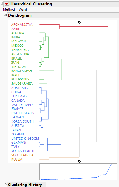
The dendrogram shows how the clustering is conducted. The clustering process can be viewed by reading the dendrogram from left to right. Each step consists of combining the two closest clusters into a single cluster.
In the dendrogram, the relative distances between clusters are given by the horizontal distances between vertical lines that join the clusters. For example, Afghanistan and Zaire differ more than Malaysia differs from the cluster consisting of Mexico and Venezuela.
The plot that appears beneath the dendrogram has a point for each step where two clusters are joined into a single cluster. The horizontal coordinates represent the numbers of clusters and they decrease from left to right. The vertical coordinate of the point is the distance between the two clusters that are joined to form the specified number of clusters. You can click on either diamond in the dendrogram and drag the line to choose the number of clusters that best represent the data. You can also use the Number of Clusters option in the red triangle menu to choose the number of clusters.
The distance graph has a noticeable change in slope at four clusters. The change in slope indicates that the differences in clusters that are joined up to the point where four clusters remain, are comparatively small. This suggests that four is a good choice for the number of clusters. Note that this is the number of clusters that was shown by default.
7. Click the red triangle next to Hierarchical Clustering and select Constellation Plot.
Figure 7.3 Constellation Plot

This constellation plot arranges the countries as endpoints and each cluster join as a new point. The lines represent membership in a cluster. The length of a line between cluster joins approximates the distance between the clusters that were joined. The constellation plot indicates that the cluster that contains Afghanistan and Zaire is about as distant from the cluster of remaining countries as are the two clusters that consist of the remaining countries in the upper half of the plot and those in the lower half of the plot.
Launch the Hierarchical Cluster Platform
Launch the Hierarchical Cluster platform by selecting Analyze > Clustering > Hierarchical Cluster. The Clustering launch window for the Birth Death Subset.jmp data table is shown in shown in Figure 7.4.
Figure 7.4 Hierarchical Cluster Launch Dialog

Y, Columns
The variables used for clustering observations.
Ordering
Sorts clusters by their mean values based on the specified column.
Tip: Use the first principal component obtained by conducting a principal components analysis as an Ordering column. The clusters are sorted by these values.
Attribute ID
(Available only if Data is stacked is selected as the data structure.) Specifies the variables that are stacked.
Object ID
(Available only if Data are summarized or Data is stacked is selected as the data structure.) A column or columns that provide a unique identifier for each unit for which measurements are stacked.
Label
A column of values used to label the dendrogram in the report.
By
A column whose levels define separate analyses. For each level of the specified column, the corresponding rows are analyzed. The results are presented in separate reports. If more than one By variable is assigned, a separate analysis is produced for each possible combination of the levels of the By variables.
The launch window has the following menus and options:
Clustering Method
Hierarchical is the default clustering method, but the dialog enables you to switch to KMeans or Normal Mixtures. If you select KMeans or Normal Mixtures, when you click OK, a Control Panel appears where you can select any of the following as Method:
K-Means Clustering
See the “K Means Cluster” chapter.
Normal Mixtures
See the “Normal Mixtures” chapter.
Robust Normal Mixtures
Self Organizing Map
Method for Distance Calculation
Select a method used to calculate distances. For distance formulas, see “Distance Method Formulas”.
Ward
In Ward’s minimum variance method, the distance between two clusters is the ANOVA sum of squares between the two clusters summed over all the variables. At each generation, the within-cluster sum of squares is minimized over all partitions obtainable by merging two clusters from the previous generation. The sums of squares are easier to interpret when they are divided by the total sum of squares to give the proportions of variance (squared semipartial correlations).
Ward’s method joins clusters to maximize the likelihood at each level of the hierarchy under the assumptions of multivariate normal mixtures, spherical covariance matrices, and equal sampling probabilities.
Ward’s method tends to join clusters with a small number of observations and is strongly biased toward producing clusters with approximately the same number of observations. It is also very sensitive to outliers. See Milligan (1980).
Average
The distance between two clusters is the average distance between pairs of observations. Average linkage tends to join clusters with small variances and is slightly biased toward producing clusters with the same variance. See Sokal and Michener (1958).
Centroid
The distance between two clusters is defined as the squared Euclidean distance between their means. The centroid method is more robust to outliers than most other hierarchical methods but in other respects might not perform as well as Ward’s method or average linkage. See Milligan (1980).
Single
The distance between two clusters is the minimum distance between an observation in one cluster and an observation in the other cluster. Single linkage has many desirable theoretical properties but has performed poorly in Monte Carlo studies. See Jardine and Sibson (1976), Fisher and Van Ness (1971), Hartigan (1981), and Milligan (1980). Single linkage was originated by Florek et al. (1951a, 1951b) and later reinvented by McQuitty (1957) and Sneath (1957).
By imposing no constraints on the shape of clusters, single linkage sacrifices performance in the recovery of compact clusters in return for the ability to detect elongated and irregular clusters. Single linkage tends to chop off the tails of distributions before separating the main clusters. See Hartigan (1981).
Complete
The distance between two clusters is the maximum distance between an observation in one cluster and an observation in the other cluster. Complete linkage is strongly biased toward producing clusters with approximately equal diameters and can be severely distorted by moderate outliers. See Milligan (1980).
Fast Ward
Applies an algorithm that computes Ward's method more quickly for large numbers of rows. The computation time is shorter because this algorithm does not require the calculation of a distance matrix. It is used automatically whenever there are more than 2,000 rows.
Data Structure
These options describe the form of the data that is used in calculating multivariate distances:
Data as usual
Data that are rectangular with one row for each observation and one column for each variable.
Data as summarized
Data that are summarized by the levels of one or more identifying columns. When you select this option, an Object ID text box appears in the launch window. Specify the identifying columns as the Object ID. The Data as summarized option calculates level means and treats these means as your input data.
Data is distance matrix
Data that consist of distances between observations. For n observations, the distance table should have n rows and n + 1 columns. One column (usually the first) must contain a unique identifier for each of the n observations. The remaining columns contain distances between that observation and the n observations. Note the following:
‒ The diagonal elements of the table should be zero or missing, because the distance between a point and itself is zero. Values that are not zero or missing are treated as zero, and a note appears in the report.
‒ The distance columns can be a symmetric square matrix, or they can be upper or lower triangular with missing entries in the lower or upper portion. If the distances are given as a square matrix, a warning appears in the report if the table is not symmetric.
‒ You can begin with a different data structure and then save a distance matrix. See “Save Distance Matrix”.
When you select the Data is distance matrix option, enter the distance columns as Y, Columns and the identifier column as Label. The Label column must have the Character data type. For an example, see “Example of a Distance Matrix”.
Data is stacked
Data that have a single response of interest and multiple rows for each object.
When you select the Data is stacked option, Attribute ID and Object ID text boxes appear in the launch window.
‒ Enter a single column as Y, Columns.
‒ Enter columns that describe groupings of the Y, Columns variable as Attribute ID. If only two columns are entered and if you select Add Spatial Measures, then you can add spatial components to be used in the cluster analysis. See “Add Spatial Measures”.
‒ Enter the identifying columns for objects as Object ID.
The analysis that is conducted is equivalent to splitting the Y, Column variable by the Attribute ID columns and then performing hierarchical clustering without standardizing the response columns.
Tip: Use this option together with the Add Spatial Measures option to perform two-dimensional spatial clustering. For example, wafer data are often recorded using one row for each die. Interest centers around clustering wafers. See “Example of Wafer Defect Classification Using Spatial Measures”.
Caution: Because there is a single measurement column, the Standardize Data option is not appropriate for stacked data.
Not Enough Nonmissing Data Alert
The JMP alert Not enough nonmissing data can be difficult to understand when you are using the Data as summarized or Data is stacked data structures. The alert occurs in the following situations:
• For Data as usual, when all rows or all but one row are missing at least one value for a Y, Columns variable.
• For Data as summarized, when your data are summarized across the Object ID columns, all rows or all but one row are missing at least one value of the summarized Y, Column variables. To see the data structure that the Cluster platform is analyzing, select Tables > Summary, enter the Object ID columns as Group and the Y, Columns variables as Statistics > Mean.
• For Data is stacked, when your data are split across the Attribute ID columns, all rows or all but one row are missing at least one value of the split Y, Column values. To see the data structure that the Cluster platform is analyzing, select Tables > Split, enter the Attribute ID columns as Split By, the Y, Columns variable as Split Columns, and the Object ID columns as Group.
Transformations to Y, Columns Variables
The following options specify the form of the Y, Columns variables to be used in the cluster analysis:
Standardize Data
Addresses the issue of different measurement scales for continuous and ordinal columns. Except when the Data is stacked option is selected, the values in each column are standardized by subtracting the column mean and dividing by the column standard deviation. Deselect the Standardize Data check box if you do not want the cluster distances computed on standardized values.
Standardize Robustly
Reduces the influence of outliers on estimates of the mean and standard deviation for continuous and ordinal columns. This option uses Huber M-estimates of the mean and standard deviation (Huber, 1964, Huber, 1973, and Huber and Ronchetti, 2009). For columns with outliers, this option gives the standardized values greater representation in determining multivariate distances.
Note: If both Standardize Data and Standardize Robustly are selected, each column is standardized by subtracting its robust column mean and dividing by its robust standard deviation. This option is useful when columns represent different measurement scales or when observations tend to be outliers in only specific dimensions.
Note: If Standardize Data is unchecked and Standardize Robustly is selected, the robust mean and robust standard deviation for the values in all columns combined are used to standardize each column. This option can be useful when columns all represent the same measurement scale and when observations tend to be outliers in all dimensions.
Missing value imputation
Imputes missing values. If the number of variables is either 50 or less, or less than half the number of rows, multivariate normal imputation is used. Otherwise, multivariate SVD imputation is used.
Multivariate normal imputation calculates pairwise covariances to construct a covariance matrix for the response columns. Then each missing value is imputed by a method that is equivalent to regression prediction using all the predictors with no missing values for the given observation. If the constructed covariance matrix is not positive definite, missing values are imputed using their column means.
Multivariate SVD imputation avoids constructing a covariance matrix by using the singular value decomposition. For more details, see the Modeling Utilities chapter in the Predictive and Specialized Modeling book.
Caution: Missing value imputation assumes that there are no clusters, that the data come from a single multivariate normal distribution, and that the values are missing completely at random. Because these assumptions are usually not reasonable in practice, use this feature with caution. However, the feature can produce more informative results than discarding most of your data.
Add Spatial Measures
(Available only if Data is stacked is selected as the data structure.) Select the Add Spatial Measures option when your data are stacked and contain two attribute columns that correspond to spatial coordinates (horizontal and vertical coordinates, for example). This option opens a window in which you can select which spatial components to add measures for circle, pie, and streak spatial measures to aid in clustering defect patterns. This is a specialty method and is applicable in only very specific settings. See “Spatial Measures” and “Example of Wafer Defect Classification Using Spatial Measures”.
Hierarchical Cluster Report
The Hierarchical Cluster report displays the method used, a dendrogram, and the Clustering History table. If you assigned a column as a Label in the launch window, the column’s values identify each observation in the dendrogram.
Dendrogram Report
The dendrogram is a tree diagram that represents the agglomeration of observations into clusters. The dendrogram also gives information about the degree of dissimilarity of clusters.
The clustering process can be viewed by reading the dendrogram from left to right. Each step consists of combining the two closest clusters into a single cluster.
• The joining of clusters is indicated by horizontal lines that are connected by vertical lines.
• The horizontal position of the vertical line represents the distance between the two clusters that are most recently joined to form the specified number of clusters.
Note: When the number of observations is less than 256, the distances are proportional to the distances shown in the Distance Graph. Otherwise, Geometric Spacing is used. See “Dendrogram Scale”.
You can perform the following tasks:
• Click and drag the diamond-shaped handle at either the top or bottom of the dendrogram to identify a given number of clusters.
• Click on any cluster stem to select all the members of the cluster in the dendrogram and in the data table.
Distance Graph
The Distance Graph is the plot that appears beneath the dendrogram. This graph has a point for each step where two clusters are joined into a single cluster. The horizontal coordinates represent the numbers of clusters, which decrease from left to right. The vertical coordinate of the point is the distance between the clusters that were joined at the given step.
You can click and drag either diamond-shaped handle in the dendrogram to control the chosen number of clusters. When you click and drag the diamond, a vertical line appears in the plot that moves to correspond to the number of clusters. Often there is a point where the slope of the distance graph levels off. Such a point suggests a natural break and helps you determine the number of clusters.
Illustration of Dendrogram and Distance Graph
Consider the dendrogram report for Birth Death Subset.jmp in “Example of Clustering”.
Figure 7.5 Dendrogram Report for Birth Death Subset.jmp

In Figure 7.5, the diamonds are set at four clusters. The two clusters that are most recently joined to form the four cluster model are the cluster consisting of Algeria to Bangladesh and the cluster consisting of Iraq to Saudi Arabia. The distance between these two clusters is the point on the distance plot indicated by the vertical line when the diamond is set to 4. The distance is given in the Clustering History report next to Number of Clusters equal to 4. There, it is shown that the distance is 1.618708760 and that clusters beginning with Algeria and Iraq are combined to yield four clusters.
The two clusters that are combined to yield five clusters are the cluster that consists of Australia to Korea, South, and the cluster that consists of Austria to Korea, North. The vertical join line in the dendrogram for these clusters is at about the same horizontal distance from the left as the vertical join line for the clusters that were joined to form the four-cluster model, Algeria to Bangladesh and Iraq to Saudi Arabia. It follows that there is not much difference in terms of distance between the clusters joined to form the four-cluster model and those joined to form the five-cluster model.
The fact that the distance plot levels off starting with the four-cluster model indicates that the cluster groupings up to that point do not account for much distance between clusters. However, the four-cluster model shows good separation between clusters.
Clustering History Report
The Clustering History table contains the clustering history.
Number of Clusters
Lists the numbers of clusters that result after the joining indicated by the Leader and Joiner is performed. The number of clusters begins with the first join, when there are n - 1 clusters, where n is the number of objects. The report lists the number of clusters in decreasing order until all objects are contained in one cluster. In this way, the Clustering History follows the order of the dendrogram from left to right.
Distance
The distance between clusters, calculated according to the distance method that you select on the launch window. See “Method for Distance Calculation”.
Leader
A representative of the first cluster in the dendrogram being joined. The cluster order and the representative shown in the Leader column is a consequence of how the data are sorted and has no intrinsic meaning.
Joiner
A representative of the second cluster in the dendrogram being joined. The cluster order and the representative shown in the Joiner column is a consequence of how the data are sorted and has no intrinsic meaning.
Hierarchical Cluster Options
The Hierarchical Clustering red triangle menu includes the following options:
Color Clusters
Colors the labels for dendrogram and their associated join bars according to cluster membership. Also assigns the corresponding colors to the rows of the data table The colors update if you change the number of clusters. If you deselect this option, the colors are no longer updated based on the number of clusters.
Mark Clusters
Assigns markers to the rows of the data table corresponding to the cluster to which the row belongs. The markers update if you change the number of clusters. If you deselect this option, the markers are no longer updated based on the number of clusters.
Number of Clusters
Prompts you to enter a number of clusters and positions the dendrogram slider to that number.
Cluster Criterion
Gives the Cubic Clustering Criterion (CCC) for the entire range of number of clusters. The CCC is used to estimate the number of clusters. It can be used with any distance-based clustering algorithm. Larger values of the CCC indicate better fit in terms of number of clusters. See SAS (1983). (Not available when Data is distance matrix is selected.)
Show Dendrogram
Shows or hides the Dendrogram report.
Dendrogram Scale
Contains the following options for scaling the dendrogram:
Distance Scale
Shows the horizontal distances between any two join points as the distances between the two clusters joined at that point, based on the distance method specified on the launch window. The distance scale is the same scale as used in the Distance Graph and is the default scale for the dendrogram.
Even Spacing
Shows the horizontal distances between any two join points as equal.
Geometric Spacing
Increases the horizontal distances between join points as the number of clusters increases. This option is useful when there are many objects and you want the smaller clusters to be more visible than the larger clusters.
Distance Graph
Shows or hides the distance plot beneath the dendrogram.
Show NCluster Handle
Shows or hides the handles on the dendrogram used to manually change the number of clusters.
Zoom to Selected Rows
Selects and enlarges a particular cluster after you select the cluster in the dendrogram. Alternatively, you can double-click the cluster to zoom in on it. Use Release Zoom to return to the original view.
Release Zoom
Returns the dendrogram to the original view after zooming.
Pivot on Selected Cluster
Reverses the order of the two sub-clusters of the currently selected cluster.
Color Map
Gives the option to add a color map, or heat map, showing each Y, Column variable colored by value. Several color theme choices are available in a submenu.
Two Way Clustering
Clusters by the variables specified in Y, Columns as well as rows. A color map is added with a dendrogram for the Y, Column variables at its base. Typically, for two-way clustering, your variables are measured on the same scale and you do not select Standardize Data. (Not available when Data is stacked is selected.)
Positioning
Provides options for changing the positions of labels and other parts of the dendrogram.
Legend
Shows or hides a legend for the colors used in color maps. This option is available only if a color map is enabled.
More Color Map Columns
Adds a color map for specified columns. (Not available when Data as summarized, Data is distance matrix, or Data is stacked is selected.)
Constellation Plot
Arranges the individuals as endpoints and each cluster join as a new point, with lines drawn that represent membership. The longer lines represent greater distances between clusters. To turn off the displayed labels, right-click inside the Constellation Plot and deselect Show Labels.
Save Constellation Coordinates
Saves the coordinates of the constellation plot to the data table. (Not available when Data as summarized, Data is distance matrix, or Data is stacked is selected.)
Save Clusters
Creates a data table column that contains the cluster number. If Add Spatial Measures is selected on the launch window, the cluster numbers are also saved to the Hough Data Table.
Save Formula for Closest Cluster
Creates a data table column that contains a formula for the closest cluster. This option calculates the squared Euclidean distance to each cluster’s centroid and selects the cluster that is closest. Note that this formula does not always reproduce the cluster assignment given by Hierarchical Clustering since the clusters are determined differently. However, the cluster assignment is very similar. (Not available when Data as summarized, Data is distance matrix, or Data is stacked is selected.)
Save Display Order
Creates a data table column that contains the order in which the row appears in the dendrogram.
Save Cluster Hierarchy
Creates a data table that contains the information needed to write a script for a custom dendrogram. For each cluster join, there are three rows: the first for the joiner, the second for the leader, and the third for the result, giving the cluster centers, size, and other information.
Save Cluster Tree
Creates a new data table that contains information needed to compare cluster trees between JMP and SAS. For each cluster join, there is one row for each new cluster, with the cluster’s size and other information.
Save Distance Matrix
Creates a new data table that contains the distances between the observations.
Save Cluster Means
Creates a new data table that contains the number of rows and the means of each column in each cluster.
Cluster Summary
(Not available when Data is distance matrix is selected.) Displays the following information:
Cluster Means
A table that gives, for each cluster, the number of observations (or Object IDs, if the data are stacked) and means for each variable.
Cluster Standard Deviations
A table that gives, for each cluster, the number of observations (or Object IDs, if the data are stacked) and standard deviations for each variable.
Cluster Means Plot
Either a parallel plot or a two-dimensional heat map of the cluster means.
The plot is a parallel plot unless Data is stacked is selected and there are two Attribute ID variables. For the parallel plot, the axis for each variable is scaled as follows:
‒ If Standardize Data were selected, the axis ranges from two standard deviations above and below the mean, where the standard deviation and mean are computed for the raw data. If a cluster mean falls beyond this range, the axis is extended to include it.
‒ If Standardize Data were not selected, there is a common vertical axis whose scaling is displayed. (The scaling is equivalent to the Scale Uniformly option in Graph Builder).
When Data is stacked is selected and there are two Attribute ID variables, two-dimensional plots of the mean of the Y variable at each location are shown for each cluster. These plots are colored using a Blue to Gray to Red color gradient.
Column Summary
For each variable, gives the RSquare value that represents the proportion of variation explained by the clusters. This number is the RSquare value for a regression of the variable on the clusters. The option also gives a bar graph of RSquare values.
Scatterplot Matrix
Creates a scatterplot matrix using all the variables. (Not available when Data as summarized, Data is distance matrix, or Data is stacked is selected.)
Parallel Coord Plots
Creates a parallel coordinate plot for each cluster. (Not available when Data as summarized, Data is distance matrix, or Data is stacked is selected.) The axes are scaled as described for the Cluster Means Plot. See “Cluster Means Plot”.
Cluster Treatment Comparisons
(Available only if you hold Shift and click the red triangle.) Select a response column and a two-level treatment column. Creates a Hierarchically Clustered Differences report.
See the JMP Reports chapter in the Using JMP book for more information about the following options:
Local Data Filter
Shows or hides the local data filter that enables you to filter the data used in a specific report.
Redo
Contains options that enable you to repeat or relaunch the analysis. In platforms that support the feature, the Automatic Recalc option immediately reflects the changes that you make to the data table in the corresponding report window.
Save Script
Contains options that enable you to save a script that reproduces the report to several destinations.
Save By-Group Script
Contains options that enable you to save a script that reproduces the platform report for all levels of a By variable to several destinations. Available only when a By variable is specified in the launch window.
Additional Examples of the Hierarchical Clustering Platform
The section contains two examples:
Example of a Distance Matrix
The proper data table structure for a distance matrix consists of the following:
• An identifier column (usually the first column) that has a Character data type.
• A set of n columns, where n is also the number of rows. These n columns define a symmetric matrix with zero or missing values on the diagonal.
Notice that the distance matrix in Flight Distances.jmp follows the preceding format.
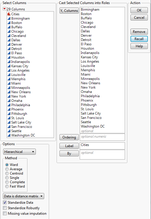
1. Select Help > Sample Data Library and open Flight Distances.jmp.
2. Select Analyze > Clustering > Hierarchical Cluster.
3. In the list at the bottom left corner of the launch window, change Data as usual to Data is distance matrix.
4. Select Cites and click Label.
5. Select all remaining columns and click Y, Columns.
Figure 7.6 Completed Distance Matrix Launch Window
6. Click OK.
7. Click the red triangle next to Hierarchical Clustering and select Color Clusters.
Figure 7.7 Dendrogram Report for Flight Distances

Figure 7.7 shows the Dendrogram report for the flight distances. The placement of the diamonds indicates that the model has grouped the cities into three clusters, which are color-coded on the dendrogram. For more details about how to interpret the report, see “Dendrogram Report”.
Example of Wafer Defect Classification Using Spatial Measures
A specialty clustering option called Spatial Measures is available in the Hierarchical Cluster platform. In this example, you use this option to cluster wafers. For details about the option, see “Spatial Measures”.
1. Select Help > Sample Data Library and open Wafer Stacked.jmp.
2. Select Analyze > Clustering > Hierarchical Cluster.
3. In the list in the lower left corner, change Data as usual to Data is stacked.
Additional options for stacked data appear in the launch window.
4. Select Defects and click Y, Columns.
5. Select X_Die and Y_Die and click Attribute ID.
6. Select Lot and Wafer and click Object ID.
7. Select Add Spatial Measures from the list of options in the lower left corner.
Figure 7.8 Completed Clustering Launch Window

8. Click OK.
Figure 7.9 Spatial Components Window

Because Defects is measured at 1423 locations, there are 1423 Attributes variables.
9. Click OK to accept the selections in the Spatial window.
Two windows open: the Hierarchical Clustering report and the Wafer Stacked Defects Spatial data table.
10. In the Dendrogram plot, click and drag the diamond-shaped handle at the top to explore various numbers of clusters.
As you drag the handle, the vertical line in the distance graph below the dendrogram moves to the corresponding number of clusters. The vertical coordinate gives the distance between the clusters that were joined at the given step. The graph seems to level off when the number of clusters is 7.
11. Click the red triangle next to Hierarchical Clustering and select Number of Clusters.
12. Enter 7 and click OK.
13. Click the red triangle next to Hierarchical Clustering and select Cluster Summary.
Figure 7.10 Cluster Summary Report

The wafer maps indicate the spatial nature of defects for each cluster. Cluster 1 contains 104 wafers with relatively few defects that are spread throughout the wafers. Cluster 3 has 5 wafers with defects concentrated at the extremes of the top and bottom hemispheres. You can view the maps for individual wafers and their Hough space maps in the data table produced by the cluster analysis. For more details, see “Spatial Measures”.
Statistical Details
The following sections provide statistical details for the Hierarchical Clustering platform.
Spatial Measures
To use the Add Spatial Measures option, your data must be stacked and contain two attribute columns that correspond to spatial coordinates. Some spatial measures are constructed using the Hough transform. See White et al. (2008) and Ballard (1981). See “Example of Wafer Defect Classification Using Spatial Measures”.
Choose Spatial Components Window
The Choose Spatial Components window appears if you do the following in the launch window:
• Select the Data is stacked data structure
• Specify two columns as Attribute ID that correspond to spatial coordinates
• Specify an Object ID
• Select Add Spatial Measures
In the Choose Spatial Components window, you add and weight variables that reflect spatial patterns to your cluster analysis.
Variables
The types of variables that are constructed and used in the cluster analysis. The variables are constructed using the response, Y.
Attributes
The value of the Y variable calculated for each location, as defined by the two Attribute ID variables.
Angle, Pie
Variables that reflect wedge shapes or hemispherical shapes.
Radius, Circle
The variables that reflect circular shapes.
Streak Angle
The variables that reflect streaks that have the same angle.
Streak Position
The variables that reflect streaks with the same spatial position.
Shot
The variables that identify which rectangle an object is in, where you specify the numbers of horizontal and vertical positions of objects in the rectangle. The term shot is used in semiconductor wafer data to identify which dies are imaged together across a wafer.
Enter values for Shot Horizontal Size and Shot Vertical Size. Specifying a horizontal shot size of 4 and a vertical shot size of 5 indicates that there are up to 20 dies in a shot. The total number of identifiers created is as follows:
floor[(hSize+hShotSize-1)/hShotSize]* floor[(vSize+vShotSize-1)/vShotSize]
where hSize and vSize are the maximum numbers of horizontal and vertical positions, respectively, hShotSize = Shot Horizontal Size, and vShotSize = Shot Vertical Size.
Note: Shot variables are represented as Shot[vert, horiz], where vert and horiz represent the vertical and horizontal die locations, respectively.
Number
The total number of variables of the given type that are constructed.
Weight
A measure of importance for the given type of variable used in determining the clusters. (How is the weight used in the clustering algorithm?)
Spatial Measures Reports
When you click OK in the Choose Spatial Components window, two windows appear.
Hierarchical Clustering Report
When you conduct an analysis with stacked data and two Attribute IDs, the Cluster Summary report shows spatial maps of the Y variable. Each plot is a two-dimensional plot that displays the cluster mean for each location defined by the Attribute ID variables. The plot uses a Blue to Gray to Red color gradient with a Quantile scale. Using the quantile scale mitigates the effect of outliers.
Spatial Data Table
The data table for Spatial measures has a row for each unique Object ID. Columns are displayed using a Blue to Gray to Red default color gradient to show the Y variable. The table contains the following columns:
Object
An expression column that shows a heat map of the Y variable at each spatial location defined by the two Attribute ID variables.
Hough
An expression column that shows a heat map of the Hough space for each object. See White et al. (2008).
Spatial Measures
A column for each spatial measure that shows the computed values for each object. Cells are colored by value.
Distance Method Formulas
This section provides the formulas used in calculating distances based on the Method that you select on the launch window. For a description of the methods, see “Method for Distance Calculation”.
The formulas use the following notation, where lowercase symbols generally pertain to observations and uppercase symbols to clusters:
n is the number of observations
v is the number of variables
xi is the ith observation
CK is the Kth cluster, subset of {1, 2,..., n}
NK is the number of observations in CK
x is the sample mean vector
xK is the mean vector for cluster CK
d(xi, xj) is
Average Linkage
Distance for the average linkage cluster method is:

Centroid Method
Distance for the centroid method of clustering is:
Ward’s
Distance for Ward’s method is:

Single Linkage
Distance for the single linkage cluster method is:
Complete Linkage
Distance for the Complete linkage cluster method is:
..................Content has been hidden....................
You can't read the all page of ebook, please click here login for view all page.