
Visualizing Crossfilter dimensions and groups is precisely the reason why dc.js was created. This handy JavaScript library was created by your humble author and is designed to allow you to visualize Crossfilter dimensional dataset easily and quickly.
Open your local copy of the following file as reference:
https://github.com/NickQiZhu/d3-cookbook/blob/master/src/appendix-a/dc.html
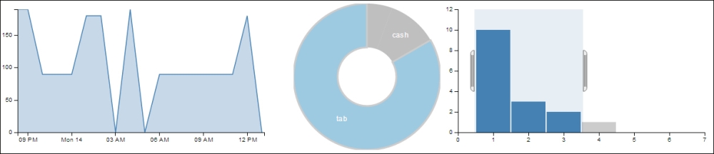
In this example we will create three charts:
- A line chart for visualizing total amount of transaction on time series
- A pie chart to visualize number of transactions by payment type
- A bar chart showing number of sales by purchase quantity
Here is what the code looks like:
<div id="area-chart"></div>
<div id="donut-chart"></div>
<div id="bar-chart"></div>
…
dc.lineChart("#area-chart")
                .width(500)
                .height(250)
                .dimension(hours)
                .group(totalByHour)
                .x(d3.time.scale().domain([
                 timeFormat.parse("2011-11-14T01:17:54Z"),
                  timeFormat.parse("2011-11-14T18:09:52Z")
]))
                .elasticY(true)
                .xUnits(d3.time.hours)
                .renderArea(true)
                .xAxis().ticks(5);

        dc.pieChart("#donut-chart")
                .width(250)
                .height(250)
                .radius(125)
                .innerRadius(50)
                .dimension(types)
                .group(transactionByType);

        dc.barChart("#bar-chart")
                .width(500)
                .height(250)
                .dimension(quantities)
                .group(salesByQuantity)
                .x(d3.scale.linear().domain([0, 7]))
                .y(d3.scale.linear().domain([0, 12]))
                .centerBar(true);

        dc.renderAll();
This generates a group of coordinated interactive charts:

Interactive dc.js charts
When you click or drag your mouse across these charts you will see the underlying Crossfilter dimensions being filtered accordingly on all charts:
Filtered dc.js charts
As we have seen through this example, dc.js is designed to generate standard chart-based visualization on top of Crossfilter. Each dc.js chart is designed to be interactive so user can apply dimensional filter by simply interacting with the chart. dc.js is built entirely on D3, therefore, its API is very D3-like and I am sure with the knowledge you have gained from this book you will feel quite at home when using dc.js. Charts are usually created in the following steps.
- First step creates a chart object by calling one of the chart creation functions while passing in a D3 selection for its anchor element, which in our example is the
divelement to host the chart:<div id="area-chart"></div> ... dc.lineChart("#area-chart") - Then we set the
width,height,dimension, andgroupfor each chart:chart.width(500) .height(250) .dimension(hours) .group(totalByHour)For coordinate charts rendered on a Cartesian plane you also need to set the
xandyscale:chart.x(d3.time.scale().domain([ timeFormat.parse("2011-11-14T01:17:54Z"), timeFormat.parse("2011-11-14T18:09:52Z") ])).elasticY(true)In this first case, we explicitly set the x axis scale while letting the chart automatically calculate the y-scale for us. While in the next case we set both x and y scale explicitly.
chart.x(d3.scale.linear().domain([0, 7]))
        .y(d3.scale.linear().domain([0, 12]))
Different charts have different functions for customizing their look-and-feel and you can see the complete API reference at https://github.com/NickQiZhu/dc.js/wiki/API.
Leveraging crossfilter.js and dc.js allows you to build sophisticated data analytics dashboard fairly quickly. The following is a demo dashboard for analyzing the NASDAQ 100 Index for the last 20 years http://nickqizhu.github.io/dc.js/:
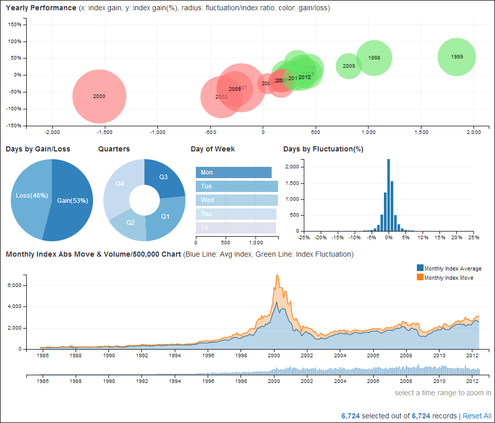
dc.js NASDAQ demo
At the time of writing this book, dc.js supports the following chart types:
- Bar chart (stackable)
- Line chart (stackable)
- Area chart (stackable)
- Pie chart
- Bubble chart
- Composite chart
- Choropleth map
- Bubble overlay chart
For more information on the dc.js 'library please check out our Wiki page at https://github.com/NickQiZhu/dc.js/wiki.
The following are some other useful D3 based reusable charting libraries. Although, unlike dc.js they are not designed to work with Crossfilter natively nevertheless they tend to be richer and more flexible when tackling general visualization challenges:
- NVD3: http://nvd3.org/
- Rickshaw: http://code.shutterstock.com/rickshaw/