
Quite often, we need horizontal and vertical grid lines to be drawn in consistency with ticks on both x and y axes. As we have shown in the previous recipe, typically we don't have or don't want to have precise control of how ticks are rendered on D3 axes. Therefore, we might not know how many ticks are present and their values, before they are rendered. This is especially true if you are building a re-usable visualization library where it is impossible to know the tick configuration ahead of time. In this recipe, we will explore some useful techniques of drawing consistent grid lines on Axis without actually needing to know the tick values.
Open your local copy of the following file in your web browser:
https://github.com/NickQiZhu/d3-cookbook/blob/master/src/chapter5/grid-line.html
First, let's take a look at how we draw grid lines in code:
<script type="text/javascript">
    var height = 500,
        width = 500,
        margin = 25;

    var svg = d3.select("body").append("svg")
            .attr("class", "axis")
            .attr("width", width)
            .attr("height", height);

    function renderXAxis(){
        var axisLength = width - 2 * margin;

        var scale = d3.scale.linear()
                        .domain([0, 100])
                        .range([0, axisLength]);

        var xAxis = d3.svg.axis()
                .scale(scale)
                .orient("bottom");

        svg.append("g")
            .attr("class", "x-axis")
            .attr("transform", function(){ // <-A
                return "translate(" + margin + "," + (height - margin) + ")";
            })
            .call(xAxis);

        d3.selectAll("g.x-axis g.tick") // <-B
            .append("line") // <-C
                .classed("grid-line", true)
                .attr("x1", 0) // <-D
                .attr("y1", 0)
                .attr("x2", 0)
                .attr("y2", - (height - 2 * margin));  // <-E
    }

    function renderYAxis(){
        var axisLength = height - 2 * margin;

        var scale = d3.scale.linear()
                        .domain([100, 0])
                        .range([0, axisLength]);

        var yAxis = d3.svg.axis()
                .scale(scale)
                .orient("left");

        svg.append("g")
            .attr("class", "y-axis")
            .attr("transform", function(){
                return "translate(" + margin + "," + margin + ")";
            })
            .call(yAxis);

        d3.selectAll("g.y-axis g.tick")
            .append("line")
                .classed("grid-line", true)
                .attr("x1", 0)
                .attr("y1", 0)
                .attr("x2", axisLength)
                .attr("y2", 0);
    }

    renderYAxis();
    renderXAxis();
</script>
The previous code generates the following visual output:
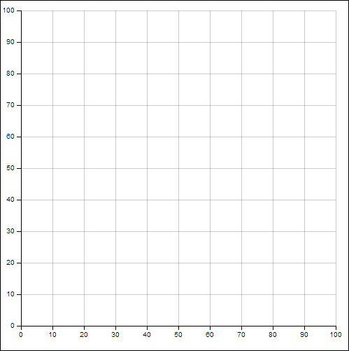
Axes and grid lines
In this recipe, two axes x and y were created in the renderXAxis and renderYAxis functions, respectively. Let's take a look at how the x axis was rendered.
Once we understand how to render x axis and its grid lines, the logic used to render y axis can be easily understood since they are almost identical. The x axis and its scale were defined with no complications, as we have already demonstrated a number of times throughout this chapter. An svg:g element was created to contain the x axis structures. This svg:g element was placed at the bottom of the chart using a translate transformation, as shown on line A:
.attr("transform", function(){ // <-A
  return "translate(" + margin + "," + (height - margin) + ")";
})
It is important to remember that the translate transformation changes the frame of reference for coordinates when it comes to any of its sub-elements. For example, within this svg:g element, if we create a point with its coordinates set as (0, 0), then when we draw this point on the SVG canvas, it will be actually placed as (margin, height – margin). This is because all subelements within the svg:g element are automatically transformed to this base coordinate, hence, the shift of the frame of reference. Equipped with this understanding, let's see how dynamic grid lines can be generated after the axis is rendered:
d3.selectAll("g.x-axis g.tick") // <-B
            .append("line") // <-C
                .classed("grid-line", true)
                .attr("x1", 0) // <-D
                .attr("y1", 0)
                .attr("x2", 0)
                .attr("y2", - (height - 2 * margin));  // <-E
Once the axis has been rendered, we can select all the ticks elements on an axis by selecting the g.tick, since each of them is grouped by its own svg:g element (see line B). Then on line C, we append a new svg:line element to each svg:g tick element. SVG line element is the simplest shape provided by the SVG standard. It has four main attributes:
- x1 and y1 attributes define the point of origin of this line
- x2 and y2 attributes define the point of destination
In our case, here we simply set x1, y1, and x2 to 0, since each g.tick element has already been translated to its position on the axis, therefore, we only need to change the y2 attribute in order to draw a vertical grid line. The y2 attribute is set to –(height – 2 * margin). The reason why the coordinate is negative was because the entire g.x-axis has been shifted down to (height – margin), as mentioned in the previous code. Therefore, in absolute coordinate terms y2 = (height – margin) – (height – 2 * margin) = margin, which is the top of the vertical grid line we want to draw from the x axis.
This is what the x axis in SVG structure with associated grid line looks like:

x axis with grid lines SVG structure
As we can see in the preceding screenshot, an svg:line element representing the grid line was added into the "g.tick" svg:g container element as discussed earlier in this section.
The y axis grid lines are generated using the identical technique; the only difference is that instead of setting the y2 attribute on the grid lines, as we did for the x axis, we change the x2 attribute, since the lines are horizontal (see line F):
d3.selectAll("g.y-axis g.tick")
            .append("line")
                .classed("grid-line", true)
                .attr("x1", 0)
                .attr("y1", 0)
                .attr("x2", axisLength) // <-F
                .attr("y2", 0);