
F
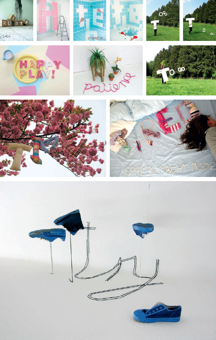
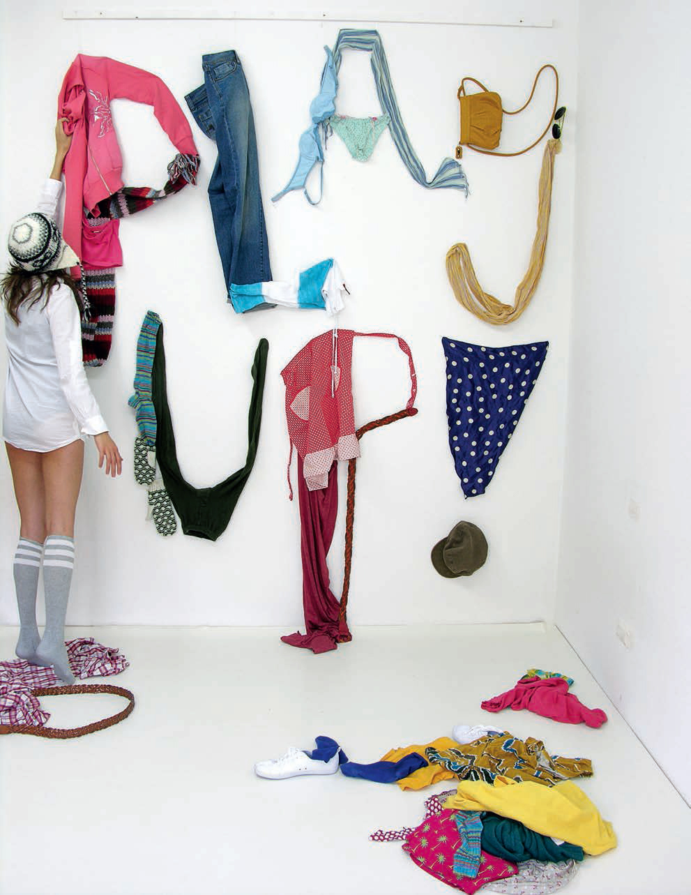
Play
Farina Kuklinski
These three-dimensional type experiments by Berlin-based graphic desiger Farina Kuklinski were created while she was studying at the Academie Beeldende Kunsten (Academy of Fine Arts) in Maastricht, the Netherlands, from where she graduated in 2009. The visuals form part of a much larger body of work comprising posters, animations and a book documenting her Play project.

Spring
Ferdinand Alfonso
Ferdinand Alfonso is a graphic designer based in New York City. He created these self-initiated letterforms using a single tendril of scrap paper. He then used the letterforms in a short film that spells out the word ‘adversary’. He chose this word as he felt he was fighting with the paper in the process – turning it and flipping it around, trying to get a word out of it. Later he used the letterforms to create a typeface called Spring.
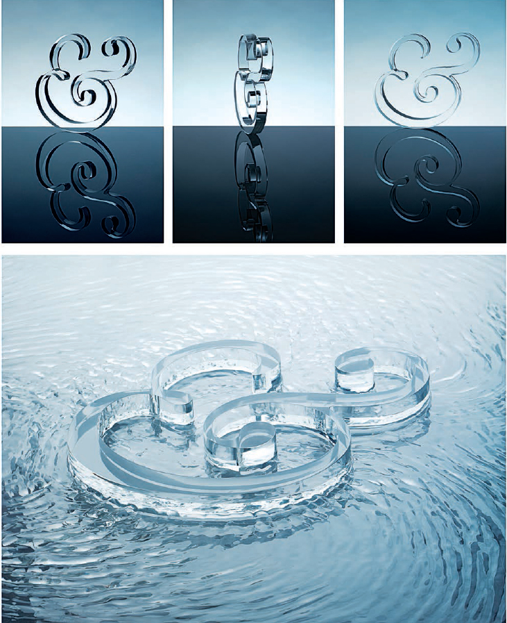
29th A&B Awards Identity
Form
In 2007, London-based studio Form were commissioned by Arts & Business (A&B) to create a new identity for the 29th A&B Awards – the UK’s most prestigious awards celebrating excellence in the field of business/arts partnerships and sponsorship. With a modern, young and innovative feel in mind, the Form team produced a Perspex model of the A&B ampersand. With the collaboration of photographer Lee Funnell, they created a series of beautiful still-life shots with the ampersand as ‘hero’. Bold typographic layouts accompanied the imagery, and gloss finishes with foil blocking added a tactile and luxury feel. Art direction and design: Form co-founder Paula Benson; art direction: Andy Harvey and Becky Johnson.
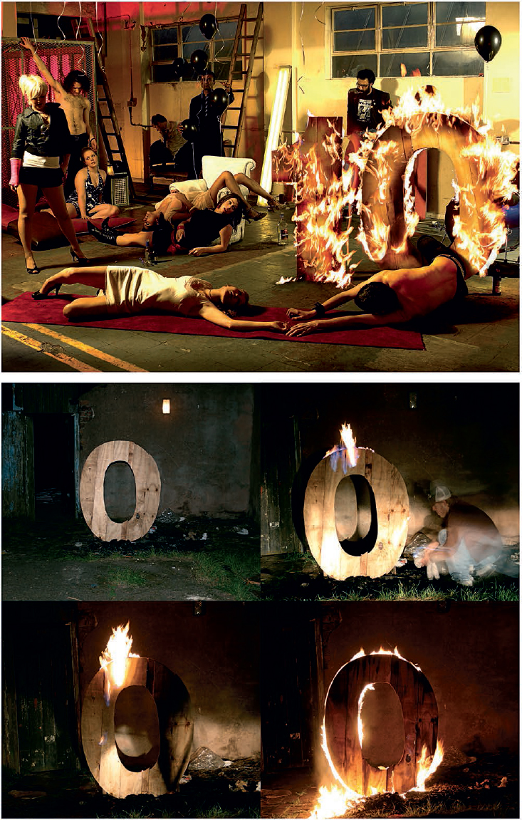
Fierce 10
Fluid
Lee Basford, from Birmingham-based design consultancy Fluid, created this visual in collaboration with photographer Jonathan Costello. The Fierce Festival is a performance arts festival attracting more than 300,000 attendees. For its tenth birthday, Fierce were planning something much bigger and the design had to reflect this. Fluid created a physical piece of work that could be photographed with some of the artists. The burning ‘10’ was constructed out of wood and – due to health and safety precautions – photographed separately. The final image was created in Photoshop using the pictures from the photoshoot.

Cracking ABC
Funda Cevik
Funda Cevik is a German-born, Turkish graphic designer who now lives in Edinburgh, where she discovered these letter-shaped cracks in pavements in 2009.

Cinema City
Fajn Hajp Agency
Filip Bojovic, founder of Fajn Hajp Agency in Novi Sad, Serbia, created this ad for the 2009 Cinema City Film and Media Festival in Novi Sad. Visual identity: Joler Vladan, Filip Bojovic, Katarina Lukic Balazikova; AD&D: Filip Bojovic, Katarina Lukic Balazikova; illustration: Katarina Lukic Balazikova, Marijana Zaric; photos: Darko Novakovic, Srdjan Srdjanov, Jana Katic.


Wonderland
Frost*Design
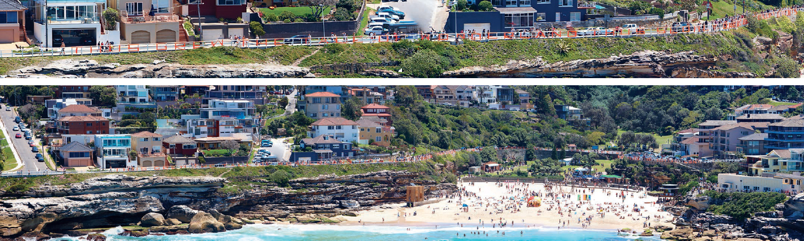
Inspired by the rich history of Tamarama, Sydney-based Frost*Design created a site-specific typographical artwork for the 2009 ‘Sculpture by the Sea’ exhibition. 138 fluorescent orange letters spell out a verse from the poem ‘All in the Golden Afternoon’ from Lewis Caroll’s famous children’s book Alice in Wonderland. The verse stretches across more than 600 m (650 yd) of the Tamarama beach fence. The sculpture references the controversial theme park Wonderland City, which stretched across the beach over 100 years ago, preventing the public from accessing the beach. Creative direction: Vince Frost; design direction: Bridget Atkinson; senior designer: Sarah Estens; copywriter: Lex Courts; project manager: Annabel Stevens; design intern: Erin Fraser.

Rubber band ball alphabet
FL@33
The British postal service hands out vast numbers of rubber bands every day. We almost always receive our mail wrapped in at least one rubber band, and used to throw most of them away until we discovered rubber band balls. Made – you guessed it – from 100 per cent rubber bands, they grow as you add on new rubber bands. We have five or six rubber-band balls here in the studio, ranging from one 9 cm (31⁄2 in) in diameter to little one-week-old ones just 1.5 cm (1⁄2 in) in diameter. Using the largest one we had, we took on the challenge of creating an alphabet, restricting ourselves to using a maximum of three green rubber bands to be added to the red ball.

Tower crane letters
FL@33
This visual is the very first FL@33 postcard we produced. The artwork was created in 2000 – even before we officially set up the studio in 2001. The artwork formed part of our research into the beauty of tower cranes, leading to FL@33’s award-winning Trans-form magazine. Trans-form was launched at the Royal College of Art’s Masters degree show in summer 2001, where this postcard was offered as a free give-away. The tower cranes really did form letters over the period of approximately six months that we studied them outside our studio windows. The visual above did admittedly involve a bit of Photoshop and later led to Trans-form cityscape insects.

FL@33 logo cake
FL@33
Created using 3 eggs, 150 g (5oz) flour (the same weight as 3 eggs without shells), 150 g (5oz) sugar, 150 g (5oz) butter. Mixed and then baked in a pre-heated oven at 180ºC (350ºF) for 33 minutes.