
M
Morph
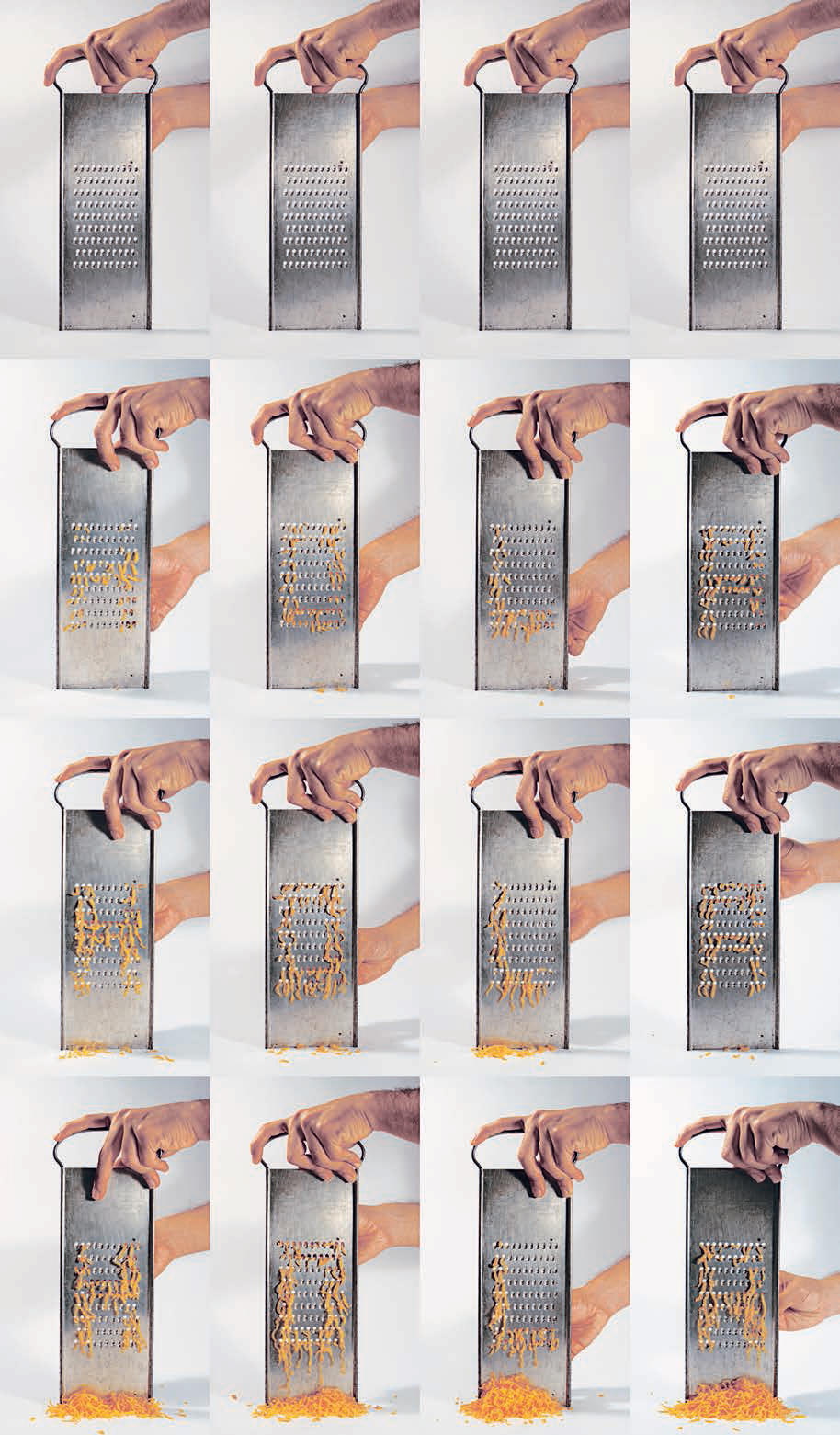
Miguel Ramirez
Designer Miguel Ramirez, based in Los Angeles, grated this typographic piece using cheese to form the letters ‘Hola’ (‘Hello’). Miguel has found that creating three-dimensional objects allows him to expand the way he approaches and solves visual problems, and leads him to a greater appreciation for embracing error.

Studio Alphabet/ Kurlansky’s Krazy Kaps
Mervyn Kurlansky
This work was conceived by Pentagram co-founder Mervyn Kurlansky while he was an external assessor at Preston Polytechnic, as a charitable contribution to Preston’s student publication on typography. The self-imposed design constraint was to restrict the choice of found objects forming an alphabet to objects found in the Pentagram studio. The items were then individually photographed by Pentagram’s in-house photographer, and prints were made to a common height and pasted in position. The student publication was to be printed in one colour only – black – hence the black and white version. The work was produced in 1977. Some ten years later (no precise date is available), it was decided to recreate the alphabet in colour for a full-colour publication. Fortunately all the objects were still to be found in the studio. The original title was Studio Alphabet. When Herb Lubalin later reproduced the alphabet in U&lc, he called it Kurlansky´s Krazy Kaps.


Standard Time
Mark Formanek
Standard Time was the idea of the German artist Mark Formanek, and was realized by the Berlin-based media agency Datenstrudel. It was shown at the Media Art Festivals Transmediale (Berlin), Ars Electronica (Linz/ Austria), and Tokyo Media Arts. Standard Time pursues a new concept in displaying time. The course of time is shown in a movie of exactly 24 hours, which shows workers constructing the time in the form of a digital display by using man-sized wooden slats – of course in real time. Like any conventional digital clock, Standard Time displays time using four ciphers. The first two show the hours, the second two the minutes. For the workers, this implies the following: on the stroke of 10:59 they have exactly one minute to rebuild the 0 to 1, the 5 to 0 and the 9 also to 0. Now Standard Time is on the 11 o’clock position. Again, there is one minute left to rebuild the last 0 to 1. And so on…. 1,611 reconstructions in 24 hours; 72 workers in four shifts, all done on a summer’s day in a gap between buildings in central Berlin. Standard Time offers us a new perspective on the watch, because it provides more than just information about time. The eyes of the viewer automatically become caught by what is happening on the screen, because there is more to see than just the hands of a watch. It is the human ambition to keep up with the time – well known to be a difficult undertaking. During large reconstructions, for example on the hour, the workers finish in the nick of time. The spectator becomes engrossed, and forgets about the time while watching the clock.

Love Type
Miguel Ramirez
Miguel Ramirez collaborated with fellow designer Melissa Madrid to create a dot matrix typeface entitled Love Type using tennis balls placed in netting.

Beeep Beep Beeeeep
Miguel Ramirez
Checking out at the grocery store. This three-dimensional type exploration uses foldable grocery store paper bags. Beeep Beep Beeeeep is one of the first 3D typefaces that Miguel created following an encouraging experimental typography class at California State University, Long Beach, taught by Andrew Byrom (whose work also features in this book).

Dyslexic alphabet
Miranda van Hooft
Dutch graphic designer Miranda van Hooft created this graduation project by hand-stitching texts into paper and then focusing on the backs of the words. Dyslexics see the shapes of letters differently and perceive texts as a series of abstract symbols. Dyslexics also tend to be better with three-dimensional shapes than nondyslexic people, and they often see (and write) text inverted. The project aims to raise awareness of this common condition.

Embroidered envelope
Michelle Jones
Michelle Jones enjoys working with hand-drawn and physical 3D type. Her business cards, for instance, feature reproduced contact details that were hand-sewn into felt. She also sends out unique CVs created using a sewing machine. This technique helps to give her work a more personal feel and has more impact. Shown here is the beautiful envelope in which she sent us her submission for this book.

Dodeca
Michael Hübner
The experimental typeface Dodeca, by Baselbased, German graphic designer Michael Hübner, is based on the diverse spacial constructions that can be built from equilateral triangles. Dodeca was not conceived at the computer, but developed using paper, scissors and glue. The results are playful characters that resemble crystals that could be combined to build bigger structures.

Twilight embroidery
Mario Hugo
This self-initiated typographic panel, full title Twilight, Gravity, and Our Many Impossible Things, was designed in 2009 by New York-based artist and designer Mario Hugo as a signed limited edition. It is hand-embroidered with silk and cotton threads on hemp/silk fabric and hand-stretched over a 7.6 cm (3 in) wooden frame. The piece was inspired by watching his girlfriend and business partner Jennifer, who has a background in fashion, work with fabric and textiles. Mario wanted to see his two-dimensional typographic piece extruded into a three-dimensional relief, and the piece was sent away to India to be hand-embroidered. The whole piece measures 106.7 x 139.7 cm (42 x 55 in).

No Rules
Me Studio
Me Studio is a small graphic design studio founded in 2005 in Amsterdam by British designer Martin Pyper. The studio has created numerous 3D type projects, including the experimental typeface No Rules – a work in progress, as they point out. It was a collaboration between studio founder Martin Pyper and Uwe Steffen. They embraced the restrictions of the ruler’s sections with folding joints and the way the two-meter-long ruler can be shaped to make the necessary letterforms for a coherent typeface.
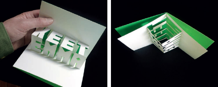
Keet Card
Me Studio
A three-dimensional card to announce the birth of baby ‘Keet’ (Kate). Printed on stiff white card in two Pantone colours, then laser-cut to create pop-up letters and dotted fold-lines, the card pops open by itself when taken out of the envelope.
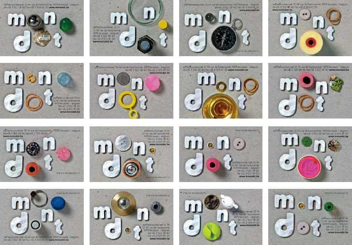
Monodot
Me Studio
Monodot is an independent film production company operating out of Brussels, Belgium, since 2009. Me Studio was commissioned to develop their corporate identity. The starting point for this playful and ever-evolving identity was the company name, which suggests ‘one dot’, whereas the word itself contains three dots (or rather letter o’s). All the letter o’s are replaced with found (round) objects and ephemera collected by the three Monodot founders. The resulting shoebox full of weird and personal objects became the basic ingredients for a set of varied and reguarly renewed logos. Photos: Femke Hulshof.

We Jane
Me Studio
Small communication agency We Jane specializes in ‘female marketing’. Their identity, developed by Me Studio, was made using ribbons to create a subtly feminine look and feel. Each person in the company has their own unique logo in a different-coloured ribbon. Photos: Femke Hulshof.

Yesterday
Me Studio
This typographic installation by collaborators Martin Pyper and former intern Dylan Polak was made from the 3,000 recycled jewel cases Martin was left with after ripping his CD collection to iTunes. The team built the line ‘Yesterday, all my troubles seemed so far away’, a quote from the Beatles song, as a comment on the plastic waste created by these defunct boxes. Yesterday was built in 2009 at the Royal Art Academy in The Hague, the Netherlands, and has since been exhibited several times at art events.

Dutch National Ballet posters
Me Studio
These posters, advertising the 2009/10 season for longterm client the Dutch National Ballet, feature pure photographs of stage sets featuring all the relevant information without any digital intervention. Apart from the posing dancers and props, the image also features a number of trompe l’oeil effects, such as the number zero that is cut into two parts in front and behind the dancer. The four numbers that form ‘2010’ are all very different sized elements that were placed in the set to appear to be the same size. Designer: Martin Pyper; photos: Ruud Baan; set design: Me Studio/Gloudy & Sons.

1976 Alphabet
Mesh Design
Mesh Design was formed in 2008 by four graduates based in the Midlands, UK. This alphabet was created by Tony Ellis, the father of Mesh Design’s director Sam Ellis. All photographs were taken on a walk through Derby in 1976. Sam follows in the footsteps of his father, and his grandfather, who were both graphic designers, specializing in typography.
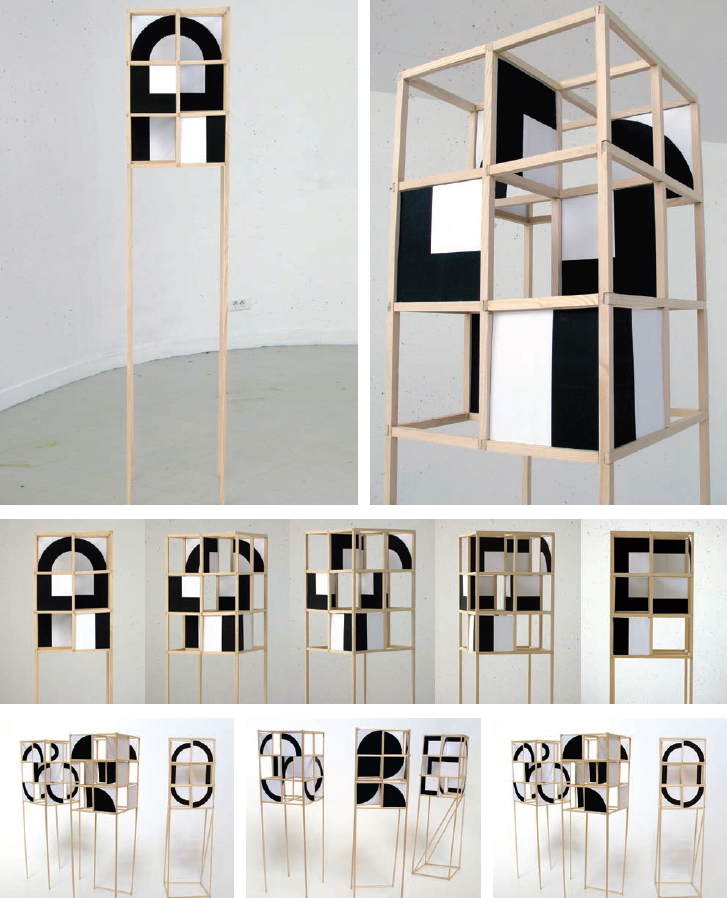
Polygraph system
Merci Bernard
French graphic designer Thomas Bernard founded Merci Bernard in 2007. He is also a member of the French graphic collective Think Experimental. His Polygraph system makes it possible to transform any letter into another when walking around it. This system is composed of two elements, a wooden structure and square modules of varnished paperboards, each painted with a black line, curve or angle. Each letter is made up of six parts. The various modules on offer (square, full, curved, etc) make it possible to create many different letters. The four sides of the structure can show four different letters or signs, which passers-by can read only when they are in the right position.

Anamorphosis
Merci Bernard
Similar to his work on the Polygraph system (see previous page), these anamorphic experiments also explore shape-shifting letterforms. These letters either transform from one letter into another as the vantage point changes, or the sculpted letter stays the same – an equally fascinating effect.

Gyroide
Merci Bernard
Gyroide is an anamorphic font that can be read perfectly at a 90-degree angle while the viewer moves around it. Astonishingly, each letter was made from only one piece of paper that was cut, folded and glued together to create the sculptural letters.
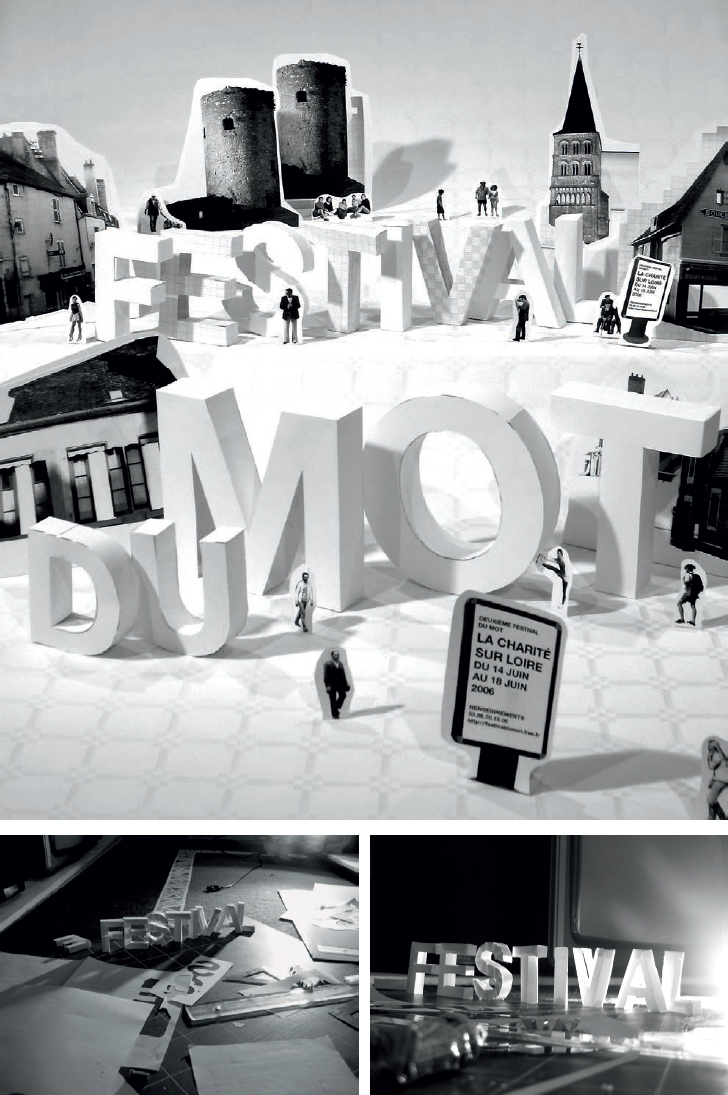
Festival du Mot
Merci Bernard
All the elements of this theatrical ad were handmade with paper. Created for the 2006 Festival du Mot, based in La Charité Sur Loire, France, all words in this composition are three-dimensional and take centre-stage.
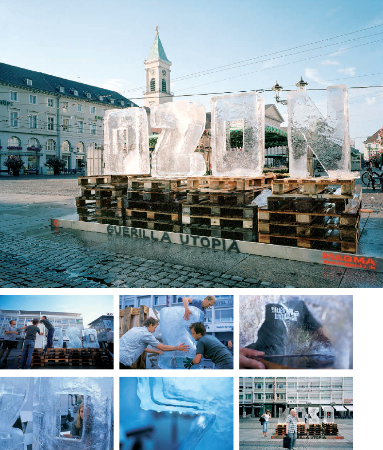
Ozon
MAGMA Brand Design
Guerilla Utopia was a series of events conceived by German agency MAGMA Brand Design, who usually focus on corporate and brand design. These thought-provoking interpretations of aspirations, fears and visions of today’s society were launched with Ozon in July 2004. Four letters were carved out of ice, each letter weighing a tonne. The work was prominently placed in the city centre of the agency’s native Karlsruhe. Ozon was installed early in the morning and by the end of that fine summer day the letters had melted away. All that was left were the details of a website that featured project information and further links. Photos: Jochen Sand/Sandwerk.
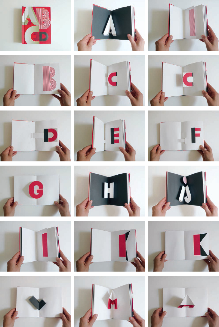

ABC 3D
Marion Bataille
Paris-based Marion Bataille is a freelance graphic designer specializing in book covers, typography and illustration. She graduated from ESAG Penninghen in 1988 and published her first book in 1999. Her alphabet pop-up book ABC 3D made a big splash internationally when it was released around the globe in 2008 by publishers including Bloomsbury, Carlsen and Albin Michel. Letters not only pop up, but some also move and transform. Shown with kind permission of Marion Bataille and Editions Albin Michel, Paris.
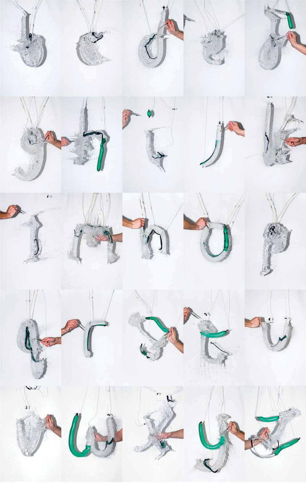

Waterform
MoreGood
MoreGood founders Ralph Hawkins and Amy Ricketts from Surrey, UK, are fascinated by aspects of coincidence. They created the Waterform typeface when trying to find a method of producing self-generated letterforms. Following many experiments, they decided to work with balloons filled with water. Timing was key to capturing each balloon bursting, leaving behind a trace of the letter for just a split second. These specific moments created a unique letterform every time, representing the fleeting nature of spoken language.