
C
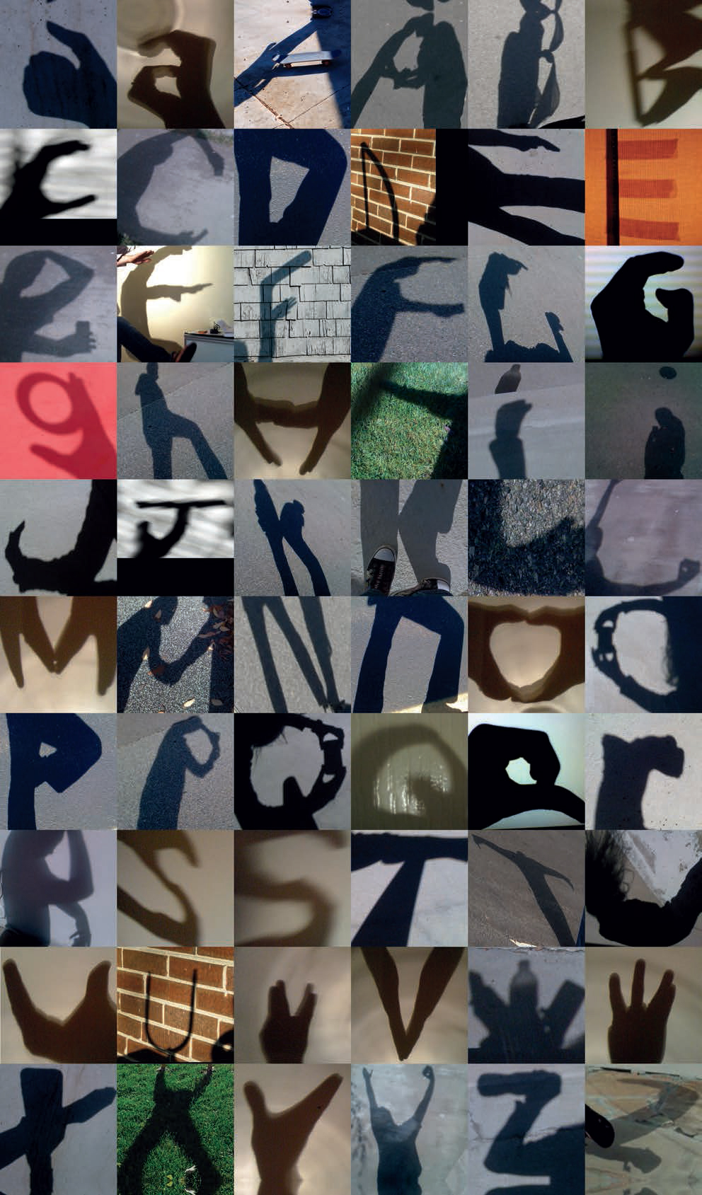
Shadow Alphabet
Cheil USA
The Wow Challenges are a global campaign from Samsung Mobile created by Cheil USA. Found online and hosted by internet personality Ze Frank, the campaign presents participants with three consecutive challenges. Anyone in the world can participate in these, with any mobile phone. All this fun supports two great causes: Architecture for Humanity and The Nature Conservancy. The voting community determines which charity receives a greater percentage of a $30,000 donation from Samsung Mobile. Challenge 1: Use your shadow to make three-dimensional letters, capture them with your mobile, upload them and help create the Shadow Alphabet. Then use the shadow letters to write a message and tell the world just what gives you a charge out of life. Online performance artist & internet personality: Ze Frank; senior art director: Kelly Shoemaker; senior copywriter: Brian Gield; junior art director: Soo Bak; design technologist: Phil Ramunno; program manager: Nicole Fiandaca; engagement director: Jed Michaelson & Shawn Kim; creative director: Ann Marie Mathis; executive creative director: Timothy Bruns.
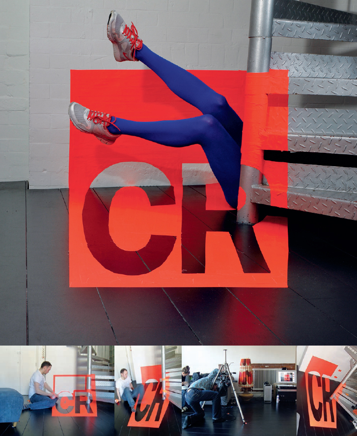
CR subscriptions page
Craig Ward
New York-based Craig Ward is a typographer and designer who likes playing with words. He was commissioned by Creative Review magazine in 2009 to create a visual for their subscriptions page following the theme ‘Make Creative Review a part of your world’. Inspired by the work of pioneering artist Felice Varini, this piece was created using fluorescent tape.

BCUC poster
Craig Ward
Using 7.6 cm (3 in)-high wooden letters on a wall, Craig Ward of Words are Pictures created this self-initiated piece to promote a talk and course he was giving at his former college – Buckinghamshire Chilterns University College, UK.

The Annual cover, 2010
Craig Ward
This image for Creative Review’s The Annual cover from May 2010 was grown out of pollen cells in an immunology lab. Each year for The Annual, Creative Review asks a different person to come up with a cover image based on a capital ‘A’. In recent years, this brief has resulted in imagery on an increasingly grand scale. In 2010, however, Craig decided to buck this trend by going much, much smaller and creating some cell-level typography. Craig approached a couple of UK universities with his idea and discovered that making letterforms from cells was possible, if a little costly (he was quoted anything up to £250,000). But he persevered and was eventually put in touch with Frank Conrad, ‘a friend of a friend,’ he says, ‘who happened to be an immunologist at the University of Denver’ (the lab shown above). After many experiments in the lab, the final visual was ready; the cover was printed using a metallic base ink to bring out the details. Concept and art direction: Craig Ward of Words are Pictures; photos and cell manipulation: Frank Conrad, with lab assistance from Bastion Ridley; Creative Review’s magazine art director: Paul Pensom.
More Annual covers can be seen on page 164.


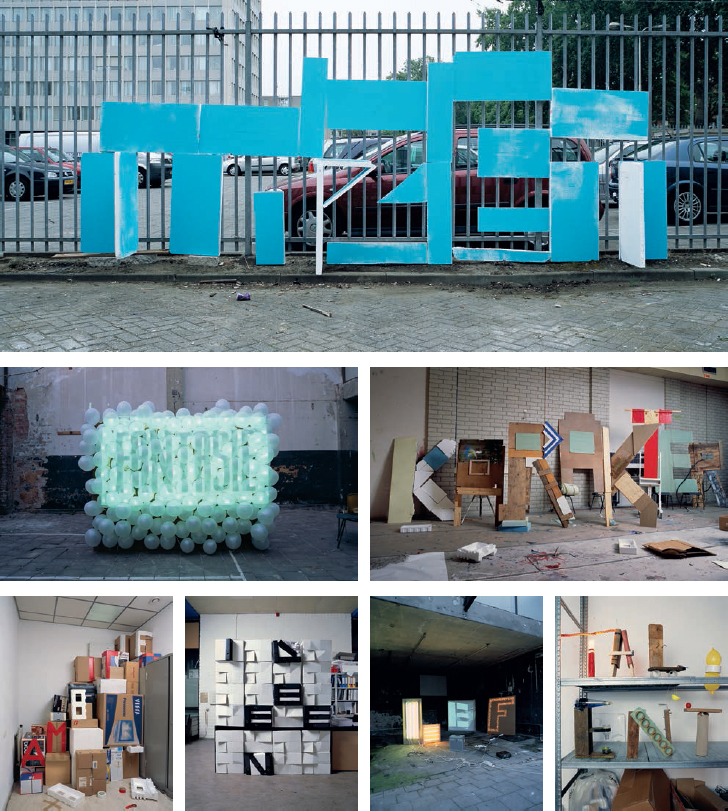
If You Could Collaborate
Craig Ward, Sean Freeman and Alison Carmichael
If You Could Collaborate was the fourth annual ‘If You Could’ exhibition, which aims to provide a platform for the finest creatives from all over the world to question their conventional working methods and outcomes. The contributors were challenged to produce something a little unexpected, by working with partners of their choosing from any discipline, profession or background. There was no brief to answer, or format to honour – the only limit was the enterprise and imagination of the artists involved, and a liberal 12-month deadline. Craig Ward teamed up with fellow type nuts Sean Freeman and Alison Carmichael to create a triptych of approximately 1 m (39 in)-high laser-cut wood pieces inspired by graffiti they had seen. This exhibition took place in A Foundation Gallery at Rochelle School, London, in January 2010, and was curated by Alex Bec and Will Hudson (aka It’s Nice That). Photos: Sean Freeman and Mark Sinclair.

&
Conor & David
This self-initiated typographic poster from 2006, by Conor Nolan and David Wall of Dublin-based design studio Conor & David, celebrates the form of the ampersand.

You Blow Me Away
Craig Ward
Craig Ward collaborated with photographer Jason Tozer to create this self-initiated piece in 2009. You Blow Me Away was screenprinted onto 7 mm (1⁄4 in) glass before a black pool ball was thrown through the glass. The images, while at once kinetic and exciting, are also studies in the boundaries of legibility, as the team managed to capture the glass at various stages of destruction.

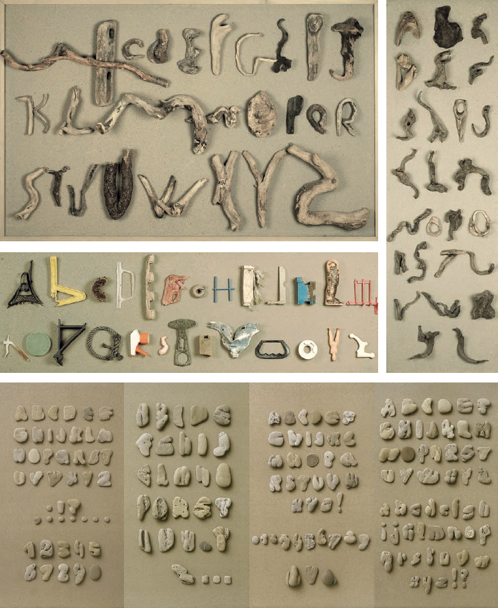
Pebbles and More
Clotilde Olyff
In 2010, Brussels-based graphic designer, typographer, author and teacher Clotilde Olyff celebrated 20 years of collecting alphabets from French beaches. She now has over 30 complete alphabets in pebbles (uppercase, lowercase, numbers and punctuation). There was one interruption of approximately two years: an oil tanker ran aground in northern Spain and polluted all the beaches of southwestern France. The beaches have since been cleaned to remove all the spilled oil, but unfortunately this cleaning process also took away all the shells and stones. The tide and the violence of the waves have brought some of them back now, but Clotilde finds fewer examples. While waiting for the pebbles to return, she has discovered alphabets from pieces of wood and waste brought in by the sea. ‘Pebbles are like wine: there are good and bad years, depending on the moods of the Atlantic Ocean!’ Photos: Fabien de Cugnac.
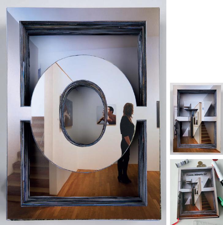
FOAM Album 07
Corriette Schoenaerts
For the cover of the FOAM Album 07 – a 2007 review of the Amsterdam Museum of Photography (FOAM), Amsterdam-based Belgian photographer Corriette Schoenaerts manually cut the numbers 0 and 7 out of all the pictures that were to be printed in the book. The results were two piles of around 500 pictures each. At the top and bottom of these piles, Corriette put two images taken in the museum itself, literally cutting through the museum’s 2007 activities and putting them back into their exhibition space, which the book reflects.
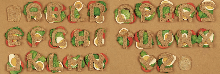
Alpha Bread
Clotilde Olyff
Alpha Bread was an edible type experiment carried out by Brussels-based graphic designer, author and teacher Clotilde Olyff.

XYZ: Spatial Typography
Chris Tozer
Fascinated by the possibilities of typography as image, London-based graphic designer Chris Tozer began experimenting with three-dimensional type during the final year of his graphic design degree at University College Falmouth, UK. He created a series of type experiments that led to a book called XYZ: Spatial Typography documenting the results in 2007. Shown here are some of the many gems.
Qualities Needed
Corriette Schoenaerts
Photographer Coriette Schoenaerts, in collaboration with 178 Aardige Ontwerpers, created a series of visuals for Utrecht School of the Arts (HKU). For this campaign, qualities deemed necessary to succeed as an artist were determined. A future student would either have these qualities, or be willing to develop them during their education. Illustrated qualities included imagination, character, dedication, boldness, passion, ambition, ideas, fun and talent.

Quicker
Corriette Schoenaerts
Commissioned by ad agency Addison NY and art directed by Jason Miller, Coriette created this visual for American paper manufacturer Neenah Paper in 2009.

Quarantine Yang Fudong invite
Corriette Schoenaerts
Featuring folded paper letters, this invitation for the Quarantine Art Space, announcing ‘Off the Wall’, an exhibition by Yang Fudong, was created by Corriette together with Julia Born and Luna Maurer.

Quotes
Corriette Schoenaerts
Corriette in collaboration with De Designpolitie created these pictures as part of a 2005 marketing campaign for Utrecht School of the Arts (HKU). Quotations by world-famous personalities painted on big cardboard cubes reflect the ambitions of both the school itself and its (future) students. At the same time, these pictures try to create an impression of the diversity of the School’s buildings.

Sheffield Institute of Arts prospectus
Chris Wilkinson
Chris Wilkinson is a graphic designer based in Sheffield, UK. Since around 2007, Chris has developed a passion for creating 3D type and was lucky enough to be able to use it in a few projects including this extraordinary series created for the Sheffield Institute of Arts prospectus 2010. Photography: Tom Jackson. Workshop assistance: Ian Broome (Sheffield Hallam University) and Lucia Kempsey.

Defined. Walnut Woodtype
Charlie Hocking
Multi-disciplinary graphic designer Charlie Hocking is based in London. The original concept behind this typeface, made from walnut wood, was to create something that almost looked alive; something that was organic in its form and that would reflect the environmental message attached to a new branding campaign that this was a part of. Making the letterforms three-dimensional heightens the fluidity of the typeface, letting the viewer imagine the forms taking on a life of their own.

Ceramics
Charlotte Cornaton
Freelance graphic designer, videographer and ceramicist Charlotte Cornaton graduated in art direction and graphic design from ESAG Penninghen in Paris in 2009, and has also attended ceramics courses at Central Saint Martins in London. She continues to develop the work that she started with her complex final-year project, Vanitas, by mixing 3D design in ceramics and graphic design with stopmotion video. Shown here are ceramics made from moulds, following preparatory work in plaster, using profile and template. Versus: earthenware silkscreened with scientific engraving. Ceramic: matter interferes with the letters, printed from lace, plastic, bubble wrap and other materials.

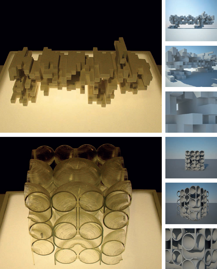
Typotectonics
Chrysostomos Tsimourdagkas
Chrysostomos Tsimourdagkas is a registered architect in Greece. He has worked as a graphic, industrial and architectural designer for several firms including Zaha Hadid Architects. When this book was being compiled, he was pursuing a PhD at the Department of Architecture of the Royal College of Art in London, investigating ways in which typography can be incorporated into the architectural field. What fascinates him is the blending of the boundaries between typography and architecture, (which he calls ‘typotecture’), for the generation of spaces that are at the same time functional and communicative. The digital images shown on the left are part of an experiment in creating an application capable of generating a variety of 3D letterforms with potential architectural applications, which Chrysostomos describes as ‘typotectonics’. The user, after selecting a typeface, will be able to create three-dimensional components by parametrically extruding the glyphs through the definition of a certain set of critical values such as path, curving, scaling, twisting and style of extrusion. The next step, after selecting a word, is to define a second parametric operation, such as arraying, tiling, branching or spiralling, in order to aggregate the three-dimensional components of that word and generate the final form. Eventually, the user will be able to export that form and further manipulate it according to given needs. Above: Digital and physical models of two typographical sculptures.