
K

Ice
Kris Hofmann
Originally from Austria, Kristina moved to London in 2003. A graduate from the Royal College of Art, she now works as a freelance designer and director from her East London studio. She has a particular interest in experimenting with handmade techniques and their application to animation and typographic design. Ice was created as part of the Oberon Book Illustration Award, a project set by the RCA CAD department and Oberon Publishers; it won the V&A Student Illustration Award in 2009.

Bouquet of Parentheses
Kate Lyons
London-based freelance graphic designer Kate Lyons graduated from Central Saint Martins in 2007. The view from the windows at the back of her house in Camden, London, was a wall and a bit of sky – typical urban living, with no access to a garden. Kate’s plan was to introduce a garden to break up the brick monotony. She worked on this site-specific lettering project, and the idea of framing a view, in her final year at Saint Martins.
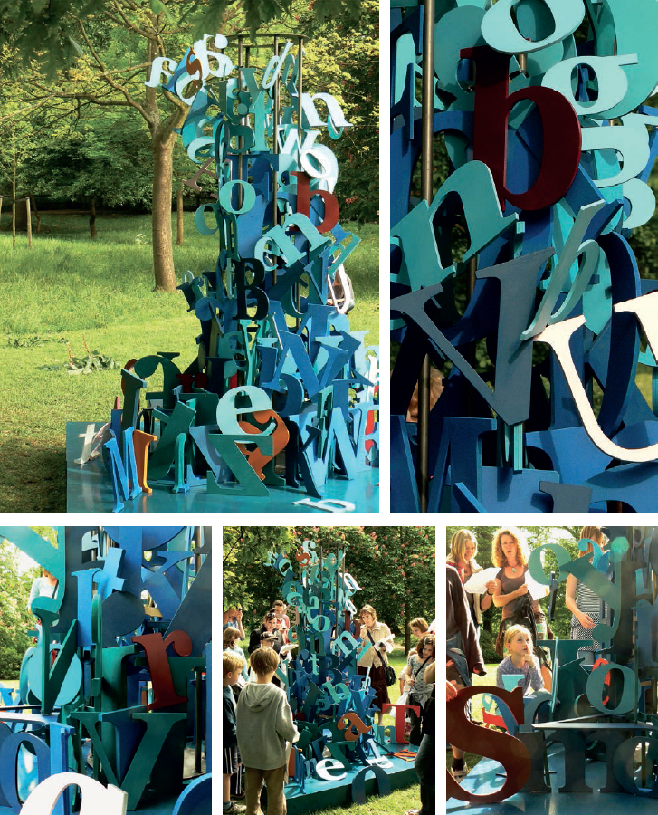
Brighton Festival
Kris Hofmann
The idea of this piece, created for the city of Brighton’s annual arts festival, was to create a huge word-search inspired by Robert Louis Stevenson’s book Treasure Island and have children and their parents guess the title of the book. The installation consisted of 250 wooden letters, in the Georgia Bold typeface, in all different sizes. Both upperand lowercase letters were assembled in a 2.5 m-high (8 ft) structure reminiscent in form and colour of the shape of a wave (appropriate for this seaside city). The size and tactile quality of the installation allowed the audience to follow the letters with both their eyes and their hands. Creative direction & design: Kris Hofmann; set building: Zain Aziz.

Red Meat
Karin von Ompteda
Karin is a biologist turned graphic designer turned doctoral researcher at the Royal College of Art investigating typeface design for people with visual impairments. ‘There is a moment in every designer’s life when you start to see letters in everything’, she quite rightly writes. She was a vegetarian when she conceived the project and had never touched raw meat, so the design process was punctuated with uncontrollable gagging. Photographing the letters on a clean cutting board transformed the carnage into an aesthetically pleasing, almost sterile design project.

Cortext
Karin von Ompteda
Using fingertips to read involves the transformation of tactile stimuli into an internal representation. Thus it seems that people engaging in this practice are forever designing ephemeral letterforms within a sort of mental notebook. Cortext was designed so that people who don’t usually read embossed letters can experience the mechanical–neural transfer of text from skin to cortex. A three-dimensional replica of typical notebook paper was created through stereo-lithographic rapid prototyping. Additionally, a custom legible typeface was designed for the project. Finally, as the project was inspired by people with visual impairments, its design meets accessibility guidelines for tactile signage.


Three-dimensional typography
Karina Petersen
Graphic designer Karina Petersen holds an MA in graphic design and is a 2009 graduate from Kolding School of Design, Denmark. In 2009 a book on her type experiments was published (Three-Dimensional Typography, see designskolenkolding.dk) featuring – among other pieces – the work shown here.