
G

Title 2
Go Welsh
Go Welsh is a design studio based in Lancaster, PA, USA. The Giving Issue, the second issue of their ongoing promotional project entitled Title, was sent prior to the 2008 holiday season. The dimensional letterforms on the cover represent wrapped gifts. Art director: Craig Welsh; designer: Scott Marz.

Earth Will Survive, Will You?
Georgina Potier and Itamar Ferrer
This is one of many pictures taken as part of a project created by Itamar Ferrer and Georgina Potier in response to an RSA (The Royal Society for the Encouragement of Arts, Manufactures & Commerce) 2008/09 competition brief called ‘Elegant Frugality’. A few facts on waste: every year, the UK produces 435 million tonnes of rubbish, or 400 kg (880 lb) per person. Although half the amount produced by the average American, it is 25 per cent more than that of a French resident. The UK is one of the most wasteful societies in Europe, and its rubbish output is rising by four per cent a year.

Print Magazine Annual
Gluekit
Gluekit is the illustration and design team of Kathleen and Christopher Sleboda. Working from their home studio in Guilford, Connecticut, USA, they created the cover and six interior spreads for Print Magazine’s 2008 Regional Design Annual. Wood, felt, hula hoops, fabric, tape, staples, foam and seams were all employed to create the type throughout the issue. The cover utilized type created out of tape, and previewed some of the three-dimensional forms that were used in the interior type sections. The package was selected by the Type Directors Club for inclusion in TDC55, published in 2009.

Creative Futures
Gareth Holt
In 2005, London-based designer and art director Gareth Holt collaborated with Daniel Mair and photographer Dan Smith to create this now-classic cover. Commissioned by Nathan Gale – art director at Creative Review at the time – this cover design was created following a brief to create a visual that had to convey that it was the Creative Futures Special Issue. Disheartened with the pure digital-generated output of recent times, the decision was to go analogue to create a CF logotype, using 21 anglepoise desk lamps (a much-needed tool for any young designer of the future) to do so. Originally assigned just to design the front cover, the team also managed to get the back cover to feature the back of the installation in order to make sure people knew it was not a Photoshop job.
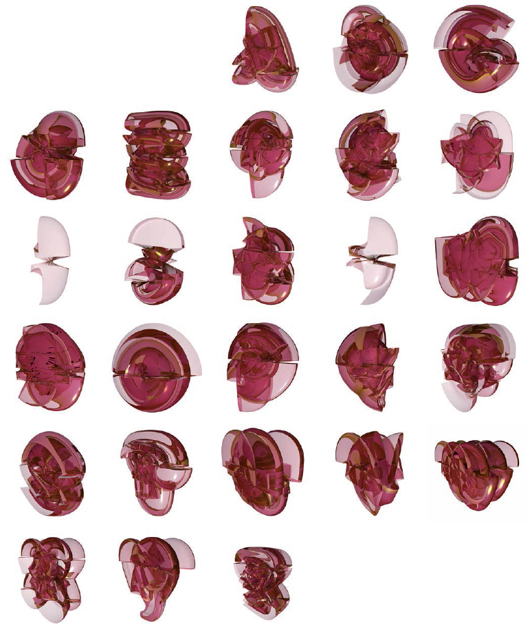
Incest
Geoff Kaplan
A Jimmy Luu and Ryan Molloy-curated exhibition, ‘Dimension+Typography’, held in 2009 at the I Space Gallery, Chicago, featured – beside many other projects also included in this book – work by San Francisco-based Geoff Kaplan of General Working Group. Geoff has produced projects for a range of academic and cultural institutions. Incest is a series of sleek, translucent shape-shifting letterforms. They are abstracted beyond easy recognition, perhaps only knowable when presented in a chart from A to Z. Around 2008, a few tangible 3D prints of his experimental and often otherwise animated letterforms were produced by Geoff, but were unfortunately never photographed. However, the sculptural qualities are apparent in the stunning visuals shown here.