
A

Feature
Antoine+Manuel
Paris-based Antoine Audiau and Manuel Warosz produced this typeface box set from 2008 in a limited edition of five. It is entitled Feature, made of laser-cut Perspex 60 x 50cm (24 x 20in), and was produced for Antoine+Manuel’s exhibition at the Musée des Arts Décoratifs, Paris, which ran from January to May 2009.

Book as Block
Amandine Alessandra
Amandine Alessandra is a French photographer and graphic designer based in London. This project was inspired by Thomas Fuller’s statement, ‘A book that is shut is but a block’. The shelves were used as a typographic grid, while the books were selected for their shape and colour rather than their content. Building up the letters reminded Amandine of typesetting; every letter made of coloured books had to be blocked with white books, just as in letterpress, where large areas of white space are created by wooden blocks called ‘furniture’.

Letterform for the Ephemeral
Amandine Alessandra
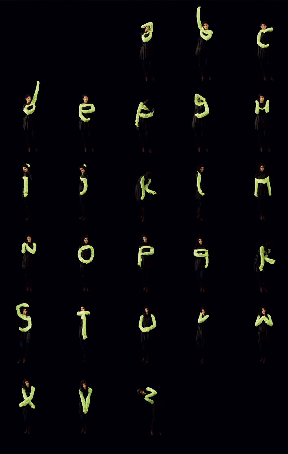
Amandine Alessandra’s project Letterform for the Ephemeral consists of several phases, all of which were created between 2009 and 2010. The experiment started with wearable typography. Amandine created so-called boleros – a pair of day-glo sleeves – and then attached them together with a strip of fabric so that they could be worn across the front or the back of the wearer. These sleeves allowed the wearer to form any letter or number in a small move. Once all the wearable letters were ready, Amandine used the ephemeral typography to induce people to feel the weight of passing time, with its flow symbolically interrupted by halting the traffic. This typographic performance was recorded by taking screenshots of the images transmitted by a public webcam showing the iconic Abbey Road crossing in London – site of the famous Beatles’ album cover (http://abbeyroad.co.uk/visit). The next phase was a clock – a choreographed performance referencing the (real) passing of time. The people standing as the hours moved only once every 60 minutes, while the one acting as the tenths of seconds executed a very fast routine in a continual move. Following the clock idea, a performance then took place in a busy train station during rush hour. It involved eight people mimicking a digital clock in real time using the movements of their arms and shoulders.

Ephemeral stencils
Amandine Alessandra
In 2009, Amandine used a stencil to set the word ‘ALWAYS’ in 1296 point, first using salt, then breadcrumbs on grass.

Take a Seat
Amandine Alessandra
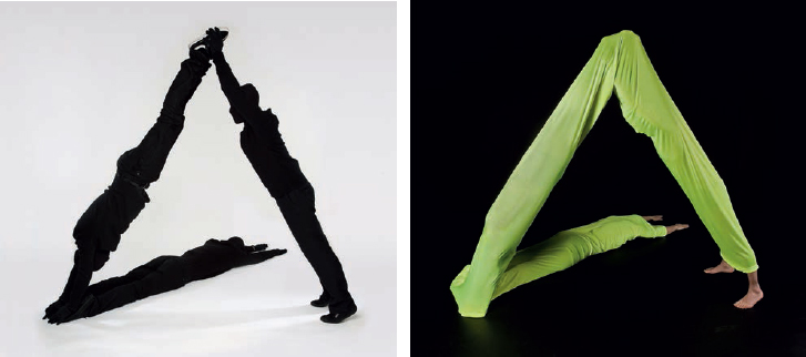
Take a Seat, from 2009, uses a chair as a matrix for an alphabet. Each letter is a meaningless installation if seen on its own, but becomes decipherable when a few are put together to form words. Objects become readable.

Wow/Light
Amandine Alessandra
These were experiments from 2009 for temporary high-visibility typographic installations.

Maîtresse alphabet
Amandine Alessandra
This alphabet from 2009 was made by photographing hands encased in shiny PVC gloves.

Body type
Amandine Alessandra
The Body type alphabet from 2009 was an experiment into organic letterforms emerging when reframing the body. It uses the analogy between typesetting terminology and vocabulary for the human body, for example: anatomy, body size, head piece, footers, leg, eye, arms, chin and hairline.

I Have Proved
Amandine Alessandra
The original quote, ‘I have proved by actual trial that a letter, that takes an hour to write, takes only about 3 minutes to read!’, by Lewis Carroll, was written in the context of the lost art of handwritten correspondence. This installation was from 2009.

Space for Fantasy
Akatre
French design studio Akatre was founded by Valentin Abad, Julien Dhivert and Sebastien Riveron. This visual was created for Space for Fantasy – an art exhibition held at Paris’ Galerie des Galeries (Galeries Lafayette) in 2010.
A4
Akatre
The three Akatre members perform a letter A/ number 4 hybrid to illustrate their name, Akatre, which means A4 (à quatre) when pronounced in French. Asked – why four? – when there are only three of them, they reply that the fourth member is considered to be the client and/or collaborator.

Mains d’Œuvres
Akatre
These typographic pieces were created for Akatre’s client Mains d’Œuvres (a venue and cultural centre). They were used as motifs on flyers for part of the company’s 2007/08 print campaign. The visuals were created with sugar cubes.

Grafik cover
Akatre
Akatre designed this front cover for London-based Grafik magazine, number 162, May 2008, that featured a special report on photography.

Mains d’Œuvres
Akatre
Experimental lettering commissioned by Mains d’Œuvres. The visual featuring the spikey pyramids was used for a programme that also formed part of the 2007/08 campaign – like the sugar cubes pieces shown on the previous page.

Furniture alphabet
Adam Voorhes
Photographer Adam Voorhes is based in Austin, Texas. His furniture alphabet for furniture store High Fashion Home in Houston, Texas, was originally published in print and outdoor ads in February 2008. The project was a collaboration with creative communications firm The Butler Bros. Concepting: Stephanie Chan; art directors: Cody Haltom, Adam Mendez.

Austin Monthly magazine cover
Adam Voorhes
The ‘Help Wanted’ copy was published as the cover of Austin Monthly magazine, which also featured the artwork as the opener of their June 2009 issue. Art director and stylist: Robin Finlay.

Rubber band typeface
Alexander Egger
This is a previously unpublished colour version of the Rubber Band typeface by Italian-born, Vienna-based graphic designer Alexander Egger. Below are a few of the visual experiments that Alexander is best known for.

Trash type
Anna Garforth and Eleanor Stevens
Freelance designer, illustrator and environmental artist Anna Garforth runs creative practice Abe in London. Her Trash type was the product of a collaborative workshop taught by Anna and Eleanor Stevens at London College of Communication. They worked with second-year graphic design students to create a word communicating the medium. The medium was trash, and the word they chose was ‘used’. A week’s worth of rubbish was collected by the students and turned into the typographic piece.

Rethink
Anna Garforth
This piece was located in front of two resources that everybody is heavily reliant upon: gas and water. The word communicates a need to rethink what we consume and how we consume it. Additional leaf typography was installed on railings around the city, using only leaves and thorns. An interview about the project was broadcast in 2010 by Arte TV’s Tracks.

Nourish
Anna Garforth and Eleanor Stevens
This self-initiated collaborative piece was created by Anna Garforth and Eleanor Stevens. The word is ‘nourish’, and the typeface was handwritten by Eleanor, which the duo then rendered in moss. (Nourish: To provide with the substances necessary for growth, health and good condition. From the Latin nutrire, ‘feed, cherish’. To provide for, sustain, encourage, nurture, cultivate, strengthen, enrich.)

Prophet
Anna Garforth and Eleanor Stevens
Prophet was another collaboration between Anna and Eleanor Stevens. In spring 2009, the team exhibited in Italy at The Rocca Paolina for the ‘Over Design Over’ exhibition. They were showcased with 44 other internationally acclaimed artists, including graphic designer Stefan Sagmeister (also featured in this book) and Italian designer Enzo Mari. For this exhibition, the duo illustrated a quote from Kahlil Gibran’s The Prophet: ‘If this is my day of harvest, in what fields have I sown my seeds?’

A detail of Prophet and snapshots of Anna’s practice Abe in mossy action.

AB0C°
Allistair Burt
Allistair Burt is a multi-disciplinary artist with a background in architecture. He runs Glasgow-based studio Hole in my Pocket. Allistair’s work encompasses a wide range of artistic forms such as film, site-specific art, painting, illustration and sculpture. AB0C° was created especially for this book, interpreting the alphabet using a temporary and fleeting material: snow.
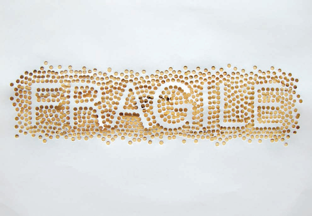
Fragile
Alex Robbins
Berlin-based illustrator and designer Alex Robbins created Fragile using a hole punch. It is one of a series of typographic pieces produced for an ongoing self-initiated project in which Alex creates typographic responses to words and phrases. These are selected from various sources, including overheard conversations, magazine articles and Twitter updates.

Urban Intervention – Ice Hands
AT.AW.
Under the label AT.AW., Toronto-based architect Eric Cheung creates side projects in which he optimistically subverts the often neglected urban environment. In Ice Hands (2009) Eric comments on how, in very cold weather, typical of Canadian winters, the act of communication is often ‘muffled’. He playfully indicates how people might use sign language to communicate during the winter.

Eureka Tower car park, Melbourne
Axel Peemoeller
Axel Peemoeller developed a wayfinding system for the Eureka Tower car park in Melbourne while working for Emery Studio. The apparently distorted letters on the wall can be read perfectly when standing in the right position. This widely published project from 2006 won several international design awards.

Feld magazine
Axel Peemoeller
Created for Feld magazine, these visuals feature poetry by autistic author Birger Sellin.
Top: ‘Scurry Birger’.
Bottom, left: ‘I don’t really fit into this crazy, cowardly, awful society. It is so weird, this selection of iron aces.’ Followed by two grammatically wrong and more fragmented poems – freely translated – including original typos: ‘Totally without me a fiasco a chaos shiveringly this vast extent resembles a partially dead city of ruins. I participate as destroyer and a disgusting “nonsense-magager”.’
Bottom, right: ‘The one and only iron lonely one strives for a first and only iron valuable thought inventing poem’.

Feld magazine
Axel Peemoeller
Illustrations for Feld magazine’s literature section: ‘Dead’, ‘Real Blokes’ and ‘Death Suits You Well’.
Various magazine contributions
Axel Peemoeller
Various magazine contributions featuring three-dimensional type experiments, including the typographic illustration Dead Man in the far left, bottom corner, which Axel created for the ‘Pirate’ issue of a Mexican magazine.

Verve
Axel Peemoeller
Front cover of a printed, large-scale magazine that Axel designed for Verve online and Verve webshop.

Splinter
Arslan Shahid
Toronto-based Arslan Shahid is a graphic design student from OCAD (Ontario College of Art & Design). He created his Splinter typeface in 2010 to reflect the concept of war. As a starting point, Arslan took some wise words from his father to heart: ‘It takes at least two for war. Conflict, on the other hand, could be within a faction or even within oneself. The outcome of war is destruction, disruption and pain. One cannot reflect war in a symmetric, disciplined and orderly type.’

Pure type
Atelier van Wageningen
Atelier van Wageningen (AVW) is a (typo)graphic design studio based in Amsterdam that has been run by Mark van Wageningen since 1995. Mark regularly publishes (mostly two-dimensional) typefaces, and his fonts are widely available. The idea that Pure type could theoretically wither with time intrigues Mark, as a fourth dimension would then be added to this three-dimensional type experiment.

FC Autobahn
Autobahn
In 2008, Jeroen Breen, Rob Stolte and Maarten Dullemeijer from design studio Autobahn in Utrecht, the Netherlands, were invited to design a poster for the Graphic Design Festival Breda (GDFB). During the daytime, the posters demonstrated the concept of graphic design in all its facets, while at night the GDFB logo, printed at the back, shone through the posters. Following a very free brief, Autobahn took the opportunity to demonstrate how work time and spare time can blend very well. During afternoon breaks, Autobahn members often play a game of football in the parking lot next to their studio complex. In wintertime, the table football table in the canteen becomes a meeting point for daily relaxation. Autobahn decided to combine its love for typography and its love of football in this award-winning typographic project, FC Autobahn: a font that is based on the markings on a football pitch. The type specimen, which consists of the pangram ‘the quick brown fox jumps over the lazy dog’, was written on the grass of a football field using a chalk cart. Photos: Jaap Scheeren.

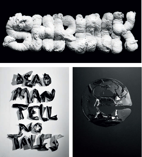
Freshfonts
Autobahn
Freshfonts sprang from an invitation to do a Pecha Kucha presentation (where 20 slides are presented for 20 seconds each). Autobahn decided to launch a new project specifically for this talk. Inspired by the limited amount of time available, the team started by writing with tools not usually used for writing. The original idea was to generate a less legible font using gravity. Toothpaste, tomato ketchup and hair gel turned out to be the best resources. These materials determined the shapes, and with that the character, of the final letters. Because of its neutral appearance, Helvetica was used as a blueprint. The fonts Gelvetica, Heldentica and Tomatica were the result.

Verkenners
Autobahn
Autobahn created a book for their client Verkenners, who focus on collaborations between artists and area developers. The image concept for their publication was inspired by Levi of Veluw’s photo series Landscapes. In consultation with Levi, Autobahn used this image to create a typographic visual. Photos: Marieke Wijntjes.

Tapewriter
Autobahn
Tapewriter was one of Autobahn’s first type experiments: a font based on the grid of a football cage and the width of a roll of duct tape. The idea behind the font is that anyone in possession of a roll of tape can submit his or her message to the world. Tapewriter was developed during a seminar at Utrecht School of the Arts (HKU) with Richard van de Laken and Eric Wie, and was later developed into a type specimen.

Utrecht Uitfeest Leidsche Rijn
Autobahn
Autobahn created the award-winning concept and graphic design for the typographic routing (huge wayfinding sculptures) of the first Utrecht Uitfeest Leidsche Rijn. This was a series of cultural acts and music performances, based around 25 works of art, organized by the City of Utrecht and Beyond, the permanent art program of Leidsche Rijn in the Netherlands. The location of the event was relatively new and unexplored, so a particularly clear and visible signage was required. Autobahn developed architectural typographic objects, laser-cut out of sustainable polystyrene. The immediate impact of the big white numbers in the landscape ensured that visitors found their way. Autobahn also designed the identity and several products for the event, including the programme, flyers, posters and banners and maps.
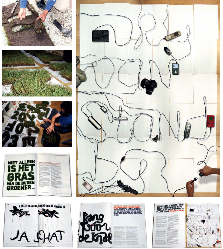
NRC Next magazine
Autobahn
Autobahn was asked by NRC Next magazine to illustrate a series of articles typographically. This assignment resulted in vector illustrations and photographic solutions, and ultimately a silver European Design Award in the Book & Editorial Illustration category in 2009. ‘Het gras van de buren...’ (‘The Neighbour’s Grass...’) was an article about envy and how begrudging other people’s happiness will eventually cause our own downfall. The article ‘Vrij van stand-by’ (‘Free of Standby’) was about saving energy by pressing the ‘off’ button. ‘Ja, schat...’ (‘Yes, dear...’) gives an insight into manipulation in relationships. ‘Bang voor de knal’ (‘Afraid of the Bang’) was an article about a woman who was too scared to drive after a car accident with a child.

Venetian
Andrew Byrom
Liverpool-born, Los Angeles-based graphic designer, teacher and 3D type specialist Andrew Byrom created Venetian in 2008 – a stencil typeface design commissioned by Elle Decoration magazine (UK). It was inspired by the forms created when opening and closing a venetian blind.

St. Louis/ASIFA
Andrew Byrom
Shown here are polished plastic trophies that were commissioned by ASIFA-Hollywood – a society of animators working to preserve and celebrate historical and contemporary animation. The trophies are for their animation competition winners. The logo and typeface were designed to work for print, digital animation and for the trophies. The logo and trophies use Andrew’s stencil typeface St. Louis, from 2008.

TSS2
Andrew Byrom
TSS2 from 2008 is a proposal for a lowcost temporary signage system. It is fabricated from corrugated plastic with peel-off segments to reveal a white background that enables every letter (upper- and lowercase) and number to be constructed. The design, which is lightweight and flat-packed, is intended for indoor or outdoor use in shops, cafés, conferences and gallery openings.

St. Julian
Andrew Byrom
St. Julian, from 2010, is a 2D/3D stencil design influenced by historical German black-letter designs. The 3D signage, fabricated in 1⁄8-inch steel, comes in and out of view as it is passed. The 2D version was created for a poster announcing an exhibition of the typographic works of Andrew Byrom, Ed Fella and Sunook Park at the ANDLAB Gallery, Los Angeles, in 2009.

Type-Step
Andrew Byrom
Type-Step from 2008 is a design for typographic concrete stepping-stones.

Fresh
Andrew Byrom
Andrew designed his first typeface while studying at the University of East London in 1994. This simple design was called Fresh and, like most of his work since, it was based on a three-dimensional object: in this case, a bendy straw.

Bloodclot
Andrew Byrom
The original Bloodclot design from 1996 was a digital typeface that was inspired by the shapes found in sticking plasters. Andrew took the forms found in these everyday objects as a starting point and developed them into a full character set (uppercase, lowercase, numbers and so on). The Bloodclot design was revisited in 2008 and a physical handmade version was produced by placing plasters (collected from different brands) directly onto the page to create 26 letters/low-relief objects.

Interiors Light
Andrew Byrom
The initial concept for Interiors Light was inspired by Marcel Breuer’s Wassily Chair. It was simply intended to be a rounded chrome tubular steel version of the original Interiors design (shown above). As the project developed in 2005, Byrom began to realize that by thinking on a smaller scale each letter could be constructed in neon. The limitations of working in neon were tough on the original concept. He reworked the design several times and began to embrace the constraints of this beautiful and delicate material.
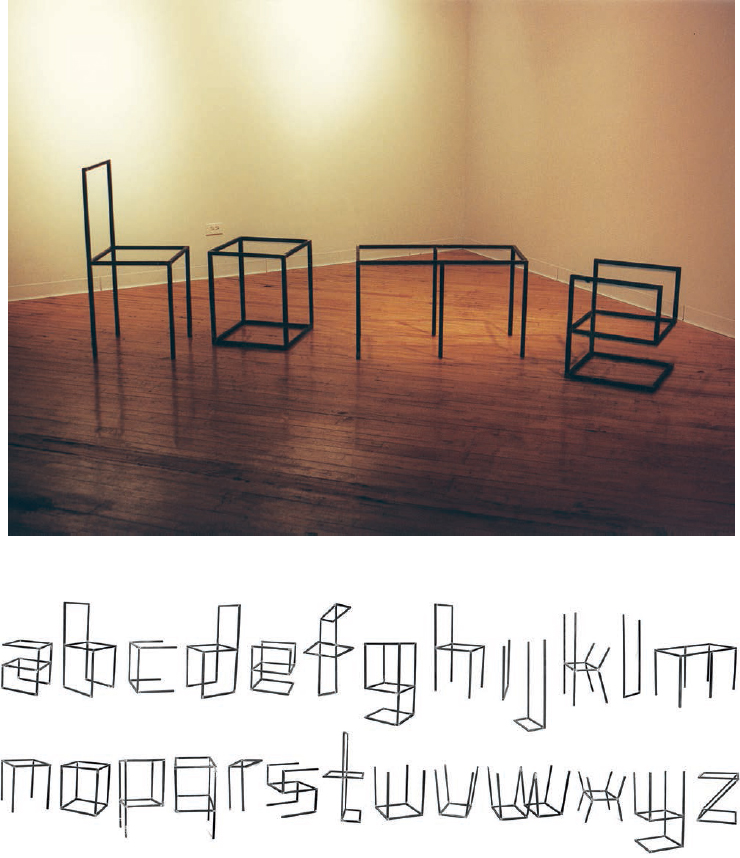
Interiors
Andrew Byrom
Interiors was originally conceived as a digital font in 2003. It was inspired by an old wooden chair in the corner of Byrom’s London office, which, when looked at from a certain angle, resembled the letter h. Using the three-dimensional principles of this simple form, and closely adhering to type design conventions, 26 letters of the alphabet were drawn and generated as a font. They were later constructed in three dimensions using tubular steel into full-scale furniture frames. Because the underlying design concept is typographical, the end result becomes almost freestyle furniture design. Letters like m, n, o, b and h can be viewed as simple tables and chairs, but other letters, like e, g, a, s, t, v, x and z, become beautiful abstract pieces of furniture.