B

Alphabets
Bela Borsodi
Austrian photographer Bela Borsodi is based in New York. He shot this series, entitled Alphabets, in 2009 for French WAD magazine #39. Every artist was given a letter to work with, and Bela’s letter was ‘A’. Bela decided to take this theme quite literally and to spell out the word ‘Alphabets’ in his apartment using clothes and random objects. He also appears with his girlfriend in some of the pictures. The stylist working with him on this project was Akari Endo-Gaut. This photographic series allowed him to revise and refine an idea that he had worked on with Stefan Sagmeister in 2003 that also involved typography – readable only from one ‘correct’ position (see page 197).

5th Typophile Film Festival
Brent Barson
Creative director Brent Barson is assistant professor in Brigham Young University’s graphic design department in Provo, Utah, USA. He has created the opening titles for a variety of independent films, including all the motion graphics for the Typophile Film Festival. For the fifth festival, Brent and his students were commissioned to create opening titles that properly introduced and branded the festival – open to anything relevant to typography, motion graphics, design history or type design. A few of the final stills are shown above; results of a visual typographic feast about the five senses, and how they contribute to and enhance our creativity. Everything in the film is real; no computer-generated effects were used. The challenges that were faced by those involved in creating the 2009 titles included learning the ins and outs of laser-cutting and dealing with the structural characteristics of Jello and squash … both are very fragile.

Cress Paper
Bola Cooper
UK-based graphic designer and illustrator Bola Cooper created the Cress Paper project based on the idea that she could recycle the free newspapers that are handed out around London to passers-by. She decided to turn the paper waste into handmade paper that could then be used to grow cress. Bola produced a book featuring (besides other things) how many sheets of paper she could make from each newspaper. She also made a typeface from the cress seeds that she grew on the paper. Bola used the cress she harvested to form the alphabet and numbers, and then screenprinted the typeface onto board cards with colours that resemble the various colours seen on a cress shoot.
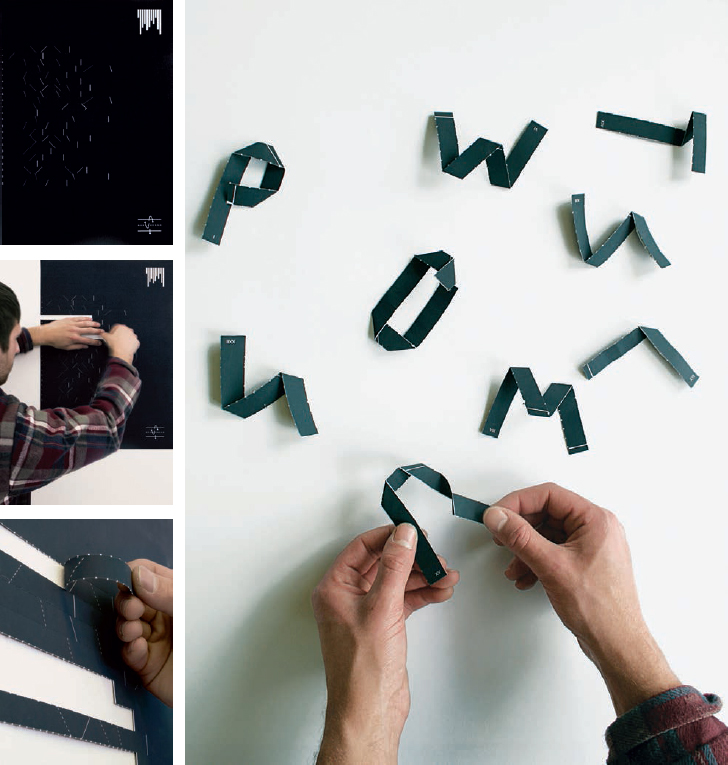
Instruction/Construction
Bradley–McQuade collaboration
Thom Bradley and Jamie McQuade were in their final year studying graphic design at Kingston University in the UK when they submitted their work to this book. The team had already collaborated several times before, including their work on the Instruction/Construction brief, which asked them to ‘create and implement a form of typographic code/coding system in the form of a poster’. The poster starts life whole, in one piece, with a series of horizontal facing lines, either solid or hatched. Following the poster’s instructions, one can then create folded letters.
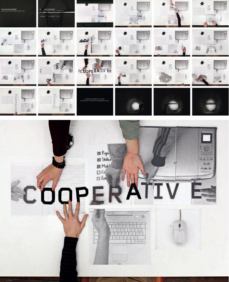
The White Desk
Benoit Lemoine and Cécile Boche
Benoit Lemoine and Cécile Boche created this very cleverly executed stop-frame animation through a sequence of interactions between two scenes playing on two levels. On one hand, there are the printed objects and, on the other, the character sitting at the desk.
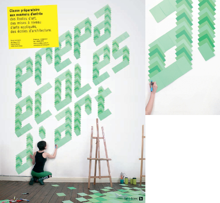
Prépa écoles d’art
Benoit Lemoine
French graphic designer Benoit Lemoine studied in Belgium before moving to Rotterdam in the Netherlands. He created Prépa écoles d’art for the Beaux-Arts de Saint-Brieuc in France. This visual was used for a poster and flyer announcing the foundation class of the entrance exams to the applied art and architecture schools. The type was created with superimposed coloured paper sheets.
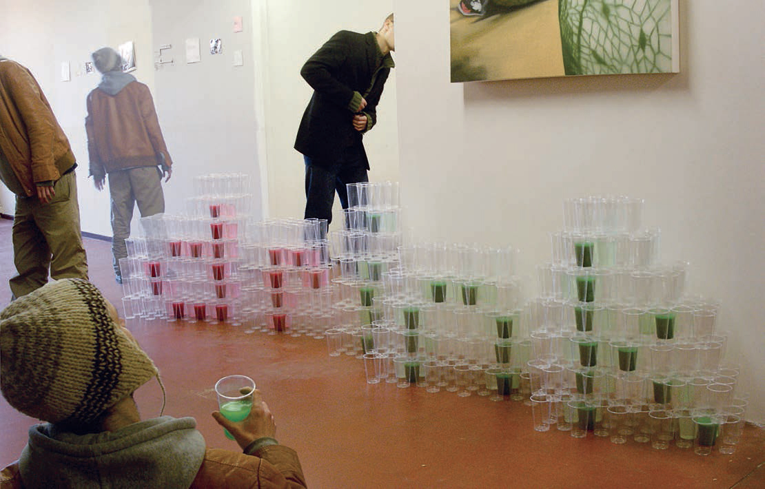
Drink
Benoit Lemoine
In 2007, Benoit Lemoine designed the Drink installation for a contemporary art space. The three-dimensional letters were contained in a pyramid of plastic cups.
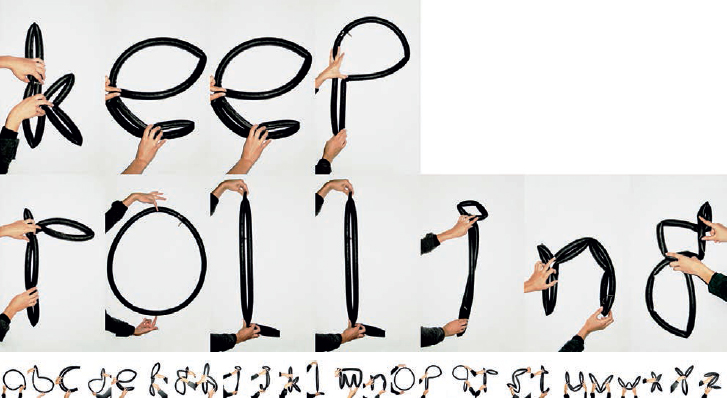
Pneuma
BANK
Berlin-based design studio BANK was founded by French/German duo Laure Boer and Sebastian Bissinger. They created the Pneuma typeface in 2007, while the Keep Rolling lettering was used for a 2008 New Year’s card.

Soap magazine
BANK
The logo and proposed masthead for Soap magazine was designed in 2007. The sample cover (detail, top of cover) shows BANK’s foam logo in action. All headlines throughout the magazine were also supposed to be set in this foam type, superimposed on the layout and visuals.
