
8
DASHBOARDS AND KEY PERFORMANCE INDICATORS
CHAPTER INTRODUCTION
The use of performance measures and dashboards has exploded over the past 20 years. The effective use of key performance indicators (KPIs) and dashboards is illustrated throughout this book. This chapter will deal with some specific techniques in selecting and developing measures and dashboards.
OBJECTIVES OF DASHBOARDS AND KEY PERFORMANCE INDICATORS
Organizations that effectively use performance measures and dashboards spend a great deal of time thoughtfully selecting appropriate measures and developing dashboards that are relevant to the organization's objectives and challenges.
Too often, organizations adopt measures or start using so‐called canned dashboards without properly vetting what should be measured. Before jumping into key performance indicators (KPIs) and dashboards, it is very important to develop a context and framework, as explained in the preceding chapter, an introduction to business performance management (BPM).
As a potentially very useful part of BPM, we must start by focusing on the objective of BPM. We want to provide executives and managers with the information they need to run the business. The cockpit of an aircraft provides us with a very useful visual to guide us in the selection of measures and the development of dashboards. I reflect on this image frequently during any BPM project (Figure 8.1).

FIGURE 8.1 Space Shuttle Cockpit Instrument Panel
Photo used with permission of NASA.
The instrument panel is essential in aviation. There are a number of important performance management principles that are illustrated by the cockpit.
Real‐Time and Predictive Insights
The pilot and crew of this aircraft are not asked to blindly fly the mission and then be handed a series of narratives and reports after the flight to tell them how it went. The crew is able to monitor the performance of the aircraft in real time.
The instrument panel provides real‐time insight into the performance of every major system on the aircraft, from engine performance to fuel levels and consumption, hydraulics, and landing systems. The cockpit has a number of alerts (flashing lights or sound alarms) to call the pilot's attention to potential problems or threats.
High Visual Impact
This pilot does not have to interpret long‐winded narratives or Excel spreadsheets to see how things are going. With a quick scan of the instrument panel the pilot can see how every major system is performing and what's happening in the external environment. The pilot is not flying blind, only to then be presented with a 50‐page report of Excel spreadsheets after the plane has landed.
Initially this instrument panel is complex, but you can be assured that the commander knows where every dial and reading should be. This illustrates an important concept in BPM, now generally described as “data visualization.” Transforming important data into visual presentations that allow the user to quickly identify trends, scale, direction, and variances has great utility. The use of graphics and dashboards has greatly increased the effectiveness of reviewing business results.
Focus on the Important Measures
The instruments are measuring what's important and relevant to the mission. The pilot has confidence that a lot of thought, 100 years of aviation experience, and substantial tax dollars went into selecting the measures that are vital to a successful mission.
Providing Insight into External Factors and Environment
The instrument panel also provides insight about the aircraft's position and relationship with the external environment. There is external radar for potential threats, a navigation system, wind speed, altitude, and attitude. The pilot can identify storms and alter course. In many planes the pilot will be alerted that an adversary has the aircraft in its sights or on missile lock!
Combining with Observation, Experience, and Intuition
Finally, the pilot doesn't rely on the panel exclusively, but rather combines it with observation, intuition, and experience to complete the mission.
One of the biggest mistakes we make is to presume that performance measures, dashboards, and other aspects of BPM eliminate or replace the need for executive judgment, decisions, and even intuition. Instead, these measures should be utilized to better inform decisions and, where appropriate, to challenge intuition to ensure that the best possible decision is made by the executive.
SELECTING APPROPRIATE PERFORMANCE MEASURES AND KEY PERFORMANCE INDICATORS
A Nonbusiness Illustration
Let's assume that we have a goal to improve our health and fitness. We then decide that we want to measure our current state and future improvements by tracking our weight, cholesterol levels, and resting heart rate. We can measure our weight by jumping on the scale every hour, but we will not make progress until we identify and manage the key drivers, primarily food intake and our level of activity. The measures we have identified are really “results” or “outcomes” of our lifestyle (diet and exercise). To achieve different results or outcomes, we must identify, manage, and measure food intake and activity.
Fitness and nutrition journals have been used successfully by athletic trainers, weight‐loss programs, and nutritionists. They also underscore an important principle of BPM: that is, what gets measured gets attention.
| Activity Measures | Result/Outcome Measures |
| Food Intake (Calories, Fat, Carbs) | Weight |
| Activity Levels | Cholesterol |
| Number of Steps | Resting Heart Rate |
| Minutes of Cardio Exercise | Blood Sugar Levels |
| Strength Sessions/Week | |
| Alcoholic Drinks/Day |
By recognizing the likely cause‐and‐effect relationships among these measures, we can begin to track the results that our lifestyle changes have on the health indicators (weight, etc.). By capturing the activity levels and displaying the measures on a dashboard with outcomes, we create a visual that typically tells a compelling story. Figure 8.2 is an illustrated dashboard for health and fitness. By tracking the measures, we create a discipline that makes us more likely to achieve our targets for increased activity and reduced food intake. By building a dashboard, we provide the linkage required to connect the dots and reinforce the cause‐and‐effect relationship.

FIGURE 8.2 Personal Health and Fitness Dashboard 
Developing Appropriate Measures
After documenting the key strategic issues and initiatives, assessing performance, and setting improvement goals in the context of valuation creation described in Chapter 7, we can begin to select the measures that will be important for monitoring performance and progress across the company. What measures will track our progress in achieving strategic objectives and goals for value creation? What are the critical elements of our business that I want to see on a daily, weekly, monthly, or quarterly basis? What measures will serve as leading indicators to alert us to potential problems in time to make meaningful adjustments? Guidelines for selecting and developing performance measures include the following:
- Relevancy. While it sounds obvious, many organizations track measures that are not relevant to important goals, objectives, or performance and value drivers.
- Objectivity. To the extent possible, performance measures should be quantifiable and objective. Qualitative assessments are necessary in certain cases. However, care must be taken to promote objectivity and to complement qualitative assessments with quantitative measures.
- Timeliness. Performance measures and dashboards must be available on a timely basis. This requires that systems and databases be maintained and updated on a current basis. This is generally not a problem for the primary business systems, but can be a problem in areas such as entering or updating sales leads or warranty experience or where outdated or poorly integrated systems inhibit real‐time access.
- Balance. Performance measures should be balanced to reduce the risk of optimizing performance in one area at the expense of the long‐term health and value of the organization. Said differently, the establishment of a seemingly benevolent measure may have unintended (and negative) consequences. For example, if inventory turns is selected as a key performance measure without a balancing measure such as on‐time deliveries, it may result in reductions in inventory at the expense of customer satisfaction. By balancing the two measures, the company will promote the development of healthy process improvements that lead to improvement in both measures.
- Emphasis on Leading Indicators of Performance. The systematic approach outlined in this chapter will provide confidence that the performance measures will be predictive of future operating and financial performance. More attention should be paid to measuring and improving the leading indicators of performance. For example, if a company sets a target of improving DSO from 75 to 55 days, it must develop targets and measure performance on leading indicators such as revenue linearity, quality, and collections.
- Measurement Definitions. Specific definitions must be developed and documented for each measure. For example, what is the definition of on‐time delivery to customers? Is it the date that the company committed to delivery or the date the customer originally requested? In one extreme case, we discovered that the date used to measure on‐time delivery was changed to the most recent internal schedule update. Since this measure is an important part of customer satisfaction, we want to view this measure through the eyes of the customer, generally the availability when the customer placed the ordered or received order confirmation. Definition of performance measures is important and must be consistent with the objective of the measure. These definitions should be documented and approved by management.
- Data Integrity. Implementing BPM without having the ability to generate performance measures and dashboards that present accurate data may be worse than not having a BPM at all. It is fairly typical for a company to encounter problems with data accuracy as it begins to use performance measures. In fact, this is a side benefit of the process: improving the accuracy of reported data. Each measure should be defined and approved by the appropriate managers. Data gathering and processing can be improved over time. It is a good idea to have performance measures reviewed by internal audit teams or the controller's staff to ensure the integrity of the measurement system.
- Unintended Consequences. As we focus on certain measures of performance with the best of intentions, we must be alert to the potential of unintended consequences. This potential should be considered before adopting any specific measure and the broad set of collective measures selected to be used.
- Less Is More. Since the team will focus on the performance measures we select, it is important to limit the number of measures utilized. We should emphasize key priorities, drivers, programs, improvement opportunities, and other important stuff. If we measure too much, the message is diluted and the team is overwhelmed. Generally, six to eight measures represent a reasonable number on which to focus attention for a team, department, or individual. Additional metrics may be used that are subordinate to these primary measures.
Several years ago, I met with an enthusiastic finance team that had begun the performance management journey. They had adopted a great practice of posting KPIs in the work area of the responsible team. The trouble was that I counted more than 40 measures for a team with a relatively straightforward mission and simple operating model. Most of the measures were not understood and were not associated with any specific projects or key business drivers. This organization lost an opportunity to select and emphasize a few very important measures, and likely confused the members of the team.
The selection of measures and building performance dashboards can be improved by using a performance measurement worksheet, illustrated in Figure 8.3. This worksheet forces us to define, identify the objective, address the critical success factors (CSFs), anticipate unintended consequences, and place the measure in context.

FIGURE 8.3 Performance Measure Worksheet
CREATING PERFORMANCE DASHBOARDS
Having developed the objectives and a context for performance management as described in Chapter 7, we then set off to build a reporting mechanism to provide insight into these critical activities. It is essential to provide managers and all employees with critical information about the health of the business and the effectiveness of the activities in which they participate. And if performance improvement is to be successful, information must be provided consistently and in a timely manner relative to the activity.
Managers have two key decisions to address in implementing dashboards across the organization. The first decision is to determine what dashboards should be developed. Beyond the corporate‐level dashboard, it will also be appropriate to have dashboards for various processes, divisions, functions, and departments. Many managers and employees also develop their own personal dashboards.
The second important consideration for developing any dashboard is to consider the optimum frequency for measuring performance and refreshing the dashboard contents. Some process and activity measures need to be monitored daily or continuously. Examples may include product yields from production processing in refinery or fabricating operations, order levels, or weather conditions. Other measures such as return on invested capital (ROIC) are typically measured at quarterly and annual intervals. Selecting the appropriate frequency for each measure is nearly as important as selecting the right measures.
Some organizations prefer the term scorecards over dashboards. While to some extent this is just a matter of semantics, words do matter. I prefer the concept of a dashboard or instrument panel because the inference is that we are visually monitoring a system in real time and have the ability to control at least some functionality within that system. A scorecard is often a document that records the results or outcome, as in recording the strokes on a hole of golf or runs scored in an inning of baseball.
Corporate or Division Summary. The corporate dashboard is the most critical dashboard (see Figure 8.4). Selecting the most important 8 to 12 measures that capture the key performance variables for the company is both important and difficult. Managers must ensure that all key value drivers are represented. All other dashboards should be developed to support the corporate‐level summary.

FIGURE 8.4 Quarterly Corporate Dashboard
Note that at first the dashboards can be visually overwhelming. However, after a few cycles, managers become familiar with where each dial and needle should be on the dashboard. Having a complete and highly visual dashboard covering the business provides great insight across all key value drivers and affords managers the opportunity to assess performance and progress on key strategic objectives.
The quarterly corporate dashboard contains key measures across all value drivers. This summary‐level dashboard would be supported by a series of dashboards with additional and more detailed measures that focus on key processes and activities. This graphic affords managers the opportunity to examine performance and understand the interrelationships of key factors, for example the relationship between forecast accuracy and operating capital.
While combining key measures in a single dashboard, some executives prefer and certain circumstances warrant breaking down the dashboard into individual views.
Daily and Weekly Dashboards. Many activities and events should be monitored more frequently than monthly or quarterly. In fact, a key part of achieving quarterly goals is to track progress on a weekly basis (see Figure 8.5). This not only tracks progress toward the goal but, in doing so, also allows the managers to take additional actions if measured progress indicates that they are not on track to attain the performance target for the quarter.

FIGURE 8.5 Example of Weekly Dashboard
Function or Department Dashboard. Dashboards should be developed for functional areas and departments such as information technology, finance, and human resources. These dashboards must support the corporate objectives and be consistent with the dashboards established for processes that the function leads or serves.
Process Dashboard. Since business and financial performance is largely the result of critical business processes, these are the most critical supporting dashboards (see Figure 8.6). Examples of key business processes include:
- Revenue process
- Supply chain management
- New product development
- Mergers and acquisitions
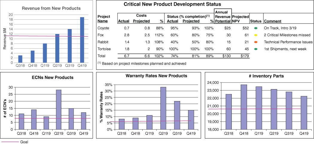
FIGURE 8.6 New Product Development Dashboard
Dashboards for other processes are presented in Part Four, Planning and Analysis for Critical Business and Value Drivers.
Project Dashboards. A very useful application for dashboards is to set goals and track performance on key projects.
Performance Improvement Dashboards. Dashboards are terrific ways to evaluate and diagnose performance issues and to track progress on performance improvement initiatives, for example improving the management of receivables in Figure 8.7.
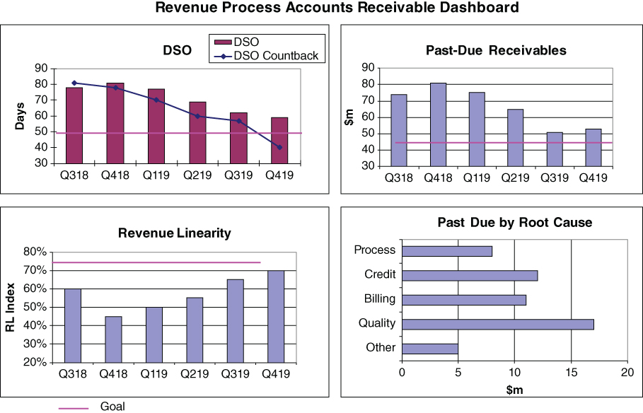
FIGURE 8.7 Revenue Process/Receivables Improvement Dashboard
Individual Manager Dashboards. In some cases, an individual's dashboard may correspond to a process, functional, or corporate dashboard. For example, the CEO can look at the corporate dashboard as his or her personal dashboard. Similarly, a vice president of R&D may choose the new product development dashboard. Other individuals may develop dashboards that include performance measures that cover critical activities and objectives within their respective responsibilities. Care must be exercised to ensure that these individual dashboards are consistent with the objectives and measures of the company and to the function or process to which the individual contributes.
Exception‐Based Reporting (EBR) and Alerts. A very effective tool that is gaining wide acceptance is a notification or alert to an analyst or manager when a transaction, trend change, or event occurs. As the result, the manager does not have to constantly monitor a process or activity, but will be alerted to some activity warranting attention. EBR leverages analysts' and managers' time by eliminating the need to review every transaction or event and allowing them to focus only on those that have certain characteristics or are outside of predetermined boundaries.
Examples include:
- Accounts past due
- Sales transactions with excessive discount or low margin
- Retail transactions that may be fraudulent
SAMPLE DASHBOARDS FOR SELECTED INDUSTRIES
It can be insightful to think about key performance indicators and dashboards for businesses other than our own. What are the key value drivers and performance measures? The sample dashboards in Figures 8.8 to 8.10 included at the end of this chapter are focused on revenue, which is critical to any business. Note how these dashboards focus on leading indicators of performance, including critical assumptions and variables affecting revenue levels. These variables will always include external factors. For example, weather impacts each of these businesses and would be reflected on the revenue dashboard. Lower temperatures and greater snowfall would have a negative impact on many businesses, but not for a ski resort or a retailer selling snow throwers or winter apparel.

FIGURE 8.8 Dashboard for Specialty Retail: Lawn and Garden


FIGURE 8.10 Dashboard for Medical Center
SUMMARY
Key performance measures and dashboards are two very useful tools in developing effective BPM. However, the selection of measures and the development of dashboards are extremely important since they implicitly state priorities and key areas of emphasis for the organization. People and organizations respond to the use of measures. The mere fact that performance is being tracked often leads to improvements in productivity. This is even more dramatic if compensation plans are tied to the measures. As a result, care must be exercised to select appropriate measures. Establishing measures that are not well vetted may lead to behavior changes that have unintended consequences. In addition, it is critically important to achieve a balance in the measures. For example, measuring inventory turns could lead to the unintended consequence of impacting customer deliveries if not balanced with appropriate measures of on‐time deliveries and customer satisfaction. The selection of performance measures should be done in the context of building a comprehensive BPM.