
Visualforce pages can be used in two different ways in the standard organization:
- Buttons and links:
- A Visualforce page can be called using a custom link to the Visualforce unique URL (
Salesforce_server_url.salesforce.com/apex/VisualforcePage) - A Visualforce page can be used by overriding the standard button
- Creating custom buttons to open the Visualforce page
- Creating a JavaScript button to open the Visualforce page
- A Visualforce page can be called using the custom help link for the custom object
- A Visualforce page can be called using a custom link to the Visualforce unique URL (
- Page layouts:
Visualforce has a common tag library, which provides rich content and components to embed Salesforce data and logic seamlessly in a page. The tags are similar to HTML and are easy to use. The layout HTML tags such as <SPAN>, <DIV>, and <TABLE> can also be used on a Visualforce page, however, it is advisable to use the Visualforce counterpart for the same for better usage and smoother operations.
Visualforce tags must be well-formed. Every opening tag should have a matching closing tag. Nested tags should be closed in the reserved order as they are opened. For example:
<apex:page>
   <apex:pageBlock>
   <apex:pageBlock>
</apex:page>
All Visualforce tags have the apex: prefix. <apex:Page> is the topmost parent tag in a Visualforce page. The following screenshot shows a basic Visualforce page:

Visualforce tags are basic components to create view of the application. They interact with the model and the controller using bindings.
There are two types of bindings for Visualforce tags:
- Data bindings:
- Dynamic object data can be inserted into the Visualforce page using the following syntax:
{!ObjectApiName.FieldApiName}For example.,
{!Media__c.name} - Global data such as login user, company information, and so on can be bound to the page using the
$syntax - Custom labels can be accessed using
$Labelsyntax, such as{!$Label.LabelName} - For example, the
{!$User.firstName}gives the first name of login user first name
- Dynamic object data can be inserted into the Visualforce page using the following syntax:
- Action bindings:
- To trigger events, such as entering into a text box or pressing a button, we bind the action to the component
- The methods can be standard methods provided by Force.com such as save, delete, or they can be custom methods written in Apex controllers
As we have seen before Visualforce provides us with standard components to simplify the task of creating visual elements. These components come with some inbuilt functionality such as validation check or AJAX rendering. Using these components reduces the efforts of developing the code for them. In this section we will be going with the basic components used in Visualforce. The Component Reference is the best place to explore different components and their use.
As shown in the following screenshot, the Component Reference is located in the top right hand corner of the Visualforce page editor:

Layout components are used to create the page layouts and the structure of the page. They are responsible for the styling, the layout, and the visual elements of the page.
<apex:page>:Itis the basic component of any Visualforce page. It is the markup at the beginning of the page and also the ending markup of the page. All other tags are enclosed within the<apex:page>markup. The following are the most important attributes of the tag:StandardControllerorControllerorExtensions: If we are using the standard object controller we add the object name to thestandardController. We can also add custom functionality tostandardControllerusingextensions.- For using the custom controller, we use the
Controllerattribute. Title: Title of the page after it is rendered. The title renders to the title HTML mark-up.TabStyle: We can choose the style-sheet of the tabs already in Salesforce.Tip
If we use the
standardControllerit automatically inherits the tab coloring of the object, so there is no need to add thetabStyle.tabStyleis needed when we are using a custom controller to add a complex functionality to the standard object to give the end-users a similar look and feel of the application.Action:Actionattribute refers to the action method to be invoked on certain event. On page the action method is invoked during thepageLoadevent.Sidebar: A Boolean value that indicates whether to show/hide the Force.com sidebar on the page.ShowHeader: A Boolean value that indicates whether show/hide the header and the tabs of Force.com.RenderAs:RenderAsgives us the option to generate a PDF from the Visualforce page.
<apex:pageBlock>: Other related components are used to mimic the Salesforce default stylesheet. When nested within each other correctly they create the exact Salesforce look and feel for the page. The following figure illustrates the use ofpageBlockcomponents to generate the Salesforce look and feel.
<apex:pageBlock>component has a few nested components as follows:<apex:pageBlockButtons>: Used to add buttons on the page. This markup creates a button on the top and the bottom of the section just like Salesforce. Alternatively, we can specify the position of the buttons using the position attribute.<apex:PageBlockSection>: A section is used to group number of fields together for ease of operation.<apex:InputField>: When we include a input field inside thepageBlockSection, Visualforce automatically renders it along with its label. Any property associated with the field, such as a required field, date picker is also rendered automatically.<apex:PageBlockSectionItem>: PageBlockSectionItemhelps in aligning a custom field with its label. When we use any other input field like<apex:inputCheckBox>or<apex:inputText>the fields are not automatically formatted according to the layout. In that case we wrap them around with the<apex:pageBlockSectionitem>. The tag can have only two nested tags inside it, one for the label and another for the input field. This helps us in mapping it to the standard UI of Salesforce.
We discussed the basic layout components that help us style the page according to Salesforce stylesheet; apart from these Force.com provides some other components to set the layout. Let's quickly look at some of these components.
<apex:toolbar>: It helps in creating a toolbar with a clickable item. The toolbar can be given a custom look and feel using custom CSS.<apex:tabPanel>: It is used to create a custom tab panel with different content. The tabs created using this component are different than the Salesforce tabs, but work just like them. Tabs are created using<apex:tab>.
To easily create Salesforce pages, Force.com provides us some standard components that mimic the Salesforce standard page. These components are very easy to use. However, they offer much less flexibility in terms of customization.
<apex:detail>: This component creates the detail page layout for the object. Therecord IDshould be provided in theSubjectattribute. Optionally, we can choose ifrelatedListandrelatedListHovershould be added to the page layout using the respective Boolean values.<apex:relatedList>: This component is helpful in creating therelated listrecord for the parent record. Alternatively, we can specify which child relationship to be displayed using thelistattribute. Just likeapex:detailwe have to specify therecord IDusing thesubjectattribute. We can specify the number of records to display using thepageSizeattribute.
Output components are used to display some output text or data from the object. All the output components are uneditable, they can be nested inside the dataTable mentioned above.
<apex:outputField>: It is a component that displays the record field in the label-value format. If the page is composed using the Salesforce stylesheet, it automatically adds the field label and the value to the data displayed.<apex:outputLabel>If the data displayed is not from Salesforce records, we use output label to label the record.<apex:outputLink>: It creates an anchor HTML tag and can be used to link other pages or URL.<apex:outputText>: It is used to display a static or dynamic series of text.
The <apex:inputField> is directly bound with the Salesforce object properties. The field name is specified in the value attribute and the respective UI are automatically rendered on page, for example, date picker for date field, red marker for required fields as shown in the following screenshot:

Alternatively, we can use the required attribute to make it mandatory to fill the field.
To display the field label along with the input box, we have to nest it inside the <apex:pageBlockSection> markup.
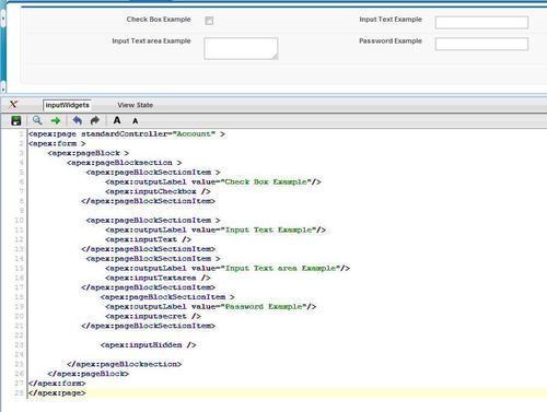
Apart from the input field Force.com also provides us with some other input components that can be used for collecting multiple uses. The following screenshot shows some of the components in action:
Some basic input components are as follows:
<apex:inputCheckBox>: It is a checkbox that is used to collect Boolean input.<apex:inputHidden>: It renders into a hidden field, useful in storing variables for passing between pages.<apex:inputText>: It acts like a simple text box with no formatting at all.<apex:inputTextArea>: It is a larger text box used to store information. Alternatively, we can useRichText=trueto use a basic formatted input.<apex:inputFile>: It is a markup used to create a basic file upload functionality. Files can be uploaded as attachment on records or in documents.<apex:inputSecret>: It is a component useful in creating password fields on the Visualforce page.<apex:CommandButton>and<apex:CommandLink>are used to create buttons and links respectively that perform some server side action. The action is specified using the attribute action and may refer to standard actions such as,{!save}, {!delete}, and{!edit}or some custom Apex Method written in the supporting controller.
Visualforce is directly compatible with JavaScript. We can use external third-party codes and script like YUI or jQuery directly into a Visualforce page. Visualforce provides us with standard AJAX-based components. We can render a small section of the page instead of rendering the entire page, thus creating a rich UI experience. We will be discussing a few AJAX components below.
In AJAX format, instead of sending the complete page to the server, a partial page is sent and the response is modified on the page immediately without refreshing it. The following screenshot shows the AJAX in use while filling a simple e-mail form:

Visualforce provides us with easy to use AJAX components to achieve this. The following is a basic overview of the AJAX-based components in Visualforce:
<apex:actionRegion>area is marked for AJAX processing. Without usingactionRegionthe entire page is send for processing, but withactionRegiononly the page inside the block is refreshed.<apex:ActionFunction>: It is used to invoke the Apex classes from JavaScript.<apex:actionSupport>: As the name suggests,actionSupportadds an AJAX service to other components allowing them to partially request.<apex:actionPoller>: It can poll the AJAX request to occur after a particular countdown.<apex:actionStatus>: It displays the status of an AJAX update.
This is just an overview of the components in a Visualforce page, for more detailed explanation and sample code, please visit the Component Reference Library.
We can add inline Visualforce directly inside a page layout to add rich features to the page. The inline Visualforce page has to be a standard controller page or a controller extension. The following screenshot shows the Google Map visualization of account address using an Inline Visualforce page :

The Inline Visualforce page can only be added on the detail page of the layout and not on the edit page, so if there are any editing fields to be added they get added on the detail page.
The Inline Visualforce page has a separate space for buttons; hence the buttons do not show along with the normal Salesforce buttons, but separately. To add an Inline Visualforce page simply drag the desired page on the page layout as shown in the following screenshot:

As the Visualforce page gets added in the middle of the page layout it is advisable to remove the headers and the sidebars for the new Visualforce page.
Static resources allow you to upload content that you can reference in a Visualforce page, including archives (such as .zip and .jar files), images, stylesheets, JavaScript, and other files.
We can package a collection of related files into a directory hierarchy and upload that hierarchy as a .zip or .jar archive. We can reference a static resource by name in page markup by using the $Resource global variable instead of hard-coding document IDs.
We can store CSS, JavaScript, and other supporting files in static resource. To create a new Static Resource navigate to Setup | Develop | Static Resource | New.
