
In the previous chapter we saw the object database behind Force.com. A robust system is one that separates the view from the model. In the model, we have now created objects and created relationships between the objects. The objects that we created in the last chapter need an equally rich UI for users to fill data. They need placeholders and visual indicators to collect this data and the information.
As with the tradition of Force.com, most of the things are point-and-click. Similarly, in this chapter we will be using point-and-click controls to create some important page layouts and UI designs.
By the end of this chapter, you will be able to:
- Build an application
- Create tabs
- Create forms
- Create page layouts
- Understand the importance of a Visualforce page
- Create a basic Visualforce page
The Salesforce Developer Certification requires us to have an overview of Apex and Visualforce; hence we will be covering only the basics of the Visualforce in this chapter and the basics of Apex in the next.
So let's start creating some amazing user interfaces...
An application or an app is a collection of tabs and objects used together to form a business process. Different tabs and objects are grouped together to form a single business unit for user convenience.
The following screenshot indicates the standard application provided by Salesforce.com by default:

Salesforce provides standard applications such as Sales, Call Center, Marketing, Community, and Force.com.
We can customize an application by giving it a custom logo, a custom name, a custom description, and a custom landing page. We can give the instructions to use the objects on the custom landing page.
All custom applications display the standard Salesforce logo. The logo can be replaced with a custom logo.
The custom logo can be any GIF and JPG file from the Documents tab.
We add the tabs that should be included in the application, for example, in the application of library management we include tabs, media, customer and so on.
The default landing tab can be selected here on the screen. The last step of the application creation wizard is assigning the profiles to the application; we will discuss this later.
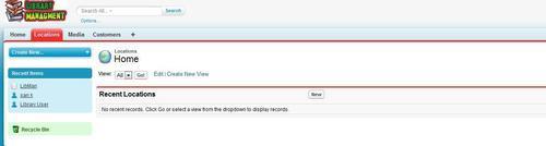
Let's continue building the Library Management System. Build an application for the Library Management System. Design a simple custom logo for the same.
To build your own application perform the following steps:
- Go to User Name | App Setup | Create | Apps.
- Click on the New button to start the wizard.
- In the first page of wizard give a proper name to the application as shown in the next screenshot and click on Next.

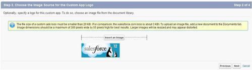
- Select the appropriate logo for the application, the Salesforce latest addition logo will be available by default as shown in the next screenshot and click on Next.
- On the next page, it will ask for the tabs to included in this application. We will be looking at custom tabs in the next section, for now keep the third page blank, but make a note, as once we learn about custom tabs, we will return to select the appropriate tabs.
- Skip the next step too for now, we will be covering profiles in Chapter 7, Application Administration. Click on Save.
A custom tab is used to display object data or other contents embedded in the application. The custom tab has a unique tab style. We can choose the color and icon for the tab.
The following screenshot shows the different types of tabs:

We cannot create tabs for standard objects. The Standard Object Tabs can be hidden/ shown and added to any custom application. There are three types of custom tabs:
- Custom Object Tabs:
- These tabs display the custom object data.
- They provide the options to create, read, update, and delete (also called CRUD rights) an object.
- The plural name of the object is given to the tab by default.
- The buttons of respective operations are visible depending on the user rights of the object. We will be studying user settings in Chapter 7, Application Administration.
- Web tabs:
- We can display any external website using the web tab.
- The web tab is useful if we want to show the external web-based applications (for example, Google, Evernote) inside Salesforce.
- Visualforce tabs:
- Tabs can also be made in rich UI and complex coding using Visualforce and HTML.
In the Library Management System, we have so far created different objects to collect data on media and customers. The general library wants to collect people's information using the web interface. They require tabs to store this information.
Create object tabs for all the objects created in Chapter 2, Creating a Database on Force.com. To create a custom object tab follow the instructions:
- Go to Username | Setup | App Setup | Create | Tabs.
- Click on New in the Custom Object Tab section to open the New Custom Object Tab wizard as shown in the following screenshot:

- We can choose the color combination and icon for the tab in the Tab Style field. Click on Next.
- Skip the next step and directly jump to Next.
- Select the applications this tab should be included in. For the exercise, select only the Library Management Application and click on Save.
Page layouts are needed to display the data collected in the system. Most of the page layouts are highly customizable while others are very poorly customizable. Page layouts can also be assigned to particular users or a type of record that is Internet. We will be looking into record type and page layout in Chapter 4, Implementing Business Logic. Every object on Force.com has a minimum of three separate page layouts:
- List view /tab view:
- The list view of objects is the first view a user sees. When we click on the tab of the object we see the list view of that object.
- The following screenshot shows the list view layout of the opportunity object:
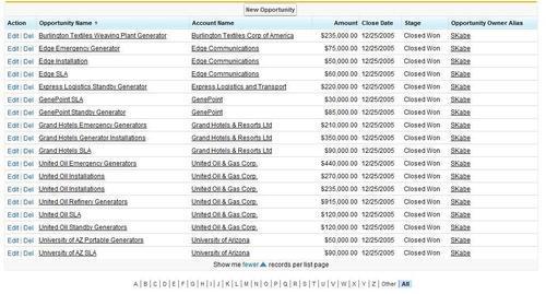
- Force.com allows very minimum configuration of the list view. We can select the fields that are seen on the list view. The list view is also seen on the related list of the object.
- Detail view:
- A detail view shows the detail of a single record. To enter the detail view we can either click on the record name or we can directly append the record ID in the URL. For example, http://na1.salesforce.com/RecordID.
- The detail view is fully customizable for any standard and custom object except for a few special objects. The following is the detail page for sample records:

We will be looking into the layout editor in detail in the coming chapter.
- Edit view:
- The edit view also focuses on the single record, but this provides input fields to enter and modify the records.
- The following screenshot is of the edit view for the same opportunity:

- The edit view follows the pattern of detail view and only those fields are shown in this view, which is editable. The edit view cannot be customized differently to that of the detail view.
The page layout editor is used in the organization of the Fields, Custom S-Controls, and Related Lists on a detail page layout. The fields that are editable are automatically available in the edit page layout.
To open the page layout editor go to Setup | Create | Objects | Custom Object name | Page Layouts.
Normally, every object will be assigned a single default page layout that is accessible to all the people. Some standard objects have multiple page layouts. To modify a page layout make sure you identify which profile the page layout is accessible to prevent data visibility problems. The following screenshot shows the enhanced page layout editor:
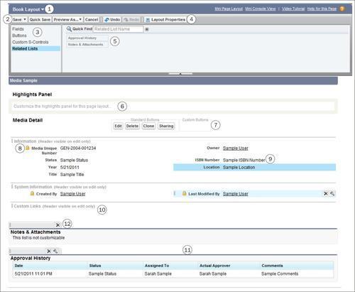
Some salient features of the editor are as follows:
|
1 |
We can select other layouts to edit quickly. |
2 |
The modified layout can also be saved in a different name. |
|
3 |
We can select between Fields, Buttons, and Related Lists. |
4 |
With the layout properties, we can change the name of the layout and make it user friendly and understandable. |
|
5 |
Fields, buttons and layouts are available for adding on the page. Already used objects are disabled. |
6 |
The highlights are used for consoles we will discuss this later in further chapters. |
|
7 |
Buttons can be added only in the custom buttons slot and are not available on the edit page layout. |
8 |
Lock indicates the field is locked from being removed on the page layout. These fields cannot be removed from a page layout. |
|
9 |
Fields can be organized and grouped together in sections. A section can have a single column or a double column. |
10 |
We can add custom links to the records in this part of the page layout. |
|
11 |
Related lists are added only in the records having a lookup relationship and a master detail relationship with other objects. |
12 |
Additional properties on the related list can be edited by clicking on the wrench symbol. We can add/remove fields from the child object to be displayed on the page of the master object using this. |
Apart from adding the fields and buttons, the advance page layout editor also helps us group different fields in sections and add blank spaces for alignment. The following screenshot shows the Section and Blank Space in the editor:
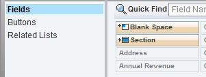
Let us the look into these two options one after another:
- Adding a section: A section is a logical grouping of fields on a page. It is always advisable to group the fields in a user friendly pattern so that the user finds it comfortable to edit the record. The following screenshot shows the Section Properties dialogue box:

A section can have a single column or two-column layout. We also get the option for the Tab-Key Order in a section.
- Blank Space: A blank space can be added to align the fields properly in the section. This is in case we need to add a blank space intentionally on the page layout.
The general library is filling information in the Media object that we have created previously.
However, the fields are spread across the page and the users are finding it difficult to fill in the information. Group the fields in a logical grouping on the page layout editor. Some fields are different for books and videos.
Create two separate layouts, one for books (with ISBN number) and one for videos (with title and year).
We can add the custom buttons and links to the record. Buttons and links have actions attached to them referring to the functionality they are achieving. For example, a Save button saves the data filled in the application to the server. The buttons are also differentiated based on their placement on the application.
There are three types of buttons available:
- Detail Page Link:
- This is a link that is added to the page layout within the Custom Links Section as shown in the following screenshot:

- The Custom Links Section can be adjusted anywhere on the page. However, any Detail Page Link that is created is added only in this section.
- This is a link that is added to the page layout within the Custom Links Section as shown in the following screenshot:
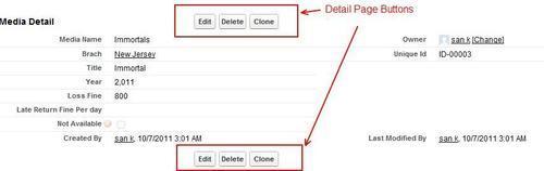
- Detail Page Buttons:
- The Detail Page Buttons are added at the top and bottom of the page in the centre as shown in the following screenshot:
- The button can open a JavaScript, point to a Visualforce or open a URL. There is a separate section for adding this button on the page layout editor as shown in the following screenshot:

- The Detail Page Buttons are added at the top and bottom of the page in the centre as shown in the following screenshot:
- List View Button:
- The List View Button can be added to the tab page or the related list of the object. The following screenshot shows the list view button on the related list for opportunity. The list view button is the only type that can be added to the related list of the object and not on the detail page layout.

Buttons cannot be added on the edit page of the record.
- The List View Button can be added to the tab page or the related list of the object. The following screenshot shows the list view button on the related list for opportunity. The list view button is the only type that can be added to the related list of the object and not on the detail page layout.
To create a new button, perform the following steps:
- Go to Setup | Custom Object Name | Custom Buttons and Links | New as shown in the following screenshot:

- Choose the type of button (Detail, List View or Detail page link).
- Choose the behavior of the opening page.
- Choose the type of button (Visualforce page, JavaScript, and so on).
- Save the custom button.
After we create the button we again go back to the advance page layout editor to add the button on the page.
When we are adding fields on the page layout they can be made Required or Read-Only by setting their properties. The Field Properties dialogue box shown in the next screenshot can be accessed by clicking the wrench symbol on the desired field:
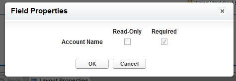
As shown in the screenshot we can set the field to be Required or Read-Only on the page layout. As mentioned in the previous chapter, if the field is not universally required (set as required during the creation of the field) it can be made required on the page layout.
Note
It should, however, be noted here that the field marked as required here will be required only on this page layout, it will not be required if the data is filled from the back-end or through API or any other page layout. This option is useful if we have a single page layout that requires this field.
We can also set the field as read-only in the same option, the field appears uneditable on the page only and the user can still fill the value from other page layouts or theback-end.
The advanced page layout editor only helps in editing the detail page of the record. Force.com does not allow us to modify the edit page for the record. Edit page layout assumes the same pattern as the detail page layout only the editable fields are displayed with a Save button.
Apart from that Force.com gives us the option to modify other layout such as the lookup layout (choosing which fields to show when lookup for the object is clicked) or the tab layout. Let's edit the Media Lookup layout as an example:
- Click on Setup | Create | Media | Search Layouts as shown in the following screenshot:
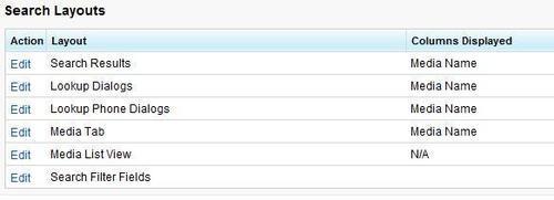
- Click on Edit on the Lookup Dialogs,a dialogue box similar to the one shown in the following screenshot should appear:
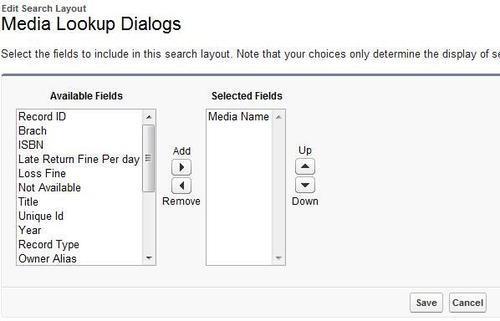
- Select the fields that will appear on the Lookup Dialogs. For example, select the Not Available field and click on Add.
- Click on Save to save the record.
- Now every time there is a lookup on media object, it will show the Not Available field in it.
We can add a custom list button to the search results and media list view. On the other layout, we can only select which fields are to be displayed on screen.
Similarly we can customize the other layouts for the object too.
We can define mini page layouts for the records that appear in the mini view of the Console tab, hover details, and event overlays. A Mini Page Layout contains a subset of the items in an existing page layout. Mini page layouts inherit record type and profile associations, related lists, fields, and field access settings from their associated page layout.
The visible fields and related lists of the Mini Page Layout can be further customized, but the other items inherited from the associated page layout cannot be changed on the Mini Page Layout itself.
To create a Mini Page Layout, click on Setup | Create | Object Name | Page Layout. Click on Mini Page Layout on the green bar on top.
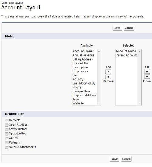
Just like Search Layout, the Mini Page Layout, and the mini console layout gives us the option of the field names that can be added to the layout.
This completes the page layouts and the visual point and click features of Force.com.
The Salesforce Certified Developer program gives an overview of what Visualforce can offer and the basic tags used in it. The following section will give a brief overview of Visualforce, we won't be going deep into coding.
Let's start with it.