
Chapter Contents
The General Linear Model
Linear models are the sum of the products of coefficient parameters and factor columns. The linear model is rich enough to encompass most statistical work. By using a coding system, you can map categorical factors to regressor columns. You can also form interactions and nested effects from products of coded terms.
Table 14.1 lists many of the situations handled by the general linear model approach. To read the model notation in Table 14.1, suppose that factors A, B, and C are categorical factors, and that X1, X2, and so forth, are continuous factors.
Table 14.1. Different Linear Models
|
Situation
|
Model Notation
|
Comments
|
|
One-way anova
|
Y = A
|
Add a different value for each level.
|
|
Two-way anova no interaction
|
Y = A, B
|
Additive model with terms for A and B.
|
|
Two-way anova with interaction
|
Y = A, B, A*B
|
Additive model with terms for A, B and the combination of A and B.
|
|
Three-way factorial
|
Y = A, B, A*B, C, A*C, B*C, A*B*C
|
For k-way factorial, 2k–1 terms. The higher order terms are often dropped.
|
|
Nested model
|
Y = A, B[A]
|
The levels of B are only meaningful within the context of A levels, e.g., City[State], pronounced “city within state”.
|
|
Simple regression
|
Y = X1
|
An intercept plus a slope coefficient times the regressor.
|
|
Multiple regression
|
Y = X1, X2, X3, X4,...
|
There can be dozens of regressors.
|
|
Polynomial regression
|
Y = X1, X12, X13, X14
|
Linear, quadratic, cubic, quartic,...
|
|
Quadratic response surface model
|
Y = X1, X2, X3 X12, X22, X32, X1*X2, X1*X3, X2*X3
|
All squares and cross products of effects define a quadratic surface with a unique critical value where the slope is zero (minimum, maximum, or a saddle point).
|
|
Analysis of covariance
|
Y = A, X1
|
Main effect (A), adjusting for the covariate (X1).
|
|
Analysis of covariance with different slopes
|
Y = A, X1, A*X1
|
Tests that the covariate slopes are different in different A groups.
|
|
Nested slopes
|
Y = A, X1[A]
|
Separate slopes for separate groups.
|
|
Multivariate regression
|
Y1, Y2 = X1, X2...
|
The same regressors affect several responses.
|
|
manova
|
Y1, Y2, Y3 = A
|
A categorical variable affects several responses.
|
|
Multivariate repeated measures
|
sum and contrasts of (Y1 Y2 Y3) = A and so on.
|
The responses are repeated measurements over time on each subject.
|
Kinds of Effects in Linear Models
The richness of the general linear model results from the kind of effects you can include as columns in a coded model. Special sets of columns can be constructed to support various effects.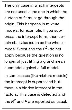
Intercept Term
Most models have an intercept term to fit the constant in the linear equation. This is equivalent to having a regressor variable whose value is always 1. If this is the only term in the model, its purpose is to estimate the mean. This part of the model is so automatic that it becomes part of the background, the submodel to which the rest of the model is compared.
Continuous Effects
These values are direct regressor terms, used in the model without modification. If all the effects are continuous, then the linear model is called multiple regression (See Chapter 13 for an extended discussion of multiple regression).
Categorical Effects
The model must fit a separate constant for each level of a categorical effect. These effects are coded columns through an internal coding scheme, which is described in the next section. These are also called main effects when contrasted with compound effects, such as interactions.
Interactions
These are crossings of categorical effects, where you fit a different constant for each combination of levels of the interaction terms. Interactions are often written with an asterisk between terms, such as Age*Sex. If continuous effects are crossed, they are multiplied together.
Nested Effects
Nested effects occur when a term is only meaningful in the context of another term, and thus is kind of a combined main effect and interaction with the term within which it is nested. For example, city is nested within state, because if you know you're in Chicago, you also know you're in Illinois. If you specify a city name alone, like Trenton, then Trenton, New Jersey could be confused with Trenton, Michigan. Nested effects are written with the upper level term in parentheses or brackets, like City[State].
It is also possible to have combinations of continuous and categorical effects, and to combine interactions and nested effects.
Coding Scheme to Fit a One-Way anova as a Linear Model
When you include categorical variables in a model, JMP converts the categorical values (levels) into internal columns of numbers and analyzes the data as a linear model. The rules to make these columns are the coding scheme. These columns are sometimes called dummy or indicator variables. They make up an internal design matrix used to fit the linear model.
Coding determines how the parameter estimates are interpreted. However, note that the interpretation of parameters is different than the construction of the coded columns. In JMP, the categorical variables in a model are such that:
• There is an indicator column for each level of the categorical variable except the last level. An indicator variable is 1 for a row that has the value represented by that indicator, is –1 for rows that have the last categorical level (for which there is no indicator variable), and zero otherwise.
• A parameter is interpreted as the comparison of that level with the average effect across all levels. The effect of the last level is the negative of the sum of all the parameters for that effect. That is why this coding scheme is often called sum-to-zero coding.
Different coding schemes are the reason why different answers are reported in different software packages. The coding scheme doesn't matter in many simple cases, but it does matter in more complex cases, because it affects the hypotheses that are tested.
It's best to start learning the new approach covered in this chapter by looking at a familiar model. In Chapter 9, “Comparing Many Means: One-Way Analysis of Variance,” you saw the Drug.jmp data, comparing three drugs (Snedecor and Cochran, 1967). Let's return to this data table and see how the general linear model handles a one-way anova.
A partial listing of the sample table called Drug.jmp, shown in Figure 14.1, contains the results of a study that measured the response of 30 subjects after treatment by one of three drugs. First, look at the one-way analysis of variance given previously by the Fit Y by X platform (y is the response and Drug is the X, Factor). We see that Drug is significant, with a p-value of 0.0305.
Figure 14.1 Drug Data Table with One-Way Analysis of Variance Report

Now, do the same analysis using the Fit Model command.
Drug has values “a”, “d”, and “f”, where “f” is really a placebo treatment. y is bacteria count after treatment, and x is a baseline count.
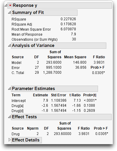
The completed dialog should look like the one in Figure 14.2.
Figure 14.2 Model Specification dialog for Simple One-Way anova

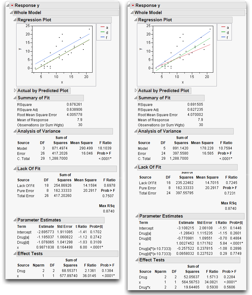
Now compare the reports from this new analysis (Figure 14.3) with the one-way anova reports in Figure 14.1. Note that the statistical results are the same: the same R2, anova F-test, means, and standard errors on the means. (The anova F-test is in both the Whole-Model Analysis of Variance table and in the Effect Tests table because there is only one effect in the model.)
Although the two platforms produce the same results, the way the analyses were run internally was not the same. The Fit Model analysis ran as a regression on an intercept and two regressor variables constructed from the levels of the model main effect. The next section describes how this is done.
Figure 14.3 anova Results Given by the Fit Model Platform
Regressor Construction
The terms in the Parameter Estimates table are named according to what level each is associated with.
 The terms are called Drug[a] and Drug[d]. Drug[a] means that the regressor variable is coded as 1 when the level is “a”, –1 when the level is “f”, and 0 otherwise. Drug[d] means that the variable is 1 when the level is “d”, –1 when the level is “f”, and 0 otherwise. You can write the notation for Drug[a] as ([Drug=a]-[Drug=f]), where [Drug=a] is a one-or-zero indicator of whether the drug is “a” or not. Theregression equation then looks like this:
y = b0+ b1*((Drug=a)-(Drug=f)) +b2*((Drug=d)-(Drug=f)) + error
So far, the parameters associated with the regressor columns in the equation are represented by the names b0, b1 and so forth.
Interpretation of Parameters
What is the interpretation of the parameters for the two regressors, b1, and b2? The equation can be rewritten as
y = b0+ b1*[Drug=a] + b2* [Drug=d] + (–b1–b2)*[Drug=f] + error
The sum of the coefficients (b1, b2, and -b1–b2) on the three indicators is always zero (again, sum-to-zero coding). The advantage of this coding is that the regression parameter tells you immediately how its level differs from the average response across all the levels.
Predictions Are the Means
To verify that the coding system works, calculate the means, which are the predicted values for the levels “a”, “d”, and “f”, by substituting the parameter estimates shown previously into the regression equation
Pred y = b0 + b1*([Drug=a]-[Drug=f]) + b2*([Drug=d]-[Drug=f)
For the “a” level,
Pred y = 7.9 + -2.6*(1–0) + –1.8*(0–0) = 5.3, which is the mean y for “a”.
For the “d” level,
Pred y = 7.9 + –2.6*(0-0) + –1.8*(1–0) = 6.1, which is the mean y for “d”.
For the “f” level,
Pred y = 7.9 + –2.6*(0–1) + –1.8*(0–1) = 12.3, which is the mean y for “f”.
These means are shown in the Effect Details table.
Parameters and Means
Now, substitute the means symbolically and solve for the parameters as functions of these means. First, write the equations for the predicted values for the three levels, called A for “a”, D for “d” and F for “f”.
MeanA= b0+ b1*1 + b2*0; MeanD= b0 + b1*0 + b2*1; MeanF= b0+ b1*(-1) + b2*(–1)
After solving for the b’s, the following coefficients result:
b1 = MeanA – (MeanA+MeanD+MeanF)/3
b2 = MeanD – (MeanA+MeanD+MeanF)/3
(–b1–b2) = MeanF - (MeanA+MeanD+MeanF)/3
Note: Each level’s parameter is interpreted as how different the mean for that group is from the mean of the means for each level.
In the next sections you will meet the generalization of this and other coding schemes, with each coding scheme having a different interpretation of the parameters.
Keep in mind that the coding of the regressors does not necessarily follow the same rule as the interpretation of the parameters. (This is a result from linear algebra, resting on the fact that the inverse of a matrix is its transpose only if the matrix is orthogonal).
Overall, analysis using this coding technique is a way to use a regression model to estimate group means. It's all the same least squares results using a different approach.
Analysis of Covariance: Continuous and Categorical Terms in the Same Model
Now take the previous drug example that had one main effect (Drug), and add the other term (x) to the model. x, the initial bacteria count, is a regular regressor, meaning it is a continuous effect, and is called a covariate.
Figure 14.4 Model Specification dialog for Analysis of Covariance
This new model is a hybrid between the anova models with nominal effects and the regression models with continuous effects. Because the analysis method uses a coding scheme, the categorical term can be put into the model with the regressor.
The new results show that adding the covariate x to the model raises the R2 from 22.78% (from Figure 14.3) to 67.62%. The parameter estimate for x is 0.987, which is not unexpected because the response is the pre-treatment bacteria count, and x is the baseline count before treatment. With a coefficient of nearly 1 for x, the model is really fitting the difference in bacteria counts. The difference in counts has a smaller variation than the absolute counts.
Figure 14.5 Analysis of Covariance Results Given by the Fit Model Platform

The t-test for x is highly significant. Because the Drug effect uses two parameters, refer to the Effect Tests table to see if Drug is significant. The null hypothesis for the F-test is that both parameters are zero. Surprisingly, the p-value for Drug changed from 0.0305 to 0.1384.
The Drug effect, which was significant in the previous model, is no longer significant! How could this be? The error in the model has been reduced, so it should be easier for differences to be detected.
One possible explanation is that there might be a relationship between x and Drug.
Look at the results, shown below, to examine the relationship of the covariate x to Drug. (The plot below has been modified with display options from the red triangle menu).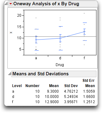
It appears that the drugs have not been randomly assigned—or, if they were, they drew an unlikely unbalanced distribution. The toughest cases (with the most bacteria) tended to be given the inert drug “f.” This gave the “a” and “d” drugs a head start at reducing the bacteria count until x was brought into the model.
When fitting models where you don't control all the factors, you may find that the factors are interrelated, and the significance of one depends on what else is in the model.
The Prediction Equation
The prediction equation generated by JMP can be stored as a formula in its own column.
This creates a new column in the data table called Pred Formula y. To see this formula,
This opens a formula editor window with the following formula for the prediction equation:

Note: The prediction equation can also be displayed in the Fit Model results window by selecting Estimates > Show Prediction Expression from the top red triangle menu.
The Whole-Model Test and Leverage Plot
The whole-model test shows how the model fits as a whole compared with the null hypothesis of fitting only the mean. This is equivalent to testing the null hypothesis that all the parameters in the linear model are zero except for the intercept. This fit has three degrees of freedom, 2 from Drug and 1 from the covariate x. The F of 18.1 is highly significant (see Figure 14.6).
The whole-model leverage plot (produced when Effect Leverage is selected rather than Minimal Report in the Model Specification dialog) is a plot of the actual value versus its predicted value. A residual is the distance from each point to the 45º line of fit (where the actual is equal to the predicted).
Figure 14.6 Whole-Model Test and Leverage Plot for Analysis of Covariance
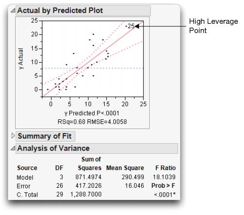
The leverage plot in Figure 14.6 shows the hypothesis test point by point. The points that are far out horizontally (like point 25) tend to contribute more to the test because the predicted values from the two models differ more there (the points are farther away from the mean). Points like this are called high-leverage points.
Effect Tests and Leverage Plots
Now look at the effect leverage plots in Figure 14.7 to examine the details for testing each effect in the model. Each effect test is computed from a difference in the residual sums of squares that compare the fitted model to the model without that effect.
For example, the sum of squares (SS) for x can be calculated by noting that the SS(error) for the full model is 417.2, but the SS(error) was 995.1 for the model that had only the Drug main effect (see Figure 14.3). The SS(error) for the model that includes the covariate is 417.2. The reduction in sum of squares is the difference, 995.1 – 417.2 = 577.9, as you can see in the Effect Tests table (Figure 14.7). Similarly, if you remove Drug from the model, the SS(Error) grows from 417.2 to 485.8, a difference of 68.6 from the full model.
The leverage plot shows the composition of these sums of squares point by point. The Drug leverage plot on the left in Figure 14.7 shows the effect on the residuals that would result from removing Drug from the model. The distance from each point to the sloped line is its residual. The distance from each point to the horizontal line is what its residual would be if Drug were removed from the model. The difference in the sum of squares for these two sets of residuals is the sum of squares for the effect, which, when divided by its degrees of freedom, is the numerator of the F-test for the Drug effect.
You can evaluate leverage plots in a way that is similar to evaluating a plot for a simple regression that has a mean line and confidence curves on it. The effect is significant if the points are able to pull the sloped line significantly away from the horizontal line. The confidence curves are placed around the sloped line to show the 0.05-level significance test. The curves cross the horizontal line if the effect is significant (as on the right in Figure 14.7), but they encompass the horizontal line if the effect is not significant (as on the left).
Click on points to identify the high-leverage points—those that are away from the middle on the horizontal axis. Note whether they seem to support the test or not. If the points support the test, they are on the side trying to pull the line toward a higher slope.
Figure 14.7 Effect Tests and Effect Leverage Plots for Analysis of Covariance
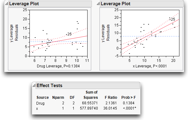
Figure 14.8 summarizes the elements of a leverage plot. A leverage plot for a specific hypothesis is any plot with the following properties:
• There is a sloped line representing the full model and a horizontal line representing a model constrained by an hypothesis.
• The distance from each point to the sloped line is the residual from the full model.
• The distance from each point to the horizontal line is the residual from the constrained model.
Figure 14.8 Schematic Defining a Leverage Plot

Least Squares Means
It might not be fair to make comparisons between raw cell means in data that you fit to a linear model. Raw cell means do not compensate for different covariate values and other factors in the model. Instead, construct predicted values that are the expected value of a typical observation from some level of a categorical factor when all the other factors have been set to neutral values. These predicted values are called least squares means. There are other terms used for this idea: marginal means, adjusted means, and marginal predicted values.
The role of these adjusted or least squares means is that they allow comparisons of levels with the other factors being held fixed.
In the drug example, the least squares means are the predicted values expected for each of the three values of Drug, given that the covariate x is held at some constant value. For convenience, the constant value is chosen to be the mean of the covariate, which is 10.733.
The prediction equation gives the least squares means as follows:
fit equation:
–2.695– 1.185 drug[a-f]–1.076 drug[d-f] + 0.987 x
for “a”:
–2.695 – 1.185 (1) – 1.076 (0) + 0.987 (10.733) = 6.715
for “d”:
–2.695 – 1.185 (0) – 1.076 (1) + 0.987 (10.733) = 6.824
for “f”:
–2.695– 1.185 (–1)– 1.076 (–1) + 0.987 (10.733) = 10.161
To verify these results, return to the Fit Model platform and open the Least Squares Means table for the Drug effect..
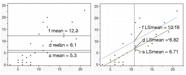
In the diagram shown on the left in Figure 14.9, the ordinary means are taken with different values of the covariate, so it is not fair to compare them.
In the diagram to the right in Figure 14.9, the least squares means for this model are the intersections of the lines of fit for each level with the x value of 10.733. With this data, the least squares means are less separated than the raw means. This LS Means plot is displayed in the Fit Model analysis window (see the Regression Plot at the top right of Figure 14.5)
Figure 14.9 Diagram of Ordinary Means (top) and LS Means (bottom)
Lack of Fit
The lack-of-fit test is the opposite of the whole-model test. Where the whole-model test (anova) tests whether anything in the model is significant, lack-of-fit tests whether anything left out of the model is significant. Unlike all other tests, it is usually desirable for the lack-of-fit test to be nonsignificant. That is, the null hypothesis is that the model does not need higher-order effects. A significant lack-of-fit test is advice to add more effects to the model using higher orders of terms already in the model.
But how is it possible to test effects that haven't been put in the model? All tests in linear models compare a model with a constrained or reduced version of that model. To test all the terms that could be in the model but are not—now that would be amazing!
Lack-of-fit compares the fitted model with a saturated model using the same terms. A saturated model is one that has a parameter for each combination of factor values that exists in the data. For example, a one-way analysis of variance is already saturated because it has a parameter for each level of the single factor. A complete factorial with all higher order interactions is completely saturated. For simple regression, saturation would be like having a separate coefficient to estimate for each value of the regressor.
If the lack-of-fit test is significant, there is some significant effect that has been left out of the model, and that effect is a function of the factors already in the model. It could be a higher-order power of a regressor variable, or some form of interaction among categorical variables. If a model is already saturated, there is no lack-of-fit test possible.
The other requirement for a lack-of-fit test in continuous responses is that there be some exact replications of factor combinations in the data table. These exact duplicate rows (except for responses) allow the test to estimate the variation to use as a denominator in the lack-of-fit F-test. The error variance estimate from exact replicates is called pure error because it is independent of whether the model is right or wrong (assuming that it includes all the right factors).
In the drug model with covariate, the observations shown in Table 14.2 form exact replications of data for Drug and x. The sum of squares around the mean in each replicate group reveals the contributions to pure error (this calculation is shown for the first two rows).
This pure error represents the best that can be done in fitting these terms to the model for this data. Whatever is done to the model involving Drug and x, these replicates and this error always exists. Pure error exists in the model regardless of the form of the model.
Table 14.2. Lack-of-Fit Analysis
|
Replicate Rows
|
Drug
|
x
|
y
|
Pure Error DF
|
Contribution to Pure Error
|
|
6
8 |
a
a |
6
6 |
4
1 |
1
|
4.5=(4-2.5)2+(1–2.5)2
|
|
1
9 |
a
a |
11
11 |
6
8 |
1
|
2.0 = (6-7)2+(8-7)2
|
|
11
12 |
d
d |
6
6 |
0
2 |
1
|
2.0
|
|
14
16 18 |
d
d d |
8
8 8 |
1
4 9 |
2
|
32.667
|
|
27
28 30 |
f
f f |
12
12 12 |
5
16 20 |
2
|
120.667
|
|
21
26 |
f
f |
16
16 |
13
12 |
1
|
0.5
|
|
Total
|
|
|
|
8
|
162.333
|
Pure error can reveal how complete the model is. If the error variance estimate from the model is much greater than the pure error, then adding higher order effects of terms already in the model improves the fit.
The Lack-of-Fit table for this example is shown below. The difference between the total error from the fitted model and pure error is called Lack-of-Fit error. It represents all the terms that might have been added to the model, but were not. The ratio of the lack-of-fit mean square to the pure error mean square is the F-test for lack-of-fit. For the covariate model, the lack-of-fit error is not significant, which is good because it is an indication that the model is adequate with respect to the terms included in the model.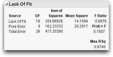
Separate Slopes: When the Covariate Interacts with a Categorical Effect
When a covariate model includes a main effect and a covariate regressor, the analysis uses a separate intercept for the covariate regressor for each level of the main effect.
If the intercepts are different, could the slopes of the lines also be different? To find out, a method to capture the interaction of the regression slope with the main effect is needed. This is accomplished by introducing a crossed term, the interaction of Drug and x, into the model:
Figure 14.10 Model Specification dialog for Analysis of Covariance with Separate Slopes

This adds two parameters to the linear model that allow the slopes for the covariate to be different for each Drug level. The new variable is the product of the dummy variables for Drug and the covariate values.
The Summary of Fit tables in Figure 14.11 compare this separate slopes fit to the same slopes, showing an increase in R2 from 67.63% to 69.15%.
Figure 14.11 Analysis of Covariance with Same Slopes (left) and Separate Slopes (right)
The separate slopes model shifts two degrees of freedom from the lack-of-fit error to the model, increasing the model degrees of freedom in the anova from 3 to 5. The pure error seen in both Lack-of-Fit tables is the same because there are no new variables in the separate slopes covariance model. The new effect in the separate slopes model is constructed from terms already in the original analysis of covariance model.
The Effect Tests table in the report on the right in Figure 14.11 shows that the test for the new term Drug*x for separate slopes is not significant; the p-value is 0.56 (shown at the bottom of the plot on the right). The confidence curves on the leverage plot for the Effect Test do not cross the horizontal mean line, showing that the interaction term doesn't significantly contribute to the model. The least squares means for the separate slopes model have a more dubious value now.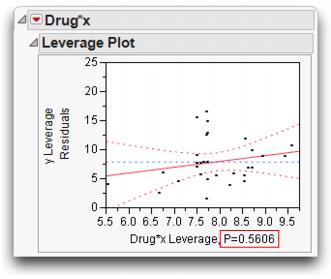
Previously, with the same slopes on x as shown in Figure 14.11, the least squares means changed with whatever value of x was used, but the separation between them did not. Now, with separate slopes as shown in Figure 14.12, the separation of the least squares means is also a function of x. The least squares means are more or less significantly different depending on whatever value of x is used. JMP uses the overall mean, but this does not represent any magic standard base. Notice that a and d cross near the mean of x, so their least squares means happen to be the about the same only because of where the x covariate was set.
Figure 14.12 Illustration of Covariance with Separate Slopes

Interaction effects always have the potential to cloud the main effect, as will be seen again with the two-way model in the next section.
Two-Way Analysis of Variance and Interactions
This section shows how to analyze a model in which there are two nominal or ordinal classification variables—a two-way model instead of a one-way model.
For example, suppose a popcorn experiment was run, varying three factors and measuring the popped volume yield per volume of kernels. The goal was to see which combination of factors gave the greatest volume of popped corn.
The variables are popcorn, with values “plain” and “gourmet”; batch, which designates whether the popcorn was popped in a large or small batch; and oil amt with values “lots” or “little.” Start with two of the three factors, popcorn and batch.
Figure 14.13 Listing of the Popcorn Data Table

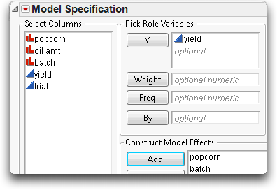
The Model Specification dialog should look like the one shown here.
Figure 14.14 shows the analysis tables for the two-factor analysis of variance:
• The model explains 56% of the variation in yield (the R2).
• The remaining variation has a standard error of 2.248 (Root Mean Square Error).
• The significant lack-of-fit test (p-value of 0.0019) says that there is something in the two factors that is not being captured by the model. The factors are affecting the response in a more complex way than is shown by main effects alone. The model needs an interaction term.
• Each of the two effects has two levels, so they each have a single parameter. Thus the t-test results are identical to the F-test results. Both factors are significant.
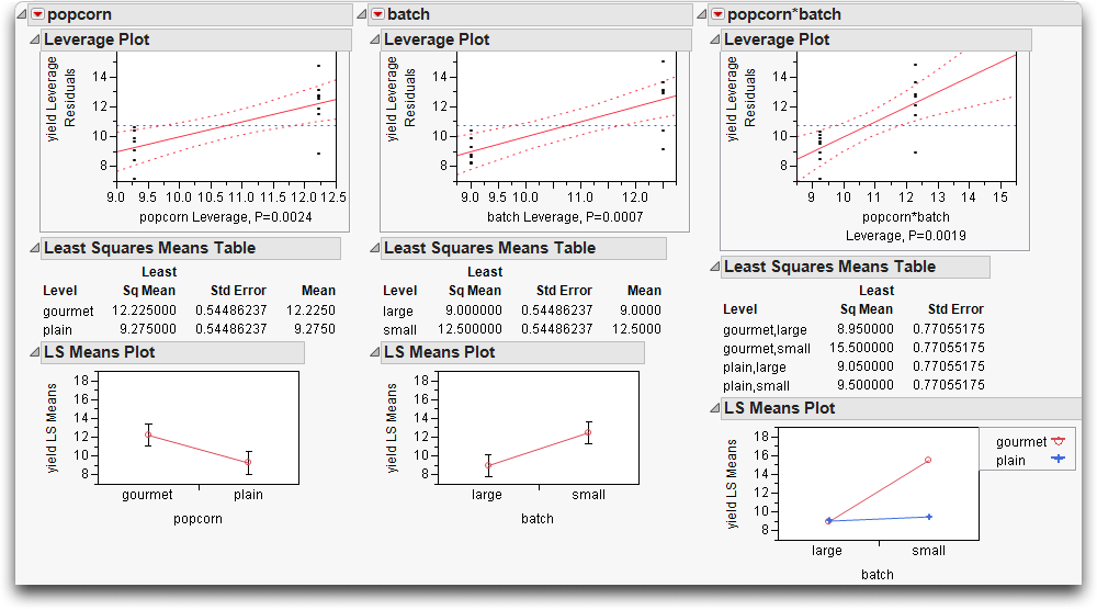
Figure 14.14 Two-Factor Analysis of Variance for Popcorn Experiment

The leverage plots in Figure 14.15 show the point-by-point detail for the fit as a whole and the fit as it is partially carried by each factor. Because this is a balanced design, all the points have the same leverage. Therefore, they are spaced out horizontally the same in the leverage plot for each effect.
Figure 14.15 Leverage Plots for Two-Factor Popcorn Experiment

The lack-of-fit test shown in Figure 14.14 is significant. We reject the null hypothesis that the model is adequate, and decide to add an interaction term, also called a crossed effect. An interaction means that the response is not simply the sum of a separate function for each term. In addition, each term affects the response differently depending on the level of the other term in the model.
The popcorn by batch interaction is added to the model as follows:
First, select both popcorn and batch in the Select Columns list. To do so,

Including the interaction term increases the R2 from 56% to 81%. The standard error of the residual (Root Mean Square Error) has gone down from 2.25 to 1.54.
Figure 14.16 Statistical Analysis of Two-Factor Experiment with Interaction
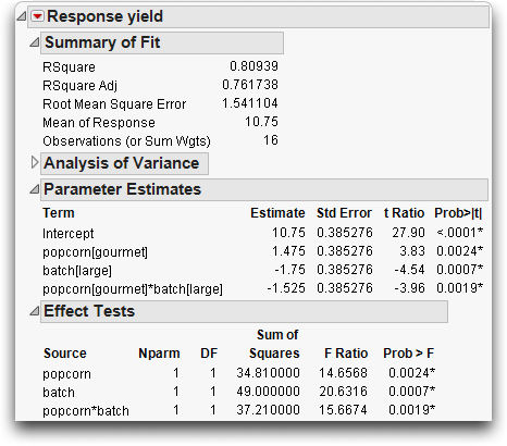
The Effect Tests table shows that all effects are significant. The popcorn*batch effect has a p-value of 0.0019, which is highly significant. The number of parameters (and degrees of freedom) of an interaction are the product of the number of parameters of each term in the interaction. The popcorn*batch interaction has one parameter (and one degree of freedom) because the popcorn and batch terms each have only one parameter.
An interesting phenomenon, which is true only in balanced designs, is that the parameter estimates and sums of squares for the main effects are the same as in the previous fit without interaction. The F-tests are different only because the error variance (Mean Square Error) is smaller in the interaction model. The sum of squares and degrees of freedom for the interaction effect test is identical to the lack-of-fit test in the previous model.
Again, the leverage plots (Figure 14.17) show the tests in point-by-point detail. The confidence curves clearly cross the horizontal line. The effects tests (shown in Figure 14.6) confirm that the model and all effects are highly significant.
Figure 14.17 Leverage Plots for Two-Factor Experiment with Interaction

You can see some details of the means in the least squares means table, but in a balanced design (equal numbers in each level and no covariate regressors), they are equal to the raw cell means.
The result is a series of profile plots below each effect's report. Profile plots are a graphical form of the values in the Least Squares Means table.
• The leftmost plot in Figure 14.18 is the profile plot for the popcorn main effect. The “gourmet” popcorn seems to have a higher yield.
• The middle plot is the profile plot for the batch main effect. It looks like small batches have higher yields.
• The rightmost plot is the profile plot for the popcorn by batch interaction effect.
Looking at the effects together in an interaction plot shows that the popcorn type matters for small batches but not for big ones. Said another way, the batch size is important for gourmet popcorn, but not for plain popcorn (gourmet popcorn does much better in smaller batches). In an interaction profile plot, one interaction term is on the x-axis and the other term forms the different lines.
Figure 14.18 Interaction Plots and Least Squares Means
Optional Topic: Random Effects and Nested Effects
This section talks about nested effects, repeated measures, and random effects mixed models—a large collection of topics to cover in a few pages. So, hopefully the following overview will be an inspiration to look to other textbooks and study these topics more completely.
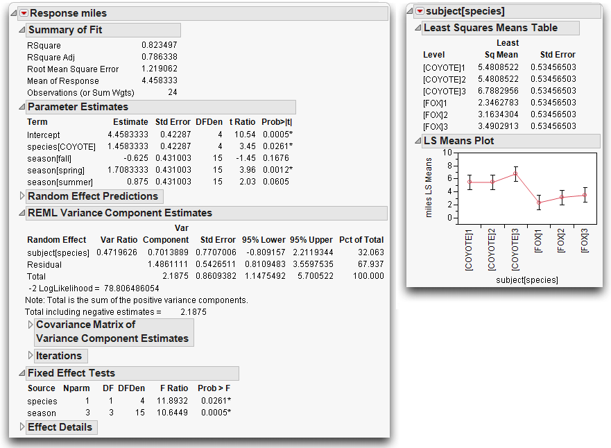
As an example, consider the following situation. Six animals from two species were tracked, and the diameter of the area that each animal wandered was recorded. Each animal was measured four times, once per season. Figure 14.19 shows a partial listing of the animals data. To see this example,
Figure 14.19 Partial Listing of the Animals Data Table

Nesting
One feature of the data is that the labeling for each subject animal is nested within species. The data (miles and season) for Fox subject 1 are not the same as the data for Coyote subject 1 (subject 1 occurs twice). The way to express this in a model is to always write the subject effect as subject[species], which is read as “subject nested within species” or “subject within species.”
The rule about nesting is that whenever you refer to a subject with a given level of factor, if that implies what another factor's level is, then the factor should only appear in nested form.
When the linear model machinery in JMP sees a nested effect such as “B within A”, denoted B[A], it computes a new set of A parameters for each level of B. The Model Specification dialog allows for nested effects to be specified as in the following example.
This adds the nested effect subject[species] shown here.
This model runs fine, but it has something wrong with it. The F-tests for all the effects in the model use the residual error in the denominator. The reason that this is incorrect and the solution to this problem, are presented in Repeated Measures.
Figure 14.20 Results for Animal Data Analysis (Incorrect Analysis)

Let’s take a look at the parameters in this nested model (Figure 14.20).
• There is one parameter for the two levels of species (“Fox” and “Coyote”).
• Subject is nested in species, so there is a separate set of two parameters (for three levels of subject) for subject within each level of species, giving a total of four parameters for subject.
• Season, with four levels, has three parameters.
The total parameters for the model (not including the intercept) is +1 for species + 4 for subject + 3 for season = 8.
Repeated Measures
As mentioned above, the previous analysis has a problem—the F-test used to test the species effect is constructed using the model residual in the denominator, which isn't appropriate for this situation. The following sections explain this problem and outline solutions.
There are three ways to understand this problem, which correspond to three different (but equivalent) resolutions:
• Method 1: The effects can be declared as random, causing JMP to synthesize special F-tests.
• Method 2: The observations can be made to correspond to the experimental unit.
• Method 3: The analysis can be viewed as a multivariate problem.
The key concept here is that there are two layers of variation: animal to animal and season to season within animal. When you test an effect, the error term used in the denominator of the F-test for that effect must refer to the correct layer.
Method 1: Random Effects-Mixed Model
The subject effect is what is called a random effect. The animals were selected randomly from a large population, and the variability from animal to animal is from some unknown distribution. To generalize to the whole population, study the species effect with respect to the variability.
It turns out that if the design is balanced, it is possible to use an appropriate random term in the model as an error term instead of using the residual error to get an appropriate test. In this case subject[species], the nested effect, acts as an error term for the species main effect.
To construct the appropriate F-test, do a hand calculation using the results from Effect Test table shown previously in Figure 14.20. Divide the mean square for species by the mean square for subject[species] as shown by the following formula.

This F-test has 1 numerator degree of freedom and 4 denominator degrees of freedom, and evaluates to 11.89.
Random effects in general statistics texts, often described in connection with split plots or repeated measures designs, describe which mean squares need to be used to test each model effect.
Now, let's have JMP do this calculation instead of doing it by hand. JMP gives the correct tests even if the design is not balanced.
First, specify subject[species] as a random effect.
Figure 14.21 Model Specification dialog Using a Random Effect

The REML (Restricted Maximum Likelihood) Method for Fitting Random Effects
Random effects those in which the levels are chosen randomly from a larger population of levels. These random effects represent a sample from the larger population. In contrast, the levels of fixed effects (nonrandom) are of direct interest and are often specified in advance. If you have both random and fixed effects in a model, it is called a mixed model.
This example is a mixed model, and uses the REML method to fit the random effect, subject[species]. For historical interest only, the Fit Model platform also offers the Method of Moments (EMS), but this is no longer recommended except in special cases where it is equivalent to REML. The REML method for fitting mixed models is now the mainstream, state-of-the-art method, supplanting older methods.
The REML approach was pioneered by Patterson and Thompson in 1974. See also Wolfinger, Tobias, and Sall (1994) and Searle, Casella, and McCulloch(1992). The reason to prefer REML is that it works without requiring balanced data, or shortcut approximations, and it gets all the tests right, even contrasts that work across interactions. Most packages that use the traditional EMS method are either not able to test some of these contrasts, or compute incorrect variances for them.
As we’ve discussed, levels in random effects are randomly selected from a larger population of levels. For the purpose of hypothesis testing, the distribution of the effect on the response over the levels is assumed to be normal, with mean zero and some variance (called a variance component). Often, the exact effect sizes are not of direct interest. It is the fact that they represent the larger population that is of interest. What you learn about the mean and variance of the effect tells you something about the general population from which the effect levels were drawn. This is different from fixed effects, where you only know about the levels you actually encounter in the data.
Negative Variance Estimates - JMP can produce negative estimates for both REML and EMS. For REML, there are two check boxes in the model launch window:
Unbounded Variance Components - Unchecking the box beside Unbounded Variance Components constrains the estimate to be non-negative. We recommend that you do not uncheck this if you are interested in estimating fixed effects.
Estimate Only Variance Components - Constraining the variance estimates leads to bias in the tests for the fixed effects. If, however, you are only interested in variance components, and you do not want to see negative variance components, then checking the box beside Estimate Only Variance Components is appropriate.
REML Results
The Fit Model Specification in Figure 14.21 produces the report shown in
Figure 14.22. A nice feature of REML is that the report doesn’t need qualification. The estimates are all properly shrunk and the standard errors are properly scaled (SAS Institute Inc. 2008). The variance components are shown as a ratio to the error variance, and as a portion of the total variance.
Figure 14.22. A nice feature of REML is that the report doesn’t need qualification. The estimates are all properly shrunk and the standard errors are properly scaled (SAS Institute Inc. 2008). The variance components are shown as a ratio to the error variance, and as a portion of the total variance.
Figure 14.22 REML Results for Animal Data
There is no special table of synthetic test creation, because all the adjustments are automatically taken care of by the model itself. There is no table of expected means squares, because the method does not need this.
If you have random effects in the model, the analysis of variance report is not shown. This is because the variance does not partition in the usual way, nor do the degrees of freedom attribute in the usual way for REML-based estimates. You can obtain the residual variance estimate from the REML report rather than from the analysis of variance report.
The Variance Component Estimates table shows 95% confidence intervals for the variance components using the Satterthwaite (1946) approximation. You can right-click on the Variance Components Estimates table to display the Kackar-Harville correction (under Columns > Norm KHC). This value is an approximation of the magnitude of the increase in the mean squared errors of the estimators for the mixed model. See Kackar and Harville (1984) for a discussion of approxi-mating standard errors in mixed models.
Use the Estimates > Show Prediction Expression command from the top red triangle menu to see the prediction equation, shown here, which is appended to the bottom of the report.
Method 2: Reduction to the Experimental Unit
There are only 6 animals, but are there 24 rows in the data table because each animal is measured 4 times. However, taking 4 measurements on each animal doesn't make it legal to count each measurement as an observation. Measuring each animal millions of times and throwing all the data into a computer would yield an extremely powerful—and incorrect—test.
The experimental unit that is relevant to species is the individual animal, not each measurement of that animal. When testing effects that only vary subject to subject, the experimental unit should be a single response per subject, instead of the repeated measurements.
One way to handle this situation is to group the data to find the means of the repeated measures, and analyze these means instead of the individual values.
This notation indicates you want to see the mean (average) miles for each subject within each species.
Figure 14.23 Summary Dialog and Summary Table for Animals Data

Now fit a model to the summarized data.

Note that this result for Species is the same as the calculation shown in the Fixed Effect Test table in the previous section.
Method 3: Correlated Measurements-Multivariate Model
In the animal example there were multiple (four) measurements for the same animal. These measurements are likely to be correlated in the same sense as two measurements are correlated in a paired t-test. This situation of multiple measurements of the same subject is called repeated measures, or a longitudinal situation. This kind of experimental situation can be looked at as a multivariate problem. The analysis is also called a Multivariate ANalysis Of VAriance (manova).
To use this multivariate approach, the data table must be rearranged so that there is only one row for each individual animal, with the four measurements on each animal in four columns.
To complete the Split dialog,
Figure 14.24 Split dialog to Arrange Data for Repeated Measures Analysis

The new table (Figure 14.25) shows the values of miles in four columns named by the four seasons. The group variables (species and subject) ensure that the rows are formed correctly.
Figure 14.25 Rearrangement of the Animals Data for MANOVA

Now, fit a multivariate model with four Y variables and a single response:
Figure 14.26 Model Specification Dialog for manova analysis

The partial report is shown in Figure 14.27.
Figure 14.27 MANOVA of Repeated Measures Data

The Between Subjects report for species in Figure 14.27 shows the same F-test with the value of 11.89 and a p-value of 0.0261, just the same as the other methods.
Varieties of Analysis
In the previous cases, all the tests resulted in the same F-test for species. However, it is not generally true that different methods produce the same answer. For example, if species had more than two levels, you would see the four standard multivariate tests (Wilk's lambda, Pillai's trace, Hotelling-Lawley trace, and Roy's maximum root. Each of these tests would produce a different test result, and none of them would agree with the mixed model approach discussed previously.
Two more tests involving adjustments to the univariate method can be obtained from the multivariate fitting platform (manova). With an unequal number of measurements per subject, the multivariate approach cannot be used. With unbalanced data, the mixed model approach also plunges into a diversity of methods that offer different answers from the method that JMP uses (the Method of Moments).
Closing Thoughts
When using the residual error to form F-statistics, ask if the row in the table corresponds to the unit of experimentation. Are you measuring variation in the way appropriate for the effect you are examining?
• When the situation does not live up to the framework of the statistical method, the analysis will be incorrect, as happened in the first method shown (treating data table observations as experimental units) in the nesting example for the species test.
• Statistics offers a diversity of methods (and a diversity of results) for the same question. In this example, the different results are not wrong, they are just different.
• Statistics is not always simple. There are many ways to go astray. Educated common sense goes a long way, but there is no substitute for expert advice when the situation warrants it.
Exercises
1. Denim manufacturers are concerned with maximizing the comfort of the jeans they make. In the manufacturing process, starch is often built up in the fabric, creating a stiff jean that must be “broken in” by the wearer before they are comfortable. To minimize the break-in time for each pair of pants, the manufacturers often wash the jeans to remove as much starch as possible. This example concerns three methods of this washing. The data table Denim.jmp (Creighton, 2000) contains four columns: Method (describing the method used in washing), Size of Load (in pounds), Sand Blasted (recording whether or not the fabric was sand blasted prior to washing), Thread Wear (a measure of the destruction of threads during the process) and Starch Content (the starch content of the fabric after washing).
(a) The three methods of washing consist of using an enzyme (alpha amalyze) to destroy the starch, chemically destroying the starch (caustic soda), and washing with an abrasive compound (pumice stone, hence the term “stone-washed jeans”). Determine if there is a significant difference in starch content due to washing method in two ways: using the Fit Y by X platform and the Fit Model platform. Compare the Summary of Fit and Analysis of Variance displays for both analyses.
(b) Produce an LSMeans Plot for the Method factor in the above analysis. What information does this tell you? Compare the results with the means diamonds produced in the Fit Y By X plot.
(c) Fit a model of Starch Content using all three factors Size of Load, Sand Blasted, and Method. Which factors are significant?
(d) Produce LSMeans Plots for Method and Sand Blasted and interpret them.
(e) Use LSMeans Contrasts to determine if alpha amalyze is significantly different from caustic soda in its effect on Starch Content.
(f) Examine all first-level interactions of the three factors by running Fit Model and requesting Factorial to Degree from the Macros menu with the three factor columns selected. Which interactions are significant?
2. The file Titanic Passengers.jmp contains information on the passengers of the RMS Titanic. Use JMP to answer the following questions:
(a) Using the Fit Model platform, find a nominal logistic model to predict survival based on passenger class, age, and sex.
(b) To evaluate the effectiveness of your model, save the probability formula from the model to the data table. Then, using Fit Y By X, prepare a contingency table to discover the percentage of times the model made the correct prediction. (Note: You can also request a Confusion Matrix from the red triangle for the model report.)
(c) Now, fit a model to predict survival based on passenger class, age, sex, and their two-way interactions. Are any of the interactions significant?
(d) Use the profiler to explore this model. Which group had the highest survival rate? The lowest?
3. The file Decathlon.jmp (Perkiömäki, 1995) contains decathlon scores from several winners in various competitions. Although there are ten events, they fall into groups of running, jumping, and throwing.
(a) Suppose you were going to predict scores on the 100m running event. Which of the other nine events do you think would be the best indicators of the 100m results?
(b) Run a Stepwise regression (from the Fit Model Platform) with 100m as the Y and the other nine events as X. Use the default value of 0.25 probability to enter and the Forward method. Which events are included in the resulting model?
(c) Complete a similar analysis on Pole Vault. Examine the events included in the model. Are you surprised?
..................Content has been hidden....................
You can't read the all page of ebook, please click here login for view all page.