Lettering is everywhere. It labels the physical environment: road signs, shop façades, fairgrounds, advertising hoardings, underground diagrams, estate agents’ boards, manhole covers. It provides information, prophecy, poetry, stories, humour and tokens of value. It forms printed matter: posters, books, newspapers, magazines, maps, banknotes, cheques, licences and certificates. It identifies and promotes: brands, products, packaging, clothing, bags and shoes. It is both illuminated and animated on film, television, the internet, laptops, Blackberrys, phones, iPods, Game Boys and a plethora of electronic devices. Yet at its simplest it is utilitarian handwriting at the tip of a pencil, as we jot down a phone number. From the first minutes of life, when a label stating our name is clipped around a tiny wrist, to our final resting place, a headstone or memorial book, it is lettering that quite literally scores the alpha and omega of our lives.
But how are letters made? Who is it that makes them? Where are they produced? These are the questions that have prompted this book. I have attempted to visually document, record and explain the many processes by which lettering is produced today. I hope the reader will visually experience the process, and not merely read about it. That understanding will be gleaned through seeing, for this is a book of visual explanation: pictures carry the narrative; and digital photography was the medium for over 1,100 images. I made a decision that this had to be a book about real places and that Daniel Alexander – the principal photographer – and I would visit all the locations and record what went on in studios, workshops, and factories. The photography was difficult: machines, acid baths, over-friendly dogs, wobbly ladders, intense heat, freezing conditions and health and safety regulations that restricted the use of tripods and flash, have all presented a considerable challenge.
The range of processes featured is broad and eclectic, covering both design and manufacture, gathering into a single book the expertise of those for whom lettering is a profession and others who merely reproduce letters as an element of manufacture. It brings together craftspeople steeped in years of apprenticeship with those unskilled operators who push a button, relying on precise technology for an excellent reproduction. It has taken Daniel and I on a fascinating journey of discovery, we have travelled over 10,000 miles in two years, visiting designers, artists, craftspeople, manufacturers, technologists, scientists, academics and librarians, all of whom have generously shared their expertise, knowledge and, crucially, granted us permission to photograph on their premises. Nearly every visit has produced a new lead; the more we photographed, the longer our itinerary grew. It is unlikely that such an undertaking is ever really complete, (certainly the impression of my long-suffering editors) as the vagaries of economics, fashion and emerging technology are in constant flux. Some crafts are fading away, clinging to an ever-diminishing client base, others are being revived, while new technologies are continually making processes and even industries obsolete. The photography can only freeze a moment in time and so the book can only really claim to record ways of making letters at the beginning of the twenty-first century and does not include the many others that have already been consigned to history. This is not a book that seeks to record the historical development of lettering, yet it seemed appropriate to identify the origins of a process where possible.
I have pondered long on how to organize and classify the processes for the reader, alphabetically? chronologically? into two-dimensional/three-dimensional lettering? or by material? The book’s seven chapters group common processes together: Hand-drawn and painted lettering;Type casting, composition and design; Printing; Cut, engraved and etched three-dimensional lettering; Moulded and cast three-dimensional lettering, Lettering in textiles, Illumination, animation and motion graphics. I have been intrigued how certain approaches to lettering within one discipline have triggered developments in another and I have tried to cross-reference common features.
The word lettering in the book’s title loosely includes all letterforms both calligraphic and typographic. Lettering in its strictest sense is a one-off – no two letterforms being identical – while typography is the mechanical, consistent repetition of characters of a particular font or fonts.
There have been many writers of articles and books who have dealt more extensively with specific crafts, techniques and processes involved in the design and reproduction of lettering but some in particular have provided an enduring source of inspiration throughout the writing of this book: Phil Baines and Catherine Dixon, Alan Bartram, Robert Bringhurst, Michelle P. Brown and Patricia Lovett, Glen U. Cleeton and Charles W. Pitkin, Ken Garland, Geoffrey Ashall Glaister, Nicolete Gray, Bob Gordon, Michael Harvey, David Kindersley, Jock Kinnear, Robin Kinross, Tony Lewery, Rick Poyner, Fred Smeijers, Herbert Spencer, Michael Twymann, Richard Ward and Geoff Weedon.
As well as photographically documenting the various processes by which lettering is made, I have attempted to feature some inspirational examples, some produced by the manufacturers we visited, others merely illustrative of the process. This book is not a how-to, encouraging the reader to recreate the processes, but I hope it will provide an informed insight for graphic designers, calligraphers, typographers, architects, academics, craftspeople and artists who share an interest in, or seek to commission, lettering in a range of media. I have attempted to explain any unfamiliar technical terms and supported this with a glossary. A list of further reading and the contact details of those companies and individuals who allowed us to photograph processes is found at the back of the book.
Andrew Haslam
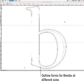
Specific technical names for the various parts of a letterform are used throughout this book. Familiarity with these basic terms will support an understanding of the descriptions of processes that follow. Although the letterforms below are type – the example shows Monotype Bembo at 396 points – many of the terms used are derived from calligraphy. Over the page these terms have been applied to a complete alphabet, together with additional terminology relating to typography. Further technical terms relating to letterpress printing and metal type production and composition derived from casting techniques are then explained. This introduction concludes on page 12 with terms relating to the design and drawing of digital type forms.
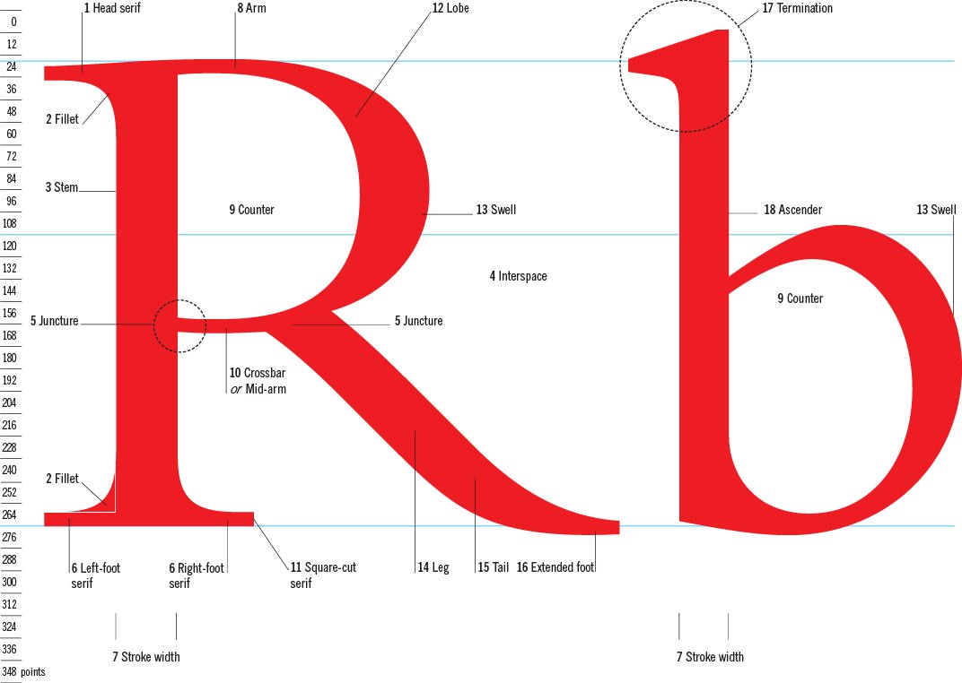
1 Head serif A projection at the top of the stem of a roman letterform. Believed to have been developed by painting on stone with a brush. Progressively inscribed within lettercutting in stone.
2 Fillet or bracket The small quadrant that infills between the serif and the stem.
3 Stem The vertical stroke of a letterform, upper or lowercase from which crossbars, arms or bowls hang.
4 Interspace The ground as opposed to the figure (character) between the parts of a letterform, falling to the left and right.
5 Juncture or Node The point at which strokes converge or from which they emanate.
6 Foot serif A serif at the bottom of the stem of a roman letterform.
7 Stroke width The breadth of a stroke. Strokes may be consistent in width, mono width or taper. Bowls and swashes may include many logarithmic variations in stroke width.
8 Arm A horizontal stroke emanating from the vertical stem.
9 Counter The enclosed, negative space contained within a series of strokes and junctures. Some letterforms, such as stencil forms, have open counters where the negative space is not entirely enclosed.
10 Crossbar or Mid-arm A horizontal stroke which emanates from the stem in either majuscule or minuscules, approximately at the centrepoint of the stem between baseline and cap line.
11 Square-cut serif A serif that ends with a truncated geometric form. Slab serif is a broad, square serif in which a stroke and serif width are similar. A filleted or bracketed square serif is a wedge-shaped serif with flared terminals where the stroke progressively broadens. A tapered serif, where the converging lines run to a point, is often seen in stone cutting. A Tuscan or fishtail (bifurcating) serif is a vestigial serif with a tiny broadening of the stroke which visibly affirms the baseline. A sans serif is a letterform without a serif.
12 Lobe A rounded stroke broadening or tapering from the vertical stem.
13 Swell A term used by some calligraphers and signwriters to describe the broadest point of a rounded stroke. Also used by some signwriters to describe the relative proportion of a letterform, its height to width. A form with swell is broad or expanded.
14 Leg A diagonal stroke emanating from a junction which is often tapering and may not terminate in a serif but a tail.
15 Tail A stroke termination which tapers and resembles a tail.
16 Extended foot The foot is the final element of the leg and sits on the baseline.
17 Termination A generic term for the endings of strokes.

18 Ascender The stroke of a lower-case letter that extends beyond the x height.
19 Cap line An imaginary line that establishes a common height for the capital letters in an alphabet
20 X height An imaginary line that establishes a common height from the baseline for the lower-case letters without the ascenders or descenders and is derived from the height of the lower-case x.
21 Baseline An imaginary line on which cap and lower-case letters sit.
22 Descender Stroke of a lower-case letter which extends below the baseline.
23 Italic Letters which slope forward and may be linked by connectives so that the letters flow into one another. See the ‘a’ above.
24 Ligature A pair of letters combined in a new form as a special character in a font or drawn as a pair in calligraphy.
25 Thin (stroke) A stroke made with a pen characteristically held at a consistent angle in which the full breadth of the nib is not exploited.
26 Thick (stroke) A stroke made with a pen characteristically held at a consistent angle in which the full breadth of the nib is exploited.
27 Descender line An imaginary line that marks the extent of the lower-case descenders.
28 Scoop A curved line that visually lightens the appearance of a stroke.
29 Incline The angled termination of a stroke.
30 Interline space and leading The space between lines of calligraphy is called interline space, in type this is referred to as leading. The term comes from the strips of lead inserted between lines of metal type to create white space between the lines of print on the page.
31 Angle of italicization The degree of slope in italicized lettering.
Upper- and lower-case letterforms
Below is the anatomy of a letterform applied to a single alphabet. Leading can be established by measuring from one baseline to the next. In this example, 60pt Bembo is set on a 72pt baseline, there are therefore 12 points of leading marked in 5 per cent cyan.

Non-aligning numerals have ascenders and descenders and relate to the x height in lower-case characters, aligning numerals stand between baseline and cap height and relate to upper-case forms.
The anatomy of metal type
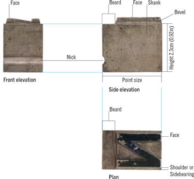
Metal type has borrowed some of its terms from calligraphy; other terms are derived from the production process. Metal type has two principal forms: cold metal (shown here) in which the pre-cast type is set or composed in a stick by hand (see below), and hot metal casting, where the type is cast in composed lines of words. The three elevations above and right show a 72pt piece of type actual size.

The body of the type has a raised relief letterform cast wrong-reading on its surface. The face of the type is inked before printing and pressed into the paper. The bevel tapers away from the letterform to the body. The beard of the type is the space between the baseline and the edge of the body and creates space between lines. The nick is an aid to the compositor, that ensures all the characters are correctly orientated in the stick. The point size is the measure of the cast body, not the printed baseline to cap height.

Metal type of a single size has two fixed dimensions: the body or point size and the type height (the depth of the type between the press bed and paper). The last dimension is determined by the character width. Uppercase M or W are generally the widest characters, the narrowest, the lower-case i. A square of the same point size is referred to as an em and is used as the basis for metal spacing units: en (half em), thick (a third), mid (a quarter), a thin (a fifth) and a hair (either a sixth or a twelfth).
Type sizes

Metal type is cast in standard sizes, points were standardized in 1886. The standard sizes are factorially related, non-standard sizes, such as 13 point are referred to as ‘bastard’ sizes.
Type width

All standard numerals are the same width to support the correct alignment of columns of figures.

Some special characters extend the letterform beyond the body, those combining several letterforms are referred to as ligatures.
The stick, measure and column width
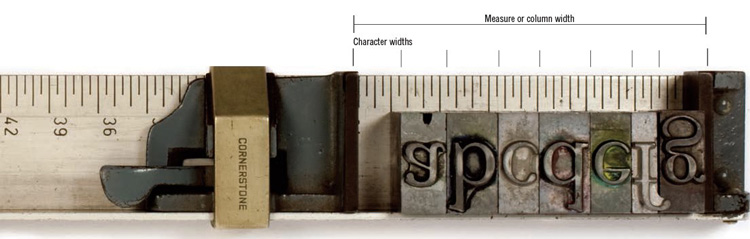
Cold metal type is set in a holder called a stick calibrated in picas (12pts), and used to set the measure or column width. The stick shown here is carrying 72pt Bembo type and is reproduced actual size; the column width is set to the book’s grid. Type characters in the stick vary in width but align on a common baseline.
Many terms used to describe digital type have been appropriated from calligraphy and metal type. Digital type can be output through laser- and ink-jet printers, photographic processes, and used as a keyline to guide computer-aided manufacture (CAM) processes. It is planar (flat) but can be imported into three-dimensional drawing programs that enable designers to extrude and visualize three-dimensional type forms linked to milling or rapid prototype machines, which can produce three-dimensional lettering used for casting processes. A number of key terms that relate to digital letterform construction and digital type production and composition are defined below. Like so much of the digital world, many of the terms relate to production systems not all of which have a visible form.
Digital technology provides a common platform for drawing both calligraphic letterforms or designing type. The calligraphic forms (right) were originally hand-drawn on paper, scanned, before being traced as outlines and adapted. The lower-case b (far right) drawn by Andy Benedek of Fine Fonts shows a similar approach in relation to type. Here shoulders or side bearings of the type are shown as vertical strokes either side of the character.
Digital type sizes
Digital type has no standard sizes, type can be scaled by percentage or specified by hundredths of a decimal point.
Encoding
The outline of a letterform can be stored in a computer in different ways.
Pixel encoding works on simple binary principals: pixels that make up the letterform are encoded and saved as black, while those that make up the ground and counters are stored as white.
Run-length coding is a more efficient way of storing the letterform. It is made up of vertical lines that terminate at a point where they define the character outline, only the start and end point are stored.
Vector encoding is even more economical with memory as the curved outline of a letterform are stored as facets. Only points at either end of each facet are stored.
Hinting
Process undertaken by the designer either automatically or manually to make the best fit between outline and the screen pixel presentation to improve character recognition.
Interpolation
Process of adjusting the form of a character’s presentation at different type sizes within a font family by moderating between two selected sizes to create a third weight. Designers can then manually adjust stroke widths and counters in the new form.
ISO Latin set 1
The basic set of 256 characters held in a matrix that links through OpenType to the QWERTY keyboard.
OpenType
Launched in 1997 Open Type supports both PostScript and TrueType formats and was developed by Adobe and Microsoft for both Macintosh and PC operating platforms. TrueType fonts have the suffix .ttf while PostScript fonts have the suffix .otf.
Pixels and Bitmaps
Short for picture elements, pixels are the smallest unit of digital storage and can be rectilinear or square. Bitmap characters are stored by area through pixel encoding and are heavy on memory.
PostScript
A cross-platform PC and Macintosh computer language independent of specific software packages which enables users to combine typefaces from different designers and manufacturers. The universality of PostScript has overcome some of the inherent problems associated with its predecessors hot metal and photosetting, where many fonts could only be composed by a particular company’s equipment. The shift has democratized font production and availability. Individual type designers using relatively cheap software are now able to singlehandedly develop fonts which they can sell directly to the public or to digital founderies without calling upon the specialist abilities or production processes of tracers, pantograph reduction, engravers, specialist lettercutters, tooling or matrix manufacture.
Resolution
The quality of the digital letterform both on screen and in printed form: the more pixels per inch, the higher the resolution. The print clarity and crispness of a letterform is determined by the refinement of the outputting printer. Domestic laserwriters may output at 300–600dpi (dots per inch) while imageexposing systems for plate-making, film or paper outputs are capable of running 2,500lpi (lines per inch).
Set width and digital spacing
The complete characters set in metal type is based on the em square, characteristically divided into eighteen units. Each character has a body calibrated in these unit widths, referred to as set width. Digital type divides the em into 1,000 units, supporting characters with individual digital bodies. Consequently intercharacter and interword spacing can be adjusted by these tiny tolerances.
TrueType
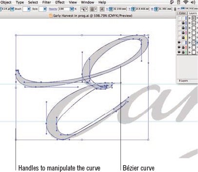
A format invented by Apple to support typesetting. It makes use of quadratic curves as opposed to the Bézier curves used for PostScript.
Unicode
A character language that accommodates 95,156 characters and is therefore capable of supporting alphabets, scripts and associated symbol and glyph sets for the majority of the major world languages. Alternative characters can be carried, for example, roman Q, swash Q, small caps and lower case. This universality was clearly advantageous during the development of the internet in the early 1990s.
Vectors
Vectors describe shapes by outline, using straight and curved lines and link specific points on a plane. They are light on memory.