Chapter 6
Build Your Skills: Enhancing Your Application with a Dynamic User Interface
Apple has always placed an important emphasis on the experience a user has when using an Apple iOS-based device, especially because it was one of the first companies to implement an operating system that used a graphical user interface (GUI) as its focus for user interaction. The Macintosh wasn't the first personal computer to use a GUI but was the first to provide such comprehensive support to the developer community. This included Interface Guidelines, which you've already discovered exist in the OS X of today through some of the Apple Developer resources provided. Apple's take on user experience isn't just the graphical user interface, of course. It also includes things like the physical characteristics of the device and touch-based user input. However, the design of your application's user interface is pivotal in providing the engaging user interface Apple expects and which works harmoniously with the other attributes that make iOS devices some of the world's leading mobile devices.
So with your iOS device in hand, and limited only by your imagination, the only hurdle is unlocking the magic held in your device and converting your ideas to reality through the application. This chapter focuses on how the iOS SDK helps you do just that. Specifically, you look at the following:
- The capabilities of your device and how to embrace them, such as autosizing
- Different application types, and view controllers available to support them
- The user-interface elements provided by the iOS SDK to help you build your user interface
- Working examples of how to use the iOS SDK to implement typical UI Element application features
- Apple resources provided to support you, and some tips of how to get the best from them
You start by exploring some of the key features of the iOS devices and typical applications.
Understanding Platform and Device Constraints
The user experience starts with the device being used, and therefore the devices you target and the physical characteristics of each device your application is written to exploit. Note that I deliberately use the words target and exploit because certain features such as device orientation and the ability of your application to rotate its user-interface are not automatically adopted by your application—you need to specifically write your application to be aware of them. You cover this later in the book.
Let's take a look at some relevant platform characteristics.
Display Size and Resolution
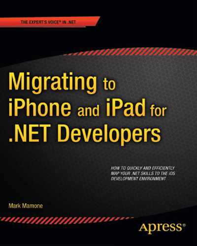
The screen resolution of the different iOS devices is very relevant when designing your application. There is an important distinction between a unit of measure used to describe the size of a device's screen (a pixel) and the measure used to describe the area that is drawn onscreen (a point). Table 6-1 details the screen resolutions available for the different iOS devices in pixels.
At this point, it's worth noting that when you look at the graphical system frameworks provided as part of iOS SDK, they require you to use a logical coordinate system that uses points, not pixels. You look at why, but the conversion between pixel and point depends on your display type. A standard display has is a 1:1 ratio; but on the Retina display, a 1:2 ratio is used.
Example Applications That Take Full Advantage of the Device's Form Factor
Good examples exist of applications that take advantage of the different device sizes and format. Some example applications change the display orientation to one that makes more sense for its usage. For example, in Figure 6–1, the YouTube application on the iPhone uses portrait to display its lists because landscape mode adds little value.

Figure 6–1. YouTube video list represented in portrait orientation
But when you play a particular video, the landscape orientation is better suited. You see the application switch to playing the video in landscape mode, as shown in Figure 6–2. It still has the option for portrait, but that mode is less effective.

Figure 6–2. YouTube defaulting to landscape mode to play a video
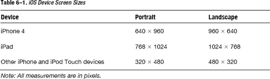
The iPad in particular gives you even more opportunity to take advantage of its dimensions. The Financial Times iPad app uses the device's form factor to present the look and feel of the newspaper that it's digitally emulating, as you can see in Figure 6–3.
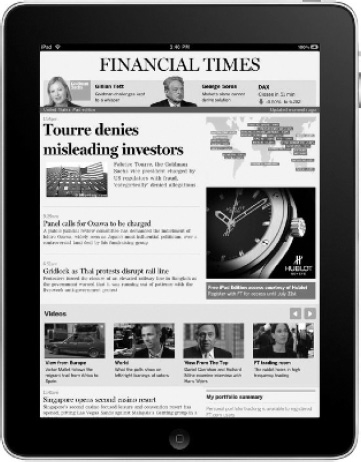
Figure 6–3. The Financial Times iPad application in all its portrait glory
An alternative is the BBC's iPad application, which takes full advantage of landscape mode to display news and corresponding video side by side using a Split View controller (something you build an example of later in the chapter). You can see the application in Figure 6–4.
Figure 6–4. BBC's News iPad application taking advantage of Landscape mode
Points Compared to Pixels
The point measurement unit is used to describe the area that is drawn onscreen, whereas pixels describe the size of a screen or the size of an image such as an icon. Why bother? Apple provides you with support to enable your application to be consistently presented regardless of the device on which it is running. It does this through the use of points and a logical coordinate system that, when also used by the iOS system frameworks to interpret a physical device location, ensures the content you draw appears the same size regardless of device. Microsoft employs a similar logical coordinate system as part of its GDI+ framework. You'll soon find it's as easy to deal with points as pixels, and the logical equivalence across devices often means it's easier.
Other Considerations
There are some obvious considerations when looking at screen size. An iPad clearly has a much larger screen than an iPhone, so your application can make use of this and your artwork quality can also reflect that the size difference. For example, don't just use the same size graphical content and scale it up unless you are happy to sacrifice the quality of your artwork.
Also keep in mind that the Apple Human Interface Guidelines suggest that certain user interface elements remain the same despite the size of the screen. For example, the guidelines suggest that tappable elements in your user interface are most comfortable for users at a size of 44 × 44 points.
NOTE: Typically, the pixel density on a mobile device is higher where it is designed to be viewed up close. This is true of an iPhone 4, which has a pixel density of 326 pixels per inch (PPI), vs. an iPad 2, which has 132 PPI.
Supporting Device Orientation
The iOS provides support for rotating your application based on the device's orientation. Whether your application chooses to support this is of course a design consideration. In some cases it makes no sense for your application to rotate into a certain orientation because the user experience would be sacrificed. For example, a game with some kind of scrolling landscape would look squashed and compromised if rotated to portrait mode.
Handling Device Orientation
As you may have come to expect, the iOS SDK fires an event to notify your code of a device orientation change. Take a look at the event's signature:
(void) didRotateFromInterfaceOrientation(UIInterfaceOrientation)fromInterfaceOrientation
When this event is fired and your application catches the event by implementing this method signature in your code, it is passed the orientation from which the device has been rotated. So you just have to implement the event, right? Wrong—in addition to providing an implementation for the rotation method, you also need to tell your application to support different orientations and fire the event in the first place. If you examine the code created when you build your view controllers, you notice the following code commented out:
/*

// Override to allow orientations other than the default portrait orientation.

- (BOOL)shouldAutorotateToInterfaceOrientation:(UIInterfaceOrientation)

interfaceOrientation {

    // Return YES for supported orientations

    return (interfaceOrientation == UIInterfaceOrientationPortrait);

}

*/
You need to both uncomment this code, indicating to the application that it now supports different orientations, and ensure that you return the value YES if the orientation fired (in the example, portrait) is supported or an unconditional YES if all orientations are supported. You also need to implement the rotation event discussed earlier.
If you want to know whether the device has been rotated into portrait orientation, you look to see if it has moved from landscape orientation and reflect the change by using a view controller that is oriented to that orientation:
if((fromInterfaceOrientation == UIInterfaceOrientationLandscapeLeft) ||

     (fromInterfaceOrientation == UIInterfaceOrientationLandscapeRight))

  {

    //  Load the view controller oriented to the Portrait mode

  }
You can also test for UIInterfaceOrientationPortrait and UIInterfaceOrientationPortraitUpsideDown, in all cases returning YES or NO depending on whether your application has been written to support a particular rotation.
Let's test it. If you leave your code commented out or return a flat NO, your application supports only portrait and not landscape orientation. So, if you run the application in the simulator and use either the rotate left (
 ) or rotate right (
 ) command from the Hardware menu, the device rotates. Rotate it to the left, and you should see a screen similar to the one in Figure 6–5.
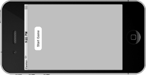
Figure 6–5. Device rotated left
This clearly doesn't look right, and it's no surprise because you've indicated that your application doesn't support any orientation other than portrait. Just to illustrate the point, let's uncomment the code and return YES as the value regardless of the orientation. After you change the code, re-run the application, and follow the same left orientation, you should see a screen similar to the one in Figure 6–6.

Figure 6–6. Device rotated with landscape support
Better, but not right. As you can see, the button isn't centered on the screen as it was in portrait mode. No matter: this is easily fixed because Xcode and the iOS SDK support autosizing using control attributes. Open your project and LunarLanderViewController.xib to display the start screen. Select button using Size Inspector (
 5), and you're presented with the Size Inspector shown in Figure 6–7.
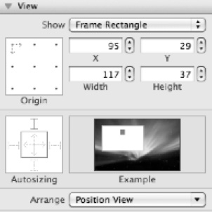
Figure 6–7. Size Inspector
First, don't be baffled by the display; it's pretty straightforward. Let's focus on the Autosizing pane. The box on the left is where you modify the attribute's values; the box on the right is an example animation depicting the effect of your change—a really useful visual tool to confirm you're making the right changes.
Looking more closely, notice two things:
- A set of red arrows in the inner square that represent horizontal and vertical space inside the selected object
- A set of I shapes outside the inner box that represent the distance between the object selected and the outside of the view that contains it
In both cases, a dashed line means the space is flexible: that is, it adjusts based on the orientation of the screen. A solid line means the space is fixed. So, if you want your button to be flexible along the horizontal axis and center itself, you need to ensure that the left I shape is dashed, not solid, as it is by default. This change is shown in Figure 6–7, and the animation shows the button moving to be centered on the landscape screen when rotated—exactly what you want. Make the change and run the application, and you should see a screen similar to that in Figure 6–8. Much better!
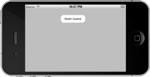
Figure 6–8. The screen rotated left with autosizing adjusted
Autosizing isn't the only option available to you. The iOS SDK provides a method that gives you precise control over the control's look and feel through code by adjusting its properties just before the rotation has completed. The method signature to change is as follows:
(void)willAnimateRotationToInterfaceOrientation:(UIInterfaceOrientation)
The final option available gives you exact control over what your screen looks like in a given orientation but without the effort of doing it programmatically. To achieve this, you have a view for each orientation you want to support, and in the same method just described you adjust the view using the self.view property. This means your view can define the look and feel of your user interface at design time for a given orientation, without you having to programmatically adjust the user-interface controls in code. Simple!
Enough of rotation and orientation. Although they're important, they aren't the main focus of this chapter. Let's look beyond the attributes of the device and consider the type of application you may be building and the SDK support provided to give the user a familiar but rich experience.
Application Types and Associated View Controllers
So far, this book has introduced the concepts of views and view controllers, and even suggested how an application might have multiple views that are programmatically displayed as a result of the user interface. I make distinctions between application types: that is, applications that exhibit certain behaviors and so use view controllers in a certain way. Consider the following application types:
- Utility applications
- Tab bar applications
- Navigation applications
In this context, I class the Lunar Lander as a utility application. The game is played predominately from a single view, and it also shows a configurationstartup screen. However, this is the simplest of user interfaces. It also displays the view controller modally, because the design of the application displays the main game screen as the only screen available while the game is being played or is terminated. Displaying a view modally is typically implemented to stop the flow of your application and force it to return before flow continues. Another typical example is to obtain key information required before you can continue. The alternative is that flow doesn't stop, and views are coordinated through controls such as tab bars.
As you can see, there are many innovative and often complex ways for users to interact with your application, typically controlled through gestures. To take you through working examples for all the different application types and their associated view controllers isn't possible in the constraints of this book. You can explore a number of options independently via the Apple guide, such as http://developer.apple.com/library/ios/#featuredarticles/ViewControllerPGforiPhoneOS or comprehensive iOS development books. Here you focus on some specific, useful alternatives that have .NET parallels, and learn how to use them.
Let's take a look at the different application types and their associated view controllers before you delve into the tab bar example.
Utility-Based Applications
In a utility-based application, the user's interaction revolves around a single view. Other views may exist, but they are typically limited to supporting the configuration of the application. A great example is the Stocks application, shown in Figure 6–9, which when invoked displays the stocks you have chosen (or that it defaults to) and their performance. The Compass is another great example, as is the Calculator application.
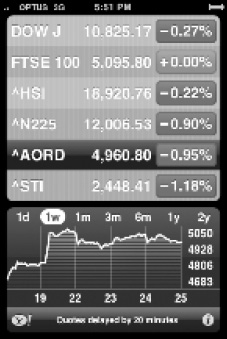
Figure 6–9. The Stocks iPhone application is an example of a utility-based application.
There isn't a specific view-controller class to manage this kind of application; instead, you present views modally in a programmatic fashion. This is exactly what you have done with the Lunar Lander application. In .NET, a utility application might be a console-based application or a Windows Form application with a single window that uses modal dialog boxes to retrieve key information.
Tab Bar–Based Applications
A tab bar application is an application supporting multiple views, whose context is chosen based on the user's interactions and typically shown as tabs. A good example is the Clock application, shown in Figure 6–10, which has many views, accessed through a tab bar at the bottom of the screen. Choosing a tab typically changes the active view controller; a new corresponding view becomes active, thus displaying the new screen.
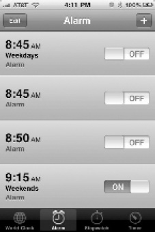
Figure 6–10. The Clock iPhone application is a multiview tab bar application.
It's worth highlighting a common cause of confusion. A toolbar looks very much the same as a tab bar, in that the horizontal bar is used to display icons that can be tapped. The key difference is that the toolbar can contain buttons and other controls, but their selection isn't mutually exclusive. The user can tap more than one, and they don't act as binary switches—instead they simply fire an event for you to capture and process. Conversely, because the tab bar selection determines the view, the tabs are mutually exclusive.
A tab bar application is typically implemented using the tab bar view controller, provided by the UITabBarController class. This class is used directly and not subclassed; you use this as the focus for a more detailed example. In .NET, the tab bar is one of the few view-controller type controls that has a comparable direct.NET control in the form of a TabControl in Windows Forms (in the System.Windows.Forms.TabControl namespace).
It's also worth mentioning that the tab bar is usually combined with a tabular type view, which the table view controller, implemented through the UITableViewController class, is designed for. It provides support for behavior that you expect when implementing a table, such as editing rows of data and or managing the selection of cells, rows, and columns.
Navigation-Based Applications
A navigation-based application is typically used to present a series of views that have a natural hierarchy. For example, if you consider the Mail application, shown in Figure 6–11, each user interaction builds on the previous one and allows you to drill down into your Mail Account, then your Inbox, then your e-mail messages, and then a specific e-mail. Each step is represented by a view, and you can reverse your way out of the hierarchy by choosing the back button.
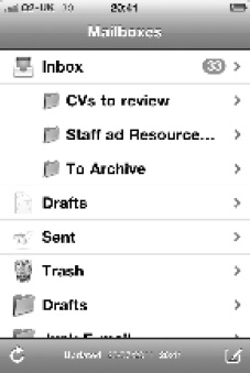
Figure 6–11. The Mail application is a hierarchical, multiview navigation-based application.
The navigation controller functionality is contained in the UINavigationController interface. This is very similar to the UITabBarController interface touched on earlier, with the key difference being that the navigation controller works by implementing a stack of views. For example, think of taking a pile of books and placing them on top of each other—you build a stack of books, and when it's complete, the easiest book to take off the stack is the last one you put on. You can then uncover the stack of books, finishing with the first one you put down. This is known as last-in-first-out (LIFO).
Implementing a Tab Bar–Based Application
If you cast your mind back to previous chapters, you saw the feature that Xcode provided for project templates, something you'll find very familiar if you've used Visual Studio. Usefully, Xcode provides just such a template for tab bar–based applications, so let's deviate from the Lunar Lander application for the moment and use this template to create another sample application to illustrate the features of a tab bar view controller. Begin by starting Xcode, and follow the procedure to create a new template, this time selecting the Tab Bar template as shown in Figure 6–12.

Figure 6–12. New tab bar application
Click Next, and provide your application with a name. I've used TabBarExample—not very imaginative, I know! In order for you to understand what Xcode has constructed, let's look at the application when it's running in the simulator straight out of the box. It's also worth reiterating at this point that the .NET platform doesn't have a concept of a view controller or, specifically, a tab bar view controller; but it does have the individual controls that, when combined with your own MVC Pattern implementation, can easily be used to replicate the same functionality. You compare the controls provided in the user interface libraries of the iOS SDK and .NET a little later in the chapter.
First, consider the screens captured from the simulator, in Figure 6–13, showing the two views displayed when you select the tabs provided in the default project implementation.
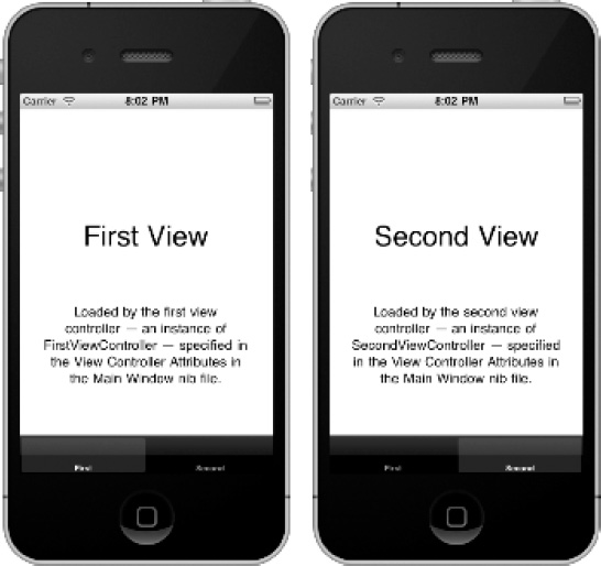
Figure 6–13. Default tab bar application running
Let's look at the implementation that results from having created the default application complete with its view/controller switching functionality. Use the project navigator (1) to view the project's structure; you see something similar to Figure 6–14 when each of the three folders (TabBarExample, Frameworks, and Products) is expanded.
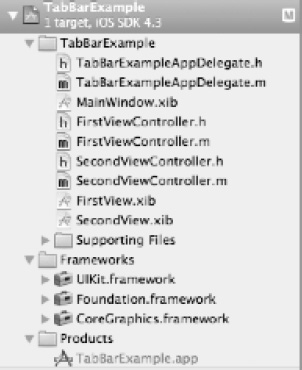
Figure 6–14. Tab bar default project structure
Let's start with the easy bits. Products is a single application binary called TabBarExample.app, which uses the UIKit, Foundation, and CoreGraphics frameworks. In Microsoft .NET, as explained in Chapter 4, these are equivalent to libraries of functionality that provide objects and their attributes and methods, all in their representative namespaces.
Working down the list, let's look at the Application Delegate implementation. If you look in both the header and implementation files, they're very similar to those you've seen before but with a few key differences. Consider the TabBarExampleAppDelegate.h file in Listing 6-1.
Listing 6-1. TabBarExampleAppDelegate.h
#import <UIKit/UIKit.h>


@interface TabBarExampleAppDelegate : NSObject <UIApplicationDelegate,

UITabBarControllerDelegate> {


}


@property (nonatomic, retain) IBOutlet UIWindow *window;


@property (nonatomic, retain) IBOutlet UITabBarController *tabBarController;


@end
The key things to notice are that it inherits from NSObject like previous examples, but it implements not only the UIApplicationDelegate protocol but also the UITabControllerDelegate protocol. Among the options available with this protocol's methods, for example, is the capability to perform post-tab selection actions. You see that it also creates a property pointing to a UITabBarController class, which is the instance reference to your tab controller object that is used by the application. Remember that the UITabController class isn't subclassed; you use the class as it is.
I won't go into the details of the TabBarExampleAppDelegate.m file, but it is worth noticing that the rootViewController for the window is set to the tabBarController property as the main view controller to use. This is shown in the following code:
self.window.rootViewController = self.tabBarController
So far, so good. If you turn your attention to the MainWindow.xib file and double-tap it, it loads in the Interface Builder. Choose the Tab Bar controller view, and you see a screen like the one shown in Figure 6–15 in Interface-Builder.
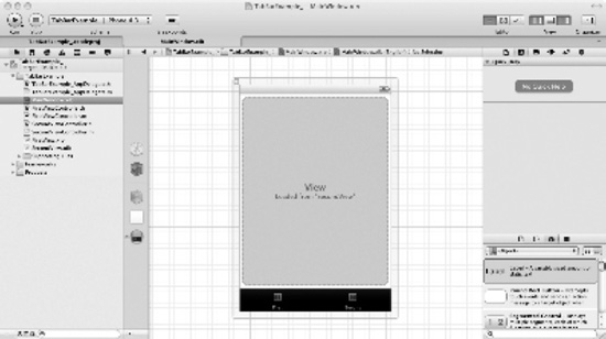
Figure 6–15. The Tab Bar MainWindow view open in Interface Builder
In this case, I've clicked the Second button on the tab bar, and you can see that Interface Builder is indicating that SecondView is loaded. If you click the first tab bar button, it predictably says that FirstView is loaded. This control is indicated in the tab bar properties, which you can display using the Attributes Inspector (4), something like that shown in Figure 6–16.
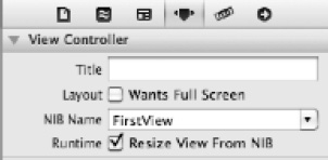
Figure 6–16. Attributes Inspector for a tab bar control
Notice the correlation between the tab bar button and the view it selects. This is indicated by the NIB Name property, which points to the NIB file that contains the view to load—in this instance, the first tab bar button displays the view from the FirstView.xib file. If you locate this file in the project and select it, you see a familiar view, shown in Figure 6–17.
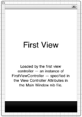
Figure 6–17. FirstView associated with the first tab bar button
Each of the views associated with each tab creates a class and its associated files, both the header and implementation files. Each view (FirstView and SecondView) provides you with the opportunity to complete custom view-controller code; you can build on the default behavior and implementation, which are pretty vanilla, doing very little other than the typical method implementations you've seen. For example, they return YES or NO depending on whether the orientation is supported (in this case by default only if it's portrait).
However, this demonstrates the ability to have different tab bar items associated with different views and view controllers, and exercise flexibility about how the tab bar items look and behave. For example, you can modify tab bar items by removing the text and adding a logo to the project and to the tab bar item. Figure 6–18 shows an example using the Attribute Inspector for the tab bar item selected.
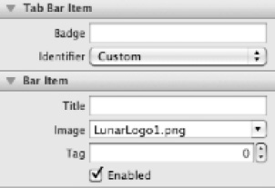
Figure 6–18. Adding a logo using the tab bar item Attribute Inspector
If you were to apply this to your game, you could use this mechanism to have a tab for the main game view displaying the actual game, along with a tab for the view used to display the high score. You won't pursue this for your Lunar Lander game because it typically uses modal views until each game session is finished—but you could. You should also now see the correlation between views and their associated view controllers, allowing you to customize these or add additional ones as suits your application's design.
Another useful technique is to use one tab to provide a means of displaying different perspectives of the same data. So your application may present a list of audio files on your device, with tabs relating to views from different perspectives: a tab for albums, a tab for genres, a tab for track names, and so on.
Overview of iPad-specific Controllers
Before you move on from view controllers, let's highlight some view controllers that are provided as part of the iOS SDK but are specific to the iPad device. The iPad form factor differs from the iPhone's in that it's larger and behaves slightly differently when the orientation is changed. For this reason, some specialized view controllers have been created to take advantage of the iPad's form factor; but this book's examples are focused on the iPhone only, so playing with the view controllers is left to those of you with iPad devices.
Popover View Controllers
Although the Popover controller is not strictly speaking a view controller, it does provide a useful mechanism for displaying additional content in your application's window. If you're looking for similar functionality in .NET, I'm afraid you'll be disappointed. Nothing exists currently, but it's possible for you to create your own equivalent using .NET code, or maybe Ajax-based source code. You can see an example in the iPad simulator shown in Figure 6–19. You build this later; let's look at the component parts first.

Figure 6–19. iPad popover example
To implement a popover, you need to use the UIPopoverController class and have a good idea what condition needs to be met for your popover to be displayed. After all, it's essentially a wrapper for an existing view controller that then displays your floating view over your application. For example, you may have a selection of items the user can choose from, and you wish to use a popover to display the description when a particular option is chosen. It also usefully displays an arrow connecting the popover window with the item to which it relates—in the case of a toolbar button, the button itself. Having made these basic decisions, you're ready to implement your popover.
Let's create a simple popover example to demonstrate these concepts. First, create a view-based application using Xcode 4 for an iPad device. Once created, you notice as before that a view controller is created for the main view. To this view, add a toolbar with a single item, which is the trigger for your popover: do this by editing the associated XIB in Interface Builder and adding the Toolbar object. Your screen in Xcode should look similar to that shown in Figure 6–20.

Figure 6–20. Your example iPad view controller with single toolbar item
If you were to execute this, you'd have a pretty bland application with the single toolbar item at the bottom. It's blank because in the real world you're more likely to have multiple toolbar items, and it has no functionality behind it yet. Let's create your popover. A popover needs a view controller to manage how the data is displayed; in this case, you provide the opportunity to display data in a tabular format, which is pretty typical for popovers. Add a file to your project (I called it PopoverSelection), ensuring that it's compatible with an iPad and that an XIB is created for it. Critically, it must also inherit from the view controller required to display your data. In this case, the popover displays tabular data, so you use UITableViewController as the subclass. See Figure 6–21.
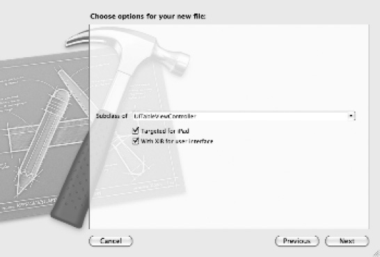
Figure 6–21. Creating your popover view controller class using the table view base class
This creates three files in your project: PopOverSelection.h (the header file), PopOverSelection.m (its implementation), and PopOverSelection.xib (the view). If you open the associated XIB file in Interface Builder, it should look like the one in Figure 6–22.
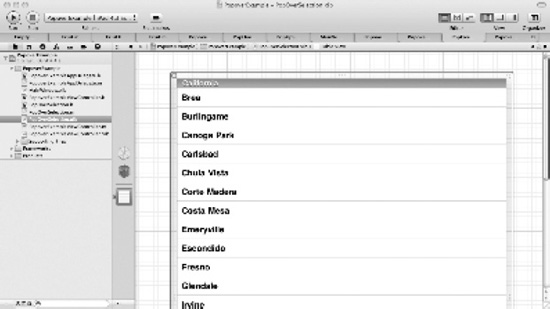
Figure 6–22. Your tabular popover view controller
You need to wire this class into your code, so you must define the relevant properties and actions to allow you to both wire up the popover controller action and present the popover. You do this in your main view controller, called PopOverExampleViewController. See Listing 6-2.
Listing 6-2. PopOverExampleViewController.h
#import <UIKit/UIKit.h>

#include "PopOverSelection.h"


@interface PopoverExampleViewController : UIViewController {

    UIPopoverController *popCtrl;

    PopOverSelection    *selection;

    IBOutlet UIBarButtonItem *bbitem;

}


@property (nonatomic, retain) UIBarButtonItem *bbitem;

@property (nonatomic, retain) UIPopoverController *popCtrl;

@property (nonatomic, retain) PopOverSelection *selection;


- (IBAction)togglePopOverController;


@end
If you break this down, the first thing you need is a pointer to your toolbar button item. You do this by defining an IBOutlet property in your class whose name matches the toolbar button on your item. I changed it to bbitem using the Identity inspector:
IBOutlet UIBarButtonItem *bbitem;
You need a corresponding @property statement, shown next, and of course the @synthesize statement in the implementation file (you see these soon):
@property (nonatomic, retain) UIBarButtonItem *bbitem;
With your toolbar button exposed via properties, you also need to define an action that your button can be connected to through the Interface Builder—this serves to toggle the popover between being visible or not. This is a simple IBAction like those you've used in previous chapters, the definition for which you can see here:
-(IBAction)togglePopOverController;
Finally, you need both a property that points to the popover view controller and the UIPopOverController singleton class that provides the required SDK code to implement popover functionality. The following lines define these member variables. Notice that you have to include your PopOverSelection.h file to bring in the popover view controller:
UIPopoverController *popCtrl;

PopOverSelection    *selection;
And of course you follow these with the appropriate @property and @synthesize statements.
You are now in a good position to connect your action to the toolbar button to invoke the popover selection, and you have the other necessary properties to implement the displayinghiding of your popover. First you connect the action, as you've done in previous chapters. Using Interface Builder, and with your main view controller open and displaying the toolbar button, open the Connections Inspector for the main file owner. Now drag your togglePopOverController action to the toolbar button and your bbitem IBOUTLET to the same button item. This allows you to reference the button and trap the action when it's clicked. You can see these connections in Figure 6–23.
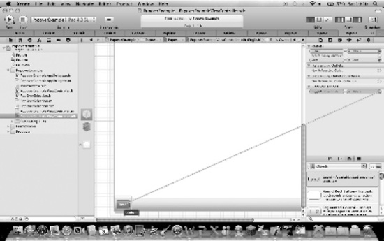
Figure 6–23. Connecting the toolbar button item to your actions in code
The only thing remaining is to provide the implementation for the popover functionality. The code in Listing 6-3 shows the core implementation code, and then you walk through it.
Listing 6-3. Popover's Core Implementation Code
#import "PopoverExampleViewController.h"


@implementation PopoverExampleViewController


@synthesize popCtrl;

@synthesize selection;

@synthesize bbitem;


- (void)dealloc

{

    [super dealloc];

}


- (void)didReceiveMemoryWarning

{

    // Releases the view if it doesn't have a superview.

    [super didReceiveMemoryWarning];


    // Release any cached data, images, etc that aren't in use.

}


#pragma mark - View lifecycle


// Implement viewDidLoad to do additional setup after loading the view, typically from

a nib.

- (void)viewDidLoad

{


    selection = [[PopOverSelection alloc] init];

    popCtrl = [[UIPopoverController alloc] initWithContentViewController:selection];

    popCtrl.popoverContentSize = CGSizeMake(250, 300);


    [super viewDidLoad];

}


- (void)viewDidUnload

{

    [super viewDidUnload];


    // Release any retained subviews of the main view.

    // e.g. self.myOutlet = nil;

    [selection release];

    [popCtrl release];


}


- (BOOL)shouldAutorotateToInterfaceOrientation:(UIInterfaceOrientation)

interfaceOrientation

{

    // Return YES for supported orientations

    return YES;

}


-(IBAction)togglePopOverController

{

    if ([popCtrl isPopoverVisible]) {


        [popCtrl dismissPopoverAnimated:YES];


    } else {


        [popCtrl presentPopoverFromBarButtonItem:bbitem permittedArrowDirections:

UIPopoverArrowDirectionAny animated:YES];


    }


}


@end
Now let's take a look at the various parts of Listing 6-3. First, you need to synthesize your properties with the following code:
@synthesize popCtrl;

@synthesize selection;

@synthesize bbitem;
You also need to ensure that the view controller for your selection popover window (in this case, the view controller class called PopOverSelection with the property selection) and the UIPopoverController class are allocated and initialized. You do this in the viewDidLoad event as shown here:
// Implement viewDidLoad to do additional setup after loading the view, typically from

a nib.

- (void)viewDidLoad

{


    selection = [[PopOverSelection alloc] init];

    popCtrl = [[UIPopoverController alloc] initWithContentViewController:selection];

    popCtrl.popoverContentSize = CGSizeMake(250, 300);


    [super viewDidLoad];

}
First your window's view controller is initialized. Then the UIPopoverController class instance is initialized with your custom view controller object (selection), and you set the default size to 250 × 300 points. The initialization is complete, so let's not forget to release your resources; this is done in the viewDidUnload method, tidying up after yourself:
[selection release];

[popCtrl release];
Finally, you come to the meat on the bones, as they say. The code associated with the button-click action toggles the popover between being visible or not, depending on its status. If it's visible, you can simply pass the dismissPopoverAnimated message; if not, you use the presentPopoverFromBarButtonItem message, passing the button both its popover and any constraints on the arrow being shown. Simple:
if ([popCtrl isPopoverVisible]) {

        [popCtrl dismissPopoverAnimated:YES];


} else {


[popCtrl presentPopoverFromBarButtonItem:bbitem permittedArrowDirections:

UIPopoverArrowDirectionAny animated:YES];


}
If you build and execute this code, your main window is shown with the toolbar at the bottom. Clicking the toolbar button displays and then hides the popover. This popover is now ready to use and present the data you require. The presentation depends on what you've used for the view controller. In this case, it's a table view using UITableViewController, which itself is an extensive control. Although the book doesn't cover this in detail, the Apple Developer Program does extensively in the “Table View Programming Guide for iOS” found in the iOS Developer Library (http://developer.apple.com/library/ios). If you build and run the application, the popover is visible, as shown in Figure 6–24.

Figure 6–24. iPad simulator running the application with the popover visible
Split-View Controllers
The UISplitView controller allows for two panes: the left pane (here called the index pane) is fixed, and the right pane (the detail pane) is resizable. In portrait mode, the detail pane is the only pane visible, with the index pane replaced by a toolbar button that displays as a popover. In landscape mode you have more space, so the index and detail panes are shown alongside each other. You can see them side by side in Figure 6–25.
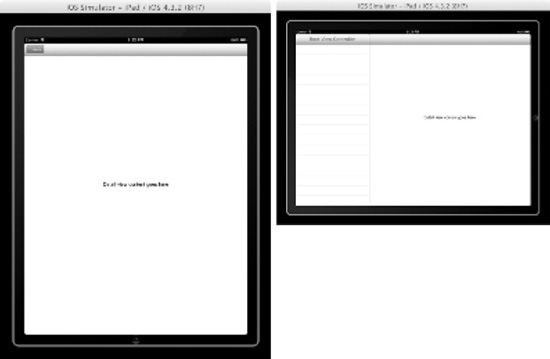
Figure 6–25. Split-view controller managing orientation on an iPad
The UISplitViewController class is used to manage both views in a single view controller, but it must be the root of any interface you create. There is a split view–based application template in Xcode that is a good starting point, and I recommend that you use it as you start to explore. You can see it running in Figure 6–26 in landscape mode, with the two panes clearly visible.
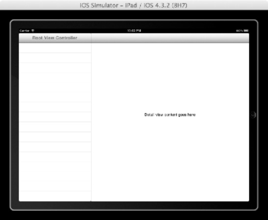
Figure 6–26. The iPad split-view controller template
Looking under the hood of the default implementation, when the application has finished launching, you assign the rootViewController to the instance of your UISplitViewController, much the same as any view controller:
self.window.rootViewController = self.splitViewController;
Now you can use the split-view controller object in Xcode and assign it the view controllers and associated NIB files all in Interface builder, or you can do it programmatically. If you examine the split-view example using the Xcode template, you can see Interface Builder was used to do the hard work—creating a left pane as a table view controller (given the list of data it presents) and the detail view as a standard view controller.
If you were to do this programmatically, you could simply create the two view controllers of your preference and add them to the viewControllers array property of the UISplitViewController class; the first element is the index, and the second is the detail. So, code similar to this should do the trick:
// Create your two view controllers as required, giving them the name firstVC and

 secondVC accordingly.

// firstVC and secondVC would be created here


// Create your SplitViewController instance

UISplitViewController* splitVC = [[UISplitViewController alloc] init];

// Add the view controllers you've created to the viewControllers property as an array

of the two controllers.

splitVC.viewControllers = [NSArray arrayWithObjects:firstVC, secondVC, nil];

// Add to the rootViewController and make visible.

self.window.rootViewController = splitVC;

[window makeKeyAndVisible];
In Microsoft .NET, there are a number of ways you can implement functionality similar to but not exactly the same as a split view, starting with the splitter controls introduced in early implementations of the .NET framework and more recently the SplitContainer class (see http://msdn.microsoft.com/en-you/library/system.windows.forms.splitcontainer.aspx), the replacement for which in WPF is called GridSplitter.
Enough iPad-specific fun. Let's look at what other fun you can have in your user interface.
User Interface Controls
You've covered views and view controllers at length but only touched on some of the elements available to build the user interface for your application. The UIKit framework, provided as part of the iOS SDK, provides an extensive set of UI elements for you to use when designing your application. The same is true of the .NET framework. You likely are familiar with the user interface controls, as they are typically called, that are provided for you to drag and drop onto your Windows Forms, or for you to use as part of other Microsoft technologies such as ASP.NET and the Windows Presentation Foundation. This section introduces the Apple UI elements and also refers to their Microsoft counterparts where available.
Controls
An interface element that a user can interact with, or that presents information back to the user, is called a control. As in the .NET framework, the iOS toolset provides a large number of controls available for use in your application. For each control, this section provides a brief overview of its purpose and, as space permits, a quick introduction to when to best use it. You also cover similar controls in the .NET framework. Let's start with controls that are used a little less often, followed by those that have a direct .NET counterpart.
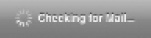
Activity and Progress Indicators
These controls are used to indicate to the user that a particular task is progressing. They provide visual feedback that the task is working by showing a spinning gear icon or a progress bar.
For the activity indicator, you use the UIActivityIndicatorView class and call the startAnimating method when you being your task and stopAnimating when it's completed. The control looks similar to that in Figure 6–27.
Figure 6–27. Activity indicator
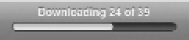
The iOS toolset also provides a progress indicator, which is similar to its .NET counterpart the Windows Forms ProgressBar class. The iOS version is shown in Figure 6–28.
Figure 6–28. Progress bar
It is implemented through the UIProgressView class, and as you'd expect, as progress is made, the bar starts to fill. This control is typically used when the task has a predetermined scope: for example, downloading 50 e-mails. If you cannot measure the progress, you should use the activity indicator instead.
Date, Time, and General Pickers
The date and time picker control, implemented by the UIDatePicker class, provides a touch-friendly way of choosing a particular date and/or time by using sliding wheels representing each element of the date or time. You can see this on the control shown in Figure 6–29.
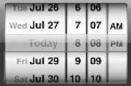
Figure 6–29. Date and time picker
You could of course present the date and time in a control that allows you to type in the values, or choose from drop-down boxes, which is the way the .NET framework expects you to enter a date/time. However, on the iPhone, to take full advantage of the touch-based interface, this presents a far more intuitive method. On the iPad, this control is normally presented as a popover.
There is no .NET equivalent that behaves in the same way, although the DateTimePicker class in .NET does provide a good alternative; it presents the date in a calendar-type format, typically with the month displayed and each element as a drop-down box and/or direct input. The iOS Picker class uses a similar approach but presents the user with a custom list in a single wheel that the user can then select from.
Detail Disclosure Button
A detail disclosure button, implemented by UITableViewCellAccessoryDetailDisclosureButton, allows you to indicate an item of interest on your screen. An arrow in a blue circle indicates that more information is available. When tapped, it displays the additional information as if it were a hyperlink. This control may be familiar from its use as a map annotation on your iPhone or iPad Maps application, as shown in Figure 6–30.
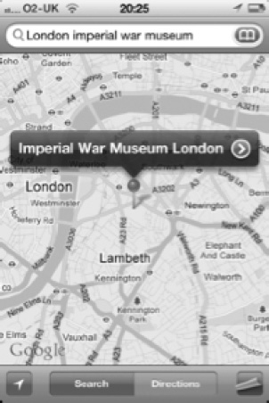
Figure 6–30. Detail disclosure button
There is no equivalent in the .NET framework, but as usual, nothing is stopping you from writing your own (although doing so isn't trivial).
Info Button
The info button is used to provide access to a configuration screen for your application. It's implemented using a UIBUtton class and the buttonType property to indicate it's an info button, which thus provides the right image as shown in Figure 6–31.
Again, there is no equivalent in the .NET framework, but you could implement similar functionality using the Button class and a suitable image.
Page Indicator
The page indicator, implemented by the UIPageControl class, provides a useful visual indicator of which view is currently open within the bounds of the totals views available, as shown in Figure 6–32.
Figure 6–32. Page indicator
As you open a view, a dot is added to represent the active or displayed view's place in the sequence. After 20 dots, the control clips any more dots so they aren't displayed. (I would argue that if you're displaying this many dots, you should rethink your user interface design.)
There is no .NET equivalent.
Search Bar
The search bar control, implemented through the UISearchBar class, allows the user to enter a text string and choose to execute a search by tapping the magnifying glass. It also lets you present common information using the bookmark icon. See Figure 6–33.
Figure 6–33. Search bar control
There is no direct .NET equivalent control.
Switch
The switch control, implemented through the UISwitch class, allows the user to choose between options that are mutually exclusive, such as ON or OFF. See Figure 6–34.
Figure 6–34. Switch control
There is no equivalent control in .NET, at least not in look and feel, although a Checkbox performs the same function: it can be checked (ON) or unchecked (OFF).
Segmented Control
A segmented control, implemented through the UISegmentedControl class, provides a method for displaying a set of segments, each of which behaves like a button and can display a corresponding view. An example is shown in Figure 6–35.
Figure 6–35. Segmented control
The segmented control provides a convenient way to group related buttons and can display either text or an image as the face of each button. The buttons are mutually exclusive, and you can have as many segments as you wish, differentiating it from the switch control.
Again, there is no .NET equivalent control, although the use of mutually exclusive radio buttons in .NET offers similar functionality.
Common Controls
A number of common controls are available in the iOS UIKit framework for which a direct .NET equivalent is available. Their usage and behavior are almost identical to their .NET counterparts, so for brevity I don't describe them in detail. These controls are shown in Table 6-2.

Let's take a look at other user interface elements included in the UIKit. Don't forget that you can use the Apple Developer resources to explore the vast array of user interface controls in the UIKit framework of the SDK; and making the correlation (where one exists) to .NET controls is pretty straightforward, as you've seen from the examples in this section.
Navigation and Information Bars
There are a number of user interface elements that are not typically used to define your application but either provide information to the user or manage how you navigate your way around your application. These elements are called bars, and they include status bars, toolbars, navigation bars, and tab bars—the latter of which you saw earlier in the chapter.
Status Bar
The status bar is used to display important information to the user and always appears in the upper edge of your device screen, regardless of the orientation of your device. Additionally, although on the iPhone you have some control over the color of your status bar, on the iPad the color is fixed as black. You can see the iPhone status bar in Figure 6–36.
Figure 6–36. Status Bar
You implement the status bar by setting the UIStatusBarStyle for your UIApplication or using an Info.plist value (UIStatusBarHidden) to hide it. The Apple Developer usage guidelines are quite specific: if your application is a game or full-screen, then the status bar typically may be hidden; otherwise the recommendation is that it be displayed, especially given the small amount of space it takes.
The StatusBar class in the .NET framework offers similar functionality.
Toolbar
A toolbar, implemented by the UIToolbar class, is pretty well understood in most graphical user interfaces, and the behavior for iOS devices is no different. It's used to provide graphical images that, when tapped, perform actions in your application. You typically place common actions on the toolbar for ease of use. You can see a toolbar in Figure 6–37.
Figure 6–37. Toolbar
The toolbar is located on the bottom edge of the screen for iPhone applications and at either edge for iPad applications, depending on the orientation and which edge you snap the control to. The items on the toolbar are context sensitive, which means they reflect actions that are typically performed against the associated view and for that reason may change between views.
The Toolbar class in the .NET framework provides equivalent functionality.
Navigation Bar
The navigation bar, implemented by the UINavigationBar class, is used to manage navigation through a hierarchy of views and is usually associated with the navigation controller. It's shown in Figure 6–38.
Figure 6–38. Navigation bar
Navigation bars are common in iOS applications when you're dealing with different views or a tab bar isn't appropriate. However, although their use is relatively straightforward, it's beyond this chapter, and the iOS Developer web site does a good job of describing it. So, the implementation of the navigation bar and associated controller is left to you, armed with the iOS developer web site: http://developer.apple.com/library/ios/#featuredarticles/ViewControllerPGforiPhoneOS/NavigationControllers/.
There is no equivalent to the navigation bar in the .NET framework.
Content Views
The iOS SDK provides a number of user interface elements intended to present custom content back to the user from your application. You've seen two iPad-specific views, the split view and the popover, but a number exist for the iPhone too.
You walk through these in turn; they are commonly used in iPhone applications because of the useful capabilities they provide.
Table View
The table view element, implemented through the UITableView class, is used as its name suggests, to present data in tabular format (rows and columns of information). An example is shown in Figure 6–39.
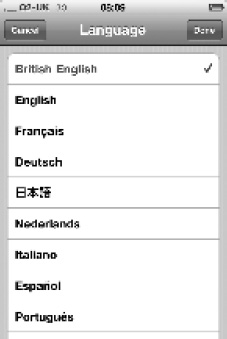
The table view control is highly configurable and used extensively in many iPhone applications. For example, the Contacts List is a table view implementation, as is the Language selection screen when choosing your device's international settings. Such diverse examples show the flexibility of the control. Remember the table view, because you'll use it to display your Lunar Lander game's High Score table.
The DataView control, when bound to a data source, provides similar functionality in the .NET framework. In the Windows Presentation Foundation, the DataView control has been replaced with a table view capability that offers similar functionality to the iOS table view element.
Text View
The text view control, implemented by the UITextView class, is used to present and allow the input of several lines of text in your application. An example is shown in Figure 6–40.

The equivalent in the .NET framework is the TextBox control.
Web View
The web view control, implemented by the UIWebView class, allows your application to display rich HTML content. It isn't recommended that you create an iOS application that behaves like a web page—that's what the Safari browser is for—but if you need to wrap a web page of any description in your iOS application, this is the control to use. An example loading the www.bbc.co.uk home page is shown in Figure 6–41.
This example can be easily created using a view-based template in Xcode 4 and adding a web view control along with an associated property. You then simply add the code snippet in Listing 6-4 to the viewDidLoad event for the view that loads the home page using the loadRequest WebView message. As you can see, the web view control is acting as a wrapper to the existing web-based content, in this case the BBC's home page.

Figure 6–41. A web view example showing the BBC home page
Listing 6-4. Web View Example
// Load the WWW.BBC.CO.UK homepage within the WebView

NSString *urlString = @"http://www.bbc.co.uk";

[wvBrowser loadRequest:[NSURLRequest requestWithURL:[NSURL URLWithString:urlString]]];
The equivalent in the .NET framework is the WebBrowser class, using the Navigate() method as an equivalent loadRequest message.
Other Elements
Although the last few pages have introduced quite a few UI elements, there are still more left for you to discover. However, I didn't want to leave a few other useful UI elements untouched, specifically alerts and action sheets.
Alerts
Alerts are designed to provide important information to the user of your application. When invoked, the alert presents a pop-up window over your existing views, and you cannot continue with your application until it is closed.
In .NET it is very similar to a MessageBox, invoked by a method of the same name. In iOS, you use the UIAlertView class to implement an alert and to display the short alerting text along with one or two buttons.
An alert is typically used to inform the user that something of significance has happened and may not be associated with their most recent actions. For example, if you kicked off a background task as part of your application and then moved on to do something else, you could use an alert to signify its completion. An example is shown in Figure 6–42.

Figure 6–42. Alert view example
You can easily create this alert view example using the code snippet in Listing 6-5. The parameters are pretty self-explanatory.
Listing 6-5. Alert View Example
UIAlertView *alert = [[ UIAlertView alloc]

                      initWithTitle: @"Important Fact"

                      message: @"Something important has happened"

                      delegate: nil

                      cancelButtonTitle :@"OK"

                      otherButtonTitles: nil];

[alert show];

[alert release];
Action Sheets
The final UI element introduced here is the action sheet, implemented by the UIActionSheet class and providing a mechanism for presenting a set of choices in relation to a particular user action. For example, the Safari browser provides an action button that, when chosen, presents a number of choices based on the web page being displayed—for example, you can add it as a bookmark, make it your home screen, and so on. This window with multiple choices is called an alert sheet and is shown in Figure 6–43.
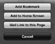
Figure 6–43. Alert sheet example
On the iPhone, the alert sheet appears from the bottom of the screen, and on the iPad it appears as a popover. There is no direct equivalent in .NET, although you could argue that a ContextMenu provides similar functionality.
Apple's User Interface Resources
Apple provides a number of resources that are essential reading when designing your own user interface. Some of these are listed here:
- iOS Human Interface Guidelines: Provides guidelines and describes principles for designing that superlative user experience.
http://developer.apple.com/library/ios/#documentation/userexperience/conceptual/mobilehig/Introduction/Introduction.html. - View Controller Programming Guide for iOS: Provides guidance about structuring and managing your application's user interface. http://developer.apple.com/library/ios/#featuredarticles/ViewControllerPGforiPhoneOS/Introduction/Introduction.html.
- View Programming Guide for iOS: Provides guidance for presenting and animating your user interface.
http://developer.apple.com/library/ios/#documentation/WindowsViews/Conceptual/ViewPG_iPhoneOS/Introduction/Introduction.html. - Drawing and Printing Guide for iOS: Provides guidance on drawing custom content and printing information.
http://developer.apple.com/library/ios/#documentation/iPhone/Conceptual/iPhoneOSProgrammingGuide/Introduction/Introduction.html.
Summary
This chapter started by taking a look at the different device types and their capabilities from a user interface perspective. You should always be cognizant of the device or devices to which you are targeting your application when designing its user interface.
You then examined the different application types, and specifically the view controller and view combinations possible. You already looked at presenting single views, including one modal-based view, using the Lunar Lander example, but many other options exist. There are too many options to cover in a single chapter, so you looked at a tab bar example (which might be appropriate for your game) and then some of the other view controller types.
After you saw the different view controllers and the mechanisms for managing the presentation of different views, you looked at the user interface elements available with which you can design your actual view. In the Lunar Lander game, you are painting a number of graphics in real time. But if you have developed .NET applications using Window Forms, or even ASP.NET, the use of UI controls to design your user interface will be familiar—and some of the iOS controls should be well-known to you. The chapter provided examples of how you might use some of the controls that are slightly more unusual.
You should now be armed with enough knowledge to navigate view controllers, views, and user interface controls, and map your .NET knowledge onto the iOS equivalents where they exist. This chapter has reiterated a number of times the importance of the user experience when building an iOS mobile device application, and it's no surprise that Apple provides numerous resources you can use to support the knowledge you've built so far, to help understand the examples in this chapter, and to provide a reference for your own exploration. Enjoy!