6
LAYER STYLES: BEVELS, SHADOWS, GLOWS, AND MORE!
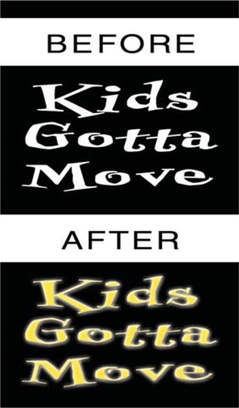
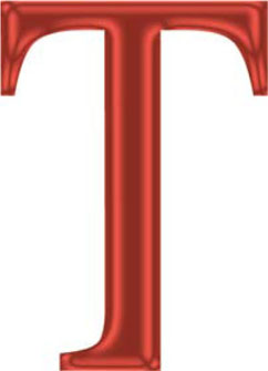
While many graphics are easy to read at print resolutions, they quickly become lost in the frame when keyed over moving video. In the print world, type is generally placed over a solid color (such as white paper). In the video space, we frequently mix type with motion, and this results in an issue referred to as type on pattern.
There are several strategies for assisting with readability in these situations. Common techniques include adding bevels, glows, or contrasting drop shadows. While there are many excellent Photoshop techniques and software products developed over the years, nothing is better suited for the video world than proper use of Layer Styles.
What are Layer Styles?
Imagine effects that never need rendering. Did I mention that they are infinitely customizable? Oh, and if you make a change on the layer, they instantly update. Photoshop offers several customizable effects that can be applied to a layer. The effects that are applied to a layer become the layer’s custom style.
Layer Styles are the perfect tools for a video pro with deadlines. Layer Styles are fast. They can be embedded into the document or easily transported, eliminating the need for identical plug-ins and cross-platform issues. Better yet, there are thousands of Layer Styles available online for free. And best of all, the effects are “live” (much like After Effects), which gives you the ability to apply, stack, undo, or remove as many times as you (or the producer) wants.
Styles aka Effects
 Layer styles are often referred to as layer effects. Do not get confused if looking at articles or tutorials.
The best way to understand Layer Styles is to simply apply them. Of course, there are a few gotchas—it wouldn’t be a computer application if there weren’t. Layer Styles are designed to work inside of Photoshop, which means they aren’t particularly friendly when you import layered files into a video application. They also don’t work perfectly with alpha channels. However, both problems can be solved in 15 seconds, still leaving Layer Styles well ahead of the race against the clock. There are four major ways to apply styles:
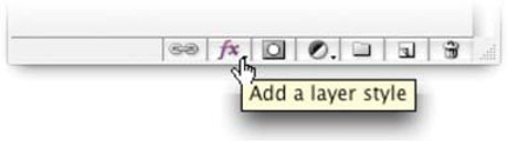
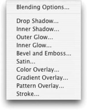
• The Add a Layer Style pop-up menu at the bottom of the Layers palette
• The Style palette
• The Layer Style dialog box
• The Layer menu (Layer>Layer Style)
More Styles from the Mothership
Looking for more Layer Styles? Be sure to check out the incredible adobexchange.com site and you will find a generous community offering free Layer Styles.
Each provides unique advantages, depending upon your situation. We will cover all four in this chapter, but let’s start with the pop-up menu.
Step 1. Create a new document sized for video using the NTSC D1 preset.
Step 2. Place an element such as text on an empty layer. Choose a thick, sans serif font and type a short word.
Step 3. Go to the bottom of the Layers palette; click on the fx icon (older versions use a circular f). Choose the first effect, Drop Shadow.
Step 4. The Layer Style dialog box appears, and you have the chance to tweak your effect.
Drop Shadow
The drop shadow is a straightforward effect that will serve well as an introduction to the other Layer Styles. Many of the options presented will reoccur in other Layer Styles.
Shadows…Go Forth and Multiply
The most practical blending mode for shadows is Multiply. This causes the shadows to mix with the background on which they are lying and create a darkening effect.
Blend Mode: You can specify the blending mode for the shadow. Different colors and modes will produce very different results. Remember, shadows aren’t always black; they often pick up the color of the light source or background on which they are cast. The Multiply blending mode is the most common for shadows.
Color: By default, the shadow is set to black. To change the color of the shadow, click on the colored rectangle to load the Adobe Color Picker. You can also pick a contrasting color to help offset your type or logo on a busy background. This allows the shadow to more realistic ally blend with lower layers.
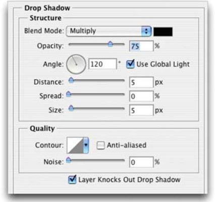

Opacity: You will want to adjust the opacity to taste. Opacity is the opposite of transparency; the higher the number, the less you can see through the layer.
Angle: This setting affects the direction of the shadow.
Use Global Light: The Global Light option allows for a consistent light source for all layer effects. It’s a good idea to leave the Global Light box checked so that your designs have realistic lighting. You can adjust the angle to modify all your effects.
Global Light is Important
The Global Light of a Layer Style affects important aspects like the direction of shadows and reflections. It is important to keep your Layer Styles consistent, so be sure to use a consistent global light setting to drive the effects.
Distance: The Distance option affects how far the shadow is cast. If numbers aren’t your thing, you can simply click in the window and manually drag the shadow into a new position.
Spread: This affects how much the shadow disperses. Higher numbers create greater dispersal.
Size: This modifies the softness of the shadow. Higher numbers create softer edges.
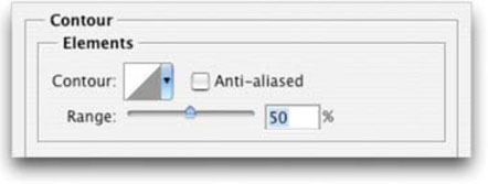
Contour: While most users skip the Contour settings, you will not. The Contour is a curve; it represents how Photoshop fades transparency. We’ll explore this powerful option later in this chapter.
Anti-aliased: Don’t forget to check the Anti-aliased box. Antialiasing will give you smoother on-screen results, especially at video resolutions.
Noise: Noise can add random dispersion to your style. This can help make the effect look more natural as well as reduce banding on a video monitor.
Layer Knocks Out Drop Shadow: This option is checked by default (and should probably stay that way). It ensures that the shadow does not bleed through partially transparent text.
Uncheck the Drop Shadow box to remove the shadow, and then click on the Inner Shadow box.
More is Better
 You’ll find the Layer Styles shown in this chapter on the book’s disc, as well as 55 styles from Action FX.
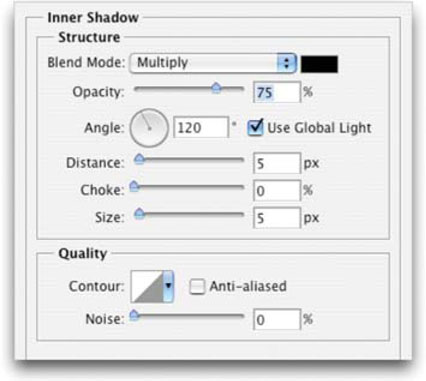
Inner Shadow
Inner shadows cause a shadow to be cast in front of your layer. This effect can be used to create a “punch-out” or recessed look. Inner shadows look best when they are soft. Play with the distance and size sliders to get a desirable effect. Inner shadows work well with other Layer Styles, but look distracting when overused. The controls of this effect are nearly identical to those of drop shadow. There is one new setting called Choke.
Choke: You can use a slider to shrink the boundaries of the Inner Shadow prior to blurring.

Go Softly
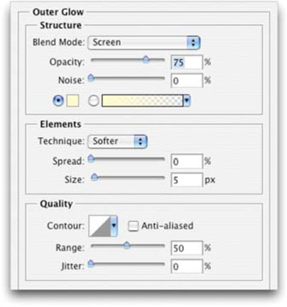
Soft-Edged Stroke? Sure—it’s called Outer Glow. Adjust the size and spread for better appearance.
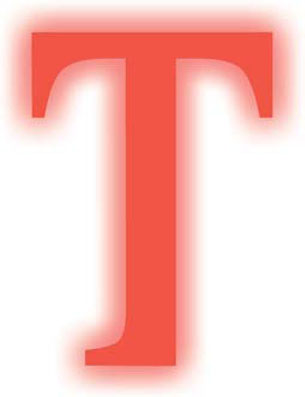
Outer Glow and Inner Glow
These two effects offer similar controls. Both enable you to set color, amount, and shape of the glow. The key difference is that the inner glow lets you set where the glow emanates, the edges of the layer or the center of the layer. Inner glows signify light coming from behind the layer. It is unlikely that you would need to apply a drop shadow and a glow simultaneously. Tweak the contour and quality for a variety of shapes to your glows.
Technique: You can choose to use the Softer option, which does not preserve as many details. Alternately, choose Precise if the source has hard edges (like s logo or text).
Source: An Inner Glow can originate either from the edges or the center of a layer.
Range: This helps target which portion of the glow is impacted by the contour.
Jitter: This will vary the application of the glow’s color gradient. It affects color and opacity. Modify to make subtle changes to the effect.
Bevel and Emboss
This versatile effect enables you to access five different types of edge effects. These work very well for offsetting a layer. Bevels complement inner and outer glows to produce a realistic depth effect.
• An Outer Bevel adds a three-dimensional beveled edge around the outside of a layer; this is generated by adding a clear edge.
• Inner Bevel generates a similar effect inside the edge but uses the layer’s own pixels.
• The Emboss effect combines inner and outer bevels.
• Pillow Emboss combines the inner and outer bevel, but reverses the outer bevel, causing the image to appear stamped into the composition.
• The last effect, Stroke Emboss, must be used in combination with the Stroke layer effect. These two combine to create a colored, beveled edge along the outside of a layer.
Check Yourself
 Don’t over-bevel. A subtle bevel helps a text or logo element lift off the screen and adds subtle depth. Overuse, however, looks amateurish.
The beveled edges allow a great deal of control. It is possible to change the lighting source and direction of the bevel, as well as thickness, softness, and depth. It is also possible to use the power of blending modes to create extremely photorealistic effects, such as plastic or chrome.
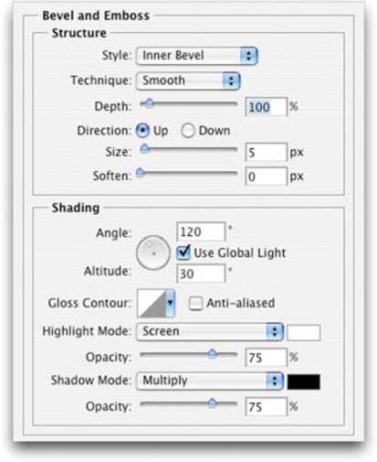

Depth: This is the thickness of the bevel.
Direction: You can set the bevel to go up or down. This can dramatically change the look of the bevel.
Altitude: You can set the altitude of the light source between 0º and 90º. The higher the number, the more the bevel appears to go straight back.
Gloss Contour: Use this command to create a glossy or metallic appearance. The Gloss Contour is applied after shading the bevel or emboss.
Highlight Mode and Opacity: This specifies the blending mode and opacity of the highlight.
Shadow Mode and Opacity: This specifies the blending mode and opacity of the shadow used in the bevel.
Contour: The flexibility of the Contour controls is the bevel effect’s best feature. There are many presets to try, or create your own. There are two contour settings: the first pane affects the lighting of the bevel, and the Specialized Contour pane alters the shape of the edge.
Texture: The final option is Texture, which can be applied to the bevel or entire surface. Many presets can be used by clicking on the triangular menus. Additional patterns can be loaded or created. Many textures exist at online creative sites; you’ll also find a variety of textures included on the bundled DVD. Creating unique textures is also easy, as we’ll see in future chapters.
Uncheck the Bevel and Emboss boxes to remove the bevel, and then click on the Satin box.
A Soft Touch
Satin is an underused effect that can add soft highlights to a layer.
Satin
Satin is used to add regular ripples or waves in your Layer Style. With a little practice, you can create liquid effects and subtle highlights. This style requires some experimentation because its controls are very sensitive. Choosing different colors, contour settings, and blending modes will produce widely different results. Satin works very well in combination with other effects.

Uncheck the Satin box to remove the Satin effect, and then click on the Color Overlay box.
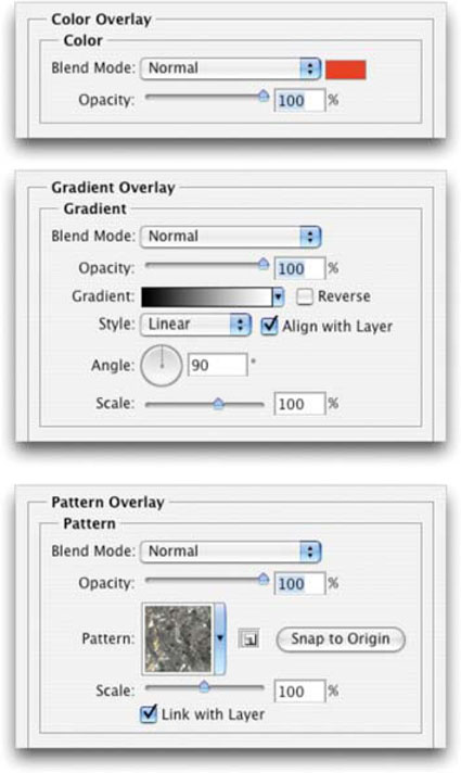
Color, Gradient, and Pattern Overlays
These three styles all serve a similar purpose: to replace the contents of your layer with new fill colors or textures. A great time-saver is the ability to quickly swap colors on a group of layers without having to repaint or edit each layer. It is possible to switch the color of text by applying a new color in the Layer Style. This same style can be applied to multiple layers simultaneously.

Step 1. Copy the Layer Style by ![]() +clicking (right-clicking) on the small fx (f) icon.
+clicking (right-clicking) on the small fx (f) icon.
Step 2. Link all of the layers together.
Step 3. Then ![]() +click (right-click) and choose Paste Layer Style to Linked.
+click (right-click) and choose Paste Layer Style to Linked.
Gradient and pattern overlays are useful in creating new looks, especially when using photorealistic patterns or seamless tiles. To create more believable effects, be sure to combine pattern usage with blending modes. All three of these overlay effects are useful in creating your own Layer Styles.
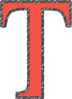
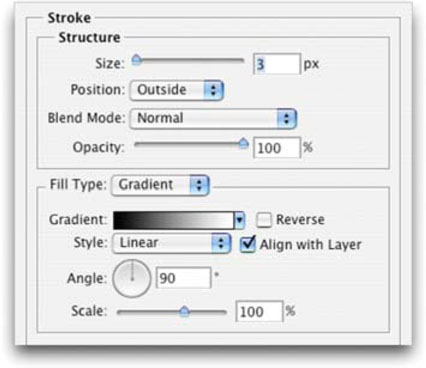
Stroke
The Stroke effect places a colored border around the outside edge of a layer. This is a great replacement for using the Stroke command under the Edit menu. It is now possible to keep the stroke as an easy-to-update effect without needing to place it on its own layer. All of the needed controls are here: you can choose from inner, outer, or center strokes, as well as advanced controls such a blending modes, textures, and gradients. The Stroke effect can be further enhanced by combining it with the Stroke Emboss effect.
Designing with Layer Styles
Harnessing Layer Styles is an important part of a professional user’s workflow. The efficiency and flexibility offered by styles are huge time-savers. They can also add consistency to a designer’s techniques. Be sure to fully explore all the ways that styles can be useful to you.
Loading Prebuilt Styles
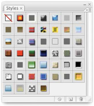
Sometimes the best way to start is with a preset. Photoshop includes some good styles to work with. The easiest way to work with styles is to call up the Styles palette, which by default is docked with the Color and Swatches tabs. If you’ve closed that window, look under the Window menu and call up the Styles palette.
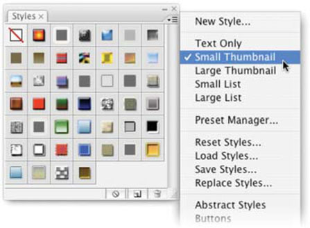
You’ll notice a small swatch that represents each style. To apply a style, highlight any layer (other than the Background layer or a locked layer) and click on a swatch. You can view these preset icons in many ways. Click on the triangular submenu icon in the upper right corner of the Styles window and choose from different sized thumbnails or lists. For the visually minded, I recommend a thumbnail view. If you have many presets to choose from, the large list view is helpful because it combines a name and thumbnail.
Accessing Additional Built-In Styles
When you need more styles to choose from, simply pick from the drop-down list in the submenu (Photoshop comes with 10 styles to choose from). When you select a new set of styles from the Preset list, you are presented a choice. You can:
• Append: Adds the new styles to the bottom of the current list.
• Cancel: Does not load anything new.
• OK: Replaces the current list with new presets.
Step 1. Open up the Ch06_Start.psd file in the chapter’s folder. If you do not have access to this file, create a new document with a floating text layer.
Step 2. Select the Text layer so that the layer is highlighted. Call up your Styles palette. From the submenu, choose Text Effects 2. Click OK to add the styles.
Step 3. Click on each preset, pausing to study the end results. See how quickly the simple text layer changes from organic effects, to shiny metal, to jelly-like letters? This is just the beginning.
To fully appreciate the power of Layer Styles, have your Layers palette open. As you change styles on a layer, the palette updates. Double-click on each component to call up the dialog window. You’ll discover how the effect was made. Better yet, these presets are merely starting points! You can modify them and save them for later use or sharing with others.
Accessing Additional Styles
If you’d like to load new styles that don’t appear in the preset list, choose Load Styles from the Styles window submenu. For inspiration, we’ve included a large collection of styles in the chapter’s folder on the DVD. If you’d like these to appear in your preset list, find the Presets folder inside your Photoshop application folder and look for the Styles folder. Any Layer Styles copied into the Styles folder will appear as a preset the next time you launch the program.
Technology is only as good as it is customizable. Fortunately, Layer Styles are infinitely “tweakable.” You can create your own entirely from scratch, or build off an existing style. The practice of building styles is booming in Photoshop user groups. One of the best places to look is Adobe Exchange (http://www.adobe.com/exchange). This popular site is free. (Don’t be thrown off when it asks you to register.) Here you will find tons of content available for all Adobe products. On first visit, stick to Photoshop and look at the styles available. You will find that many users have been busy posting their own creations. Download a few styles to help on your next project and see what’s possible with Layer Styles.
Sizing Styles
When changing Image Size (Image > Image Size), you can now specify that you’d like styles to scale proportionately.
Building Your Own Styles
Creating a style is a straightforward process. You can apply any combination of the previously mentioned 10 effects. Change the options, use a new texture, apply gradients and blending modes, and so on. If you are unsure how each Layer Style is applied, flip back to “Layer Styles” on page 141. Styles are quick to learn and easy to master; just continue to experiment with many options. Advanced customization through contours, gradients, and textures will be covered later on in this chapter.

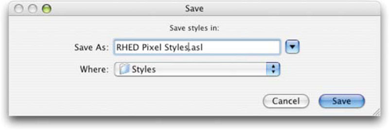
Saving Styles
Once you’ve created an original style (or even modified an existing one), you will likely want to save it. Sharing styles can be accomplished two ways:
• First, you can give someone the project in which you used the style. The styles remain attached to the layered document. Choose a layered format such as PSD, Layered TIFF, or Photoshop PDF. This will allow the information to be called back up later. So six months from now, when your project comes back, you can open up your source files and start making changes.
• The second method is more efficient for the Web. You can save the styles as self-contained .asl files. These library files can then be shared between users and machines.

Sharing Styles
Whatever items currently appear in the Styles palette will be included in the style library. It is a good idea to remove unwanted or preset styles from the palette first. You can drag these into the palette’s Trashcan, or ![]() +click (
+click (![]() +click) on the ones you wish to delete. When ready, choose Save Styles from the Style palette submenu. The resulting file is small and can easily be e-mailed to others. To prevent the file from being garbled in e-mail, make sure that you include the .asl extension.
+click) on the ones you wish to delete. When ready, choose Save Styles from the Style palette submenu. The resulting file is small and can easily be e-mailed to others. To prevent the file from being garbled in e-mail, make sure that you include the .asl extension.
Save Yourself
If you add new styles to a library, you must resave the .asl file to update it. Otherwise, the new styles will be cleared when you load another library.
Updating Your Presets
A good place to store styles is in Application folder>Presets> Styles. By using the default location, Photoshop will recognize the libraries on start-up. This will allow you to click on the Styles palette submenu and load them from the presets list.
Step 1. When you create a style worth sharing, load the library where you want to save it. It’s a good idea to create a custom set for yourself.
Step 2. Select the affected layer in the Layers palette, and then click on an empty space in the Styles palette.
Step 3. Now choose Save Styles; name the file with the same name it had before, and save it to the same location.
Action FX
Known best for its many action files, Action FX has an impressive collection of Layer Styles as well. What started as a site for Photoshop hobbyists has quickly become a popular stop for Actions, Layer Styles, Brush Sets, and Textures.
There are many tutorials and articles created by Photoshop author Al Ward. Al calls himself a certified Photoshop addict and is the webmaster of Action FX Photoshop Resources. He also contributes to the official NAPP Web site as the Actions area coordinator (www.photoshopuser.com).

Action FX has included 55 Layer Styles on the book’s disc. You’ll find these to be great time-savers in your upcoming projects. There are many more styles and resources available at the Web site as well. Action FX offers tons of free downloads that will generate fast results. If you like what you find, there are also many other great things to be had by joining.
Besides creating cool software, Al is an accomplished author and is worth looking up the next time you are in the market for a book on special effects. You can count on more great things from Al Ward, as he lists coffee as his favorite food group and sleep as the one pastime he’d like to take up some day.
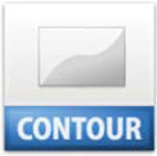
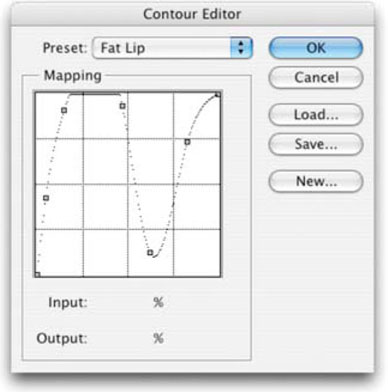
The Power of Contour Settings
Perhaps the least understood option of the Layer Styles dialog boxes is the Contour setting. Most users leave it set to the default linear slope setting. The easiest way to understand the contour is to think of it as a cross-section of the bevel. The contour represents the shape of the bevel from a parallel point of view. A simple linear contour reflects light with predictable results. Irregularly shaped contours can generate metallic highlights or multiple rings to the bevel. When you think you’ve tried every option, the contour settings will unlock many more. Just make sure to pick the Anti-aliased option.
Contours to Try Out
You’ll find a collection of contour settings to try out on the disc.
To modify a contour, you can click on the drop-down menu and select a preset. If you don’t like the 12 included settings, feel free to load some or make your own. Loading contours is similar to loading styles: just click on the submenu triangle. Making your own involves defining the shape of the curve. Click on the curve and add points. If the Preview box is selected, your curve will update in near real time. This is the best way to learn how the contour controls work. Contour controls are available on glows, shadows, and bevels.
Think of the contour as a cross-section of the bevel. It represents the shape of the bevel from a parallel point of view.
Gradients and Textures
Another way to create a unique look is to use custom overlays for your layer. These can be a gradient or a texture. You have precise control of how the overlay is blended and scaled to the layer. These tools behave the same way throughout Photoshop, so if you are experienced with gradients or textures, this will be easy!
Using Gradients
A gradient is simply a gradual blend between two or more colors. Photoshop offers many gradient libraries in the Presets menu. To access these, follow the triangles to access the submenus. Try different styles of gradients (radial, linear, angle, reflected, or diamond) for a new look. The angle setting will also change the gradient’s appearance. To go even further, change the blend mode.

Creating your own gradients is a simple process. Clicking on the image of the gradient will bring up the Gradient Editor, where the color stops and opacity stops define the color and opacity throughout the gradient. The midpoint can also be adjusted to favor one color over the other. To add new stops, click in an empty space above (for opacity) or below (for color). You can also create copies of existing stops by holding down the ![]() key and dragging left or right. Gradients are useful for adding depth and life to an image. Be careful to avoid extreme contrast between stops, or you will get visible banding or patterns on your video output. For more on gradients, be sure to see Chapter 11, “Creating Backgrounds for Video.”
key and dragging left or right. Gradients are useful for adding depth and life to an image. Be careful to avoid extreme contrast between stops, or you will get visible banding or patterns on your video output. For more on gradients, be sure to see Chapter 11, “Creating Backgrounds for Video.”
Using Patterns
The introduction of photorealistic patterns goes a long way towards adding life to your layers. Patterns can be created from any scan or digital photo. You may also choose to paint your own. There is an abundance of patterns available online and from third-party vendors. The trick is to use a seamless pattern that tiles smoothly. Creating a seamless pattern is now simple, thanks to the Pattern Maker filter. In total, the process of creating and saving a seamless pattern should take you less than two minutes. To get started, open the file Ch06_Stone_Texture.tiff from the chapter’s folder on the DVD-ROM.

Step 1. Select the Background layer and then choose the Crop tool.
Step 2. In the Options bar, enter a target size of 800 px by 800 px. Crop the image to size and press Enter to apply the crop.
Step 3. Choose Edit>Select All and then Filter>Pattern Maker. The Smoothness and Sample Details should be adjusted to produce best results. Higher numbers warrant better patterns but will take longer to generate. Be sure to click on the Use Image Size button to generate a large texture.
Step 4. Click the Generate button to create the first pattern. Repeated clicks will generate multiple results, all of which are tracked in the lower right corner. You can go back to earlier versions by clicking the arrows in the bottom corner.
Step 5. When you are happy with the results, click OK.
Step 6. With the entire layer selected (Edit> Select All), choose Edit>Define Pattern.
Once a pattern is created, it can be used from the Pattern Overlay Layer Style or Pattern Fill Layer. Choose the pattern from the pop-up list. If you’d like, you can access the submenu in the Layer Styles palette and choose to save your currently loaded patterns. (This process is identical to saving contours.)

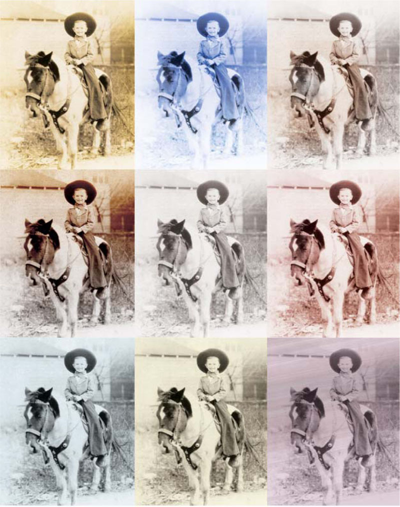
Creating Duotones and Sepia Tones with Layer Styles
The Color, Gradient, and Pattern overlays are useful when working with photos. If working with groups of historical sources or grayscale photos, you can use Layer Styles for consistent tinting effects.
Step 1. If working with a historical photo, strip all of the color data out the photo before restoring it. You can do this by choosing Image> Adjustments>Desaturate.
Step 2. Add a layer effect such as Color Overlay or Gradient Overlay. Adjust the blending mode of the effects to tint the layer.
If you’d like to see effects in action, load the style library PhotoStyles.asl from the book’s DVD-ROM.
Importing Layer Styles into an NLE
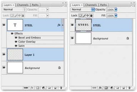
Importing Layer Styles into a nonlinear editing system generally warrants undesirable results. While most NLE software will recognize a layered PSD file, Layer Styles are ignored. To get around this, there are two approaches. The first approach is to attempt to recreate the effects within the NLE environment. This works well for basic effects like drop shadows, but not for the more advanced features.
The second approach is to use merging to permanently apply the Layer Styles. If you are going to choose this approach, be sure to save a copy of the original file before proceeding.
Step 1. Create a text layer and apply a Layer Style to it.
Step 2. Create a new layer by pressing ![]()
![]() . Drag the new layer below the stylized layer in the Layers palette.
. Drag the new layer below the stylized layer in the Layers palette.
Step 3. Select both layers, ![]() +clicking their layers in the Layers palette (older versions of Photoshop require that you link the layers).
+clicking their layers in the Layers palette (older versions of Photoshop require that you link the layers).
Step 4. Choose Layer>Merge Layers.
Step 5. Repeat for any other layers that have Layer Styles applied.
The left image shows the original layers, the right image is after merging.
Alternately, you can take merging layers a step further; see “Targeted Flattening” at the end of this chapter.
Importing Layer Styles into After Effects
The process of importing Layer Styles into Adobe After Effects has continued to improve with each software release. As both Photoshop and After Effects are made by Adobe, the expectation is that the two applications will exchange seamlessly. However, expectations are not always reality.
The top image shows the merged layers when imported into After Effects. The bottom image shows the errors generated when Layer Styles are brought into After Effects as a “live effect.”
Layer Styles are very complex, especially when features like Contours and Patterns are used. After Effects does its best to recreate the Layer Style using its effects engine. Depending on the effects you have applied, After Effects may need to pre-compose layers or split the stylized layer into multiple tracks. If you have After Effects, we’ve included a test file on the book’s DVD-ROM.
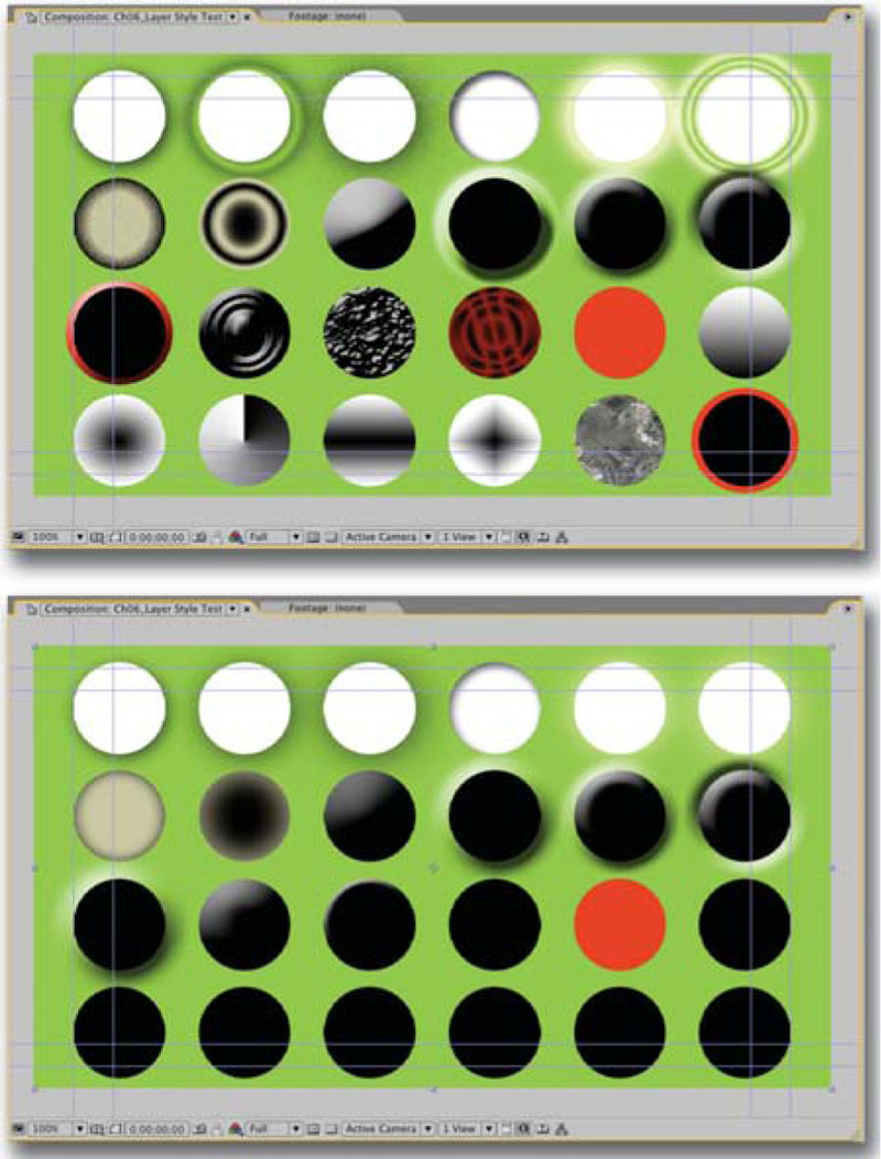
Step 1. Launch After Effects and select the Project window.
Step 2. Choose File>Import>File and select the file Ch06_Layer Style Test.psd from the chapter’s folder on the DVD-ROM. Choose to Import As: Composition and click Open. The layered file is opened into After Effects.
Step 3. Double-click the composition icon in the Project window to load it.
Step 4. The topmost layer can be toggled off and on. It is a merged copy created in Photoshop that shows you how the Layer Styles should look. You’ll notice that none of the advanced features like Contour or Noise translate. Additionally Texture, Gradient, Stroke, and Satin may be ignored (depending on which version of AE you are using). Even features like bevels don’t translate exactly.
Depending on your desired results, you’ll need to make a choice. You can take the approach we discussed for NLE import and merge stylized layers with empty layers to “flatten” the style. Otherwise, if you need the layer effect to be editable, you will need to modify the imported file until it matches your desired effect as closely as possible. It is important to keep in mind that After Effects and Photoshop are separate programs and you cannot expect all features to work seamlessly.
Final Advice when Working with Layer Styles
The following advice is offered to really make you an expert Layer Styles user. These techniques can really tip the balance of power and give you the speed and flexibility that video deadlines demand.
Shortcuts
How do you add shortcuts to a technology based on shortcuts? The designers at Adobe managed to squeeze a few in. Here are the most useful shortcuts related to Layer Styles:
• Double-click on a layer in the layer’s palette (except on the name), and you will be in the Layer Style dialog box.
• To edit a specific effect, double-click that effect’s name in the Layers palette.
• Turn effects off temporarily by clicking on the eyeball icon next to it.
• Copy and paste Layer Styles by right-clicking on the effect icon in the Layers palette and choose Copy Layer Style.
• You can also paste a copied effect to multiple layers that are selected or linked. Just right-click on the Effect icon and select Paste Layer Style.
• You can move a Layer Style from one layer to another by dragging it.
• You can ![]() +drag (
+drag (![]() +drag) a Layer Style from one layer to another to copy it.
+drag) a Layer Style from one layer to another to copy it.

Alpha Channels and Import Issues
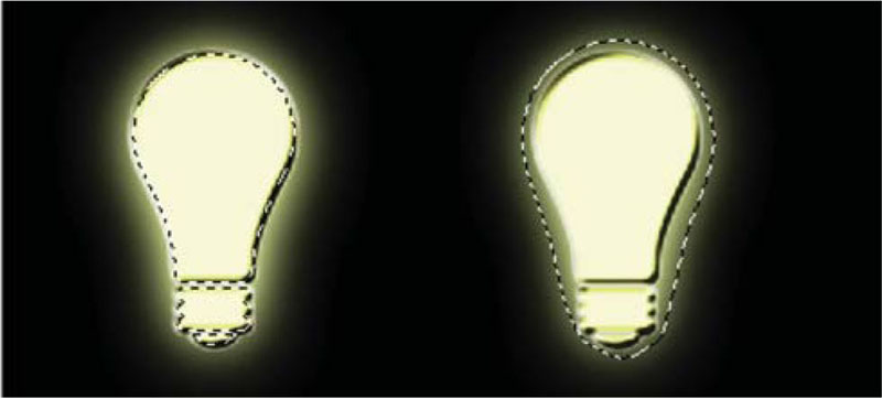
You’d think alpha channels would be a snap with Layer Styles as such a perfect time-saver. Despite lobbying efforts, Layer Styles do not affect how a layer loads; this is a crucial step in creating the alpha channel. Simply put: loading a layer with a drop shadow or glow will ignore any pixels outside the initial shape. This makes generating an alpha channel nearly impossible.
“Marching ants” don’t lie…the light bulb on the left is loading incorrectly, as it does not recognize the outer glow layer effect. It is important to flatten layer effects before sending them out to other video applications.
To add to this problem, other applications have difficulty with Layer Styles. No NLE system correctly interprets all effects. Even After Effects imports Layer Styles as multiple layers and pre-compositions, with some features not fully supported. While the Create Layers command is often recommended as a solution, it is not a perfect fix. It generates messy results with grouped layers and some effects displaying incorrectly.
Targeted Flattening
Many designers I know have given up on Layer Styles and reverted to using filters. But you can keep using Layer Styles without problems. The solution is simple: Flatten them! You can flatten the contents of an individual layer so that it loads perfectly and travels easily. Better yet, through a little Layers palette trickery, we can make a portable copy while still preserving an editable layer. This technique, which I call targeted flattening, is similar to a video mixdown or a nested composition.
Using Create Layers
You can right-click and choose Create Layers to turn a Layer Style into a multilayered effect. This command can assist in translating effects to another system, but you lose the ability to modify the effects.
Step 1. Save your document under a different name by using Save As. This is an extra precaution against accidentally deleting your work. (I usually rename it Document Name for AE.psd or Document Name for FCP.psd, etc.)
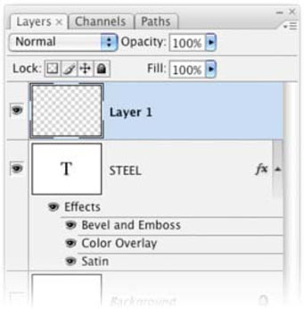
Step 2. Double-click on the background and give it a new name, thus creating a floating layer. This procedure will not work correctly if the background layer is part of your linked set.
Step 3. Create a new (empty) layer and place it below the stylized layer.
Step 4. Select both layers by ![]() -clicking. Older versions of Photoshop (pre-CS2) require you to link the two layers together.
-clicking. Older versions of Photoshop (pre-CS2) require you to link the two layers together.
Step 5. Leave the empty layer highlighted. While holding down the ![]() key, click on the submenu and select Merge (or Merge Linked). This merges the layers to the target layer, but leaves the originals behind.
key, click on the submenu and select Merge (or Merge Linked). This merges the layers to the target layer, but leaves the originals behind.
You should have a flattened copy on the target layer. Repeat for all layers and save your work. This method will produce a layered document, which can be cleanly imported into other editing applications that support layers. You will discard the layers that you don’t need within the NLE or motion graphics application after import.
Updating Styles
You can easily jump into the Photoshop document to make updates. After Effects users can choose Edit Original (![]()
![]() ).
).
Step 1. Select the flattened layer, choose Select All, and press ![]() .
.
Step 2. Pick the original (unflattened) layer and make your changes to the Layer Style or layer contents.
Step 3. Repeat the Targeted Flattening procedure.
This process works well with the Edit Original command in After Effects and Premiere Pro or Final Cut Pro’s External Editor. It can also work with Avid’s batch import command and support for Photoshop layers, as well on newer systems.
Create the Alpha Channel
If you need to create an alpha channel for an effected layer, you will need to create a merged copy.
Step 1. Create a new, empty layer.
Step 2. Disable the visibility on any background or reference layers that you don’t want included in the alpha channel.
Step 3. With the empty layer selected, hold down the ![]()
![]() key and choose Layer>Merge Visible.
key and choose Layer>Merge Visible.
Step 4. You can now ![]() +click (
+click (![]() +click) on the merged layer to load it as a selection. Throw away the merged layer as you are done with it. Creating an alpha channel is just one click away.
+click) on the merged layer to load it as a selection. Throw away the merged layer as you are done with it. Creating an alpha channel is just one click away.
Step 5. With the “marching ants” circling, go to the Channels palette. Click on the Save Selection as Channel button (second from the left). You have now created the needed alpha channel.
Step 6. Choose File>Save As… and pick a format that your system recognizes and that will support an alpha channel (such as PICT, TIFF, or Targa). Be sure to only have one alpha channel in your Channels palette (visible or invisible). Additional channels will cause problems when you save your files out for video.

Hands On | 06
Creating Layer Styles with Photos
Layer Styles are one of the most exciting things to happen to Photoshop. Flat images can take on a rich depth and visual excitement. In this tutorial we’ll explore using multiple layers and photographic sources to create a logo.
Unfortunately, most users resign themselves to only using the built-in styles. Many don’t realize that there are more to load (just click on the palette’s submenu). Better yet you can download more from great sites like www.adobe.com/exchange. But the true power lies in creating your own.
While the act of creation may seem intimidating, don’t fret. Photoshop offers several easy ways to create your own styles. In this tutorial we’ll explore using photographic sources as textures or patterns that will push Layer Styles into new possibilities.

You’ll find Exercise 06 on the DVD-ROM.
PROfile: Michael H. Amundson
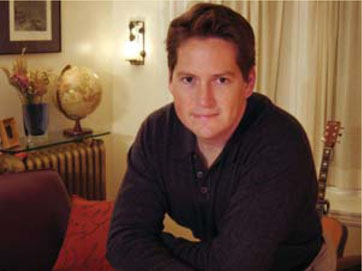
Michael Amundson studied film at The University of Iowa, and soon found himself a freelancer in film production. He worked as an operator and assistant on film and video productions as well as other duties ranging from dolly grip to sound recordist. He then went to work for a production company, where he became an Avid editor, making commercials, videos, and interactive media. Amundson then pulled up roots and moved across the country to Boston, Massachusetts to work for the PBS long-form public-affairs documentary series FRONTLINE.
“My duties at FRONTLINE were demanding and wide-ranging, including online and offline editing of the films and promos,” said Amundson. “I also supervised restoration of archival documentary film. But I did a significant amount of design work for the open titles and credits, promo end-pages, and graphics, as well as the design and updating of packaging elements.”
After five years Mike decided to get behind the camera again and is now with Vermont Studio, a boutique company not far from Boston. “I’m very lucky to have found a flexible environment where I can keep one foot in the edit suite and the other behind the lens.” Mike has been shooting for FRONTLINE as well as providing post-production services for a variety of filmmakers and non-broadcast clients.
When graphics are involved, Amundson always turns to Adobe Photoshop. He uses Photoshop to prepare photographs and other scanned elements for use in the documentaries. Amundson says that Photoshop is “indispensable” to the broadcast TV business.
“Photoshop is great for retouching problem photos to eliminate scratches or distracting elements in the image,” said Amundson. “I also create graphic elements such as main titles and credits in Photoshop, then animate or effect them in After Effects. Photoshop support is integrated perfectly in After Effects, making the work very easy and more creative. I then render a QuickTime movie with After Effects to be imported into the finishing system.”
Amundson says Photoshop’s accessible and affordable toolset is a perfect complement to an NLE suite.
“Our online system has excellent color correction and scratch removal tools, so I don’t use Photoshop as much as I used to for that,” said Amundson. “However, not everyone has access to expensive broadcast tools, and Photoshop can accomplish many of these tasks at a great price.”
Amundson offers two pieces of advice for nonlinear editors.
• He says he relies heavily on the History palette. “I use the history palette to undo my screw-ups, which are many.”
• He also points to the need for collaboration. “Being in tune with the people in your edit suite is half of the editing process.”